14 Modern Accounting Website Designs Worth Studying
Fourteen firms that dropped the handshake photograph. This is accounting website design once a practice commits to an identity of its own.
Shown
14 sites
Reviewed
28 candidates
Chosen on
The work, not the ranking
Updated
15 October 2026
01
harness.co
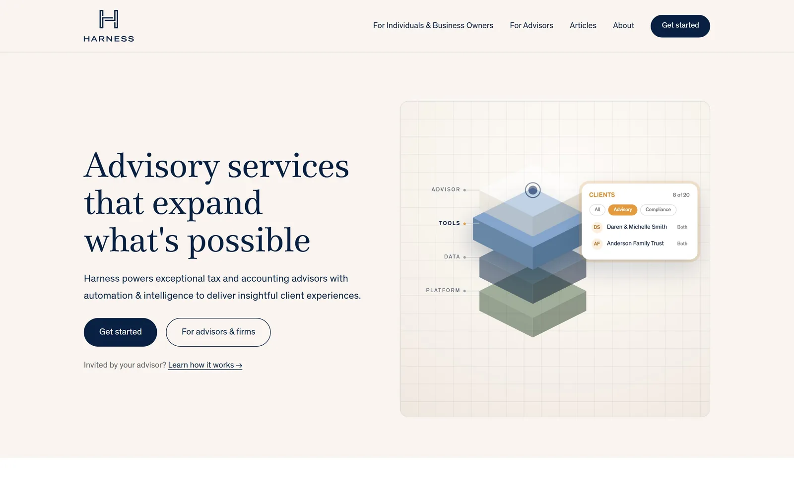
Navy serif on a warm sand ground, with an exploded isometric diagram standing in for the usual team photograph.
Type
Media77 62px
Body
Theinhardt
Build
two column, 64px gutter, 1200px container
Made on
custom
Colour
#f9f4ef #082042 #375234
Type. The headline is Media77 at around 62px, a serif with real contrast in the strokes, set with slightly negative tracking and a tight 1.08 line height so three lines stack into a block. Body copy drops to Theinhardt at 18px with generous 1.65 leading. Serif display over grotesque body is a standard pairing, but the restraint is the point: two families, four sizes, no capitals, no letterspaced eyebrow label.
Colour. A warm sand #f9f4ef carries the whole page, deep navy #082042 does all the typesetting, and a muted sage #375234 shows up only inside the diagram. There is an amber #e49b3d used once, on a single filter pill in the interface panel. That is the entire palette, and the warmth of the ground is what keeps the navy from reading cold and institutional.
Layout. Two columns across a narrow 1200px container with a 64px gutter, text left and a framed panel right. Inside that panel, four translucent planes float apart on a faint grid, labelled ADVISOR, TOOLS, DATA, PLATFORM in small letterspaced capitals. It explains a layered product without a screenshot or a diagram caption.
The ask. Two pill buttons, filled navy for Get started and outlined for For advisors and firms, which splits the two audiences without a second nav. Below them, a quiet line of small text reads Invited by your advisor? Learn how it works, catching a third group who arrived by referral.
An abstract diagram will outperform a stock boardroom photo when your product is a layer most clients never see.
02
pilot.com
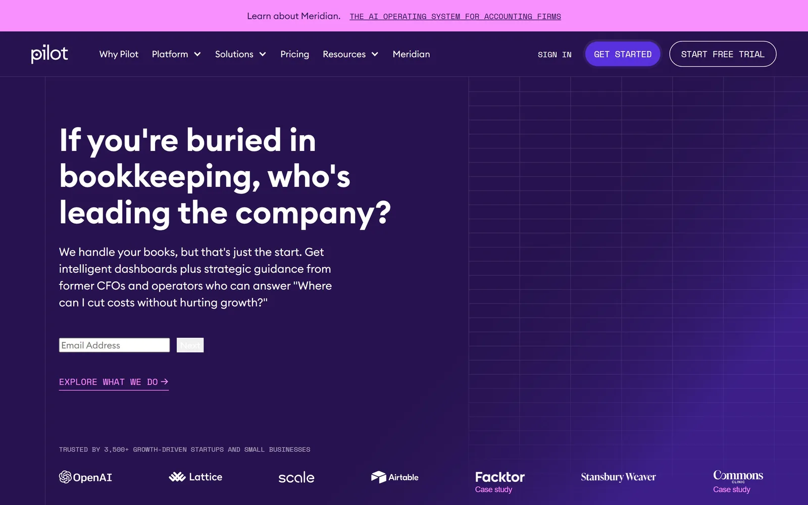
Deep violet with a faint engineering grid, a 56px question for a headline, and monospace running underneath it.
Type
Euclid Circular B 56px
Body
Euclid Circular B
Build
half-width content column, grid field right
Made on
Webflow
Colour
#281350 #5931dc #f891ff
Type. Euclid Circular B does almost everything, at 56px semibold for the headline and 20px regular for the paragraph. The interesting choice is the second family: Space Mono at 14px in capitals, used for the trust line, the explore link and the nav buttons. Monospace reads as instrument panel rather than marketing, which suits a company selling dashboards. The headline is phrased as a question, which is rarer than it should be.
Colour. Violet #281350 grounds the page, a brighter #5931dc fills the primary button, and a hot pink #f891ff is held back for the top announcement bar and the small arrow link. Three tones of one hue plus an accent that only appears twice. The grid lines over the right half are barely a shade lighter than the ground, which is the correct amount of texture.
Layout. Content sits in the left half and the right half stays empty except for the grid, which is a confident thing to do with that much space. Client logos run along the bottom edge in white, with two of them carrying small Case study labels in pink so the row doubles as navigation rather than decoration.
The ask. An inline email field with a Next button, rather than a button that opens a form, which removes a step. One blemish: that field and its button render as unstyled browser defaults against an otherwise finished page, and it sits exactly where the eye is meant to go. A secondary EXPLORE WHAT WE DO link gives non-buyers somewhere to land.
If you are going to leave half the fold empty, put texture in it rather than a photograph, and let the type carry the weight.
03
hiline.co
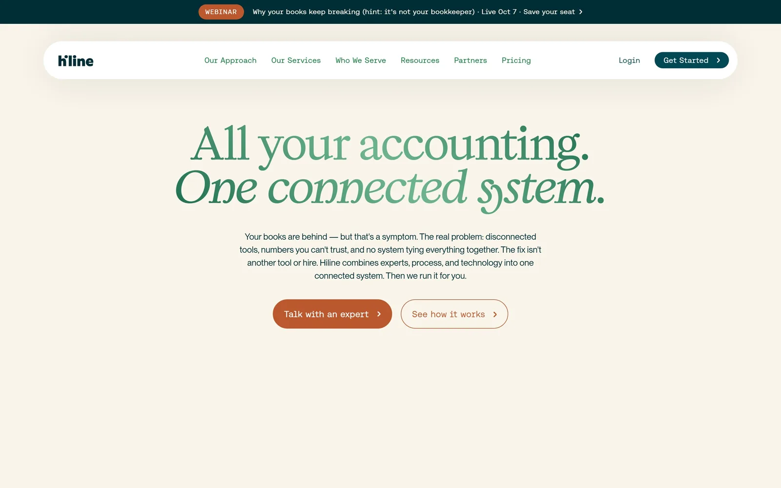
Two lines of green serif, the second in italic, centred on cream with nothing else competing for attention.
Type
Kalice 78px
Body
Neue Montreal
Build
centred single column, 1440px container
Made on
Webflow
Colour
#f9f5ea #002e36 #bb582d
Type. Kalice at about 78px, roman on the first line and italic on the second, is the whole design. Setting All your accounting. upright and One connected system. in italic turns a two-sentence headline into a statement and its echo. Supporting copy drops hard to 16px Neue Montreal, a ratio of nearly five to one, which is the kind of gap most firms are too nervous to leave.
Colour. Cream #f9f5ea everywhere, deep teal #002e36 for ink, and a burnt orange #bb582d for the primary button and the outline of the secondary. A brighter green #19813c appears only in the navigation links. Four colours, each with one assignment, and no gradient anywhere.
Layout. Centred, single column, with the navigation floating as a white rounded capsule rather than sitting flush to the edge. The lower two thirds of the fold are deliberately empty. A webinar strip runs along the very top, which is the one thing cluttering an otherwise disciplined composition.
The ask. Two pills side by side, filled orange for Talk with an expert and outlined for See how it works. The supporting paragraph does real work before them, naming the symptom (your books are behind) and then reframing it as a systems problem, which is the argument for buying a service rather than hiring a bookkeeper.
One typeface used at two radically different sizes beats three typefaces used politely.
04
decimal.com
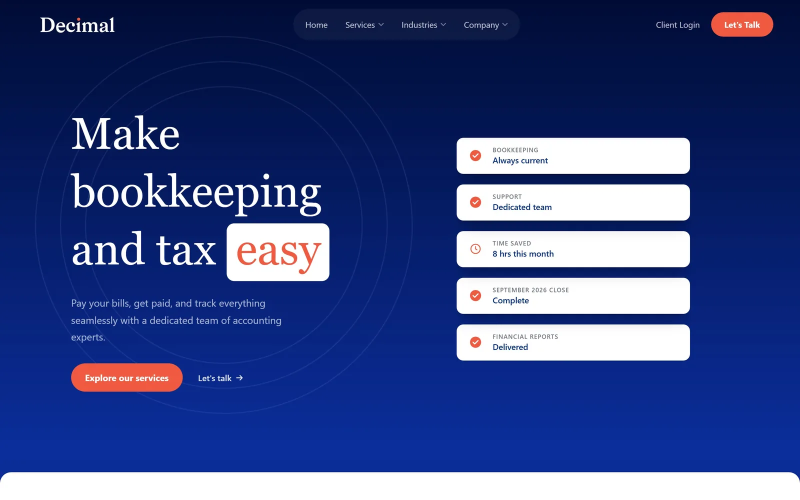
A navy gradient, a Playfair headline, and the word easy lifted out into a white box in orange.
Type
Playfair Display 80px
Body
Inter
Build
two column 560px, 64px gutter
Made on
custom
Colour
#000c35 #ffffff #ee5940
Type. Playfair Display at 80px is the headline, and the trick is the last word: easy sits in a white rounded rectangle in orange #ee5940, as though someone highlighted it. Setting a high-contrast didone over 18px Inter at 1.7 line height gives the page an editorial top and a utilitarian bottom. The logo is set in the same serif, so the wordmark and the headline belong to each other.
Colour. Navy #000c35 graduating toward a brighter blue at the base, white, and a single coral-orange that appears on the highlight box, the button and the five small status icons. Three colours total. Faint concentric rings are drawn behind the headline in a navy barely distinguishable from the ground.
Layout. Two equal 560px columns with a 64px gutter. The right column holds five stacked white cards reading BOOKKEEPING Always current, SEPTEMBER 2026 CLOSE Complete, FINANCIAL REPORTS Delivered. It is a status feed rather than a product screenshot, which communicates the service faster than an interface would.
The ask. A fully rounded orange button for Explore our services, with a text link Let's talk beside it, so the softer option is genuinely softer rather than a second button in a different colour. Those status cards quietly answer the real question a prospect has, which is whether anything will actually get done on time.
Highlighting one word of the headline in your accent colour does more than adding a third brand colour ever will.
05
revelcpa.com
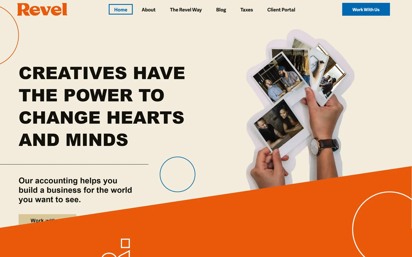
Heavy black capitals reading CREATIVES HAVE THE POWER TO CHANGE HEARTS AND MINDS, with an orange diagonal slicing the page.
Type
Adelle Sans 60px extrabold
Body
Adelle Sans
Build
two column, 1370px container
Made on
WordPress
Colour
#f8f5ec #ea580c #0067b2
Type. Adelle Sans at extrabold, around 60px in the hero and up to 137px elsewhere, set in capitals across four short lines. The wordmark is the same family in orange. One typeface, worked hard at several weights, which is why a page carrying this many shapes still holds together.
Colour. Cream #f8f5ec, orange #ea580c and a strong blue #0067b2 that shows up on the nav button and the outline circles. Orange and blue sitting opposite each other on the wheel is a bold call for an accounting firm and it reads as confidence rather than noise, mostly because the cream keeps them apart.
Layout. Text left, a cut-out photograph of hands holding Polaroids right, with outline circles and squares scattered as brand furniture. A hard orange diagonal cuts across the lower third. That diagonal also clips the primary button in half, which is a genuine flaw rather than a loading artefact, and the one thing stopping this being a top-three example.
The ask. Work With Us sits top right in blue, duplicated as a cream button lower in the hero where the diagonal catches it. The headline is a mission statement rather than a service description, which is a deliberate filter: a client who does not respond to it is not the client this firm wants.
Check your hero at the breakpoint you actually designed on, because a decorative diagonal that eats your only button costs real money.
06
lettuce.co
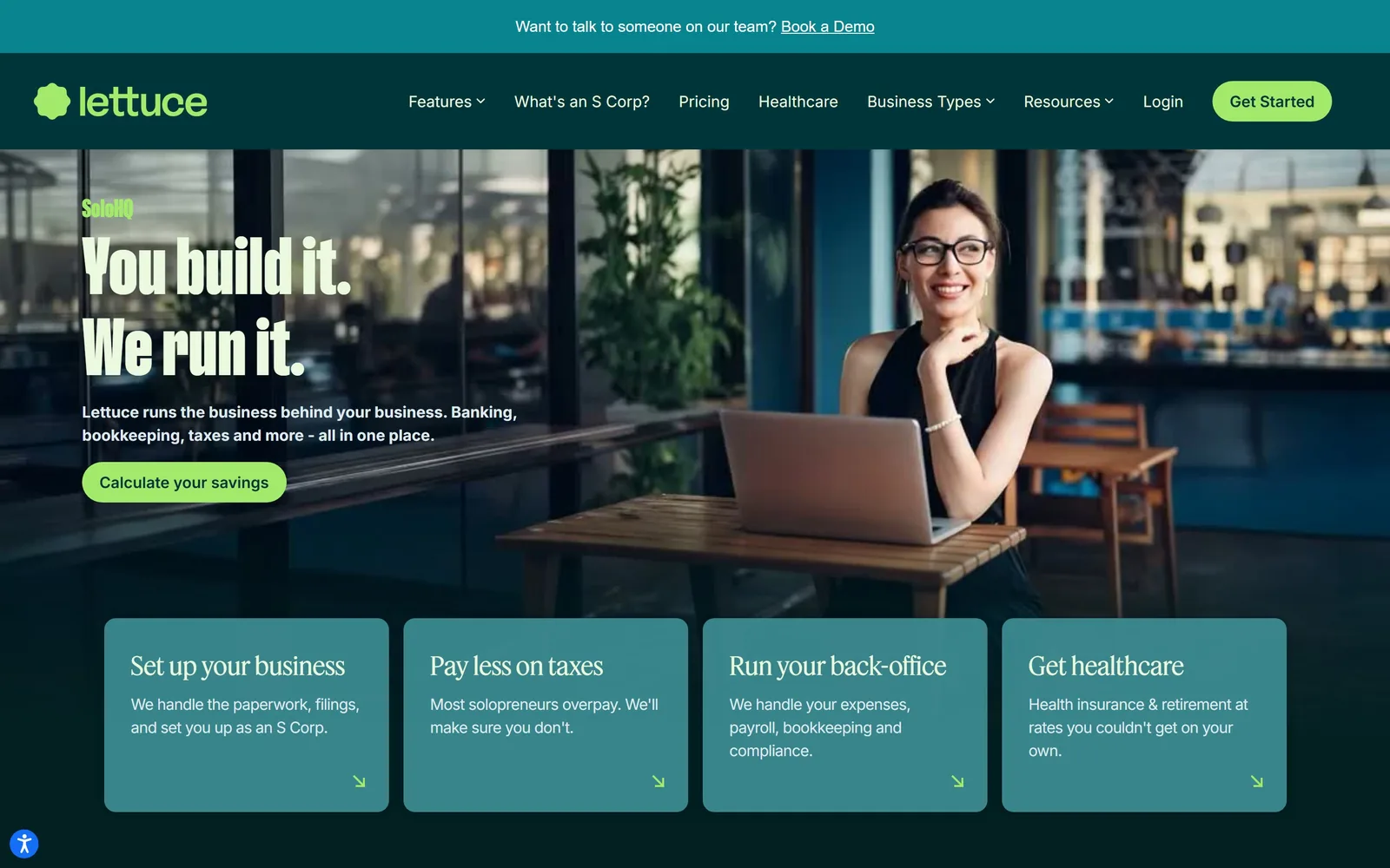
Compressed cream capitals over a dark teal photograph, with four flat cards sitting directly on the image.
Type
ABC Gravity Compressed 84px
Body
Inter
Build
full-bleed image with four-card overlay
Made on
custom
Colour
#022021 #3c8b92 #a3e96b
Type. ABC Gravity Compressed at 84px, set at a line height of exactly 1 so You build it. and We run it. lock into a tight two-line block. A tiny eyebrow in the same compressed face reads SoloHQ in green. Card headings switch to Feature Deck, a serif, at 40px, which softens the row and stops the whole page shouting. Body copy is Inter at 16px and stays out of the way.
Colour. Dark teal #022021 as the base, a lighter #3c8b92 for the card fills, and a sharp lime #a3e96b reserved for the logo mark, the eyebrow, the button and four small arrows. The lime appears on well under a tenth of the page and is the only thing that moves the eye. Headline text is a pale green-white #ebfadf rather than pure white, a small warming adjustment most people would skip.
Layout. The photograph bleeds full width and the four cards sit on top of it rather than below, overlapping the lower edge of the image so the fold carries both the pitch and the service breakdown. Those cards each end with a small diagonal arrow in the bottom right, a quiet signal that they are links.
The ask. Calculate your savings is a better primary button than Get started, because it offers arithmetic rather than a commitment, and the S Corp question in the nav backs it up. The four cards double as a service menu for anyone not ready to click.
Name the button after the thing the visitor wants to find out, not after the step you want them to take.
07
finaloop.com
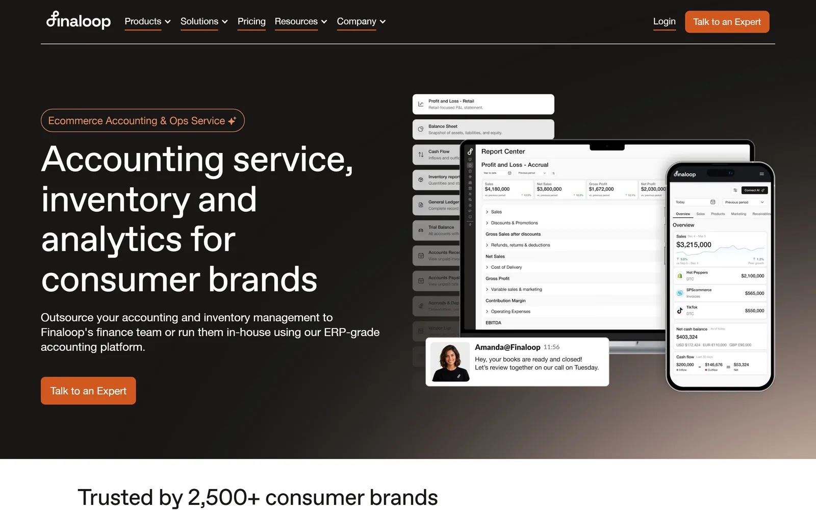
Charcoal page, 64px white headline, and a floating cluster of product screens with a real support message pinned to it.
Type
ABC Favorit 64px
Body
Helvetica Neue
Build
two column 640px, 48px row gap
Made on
Webflow
Colour
#181716 #ffffff #d1581f
Type. The headline is set in ABC Favorit at 64px with slightly negative tracking, broken across four short lines so the ragged right edge becomes part of the composition. Nav and button text is Helvetica Neue at 18px. The small pill above the headline reads Ecommerce Accounting & Ops Service in orange outline, which does the category labelling so the headline does not have to.
Colour. Near-black #181716 with a warm cast rather than a cool one, white type, and burnt orange #d1581f on the pill outline, the button and the logo. The orange is used three times and nowhere else. A faint warm glow sits in the bottom right corner behind the product imagery, which is the only lighting effect on the page.
Layout. Text left, product collage right, built from a desktop report, a phone overview and a column of document tiles layered at different depths. Pinned to the front is a chat bubble from Amanda@Finaloop saying the books are closed and ready to review. That one detail is worth more than the three dashboards behind it, because it shows the service rather than the software.
The ask. A single orange button, Talk to an Expert, repeated in the nav. No demo request, no pricing link in the hero, no second CTA competing with it. Directly below the fold the page opens with Trusted by 2,500+ consumer brands, so the number arrives right after the ask.
Put a named human into your product screenshot; the dashboard proves the software works, the message proves someone is minding it.
08
every.io
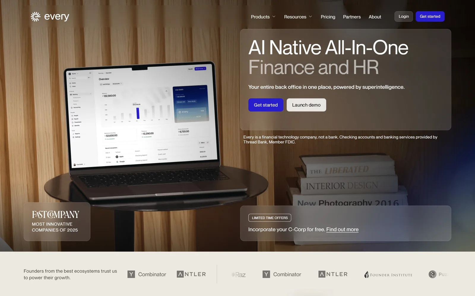
A laptop on a walnut table shot in warm light, with translucent frosted panels laid over the photograph.
Type
Neue Montreal 60px
Body
Neue Montreal
Build
two column 636px, 24px gutter
Made on
Webflow
Colour
#ede9e1 #271dcd #ffffff
Type. Neue Montreal at 60px, with the second line AI Native All-In-One in white and Finance and HR dropped to grey, so one headline carries two levels of emphasis without a size change. Small capitals at 13px with wide letterspacing handle labels like LIMITED TIME OFFERS. Nothing is set larger than 60px anywhere on the page.
Colour. The photograph supplies the palette: walnut browns and warm greys, with a cool blue bloom in the top right corner. The only applied colour is an electric blue #271dcd on the Get started button, which is the single saturated thing in view and impossible to miss as a result.
Layout. Frosted translucent cards float over the image, one holding the headline, one holding a Fast Company award, one holding an offer. Glass panels over photography is a well-worn device and it survives here because the photograph underneath is genuinely good and the panels are placed on the quiet parts of it. The investor logo strip along the bottom was caught mid-scroll and repeats Combinator and Antler twice, which reads as a bug.
The ask. Get started in blue and Launch demo in white, side by side at equal size. A legal line directly beneath clarifies that Every is not a bank, which is the right place for it. The C-Corp incorporation offer in its own panel gives founders a reason to act now rather than bookmark.
If you are going to put glass panels over a photograph, commission the photograph first, because the effect has nothing to hide behind.
09
fincent.com
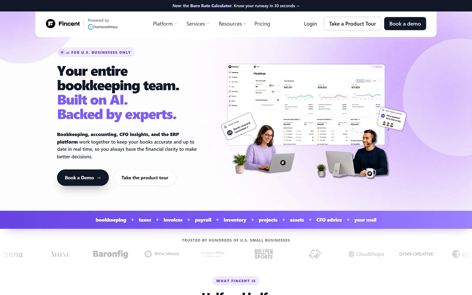
Pale lilac ground, a three-line headline that switches to violet halfway, and cut-out people sitting beside a dashboard.
Type
42px heavy sans
Build
two column, uneven split, 1440px container
Colour
#f3eefb #6544e0 #111827
Type. Heavy sans at 42px with noticeably tight tracking, set in three lines. The first line stays near-black and the next two turn violet, which splits one sentence into claim and proof: your entire bookkeeping team, then Built on AI. Backed by experts. The supporting paragraph bolds only the service list and leaves the rest at regular weight, a small piece of scanning help.
Colour. Two lilacs, #f3eefb and #efeaff, laid as soft overlapping circles rather than a flat fill, with violet #6544e0 for the emphasised type and a saturated purple band below the fold. Purple is unusual in this profession and it is handled with more discipline than most, though the near-black headline on lilac is a weaker contrast than it needs to be.
Layout. Text left, imagery right, with the dashboard screenshot flanked by two cut-out photographed people at their own desks. A full-width purple strip underneath runs the service list as a single line: bookkeeping, taxes, invoices, payroll, inventory, projects, assets, CFO advice, your mail. That strip does more work than the dashboard above it.
The ask. Book a Demo in dark navy and Take the product tour outlined beside it, repeated identically in the nav. A small pill above the headline reads FOR U.S. BUSINESSES ONLY, which disqualifies the wrong visitor in four words before they read anything else.
Qualify your visitor in the first element they see; a short exclusion badge saves more time than any pricing page.
10
propellerindustries.com
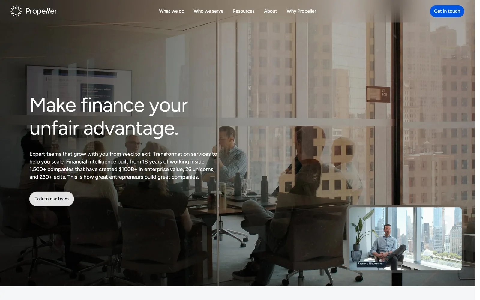
A glass-walled boardroom shot through the window, with light type sitting in the darkest part of the frame.
Type
Figtree 60px regular
Body
Figtree
Build
full-bleed photograph, text lower left
Made on
custom
Colour
#0f202f #ffffff #0056e0
Type. Figtree at 60px in regular weight, not bold, set white over a dark photograph with slightly negative tracking. Choosing a light weight at that size takes nerve and it is why the headline reads as composed rather than loud. Body copy is a dense 16px block of six lines carrying the proof points, and it is the only paragraph on the fold.
Colour. Almost none applied. The photograph is desaturated toward navy #0f202f, the type is white, and a single blue #0056e0 fills the Get in touch button in the corner. The site is holding one brand colour in reserve and spending it in exactly one place.
Layout. Text sits low and left, in the shadowed region of the image, which is where it needs to be for the contrast to hold. A small video thumbnail of a named person is tucked into the bottom right. The reflections in the glass make the image busier than ideal and the body copy is working slightly harder than it should to stay legible.
The ask. Talk to our team in a black pill under the paragraph, with Get in touch in blue in the top corner. The copy carries the sell rather than the button: 1,500+ companies, $100B+ in enterprise value, 26 unicorns, 230+ exits. For a firm selling to venture-backed founders, the numbers are the argument.
A light weight at large size reads as expensive; bold at the same size reads as a sale.
11
lutz.us
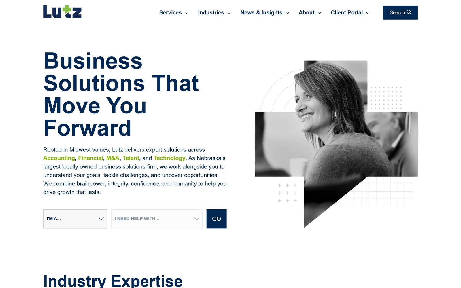
Condensed navy capitals four lines deep, next to a black and white portrait chopped into geometric fragments.
Type
Roboto Condensed 70px bold
Body
Roboto
Build
two column, 1440px container
Made on
custom
Colour
#002855 #84bd00 #ffffff
Type. Roboto Condensed bold at 70px with a line height of 1, stacking Business Solutions That Move You Forward into a solid navy block. Body text is regular Roboto at 18px, and the service names inside that paragraph are set in green as inline links, which turns a description into a navigation element. Navigation is 16px with wide letterspacing in capitals.
Colour. Navy #002855 and a bright chartreuse #84bd00, on white, and nothing else. The green appears in the logo mark, the inline service links and the nav, never as a large fill. That pairing is doing the work a photograph usually does, which is how a page this plain stays interesting.
Layout. Text left, image right, with the portrait sliced into rectangles and a triangular notch cut from one corner, surrounded by dotted grids and plus-sign patterns borrowed from the logo. Black and white treatment keeps the photograph from fighting the two brand colours. For a regional firm this is a considerably sharper composition than the category average.
The ask. Two dropdowns reading I'M A... and I NEED HELP WITH... with a navy GO button, which routes a visitor by role and need instead of asking them to read a service list. It is the most useful conversion device on this page and the only one of its kind in the set.
A two-field router beats a nav menu when you sell six service lines to four different kinds of buyer.
12
aldrichadvisors.com
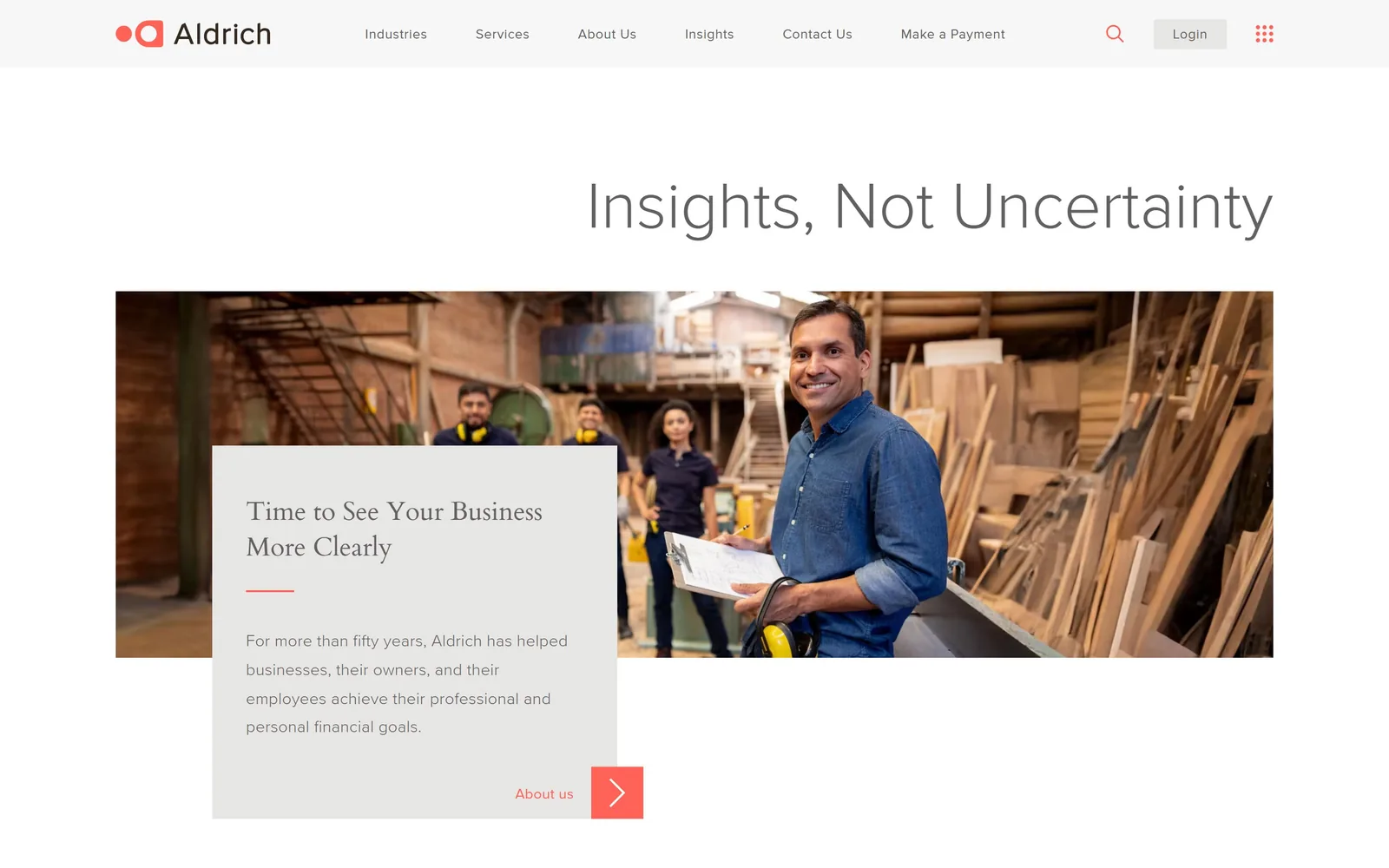
A light sans headline floated to the right, above a photograph of a lumber yard rather than a boardroom.
Type
Proxima Nova Light 68px
Body
Proxima Nova
Build
three column 313px, 30px gutter, 1200px container
Made on
WordPress
Colour
#ffffff #ff6357 #616161
Type. Proxima Nova Light at 68px for Insights, Not Uncertainty, in grey rather than black, which is an unusually quiet hero. The card heading beneath switches to Cardo, a serif, at 27px, and small capitals at 13px with very wide letterspacing handle the labels. Three registers, each used once, and the lightest weight carries the biggest size.
Colour. Mostly white and pale grey, with a single coral #ff6357 on the logo mark, the nav underline, a short rule in the card and the arrow button. The restraint is genuine but the page is close to washing out, and the grey headline against white is the weakest contrast in this set.
Layout. The headline is pushed hard right, leaving the top left corner empty, then a full-width photograph sits below with a pale card overlapping its left edge. The photograph is the best decision here: four people in a timber workshop in work clothes, not a conference room, which tells you what kind of client this firm actually serves.
The ask. One route out of the fold, a small About us link with a coral arrow tile in the corner of the card. For a fifty-year-old firm that is arguably correct, since the visitor is being asked to read rather than to buy, but there is no path to a service or an advisor anywhere above the fold.
Photograph your clients at work in their own setting and the stock-photo problem solves itself.
13
sensiba.com
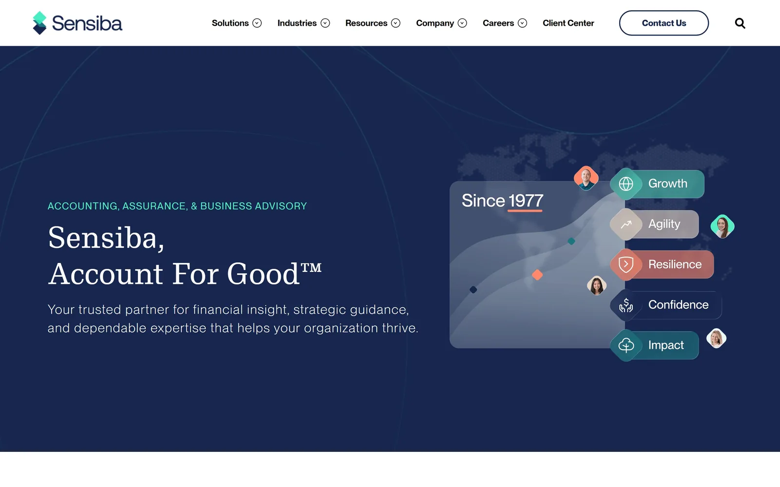
Sensiba, Account For Good set in a serif on deep navy, with coloured pills orbiting a soft data curve.
Type
Messina Modern 56px
Body
Neue Montreal Light
Build
two column, 1440px container
Made on
WordPress
Colour
#17264e #ffffff #3fb8a0
Type. Messina Modern at 56px, a serif, set on two lines with the firm name above and the tagline below. Body copy is Neue Montreal Light at 24px with noticeable letterspacing, which is larger and airier than most firms allow a supporting paragraph. The eyebrow label ACCOUNTING, ASSURANCE, & BUSINESS ADVISORY runs in teal capitals and does the plain-English explaining that the tagline avoids.
Colour. Navy #17264e across the whole fold with white type, and a set of accent pills in teal, sand, coral and slate on the right. Those four accents appear only inside the graphic, never in the typography, which keeps a fairly busy illustration from spreading into the rest of the page.
Layout. Text left, graphic right. The graphic stacks five labelled pills, Growth, Agility, Resilience, Confidence, Impact, each attached to a small round headshot, over a translucent panel marked Since 1977. Five abstract nouns is four more than most heroes can carry, and it is the one place the page overreaches.
The ask. Contact Us as an outlined pill in the nav and nothing else above the fold, which for a firm leading with a trademarked tagline is a consistent choice. The B Corp positioning is implied by Account For Good rather than stated, and a visitor who does not already know the term will not pick it up here.
A tagline can carry your values or your service, rarely both, so put the plain description in the eyebrow above it.
14
camusocpa.com
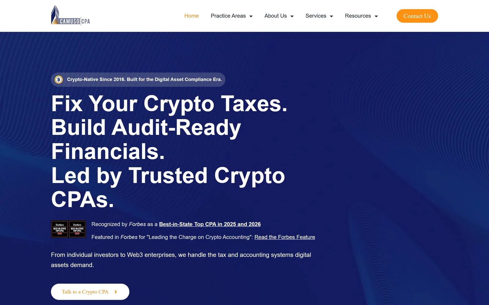
Four short sentences in bold white over navy, with two Forbes badges sitting directly under the headline.
Type
DM Sans 65px bold
Body
Inter
Build
single left column, 1440px container
Made on
WordPress
Colour
#0d1b2e #ffffff #fe9112
Type. DM Sans bold at 65px, broken into four full-stopped sentences rather than one flowing headline: Fix Your Crypto Taxes. Build Audit-Ready Financials. Led by Trusted Crypto CPAs. Each line is a separate claim, which suits a niche where the visitor is scanning for competence. Body copy drops to Inter at 16px with a roomy 1.75 line height, and the Forbes citation sits in Georgia so the press mention looks like a quotation rather than a banner.
Colour. Deep navy #0d1b2e with a faint moiré of diagonal lines behind the type, white headline, and amber #fe9112 on the active nav item, the Contact button and the button text. Two colours and a texture. The moiré is subtle enough to add depth without interfering with the type sitting on it.
Layout. Single left column running the full height, with the right third left to the pattern. A small pill above the headline reads Crypto-Native Since 2016, dating the firm in a market where that matters. The two Forbes badges are rendered small and dark and are the least resolved element on an otherwise tidy fold.
The ask. One white pill reading Talk to a Crypto CPA, which names the specialism in the button itself. Credibility is loaded before the ask: the badge, the two Forbes lines, then a single sentence covering the client range from individual investors to Web3 enterprises.
In a niche clients are nervous about, spend the fold on proof and keep the headline to short declarative claims.
How these were chosen
Accounting is the profession stock photography did the most damage to: the handshake, the calculator, the skyline through vertical blinds, repeated across thousands of near-identical template sites. The fourteen firms below went the other way and committed to a real identity, and the point of studying accounting website design at this level is to see exactly where that commitment shows up. Each entry breaks down the type, the palette, the structure and the way the page asks for the work, so you can take the decisions rather than the look.
Finding accounting sites that someone had actually designed took far longer than it should have. 28 candidates made the shortlist. 14 made the page.
Each one was opened and looked at properly: what the type is doing, where the colour gets spent, how the page is built, how it asks for the job. Nothing is here because it ranks. Nothing is here because an agency filed it under portfolio. Several well known names were left out for the plain reason that their site came out of the same template as everyone else's, and a few sites worth including did not survive a second look.
Where a site is only competent, it says so. The order is the order worth your time, best first.
Reviewed and selected by Larry W. Matthews for Websitely.