B2B Website Design: 128 Sites That Sell to Business
Eight categories with one buyer in common: somebody doing the research at work, on a deadline, who has to show the shortlist to three other people before anything is signed.
That buyer is not browsing. The job of B2B website design is to make a capable firm look capable in the first screen, and then to let somebody verify it. One hundred and twenty-eight sites here do that, and the notes under each screenshot say how.
- Galleries
- 8
- Sites
- 128
- Chosen on
- The work, not the ranking
- Updated
- 15 October 2026
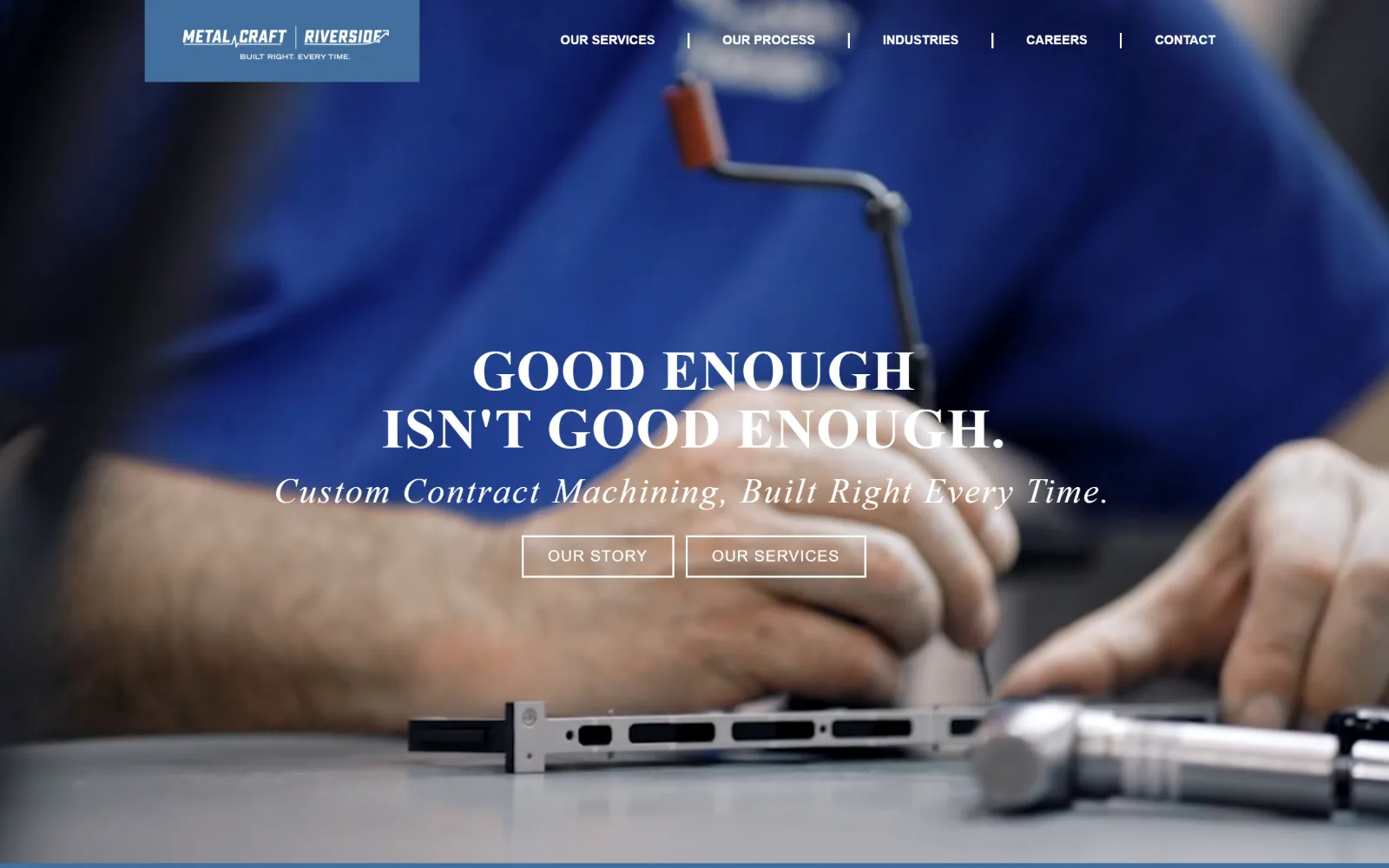
Manufacturing Website Design
Sixteen US plants, machine shops and contract manufacturers. Manufacturing website design that photographs the floor instead of a stock handshake.
16 sites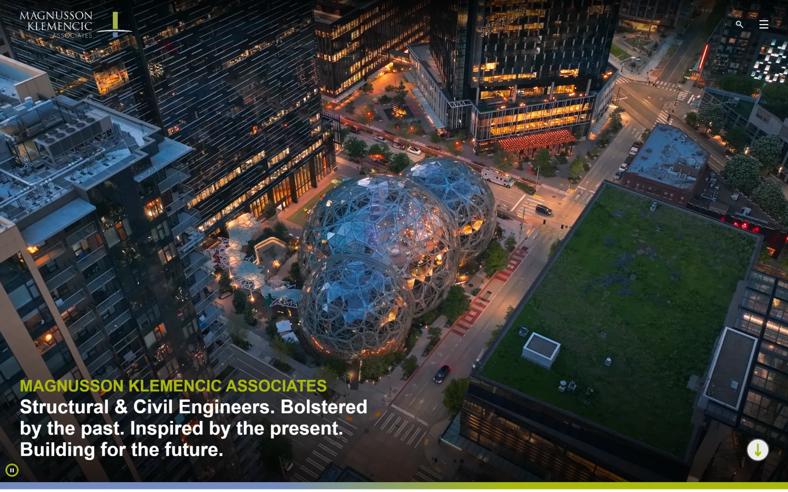
Engineering Website Design
Eighteen US structural, civil and MEP firms. Engineering website design judged on whether the work or the org chart gets the first screen.
18 sites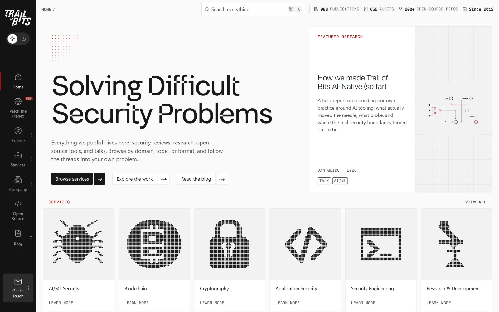
Cyber Security Website Design
Eighteen US security firms and testers. Cyber security website design past the dark-and-neon reflex, measured on type and real hex values.
18 sites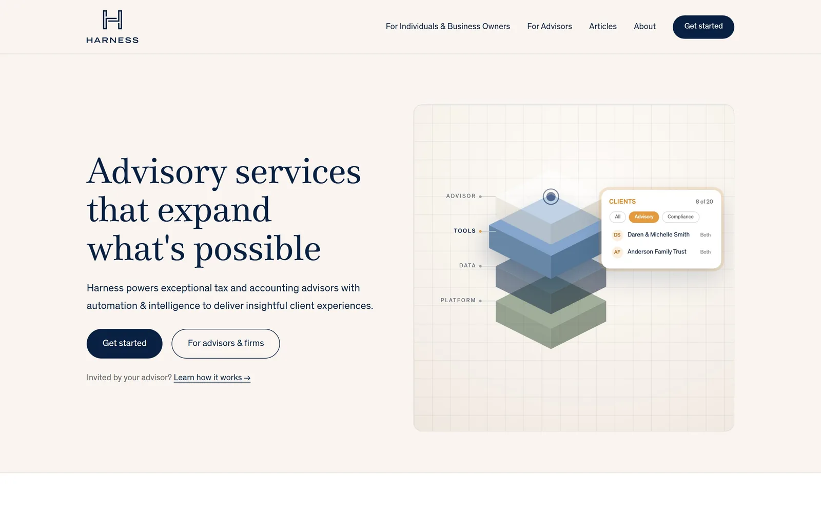
Accounting Website Design
Fourteen firms that dropped the handshake photograph. This is accounting website design once a practice commits to an identity of its own.
14 sites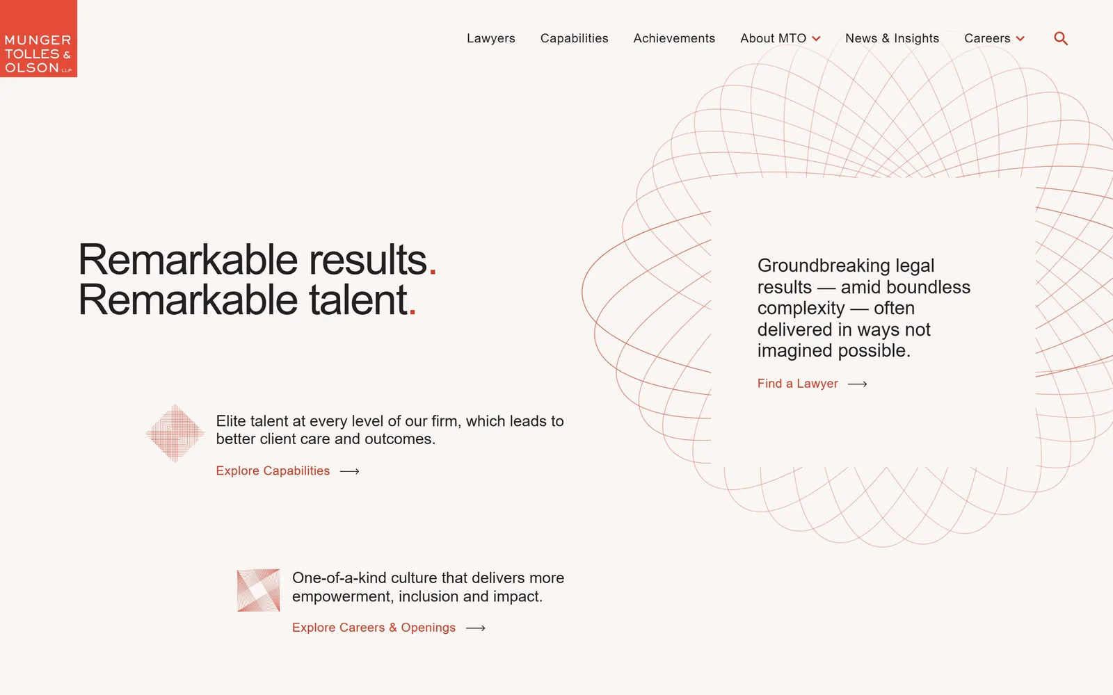
Law Firm Website Design
Almost none of these fifteen firms photograph a lawyer. Law firm website design that hands one sentence the whole fold instead of a slider over a skyline.
15 sites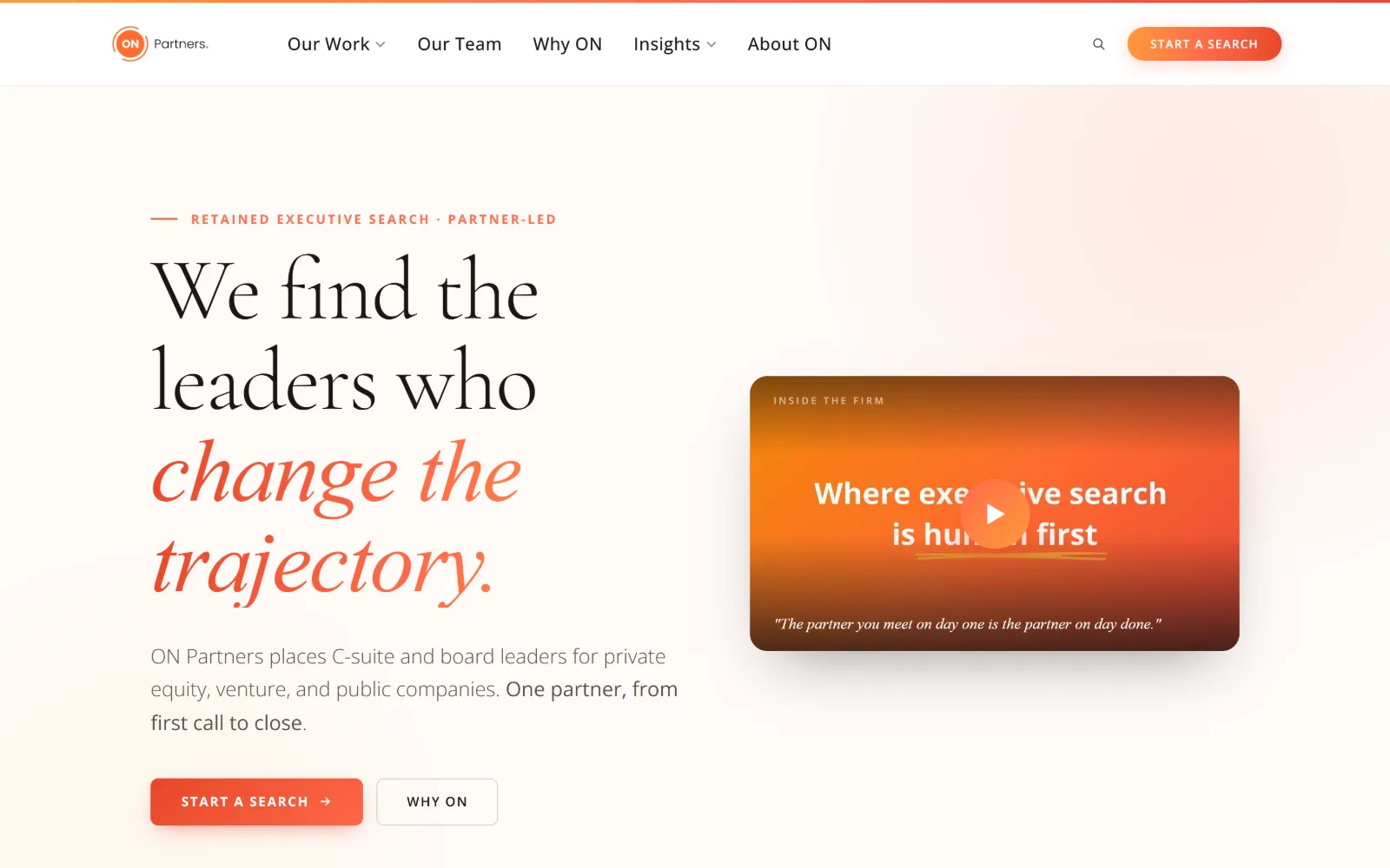
Staffing Agency Website Design
Sixteen US search firms and talent platforms. Staffing agency website design where the client and the candidate want opposite things.
16 sites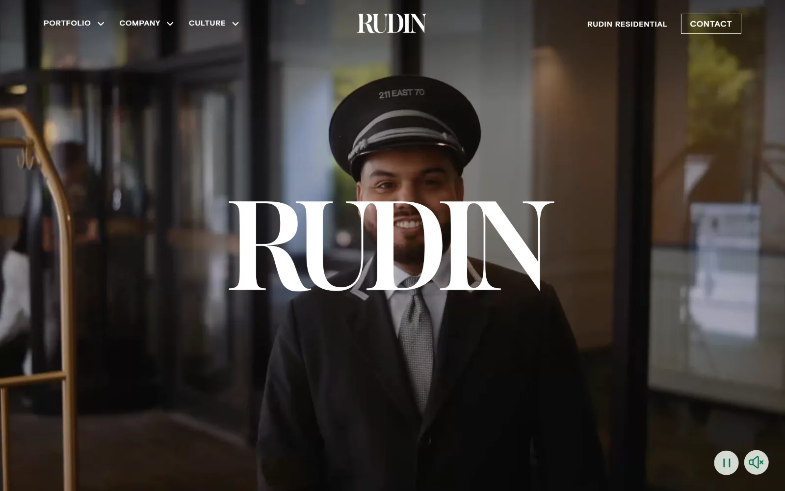
Property Management Website Design
Sixteen US owners and operators, mostly commercial. Property management website design for a reader who is a committee, not a tenant.
16 sites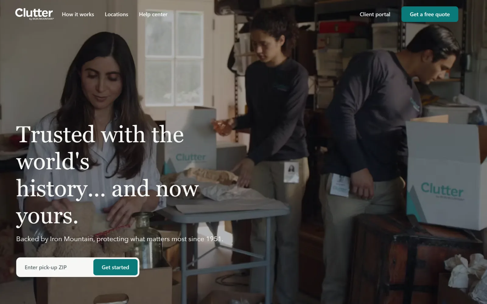
Self Storage Website Design
Fifteen US operators, promo heroes and all. Self storage website design turns on how fast you reach a unit size, a price and a door.
15 sitesNobody buys from the first screen, so stop selling on it
A consumer page can ask for the booking straight away. A buyer specifying a machined part or a penetration test cannot act on the first screen even if they want to, because the decision is not theirs alone. The good sites in the manufacturing gallery understand that and spend the fold on evidence rather than persuasion: what the shop makes, to what tolerance, on what equipment, for which industries.
The weak ones open with a stock handshake and the word partnership, which tells a buyer nothing they can put in an email to their boss.
Photograph the floor, the site, the bench
Every category on this page owns something worth shooting and most of them do not shoot it. Manufacturers have machines mid-cut and parts in a tray. Engineering firms have the bridge, the plant room, the model on screen. The ones that send a photographer get a first screen nobody else can copy. The ones that buy a library image get a first screen their competitor has already bought.
Security is where the visual cliche is worst
Open ten cyber security sites and you will see the same dark field, the same cyan glow, the same padlock, the same hooded figure. It is the most uniform look of any category here, and the firms that broke from it did it with ordinary good typography, real daylight and a plain statement of what they actually do. In a trade that sells calm competence, looking like a film poster works against you.
Expertise still beats a team photograph
The same rule that runs through accounting and law firm sites runs through the industrial ones: when you sell judgement, design the argument rather than the people making it. Munger Tolles writes two sentences on off-white. A machine shop that leads with a tolerance figure is doing exactly the same thing.
Make it easy to check you out
A B2B page is read by somebody who will then go looking for proof: certifications, a capability list, a spec sheet, a named contact. The sites that convert put that one click away rather than behind a form. Gating the thing a buyer needs to justify you internally is the most common unforced error in this category.
What to take into a brief
- Say what you make or do, for whom, to what standard, in the first screen.
- Commission photography of your own floor, site or bench. It is the one asset a competitor cannot buy.
- Skip the category costume. Dark and neon in security, blue gradients in manufacturing, skylines in professional services.
- Put the proof a buyer needs in front of the form, not behind it.
- Design for the person who has to forward your page to somebody more senior.
Manufacturing if you have a floor worth photographing, engineering for showing the work, security if you want out of the dark-and-neon trap.
The other sectors: Contractors, for construction website design among others; Local Services, for moving company website design among others; and Health & Wellness, for medical website design among others.