Website Design Examples: 836 Sites, Sorted by Idea
Every site on Websitely, sorted a second way. The galleries group by trade, which is how you shop for ideas. This page groups by the decision, which is how you learn something.
Eight hundred and thirty-six homepages, four approaches, and the names of the sites that take each one furthest.
- Galleries
- 58
- Sites
- 836
- Chosen on
- The work, not the ranking
- Updated
- 15 October 2026

Medical Website Design
Twelve US practices that have actually been designed, and a good share are dental, which is where the bravest medical website design is happening now.
12 sites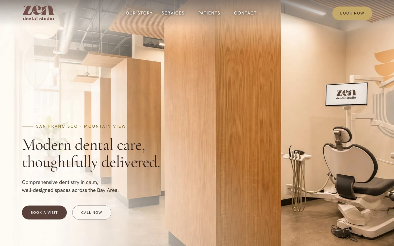
Dental Website Design
Fifteen practices that photographed their own rooms and staff. That decision does more for dental website design than any font pairing on the page.
15 sites
Accounting Website Design
Fourteen firms that dropped the handshake photograph. This is accounting website design once a practice commits to an identity of its own.
14 sites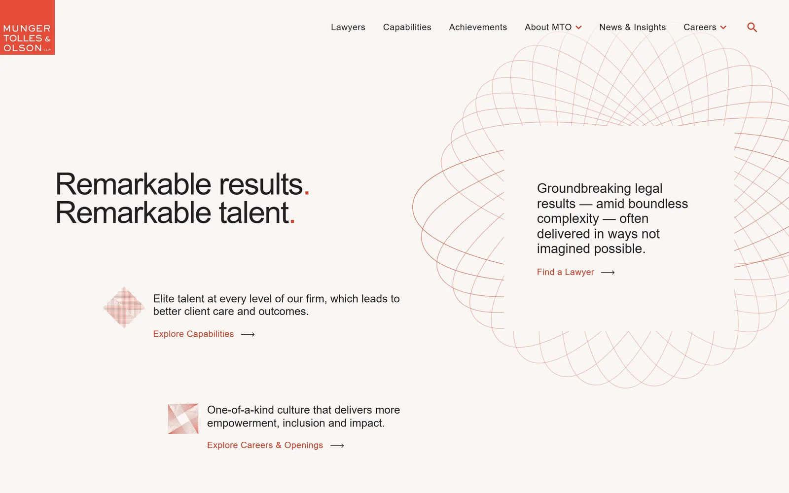
Law Firm Website Design
Almost none of these fifteen firms photograph a lawyer. Law firm website design that hands one sentence the whole fold instead of a slider over a skyline.
15 sites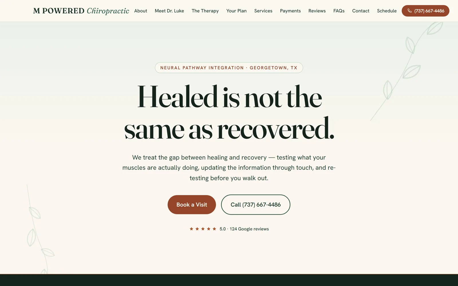
Chiropractor Website Design
The vendor template rules this trade. Thirteen clinics that escaped it, and the chiropractor website design decisions that got them out.
13 sites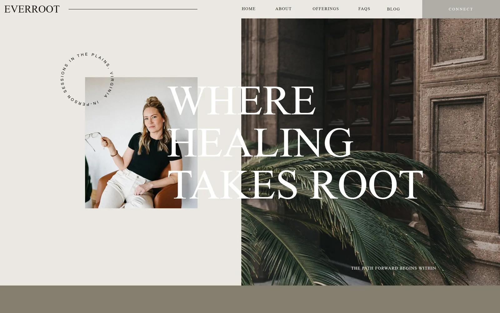
Therapist Website Design
Sage green and blush are the reflex. Fourteen practices whose therapist website design put a real face or a real room above the fold instead.
14 sites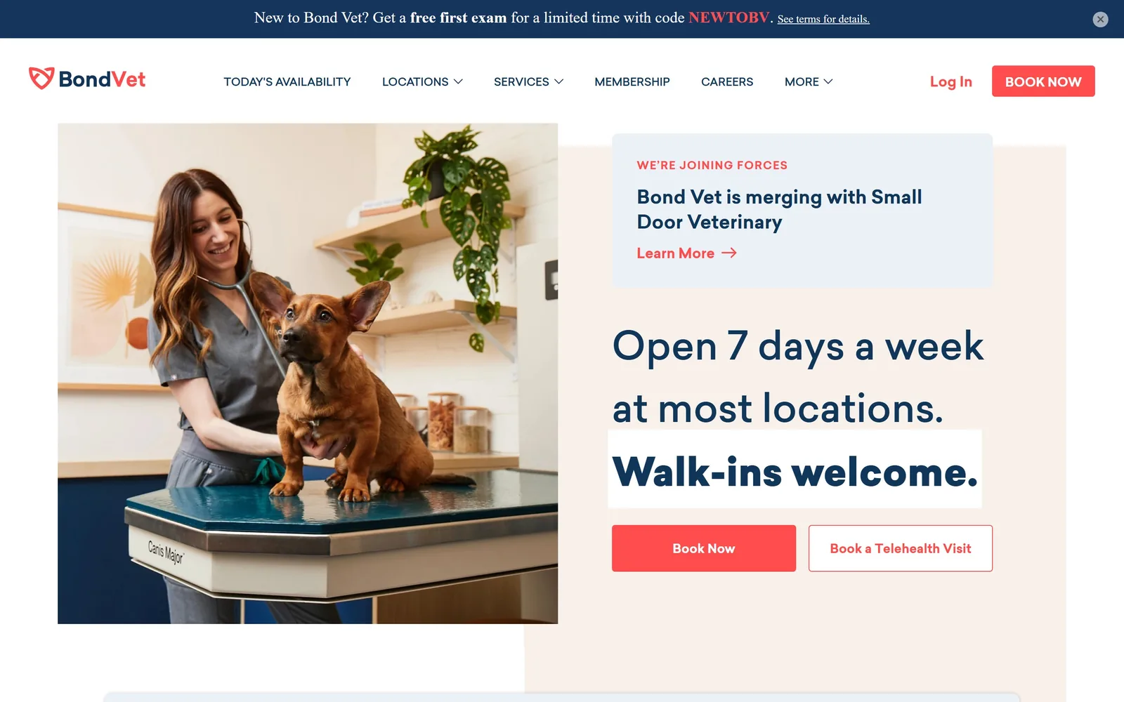
Veterinary Website Design
Fifteen clinics and equine hospitals that shot their own staff. Veterinary website design at this level is a decision about what to leave out.
15 sites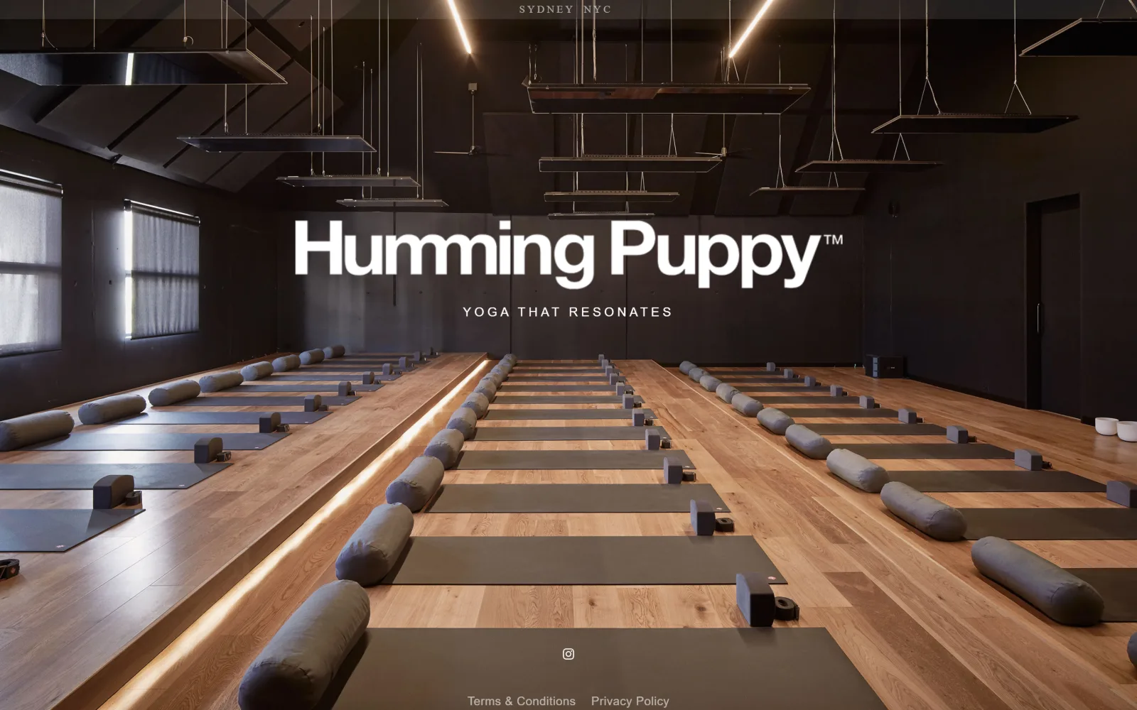
Yoga Studio Website Design
Twelve US studios that sell a room rather than a body. Yoga studio website design carried by type, colour and a timetable you can find at a glance.
12 sites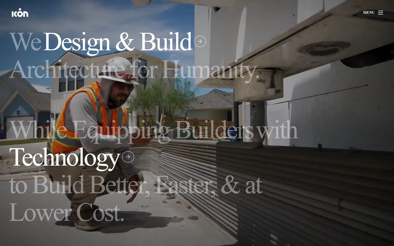
Construction Website Design
Every firm here has a finished building to shoot. The question to ask of this construction website design is how little each one gets away with.
15 sites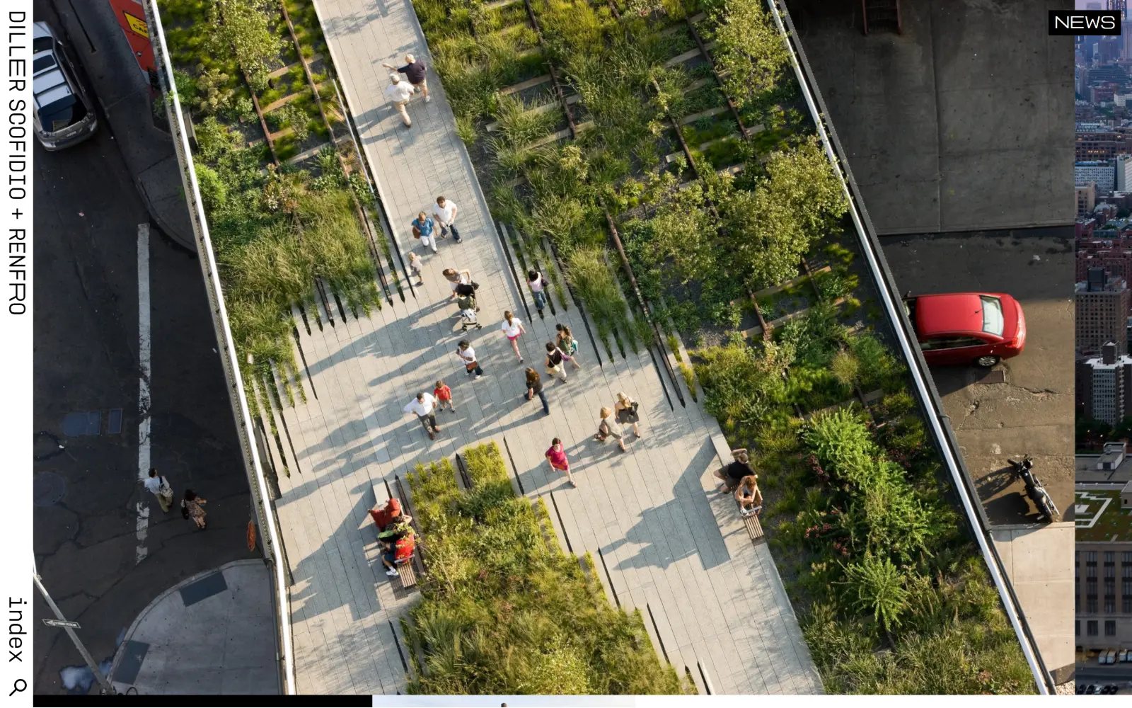
Architect Website Design
Fifteen US practices whose sites have to look like the buildings they draw. Architect website design is one photograph, a lot of air and little else.
15 sites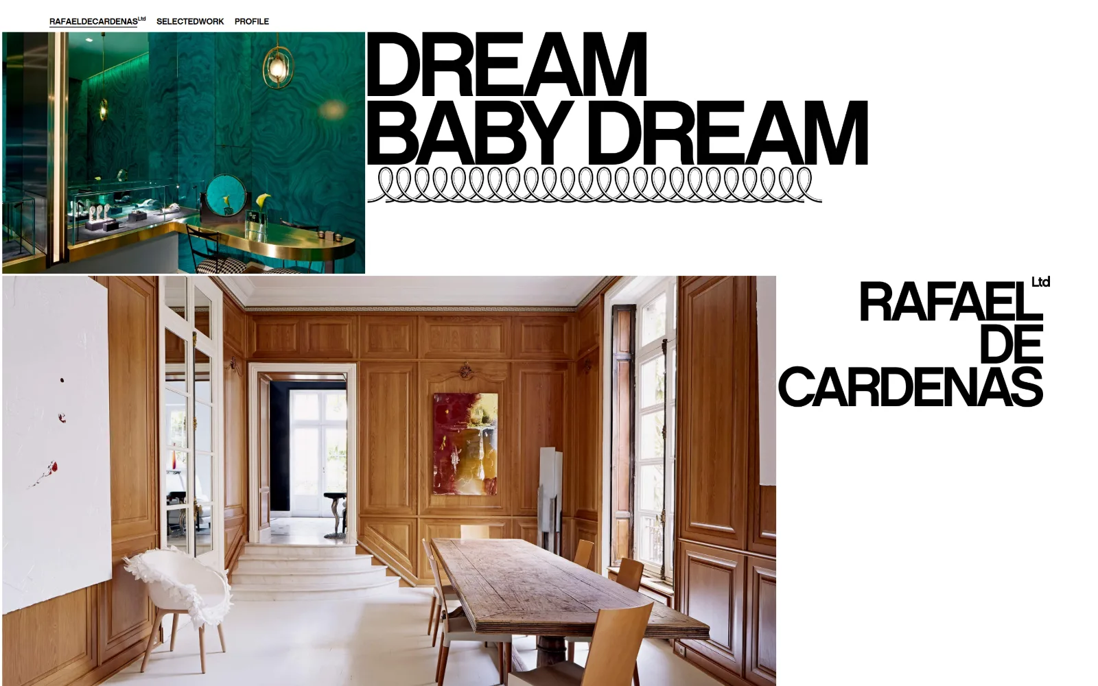
Interior Design Website Design
Fourteen US studios, minimal through maximalist. Interior design website design lives or dies on the portfolio grid, and these got the grid right.
14 sites
Auto Repair Website Design
Most auto repair website design comes out of four lead-gen templates. These fifteen US shops escaped it, and the notes say how.
15 sites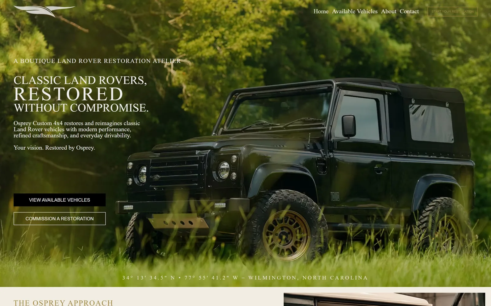
Car Dealership Website Design
Thirteen collector, restomod and EV dealers. What car dealership website design turns on here is how much each page leaves out before you scroll.
13 sites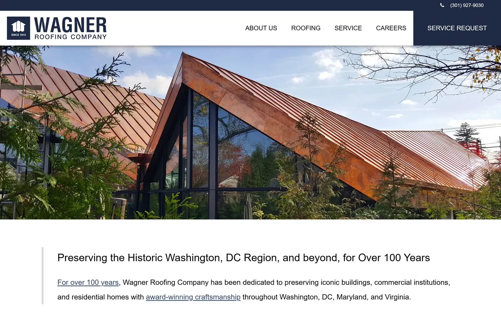
Roofing Website Design
Navy header, orange button, every time. Fifteen US companies whose roofing website design went somewhere else, with what the choice cost them.
15 sites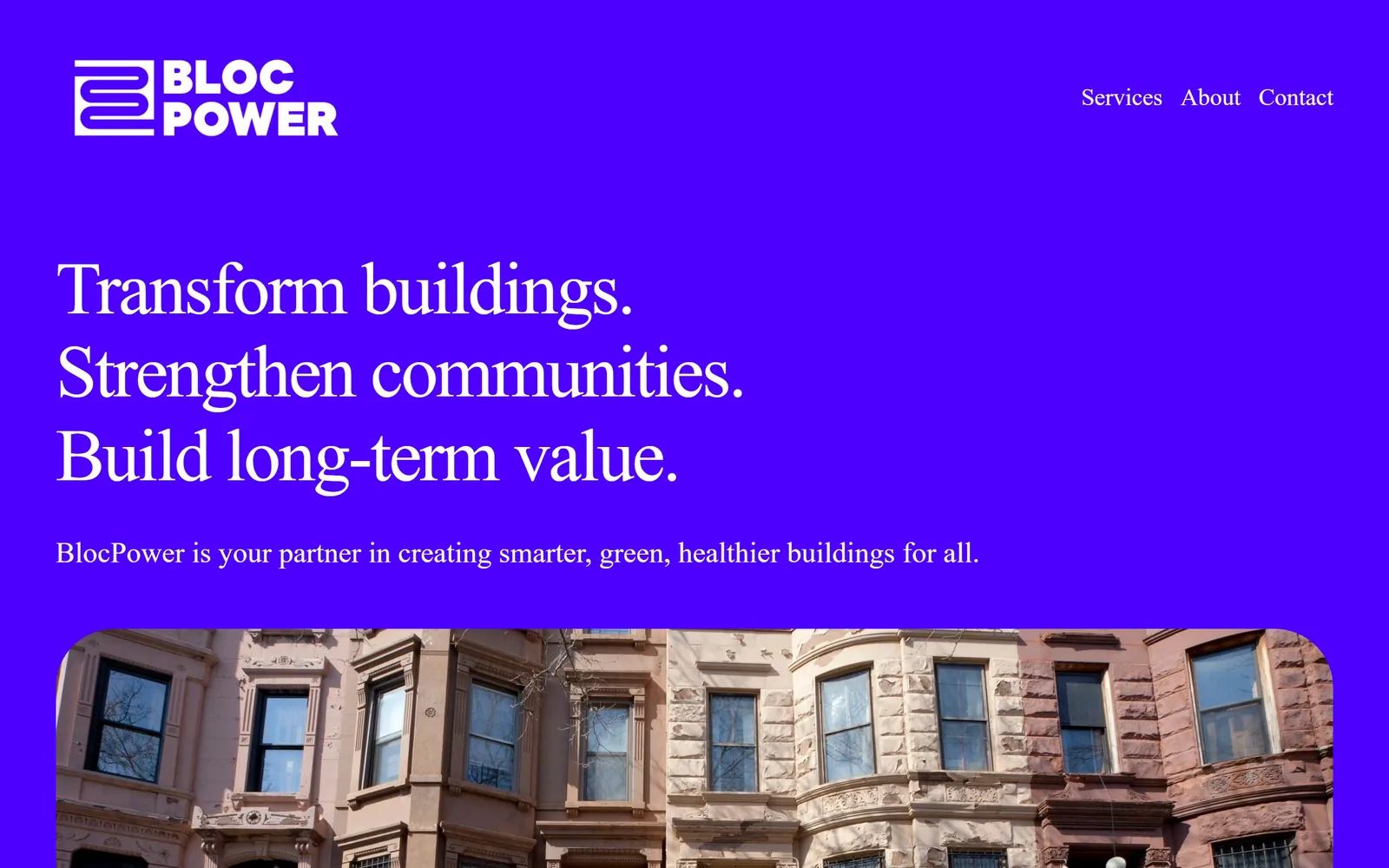
Electrician Website Design
Residential electrical is close to a design vacuum. Sixteen battery, lighting and EV firms whose electrician website design is worth stealing from.
16 sites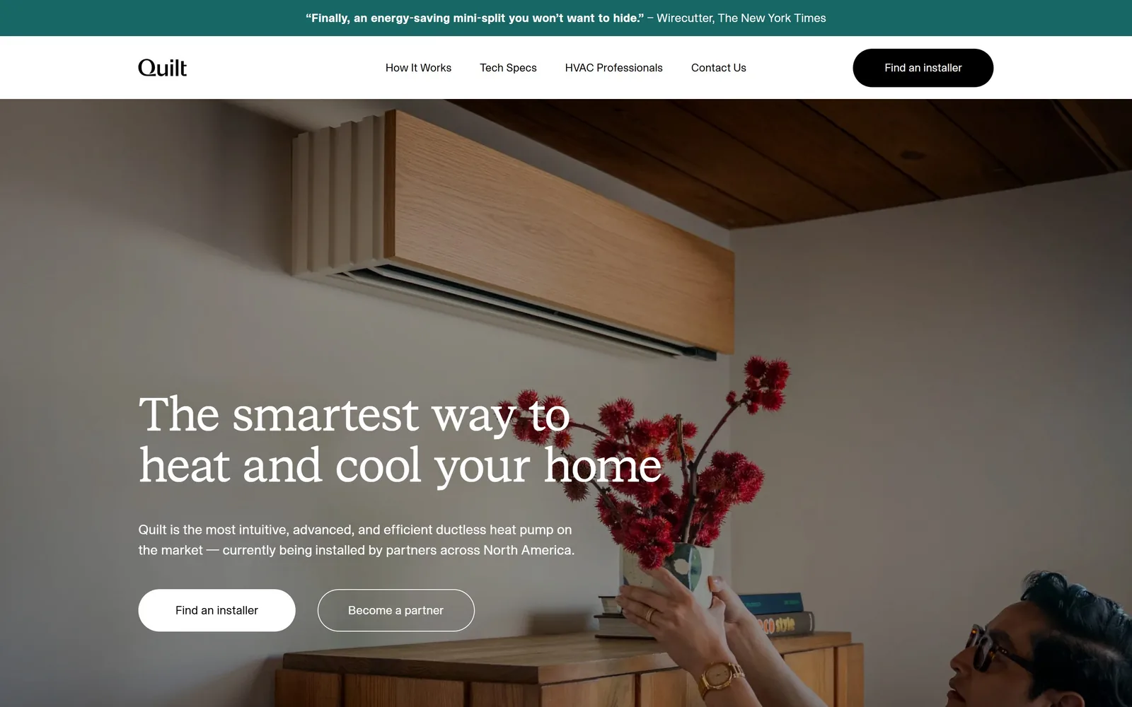
HVAC Website Design
Heat pump start-ups on one side, union mechanical contractors on the other. Across these fifteen, HVAC website design turns on who the fold is honest with.
15 sites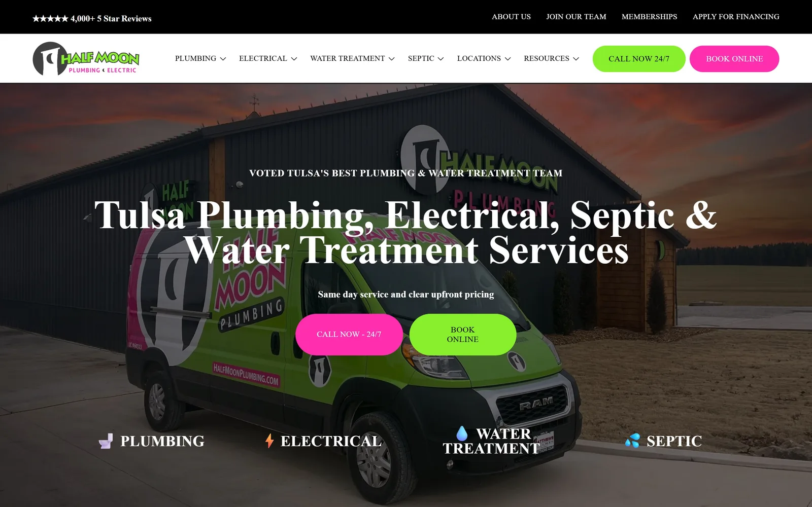
Plumbing Website Design
One van or two hundred staff, the good ideas travel both ways. Twelve pages to put in front of whoever you are paying for plumbing website design.
12 sites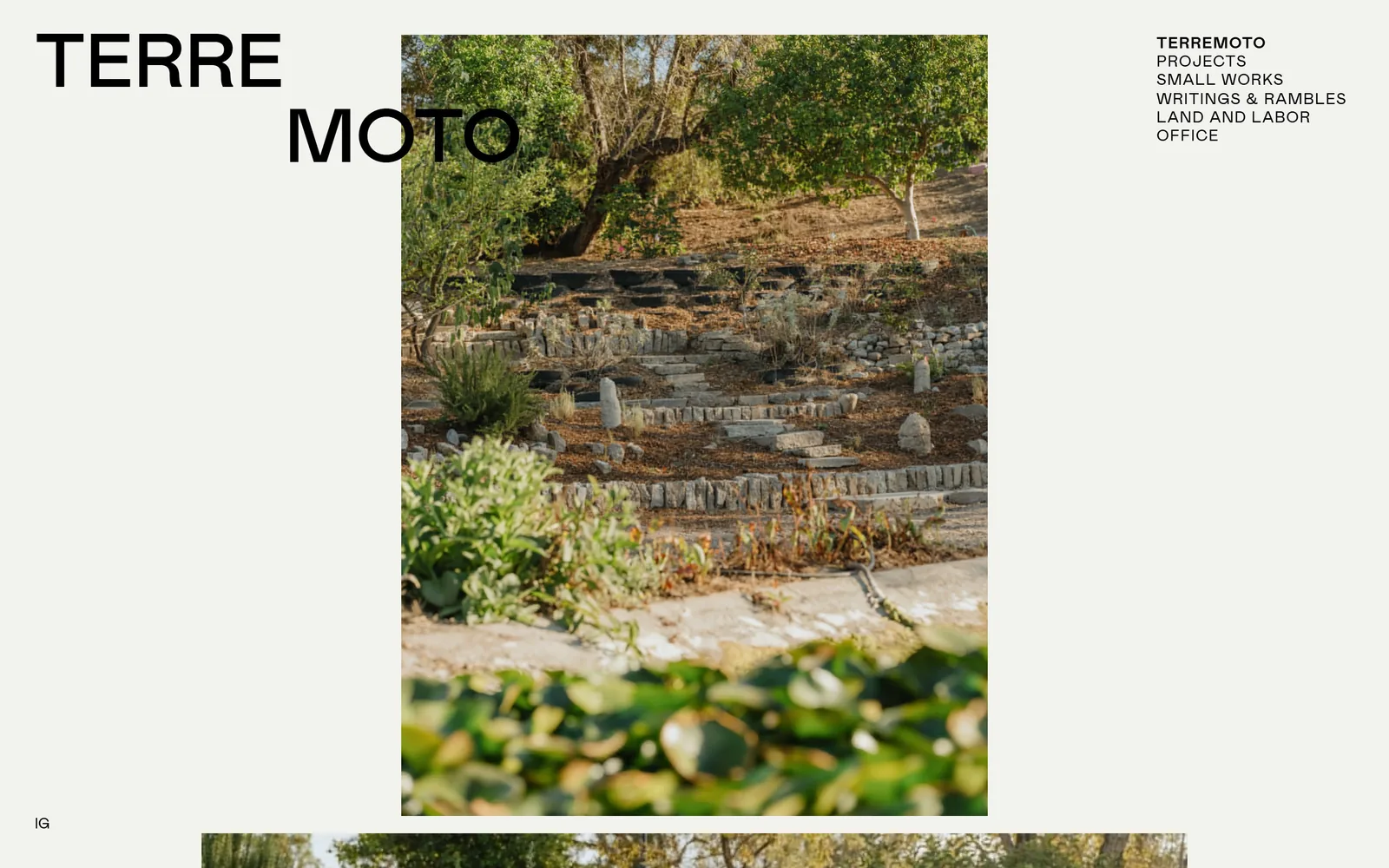
Landscaping Website Design
Choose your landscaping website design by the problem it solves, not the photograph it leads with. Fourteen studios and one engineered consumer service.
14 sites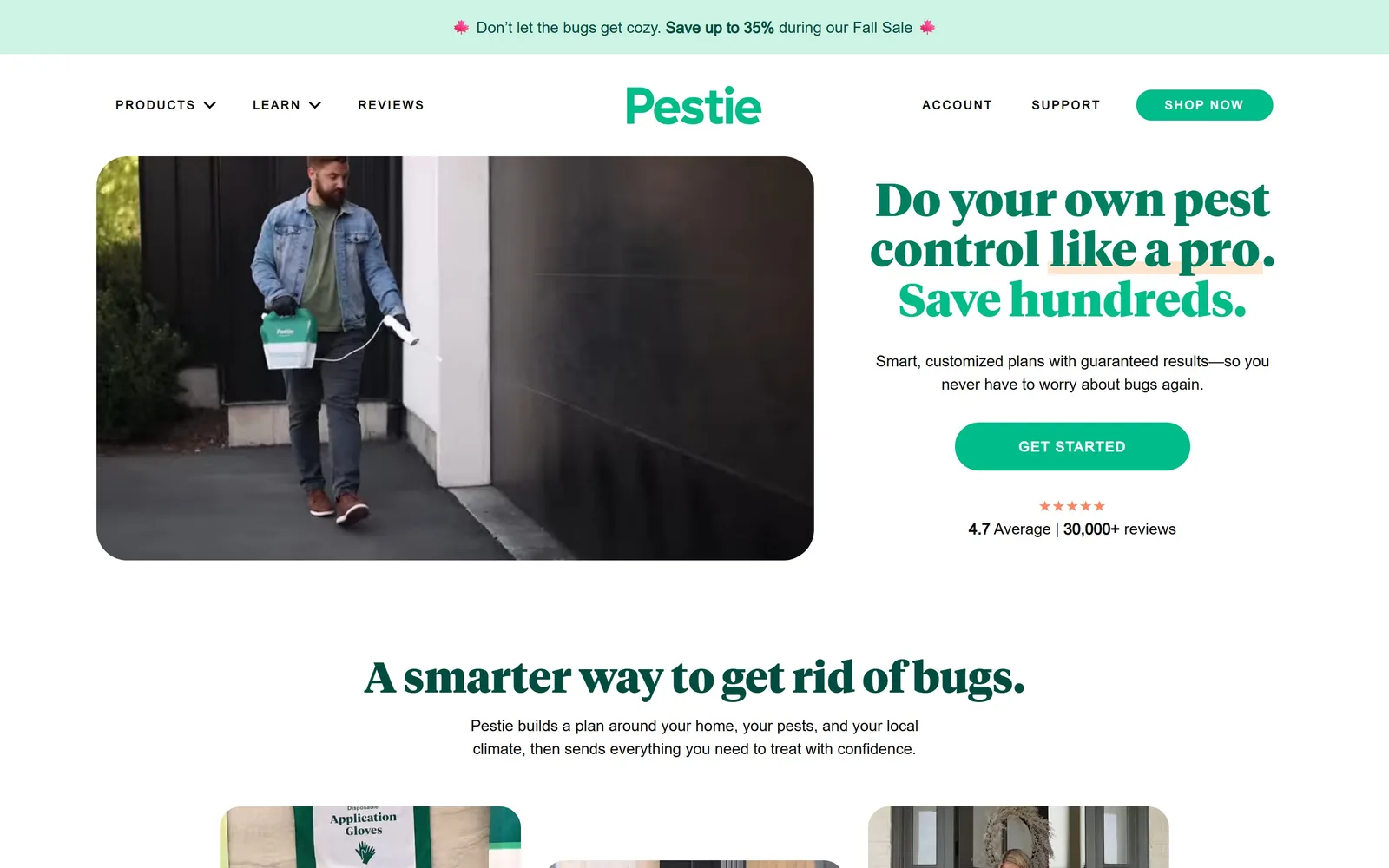
Pest Control Website Design
Everyone reaches for the same green or red. Twelve companies whose pest control website design looks considered before a visitor reads a word.
12 sites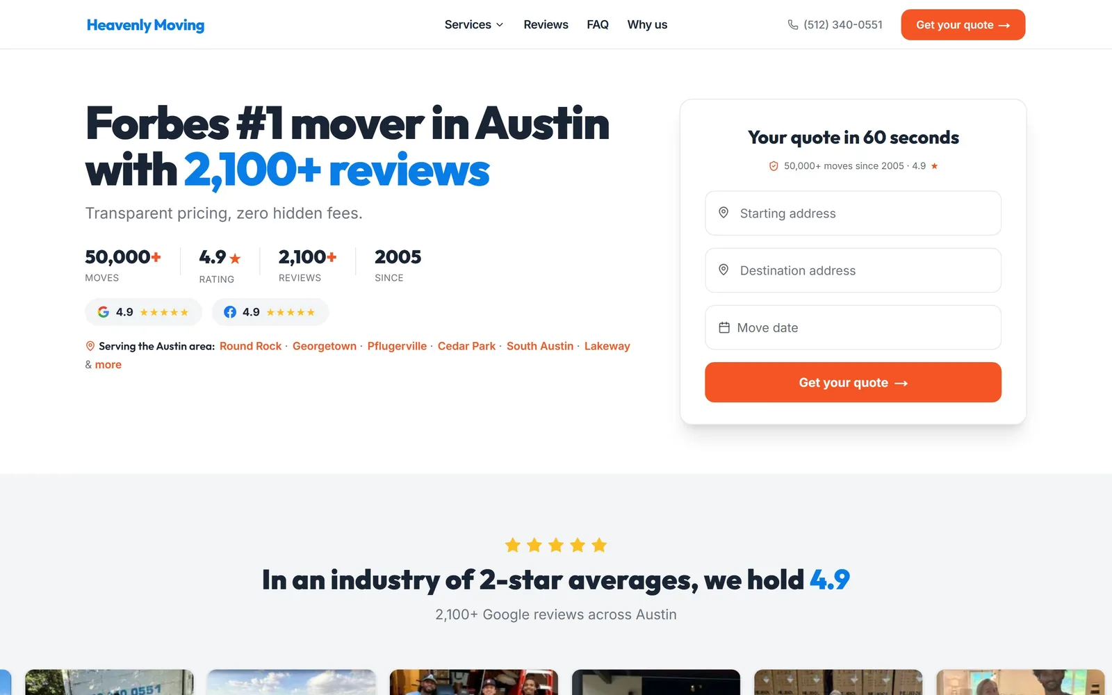
Moving Company Website Design
Quote form in the hero, proof under the submit button. Fourteen movers, from app crews to fine art logistics, doing moving company website design properly.
14 sites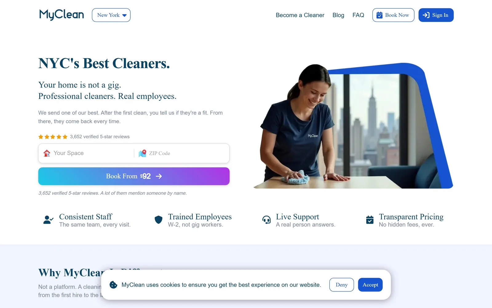
Cleaning Company Website Design
Judge any cleaning company website design by what its first screen asks for. Fifteen maid, janitorial and biohazard firms, ranked on exactly that.
15 sites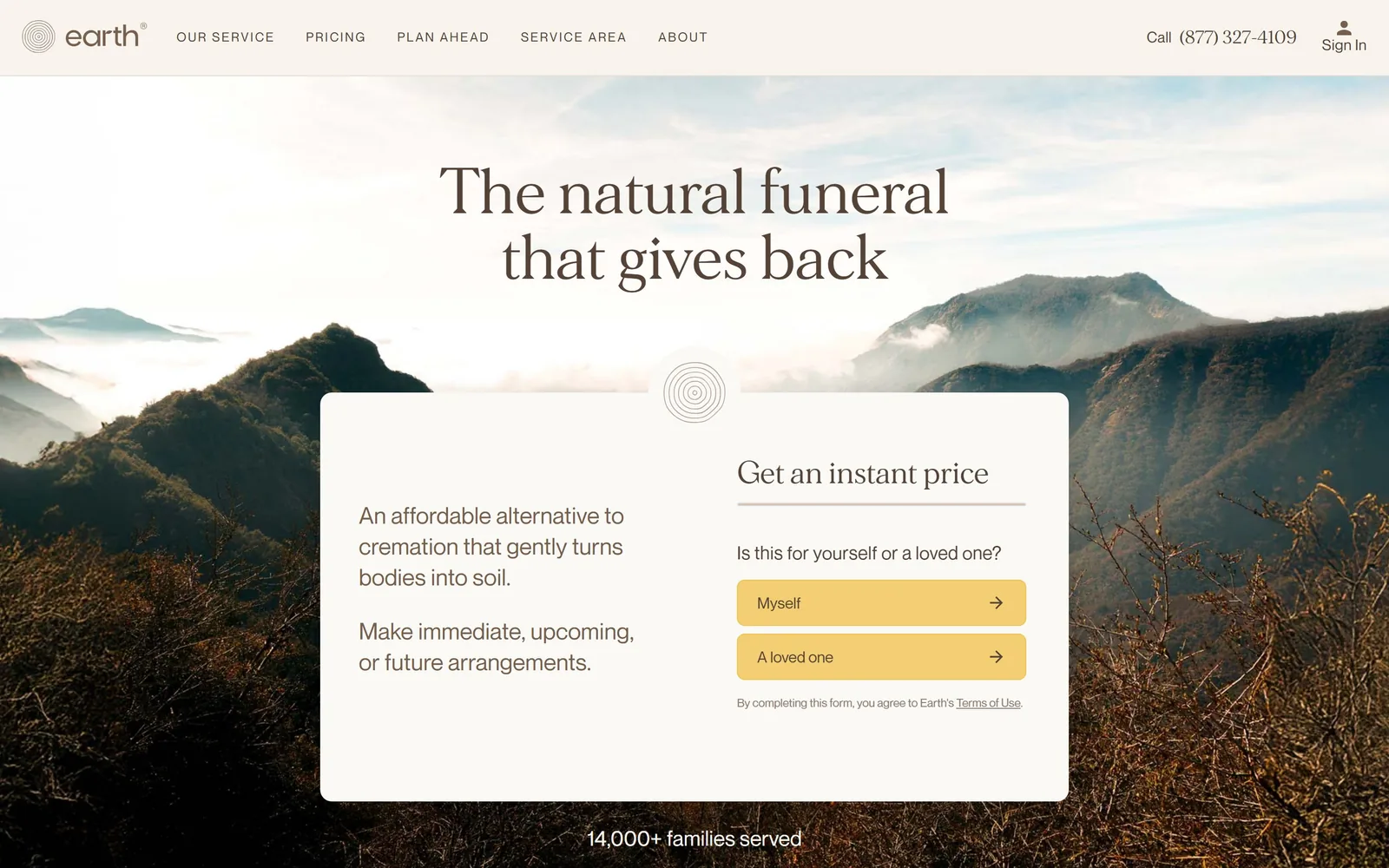
Funeral Home Website Design
Funeral home website design turns on the first button, and the best of these twelve name a situation rather than an action. Pricing is often right there.
12 sites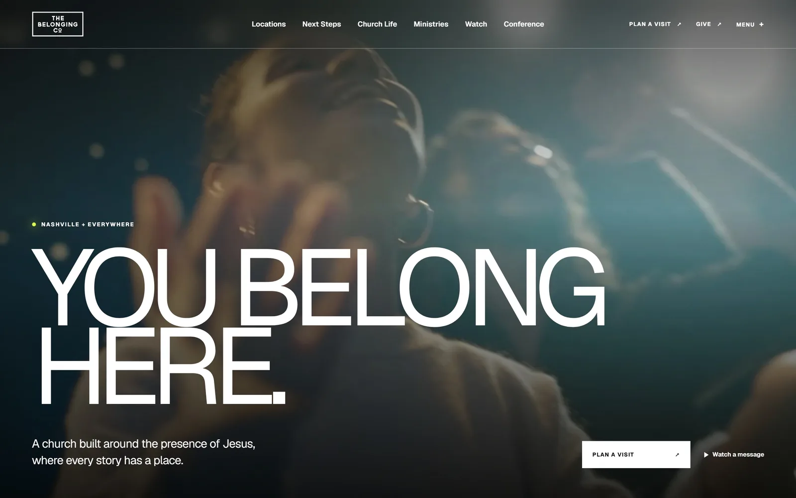
Church Website Design
Thirteen congregations, cathedrals and chapels that spend almost nothing on colour. Church website design carried by one photograph and the service times.
13 sites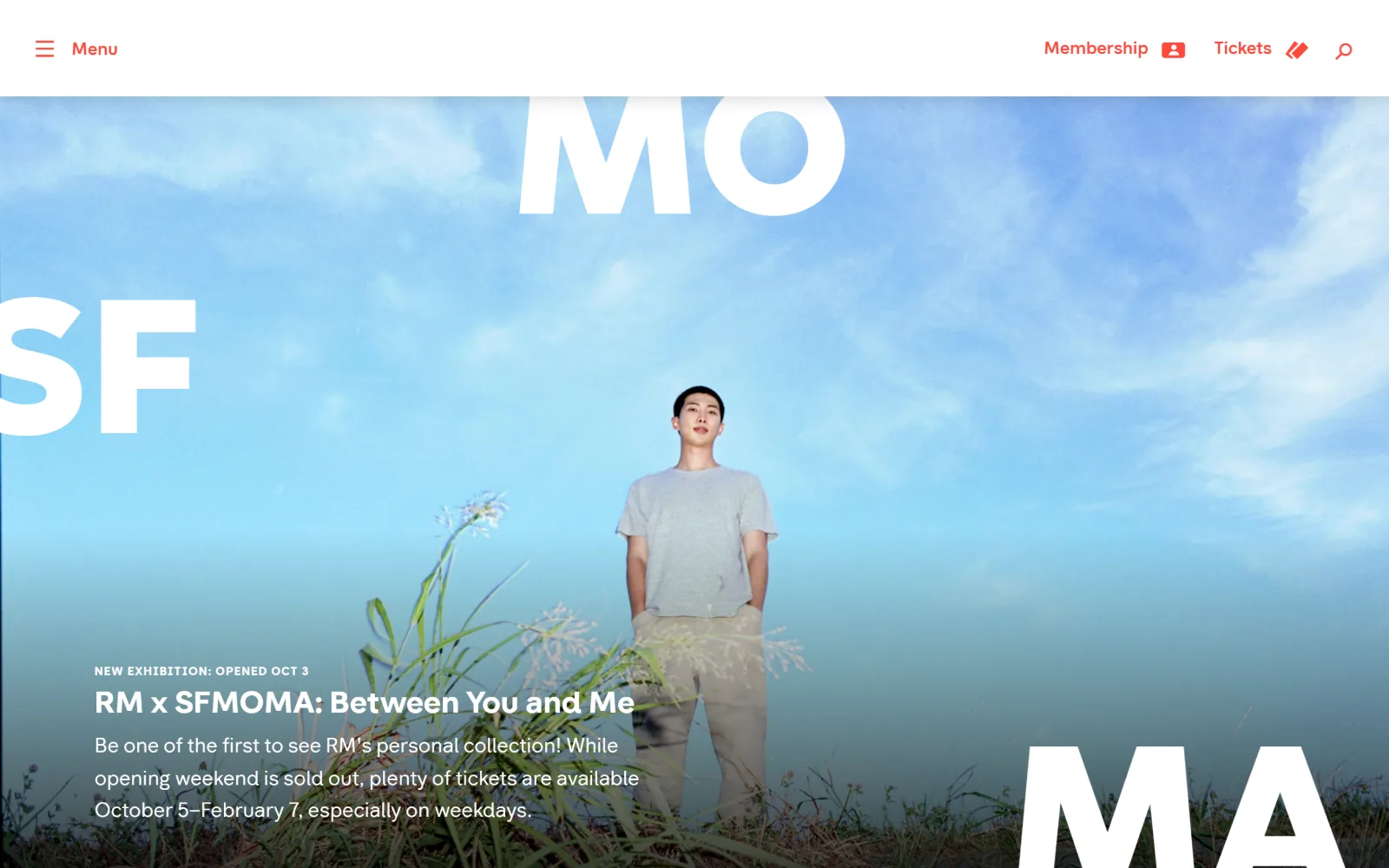
Nonprofit Website Design
Fifteen charities, foundations and museums that ask for money without a guilt photograph. Nonprofit website design that trusts the reader to care.
15 sites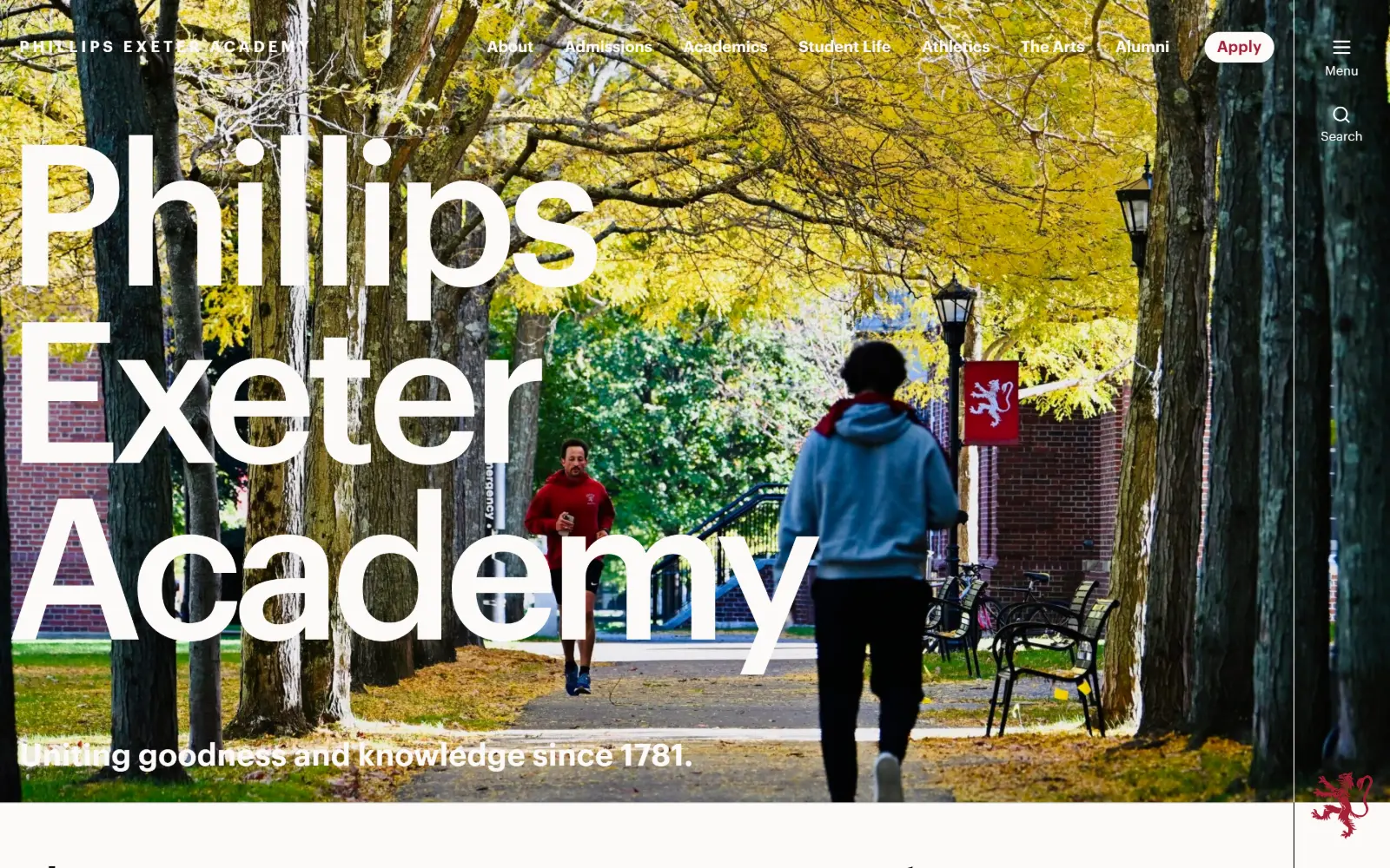
Private School Website Design
Thirteen US independent schools that escaped the platform template. Private school website design where the photography is commissioned, not bought.
13 sites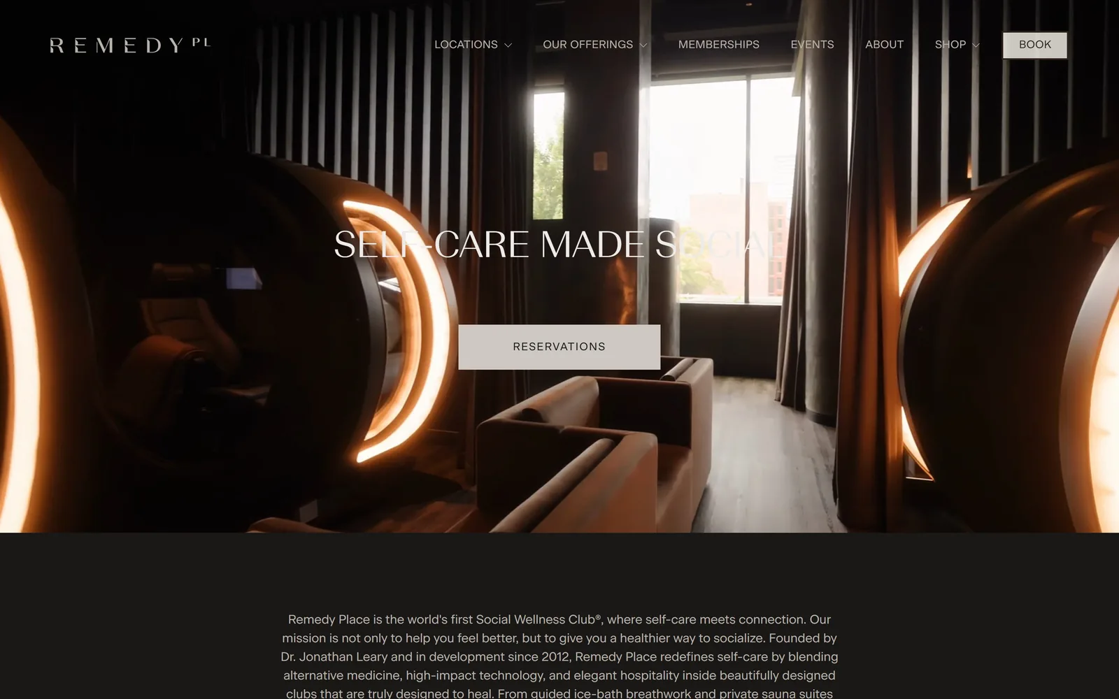
Gym Website Design
The photograph carries the colour and the stylesheet holds at three values. Ten studios, climbing gyms and recovery clubs doing gym website design well.
10 sites
Spa Website Design
Nine spas, bathhouses and plunge clubs that lead with video. Spa website design here is one accent colour and a booking button louder than everything.
9 sites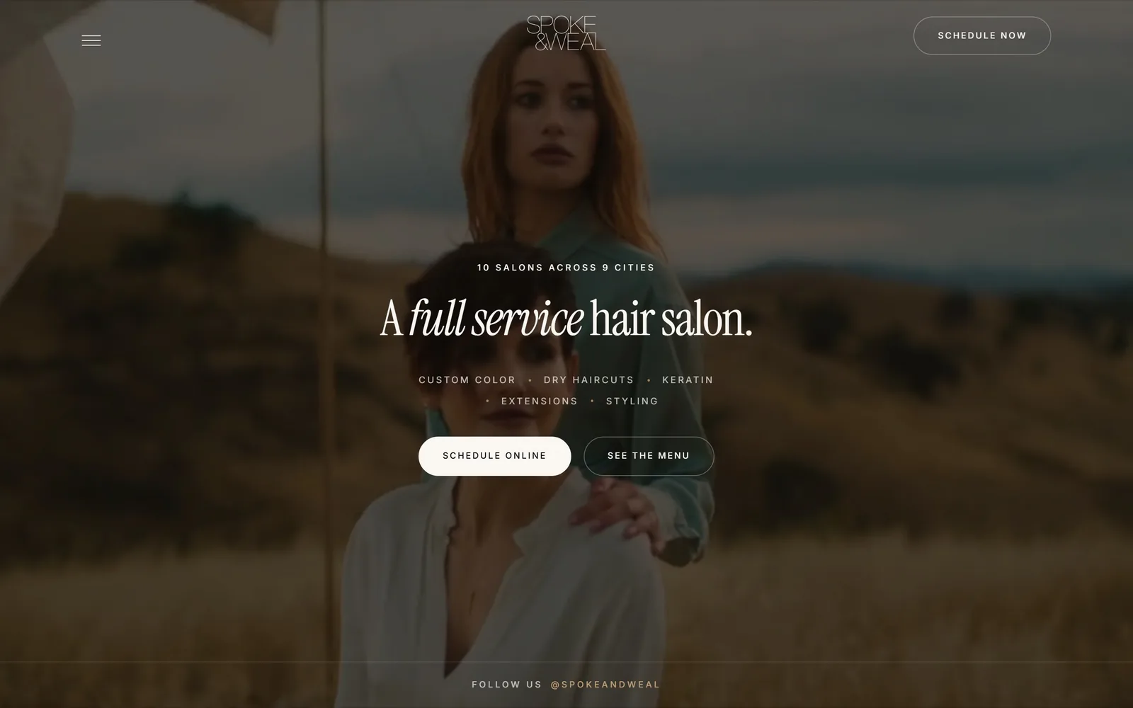
Salon Website Design
A booking button in the header, then a longer one further down. Twelve salons, barbershops and nail studios judged on salon website design above the fold.
12 sites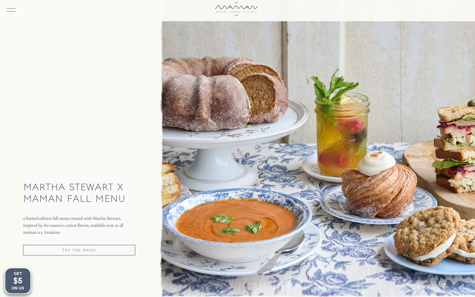
Bakery Website Design
Flat brand colour or one honest photograph: fifteen US bakeries whose folds hold to that, plus the bakery website design habit of a very short ask.
15 sites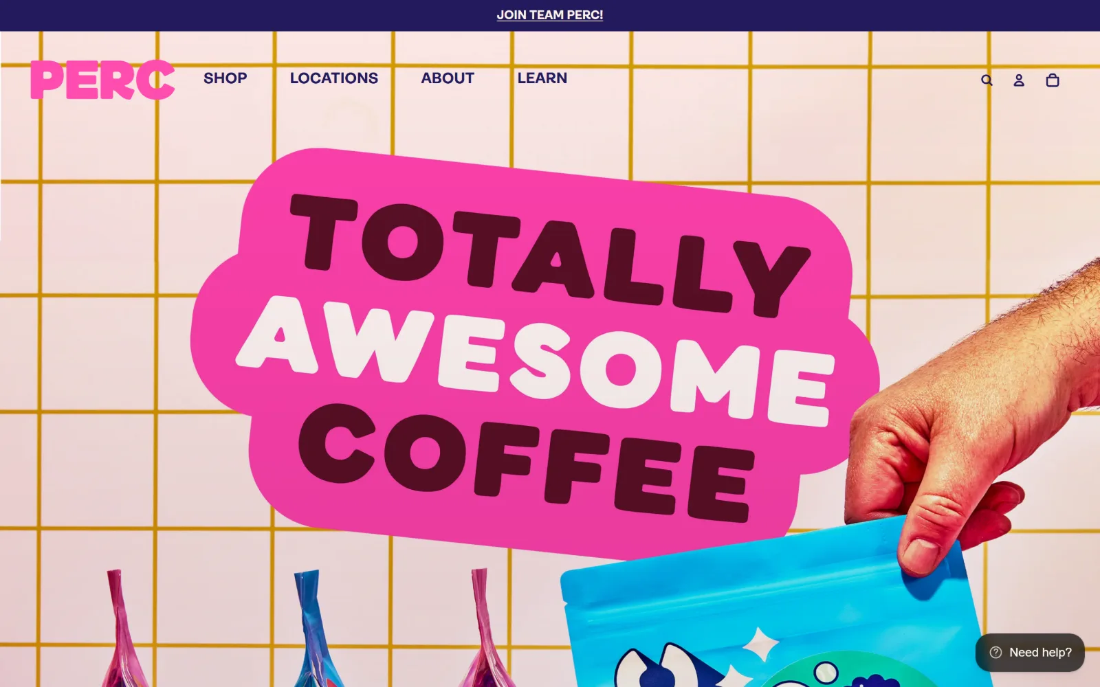
Coffee Shop Website Design
Fourteen US cafes and roasters with a house style on the page as well as in the cup. Coffee shop website design that puts the hours above the story.
14 sites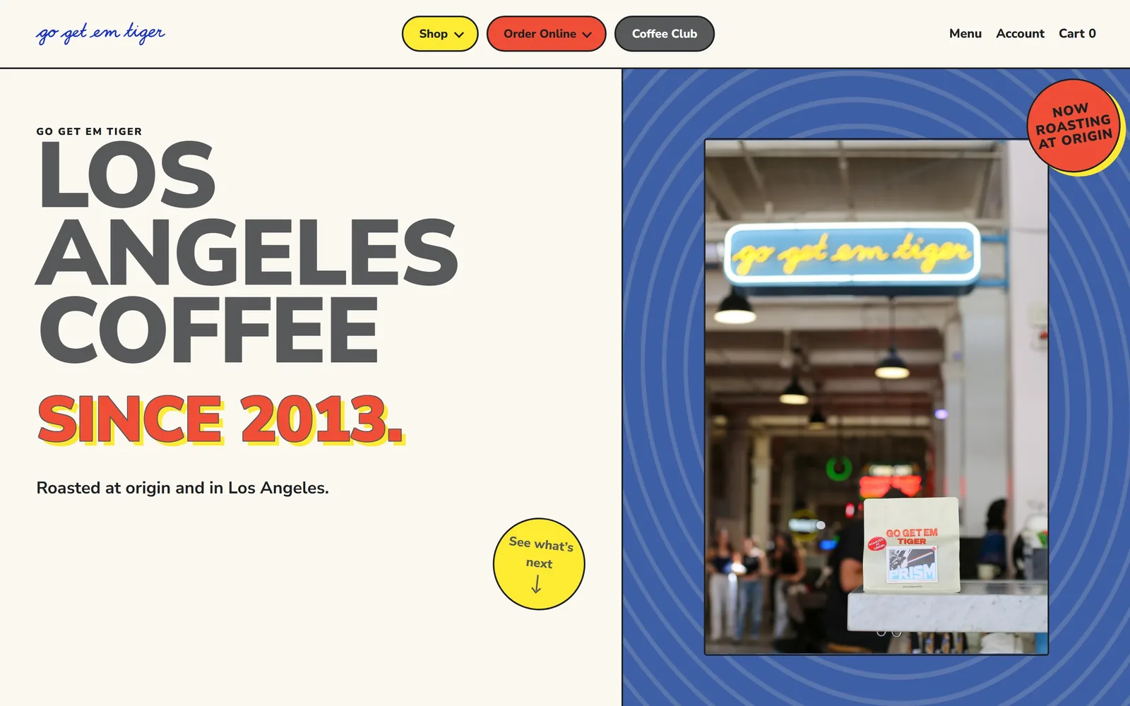
Restaurant Website Design
The fold as a poster rather than a brochure. Sixteen rooms, delis and coffee roasters, and the restaurant website design decision behind each one.
16 sites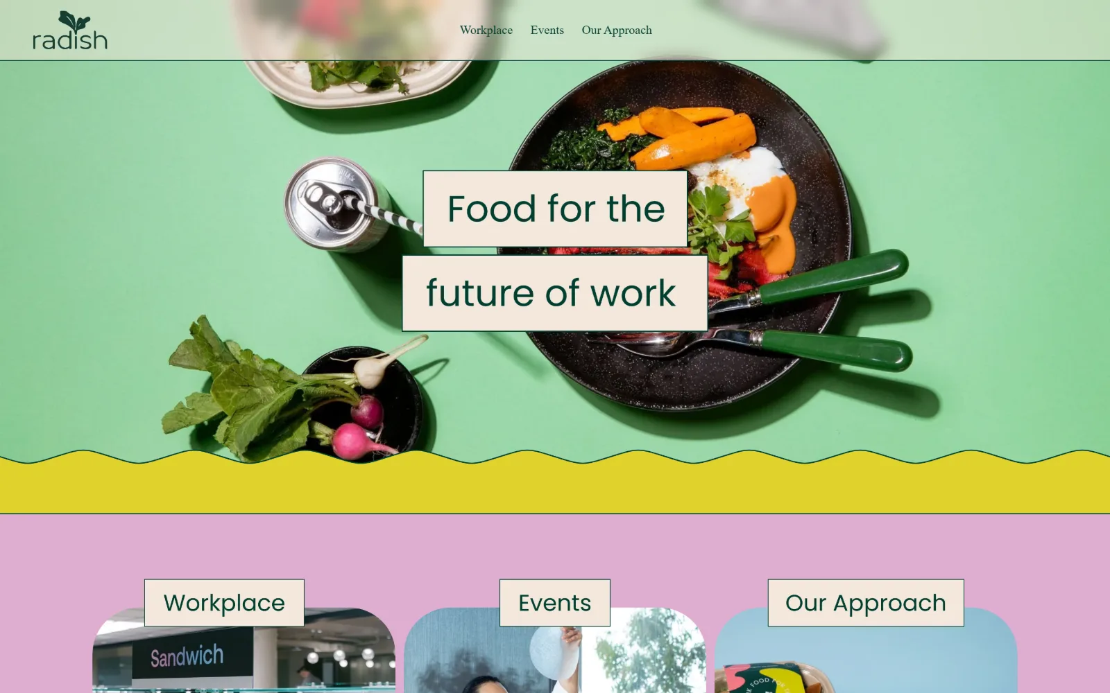
Catering Website Design
Fifteen US caterers whose sites photograph the food and nothing else. Catering website design judged on the menu, the enquiry and the route to a price.
15 sites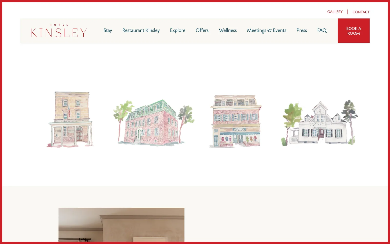
Hotel Website Design
Thirteen independent hotels, inns and lodges. Their hotel website design makes one typeface decision loudly and every other decision very quietly.
13 sites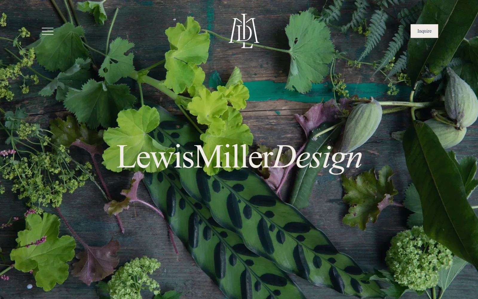
Florist Website Design
Thirteen US flower shops and event studios. Florist website design has one job harder than it looks: photographing colour against more colour.
13 sites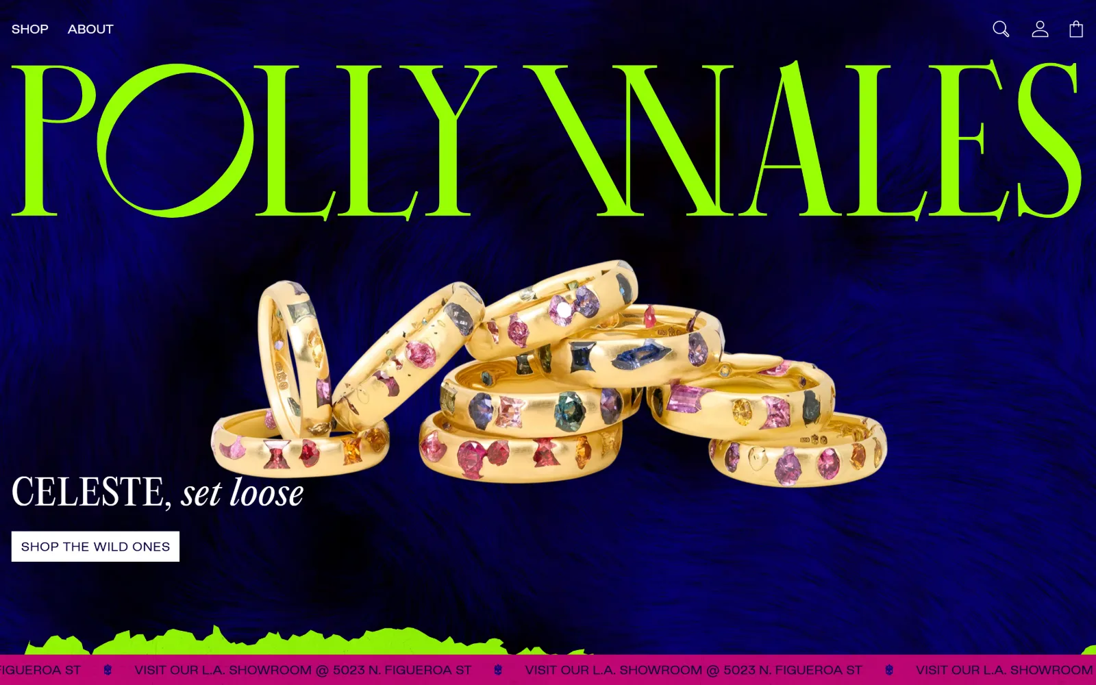
Jewelry Store Website Design
Small objects, enormous photographs. Sixteen US jewelers, and the jewelry store website design decisions that keep a ring legible on a wide screen.
16 sites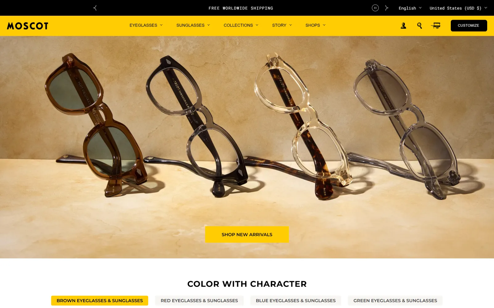
Ecommerce Website Design
Fourteen US stores where the product does the talking. Ecommerce website design judged on the first screen, the type, and how fast you reach the cart.
14 sites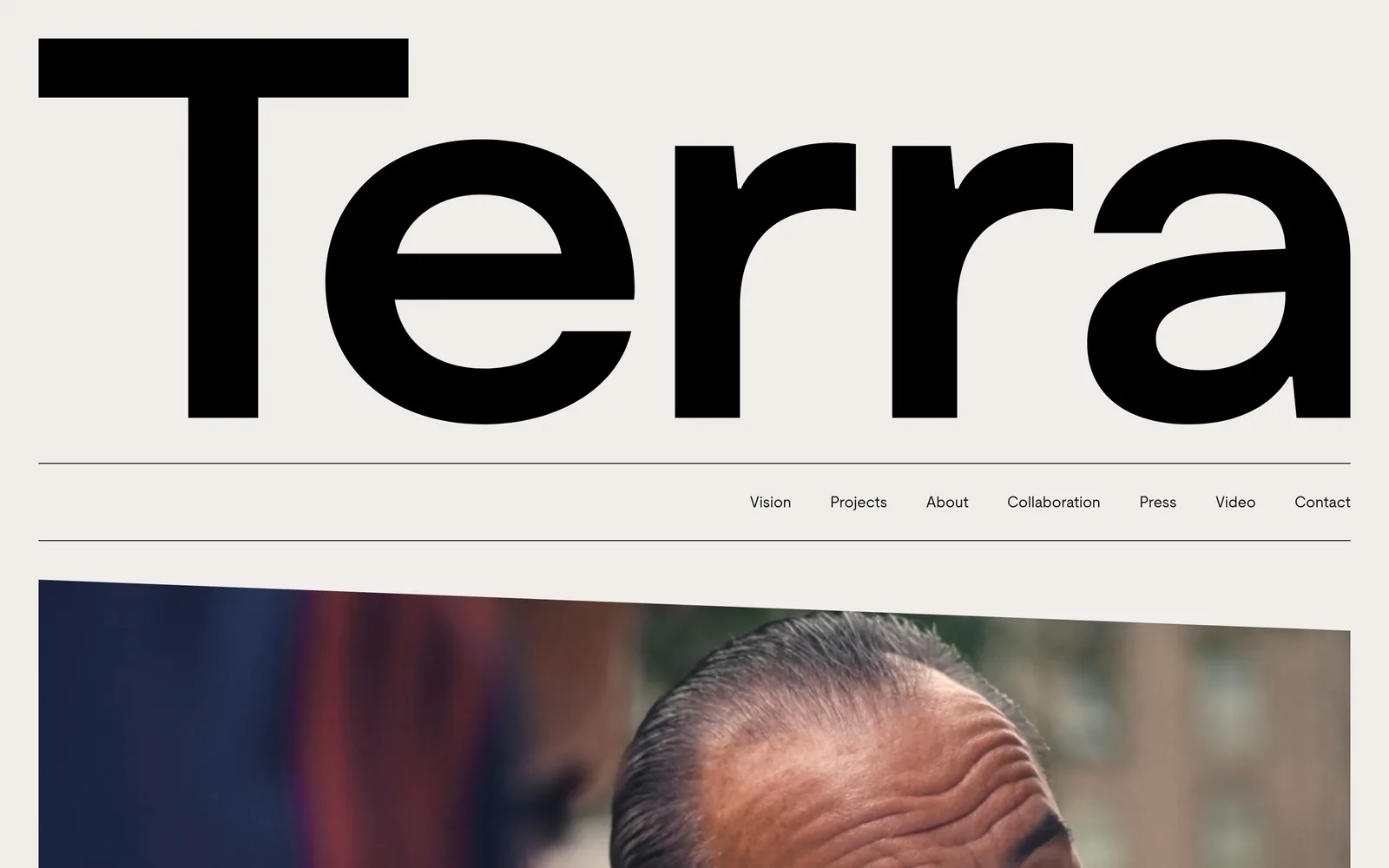
Real Estate Website Design
The photograph is the page: a headline, one button, nothing else until you scroll. Twelve brokerages and developers doing real estate website design.
12 sites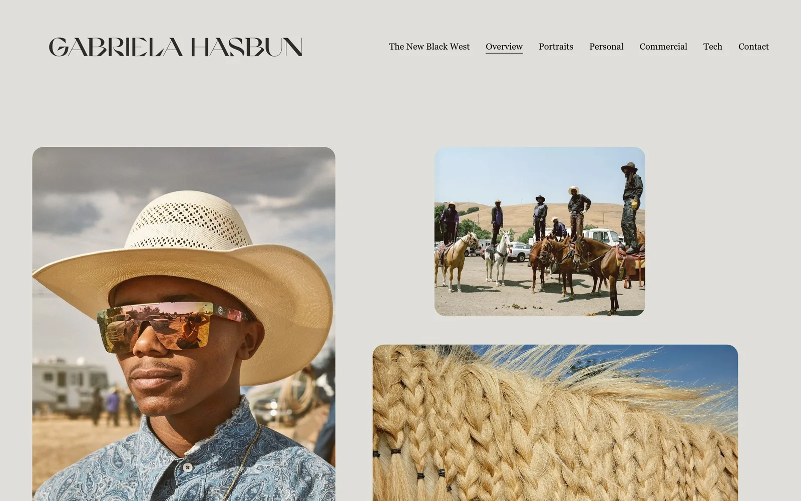
Photography Website Design
A wordmark, five links and the word Contact. Fourteen working photographers whose photography website design needs almost no interface at all.
14 sites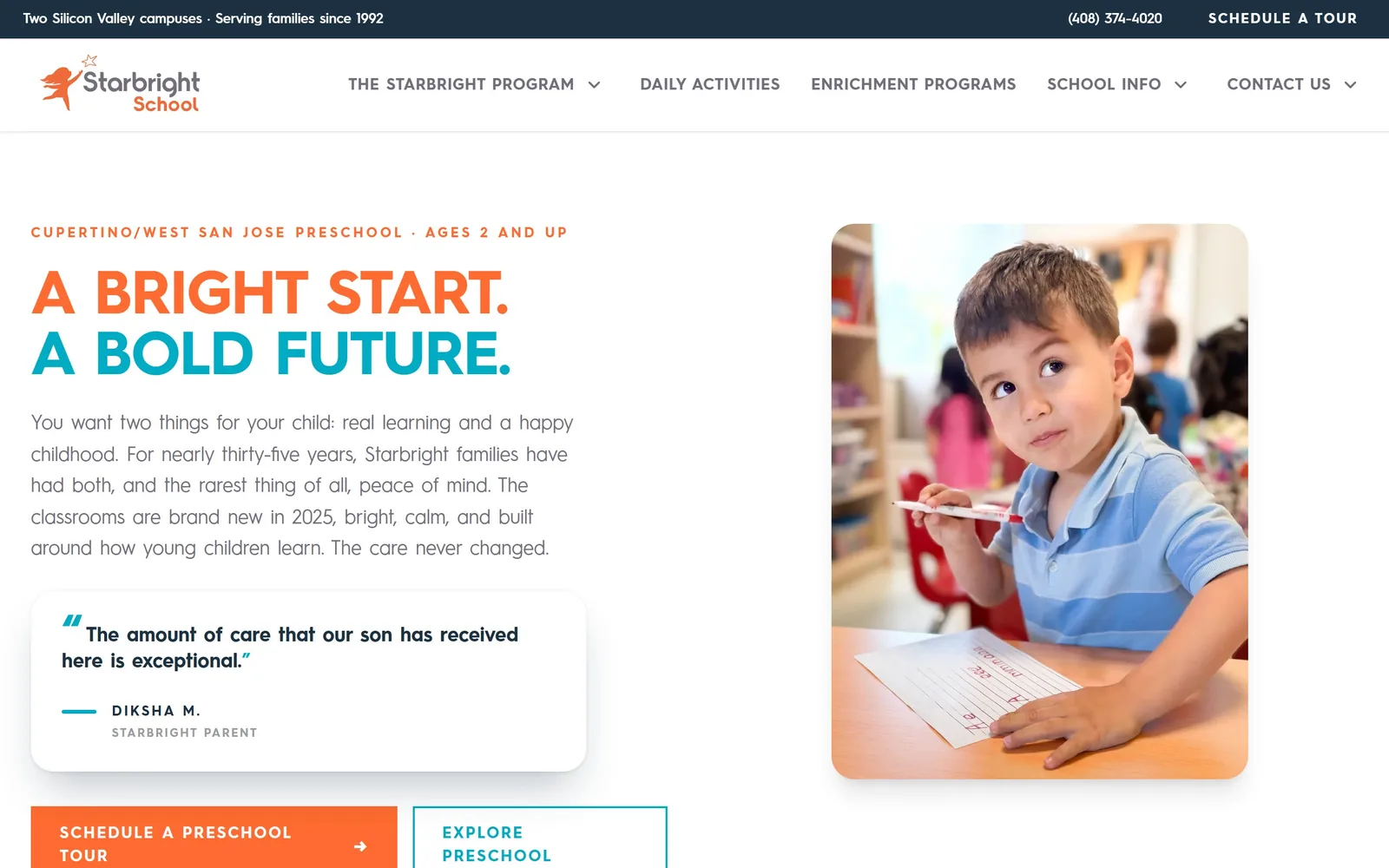
Daycare Website Design
One idea per first screen, and an ask for a tour rather than an enquiry. Fifteen nurseries and preschools whose daycare website design has some nerve.
15 sites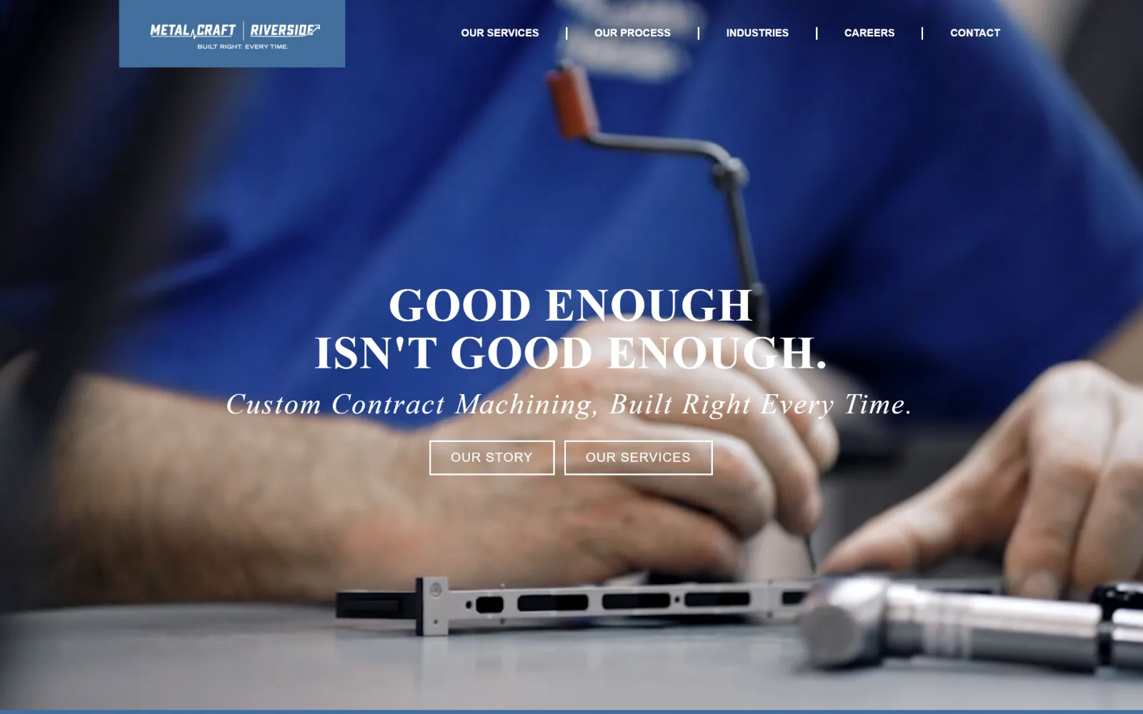
Manufacturing Website Design
Sixteen US plants, machine shops and contract manufacturers. Manufacturing website design that photographs the floor instead of a stock handshake.
16 sites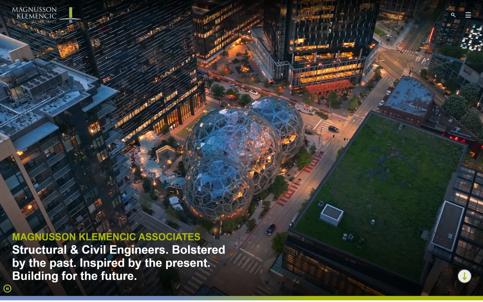
Engineering Website Design
Eighteen US structural, civil and MEP firms. Engineering website design judged on whether the work or the org chart gets the first screen.
18 sites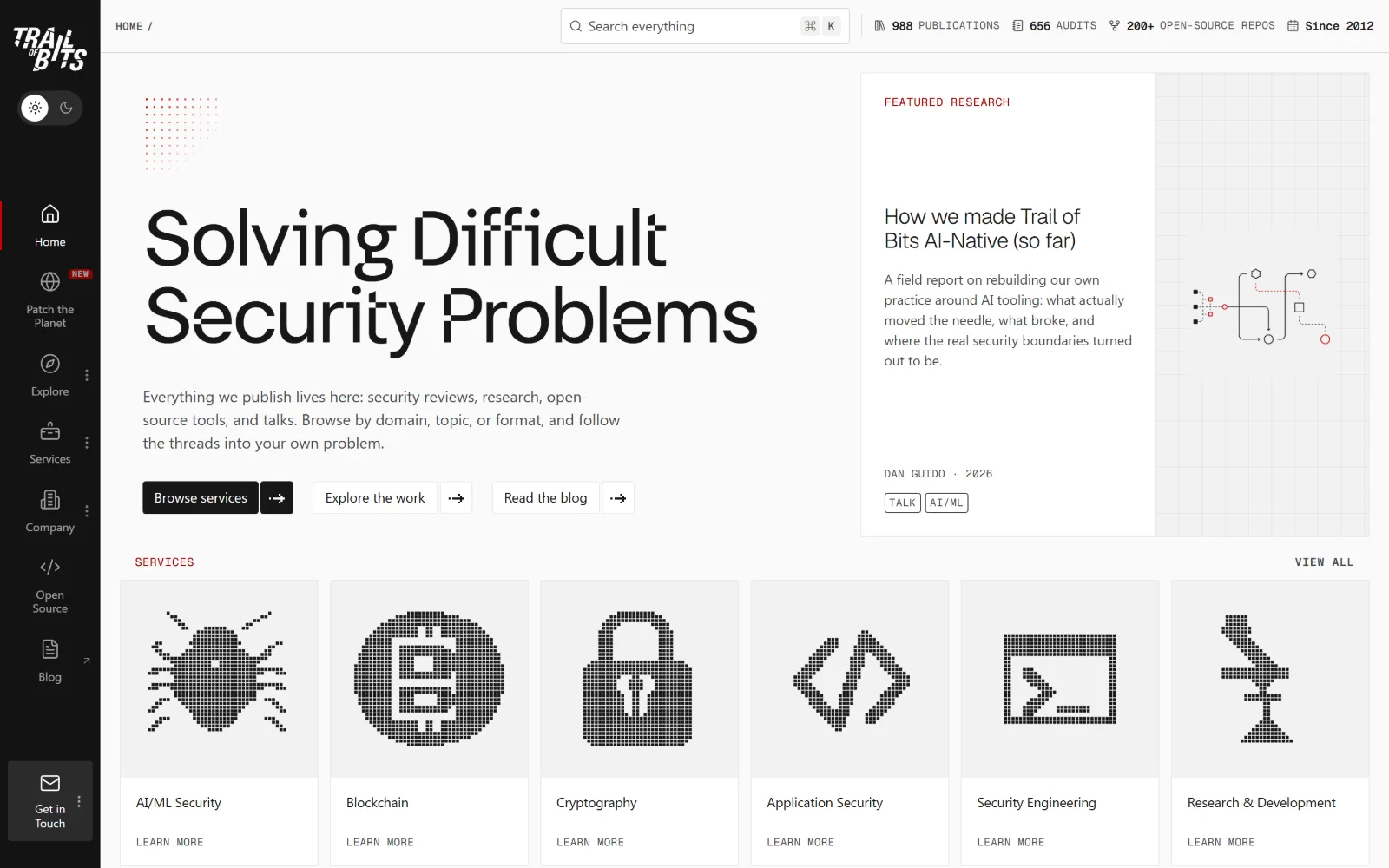
Cyber Security Website Design
Eighteen US security firms and testers. Cyber security website design past the dark-and-neon reflex, measured on type and real hex values.
18 sites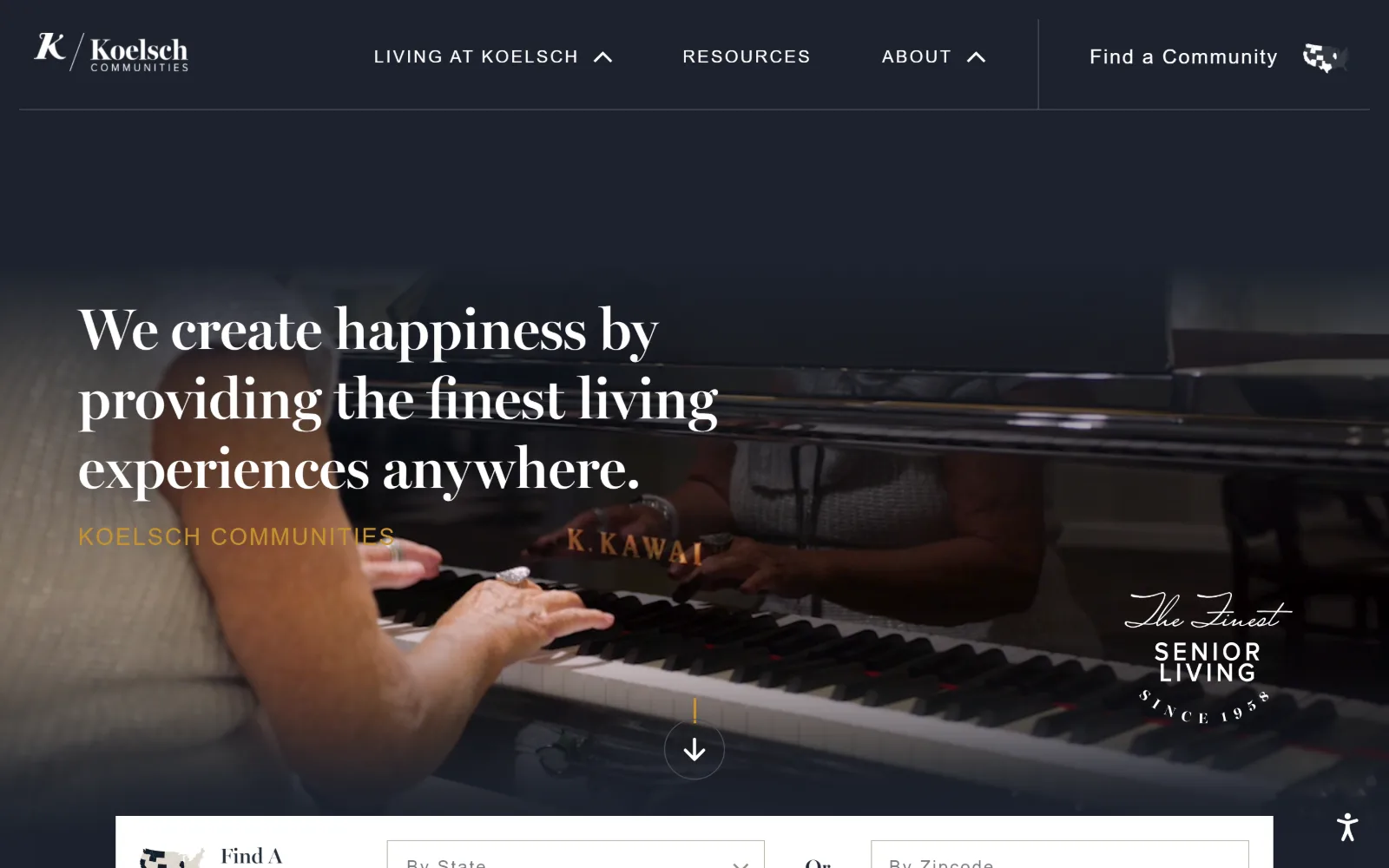
Senior Living Website Design
Seventeen US communities where the first screen is a room you can picture living in. Senior living website design without the stock-photo smile.
17 sites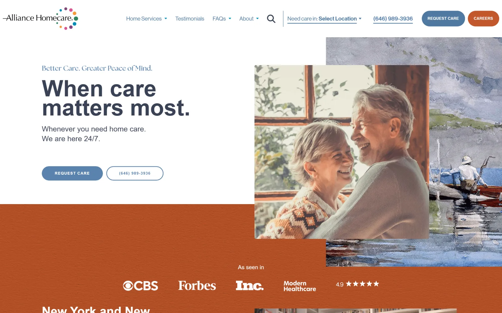
Home Care Website Design
Sixteen US agencies whose home care website design leads with a face rather than a logo, and names a price or a phone before you scroll.
16 sites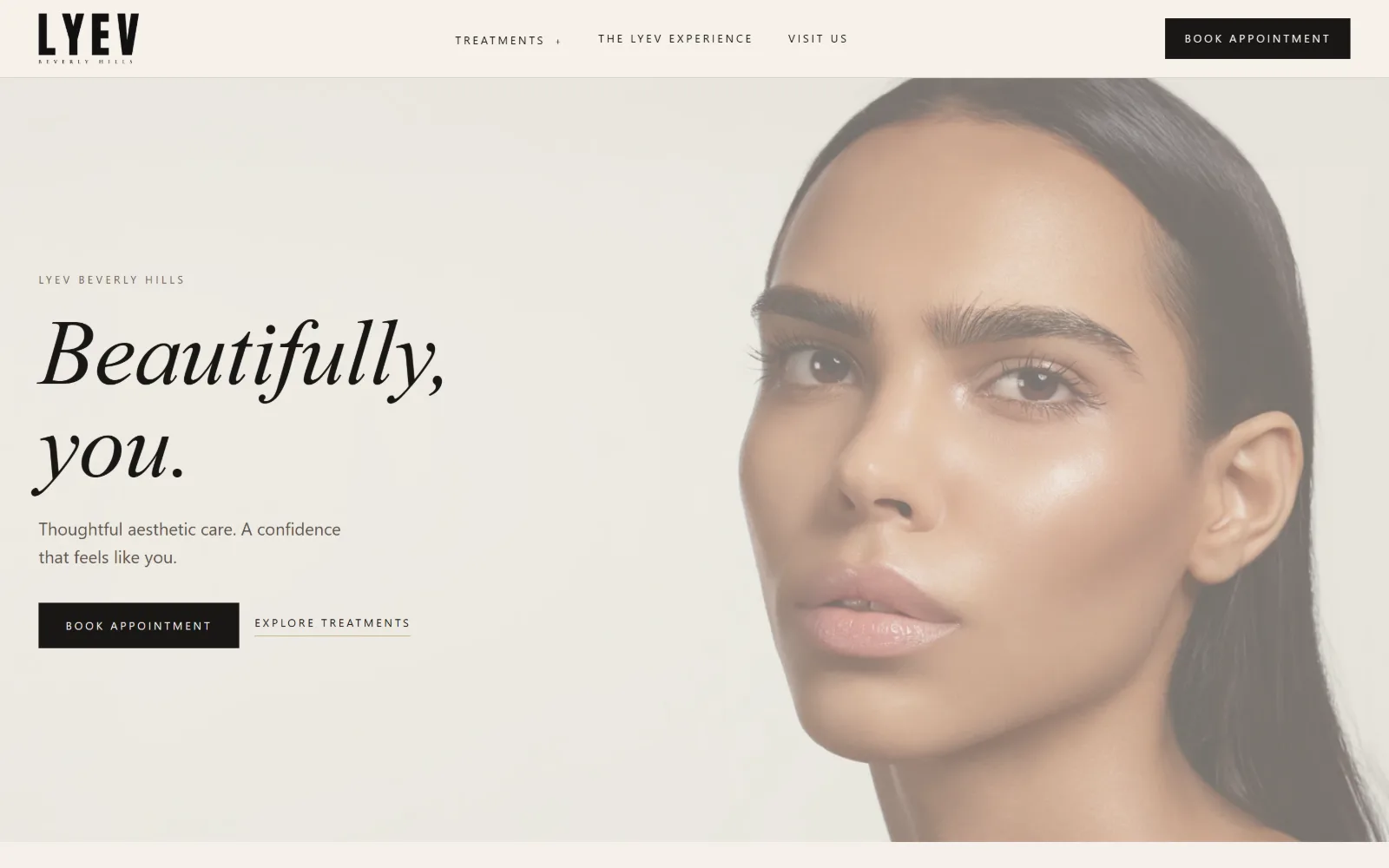
Med Spa Website Design
Med spa website design lives or dies on the price list. Sixteen US aesthetics clinics, read for what they put above the fold and what they hide.
16 sites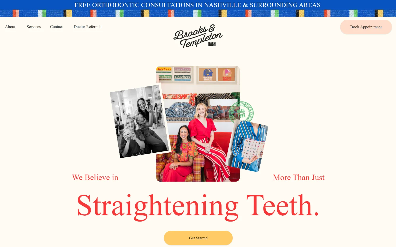
Orthodontist Website Design
Fifteen US practices that escaped the vendor template. Orthodontist website design turns on the smile you lead with and the ask beneath it.
15 sites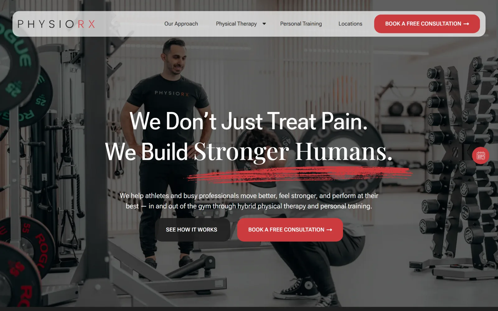
Physical Therapy Website Design
Fourteen US clinics, sports rehab through movement practice. Physical therapy website design that shows the room rather than the body.
14 sites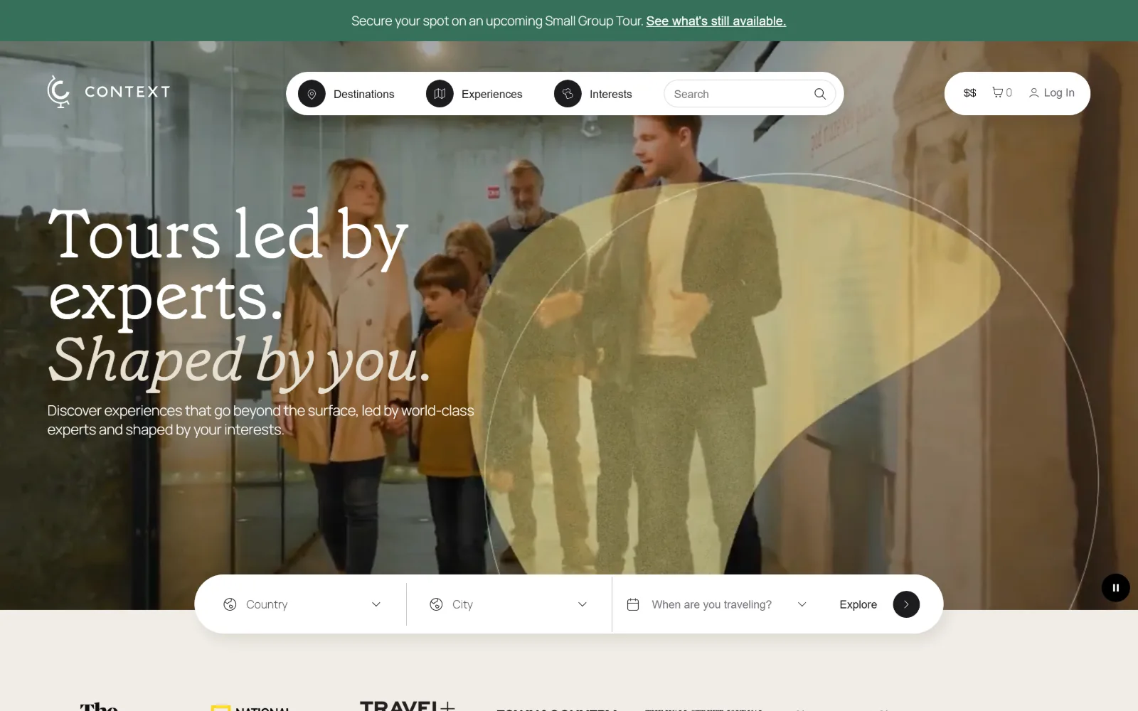
Travel Agency Website Design
Sixteen US agencies, outfitters and trip planners. The travel agency website design question is whether the photograph is doing any selling.
16 sites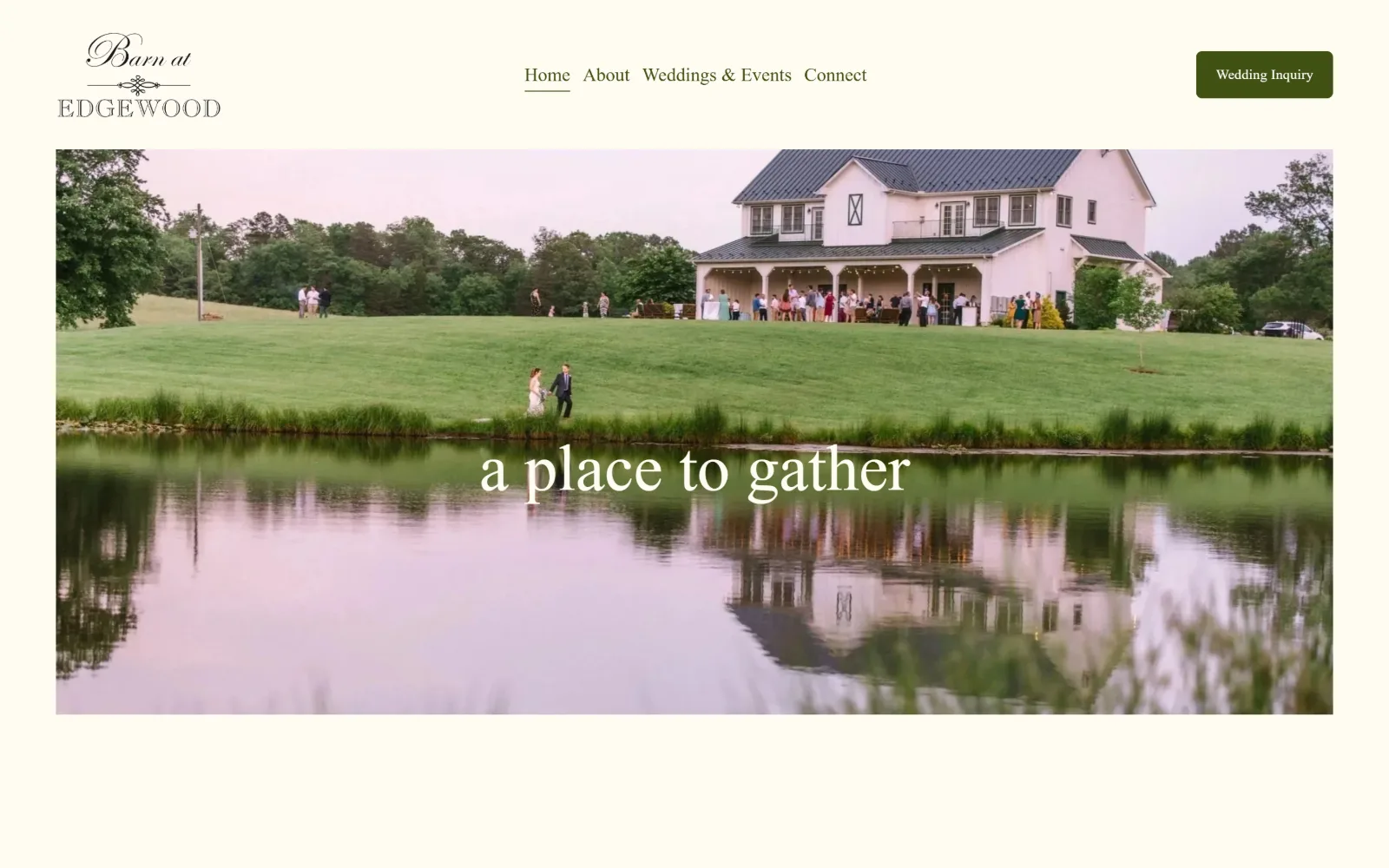
Wedding Venue Website Design
Fourteen US barns, estates and halls. What separates good wedding venue website design is how fast you reach a date, a number and a plan.
14 sites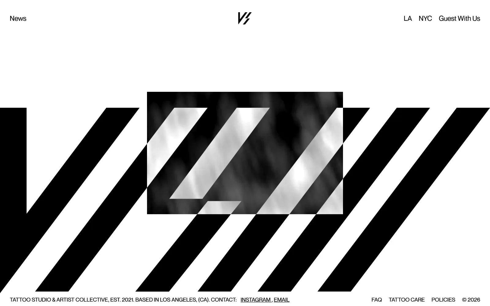
Tattoo Website Design
Sixteen US studios that lead with the shop, the flash wall and the lettering. Tattoo website design where the room does the selling, not the skin.
16 sites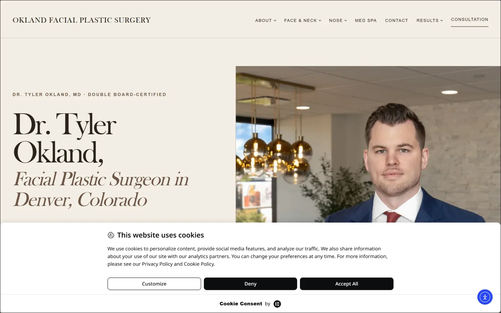
Plastic Surgery Website Design
Sixteen US facial, oculofacial and hand practices. Plastic surgery website design judged on a first screen that usually reaches for a gallery.
16 sites
Dermatology Website Design
Fifteen US medical and Mohs practices rather than cosmetic clinics. Dermatology website design that photographs the room and the people in it.
15 sites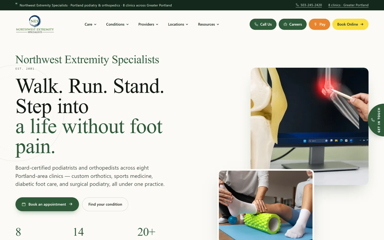
Podiatry Website Design
The vendor template owns this trade. Sixteen US foot and ankle clinics that escaped it, and the podiatry website design decisions that got them out.
16 sites
Property Management Website Design
Sixteen US owners and operators, mostly commercial. Property management website design for a reader who is a committee, not a tenant.
16 sites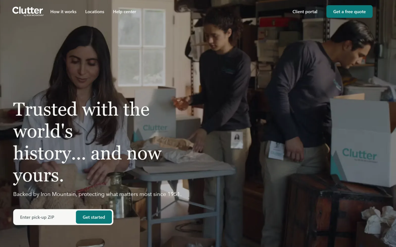
Self Storage Website Design
Fifteen US operators, promo heroes and all. Self storage website design turns on how fast you reach a unit size, a price and a door.
15 sites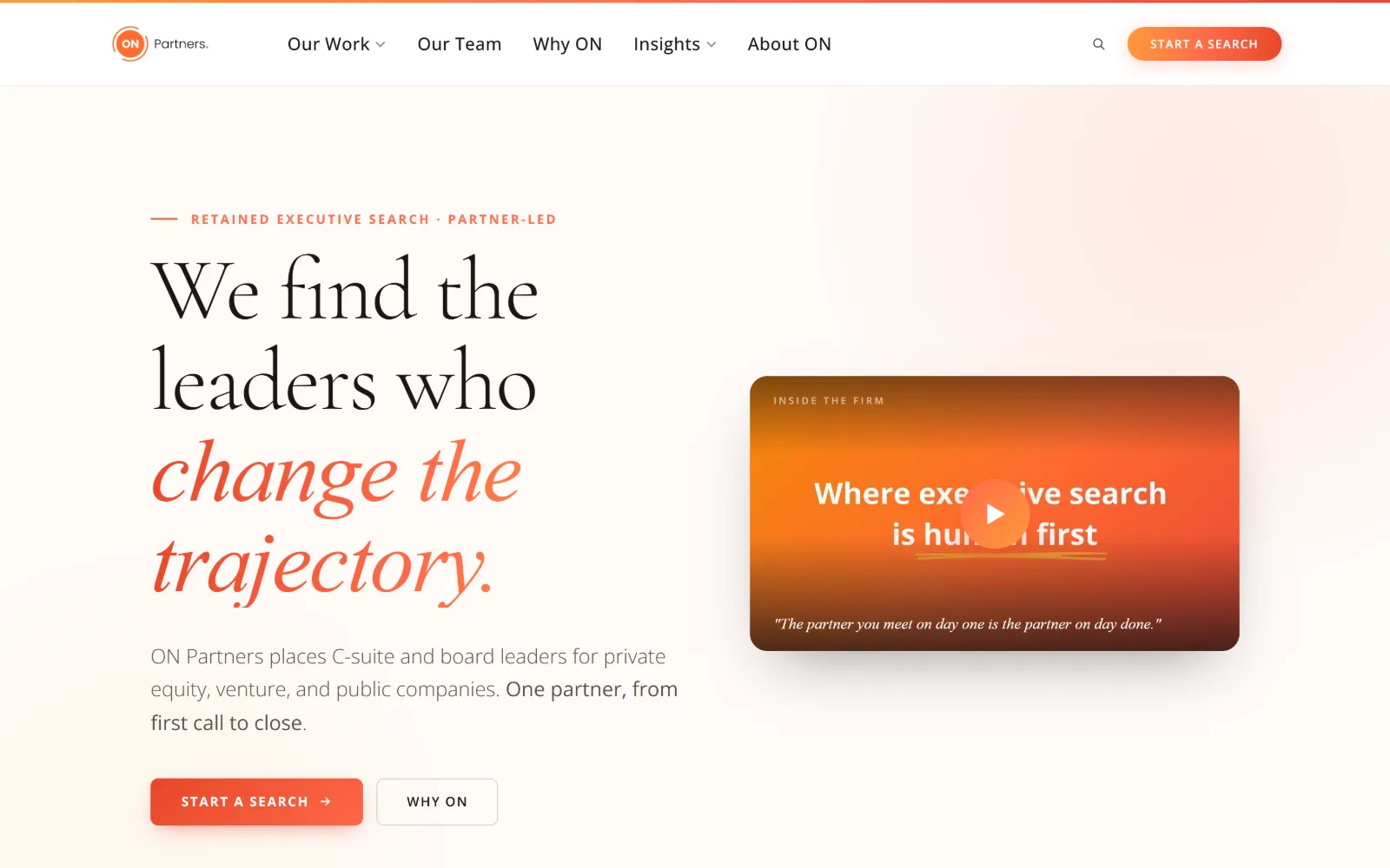
Staffing Agency Website Design
Sixteen US search firms and talent platforms. Staffing agency website design where the client and the candidate want opposite things.
16 sites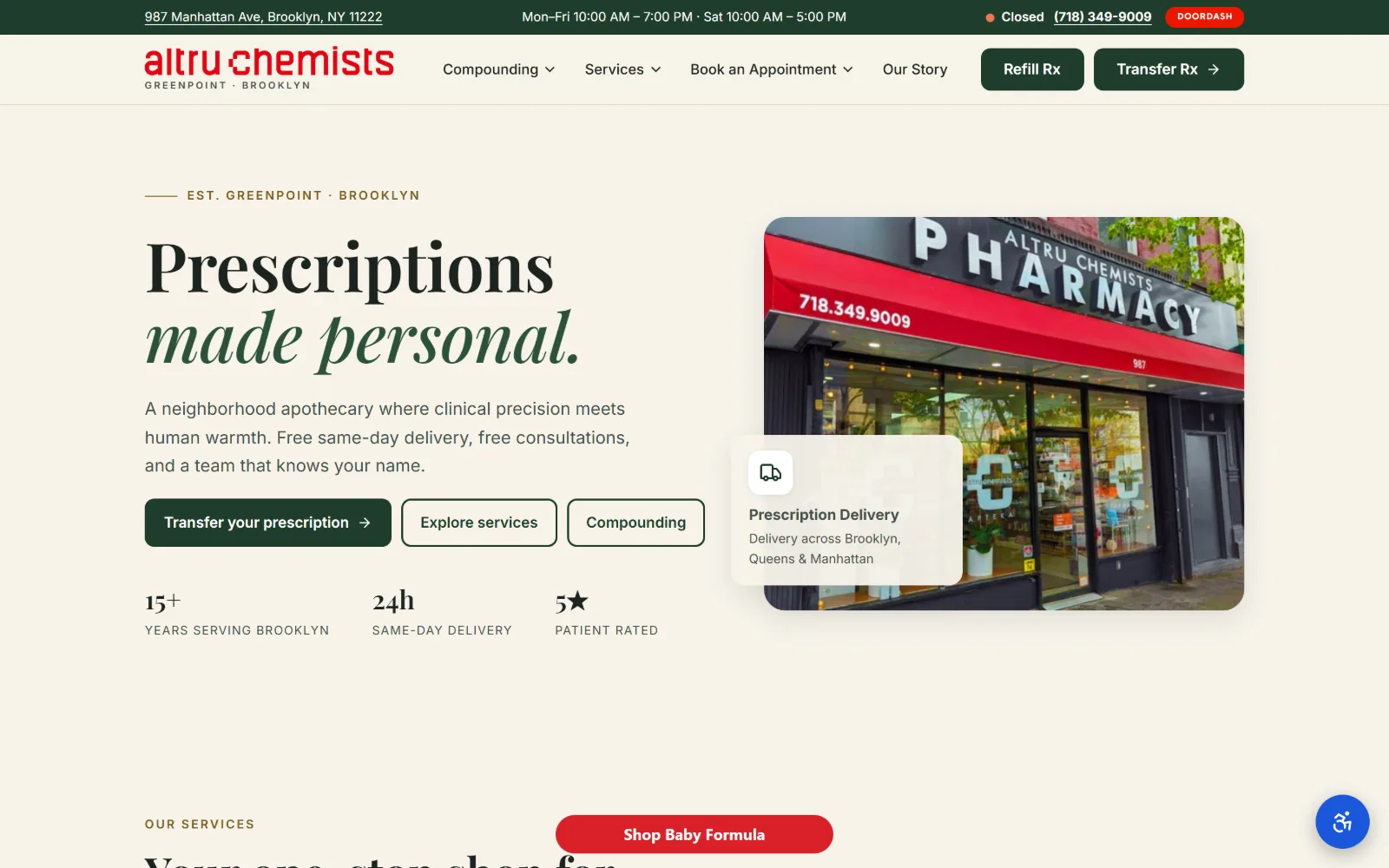
Pharmacy Website Design
Fourteen US independents and compounders. Pharmacy website design splits between a counter that dispenses and a shelf that sells.
14 sites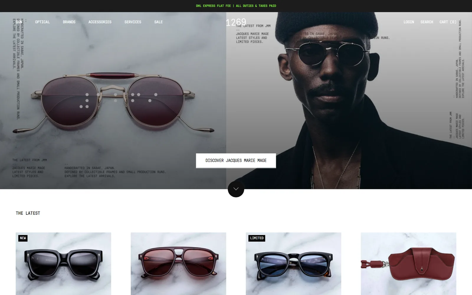
Optometrist Website Design
Sixteen US optical shops and eye care practices. Optometrist website design where the frames are the product and the exam is the quiet half.
16 sitesType first
The largest group. No photograph carries the page, and the headline is set big enough to be the design. Palmetto runs a heavy rounded display face at over 100px in near black on cream with one hot orange doing all the pointing. Skender sets 100px type straight over site footage. Call Thelen sets cream capitals so large the line runs off the bottom of the screen. Midi puts two lines of 154px condensed capitals along the bottom edge of a photograph. Gotham Gym goes to 160px hairline serif caps on a scratched black ground and punches a narrow vertical video panel through the middle of it.
The newest galleries push it further. The Belonging runs two lines of 194px white capitals over dim teal video. Hagyard sets the single word TRUSTED enormous in cornflower blue beside a bay horse lit against black. Terra prints its own name in a grotesk so large it runs off the right edge. Kristin Teig fills the whole screen with her name in an italic serif and shows no photograph at all.
What makes it work is almost never the typeface. It is the size, the tracking pulled in tight, and the discipline to put nothing else on the screen. Terremoto splits its own name across two lines at poster scale and then hands three grid columns to a single photograph.
One photograph, no headline
The riskiest approach and the most striking when it lands. Peter Dab shows one curved cedar shingle canopy over the sea and writes nothing. Hocker puts up an ivy wall with two windows cut into it and no text at all. Wagner Roofing fills the frame with a copper standing seam roof in full sun. Lobs runs a full bleed photograph of a lit hotel lobby with a project name in the corner and the word Menu. Laurel Hill, in the childcare gallery, gives the whole screen to a faded 1970s photograph of two children on a climbing frame.
Thorncrown gives the screen to a glass chapel glowing gold in blue winter woods. Sterling Bay fills it with the Chicago skyline and prints only a wordmark, five links and a slide counter on top. Jason O'Rear pins one architectural photograph right of centre on white and runs his contact details vertically up the left edge.
It requires a photograph good enough to carry the whole argument, which is why it clusters in construction, landscaping and photography. Try it without that photograph and the page just looks unfinished.
One colour, everywhere
A field of a single saturated colour with type on top. BlocPower fills the screen with electric violet. Pilot uses deep violet with a faint engineering grid. Bub and Grandma's floods the fold with amber and draws its own storefront on it in navy ink. My Piece of Cake runs hot pink across the whole hero with two people sitting on a stack of pink crates. Lucé goes near black with a chunky orange display face and splits the headline across two colours mid sentence.
Gentry runs a pure black field for a dental practice. Keker puts a yellow headline on dark green for a litigation firm. Middle Child splits the screen white and bottle green and builds a smiley face out of a circle, a bar and a half-moon bowl.
The common thread is that the colour is not the brand colour used loudly, it is a choice the category does not expect. In pest control, where everything is green or red, Blue Beetle running Kansas City blue against hard yellow does more work than any amount of copy.
No hero image at all
A quieter group and worth studying if your photography is not ready. M Powered sets a single sentence in a big contrasty serif on warm paper. Andersen opens with a serif line, three paragraphs of grey text and a lot of white space, then a split band halfway down. Hiline centres two lines of green serif on cream. Dozen lays a widely spaced wordmark over a black slab of hours and address and nothing else.
Munger Tolles draws a red wire frame loop on warm off-white and writes two sentences. Cravath blows words from its own headline up until they bleed off both edges and uses them as the background. Bartlit Beck shows a logo, four links and some press quotes.
These pages win on confidence. They work because the sentence is worth reading, which makes them the cheapest approach to build and the hardest to get right.
Where to go next
The trade galleries are listed above and each one carries the full write up for every site in it: the display face and its size, the body face, the palette in hex, the grid and container widths, the platform, and a note on how the page asks for the job. Pick the trade nearest yours, then come back here and read the three approaches you did not choose.
If you only read one gallery, read the one closest to your own trade, then read construction for ambition and plumbing for conversion.
The other sectors: Contractors, for construction website design among others; Local Services, for moving company web design among others; and Health & Wellness, for medical website examples among others.