The Best of Roofing Website Design in 2026: 15 Examples
Navy header, orange button, every time. Fifteen US companies whose roofing website design went somewhere else, with what the choice cost them.
Shown
15 sites
Reviewed
34 candidates
Chosen on
The work, not the ranking
Updated
15 October 2026
01
wagnerroofing.com
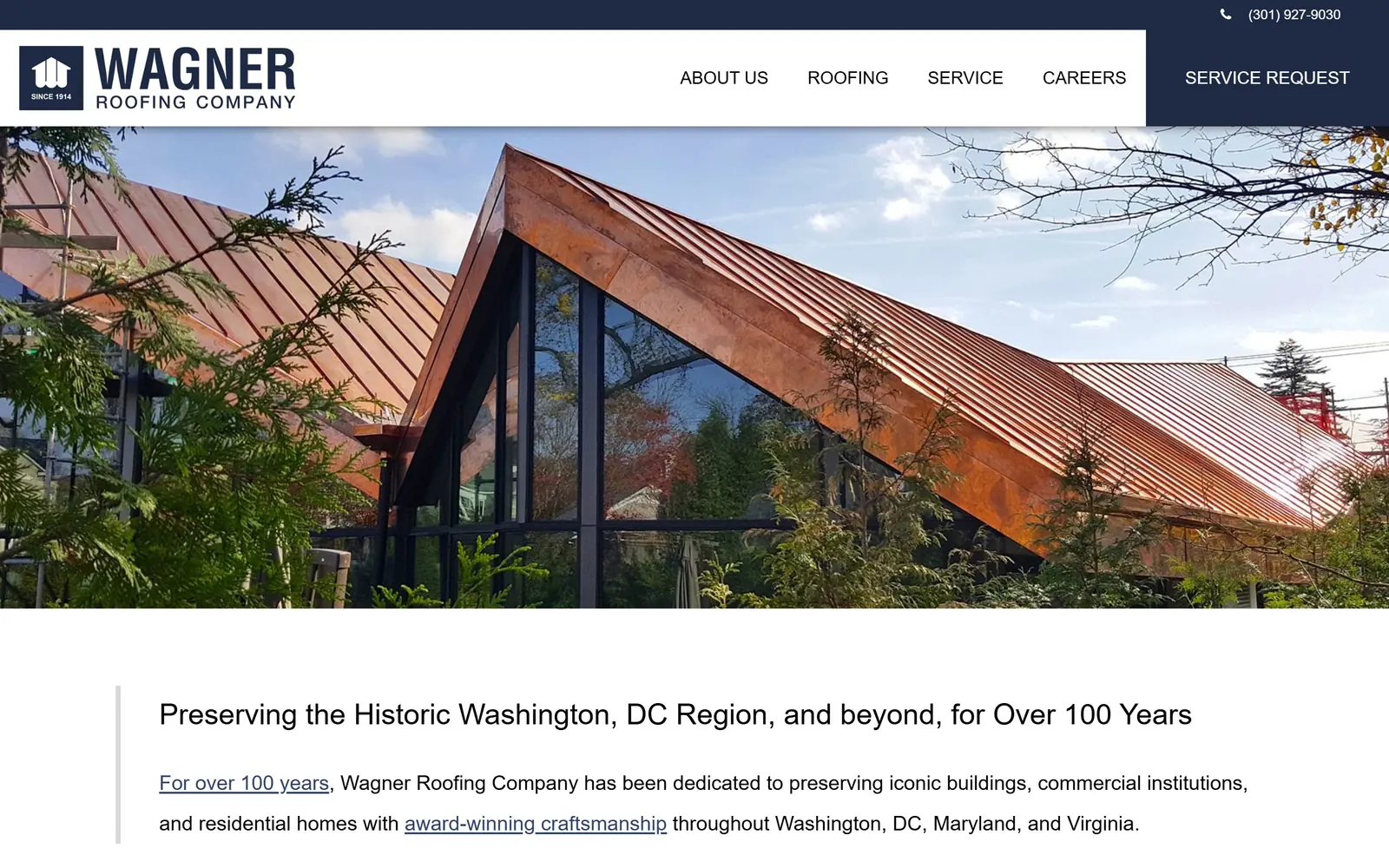
A new copper standing seam roof in full sun, filling the frame with no headline on top of it.
Type
Open Sans, about 30px regular
Body
Open Sans Light
Build
full-bleed photo over a short white page
Made on
WordPress
Colour
#1e2a44 #ffffff
Type. Open Sans at about 30px, regular weight, on a generous line height. That is the whole display treatment. Wagner puts the sentence under the photograph rather than over it, which is why the type can stay this quiet: Preserving the Historic Washington, DC Region, and beyond, for Over 100 Years reads as a caption to the work.
Colour. Navy #1e2a44 in the header and the logo block, white everywhere else, and that is it. All the colour in the hero is copper, and it belongs to the roof rather than the brand.
Layout. Full-bleed photograph, then a hard stop, then text on white with a thin rule down the left margin. The page is short. There is no slider, no stat bar, no badge row, and the restraint is the argument: a company founded in 1914 doing landmark work in DC does not need to shout.
The ask. Service Request sits in the navy block at the top right and nothing competes with it. No hero button at all. For institutional and architect-led work that is the correct read, since nobody specifying a copper roof is clicking Get A Free Quote.
Let the material be the colour. If your crews do copper, slate or zinc, photograph it in sun and keep every brand colour off the image.
02
rhinoroofers.com
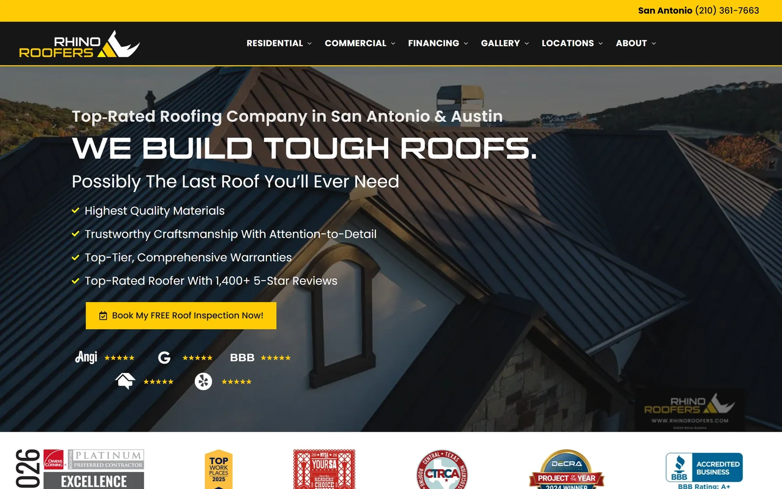
Black and yellow instead of navy and orange, over a dark standing seam roof shot at dusk.
Type
suiGeneris 56px uppercase
Body
Poppins
Build
two columns, 40px gaps, square corners
Made on
Next.js
Colour
#161616 #ffcb05 #ffffff
Type. suiGeneris sets WE BUILD TOUGH ROOFS at 56px in squared-off caps with a hair of tracking, and Poppins handles everything else. Keeping the display face to one line is what makes it land. Used twice it would read as a novelty.
Colour. Black and yellow in a trade that defaults to navy. Near-black #161616 anchors the page, white opens it, and a saturated #ffcb05 lands on the logo, the four tick marks and the one button. Cover the logo and the colour still names the company.
Layout. Two column grids below the fold, an even pair and an 832 by 320 split, on 40px and 24px gaps with 64px between sections. Corners stay square throughout. The benefit list stops at four lines where most roofers run eight.
The ask. One yellow button, Book My FREE Roof Inspection, with the review badges stacked underneath instead of above. The phone number stays in the top bar. The hero asks once.
Pick an accent your nearest competitors do not own and spend it on three things, because that buys recognition no amount of photography will.
03
westernspecialtycontractors.com
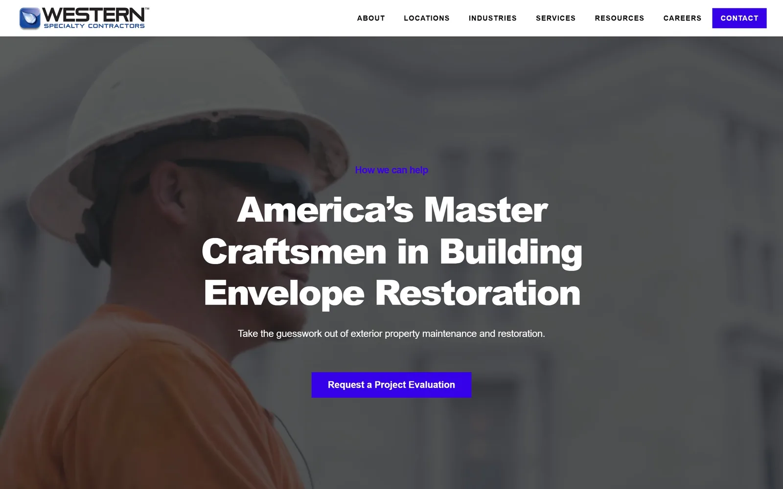
A close portrait of a man in a hard hat, almost monochrome, with an electric violet button sitting on top.
Type
Lato Black 64px, tight
Body
Museo Sans
Build
1380px container, two columns at 108px gap
Made on
WordPress
Colour
#3600e8 #1c201f #ffffff
Type. Lato Black runs the headline at 64px with the tracking pulled in tight to -0.04em, so America's Master Craftsmen in Building Envelope Restoration holds together as one dense block across three lines. Museo Sans takes the body and the nav, the latter at 13px with wide 0.077em letterspacing in caps. The weight contrast between the two is the whole typographic idea.
Colour. An electric blue-violet, #3600e8, against a desaturated photograph and near-black #1c201f. It appears exactly twice, on the How we can help label and the button. In a category of navy and safety orange this reads as a different industry altogether.
Layout. The photograph is a portrait, not a building, and it is pushed out of focus so the type can sit centred over the face. Content below runs two even columns at a wide 108px gap. Nothing is rounded.
The ask. Request a Project Evaluation, one button, no phone number in the hero and no form. For building envelope work that sells on survey and specification rather than urgency, asking for an evaluation instead of a quote is the right verb.
Choose your accent from outside the trade. The fastest way to stop looking like a contractor is to use a colour contractors do not use.
04
fiveguysroofing.com
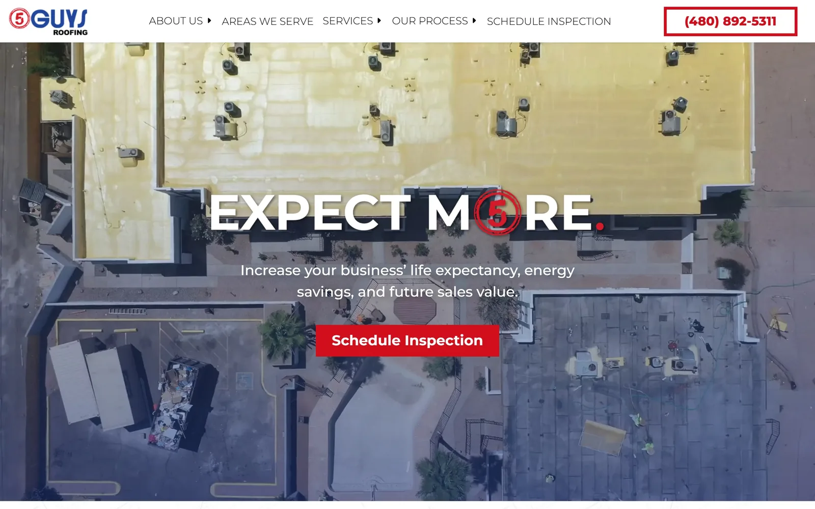
Shot straight down onto a half-coated commercial roof, with the company's 5 badge standing in for the O in MORE.
Type
Montserrat 800, about 45px
Body
Montserrat
Build
full width, square corners
Made on
WordPress
Colour
#ffffff #d10e1c #263c8e
Type. One typeface, Montserrat, doing every job. The hero runs about 45px in heavy uppercase and the red 5 badge drops into the word MORE where the O belongs. Small trick, and it works, because the logo stops being a logo and becomes part of the sentence. Nav sits at 15px in a light 300 weight so nothing competes.
Colour. White ground, one red at #d10e1c, one navy at #263c8e. The red turns up on the badge, the boxed phone number and the inspection button. Nowhere else.
Layout. Edge to edge, square corners, buttons included. The photograph carries it: shot straight down, so a half-coated roof of yellow foam against grey membrane reads as an abstract field rather than a building. Most roofers would have run a three-quarter view of a house and lost all of it.
The ask. A single centred button under the subhead, with the phone number boxed in red at top right as the only other route. No chat bubble, no hero form, no second offer.
Point the drone straight down. An overhead frame of a commercial roof is abstract enough to work as a graphic, and nobody else in your market is shooting that way.
05
wegnerroofing.com
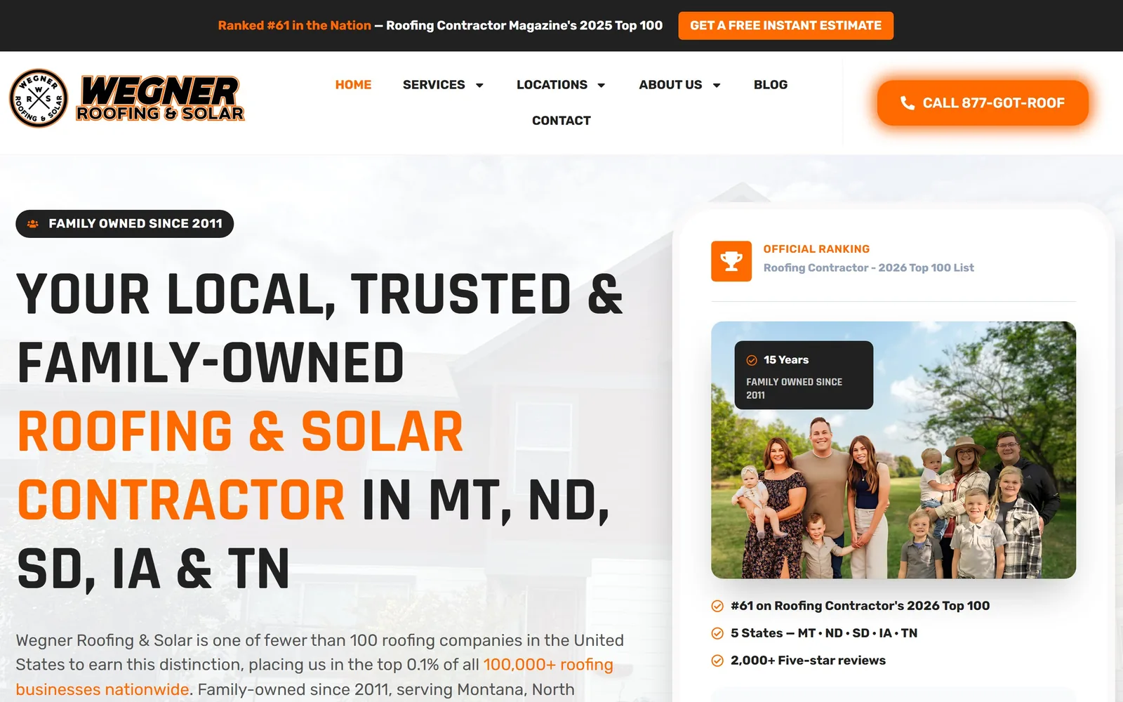
Condensed caps in black and orange on a white ground, with the owners' family photo as the proof panel.
Type
Rajdhani Bold 80px uppercase
Body
Rubik
Build
two columns, 840 and 560 split
Made on
WordPress
Colour
#ff6a00 #212121 #ffffff
Type. Rajdhani Bold drives the hero at 80px in condensed caps, and the sentence turns colour partway through so ROOFING & SOLAR CONTRACTOR lands in orange while the rest holds near-black. Rubik runs body at 21px and nav at 16px. Keeping the condensed face strictly for display is right, since Rajdhani tires quickly at reading size.
Colour. Orange #ff6a00 against #212121 on white, and that is the entire palette. It runs the nav links, the CALL 877-GOT-ROOF button and the ranking badge.
Layout. No photographic hero at all, which is unusual here and works. White ground, headline left across an 840 and 560 split, and a card on the right holding the Top 100 ranking, a family photograph and three ticked lines. Buttons take a 5px radius while the cards sit square, which is sloppy, though it is the only loose thread.
The ask. The call button lives in the nav where it stays visible, and the proof card does the selling. There is no button under the headline at all, a gamble that the ranking pulls people down the page.
If a ranking or a family is what actually separates you, build it into a card beside the headline, not a badge strip at the foot of the page.
06
mintroofing.com
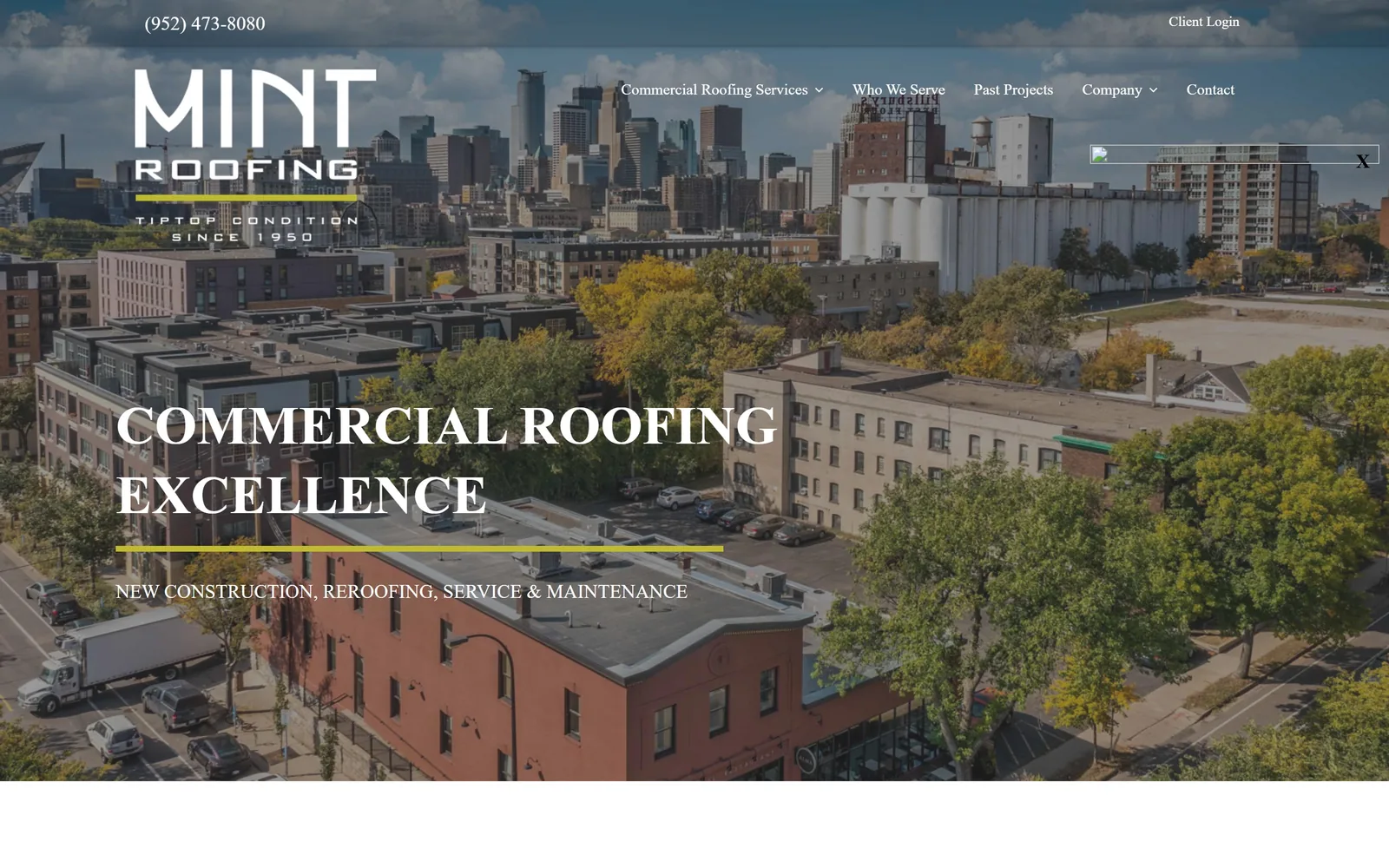
An aerial of the Minneapolis skyline with a flat-roofed brick building in the foreground, headline underlined in chartreuse.
Type
serif caps, about 56px
Body
Roboto Light
Build
single full-bleed aerial, short page
Made on
WordPress
Colour
#c8d400 #ffffff
Type. A classical serif in wide caps sets COMMERCIAL ROOFING EXCELLENCE, with the nav in the same serif rather than the usual sans. That is a deliberately old-fashioned choice for a commercial roofer and it reads as confidence. A chartreuse rule runs under the headline and again under the wordmark, tying the two together.
Colour. Chartreuse, a yellow-green nobody else in this trade touches, used only as a rule and only twice. Everything else is white type on the photograph. Of the sites looked at for this collection, this and Rhino are the only two that escaped navy entirely.
Layout. The hero is one photograph taken from above the river looking into the city, with a real client building in the frame rather than a stock roof. Type sits low on the left over the darkest part of it. Below the fold the page is short and plain.
The ask. No button in the hero. The phone number sits top left, Client Login top right, and the headline carries a plain service line beneath it. For a commercial maintenance firm whose work arrives by relationship that is a defensible choice, though a single assessment link would cost nothing.
A rule in an unusual colour under a serif headline is a cheap, strong brand device. You do not need a logo lockup to own a colour.
07
guardianroofing.com
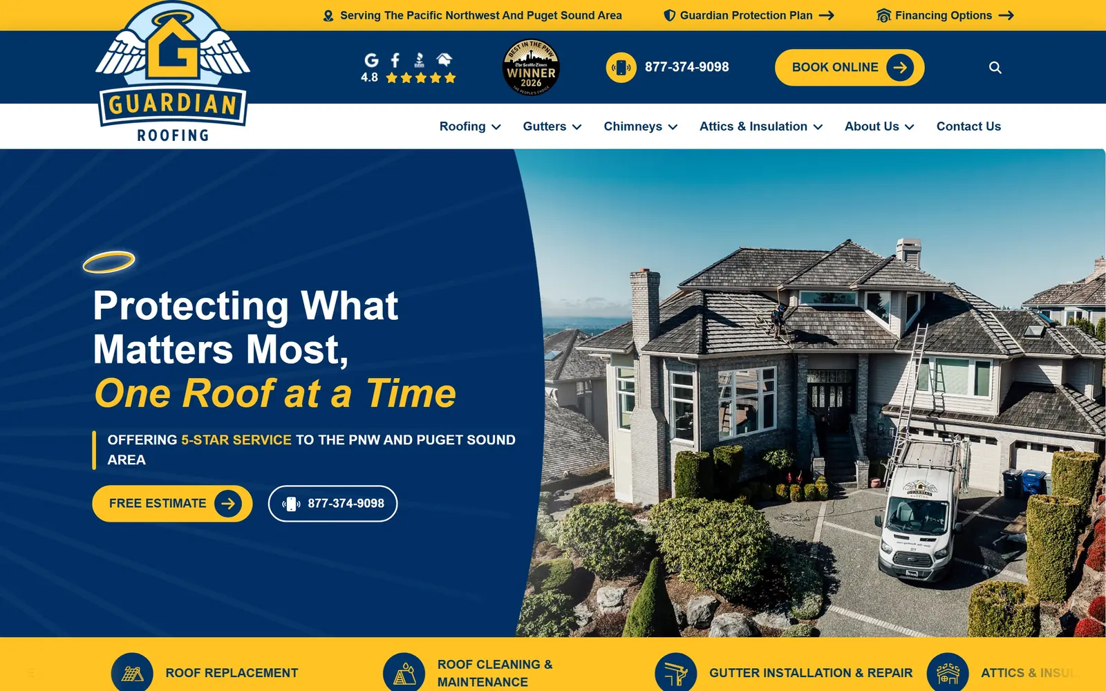
A curved navy panel sweeps into a photo of a crew on a shingle roof, with a gold halo over the headline.
Type
Geologica Bold 52px
Body
Montserrat
Build
curved panel split, pill buttons
Made on
WordPress
Colour
#003366 #ffc323
Type. Protecting What Matters Most is set in Geologica Bold at 52px, and the second line switches to gold italic. One flourish, used once. Montserrat carries body at 16px in a soft navy-grey rather than black, which keeps the page from going hard.
Colour. Navy #003366 and gold #ffc323, applied with no exceptions across the halo mark, the pill buttons and the service strip. Putting 5-STAR SERVICE in gold inside a sentence is neat, because the review proof lands where someone reads it instead of in a badge row.
Layout. A curved navy panel sweeps into the photograph rather than meeting it on a diagonal, and the curve answers the halo in the logo, so the shape has a reason to exist. Buttons are fully rounded at a 70px radius and nothing else is, leaving the call as the only soft thing on screen.
The ask. Free Estimate as a gold pill, the phone number as an outlined pill beside it, Book Online up in the bar. Three routes, all visible at once, none of them a popup.
Commit to the mascot or drop it. A halo, a curve and a gold that all trace to one idea will beat a logo the rest of the page ignores.
08
nationsroof.com
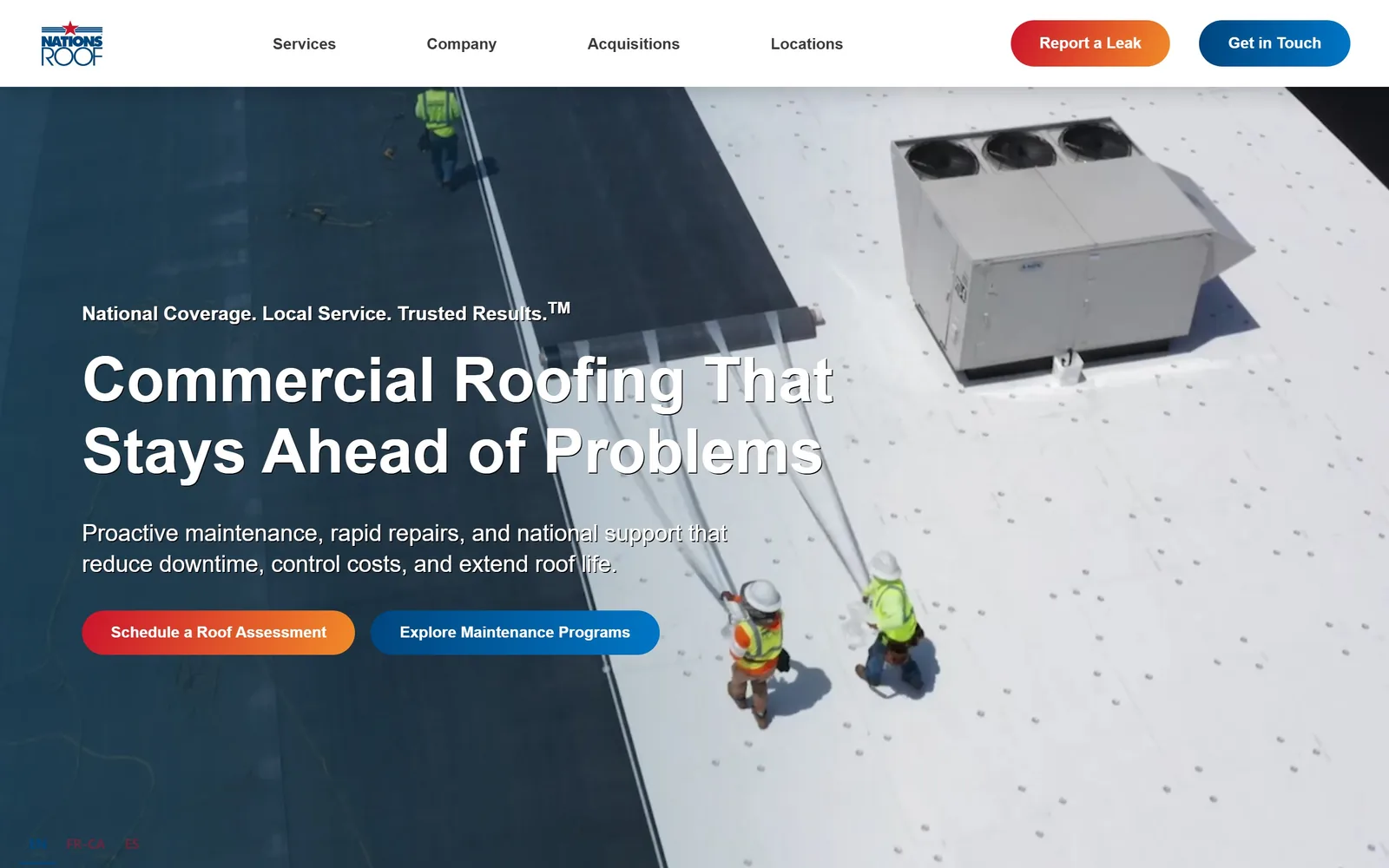
An aerial of two crew walking a white membrane roof, with the headline in the shadowed half of the frame.
Type
Montserrat Bold 64px
Body
Montserrat
Build
full width, 100px section rhythm
Made on
HubSpot
Colour
#cc132c #00467f #3a3a3a
Type. Montserrat Bold at 64px, no tracking games, broken over two lines so it reads as a sentence rather than a slogan. The trademarked three-beat line sits above it, small. Body drops to mid grey #3a3a3a, which matters once the maintenance pages run long.
Colour. Red #cc132c and navy #00467f used as two decisions rather than decoration. Red means urgency and stays with it, on the assessment button and Report a Leak in the nav. Navy takes planned work. You can tell them apart without reading them.
Layout. Type occupies the shadowed left third of the aerial and the bright membrane on the right is left completely empty. That is composition doing the job a dark overlay usually does badly. Below, four and three column grids with 100px between sections.
The ask. Two buttons side by side, colour coded to two intentions: emergency on the left, planned maintenance on the right. Rare for a commercial site to admit that visitors arrive for unrelated reasons.
Shoot the hero already knowing where the headline goes, and you will never have to flatten the photograph under a grey scrim.
09
rooflife-oregon.com
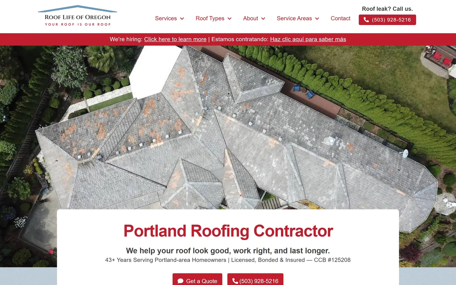
A straight-down drone frame of a moss-stained roof, with a white card cutting across the lower third.
Type
Arvo Bold 52px
Body
Open Sans
Build
1200px container, card overlapping the aerial
Made on
WordPress
Colour
#be1e2d #ffffff
Type. Arvo, a slab serif, sets Portland Roofing Contractor at 52px with the tracking pulled tight. Open Sans runs body at 18px so the slab never appears small, where it would clog. The licence number is printed into the subhead, which is a very Oregon thing to do.
Colour. One red, #be1e2d, on a white card. It takes the headline, the nav links and both buttons and stops there.
Layout. The card cuts across the photograph instead of floating on a tinted overlay, and a 1200px container keeps real margin either side. The aerial underneath is the clever part: a large roof with visible moss and wear, which is the condition a Portland homeowner worries about, not a finished roof nobody needs.
The ask. Get a Quote and the phone number sit together at equal weight, lightly rounded, with a leak line repeated at the top right. Someone with water coming in finds a number in about a second.
Lead with the problem in the hero image, not the finished job, because nobody looks up a roofer while the roof is fine.
10
heidlerroofing.com
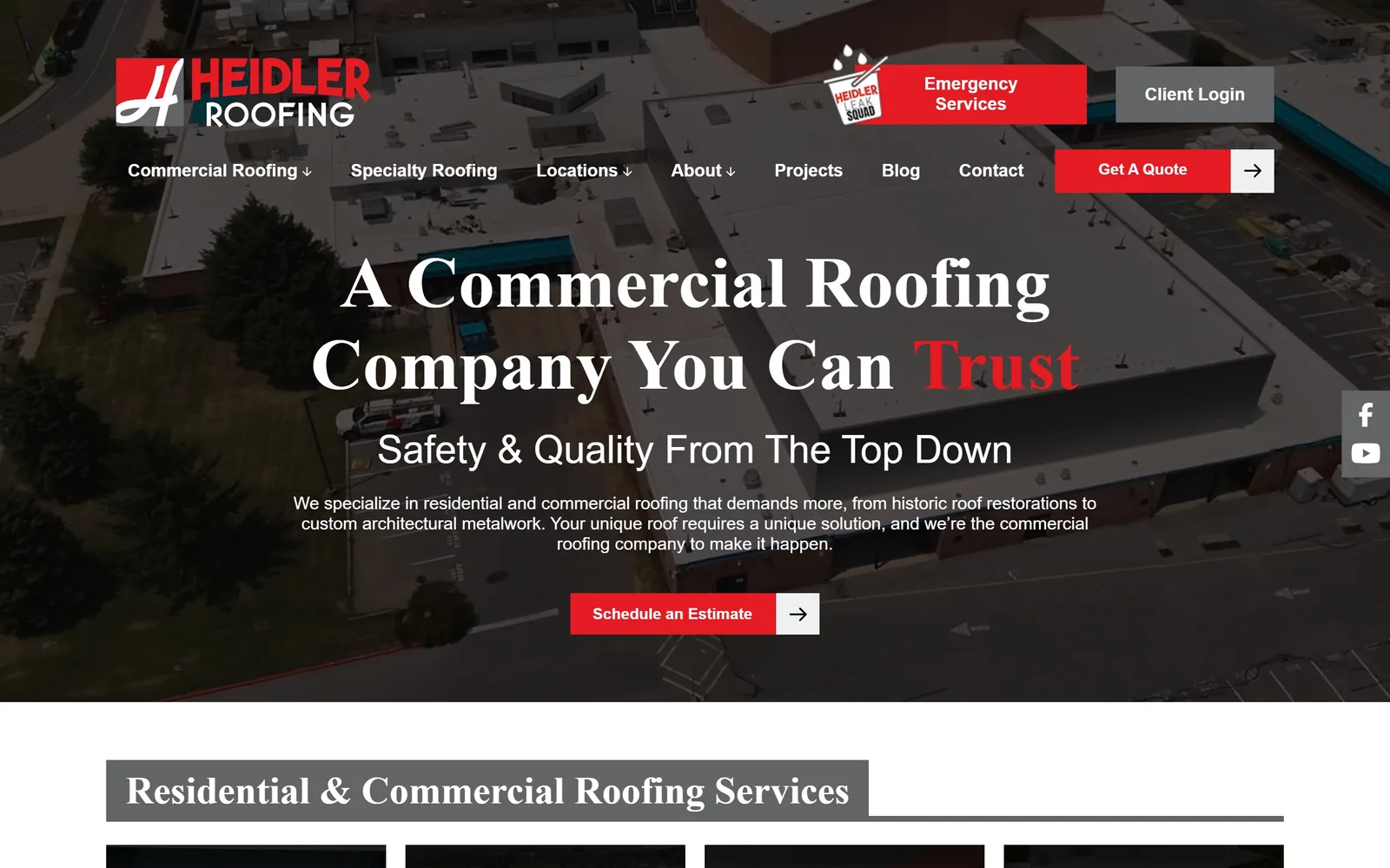
Adobe Garamond at 75px across a drone shot of a flat commercial roof, with the final word picked out in red.
Type
Adobe Garamond Pro Bold 75px
Body
Myriad Pro
Build
1200px container, square corners
Colour
#e41b23 #ffffff
Type. Adobe Garamond Pro, bold, at 75px. A serif that size is close to unheard of in roofing and it separates the page instantly from whatever else is open in the next tab. Trust is picked out in red at the end of the line. Myriad Pro handles everything below, so the serif is spent exactly once.
Colour. Red #e41b23 against white, and not much of either. The aerial underneath is drab, an olive-grey field of flat roof, and the type is strong enough to carry it anyway.
Layout. A 1200px container with wide side tracks keeps the hero calm. Further down the section headings sit in flat grey bars, and that is where the page shows its age against the rest of this set. Study the top half.
The ask. One red Schedule an Estimate button with its arrow in a separate white square, a detail repeated on Get A Quote in the nav. Small consistencies like that tell you somebody was paying attention.
A serif at display size will separate you in a category running on bold sans, provided you use it for one line and hand the rest to a neutral face.
11
pickardroofing.com
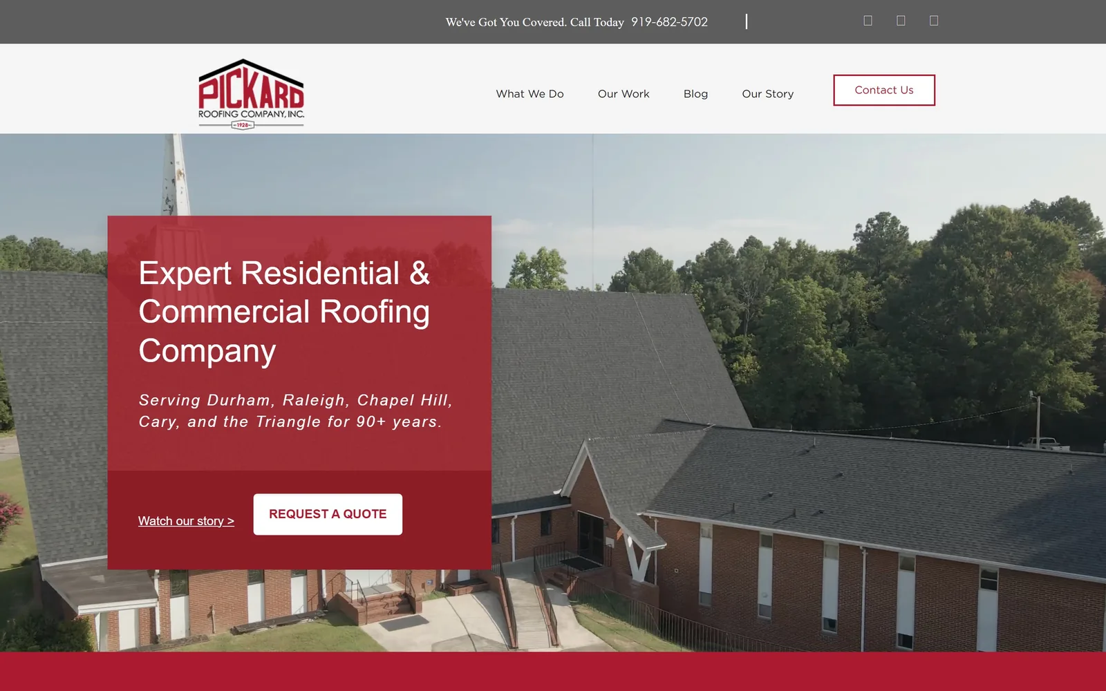
A deep red block sits on a drone shot of a church roof, carrying the headline and both calls.
Type
Montserrat 42px regular
Body
Gotham Book
Build
offset colour block over a full-bleed aerial
Made on
HubSpot
Colour
#ab1b2f #a5222d
Type. Setting the headline in Montserrat at 42px regular rather than bold gives Expert Residential & Commercial Roofing Company an unusually calm voice for the trade. An italic line underneath names Durham, Raleigh and Chapel Hill, which does the local search work without a keyword-stuffed headline.
Colour. Two reds sitting close together. The message block is #ab1b2f and the band beneath holding the buttons drops to #a5222d. It quietly separates what the company says from what it wants you to do, and almost nobody will consciously notice.
Layout. The block sits off-centre on a drone shot of a long shingled church roof, real completed work rather than a stock house. It is tall enough for the headline, the service line and the buttons without crowding, and the photograph handles the rest.
The ask. Two routes at deliberately different weights. REQUEST A QUOTE is a solid white button in Gotham Book; Watch our story is a plain underlined link beside it. The ready visitor and the undecided one each get somewhere to go.
Put the low-commitment link next to the main button instead of burying it in the nav, so people who are not ready to call still land somewhere you chose.
12
kellyroofing.com
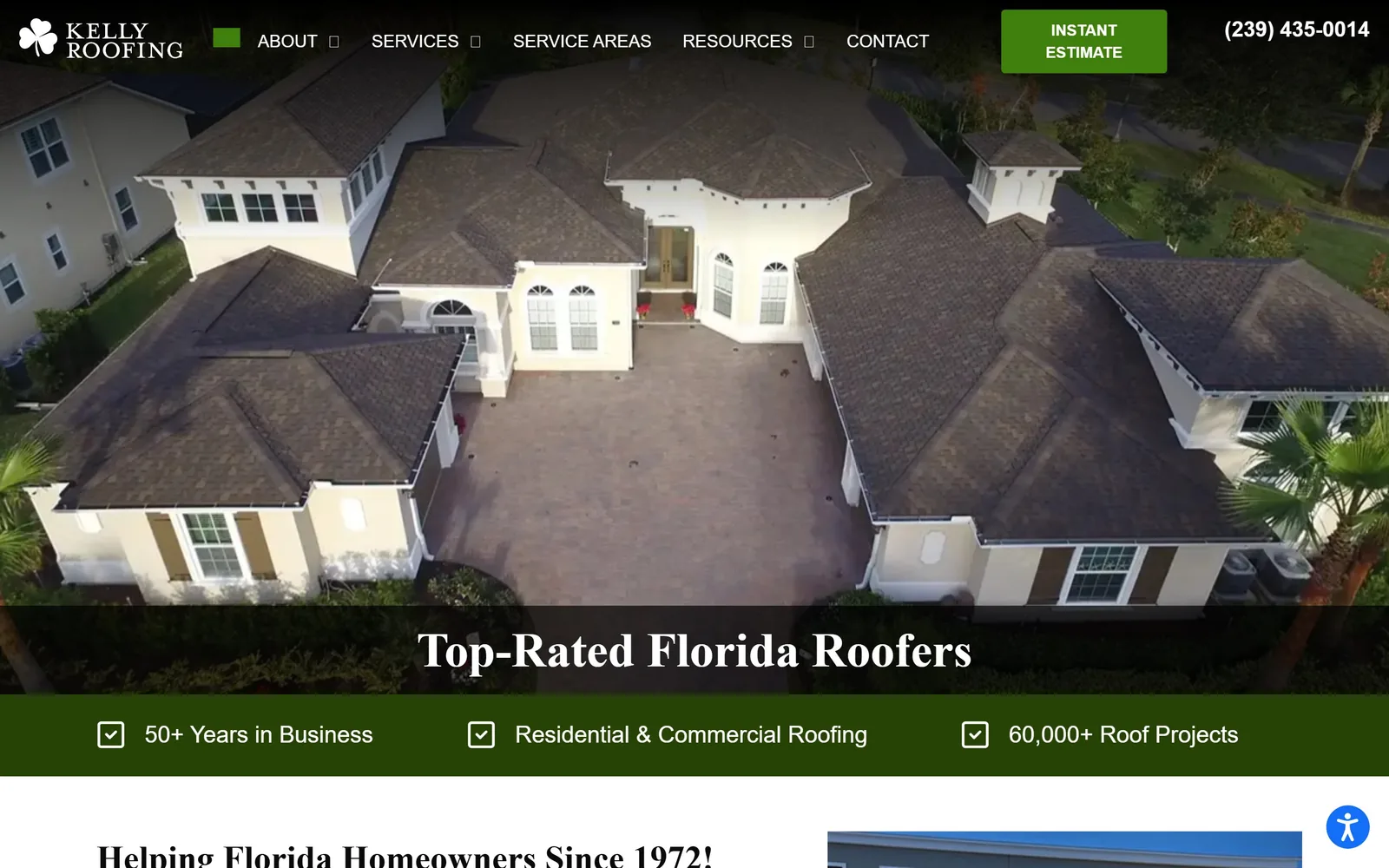
Drone frame of a big tile-roofed Florida house, with the headline waiting in a band across the bottom.
Type
Minion Pro 50px
Body
Lato
Build
full-bleed aerial with a headline band and stat bar
Made on
WordPress
Colour
#274205 #3f800d #ffffff
Type. Minion Pro, a book serif, sets Top-Rated Florida Roofers at 50px, and Lato handles everything underneath at 18px. The pairing is conservative and suits a company trading since 1972. Nothing here is trying to look like a startup.
Colour. Deep forest green, #274205 in the stat bar with a brighter #3f800d on the estimate button, against white. Green in roofing usually means a solar or eco angle; here it is just the brand, and it is a quieter choice than the category norm.
Layout. Photography gets the whole upper half and the headline waits until the bottom, which is a brave inversion that only works because the aerial is good enough to hold attention on its own. A green stat bar runs beneath it carrying three numbers: fifty years, both sectors, sixty thousand projects.
The ask. Instant Estimate as a green button in the bar, the phone number beside it, and no form in the hero. Naming the tool Instant Estimate rather than Free Quote promises a different thing, and it is the more interesting promise.
If your aerial is strong enough, put the headline under it rather than over it, and let the photograph do thirty seconds of work unassisted.
13
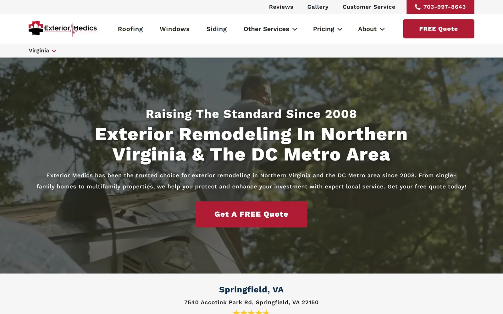
exteriormedics.com
Work Sans at 800 weight, centred in white over a low angle shot of a roofer, with one crimson button beneath.
Type
Work Sans 800, 53px
Body
Work Sans
Build
centred stack over a full-bleed photo
Colour
#222222 #b01c33
Type. Work Sans does all of it, from a 53px Extra Bold headline tracked out slightly to 16px body on a roomy line height. Perhaps four weights in play across the page. Raising The Standard Since 2008 runs above the headline as an eyebrow, giving the centred stack a top edge it would otherwise lack.
Colour. Near-black #222222 out of the photograph, white type, crimson #b01c33 on the quote button and the phone pill. Two places, no more.
Layout. Centred type over a darkened low-angle shot of a roofer. Conventional, and it knows it. The one genuinely useful touch is a state selector in a thin bar under the nav, sensible for a company working either side of the Potomac.
The ask. A single crimson button under the paragraph with the phone number repeated in the bar above. No hero form and no second offer competing with it.
One typeface and one accent, used consistently, will carry a site with no big idea in it, which is the honest target for most contractors.
14
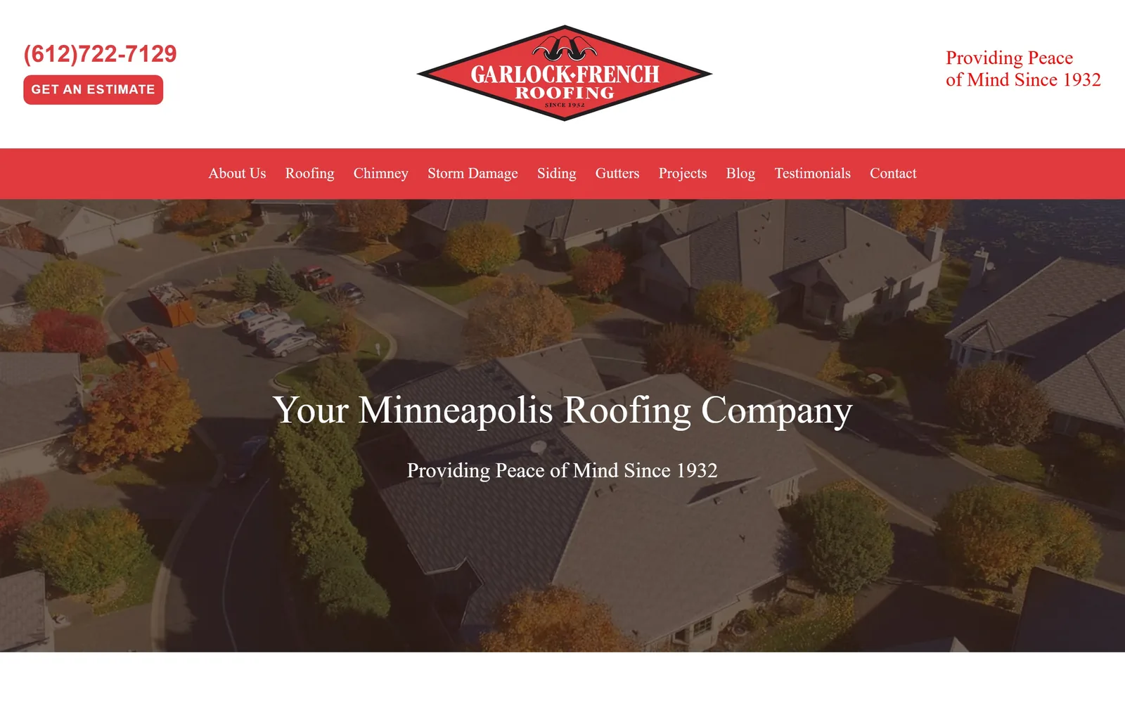
garlock-french.com
A dimmed autumn aerial of suburban rooflines, with a red nav bar and a diamond logo above it.
Type
Frank Ruhl Libre 50px
Body
Open Sans
Build
banded header, nav bar, full-bleed aerial
Made on
WordPress
Colour
#e0393e #352015 #d3c3ae
Type. Frank Ruhl Libre, a serif, sets Your Minneapolis Roofing Company at 50px centred, with the nav in the same face at 19px. Running serif navigation is unusual and it matches the 1932 diamond logo, which looks like it came off a van door. Providing Peace of Mind Since 1932 sits underneath as a straight subhead.
Colour. Red #e0393e in the nav bar, the logo and the estimate button, against warm browns and tans pulled out of the autumn photograph. The red is brighter than the heritage mark suggests, and the clash is the one weak note here.
Layout. A red nav bar sits as a solid band between the white logo header and the photograph, which dates the layout a little but gives the page a clear three-part structure. The aerial is dimmed heavily so centred white type can sit on it. Sections run on a tight 40px rhythm.
The ask. Get An Estimate sits top left next to the phone number, with nothing in the hero itself. The nav carries nine items including Chimney and Testimonials, which is a lot of choice to offer before anyone has been asked for anything.
If your logo is genuinely old, set the type to match it rather than bolting a modern sans onto a ninety year old mark.
15
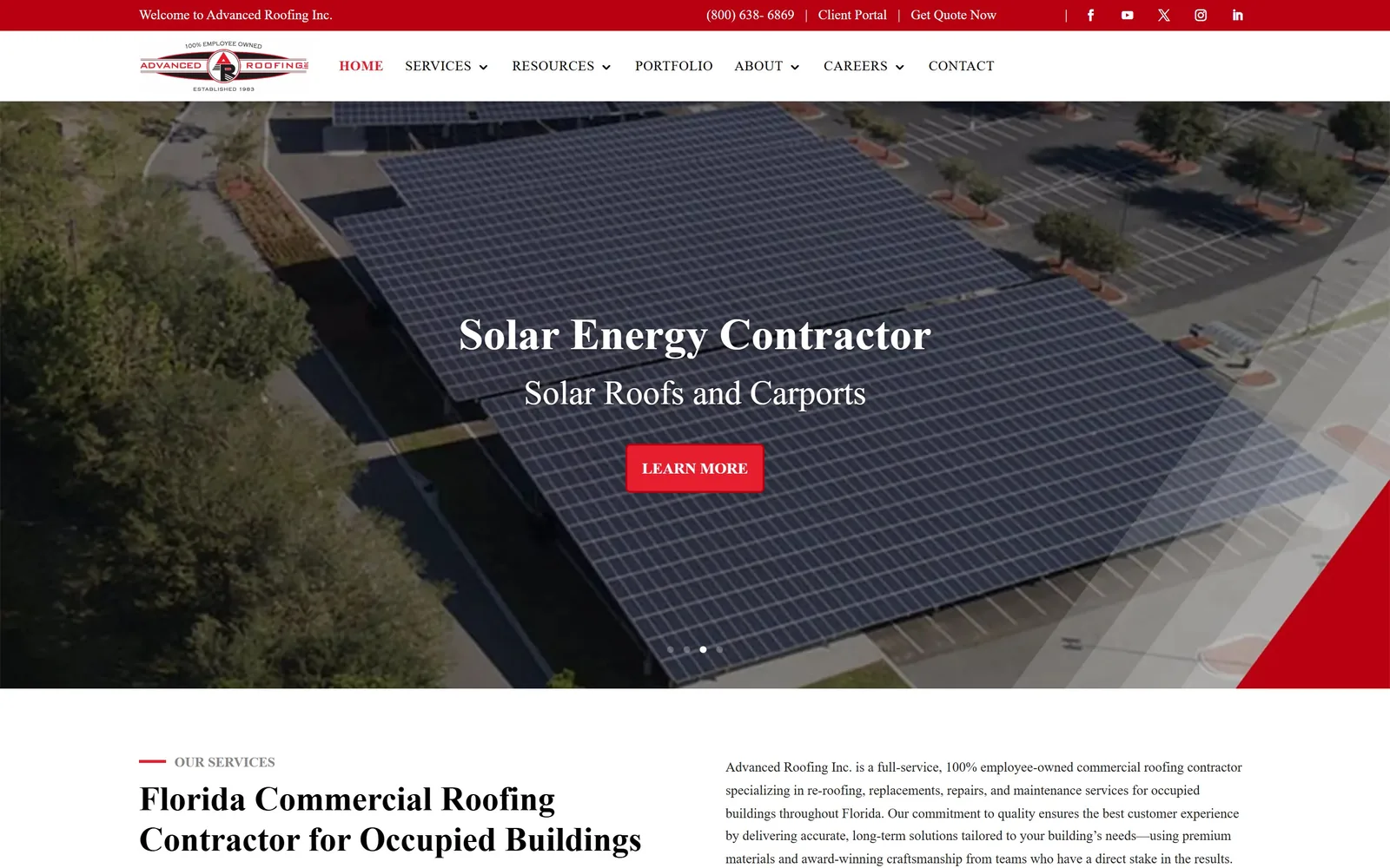
advancedroofing.com
Light serif over an aerial of a solar carport array, with a red diagonal wedge clipping the corner.
Type
light serif, about 35px
Body
Roboto
Build
rotating carousel hero
Made on
WordPress (Divi)
Colour
#b90011 #e61e2e
Type. The hero runs a light serif, Solar Energy Contractor above a smaller Solar Roofs and Carports. Roboto takes everything else at 14px for body and 14px bold and tracked for the uppercase nav. The serif has no relationship to the Roboto under it, and the hero is weaker for that.
Colour. Nearly all the colour work falls to red, #b90011 on the top bar and the button with a brighter #e61e2e on the nav links, over a page that goes almost entirely white once you scroll.
Layout. Three carousel dots under the button give it away, the hero rotates. A red diagonal wedge clips the bottom right corner, and that single shape dates the page more than anything else in this collection. The better work sits further down, where a short red OUR SERVICES label runs over a 35px heading and a plain column about re-roofing occupied buildings.
The ask. LEARN MORE asks for nothing and promises nothing, with Get Quote Now parked in the utility bar. For a contractor working on large occupied buildings that restraint may be deliberate, but the hero gives a visitor no reason to move.
An aerial of work you genuinely did can carry a hero, though a rotating carousel and a decorative diagonal will quietly cancel out whatever it earned.
How these were chosen
Roofing has a colour problem. Look at enough contractor sites and they blur into one navy header with an orange button, which is exactly why the handful that chose differently are worth studying. These fifteen US roofing companies each did something deliberate with type, colour or photography, and the notes below pull out what the decision was and what it cost, so you can judge your own roofing website design against work that is actually good rather than against your four nearest competitors.
Finding roofing sites that someone had actually designed took far longer than it should have. 34 candidates made the shortlist. 15 made the page.
Each one was opened and looked at properly: what the type is doing, where the colour gets spent, how the page is built, how it asks for the job. Nothing is here because it ranks. Nothing is here because an agency filed it under portfolio. Several well known names were left out for the plain reason that their site came out of the same template as everyone else's, and a few sites worth including did not survive a second look.
Where a site is only competent, it says so. The order is the order worth your time, best first.
Reviewed and selected by Larry W. Matthews for Websitely.