What Good Plumbing Website Design Looks Like: 12 Sites
One van or two hundred staff, the good ideas travel both ways. Twelve pages to put in front of whoever you are paying for plumbing website design.
Shown
12 sites
Reviewed
28 candidates
Chosen on
The work, not the ranking
Updated
15 October 2026
01
halfmoonplumbing.com
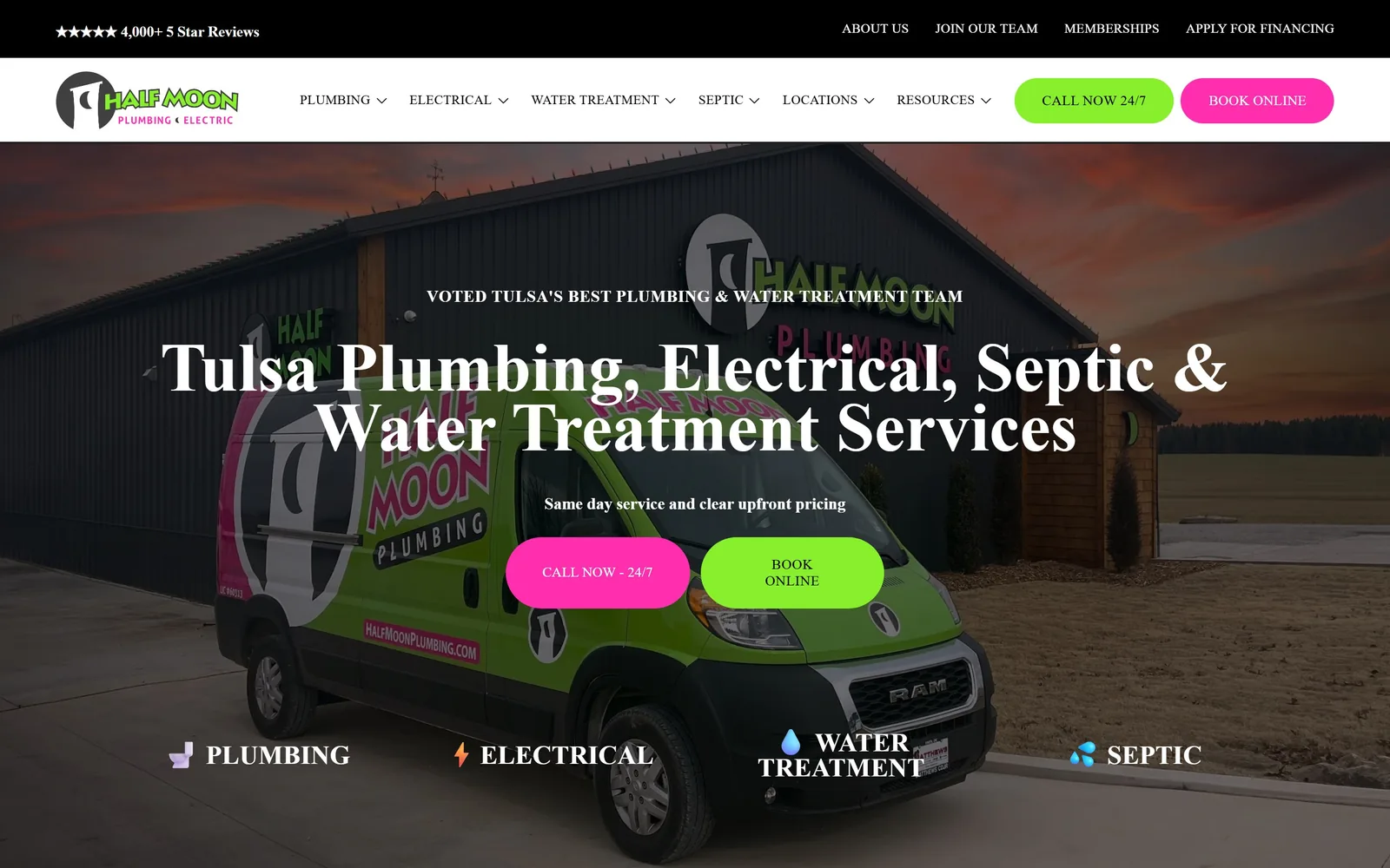
A near-black dusk photograph, the headline in a high-contrast serif, with magenta and lime doing all the colour work.
Type
High-contrast display serif, about 71px
Body
Poppins 17px light, Oswald for nav and buttons
Build
Full-bleed dusk photograph, paired pill buttons, very generous section spacing
Made on
Squarespace
Colour
#000000 #ff2eae #87ef2b
Type. Two lines of white serif sit at roughly 71px with the leading closed right up, tight enough that the words stack into a single block instead of reading as two separate lines. It is a display serif with real contrast in the strokes, which is not what this trade usually reaches for. Everything else gets out of the way: navigation and button labels drop to Oswald at 14px, uppercase, lightly tracked, and body copy is Poppins at 17px in a light weight.
Colour. The page is essentially black and white. Magenta #ff2eae and lime #87ef2b appear on the two pill buttons and almost nowhere else, which is the whole trick. Both colours come off the van in the photograph behind them, so they read as the company's colours rather than as decoration someone chose in a theme panel.
Layout. Behind the type is the company's own building at dusk with a liveried van parked outside. Real photography, not stock, and it is doing a lot of work here. Sections below breathe more than anything else in this collection, with close to 150px between them.
The ask. Two pills, fully rounded, side by side: call now on the magenta, book online on the lime. Because they are the only saturated things on a black page, the choice between phoning and booking is the brightest decision on screen. A five star review count sits in the bar above the nav, and four service labels run along the bottom of the hero. No popup, no chat widget, no coupon.
Ration your two brightest colours to the two buttons, put everything else in black and white, and you will never have to wonder whether the call to action is visible.
02
texasqualityplumbing.com
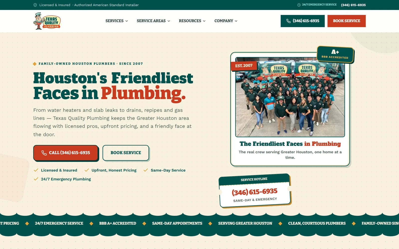
Warm cream ground, a heavy slab serif in deep teal, and a crew photograph framed like something off a tin sign.
Type
Bitter 900 at 62px, Alfa Slab One at 51px
Body
Work Sans 18px
Build
Two column hero, copy left and framed crew photo right, scalloped divider
Made on
HydraOS (CI Web Group)
Colour
#f8f1de #00514d #c93b21
Type. Bitter does the shouting, set at 62px in its heaviest weight and pulled slightly tight. The line lands on the word 'Plumbing.' in rust red while the rest stays deep teal, which is a cheap trick that works. Work Sans at 18px handles the reading copy underneath, quiet enough to let the serif stay loud, and Alfa Slab One turns up at 51px on the photo caption as a second display voice.
Colour. Cream #f8f1de is the ground, and nearly everything sits on it. Deep teal #00514d carries the headline and the filled button, rust #c93b21 picks out one word and the phone number, and amber #e3a23a shows up only in the little diamond dividers. Four colours, each with a job.
Layout. Copy on the left, crew photograph on the right, roughly a 55/45 split with a comfortable gutter. The photo is framed like a card with an 'EST. 2007' tab and a BBB badge pinned to its corners, and a scalloped teal divider closes the first screen with a ticker of proof points running through it. That is a lot of ornament, and it holds together because the period styling is consistent.
The ask. A filled red call button and an outlined teal booking button, both square cornered, with the phone number written into the red one. Beneath them, four short guarantees run as a checklist: licensed, upfront pricing, same day, 24/7. There is also a separate 'service hotline' card lower in the hero repeating the number, which is one repetition too many.
Period styling needs real assets behind it, so book the crew photograph and draw the mascot before you commit to the slab serif, or it collapses into costume.
03
andersenplumbing.com
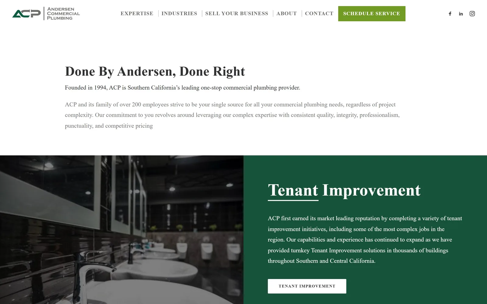
No hero image at all, just a serif line, three paragraphs of grey text and a great deal of white space.
Type
Serif headline, about 40px
Body
Serif body at 18px, loose leading
Build
No hero image, text opening, then a half photo half colour split band
Made on
WordPress
Colour
#ffffff #165339 #719b25
Type. A serif headline, black on white, at around 40px, and then paragraphs at 18px on a loose line height. That is the entire first screen. The restraint is the argument: this reads like a professional services firm, not a contractor, and for tenant improvement work that is exactly the right signal to send.
Colour. White, then forest green #165339 when the split band arrives, photograph on one half and flat green on the other carrying a white serif heading with a rule beneath it. Olive #719b25 appears on the single scheduling button in the header and is never used again.
Layout. Skipping the hero photograph is the bravest decision in this collection. The page opens on words, drops into an image and colour split, and finishes quickly; it is the shortest page here by some distance. Secondary buttons are white outlines with their labels tracked well out, which keeps them calm next to the long serif headings.
The ask. One green button in the header and nothing else above the fold. No phone number, no form, no chat. For a two hundred person commercial outfit that is a defensible call, since the buyer is researching rather than panicking about a burst pipe, but it would be wrong for any residential business.
If your buyer reads a proposal before they call anyone, you can open on a sentence instead of a stock photo and lose nothing.
04
quixservice.com
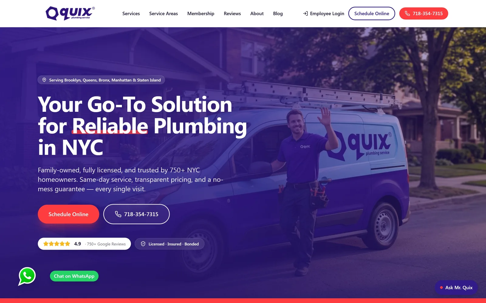
A deep violet wash over a technician mid-wave, with one red button as the only warm thing on screen.
Type
Bold geometric sans at 64px, tight tracking
Body
Sans at 20px
Build
Full-bleed violet gradient over photography, two column content below
Colour
#311b88 #ff3d40 #ffffff
Type. The headline is one solid white mass: a bold geometric sans at 64px, tracked in tight, leading closed to the point where three lines behave like a paragraph. One word, 'Reliable', gets a short red underscore. That is the only typographic flourish anywhere on the page and it does not need another.
Colour. Violet #311b88 is laid over the photograph as a gradient, deep enough that white type holds without any extra scrim. Red #ff3d40 sits on the booking pill and nothing else competes with it. Nobody else in this trade is using violet, which is most of why the page registers.
Layout. Behind the wash, a technician waves beside a branded van, shot on a real street. Supporting copy runs at 20px and names the things people actually worry about: same day service, transparent pricing, no mess. Content further down organises on clean two column splits.
The ask. A red pill to book online, a white outlined pill carrying the phone number, and immediately below them two small chips holding a 4.9 rating and the licensing. Proof is on the first screen without a wall of badges, which is rare. A WhatsApp bubble and a small 'Ask Mr. Quix' tab sit in the bottom corners, close to the edge but clear of the headline.
Find the colour your competitors are not using, commit to it across the whole hero, and a single hot accent will carry the button.
05
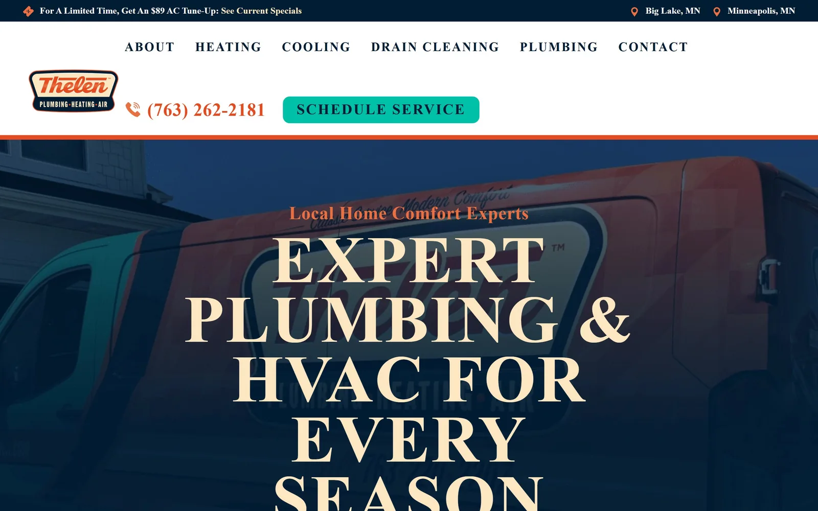
callthelen.com
Cream capitals in a high-contrast serif, set so large the headline runs off the bottom of the screen.
Type
Fairweather 117px, uppercase
Body
Acumin Pro Semi Condensed 20px
Build
Oversized type over a dark vehicle photograph, cream ground below
Made on
WordPress (YOOtheme)
Colour
#fce7c2 #001d34 #00c0a7
Type. Fairweather at 117px, all capitals, heaviest weight, leading pulled under the line height so the rows almost touch. Scale is the entire idea. The line is deliberately too big for the screen and runs past the fold, which turns reading it into scrolling. At smaller sizes the same serif gets tracked out enormously and starts behaving like a label rather than a headline, which is a smart way to get two voices from one font.
Colour. Cream #fce7c2 does double duty: it is the colour of the hero type and then becomes the page ground below. Navy #001d34 sits behind, orange from the retro badge logo carries the eyebrow line, and teal #00c0a7 is held back entirely for the scheduling button.
Layout. The hero photograph is the company's own vans, dark enough to take cream type cleanly. Body copy switches to Acumin Pro Semi Condensed at 20px, narrow enough to sit under that wide serif without arguing with it.
The ask. One teal button in the header, 'Schedule Service', with the phone number in orange beside it. A promotional strip across the very top carries an $89 tune-up offer, and the two locations sit at the other end. It is a light touch for a four trade business, and it works because the teal is the only cool bright colour on the page.
One display face pushed to an uncomfortable size will beat three safe ones, as long as you keep the rest of the page quiet enough to carry it.
06
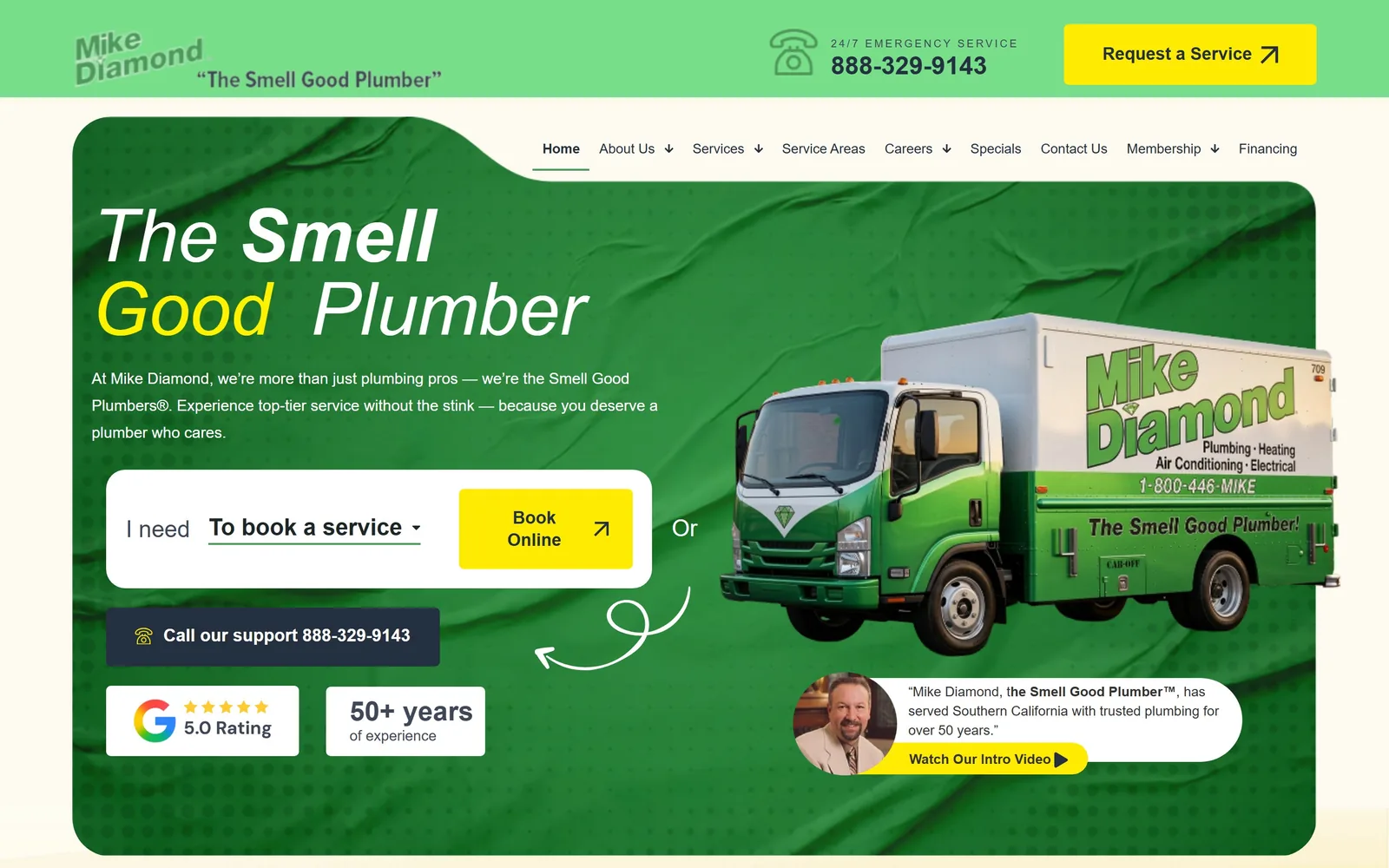
mikediamondservices.com
One headline set in three different fonts, and a booking dropdown placed where the hero image usually goes.
Type
TT Commons Pro at 76px, mixed weights, with Timberline for one word
Body
TT Commons Pro 16px
Build
Rounded green panel floating on cream, truck cutout, booking dropdown in the hero
Made on
WordPress
Colour
#fdfbf1 #78de8a #ffeb03
Type. Three typefaces, one line, all at 76px. A thin weight for 'The', a bold for 'Smell', a brush face for the yellow word, then back to thin for 'Plumber'. It should be a mess. It is not, because the mixing follows the sense of the phrase rather than decorating it, and the company has been saying that phrase on the radio for decades.
Colour. A green panel, mint over a deeper green, sits on a cream ground. Yellow #ffeb03 is reserved for the booking button and the navy #242f3f for the support bar underneath it. Green is the truck, so again the palette comes off the vehicles rather than out of a theme.
Layout. The green panel has generous rounded corners and floats on the cream, with a cutout of the box truck pushing into it from the right. A founder portrait and quote anchor the bottom corner. The page runs very long below this, with tight spacing between sections.
The ask. Instead of a plain button, the middle of the hero holds a white card containing the sentence 'I need [to book a service]' as a working dropdown with the yellow button attached to it. The first interaction is a choice, not a click, which is a genuinely better idea than a form. A dark support bar with the phone number sits underneath, a Google 5.0 chip and a '50+ years' chip beside it, and a hand-drawn arrow points from the card to the truck.
If you own a phrase people already repeat, make it the hero and build the booking control into the same frame rather than parking it below.
07
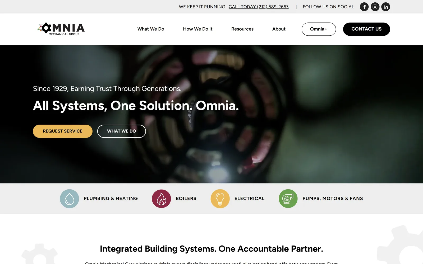
omniagroup.nyc
A dark video still of machinery, a flat white nav above it, and four coloured discipline markers directly beneath.
Type
Figtree 800 at 45px
Body
Figtree 16px
Build
Video hero, discipline markers beneath, three column content with a wider middle
Made on
HubSpot
Colour
#111111 #ecb959 #ffffff
Type. Figtree handles everything, which is unusual and works out fine. The headline sits at 45px in a heavy weight over a lighter 24px line reading 'Since 1929, Earning Trust Through Generations.' No second typeface, no display face, just weight doing the separation.
Colour. Black, white and a pale grey, then gold #ecb959 on the primary button. The four discipline markers below the hero each get their own colour, which is the only place the page lets itself spread out.
Layout. A video of machinery in close up runs behind the type, dark and shallow enough that white text holds without a scrim. Underneath, a pale band carries four captioned circles for plumbing and heating, boilers, electrical and pumps. The content below sits on a three column structure with a wider middle.
The ask. A gold pill to request service, a white outlined pill to read about the work, and the phone number in the strip above the navigation. The four discipline markers are the real conversion device: a building manager arrives wanting to know whether you cover their problem, and the answer is there before any scrolling. No chat, no form in the hero, nothing asking for an email.
When you cover several trades, name all of them in the first screen, because the visitor is checking coverage long before they are judging your taste.
08
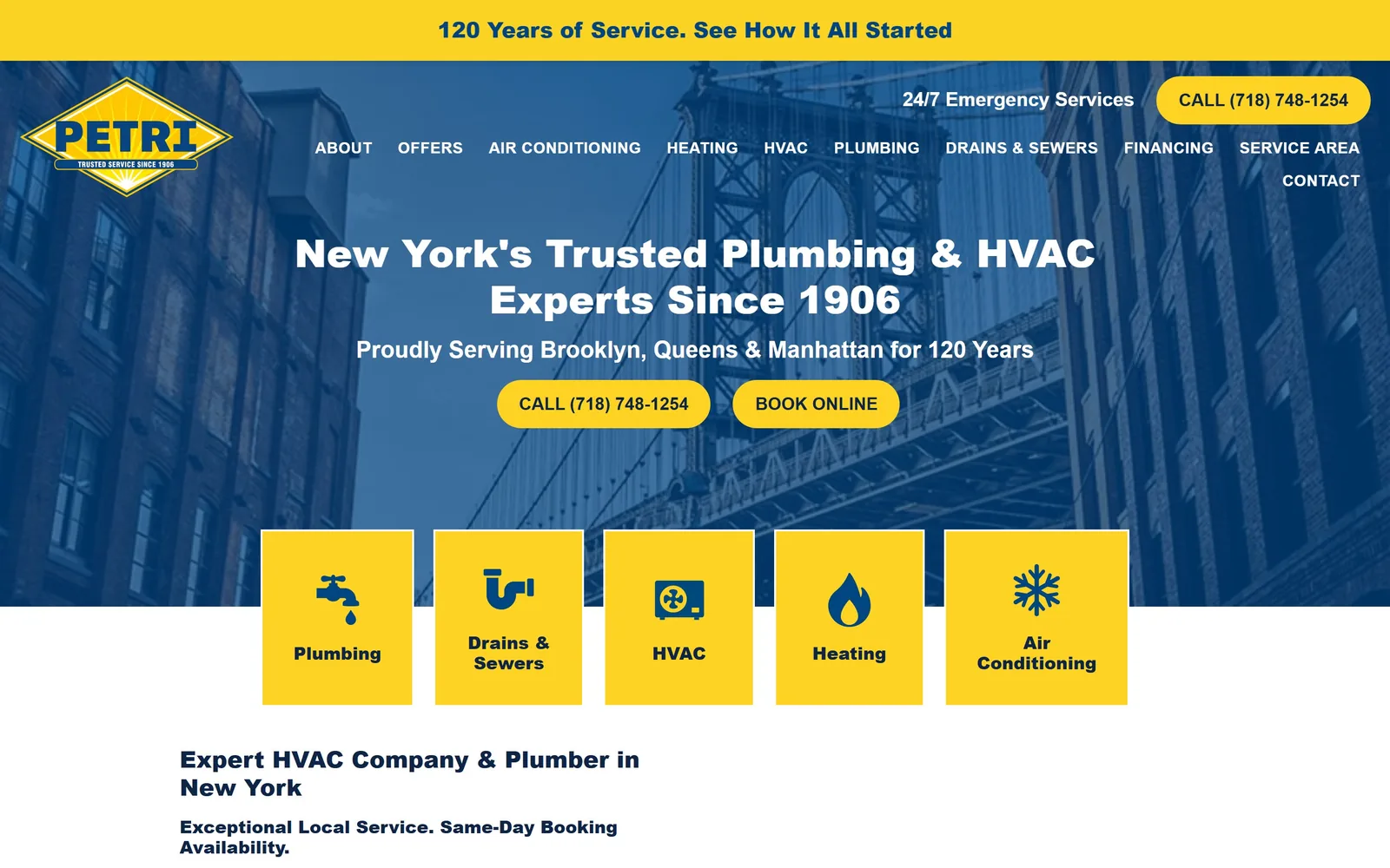
petriplumbing.com
Navy over a bridge photograph, saturated yellow on the bar and buttons, five tiles cut into the hero edge.
Type
Merel 900 at 40px
Body
Soleil 16px
Build
Navy hero over city photography, five service tiles overlapping the lower edge
Made on
WordPress
Colour
#004483 #fed324
Type. Merel sets the headline at 40px in its heaviest weight, white on navy, with the 1906 founding date written into the sentence rather than parked in a badge. Soleil handles body copy at 16px. Nav labels sit in Merel, uppercase and lightly tracked, and there are too many of them: thirteen items wrap onto a second line and crowd the corner.
Colour. Navy #004483 and yellow #fed324, and a great deal of the yellow. It runs through the announcement bar, both pills and five service tiles. Subtle it is not, but the contrast is strong and the brand is unmistakably consistent from the diamond logo outward.
Layout. The best move is at the bottom edge of the hero, where five yellow service tiles overlap the photograph and break the boundary. Plumbing, drains and sewers, HVAC, heating, air conditioning, each with an icon. That turns the most common visitor question into navigation instead of decoration.
The ask. Two yellow pills in the hero, call and book online, with the phone number repeated in the header and a 24/7 emergency line above it. The announcement bar at the very top sells the 120 year story rather than a discount, which is a better use of that strip than most sites manage. The five tiles then catch anyone who did not want either button.
Overlap your service tiles onto the hero so the first thing a visitor can click is the thing they came looking for.
09
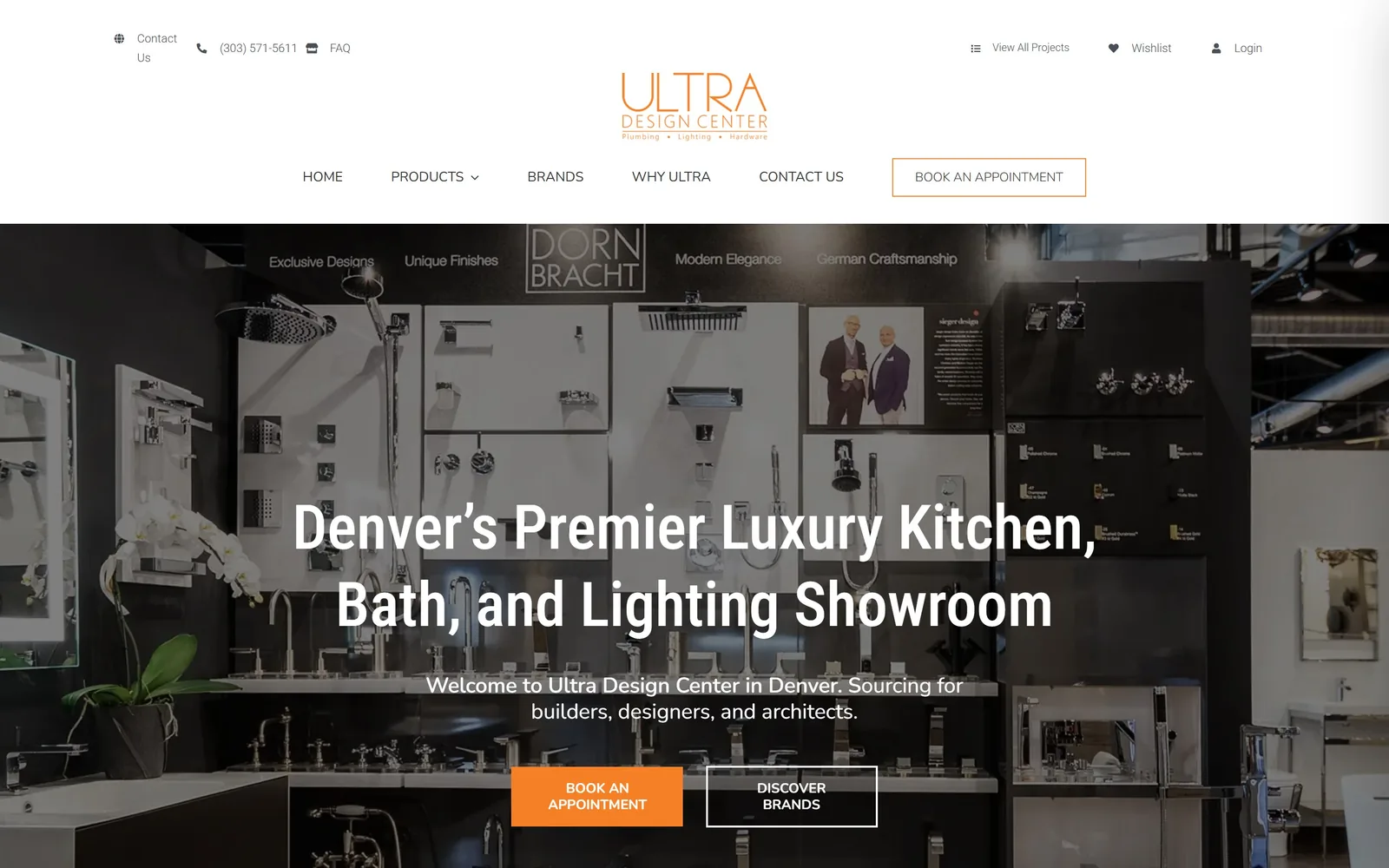
ultradesigncenter.com
A dark showroom wall of fixtures, with the type kept deliberately quiet so the product does the selling.
Type
Roboto Condensed 64px, medium weight
Body
Nunito 22px
Build
Dark showroom photography running nearly full width, small centred navigation
Made on
WordPress
Colour
#181d27 #f58025 #ffffff
Type. Roboto Condensed at 64px in a medium weight, not a bold. That single decision is why the page feels expensive rather than loud. Nunito at 22px carries one supporting line naming builders, designers and architects, which filters the audience in a sentence.
Colour. The photograph supplies most of the colour, all dark metal and shadow. Orange #f58025 appears on the wordmark and the appointment button and stops there.
Layout. The hero is the showroom's own Dornbracht wall, shot dark, with the brand names already legible in the image behind the words. Navigation stays centred and small while the photograph runs nearly edge to edge. For a fixtures showroom this hierarchy is correct, since nobody books an appointment because of a heading.
The ask. A square orange button to book an appointment, a white outlined one to browse brands. Appointment first, browsing second, which matches how a showroom actually earns money. A wishlist and a login sit in the top bar for trade customers, quietly, without cluttering the main path.
When the product is the reason anyone visits, spend the money on photography and let the typography stay out of its way.
10
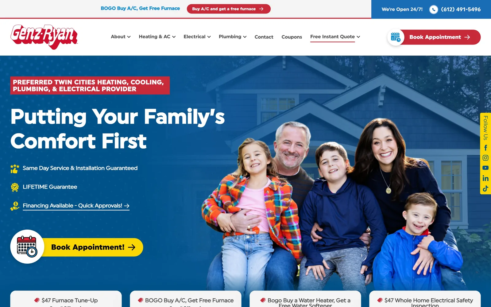
genzryan.com
A family on a porch, a red eyebrow tab, a yellow booking button and a row of coupons underneath.
Type
Uniform Bold 60px
Body
Uniform 16px
Build
Copy left, family photograph right, coupon cards below the fold
Made on
WordPress
Colour
#005289 #c92a39 #fad604
Type. Uniform Bold runs the headline at 60px in white, stepping down through 50, 36 and 28 for the levels below. The hierarchy is properly spaced and the licensed family lifts it above the usual system stack. There is nothing here you have not seen before, but it is set carefully.
Colour. Blue #005289 across the hero, red #c92a39 on a small eyebrow tab, yellow #fad604 on the booking pill. Conventional trade colours, handled without muddying them.
Layout. Copy left, family photograph right, three benefit lines with gold icons stacked between the headline and the button. Coupon cards start immediately below the fold. This is the category default executed tidily rather than a design with a point of view, and it earns its place here as the baseline the bolder pages are judged against.
The ask. A yellow pill with a calendar badge overlapping it, which signals scheduling rather than a phone call, plus the number and a 24/7 note in the bar above. Underneath, four coupon cards: furnace tune-up, free furnace with an air conditioner, and so on. That is honest about how the business converts, though the offers crowd the page quickly and a social rail clings to the right edge.
Conventional is a legitimate choice when it is this clean, but be clear-eyed that nothing here will make anyone remember you tomorrow.
11
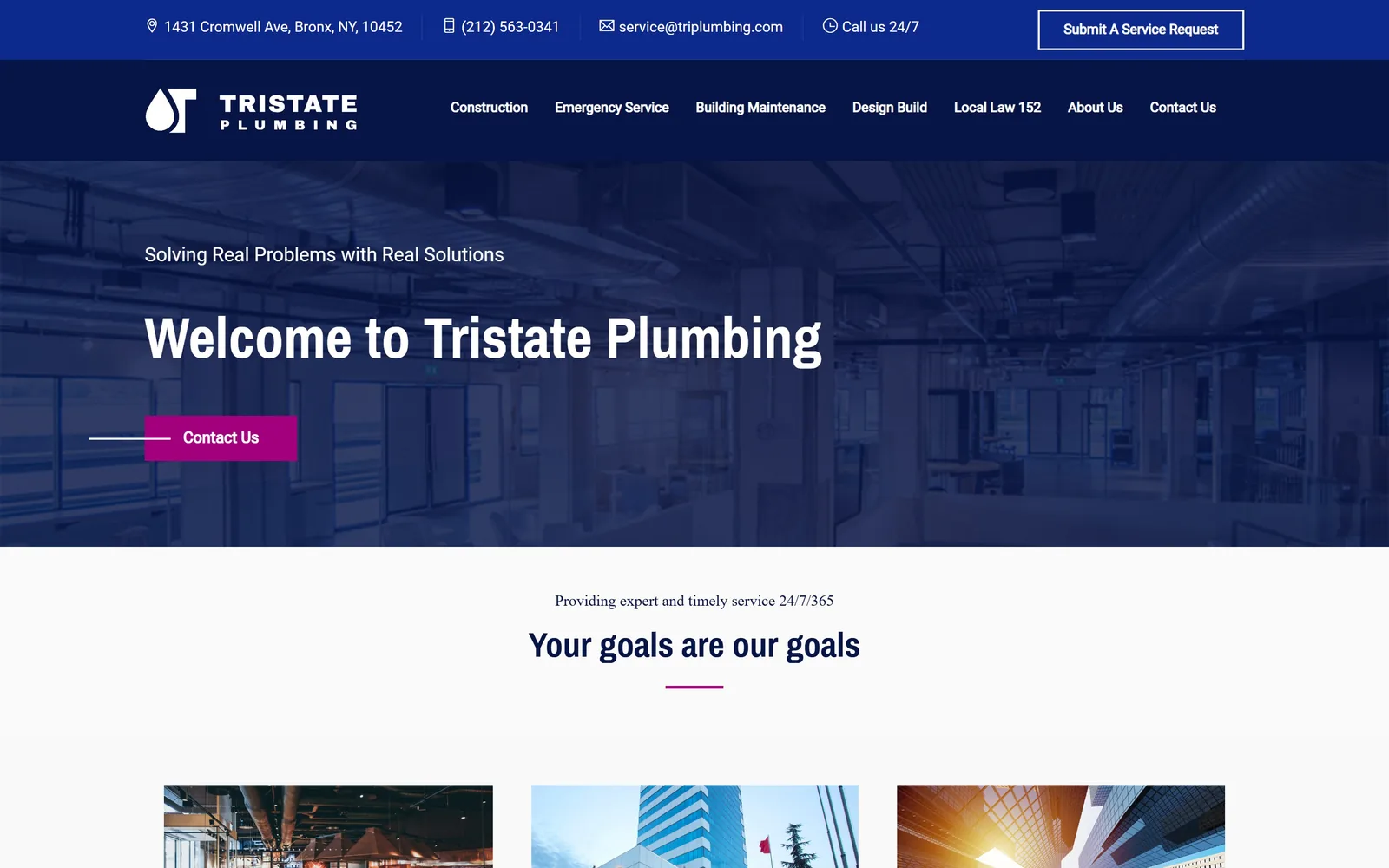
triplumbing.com
Navy over a pale shot of exposed pipework, with magenta picking out the one button worth pressing.
Type
Archivo Narrow Bold 60px
Body
Roboto 16px
Build
Narrow centred measure, navy header over a faded interior photograph
Made on
WordPress
Colour
#071546 #a2007c #fafafa
Type. Archivo Narrow Bold at 60px, white, with the positioning line 'Solving Real Problems with Real Solutions' sitting above it at 20px. The problem is what the headline then says: 'Welcome to Tristate Plumbing' wastes the largest type on the page on a greeting, when the smaller line above it is the better sentence. Swap the two and this hero improves immediately.
Colour. Navy #071546 holds the header against near-white grounds, and the accent is an unexpected magenta #a2007c. It turns up on the contact button and again as a short rule under the next heading. Magenta against navy is a genuinely good pairing and it is the most interesting thing on the page.
Layout. The content sits in a notably narrow measure, well in from the edges, which gives the commercial copy a comfortable reading width and keeps the page feeling considered. The hero photograph of exposed ceiling services is faded so far back that it adds very little; a stronger image would cost nothing.
The ask. One square magenta button, with a thin white rule running into its left edge to point at it without shouting. The top strip carries the address, phone, email and a 'submit a service request' button, which is the right set for building owners. Local Law 152 sitting in the main navigation is a sharper piece of targeting than anything in the hero, since any New York building manager searching that term knows exactly what it means.
Spend your largest type on what you do, never on a welcome, because that line is the only one a commercial buyer is guaranteed to read.
12
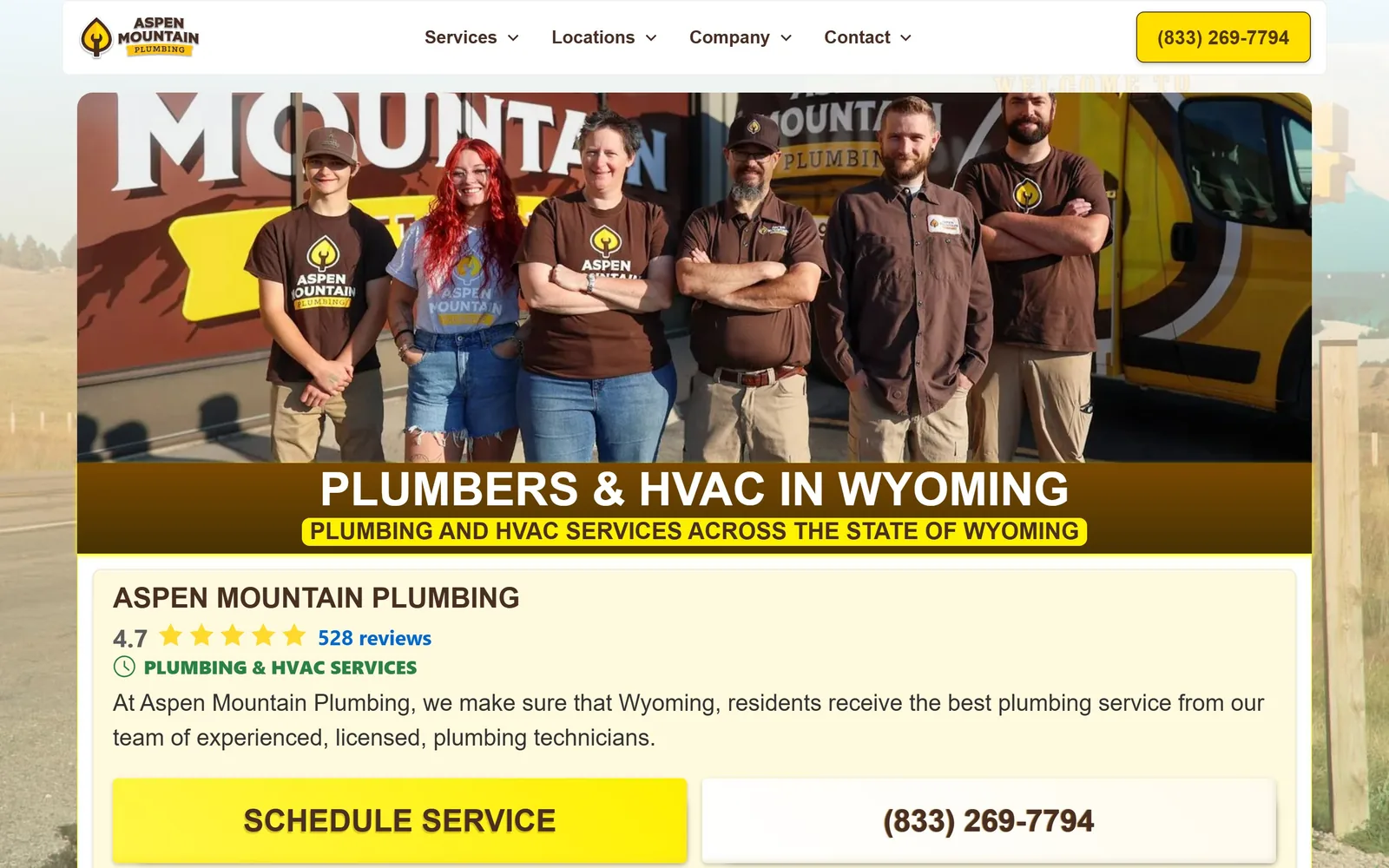
aspenmtnplumbing.com
A Wyoming crew photographed in front of their own van, in brown and gold instead of the usual trade blue.
Type
Vista Slab 48px, uppercase
Body
Vista Slab 24px
Build
Full-width crew photograph with a brown caption band, cream information card beneath
Colour
#3f2e28 #fff9dd #ffde00
Type. Vista Slab carries the headline at 48px, uppercase and white, sitting in a brown band laid across the bottom of the photograph. The same slab runs through the navigation and the body copy at 24px, so the page speaks in one voice throughout. Under the headline the subtitle gets a yellow highlight behind it, a marker pen effect that is the first clue this page is older than it first looks.
Colour. Brown #3f2e28 and a pale cream #fff9dd carry the page, with yellow #ffde00 on the button and the logo mark. The palette is lifted straight off the vans and the shirts in the photograph. Nobody else in this collection is using brown, and it reads as Wyoming rather than as a colour picked from a theme panel.
Layout. A full-width crew photograph opens the page, captioned by the brown band rather than having type floated over it, which keeps every face readable. Below sits a cream card holding the rating, a short paragraph and the two buttons. That card looks like an embedded business listing dropped into the page rather than part of it, and it flattens the hierarchy just when the page needs to build one.
The ask. Schedule Service in yellow and the phone number in an outlined button, side by side and both generously sized, with the star rating and review count directly above them so the proof sits next to the action. The yellow button carries a bevel and a drop shadow, which dates it more than anything else here; flat would cost nothing. Service areas and Wyoming counties are listed in full further down, which for a company covering a whole state is the right call.
Take your palette off your own vans and you will stand apart from every blue competitor in the county, but lose the bevels, because one dated button undercuts good photography.
How these were chosen
Twelve plumbing companies who got their websites right, and the reasons why. Some run one van, some put two hundred people on commercial jobs, and the good ideas travel in both directions. If you are about to pay for plumbing website design, these are the pages to put in front of whoever you hire.
Finding plumbing sites that someone had actually designed took far longer than it should have. 28 candidates made the shortlist. 12 made the page.
Each one was opened and looked at properly: what the type is doing, where the colour gets spent, how the page is built, how it asks for the job. Nothing is here because it ranks. Nothing is here because an agency filed it under portfolio. Several well known names were left out for the plain reason that their site came out of the same template as everyone else's, and a few sites worth including did not survive a second look.
Where a site is only competent, it says so. The order is the order worth your time, best first.
Reviewed and selected by Larry W. Matthews for Websitely.