Residential electrical is close to a design vacuum. Sixteen battery, lighting and EV firms whose electrician website design is worth stealing from.
Shown
16 sites
Reviewed
34 candidates
Chosen on
The work, not the ranking
Updated
15 October 2026
01
blocpower.io
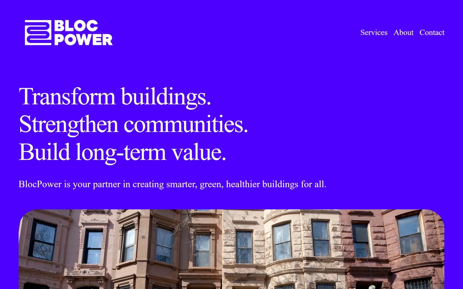
An electric violet field with a serif headline, and not a bolt, spark or safety vest anywhere on it.
Type
Serif, about 77px
Body
Inter
Build
single column on a full bleed colour field
Made on
Squarespace
Colour
#4B10F0 #FFFFFF
Type. The headline is a serif, around 77px, three lines stacked tight and ranged left. A serif on a building retrofit site is a provocation; it reads closer to a university press than a contractor. The line beneath runs about 30px, unusually large for a subhead, and stays in the same family so nothing competes.
Colour. One colour does nearly all the work: a saturated violet near #4B10F0, poured edge to edge behind white type. No secondary accent, no gradient. When the brownstone photograph rises from the bottom the violet frames it like a mount, which makes an ordinary street elevation look curated.
Layout. Three lines of headline, one of subhead, then a photograph with rounded top corners pushing up from the lower edge. The navigation is three words. Everything else has been removed and the nerve of that is the entire first impression.
The ask. No form, no phone number, no quote button above the fold, which for most contractors would be a mistake. BlocPower sells to building owners and city agencies across long cycles, so credibility is the conversion event. Copy this only if your buyer is making a six figure decision.
If you are the only firm in your category willing to use one loud colour and nothing else, you stop being compared on price.
02
revisionenergy.com
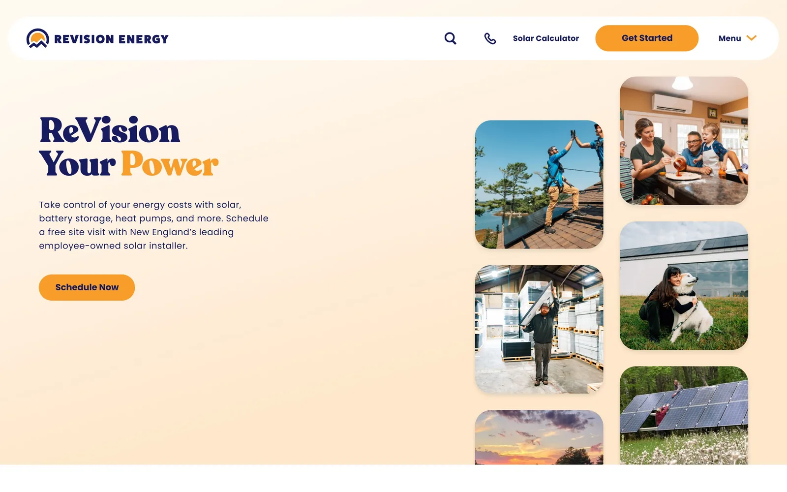
Navy slab serif on apricot, one word flipped to amber, and a staggered mosaic of crew photographs down the right.
Type
Slab serif, about 64px
Body
Poppins
Build
copy left, staggered photo mosaic right
Made on
WordPress
Colour
#FBE3CB #1E2A5E #F5A623
Type. A high contrast slab serif sets ReVision Your Power across three short lines, with Power switching to amber so the pun lands without a second sentence explaining it. Body copy drops to a rounded sans around 17px. Two voices, clearly ranked, and the serif is the only one allowed any personality.
Colour. The ground is a soft apricot wash running pale at the top and warmer at the bottom, with navy ink and amber for the button and the accented word. Nobody else in solar is working in peach. It is the single most effective decision on the page because it signals warmth without a stock photo of a smiling family.
Layout. Copy holds the left third, and the right two thirds carry a staggered column of rounded photographs at different heights, scrolling independently. The navigation floats as a white pill rather than sitting flush, which keeps the apricot running behind it.
The ask. Schedule Now sits under four lines of plain explanation, and Get Started repeats in the pill nav alongside a Solar Calculator link and a phone icon. Three ways in, each a different level of commitment. The photographs are of their own crews and customers, which is doing quiet work that testimonials usually do badly.
A warm unexpected ground colour will separate you from your competitors faster than any amount of photography, and it costs nothing to specify.
03
terawattinfrastructure.com
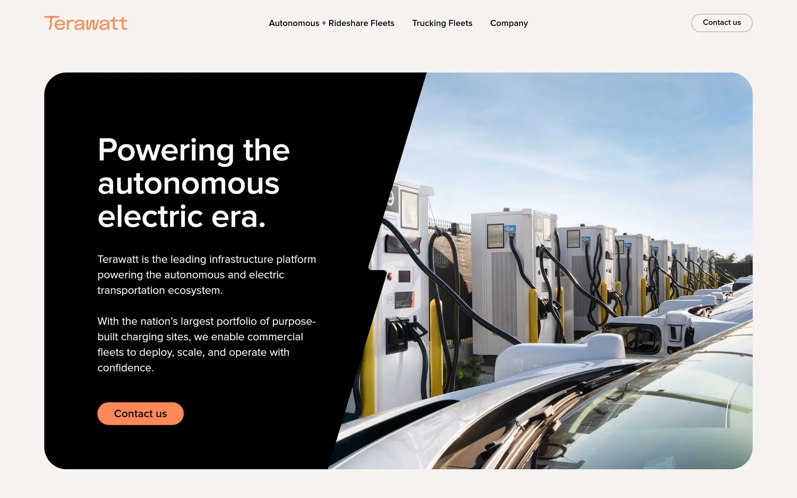
A black card inset on warm grey, split by a diagonal, with a yard of charging posts filling the other half.
Type
Proxima Nova 60px
Body
Proxima Nova
Build
inset rounded hero card split on a diagonal
Made on
Webflow
Colour
#F4F1EE #0A0A0A #FF7A4D
Type. Proxima Nova around 60px, semibold, three short lines with a full stop at the end of the headline. The full stop is doing real work; it makes a claim sound settled. Body copy sits at a modest size in two separate paragraphs rather than one block, which is easier to scan and almost nobody bothers.
Colour. Warm off grey page, near black card, white type, and a coral orange reserved for the wordmark and one button. That coral appears twice and nowhere else. Against the black it reads as a signal rather than a brand colour being enjoyed for its own sake.
Layout. The whole hero is a rounded rectangle floating inside the page with a diagonal cut separating black panel from photograph. Diagonals usually look like a 2015 template; this one survives because it follows the perspective line of the charger row behind it.
The ask. One button, Contact us, repeated in the top right in an outlined version. No form, no calculator, no chat. Terawatt sells charging depots to fleet operators, so the job of the page is to look like an infrastructure company rather than a vendor.
Match the angle of a diagonal cut to a real line inside the photograph and the device stops looking like decoration.
04
palmetto.com
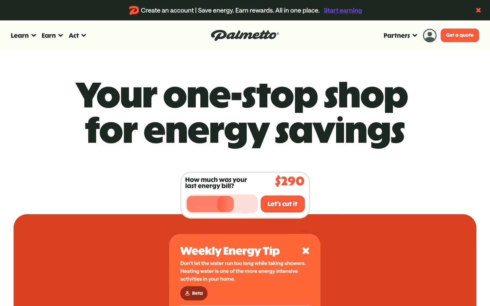
A heavy rounded display face at over 100px in near black on cream, with one hot orange doing all the pointing.
Type
ABC Solar Display 104px
Body
ui-sans-serif 16px
Build
centred single column with an overlapping card
Made on
custom
Colour
#F7F4EC #1A241C #E8431F
Type. ABC Solar Display at roughly 104px, extra bold, two lines locked at a line height of 1. Rounded terminals and tight counters keep it friendly rather than shouty at that size. Navigation drops to a plain 16px sans, which is correct; only one voice gets to be loud.
Colour. Cream ground, a green so dark it passes for black, and an orange red appearing on the logo mark, the quote button, the slider handle and the dollar figure. Nothing else carries colour. That restraint is what makes the orange read as an instruction rather than decoration.
Layout. Centred headline across the full width, then a small bill calculator card floating over the top edge of a large orange panel. The overlap is the only complicated move on the screen and it earns its keep by implying depth.
The ask. The first interactive element is not a form but a slider asking what your last energy bill was. It costs nothing, it is obviously about the visitor, and it produces a number before any contact details are requested. An electrical contractor could run the same pattern with panel age or home square footage.
Lead with a question the customer already knows the answer to and the form stops feeling like a form.
05
lobsintl.com
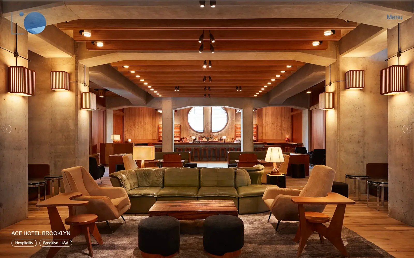
No headline at all: one full bleed photograph of a lit hotel lobby, a project name in the corner, and the word Menu.
Type
Roboto Light 18px
Build
full bleed image slideshow
Colour
#B5793F #1C1A18 #A8C4D8
Type. There is barely any type to judge. A project title in light Roboto caps around 18px, two pill shaped tags beneath it, a Menu link top right. Keeping type this small is a judgement about the visitor, since an architect who recognises an Ace Hotel interior does not need telling what the firm does.
Colour. The palette is whatever the photograph is, which here means warm timber, raw concrete and lamp glow. The only brand colour on screen is a small pale blue circle in the logo mark. A lighting firm letting the light carry the colour is the obvious idea, and obvious is fine when executed this cleanly.
Layout. Edge to edge image, arrows left and right at the vertical centre, caption bottom left, logo top left. It is a slideshow, which usually dates a site badly, and it survives because each slide is one strong photograph rather than a composition with text baked over it.
The ask. Nothing is being converted. No phone number, no contact button, no form. That works for a practice winning work through architects and referral, and it would be malpractice on a site that needs call-outs.
When your work photographs this well, every element you add to the page is subtracting from it.
06
availablelight.com
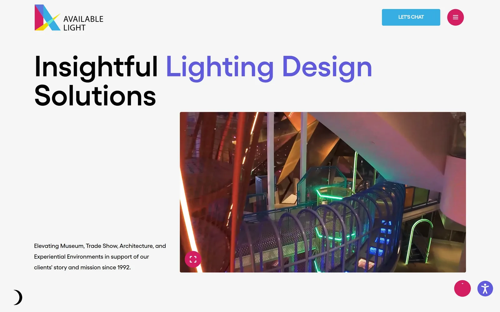
Black and violet geometric sans at 84px on light grey, with a photograph of neon handrails supplying all the colour.
Type
Gellix 84px
Body
Gellix 17px
Build
headline over an asymmetric two part split
Colour
#F2F2F2 #111111 #5B4BE0
Type. Gellix, about 84px, semibold, and the headline switches from black to violet partway through the sentence. Using a colour break instead of a line break is cheap and it works, because the eye lands on Lighting Design. Body copy at 17px gets a very open 1.8 line height, which keeps a short paragraph readable with that much space around it.
Colour. A near white grey ground, black ink, and a violet the logo shares with magenta and cyan. That CMY triangle in the mark is a reference to additive colour, decent thinking for a lighting practice. Green and orange arrive in the photograph, so the page ends up colourful while the layout itself carries almost none.
Layout. Headline across the top two thirds of the width, then a hard split with the supporting paragraph bottom left and the project image bottom right. The large empty block under the headline is the most interesting decision here, and most clients would have asked to fill it.
The ask. A single Let's Chat button top right in cyan, with nothing competing. A dark mode toggle sits bottom left, which tells you the studio treats its site as a product rather than a brochure.
Changing colour mid headline creates hierarchy more cheaply than changing size, and it does not cost you a line break.
07
mecojax.com
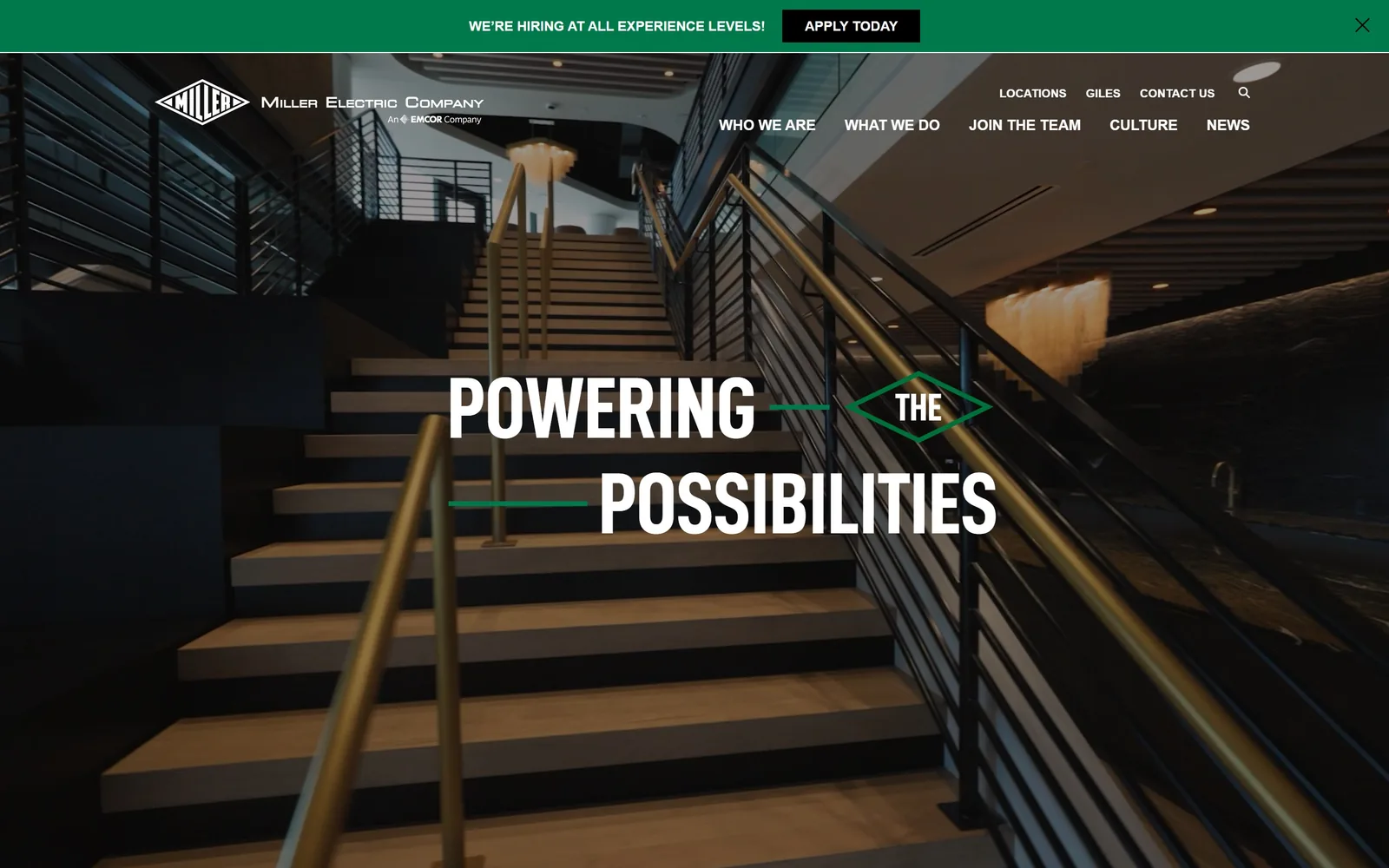
Condensed white capitals broken across two lines by a green diamond holding the word THE.
Type
Condensed grotesque caps, about 72px
Body
Brandon Grotesque
Build
full bleed photograph, centred split headline
Made on
WordPress
Colour
#0F1C17 #00843D #FFFFFF
Type. A heavy condensed grotesque, white, caps, split so that POWERING and POSSIBILITIES sit on separate lines with rules running between them. Dropping the small word into a lozenge instead of letting it sit awkwardly at the end of a line is an old poster trick and it is the best typographic idea among the big contractors here.
Colour. Dark architectural photography, white type, and a green taken straight from the 1928 diamond logo. The green appears only on the rules, the lozenge and the hiring bar. For a five thousand person firm this is a surprisingly tight palette.
Layout. Full bleed interior shot of a lit staircase with the headline centred across it. The navigation breaks into two rows, which is slightly awkward, and the recruitment bar sits above everything in solid green.
The ask. We're hiring at all experience levels, with an Apply Today button, is the first thing on the page, above the logo. Join The Team is in the main navigation. For a contractor this size labour is the constraint and the site is honest about it.
Pull one shape out of your existing logo and use it as a typographic device, and the brand starts doing work the logo alone never could.
08
tillotsondesign.com
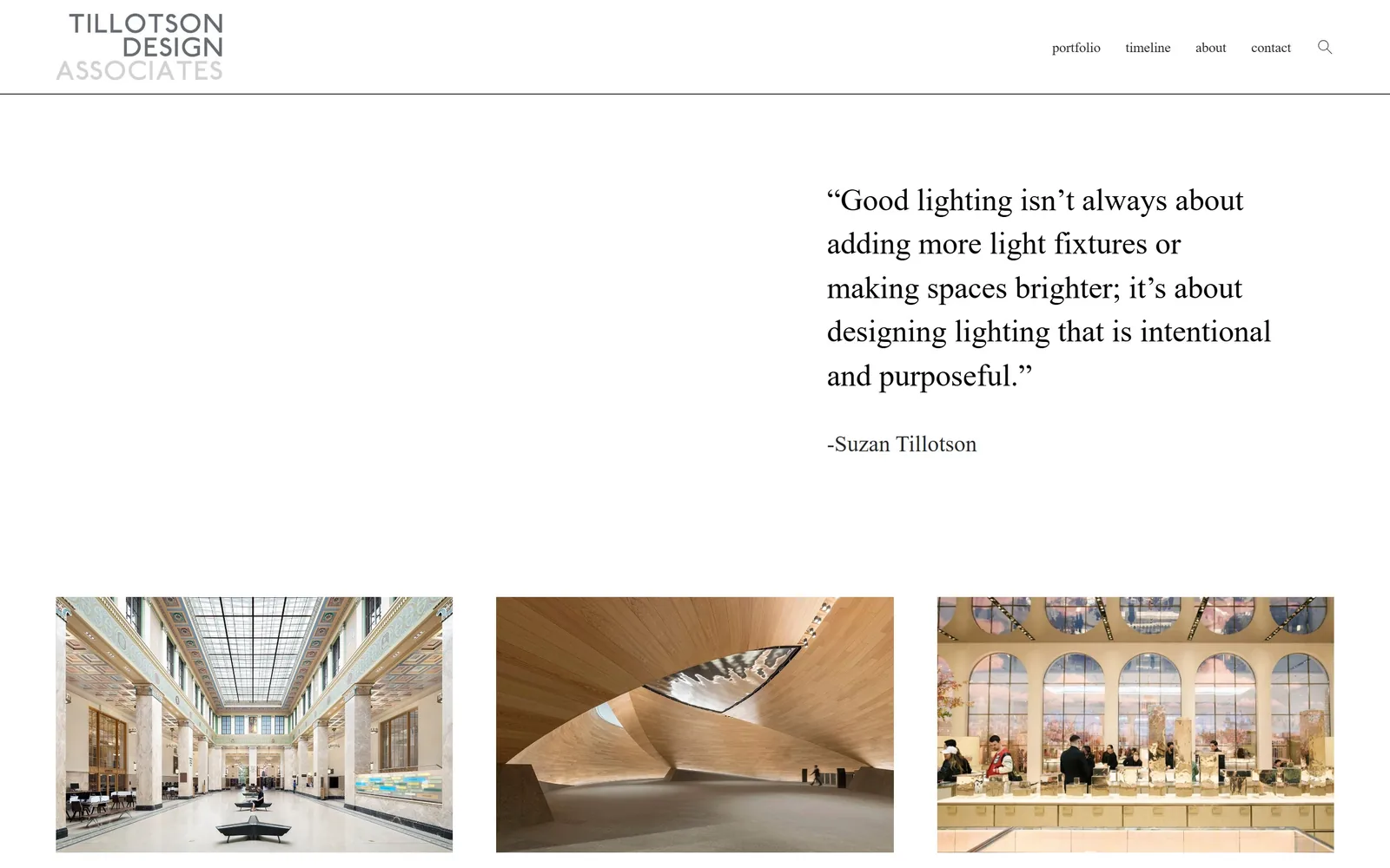
Half the screen is empty. The other half holds a serif pull quote about not adding more light fixtures.
Type
Serif, about 32px
Body
Proxima Nova 14px
Build
asymmetric split, then a three column grid
Made on
Squarespace
Colour
#FFFFFF #1A1A1A #B4B4B4
Type. A transitional serif around 32px, set loose with a generous line height and a soft rag. It reads like a book page rather than a web page, which for a practice whose client list runs MoMA and Lincoln Center is the right register. The wordmark above is letterspaced caps fading from dark grey to pale across its three lines.
Colour. White, black and two greys. That is the whole palette and there is no accent. For a studio that spends its working life on colour temperature, declining to use any colour on its own site is a position rather than an absence.
Layout. A hairline rule under the header, then an asymmetric split with nothing at all on the left and the quote pushed right. Three project images follow in an even grid with equal gaps. That empty left half is doing the job a wide margin does in print.
The ask. Four lowercase nav items and a search icon. No call to action, no form, no phone number. The portfolio grid is the entire pitch.
Leaving half a screen empty signals you are not worried about the next job, which is the most persuasive thing a design practice can say.
09
basepowercompany.com
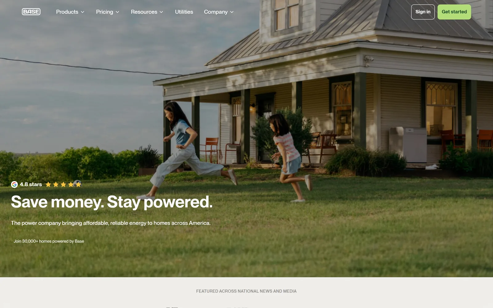
A farmhouse at golden hour, two kids mid sprint, and the headline sitting quietly in the bottom left corner.
Type
PP Neue Montreal 48px
Body
PP Neue Montreal 16px
Build
full bleed photograph, type anchored bottom left
Made on
Webflow
Colour
#FFFFFF #6BBF59 #3C4A2E
Type. PP Neue Montreal at around 48px, semibold, white, both short sentences on one line. That is a small headline by current standards and the smallness is the point: the photograph is the argument and the words are its caption. The 16px nav in the same family keeps the top edge from competing.
Colour. No brand colour appears in the image area at all. Green shows up once, on the Get started button top right, and again as a wash in the band below. Letting a photograph supply the entire palette takes rare nerve for a company selling electricity.
Layout. Full bleed photograph with type anchored bottom left, a Google rating line directly above the headline, and a press logo strip breaking in just below. Nothing is centred, which is most of what keeps it from reading as a template.
The ask. The star rating sits above the headline rather than buried in a testimonials section, so trust arrives before the pitch. One Get started button lives in the nav and is not repeated anywhere on the first screen.
One properly art directed photograph will outperform three stock images and a gradient every time.
10
xealenergy.com
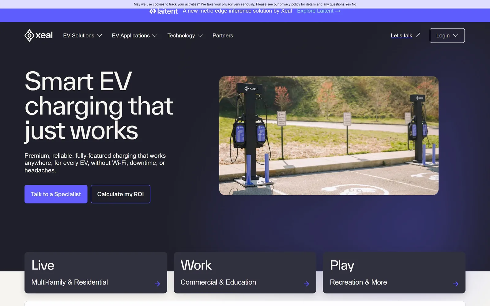
Dark indigo, a light weight sans at 72px, and three flat cards labelled Live, Work and Play.
Type
TWK Everett 72px
Body
Proxima Nova
Build
copy left, image right, three card row across the fold
Made on
custom
Colour
#1B1B35 #FFFFFF #5B4BF5
Type. TWK Everett around 72px at a regular weight, three lines ranged left, with a slightly quirky lowercase g that stops it reading as another default grotesque. Supporting copy drops hard to about 15px, which is a big gap and makes the headline feel larger than it is. Card labels come back up to roughly 30px, so the page has three clear typographic tiers.
Colour. Deep indigo, nearly black at the top and bluer towards the bottom, with white type and a violet confined to one filled button and the card arrows. The photograph of chargers in a car park brings the only natural colour on screen. Dark grounds are common in EV; the discipline of one accent is not.
Layout. Copy left, image right in a rounded frame, then a three card row cutting across the fold onto a white section. That overlap gives the page somewhere to go without resorting to a scroll arrow.
The ask. Two buttons, Talk to a Specialist filled and Calculate my ROI outlined, which is the right order for a product sold to property managers. Live, Work and Play split the audience by building type in three words each. There is a Login in the top right, so the site serves existing customers too.
Segmenting your audience in three words on the first screen saves the visitor a menu hunt and tells them you know who they are.
11
interstates.com
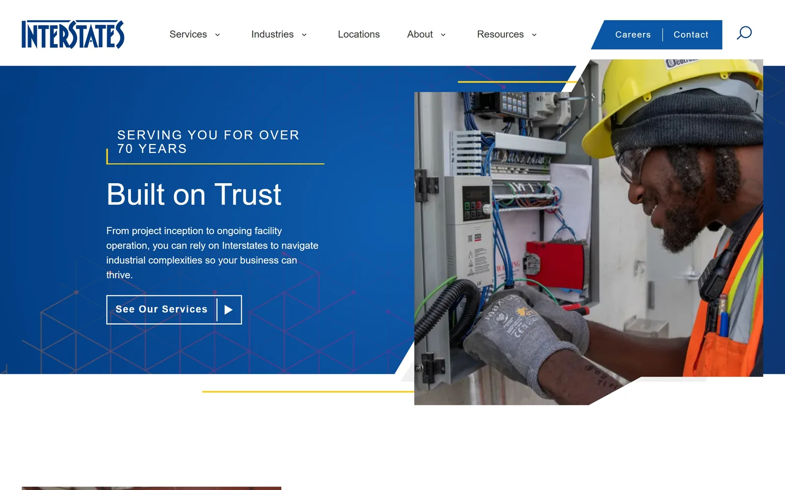
Blue and yellow, the trade's default pairing, rescued by a real photograph of a technician inside a live control panel.
Type
Montserrat 55px
Body
Roboto 18px
Build
split screen, copy left, image right
Colour
#12479E #F2C230 #FFFFFF
Type. Montserrat at about 55px, medium weight, under a letterspaced eyebrow in caps. Body copy switches to Roboto at 18px. Two families where one would have done, and Montserrat is a very common pick, so this is the least distinctive part of an otherwise careful page.
Colour. Deep blue field, yellow hairline rules, white type. This is the exact palette the trade falls back on, and it survives because there is no bolt, no spark and no gradient glow near it. The yellow is used as a rule and an underline rather than a fill, which is what stops it looking like a van wrap.
Layout. Split screen with copy left on blue and the photograph right, the image breaking past the section edge, a faint hexagonal pattern behind the text. The diagonal cut across the bottom of the photo is a dated device, but it is the only one on the screen.
The ask. One outlined button, See Our Services, with a play triangle inside it. Careers and Contact get their own highlighted block in the nav, honest about where an industrial contractor's traffic actually goes. Hiring is the conversion for a firm this size.
You can keep the sector's default colours as long as you refuse every other cliche that normally travels with them.
12
treehouse.pro
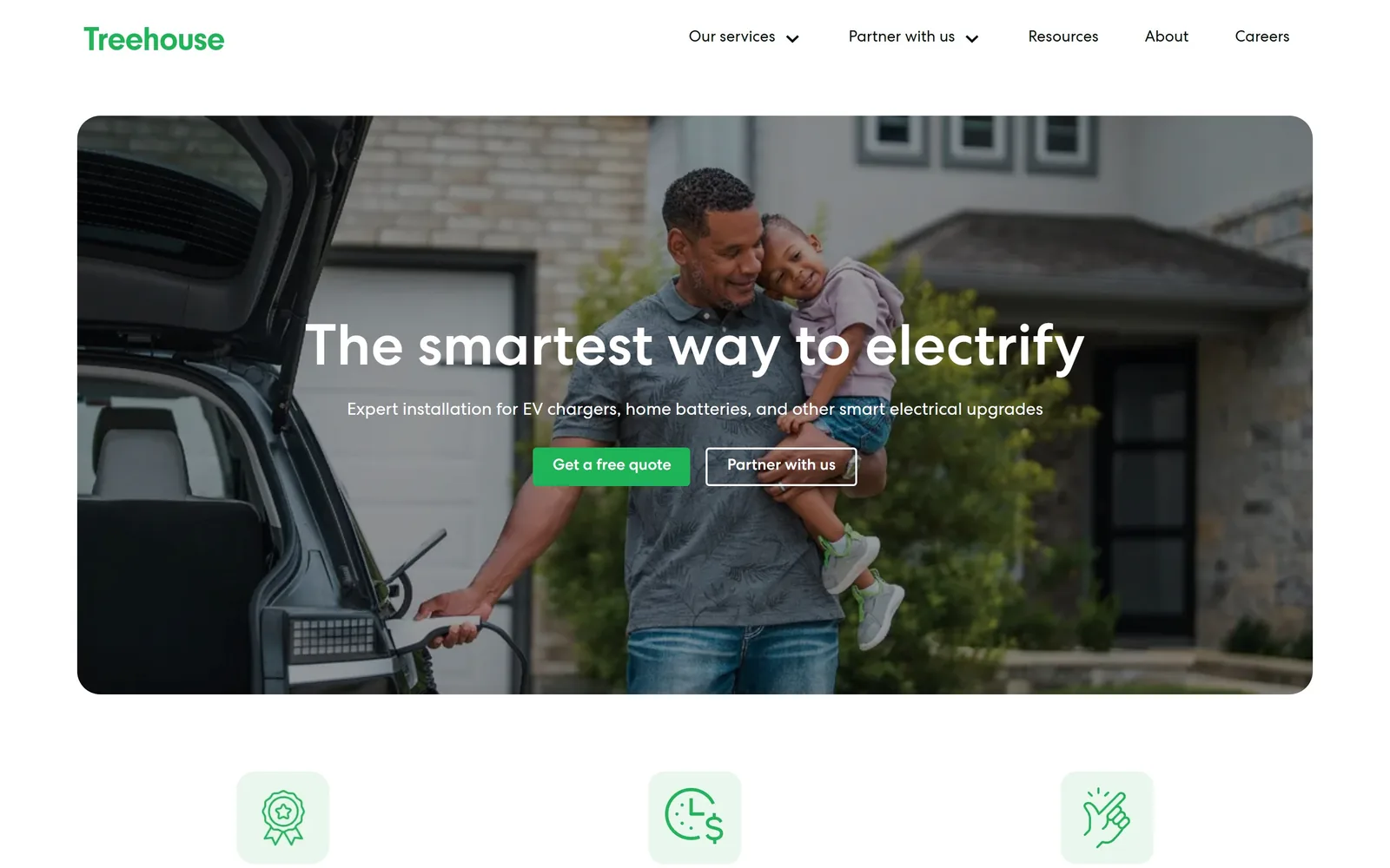
White rounded geometric sans over a father and daughter at an open tailgate, charger in hand.
Type
Centra No2 Medium 60px
Body
Centra No2 18px
Build
inset rounded hero card, three column icon row
Colour
#2DB84C #FFFFFF #1C1C1C
Type. Centra No2 Medium at about 60px with a line height of 1, tight for a single line and useful for holding a headline together over a busy photo. The supporting line drops to 18px. The gap between the two is wide enough that the eye never hesitates about reading order.
Colour. A single green on the wordmark, the primary button and the line icons below, against white and whatever the photograph brings. The second button is a white outline rather than a second colour. One accent, two button weights, no third idea.
Layout. The hero is a rounded rectangle inset from the page edges rather than bled to them, so white frames it on all four sides. That inset is what separates this from every other photo hero in the category, and it costs nothing to copy.
The ask. Two buttons side by side, Get a free quote and Partner with us, addressing homeowner and subcontractor in the same breath. Centred, which is conventional, though the filled primary against the outlined secondary keeps the hierarchy intact. The icon row underneath goes straight to warranty, pricing and workmanship.
Insetting the hero image instead of bleeding it to the edges is the cheapest way to stop looking like a template.
13
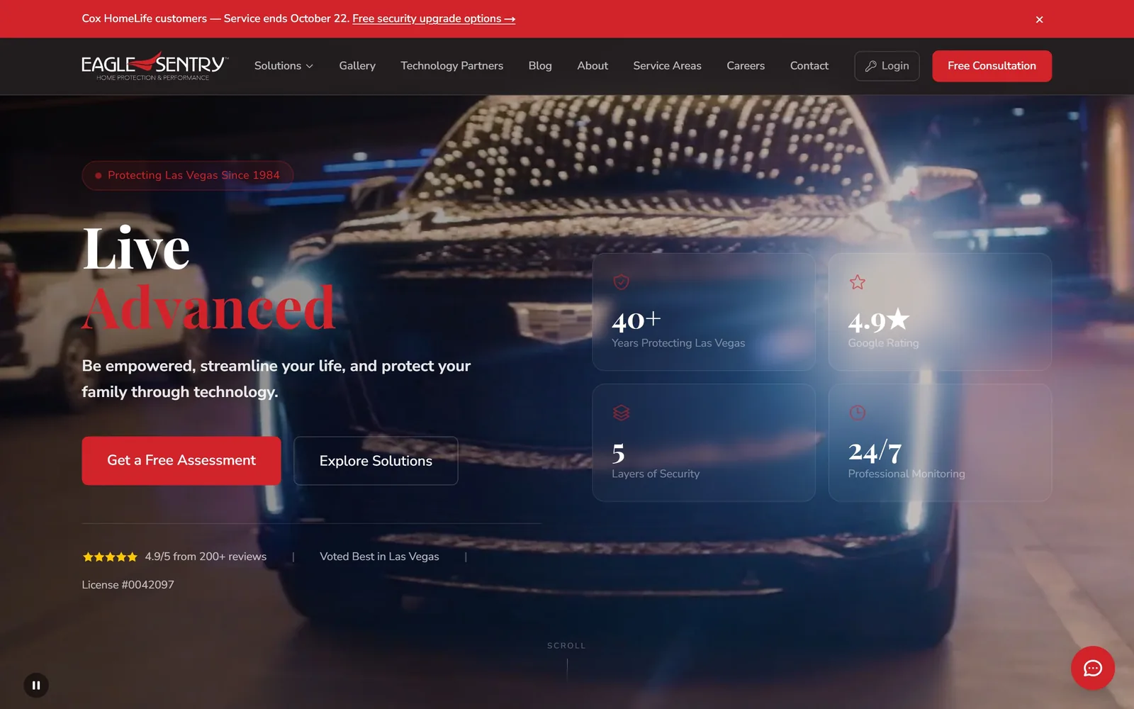
eaglesentry.com
Live in white, Advanced in red serif underneath, over a night shot of a car grille lit by the Strip.
Type
Playfair Display 72px
Body
Nunito Sans
Build
copy left, two by two stat grid right, video behind
Made on
custom
Colour
#0D0D12 #D8232A #FFFFFF
Type. Playfair Display around 72px, bold, with the two words on separate lines and the second in red. A high contrast serif in a security and automation market is unusual and it does lift the page above its competitors. Supporting copy runs in Nunito Sans at a sensible size, so the serif stays a one line event.
Colour. Near black with a single red, used on the second headline word, the primary button, the icons and the promo bar. The photograph is cold blue and amber, so the red reads as the only brand decision on screen. It is a lot of red, and the promotional bar at the top is where it starts to feel like a sale.
Layout. Copy holds the left half, four translucent stat cards sit in a two by two block on the right. Those cards are frosted glass over the video, which is a current device and already looking its age, but the numbers inside them are specific enough to justify it.
The ask. Get a Free Assessment filled, Explore Solutions outlined, with a review score, a Voted Best in Las Vegas line and the licence number stacked beneath. Putting the state licence number on the first screen is a small thing most trades skip and it is worth copying.
Four specific numbers in a grid will always outperform a paragraph claiming you are experienced and trusted.
14
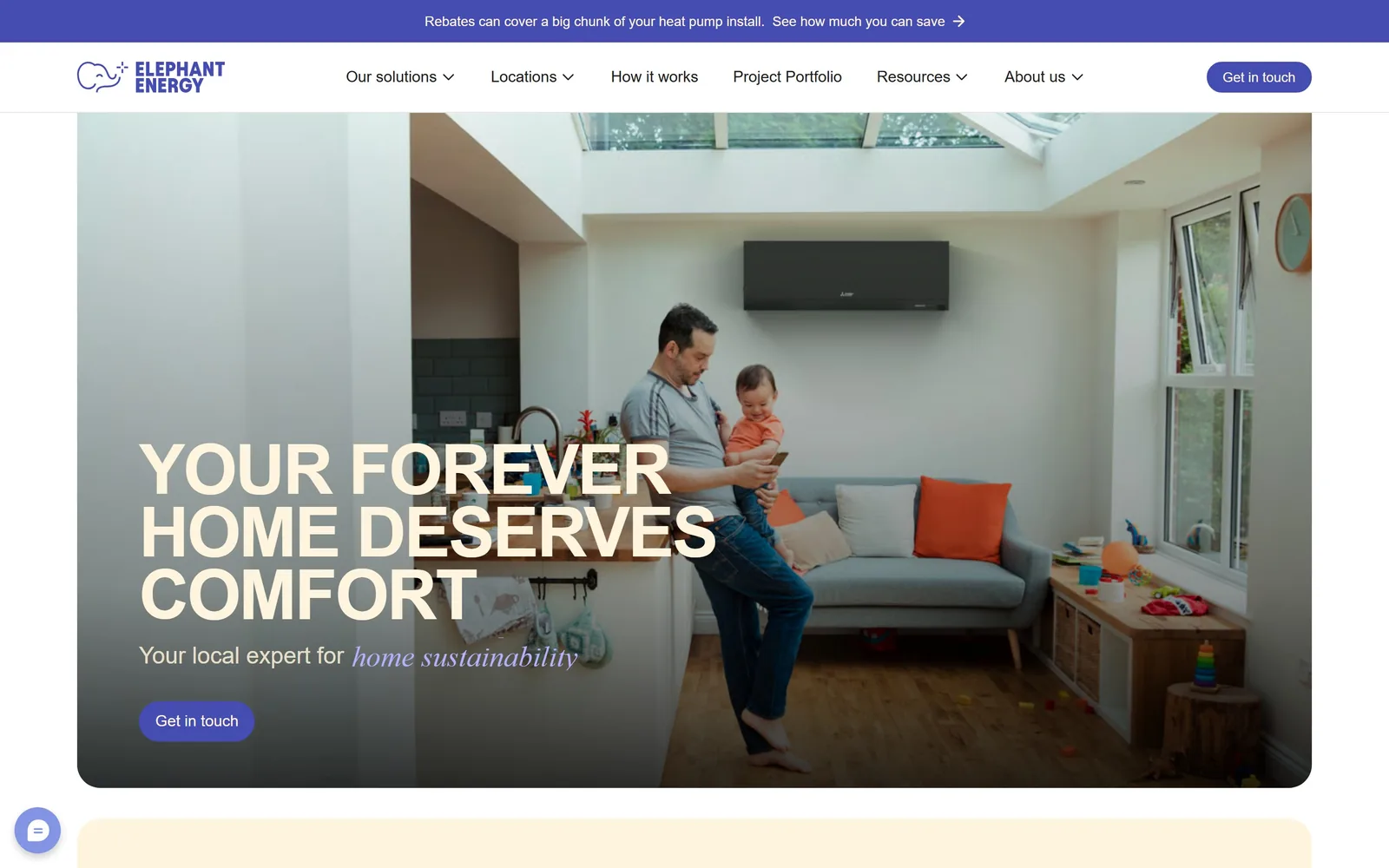
elephantenergy.com
Condensed cream capitals three lines deep over a living room, with an italic serif slipped into the subhead.
Type
Condensed uppercase, about 72px
Body
Poppins 24px
Build
inset rounded hero, type bottom left
Colour
#4A3FBF #F3E6CE #FFFFFF
Type. The headline is a heavy condensed uppercase face at roughly 72px, line height pulled under 1 so the three lines lock into a block. Beneath it the subhead switches mid sentence from upright sans to a violet italic serif for the words home sustainability. That mixed setting is the one genuinely considered typographic moment on the page.
Colour. Cream type and a violet running through the logo, the promo bar, the button and the italic. Violet for a heat pump and solar company is a real decision, held consistently. Where it falls down is contrast: the top line of cream capitals sits against a bright window and most of it disappears.
Layout. Inset rounded hero with type stacked bottom left, a promotional strip above the nav, a pale panel beginning below. Conventional arrangement, tidily executed.
The ask. The promo bar leads with rebates rather than the service, which is the correct instinct in this market. Get in touch appears twice in the same violet, once in the nav and once under the headline. A chat bubble sits in the lower left corner.
One italic serif inside an otherwise plain subhead carries more personality than a whole extra colour, and it takes five minutes.
15
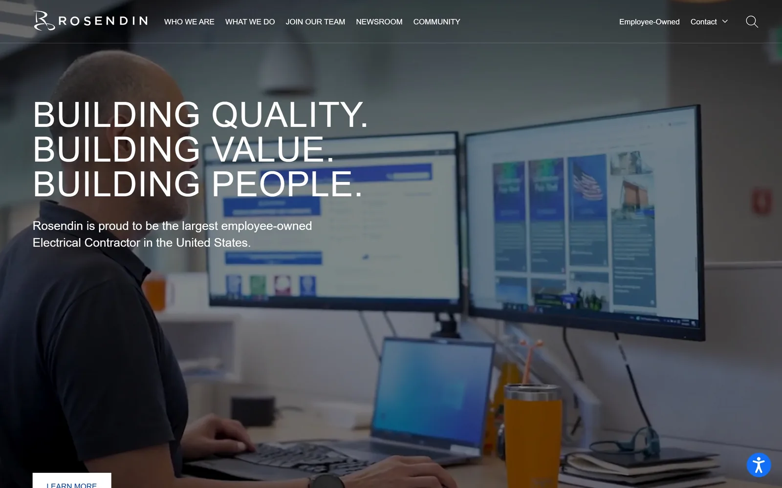
rosendin.com
Three lines of wide light capitals over a desaturated office shot, from the largest employee owned electrical contractor in the country.
Type
Gotham 64px caps
Body
Gotham 22px
Build
full bleed video, type ranged left
Made on
WordPress
Colour
#FFFFFF #3E4650
Type. Gotham at about 64px, medium weight, capitals, with slight positive letterspacing and the lines set solid. Restrained for a company of twelve thousand people, and the restraint suits it. The 22px supporting line is big enough to work as a second headline rather than a caption.
Colour. Grey, white and whatever the video frame supplies, which here is mostly washed out office blue. The red from the logo never appears on the first screen. A palette this quiet needs a strong image behind it and it is not getting one.
Layout. Type anchored left about a third of the way down, nav in small caps across the top, a Learn More button clipping the bottom edge. Clean, if unremarkable.
The ask. Who We Are, What We Do, Join Our Team. Recruitment is the second item in the navigation, which tells you what this site is really for. There is no quote request anywhere and there should not be.
Wide light capitals read as scale and seriousness, but they need a photograph with a subject, and a man at two monitors is not one.
16
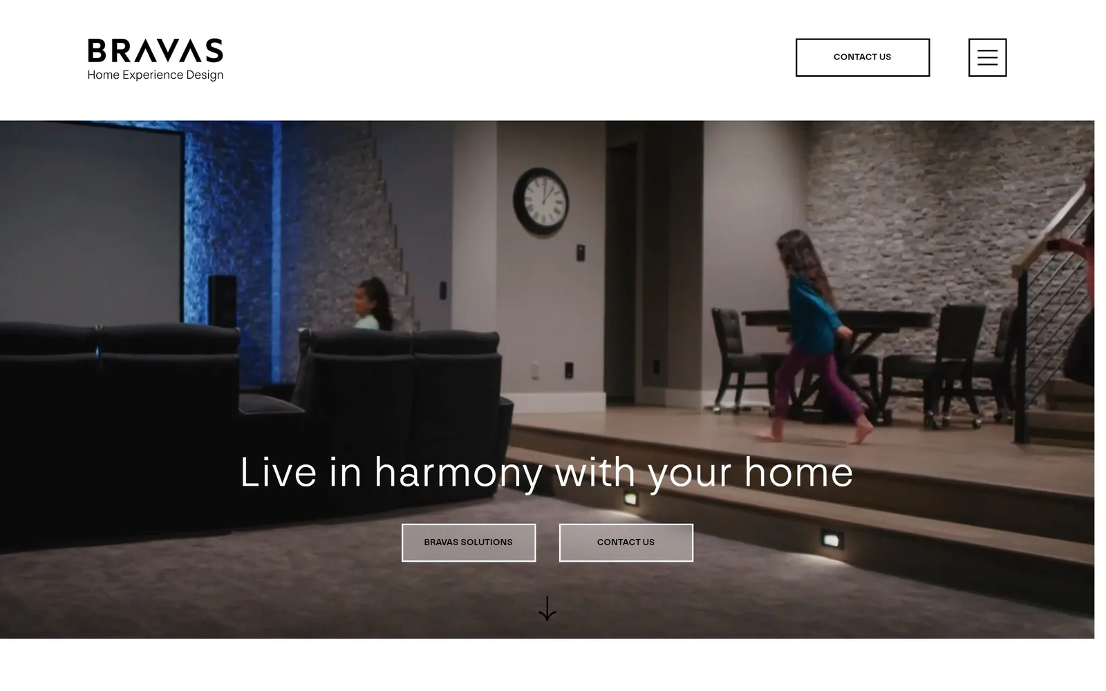
bravas.com
A hairline sans, widely tracked, floating low over a dim video of a basement theatre and a child walking through.
Type
NN Nouvelle Grotesk 57px Light
Body
NN Nouvelle Grotesk 16px
Build
full bleed video below a white header bar
Made on
WordPress
Colour
#FFFFFF #121212 #2A5B8C
Type. NN Nouvelle Grotesk at around 57px in a 300 weight with open letterspacing. Light weights at that size over moving footage is a difficult combination and this one is only just holding; let the video brighten and the headline goes with it. Nav and buttons sit at 12px caps, small on purpose.
Colour. Black, white and the blue glow off the cove lighting in the shot. No brand colour at all. For an integrator competing with showroom sites full of chrome and product photography, the absence reads as expensive.
Layout. Logo and a boxed Contact Us sit on white, then the video begins below a hard edge rather than running under the header. Two outlined buttons sit under the headline with a down arrow beneath them, which is one prompt too many.
The ask. Contact Us appears in the header and again as a button a few inches below it. Bravas Solutions and Contact Us get identical weight, so neither is primary. Picking one would have been better.
A light weight at 57px looks expensive right up until the footage behind it brightens, so pin the headline to the darkest part of the frame or scrim it.
How these were chosen
Electrical is a trade where the good work hides somewhere other than where you would look for it. Residential electricians are close to a design vacuum, nearly all of them sitting on the same few lead generation templates, so the sites here lean towards battery and EV installers, lighting practices and the handful of contractors large enough to hire a studio. Treat it as electrician website design worth stealing from: the typography, the discipline with colour, and what each one decided to leave off the first screen.
Finding electrical sites that someone had actually designed took far longer than it should have. 34 candidates made the shortlist. 16 made the page.
Each one was opened and looked at properly: what the type is doing, where the colour gets spent, how the page is built, how it asks for the job. Nothing is here because it ranks. Nothing is here because an agency filed it under portfolio. Several well known names were left out for the plain reason that their site came out of the same template as everyone else's, and a few sites worth including did not survive a second look.
Where a site is only competent, it says so. The order is the order worth your time, best first.
Reviewed and selected by Larry W. Matthews for Websitely.