Every firm here has a finished building to shoot. The question to ask of this construction website design is how little each one gets away with.
Shown
15 sites
Reviewed
28 candidates
Chosen on
The work, not the ranking
Updated
15 October 2026
01
iconbuild.com
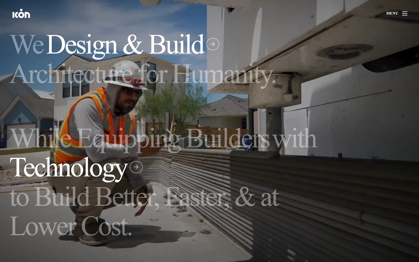
Six lines of huge serif laid over site footage, with only two of them turned up to full white.
Type
Lightspeed, about 96px
Body
Roboto Mono
Build
full bleed video, type layered at mixed opacity
Made on
Webflow
Colour
#1a1a1a #ffffff
Type. The whole statement is set in Lightspeed at around 96px, tracked tight at minus 0.05em so six lines of it still hold together. What makes it work is the opacity. Only Design and Build on the first line and Technology further down sit at full white, and everything around them is dimmed back into the footage. You read the two phrases the company wants you to read, then the sentence they sit inside. Small circled arrows after each bright phrase turn them into links without adding a button.
Colour. Two colours and nothing else, white type on a near black at #1a1a1a. The footage supplies every other colour on screen, which is why the hi-vis orange of the worker's vest reads as strongly as it does.
Layout. There is no card, no box and no panel. Type sits directly on moving footage of a 3D printed wall going up, and the only chrome is the wordmark top left and MENU top right. A lesser site would have dropped a dark scrim over the video and lost the texture of the concrete.
The ask. Nothing asks you to do anything. The two bright phrases are the only route onward, which is a confident choice for a company selling a construction method most visitors have never seen.
Put your emphasis inside the sentence rather than after it, and a headline can carry both your pitch and your navigation at once.
02
psdab.com
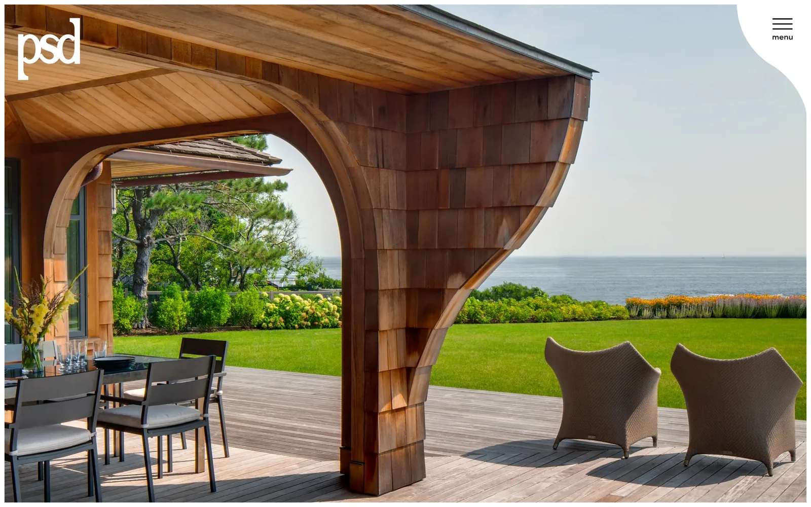
One photograph of a curved cedar shingle canopy over the sea, and almost nothing else on the screen.
Type
Tiempos Fine
Body
Tiempos Fine
Build
full bleed photography, no headline
Colour
#f5f0ed #bccffa
Type. Only the psd wordmark appears, set small and lowercase in white at the top left. Everything else is held back for later. Tiempos Fine turns up below the fold at 42px, so the site has a voice, it just declines to use it here.
Colour. The palette is the photograph. A soft white and a warm off tone at #f5f0ed carry the rest of the site, with a pale cornflower at #bccffa appearing further down as the only real accent.
Layout. The image runs edge to edge with no inset and no crop marks. The menu button sits in a white rounded notch cut into the top right corner, which is the single piece of interface allowed on screen and reads as a deliberate interruption of the photograph rather than a bar laid across it.
The ask. No call to action at all. For a builder working at this level the portfolio is the pitch, and the site trusts the photograph to do the asking.
If your photography is genuinely good, the bravest thing you can do is get your own words out of its way.
03
skender.com
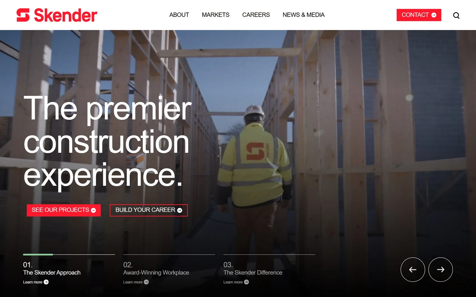
One hundred pixel type over a worker walking through timber framing, with two red buttons underneath.
Type
Early Sans Variable, about 100px
Body
Early Sans Variable
Build
full bleed video, square corners
Made on
WordPress
Colour
#000000 #ff192d
Type. A variable sans carries the headline at about 100px, tracked in at minus 0.03em and broken across three lines so premier, construction and experience each get a line of their own. Weight stays light rather than heavy, which is unusual at that size in this trade and stops the whole thing feeling like shouting.
Colour. Black and white carry the page and a single hot red at #ff192d does all the work. It appears on the two hero buttons, on the CONTACT button in the nav and on the S of the wordmark, and nowhere else.
Layout. Video fills the frame behind the type. Along the bottom a thin progress rule runs under three numbered teasers, 01 through 03, with a pair of circular arrows at the right, so the hero doubles as the first slide of a sequence without needing a caption to explain itself.
The ask. Two buttons, and they are not the usual pair. See Our Projects is for clients, Build Your Career is for recruits, and giving hiring equal weight to sales is a deliberate read of who actually visits a commercial contractor's homepage.
If recruitment matters as much as sales to your business, give it equal space in the hero rather than burying it in the nav.
04
samara.com
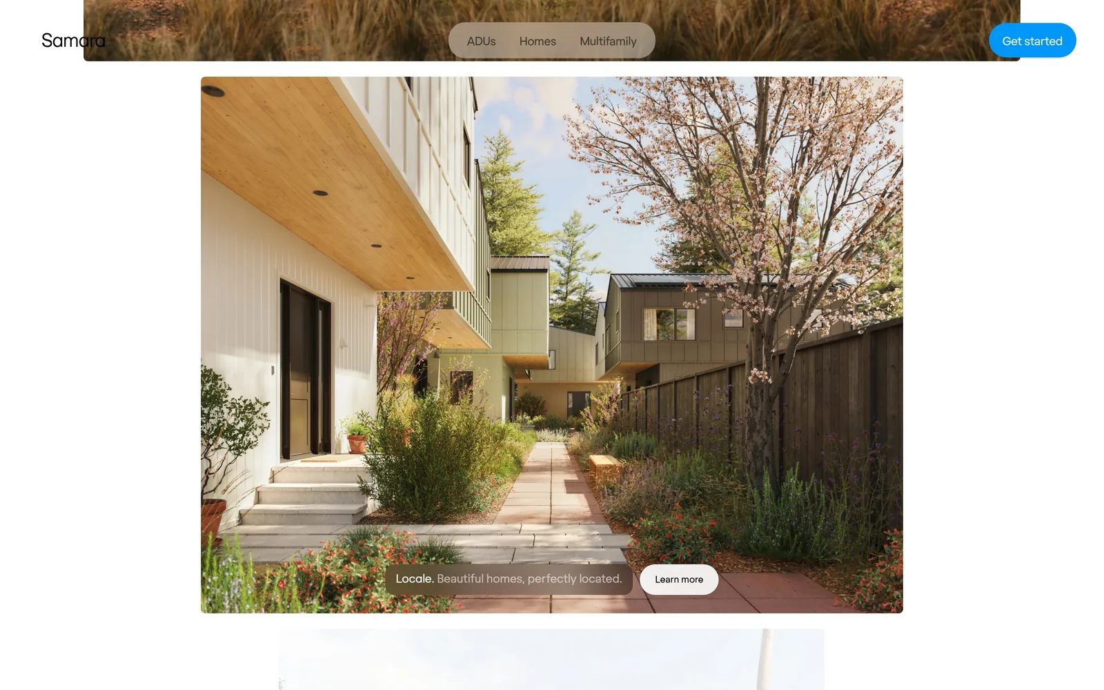
Built like a product company rather than a builder, with the photograph framed inside the page instead of filling it.
Type
Regola Light, about 72px
Body
Regola Book
Build
inset hero image, pill nav, 100px radius
Colour
#ffffff #f7f7f0
Type. Regola runs the whole site, light at 72px for display and book at 15 to 18px for everything else. The wordmark is lowercase and unemphatic. Nothing is tracked, nothing is capitalised, and the restraint is what makes it read as a technology company that happens to build houses.
Colour. White is the ground, a warm paper tone at #f7f7f0 separates the sections, and a saturated blue sits on the Get started pill. That blue appears once in the whole first screen.
Layout. The photograph does not bleed. It sits inset with white on all four sides, which is a software convention rather than a construction one, and it changes how the whole page reads. The nav floats in a pill at the centre of the header with three words in it. Corners are fully rounded at 100px on the buttons.
The ask. Get started sits top right in blue, and a second Learn more pill rides inside the image over a one line caption. Two asks, clearly ranked, neither of them shouting.
Inset your hero image rather than bleeding it and the page stops looking like a brochure, which matters if you are selling a product rather than a service.
05
dowbuilt.com
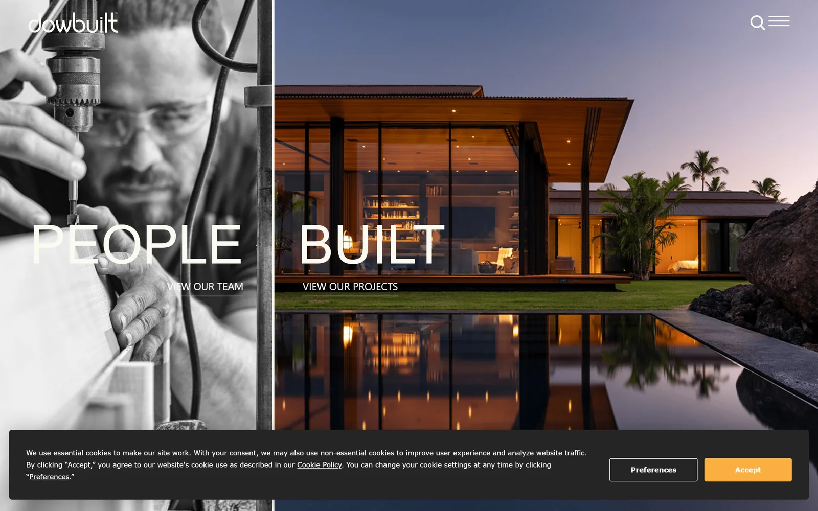
The screen splits in two, black and white craftsman on the left, colour house at dusk on the right, one word over each.
Type
DIN 2014, about 94px uppercase
Body
DIN 2014
Build
vertical split screen, two photographs
Colour
#242424 #faf9f2
Type. PEOPLE and BUILT are set in DIN 2014 at about 94px, uppercase, one word per half. The line reads across the join as a single phrase, so the split does not break the sentence. Underneath each, VIEW OUR TEAM and VIEW OUR PROJECTS sit small and quiet at 22px.
Colour. A warm near white at #faf9f2 for the type against a dark at #242424, and then the two photographs do everything else. Putting a monochrome portrait beside a colour architectural shot is the whole idea: people on one side, product on the other.
Layout. A hard vertical split down the middle, no gutter, no border. The nav is reduced to a search icon and a hamburger at the top right, which leaves the two halves to carry the entire first screen.
The ask. The two links under the headline are the only route in, and they divide the audience at the door. One for people who want to see the work, one for people who want to see who does it.
A split hero only works if the headline reads across both halves. Otherwise you have made two half pages.
06
buildcover.com
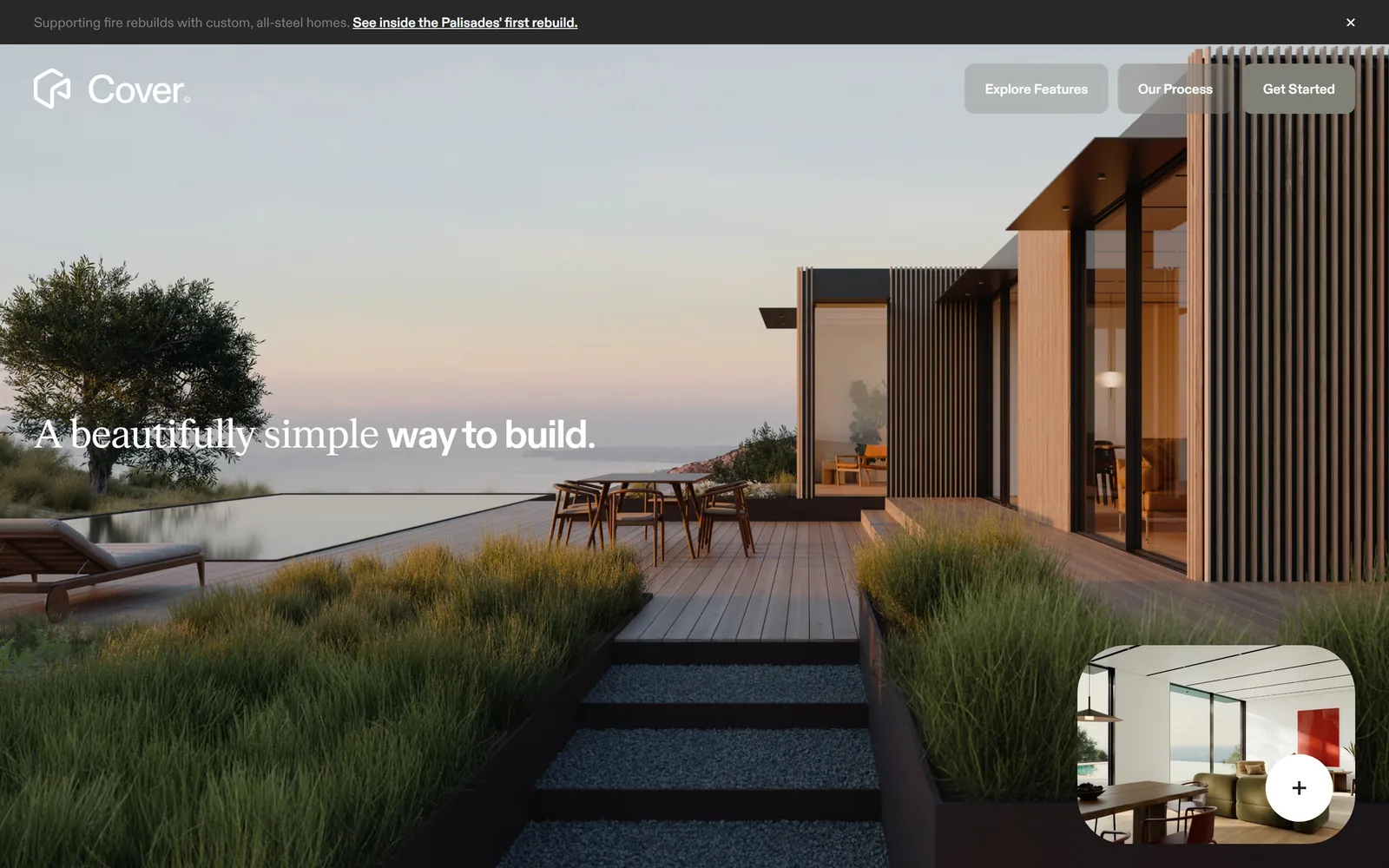
A serif and a sans share one sentence, over a timber house at dusk with an infinity pool.
Type
FK Roman Standard, about 40px
Body
ABC Diatype
Build
full bleed photography, floating pill nav
Colour
#202020 #ffffff
Type. A beautifully simple is set in FK Roman Standard, and way to build finishes the line in a heavier cut. Mixing two faces inside a single sentence usually looks like an accident. Here the break lands exactly on the shift from adjective to verb, so it reads as emphasis rather than error. Everything else is ABC Diatype at 14px.
Colour. White type on a dusk photograph, with a near black at #202020 for the announcement strip across the top. The warmth is entirely in the photography, the interface stays neutral.
Layout. Three pill buttons float at the top right instead of a nav bar, and a small rounded thumbnail of an interior sits in the bottom right corner with a plus button on it, which previews the next section without scrolling.
The ask. Get Started sits in the floating pill group, and the thumbnail in the corner is the softer second option. The announcement bar above carries a current story about fire rebuilds with a dismiss X, which is doing public relations rather than conversion.
Switching typeface mid sentence can work, but only if the break falls where the meaning turns.
07
woodhullmaine.com
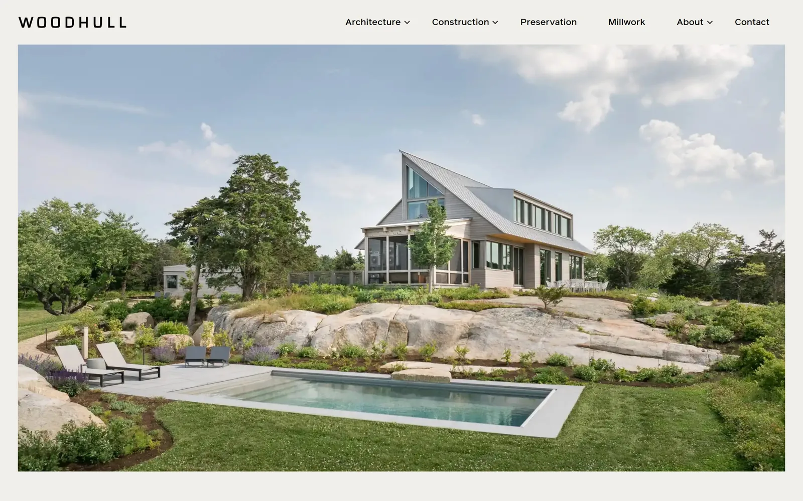
WOODHULL spaced wide across the top, then a single house on granite ledge with a pool.
Type
Reader, about 42px
Body
Reader
Build
inset photography, no hero headline
Made on
WordPress
Colour
#f2f1ee #1c1c1a
Type. The wordmark is letterspaced hard and set small, which is the only typographic gesture on the screen. Reader carries the nav at 18px and the headings at 42px further down. There is no hero headline at all.
Colour. A pale ground frames the image on all sides. Every colour in view belongs to the photograph: grey shingle, green lawn, blue pool, granite.
Layout. The photograph is inset rather than bled, with an even margin top and sides, so the page reads as a printed page rather than a screen. The nav sits above it with six items and dropdowns, which is more structure than most of the firms here allow themselves.
The ask. Nothing asks for the job. Architecture, Construction, Preservation and Millwork in the nav are the real routes in, and each one is a different kind of client.
Letterspacing a wordmark and then leaving the rest of the screen alone is a cheap way to look expensive, as long as you actually leave it alone.
08
abodu.com
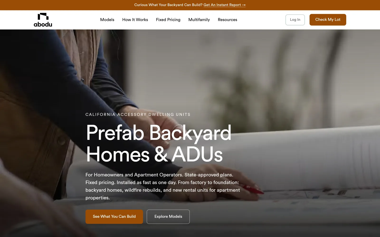
An eyebrow in spaced capitals, then Prefab Backyard Homes & ADUs at 81px over a photo of hands and drawings.
Type
Circular Std, about 81px
Body
Circular Std
Build
darkened photo hero, square corners
Colour
#9b4c05 #faf7f2
Type. Circular Std does everything, 81px for the headline tracked in at minus 0.031em, 52px for the second line and 19px for the paragraph. The eyebrow above, CALIFORNIA ACCESSORY DWELLING UNITS, is letterspaced and small, and it is the most useful line on the screen because it says where and what before the headline says anything.
Colour. A dark photographic ground with a burnt orange at #9b4c05 on the primary button and the announcement bar. A warm paper tone at #faf7f2 picks up below the fold. The orange appears three times and never competes with itself.
Layout. The photograph is darkened enough to carry four lines of white body copy, which is the compromise most hero images need and few get right. Squared corners throughout. The announcement bar, nav and hero stack cleanly with no overlap.
The ask. Two buttons, properly ranked. See What You Can Build is filled in orange, Explore Models is outlined beside it, and Check My Lot repeats the primary action in the nav. Three asks for the same job, phrased three different ways.
An eyebrow that names your market and your service in six words will do more for a cold visitor than a clever headline.
09
claycorp.com
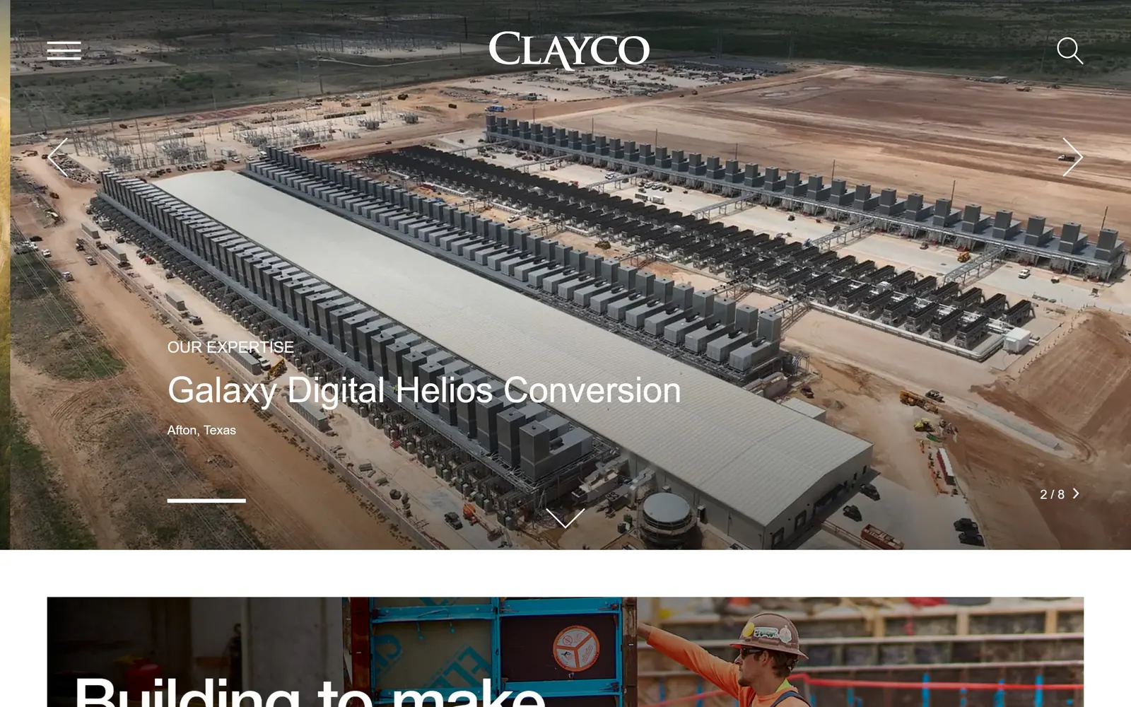
An aerial of a data centre mid build, captioned like a plate in a book rather than a slide in a carousel.
Type
Neue Haas Grotesk Text Round, about 45px
Body
Neue Haas Grotesk Text Round
Build
centred masthead, captioned carousel
Made on
WordPress
Colour
#000000 #ffffff
Type. Neue Haas Grotesk Text Round runs at 45px for the project name, with OUR EXPERTISE above it small and spaced, and Afton, Texas below it smaller still. Three sizes, one family, a clear hierarchy inside a caption that occupies a corner of the screen.
Colour. Black and white only. The photograph carries the colour, and the orange dirt of a Texas construction site does more for the page than any brand palette would.
Layout. The wordmark sits centred at the top, which is rare and gives the page a masthead feel. Hamburger left, search right, carousel arrows at both edges, slide counter at 2 of 8 bottom right. The caption sits bottom left rather than centred, so it never fights the image.
The ask. No button anywhere. The slide counter and arrows are the only interaction, which treats the homepage as a portfolio you leaf through.
Caption your hero image with the project name and its location and it stops being decoration and starts being evidence.
10
birdseyevt.com
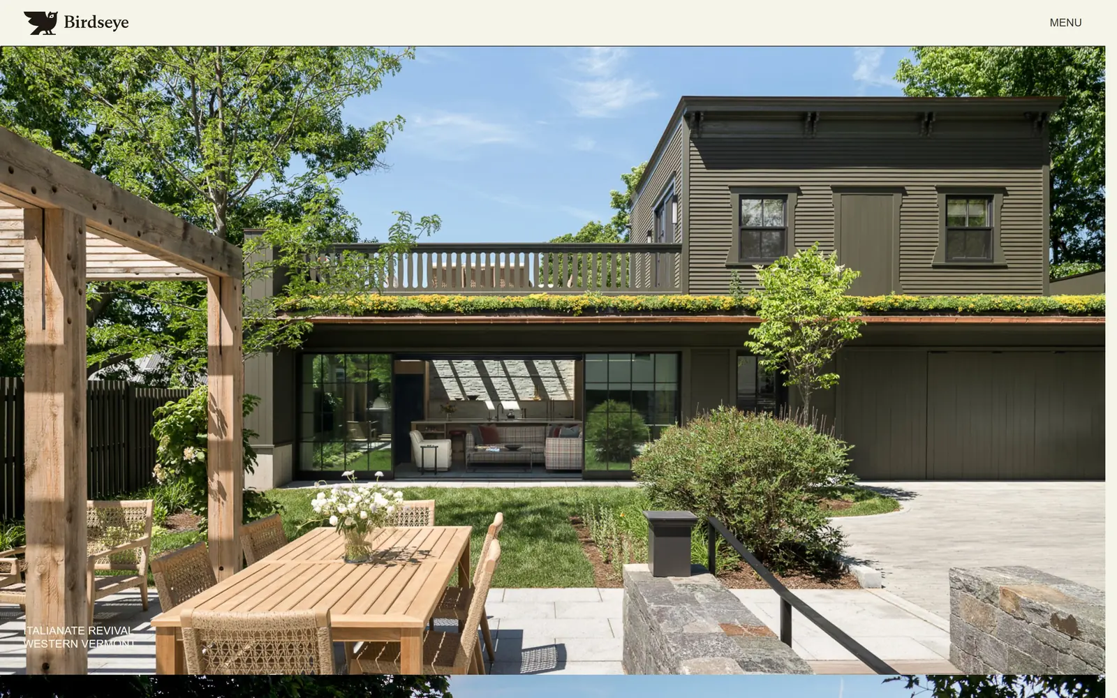
A dark stained Vermont house fills the frame, labelled in tiny spaced capitals in the bottom corner.
Type
Switzer, 14px uppercase
Body
Switzer
Build
full bleed photography, corner project label
Made on
Framer
Colour
#f5f4e9 #2f3630
Type. Switzer at 14px, uppercase, tracked at 0.02em, and that is the entire type specimen on the first screen. The wordmark pairs a small bird mark with the name. Nothing is big, which is the opposite of what most builders do and reads as more confident, not less.
Colour. A warm off tone at #f5f4e9 for the wordmark and the label, set against whatever the photograph brings. Here that is dark stained siding, a green roof and a bleached timber pergola.
Layout. The image bleeds to the edges with a thin margin at the top only. The project label sits bottom left and is deliberately small enough that you have to decide to read it.
The ask. Nothing asks for anything. MENU top right is the only control on the screen.
Setting your project captions at 14px takes nerve, but it makes the photograph the subject and the label the footnote, which is the right way round.
11
greenhammer.com
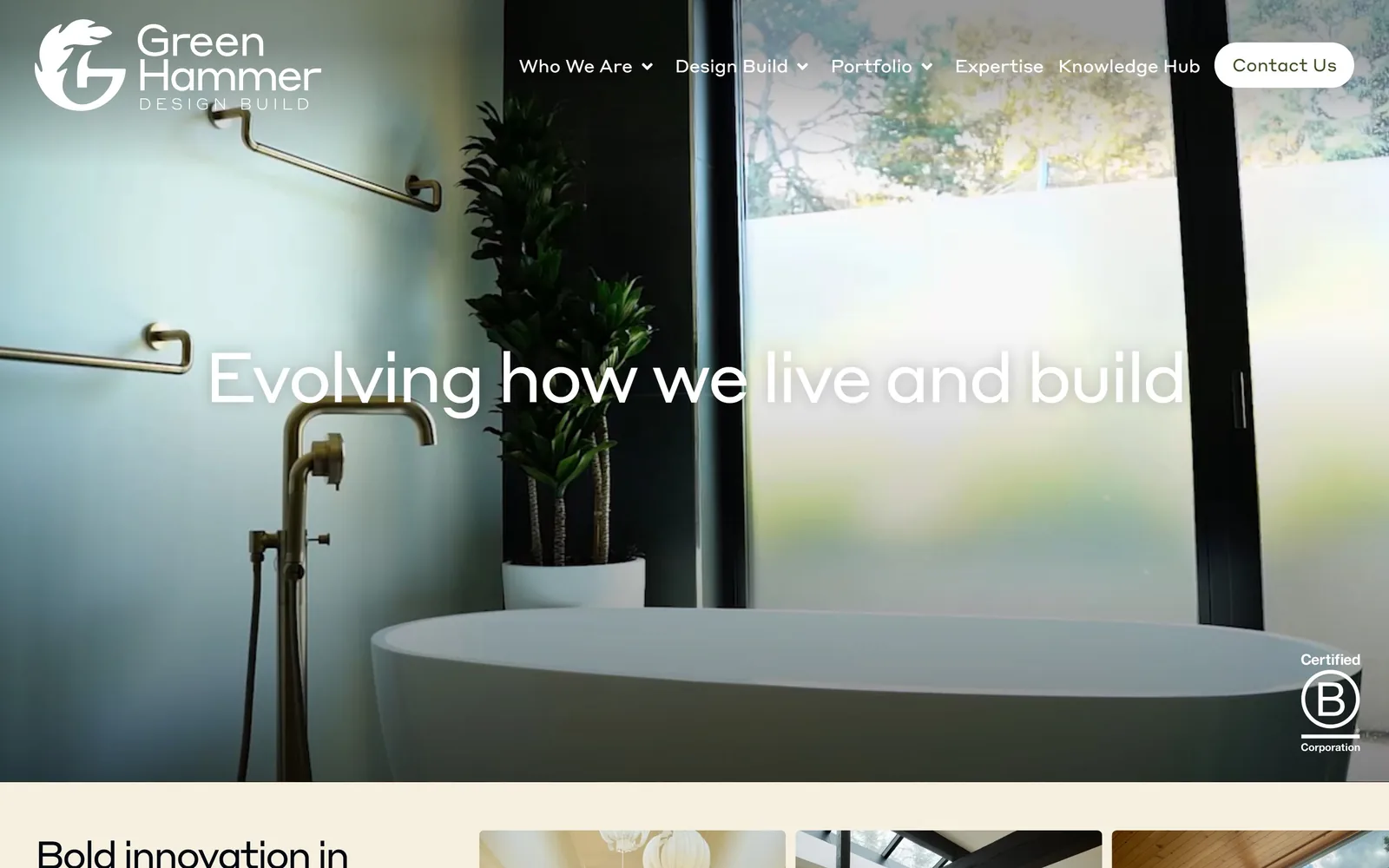
Evolving how we live and build, set light across a bathroom with a freestanding tub and brass taps.
Type
Styrene Regular, about 72px
Body
Styrene Regular
Build
full bleed photo, centred headline
Made on
WordPress
Colour
#2c343b #f5f0e0
Type. Styrene at around 72px, with the weight shifting mid line so live and build sits heavier than the words before it. The nav below the wordmark is small and sentence case with dropdown arrows, which keeps the header quiet under a large headline.
Colour. White type over photography, with a soft cream at #f5f0e0 and a slate at #2c343b taking over below the fold. The photograph is left alone rather than tinted, so the brass fixtures and the green outside the window stay as they were shot.
Layout. A full bleed image with the headline centred across it. The Contact Us button is a fully rounded pill at 50px radius, which sits oddly against an otherwise square layout. The B Corp mark is parked bottom right, small, where it reads as a credential rather than a badge.
The ask. One pill button in the header and nothing in the hero itself. For a design build firm selling considered work, a single quiet ask is the right volume.
Changing weight inside a headline is a cheaper way to create emphasis than changing size, and it keeps the line on one row.
12
sundt.com
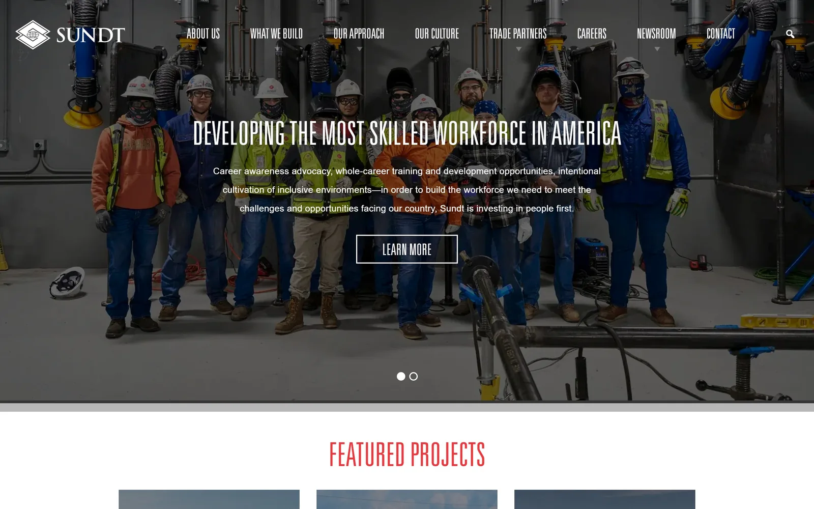
A full crew posed in the shop, under a headline about workforce rather than buildings.
Type
Univers, about 58px uppercase
Body
Open Sans
Build
1170px column, centred type
Made on
WordPress
Colour
#f5363f #ffffff
Type. Univers at about 58px, uppercase, centred, with a centred paragraph beneath it at 23px. Centring a long headline usually weakens it. Here the symmetry of the crew standing in a line under it makes the choice look intentional rather than default.
Colour. White type on the photograph, with a red at #f5363f carrying the section headings further down the page. The photograph supplies the hi-vis yellow and orange, which is the loudest colour on screen and belongs to the people rather than the brand.
Layout. The content column is held to 1170px rather than running full width, so the type sits in the middle third and the crew either side stays visible. Carousel dots sit under the button.
The ask. A single outlined LEARN MORE, and it leads to a careers story rather than a project. A commercial contractor this size is competing for labour at least as hard as for work, and the homepage says so plainly.
If recruitment is your constraint, put it in the hero and photograph the actual crew rather than buying a stock site shot.
13
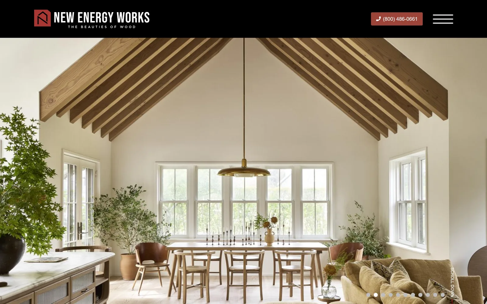
newenergyworks.com
A timber framed dining room with exposed trusses, and a header that gets out of the way completely.
Type
Gotham, about 28px
Body
Gotham
Build
solid header band above full bleed photo
Made on
Framer
Colour
#111111 #b8332c
Type. Gotham at 18 to 22px through the interface, with the wordmark locked up over a spaced out tagline, THE BEAUTIES OF WOOD. There is no hero headline. The vertical SCROLL marker on the right edge is the only other type on screen.
Colour. A solid black header bar sits above a photograph that is all warm timber and cream plaster. The red phone pill in the header is the one saturated colour, and against that much brown it reads immediately.
Layout. The black bar is the interesting decision. Most firms float a transparent header over the image. Pinning a solid band above it instead means the photograph starts clean at a hard edge, with nothing laid across the trusses.
The ask. The phone number is the primary ask, pinned in the header as a filled pill. For a company selling bespoke timber framing, a call rather than a form is the right next step.
A solid header bar is less fashionable than a floating one, but it keeps your photography unobstructed, which matters more when the photography is the product.
14
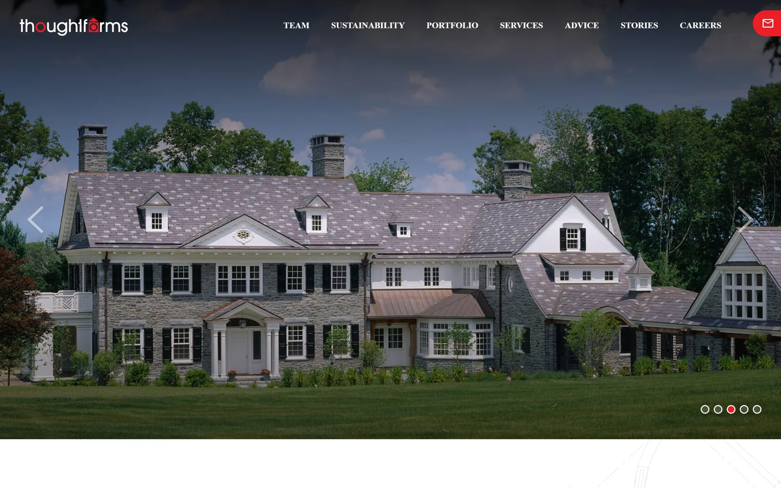
thoughtforms-corp.com
A shingle style estate across the full screen, with a seven item nav and a red envelope in the corner.
Type
Noto Serif, about 48px
Body
Open Sans
Build
full bleed carousel, floating nav
Made on
WordPress
Colour
#ec1d24 #ffffff
Type. The wordmark sets thoughtforms in lowercase with a red dot tucked into the f, which is the only playful mark on an otherwise sober page. The nav runs seven items in small spaced capitals, and Noto Serif carries the headings at 48px further down.
Colour. Red at #ec1d24 and white, nothing else from the brand. It appears on the wordmark dot and the envelope button and is otherwise held back entirely for the photography.
Layout. The image bleeds full width with the nav floating over it. Carousel arrows sit at both edges and four dots mark the slides at the bottom right. The nav is wide for a builder, but each item is a genuinely different section rather than padding.
The ask. A red envelope icon top right is the whole conversion strategy. It is small, it is permanent, and it does not interrupt the photograph.
A single icon button in the corner can carry your contact action without a banner, as long as it is the only red thing on the page.
15
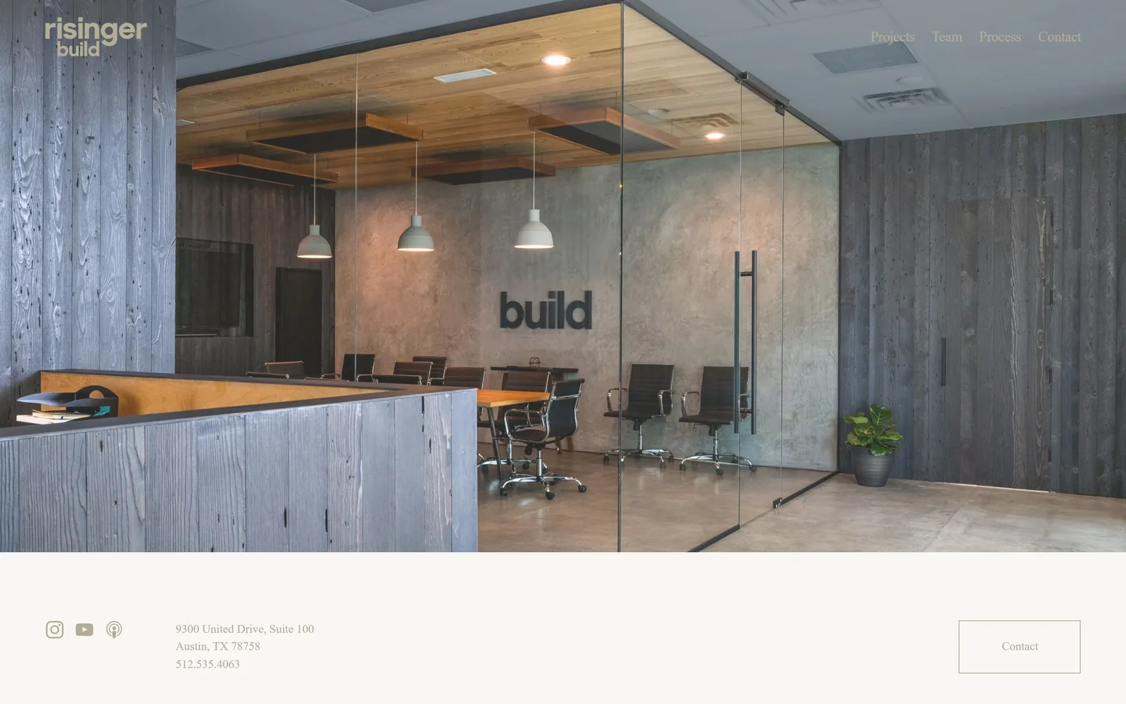
risingerbuild.com
Their own office photographed as the hero, with the word build on the wall doing the work of a headline.
Type
EB Garamond
Body
Poppins
Build
inset photography, short page
Made on
Squarespace
Colour
#f9f7f4 #4a4a46
Type. EB Garamond and Poppins share the page, the serif small at 15px in the nav and the sans at 18px elsewhere. The wordmark stacks risinger over build in white with the second line lighter. Nothing is set large anywhere on the screen.
Colour. A pale warm ground at #f9f7f4 frames the photograph, and the image itself is all grey stained timber, polished concrete and black steel. The palette is the building, not the brand.
Layout. The photograph is inset with the page colour visible around it. Below it the footer arrives almost immediately with social icons, the Austin address and phone number, which makes the homepage unusually short.
The ask. An outlined Contact button sits in the footer block and the phone number is printed plainly beside the address. No form, no pop up, no chat.
Photographing your own premises instead of a project tells a client what kind of outfit they would be hiring, which a portfolio shot cannot do.
How these were chosen
Construction is one of the few trades where the photography is already good, because every firm here has a finished building to shoot. What separates these fifteen is what they do around it. Some set one word at 100px and let it sit on video, some refuse a headline altogether, and one splits the screen down the middle to put its people beside its product. If you are weighing up your own construction website design, the question worth asking of each one is how little it gets away with.
Finding construction sites that someone had actually designed took far longer than it should have. 28 candidates made the shortlist. 15 made the page.
Each one was opened and looked at properly: what the type is doing, where the colour gets spent, how the page is built, how it asks for the job. Nothing is here because it ranks. Nothing is here because an agency filed it under portfolio. Several well known names were left out for the plain reason that their site came out of the same template as everyone else's, and a few sites worth including did not survive a second look.
Where a site is only competent, it says so. The order is the order worth your time, best first.
Reviewed and selected by Larry W. Matthews for Websitely.