How 12 Brokerages Handle Real Estate Website Design
The photograph is the page: a headline, one button, nothing else until you scroll. Twelve brokerages and developers doing real estate website design.
Shown
12 sites
Reviewed
26 candidates
Chosen on
The work, not the ranking
Updated
15 October 2026
01
terragroup.com
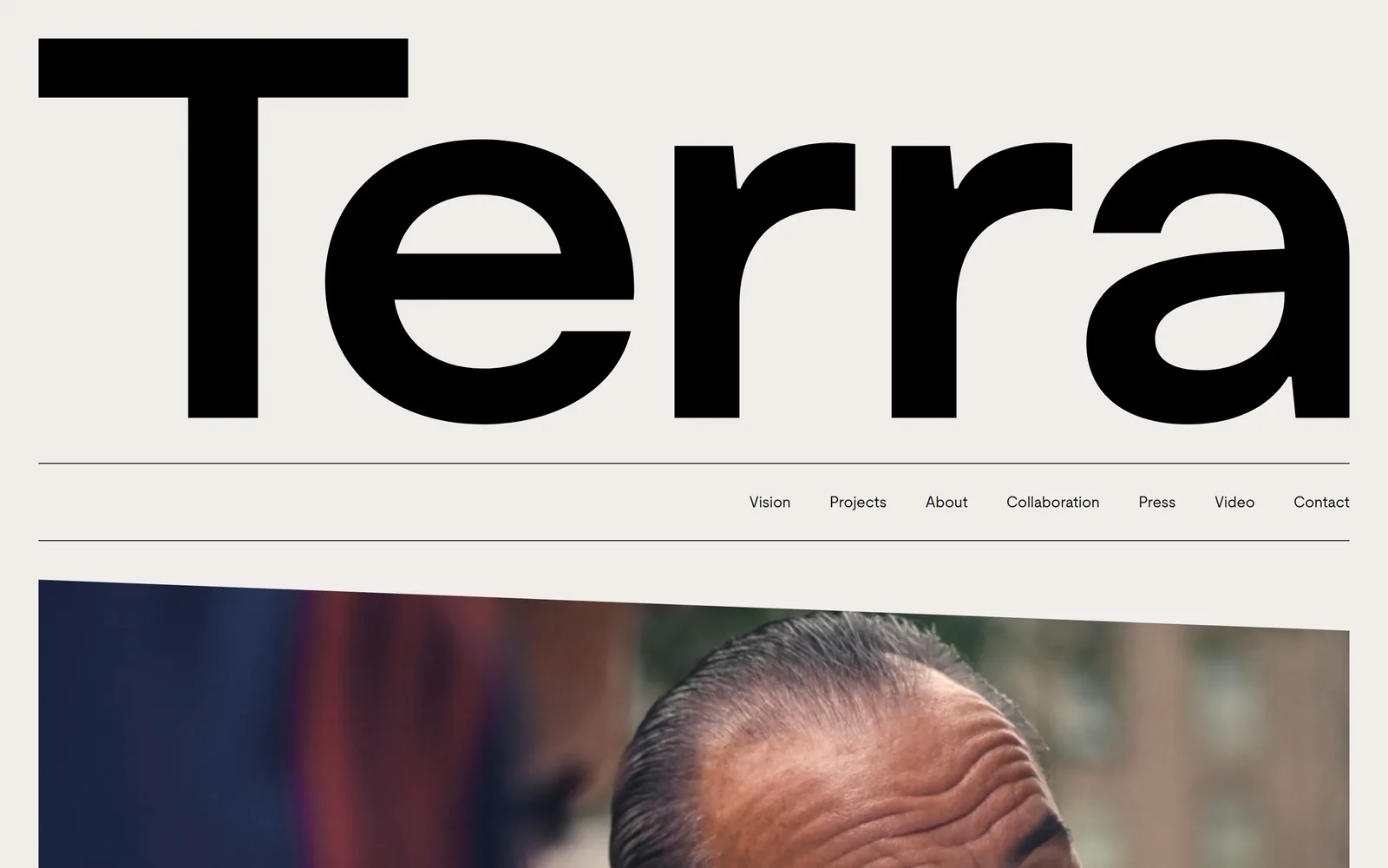
The word Terra set in black grotesk so large it runs off the right edge, with a diagonal-cut video below.
Type
Heavy neo-grotesk wordmark, roughly 550px cap height
Body
Moderat 16px, Austin News Text Web 75px hairline
Build
Full-bleed 1440, letterhead bar over diagonal-clipped video
Made on
Custom build
Colour
#f1edeb #111111 #ff4200
Type. The wordmark is a heavy neo-grotesk, cap height around 550px, cropped by the viewport so the final a half leaves the page. Nav sits at 16px in Moderat with slightly tight tracking of -0.009em, lowercase, right aligned. Body copy further down is Austin News Text Web at 75px in a hairline weight, which is the opposite move from the wordmark. One face shouts, the other whispers, and the page never mixes the two in the same block.
Colour. Two colours carry the screen: a warm off-white ground at #f1edeb covering just over half the pixels, and near-black #111111 for the type at 40 percent. The orange is #ff4200 and it is reserved for running body text below the fold, not for a button. That is unusual and it means the accent reads as a voice rather than as a signpost.
Layout. Full-bleed 1440 container, no inner column at all. The wordmark block is separated from the nav by two hairline rules, giving a letterhead bar about 100px deep. Below that the video panel enters on a diagonal clip, so the first thing under the fold is a slanted edge rather than a rectangle. Corner radius is zero throughout.
The ask. There is no button above the fold. The only ask is Contact, seventh of seven nav items, 16px, same weight as the rest. The page is betting that a developer with a 20 billion dollar portfolio does not need to chase a form fill, and the measured decision is to let the work do the selling.
Cropping a wordmark at the viewport edge gives a page confidence that a centred logo never will.
02
111w57.com
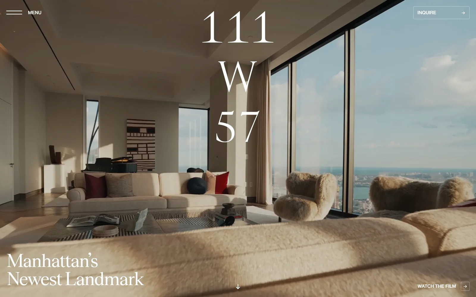
A high-contrast serif stacks 111 W 57 down the centre of a sunlit penthouse interior shot on video.
Type
High-contrast display serif, about 120px
Body
Sans at 13px uppercase, 500 weight
Build
24-column grid, 40px columns, 19px gutters, full-bleed video
Made on
Custom JS framework
Colour
#ffffff #7c7262 #c68f43
Type. The numerals are a high-contrast display serif with hairline serifs and a strong thick-thin, set around 120px and stacked three lines deep. The secondary line, Manhattan's Newest Landmark, runs at 58px in the same face with tracking pulled to -0.025em and a 1.25 line height. Utility type drops to 13px uppercase sans at 500 weight. Three sizes, one serif, no decoration.
Colour. The palette is whatever the video is doing, which here is a warm greige around #7c7262 across half the frame. All type is pure #ffffff. A muted brass, roughly #c68f43, appears in about 6 percent of pixels from the room itself rather than from any UI. Nothing is tinted, nothing is overlaid, and the restraint is the point.
Layout. A 24-column grid with 40px columns and 19px gutters underpins a container that fills the full 1440 viewport. The hero is a silent autoplay video with no scrim. Above the fold you get a hamburger labelled MENU at top left, an outlined INQUIRE box at top right, the stacked numerals centred, and a two-line headline anchored bottom left. Radius is zero everywhere.
The ask. INQUIRE sits in a thin outlined rectangle top right with a right arrow, and WATCH THE FILM mirrors it bottom right. Two asks, both quiet, neither competing with the other. A centred down arrow is the third path, which is a soft sell for a building where pages become the brochure.
Two corner-anchored asks and an empty middle let the photography do what the copy cannot.
03
sterlingbay.com
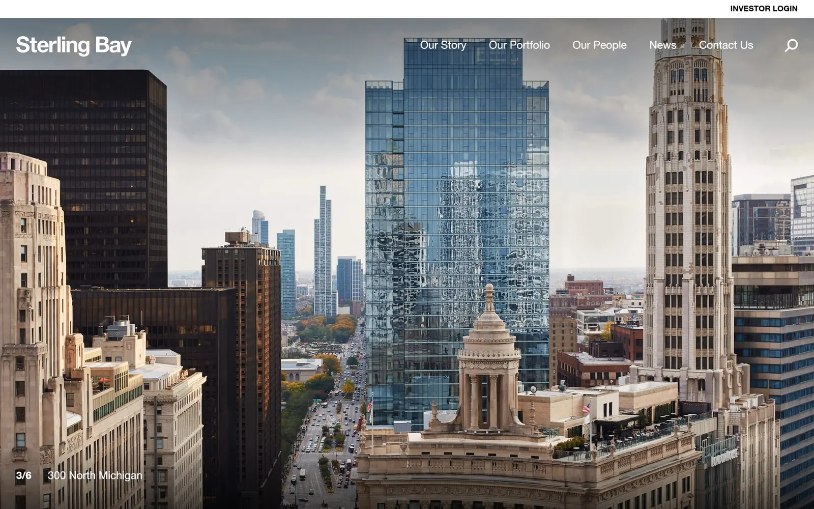
A Chicago skyline photograph fills the whole screen with only a wordmark, five nav links and a slide counter on top.
Type. Everything is Helvetica Neue LT and almost nothing else. The Sterling Bay wordmark runs around 36px bold with tracking at -0.023em, nav items sit at 14px semibold uppercase, and the slide caption drops to 19px regular with a loose 1.79 line height. Further down the page the scale jumps to 72px bold. There is no second typeface anywhere.
Colour. The palette is two values: #ffffff at full coverage for every piece of type, and #000000 for the small INVESTOR LOGIN strip across the top. No brand colour, no tint, no accent at all. For a Chicago developer whose product is glass and limestone, letting the photograph supply all the colour is a decision, not a default.
Layout. Full-bleed 1440 with no container inset in the hero. The photograph goes edge to edge and the header floats on it with no bar and no scrim, which only works because the sky in frame three happens to be pale. Slide position reads 3/6 at bottom left beside the building name, 300 North Michigan. Below the fold the layout resolves into 387px three-column and 790/395 two-column grids with 24px gutters.
The ask. The only button on screen is INVESTOR LOGIN, in the top right corner, black on white. No contact form, no phone, no newsletter. Contact Us is the last of five nav links. For a firm selling leases and fund positions rather than units, that is the right amount of friction.
If the photography is genuinely good, removing every panel, scrim and badge from the hero is a free upgrade.
04
homebound.com
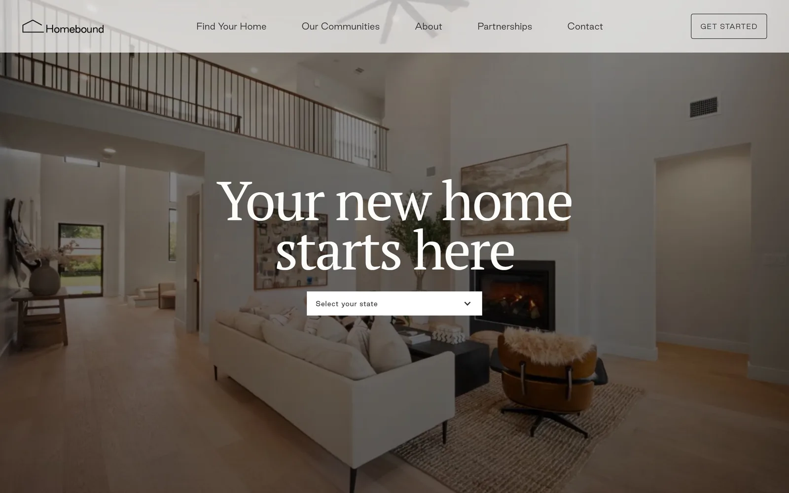
A 100px serif headline centred over a warm interior, with a single white state dropdown sitting directly beneath it.
Type
PT Serif 100px, 0.90 line height
Body
Good Sans 16px light, 8px uppercase labels
Build
1440 full width, three-column 442px grid, 16px gutters
Made on
Webflow
Colour
#f6f6f0 #353535 #526675
Type. The headline is PT Serif at 100px, weight 400, with tracking at -0.030em and a line height squeezed to 0.90 so the two lines nearly touch. That tight leading is what makes a book serif read as a display face. Nav is Good Sans at 16px in a 300 weight, and the eyebrow labels drop all the way to 8px uppercase at 700 with 0.140em tracking. The gap between 100px and 8px is the whole type system.
Colour. The ground is a warm paper white, #f6f6f0, which carries the header bar and every section below the hero. Headline ink is #fcfcfa so it sits a shade off pure white against the photograph. Interface text is #353535 rather than black. The photograph supplies a slate blue around #526675, and no brand colour is introduced at all.
Layout. Full 1440 container with a translucent header bar about 135px deep across the top. The hero is autoplaying video, headline centred, and a 440px white select field immediately under it. Below the fold a three-column 442px grid with 16px gutters carries the listings. Corner radius is zero on every element including the dropdown.
The ask. The page asks twice and the two asks are different sizes. GET STARTED sits in an outlined box in the header, and the real conversion is the Select your state dropdown planted under the headline, which qualifies the visitor by market before anything else loads. Nothing else competes above the fold.
A single qualifying dropdown under the headline converts better than a button when your product only exists in some states.
05
hiltonhyland.com
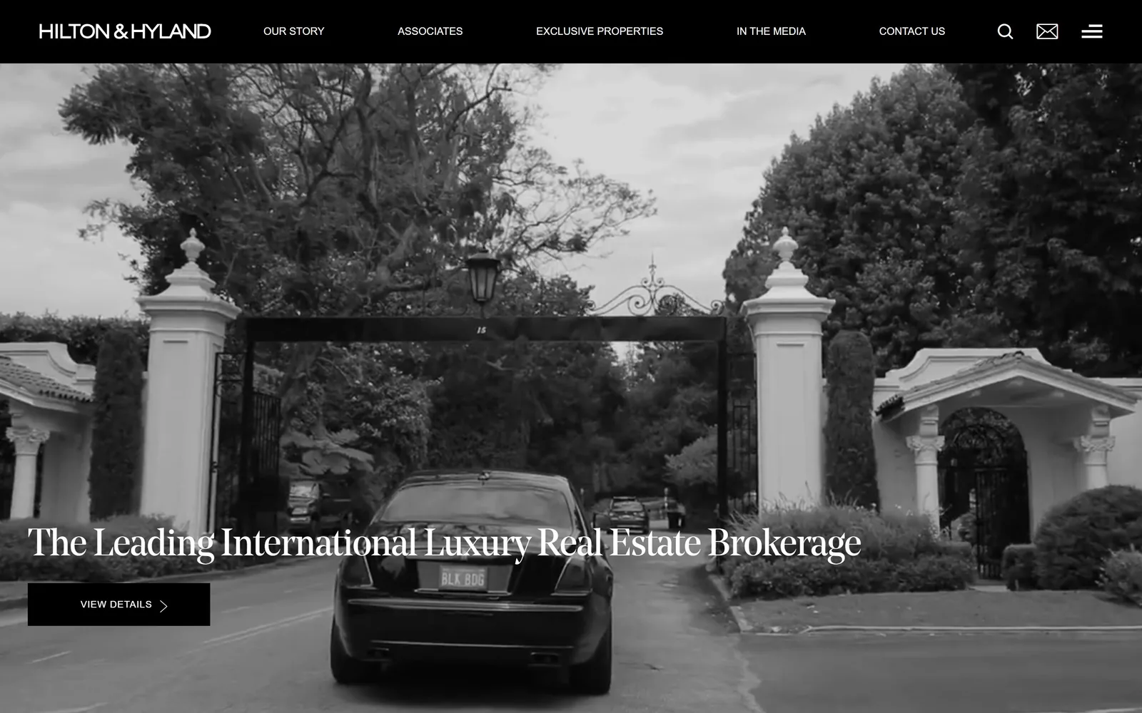
Black and white footage of a car at an estate gate, a serif line across the lower third, one black button.
Type
Noe serif, 48px
Body
Montserrat 14px, 1.90 line height
Build
Full-bleed video under a 108px black sticky bar, 60px sections
Made on
WordPress
Colour
#000000 #ffffff #dedede
Type. The headline is Noe, a contemporary display serif with sharp bracketed serifs, at 48px with -0.025em tracking and a tight 1.10 line height. Everything else is Montserrat: 13px uppercase for the six nav items, 14px at a generous 1.90 line height for body, and 12px at a 300 weight with 0.050em tracking inside the button. One serif for voice, one geometric sans for machinery.
Colour. The whole hero is desaturated to black and white, so #000000 and #ffffff account for nearly all of it, with the midtones landing around #dedede. Body ink below the fold is #4b4b4b rather than black. There is no accent colour on the page at all, which for a Beverly Hills brokerage reads as deliberate rather than cheap.
Layout. Full 1440 width with a solid black header bar 108px deep that never scrolls away. Hero video runs edge to edge under it. The headline and button are anchored to the lower left at roughly a 55px margin, leaving the top two thirds entirely to the image. Section padding below settles at 60px and nothing has a radius.
The ask. One button, VIEW DETAILS, solid black with a chevron, sitting under the headline. The header also carries a search icon and a mail icon, so there are three routes in but only one is weighted. The six-item nav is shallow by brokerage standards and no phone number is shown.
Grading the hero to black and white removes every colour decision you would otherwise argue about and makes listing photography look expensive.
06
pacaso.com
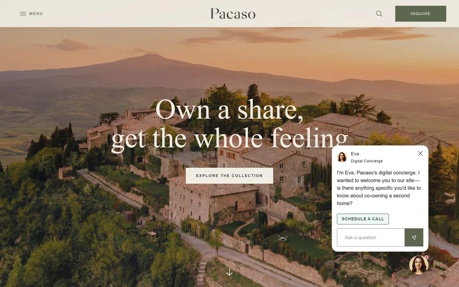
An aerial of a Tuscan hill village at sunset with a 90px serif line across it and a cream button centred below.
Type
freight-display-pro, 90px
Body
Plus Jakarta Sans 300, 20px body
Build
Full-bleed hero under a 118px cream bar, 446px three-column below
Made on
Custom JS framework
Colour
#f1ece3 #376559 #251e35
Type. The headline is freight-display-pro at 90px, weight 400, tracking barely negative at -0.006em, set in sentence case over two lines. Interface type is Plus Jakarta Sans at a 300 weight, 20px for body and 12px for buttons with a wide 0.167em letterspacing and uppercase. The contrast between a warm old-style serif and a cool geometric sans is doing the work of a second brand colour.
Colour. The header bar and every button are the same cream, #f1ece3, which covers more of the page than anything else once you scroll. The INQUIRE button in the header is a deep forest green, about #376559, and it is the only saturated element on screen at well under one percent of pixels. Body ink is #6f6a6a and headings go to #251e35 rather than black.
Layout. Full 1440 width with a cream header bar roughly 118px deep. The hero photograph runs full bleed below it, headline centred at about 45 percent height, button centred under it, and a down arrow at the bottom. Below the fold the page splits into three-column 446px and four-column 335px grids with zero gutters. Radius is zero except on the chat bubble.
The ask. The ask is doubled: INQUIRE in green in the header, and EXPLORE THE COLLECTION as a cream block under the headline. A digital concierge panel named Eva opens unprompted at bottom right with a SCHEDULE A CALL button, which is a third ask and the one that covers part of the headline. That panel is the weakest thing on the screen.
Letting the header bar and the buttons share one cream value makes a photographic hero feel like a single designed object.
07
serenbe.com
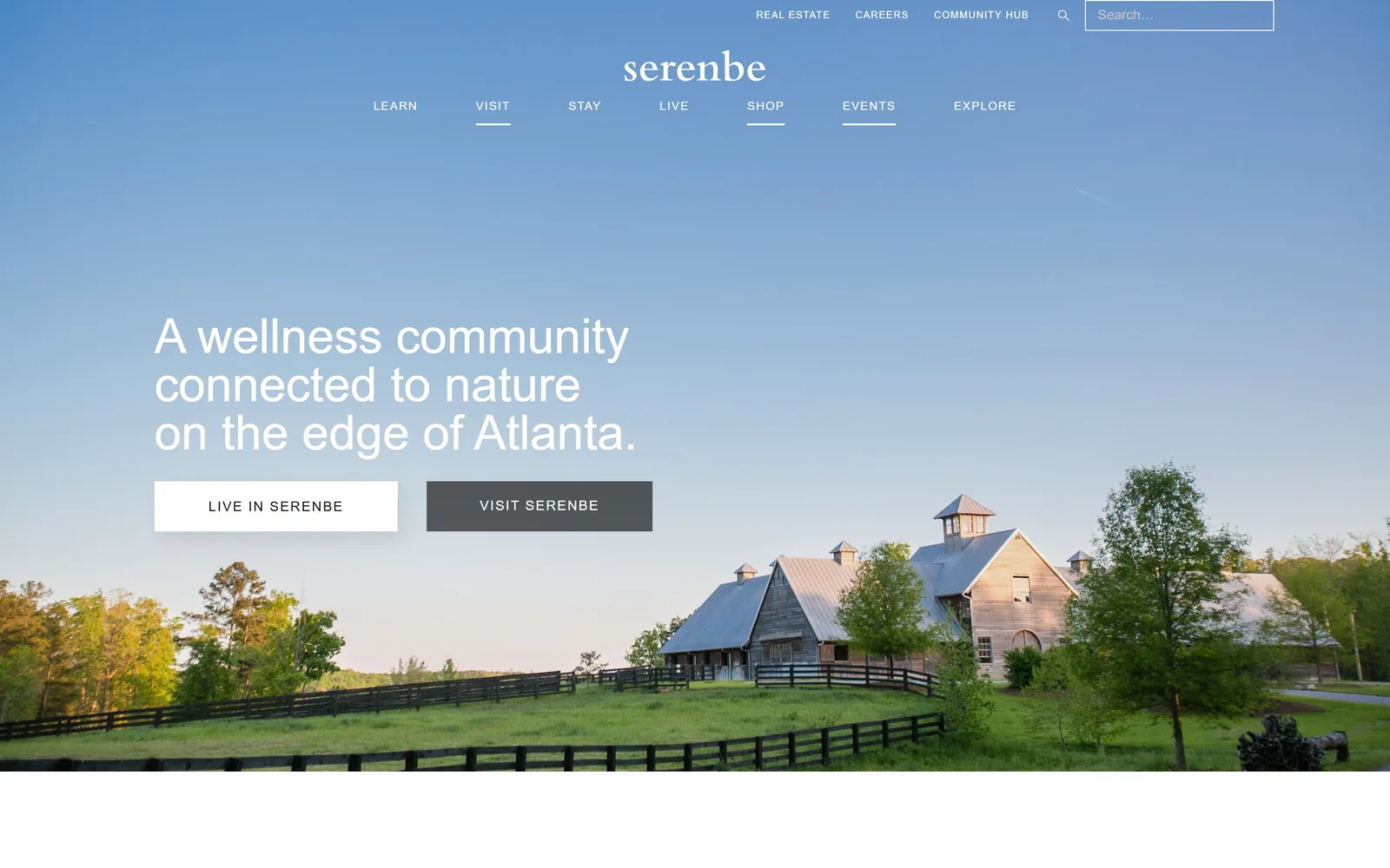
Barns on a green field under an enormous clear blue sky, with the headline and two buttons placed in the empty air.
Type. The wordmark is a light serif, lowercase, around 44px. The headline is not: it is a light grotesk at 50px with a 1.00 line height, three lines, left aligned. Montserrat handles everything else at 16px for body and 14px at a 500 weight with 0.100em tracking for the buttons and nav. Nav labels and footers drop to 10px uppercase.
Colour. Almost the entire screen is photographic sky, so the dominant value is a gradient blue that the DOM never declares. Interface white is #ffffff, body ink is #2d2e2f, and the second button is a dark charcoal #181818. No brand colour is applied anywhere. The composition relies on there being enough empty sky in the frame to hold type, which is a photo brief as much as a design one.
Layout. Two stacked nav rows, utility links at the top right and seven primary items centred under the wordmark, with active items underlined. The hero photograph runs full bleed and the headline block starts at about 38 percent height on a roughly 220px left margin. Both buttons are 350px wide blocks with zero radius sitting side by side with a 40px gap.
The ask. LIVE IN SERENBE in white and VISIT SERENBE in charcoal, side by side, equal size. That is an honest fork: one is a property enquiry, the other is a hotel booking, and the page refuses to rank them. A search field sits in the top right as a third route.
When two audiences want different things, give them two buttons of equal weight instead of burying one in the nav.
08
mirrranchgroup.com
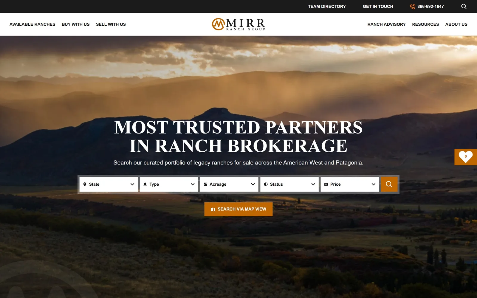
Sunbeams over Western foothills, with a bold serif headline and a five-field property search bar laid across the middle.
Type
adobe-jenson-pro bold, 56px, all caps
Body
Montserrat 18px, 13px semibold uppercase
Build
Stacked black and white header, 1125px five-field search row
Made on
WordPress
Colour
#1c1b1c #ffffff #c06600
Type. The headline is adobe-jenson-pro at 56px, bold, set all caps with a 1.00 line height, which turns an old-style book serif into something that reads like a ranch brand burned into wood. Montserrat carries everything else: 19px for the subhead, 18px for body, 13px semibold uppercase for buttons, and 11px semibold uppercase for nav. The caps-plus-Jenson combination is the single idea here.
Colour. Black runs the two header bars at #010000 and #1c1b1c, white carries the type at about 12 percent coverage, and the accent is a burnt orange #c06600 that appears on exactly two things: the search submit button and a floating favourites counter. Roughly 1.3 percent of the screen. The orange is pulled out of the sunset in the photograph rather than imposed on it.
Layout. Full 1440 width with a stacked header: a black utility bar about 54px deep carrying a phone number, then a white nav bar about 70px with the logo centred. The hero photograph fills the rest. The search bar is a 1125px wide white row of five dropdowns, State, Type, Acreage, Status and Price, centred at roughly 62 percent height. Section padding below runs 115px and radius is zero.
The ask. Search is the conversion and it is enormous. Five filters plus an orange magnifier, then SEARCH VIA MAP VIEW as a second orange block directly beneath it. Competing for attention are GET IN TOUCH and a phone number in the top bar, plus BUY WITH US and SELL WITH US in the nav. Five asks is a lot, but they are ranked correctly by size.
An accent pulled out of the hero photograph rather than chosen from a brand deck makes a search bar feel native to the page.
09
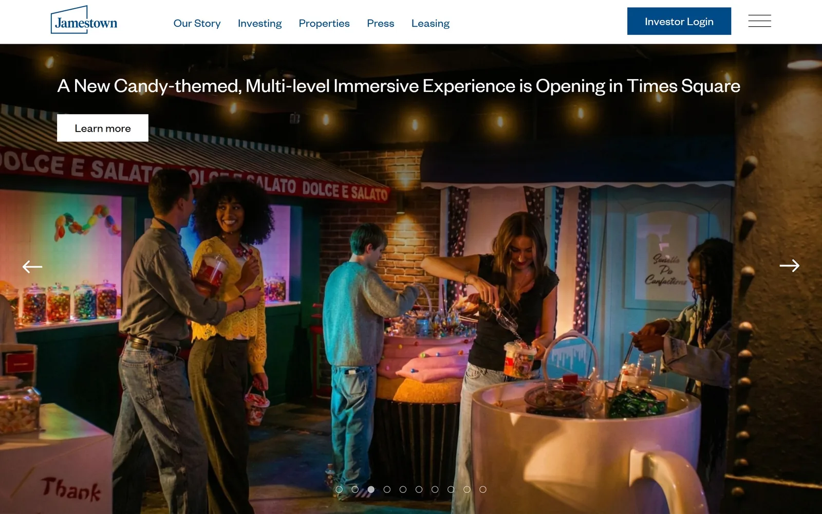
jamestownlp.com
A lit candy-shop scene fills the frame with a single-line news headline and a small white Learn more button at the top.
Type. Founders Grotesk throughout, in two cuts. The headline runs at 36px Regular with a 1.19 line height and no tracking, which is restrained for a hero. Body and button labels sit at 21px in the Light cut with 0.010em tracking. Nothing is uppercased, nothing is bold, and the result reads more like a magazine deck than a property pitch.
Colour. The navy is #004b87 and it does a lot of work: logo outline, every nav item, and the solid Investor Login button, adding up to about 41 percent of declared colour. Black carries the photographic frame. The warm tones in the image, around #fae2be, are incidental. Navy on white for an institutional real estate investor is the default for the category, and this one does not try to escape it.
Layout. A 12-column grid of 77.7px columns with unusually tight 2px gutters sits under a white header bar roughly 110px deep. The hero is a nine-frame photographic carousel with left and right arrows at the vertical midpoint and dot indicators at the bottom. Headline and button are anchored to the top left of the image rather than centred. Zero radius on the button.
The ask. Investor Login is the loudest thing on screen, solid navy at the top right, which tells you who this site is really for. The rotating Learn more button is the secondary ask and changes with each of the nine frames. Leasing sits in the nav as a third path. The carousel is doing press-release duty, so each frame is a different ask.
A nine-frame carousel works when every frame is a separate news story with its own button, not when it is nine photos of the same building.
10
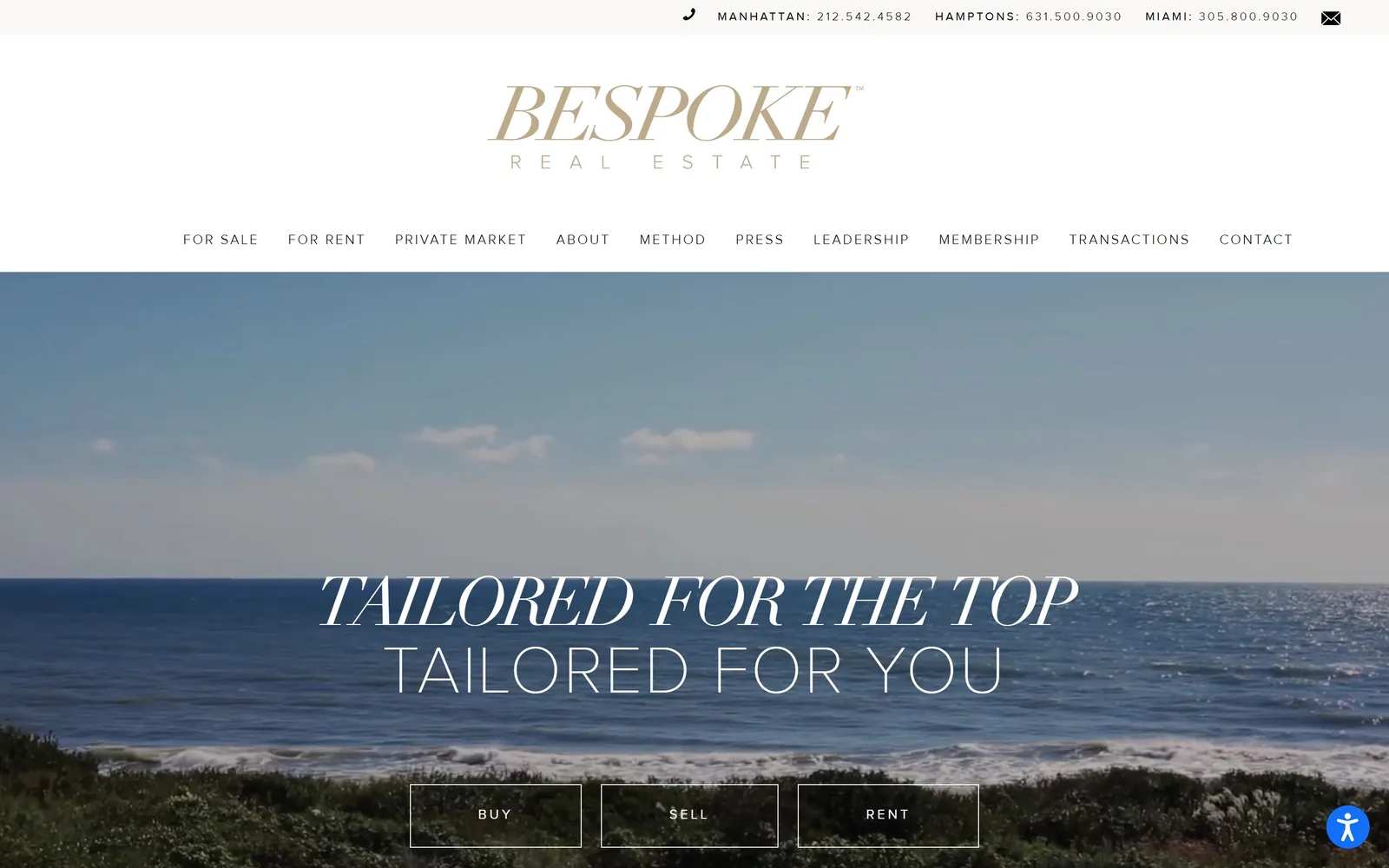
bespokerealestate.com
An ocean horizon under pale sky, with TAILORED FOR THE TOP in italic serif caps above a thin sans line reading TAILORED FOR YOU.
Type
Didot-style italic caps and ProximaNova 200, both 70px
Body
ProximaNova 14px at 0.150em, Didot 23px
Build
380px three-deck header over a 520px video band
Made on
WordPress
Colour
#ffffff #222222 #b6a179
Type. The headline is two faces at the same 70px size, stacked. The top line is a Didot-style high-contrast serif in italic caps with tracking pulled in to -0.071em so the letters almost touch. The bottom line is ProximaNova at a 200 weight, uppercase, tracking opened to 0.031em. Same size, opposite treatment, and the pairing is the one genuinely good idea on the page. Nav runs 14px at 300 weight with a wide 0.150em letterspacing.
Colour. White dominates at full coverage across the header and body, with the hero video sitting around #222222 in its darkest areas. The wordmark is a muted gold near #b6a179 and it is the only colour on the page, used for the logo and nothing else. Body copy is pure #000000 on #ffffff. For a Hamptons brokerage working at 10 million and above, the gold-on-white is category default rather than a decision.
Layout. Full 1440 width with a three-deck header: a phone bar about 48px, a centred wordmark block about 210px, then a ten-item nav row. That is 380px of chrome before the image starts. The hero video takes the remaining 520px. Headline is centred at roughly 70 percent height with three outlined buttons below it. Radius is zero throughout.
The ask. Three buttons, BUY, SELL and RENT, outlined in white and sitting side by side at the bottom edge. Above them, three phone numbers for Manhattan, the Hamptons and Miami plus a mail icon. Ten nav items including MEMBERSHIP and TRANSACTIONS. The page asks for a lot at once and the 380px header is the cost.
Setting two lines of a headline at identical size in opposite faces gives you a logotype moment without drawing a logo.
11
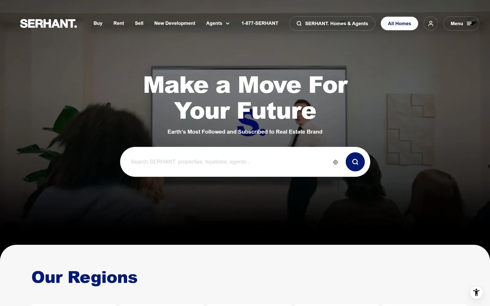
serhant.com
A dim office scene behind a heavy sans headline, a navy S. watermark and a full-width white pill search field.
Type. Montserrat at an 800 weight, 68px, with tracking at -0.022em for the headline, which is as heavy as anything in this set. The subhead drops to 16px at 500 weight. Everything on the page is Montserrat, from 68px down to 12px uppercase, so the hierarchy is carried entirely by weight and size. It is efficient and it is also the reason nothing here looks like a typographic decision.
Colour. Navy is #121275 for text and #001a72 for the search icon, against a black page background. White covers about 46 percent. The navy S. watermark sits directly behind the word Future and collides with it, which is the one real mistake on this screen. Below the fold Our Regions appears in the same navy on #f7f7f7.
Layout. Full 1440 width with a sticky header about 140px deep carrying nine separate controls. The hero is darkened video, headline centred at about 30 percent height, and a 1000px search field with a 500px radius, meaning a full pill, centred beneath it. The content below sits in a white panel with large rounded top corners. Grids run five-column at 249px with 8px gutters and three-column at 394px with 48px gutters. The page runs 36,881px deep.
The ask. The search field is the primary ask and it is huge. Around it: All Homes as a white pill, an account icon, a Menu toggle, a phone number reading 1-877-SERHANT, and Buy, Rent and Sell in the nav. That is seven routes above the fold, which is a brokerage that wants volume rather than a single conversion.
If you only use one typeface, make the weight jump violent, because 800 against 500 is the only hierarchy you have left.
12
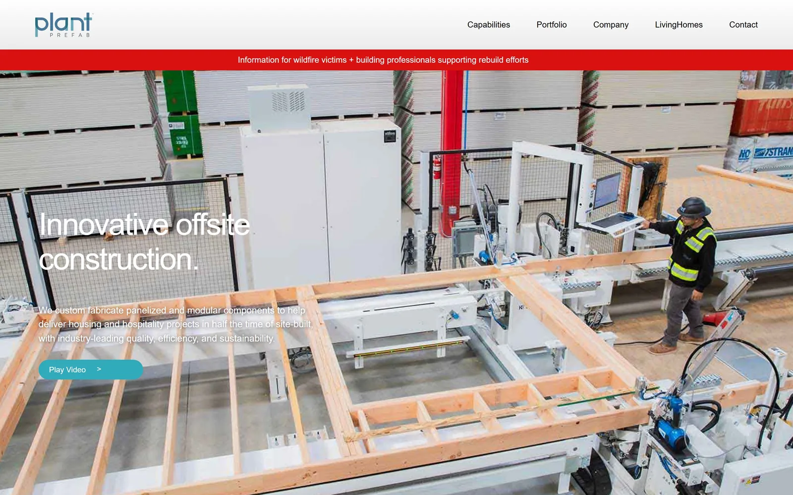
plantprefab.com
An overhead shot of a factory floor assembling a timber wall panel, with white sans type stacked down the left edge.
Type. Helvetica Neue at 56px, weight 500, tracking tightened to -0.036em, two lines, left aligned, with a full stop after the word construction. Body runs 17px regular at a 1.50 line height and nav sits at 15px. One face, three sizes, no uppercase anywhere. It is a competent system rather than an interesting one, and it suits a manufacturer better than a serif would.
Colour. White type carries the whole hero at about 5 percent pixel coverage, with the factory supplying the rest in concrete grey and raw timber. Two accents exist and they fight: a red alert strip at #d91111 across the full width under the header, and a teal pill at #31aabb on the Play Video button. The red is louder than anything the page actually wants you to click.
Layout. Full 1440 width with a white header bar about 115px deep, then the 44px red notice strip, then the photograph taking the remaining 740px. The headline block starts at roughly 46 percent height with a 72px left margin. The teal button is the only rounded element on screen, a full pill against zero radius everywhere else.
The ask. The single ask is a teal Play Video pill, which asks for attention rather than contact. Contact is the sixth and last nav item. The red strip at the top links to wildfire rebuild information and visually outranks both. For a fabricator selling to developers rather than homeowners, a light ask is defensible, but the red strip undercuts it.
An emergency notice bar will beat your call to action on contrast every time, so recolour one of them.
How these were chosen
Twelve sites here, running from Manhattan condo towers and a Beverly Hills brokerage to a prefab factory in California and a ranch broker selling land in Patagonia. The pattern across almost every one of them is that the photograph is the page: a headline, one button, and nothing else until you scroll. The second thing you notice about real estate website design at this level is how quiet the colour is, with most of these holding to two neutrals and keeping any accent under two percent of the screen. Terra and Serhant break that rule in opposite directions, and both are worth looking at for it.
Finding real estate sites that someone had actually designed took far longer than it should have. 26 candidates made the shortlist. 12 made the page.
Each one was opened and looked at properly: what the type is doing, where the colour gets spent, how the page is built, how it asks for the job. Nothing is here because it ranks. Nothing is here because an agency filed it under portfolio. Several well known names were left out for the plain reason that their site came out of the same template as everyone else's, and a few sites worth including did not survive a second look.
Where a site is only competent, it says so. The order is the order worth your time, best first.
Reviewed and selected by Larry W. Matthews for Websitely.