Property Management Website Design Past the Vendor Template
Sixteen US owners and operators, mostly commercial. Property management website design for a reader who is a committee, not a tenant.
Shown
16 sites
Reviewed
42 candidates
Chosen on
The work, not the ranking
Updated
15 October 2026
01
rudin.com
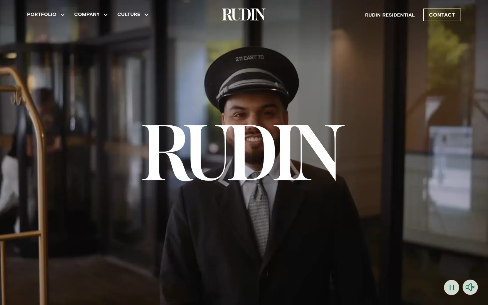
A uniformed doorman under a 211 East 70 cap fills the muted video hero, with a tall white serif wordmark laid across his chest.
Type
Lust Pro Slim 72px, uppercase
Body
Basis Grotesque Pro 21px/1.50
Build
full-bleed video, 1440px container, 0px radius
Made on
custom build
Colour
#ffffff #242423 #006e51
Type. The wordmark runs 72px in Lust Pro Slim, uppercase, tracked at zero, with hairline serifs thin enough to let the footage read straight through the counters. Everything else is Basis Grotesque Pro: nav at 14px bold, uppercase, 0.05em, and body at 21px on 1.50 leading in #242423. One voice for display, one for utility, and no third weight anywhere in between.
Colour. Two colours do the whole job. White covers the page at 195.8 in the measured palette and a single green, #006e51, carries just 30 characters of ink, which means it only ever appears on a link or a control. The dark half of the screen is video, not paint, so the chrome stays neutral and the footage supplies every tone the page needs.
Layout. Nothing is boxed. The container runs the full 1440px viewport width with a 0px corner radius throughout, the header is sticky and transparent over the video, and the three nav groups sit hard left while Contact sits hard right, leaving the centred wordmark a clear band of its own. The hero takes the entire first screen with no card, panel or scrim.
The ask. There is one ask in view, a Contact button in a thin white rule, with Rudin Residential beside it as a secondary route. No phone number, no form, no newsletter. Playback pause and mute controls sit bottom right in soft circles, which is the only other clickable thing on the first screen and reads as courtesy rather than a second request.
Give the display face one appearance at one size and let video supply the contrast the palette refuses to.
02
tishmanspeyer.com
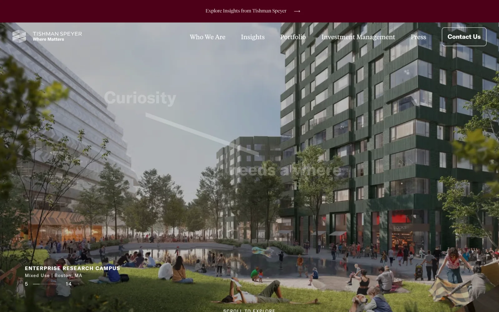
A rendered Boston campus with crowds on the grass, the word Curiosity ghosted across the sky, and a maroon announcement strip above the nav.
Type
GT America 48px/600 with Tiempos Fine 54px
Body
Tiempos Text 18px
Build
full-bleed render, 1440px container, 5 of 14 counter
Made on
custom JS framework
Colour
#ffffff #4c0018 #e2ddd9
Type. Two families share the page without arguing. GT America handles structure at 48px semibold for headings and 16px for nav, while Tiempos Fine takes the editorial steps at 54px, 42px and 32px with Tiempos Text at 18px underneath. The hero word is set at low opacity so it functions as texture rather than a headline, which is why the small bold 18px project label reads as the real entry point.
Colour. White dominates at 200 coverage against 50 of black, and the only saturated value is a deep maroon, #4c0018, at 3.6 coverage, used for the top strip and the nav links. Text on imagery is warm off-white #e2ddd9 while text below drops to near-black #1a1919, so the same page carries two ink colours for two different grounds.
Layout. The render is full bleed across the 1440px container with a 0px radius anywhere, the announcement strip pins to the top and the nav floats over the image rather than sitting in a bar. Project metadata is anchored lower left with a 5 of 14 counter on a hairline rule, which turns the hero into an index entry instead of a static picture.
The ask. A single outlined Contact Us button sits at the far right of the nav and nothing competes with it. The rest of the first screen points inward: Explore Insights in the strip, the slide counter, and a Scroll To Explore prompt at the bottom. No phone, no form, no portal login crowding the corner.
Low-opacity display type can carry atmosphere while a small bold label carries the actual message, provided only one of them is clickable.
03
hines.com
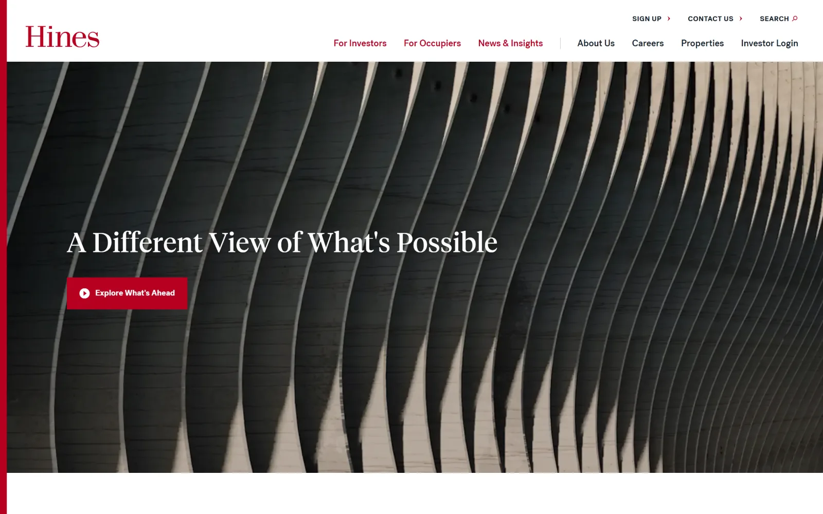
An abstract black and cream photograph of curved fins runs behind a serif headline and one crimson button, with the red wordmark at top left.
Type. TiemposHeadlineWeb sets the hero at 48px with a touch of positive tracking at 0.01em and tight 1.17 leading, and the same face scales to 90px and 40px further down the page, so the serif alone builds the whole hierarchy. PostGrotesk is kept small and functional at 12px bold with 0.042em tracking for nav and 16px for running text, never competing for a headline role.
Colour. The ground is a deep slate #1a2930 at 41 coverage with white at 6, and the single accent is crimson #b70021. That red covers barely 0.5 of the surface but carries 786 characters of ink, so it reads as a text colour rather than a decorative fill, and the nav sits in near-black #17212b beneath it.
Layout. The container is 1300px, about 90 percent of the viewport, with 40px of section padding and a 0px radius on every element including the button. A thin crimson rule runs the full height of the left edge, and the nav splits into a small utility row above a larger primary row, which keeps the header shallow over a hero that takes most of the screen.
The ask. One filled crimson button, Explore What's Ahead, with a play glyph that signals video rather than a page. Three secondary routes sit in the utility strip above the nav: Sign Up, Contact Us and Search, plus Investor Login at the end of the main row. The asks are tiered by size rather than placed side by side.
Tier the asks by scale instead of position: one filled button at hero size and everything else reduced to 12px utility text.
04
kilroyrealty.com
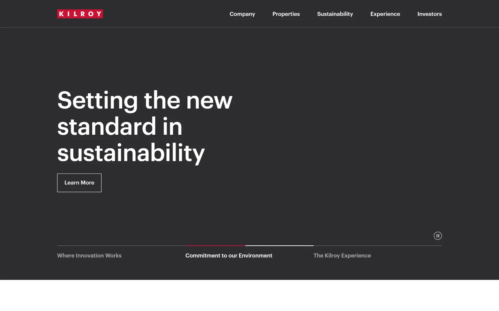
A flat charcoal field carries a three-line white headline and an outlined Learn More, with three slide labels on a hairline rule below.
Type
Graphik Medium 69px, -0.01em
Body
Graphik 16px
Build
1140px container at 79% viewport, slider rail
Made on
WordPress
Colour
#2d2d30 #ffffff #222222
Type. Graphik Medium runs the hero at 69px with -0.01em tracking and 1.10 leading, set in sentence case rather than caps, which is what keeps a 69px line from shouting. The same face drops to 20px for nav with no tracking change, so the scale jump does all the work. Playfair Display appears later at 48px and 27px as a contrasting editorial voice.
Colour. Two values hold the first screen: #2d2d30 at 180 coverage and white at 128. Body copy below switches to #222222 on white. The only saturation is the crimson block behind the logo and the short crimson segment marking the active slide, which gives the red a job rather than a decorative presence.
Layout. The container is 1140px at 79 percent of the viewport, so the headline starts well inside the frame with a wide right margin left deliberately empty. Radius is 0px throughout, including the button. The slider rail sits low with three named chapters and a pause circle at the right, turning the bottom edge into navigation instead of ornament.
The ask. A single outlined Learn More in a thin white rule is the only button in view. The five-item nav ends with Investors, and there is no phone number, search field or portal login competing for the corner. The three slide labels act as a secondary, lower-commitment route into the same material.
Name the slides. Three labelled chapters on a rule give a carousel a structure users can read without waiting for it to rotate.
05
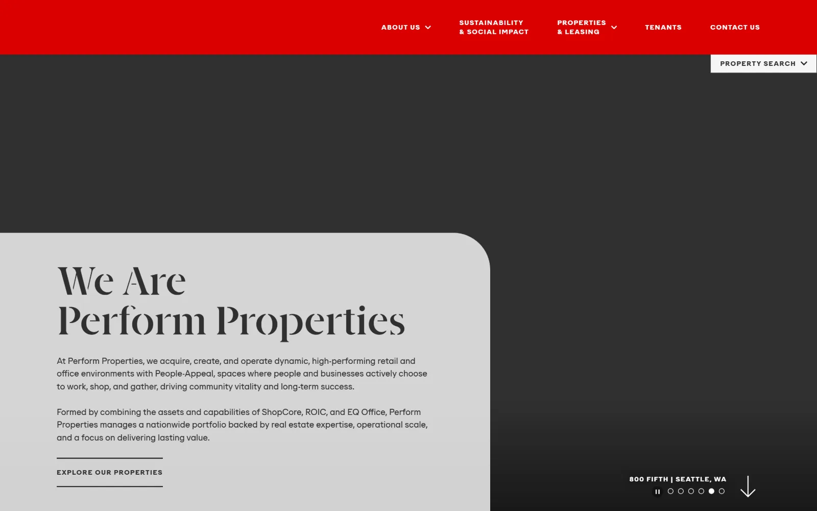
performproperties.com
A saturated red masthead sits above a charcoal field, with a pale grey panel curving in from the lower left to hold a high-contrast display headline.
Type
high-contrast didone 70px bold, 1.00 leading
Body
neutral grotesque 15px/1.50
Build
full-bleed, panel with one large corner radius
Made on
WordPress
Colour
#303030 #f6f6f6 #db0000
Type. The display face is a high-contrast didone cut, set at 70px bold on 1.00 leading so the two lines almost touch, with thin hairlines and heavy stems that read as fashion rather than property. Supporting text is a neutral grotesque at 15px on 1.50, and every label, nav item and button runs 12px bold uppercase at a wide 0.10em, which keeps the small type from blurring into the panel.
Colour. Four values carry the page: charcoal #303030 at 45.1, pale grey #f6f6f6 at 33.8, white at 16.6 and a hot red #db0000 at 5.3. The red is confined to the masthead band and nothing else, so the panel below reads as quiet by contrast and the charcoal does the work of a photograph that has not loaded.
Layout. The page runs the full 1440px width with the grey panel inset from the left and given a single large radius on its top-right corner only, so it reads as a sheet sliding over the hero. A Property Search tab is tucked under the header at the right, and a slide counter with a location caption and a down arrow holds the bottom-right corner.
The ask. The primary ask is a bare underlined link, Explore Our Properties, rather than a filled button, which is unusual at this scale. Competing with it are a Property Search dropdown pinned under the header, plus Tenants and Contact Us in the nav. Three routes in total, each visually distinct enough not to blur together.
A single large corner radius on one corner of a panel suggests motion in a static layout better than four matched rounded corners do.
06
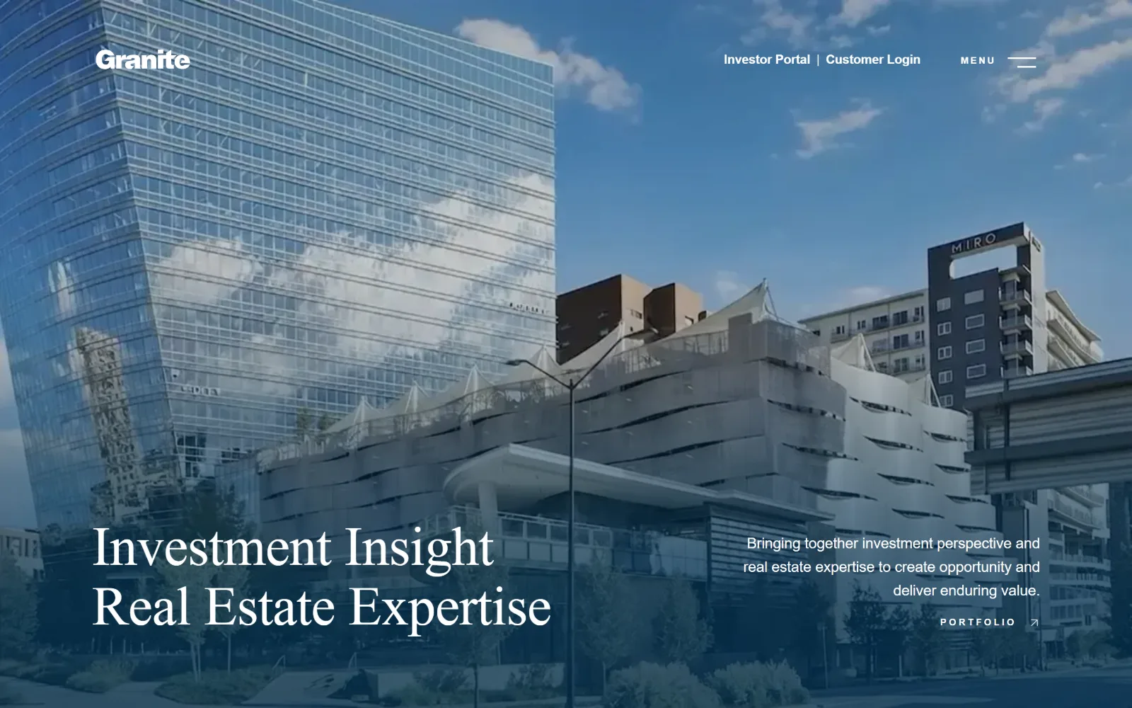
graniteprop.com
A glass tower under blue sky sits beneath a heavy blue wash, with a two-line serif headline bottom left and a right-aligned paragraph opposite it.
Type. The headline is freight-display-pro at 70px with -0.01em tracking and 1.09 leading, a transitional serif with enough contrast to stay crisp against a photograph. Proxima Nova handles support at 19px with -0.01em and a generous 1.58 leading. The nav is where the tension sits: 12px semibold at an extreme 0.25em of tracking, which stretches six short labels into a measured band.
Colour. The chrome is almost colourless, white at 150 and #ededed at 11.1, because the blue comes from the duotone treatment on the photograph rather than from any fill. Ink below the fold runs three values, slate #5b697e for body, navy #002858 for headings and a bright #025beb for links, so saturation increases as you scroll rather than peaking in the hero.
Layout. The container is 1210px at 84 percent of the viewport with a deep 118px of section padding, and content below sits in a three-column grid of 372px tracks with 40px gaps. Radius is 0px. The hero is full bleed with the headline and the paragraph pushed to opposite bottom corners, so the empty middle is the composition.
The ask. Two asks share the top right, Investor Portal and Customer Login, separated by a pipe, with a Menu toggle beside them. In the hero itself there is one route, a Portfolio link with an arrow. Nothing is filled or boxed, so the page asks three times without ever raising its voice.
Push a headline and its paragraph into opposite bottom corners and the empty middle of the photograph becomes part of the typography.
07
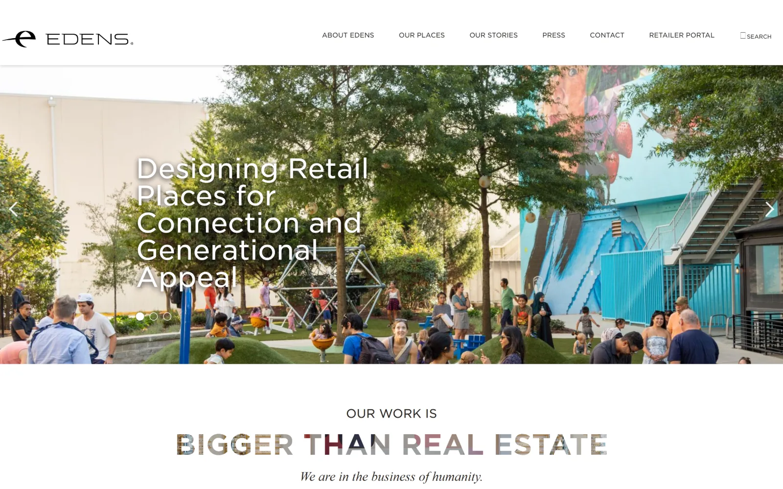
edens.com
A shaded plaza full of families sits behind a white sans headline, with a line below reading Bigger Than Real Estate filled with photo texture.
Type
Gotham SSm 52px bold, uppercase
Body
Gotham SSm 22px
Build
full-bleed carousel, 1440px, 80px section padding
Made on
WordPress
Colour
#ffffff #2d2926
Type. Gotham SSm carries almost everything: 52px bold uppercase on 1.00 leading for the statement line, 50px regular for the carousel headline, 12px uppercase for nav. Two other faces appear in small doses, a bold italic didone at 34px and a light Chronicle Display at 24px, which is what stops a single-family page from reading as corporate boilerplate.
Colour. The measured palette is white at 124.5 against black at 17.5, with ink at #2d2926, a warm near-black rather than a true one. All the saturation on the page is borrowed: the letters of the statement line are filled with cropped photography, so colour arrives through the type itself instead of through a fill, a tint or a button.
Layout. Content runs the full 1440px width with 80px of section padding and five stacked flex rows, radius 0px throughout. Carousel arrows sit at the vertical centre of the hero's left and right edges while the dots sit low and left, under the headline rather than centred, which keeps the eye in the same column it started in.
The ask. There is no button anywhere on the first screen. The only routes are the six nav labels, a Retailer Portal link and a search toggle, and the carousel arrows. For a landlord courting national tenants that is a deliberate refusal to behave like a lead-capture page, and it puts the full weight on the statement line.
Filling display letterforms with cropped photography lets a two-colour page carry image without adding a single tint to the palette.
08
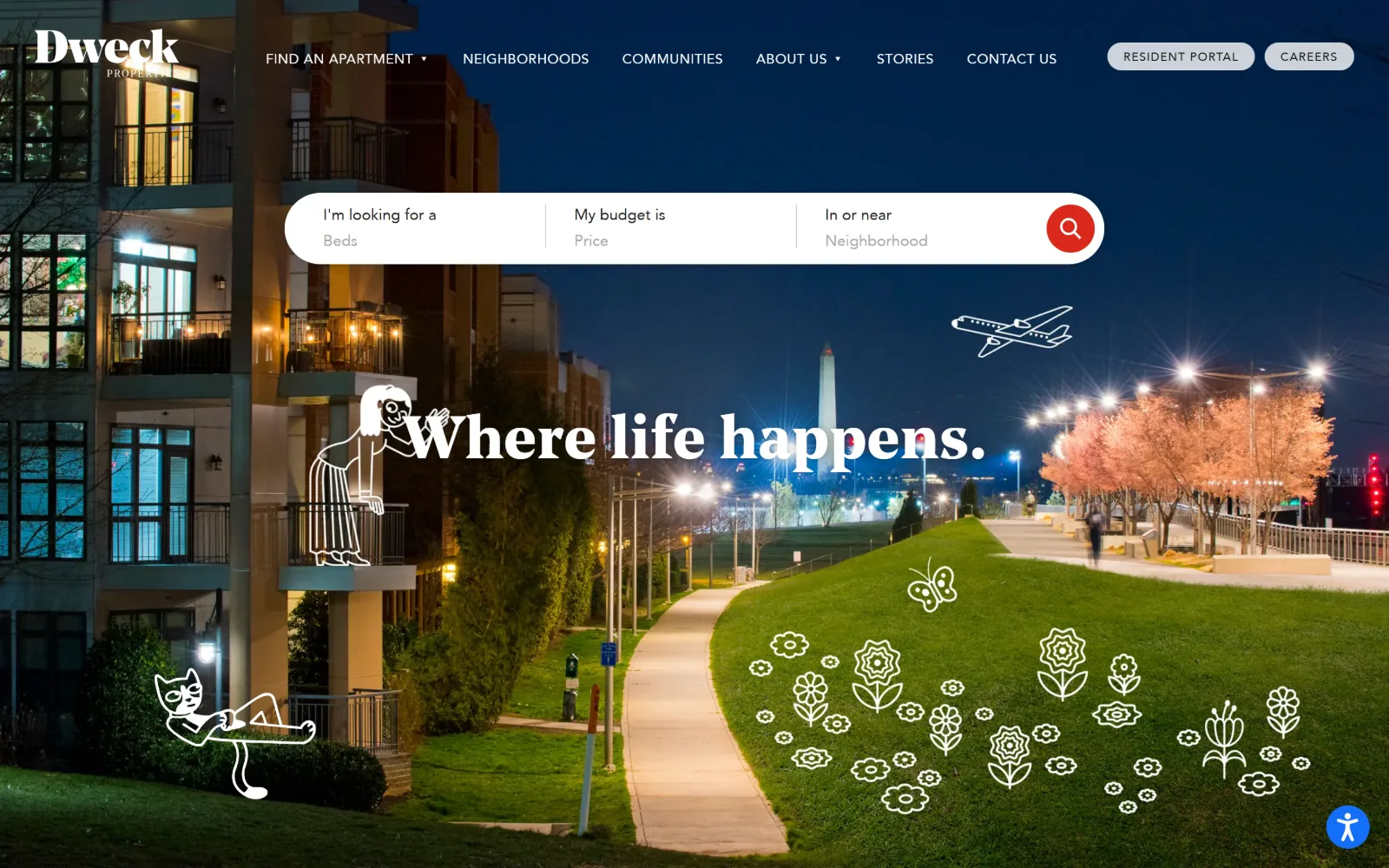
dweckproperties.com
A night view of waterfront apartments with the Washington Monument behind, overlaid with white line drawings of a cat, a figure and flowers.
Type
Noe Display 62px/1.06
Body
Noe Text 21px/1.38
Build
full-bleed photo, pill search bar overlapping hero
Made on
WordPress
Colour
#ffffff #1c1c1c #da291c
Type. Noe Display sets the headline at 62px on 1.06 leading, a contemporary didone with flat serifs that sits well over a dark photograph, and Noe Text follows at 21px on 1.38 for running copy. The nav switches to Avenir at 14px uppercase with 0.036em, so the serif stays with the brand voice and the sans stays with the controls.
Colour. The hero measures white at 30.9 and near-black #1c1c1c at 22.9, with red #da291c at only 0.1 coverage. That red appears once, as the circular submit on the search bar, which makes a single small disc the most saturated object on a busy night photograph.
Layout. The background image runs full bleed at the 1440px container width with a transparent header over it. The search bar is a white pill overlapping the top of the hero, its fields divided by hairline rules, and the two top-right account links are also pill-shaped, so rounded forms mark everything interactive and the rest of the page stays square.
The ask. The search bar is the page: three fields for beds, price and neighbourhood with a red circular submit. Behind it sit Resident Portal and Careers as outlined pills, and Find An Apartment repeats the same intent in the nav. Three asks, but two of them are the same ask stated twice, which is why it does not feel crowded.
Reserve rounded shapes for interactive elements only, and a user can find the controls on a dark photograph without any contrast tricks.
09
shorenstein.com
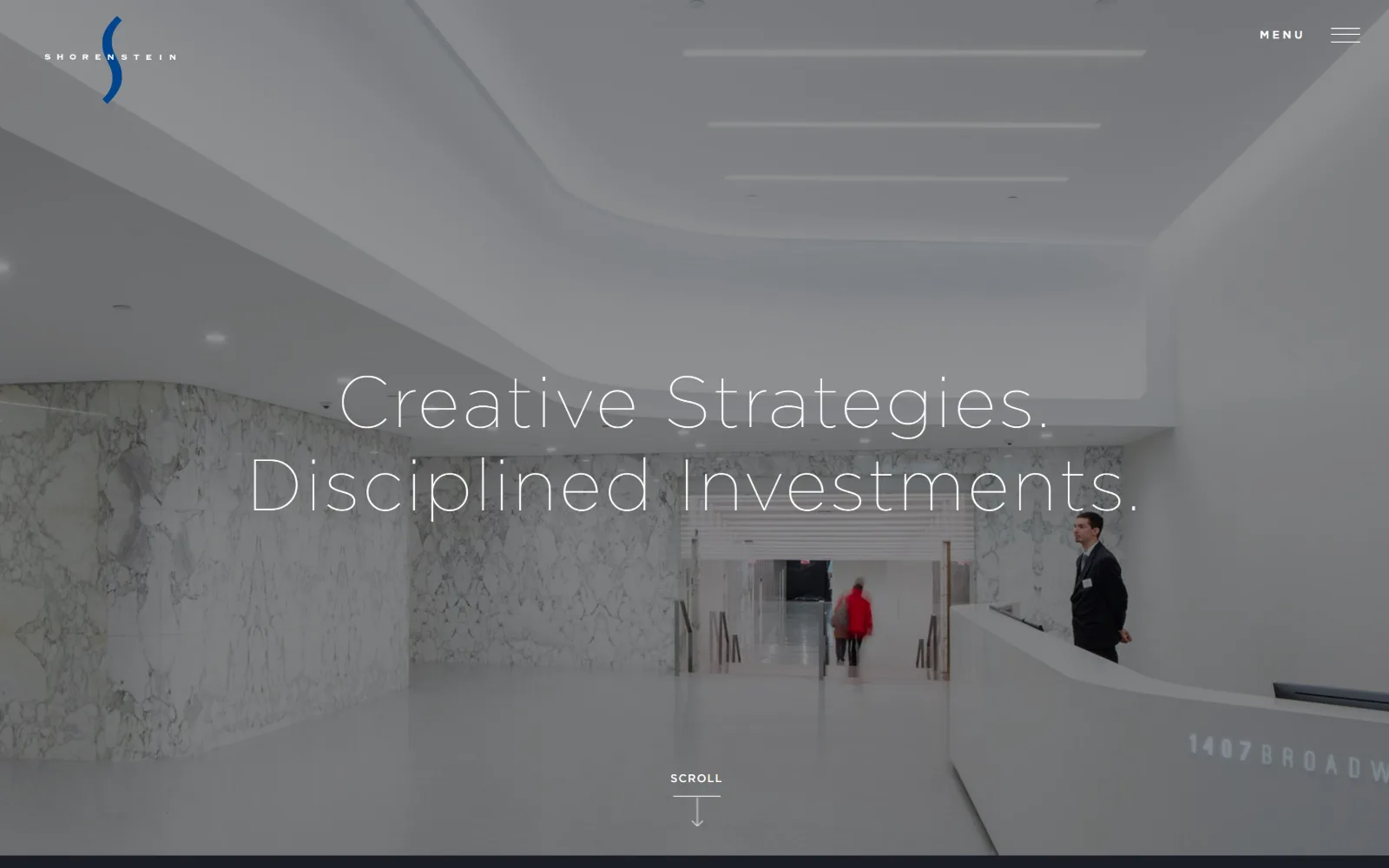
A pale marble office lobby fills the frame, with a two-line hairline headline centred across it and a thin Scroll arrow beneath.
Type
Gotham Thin 75px, 0.04em
Body
Gotham Light 28px/1.56
Build
full-bleed photo, 1440px, menu toggle only
Made on
WordPress
Colour
#dadada #212a42 #b4b4b4
Type. The headline is Gotham Thin at 75px with 0.04em of positive tracking in title case, which is the lightest weight on this page and still the largest thing on it. Supporting copy runs Gotham Light at 28px with 0.029em and a loose 1.56 leading, and the nav drops to Gotham Book at 14px with a very wide 0.143em, so every step is the same face at a different thinness.
Colour. The body ground is #dadada at 100 coverage with white also at 100 and black at 63.4 from the photograph, plus a trace of #1a1d26. Ink is a cool navy #212a42, never pure black, and the nav grey is #b4b4b4. Nothing on the first screen is saturated at all, which puts the whole burden on the marble.
Layout. Full bleed at 1440px with a 0px radius and no visible nav bar, only a wordmark top left and a Menu toggle top right. The headline is optically centred rather than aligned to a grid, and the Scroll cue sits on the vertical axis beneath it, so the hero behaves like a title card rather than the top of a page.
The ask. Nothing is asked for on the first screen. There is no button, no phone number, no search and no portal login, only Menu and a Scroll prompt. A $20.6 billion figure waits further down. For a firm whose audience arrives already knowing the name, withholding every ask is the position.
Build the whole scale from one typeface at four weights of thinness and the hierarchy stays legible without a single bold.
10
greystar.com
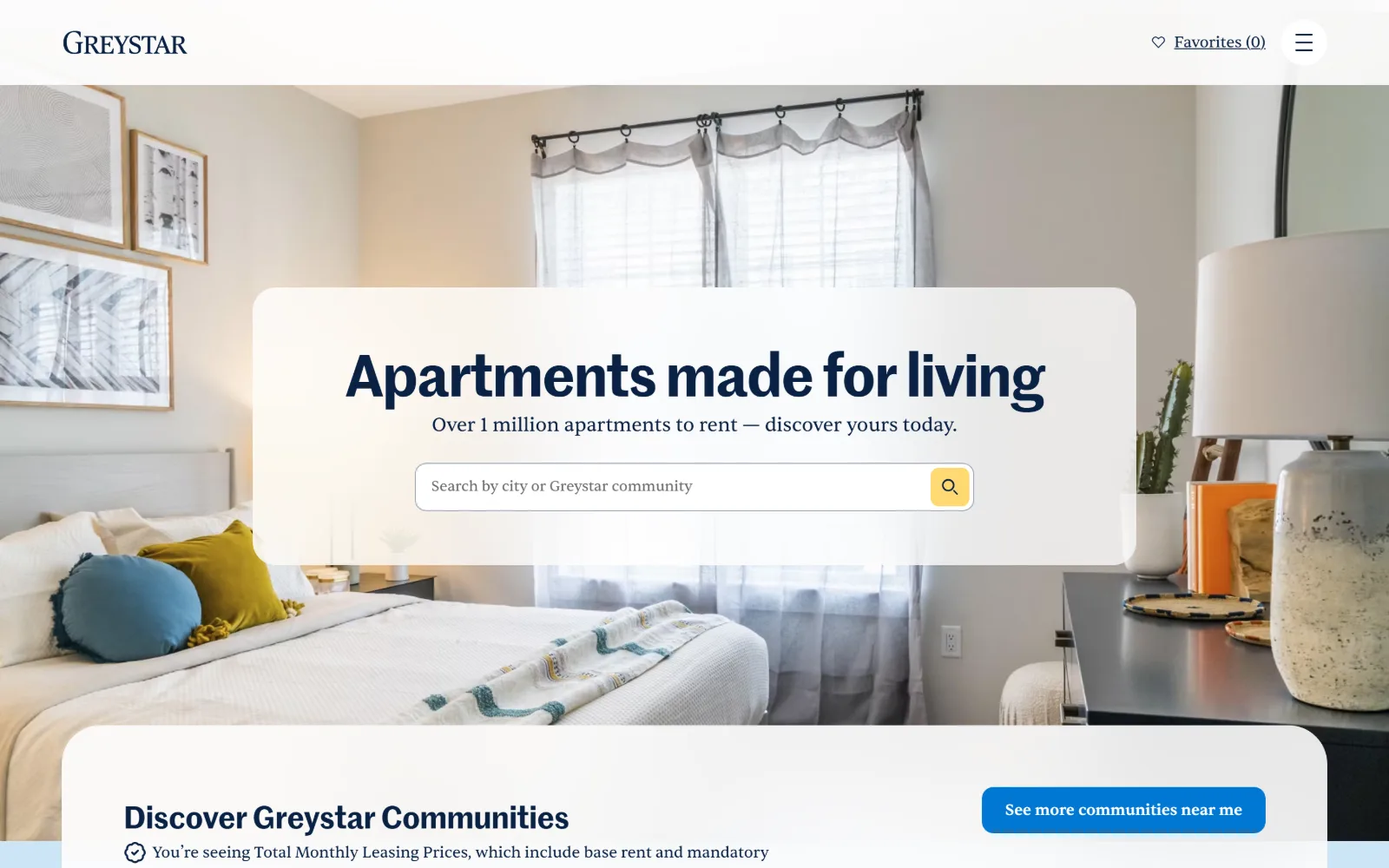
A styled bedroom photograph sits behind a frosted rounded card holding a navy headline, a line of serif copy and a search field with a yellow button.
Type
Marr Sans Semi Bold 60px, -0.02em
Body
Sentient 16px/1.50
Build
frosted card over photo, 9999px pill radius
Made on
custom JS framework
Colour
#ffffff #0a2245 #cce4f6
Type. Marr Sans Semi Bold sets the headline at 60px with -0.02em of negative tracking on 1.07 leading, which closes the word spacing enough to make six words behave as one block. Everything else is Sentient, a serif, at 16px for body and nav and 22px for supporting lines, so the pairing runs sans for display and serif for reading, the reverse of the usual arrangement.
Colour. The page measures white at 188.8, a pale blue #cce4f6 at 39.2 and near-black at 1.5, with a yellow #ffd972 at 0.1. That yellow exists only inside the search button, roughly the size of a thumbnail, and the navy #0a2245 does all the typographic work across 571 characters of ink.
Layout. Full 1440px bleed with 40px of section padding, and a common border radius recorded at 9999px, meaning pills and fully rounded corners are the default rather than an exception. The frosted card overlaps the hero photograph and the section below it repeats the same large rounded top edge, so the page reads as stacked soft sheets.
The ask. One search field is the primary ask, with a yellow submit that is the only warm colour on screen. A Favourites counter and a hamburger hold the top right, and a See More Communities Near Me button appears immediately below the fold, so the second ask does not compete with the first until you scroll.
Pairing a sans for display with a serif for body inverts the default and gives a search-led page a residential tone without any extra colour.
11
hudsonpacificproperties.com
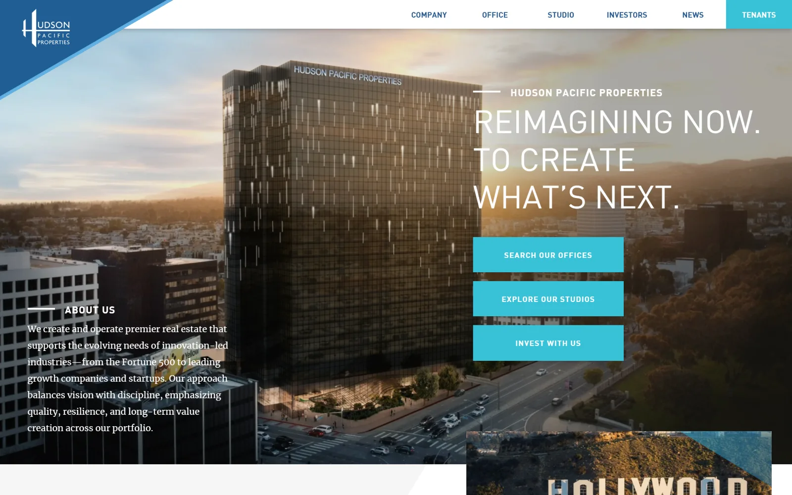
A sunset render of a glass tower carries an uppercase headline at the right over three stacked cyan buttons, with a blue diagonal top left.
Type
FF DIN 58px, uppercase
Body
FF DIN 16px
Build
full-bleed render, diagonal cuts, 48px padding
Made on
custom build
Colour
#ffffff #38c2d8 #26588d
Type. FF DIN sets the hero at 58px uppercase on 1.18 leading, an engineering face used at display size, with a 48px step repeating below. The bold cut handles nav at 14px and buttons at 14px with 0.071em of tracking. An About Us paragraph in the lower left switches to a serif, the only serif on screen, which marks the difference between claim and explanation.
Colour. White runs 190.9 and #f6f6f6 53.1, so the chrome is effectively two greys, and a single cyan #38c2d8 at 2.5 coverage carries every button plus the Tenants tab. Nav links sit in a muted blue #26588d. The sunset in the render supplies the warmth, and nothing in the interface tries to match it.
Layout. Full 1440px bleed with 48px of section padding and a 0px radius throughout. Diagonal cuts are the structural motif: one through the logo block at the top left, one across the overlay card at the bottom. The three buttons stack vertically at exactly the same width, which is what gives the right-hand column its spine.
The ask. Three cyan buttons of identical size sit one above the other, Search Our Offices, Explore Our Studios and Invest With Us, which is three audiences asked at once with no priority between them. A fourth cyan block, Tenants, holds the far right of the nav. Clear routing, but the equal weighting leaves the ranking to the reader.
Three equal buttons route three audiences cleanly, but equal size means the page has declined to say which visitor it wants most.
12
gid.com
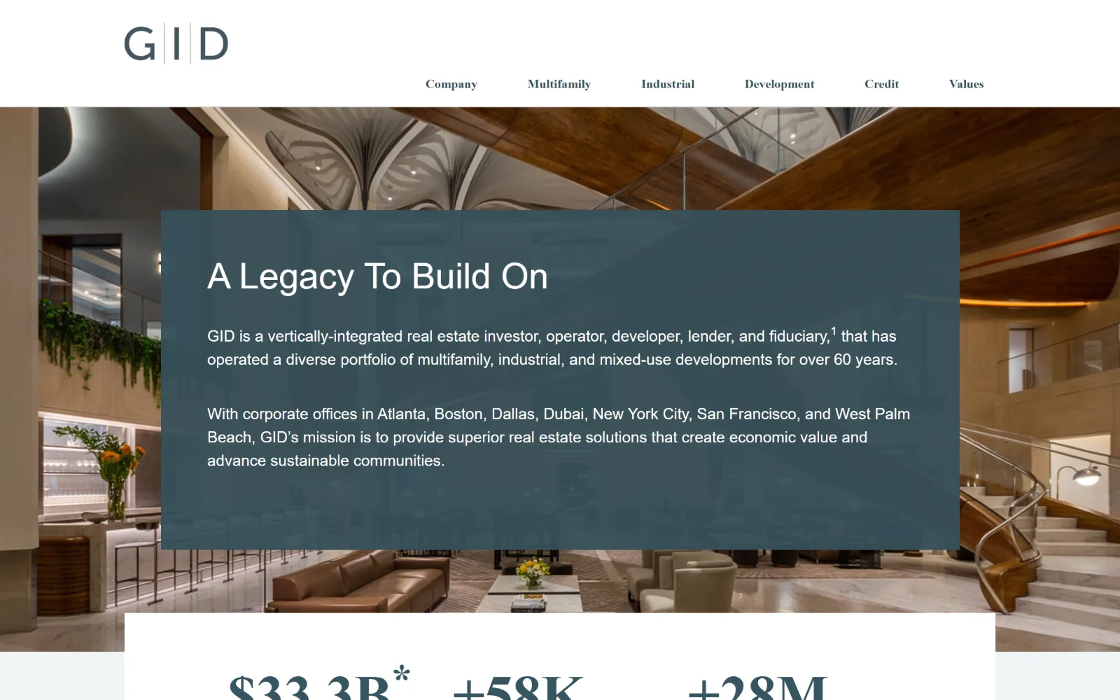
A warm timber-and-marble lobby sits behind a large translucent slate panel carrying a headline and two paragraphs, with a stat row beginning below.
Type
Quattrocento Sans 46px
Body
Quattrocento Sans 20px/1.50
Build
translucent inset panel, stat band above fold
Made on
WordPress
Colour
#37505a #ffffff #eff5f6
Type. A single superfamily covers the page: the serif cut for the wordmark, nav at 16px and headings that reach 72px bold further down, with the sans cut at 46px for the hero headline and 20px on 1.50 for body. Using the sans for the hero and the serif for the nav is the inversion that gives the panel its calm, institutional read.
Colour. The slate #37505a measures 117.3 against white at 120 and a pale #eff5f6 at 53.4. That slate is both the panel fill and the heading ink #365561, which is why the overlay feels like part of the photograph rather than a box dropped on it. Body text inside the panel reverses to white across 459 characters.
Layout. Full 1440px bleed with a 0px radius, the panel inset from the left edge and extending past the centre, with heavy internal padding on all four sides. Below it a white band carrying three figures, 33.3B, 58K and 28M, breaks the hero before the fold, so the page proves scale immediately rather than waiting.
The ask. No button appears in view. Six nav labels are the only routes, and the panel copy ends with a footnote marker on the word fiduciary rather than a link. A page that asks for nothing and shows three numbers instead is positioning itself for institutional capital, not for a form fill.
A translucent panel tinted with the page's own heading colour sits inside a photograph instead of on top of it.
13
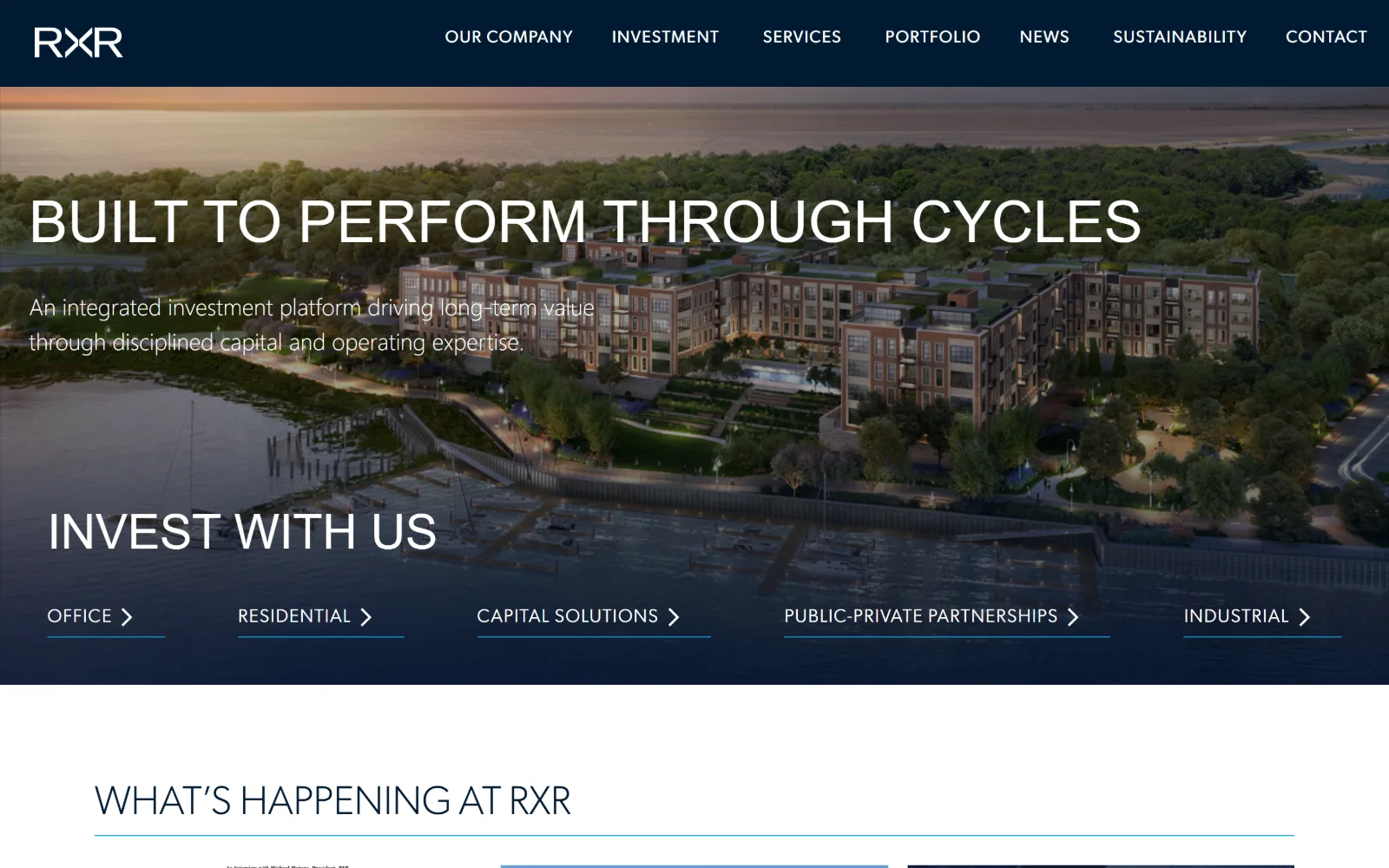
rxr.com
An aerial dusk render of a waterfront development sits under a navy wash, with a wide thin headline above a row of five underlined sector links.
Type
Gibson 60px weight 200, uppercase
Body
Gibson 22px weight 300
Build
full-bleed render, 401px three-column grid below
Made on
WordPress
Colour
#001a32 #ffffff #00a3e3
Type. Gibson runs the hero at 60px in weight 200, uppercase, with 50px and 42px steps below it, so the largest type on the page is also the lightest. Body copy sits at 24px in weight 300 and the nav at 18px uppercase with 0.056em. There is no bold anywhere on the first screen, which is a risk at this width and works because the headline is short.
Colour. White measures 100 against black at 39.4, with two navies, #001a32 at 5 and #02183d at 1.3, holding the header and the gradient over the render. A bright #00a3e3 carries 45 characters of ink, all of it in the nav and the sector links, so the only saturated colour on the page is also the only interactive one.
Layout. Full 1440px bleed with a 0px radius and a solid navy nav bar above an image that fades into the same navy at its base. Below the fold a three-column grid of 401px tracks with 20px gaps carries news. The sector links sit on one baseline with individual underlines, which turns a row of five into a single horizontal rule.
The ask. No button at all. The five sector links, Office, Residential, Capital Solutions, Public-Private Partnerships and Industrial, are the whole conversion layer, each with a chevron and an underline. Contact sits at the end of a seven-item nav. The ask is segmentation rather than commitment.
Five underlined links on one baseline can do a button row's work and keep a hero image free of filled rectangles.
14
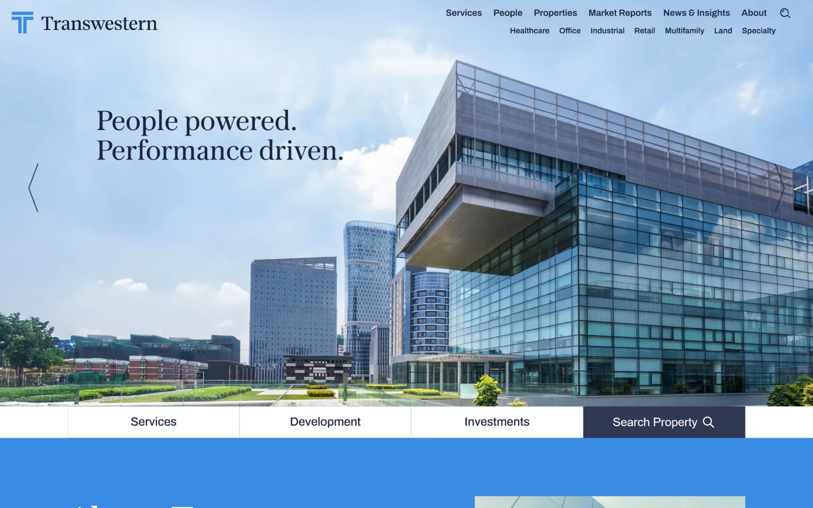
transwestern.com
A cantilevered glass office block under bright cloud sits behind a two-line serif headline, with a four-tab bar running across the base of the hero.
Type
Austin News Deck 66px/1.25
Body
Archivo 15px/1.60
Build
full-bleed photo, two-tier nav, four-tab bar
Made on
custom build
Colour
#398be4 #004073 #ffffff
Type. Austin News Deck sets the headline at 66px on a roomy 1.25 leading, a newspaper serif with sharp, narrow forms that stay legible against sky. Archivo handles everything functional at 15px on 1.60 for body, 23px semibold for subheads and 17px for the sector row. The serif never appears below display size, so the two faces never sit on the same line.
Colour. Blue dominates in three steps: a bright #398be4 at 92.5, a dark #004073 at 40 and a near-black #323850 at 0.6, against white at 123.4. Headline ink is white over the photograph and #1d243d below it. The bright blue is doing double duty as both a large background field and a link colour, which flattens the hierarchy slightly.
Layout. Full 1440px bleed with a deep 103px of section padding and a 0px radius. The nav is two-tier, seven primary labels above seven sector labels, which is a lot of header for one screen. A four-tab bar spans the bottom of the hero, and a carousel arrow sits at the left edge at the vertical midpoint of the headline.
The ask. The four-tab bar is the main ask: Services, Development, Investments and Search Property, with only the last filled in dark navy to mark it as different. Above it the two-tier nav offers fourteen more routes, so the tab bar is doing the work of cutting fourteen options down to four.
When a nav carries fourteen labels, a four-tab bar under the hero is not decoration, it is the real navigation.
15
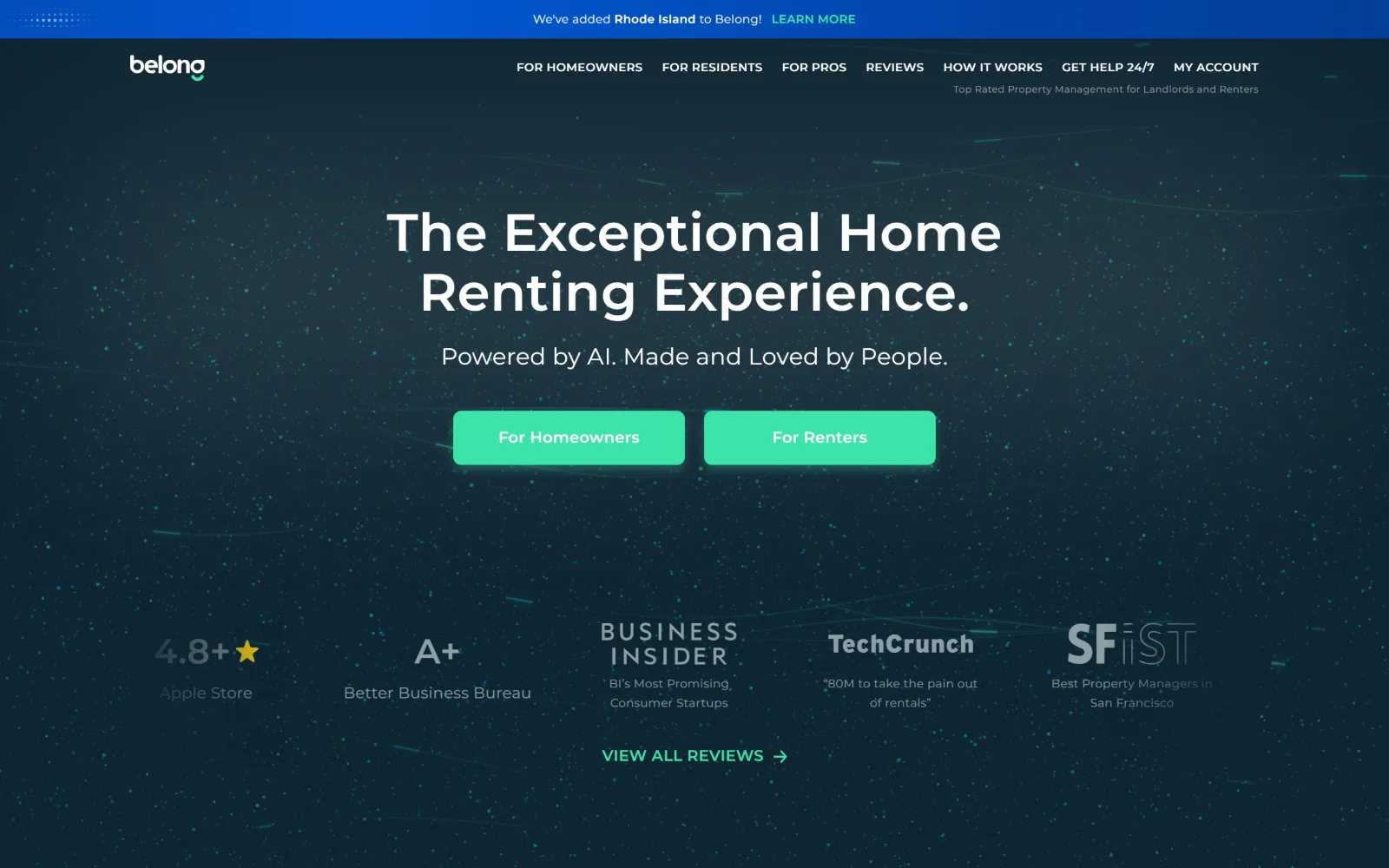
belonghome.com
A dark teal field scattered with faint particles holds a centred white headline, two mint buttons side by side and a row of press marks below.
Type
Montserrat 54px/600, 0.009em
Body
Montserrat 16px
Build
centred column, 8px button radius, five-up logo row
Made on
custom JS framework
Colour
#0f2532 #3ee4a9 #0458d6
Type. Montserrat does every job here, from the 54px semibold headline with 0.009em tracking and 1.15 leading, through a 24px regular subline, to 16px semibold buttons and 12px captions. One geometric sans across five sizes is efficient and consistent, though it leaves the page with no voice for the editorial lines that a second face would give it.
Colour. The ground is a deep teal #0f2532 at 112.9 with a charcoal #323239 at 41.3 beneath it. Two accents remain: a blue #0458d6 at 2.2 for the announcement strip and a mint #3ee4a9 at 1.0 for both buttons. Body ink is a desaturated #8ea0a4, which keeps the supporting text from fighting the mint.
Layout. Full 1440px bleed with the content locked to a centred column and an announcement strip above the nav. Buttons carry an 8px radius, the only rounding on the page. Press marks sit in a five-up row at reduced opacity, which gives the lower half of the hero a measured rhythm without adding another colour.
The ask. Two mint buttons of equal size, For Homeowners and For Renters, split the audience at the first click. Around them sit My Account, Get Help 24/7 and a View All Reviews link, and the strip above offers a Learn More. That is five asks on one screen, which is the cost of serving two sides of a marketplace.
Splitting the hero button into two equal halves is the honest move for a marketplace, but it doubles every downstream ask on the page.
16
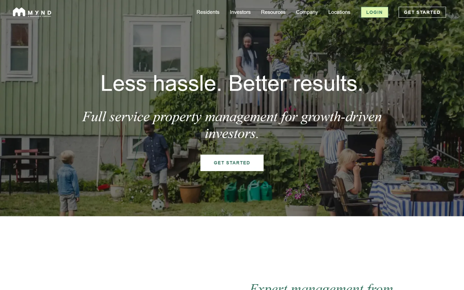
mynd.co
A backyard scene of families at a green timber house runs behind a light sans headline, an italic serif subline and a white Get Started button.
Type. Poppins at weight 300 sets the headline at 68px on 1.12 leading, so the largest line is also a light one, and body copy stays in the same face at 16px in #686868. The subline switches to Taviraj, an italic serif, at 44px, and that single italic line is what separates the promise from the explanation without any change in colour or size order.
Colour. White covers 42.8 and a forest green #33755e covers 20.7, with a pale lime #dff6af at 0.1 used only for the Login pill. The green appears as section fill, as button label colour and as link ink across 62 characters, so one hue does three jobs and the page needs no second accent.
Layout. The container is 1240px at 86 percent of the viewport with a deep 120px of section padding and a two-column grid of 486px tracks below the fold. The hero photograph bleeds the full width behind a centred text column, radius is 0px throughout, and the header is sticky with the nav sitting directly on the image.
The ask. Get Started appears twice on one screen, once as a bordered button in the header and once as a filled white button in the hero, with a lime Login pill between them. The nav carries twenty items in total, so the repeated button is less a redundancy than a handrail through a very wide header.
One italic serif line between a light sans headline and a button does more separating than a colour change or a rule would.
How these were chosen
Shortlisting property management website design means accepting that the pure residential managers are nearly all vendor builds on the same three templates, so this set leans toward commercial and mixed-use operators and owner-operators, where the design budget actually lands. What holds across almost all of them is restraint in colour: fifteen of the sixteen run two or three values, with the accent carrying links and one button rather than filling anything. What does not hold is the ask. The investor-facing pages often have no button on the first screen at all, while the resident-facing and marketplace pages open with a search field or two competing audience buttons. Same industry, opposite jobs, and the first screen shows which one the owner thinks it is doing.
Finding property management sites that someone had actually designed took far longer than it should have. 42 candidates made the shortlist. 16 made the page.
Each one was opened and looked at properly: what the type is doing, where the colour gets spent, how the page is built, how it asks for the job. Nothing is here because it ranks. Nothing is here because an agency filed it under portfolio. Several well known names were left out for the plain reason that their site came out of the same template as everyone else's, and a few sites worth including did not survive a second look.
Where a site is only competent, it says so. The order is the order worth your time, best first.
Reviewed and selected by Larry W. Matthews for Websitely.