Self Storage Website Design Judged on 15 First Screens
Fifteen US operators, promo heroes and all. Self storage website design turns on how fast you reach a unit size, a price and a door.
Shown
15 sites
Reviewed
36 candidates
Chosen on
The work, not the ranking
Updated
15 October 2026
01
clutter.com
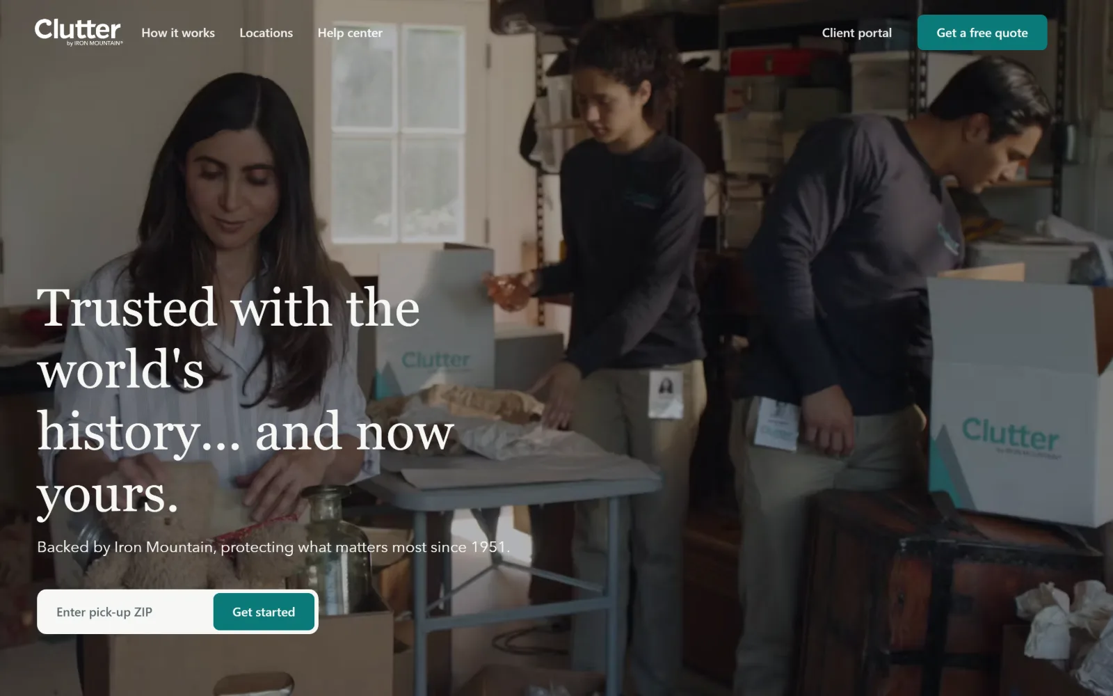
Three people pack boxes in a garage across a full-bleed video, with a four-line serif headline and a pick-up ZIP field at lower left.
Type
EB Garamond 68px, 1.18 leading
Body
Avenir Next 16px, 20px secondary
Build
full-bleed video, 1440px, 98px section padding
Colour
#f6f7f5 #040711 #e6e2d7
Type. EB Garamond at 68px, weight 500 and 1.18 leading, is the only serif in this group, and it is doing the work of a heritage mark rather than a storage advert. Everything operational sits in Avenir Next at 16px weight 500: nav, button, the 20px subhead. The gap between a 68px book serif and a 16px grotesque is wide enough that no second display size is needed.
Colour. Two grounds and one accent. The near-white #f6f7f5 covers the most surface at 143.6, the near-black #040711 at 50.0 holds the video overlay, and a warm #e6e2d7 at 7.2 softens the lower panels. Saturation is rationed to teal #0b7a79 at 0.5 coverage, which appears only on the quote button and the Get started control. Running text sits in a slate #263e45.
Layout. Full-bleed 1440px with no visible container inset, so the video runs edge to edge and the header floats transparently over it with no bar of its own. Section padding below the hero is 98px. Corners are mostly square, with an 8px radius reserved for the two buttons. The ZIP input and its button form a single pill-shaped unit pinned to the lower left.
The ask. Two asks, clearly ranked. Get a free quote sits in the header as the only filled teal control, and the hero repeats the same intent as a ZIP field with Get started. There is no phone number anywhere in the frame, which is a deliberate push toward the self-serve quote flow rather than a call.
A book serif at 68px over documentary video buys credibility that no amount of sans serif headline weight will, provided the interface type stays plain.
02
stufstorage.com
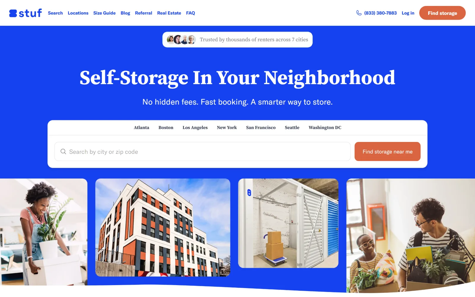
An electric blue field fills the hero, carrying a white serif headline, a row of seven city names and a search bar above four photos in a curved band.
Type
serif ~60px, weight 700
Body
GT America 14 to 20px
Build
full-bleed blue, pill controls, curved photo band
Made on
custom JS framework
Colour
#1642f0 #ffffff #f9f5f0
Type. The display line is a high-contrast serif set around 60px at weight 700, which reads as editorial against the flat blue rather than as a storage brand. Interface type is a tight grotesque: nav at 14px weight 600, buttons at 15px weight 700, supporting copy at 16 to 20px. A 36px capitalised tier sits between them. The serif appears once and is not repeated below.
Colour. The blue is the whole idea. #1642f0 covers 44.9 against white at 71.1, with a warm #f9f5f0 at 8.0 for the panels underneath and terracotta #d96541 at 0.7 carrying both buttons. The same blue doubles as link ink across 249 characters, so the accent and the brand colour are one value rather than two.
Layout. Full 1440px width with the blue running edge to edge and a white search card floating on it. Buttons use a 9999px radius, so every control is a full pill. The photo strip below is four unequal panels under a curved mask that cuts into the blue, which is the one non-rectangular move on the page.
The ask. The search card is the page. City tabs sit above the input as a second path for people who do not want to type, Find storage near me handles geolocation, and a duplicate Find storage button sits in the header. The phone number 833 380 7883 is present but set at nav weight, not promoted.
Pick one saturated hue, use it for the ground, the links and the logo, and the page needs no second brand colour to feel owned.
03
usstoragecenters.com
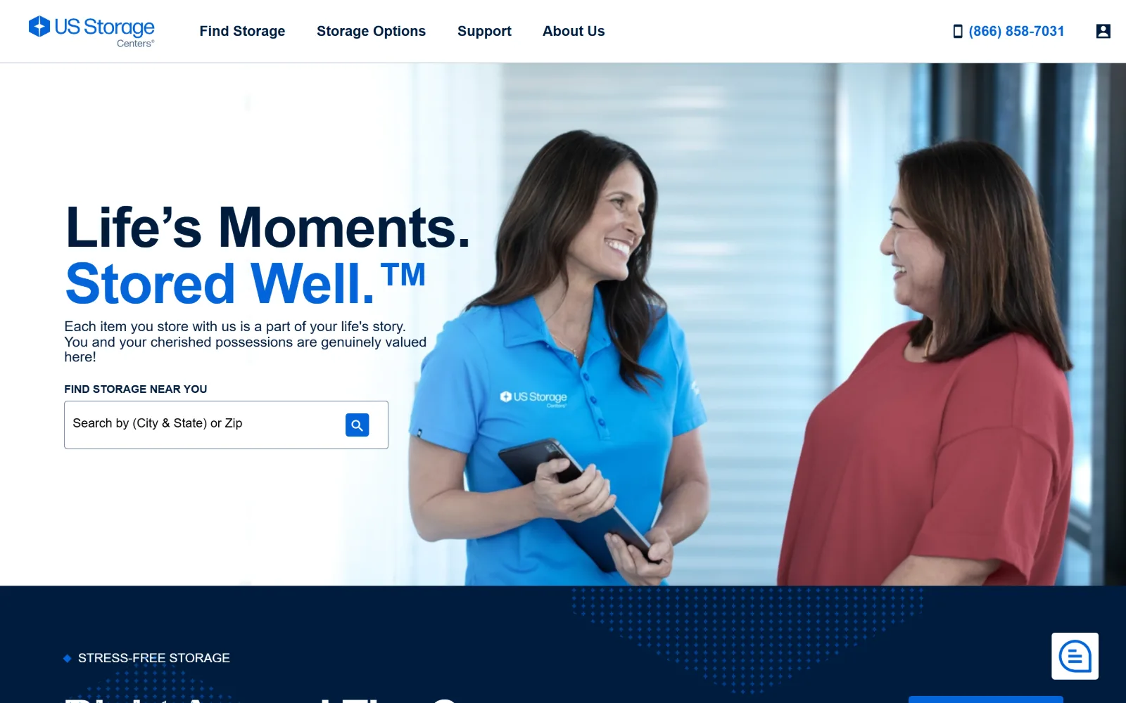
Left half is white with a navy two-line headline and a search field; the right half is a photograph of two women talking in a bright storage corridor.
Type
forma-djr-text 72px, -0.02em
Body
gesta 18px, 1.1 leading
Build
50/50 split, 1440px full bleed, 4px radius
Colour
#001c3e #ffffff #efefef
Type. forma-djr-text runs the headline at 72px, weight 700, tracked in to minus 0.02em with 1.0 leading, so the two lines stack as a solid block. Body and nav switch to gesta at 18px with unusually tight 1.1 leading, which keeps the three-line paragraph compact under the headline. The uppercase 16px button text is tracked the same minus 0.02em as the display.
Colour. Navy #001c3e is the ink and the second ground, covering 41.7 and carrying 812 characters of text. White holds 55.9, a flat #efefef at 37.2 separates bands, and #0365d9 at 8.6 is the only saturated value, used for the trademark line, the nav hover and the search button. Three colours plus grey, no fourth.
Layout. Full 1440px bleed with a clean 50/50 vertical split, text left and photograph right, no gutter between them. The header is a thin white bar with no utility strip above it. Radius is 4px on the input and button. Below the fold the navy band is edged with a dotted halftone that softens the join instead of a hard rule.
The ask. One ask. A single search field under a Find storage near you label, with the phone number 866 858 7031 and an account glyph in the header and nothing else competing. The headline sells reassurance rather than a discount, which is rare in this set.
A 50/50 split with the type block tracked tight and the photo given equal weight lets a single search field carry the hero without a promotional crutch.
04
primestoragegroup.com
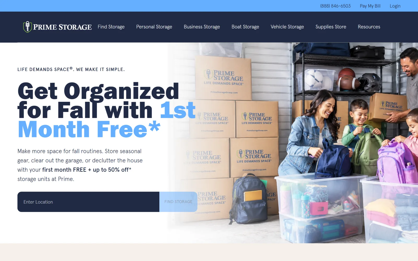
Cream hero carrying a huge condensed headline, half navy and half light blue, beside a photograph of a family packing boxes above a dark search bar.
Type
condensed heavy 84px, 0.79 leading
Body
apercu 20px, weight 300
Build
two-tier header, 45/55 split, zero radius
Made on
WordPress
Colour
#f5f0ea #202a44 #66afff
Type. An 84px condensed heavy face sets the promotional line at 0.79 leading, so the three lines almost touch and read as one mass. Above it a small uppercase eyebrow sits at 16px. Everything else is apercu at weight 300: body at 20px with 0.009em tracking and 1.6 leading, nav at 16px, button text at 14px uppercase tracked 0.04em. Light body against heavy display is the whole typographic argument.
Colour. Warm cream #f5f0ea at full 100 coverage is the ground, which is unusual against the white most of this trade uses. White at 38.4 holds the lower bands, navy #202a44 at 10.0 is the ink across 551 characters, and #66afff at 2.6 picks out the second half of the headline and the search button. Four values, one of them doing double duty as highlight and control.
Layout. Full 1440px bleed, text column occupying roughly the left 45 percent and the photograph bleeding off the right edge with no rounded corner anywhere. A thin light blue utility bar sits above a navy nav bar, giving a two-tier header. The search bar is a single dark slab with the button inset at its right, zero radius throughout.
The ask. One search field plus seven nav entries that each name a storage type, which is where the real segmentation happens. The phone number 888 846 6503, Pay My Bill and Login sit in the utility bar above the brand. The hero is a seasonal offer, so the page loses its evergreen headline and will need reshooting each quarter.
Setting a 300-weight body against an 84px condensed heavy at 0.79 leading creates hierarchy from weight contrast alone, with no change of family needed.
05
storagescholars.com
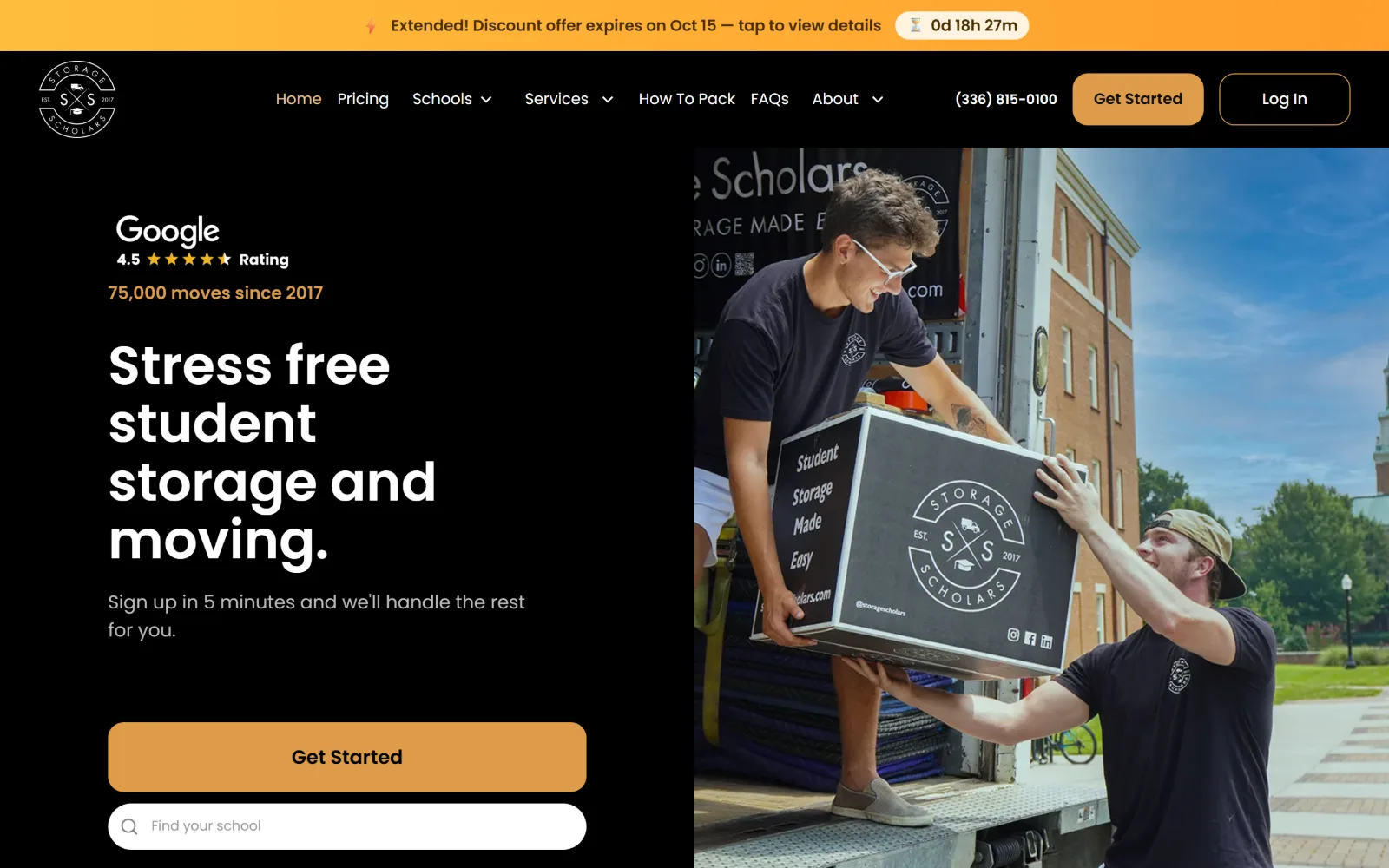
Black left column with a Google rating, a four-line white headline and an amber button, beside a photo of two movers lifting a branded crate.
Type
Poppins 55px, weight 600
Body
Poppins 18 to 20px
Build
50/50 split, 4-col 300px grid, 16px radius
Made on
Webflow
Colour
#000000 #ffffff #de9c4a
Type. Poppins does everything here, at 55px weight 600 with 1.1 leading for the headline and 16 to 20px for the rest. The geometric roundness of the face at that size makes the four stacked lines feel wide rather than tall. Nav items sit at 16px weight 400 in a sand tone rather than white, which quietly ranks them below the headline without changing size.
Colour. A hard black ground at 55.8 coverage with white at 36.5 and a flat #f0f0f0 at 21.3 for the sections below. The single accent is amber #de9c4a at 1.7, which carries the Get Started button, the nav text and the moves-since-2017 figure. Review stars supply the only other saturation in the frame.
Layout. Full 1440px, split close to 50/50 with the photograph flush to the right edge and no gutter. Buttons take a 16px radius, the search field a full pill. Below the hero a four-column 300px grid runs at 32px column and 64px row gaps. A promotional countdown bar sits above the header as a separate full-width strip.
The ask. Four asks in one viewport: Get Started in the header, Get Started again as the hero button, a school search field below it, and Log In. The phone number 336 815 0100 sits between them. The countdown bar adds urgency but also a fifth thing to read before the headline.
Tinting nav links to the accent instead of white demotes them against a headline without touching type size, which keeps the hero hierarchy to two levels.
06
bigtexstorage.com
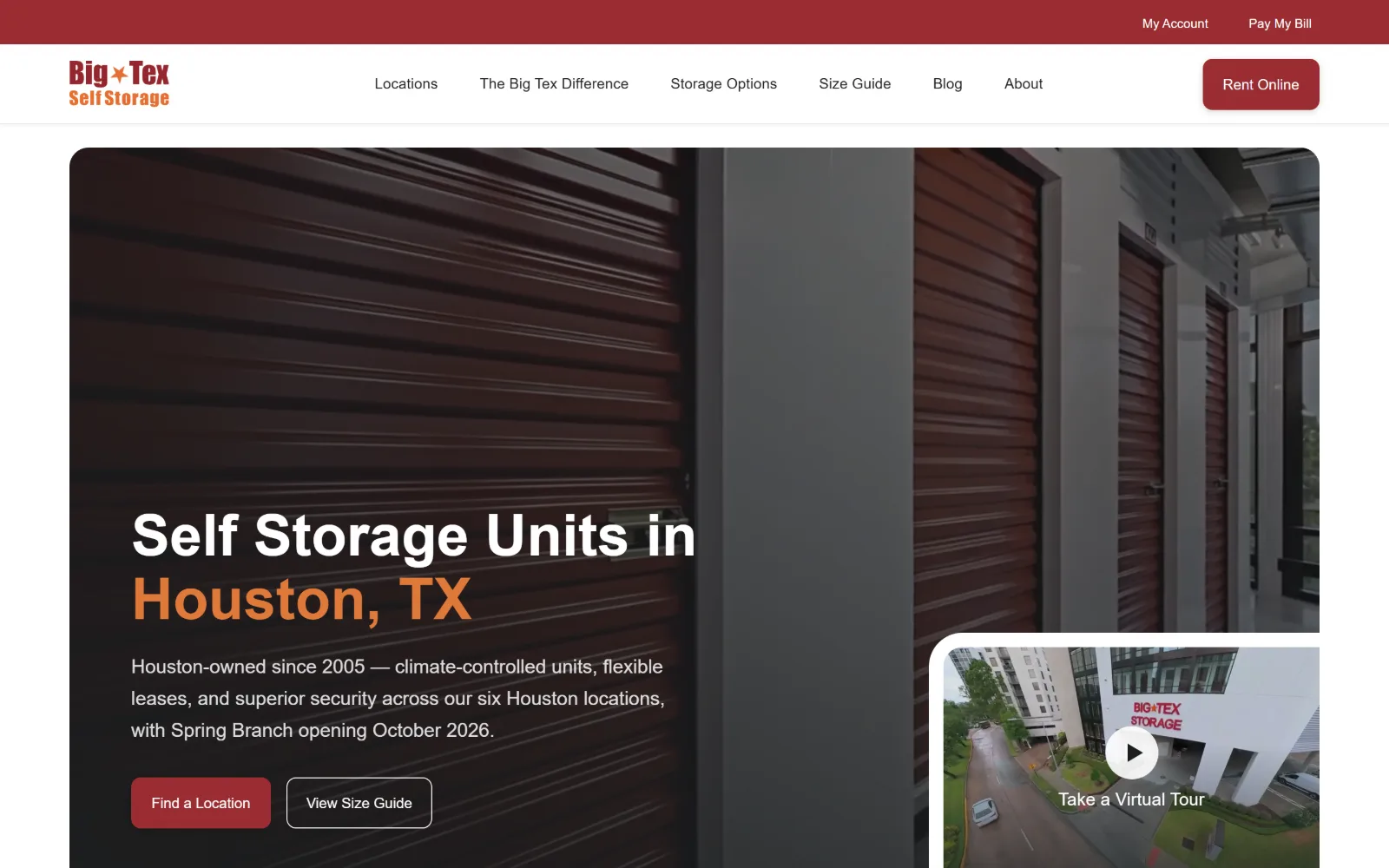
Dark photograph of maroon roller doors fills a rounded hero panel, with a white and orange headline, two buttons and a video tour card at lower right.
Type
Inter 60px, weight 600
Body
Inter 20px, 1.65 leading
Build
1300px container, rounded hero panel, 10px radius
Colour
#ffffff #9a2d32 #212121
Type. Inter at 60px weight 600 with 1.1 leading sets a two-line headline where the city name drops to orange, so location is carried by colour rather than by a second size. Body runs 20px at 1.65 leading, generous for a hero paragraph, and nav sits at 20px weight 400 in black. Button text drops to 15px weight 500, the smallest thing in the frame.
Colour. White dominates at 124.6 coverage, with near-black #212121 at 3.8 for text. The brand maroon #9a2d32 at 3.2 carries the top utility strip, the Rent Online button and the primary hero control, while a rust #cf6d31 at 0.4 picks out the city name. The photograph supplies the rest of the warmth, so the palette itself stays at three values.
Layout. A 1300px container, 90 percent of the 1440px viewport, so the hero sits as a rounded panel with white margins on both sides rather than bleeding. Radius is 10px on the panel, the buttons and the floating tour card. The header is a thin white bar under a maroon utility strip, giving a two-row top edge without a heavy mast.
The ask. Rent Online is the only filled control in the header. The hero pairs a solid Find a Location with an outlined View Size Guide, so the secondary path is visible but visually subordinate. A video tour card sits in the corner as a third, softer ask. No phone number appears in the header.
Insetting the hero to a 1300px rounded panel instead of bleeding it turns a stock corridor photograph into a deliberate object on the page.
07
pods.com
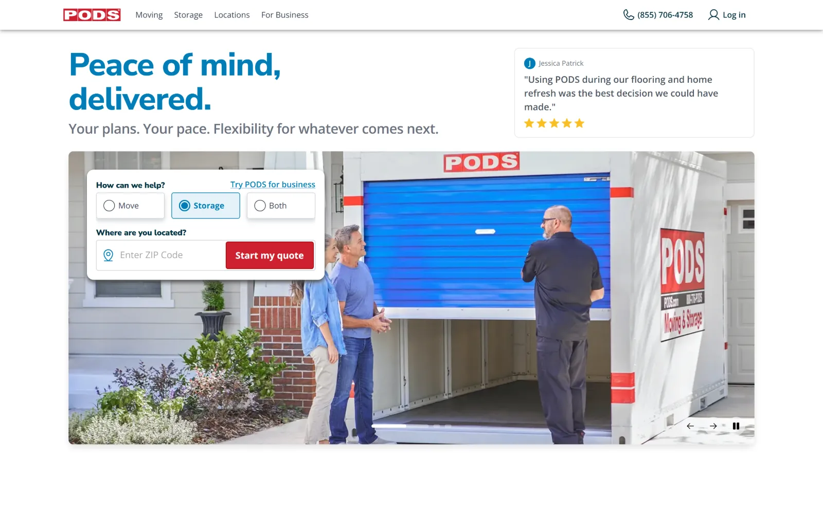
White page with a two-line blue headline, a review card at top right, and a photo panel of a container delivery with a quote form overlapping it.
Type
Nunito Sans 56px, -0.02em
Body
Open Sans 16px, weight 600
Build
inset media panel, overlapping form card, 4px radius
Colour
#ffffff #007db8 #ce202f
Type. Nunito Sans sets the headline at 56px weight 800, tracked minus 0.02em with 1.07 leading, in the brand blue rather than black. Body is Open Sans at 16px weight 600, a heavier body weight than most pages here use, which holds up against the 18px subhead. Further down the scale jumps to 48px and 32px at weight 900, so the page gets louder below the fold, not above it.
Colour. Effectively a white page: #ffffff at 118.7 coverage with only #ce202f at 1.1 and #007db8 at 0.4 breaking it, plus a pale #e5f2f8 wash. Grey ink at #4b5563 runs to 480 characters and a deep teal #083544 to 444. The red is held back entirely for the quote button, so the headline blue and the action red never compete.
Layout. Full 1440px width but nothing bleeds: the hero media sits as an inset panel with the quote form card overlapping its top left corner. Radius is a restrained 4px. The header is a single thin white bar. The overlap of card onto panel is the only depth cue on an otherwise flat page.
The ask. The form is the hero. Three radio buttons choose Move, Storage or Both before a ZIP field and a red Start my quote button, so segmentation happens before the lead is captured. The phone number 855 706 4758 and Log in sit in the header, with a Try PODS for business link tucked inside the card.
Asking a one-click qualifying question inside the hero form sorts traffic before the lead is taken, without adding a second page or a second button.
08
storeease.com
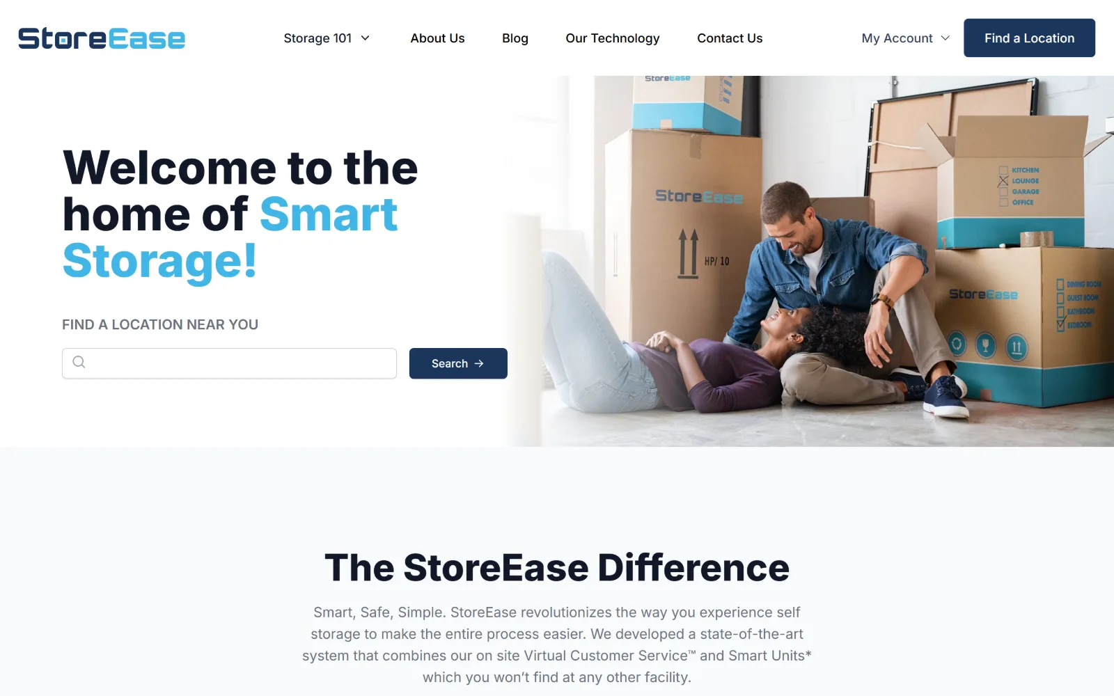
Navy and cyan headline with a location search sits on white at left, beside a photo of a couple sitting among branded moving boxes.
Type. Two weights of Inter carry the page: 60px at weight 800 with 1.0 leading for the headline, dropping to 48px for the section title below. The brand word is set in cyan inside the navy line, so emphasis is colour rather than weight. A small uppercase 18px weight 600 label introduces the search field, and button text sits at 14px weight 500.
Colour. Barely any colour at all. An off-white #f9fafb at 54.6 and pure white at 19.4 make up almost the whole surface, with navy #1b365d at 0.8 carrying the search button and the header control. Ink is #111827 with #6b7280 for secondary copy. The cyan in the headline comes from the logo rather than the measured palette.
Layout. Full 1440px with the photograph flush to the right edge and the text column starting at a conventional left margin. Section padding is a roomy 128px. Below the fold sit a four-column 284px grid at 48px gaps and a two-column arrangement, all on 6px radius. Nothing is full bleed except the image edge.
The ask. One search field with a Search button, mirrored by a Find a Location control in the header. There is no phone number in the frame and no promotional banner, so the page asks for exactly one action. The nav leans on content, with Storage 101, Blog and Our Technology instead of offers.
A hero with one input, one button and 128px of section padding reads as confident; the restraint only works because the nav carries the secondary paths.
09
storquest.com
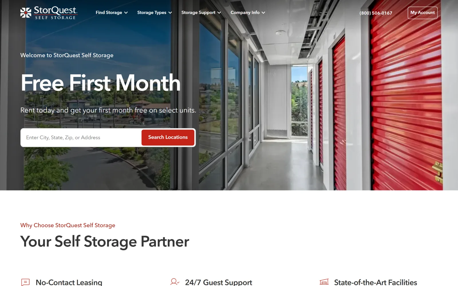
Wide shot down a glazed corridor lined with red roller doors, with a white headline, a welcome line and a search bar over the left third.
Type
geometric sans 72px, -0.033em
Body
18px, 1.5 leading
Build
1380px container, full-bleed photo, 96px padding
Made on
custom JS framework
Colour
#ffffff #f1f1f0 #c42419
Type. A geometric sans sets Free First Month at 72px weight 600, tracked unusually tight at minus 0.033em, which pulls the three words into a single shape. The scale below keeps that discipline at 48px, 40px and 24px, all at minus 0.02em, so every heading on the page shares one tracking logic. Body sits at 18px with normal tracking, the only place the tightening stops.
Colour. White at 132.3 coverage and black at 33.3 from the photograph, with a neutral #f1f1f0 at 28.5 for the bands below. The single accent is #c42419 at 0.7, used for the search button, the section eyebrow and the feature icons. Body ink is a soft #353535 rather than black, which keeps the text from competing with the red.
Layout. A 1380px container, 96 percent of the viewport, with the hero photograph running full bleed behind it. Section padding is 96px and the feature row below is a three-column 373px grid with wide 96px column gaps. Radius is 6px on the button. The header floats over the photograph with no background bar.
The ask. A single search field with Search Locations is the primary ask, with the phone number 800 506 0167 and an outlined My Account button in the header. The headline is itself the offer, so the discount and the action occupy the same block rather than fighting for the same space.
Applying one tracking value of minus 0.02em to every heading tier, and none to body, makes a mixed scale read as a single designed system.
10
storageassetmanagement.com
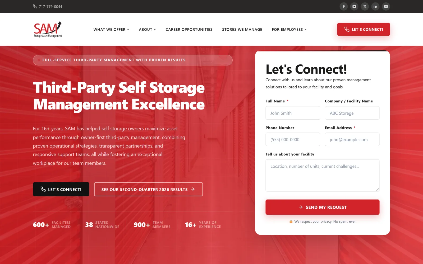
Red hero with a white headline and body copy at left, a white lead form card at right, and four statistics ruled along the bottom edge.
Type
52px, weight 800, -0.03em
Body
Inter 17px, 1.75 leading
Build
692/460 two-col grid, 155px padding, 6px radius
Made on
WordPress
Colour
#d2242a #ffffff #2a2928
Type. Display type runs 52px at weight 800 tracked minus 0.03em, with a 44px second tier at minus 0.02em, so the headline is tighter than anything else in this set. Body is Inter at 17px with 1.75 leading in white, which stays readable on red. Buttons switch to Montserrat at 14px weight 700, uppercase and tracked 0.04em, a clear signal that controls are a different class of type.
Colour. A two-colour page. Red #d2242a at 53.3 coverage against white at 173.5, with near-black #2a2928 and #111111 only on the utility bar and the secondary button. White carries 518 characters of text on the red field. There is no third brand colour, so the form card reads as the brightest object by contrast alone.
Layout. Full 1440px bleed with a two-column 692px and 460px grid at 64px gaps, text left and form right. Section padding is a very large 155px. The form card takes a 6px radius and a soft shadow, lifting it off the flat red. A dark utility bar with the phone number and social icons sits above the white header.
The ask. Four asks competing: a header LET'S CONNECT button, a hero LET'S CONNECT button, an outlined link to quarterly results, and the SEND MY REQUEST form itself. Since three of them lead to the same place, the form is doing the real work and the repetition mostly costs clarity.
On a saturated ground, a white form card needs no border or accent colour to dominate; contrast of field alone sets the hierarchy.
11
storageblue.com
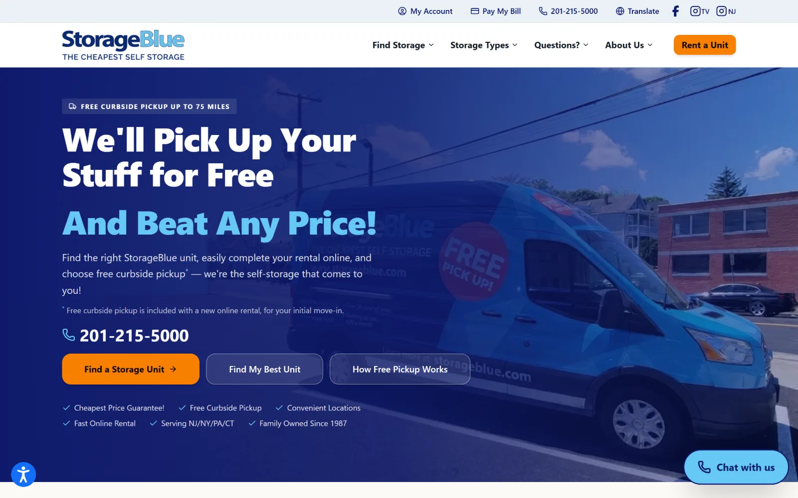
Deep navy wash over a photo of a branded van, carrying a white and light blue headline, a phone number, three buttons and six ticked claims.
Type
Inter 60px, weight 900, -0.02em
Body
Inter 18px, 1.63 leading
Build
1280px container, 96px padding, 10px radius
Colour
#01005a #0100f0 #e5e3df
Type. Weight 900 Inter at 60px with minus 0.02em tracking and 1.05 leading sets a three-line headline whose last line drops to light blue. A 48px tier repeats the same weight below. Body is 18px at 1.63 leading, with a small footnote tier under it. Nav sits at 14px weight 600, tiny against the display, so the hero is effectively the only type that registers.
Colour. Navy #01005a at 100 coverage is the ground, with a brighter #0100f0 at 29.2 inside the gradient and a warm grey #e5e3df at 19.6 for the bands below. White runs at 4.5. The one warm note is the orange primary button, which is the only non-blue element in the hero and therefore the only thing the eye lands on.
Layout. A 1280px container at 89 percent of the viewport, with 96px section padding and a two-column 596px grid at 24px gaps underneath. Radius is 10px on the buttons. The photograph is darkened almost to a flat field, so the hero behaves as a colour block with a vehicle faintly visible inside it.
The ask. Six asks in one screen: Rent a Unit in the header, Find a Storage Unit, Find My Best Unit, How Free Pickup Works, the phone number twice, and a chat bubble. The orange on the first hero button is the only thing ranking them, and the six ticked claims below add more to read before any of it.
When a hero runs three buttons, only one can be filled in the accent colour; the other two should be ghosted or the ranking disappears.
12
storagekingusa.com
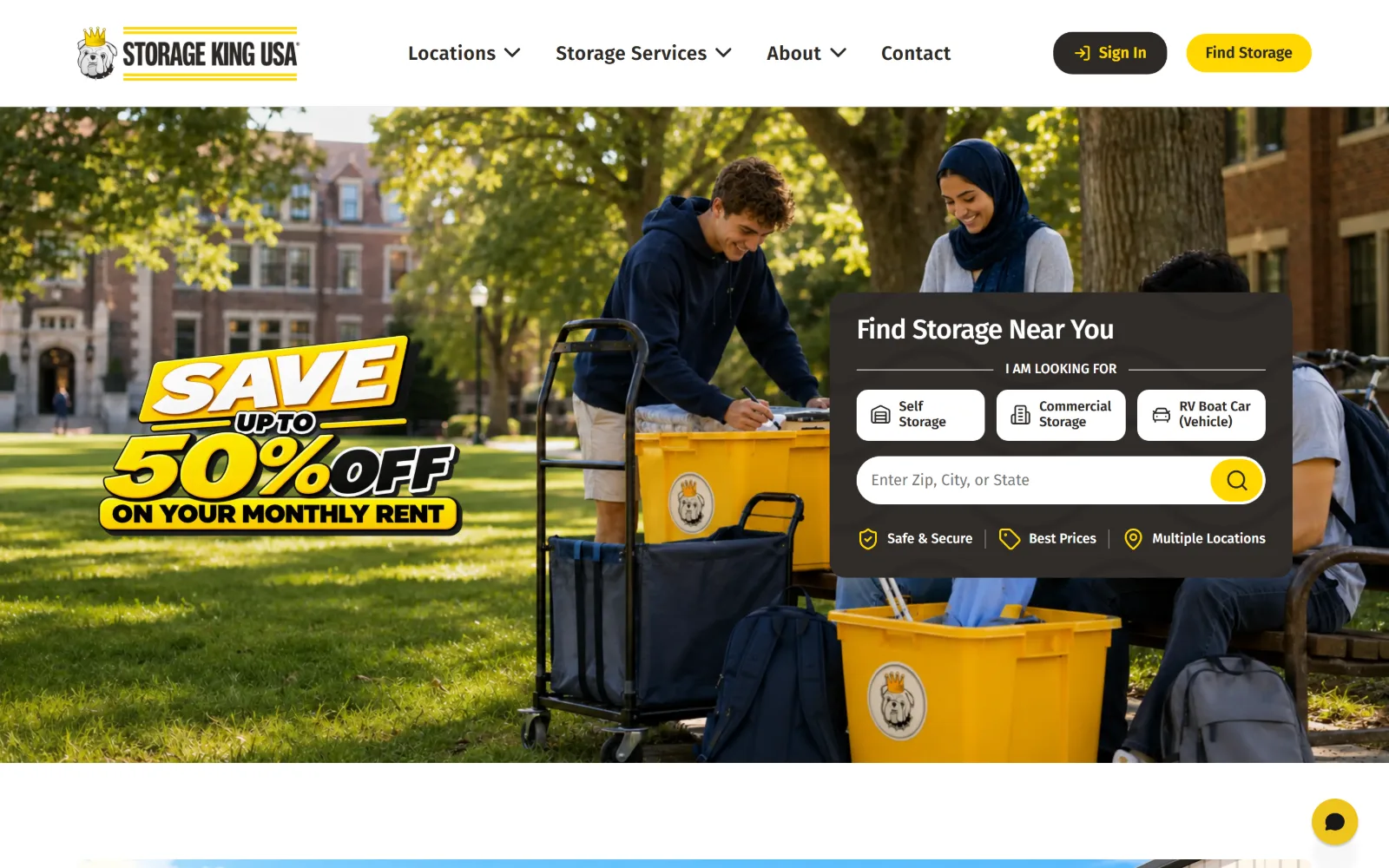
Campus lawn photograph of students loading yellow bins, with a cartoon SAVE 50% OFF lockup at left and a dark search card at right.
Type
Fira Sans 28px, -0.02em
Body
Fira Sans 20px nav, 16px controls
Build
full-bleed photo, dark inset card, 20px radius
Colour
#ffffff #2d2926 #f7f7f7
Type. Fira Sans handles the interface at modest sizes: 28px weight 500 tracked minus 0.02em for the card heading, 40px weight 700 further down, nav at 20px weight 600 tracked 0.02em, buttons at 16px. The promotional lockup is artwork rather than type, so the real typography stays quiet and the loudest element in the frame is an image.
Colour. Near-monochrome with one accent. White at 107.8, then #f7f7f7 at 38.2 and #f2f2f2 at 19.5 for the bands below, with charcoal #2d2926 at 5.7 carrying the search card and the buttons. Gold #ffd700 sits at just 0.3 coverage but takes the header Find Storage button and the search icon, so a tiny amount of it carries the brand.
Layout. Full 1440px bleed photograph with 100px section padding below. The search card is a dark inset panel on the right third, at 20px radius, holding three selector chips on a three-column 133px grid at 12px gaps. The header is a plain white bar, so the dark card is the only heavy element in the upper page.
The ask. The card asks one thing but qualifies first, with Self Storage, Commercial and RV Boat Car chips above the location field. Find Storage and Sign In sit in the header. No phone number appears, and the discount is left to the artwork rather than given its own button.
Putting unit-type chips above the location field lets one search box serve three audiences without adding a second entry point to the hero.
13
cubesmart.com
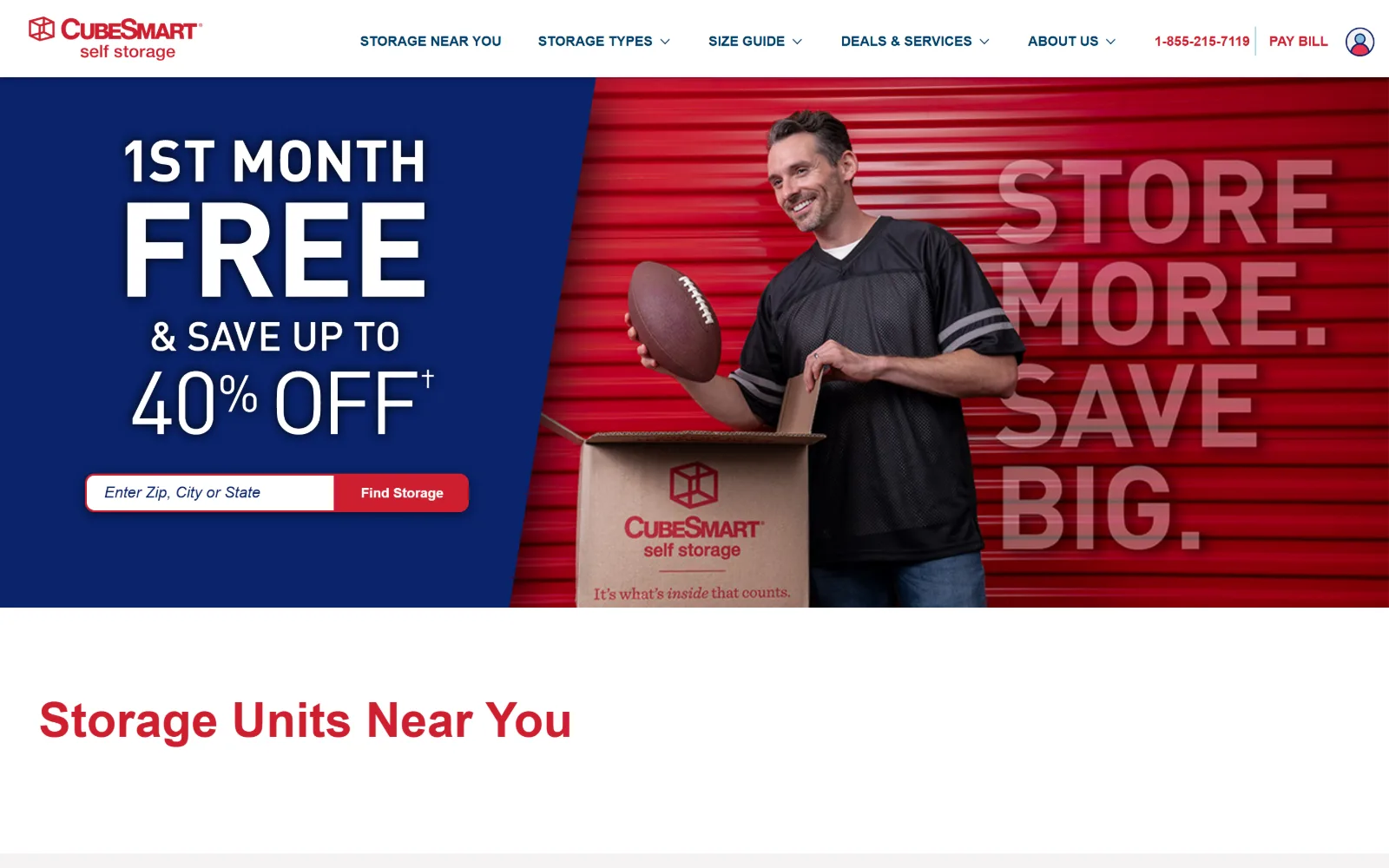
Diagonal split hero: navy at left with 1ST MONTH FREE and a search field, red roller doors at right behind a man holding a football.
Type. Promotional lettering at 50px weight 700 dominates the navy panel, with FREE enlarged well beyond the rest so the discount reads before the brand does. Body is din-2014 at 18px weight 300 with 1.75 leading, a light industrial face that suits the trade. Nav sits at 14px weight 700 in navy, and a 16px weight 700 tier is tracked a wide 0.047em for small labels.
Colour. Four near-equal grounds and one accent. White at 120.5, warm grey #f5f2f2 at 50.8, navy #0a236a at 50.3 and charcoal #3f3f44 at 50.0 each hold a band. Red #cf1f2f sits at 0.4 but takes the Find Storage button, the Storage Units Near You heading and the phone number, so the smallest value is the loudest.
Layout. Full 1440px bleed with the hero split by a diagonal rather than a vertical, which is the page's one structural risk and why the photograph can carry a word-mark across its own area. Section padding is 90px and every corner is square, including the search button. Eight nav items make the header the densest row on the page.
The ask. The search field is the single conversion point, framed by the discount rather than by a second button. The phone number 1 855 215 7119 and PAY BILL sit in the header as service rather than sales. The cost of the promotional hero is that the brand line now lives inside the photograph instead of in type.
A diagonal split lets a promotional panel and a brand image share one hero, but the brand message then has to survive as part of the photograph.
14
publicstorage.com
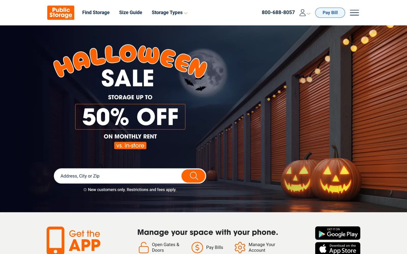
Night-time corridor of orange doors with string lights and two lit pumpkins, under arched HALLOWEEN SALE lettering and a boxed 50% OFF.
Type
ITC Avant Garde 26px, custom promo lettering
Body
Roboto 18px nav
Build
1140px container, full-bleed seasonal hero
Colour
#f9f9f9 #0f274d #ffffff
Type. Below the fold ITC Avant Garde sets headings at 26px weight 700, and a 50px weight 700 tier appears further down, but the hero itself is almost entirely custom promotional lettering set on an arc. Nav is Roboto at 18px weight 600 in navy. The consequence is that the page's actual typographic voice does not appear until the app band under the hero.
Colour. Light grounds with the colour coming from the photograph. #f9f9f9 at 100 coverage, white at 75.6, navy #0f274d at 14.2 carrying 140 characters of ink, and a warm #f2f2ef at 11.3. The orange that defines the frame is in the artwork and the logo rather than the measured palette, which is why the design reads as seasonal rather than branded.
Layout. An unusually narrow 1140px container, 79 percent of the viewport, so the content column is tight while the hero photograph bleeds full width behind it. The hero is tall enough to push the app band mostly below the fold. A hamburger sits alongside three nav items, so most navigation is hidden by choice.
The ask. One search field with no competing button in the hero, then a stack of service asks below: 800 688 8057, Pay Bill, and Google Play and App Store badges. The seasonal hero will be obsolete within weeks, and because the lettering is artwork the page cannot be updated by editing text.
Seasonal artwork in the hero costs you the brand voice and a reshoot every quarter; keep the headline as live text if the offer changes often.
15
storage-mart.com
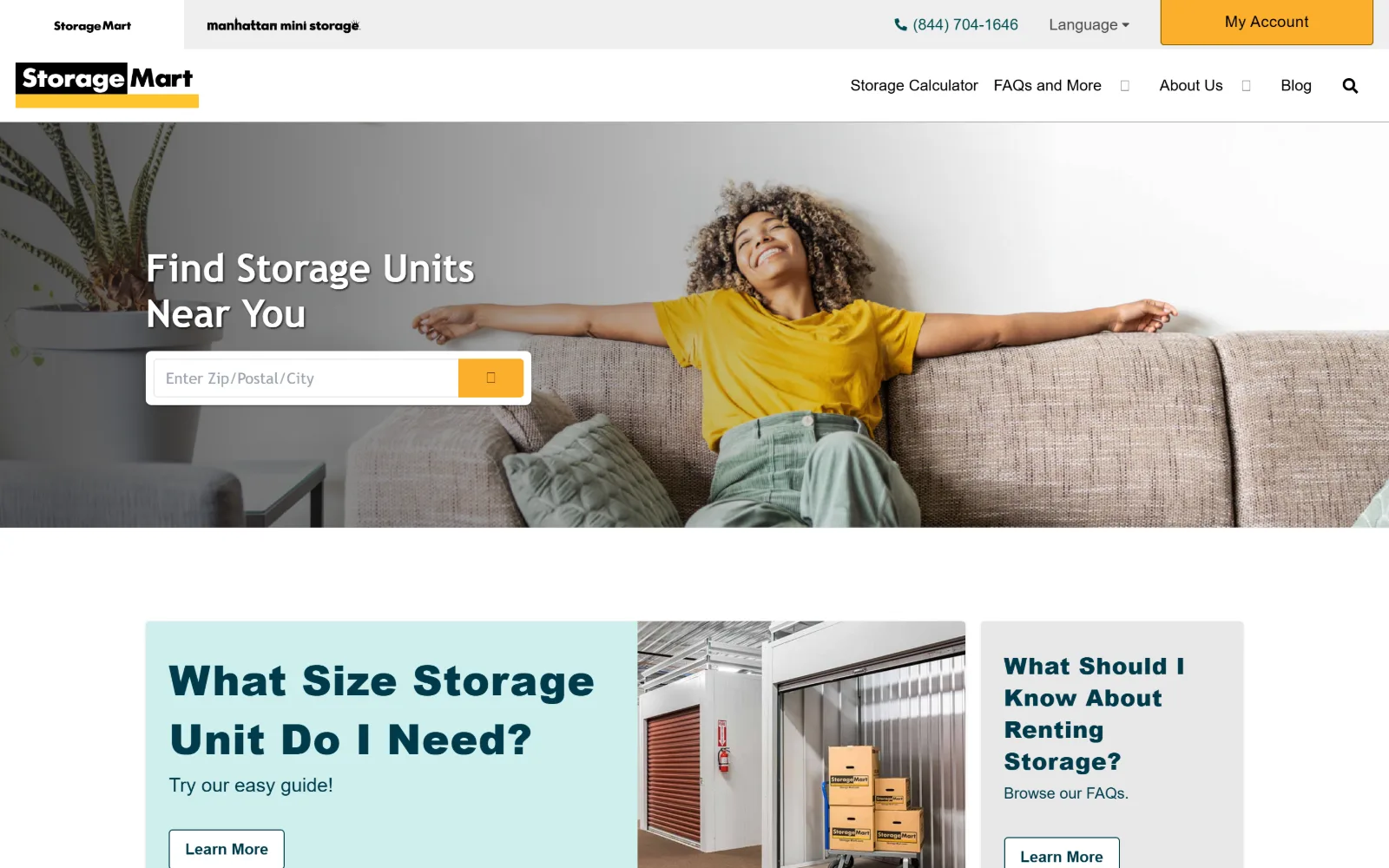
Photograph of a woman stretched out on a sofa fills the hero, with a white two-line headline and search field at left over a grey wash.
Type
Arial 43px, weight 900, 0.012em
Body
18px, weight 300, 1.69 leading
Build
1440px bleed, 4-col 272.5px grid, square corners
Colour
#fbaf2b #003b4b #62cbc9
Type. Arial at weight 900 and 43px, tracked 0.012em, sets the headline, and the heavier tiers below run 32px at 0.016em and 24px at 0.021em, so tracking widens as size drops. Body is 18px at weight 300 with 1.69 leading. Using a system face at the maximum weight is a plain choice, and at this size the letterforms hold up better than the brand would suggest.
Colour. Warm and cool in one palette. White at 67.5, amber #fbaf2b at 23.3 carrying the My Account button and the search control, pale mint #dcf2f3 at 11.2 and teal #62cbc9 at 9.5 for the card below. Deep teal #003b4b is the heading ink, with #4a4a4a for body. Five values is more than most pages here carry, and the teal pair does the differentiating.
Layout. Full 1440px bleed with a brand switcher strip above the header, so a second logo sits over the primary one. Below the hero a four-column 272.5px grid at 16px gaps holds the guide cards. Every corner is square, which keeps the amber button reading as a slab rather than a pill.
The ask. A single search field, with the phone number 844 704 1646 and a filled amber My Account button in the header. The two Learn More cards below are content rather than conversion, so the hero is not competing with itself. The brand switcher is the main distraction above the fold.
Widening tracking as type size falls keeps a heavy system face even in colour across the scale, which is what makes Arial at weight 900 survive at 43px.
How these were chosen
Every homepage in this set is trying to get a postcode into a box. What separates them is how much else they ask for first. The strongest entries give the search field the whole hero and let the photograph carry the mood; the weakest bury it under a seasonal discount lockup that will be stale by November. Three patterns hold across the shortlist: a display face between 43 and 84px, a dark or cream ground with a single saturated accent under three percent coverage, and a phone number parked top right as service rather than sales. The pattern that does not hold is restraint. Several of these pages run four or more competing calls to action in one viewport, which is the recurring fault in self storage website design rather than anything to do with type or colour. Every site here was judged on the captured frame, not on how many facilities it runs.
Finding self storage sites that someone had actually designed took far longer than it should have. 36 candidates made the shortlist. 15 made the page.
Each one was opened and looked at properly: what the type is doing, where the colour gets spent, how the page is built, how it asks for the job. Nothing is here because it ranks. Nothing is here because an agency filed it under portfolio. Several well known names were left out for the plain reason that their site came out of the same template as everyone else's, and a few sites worth including did not survive a second look.
Where a site is only competent, it says so. The order is the order worth your time, best first.
Reviewed and selected by Larry W. Matthews for Websitely.