Top 276 Small Business Website Design Examples
An accounting firm, a litigation boutique, an architecture studio, a bakery, a florist and a hotel have almost nothing in common except the problem: a business with a reputation to protect and a website that has to explain in five seconds why it deserves the work.
Two hundred and seventy-six of them here got it right. Offices in some galleries, shops and rooms you walk into in others, and the good ideas cross between them far more than you would expect.
- Galleries
- 19
- Sites
- 276
- Chosen on
- The work, not the ranking
- Updated
- 15 October 2026
Accounting Website Design
Fourteen firms that dropped the handshake photograph. This is accounting website design once a practice commits to an identity of its own.
14 sites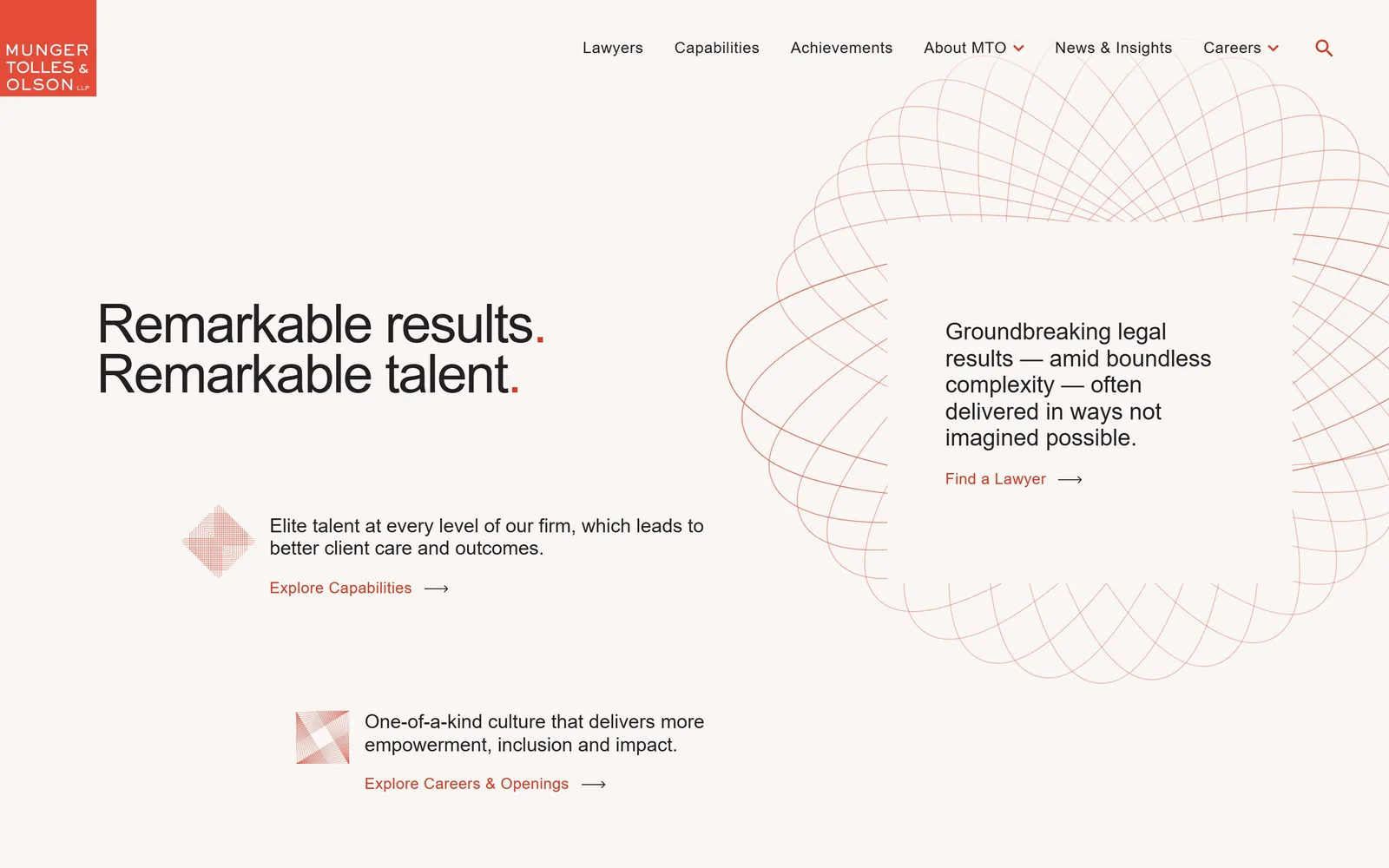
Law Firm Website Design
Almost none of these fifteen firms photograph a lawyer. Law firm website design that hands one sentence the whole fold instead of a slider over a skyline.
15 sites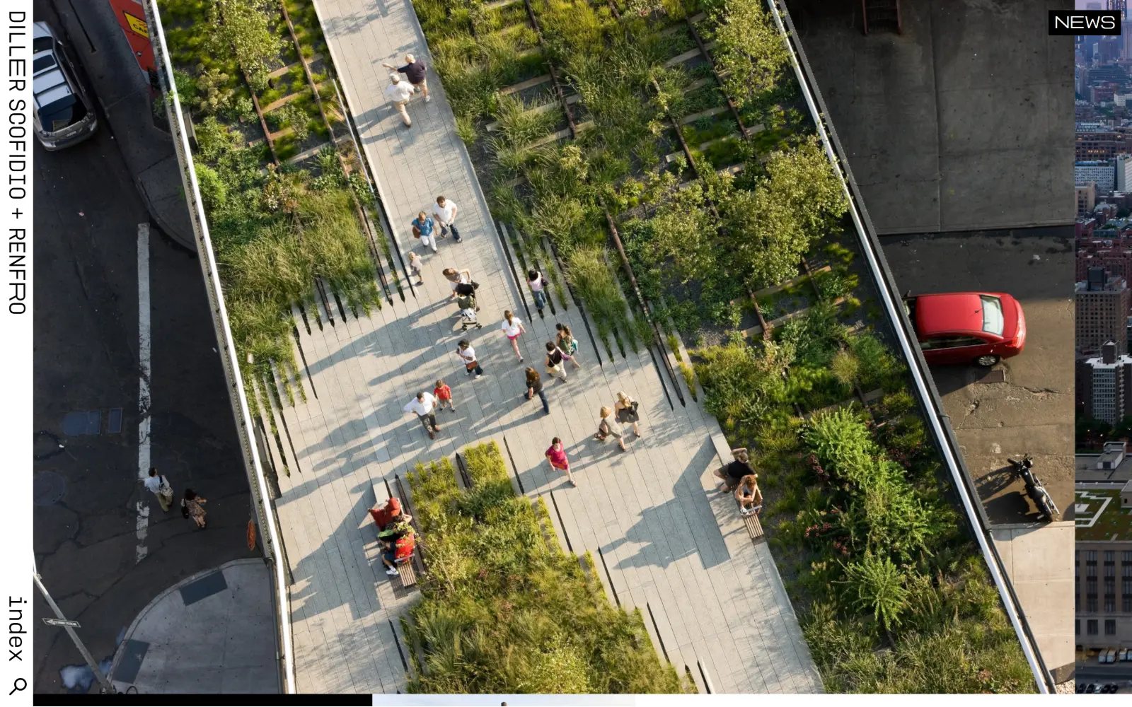
Architect Website Design
Fifteen US practices whose sites have to look like the buildings they draw. Architect website design is one photograph, a lot of air and little else.
15 sites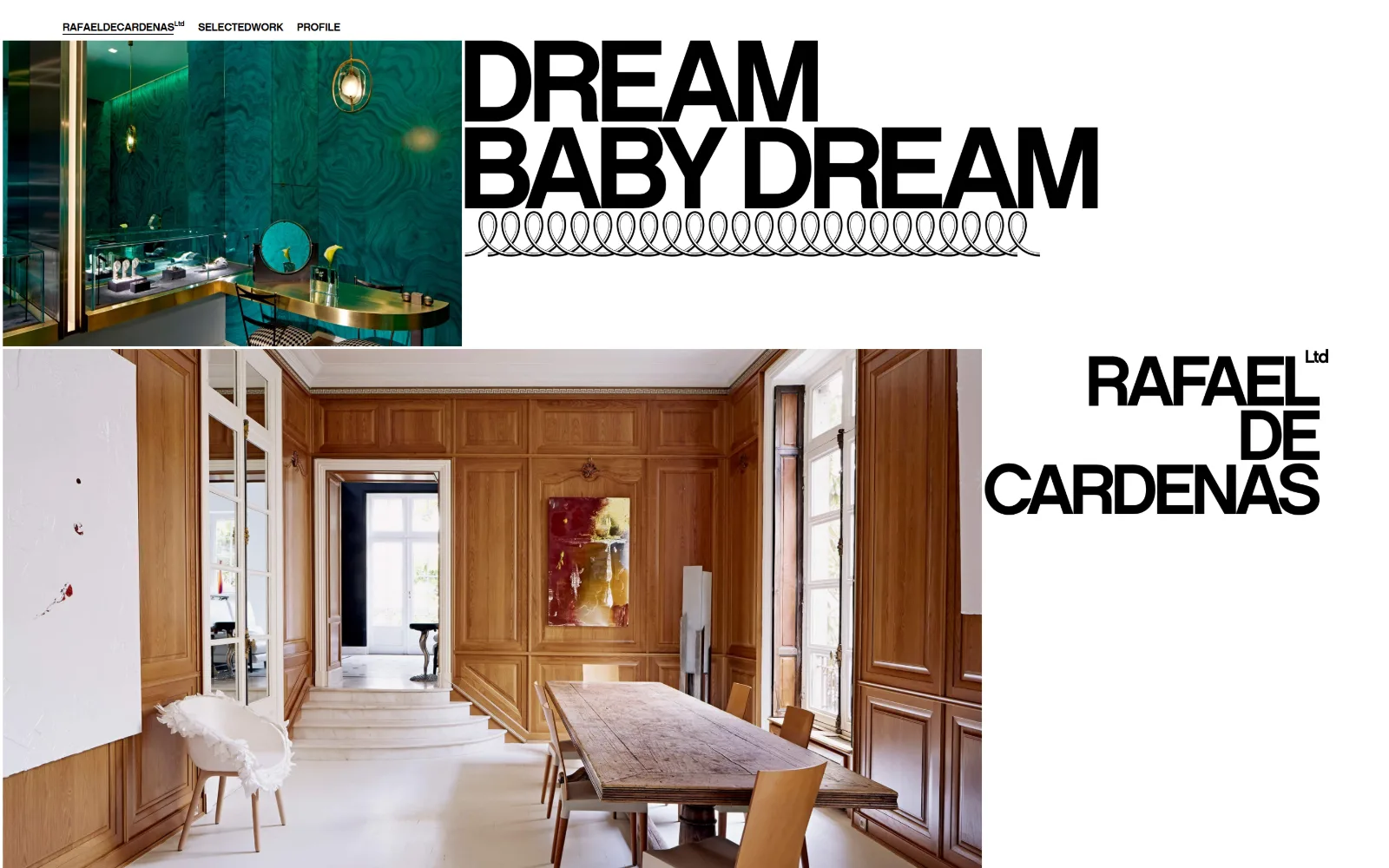
Interior Design Website Design
Fourteen US studios, minimal through maximalist. Interior design website design lives or dies on the portfolio grid, and these got the grid right.
14 sites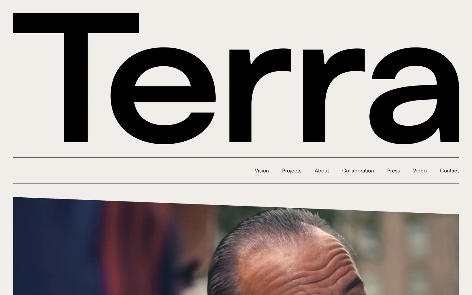
Real Estate Website Design
The photograph is the page: a headline, one button, nothing else until you scroll. Twelve brokerages and developers doing real estate website design.
12 sites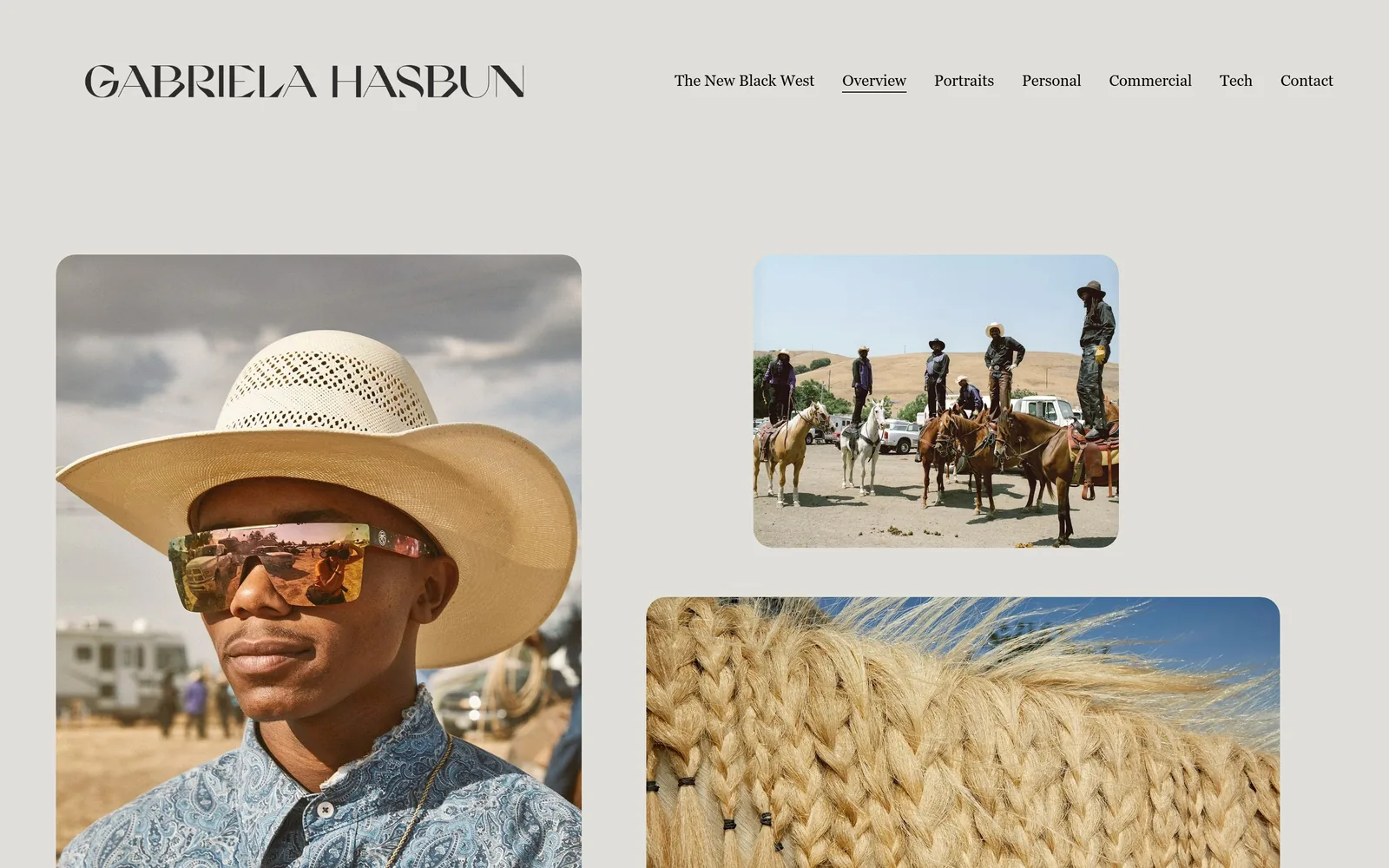
Photography Website Design
A wordmark, five links and the word Contact. Fourteen working photographers whose photography website design needs almost no interface at all.
14 sites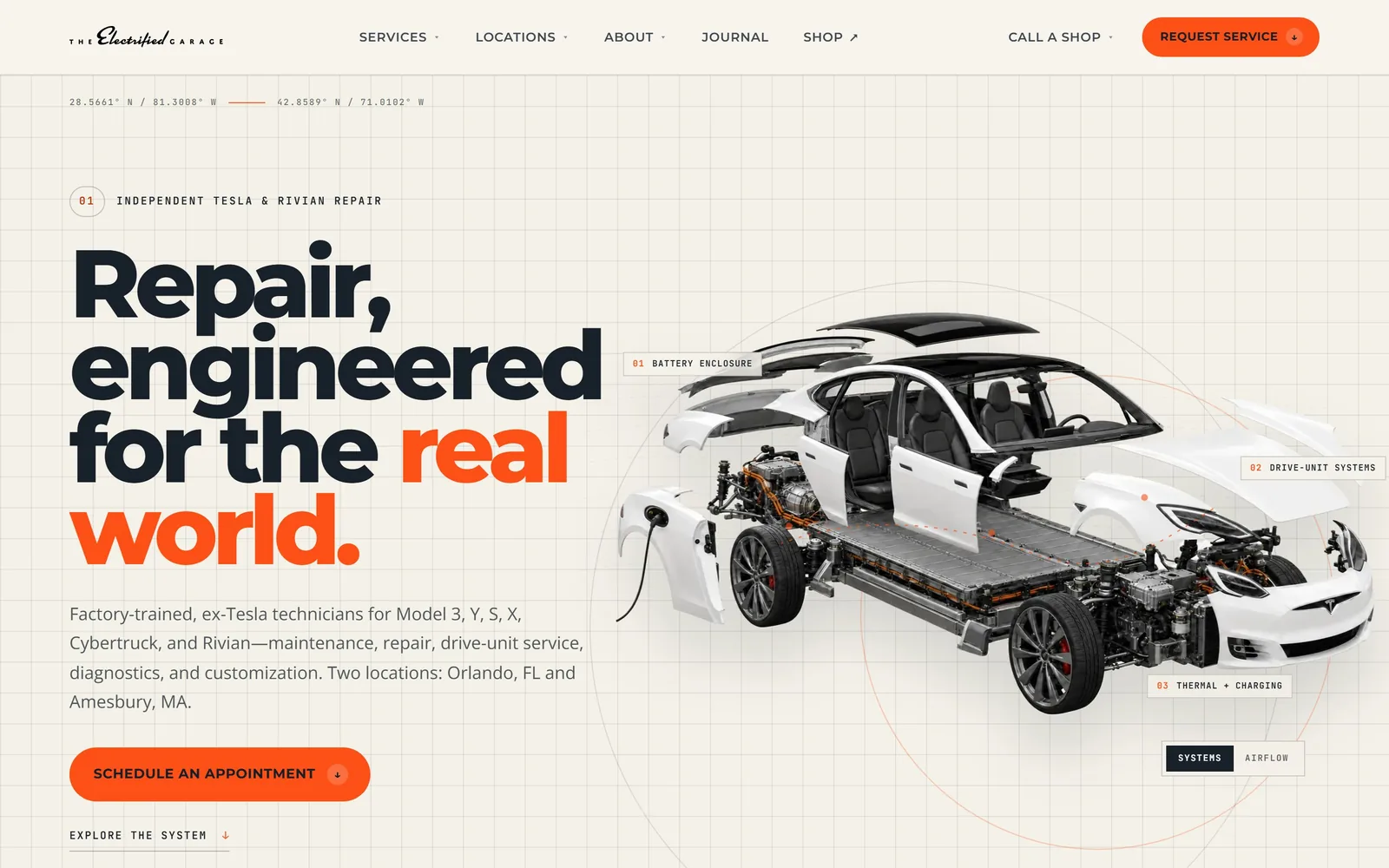
Auto Repair Website Design
Most auto repair website design comes out of four lead-gen templates. These fifteen US shops escaped it, and the notes say how.
15 sites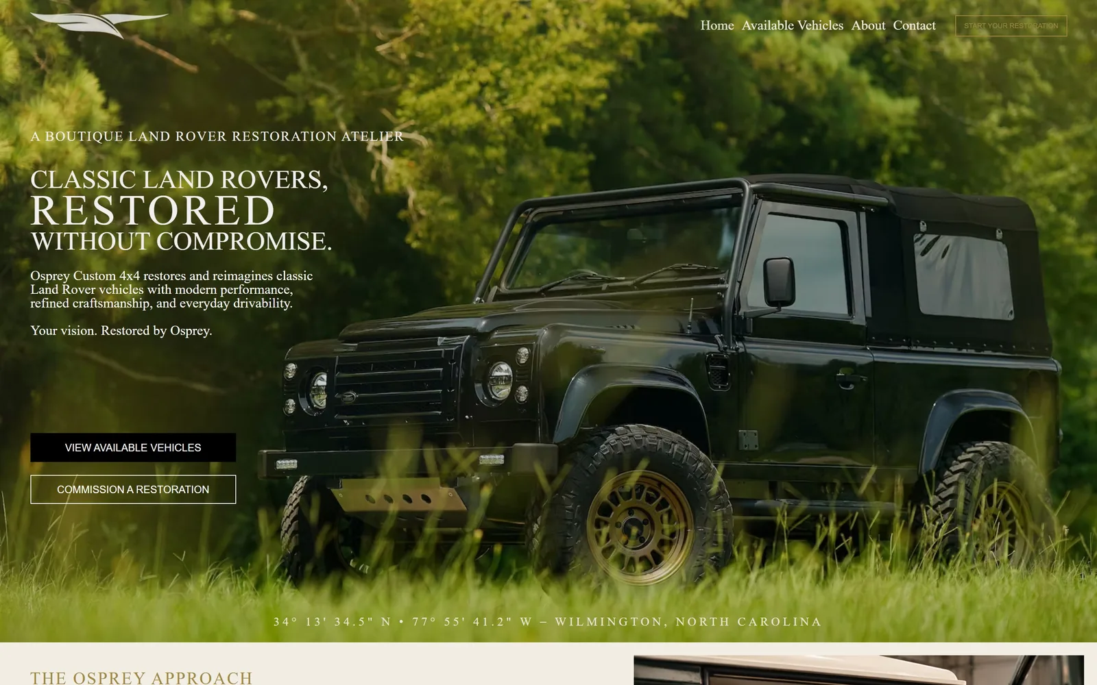
Car Dealership Website Design
Thirteen collector, restomod and EV dealers. What car dealership website design turns on here is how much each page leaves out before you scroll.
13 sites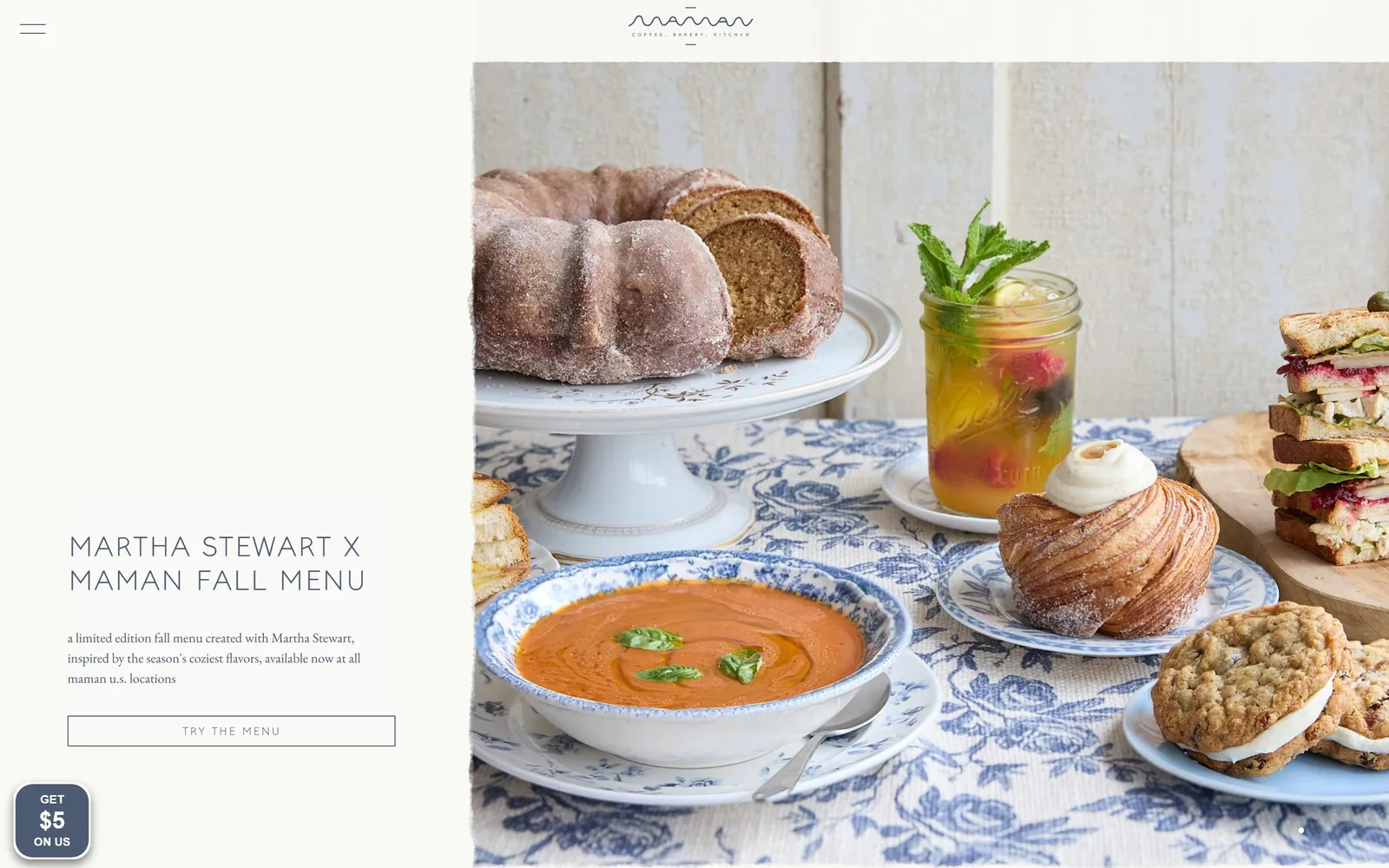
Bakery Website Design
Flat brand colour or one honest photograph: fifteen US bakeries whose folds hold to that, plus the bakery website design habit of a very short ask.
15 sites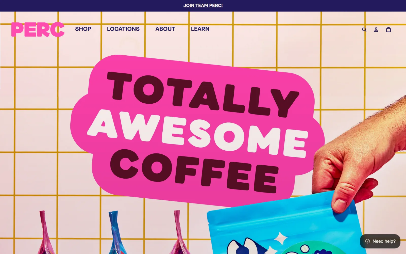
Coffee Shop Website Design
Fourteen US cafes and roasters with a house style on the page as well as in the cup. Coffee shop website design that puts the hours above the story.
14 sites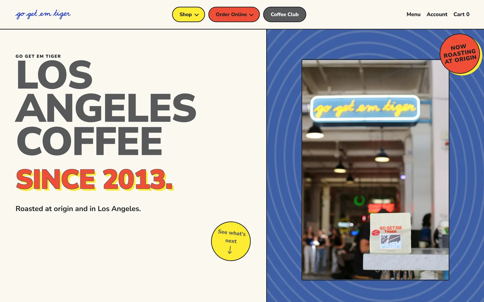
Restaurant Website Design
The fold as a poster rather than a brochure. Sixteen rooms, delis and coffee roasters, and the restaurant website design decision behind each one.
16 sites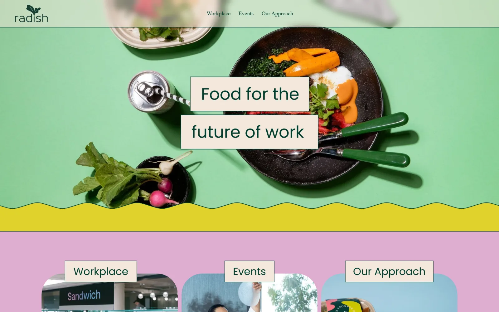
Catering Website Design
Fifteen US caterers whose sites photograph the food and nothing else. Catering website design judged on the menu, the enquiry and the route to a price.
15 sites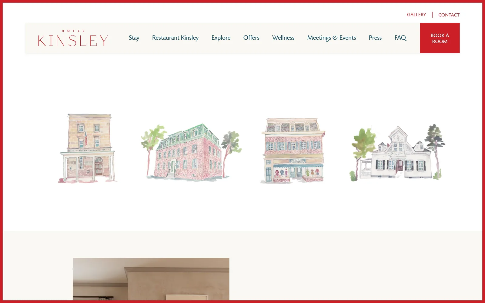
Hotel Website Design
Thirteen independent hotels, inns and lodges. Their hotel website design makes one typeface decision loudly and every other decision very quietly.
13 sites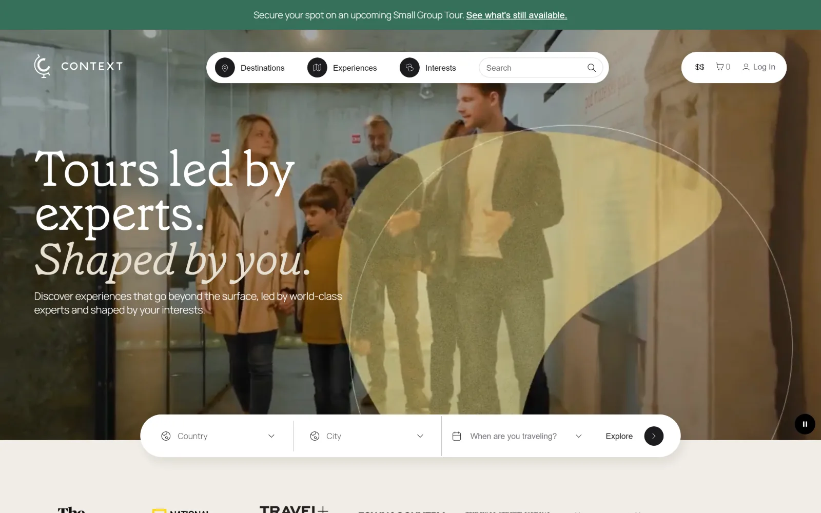
Travel Agency Website Design
Sixteen US agencies, outfitters and trip planners. The travel agency website design question is whether the photograph is doing any selling.
16 sites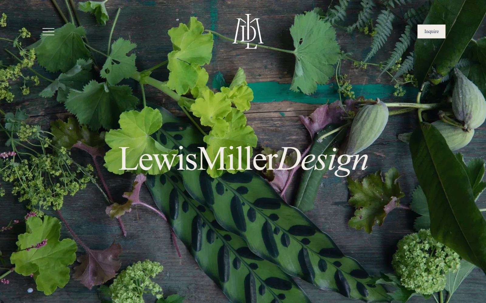
Florist Website Design
Thirteen US flower shops and event studios. Florist website design has one job harder than it looks: photographing colour against more colour.
13 sites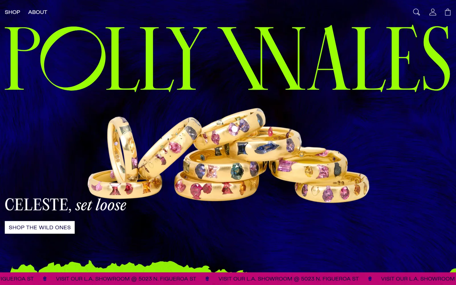
Jewelry Store Website Design
Small objects, enormous photographs. Sixteen US jewelers, and the jewelry store website design decisions that keep a ring legible on a wide screen.
16 sites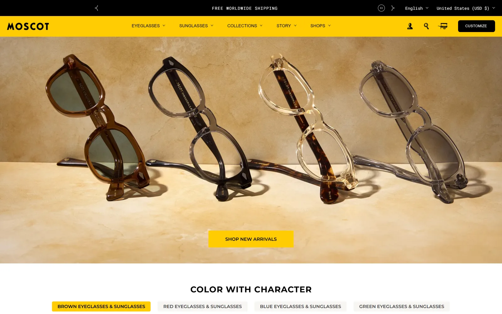
Ecommerce Website Design
Fourteen US stores where the product does the talking. Ecommerce website design judged on the first screen, the type, and how fast you reach the cart.
14 sites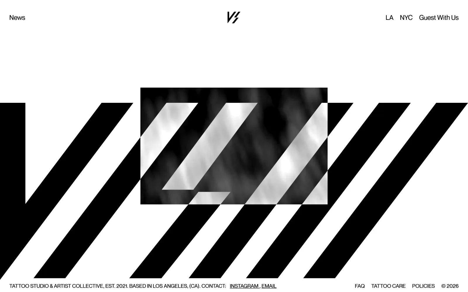
Tattoo Website Design
Sixteen US studios that lead with the shop, the flash wall and the lettering. Tattoo website design where the room does the selling, not the skin.
16 sites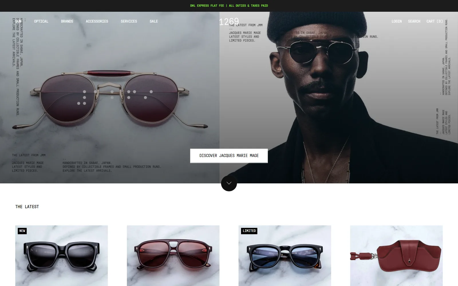
Optometrist Website Design
Sixteen US optical shops and eye care practices. Optometrist website design where the frames are the product and the exam is the quiet half.
16 sitesStock photography did the most damage here
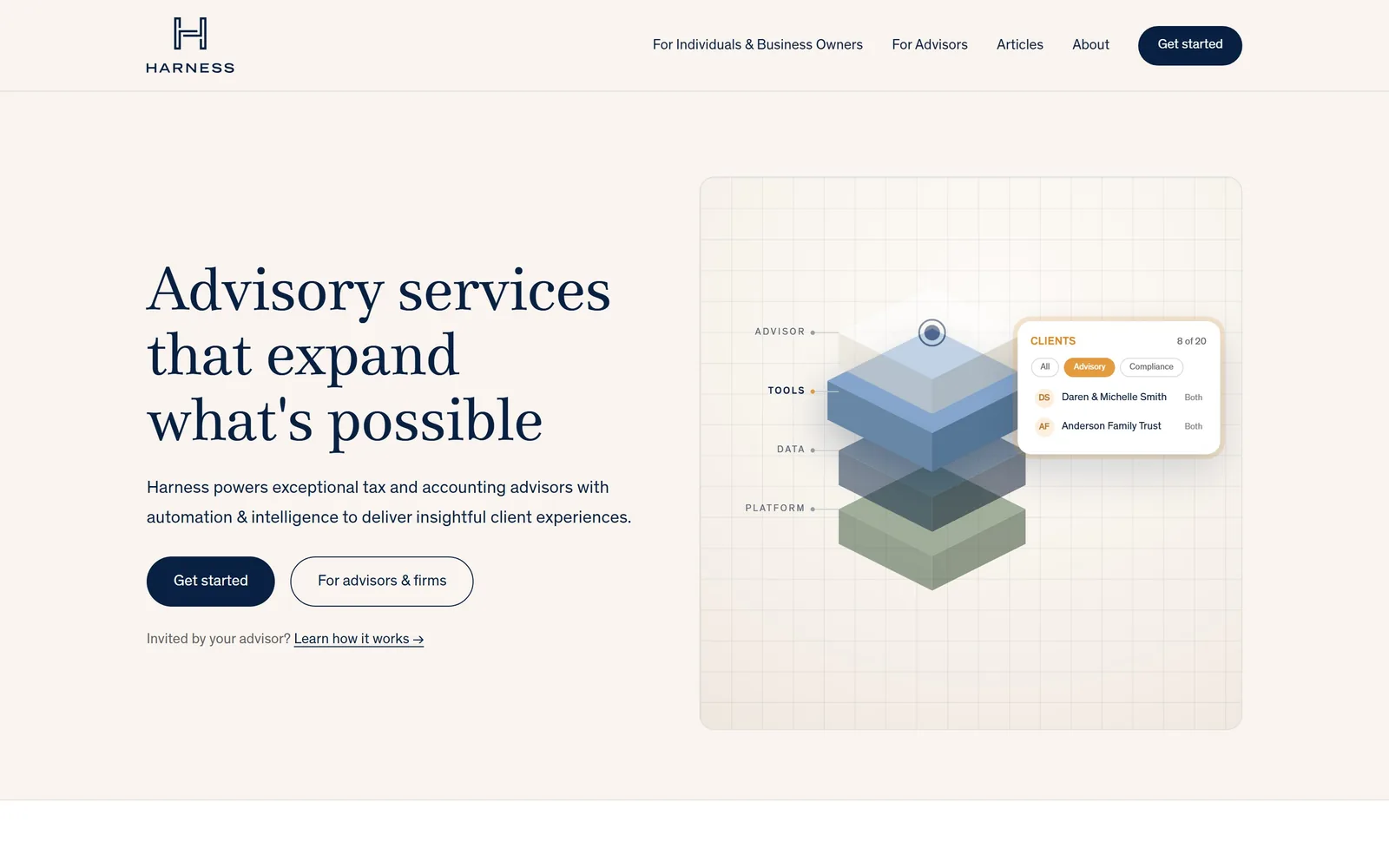
Accounting is the category stock libraries hurt worst. The handshake, the calculator, the skyline through vertical blinds, repeated across thousands of near identical sites, all saying the same nothing. The firms in the accounting gallery went the other way and committed to an identity. Harness runs navy serif on warm sand and puts an exploded isometric diagram where the team photograph would go. Pilot fills the screen with deep violet and a faint engineering grid. Hiline centres two lines of green serif on cream and lets the second one fall into italic.
None of that is decoration. A firm that looks like the clients it wants wins those clients, and the firm that looks like every other firm competes on price.
Shops that photograph their own building
Repair is the mirror image. Four or five lead generation vendors supply most of the trade, and the shops that escaped did it with a camera. Grace Automotive sets enormous condensed capitals over a night shot of its real storefront and splits the promise white and red. King of Hybrid runs a dim video of the actual workshop with one bright green button cutting through it. Electrified Garage floats a cutaway Tesla on a drafting grid with numbered callouts naming the systems it repairs, which tells you more about the shop's competence than any paragraph could.
The best professional sites photograph nobody
The law firm gallery is the sharpest lesson in restraint on the site, because the category default is a lawyer in front of a bookcase and almost none of the good ones do it. Munger Tolles draws a red wire frame loop on warm off-white and writes two black sentences, each closed by a red full stop. Cravath floats a navy serif deal headline over giant pale blue words from the same sentence, blown up and bled off both edges. Keker puts a yellow three line headline on a dark green panel beside a photograph of its own lobby.
The same holds in accounting, where the firms with an identity beat the firms with a team photo, and in real estate, where the photograph simply is the page: a headline, one button, and nothing else until you scroll. If you sell expertise, the thing to design is the argument, not the people making it.
Photographers are the control group
Thirteen of the fourteen sites in the photography gallery lead with an image above the fold, and nine introduce no colour of their own anywhere in the interface. That is the purest version of a rule every business on this page is working with: if your pictures are good, get out of their way, and if they are not, the design cannot rescue them.
The two that break it are worth the look. Kristin Teig fills the screen with her own name in a huge italic serif and shows no photograph at all. Kelsey McClellan runs a tomato red nav band with a looping script signature over cream. Both work because the restraint elsewhere is total.
Leave things out
The dealer gallery is the purest lesson in restraint on the site, because almost every entry places the same bet: a full-bleed photograph or autoplaying video, type set straight over it with no scrim, one or two square-cornered buttons. What separates the good from the merely competent is how much they leave out. Osprey puts a black Defender in tall grass, stacks a serif headline at the left and runs GPS coordinates along the bottom edge. Enthusiast Auto shoots a blue E46 M3 dark and close and spends its entire colour budget on a pill button ringed in red and blue.
That is a dealer problem only in the sense that dealers have good photographs. The question travels: how many things are you willing to ask for before the visitor scrolls?
One idea on the first screen, in food and lodging too
The restaurant gallery holds the line almost everywhere: the first screen carries one idea and nothing else, a photograph or a wordmark or a flat field of colour. GGET splits a cream page down the middle with grey caps stacked three deep against a cobalt panel. Canlis prints a pale sage wordmark the width of the screen both over and under a photograph of its own cantilevered glass roof. State Bird scatters nine quail silhouettes across cream beside a hand-brushed wordmark.
Hotels do the same with more room to spend. Kinsley floats four watercolour paintings of its own buildings on white inside a thin red border. Zero George sets a 96px italic serif over desaturated video of a shuttered white room. What neither category does, in the sites that survived, is stack a promo bar, a popup and a booking widget on top of each other before you have seen the place.
Flat colour beats a gradient over a photograph
Every strong fold in the bakery gallery is either one flat brand colour or one honest photograph, and never a stock image with a dark gradient dropped over it to make the type readable. Bub and Grandma's fills the whole screen with amber and a navy ink drawing of the storefront. Radio Bakery sets a 76px serif reading OPEN DAILY on pistachio green. Dozen runs a cream band over a black slab carrying hours, address and a daylight photograph of the building.
The ones that stumble all stumble in the same place, with script or pale type laid over a bright photograph. If the headline needs a scrim to be legible, the photograph is wrong or the headline is.
What to take into a brief
- Pick the client you want and design for that one, not for everybody with a wallet.
- Photograph your own premises, your own people, your own work. Badly shot real beats beautifully shot generic.
- One typeface doing the display work, one doing the reading, and a reason for each.
- One action on the first screen. Decide what it is before anything else gets designed.
- Say the price, the turnaround or the speciality out loud if it is the thing that wins work.
Accounting if you sell expertise and need an identity, repair and dealers if you have premises and a camera, bakeries for colour.
The other sectors: Contractors, for construction website design ideas among others; Local Services, for moving company website examples among others; and Health & Wellness, for medical website examples among others.