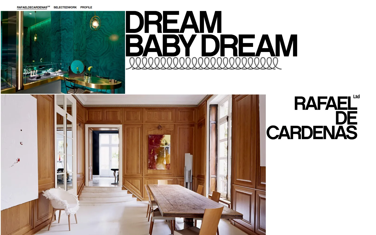
Type. Two registers, set far apart. Navigation is C1960 at 12px, weight 500, uppercase and tracked tight at -0.017em, so RAFAELDECARDENAS Ltd reads as one locked word. Against that, the headline runs near 90px in the same heavy grotesque, ragged right, with the studio name stacked below in three uppercase lines. No serif appears anywhere on the page.
Colour. The measured palette is #b2b8b4 at 42 per cent coverage, #a38b7f at 27, #1d4b3e at 6 and #ffffff at barely 2. Those are sampled from the photographs, not set in the interface: the malachite wall and the oak panelling are supplying them. The page itself is #000000 type on white, so each project dictates its own colour as you scroll.
Layout. The container is 1430px, 99 per cent of a 1440 viewport, so content runs edge to edge with a hairline margin. Images are placed as blocks at unequal widths rather than in a repeating grid, a 540px tile top left and a 1130px one below it, with type filling the gaps. Sticky header, zero corner radius, and a document 107,062px tall.
The ask. Three nav items and nothing more. No contact button, no form, no email capture, no press strip. The wordmark returns to the index, SELECTEDWORK and PROFILE carry everything else, and an enquiry means finding an address on the profile page. The page treats the work itself as the entire argument.
Setting the wordmark at the same weight and scale as the headline makes a studio read as one of its own projects, not a label stuck on top.
02
communedesign.com
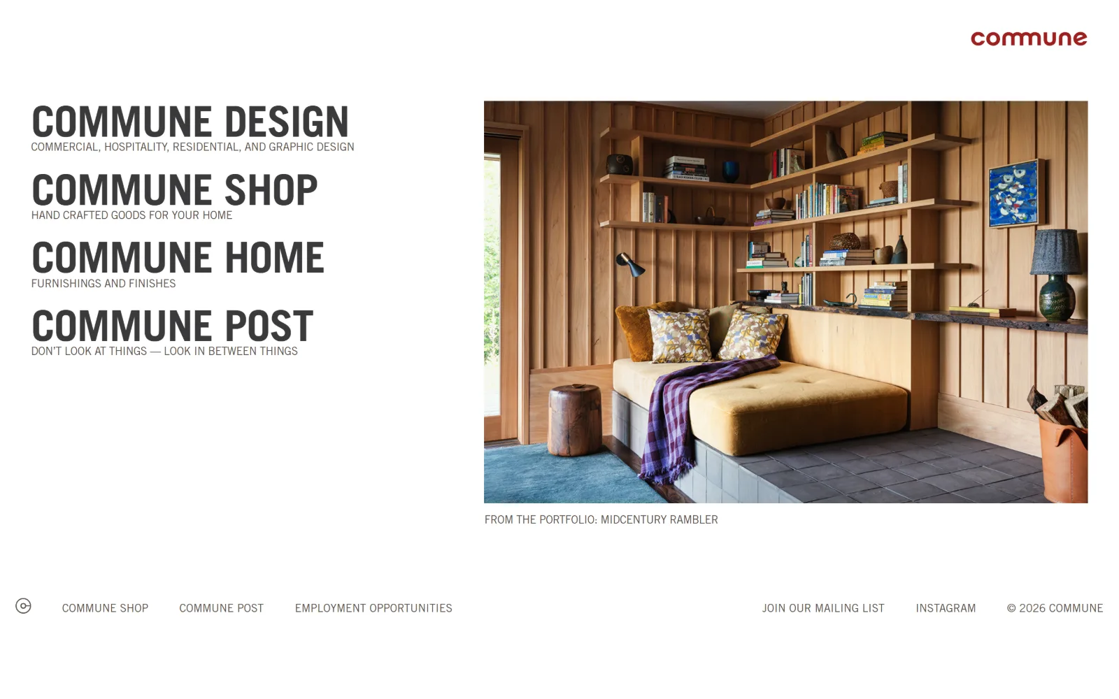
Four stacked Trade Gothic titles fill the left half while a cedar-lined window seat with a blue rug holds the right.
Type
Trade Gothic Bold, 55px uppercase
Body
Trade Gothic, 14px uppercase at -0.020em
Build
Half-and-half split, single-screen 823px page
Made on
Custom JS framework
Colour
#ffffff #efefed #5b534c
Type. Trade Gothic does all of it at exactly two sizes. Four section titles sit at 55px, weight 700, uppercase, tracked at -0.020em so the condensed caps close into solid bars. Under each one runs a 14px line in the same face with the same negative tracking, also uppercase. Nothing exists between 55 and 14, and no second family is loaded.
Colour. White covers 55 per cent of the frame with #efefed taking another 4. Ink is a warm grey, #5b534c, for the subtitles and #3a3a3b for the titles, so nothing on the page is true black. The one saturated note in the interface is the red wordmark top right; the blue rug and ochre cushion arrive entirely through the single portfolio photograph.
Layout. A straight split on a 1440px full-bleed container: type stacked down the left half, one 865px photograph on the right with its caption directly beneath. Document height is 823px, so the homepage finishes at the fold and never scrolls. A footer row of five links sits on the baseline, and corner radius is zero throughout.
The ask. There is no nav bar. The four stacked titles are the navigation, and the footer offers the shop, the journal, employment listings, a mailing list and Instagram. No contact link appears anywhere in view. Joining the mailing list is the only action the page actually requests.
A homepage that ends at the fold forces every link to earn its place: four titles and one photograph is the whole information architecture.
03
postcompany.co
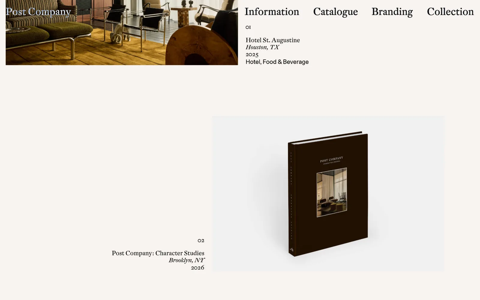
A numbered index: a hotel lounge shot clipped to the top edge, then a dark monograph photographed against pale grey.
Type
DTL Fleischmann, 29px
Body
DTL Fleischmann 18px, Unica77 18px for tags
Build
Numbered index, image and metadata sides alternating
Made on
Custom JS framework
Colour
#f8f4f0 #000000 #ffffff
Type. DTL Fleischmann carries nearly everything: navigation at 29px, project titles at 18px with the city line in italic, and oldstyle figures numbering each entry 01, 02. Unica77 at 18px handles only the category tag reading Hotel, Food & Beverage, so the single sans on the page is reserved for metadata. Heading line height sits at 1.19.
Colour. One ground colour, #f8f4f0, covers the page. Ink is #000000 across 205 characters and #ffffff across 97, the white reserved for the wordmark sitting over a photograph. There is no accent, no rule colour and no tint block. Every colour a visitor registers comes from the project images, here the olive upholstery and honey floorboards.
Layout. An index rather than a hero. Entry 01 sets a 790px image hard against the top left with its metadata beginning at x=818; entry 02 reverses the arrangement, right-aligning text against a 780px image. Navigation sits inline at the top right. Full-bleed 1440px container, zero radius, and 8,893px of scroll holding the rest.
The ask. Four nav items: Information, Catalogue, Branding, Collection. Nothing is a button, nothing is highlighted, and contact does not appear at the top level at all. The catalogue leads to a monograph the studio sells, which is the nearest thing to a transaction anywhere on the page.
Numbering projects 01, 02 and tagging each with client, place and year turns a portfolio into a record, which reads more credible than a slideshow.
04
electricbowery.com
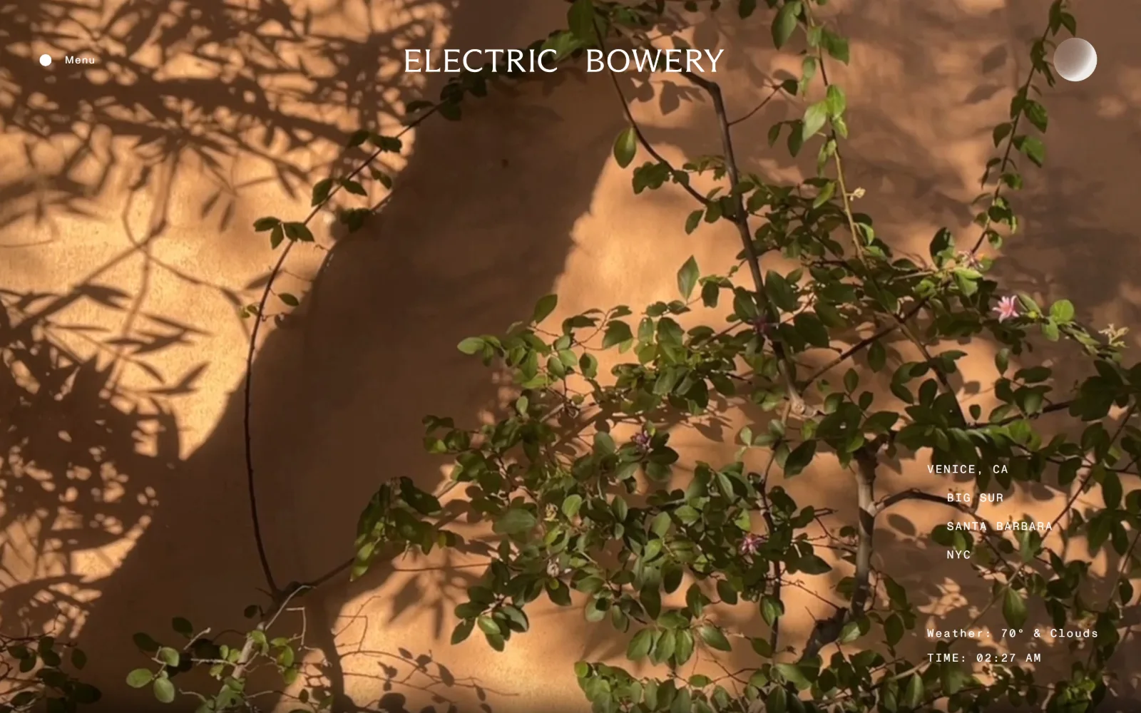
Jasmine shadows fall across a terracotta wall in a video hero, with a city list, local weather and a running clock.
Type
ABC Arizona Flare, roughly 36px
Body
ABC Monument Grotesk Mono, 14px at 0.120em
Build
Full-bleed video, chrome pinned to four corners
Made on
WordPress
Colour
#ffffff #c48650 #442c17
Type. Two faces doing opposite jobs. ABC Arizona Flare, a flared serif, sets the ELECTRIC BOWERY wordmark across the top at roughly 36px with generous word spacing. Everything else is ABC Monument Grotesk Mono at 14px, tracked 0.120em with 1.70 line height: the city list, the weather readout, the clock. Mono for data, serif for the name.
Colour. The interface contributes exactly one value, #ffffff, used for every character on screen, with no second colour and no accent. The warmth is the footage: the wall samples at #c48650 and its shadows at #442c17. Because the palette belongs to the video, it changes with each clip, and white type survives only because the grade stays warm and mid-dark.
Layout. Full-bleed video at 1440px with no container, no gutters and no visible grid. Chrome is pinned to the corners instead: Menu top left, wordmark top centre, a circular scroll cue top right, and a right-aligned stack of four locations low on the right with weather and time beneath. Sticky header, zero radius.
The ask. Two nav items behind a Menu toggle, and that is the complete set. No contact button, no form, no call to action in the first screen. What the page offers instead is live weather and local time for Venice, which signals presence rather than prompting anyone to act.
Live local time and weather in a corner costs almost nothing to build and does the job a studio paragraph usually does: someone is actually there.
05
studioshamshiri.com
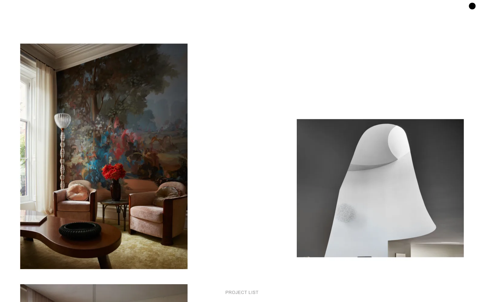
Two photographs float on white at different heights, one of a painted garden mural, one of a white sculptural form.
Type
Akzidenz Grotesk, 20px uppercase
Body
Akzidenz Grotesk, 13px at 0.046em
Build
1400px container, two staggered image columns
Made on
WordPress
Colour
#ffffff #959595
Type. A single family, Akzidenz Grotesk, at two sizes. The only type visible in the frame is PROJECT LIST at 13px, uppercase, tracked 0.046em, in #959595. Menu items run 20px uppercase at 0.090em but stay hidden behind the dot at top right. Times New Roman is declared as the body fallback and never surfaces above the fold at all.
Colour. White holds 53 per cent coverage and one grey, #959595, colours the single visible label. Nothing else is applied by the interface. The page reads as two photographs suspended on white, and the colour anyone remembers, the painted garden mural and the apricot club chairs, is entirely the image. Interface colour count: two.
Layout. The measured grid is two 497.5px columns with a 325px gutter inside a 1400px container, 97 per cent of viewport. In practice the images are staggered vertically: a tall 555px frame at upper left, a shorter one dropped 250px lower on the right, with PROJECT LIST centred on the baseline between them. Radius zero.
The ask. One text link, PROJECT LIST, and a dot that opens the menu. No contact, no email, no enquiry form and no social icons appear above the fold. The studio asks for a single thing, that you keep scrolling through 2,172px of work, and withholds everything else until you do.
Staggering two images so they never align horizontally keeps the eye travelling down the page without any scroll prompt or animation.
06
chango.com
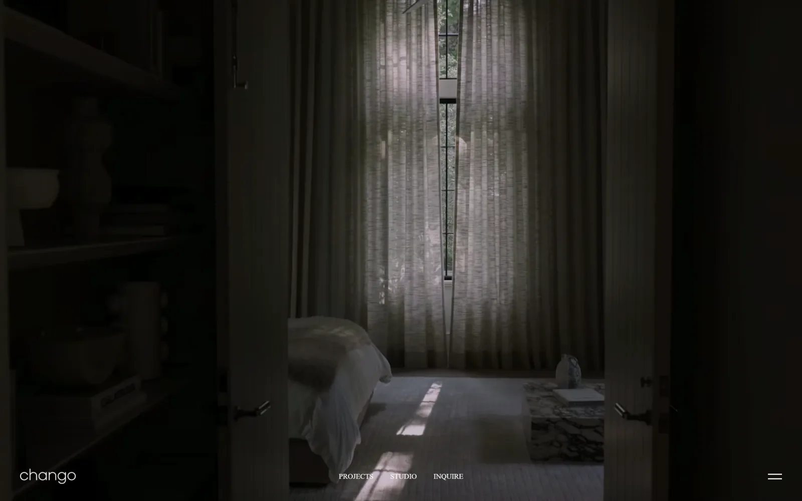
A near-black bedroom seen through open doors, with the wordmark, three nav links and a menu glyph on the bottom edge.
Type
Lowercase humanist sans wordmark, roughly 30px
Body
Licensed serif, 13px uppercase nav
Build
1440px full-bleed hero, chrome on the bottom edge
Made on
Wix
Colour
#000000 #fafaf8
Type. Navigation sits at 13px with 1.40 line height in a licensed serif, rendered as spaced capitals: PROJECTS, STUDIO, INQUIRE. The wordmark beside it is lowercase at roughly 30px in a soft humanist sans, the one place the page breaks its own uppercase rule. Nothing else is typeset in the first screen, and no heading scale exists above the fold.
Colour. Two values only: #000000 as the document background at 150 coverage and #fafaf8 as ink at 50. Because the photograph is a low-key interior graded almost to black at its edges, image and page share a boundary that is impossible to locate. The off-white type is the only element that separates one from the other.
Layout. A single photograph at 1440px full bleed fills the 900px viewport exactly, with a three-column 456px grid beneath it at zero gutters. All chrome is pushed to the bottom edge, wordmark left, nav centred, menu glyph right, which leaves the top two thirds of the image uninterrupted. Effective header height is zero.
The ask. INQUIRE, set as a word rather than a button, third in a three-item nav. There is no form, no phone number, no pricing and no newsletter. The hamburger holds the rest of the site. Placing the enquiry inline with Projects and Studio makes it a destination instead of a pitch.
Moving the entire header to the bottom edge hands a photograph the top two thirds of the screen and still keeps navigation one glance away.
07
srgambrel.com
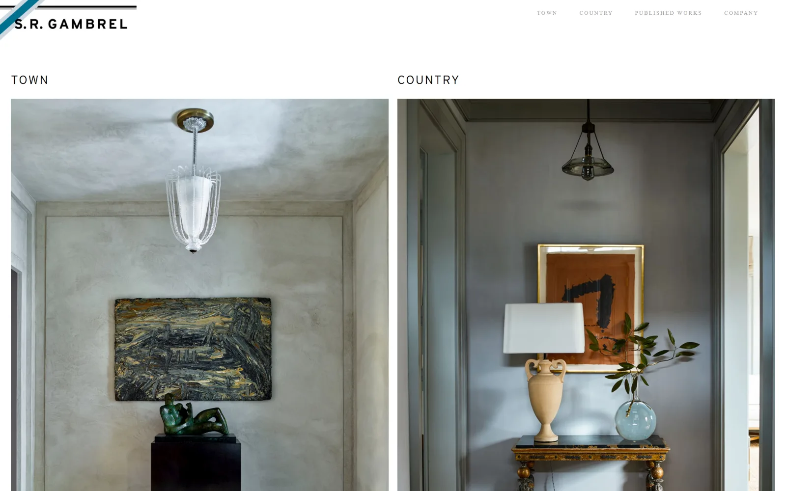
Two full-height interiors sit side by side under the labels TOWN and COUNTRY, a plastered hall and a grey entry.
Type
Interstate, 22px uppercase at 0.100em
Body
Times New Roman, 10px uppercase at 0.200em
Build
Eight-column 161px grid used as two 786px halves
Made on
Webflow
Colour
#ffffff #9b9a9a #000000
Type. An odd pairing that works. Navigation is Times New Roman at 10px, uppercase, tracked hard at 0.200em with 2.00 line height, which turns a default serif into something clearly deliberate. The two column labels, TOWN and COUNTRY, are Interstate at 22px, weight 300, tracked 0.100em. Serif for navigation and sans for headings is backwards, and it reads.
Colour. White at 57 per cent coverage plus two inks: #9b9a9a for the nav items, #000000 for the two labels. That is the complete interface palette. The plaster greys, bronze and ochre anyone registers belong to the two photographs, which sit directly on white with no border, no drop shadow and no overlay tint between them.
Layout. An eight-column grid of 161px tracks at 16px gutters, used as two halves: each photograph occupies 786px and runs from the top of the content area down past the fold. Labels sit 40px above their images. The header is 95px with the logo locked left and four nav items right, and the document measures 1,104px.
The ask. Four nav items, one of them COMPANY, which is where contact is kept. Nothing above the fold asks for anything at all. The homepage's entire proposition is a binary choice, TOWN or COUNTRY, which doubles as the firm's positioning statement and its site map in one gesture.
Splitting a portfolio into two named halves gives a visitor a decision on arrival, which beats a grid of undifferentiated thumbnails.
08
gachotstudios.com
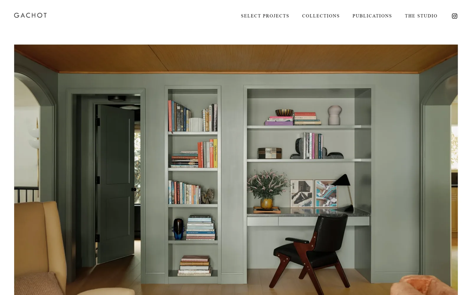
A sage-green library with built-in shelves and a black leather chair, inset inside an off-white ground on all sides.
Type. Futura PT runs the whole page, which is rare in this category and sets the tone at once. Navigation sits at 14px, uppercase, tracked 0.130em; the GACHOT wordmark uses the same face at roughly 22px with wider letterspacing; body copy drops to 23px at weight 300, tracked 0.061em. The geometric caps give a 1930s poster feel rather than a luxury-serif one.
Colour. White at 116 coverage against a #f5f5f4 page ground, a half-step off white that stops the photograph looking pasted on. Ink is #000000 across 133 characters and #ffffff across 15 inside a black button at zero radius. Two neutrals and black: the sage walls and tan ceiling in the picture supply everything else.
Layout. Section padding of 93px sets the rhythm. The header stands 105px tall and the photograph begins at y=150, inset 48px from each side rather than bleeding full width, so the off-white ground frames it on all four edges. Sticky header, 1440px container, zero corner radius, 1,321px document.
The ask. Four nav items plus an Instagram glyph, and one black button further down at 13px uppercase. Nothing in the first screen asks for an enquiry. SELECT PROJECTS leads the navigation, which tells you the studio expects to be judged before it expects to be contacted.
Insetting a hero image 48px instead of bleeding it full width reads as a framed print, which suits work that is itself about framing.
09
hendrickschurchill.com
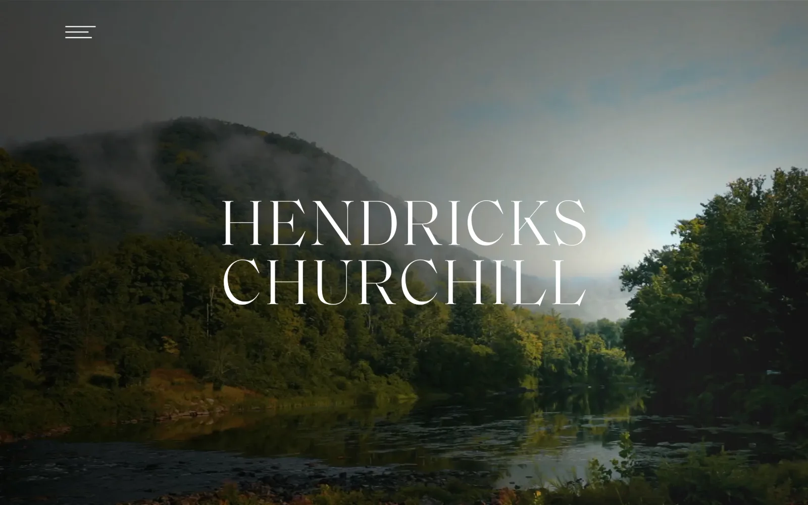
A misted river valley plays behind the studio name set in 100px didone capitals across two centred lines.
Type. Saol Display Light at 100px sets the name across two centred lines, a high-contrast didone with sharp unbracketed serifs and hairlines thin enough to disappear against the brightest part of the frame. No second size appears above the fold. Body copy further down is GT America, a neutral grotesque, so the display face carries all the character alone.
Colour. The measured ground is #5a6e73, a grey-green taken straight from the misted hillside in the video, and nav ink is #4b3c35, a warm brown from the same frame. Both are sampled from the footage rather than set against it. White type at 100px is the only high-contrast element, and it sits over the darkest band of the picture.
Layout. Full-bleed video behind a 1280px content container at 89 per cent of viewport, with a three-column 392px grid at 16px gutters for the project rows below. The only chrome above the fold is a hamburger roughly 60px in from the top left corner. The wordmark is optically centred and set a little above the midline.
The ask. Nothing is asked. One hamburger, no contact, no button, no form and no scroll cue. A studio name over a landscape is the whole first screen, and a visitor has to open the menu before doing anything at all, which is a confident bet on the name already being known.
Pulling interface colours out of the hero footage means the page never fights the image, even as the video changes behind it.
10
michaelsmithinc.com
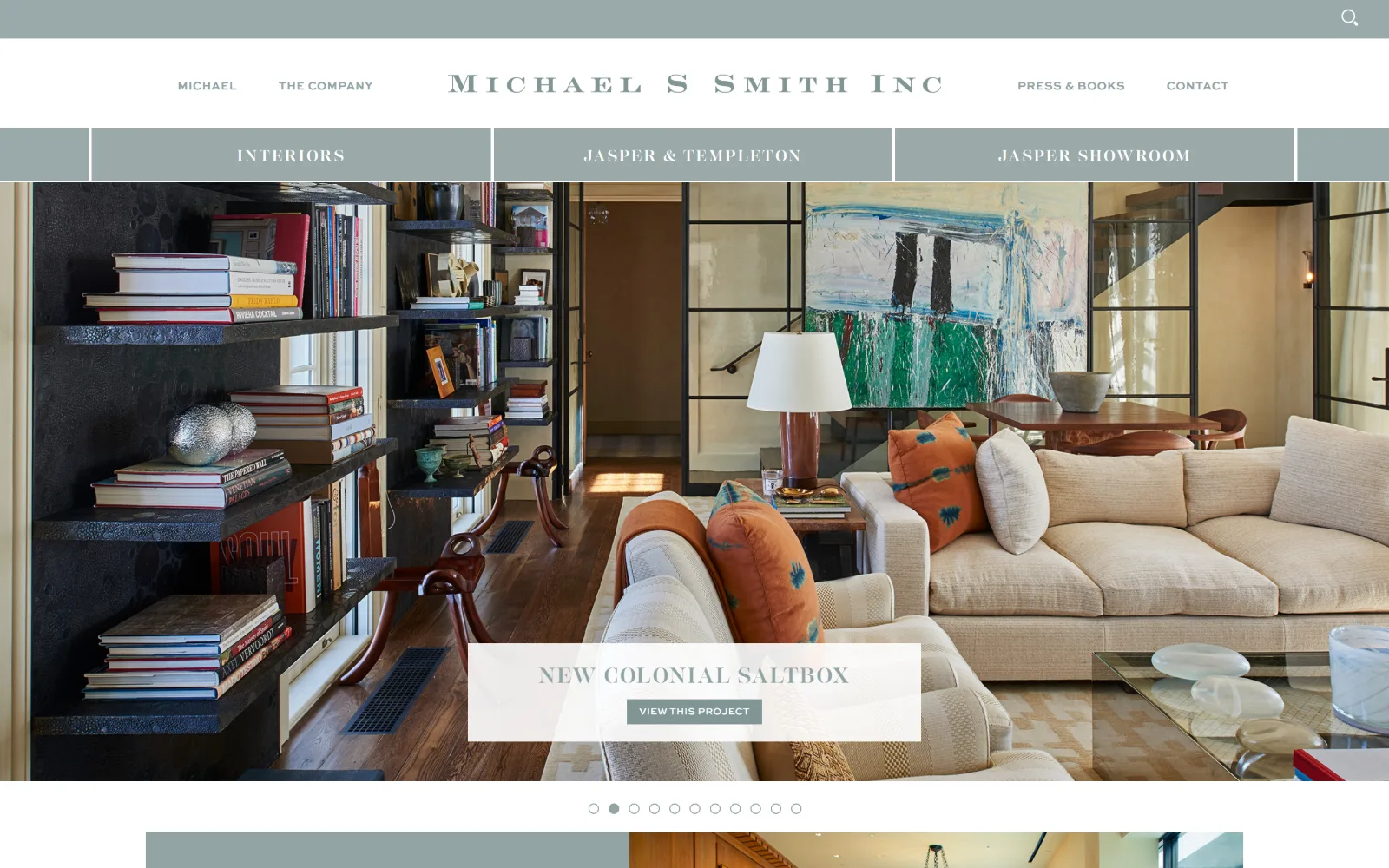
Three header bands in teal and white sit above a slider showing a living room with black shelving and orange cushions.
Type
LustPro Demi, 22px uppercase at 0.080em
Body
Georgia 18px, SweetSans Medium 12px nav
Build
44px utility strip, 100px header, 70px tab bar, full-bleed slider
Made on
Not detected
Colour
#ffffff #91a4a4 #829494
Type. Three faces split by job. LustPro Demi, a high-contrast display serif, sets the Michael S Smith Inc wordmark at 22px and the slide caption at 16px with 0.140em tracking. SweetSans Medium runs navigation at 12px bold uppercase and the button label at 10px with a 2.50 line height. Georgia at 18px, line height 1.70, handles body copy below.
Colour. Five measured values, four of them the same muted teal: #91a4a4 at 18 per cent coverage, then #829494, #99aaaa and #809595 as bar, hover and rule tints. White carries 46 per cent. That single sampled green-grey serves as brand colour, navigation ground and accent at once, which is why the page feels coloured without ever being bright.
Layout. Three stacked bands arrive before the image does: a 44px utility strip carrying search, a 100px white header with the wordmark centred between two nav pairs, then a 70px teal bar holding three section tabs. The slider runs full bleed beneath with eleven dots under it. Container 1440px, radius zero, 3,488px document.
The ask. A caption card with a VIEW THIS PROJECT button sits over the slide, the only button above the fold. CONTACT closes the navigation and a search field is offered in the top strip. The three tabs push visitors towards two product lines rather than towards an enquiry.
One sampled colour used for the utility bar, the section tabs and the nav ink makes a four-band header read as a single system, not three.
11
katicurtisdesign.com
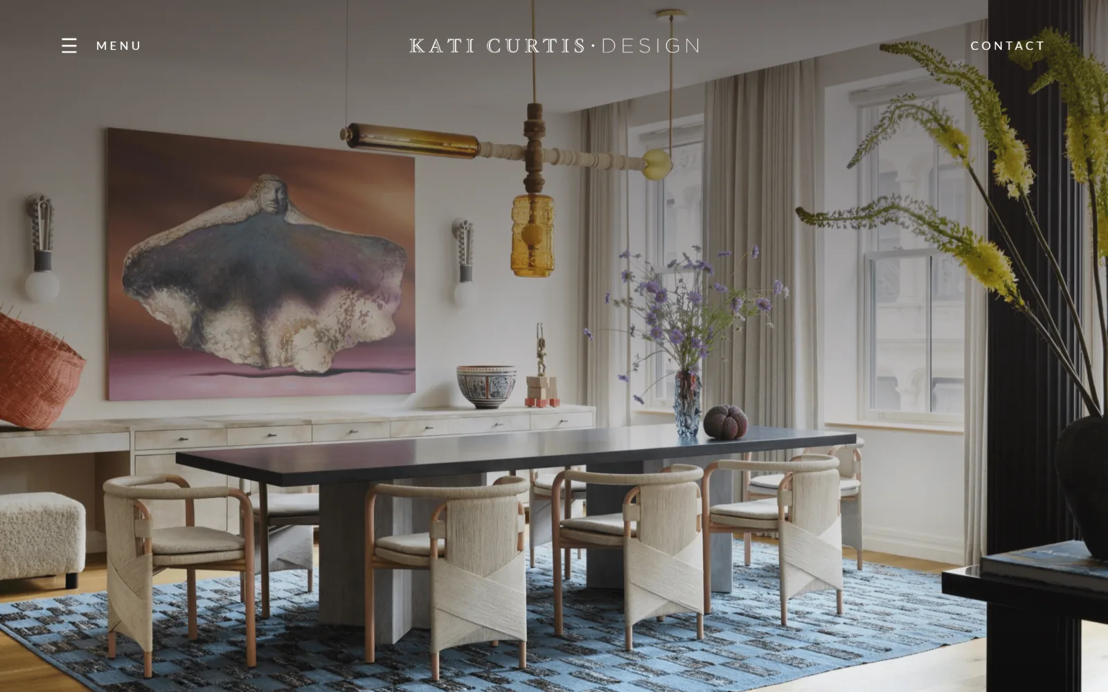
A pale dining room with a blue rug and large abstract canvas runs full bleed under a single thin row of chrome.
Type
Lato Light, 48px uppercase
Body
Playfair Display, 16px at 2.00 line height
Build
Full-viewport background-image hero under a 60px chrome row
Made on
WordPress
Colour
#ffffff #da3d77 #bfb3ac
Type. Lato and Playfair Display, cleanly divided. The wordmark runs near 22px in a tracked serif broken by an interpunct, while MENU and CONTACT are Lato at 9px, weight 600, uppercase, tracked 0.111em, small enough to read as punctuation rather than text. Below the fold a 48px Lato Light heading sits above Playfair body copy at 16px with 2.00 line height.
Colour. White at full coverage and one genuine accent, #da3d77, a hot pink measured at 1.1 per cent and used sparingly below the fold. Hero ink is #ffffff with #bfb3ac for the secondary line. The colour this page is actually remembered for, the blue rug and the lavender canvas, belongs to the photographer rather than the design.
Layout. The hero is a background image on the section rather than an img tag, running the full 1440px width and the full 900px viewport height. Chrome is one 60px row: menu glyph and MENU at left, wordmark centred, CONTACT hard right. No container inset, no radius, and a document of 8,158px under a silent first screen.
The ask. CONTACT, right-aligned, in 9px capitals. That is the whole ask above the fold. No phone number, no form, no consultation booking and no press strip, despite 8,000px of page below. The decision is to make the first screen a photograph and defer every request to the scroll.
Setting navigation at 9px keeps it legible without competing with the photograph, which is the trade every full-bleed hero has to make.
12
robertstilin.com
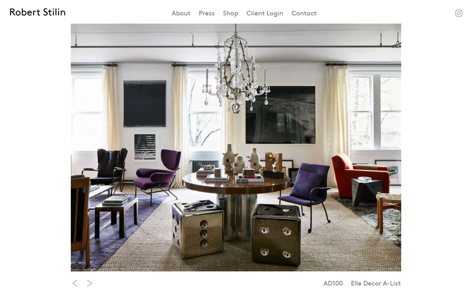
A centred, white-framed photograph of a loft with a crystal chandelier, purple chairs and two mirrored dice stools.
Type
BrownStd, 30px wordmark
Body
BrownStd, 20px sentence case
Build
90px header, centred 1120px image plate with 240px side margins
Made on
Not detected
Colour
#ffffff #000000 #777777
Type. BrownStd, a geometric sans, at two sizes: the wordmark at 30px in #000000 and the nav items at 20px in #777777. Everything is sentence case, with no added tracking and no capitals anywhere, which is rare in a category that reaches for tracked uppercase by reflex. The result reads considerably quieter than spaced caps would.
Colour. Very little: a white ground, #000000 for the wordmark, #777777 for the five nav items, and the same mid-grey for the slider arrows and two award credits. The photograph brings purple velvet, a red armchair and polished chrome, and because the page frames it on plain white, those colours land harder than they would on any tinted ground.
Layout. A centred, contained image roughly 1120px wide sits 80px below a 90px header, with matching 240px margins left and right, so the photograph reads as a plate rather than a backdrop. Previous and next arrows sit bottom left, the two award credits bottom right on the same baseline. Document height 756px, radius zero.
The ask. Five items including Shop and Client Login, so there is commerce and a project portal, but neither is pushed. Two award credits sit on the slider baseline doing the work a testimonial block would otherwise need. Contact comes last in the nav with no button treatment at all.
Two award credits on the same baseline as the slider arrows add proof without a logo strip, which would have demanded a band of its own.
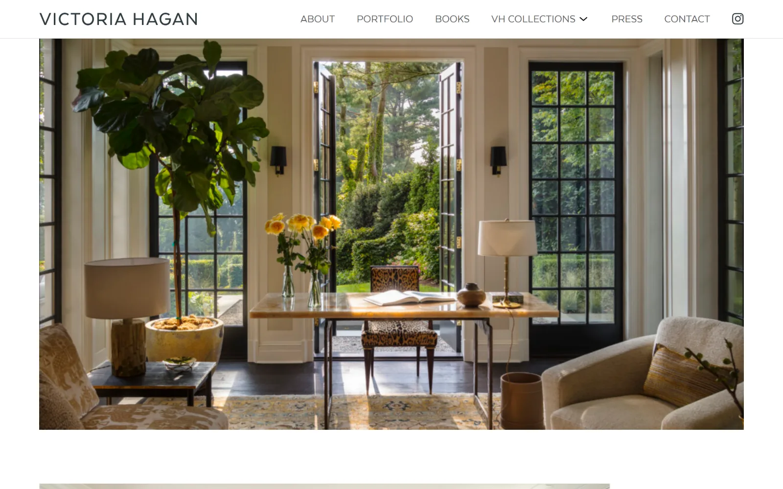
13
victoriahagan.com
A sunlit garden room with French doors open, a fiddle-leaf fig and yellow roses, contained inside white margins.
Type
Miller Display, 36px at weight 100
Body
Texta Alt, 21px uppercase
Build
1300px container at 90 per cent viewport, 78px sticky header
Made on
WordPress
Colour
#ffffff #f1f1f1 #5c5d5f
Type. Texta Alt at 21px, uppercase and untracked, carries seven nav items and the wordmark, which is set at the same size as the navigation rather than above it. Further down, Miller Display at 36px, weight 100, uppercase, takes section headings. Nav ink is #5c5d5f, a warm grey rather than black, which softens a header of that many items.
Colour. Two interface values, #ffffff at 104 coverage and #f1f1f1 at 13 for alternating section grounds, with #303c42 as a near-black for headings. Everything chromatic is photographic: the fiddle-leaf fig, the yellow roses, the leopard-print chair seat. The design supplies white and two greys and asks the image for the rest.
Layout. A 1300px container at 90 per cent of viewport, so the photograph keeps a visible 70px margin on both sides and never touches the screen edge. The header is 78px and sticky, wordmark left, nav right, Instagram glyph last. The image runs 790px tall and the following section begins 110px beneath it. Zero radius.
The ask. Seven nav items with CONTACT second from the end, VH COLLECTIONS carrying a dropdown for the product lines and BOOKS for the monographs. No button, no form and no enquiry prompt appears in the first screen. The ask is distributed across the navigation instead of concentrated anywhere.
Setting a wordmark at the same 21px as the nav items refuses the usual logo hierarchy and makes the header read as one horizontal line.
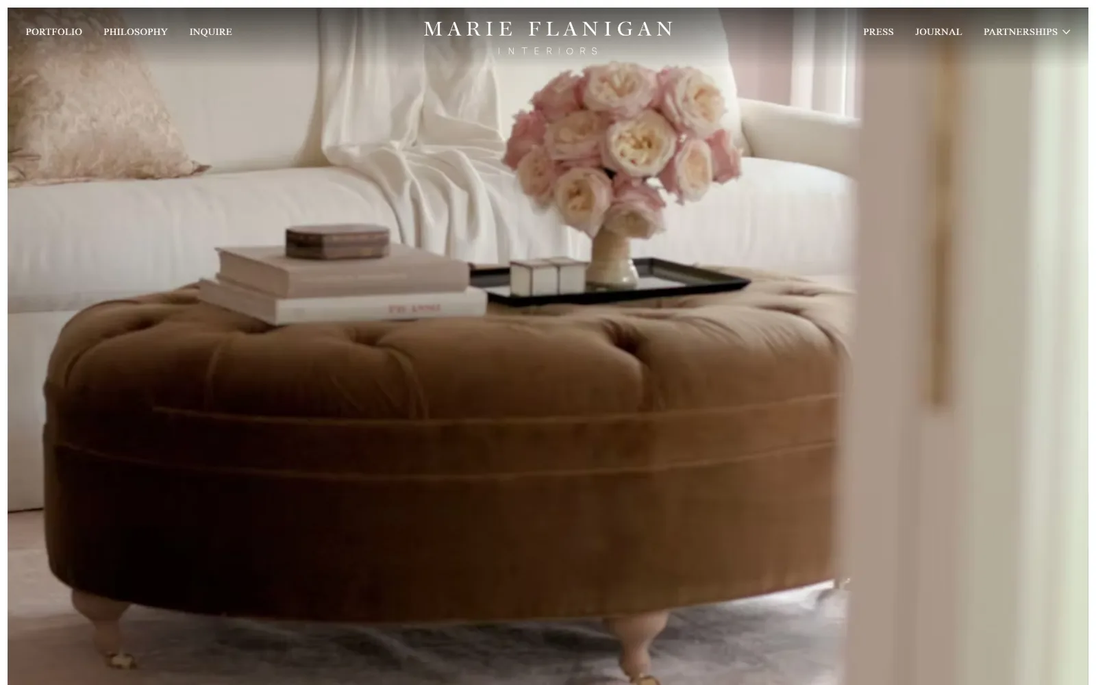
14
marieflanigan.com
A soft-focus video of a camel velvet ottoman and blush roses, with the wordmark centred between six nav links.
Type
Tracked display serif wordmark, roughly 30px
Body
Arial fallback at 10px, nav serif at 14px
Build
Full-bleed video, 90px split nav band, three-column 473px grid
Made on
Wix
Colour
#ffffff #404a48
Type. The wordmark is a tracked display serif near 30px with INTERIORS set beneath it at roughly 11px and very wide letterspacing, the two locked into one centred block. Nav items flank it at about 14px in the same serif, uppercase. Measured body type falls back to Arial at 10px, which is the platform default surfacing rather than a decision.
Colour. White at 102 coverage and #404a48, a deep slate green, at 97.5, the second value coming from a gradient scrim behind the top navigation rather than from any painted block. Everything else belongs to the footage: camel velvet, blush roses, cream linen. The scrim exists for one reason, to keep white type legible over a pale video.
Layout. Full-bleed video at 1440px filling a 918px document, with a three-column 473px grid defined beneath it at zero gutters. Navigation splits three items left and three right of the centred wordmark, all inside a 90px band carrying a soft dark gradient. No container inset, no corner radius, no sticky behaviour.
The ask. INQUIRE sits third from the left at the same size and weight as PORTFOLIO and PHILOSOPHY, with PARTNERSHIPS carrying a dropdown on the right. No form, no phone number and no booking link appear. The split nav gives six destinations equal weight and singles out none of them.
A dark gradient scrim behind a split nav is the cheapest way to keep white type legible over video that changes brightness shot to shot.
How these were chosen
Fourteen studio homepages, chosen from twenty-two captures, judged on one problem: the photography is the pitch, and the interface has to carry it without arguing back. These studios sell taste, so their sites get read on the same terms as their rooms. What separates good interior design website design from a slideshow with a logo on it is restraint in the chrome, and you can measure it: navigation set at 9 to 14px, a palette sampled from the pictures instead of invented around them, and a grid that lets one photograph run full width when it has earned the room. Eight captures were dropped for loader frames, heroes that never loaded, a cookie overlay and content outside the brief.
Finding interior design sites that someone had actually designed took far longer than it should have. 30 candidates made the shortlist. 14 made the page.
Each one was opened and looked at properly: what the type is doing, where the colour gets spent, how the page is built, how it asks for the job. Nothing is here because it ranks. Nothing is here because an agency filed it under portfolio. Several well known names were left out for the plain reason that their site came out of the same template as everyone else's, and a few sites worth including did not survive a second look.
Where a site is only competent, it says so. The order is the order worth your time, best first.
Reviewed and selected by Larry W. Matthews for Websitely.