Architect Website Design: 15 Studios That Show the Work
Fifteen US practices whose sites have to look like the buildings they draw. Architect website design is one photograph, a lot of air and little else.
Shown
15 sites
Reviewed
30 candidates
Chosen on
The work, not the ranking
Updated
15 October 2026
01
dsrny.com
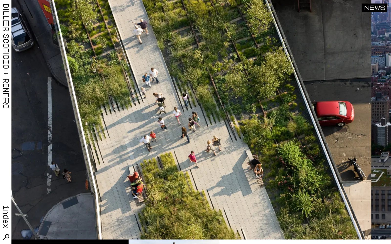
An aerial photograph of the High Line fills the frame while the studio name runs vertically up a narrow black rail on the left edge.
Type
DSPLUSR 28px
Body
DSPLUSR 13px / 1.70
Build
Vertical left rail, full-bleed photo, 460px content column
Made on
Not detected
Colour
#dddddd #000000 #ffffff
Type. Everything is set in DSPLUSR, a house monospace falling back to Courier, and almost nothing is large: body runs 13px at 1.70 line height, nav 12px at weight 700, and a second register of 11px uppercase appears 175 times across the page. The largest thing measured is 28px. Type behaves like a filing system rather than a voice, which suits a studio whose output is already loud.
Colour. Three values do the work: a #dddddd field covering 51.1 percent of the page, black ink at #000000, and white at 2.1 percent coverage. The only saturation on screen comes from the photograph itself, the red car and the planting. Even the links keep the browser default #0000ee rather than a brand colour, which reads as deliberate rather than unfinished.
Layout. The vertical black rail on the left is the whole chrome: rotated wordmark at the top, the word index and a search glyph at the bottom, with a small NEWS tab clipped to the top right. The photograph is full bleed behind it. Below the fold the content container narrows to 460px, 32 percent of a 1440 viewport, feeding three-column and two-column grids with 28px and 14px gutters. Corner radius is 0 throughout.
The ask. There is no button, no form and no measurable nav list. The page asks for a single thing, the word index, which leads to a list of projects. Enquiries are not solicited anywhere above the fold. A practice at this level treats the homepage as a door rather than a pitch, and the restraint is the message.
Rotating the wordmark into a vertical rail frees the entire viewport for one image without losing the brand anchor or the navigation.
02
stevenholl.com
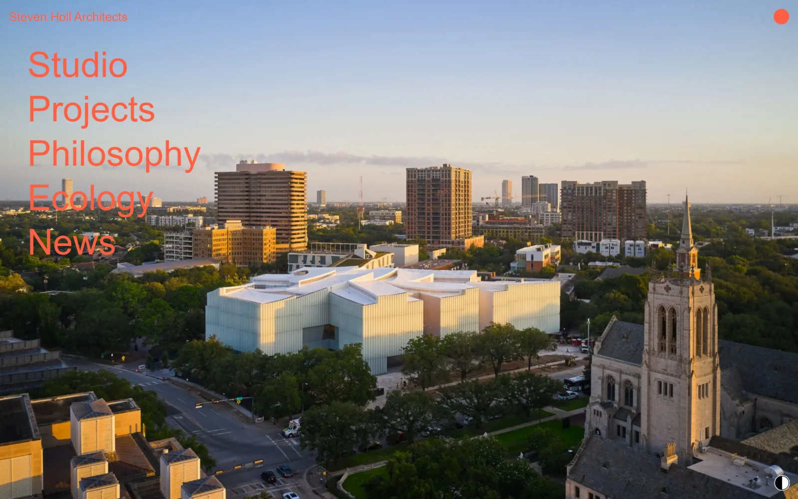
Five navigation words stack in orange down the left of a dusk aerial photograph of a white museum building, with a small orange dot top right.
Type
Helvetica Neue 64px
Body
Helvetica Neue 16px
Build
Full-bleed image, stacked left nav, no header
Made on
WordPress
Colour
#ffffff #ff5f43
Type. Helvetica Neue carries the entire page. The nav is the display type here, set at 64px weight 500 with 1.25 line height, stacked one word per line. Under it the practice name sits at 16px weight 700 and a single 22px line handles the project credit. Three sizes, one family, no tracking adjustments anywhere. The scale jump from 64 to 22 to 16 is wide enough that hierarchy never needs a rule or a box.
Colour. A two-colour page in the strictest sense: #ffffff behind everything at full coverage and #ff5f43 for every character of type on screen, all 500 of them. There is no grey, no secondary ink, no hover state colour. Saturation comes from the orange and from the sunset in the photograph, and the two happen to rhyme, which is either luck or a chosen image.
Layout. The photograph is full bleed at 1440px, the full viewport width, with no header bar and no container. Navigation sits directly on the image at the top left with no scrim behind it, so legibility depends entirely on the picture staying pale in that corner. The document runs 13403px deep. Corner radius is 0 and section padding is undefined, because there are no sections in the usual sense.
The ask. No call to action, no contact line, no phone. News sits last in a five-item list and the orange dot top right is the only interactive affordance outside the nav. The page is a cover, and the only transaction it offers is going deeper.
Setting navigation at 64px makes it the page's display type, which removes the need for a separate headline entirely.
03
olsonkundig.com
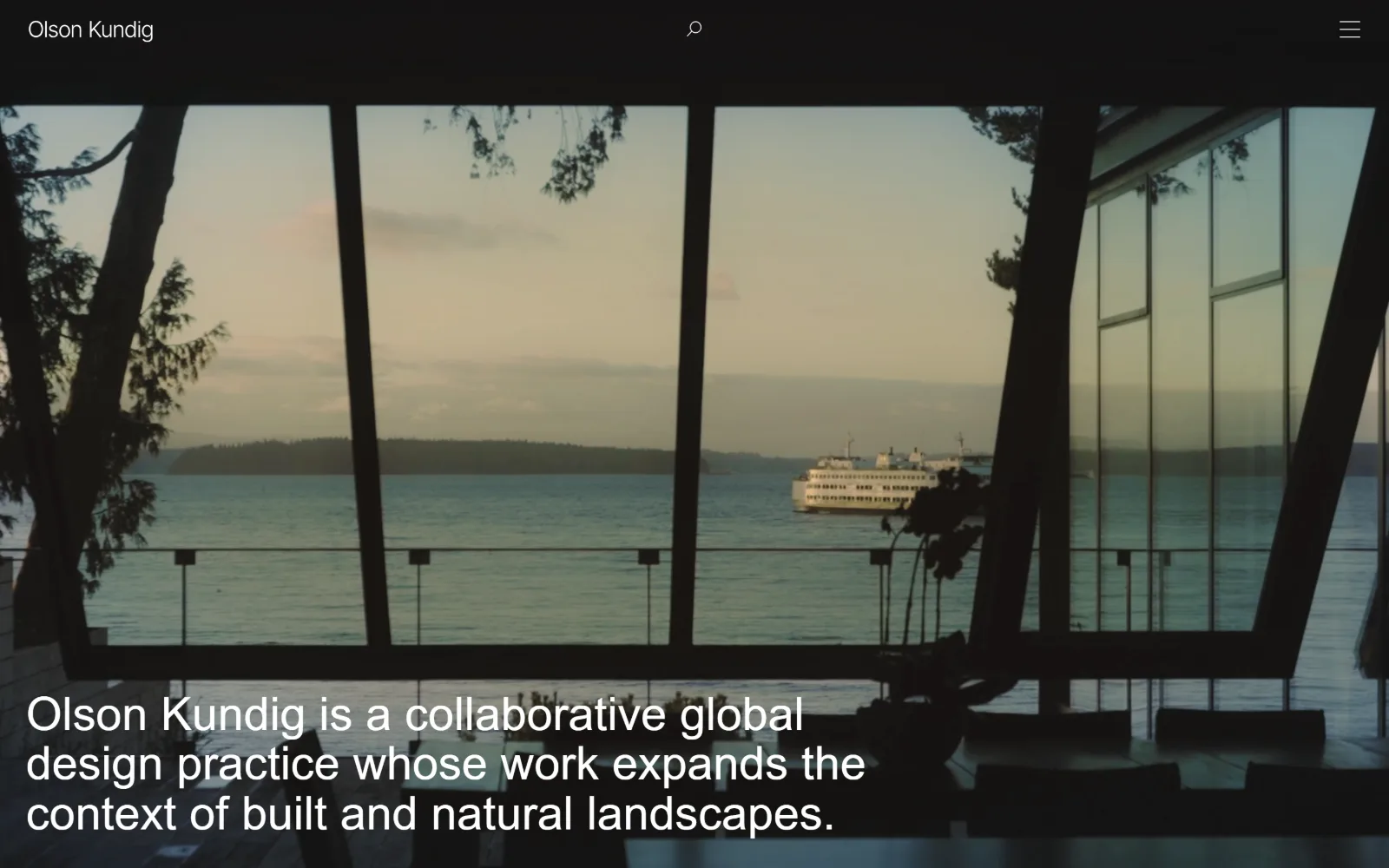
A dark video still looks out through a canted window wall at a ferry crossing grey water, with three lines of white text across the lower third.
Type. InterVariable at 48px weight 500, 0.004em tracking and a tight 1.08 line height carries the one sentence on screen, broken across three lines. A 17px weight 600 label is the only other size recorded. The sentence is the firm's own description of itself rather than a slogan, and setting it at headline scale without shortening it is the decision: it reads as a statement of practice, not a tagline.
Colour. The page sits on #181213, a near-black with a red cast rather than a neutral, with #918985 as the warm grey secondary. White ink at #ffffff covers all 261 characters. Saturation is entirely in the video: the pale green water and the sunset haze. Because the ground is warm-black rather than #000000, the footage never feels cut out of the page.
Layout. A sticky header about 72px tall sits above the video, holding the wordmark at left, a search glyph dead centre and a hamburger at right. The video runs full width at 1440px below it with the headline overlaid on its lower third, not in a panel. The document is 6300px deep. Radius is 0. Note the nav collapses to a hamburger even at desktop width, which hides a large practice behind one icon.
The ask. Nothing is being requested. There is no enquiry link, no project filter, no newsletter field in view. The hamburger is the entire interaction budget above the fold, and everything else is left to scroll.
A near-black with a warm cast, rather than pure black, lets video sit in the page instead of looking pasted onto it.
04
shoparc.com
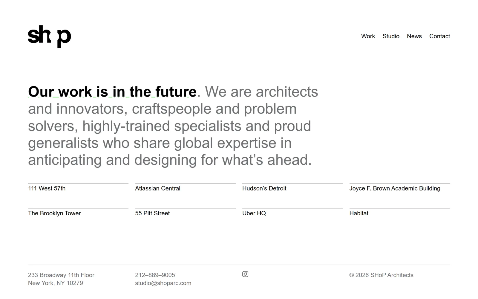
A white page holding a logotype with overlapping letterforms, a six-line grey paragraph, eight project names under hairline rules, and a footer.
Type
Brandon Grotesque 44px / 300
Body
Brandon Grotesque 18px
Build
1270px container, 250px padding, single-screen index
Made on
WordPress
Colour
#ffffff #6d6e71 #000000
Type. Brandon Grotesque at 44px weight 300 sets the statement, with the opening clause at weight 700 so one sentence carries two voices. Project names and nav drop to 18px, weights 300 and 400. The 44 to 18 ratio is the only hierarchy on the page. The light weight at that size gets thin, and the grey makes it thinner, so the bold opening is doing real work holding the eye.
Colour. Essentially two inks on white: #6d6e71 for the 264 characters of the paragraph and #000000 for the 170 characters of nav, the bold opening and the project names. White is the only measured background colour at 8.6 percent coverage. No accent colour exists. The only saturation available to this studio's homepage is the grey ramp itself.
Layout. A 1270px container, 88 percent of the viewport, with roughly 250px of section padding above the statement. The project index sits in two rows of four, each name under a hairline rule that stops at the column edge rather than running the full width. The document height is exactly 900px, so the entire site homepage is one screen. Radius 0.
The ask. Four nav items, an address, a phone number, an email and an Instagram glyph in the footer, and no button anywhere. The project names are the links. Contact details are present but given the smallest type on the page, which is the opposite of how most trades handle a phone number.
Shifting the first clause of a paragraph to bold gives you a headline and body copy in one block without adding a second typeface.
05
studiogang.com
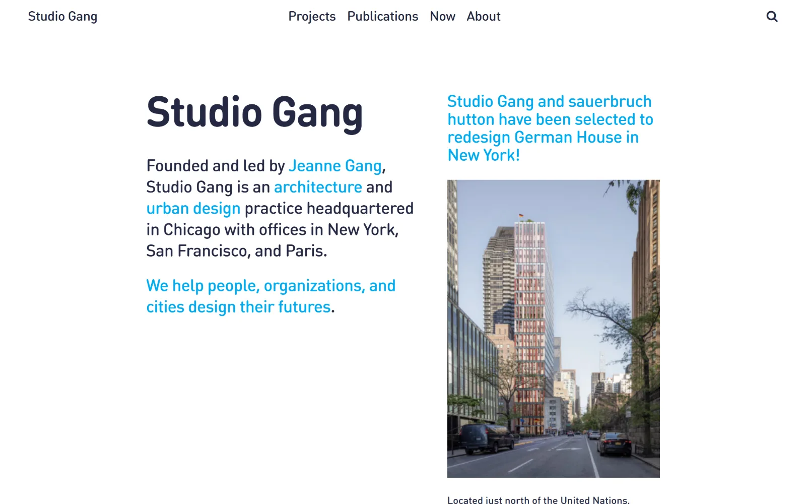
The practice name sits at large size in dark navy on the left beside a cyan news headline and a street-level rendering of a slender tower.
Type
DINround 76px / 700
Body
DINround 30px
Build
Two columns, no hero, sticky four-item header
Made on
WordPress
Colour
#232841 #00aaf0 #ffffff
Type. DINround at 76px weight 700 with -0.030em tracking sets the name, and the body paragraph runs 30px weight 400 at -0.020em. A 30px body size is unusually large and it is what makes the left column read as a statement rather than an about blurb. A DINmono cut appears at 16px for metadata. Negative tracking at both sizes keeps the rounded grotesque from feeling soft.
Colour. Ink is #232841, a navy dark enough to read as black until the cyan arrives, and #00aaf0 covers 324 characters as links, the news headline and a pull line. Background is white at 3.1 percent measured coverage. One accent, used at three different jobs, with the photograph supplying everything else.
Layout. Two columns across a 1440px full-width field: a text column on the left running from the name down through the paragraph, and a news column on the right pairing a cyan headline with a portrait rendering. There is no hero image. A sticky header carries four nav items centred with a search glyph at the far right. Document height 5764px, radius 0.
The ask. No button, no form, no phone. Cyan links inside the paragraph are the conversion surface: Jeanne Gang, architecture, urban design. The practice turns its own description into navigation, so reading the sentence and browsing the site are the same action.
Running links inside a 30px introductory paragraph turns the about text into the primary navigation without adding a menu.
06
mos.nyc
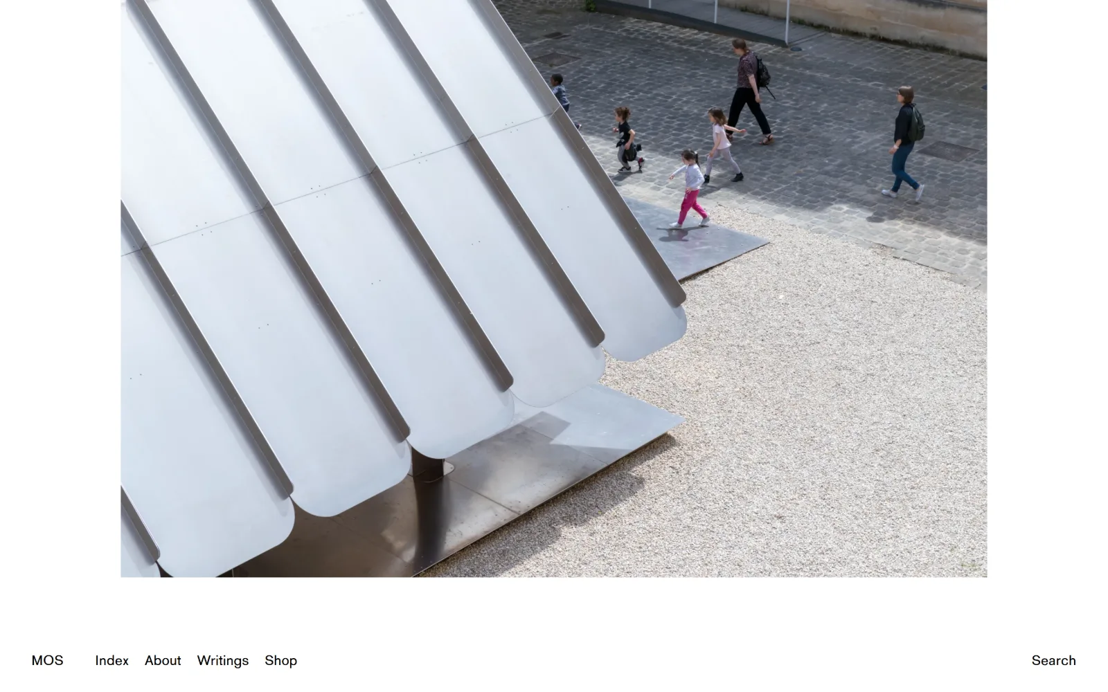
A photograph of a white fluted canopy on gravel, people crossing cobbles behind it, with a thin text bar sitting below the image at the base.
Type
Akzidenz MOS 18px
Body
Akzidenz MOS 14px
Build
Inset image, bottom-anchored nav, 219506px scroll
Made on
WordPress
Colour
#ffffff #000000
Type. Akzidenz MOS, a customised cut of Akzidenz Grotesk, at a single size: 18px weight 400 with 0.023em tracking, used five times. Nav is 14px at 0.030em. That is the entire type system, with no heading style recorded at all. The slight positive tracking is the only typographic refinement on screen, and at 18px it stops the lowercase from clotting at small sizes.
Colour. Black at #000000 and white at #ffffff, measured at 81.9 and 104.6 percent coverage, and nothing else. All 25 characters of ink are black. Every colour on the page belongs to the photograph: the grey cobbles, the gravel, the one child in pink. A palette this bare makes any image look like it was art directed, whether or not it was.
Layout. The image sits inset inside a white field rather than bleeding, with the navigation bar placed below it at the bottom of the viewport instead of above. Full 1440px field, no container, radius 0. The document runs 219506px, which is roughly 244 screens of scrolling, so the homepage is an index of everything the studio has made rather than a selection.
The ask. Five words in the bottom bar and a search link, no button, no contact line, no enquiry. Shop is one of the five, which is the only commercial intent on the page and it is given exactly the same weight as Index. Nothing is emphasised because nothing is being sold hard.
Moving navigation to the foot of the viewport lets the image own the top of the screen without an overlay or a scrim.
07
johnstonmarklee.com
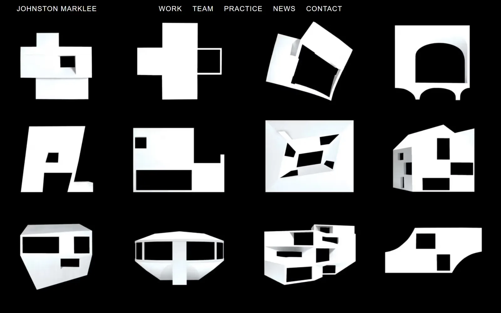
Twelve white study models float on a pure black field in a four by three grid, uncaptioned, with uppercase navigation across the top.
Type
F Grotesk Book 32px uppercase
Body
F Grotesk Book 20px / 0.063em
Build
4x3 grid on black, 60px padding, one-screen page
Made on
Custom JS framework
Colour
#000000 #ffffff
Type. F Grotesk Book is the only face, and it only appears twice: nav at 32px weight 400 with 0.039em tracking in uppercase, and a 20px cut at a wider 0.063em across six items. Both are uppercase white. The wider tracking on the smaller size is the right instinct, and the absence of any body copy means type is signage here rather than reading matter.
Colour. Black at #000000 covers 52.8 percent of the page and white carries all 43 characters of ink. Two values, no accent, no grey. The models themselves are white objects photographed on black, so the palette and the content are the same two values, and the page reads as one continuous material rather than images placed on a background.
Layout. A 1440px full-width field with 60px section padding and a sticky header holding five nav items. The grid is four across and three down with generous gaps, each model sitting at its own scale rather than cropped to a uniform frame, so the row rhythm is irregular on purpose. Document height is 900px, meaning the homepage is exactly one screen. Radius 0.
The ask. No captions, no project titles, no button, no contact detail in view. Hovering is the only way to learn what any of the twelve objects is. The page asks a visitor to be curious first and informed second, which filters the audience before a single word of copy is read.
Uncaptioned thumbnails work when the images share one visual logic, because the grid itself becomes the explanation.
08
twbta.com
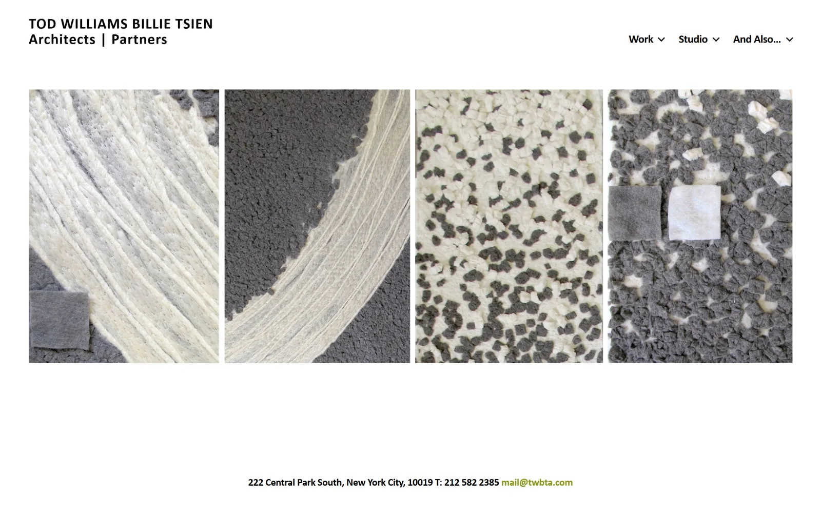
Four tall images of grey and cream felted material samples sit in a row on white, under a two-line wordmark, above a centred contact line.
Type
NewRailAlphabet Light 26px
Body
NewRailAlphabet Light 16px
Build
1340px container, four portrait crops, 637px page
Made on
WordPress
Colour
#ffffff #000000 #8c9514
Type. NewRailAlphabet Light carries everything, though the weights undercut the name: the wordmark runs 26px weight 600 at 0.038em, nav 20px weight 700 at -0.025em, and the contact line 16px weight 700 at -0.031em. Tight negative tracking on the small sizes against positive tracking on the wordmark gives the header two clearly different jobs without a second family.
Colour. White at 47.5 percent coverage, black ink across 181 characters, and one surprise: #8c9514, an olive, reserved for the 14 characters of the email address. A single accent spent on one link is the most disciplined colour decision on this page, and it comes at the bottom rather than the top.
Layout. A 1340px container, 93 percent of viewport, holding four portrait images edge to edge with narrow gaps, each one a crop of material rather than a building. The wordmark stacks over two lines at top left and three dropdown nav items sit at top right. Document height is 637px, shorter than a single viewport. Radius 0.
The ask. The contact line is the conversion: a street address, a phone number and an olive email link, centred under the images. No button, no form, no enquiry page. Showing material samples instead of finished buildings is itself a filter, and the one coloured link is where the page expects a serious visitor to land.
Reserving your only accent colour for the single most important link makes the hierarchy obvious without a button.
09
clbarchitects.com
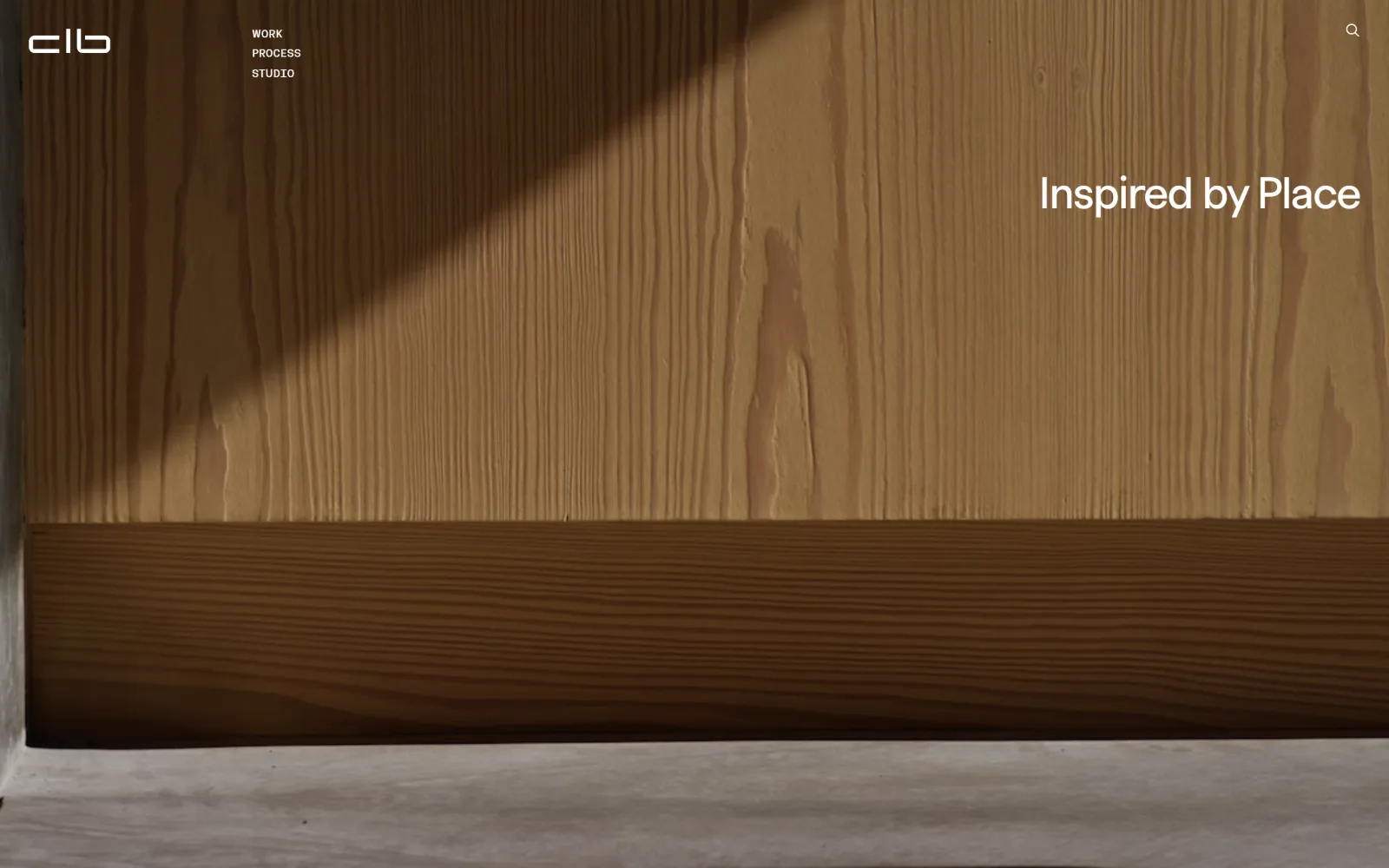
A close video still of sunlit vertical-grain timber boards fills the screen, cut by a diagonal shadow, with a white line of text at the right.
Type. FTPolar Regular sets the line at 46px with -0.030em tracking and 1.08 line height, and a semi-mono companion, FTPolar SemiMono Regular, handles the nav at 12px uppercase with 1.50 line height. Pairing a neo-grotesque with its own semi-mono sibling gives the header a technical register without reaching for Courier. Body copy further down runs 20px.
Colour. The measured palette comes back empty because almost everything on screen is video, so the colour is the timber: warm ochres and browns with a grey concrete sill. Ink is #000000 for body, #ffffff for the overlaid headline and nav, with #1f1f1f on eight characters. No brand accent competes with the footage.
Layout. No container is set, so the video runs the full 1440px with the headline right-aligned near the top rather than centred or bottom-left. A sticky header puts the monogram at far left and stacks three nav items vertically beside it, which is an unusual choice: the menu reads as a column, not a bar. Search sits at the far right. Document height 7996px, radius 0.
The ask. Three nav words and a search glyph. No phone, no email, no enquiry button in view. Inspired by Place is a positioning statement rather than an offer, and the page lets a 46px line and a piece of timber do the work most firms give to a form.
Stacking a three-item menu vertically beside the logo reads as a contents list rather than a navigation bar, which suits a small index.
10
work.ac
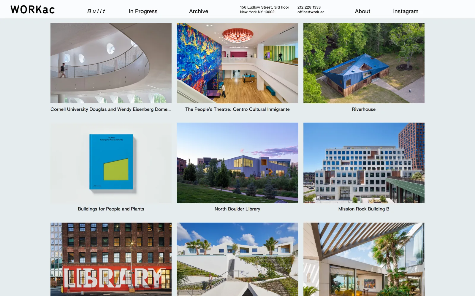
A pale blue-grey page carries a three-column grid of project photographs with captions beneath, under a white header holding address and phone.
Type. AUTHENTIC Sans runs the page at three sizes: 16px at 0.020em for nav and captions, 13px at 0.024em for body across 456 characters, and 11px at 0.030em. The nav has one italic item set at an extreme 0.300em tracking, which marks the current section instead of an underline. Positive tracking at every size is consistent and keeps a quirky face legible at 13px.
Colour. A #e5ebee ground at full coverage, white at 3 percent for the header bar, and #000000 for all 545 characters of ink. Three values total. The pale blue-grey is doing something specific: it drops the brightness behind nine colour photographs so the images read as the brightest thing on screen without any of them being enlarged.
Layout. A 1200px container at 83 percent of viewport sits on the tinted field, with a 12-column base grid at 16px gutters resolving to three columns of thumbnails. The sticky white header is unusually dense, carrying the wordmark, three nav items, a street address, a phone number and an email on one line. Row gap is 0, so captions sit tight under their images. Radius 0.
The ask. Phone and email are in the header, which almost none of the other fifteen do, and the only headline the extractor could find is Sign up to get news from us. So the page asks for two small things, a call or a subscription, and never for a project enquiry.
Tinting the page background slightly darker than white makes photographs the brightest element without resizing or framing any of them.
11
solidobjectives.com
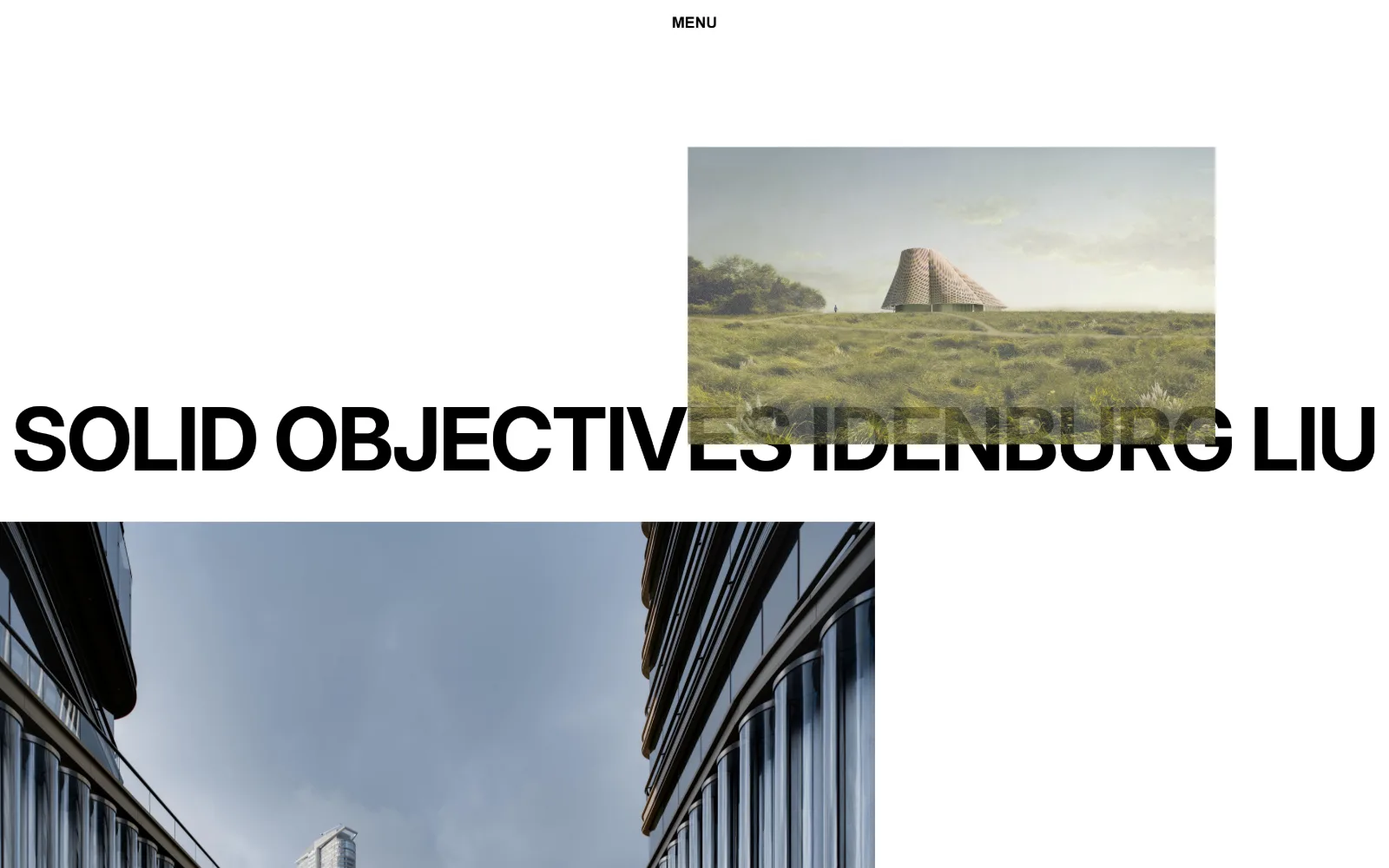
The full practice name runs in heavy black capitals across the whole width, with a landscape rendering overlapping and sitting on top of the letters.
Type
Drawn wordmark, full-width caps
Body
Inter 16px / 700 uppercase
Build
Overlapping image and wordmark, centred MENU, no container
Made on
Not detected
Colour
#ffffff #000000
Type. Only one type size was recorded, Inter at 16px weight 700 uppercase, which is the MENU label. The wordmark itself is drawn rather than set, in a heavy grotesque spanning the full 1440px so the letterforms are roughly 90px tall. A page with exactly one piece of real text and one giant graphic word is unusual, and it means the type carries no information beyond the name.
Colour. No palette values were extracted, which fits: the page is white, the wordmark is black, and the only four characters of ink come back as #000000. Colour arrives entirely through the two images, a green meadow rendering and a blue-grey street-level photograph of a glazed facade. The page itself contributes nothing chromatic.
Layout. The structural move is the overlap. The rendering is positioned so it crosses the wordmark, with the image in front and the letters passing behind it, which breaks the usual rule that the logo sits on top. MENU is centred at the very top, alone. Full 1440px field, no container, radius 0, document 11630px deep. Images are placed at different widths rather than gridded.
The ask. One word, MENU, centred at the top of the page. No nav list, no contact, no button, no project titles. Of all fifteen this is the shortest route between arriving and being asked to make a choice, and the choice is binary.
Letting an image cross in front of the wordmark signals that the work outranks the brand, and it only works if the wordmark is large enough to survive the crop.
12
faulknerarchitects.com
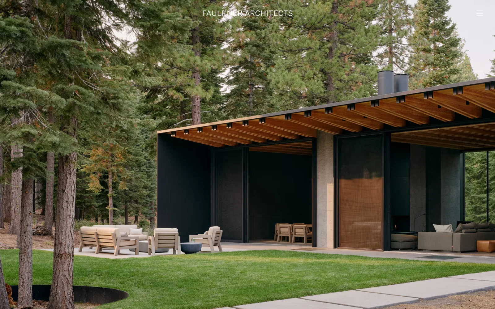
A low house with a deep timber eave sits among tall pines on cut grass, filling the frame, with the firm name centred in white caps at the top.
Type. Soehne at 22px weight 300 with 0.020em tracking and a 1.50 line height is the only size recorded, in #7a726a, a warm grey-brown rather than black. The header wordmark is letterspaced uppercase, centred, and small enough to read as a caption rather than a logo. A light weight at 22px with generous leading is a specific choice: the copy is meant to be read slowly.
Colour. The extracted palette is sampled from the photographs rather than the interface: #998051, #a2785e and #a86c78 at 4.3 percent each, then #a78b57, #a78160 and #6f8596 at 1 percent. Six warm earth tones and one cool blue, all from imagery. The body ink at #7a726a sits inside that same range, so the type and the pictures share a temperature.
Layout. Full-bleed photograph at 1440px with no header bar, no scrim and no container. The wordmark is centred at the top, which is rare in this set, and a hamburger sits at the far right. Further down a three-column grid of 300px columns uses an enormous 135px gutter, far wider than the 16 to 28px most of these sites run. Document height 2932px, radius 0.
The ask. A hamburger and nothing else. No phone, no email, no enquiry, no project captions on the opening screen. Three offices are mentioned in the meta description and none of them appear on the page. The site is built on the assumption that anyone serious will find the contact page.
Pulling body ink from the same warm range as your photography makes text feel like part of the image rather than an overlay on it.
13
spechtnovak.com
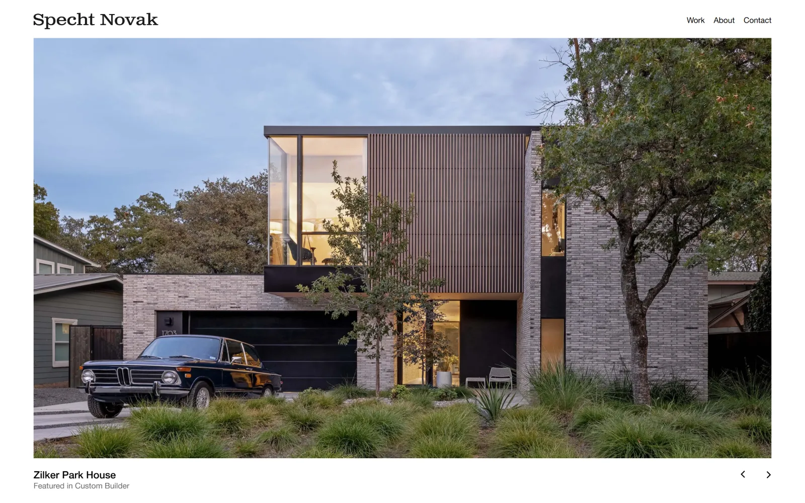
A two-storey brick and timber house at dusk fills most of the page, a vintage saloon car parked outside, with a project caption below at left.
Type
Serif wordmark
Body
Helvetica Neue Roman 14px / 1.50
Build
1320px container, 72px padding, contained hero with caption
Made on
WordPress
Colour
#ffffff #000000 #696969
Type. The wordmark is a serif, which makes this the outlier in a set of grotesques, while everything else runs Helvetica Neue in two cuts: Medium at 18px for project titles and a 43px size at -0.045em further down, Roman at 14px with 1.50 line height for the 1118 characters of body. An 11px uppercase label at 0.050em handles the smallest metadata. Three sizes, clean separation.
Colour. Black at #000000 and white at #ffffff dominate, with #696969 carrying 1102 characters of body text and #828282 on eight characters of label. A grey ramp with no hue anywhere, which leaves the dusk sky and the warm interior lights in the photograph as the only colour. Button background is #000000 at 0 radius.
Layout. A 1320px container at 92 percent of viewport with 72px section padding. The image sits inside that container rather than bleeding, so a white margin frames it on three sides. The caption sits below the image at left and slider arrows at right, both outside the frame. Sticky header with three nav items. Document height 8375px, radius 0.
The ask. Contact is one of three nav items and there is a black square-cornered button defined in the stylesheet, so this is the only site in the fifteen with a real button component. The caption also credits a press feature. That combination, a button plus press, puts this closer to a residential practice selling work than to a studio publishing it.
Keeping a hero image inside the container instead of bleeding it leaves room for a caption and controls without overlaying anything on the photograph.
14
narchitects.com
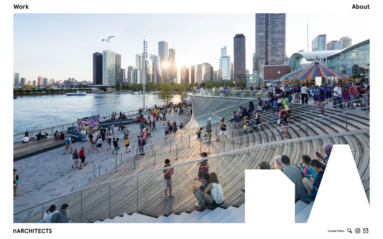
A wide photograph of a crowded waterfront pier with a city skyline behind it, with a large white letter n cut out of its lower right corner.
Type
Apercu 30px
Body
Apercu 24px
Build
1340px container, split top nav, logo knocked out of image
Made on
WordPress
Colour
#ffffff #000000
Type. Apercu at 30px weight 400 across 83 characters sets the opening line about the practice, with 24px weight 700 for two short labels and a 10px weight 700 cut for the smallest item. No letter-spacing adjustment anywhere, no uppercase transform. The 30 to 24 to 10 scale is steep, and the 10px bottom end is small enough that it is clearly metadata rather than copy.
Colour. White at #ffffff covering 107.8 percent and black ink across 105 characters. Two values and no accent, with the photograph bringing every hue on screen: the sunset on the water, the striped fairground canopy, the crowd. The page supplies no colour of its own at all, which makes a busy photograph the only busy thing present.
Layout. The distinctive move is the logo. Instead of sitting over the image, a white letterform is knocked out of the photograph's lower right corner, so the picture is cropped into the shape of the mark. Container is 1340px at 93 percent of viewport. Work sits at top left, About at top right, with the full wordmark anchored bottom left. Document 6990px, radius 0.
The ask. Two nav words at the top and three glyphs at the bottom right, search, Instagram and a mail icon. No button, no phone, no enquiry text. The mail glyph is the entire contact proposition, and it is the smallest element on the page at 10px.
Knocking the logo out of the image as negative space binds mark and photograph together, so neither needs a scrim or a containing box.
15
young-projects.com
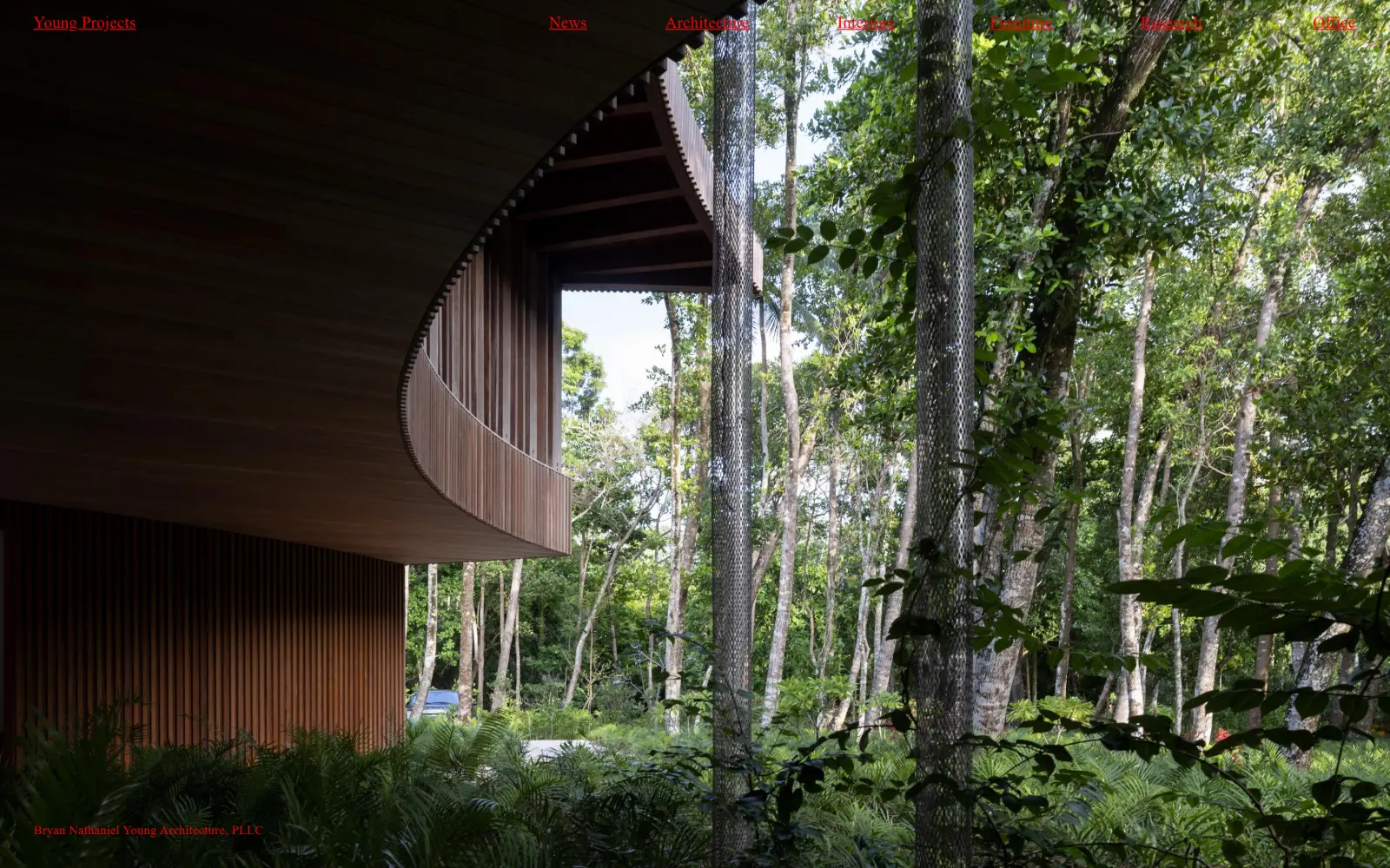
A curved timber canopy sits deep in a green tropical forest, filling the frame, with red underlined navigation words spaced across the very top.
Type
Diatype Variable 17px
Body
Times New Roman 13px
Build
Full-bleed photo, seven evenly spread nav items, one-screen page
Made on
Not detected
Colour
#ff0000 #ffffff
Type. Two faces split the work: Diatype Variable at 17px weight 500 with 0.015em tracking for the nav, and a Times fallback for the legal line at the foot. Nav items are underlined like raw hyperlinks rather than styled, which with the red reads as a deliberate reference to unstyled HTML. At 13px the entity name at the bottom is almost a footnote.
Colour. Pure #ff0000 carries all 102 characters of ink, against white at 50 percent coverage behind the content below the fold. One colour, at maximum saturation, used for every word on the page. Red on a dense green photograph is the highest-contrast pairing in this set, and it is the opposite of the warm earth palettes two entries above.
Layout. Full 1440px field with the photograph bleeding to all four edges and no header bar or scrim. Seven nav items spread evenly across the top with wide gaps rather than clustering at one side, so the menu reads as a horizontal rule of text. The legal entity name sits bottom left in the same red. Document height is exactly 900px, a single screen. Radius 0.
The ask. Seven nav words and nothing else: News, Architecture, Interiors, Furniture, Research, Office. No contact line, no button, no project title under the image. Office is where an enquiry would go, and it is given no more prominence than Furniture.
Pure red links on a dark photograph need no scrim or shadow, because saturation does the separating that a drop shadow usually does badly.
How these were chosen
Fifteen studios, and only two of them behave like marketing. The common ground is restraint: thirteen have no button at all, most carry no phone number above the fold, and radius is 0 on every single one. What does not hold is the idea that architect website design means a full-bleed hero. Four of these open on a grid, one on twelve uncaptioned study models, one on a text column with no image at the top. The real division is between studios publishing a portfolio, where the photograph is the argument, and studios publishing an argument, where the writing or the index is. Both work. They ask different things of a visitor, and the colour and type decisions follow from that choice rather than from taste.
Finding architecture sites that someone had actually designed took far longer than it should have. 30 candidates made the shortlist. 15 made the page.
Each one was opened and looked at properly: what the type is doing, where the colour gets spent, how the page is built, how it asks for the job. Nothing is here because it ranks. Nothing is here because an agency filed it under portfolio. Several well known names were left out for the plain reason that their site came out of the same template as everyone else's, and a few sites worth including did not survive a second look.
Where a site is only competent, it says so. The order is the order worth your time, best first.
Reviewed and selected by Larry W. Matthews for Websitely.