Photography Website Design With Almost No Interface
A wordmark, five links and the word Contact. Fourteen working photographers whose photography website design needs almost no interface at all.
Shown
14 sites
Reviewed
30 candidates
Chosen on
The work, not the ranking
Updated
15 October 2026
01
gabrielahasbun.com
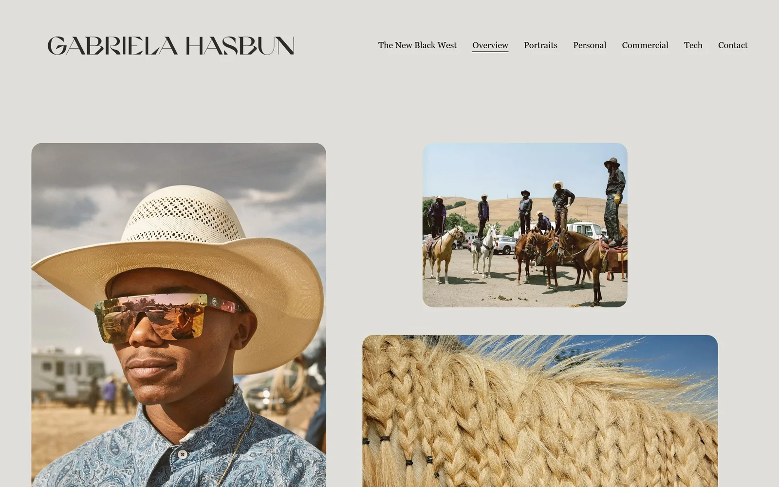
Warm grey page, a cowboy in a straw hat filling the left column, two smaller rounded photographs stacked at the right.
Type
display sans, caps, ~45px
Body
mixed-case serif, 16px
Build
full-width two-column photo mosaic
Made on
Squarespace
Colour
#e0dfda #2c2b29 #fc217d
Type. The wordmark GABRIELA HASBUN is set in a high-waisted display sans at about 45px, caps, with sheared terminals and a flat-topped A that stops it reading as a system font. Nav is a mixed-case serif at 16px, no tracking, with a hairline underline marking the open section. Pairing a sharp modern display face with a plain book serif is the whole system, and there is no third face anywhere.
Colour. The ground is #e0dfda across the entire page and the type is a near-black #2c2b29. Every colour on screen comes from the photographs: straw, blue paisley, bleached grass, a horse mane. The one saturated element in the system, a #fc217d lightbox button, is held back and never appears above the fold.
Layout. Full width with no centred container. The left photograph starts 80px in and runs past the fold, the right column holds a landscape and a square stacked with about a 90px gutter between the two columns. Every image carries the same 10px corner radius, which is the only decorative move on the page. Nav sits on a single line in the top right.
The ask. Contact is the seventh and last nav item, 16px, no button, no emphasis. Nothing else above the fold asks for anything, and there is no phone number or form in sight. The work is the pitch and the click target is one word in the corner.
Rounding every image by the same 10px turns a plain photo grid into something that reads as designed.
02
jasonorear.com
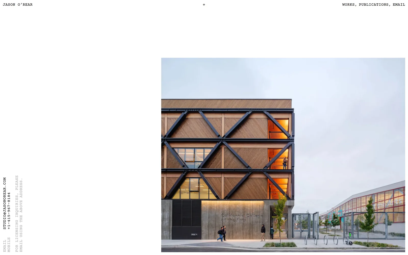
A single architectural photograph pinned right of centre on white, with contact details set vertically up the left edge.
Type
Courier Prime 14px caps
Body
Courier Prime 14px caps
Build
single square image with rotated left-margin contact block
Made on
custom JS framework
Colour
#ffffff #000000 #9a7562
Type. Everything on the first screen is Courier Prime at 14px, uppercase, with 0.025em of tracking. The name, the three nav words, the licensing note and the phone number are all the same size and the same weight. One face, one size, one weight is a hard discipline and it is the reason the page looks composed rather than sparse.
Colour. White #ffffff and black, with nothing else in the interface. The photograph supplies the only colour on screen: #9a7562 timber cladding, orange window light and a flat grey sky. There is no accent, no hover colour, no rule.
Layout. No container. The top line runs edge to edge with the name hard left, a plus sign dead centre and WORKS, PUBLICATIONS, EMAIL hard right. The photograph is roughly 860px square, parked right of centre and bleeding off the bottom. The contact block is rotated 90 degrees and runs up the left margin, which is the only element that is not horizontal.
The ask. EMAIL appears twice above the fold, once in the top line and once in the rotated block where the address and the number are both spelled out in full. No form, no button, no booking link. Two plain-text asks and nothing competing with them.
Setting a whole first screen in one 14px monospace at one weight costs nothing and reads as more deliberate than three typefaces.
03
kelseymcclellan.com
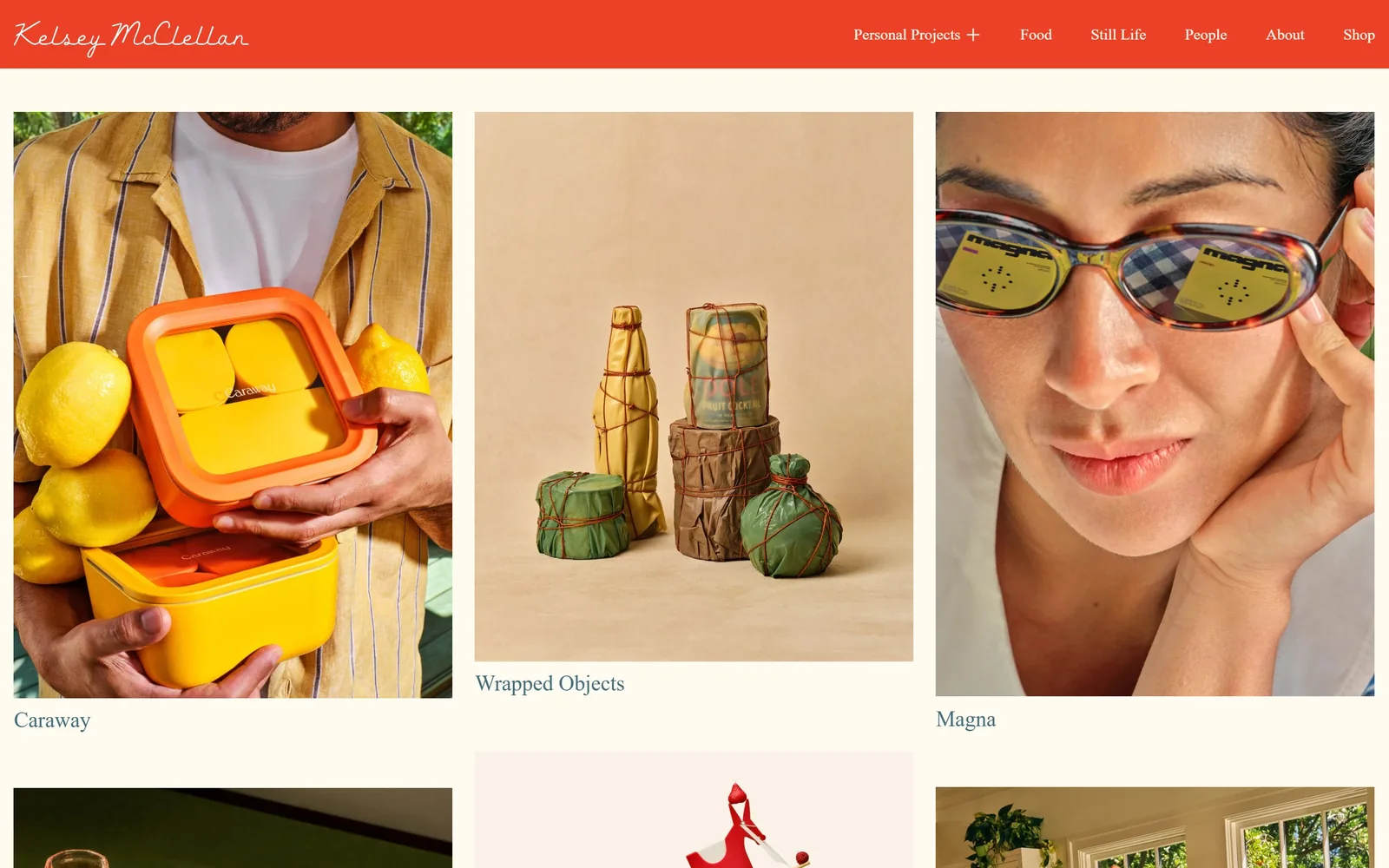
A tomato-red nav band with a looping script signature sits over a cream page of food, still life and portrait work.
Type
looping script wordmark, ~34px
Body
transitional serif, 16px
Build
three-column flush grid under a fixed red bar
Made on
Squarespace
Colour
#ec4127 #fffbf0 #46687a
Type. The wordmark is a thin looping script at about 34px in white on the red band. The nav beside it is a mixed-case transitional serif at 16px with no tracking, and the project captions under each tile use the same serif at about 22px. Script plus book serif should not work and does, because both are high-contrast and neither is trying to shout over the pictures.
Colour. The band is #ec4127 and the page is #fffbf0, a cream warm enough to stop the red reading as an alert state. Captions are a muted #46687a blue and take maybe two per cent of the screen. Picking a loud red as the house colour for a food photographer is a decision, not a category default; most of this field hides behind grey.
Layout. Three equal columns with roughly 55px gutters and a 20px page margin, so the grid runs almost edge to edge. Tile heights vary by crop, captions sit left-aligned below each image, and the red band is a fixed 95px strip. No corner radius, no frames, no shadows.
The ask. The only ask above the fold is Shop, the last nav item. Contact sits behind About, and the email address and phone number appear in the footer. The grid is doing the selling and the band is the only thing competing with it.
One saturated band at the top gives a site a colour people remember while leaving every photograph underneath untouched.
04
kristinteig.com
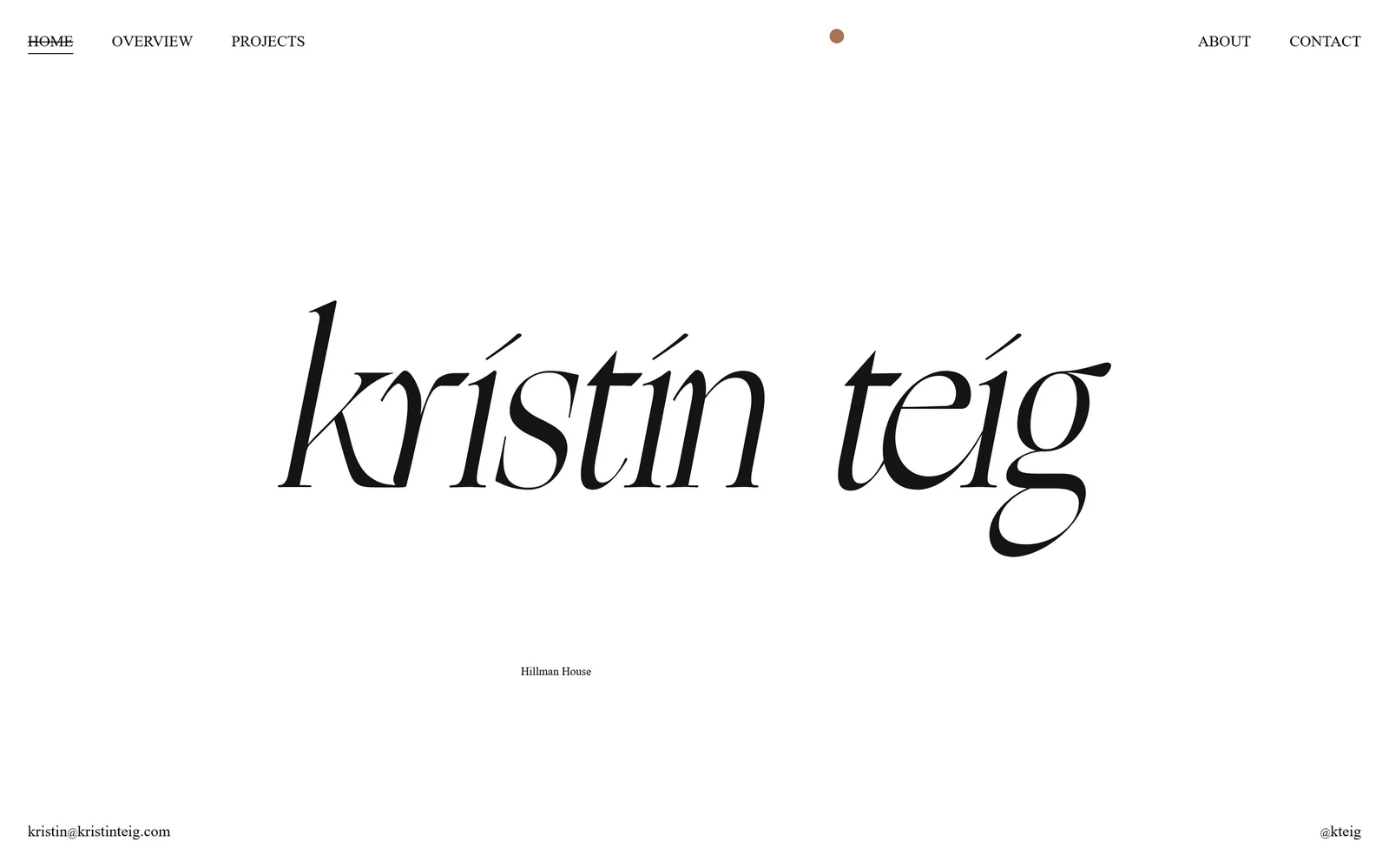
The photographer's name fills the screen in a huge italic serif, with one small caption line and no photograph at all.
Type
high-contrast italic display serif, ~200px
Body
uppercase serif, 16px
Build
centred type-only hero
Made on
Squarespace
Colour
#ffffff #131313 #a97254
Type. The name is set in a very high-contrast italic display serif at roughly 200px, lowercase, with hairline joins and a swash g dropping below the baseline. Nav is a small uppercase serif at 16px with a hairline underline on the active item, and the project caption is 12px. The jump from 200px to 12px is about sixteen to one with nothing in between.
Colour. White ground, near-black #131313 type, and a single 14px terracotta dot #a97254 centred at the top of the page. That dot is the entire accent. For a cookbook and food photographer, showing no food above the fold is a real bet, and the restraint reads as confidence rather than caution.
Layout. No container and no columns. The wordmark is centred and spans about 1150 of 1440px, the caption Hillman House sits roughly 180px beneath it, and the email address and Instagram handle anchor the bottom left and right corners. Nothing else is on the first screen.
The ask. CONTACT is the far right nav item and the email address is spelled out bottom left, so the ask appears twice and both are plain text. No button, no form, no rate card. The risk is obvious: a visitor who does not scroll has seen a name and nothing else.
If the typeface is good enough, a name at 200px will hold a screen that most people would fill with a slideshow.
05
amivitale.com
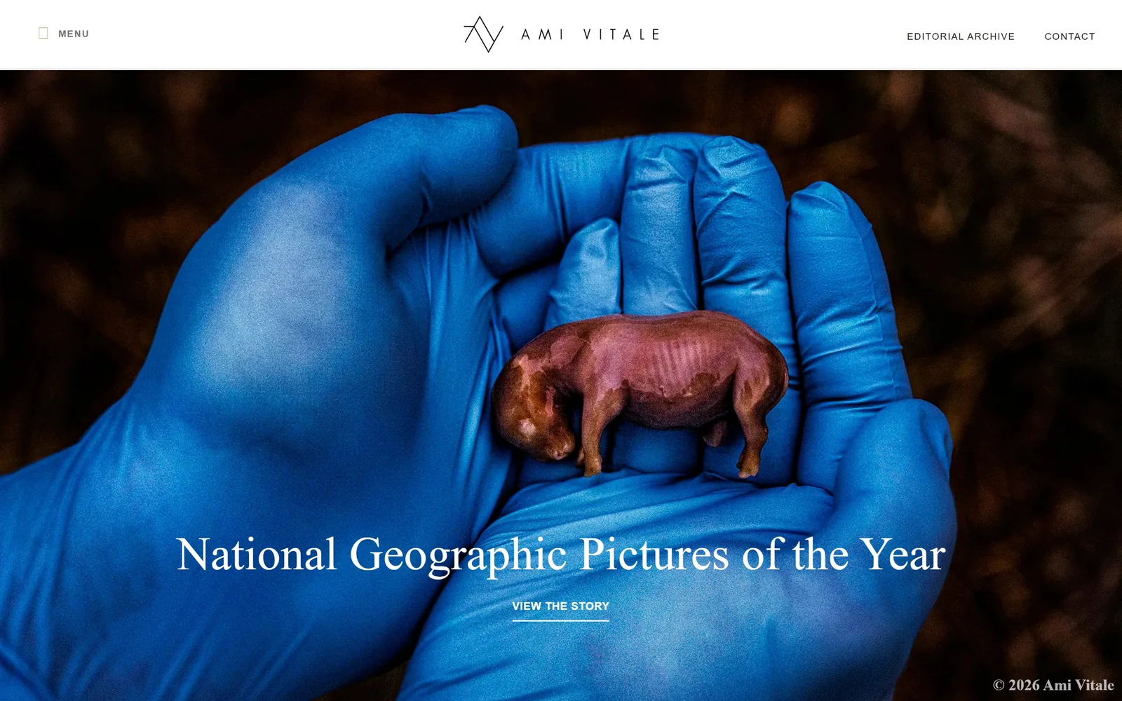
A blue-gloved hand cradling a tiny rhino figure, with a white serif headline and a VIEW THE STORY link across the lower third.
Type
Garamond Premier Pro Display, 60px
Body
Museo Sans, 12px caps
Build
full-bleed hero slider under a sticky bar
Made on
WordPress
Colour
#ffffff #00285c #222222
Type. The headline is Garamond Premier Pro Display at 60px, medium weight, no tracking, line height 1.0, in white over the photograph. Nav is Museo Sans at 12px, uppercase, 0.1em tracking, in #222222 on the white bar. The call to action drops to a 14px bold uppercase sans, so the serif is reserved entirely for story titles and never used for interface.
Colour. The top 85px is a white bar; everything below it is photograph, and this frame is almost entirely cobalt #00285c against warm brown. The interface contributes no colour of its own. A copyright line bottom right is the only other mark laid on the image.
Layout. Full-bleed hero under a sticky white header, about 1440 by 815 visible. The logotype is centred in the bar with MENU hard left and Editorial Archive and Contact hard right. Headline and link are centre-aligned roughly 180px from the bottom, which keeps the subject of the photograph clear.
The ask. VIEW THE STORY is the single ask above the fold, 14px, underlined, centred under the headline. Contact sits in the header. Because the hero is a slider, that one link cycles through seven different stories, so a single button does seven jobs without the page ever gaining a second one.
Pinning headline and link to the lower third leaves the middle of the frame to the photograph, which is the thing being sold.
06
joepug.com
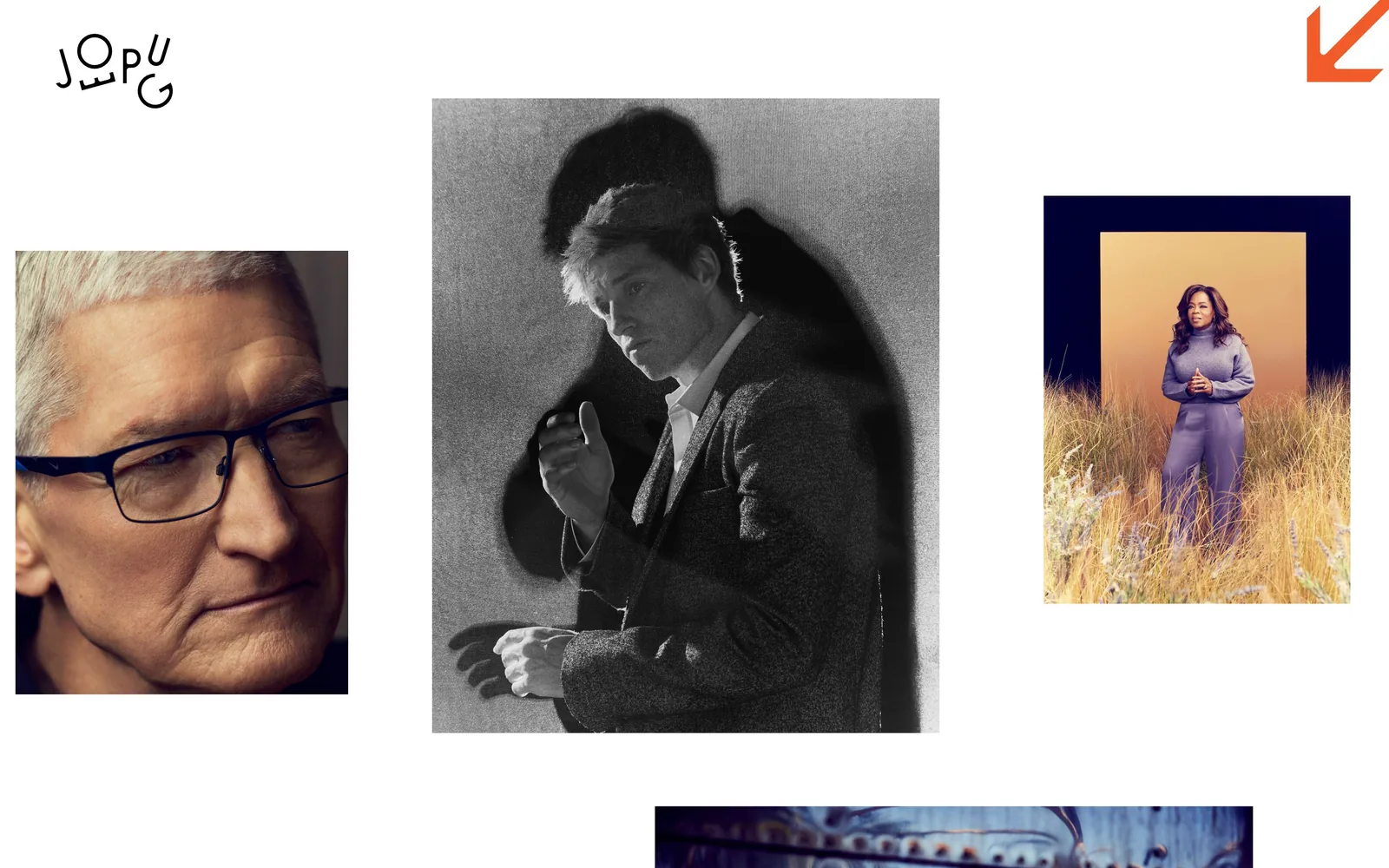
Four portraits at four different sizes scattered across white, with a hand-drawn JOEPUG monogram top left and an orange arrow top right.
Type
hand-drawn interlocking monogram, ~58px
Body
light slab serif, 18px
Build
freeform scattered collage
Made on
custom
Colour
#ffffff #f15b29 #1a1a1a
Type. The wordmark is hand-drawn, with JOE and PUG interlocked into a block about 58px tall and set with roughly 0.2em of spacing between the letters. It is the only display typography anywhere on the first screen. Supporting text is a light slab serif at 18px. Nothing is centred and nothing except the mark is uppercase.
Colour. White ground, greyscale and muted colour portraits, and one orange #f15b29 arrow in the top right corner. The arrow is the only coloured element the design contributes. The purple and gold of the Oprah frame is the strongest colour on screen and it belongs to the photograph, not the site.
Layout. There is no grid. Four images sit at four sizes and four vertical offsets, the tallest about 750px in the centre, the smallest about 640px hard left at a lower baseline. Margins are uneven on purpose. The result reads as a contact sheet laid out by hand rather than a template filled in.
The ask. Nothing above the fold asks for anything. The whole contact apparatus, two agents in two territories, three phone numbers and a syndication desk, sits further down in plain text. The orange arrow is the only prompt and all it says is keep going.
Deliberately uneven image placement makes a portfolio feel curated instead of uploaded, and it costs nothing but nerve.
07
charlieschuck.com
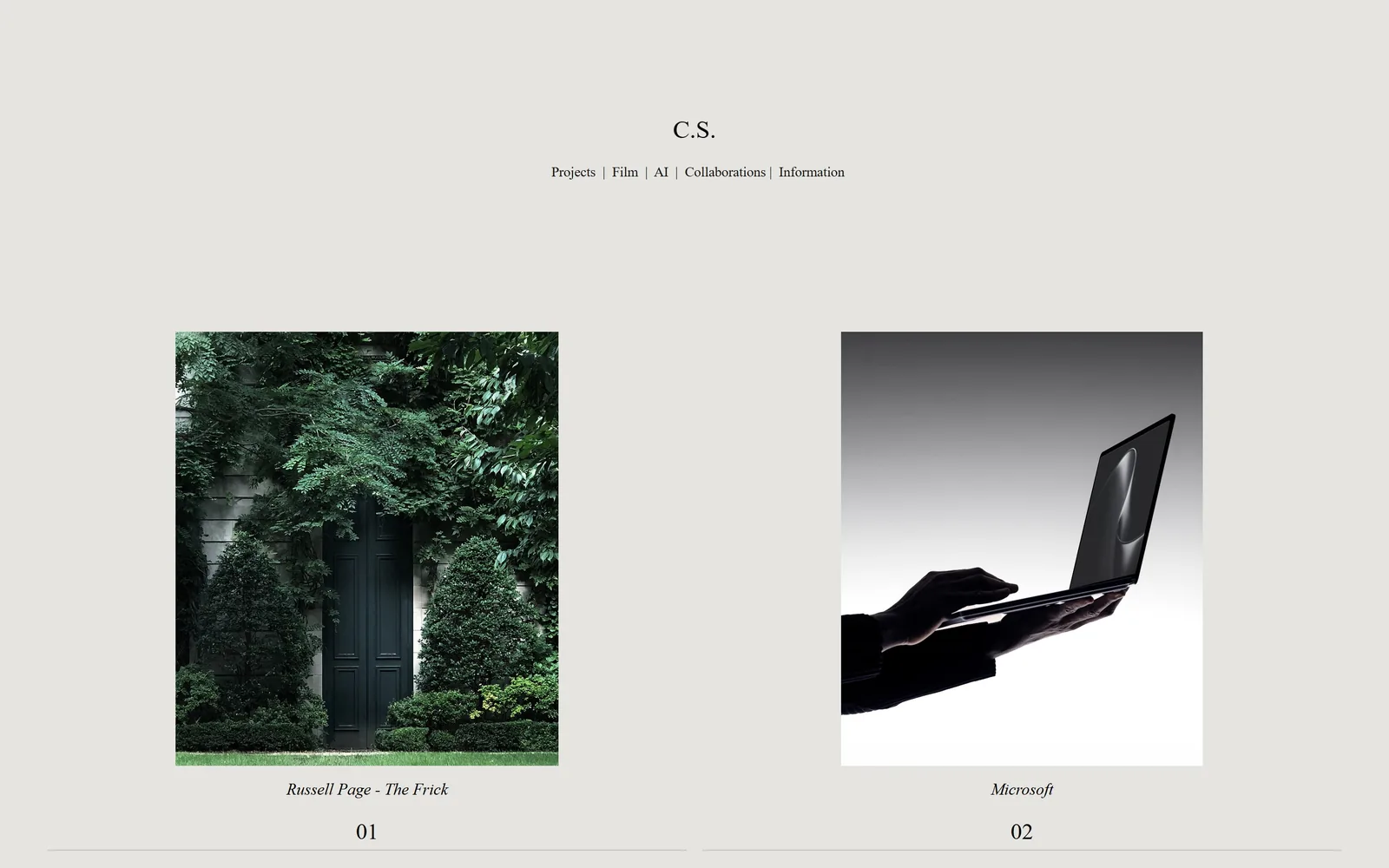
Two square photographs sit low on a bone-grey page under a tiny C.S. monogram and a nav separated by pipes.
Type
Cormorant, ~26px
Body
Cormorant italic, 14px
Build
two-column numbered editorial spread
Made on
custom
Colour
#e5e4e0 #000000 #323c34
Type. Everything is Cormorant, a light high-contrast serif. The monogram is about 26px, the nav 17px, the picture captions italic at 14px, and the numbers 01 and 02 beneath them about 23px. Four sizes of one face with the captions italicised so they cannot be mistaken for navigation.
Colour. The page is #e5e4e0, a cool bone grey, with black type. The left photograph is almost entirely dark green #323c34 and the right one is a black-and-white product shot, so the pair reads as a chosen colour relationship rather than two unrelated frames. No accent colour exists in the interface.
Layout. Two columns on a 1440 page, each image roughly 560px square, the left starting 250px in and the right ending 250px from the edge, leaving a 420px channel down the middle. Captions are centred under each image, numbers below those, then a hairline rule runs the full width. The top 450px carry only the monogram and the nav.
The ask. There is no call to action at all. Information is the fifth and last nav item, separated from the rest by pipes, at 17px. Prev and Next controls exist but are invisible above the fold. This is a portfolio that assumes you will find the email yourself.
Numbering the work 01, 02, 03 turns a gallery into a sequence and gives a visitor a reason to keep scrolling.
08
caseydunn.net
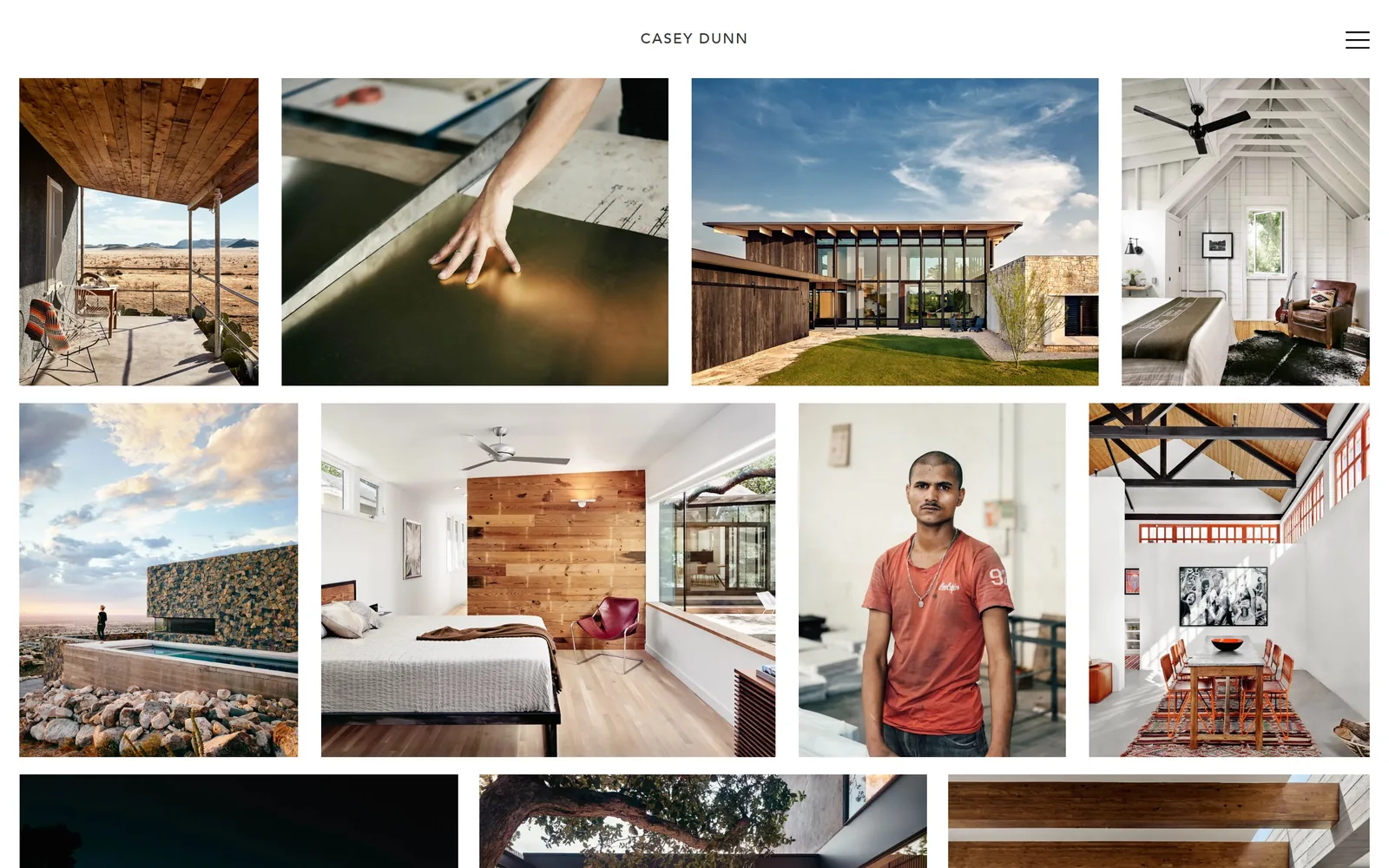
A nine-image masonry grid of Texas architecture, interiors and portraits under a small centred CASEY DUNN wordmark.
Type
Adobe Caslon Pro, 19px caps
Body
Avenir Light, 15px
Build
four-column masonry grid
Made on
WordPress
Colour
#ffffff #6892ab #353435
Type. The wordmark is Adobe Caslon Pro at 19px, caps, tracked about 0.1em, centred and deliberately tiny against a screen full of photographs. Project titles are Avenir Light at 15px and appear only on hover, so the first screen is almost wordless. A hamburger at the far right is the only other element in the header.
Colour. White #ffffff wherever the photographs are not. The images supply the palette: desert tan, cedar brown, a #6892ab sky, one rust-red T-shirt. No accent colour is introduced anywhere in the interface, not even on the active nav item.
Layout. A masonry grid about four columns wide with roughly 24px gutters and a 24px outer margin, rows of unequal height so landscape and portrait crops both sit flush. The header is a 100px white band. Nine images are fully visible above the fold with three more cut by it, which is a lot of finished work to put in front of someone at once.
The ask. The only ask above the fold is the hamburger. Behind it, a single line reads FOR ALL INQUIRIES, PLEASE CONTACT REBECCA FORCHIONE with a studio address, routing every enquiry through a rep. No form, no phone number, no rate.
Showing nine finished pictures before any words answers the only question a prospective client actually has.
09
readmckendree.com
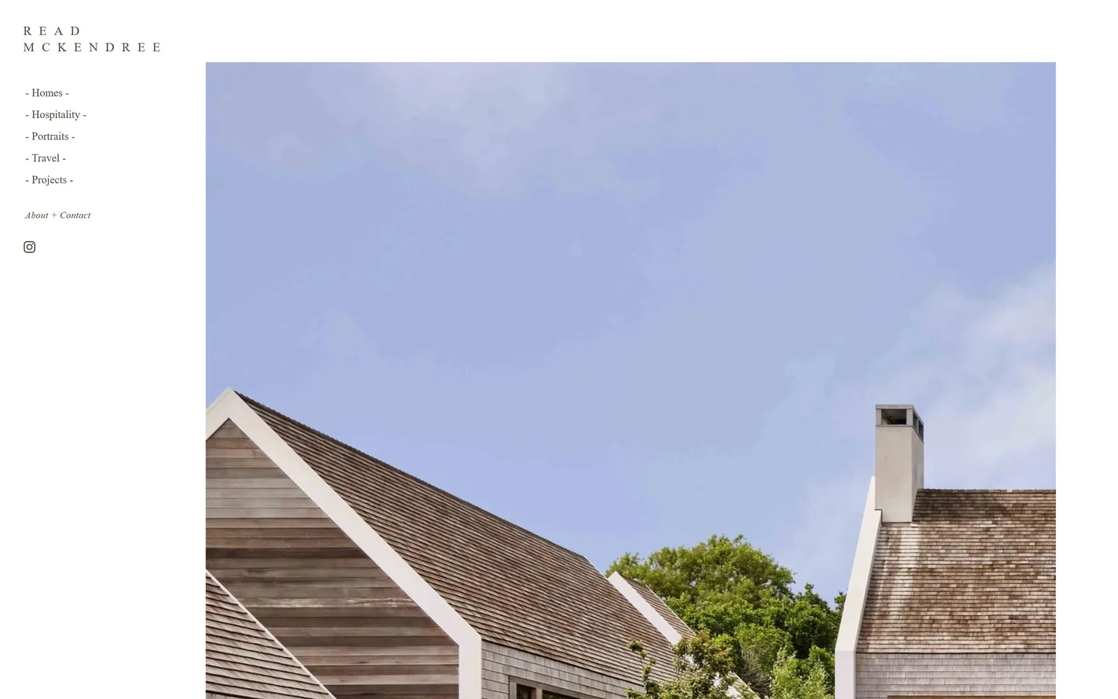
A shingled gable roof against a pale blue sky fills the right side, with a hyphen-bracketed nav list running down the left.
Type
light serif caps, 16px at 0.6em tracking
Body
Proxima Nova Light, 14px
Build
370px fixed sidebar beside a full-height image
Made on
Squarespace
Colour
#ffffff #3f453b #aab7e1
Type. The wordmark is a light serif at 16px, caps, tracked at roughly 0.6em and broken onto two lines so READ sits above MCKENDREE. Nav is Proxima Nova Light at 14px, mixed case, and every item is wrapped in hyphens: - Homes -, - Hospitality -, - Portraits -. About + Contact is italic and sits apart below the list.
Colour. White page with nav type in a dark olive #3f453b rather than black, which warms the whole column by a degree without anyone noticing why. The photograph brings a #aab7e1 sky and weathered cedar. The olive is small and it is the only colour decision the interface makes.
Layout. A 370px fixed left column against an image running from x=370 to the right edge and off the bottom. The wordmark sits 60px from the top, the nav list starts at 165px, items are spaced about 38px apart, and a deliberate gap separates the portfolio links from About + Contact. Nothing is centred.
The ask. About + Contact is the only ask, italicised so it reads as a different kind of link from the five portfolio sections, with an Instagram glyph below it. One ask, one channel, no form and no phone number above the fold.
Bracketing nav items with hyphens is a two-character change that makes a default sidebar look like someone made it on purpose.
10
nicolefranzen.com
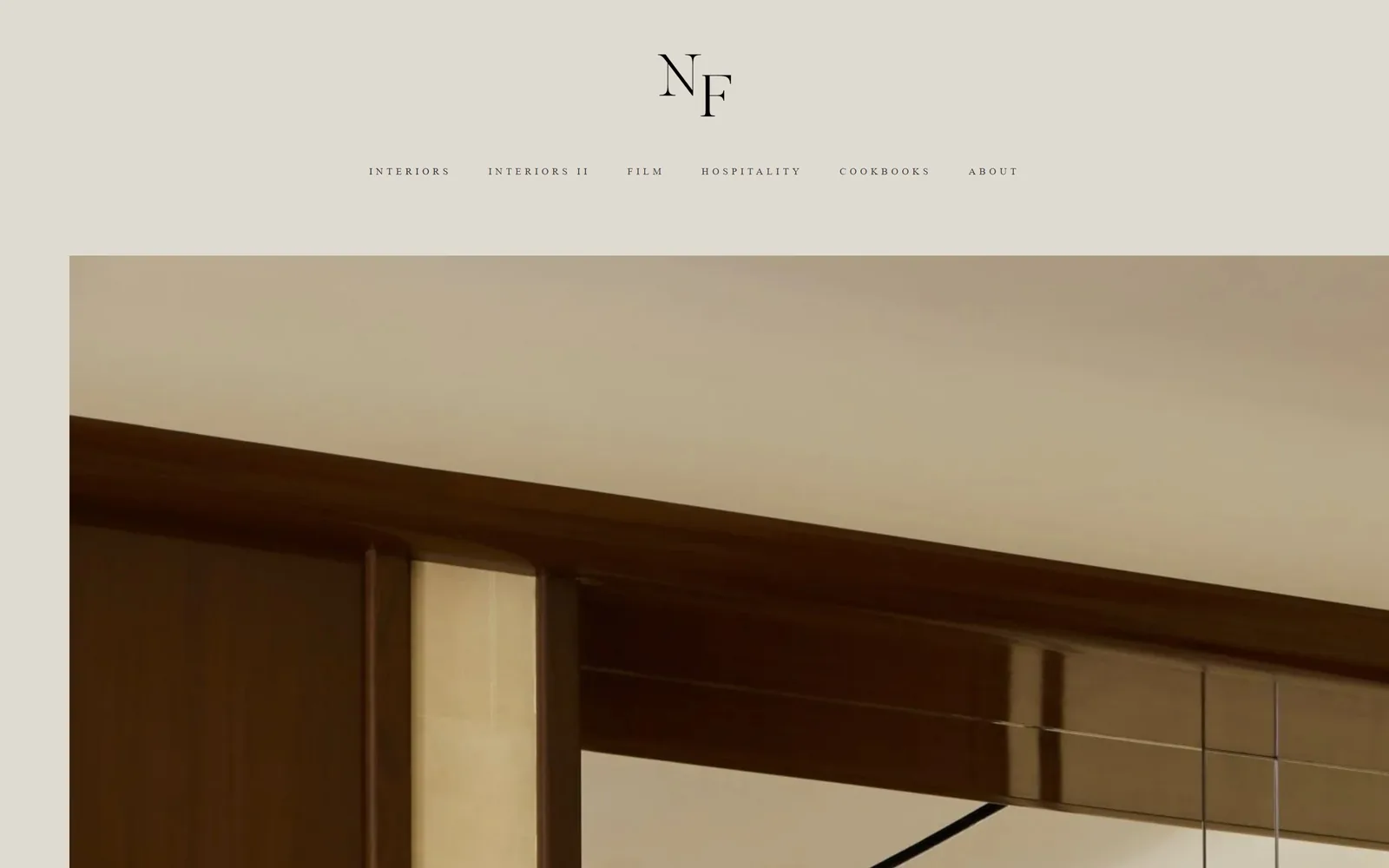
An NF serif monogram above a widely tracked nav on warm grey, over a cropped interior detail in walnut and brass.
Type
serif NF monogram, ~70px
Body
10px uppercase at 0.37em tracking
Build
centred header above a left-offset image
Made on
Squarespace
Colour
#dfdbd2 #3b2005 #080808
Type. The monogram is a high-contrast serif with the F tucked under the N, about 70px, and it is the only large type anywhere. The nav beneath it is 10px, uppercase, with 0.37em of tracking, which is extreme enough that six words read as a decorative rule rather than a list. The gap between 70px and 10px is the entire typographic system.
Colour. A warm grey #dfdbd2 holds the top 360px, then the photograph takes over at the same temperature: #3b2005 walnut, bronze trim, a cream ceiling. Header and image share a palette, which is why the join at y=360 does not read as a seam. No accent colour exists.
Layout. Everything in the header is centre-aligned on a 1440 page. The image starts 100px from the left and runs to the right edge, so it is deliberately off-centre against a centred header, and that mismatch is the only tension on the screen. Nav items sit on one line about 50px apart.
The ask. Contact is the sixth and last nav item at 10px with no emphasis of any kind. Nothing else asks. The bet is that the work and the cookbook credits will carry the enquiry, which for this client list is probably right.
Matching the header background to the dominant tone of the hero photograph makes a page feel printed rather than assembled.
11
chrispaynephoto.com
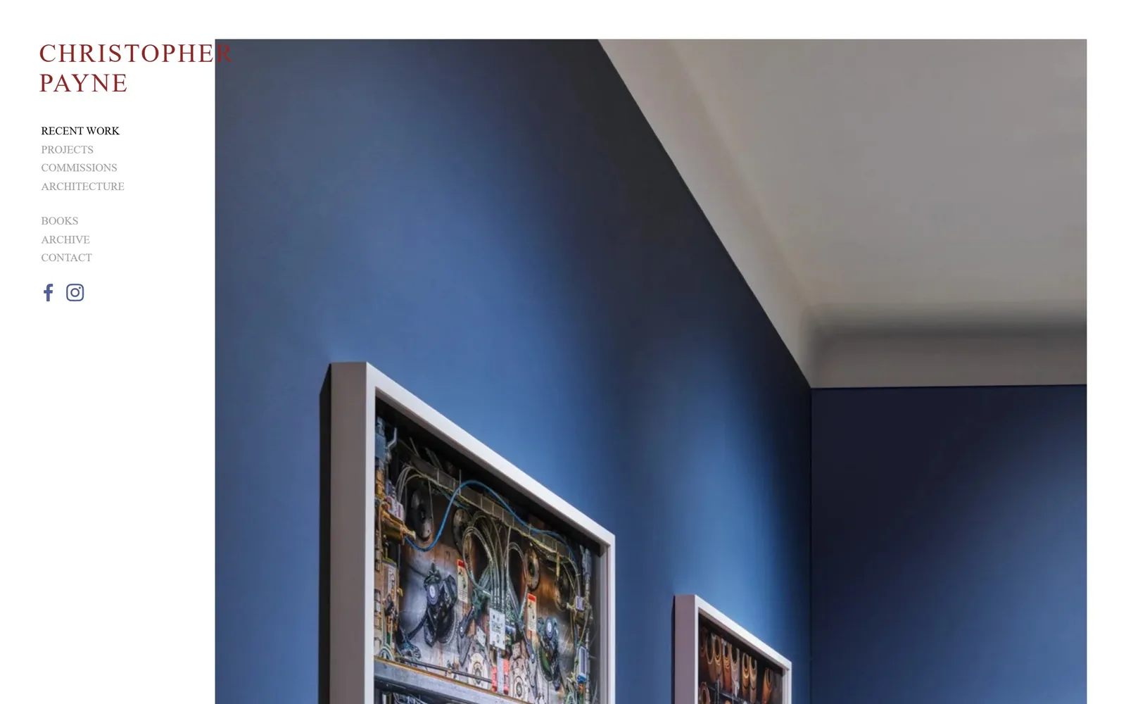
An oxblood CHRISTOPHER PAYNE wordmark and a grey nav column on white, beside framed prints hung on a cobalt wall.
Type
serif caps, ~33px
Body
Roboto Condensed, 14px caps
Build
380px sidebar beside a bleeding image
Made on
Squarespace
Colour
#8f2825 #ffffff #3a517a
Type. The wordmark is a serif at about 33px, caps, tracked roughly 0.07em and broken over two lines. Nav is Roboto Condensed at 14px, caps, in grey #a2a2a2 with the active item in solid black, which is the only state indicator on the page. Three nav groups are separated by vertical gaps instead of rules.
Colour. The wordmark is a dark brick #8f2825 and it is the only coloured element in the whole interface. Everything else in the column is white or grey. The photograph is almost entirely #3a517a cobalt, so the red mark faces blue across a white gutter, which is a sharper pairing than it looks at first.
Layout. A 380px left column against an image that starts at x=380 and bleeds off the right and the bottom. The wordmark sits 85px down, the nav begins at 230px, and two social glyphs sit at 520px. Everything in the column is left-aligned on a single axis with no indents.
The ask. Contact is the last item in the lower nav group, 14px, grey, no weight, no button. Two social glyphs follow. No email address, no form and no phone number in view. The page behaves like a museum index rather than a sales page, which suits a photographer whose client list reads Smithsonian and New York Times.
One coloured word in an otherwise black-and-grey interface is enough branding for a portfolio.
12
conniezhou.com
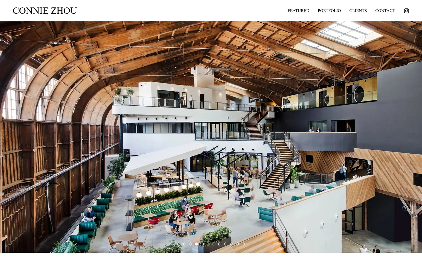
A wide-angle interior of a barrel-vaulted timber hangar fills the screen beneath a thin white bar carrying a serif wordmark.
Type
serif caps, ~32px
Body
15px caps nav
Build
full-bleed slider under a thin sticky bar
Made on
Squarespace
Colour
#ffffff #8f5120 #a8a6a1
Type. CONNIE ZHOU is set in a serif at about 32px, caps, no tracking, hard left in the bar. The nav opposite is 15px, caps, lightly tracked, in a different face entirely. Two faces for two jobs, and the jump from 32px to 15px carries all of the hierarchy on the page.
Colour. A white 95px bar over a photograph of #8f5120 timber, pale concrete and teal banquettes. The design itself contributes no colour at all. A grey #a8a6a1 button exists in the system but does not appear above the fold, so the first screen is white plus whatever the slide happens to be.
Layout. Full-bleed hero, roughly 1440 by 805 visible, under a sticky white header with the wordmark 60px from the left and four nav items plus an Instagram glyph at the right. Eleven slider dots sit centred about 60px from the bottom, which quietly tells a visitor how much there is.
The ask. CONTACT is the fourth nav item and the only ask above the fold. There is no overlay text on the hero, no button and no caption naming the project, so a visitor who likes the picture has exactly one place to click.
A white bar only 95px tall keeps navigation legible without taking a meaningful bite out of the photograph.
13
mpkelley.com
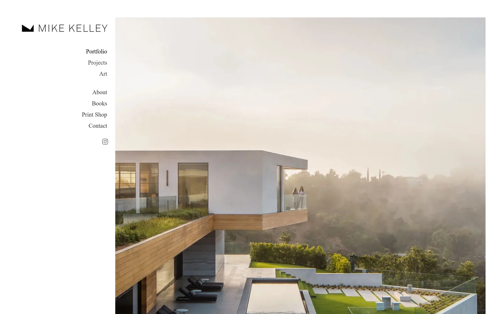
A hillside house in morning haze sits right of a narrow white column holding a black mountain glyph and right-aligned nav.
Type
light sans caps, ~25px
Body
Aktiv Grotesk Thin, 17px
Build
455px sidebar with right-aligned nav
Made on
Squarespace
Colour
#ffffff #424242 #e3dfdc
Type. MIKE KELLEY is set in a light sans at about 25px, caps, tracked wide, beside a solid black mountain glyph that doubles as the logo. Nav is Aktiv Grotesk Thin at 17px, weight 200, mixed case, right-aligned so the ragged edge faces the photograph. A 200 weight at 17px is a risk and it just holds at this size.
Colour. White column, #424242 nav type, black for the active item and the glyph. The photograph is nearly monochrome, a hazy #e3dfdc sky over white stucco and green planting, so the entire screen sits within about three steps of value. Nothing is coloured on purpose.
Layout. A 455px left column against an image bleeding right and bottom. Nav is right-aligned to x=430, which lines the text up against the edge of the photograph rather than the page margin, and that is the one detail separating this from a stock sidebar. Two nav groups split by a 55px gap, social glyph below.
The ask. Contact closes the second nav group and Print Shop sits just above it, so there are two asks and one of them sells something directly. Neither is styled as a button. The About entry splits into The business version and The fun version, which is the only piece of voice visible anywhere on the page.
Right-aligning sidebar navigation against the image edge creates a clean seam that a left-aligned list never gets.
14
nahokubota.com
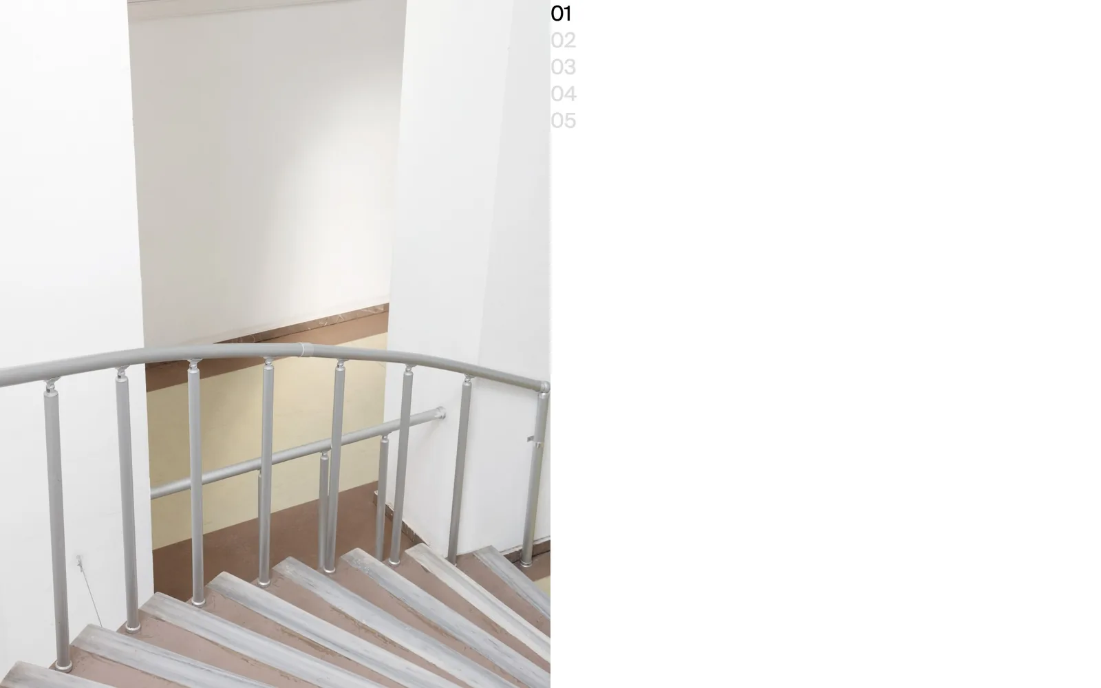
A single photograph of a stairwell fills the left half of the screen, with a column of numbers 01 to 05 top right.
Type
Suisse, 27px numerals
Body
Suisse, 27px
Build
left half-bleed image with a corner index
Made on
custom
Colour
#ffffff #dbdbdb #afa186
Type. One face, Suisse, at 27px medium, used only for the index numbers. The active 01 is black and 02 through 05 are #dbdbdb. There is no wordmark, no nav and no caption above the fold, which is the most extreme typographic position in this set and will not suit most businesses.
Colour. White and the photograph, and the photograph is nearly colourless: pale green walls, a grey aluminium handrail, a dusty #afa186 floor. The only interface colour is the grey of the inactive numbers. The page has no brand colour because it has almost no brand elements.
Layout. The image fills the left 50 per cent of the 1440 page from top edge to bottom edge with no margin at all. The number column sits at x=1000, flush to y=25, with about 35px between items. The right 1000px are empty white, which is either the boldest or the most wasteful decision on this page depending on your taste.
The ask. Nothing above the fold asks for anything. Two addresses, one general and one for architecture and prints, appear only after a scroll, alongside a client list running from OMA to the New Museum. The index numbers are the only clickable thing in view.
Numbering five frames in the corner replaces a navigation bar entirely and tells a visitor exactly how much there is to see.
How these were chosen
Fourteen working photographers here, nearly all one-person studios shooting architecture, interiors, food, portraits and conservation work for editorial and commercial clients. Thirteen of the fourteen lead with photography above the fold, and nine introduce no colour of their own anywhere in the interface, letting the pictures carry all of it. The ones that break that habit are the ones you remember: a tomato-red nav band, a hand-drawn monogram with an orange arrow, an oxblood wordmark on white. Anyone commissioning photography website design can take the real lesson from how little chrome these pages need, usually a wordmark, five links and the word Contact.
Finding photography sites that someone had actually designed took far longer than it should have. 30 candidates made the shortlist. 14 made the page.
Each one was opened and looked at properly: what the type is doing, where the colour gets spent, how the page is built, how it asks for the job. Nothing is here because it ranks. Nothing is here because an agency filed it under portfolio. Several well known names were left out for the plain reason that their site came out of the same template as everyone else's, and a few sites worth including did not survive a second look.
Where a site is only competent, it says so. The order is the order worth your time, best first.
Reviewed and selected by Larry W. Matthews for Websitely.