Solving for the Brief in Landscaping Website Design
Choose your landscaping website design by the problem it solves, not the photograph it leads with. Fourteen studios and one engineered consumer service.
Shown
14 sites
Reviewed
28 candidates
Chosen on
The work, not the ranking
Updated
15 October 2026
01
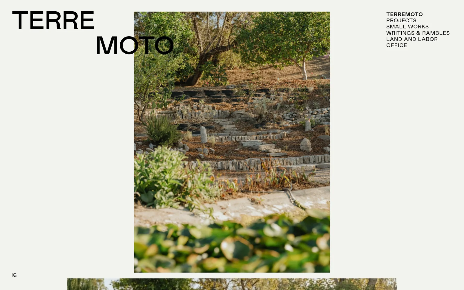
terremoto.la
Splits its own name across two lines at poster scale, then gives three grid columns to one photograph.
Type
drawn wordmark, around 70px
Body
Mabry 16px
Build
eight column grid, stacked image plates, no hero
Made on
custom
Colour
#f2f3ef #000000
Type. The name is drawn, not typed. TERRE sits on one line with MOTO stepped in underneath, big enough to behave like a poster, and nothing else on the page comes near it. Navigation is Mabry at 16px, uppercase, lightly tracked, one item at weight 700 and the other five at 400. That is the entire type system.
Colour. One flat #f2f3ef across the whole screen, black type, nothing else declared. Every bit of colour you can see is inside the photograph. It reads as a warm grey rather than a cream, which matters, because cream would have aged it.
Layout. Eight columns, 155px tracks, 18px gutters. The photograph takes three of them dead centre and the navigation takes one at the right, leaving a lot of empty ground doing nothing in particular, which is the point. The next plate is already pushing into the bottom edge, so you understand straight away that this is a stack of images rather than a hero with a page underneath it.
The ask. There is no call at all. No button, no project title, no phone number, just IG in the bottom corner. The studio is betting that anyone who ought to be hiring them will scroll, and with twenty six screens of work below, that is a fair bet.
If you are going to spend a whole first screen on your own name, the work underneath has to be deep enough to reward the scroll, so count your projects before copying this.
02
reedhilderbrand.com
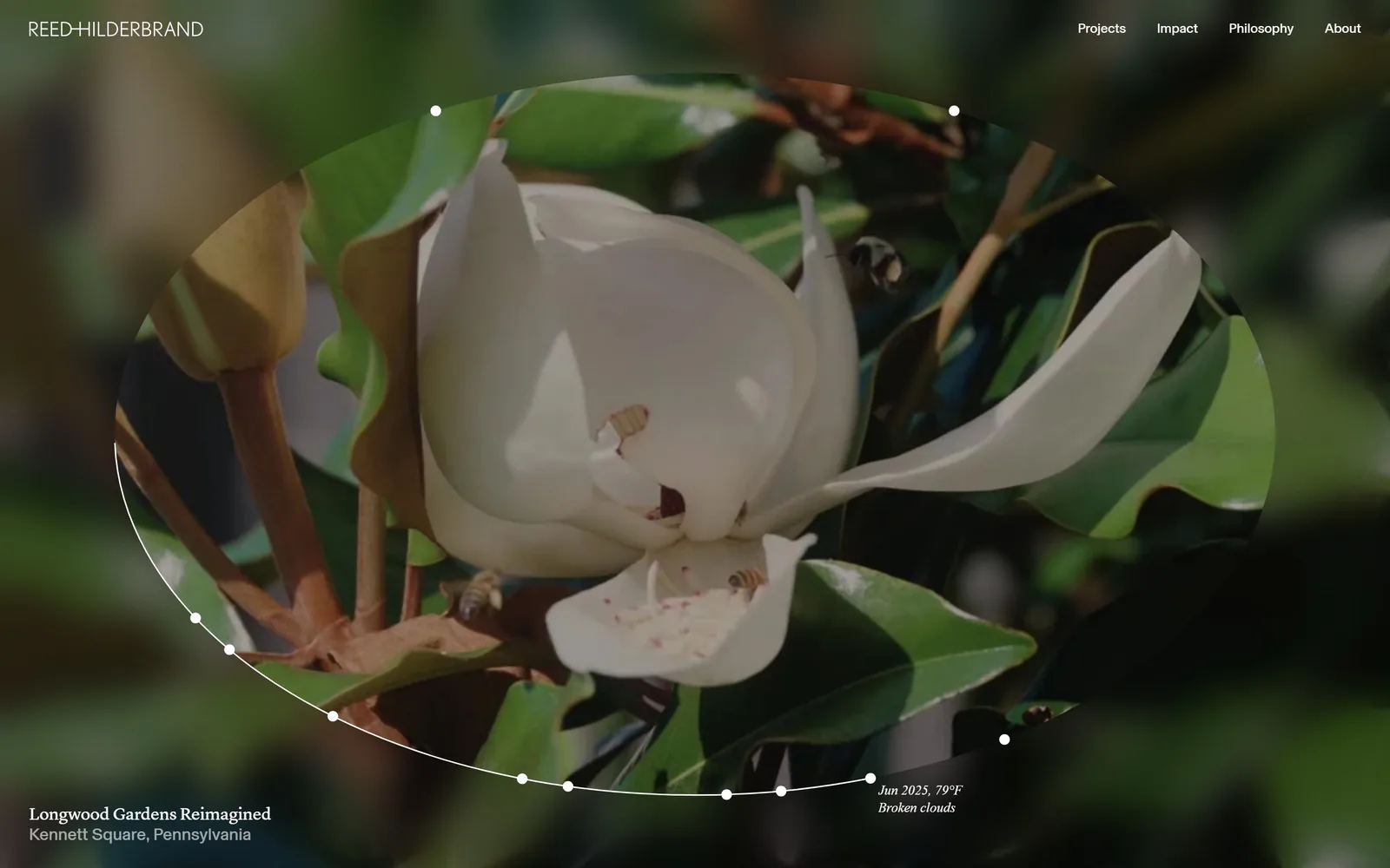
Blurs the whole frame, then cuts a sharp ellipse through the centre and prints the live weather in the corner.
Type
Lyon 18px
Body
Basel 18px
Build
single screen, elliptical mask over video
Made on
custom
Colour
#ffffff
Type. Everything is 18px. The nav, the project title, the location, the conditions line, all of it, with Lyon doing the serif work at a slightly tight -0.01em and Basel handling the rest. Refusing to make anything bigger is a strong move. It holds because there is so little text that position alone can carry the hierarchy.
Colour. White type on dark, defocused green. That is the whole palette. The magnolia supplies every other colour on the page.
Layout. A blurred frame fills the screen and a sharp ellipse is cut through the middle of it, so the page works like a lens rather than a hero. White dots mark intervals around the ellipse and a thin arc runs along its lower left, borrowed from the notation of a survey drawing. The homepage is one screen and then it stops. There is nothing underneath.
The ask. No button anywhere. Four nav words are the only route in, and the firm plainly expects you to know who they are already. The weather at the project site, Jun 2025, 79F, broken clouds, is the one element doing any persuading, and it does more than a button would.
Pulling live data from a real site is cheap to build and almost nobody in this trade does it, which makes it the one idea here you could ship next month.
03
landdesign.com
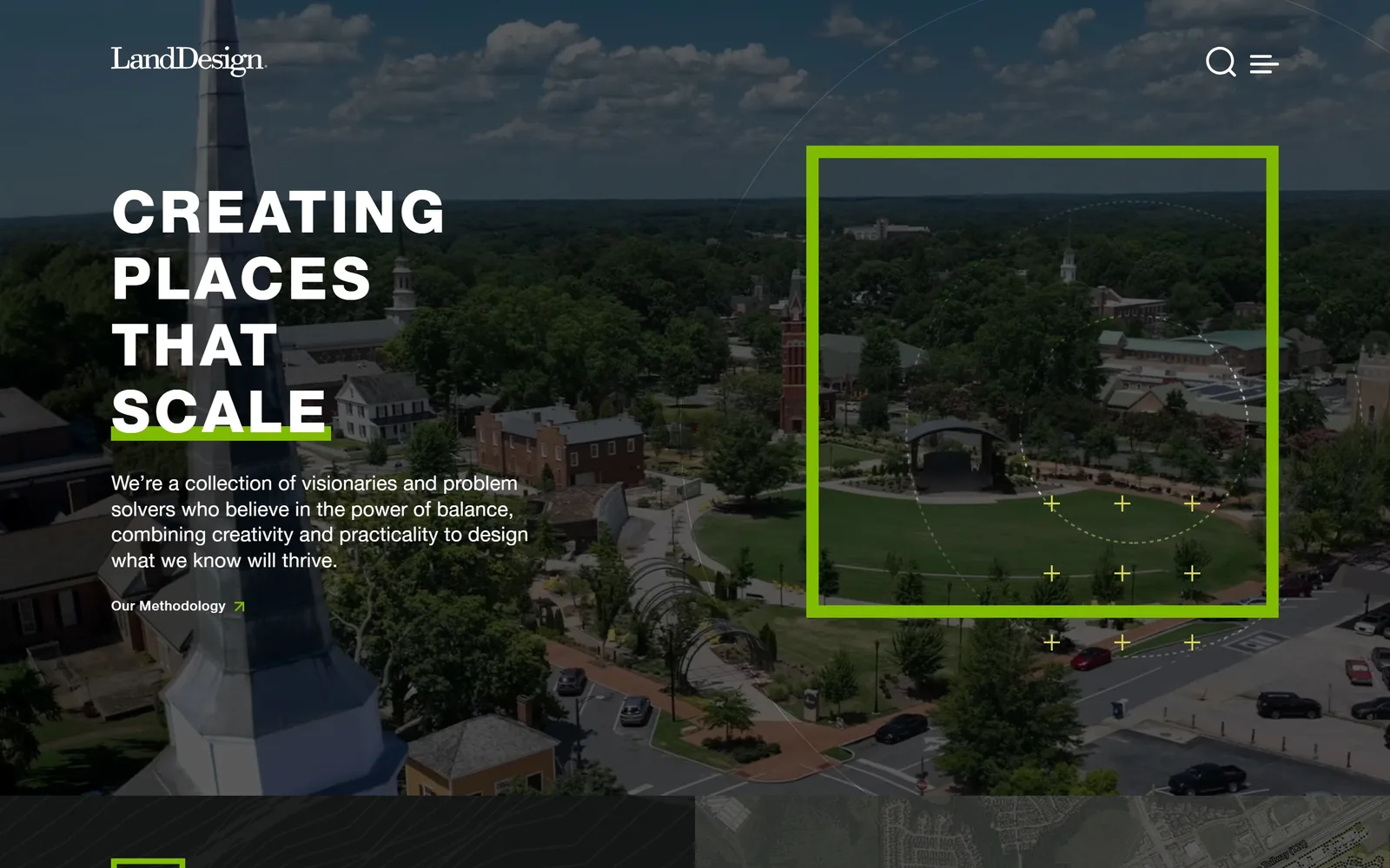
Drops an acid green survey frame over a drone shot, with the last word of the headline on a highlighter bar.
Type
helvetica85 60px, weight 900
Body
helveticaRoman 21px
Build
dark scrim over aerial, survey overlay right
Made on
WordPress
Colour
#000000 #ffffff
Type. CREATING PLACES THAT stacks across three lines of helvetica85 at 60px, weight 900, uppercase, tracked to 0.066em. The fourth line is a rotating word, SCALE in this instance, sitting on a bar of acid green as though a marker pen has gone through it. Body copy is helveticaRoman at 21px on roomy line spacing, which is what keeps it readable over an aerial photograph.
Colour. The photograph has been scrimmed almost to black, and that is the only reason white copy survives on top of an image this busy. Green appears in exactly two places, the highlighter bar and the survey overlay, and nowhere else. That restraint is why it reads as information rather than branding.
Layout. Headline and paragraph hold the left third. The right half carries a green square frame, a dotted ellipse and a scatter of small plus marks drawn over the image, so you are looking at site analysis laid onto a place rather than a finished view of it. It is the most confident graphic idea in this set.
The ask. One link, Our Methodology, small and bold with an arrow, in the same green. Everything else is a wordmark, a search icon and a hamburger. For a firm of this size that is notably disciplined, and the single link reads as an invitation rather than a demand.
Drawing your process on top of the photograph sells thinking rather than results, which is the harder and better sell when the work is bespoke.
04
hockerdesign.com
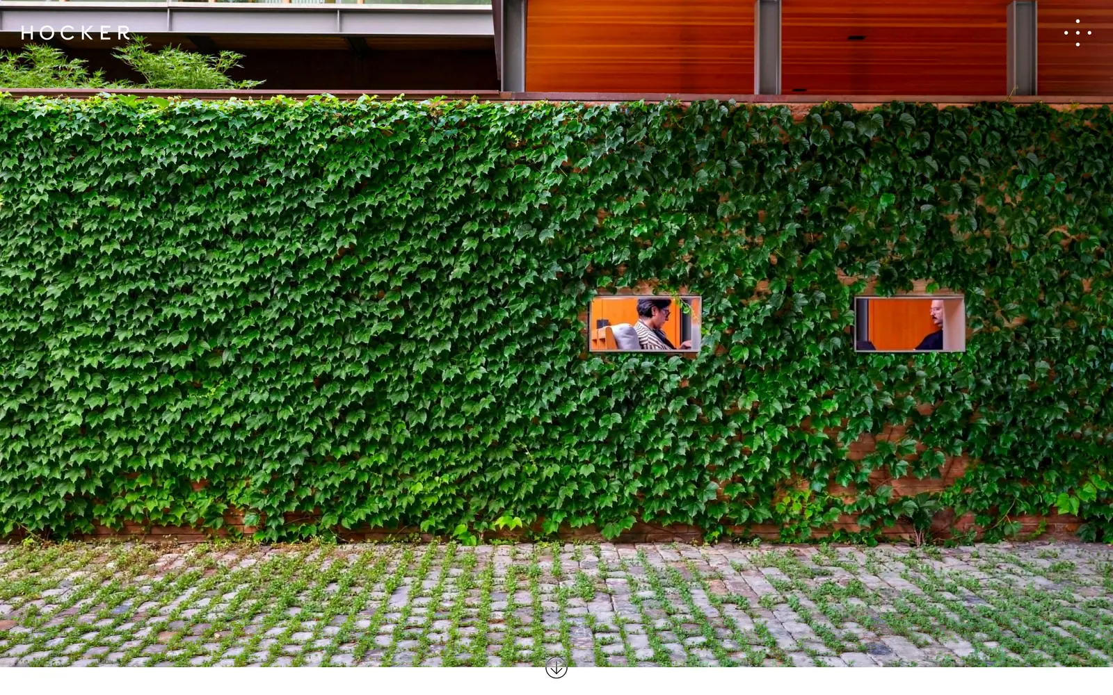
An ivy wall with two windows cut into it, and not one word of text on the screen.
Type
HOCKER wordmark, letterspaced caps
Body
capo
Build
twelve column grid, full bleed image, no text
Made on
custom
Colour
#1f2a1c #f4f4f1 #2f3a2a
Type. There is no live text here at all. HOCKER sits top left in white letterspaced caps, drawn into the page rather than set, and that is the only thing resembling type you will find. A six dot marker in the opposite corner replaces the word Menu entirely.
Colour. Green, brick red and the warm cedar of the soffit, all of it out of the photograph. The page declares white underneath and then never shows it.
Layout. One photograph, edge to edge: a wall under Boston ivy with two openings punched through it showing people at work inside, setts below seeded with green. A thin down arrow sits centred at the foot. Beneath runs a twelve column grid with 28px gutters, invisible until you scroll, and nothing on the site has a rounded corner.
The ask. Nothing asks for anything. No project name, no button, no prompt beyond that one arrow. The homepage runs barely two screens, so the site is effectively saying look at this, then decide.
Going wordless only works when a single image can carry your whole introduction, so be honest about whether your photography is at this level first.
05
wagnerhodgson.com
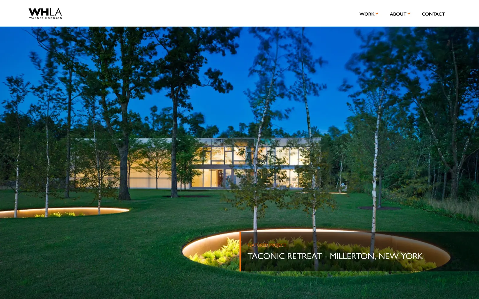
A twilight lawn with planters lit from inside, and an orange used on exactly sixteen characters.
Type
Gill Sans Nova 26px
Body
Gill Sans Nova 18px
Build
white header bar, full bleed photo, caption band
Made on
WordPress
Colour
#f5f5f5 #707070 #fd7e14
Type. One family does everything: Gill Sans Nova, at 26px uppercase for the project line, 18px on generous leading for body, 14px at weight 700 for the nav. Using a single typeface across a whole site is unfashionable and it has aged this one well. Nothing is trying to be clever.
Colour. The accent is #fd7e14, spent on one sixteen character label, FEATURED PROJECT, plus a thin rule beside it and two small chevrons in the nav. That orange came straight out of the lighting in the photograph, where sunken planters glow amber against a deep blue sky. Grey at #707070 does the actual reading work over a near white #f5f5f5 ground.
Layout. A white header strip, the photograph full bleed, then a dark translucent caption band dropped across the lower third. Section spacing below runs at a generous 120px, which gives the inside pages their unhurried feel.
The ask. No button on the first screen, just the project name as the thing to click. The firm is treating its homepage as one featured piece of work rather than a menu, which suits a studio this size.
Take your accent colour out of your own photography rather than a palette generator and it will look inevitable instead of applied.
06
hoerrschaudt.com
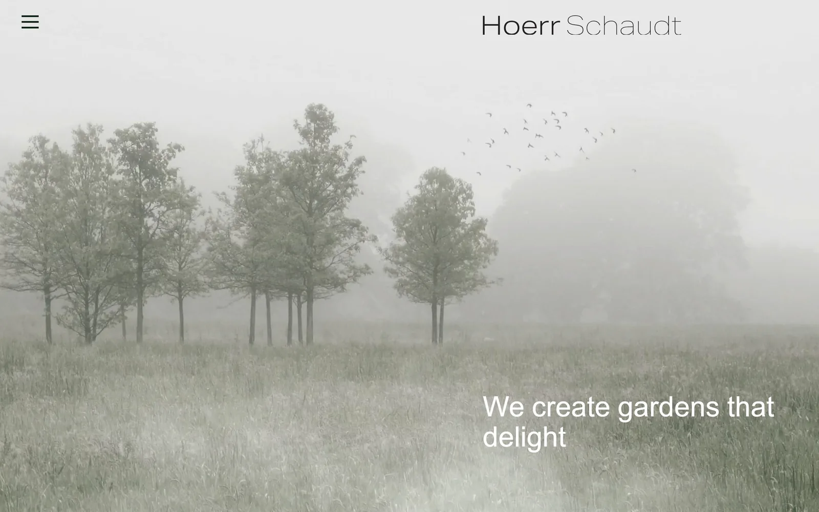
A meadow in fog, drained nearly to grey, with one extra light line of white type low on the right.
Type
aktiv-grotesk-extended 50px, weight 200
Body
aktiv-grotesk-extended 14px
Build
single screen, full bleed photo
Made on
custom
Colour
#ffffff
Type. We create gardens that delight runs at 50px in aktiv-grotesk-extended at weight 200, which is dangerously light for display type at that size. It survives because the image behind it has almost no contrast left. One word in the line swaps on a cycle, so the sentence is never quite the same twice, and the wordmark splits its two names across a medium and a light weight.
Colour. Barely any. The photograph is desaturated so far toward pale sage that a flock of birds in the upper right is nearly lost. White type, and that is the lot.
Layout. Full bleed photograph, headline dropped into the lower right, wordmark top right, hamburger top left rather than the usual right. The homepage is one screen and ends there.
The ask. Nothing is asked for. No button, no enquiry line, no project name. The hamburger sitting in the wrong corner is a small piece of friction they have decided they can afford, and with this client list they probably can.
A quiet photograph is a harder choice than a vivid one and it buys room to set type this delicately, but your photographer has to be in on the decision.
07
raymondjungles.com
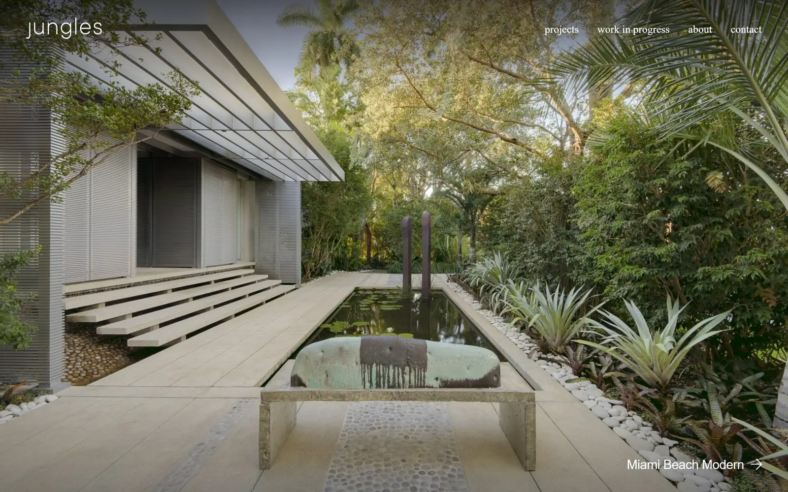
Full bleed Miami garden with a black reflecting pool, carrying fifty four characters of type in total.
Type
aktiv-grotesk 23px
Body
aktiv-grotesk-condensed 20px
Build
full bleed photo inside a thin dark border
Made on
WordPress
Colour
#222222 #ffffff
Type. The navigation is forced to lowercase, aktiv-grotesk-condensed at 20px in white, reading projects, work in progress, about, contact. Lowercasing a nav is a volume control, and against a photograph this dense it is the right call. The project credit bottom right sits in aktiv-grotesk at 23px, weight 500, tracked slightly tight.
Colour. Fifty four characters of white type and a dark #222222 ground that shows only as a thin margin at the edges. Everything else is the garden: travertine, black water, grey green bromeliads, a weathered stone form at the centre.
Layout. The photograph fills almost the whole window with that narrow dark border holding it in, and the content sits just inside the frame. One screen, no scroll.
The ask. A thin arrow after the project name is the only prompt on the page. Work in progress as a nav item is the interesting decision, because showing unfinished jobs is a trust move most contractors are too nervous to make.
Give unfinished work its own section, since half built projects answer the question clients are really asking, which is what it is like to have you on site.
08
studio-mla.com
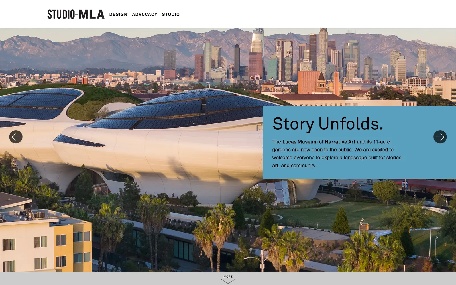
A dusty blue panel lands over an aerial of the Lucas Museum, holding a two word headline and a short note.
Type
Akkurat around 54px
Body
Akkurat
Build
white header bar, blue panel over aerial slider
Made on
WordPress
Colour
#ffffff
Type. Story Unfolds. sits at around 54px in Akkurat, four lines of supporting copy beneath it, one phrase bolded into a link. The wordmark is a heavy condensed cut with a small stroke joining its two halves. A sensible, slightly corporate system that does not get in the way.
Colour. A solid dusty mid blue panel over the warm evening tones of the aerial. The blue is nowhere near the photograph's own palette, which is exactly why the panel reads as a separate object rather than a wash over the image.
Layout. White header bar across the top with only three nav words, then the aerial, then the panel holding the right third. Circular arrows at both edges and a MORE chevron at the foot make the slider obvious without shouting about it.
The ask. The bolded project name inside the paragraph is the only link and there is no enquiry button anywhere. For a civic practice chasing public commissions that is probably right, though the slider arrows end up doing more work than the copy.
A solid panel is the honest way to put a paragraph over a busy photograph, and it beats scrimming the whole image, which kills the picture to make room for words.
09
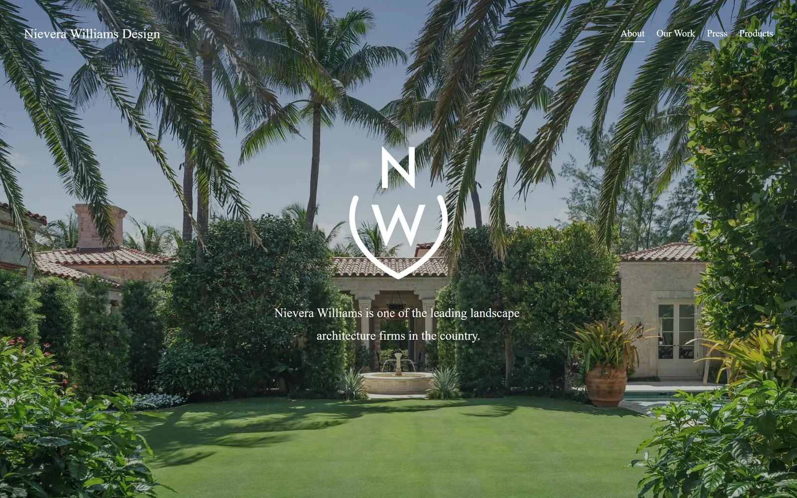
nieverawilliams.com
Symmetrical Palm Beach garden with a line monogram and one Garamond sentence on very open leading.
Type
adobe-garamond-pro 23px
Body
adobe-garamond-pro 17px
Build
centred symmetrical composition over full bleed photo
Made on
Squarespace
Colour
#1d231c #ffffff
Type. One sentence, set in adobe-garamond-pro at 23px, weight 300, on a line height near 1.8. The leading is the whole trick: two short lines spaced that far apart stop reading as a caption and start reading as an inscription. The same face carries the wordmark and the nav at 17px, with no sans anywhere on the page.
Colour. White type and a white line monogram over full colour photography. Nothing is tinted, nothing is scrimmed, and the garden supplies the entire palette.
Layout. Dead centre, all of it. A tile roofed villa behind a clipped lawn, a fountain on the axis, palms arching in from both edges, and the monogram sitting exactly in the middle of the frame. Every element is centred or symmetrically paired.
The ask. No button and no enquiry prompt, just four nav items with About underlined. The claim in that sentence, one of the leading landscape architecture firms in the country, is doing the selling, and it is a good deal bolder than the restraint around it.
When the work is formal and axial, letting the page composition echo the garden composition says more about your taste than an about page ever will.
10
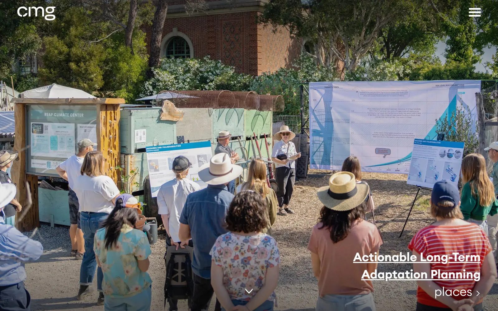
cmgsite.com
Leads with a community workshop rather than a finished garden, presentation boards and sun hats and all.
Type
Euclid Circular A
Body
Euclid Circular A
Build
full bleed documentary photo, headline lower right
Made on
WordPress
Colour
#ffffff
Type. Actionable Long-Term Adaptation Planning is set in Euclid Circular A, white, underlined across two lines in the lower right. The underline is the weak point: on a two line headline it looks like a mistake rather than a link, and a small arrow would have done the job better. Below it, places with a chevron is the actual way in.
Colour. Nothing applied at all. White type over an unretouched photograph, with the colour coming from sun hats, a brick wall and the blue of the presentation boards.
Layout. One documentary photograph, edge to edge, a lowercase cmg top left, a hamburger top right, a down chevron centred at the foot. The image is not styled and the slight awkwardness of it is deliberate.
The ask. The underlined headline and the word places are the only routes forward. No contact prompt, no services list, nothing resembling a pitch, which for a practice selling public engagement work is at least consistent.
Photographing the process instead of the product is the cheapest differentiator you have, because every competitor already owns pictures of finished gardens.
11
janiceparker.com
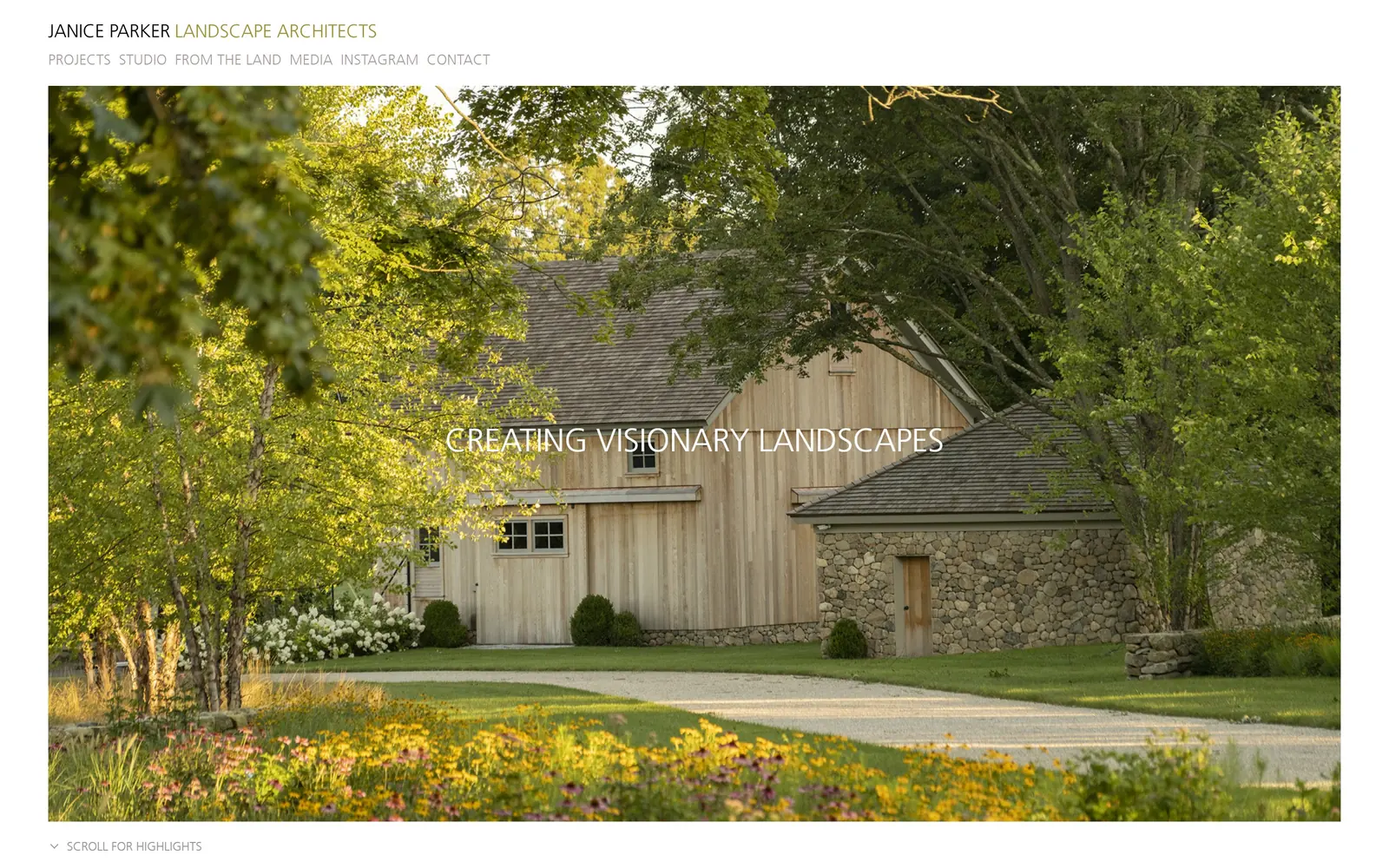
Insets the photograph inside a white margin instead of bleeding it, with the identity stacked tight in one corner.
Type
Frutiger, letterspaced caps
Body
Frutiger
Build
inset photo inside a white margin
Made on
WordPress
Colour
#ffffff
Type. CREATING VISIONARY LANDSCAPES is centred in a light humanist sans, letterspaced and white, small enough to sit on the image without fighting it. The identity above is stacked tight: JANICE PARKER in dark grey caps, LANDSCAPE ARCHITECTS following in a warm olive, then six small caps nav items on the line below. All of it is set very small, and the practice name nearly disappears as a result.
Colour. The warm olive in the wordmark is the only applied colour on the page. Everything else is the photograph, backlit and full of yellows, held inside a white margin.
Layout. This is the only one here that frames its image rather than bleeding it. A white margin on three sides turns the photograph into a plate instead of a backdrop, which is quieter and more gallery like than full bleed, and nobody else in this set attempts it.
The ask. SCROLL FOR HIGHLIGHTS with a chevron, bottom left, is the only instruction given. No button, no enquiry form above the fold.
Framing the hero rather than bleeding it is an easy way to look like a gallery instead of a brochure, but do not shrink your own name to go with it.
12
lutskoassociates.com
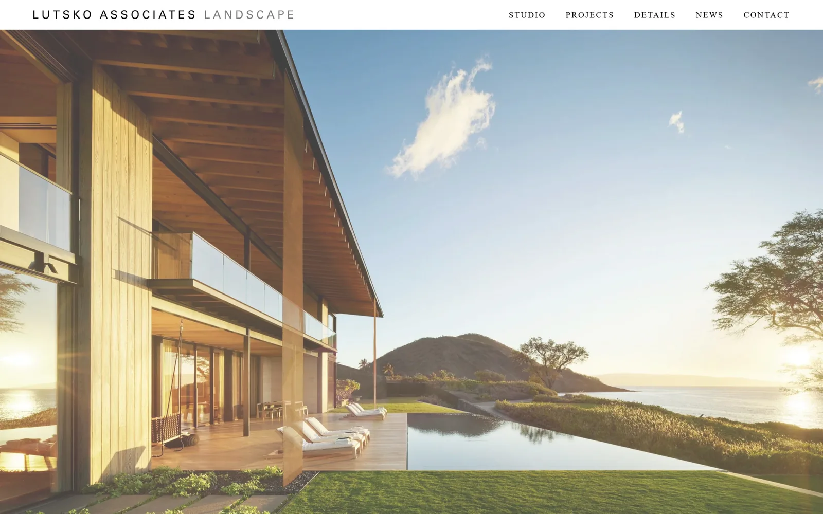
A thin white bar of letterspaced caps, then an uninterrupted sunset with nothing printed on it.
Type
Pavanam 14px, 0.15em
Body
Pavanam
Build
shallow header bar over full bleed photo
Made on
Squarespace
Colour
#ffffff #000000
Type. Pavanam at 14px, tracked out hard to 0.15em, caps. LUTSKO ASSOCIATES in black with LANDSCAPE trailing in grey, five nav items to the right in the same treatment. Thirty two characters is the entire visible text on the page, and that wide tracking does all the work size would normally do.
Colour. Black type, grey secondary, white bar. The photograph brings the rest: timber, sea, a low sun flaring through the structure.
Layout. The header strip is shallow, around forty pixels deep, and everything under it is photograph. Nothing is laid over the image, no caption, no dots, no button. The ratio of chrome to picture is the most extreme in this set.
The ask. There is no call on the first screen whatsoever. What there is instead is a nav item called Details, opening onto junctions, edges and materials rather than finished views, and that is quietly the smartest thing on the page.
Build a Details section of close ups showing how your edges and junctions are made, because that is what proves competence to anyone a contractor has let down before.
13
yardzen.com
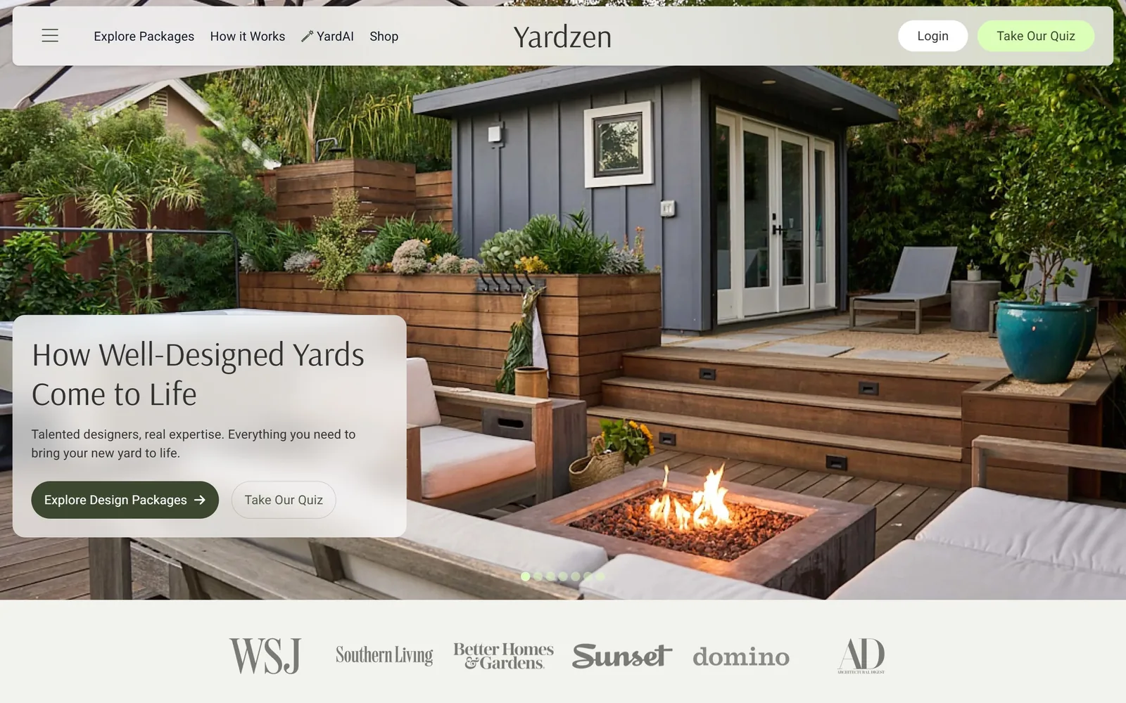
Frosted card over a lit fire table, two tiers of button, and six magazine logos sitting directly below.
Type
Arsenal 42px
Body
Roboto 16px
Build
floating pill header, frosted card over photo, press row
Made on
custom, Next.js
Colour
#f3f3ed #3b482f #e5ffcb
Type. How Well-Designed Yards Come to Life is set in Arsenal at 42px, a serif, which is a soft choice for a technology company and clearly a deliberate one. Roboto handles everything functional underneath at 16px. Warm serif for the promise, neutral sans for the mechanics, is the oldest trick in consumer web design, applied cleanly.
Colour. A warm off white #f3f3ed ground, a dark olive #3b482f on the primary button, a pale green #e5ffcb on the secondary one in the header. The two greens land on buttons and nowhere else on the page, which is why your eye goes straight to them.
Layout. A rounded pill header floats clear of the top edge, then a backyard at dusk with a fire table alight, then a translucent frosted card dropped over the lower left. Press logos for WSJ, Southern Living, Better Homes & Gardens, Sunset, domino and AD run across the band beneath. Everything is rounded, the buttons into full pills.
The ask. The only page here built to sell rather than to impress, and it shows. Two tiers of call sit side by side, Explore Design Packages as the committed one and Take Our Quiz as the cheap one, with the quiz repeated up in the header. Prices appear further down, which almost nobody in this trade is brave enough to do.
Put a low commitment option beside your real call, because most visitors are not ready to book and a quiz or a guide keeps them rather than losing them.
14
hollanderdesign.com
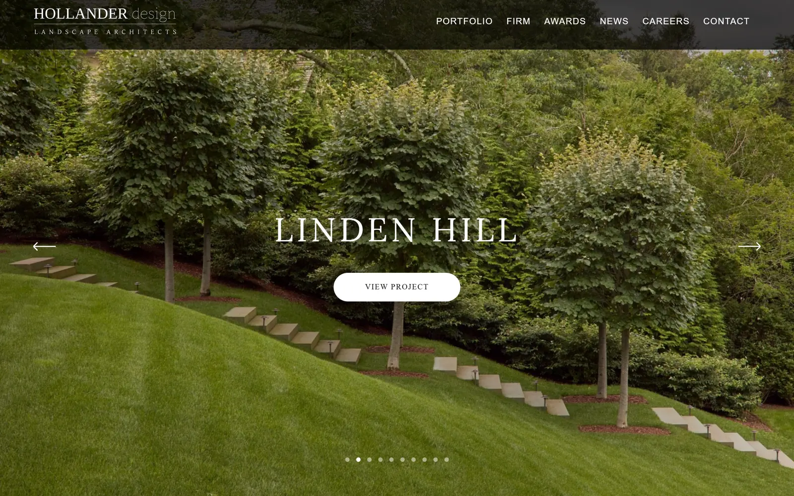
Centred letterspaced caps and a white pill button over a lawn threaded with stone treads.
Type
letterspaced serif, around 60px
Body
Open Sans 16px
Build
dark header bar, centred title over slider
Made on
WordPress
Colour
#ffffff #171617
Type. LINDEN HILL is centred in a letterspaced serif at roughly 60px. The header carries the wordmark in caps serif with design in lowercase under a hairline rule, plus six Open Sans nav items at 16px with light tracking. A tidy pairing, and nothing about it will surprise you.
Colour. White type, a near black #171617 for the header bar, and a photograph that is almost entirely one shade of green. The flat lighting on that image is the real problem, because it leaves the page nothing to work with.
Layout. Dark bar across the top, centred title in the middle of the frame, pill button directly beneath it, arrows at both edges, nine dots at the foot. Every element is exactly where you expect it to be.
The ask. VIEW PROJECT in a white pill is the only call and it points at browsing rather than enquiry. The contact route is a nav item and nothing more, which is standard for the sector and leaves a lot of intent on the table.
The familiar formula done carefully rather than an idea of its own, which is a realistic target for most firms, so study the execution and skip the layout.
How these were chosen
Fourteen sites from the better end of the trade, and the reasons each one works. Some are studios confident enough to put one photograph on the screen and say nothing at all; one is a consumer service engineered to turn a browser into a paying job. If you are thinking about your own landscaping website design, the useful question is not which of these looks best, but which one is solving the problem you have.
Finding landscaping sites that someone had actually designed took far longer than it should have. 28 candidates made the shortlist. 14 made the page.
Each one was opened and looked at properly: what the type is doing, where the colour gets spent, how the page is built, how it asks for the job. Nothing is here because it ranks. Nothing is here because an agency filed it under portfolio. Several well known names were left out for the plain reason that their site came out of the same template as everyone else's, and a few sites worth including did not survive a second look.
Where a site is only competent, it says so. The order is the order worth your time, best first.
Reviewed and selected by Larry W. Matthews for Websitely.