Healthcare Website Design: 267 Clinics, Studios and Spas
Two hundred and sixty-seven places people go with their bodies, or their child's, or their animals: clinics, dental and orthodontic practices, chiropractic and physical therapy rooms, therapy offices, veterinary surgeries, senior living communities, home care agencies, med spas, bathhouses, yoga rooms, boxing gyms and salons. They are grouped together because they share one design problem, which is a visitor who is anxious, in pain, or spending money on themselves and wants to feel good about it.
Healthcare has the strongest vendor monoculture of any category on this site, and also the most interesting escapes from it.
- Galleries
- 19
- Sites
- 267
- Chosen on
- The work, not the ranking
- Updated
- 15 October 2026

Medical Website Design
Twelve US practices that have actually been designed, and a good share are dental, which is where the bravest medical website design is happening now.
12 sites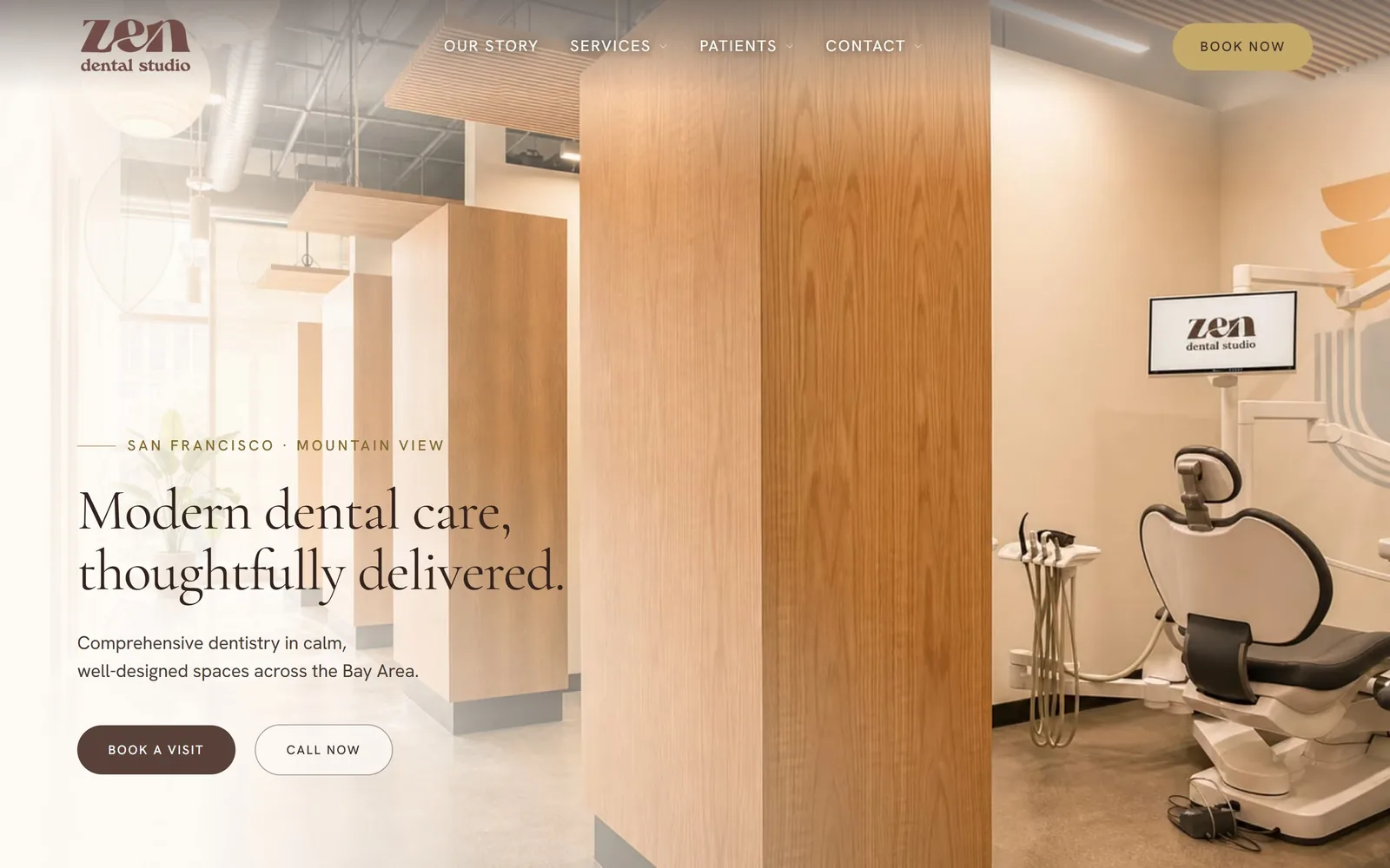
Dental Website Design
Fifteen practices that photographed their own rooms and staff. That decision does more for dental website design than any font pairing on the page.
15 sites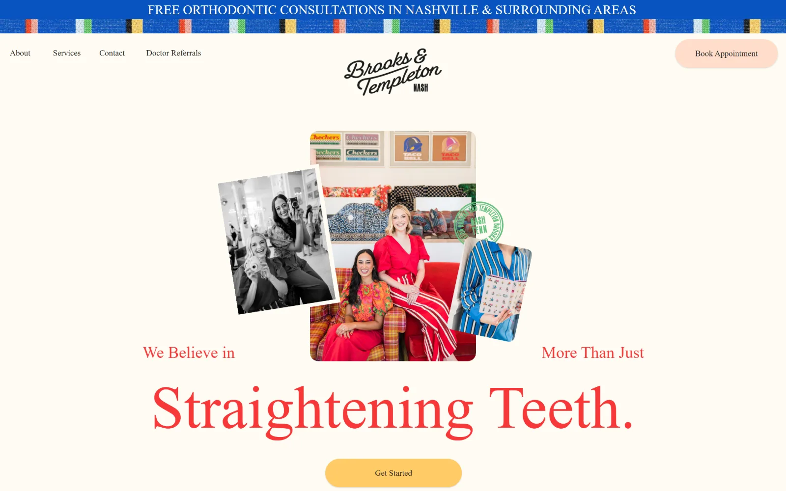
Orthodontist Website Design
Fifteen US practices that escaped the vendor template. Orthodontist website design turns on the smile you lead with and the ask beneath it.
15 sites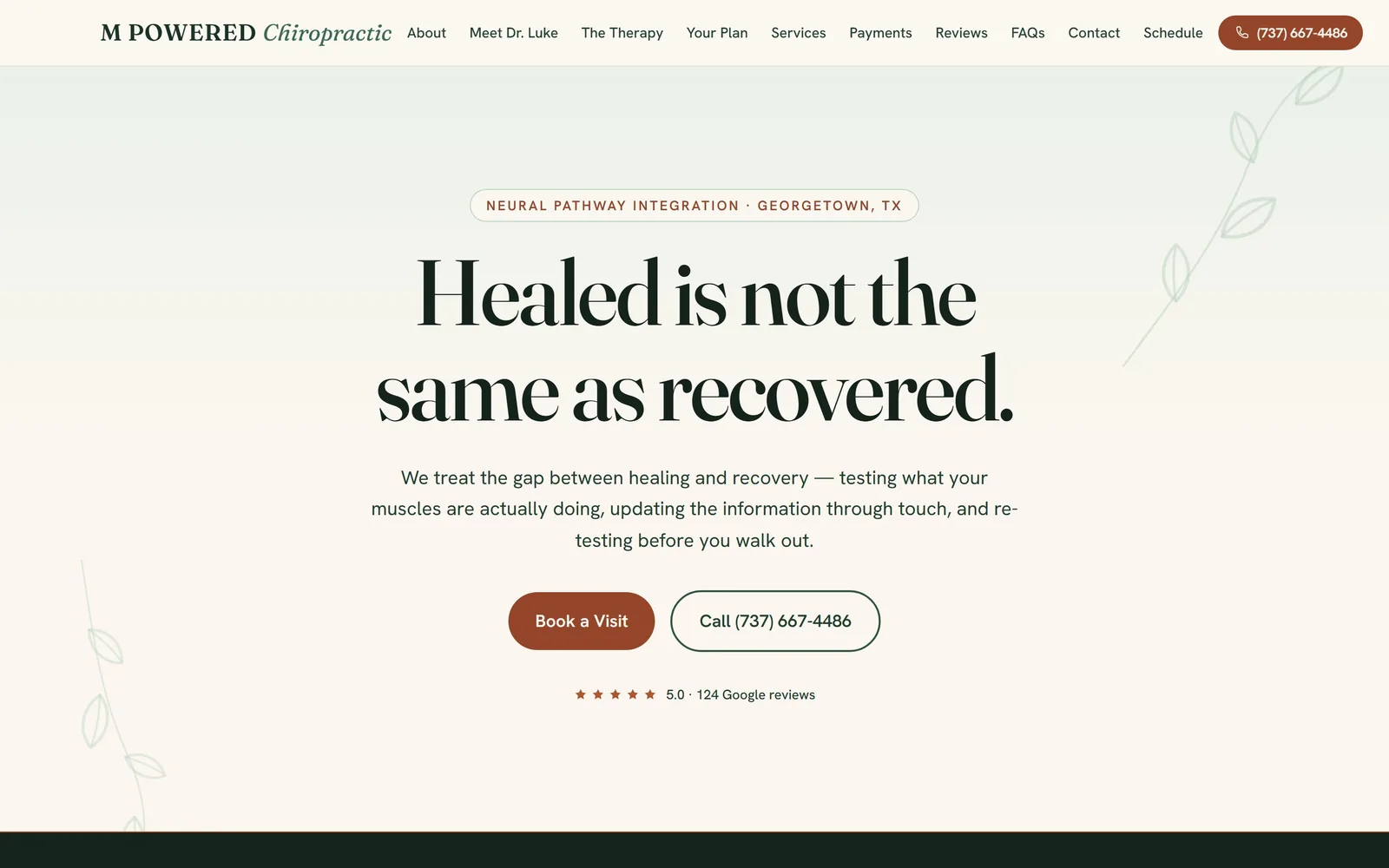
Chiropractor Website Design
The vendor template rules this trade. Thirteen clinics that escaped it, and the chiropractor website design decisions that got them out.
13 sites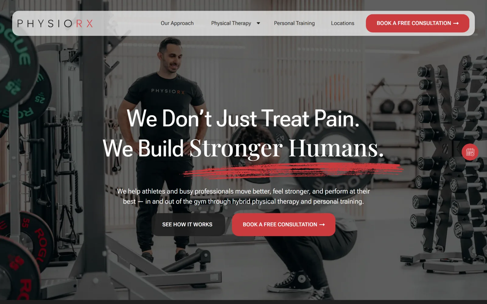
Physical Therapy Website Design
Fourteen US clinics, sports rehab through movement practice. Physical therapy website design that shows the room rather than the body.
14 sites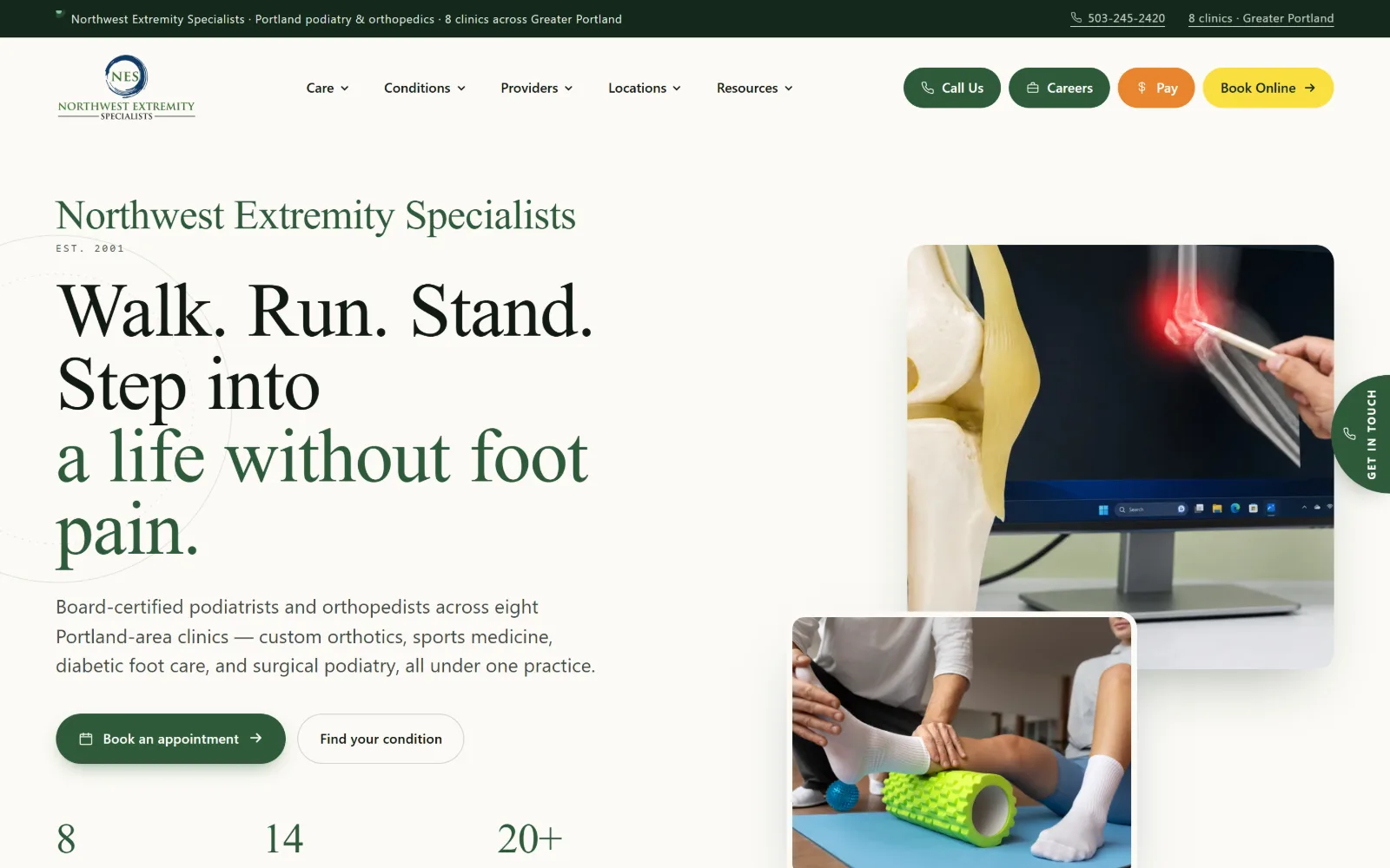
Podiatry Website Design
The vendor template owns this trade. Sixteen US foot and ankle clinics that escaped it, and the podiatry website design decisions that got them out.
16 sites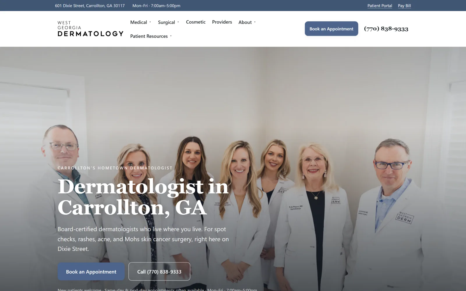
Dermatology Website Design
Fifteen US medical and Mohs practices rather than cosmetic clinics. Dermatology website design that photographs the room and the people in it.
15 sites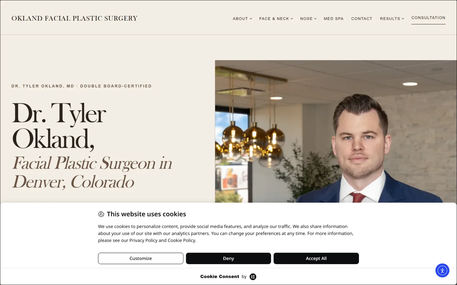
Plastic Surgery Website Design
Sixteen US facial, oculofacial and hand practices. Plastic surgery website design judged on a first screen that usually reaches for a gallery.
16 sites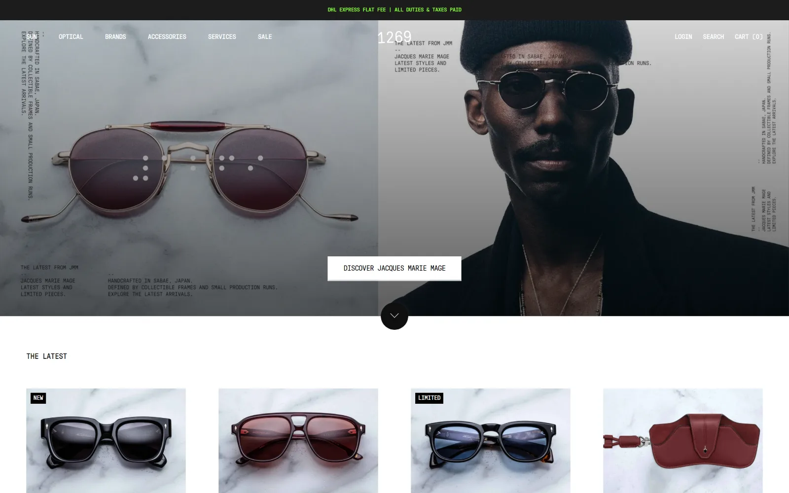
Optometrist Website Design
Sixteen US optical shops and eye care practices. Optometrist website design where the frames are the product and the exam is the quiet half.
16 sites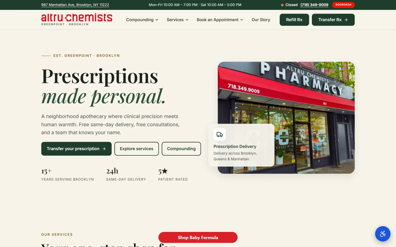
Pharmacy Website Design
Fourteen US independents and compounders. Pharmacy website design splits between a counter that dispenses and a shelf that sells.
14 sites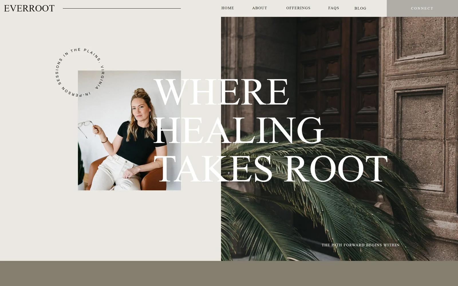
Therapist Website Design
Sage green and blush are the reflex. Fourteen practices whose therapist website design put a real face or a real room above the fold instead.
14 sites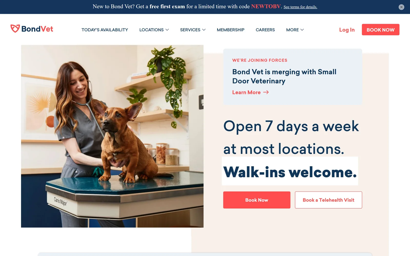
Veterinary Website Design
Fifteen clinics and equine hospitals that shot their own staff. Veterinary website design at this level is a decision about what to leave out.
15 sites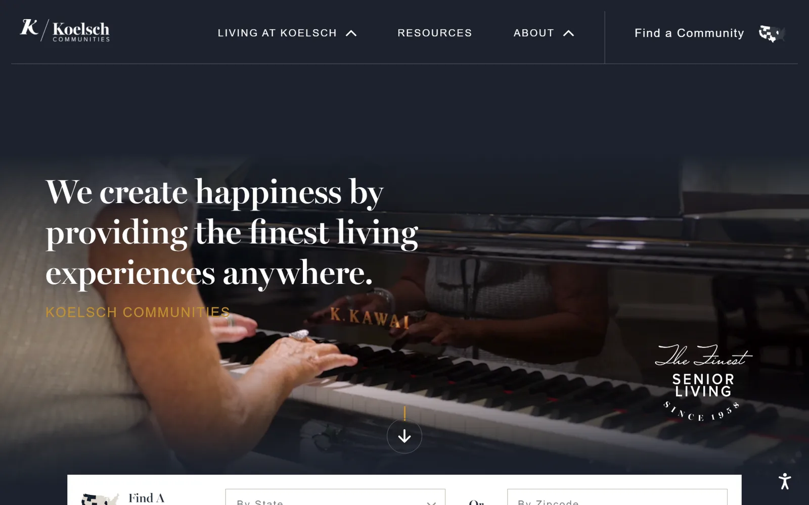
Senior Living Website Design
Seventeen US communities where the first screen is a room you can picture living in. Senior living website design without the stock-photo smile.
17 sites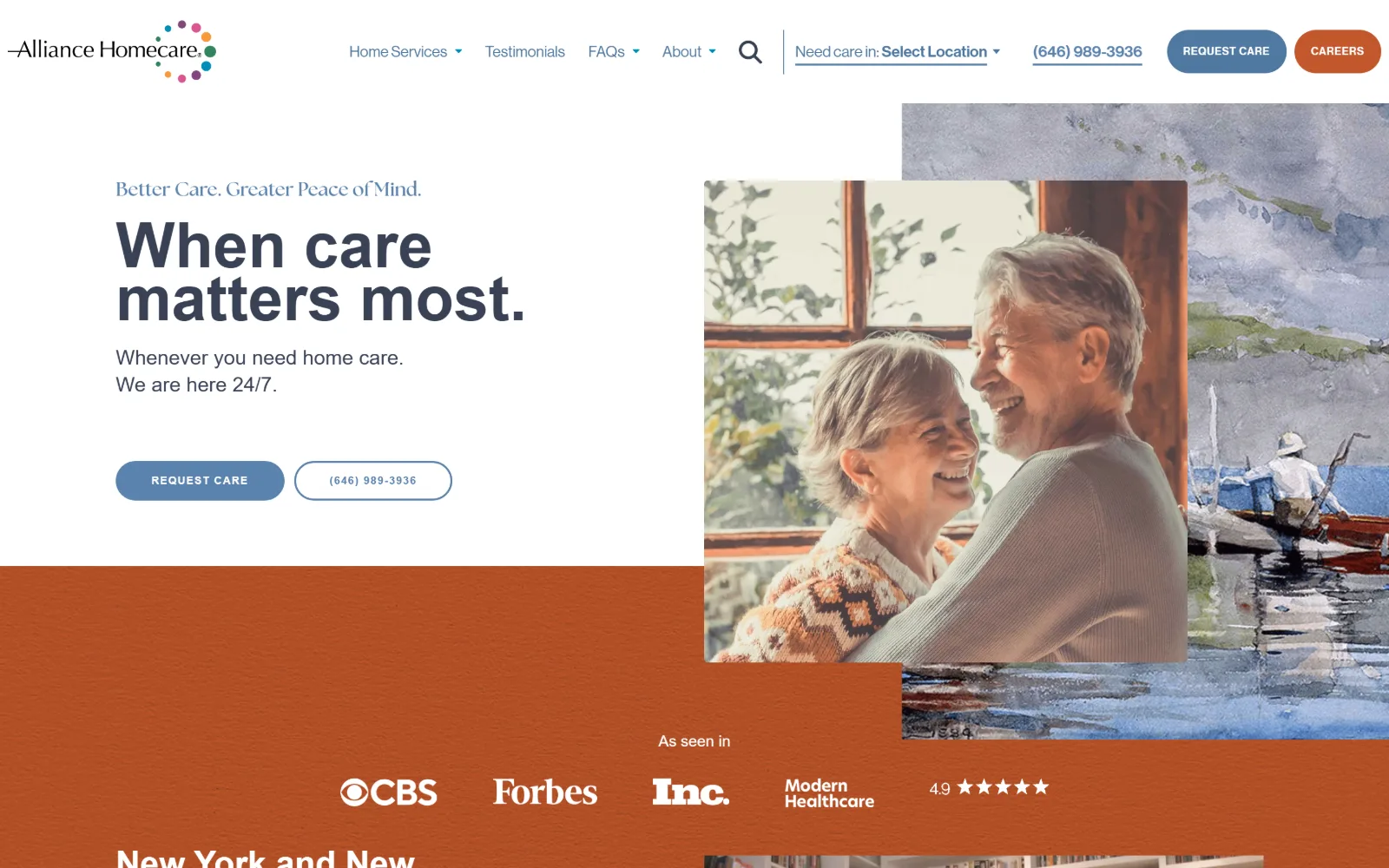
Home Care Website Design
Sixteen US agencies whose home care website design leads with a face rather than a logo, and names a price or a phone before you scroll.
16 sites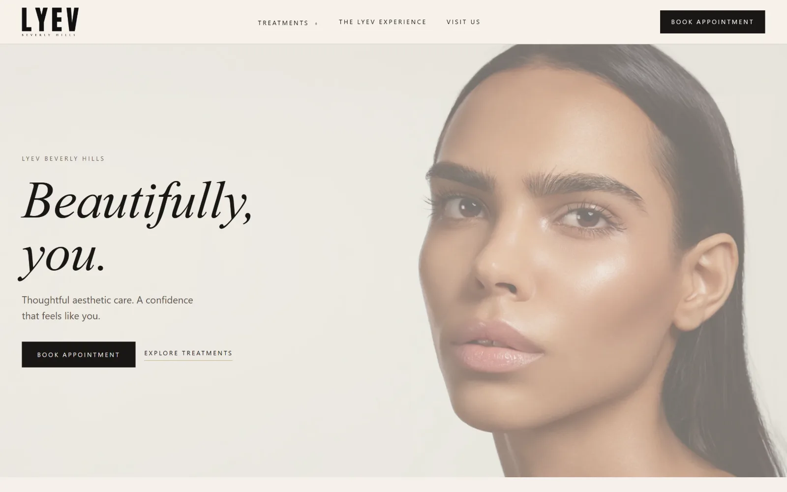
Med Spa Website Design
Med spa website design lives or dies on the price list. Sixteen US aesthetics clinics, read for what they put above the fold and what they hide.
16 sites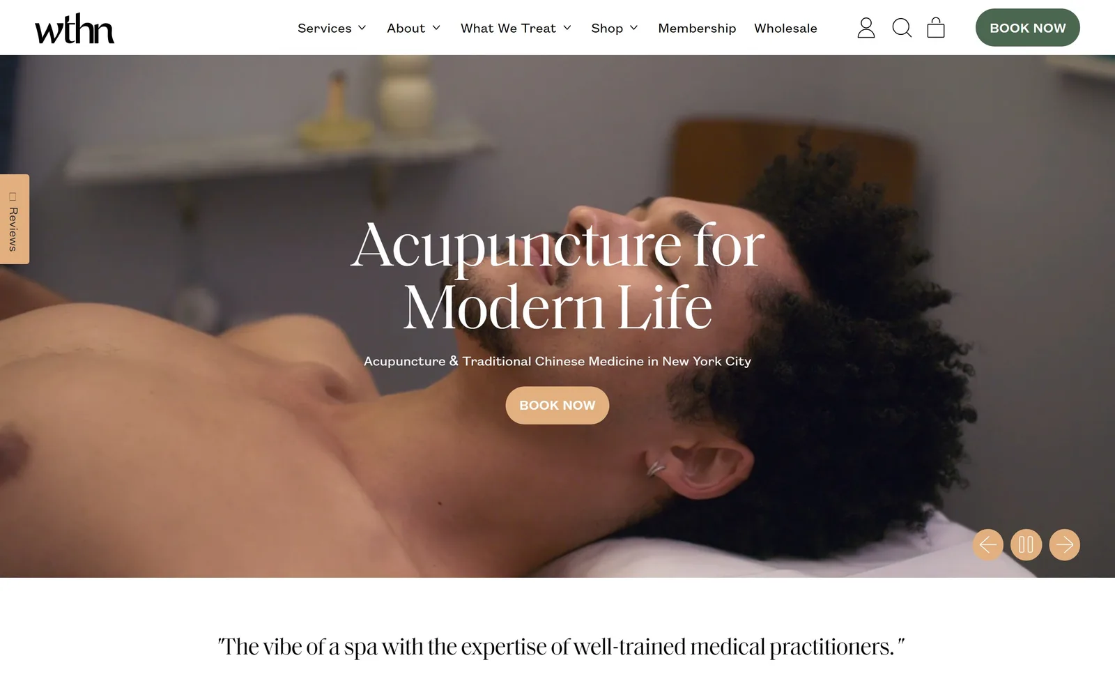
Spa Website Design
Nine spas, bathhouses and plunge clubs that lead with video. Spa website design here is one accent colour and a booking button louder than everything.
9 sites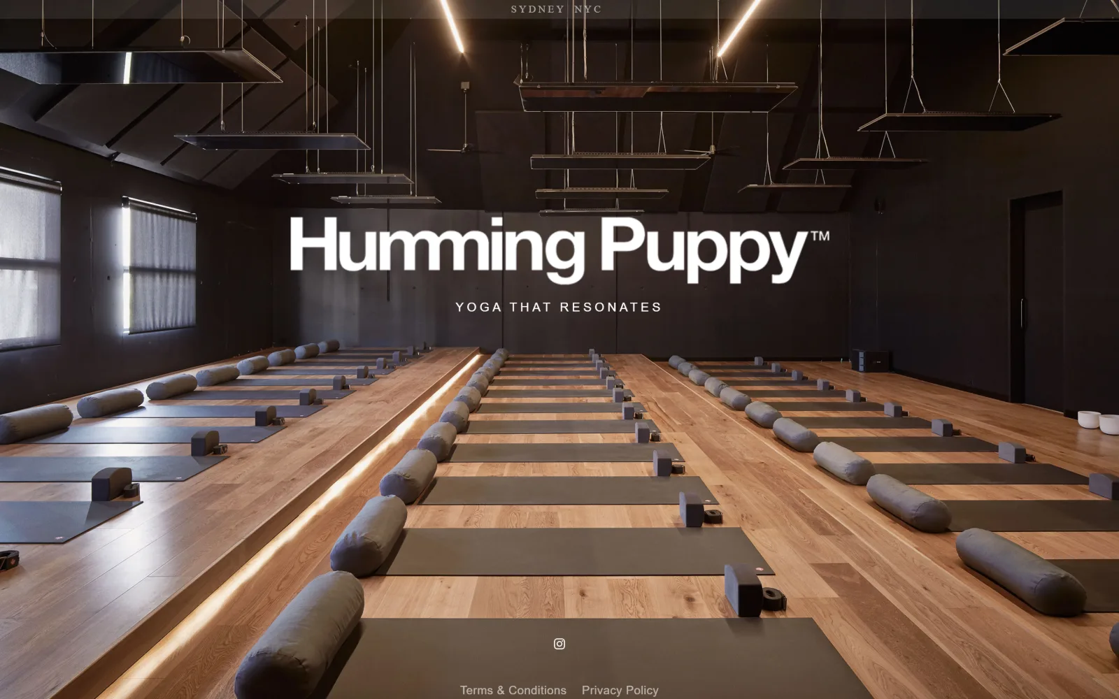
Yoga Studio Website Design
Twelve US studios that sell a room rather than a body. Yoga studio website design carried by type, colour and a timetable you can find at a glance.
12 sites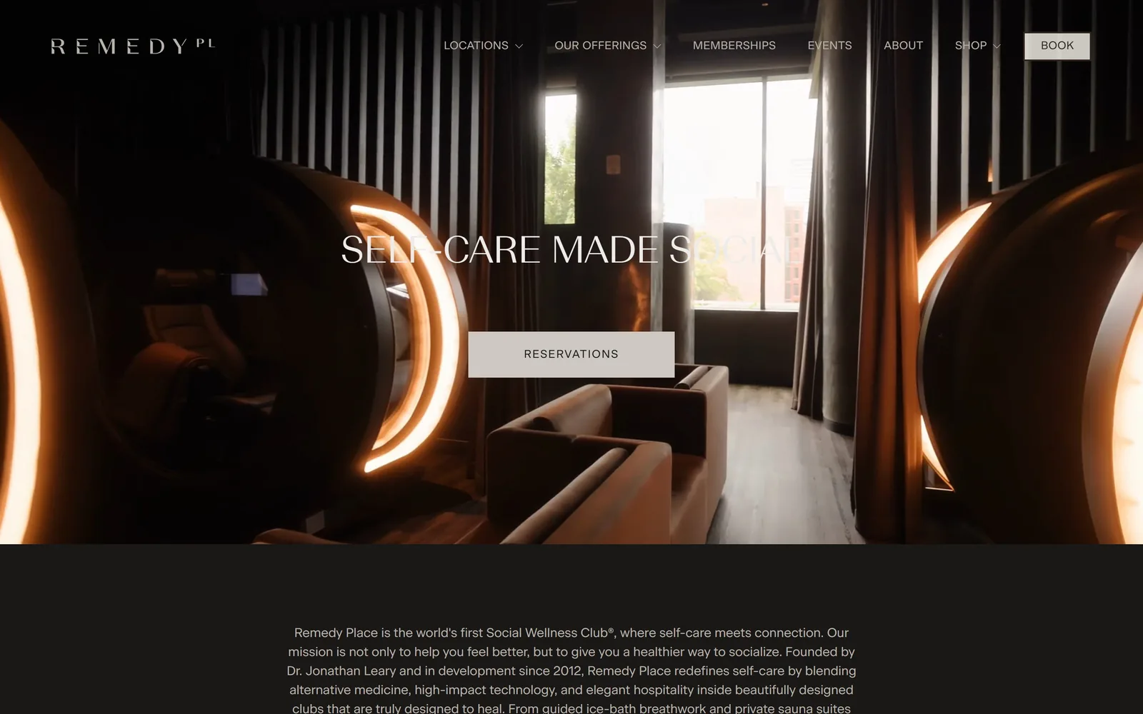
Gym Website Design
The photograph carries the colour and the stylesheet holds at three values. Ten studios, climbing gyms and recovery clubs doing gym website design well.
10 sites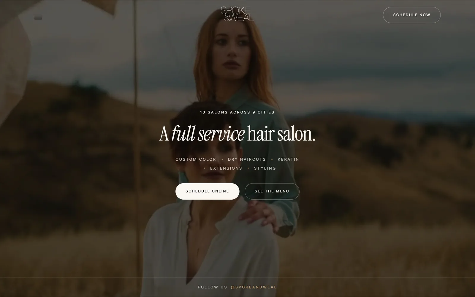
Salon Website Design
A booking button in the header, then a longer one further down. Twelve salons, barbershops and nail studios judged on salon website design above the fold.
12 sitesDentistry is where the adventurous work is
If you had to guess which corner of healthcare was taking visual risks, dentistry would not be the obvious answer, and it is. Grand Street Dental scatters flat half circles in orange, pink and cobalt across a bone field and drops two words of serif into it. A pediatric practice in El Segundo is doing better work than most hospital groups. The reason is probably commercial: a dental practice competes inside a few square miles, pays for its own marketing, and can tell in a month whether a site works.
Medicine proper splits in two. The concierge and specialist end hires studios, and it shows. Midi sets two lines of enormous condensed capitals along the bottom edge of a photograph of three women laughing. Biograph photographs its own building at night, a lit glass pavilion behind wood slats, and drops the headline low in white. Everything below that tier tends to sit on a template.
The forty-seven dollar banner
Chiropractic is the clearest case of a profession buying the same website in bulk. Several marketing vendors sell the identical build to thousands of clinics, down to the same new patient offer in the same position in the same colour. A patient who has looked at four clinics has seen one website four times.
The thirteen in the clinic gallery all got out, and mostly by doing less. M Powered sets a single sentence in a big contrasty serif, centred on warm paper, with no hero photograph at all. Brooklyn Sports runs black, white, and a photograph of sprinters mid start. Charleston goes the other way and puts a complete appointment form in the hero, which is the most aggressive solution in either gallery and probably the most effective.
Dentistry, properly done, looks nothing like dentistry
The dental gallery settled into three camps and only one of them looks like the category. Boutique general practices went to warm neutrals and serif type: Zen shoots a white oak operatory through a timber screen and sets a Garamond headline low on the left. Gentry runs a pure black field with a monogram and a high-contrast serif at display size. Norman cuts a quarter circle out of a sage green panel and fills it with condensed caps and calligraphic swashes. Not one of them shows a stock smile or a blue gradient.
Pediatric practices form the second camp and commission their own illustration rather than buying clip art, and the aligner brands form the third, designing like consumer products. If you run a practice, the useful comparison is which camp your nearest four competitors are in, because that is the one to leave.
Therapy and veterinary are where the vendor grip is loosening
Two of the newest galleries show the same shift. In therapy the strong sites put either a real face or a real room above the fold and let one typeface carry everything else: My Everroot splits the screen between a warm grey panel and palm fronds with 121px capitals across the seam, The Practice photographs two therapists against olive beside a headline alternating roman and italic. In veterinary the practices that look most expensive are the ones photographing their own staff handling animals, with Bond, Sploot and Small Door all working from cream and a single accent rather than teal and orange.
Both categories are still mostly template, which means the bar to look considered is low. One commissioned photo session and one typeface is the whole difference.
Wellness leads with video, and most of it is wasted
Nearly every site in the spa gallery and over half the gyms open with footage rather than a still. The ones that work treat the footage as the whole argument instead of as a backdrop for a slogan. WTHN runs full-bleed treatment footage behind an 81px serif and one peach booking pill. Remedy Place goes near-black with amber hyperbaric pods glowing in a dim lounge and a single stone-grey Reservations button. Rumble grades a boxer teal and magenta and crops 150px type against the frame.
The weak ones stack a promo bar, a popup and a nav link over the video before a visitor has seen what the place looks like. If the footage cannot carry the page on its own, a photograph will do the job better.
Two typefaces, one accent, one ask
Across all nineteen galleries the formula that keeps working is a serif for display, a grotesque for everything else, and a single accent colour spent on the booking control and nothing else. It is common enough in salons and spas that the sites refusing it stand out on sight: MiniLuxe crops almond nails against a jaw and sets NAIL IT small and white at the dark left edge, and Spoke and Weal runs a warm brown film still of two women in a dry field.
The booking button is the other constant. Put one in the header, then a second further down with a longer label that says what is being booked. Where a site on these pages paid for its look in legibility, the entry says so.
Medical and chiropractic for type and booking paths, spa and gym for video that earns its place, salons for making one room look like a brand.
The other sectors: Contractors, for construction website design among others; Local Services, for moving company website examples among others; and Small Business, for accounting website design among others.