Yoga Studio Website Design: 12 Studios With a Point of View
Twelve US studios that sell a room rather than a body. Yoga studio website design carried by type, colour and a timetable you can find at a glance.
Shown
12 sites
Reviewed
44 candidates
Chosen on
The work, not the ranking
Updated
15 October 2026
01
hummingpuppy.com
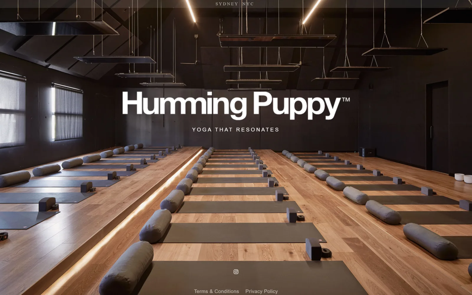
A dark timber studio lined with grey mats and bolsters recedes to a back wall, the wordmark set in white across the centre.
Type
proxima-nova 60px, -0.017em
Body
Helvetica Neue 16px, 0.250em
Build
full-bleed photo, 900px single screen
Made on
Squarespace
Colour
#000000 #ffffff
Type. The wordmark is the only large thing here, proxima-nova at 60px, weight 700, set lowercase at -0.017em so the two words lock together. Under it the tagline runs Helvetica Neue at 16px, weight 100, uppercase, opened out to 0.250em. One heavy line, one hairline, nothing in between, and the entire page carries 74 characters of type.
Colour. Two values and no accent. Black at #000000 covers half the frame and is also the body background, white appears at 1.3 percent coverage and is the only ink on the page. Every warm note, the timber floor and the strip of light along the riser, comes out of the photograph itself rather than from a brand colour.
Layout. Nothing registers as a nav because there is no nav. The photograph runs full bleed across the 1440px viewport and the document is exactly 900px tall, so the page ends where the fold does. Section padding sits at 86px, radius is 0, and the only chrome is the SYDNEY NYC locator pinned to the top edge with a row of legal links at the bottom.
The ask. There is no button, no form, no phone number and no schedule, since the page is one screen tall. The single interactive element is an Instagram glyph at the bottom centre. A studio operating in two cities treats the homepage as a holding frame and pushes booking entirely elsewhere, which only works when the photograph is this specific.
A one-screen homepage holds up when the photograph already answers the question a visitor arrived with and the type stays at two weights.
02
yogamaya.com
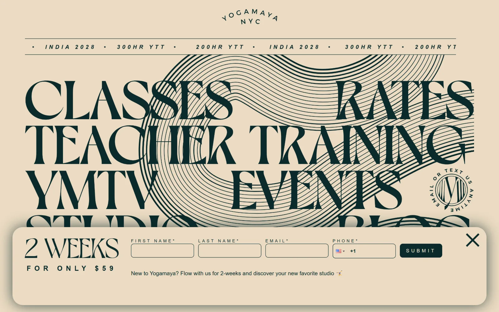
Six section names set in a huge display serif stack over a cream ground, overlaid on a fine line drawing of concentric contours.
Type
Dahlia-med 158px, 0.82 line height
Body
Montserrat 16px, 0.400em
Build
1300px container, nav as display type
Made on
WordPress
Colour
#ebdbc2 #0b2a2b #f1e6d5
Type. Navigation is the display type: Dahlia-med at 158px, uppercase, line height 0.82, eight items stacked so tightly the lines almost touch. A second serif cut, Dahlia at 80px, carries the offer. Everything else is Montserrat at 16px and 12px, uppercase, pushed out to 0.400em so the small type reads as a ticker rather than as prose.
Colour. Two values. The cream ground #ebdbc2 covers 95.9 percent of the frame and a deep green-black #0b2a2b supplies all 343 characters of ink, the contour drawing and the submit button. The docked panel lifts to #f1e6d5, half a step warmer, which is the only tonal shift anywhere on the page.
Layout. A 1300px container, 90 percent of the viewport, holds a rule-bound marquee of training dates under the arched logo. The nav words then break that container and bleed past both edges. The lead capture docks to the bottom as a full-width panel with an 8px radius, the only rounded corner on a page whose common radius is 0.
The ask. One ask, and it is assertive: a four-field form for a two-week intro at $59, pinned across the bottom with a close cross. No phone number, no schedule link in the header, no cart. The eight nav words are the entire site map, so the choice is to hand over an email address or to pick one of eight destinations.
Setting the navigation at 158px turns the site map into the artwork, which removes the need for a hero image entirely.
03
highlandparkyoga.com
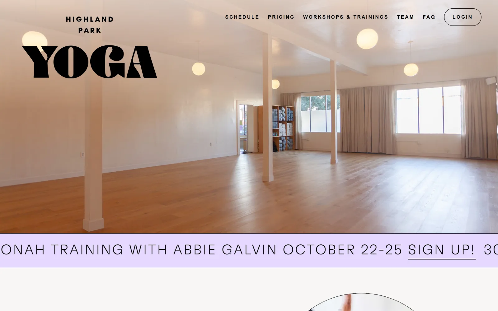
An empty studio with pale pink columns, globe pendants and an oak floor sits behind a heavy black YOGA lockup in the top left.
Type
GT Flexa 40px, 0.100em
Body
GT Flexa 30px / 1.20
Build
full-bleed photo, zero-height header
Made on
Custom JS framework
Colour
#f8f7f6 #000000 #e5d9ff
Type. GT Flexa does the display work at 40px, uppercase, tracked to 0.100em, with a 30px roman for running text, so the gap between display and body is only ten pixels. The wordmark is a separate and much heavier high-contrast cut with a spurred G and a clipped A. Nav drops to Poppins at 14px, weight 600, opened to 0.200em.
Colour. Near-white #f8f7f6 covers the whole page and black carries all 738 characters of ink. The one saturated value is a pale lilac #e5d9ff at 5.6 percent coverage, used for a single announcement band under the hero. No second accent, no tint on the controls, and the photograph supplies the only warmth in the frame.
Layout. A full-bleed interior photograph fills 1440px with the logo floated over it top left and the nav top right rather than inside a bar, so header height is effectively zero. The lilac band below runs edge to edge with its notice set at 40px and scrolling, which clips the first word. Section padding is 72px and radius is 0 apart from the pill-outlined login.
The ask. The only button is LOGIN, outlined rather than filled, which assumes an existing member. SCHEDULE and PRICING sit first in a six-item nav and carry the booking load instead. No phone number, no email capture, no price above the fold. The lilac band is the one timed ask, a training with a named teacher and a date.
Floating the logo and nav directly on the photograph removes the header bar, so the room reaches the very top of the viewport.
04
suiyoga.com
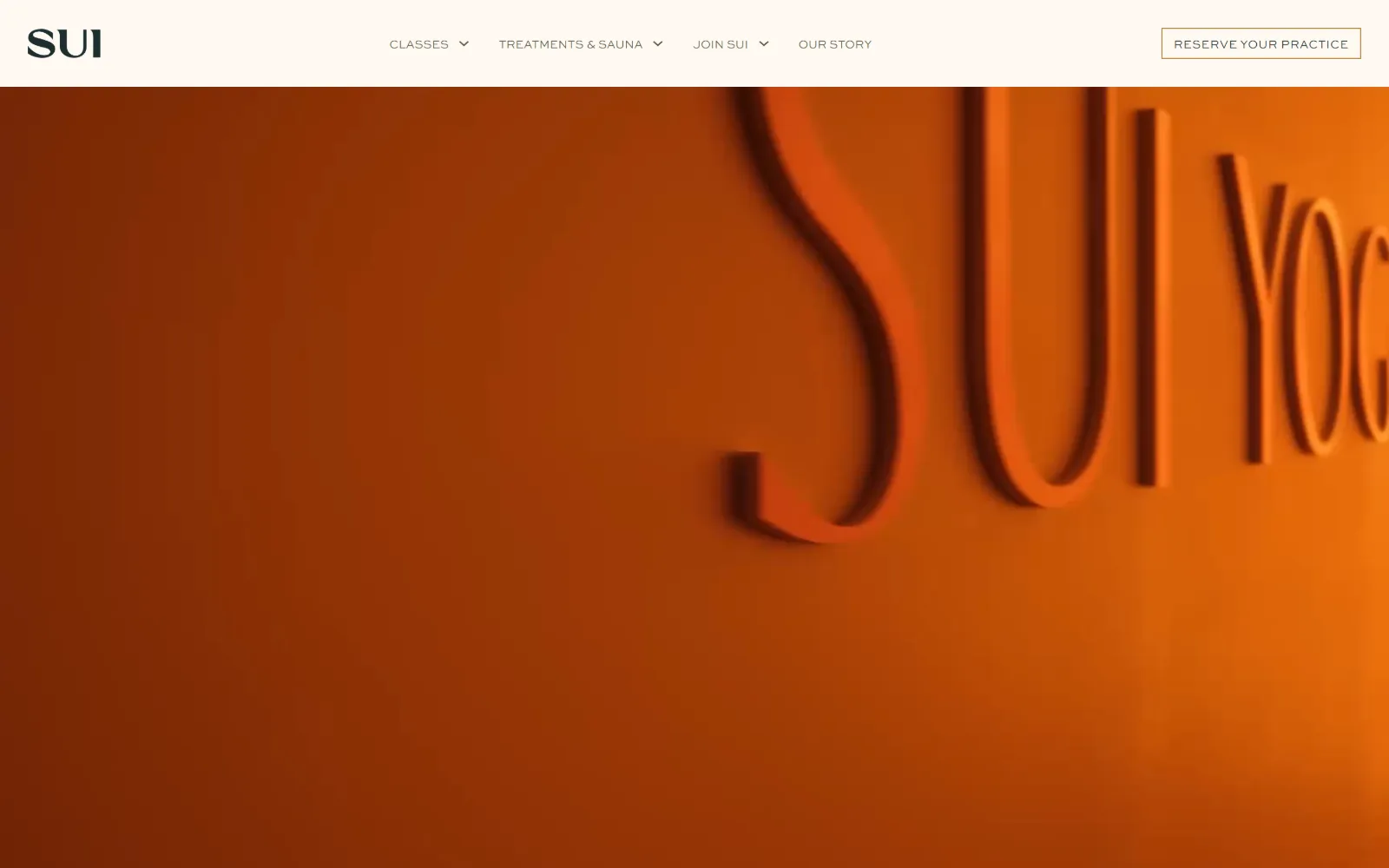
A burnt orange wall fills the frame with dimensional SUI YOGA lettering raking across it, lit so the letterforms cast shadows.
Type
Canela 53px
Body
Forum 16px
Build
sticky cream header, full-bleed video
Made on
WordPress
Colour
#f5f5ef #1c2e2f #b58036
Type. Canela at 53px is the largest cut on the page, with Forum at 16px as the body serif and Sweet Sans Pro at 12px, weight 300, uppercase in the nav. The hero carries no web type at all, since the headline is the physical signage on the wall, so the type only has to label things. Three faces, none of them raised above a murmur.
Colour. The measured page is nearly colourless: #f5f5ef at full coverage, a warmer #fff9f3 at 5 percent, ink split between an olive #555b3f in the nav and a deep green #1c2e2f in text, with #b58036 as the stated accent. All the saturation on screen belongs to the video, a single orange that would be unusable as an interface colour.
Layout. A sticky cream header sits above a full-bleed video that takes the rest of the viewport. Four nav items with dropdowns sit centre, the reserve control boxed in a 1px rule on the right. Section padding is 90px, radius is 0 throughout, and the document runs 6260px, so the signage frame is one chapter of a much longer page.
The ask. RESERVE YOUR PRACTICE is the single button and it is outlined rather than filled, which keeps it quieter than the four nav dropdowns beside it. No phone, no price, no email capture in view. TREATMENTS & SAUNA sits second in the nav, signalling a second revenue line before any booking is asked for.
Photographing the studio signage instead of setting a headline lets one frame carry the name, the brand colour and the material at once.
05
yogaspace.nyc
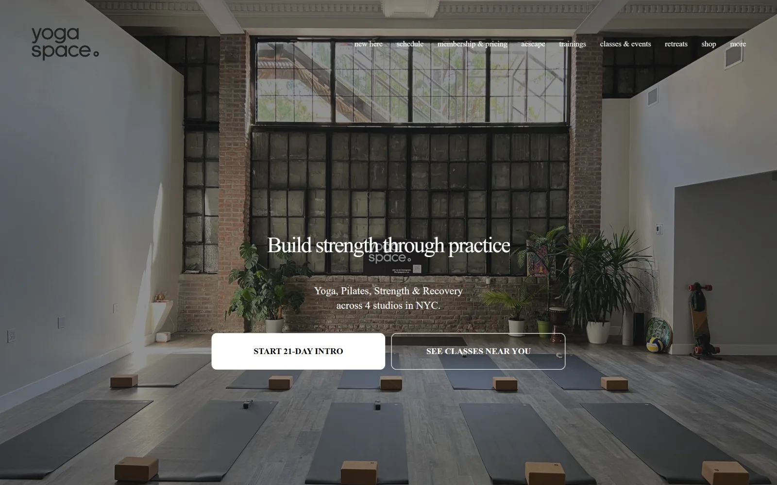
Mats and cork blocks line up across a loft floor under a tall factory window, two stacked buttons centred below the headline.
Type
Poppins 41px, -0.05em
Body
proxima-nova 19px / 1.40
Build
full-bleed photo, 26-column grid, 128px padding
Made on
Squarespace
Colour
#ffffff #121212 #99e0df
Type. Poppins at 41px, tracked in to -0.050em, carries the headline, and the supporting line drops to proxima-nova at 19px, a gap of 22 pixels. A third face, Josefin Sans at 16px with 0.120em tracking, appears only inside the buttons and only in lowercase. The lowercase wordmark with its small trailing circle is the one piece of custom drawing.
Colour. Six values. White leads on coverage, with #121212 and #202022 as the two near-blacks behind the hero scrim, and a mint #99e0df at 11.7 percent doing all the accent work further down the page. Ink is white over the photograph and black inside the filled button, so everything above the fold is grey apart from that mint.
Layout. A full-bleed photograph spans 1440px with a nine-item nav floated on it and no bar behind it. Below the fold the page runs on a 26-column grid with 11px gutters plus a two-column 268px split. Section padding is 128px, the deepest in this set, and buttons take a 10px radius against a page radius of 0.
The ask. Two asks sit side by side, START 21-DAY INTRO filled white and SEE CLASSES NEAR YOU outlined, which ranks the trial above the schedule without hiding either. Four locations are named in the subhead, so the second button works as a locator as much as a booking link. No phone number and no price above the fold.
Pairing a filled trial button with an outlined locator lets a multi-site studio make a sale and answer the where question in one row.
06
pranany.com
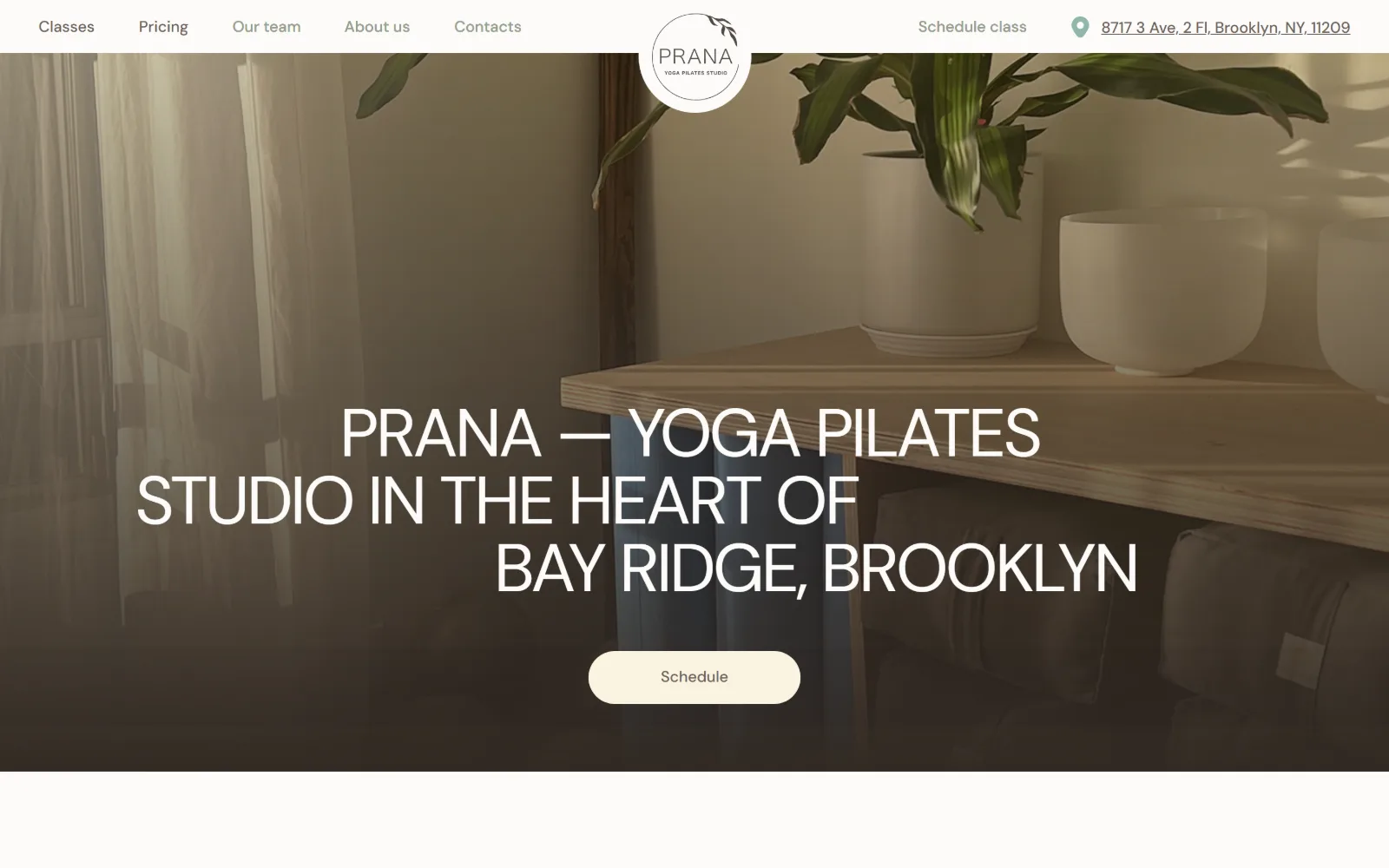
A sunlit corner with a potted plant, singing bowls on a timber shelf and rolled mats below, white type set across the centre.
Type
Pranafont 70px, -0.043em
Body
Pranafont 18px
Build
full-bleed photo, centred logo, 50px pill
Colour
#fcfbf9 #9fa9c5 #6c6159
Type. Pranafont, a custom grotesque, sets every rank: 70px uppercase for the hero statement at -0.043em, 35px below it, then 18px and 16px for nav and controls. One family, five sizes, no serif anywhere. The hero line breaks into three ragged lines that step inward, a deliberate choice given that the measure would allow two.
Colour. Four measured values with an unusually cool lead: off-white #fcfbf9 at 56.8 percent and a dusty periwinkle #9fa9c5 at 17 percent, the brand blue, which is not visible in the hero frame at all. Cream #faf3e1 fills the schedule pill. Ink is a warm grey-brown #6c6159 with a sage #96a18d second, both softer than black.
Layout. A transparent header puts five nav links on the left and the circular logo dead centre, with the street address set as the rightmost item. The hero photograph is full bleed with a dark gradient at its base to hold the white type. Corner radius is 50px on the one button against a page radius of 0, and the document runs 14711px, by far the longest here.
The ask. One pill button, Schedule, centred under the headline, with a Schedule class link repeating in the header. The address is the only contact detail offered, hyperlinked and placed where a phone number would normally go, which suits a neighbourhood studio whose argument is that it is close by.
Putting the street address in the header slot usually held by a phone number makes proximity the offer for a single-neighbourhood studio.
07
youryoga.com
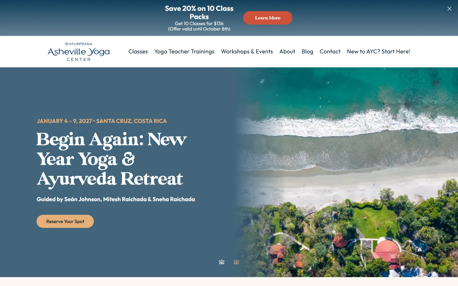
A split screen: a retreat headline in cream display serif on slate blue at left, an aerial shot of surf and jungle at right.
Type
GlamourAbsolute 62px
Body
Outfit 18px / 1.50
Build
split hero, 1440px, 20px pill
Made on
WordPress
Colour
#fdf8f4 #41657c #dd944b
Type. GlamourAbsolute runs a full display ladder, 62px down through 50, 44 and 39px, all at the same weight 500, so hierarchy comes from size alone. Outfit at 18px handles nav, body and the eyebrow, which is set uppercase in gold. The contrast between a high-waisted contemporary serif and a plain geometric sans is the whole type idea.
Colour. Six values, the most of any page in this set. Off-white #fdf8f4 and white carry the ground, a slate #41657c and a gold #dd944b each cover 36.7 percent as the two hero halves, and the button takes a hotter terracotta #ce523a. Ink is a near-navy #09202e. Gold, slate and terracotta is three accents, one more than the page needs.
Layout. A white header bar sits under a promotional strip, both full width. Below them the hero splits roughly 52/48 with the diagonal edge of the photograph cutting into the text panel rather than meeting it square. The container is the full 1440px, button radius is 20px, and two small lotus glyphs act as slider dots at the lower centre.
The ask. Three asks compete above the fold. A dismissible strip sells a ten-class pack with a price and an expiry date, a Reserve Your Spot pill books a 2027 retreat, and the nav ends on New to AYC? Start Here!. The retreat rather than a class gets the hero, which tells you where the margin sits.
Running a dated discount strip above the header lets a promotion sit over the hero without the hero itself having to become the promotion.
08
sagradawellness.com
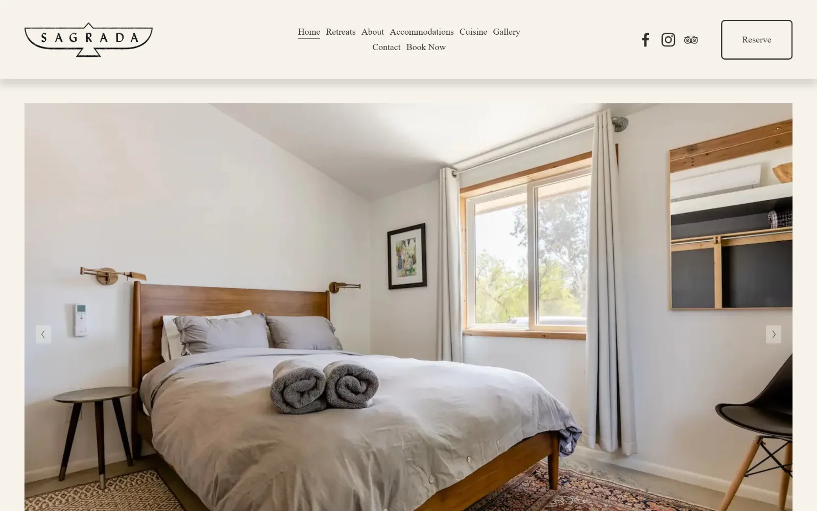
A guest room with a walnut bed, rolled grey towels and a bright window fills a bordered slider frame under a winged logo.
Type
Libre Baskerville 16px
Body
Libre Baskerville 16px / 1.50
Build
inset slider, 1440px, 139px padding
Made on
Squarespace
Colour
#f6f3ec #36302a
Type. Libre Baskerville at 16px is the entire type system, used for nav, body and the headings below, with Almarai at the same 16px inside the reserve control. The measured scale has two steps and both are 16px, so nothing on this page is set large. The drawn logo, letterspaced wide inside a winged badge, takes on the display job instead.
Colour. One measured value, a warm bone #f6f3ec, at 307.7 percent cumulative coverage across stacked sections, with #36302a as the ink and the button fill. There is no accent colour at all. Every hue on screen, the walnut headboard, the kilim, the green outside the window, belongs to the photograph rather than to the stylesheet.
Layout. An eight-item nav wraps onto two lines in the centre of the header, with social glyphs and an outlined Reserve box on the right. The slider sits inside the container with a visible margin on all four sides rather than running full bleed, arrows at its vertical centre. Section padding is 139px and radius is 5px on the button only.
The ask. Reserve is boxed top right and Book Now repeats as the last nav item, so the same ask appears twice within 100 pixels. Retreats, Accommodations and Cuisine read as a hotel menu rather than a class list, and no price or date appears above the fold. A TripAdvisor glyph sits with the two social icons.
Insetting the hero slider inside a margin rather than bleeding it makes a retreat read as a property listing rather than a class timetable.
09
urban728yoga.com
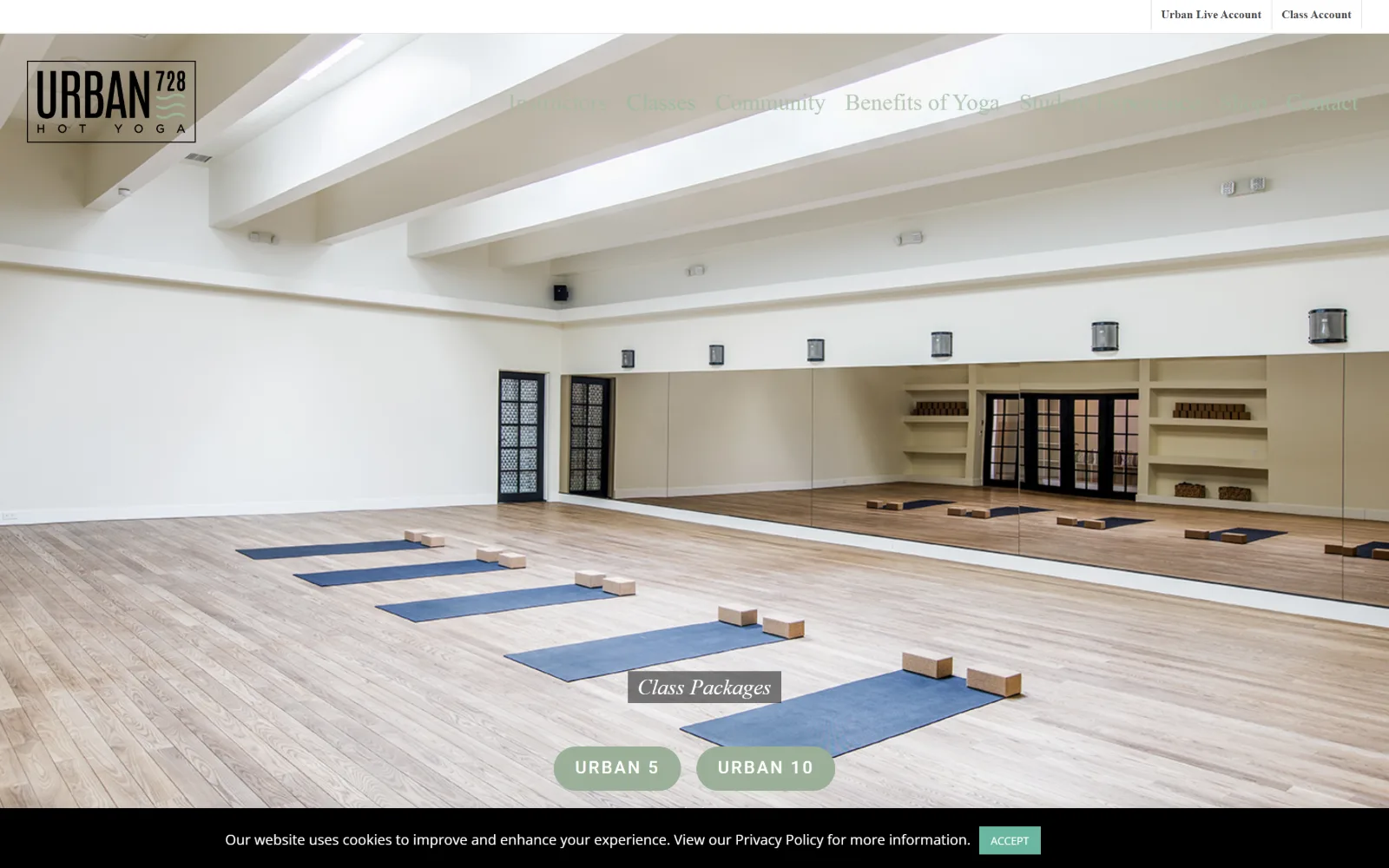
A mirrored room with five blue mats on pale oak, two sage pill buttons centred low and a cookie bar across the bottom edge.
Type. Pathway Gothic One, a tall condensed sans, runs the large sizes at 36px and 24px, while an italic Libre Baskerville at 22px with a 2.14 line height labels the hero block. Nav is Open Sans at 12px, weight 600, small enough that it vanishes against the bright ceiling behind it. Four families in total, one more than the page can hold together.
Colour. Six values. White and black dominate on coverage, with sage #9bb098 filling the pill buttons, a lighter #b8d3b6 behind them and #e5e5e5 for rules. Ink runs #494949 in the nav and a sage #a2baa0 on links. The saturation is entirely in that one green, which sits against the blue of the mats without being tied to it.
Layout. A thin account bar runs above a transparent header, so the nav floats over the photograph and loses contrast exactly where the ceiling is lit. The boxed logo anchors the top left. The hero is a full-bleed slider across 1440px with its caption and two pills centred low, and those pills carry a 200px radius against a page radius of 0.
The ask. CLASS SCHEDULE sits in the nav while the hero asks for a package instead, URBAN 5 or URBAN 10 as two pills of equal weight, which puts a pricing decision before a first visit. Two account links sit above the nav for returning students. No phone number and no trial offer anywhere above the fold.
A transparent header over a bright photograph needs a scrim or a dark cap, or the nav disappears precisely where the image is lightest.
10
yogasoup.com
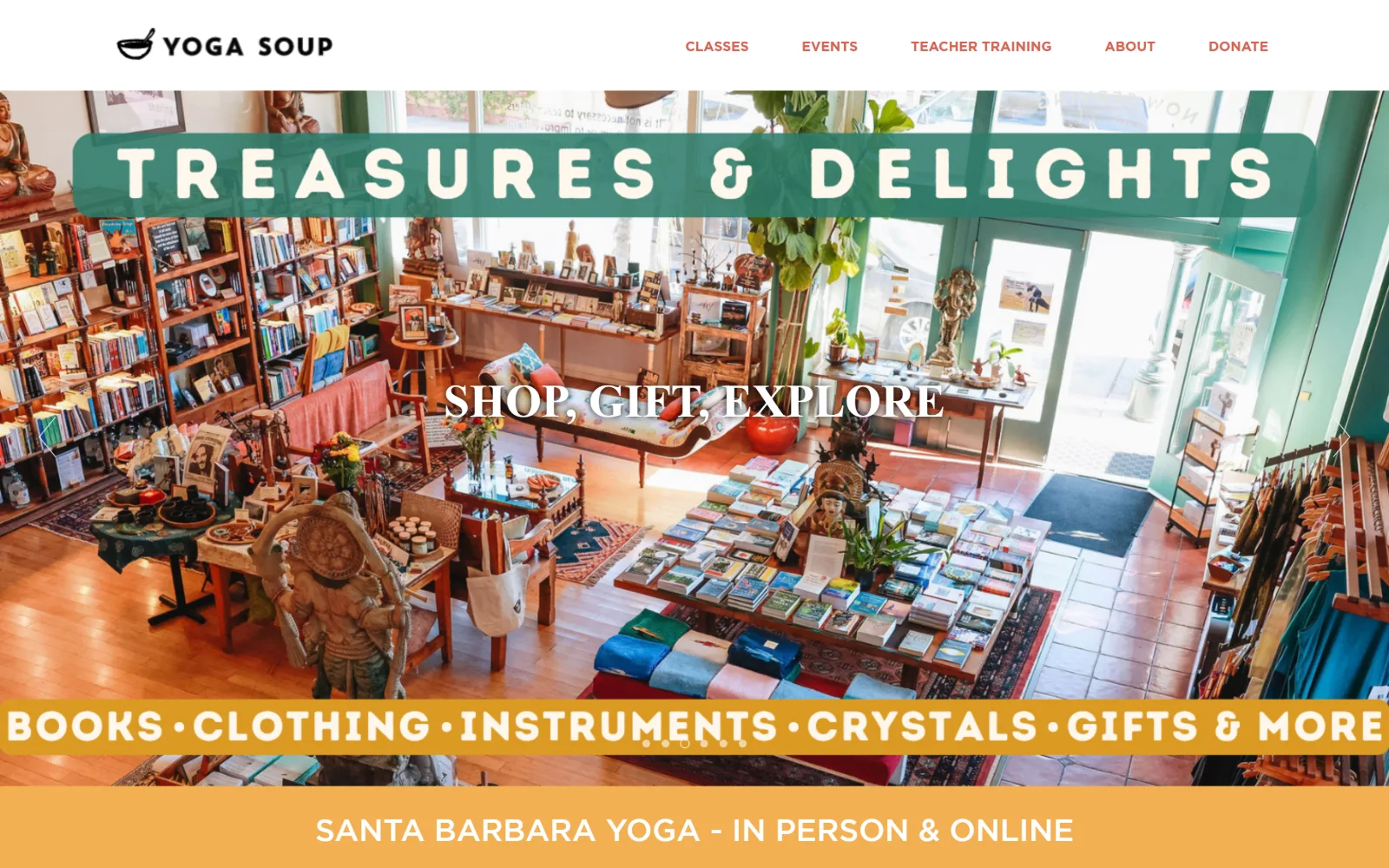
An overhead view of a shop full of books, mats and brass statues, captioned by two chunky banded headlines in teal and amber.
Type
brandon-grotesque 48px, uppercase
Body
Gotham 30px / 1.50
Build
full-bleed slider, overlaid colour bands
Made on
WordPress
Colour
#ffffff #f3af52 #c55949
Type. brandon-grotesque at 48px, uppercase, sets the banded TREASURES & DELIGHTS title, with Gotham at 32px uppercase and 30px roman underneath it. The bands are the device: white type knocked out of coloured blocks sized to the line, which reads as hand-painted signage rather than as web type. Nav is Gotham 14px, weight 700, in terracotta.
Colour. Four values with unusually high saturation for this set: white at 45.5 percent, amber #f3af52 at 28.9 and terracotta #c55949 at 25.8, with a blue #168cb9 reserved for the button fill alone. Teal appears only inside the photograph and the upper band. Nav ink softens to #d96252. Nothing on the page is grey.
Layout. A white header sits above a full-bleed slider at 1440px. Two coloured bands overlay the photograph, one near the top and one near the base, each sized to its own text rather than to the grid, with a third flat amber strip below carrying the locator line. Button radius is 23px and the slider dots sit inside the lower band.
The ask. The hero sells retail rather than classes: SHOP, GIFT, EXPLORE over a list reading books, clothing, instruments and crystals. The booking ask, JOIN US FOR A MONTH, is a blue pill further down, and DONATE closes a five-item nav. Three revenue lines compete and the schedule is not the one placed in front.
Sizing a colour band to its own text rather than to the container turns a caption into signage that can sit anywhere on a busy photograph.
11
sonicnyc.com
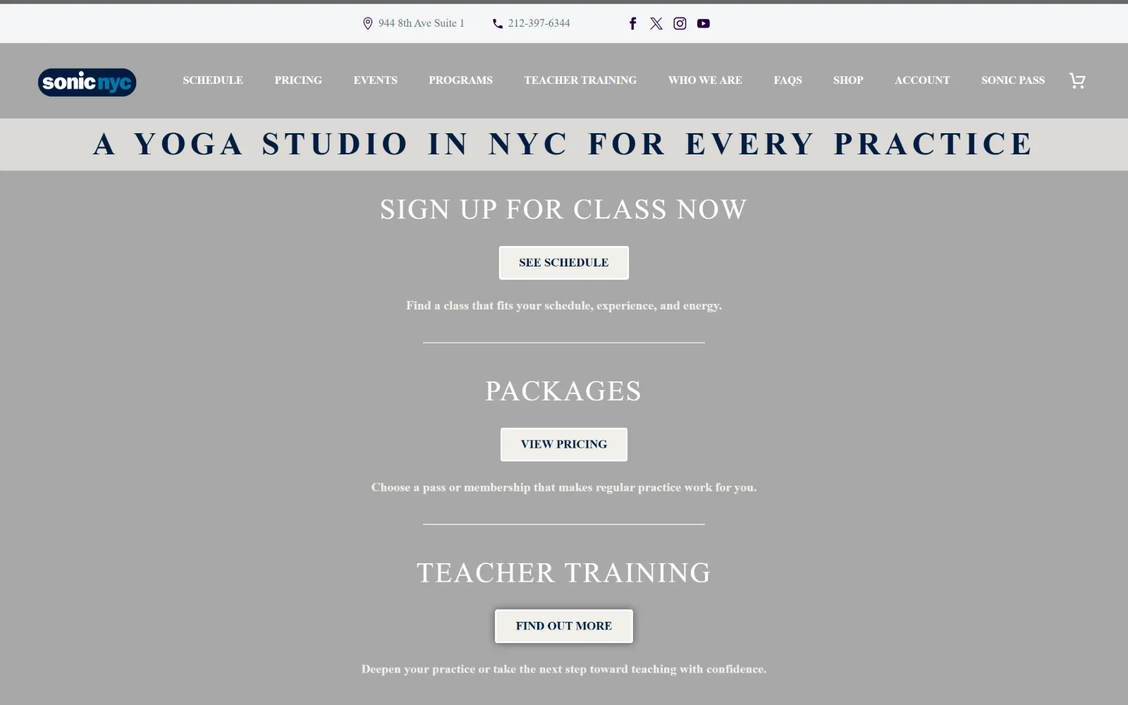
A wide letterspaced line announcing a yoga studio in NYC sits above three stacked headings, each with its own pale button.
Type
Montserrat 41px, 0.137em
Body
Montserrat 23px / 1.43
Build
two-row header, 1440px, 100px padding
Made on
WordPress
Colour
#ffffff #000000 #f1f0e9
Type. Montserrat does everything across eight measured steps. The locator line runs 41px, weight 700, uppercase, opened to 0.137em, and the three section headings sit at 36px, weight 500, at 0.050em, used twelve times. Body drops to 23px at 1.43 line height. That wide tracking on the top line is what gives a single sentence the weight of a masthead.
Colour. Three values: white at 196.9 percent cumulative coverage, black at 47.3 and a cream #f1f0e9 at 4.6 that fills every button. Ink is a charcoal #22242d in running text and a navy #011c40 inside the buttons, which is the only chromatic value anywhere. The hero is declared a flat field, not a photograph, so type carries the whole frame.
Layout. A contact strip holding address, phone and four social glyphs sits above an eleven-item nav bar, so the header stack is two rows deep before any content begins. The container is the full 1440px, section padding is 100px, radius is 3px on the buttons, and the body then repeats a centred heading, button, one-line explainer and rule three times over.
The ask. Three asks in a single column, SEE SCHEDULE then VIEW PRICING then FIND OUT MORE, each with one line of justification beneath it, so they read as a sequence rather than as rivals. The phone number sits in the top strip beside the address, and a cart plus an ACCOUNT link serve returning students.
Stacking three asks vertically with one line of reasoning each turns competing buttons into a funnel the visitor reads in order.
12
practiceyogaaustin.com
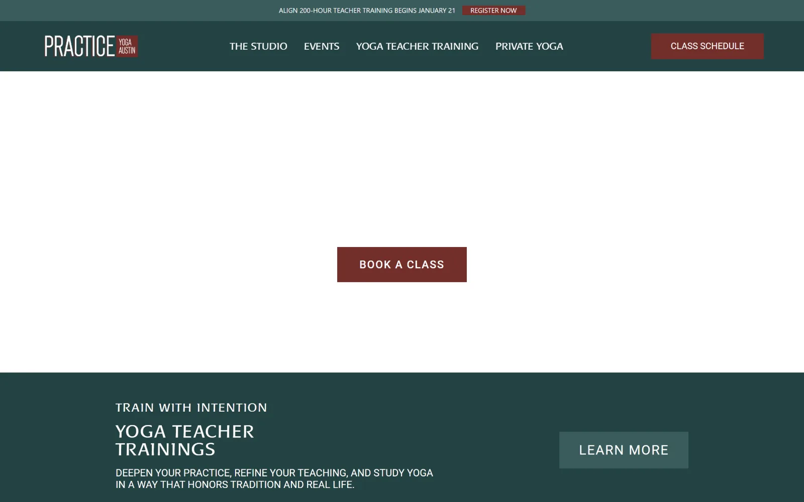
A dark green header and a maroon BOOK A CLASS button sit above an open white hero, with a teal teacher training band below.
Type
Baar Metanoia 56px, 0.027em
Body
Roboto 18px, uppercase
Build
full-width bands, 1440px, 0 radius
Made on
WordPress
Colour
#ffffff #234242 #3a5c5c
Type. Baar Metanoia, a quirky uppercase display sans, runs 56px down to 18px across five ranks and sets the nav as well, so navigation and headlines share one face. Roboto handles the running lines at 24px and 18px, uppercase, tracked to 0.063em. Letting the display face down into an 18px nav is what gives the header its handmade character.
Colour. Four values. White is the ground, a deep teal #234242 at 46.3 percent coverage fills the header and the training band, a lighter #3a5c5c at 34.4 takes the secondary button, and a brick #722e2a at 1 percent is held back for the two primary calls to action. Ink is white with a sand #c2a97c used only on the eyebrow line.
Layout. An announcement strip, a dark green bar and a full-width hero stack to the top of the 1440px viewport. The teacher training band below sets its text left and its button right across the full width with no container inset at all. Button radius is 0 throughout, which matches the squared logo lockup in the top left.
The ask. The same ask appears twice within one screen, CLASS SCHEDULE boxed in the header and BOOK A CLASS centred in the hero, both in the brick accent. A third, REGISTER NOW, sits in the announcement strip for a dated teacher training. With only four nav items the page is closer to a booking page than to a brochure.
Reserving one accent colour for booking and a lighter tint of the brand colour for secondary links keeps a four-item nav unambiguous.
How these were chosen
Twelve studios, and what they share is that not one of them leads with a person. Seven open on a room instead: mats laid out on an empty floor, a shop counter seen from above, a loft under factory windows, a guest bedroom at a retreat. The rest open on lettering. Radius is 0 on all twelve, cream or off-white is the ground on four, and the accent is usually a single hue held back for one button. What does not hold is the assumption that yoga studio website design needs a large headline. Five of these have no measured headline at all, one sets its navigation at 158px and treats that as the artwork, and one runs its display type at 16px. The real split is between studios selling a schedule, which front a button and a price, and studios selling a room, which front the room and let you go looking for the schedule.
Finding yoga studio sites that someone had actually designed took far longer than it should have. 44 candidates made the shortlist. 12 made the page.
Each one was opened and looked at properly: what the type is doing, where the colour gets spent, how the page is built, how it asks for the job. Nothing is here because it ranks. Nothing is here because an agency filed it under portfolio. Several well known names were left out for the plain reason that their site came out of the same template as everyone else's, and a few sites worth including did not survive a second look.
Where a site is only competent, it says so. The order is the order worth your time, best first.
Reviewed and selected by Larry W. Matthews for Websitely.