Spa Website Design Where the Video Does the Selling
Nine spas, bathhouses and plunge clubs that lead with video. Spa website design here is one accent colour and a booking button louder than everything.
Shown
9 sites
Reviewed
35 candidates
Chosen on
The work, not the ranking
Updated
15 October 2026
01
wthn.com
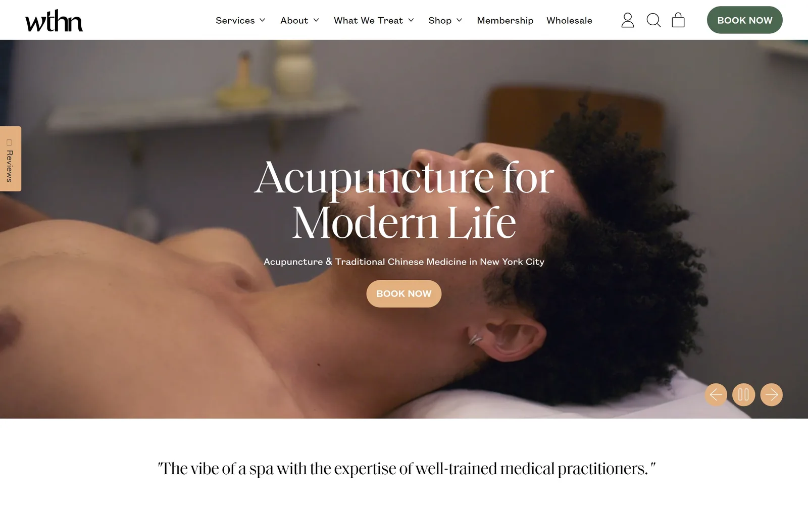
A white navbar over full-bleed treatment footage, with an 81px serif headline and a peach Book Now pill centred beneath it.
Type
Saol serif, 81px
Body
Founders Grotesk, 18px
Build
12-col, 1440px container, full-bleed video hero
Made on
Shopify
Colour
#f6e8da #e2af7f #4c6750
Type. The headline is Saol, a high-contrast display serif, set at 81px with a tight -0.025em track and a 1.0 line height. Everything else is Founders Grotesk at 18px, regular weight, no tracking adjustment, sentence case. The serif carries all the warmth and the grotesk stays out of the way, which is why a nav label like What We Treat reads as instruction rather than branding.
Colour. White #ffffff runs the chrome and the body, with a sand #f6e8da used for alternating bands further down. The accent is a peach #e2af7f, spent on exactly two things: the Book Now pill under the headline and the three carousel controls bottom right. The header's own Book Now sits in deep green #4c6750, so the two booking buttons are deliberately not the same colour.
Layout. A 12-column grid of 71px columns with 45px gutters on a 1440px container. The hero is full-bleed video roughly 930px tall with the headline, one 18px subline and a single button stacked on the centre axis. Nothing is rounded except the pill buttons; every other corner is square.
The ask. Book Now appears twice above the fold, in the header and in the hero, and the subline names New York City so the click is qualified before it happens. A Reviews tab is pinned to the left edge and the carousel offers pause and arrows, which is all that competes. The first thing below the fold is a pull quote in the same serif rather than a services grid.
One accent colour, spent only on the thing you want clicked, does more work than a full palette.
02
hiatusspa.com
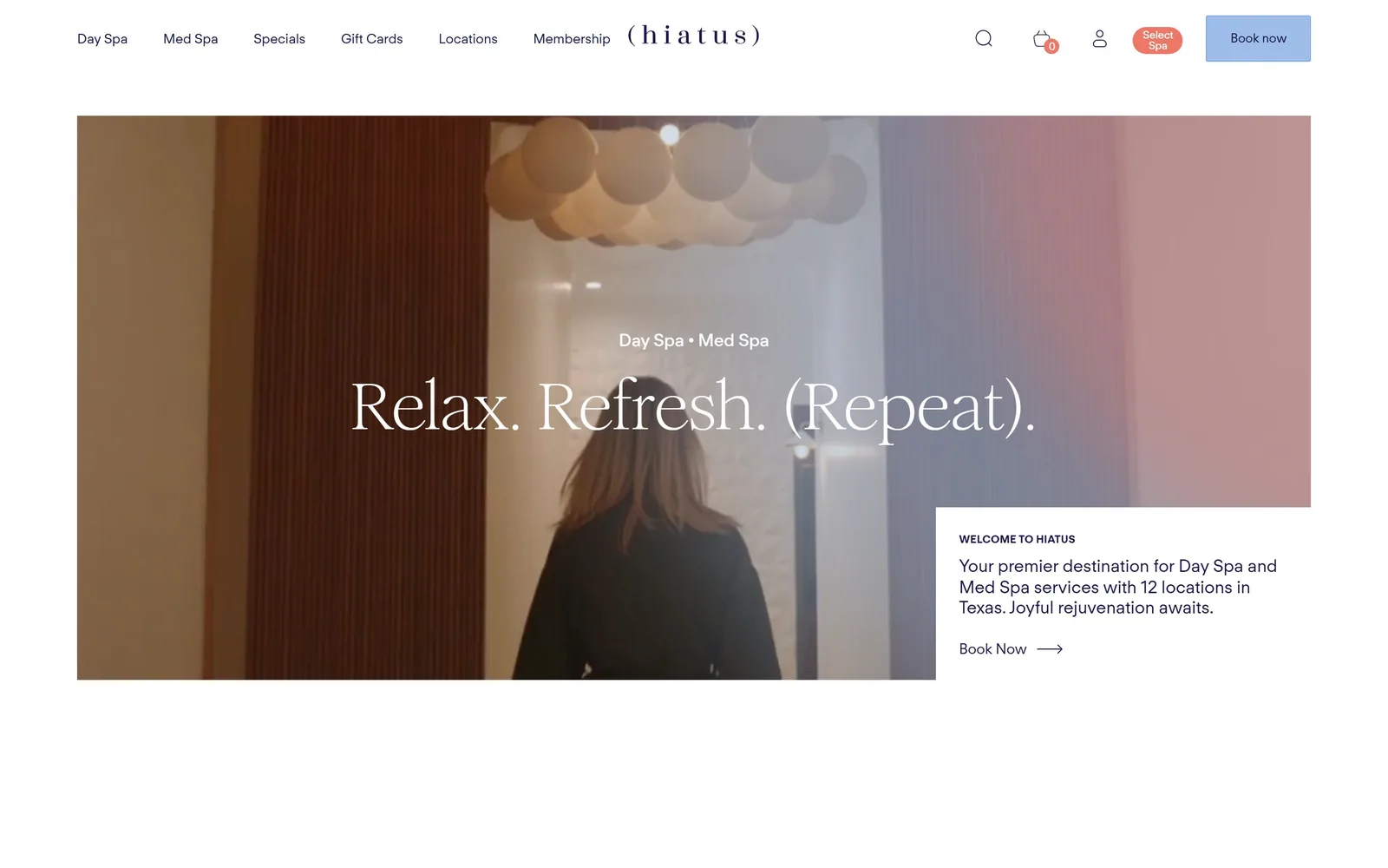
Inset video hero with a Relax. Refresh. (Repeat). serif headline and a white welcome card notched into its bottom right corner.
Type
high-contrast serif, ~60px
Body
FT Regola Neue, 19px
Build
3-col 556/136/556, inset video hero
Made on
Webflow
Colour
#1a174b #aec9ed #ee7868
Type. The headline is a high-contrast serif with very fine hairlines, set white at roughly 60px, and the brackets around (Repeat) are carrying the joke. Running text is FT Regola Neue at 19px, weight 400, line height 1.5, no tracking. The wordmark is that same sans spaced out to about 0.4em, so ( h i a t u s ) works as a logotype without anyone drawing a mark.
Colour. The ground is plain #ffffff and every piece of ink is a navy-violet #1a174b, never black. Two accents split the header: powder blue #aec9ed on Book now and a coral #ee7868 on the small Select Spa pill. Blue and coral at that saturation is a decision, not the beige this category defaults to.
Layout. A three-column grid at 556px / 136px / 556px inside a 1440px frame, so the hero video sits inset with white margin all round rather than bleeding. The welcome card overlaps the video's bottom right corner and breaks its edge, which is the only structural move on the page. Corners are square throughout.
The ask. Book now sits in the header and again as an arrow link inside the overlap card, and that card does the explaining, naming twelve Texas locations so visitors self-select. Select Spa is the real primary action, because booking needs a branch chosen first. Nothing else above the fold asks for anything.
Let one element break the edge of another and a flat layout gains depth without a single shadow.
03
heydayskincare.com
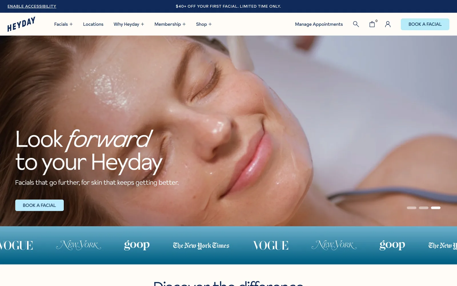
Close-up facial footage behind a 72px headline where the word forward turns italic, with an ice-blue Book a Facial button.
Type
Sunset Gothic Light, 72px
Body
Sunset Gothic Light, 20px
Build
12-col 82px, 1440px, carousel hero
Made on
Shopify
Colour
#0f2a59 #b6ebf9 #fffcf8
Type. Sunset Gothic Light at 72px, tracked in to -0.03em with a 1.0 line height, and the single italic word in Look forward to your Heyday is the only typographic flourish on the screen. Body runs 20px in the same light cut. Buttons drop to 14px uppercase in the regular weight, which keeps them quiet next to that headline.
Colour. Navy #0f2a59 is the ink everywhere including the nav, over a warm white #fffcf8 that covers about 46% of the page. The accent is an ice blue #b6ebf9 and it lands on one button, with a pale yellow #fceaa8 held back for later sections. Blue on navy on warm white is a skincare palette with no pink in it, which is the whole idea.
Layout. A 12-column grid of 82px columns with 24px gutters at full 1440px width and 48px section padding. The hero is a three-slide carousel running behind a left-aligned text block, and the band immediately under it is a teal gradient strip of Vogue, New York, goop and NYT marks scrolling sideways. Radius is 6px on buttons and 0 elsewhere.
The ask. Book a Facial sits in the header and again under the headline, and the announcement bar above both offers $40+ off a first facial. Membership gets its own nav item and a second ask further down the page. Cart, search and an accessibility link share the header row, so the booking button has to win on colour rather than position.
Italicising one word of a headline costs nothing and reads as more considered than adding a second typeface.
04
nordicspaklub.com
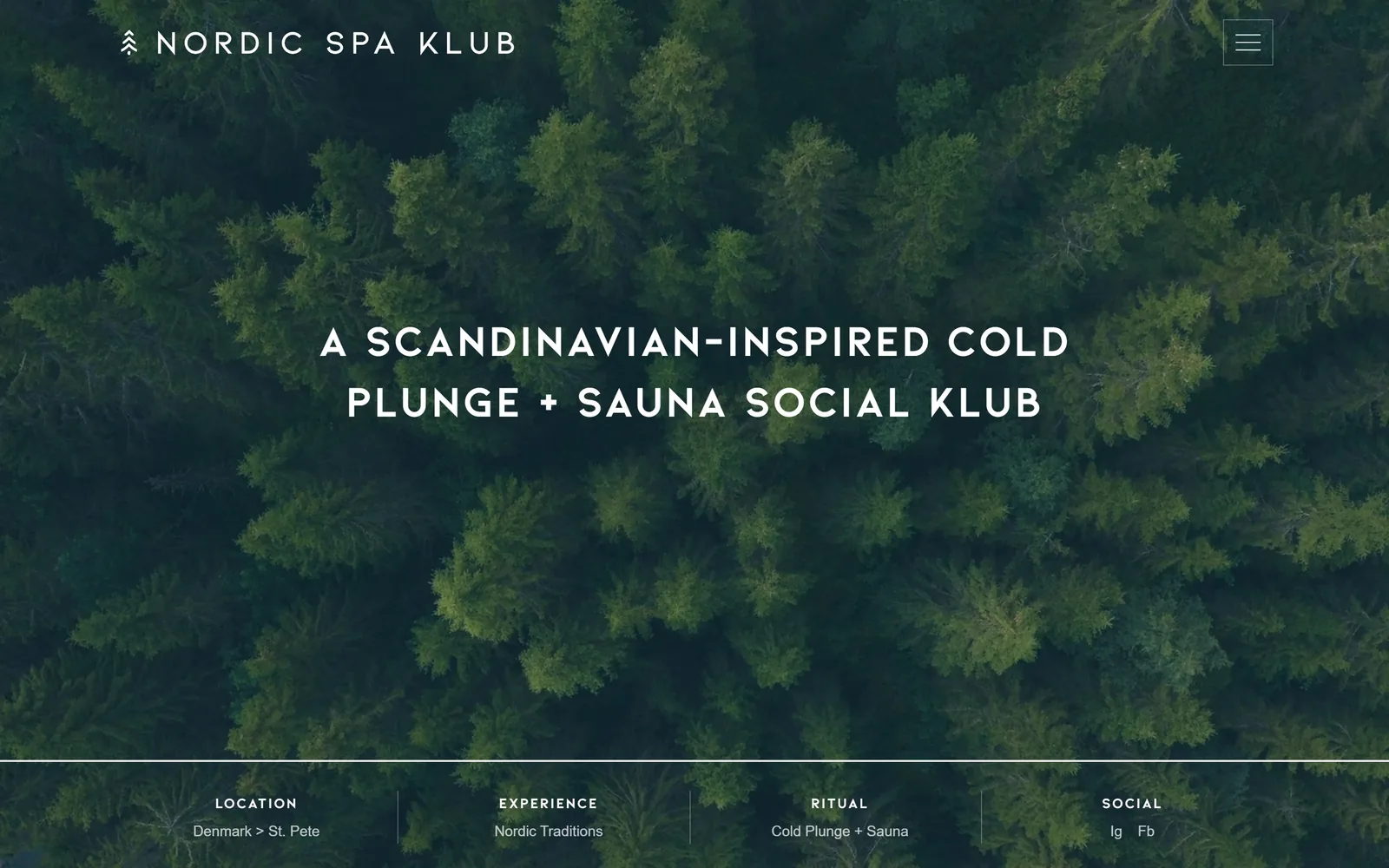
Aerial drone footage of dark pine forest with a 45px uppercase geometric headline and a four-column information strip across the base.
Type
Kiona Bold, 45px caps
Body
Sen, 15px
Build
1440px full-bleed video, 4-col base strip
Made on
WordPress
Colour
#ffffff #141414 #2f4a33
Type. Kiona Bold at 45px, all caps, tracked out to 0.044em and centred over two lines, with the wordmark in the same face at a smaller size. Secondary labels drop to 15px caps at 0.1em. There is no serif anywhere and no second family, which is rare in this set and is exactly why it reads as assured rather than underdressed.
Colour. The entire palette above the fold is white #ffffff type over the greens of the footage, somewhere around #2f4a33, with #141414 held for ink below. No accent colour exists on this screen at all. For a cold plunge business that restraint is a position, not an unfinished palette.
Layout. A 1440px full-bleed video with the headline centred vertically and nothing else in the frame. A hairline rule crosses the full width near the base and divides into four labelled columns, Location, Experience, Ritual and Social, each carrying one line of value. The hamburger sits in a square 1px box top right.
The ask. There is no button above the fold, which is unusual and slightly risky. The base strip is the entire pitch, telling you it is Denmark by way of St. Pete and the ritual is cold plunge plus sauna. Booking only turns up after a scroll under Join the Klub, so the hero does branding work and nothing else.
A four-field strip at the base of a hero answers who, what and where without spending a single headline word.
05
tenthousandwaves.com
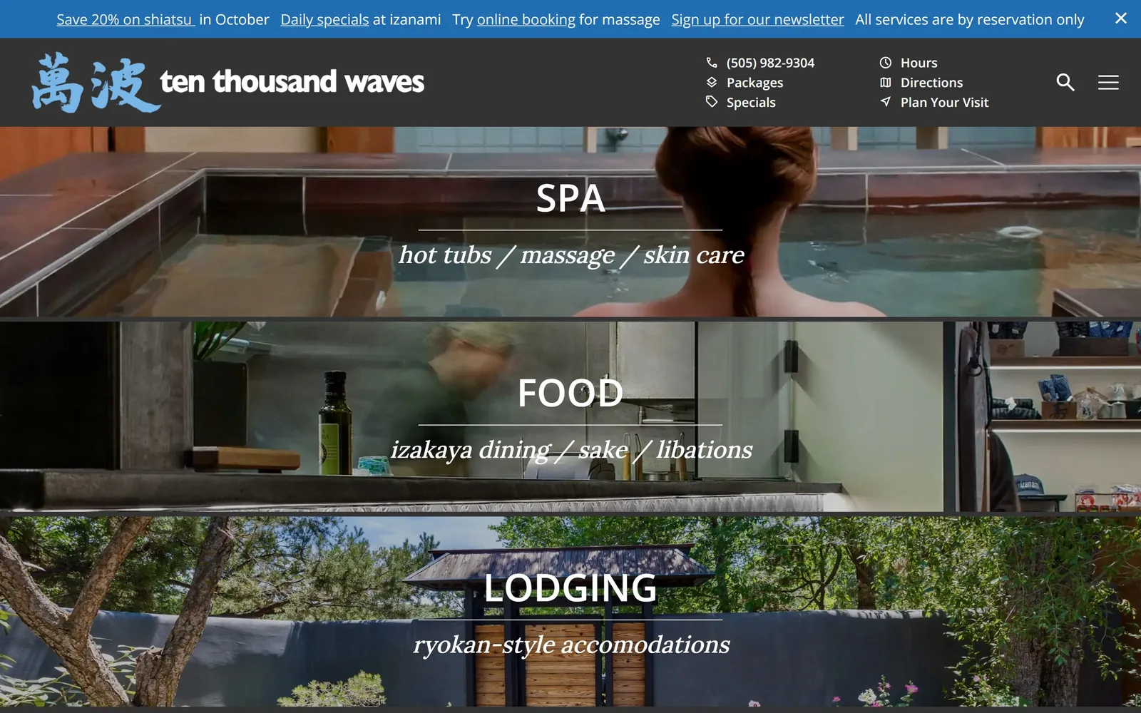
Three stacked photo bands labelled SPA, FOOD and LODGING in white caps, each with an italic serif subline under a thin rule.
Type
Open Sans, 48px caps
Body
Open Sans 18px with Lora italic
Build
three stacked full-width photo bands
Made on
custom
Colour
#206db1 #333333 #fdf8f2
Type. Open Sans semibold at 48px, uppercase, for the three band labels, against an italic Lora subline separated from it by a hairline rule. Nav and body both sit at 18px Open Sans. The pairing is not expensive, but putting the italic serif under a rule under the caps gives each band its own small masthead.
Colour. A blue #206db1 announcement bar, a near-black #333333 header, and a warm paper #fdf8f2 for the page body. The photography supplies all the colour, so the interface stays neutral on purpose. That blue is the weak link and reads more like a default link colour than a brand decision.
Layout. Three full-width photo bands fill the whole 1440px viewport instead of one hero, each roughly 330px tall with its label block centred. The header carries the phone number plus six icon-labelled utility links stacked in two columns. Below the bands the content drops to a three-column 218px grid with 32px row gaps.
The ask. The page does not ask you to book. It asks which of three businesses you came for, which is honest for a place that is a bathhouse, an izakaya and an inn at once. The announcement bar carries four separate links including a 20% shiatsu offer, and reservations hide behind Plan Your Visit, one click further than they need to be.
If you run three businesses off one address, split the hero three ways instead of making visitors guess from a nav.
06
thenowmassage.com
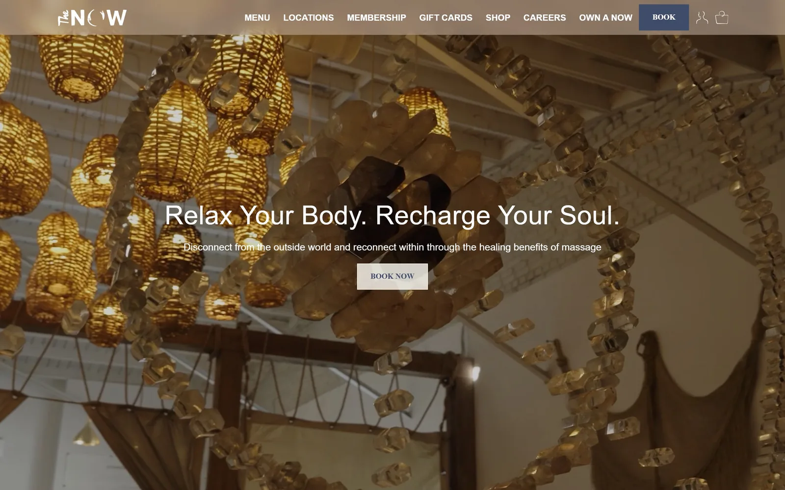
Backlit citrine crystal chandelier footage behind a 48px white headline and a small cream Book Now button, all centred.
Type
house display sans, 48px
Body
house sans, 18px
Build
1230px container, full-bleed video hero
Made on
custom
Colour
#fefcf5 #bea998 #404d6a
Type. The display face is a soft-edged sans at 48px with a slight 0.01em positive track, which stops Relax Your Body. Recharge Your Soul. from tightening up at that size. Body is 18px at a 1.56 line height. Nav items are uppercase 16px semibold and button text drops to 14px uppercase, so the scale steps down in clear stages rather than drifting.
Colour. Cream #fefcf5 is the house ground, tan #bea998 pulls straight out of the photography, and navy #404d6a does the buttons. The navy appears exactly once above the fold, on the header BOOK. Cream and tan is the predictable massage palette; the navy is the thing stopping it being anonymous.
Layout. A 1230px container over full-bleed video. The hero skips the eyebrow entirely: headline, one line of body, one button, stacked on the vertical axis. The header runs nine items plus account and bag icons at identical weight, which is a lot of navigation for a business that sells one thing.
The ask. BOOK sits top right in navy and BOOK NOW again in the hero in cream, so the second ask is visually quieter than the first. Gift Cards, Shop and Own a Now compete in the same header row, and Own a Now is a franchise pitch sharing space with a consumer booking. The hero copy explains the benefit before asking, which most massage chains skip.
Pick the one photograph nobody else in your category could have taken and give it the entire screen.
07
plunj.co
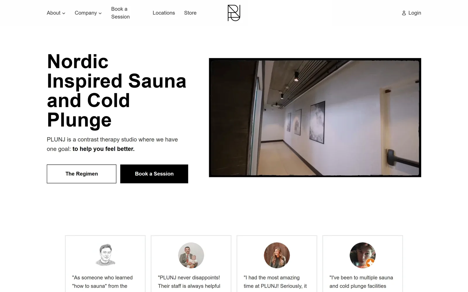
Black Helvetica headline stacked left of a video panel with a torn paper edge, above two square buttons and four review cards.
Type
Helvetica Neue, 60px / 600
Body
Helvetica Neue, 18px
Build
1150px container, 435/653 two-col hero
Made on
custom JS
Colour
#ffffff #000000 #333333
Type. Helvetica Neue semibold at 60px with a 1.0 line height and zero tracking, about as plain as a display setting gets, which is plainly the point for a contrast therapy studio. Body is 18px regular at 1.63 in #333333 rather than black. One sentence bolds its back half, to help you feel better, and that is the only emphasis anywhere on the screen.
Colour. White #ffffff covers nearly everything, with #000000 for the headline and the filled button. There is no accent colour at all. For a brand selling heat and cold, having neither a warm nor a cool tone anywhere reads as a missed opportunity rather than a statement.
Layout. An 1150px container, narrower than anything else in this set, split into a 435px / 653px two-column hero with a 64px gutter. Section padding is 80px and every corner is square. The video panel is masked with a hand-torn edge, the only soft shape on an otherwise rigid page.
The ask. Two buttons sit side by side, The Regimen outlined and Book a Session filled black, offering education and booking as equals. Book a Session repeats in the nav. Directly below the fold are four customer quotes in 1px bordered cards, which puts proof ahead of the service list instead of after it.
Setting a headline in plain Helvetica works when the business genuinely is plain, and falls apart when it is a pose.
08
olympusspa.com
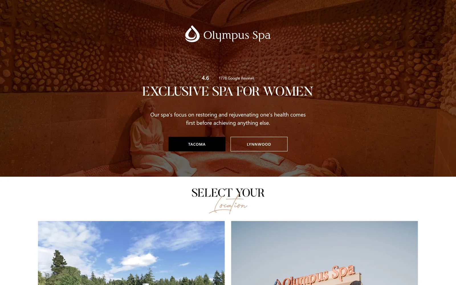
Terracotta-washed jade room photograph behind an uppercase serif headline, a Google rating line and two location buttons.
Type
Butler caps 40px, Liberty script 62px
Body
system sans, 12px
Build
1440px centred hero, two-card grid
Made on
WordPress
Colour
#d28255 #575756 #000000
Type. The headline is Butler, a contrasted serif, at 40px uppercase above a 12px caps label tracked to 0.085em. Below the fold a script face, Liberty, runs at 62px for the word Location under a Butler caps line, a pairing that usually fails and here just about holds. Body falls back to the system sans, which is the weakest thing on the page.
Colour. The hero photograph is pushed hard into terracotta, roughly #a8582f through #c97a4e, while the interface sits in white #ffffff with grey #575756 and a terracotta #d28255 for the script word and small accents. Buttons are solid #000000 and white outline. Almost all the warmth comes from the photo rather than from declared brand colours.
Layout. A 1440px full-width hero about 770px tall with everything centred on the vertical axis: rating, headline, body, buttons. Below it a grid declared as 590px / 590px / 0 / 0 with 20px gaps, which in practice is two cards. Every corner is square and nothing is rounded.
The ask. There is no Book Now. The two buttons are Tacoma and Lynnwood, forcing a location choice as the first action, and 4.6 from 1,778 Google reviews sits directly above the headline as proof. Repeating that same location choice as two large cards immediately below is redundant; the second pass adds nothing the buttons did not already do.
Putting the review score above the headline instead of in a footer badge makes it part of the pitch.
09
goldendoor.com
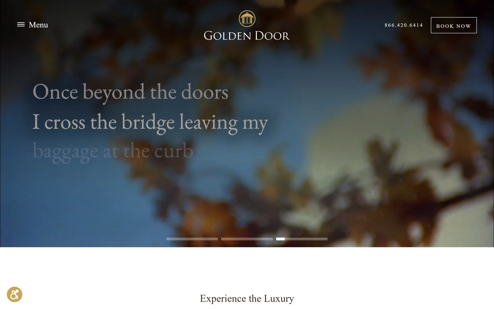
Out-of-focus autumn leaves against blue sky, a three-line poem fading in, and a gold arch mark above a Trajan wordmark.
Type
Trajan Pro, 34px
Body
Rustica, 18px / 300
Build
1440px, 100px padding, full-bleed video slider
Made on
WordPress
Colour
#c9a555 #ffffff #69504c
Type. Trajan Pro, the inscriptional Roman capital, sets the wordmark and the 34px section headings, the most conservative luxury choice available and a fair match for a resort of this vintage. The poem across the hero runs in a lighter serif at display size. Body is Rustica at 18px weight 300, which leaves the running text noticeably frail beside those headings.
Colour. Gold #c9a555 is the brand colour and covers close to 29% of the page across buttons and rules. The hero contributes its own blues and rusts straight from the footage. White text over blurred video is the only treatment above the fold, with no solid panel anywhere to anchor it.
Layout. A 1440px frame with 100px section padding and a three-column 400px grid below the fold. The hero video runs about 1,000px tall with a four-segment progress bar at its base, and the menu stays collapsed behind a labelled hamburger even at desktop width. The slider is mid-transition in this capture, so the poem's third line is still fading up.
The ask. A phone number and an outlined BOOK NOW top right are the entire ask above the fold: no price, no date picker, no offer. For a destination resort selling week-long stays that is the right restraint, because the real conversion is a phone call. The hamburger hides roughly forty menu items, which is where the work actually sits.
Soft-focus footage behind type only works when the type is large and the business is already known.
How these were chosen
Nine American spas, bathhouses and medi-spas, from a Santa Fe onsen that also runs a restaurant and an inn to a one-room cold plunge klub in St. Petersburg. Most lead with video rather than a still photograph, and the ones that work treat the footage as the whole argument instead of as a backdrop for a slogan. Good spa website design in this set comes down to two decisions: one accent colour used sparingly, and a booking button louder than anything else in the header. The weaker entries stack three competing asks above the fold, usually a promo bar, a popup and a nav link, before a visitor has seen what the place looks like. Most pair a serif for display with a grotesk for everything else, so the handful that refuse that formula are the pages worth the longest look.
Finding spa sites that someone had actually designed took far longer than it should have. 35 candidates made the shortlist. 9 made the page.
Each one was opened and looked at properly: what the type is doing, where the colour gets spent, how the page is built, how it asks for the job. Nothing is here because it ranks. Nothing is here because an agency filed it under portfolio. Several well known names were left out for the plain reason that their site came out of the same template as everyone else's, and a few sites worth including did not survive a second look.
Where a site is only competent, it says so. The order is the order worth your time, best first.
Reviewed and selected by Larry W. Matthews for Websitely.