Med spa website design lives or dies on the price list. Sixteen US aesthetics clinics, read for what they put above the fold and what they hide.
Shown
16 sites
Reviewed
30 candidates
Chosen on
The work, not the ranking
Updated
15 October 2026
01
lyevbeverlyhills.com
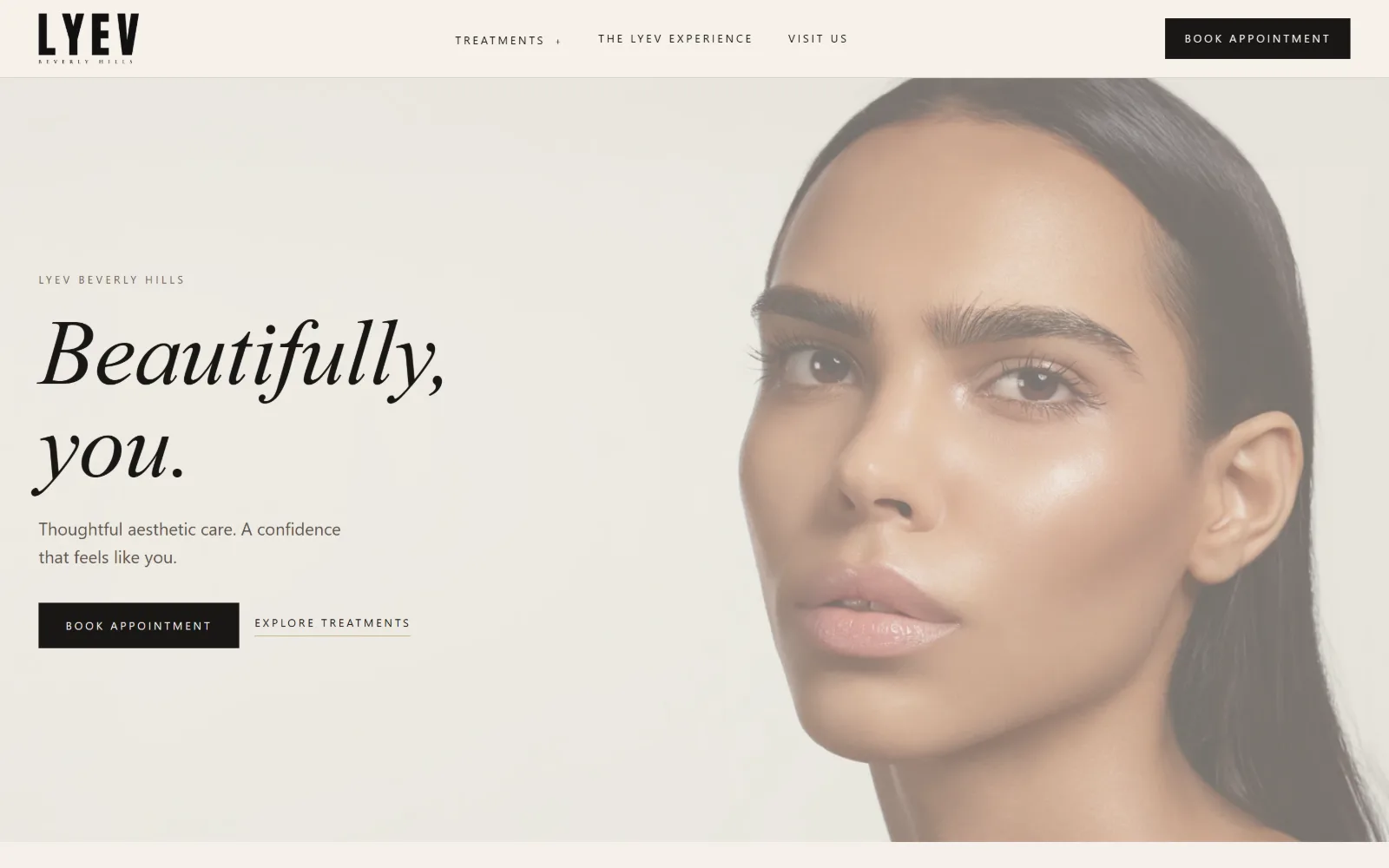
A pale ground carries an italic serif headline and two buttons on the left, beside a cropped head-and-shoulders portrait filling the right half.
Type
Cormorant Garamond italic 96px, -0.01em
Body
Figtree 16px / 1.50
Build
50/50 split, 1440px field, 80px padding
Made on
Not detected
Colour
#00003c #00004b #000000
Type. Cormorant Garamond italic at 96px with -0.010em tracking and a 1.00 line height sets the two words of the headline, and the ramp under it steps 60, 36, 30 in the same face. Everything else is Figtree: 16px body at 1.50, and a 12px uppercase nav opened out to a severe 0.220em, with an 11px cut at 0.280em below it. One serif for voice, one sans for signage, and no middle ground.
Colour. The measured ink is navy rather than black: #00003c across 323 characters, #00004b on 223 more, with #01004b recorded as the dominant surface at 107.5 percent coverage and plain #000000 at 50. On screen that navy reads as near-black against the warm pale ground, so the page looks like two colours while actually running a blue-tinted ink that never goes fully neutral.
Layout. A straight half-and-half split across the full 1440px field, text block left, photograph right, with 80px section padding and a sticky header above it. Corner radius is 0 everywhere, including the solid book button, which keeps the sharp serif company. Further down a four-column grid of 322px columns runs 24px gutters and 48px row gaps. The document is 11675px deep.
The ask. Three nav items and two asks stacked side by side: a filled book button and an underlined explore link that is deliberately the weaker of the pair. No phone number sits in the header. The recorded call to action, claim your free session, appears below the fold, so the opening screen asks for a booking and nothing else.
Pairing a solid rectangle with a plain underlined link gives you a primary and secondary action without inventing a second button style.
02
flawlessskincenter.com
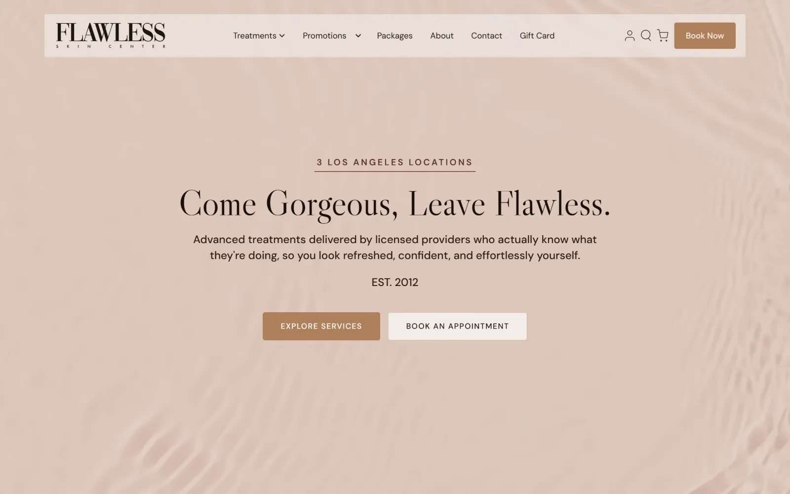
Centred black serif type sits on a rippling blush-pink water video, with a pill-shaped white nav bar floating above and two buttons below the copy.
Type. Libre Caslon Display at 64px sets the line, with a 54px step under it and a 24px cut reused 20 times for section headings. Body is DM Sans at 20px weight 500, 1.45 line height, and the eyebrow runs 16px weight 600 at an extreme 1.250em of tracking, wide enough that the three words read as a rule rather than a phrase. High-contrast Caslon against a geometric sans is the whole system.
Colour. Five tints of one hue and no second colour at all: #faeee9 at 474 percent coverage, #fef8f1 on the body, white at 97.6, #d9c7bb for the filled button and #e8e0d5 under it. Ink is #1f170f, a brown-black, with #3e2e1e as the secondary. The saturation is entirely in the water footage, and every interface value is sampled from the same blush range.
Layout. The header is a detached white bar with rounded ends floating inside the viewport rather than sitting flush to the edge, which is the one piece of radius on a page whose common corner radius is 0. Below it the video runs full bleed at 1440px with the whole content block centred on it. Section padding is 96px and the document is 6087px.
The ask. Six nav items plus account, search and cart glyphs, a Book Now button in the bar, then two more buttons in the hero: explore services in solid clay and book an appointment in white. Three booking routes compete above the fold on a Shopify build that also sells gift cards and packages, so the page is a storefront as much as a clinic.
Build the entire interface palette out of tints of one hue and let the video supply the only saturation, so nothing on the page competes with the imagery.
03
sovous.com
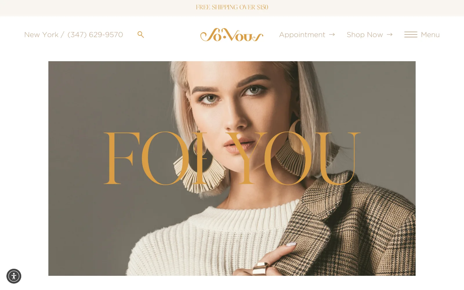
Gold display letters run across the middle of a contained portrait of a woman in a cream knit and check jacket, below a script wordmark.
Type
ivar-fine 228px uppercase
Body
Gotham 16px
Build
Inset photograph, centred wordmark, 1440px field
Made on
Not detected
Colour
#da9d44 #c2a68b #f8f5f0
Type. Display duty falls to ivar-fine at 228px in uppercase, used twice and carrying only six characters. Nothing else comes close: 36px for the next ivar-fine line, then Gotham at 22px for nav at a 2.00 line height and 16px for body across 256 characters. A 228 to 22 jump is about as steep as a type scale gets, and it works because the big word is treated as image rather than as reading matter.
Colour. Ink does the colouring here, not the background. Black carries 288 characters, #da9d44 a saturated gold on 47, and #c2a68b a muted tan on 43 more. The measured surface values are only #f8f5f0 at 2.8 percent and #444444 at 0.1, because nearly everything visible is photograph. Two golds at different saturations, one for display and one for nav, is a finer distinction than most sites attempt.
Layout. The photograph is inset inside a white field with a clear margin on all four sides rather than bleeding, and the display word is set across it at a point where it crosses the face. Container is the full 1440px with no grid recorded and radius 0. A free shipping bar sits above the header, and the document runs 13966px.
The ask. Phone number and city sit top left in plain text, with Appointment and Shop Now as arrowed links to the right of the wordmark and a hamburger beyond them. Two different transactions, a booking and a product sale, are offered at equal weight, which is the structural consequence of running a retail line alongside the clinic.
Display type large enough to overlap a face stops being type and becomes part of the image, which is why it needs no scrim behind it.
04
minimaleskin.com
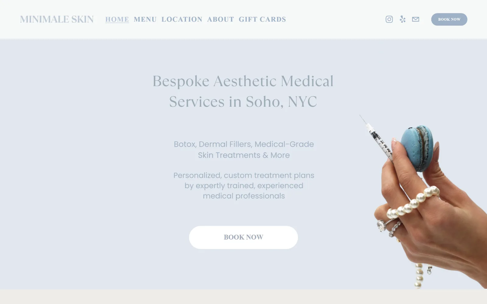
Pale blue-grey fills the screen behind centred grey copy and a white pill button, as a manicured hand holding a syringe enters from the right.
Type
Poppins 21px / 600
Body
Poppins 11px / 700
Build
26-column grid, 115px padding, 300px pill button
Made on
Squarespace
Colour
#edece7 #6d8690 #9db1c5
Type. Poppins does everything, which is unusual for a practice selling restraint: nav at 21px weight 600 with 0.050em tracking, a 20px weight 800 item, a 16px cut at weight 990, and an 11px weight 700 button at 0.040em. Four sizes inside a 10px range, separated by weight rather than scale. The hero lines read as serif on screen while the extractor records Poppins throughout, so the headline art is image rather than live text.
Colour. Six values, all within one cool range: #edece7 at 95.3 percent, #6d8690 the slate blue at 95.2, #e4e8f0 on the body, #dcebf4, #f9fbf8 and white at 0.8. The accent #9db1c5 carries both the button fill and 27 characters of ink. The single warm note on the whole page is the blue macaron, and even that is cool.
Layout. Full 1440px field with 115px of section padding, the most generous in this set, and a sticky header. The underlying grid is 26 columns at 11px gutters, which gives fine placement control and explains how the hand image can be cropped off the right edge at an arbitrary position. Common radius is 0 but the button is a 300px pill, so the one curved thing on the page is the thing being clicked.
The ask. Five nav items, three social glyphs and two Book Now buttons, one in the header at 11px and one at the centre of the hero. No phone number anywhere above the fold. The centre button is the only element rendered in pure white, which is how it wins attention on a page that otherwise refuses contrast.
On a low-contrast page, reserve pure white for the one element you want clicked and let everything else sit in the same narrow value range.
05
peachystudio.com
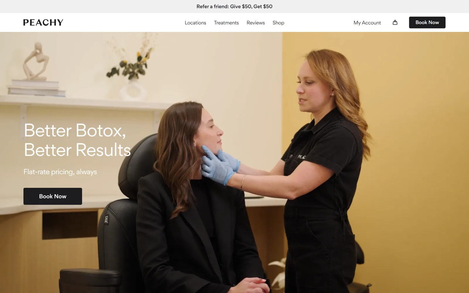
In a warm yellow treatment room, a clinician in black scrubs assesses a seated client, with a white headline and black button at the left.
Type. Gordita runs the whole page at 50px for the headline with -0.020em tracking and a 1.20 line height, 48px for the next step, 20px for the subline and 14px for nav at a very tight -0.071em. That nav tracking is the detail worth copying: at 14px the negative value tightens four short words into a compact cluster instead of letting them drift across the bar.
Colour. Three values and nothing else: white at 106.8 percent coverage, #f0f0f0 for the announcement strip and #1d1d1f for 251 characters of ink and the button fill. The near-black is a degree warmer than #000000. All the colour on screen comes from the footage, the ochre wall and the blue nitrile gloves, so the page itself is monochrome.
Layout. A sticky white header with four nav items sits above a full-bleed video at 1440px, with the headline block left-aligned on it rather than centred. Below the fold a three-column grid runs 489, 317, 489, a deliberately uneven measure. Corner radius is 4px on the button, the smallest non-zero value in this set, and 0 everywhere else.
The ask. Flat-rate pricing, always sits directly under the headline, which puts the commercial promise above the button rather than in a pricing page. One Book Now in the header, one in the hero, both identical black. A referral offer runs in the strip above everything. Three asks, one message, no phone number.
Putting the pricing promise between headline and button answers the objection before the click instead of after it.
06
skinversemedspa.com
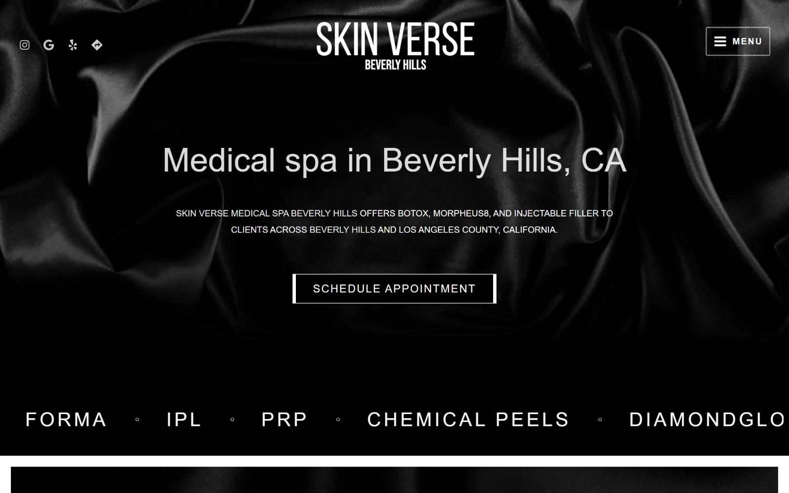
Black satin fills the frame behind a centred white wordmark, a grey sentence and an outlined button, with a treatment ticker across the base.
Type. Marcellus at 80px weight 100 uppercase carries nine characters, with a 60px cut under it, and then Raleway handles everything practical: 35px weight 300 at 0.143em across 18 uses, 24px at 0.083em, 20px weight 200 for 307 characters of body, 16px uppercase for nav. A 200 weight at 20px is extremely thin, and it survives only because the ground is dark enough to let hairlines read.
Colour. Three values total: #4f4f4f at full coverage, #000000 at 58.8 percent and white at 1.5. Ink is white across 631 characters with #ebebeb on 49 more. There is no accent colour at all, and no hue anywhere on the page. The satin photograph supplies texture instead of colour, which is a harder thing to pull off than a tinted hero.
Layout. Full 1440px field with the background image bleeding to all edges and no section padding recorded. The treatment names run as a single horizontal band at the base of the viewport, clipped mid-word at the right edge so the row reads as a ticker rather than a list. A three-column grid below runs 502, 325, 502. Radius is 0, including the outlined button.
The ask. Seven nav items collapse into a bordered MENU box at top right, so the opening screen shows one route in and one button out. Schedule Appointment is outlined rather than filled, which on a black ground is the quieter choice. No phone, no price, no offer strip.
A monochrome page needs texture in the hero image, not colour, or the type has nothing to sit against.
07
puremedicalspaidaho.com
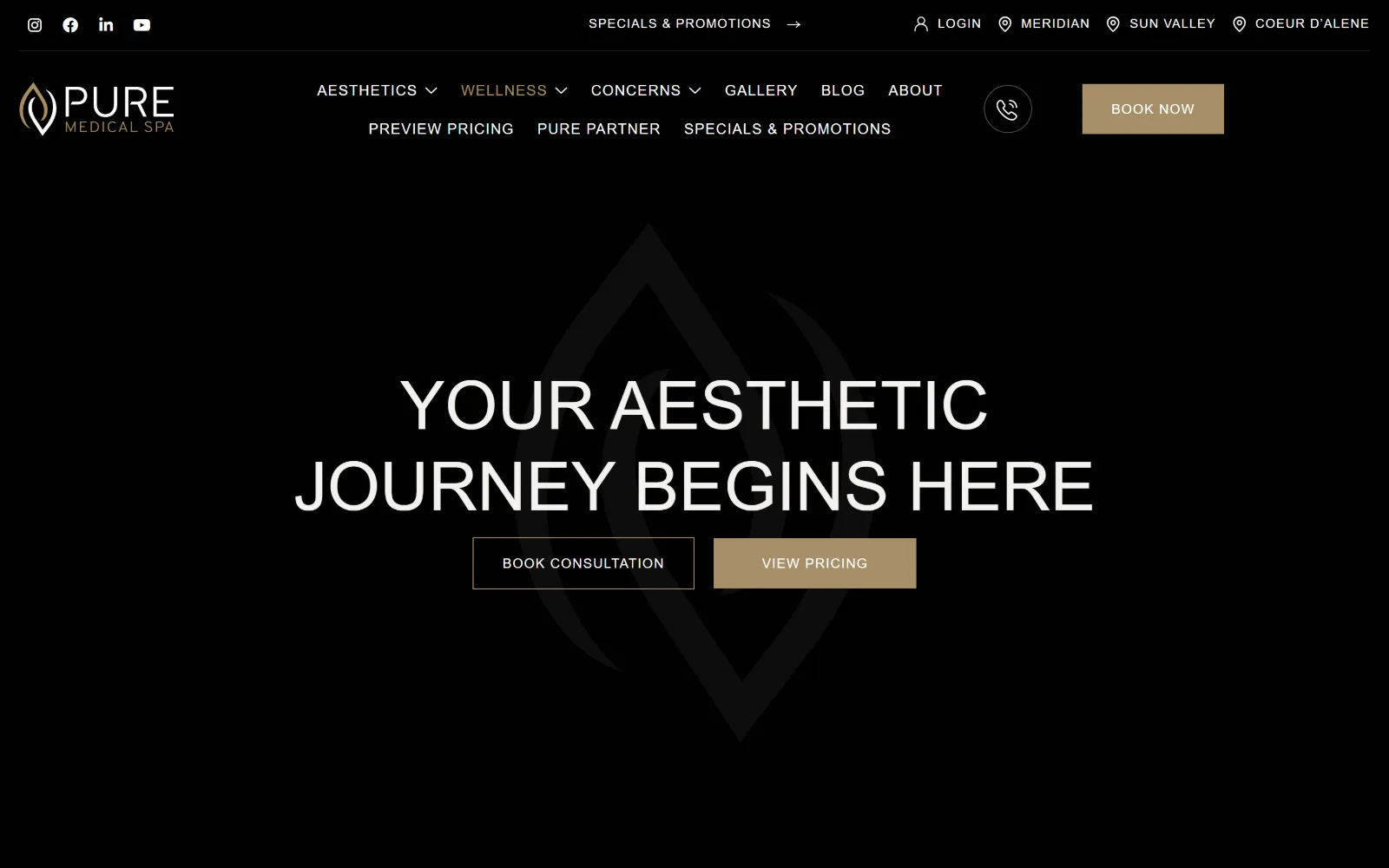
Two lines of large white capitals sit centred on near-black over a faint logo watermark, with an outlined button and a gold one beneath.
Type
ivyora-display 64px / 300
Body
gill-sans-nova 20px / 1.40
Build
Two-row header, nine nav items, full-bleed video
Made on
WordPress
Colour
#0f0f10 #141414 #a68f69
Type. ivyora-display at 64px weight 300 uppercase sets the headline across 39 characters, and gill-sans-nova handles the rest at 20, 18, 15, 14 and 13px with tracking widening as the size drops, from 0 at 20px to 0.077em at 13px. Opening out the tracking as type gets smaller is the correct direction and it is applied consistently here, which is rarer than it should be.
Colour. Three values: #0f0f10 at full coverage, #141414 at 50 percent and #a68f69 at 6. The gold carries only eight characters of ink but fills the second button, so it functions as colour rather than as text. Everything else is white at 359 characters and #f3f2f0 at 283. A near-black with a green cast rather than pure black keeps the gold from going brassy.
Layout. Full 1440px field with the video behind a two-row header: a utility strip with social glyphs and three location links, then a nav row carrying nine items wrapped onto two lines. That is a lot of chrome before any content. The logo mark is scaled up as a watermark behind the headline rather than used at sign size. Radius 0, document 7537px.
The ask. Nine nav items, three locations, a phone glyph, a Book Now in the header and then two more buttons in the hero, book consultation outlined and view pricing filled in gold. Making pricing the filled button rather than booking is the notable decision: the stronger visual weight goes to the lower-commitment ask.
Give the filled button to the lower-commitment action when your service is expensive, and let the booking link carry less visual weight.
08
skinsolutions.co
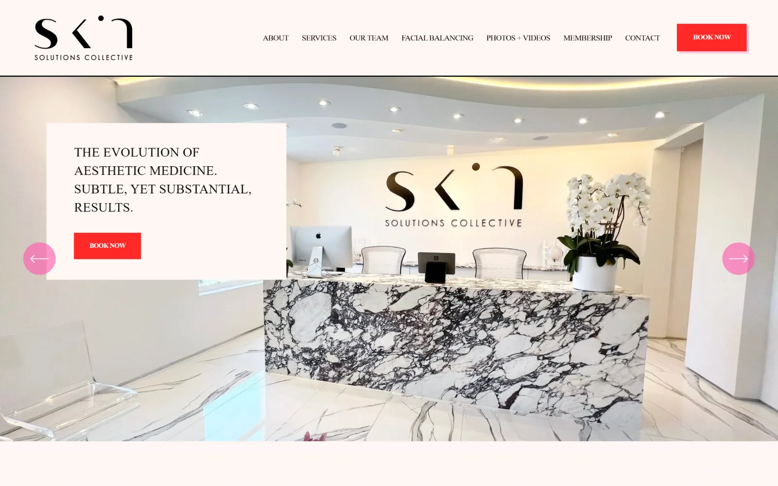
Edge to edge, a white reception with a veined marble desk and orchids, overlaid at the left by a cream panel holding caps and a red button.
Type. Tenor Sans at 24px uppercase with 0.010em tracking is the largest type on the page, which is remarkable for a hero: the statement is set smaller than most sites set their nav. A 17px cut repeats six times, and Montserrat handles nav at 15px with -0.030em, buttons at 13px weight 700 at -0.040em. Negative tracking on the sans against positive on the serif keeps the two from blurring together.
Colour. Four near-whites do the background work: #ffffff at 144.9 percent, #fff7f4 at 40.1, #fff7f5 at 32.2 and #fff7f3 at 5, warm tints a shade apart. Against that, #fe2928 at 0.3 percent coverage and #ff57ac at 0.6. The red is the entire accent budget and it is spent on one button and two slider arrows in pink, which is the loudest small decision in this set.
Layout. The hero sits full width with a cream text panel overlapping its lower left quadrant, and circular pink slider arrows pinned to the outer edges of the viewport rather than beside the panel. Section padding is a large 142px and three five-column grids of 248.953px run below at 20px gutters. Radius is 0 on the button, so the red rectangle is hard-edged against a page of soft tints.
The ask. Seven nav items including Photos + Videos and Facial Balancing, a Book Now in red at top right and the same ask repeated in the hero panel. Two identical red buttons is a repetition that only works because nothing else on the page is saturated. No phone number in the header.
Against four near-white tints, a single saturated red at under one percent coverage is enough to carry every call to action on the page.
09
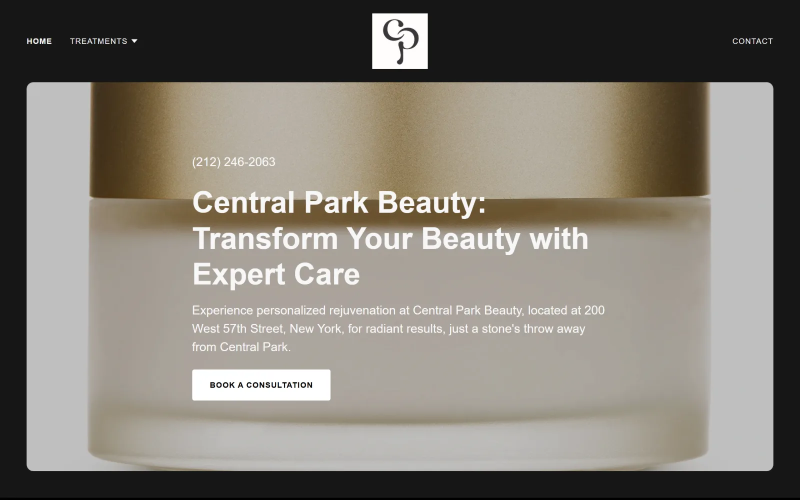
centralparkbeauty.com
Shot close, a gold-lidded cream jar fills a rounded panel on black, with a phone number, a headline and a white button at the left.
Type. Karla at 54px weight 700 sets the headline with no tracking adjustment and a 1.20 line height, stepping down to 39px. Body is Source Sans Pro at 22px, a large reading size, with 16px below it and a 14px uppercase button at 0.071em. Setting body at 22px is what lets a three-line address paragraph sit under a bold headline without looking like fine print.
Colour. Black at 200.4 percent coverage, white at 100.5 and #161616 at 99.6, so the page is three near-identical dark values plus white. Ink splits between #919191 on 374 characters and #f7f7f7 on 284, a deliberate two-step grey so the paragraph sits visibly behind the headline. Every warm tone on screen belongs to the brass jar lid.
Layout. The hero image is inset inside the black field with a visible margin and generously rounded corners, a radius large enough to read as a card, while the common radius elsewhere is 0 and the button is 4px. Header runs the full width with the logo centred in a white square tile. Section padding is 56px and the document is only 2869px, so the whole site is short.
The ask. The phone number sits above the headline rather than in the header, which reverses the usual order and makes calling the first thing read. Book a Consultation follows in white. Nav is a two-item affair, Home and Treatments at the left, Contact at the far right, so the page offers a call, a booking and almost no browsing.
Placing the phone number above the headline rather than in the header makes a call the first thing read instead of the last thing found.
10
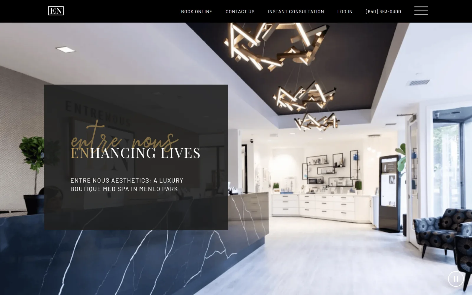
enaesthetics.com
Wide across the frame, a bright reception with a navy marble desk and sculptural lights, under a translucent dark panel holding a script lockup.
Type
Rasendrya 200px / 0.35 + Playfair Display 52px
Body
Barlow 16px / 1.50
Build
1270px container, translucent left panel, full-bleed video
Made on
WordPress
Colour
#7f6b43 #b8995a #1f1f1f
Type. The lockup is the whole idea: Rasendrya, a script, at 200px with a 0.35 line height, overlapping Playfair Display caps at 52px so the two words interlock rather than stack. The 0.35 leading is what makes the collision possible. Underneath, Barlow at 18px uppercase with 0.083em handles the descriptor and 16px regular runs 609 characters of body. Three faces, each with one job.
Colour. The measured palette is almost empty, white at 27.9 percent and black at 8.7, because the frame is nearly all video. Ink is #1f1f1f across 838 characters, white across 147, and two golds, #7f6b43 for the script and #b8995a on four characters. The colour on screen is the photograph's: navy stone, pale oak, the warm filament fittings.
Layout. A 1270px container at 88 percent of viewport, with the text panel placed over the left third of the video as a semi-transparent dark rectangle rather than a solid block, so the reception behind it stays legible through the type. Sticky black header holds five items plus a phone number and a hamburger. Radius 0, document 8131px.
The ask. The header is dense with asks: Book Online, Contact Us, Instant Consultation, Log In and a phone number, five routes before the hero copy begins. Nothing in the hero panel is clickable at all. Every transaction has been pushed into the bar, which keeps the opening image clean at the cost of a crowded header.
A semi-transparent panel instead of a solid one keeps the interior photograph readable behind the type, which matters when the room is the selling point.
11
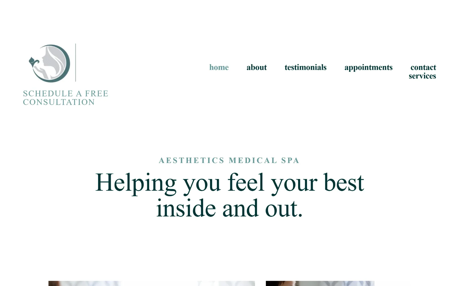
aleamedspa.com
An almost empty white page with a circular logo and a teal consultation line top left, five nav words right, and a centred serif headline low down.
Type
calluna 81px / 300
Body
futura-pt 16px / 1.50
Build
490px container, no hero image, text-link CTA
Made on
Squarespace
Colour
#ffffff #081b33 #003333
Type. calluna at 81px weight 300 with -0.010em sets the headline, with a 44px step below it. Two Trajan cuts handle the small caps: trajan-color at 27px with 0.080em for the eyebrow and trajan-pro-3 at 27px weight 600 forced to lowercase across 15 uses, plus a 26px weight 700 at a very wide 0.180em. Body is futura-pt at 16px. Three families is a lot, and the Trajan-set-lowercase trick is the odd note.
Colour. White at 193.6 percent is the only surface value recorded. Ink is #081b33, a near-black navy, across 719 characters, #003333 a deep teal on 250, and #669999 a pale teal on 54 for the nav and the consultation line. Two teals at different depths plus one navy, and no background colour at all.
Layout. The container is 490px, 34 percent of a 1440 viewport, which is the narrowest measurement here and means the reading column occupies barely a third of the screen. Nav sits top right across two ragged lines rather than one, with contact and services wrapping. There is no hero image above the fold, only type on white. Radius 0, document 7950px.
The ask. Schedule a Free Consultation sits under the logo in teal small caps as a text link, not a button, and there is no button anywhere on the opening screen. The nav list carries appointments and contact at equal weight. For a category built on booking widgets, offering a free consultation as plain text is the restrained read.
A 490px reading column on a 1440px screen forces short lines and makes a type-only hero work without any image at all.
12
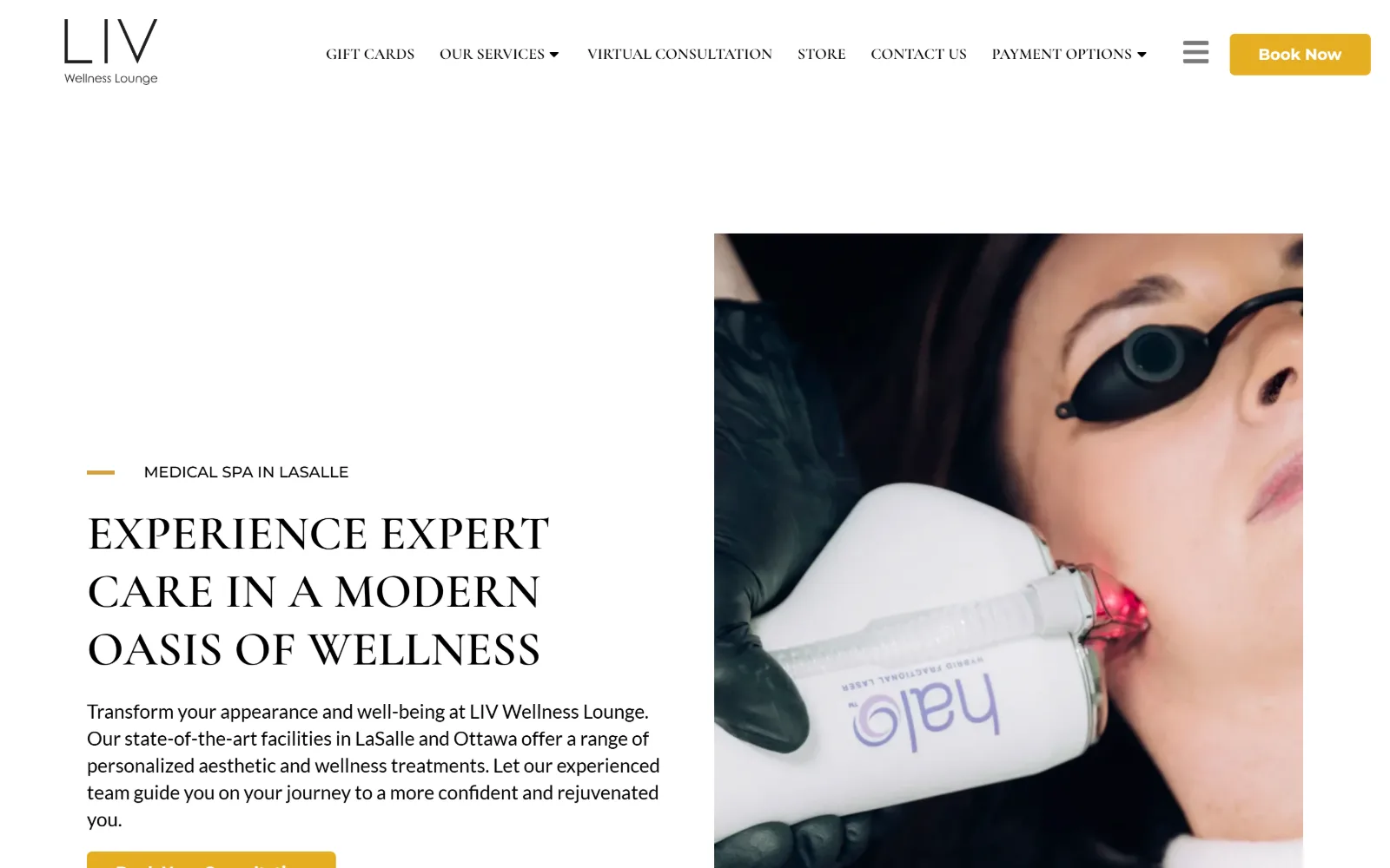
livclinic.com
White fills the left half with a gold rule, a serif headline in caps and a paragraph, beside a contained photograph of a laser at a client's cheek.
Type
Cormorant Garamond 50px caps
Body
Lato 20px / 1.40
Build
Split hero, contained right image, 5px button radius
Made on
WordPress
Colour
#e5ae21 #000000 #ffffff
Type. Headline work goes to Cormorant Garamond at 50px weight 600 uppercase, across 78 characters at a 1.20 line height, and the same face drops to 16px weight 600 uppercase for the six nav items, so display and navigation share one voice. Body is Lato at 20px with a 1.40 line height, and the button alone switches to Montserrat 16px weight 700. Setting a Garamond in caps is a specific choice and it gives the headline width it would not otherwise have.
Colour. Only one palette value registers, #e5ae21, at 0.7 percent coverage: a saturated mustard used for the eyebrow rule and the button fill. Ink is black across 447 characters and white across 30. So the page is black type on white with a single yellow note repeated twice, and every other colour on screen belongs to the clinical photograph.
Layout. A split hero with the text column left and an image block right, but the image is contained with margins rather than bleeding to the edge, which leaves white running down the outer side. Container is the full 1440px with no grid recorded and no section padding. Button radius is 5px, one of only three non-zero radii in this set. Document 10839px.
The ask. Six nav items, a hamburger and a yellow Book Now in the header, then a second yellow consultation button in the hero. Store and Payment Options sit in the nav, so financing and retail are surfaced before treatments are. No phone number above the fold.
When the hero image is clinical rather than aspirational, contain it with a margin so it reads as evidence rather than as atmosphere.
13
mdskinlounge.com
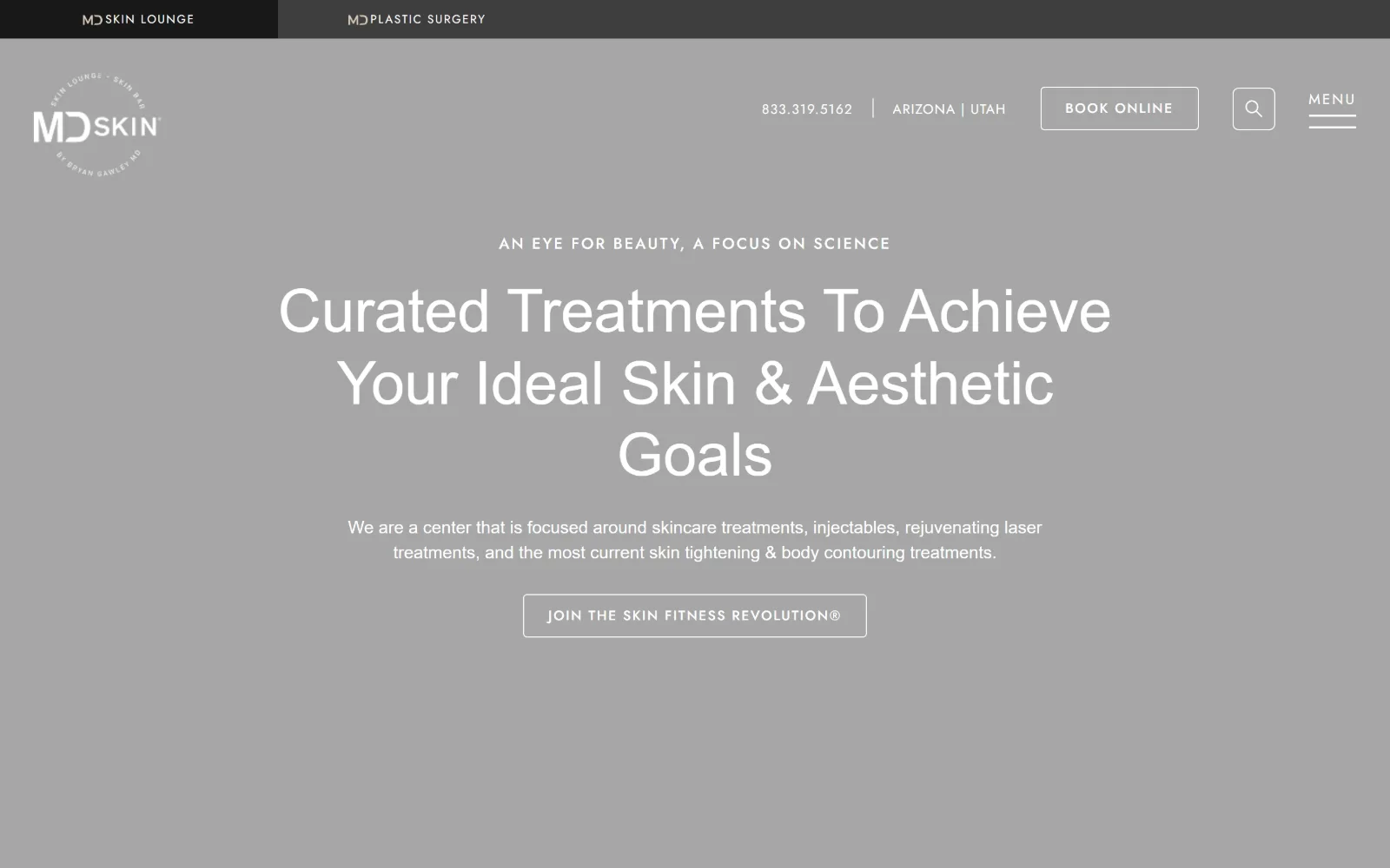
Flat mid-grey carries centred white type, a three-line headline and an outlined button, with a two-tab brand bar sitting above the header.
Type
collier 62px / 350
Body
montserrat 18px / 1.44
Build
Two-tab brand bar, 28px padding, zero-gutter 5-column grid
Made on
WordPress
Colour
#ffffff #f0eeec #b9e3e0
Type. collier at 62px weight 350 sets the headline, with 46, 42, 32 and 24px steps below it in the same face, and montserrat at 18px for the sentence. The workhorse is a 16px Jost cut at weight 500 with 0.125em uppercase tracking, used 68 times across 951 characters, which is what every link and label on the page is set in. A weight of 350 is a variable-font value, not a standard one.
Colour. Six values: white at 120.9 percent, #f0eeec at 42.8, #b9e3e0 a pale aqua at 12.8, #3e3e3e, #191919 for the button fill and #4a4e55 at 0.4 percent. Ink is white on 1294 characters and #4a4e55, a blue-grey, on 341. The grey behind the hero in this frame is the video poster rather than a brand colour, and the aqua is the only hue the site actually owns.
Layout. Two stacked bars at the very top switch between the skin lounge and the plastic surgery practice, a tab metaphor rather than a nav item, with the main header beneath. The hero is full bleed at 1440px. Section padding is a tight 28px and a five-column grid of 288px columns runs with zero gutters, so tiles below sit edge to edge. Radius 0.
The ask. Phone number, two state names, a Book Online button and a search glyph sit in the header, with the nav itself hidden behind MENU. The hero offers one outlined button, Join the Skin Fitness Revolution, which is a membership pitch rather than a booking. Two different businesses are being chosen between before any of that.
A two-tab bar above the header is a cleaner way to split sister brands than forcing both into one navigation list.
14
revive.md
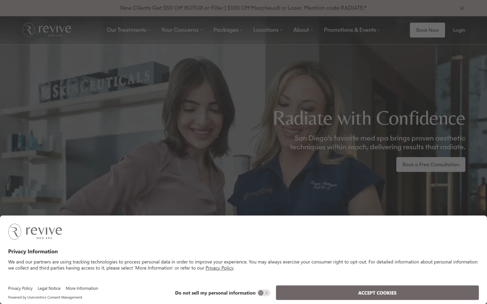
Before a lit retail shelf two women talk, with a large light serif line and a paragraph at the right and a privacy panel over the base.
Type. Belleza at 60px with -0.015em and a 1.10 line height sets the headline, stepping through 40, 32 and 24px in the same face across 350 characters in total. Body is a custom majorant cut at 20px for long copy, 16px for nav and 14px across 363 characters of small print. Belleza is a humanist sans with serif-like proportions, which is why the hero line reads as elegant without a serif being present.
Colour. Six muted values: #e9e2df at 33.3 percent, white at 21.2, #d4d9db at 16.7, #f0f0ed at 15 for both the button fill and 927 characters of ink, #cdbdb8 at 3 and #6d6666 at 0.7. A single cool note, #386174, appears on 122 characters. Every value is desaturated, so the page has no accent at all and relies on tonal separation.
Layout. Full 1440px field with the photograph bleeding behind a transparent header, and a 12-column grid at 16px gutters running below the fold. Button radius is 4px. The document is 6528px. In this frame a consent panel occupies the bottom third of the viewport and dims everything above it, so the real contrast of the hero is not visible as the designer intended.
The ask. An offer strip, six dropdown nav items, Book Now and Login in the header, then a Book a Free Consultation button in the hero: four distinct asks before scrolling, plus a cookie dialogue with its own accept button. The free consultation is the only one tied to the headline, and it is the least prominent of them.
Treat the consent panel as part of the first impression and design the opening screen assuming a third of it will be covered.
15
renewaesthetics.com
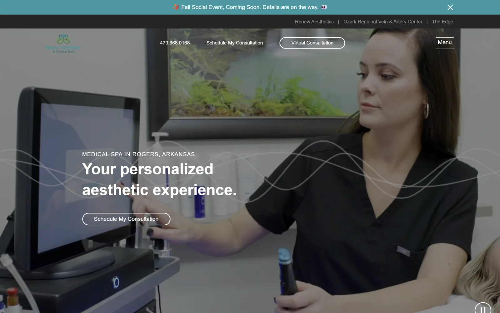
Filling the frame, a video still of a clinician operating a treatment device, crossed by thin white wave lines, headline at the left.
Type. Muli at 44px weight 600 with a 1.36 line height carries the headline across 39 characters, and the rest of the page runs just two more sizes: 16px weight 300 and 14px weight 300. The nav is recorded at 28px weight 300, larger than the body, which inverts the usual relationship and gives the hidden menu more presence than the copy it sits above.
Colour. Only two palette values register, #4d97a0 a teal at 2.3 percent and #252525 at 2.2, because the viewport is almost entirely video. Ink is white across 195 characters and #979797 on 59. The teal appears in the announcement bar and the logo mark and nowhere else above the fold, so the brand colour is present but never used on anything clickable.
Layout. Full 1440px field with the video bleeding to all edges and a thin animated wave graphic overlaid across the middle, which is the one piece of motion design here and it crosses the headline rather than framing it. The header is transparent with a Menu label at the far right and a sister-practice bar above it. Radius 0, document 6981px.
The ask. Phone number, Schedule My Consultation and a pill-shaped Virtual Consultation button sit in the header, with the same consultation ask repeated in the hero. Two routes to the same appointment, plus a dismissible event announcement above everything, and a sister-practice bar offering two other businesses entirely.
An overlay graphic that crosses the headline will fight it at every viewport size, so keep motion graphics out of the text column.
16
envisionroc.com
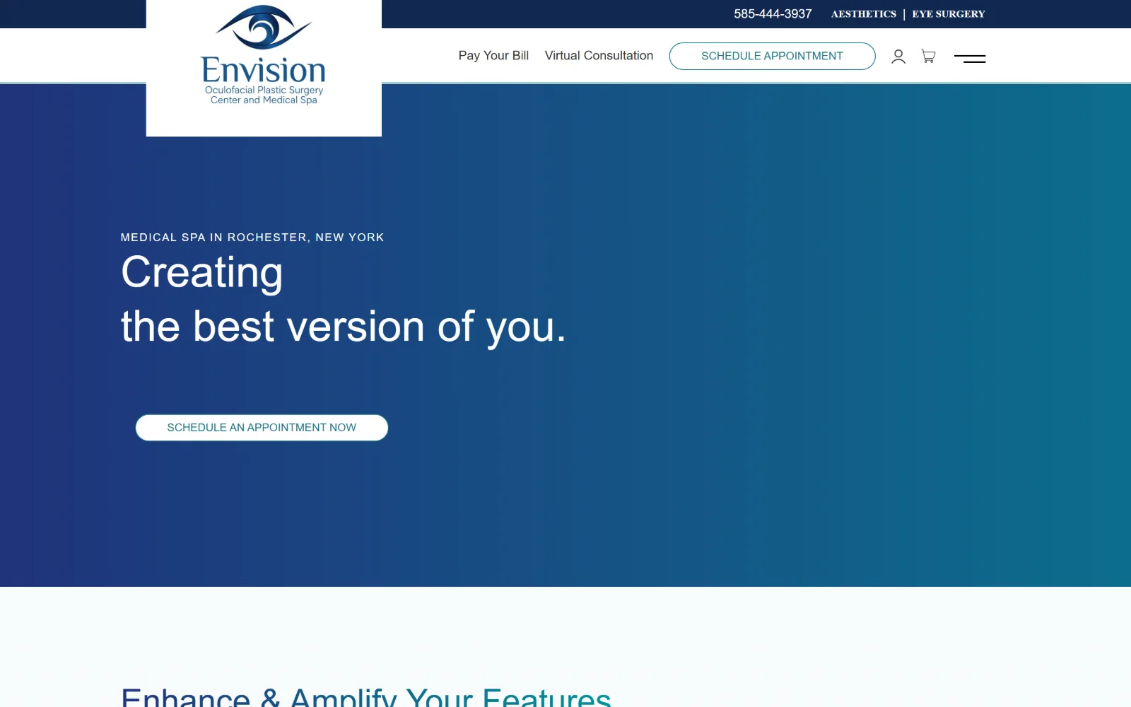
Navy fades to teal across the hero behind a white two-line headline and a pill button at the left, under a logo tile breaking above the bar.
Type. Rubik at 55px weight 300 sets the headline with a 1.25 line height, dropping to 42px for the next step and 16px weight 400 for 497 characters of body at a loose 1.75. Nav and button share a 14px weight 500 uppercase cut. A 300 weight at 55px on a gradient is thin, and the second headline line is noticeably wider than the first because the two lines are set as separate blocks rather than wrapped.
Colour. Four values carry the page: #20337b a deep navy at 35.6 percent, #00959b a teal at 16, white at 6.9 and #10274f at 2. The hero is a left-to-right gradient between the navy and the teal rather than a flat fill. Ink is white on 638 characters with #1e788b, a third blue, on 57 for links and button text. Three blues in one system is one more than needed.
Layout. A 1130px container at 78 percent of viewport, the second narrowest here, with 120px section padding. The logo sits in a white tile that extends above the header bar and down past it, breaking the horizontal line in both directions. Button radius is 200px, a full pill, against a common radius of 0 elsewhere. Document 9362px.
The ask. A phone number, two practice links, Pay Your Bill, Virtual Consultation, an outlined Schedule Appointment, an account glyph and a cart all sit in the header, then a second schedule button appears in the hero. Eight separate asks compete before the first scroll, and billing is given the same weight as booking.
Gradient heroes only work if the headline sits over the darkest end, otherwise a light weight loses contrast halfway across the line.
How these were chosen
Twenty-five homepages went into this shortlist and sixteen came out, five of them removed on imagery rather than design. What holds across the survivors is the ask: every one of them puts a booking route above the fold, and eleven put two or more there, which makes med spa website design the opposite of the architecture pages in this series, where a button is rare. The second pattern is tonal. Most of these build their entire interface out of one narrow range, blush tints, near-blacks, cool slates, and let the photograph supply the only saturation. What does not hold is the assumption that the category runs on faces. The strongest frames here lead with a reception desk, a jar of cream, a satin backdrop, a syringe held like jewellery, or nothing at all beyond type on white. The sites that do show a face crop it tight and treat it as texture rather than as proof.
Finding med spa sites that someone had actually designed took far longer than it should have. 30 candidates made the shortlist. 16 made the page.
Each one was opened and looked at properly: what the type is doing, where the colour gets spent, how the page is built, how it asks for the job. Nothing is here because it ranks. Nothing is here because an agency filed it under portfolio. Several well known names were left out for the plain reason that their site came out of the same template as everyone else's, and a few sites worth including did not survive a second look.
Where a site is only competent, it says so. The order is the order worth your time, best first.
Reviewed and selected by Larry W. Matthews for Websitely.