A booking button in the header, then a longer one further down. Twelve salons, barbershops and nail studios judged on salon website design above the fold.
Shown
12 sites
Reviewed
30 candidates
Chosen on
The work, not the ranking
Updated
15 October 2026
01
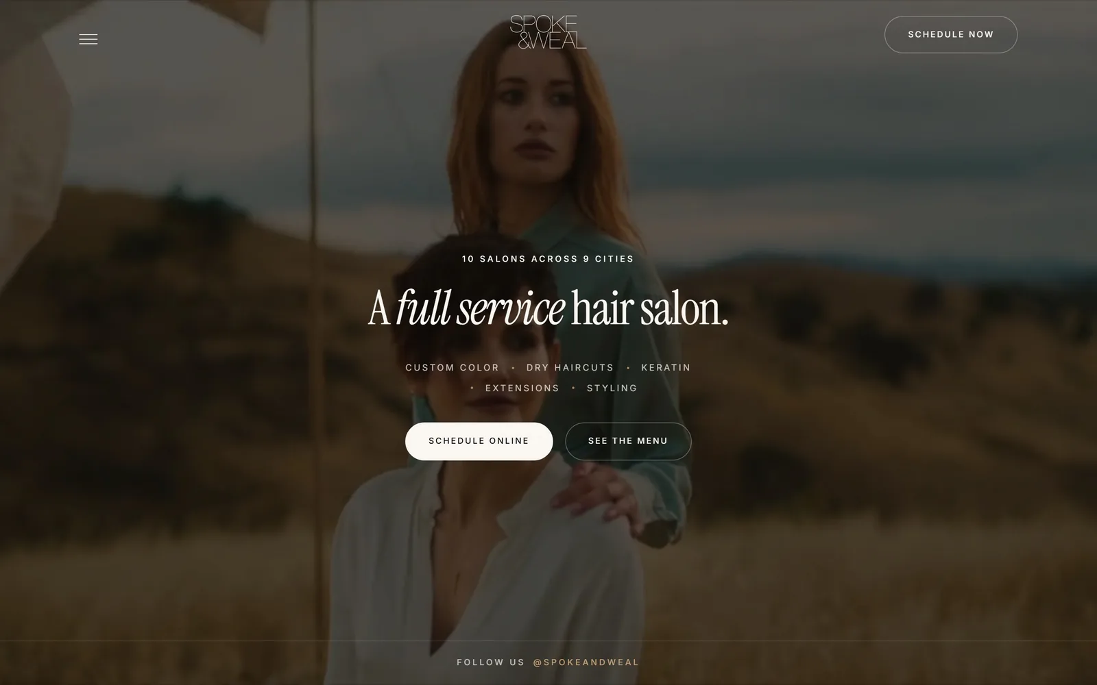
spokeandweal.com
A warm brown film still of two women in a dry field, with a centred serif line and two pill buttons over it.
Type
Instrument Serif, 62px
Body
Inter 15px, 1.7 line height
Build
Centred column over full-bleed video
Made on
Custom JS framework
Colour
#0a0a0a #faf7f2 #120f0c
Type. The headline is Instrument Serif at 62px with tracking pulled in to -0.025em, and the words "full service" switch to the italic mid-sentence. Everything else is Inter: a 15px paragraph, a 12px eyebrow reading 10 SALONS ACROSS 9 CITIES at 0.22em tracking, and 11px uppercase button labels at 0.18em. One serif, one grotesque, three sizes, and the italic carries all the personality.
Colour. The page runs on near black #0a0a0a and #120f0c with cream #faf7f2 type, and a warm brown scrim sits over the whole video so the field and sky read as dusty gold. There is no accent hue at all. The filled pill is cream on brown, which is the strongest contrast on the screen and lands exactly on SCHEDULE ONLINE.
Layout. A 1440 frame with everything centred in a single column about 620px wide, floating over a full-viewport video. Hamburger at the left, wordmark centred, SCHEDULE NOW pill at the right, all three sitting on the footage with no header bar. Buttons are fully round at 999px radius, and the Instagram handle pins to the bottom edge of the fold.
The ask. Three asks above the fold, and two of them are the same ask: SCHEDULE NOW in the header and SCHEDULE ONLINE in the hero. SEE THE MENU is the only competing link and it is outlined rather than filled, so it reads second. The dotted service line, CUSTOM COLOR, DRY HAIRCUTS, KERATIN, EXTENSIONS, STYLING, answers the "do they do my thing" question before either button.
Switching one phrase of the headline to italic gives you a second voice without paying for a second typeface.
02
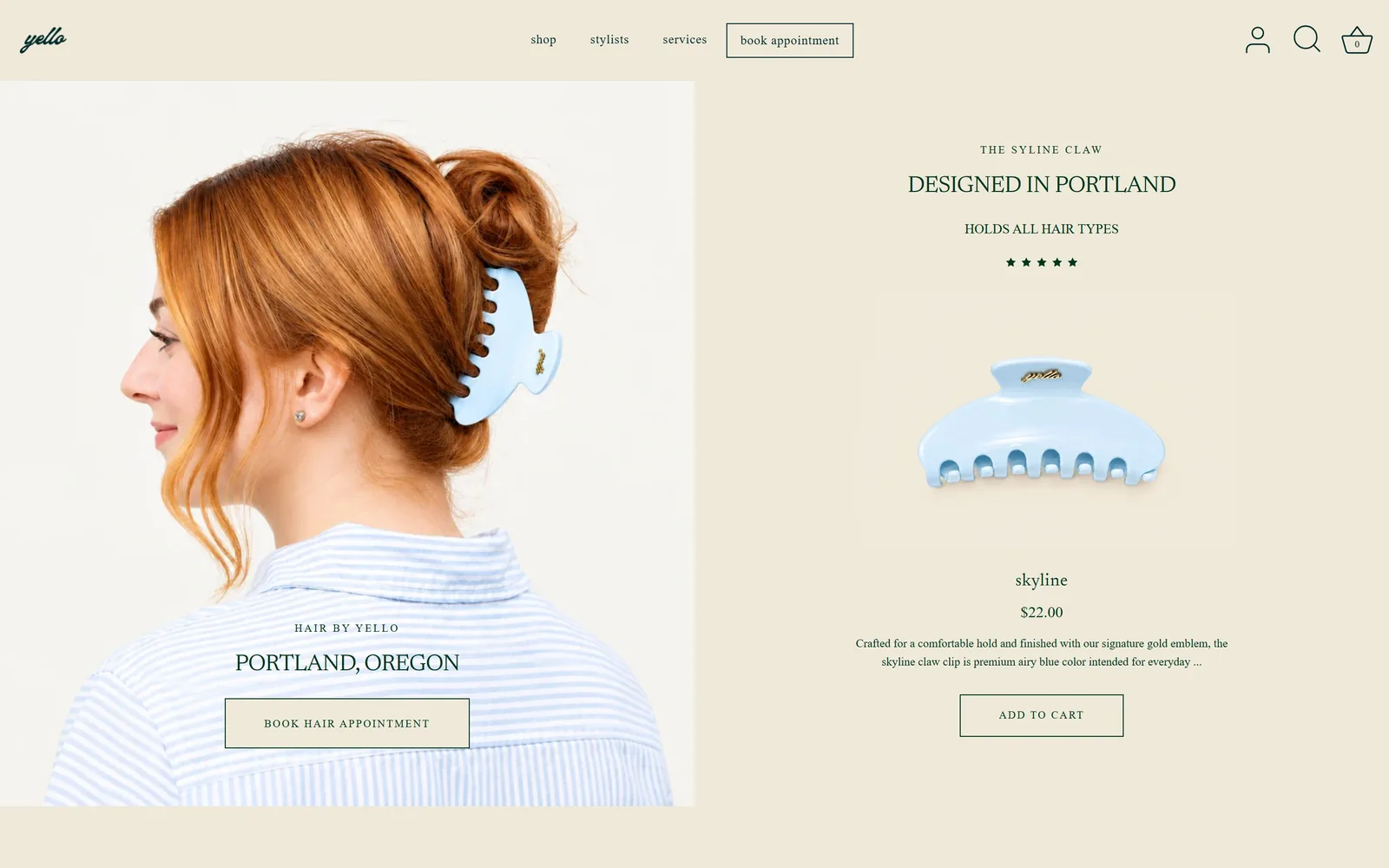
yello.salon
A 50/50 split: a portrait with a blue claw clip and a booking button on the left, a $22 product listing on the right.
Type
Newsreader, 42px caps
Body
Old-style serif, 18px
Build
50/50 split hero
Made on
Shopify
Colour
#efe9d9 #00341e #b8cfe4
Type. Newsreader does the headings, with PORTLAND, OREGON set in caps at roughly 42px and 0.08em tracking, and HAIR BY YELLO above it at about 13px with much wider tracking. Body copy is an old-style serif around 18px. There is no sans anywhere on the page, including the nav and the buttons, which is rarer than it sounds.
Colour. Cream #efe9d9 fills the header, the right column and the page margins, and every piece of type is forest green #00341e. The pale blue of the hair clip and the gold emblem are the only other colours, and both come from the product rather than the palette. Two colours and a photograph is the whole system.
Layout. Container 1440, split down the middle at roughly 1010px, with the photo panel bleeding to the left edge and the product column centred in the right half. Buttons are hairline rectangles at 0 radius, including the nav's boxed "book appointment". The fold holds both columns in full with nothing cropped.
The ask. Booking and retail are asked for side by side: "book appointment" boxed in the nav, BOOK HAIR APPOINTMENT over the photo, ADD TO CART on the right. Five stars and HOLDS ALL HAIR TYPES back the product, while the salon side gets only a location line. Two different conversions sharing one fold, with no slider deciding for the visitor.
A split hero lets a salon that also sells something stop choosing between the two on its homepage.
03
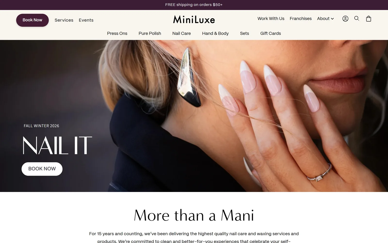
miniluxe.com
A close crop of almond nails against a jaw, with NAIL IT set small and white over the dark left edge.
Type
High-contrast display serif, 60px
Body
PPMori 16px, 1.8 line height
Build
Two-row header over full-bleed hero
Made on
Shopify
Colour
#3b1e35 #f8f4ee #ffffff
Type. NAIL IT is a high-contrast display serif at about 60px, thin hairlines, caps, sitting on a 13px tracked FALL WINTER 2026 eyebrow. The rest of the page is PPMori at 16px with 1.8 line height and 0.016em tracking, which keeps the two-row nav calm under a lot of links. The display face appears exactly twice above the fold and never below 34px.
Colour. Aubergine #3b1e35 runs the announcement bar and the Book Now pill, cream #f8f4ee backs the header, and the body below the hero is plain white. The aubergine covers maybe two percent of the screen and still reads as the brand colour because it owns the top-left corner. The hero's own colours are skin, black wool and a silver earring, nothing added.
Layout. A 1440 frame with a two-row header: utility links and the wordmark on the first row, seven shop categories on the second. The hero image is full bleed and about 800px tall, with the text block left-aligned 120px in and dropped to the lower third. Pills are fully round; everything else is square.
The ask. The Book Now pill sits top left where the logo usually goes, then repeats as a white pill in the hero. Against it are fourteen other links, seven of them product categories, so the booking ask has to win on position and colour rather than on being alone. FREE shipping on orders $50+ is the only thing above both.
Putting the booking pill in the top-left corner, ahead of the logo, makes it the first thing the eye lands on.
04
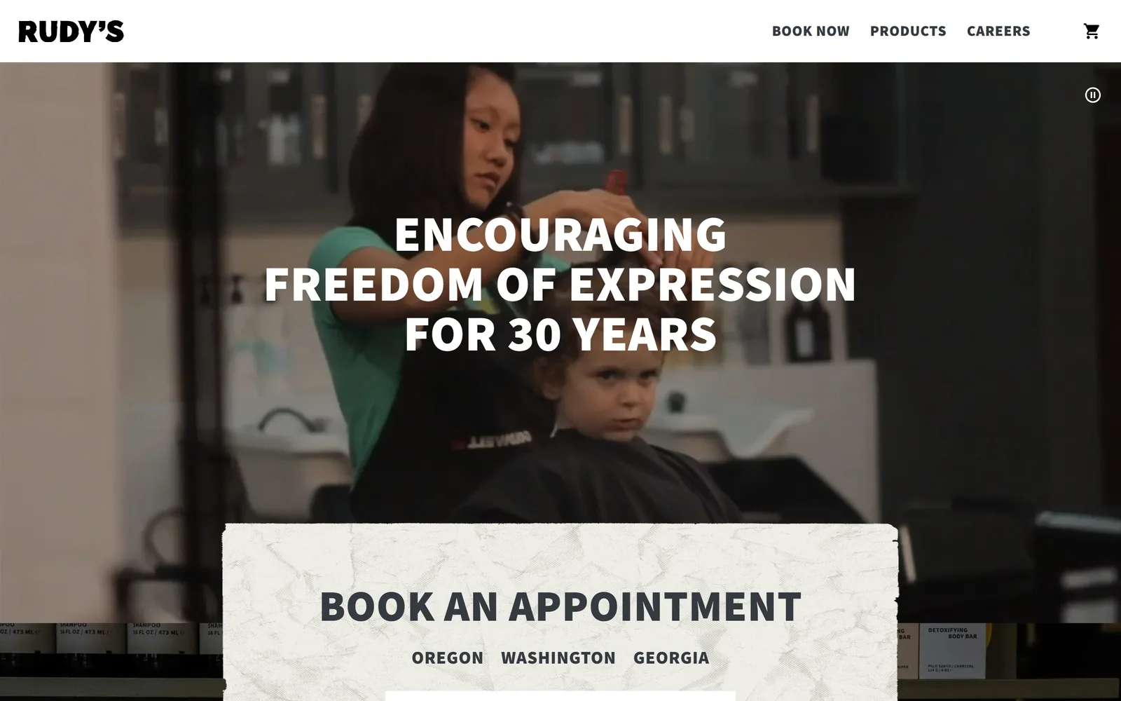
rudysbarbershop.com
A barber cutting a boy's hair on video, three lines of heavy white caps, a torn-paper booking panel below.
Type
Source Sans Pro 900, 64px caps
Body
Source Sans Pro, 20px
Build
Booking panel overlapping hero video
Made on
Shopify
Colour
#f5f5f5 #000000 #2e2e30
Type. Source Sans Pro at weight 900, uppercase, 64px, tracked just 0.009em, three centred lines. The nav uses the same face at 19px and the same 900 weight, so the page has one typeface and essentially one weight. BOOK AN APPOINTMENT in the panel is set at 56px, nearly as large as the headline itself.
Colour. The page is #f5f5f5 with black type and no accent colour whatsoever. All the colour on screen comes from the footage: a mint green t-shirt, a black cape, the wood of the cabinets. The booking panel is an off-white paper texture with a torn edge, which is the only decorative element anywhere.
Layout. A 1440 frame, header 110px, video full width behind it. The booking panel is roughly 1200px wide and overlaps the lower third of the video rather than sitting below it, so the fold cuts through the form instead of ending at the image. OREGON, WASHINGTON, GEORGIA sit as a row of state choices inside it.
The ask. The header offers BOOK NOW, and then the hero gives you the first step of the booking itself: pick your state. That is a real improvement on a button that merely promises a form on the next page. PRODUCTS and CAREERS are the only competition, both plain text.
Lifting the first field of the booking form into the hero removes a click that a button alone cannot.
05
hudsonhawk.com
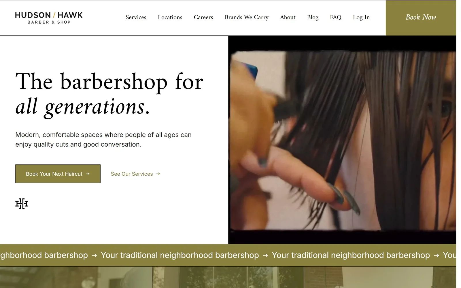
A split hero: old-style serif headline and two links on white at left, grainy combing video at right.
Type
Old-style serif, 76px
Body
Inter, 25px
Build
Split hero, text left, video right
Made on
WordPress
Colour
#ffffff #8a813e #000000
Type. The headline is a sharp old-style serif at 76px, with the second line, "all generations.", dropped into the italic. Inter handles the 25px supporting sentence and the button label, and the nav goes back to the serif at 20px. Serif for voice, sans for instructions, applied consistently.
Colour. White page, black type, and a single olive #8a813e that gets about six percent of the screen: the Book Now tab, the filled button, the See Our Services arrow and the marquee band under the fold. It is a committed choice rather than a safe one, since olive is not the colour this category usually reaches for.
Layout. A 1430 container split at roughly 990px, text left, video right, with the video bleeding to the right edge and the header white only across the left portion. The Book Now tab is a full-height olive block in the top right corner, 0 radius like every other box here. A scrolling band reading "Your traditional neighborhood barbershop" sits right on the fold line.
The ask. Two asks, phrased differently on purpose: "Book Your Next Haircut →" filled in olive, "See Our Services →" as a bare link. The header adds a third, "Book Now", in the corner tab. Eight nav items is a lot of competition for a three-ask fold, and Log In among them is noise for a first visit.
A button labelled "Book Your Next Haircut" tells the visitor what they are getting; one labelled "Book" makes them guess.
06
birdsbarbershop.com
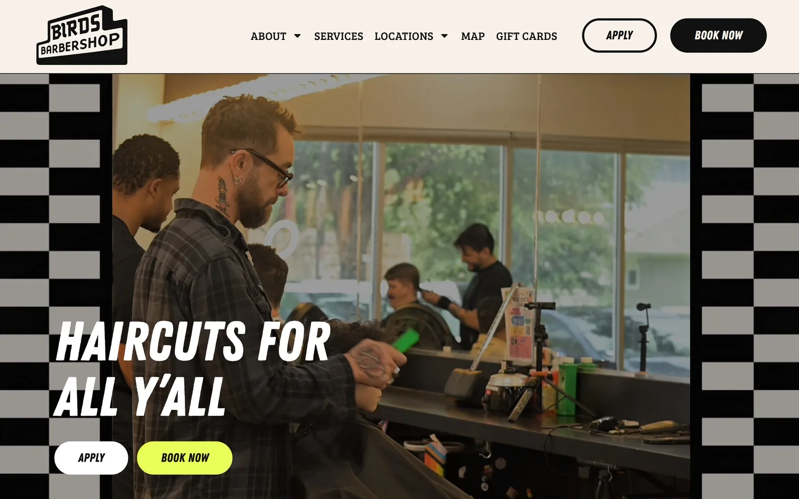
A barber mid-cut, with HAIRCUTS FOR ALL Y'ALL in slanted white caps and a lime pill button, framed by black-and-white checker rails.
Type
Slanted sign-painter sans, 100px
Body
Bree Serif, 20px
Build
Checker-railed video hero
Made on
WordPress
Colour
#f7f1ea #111111 #e8fe59
Type. The display face is a heavy slanted condensed sign-painter sans set at 100px in caps, the kind of lettering painted on a shop window rather than licensed from a foundry. Buttons use the same slanted face at 22px, which is unusual and works because the labels are two words long. The nav switches to Bree Serif at 20px, uppercase, 0.02em tracking, and that slab serif against the brush caps is the whole identity.
Colour. The header and page sit on warm off-white #f7f1ea with #111111 type, and the accent is an electric lime #e8fe59 holding about five percent of the screen on one pill. Checkerboard rails in black and grey run down both edges of the hero, roughly 120px wide. The lime appears once above the fold, on BOOK NOW, and nowhere else.
Layout. A 1440 frame with a 180px header band, then the video hero inset between the two checker rails. Buttons are 300px radius, so fully round, and they appear twice in the same order: APPLY outlined, BOOK NOW filled. The headline sits at the lower left, roughly 150px from the left rail.
The ask. Four buttons above the fold, and two of them are recruiting: APPLY and BOOK NOW in the header, then APPLY and BOOK NOW again in the hero. Hiring gets equal billing with booking, which is honest about what a multi-shop barbershop actually runs short of. Five nav items keep the competition low.
If staffing is your constraint, give the recruiting button the same size and position as the booking one rather than burying it in the footer.
07
edosalon.com
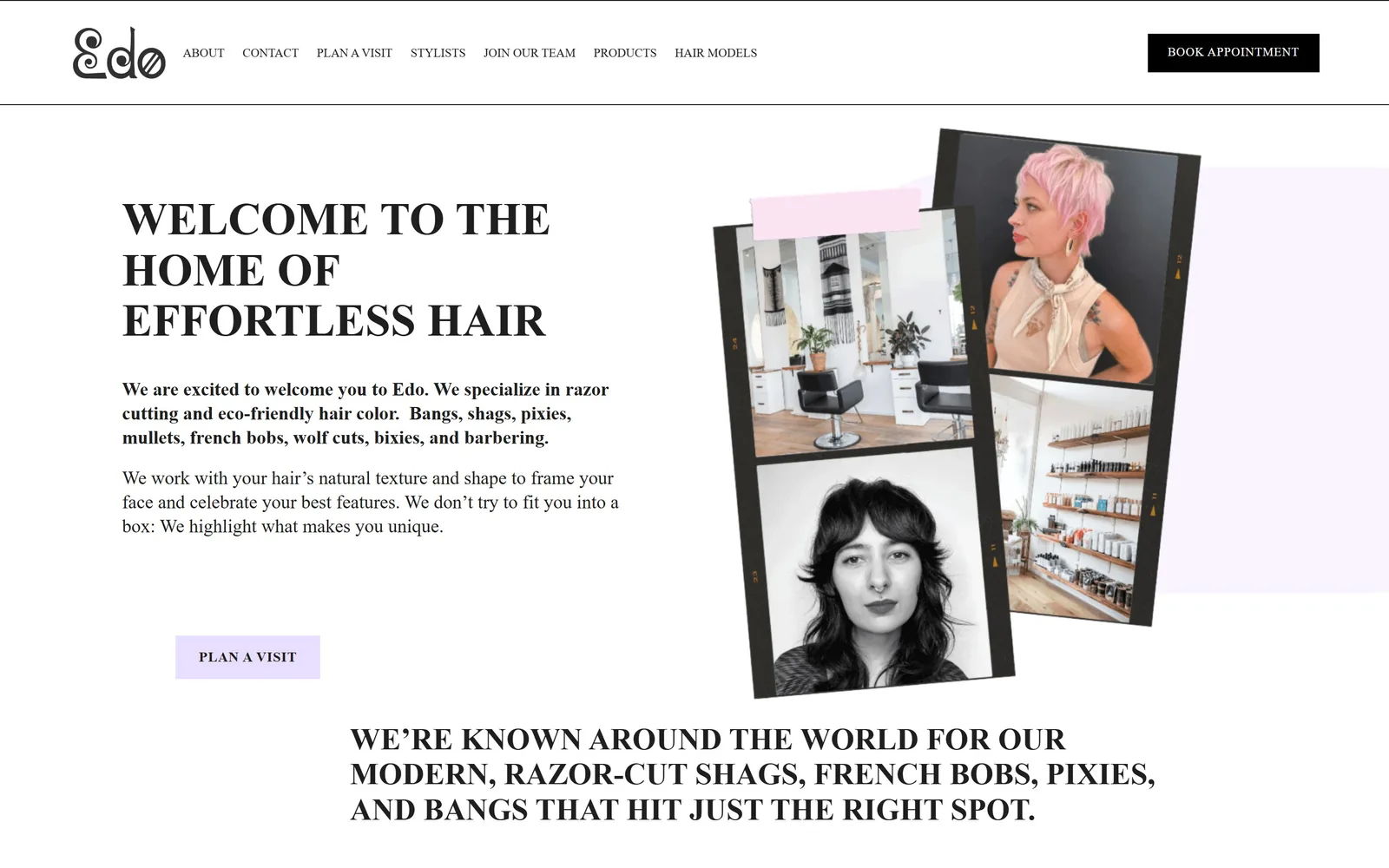
Three tilted film-strip photos taped with pink washi at the right, a high-contrast serif welcome headline at the left.
Type
Transitional serif, 56px caps
Body
Serif, 19px
Build
Two column with tilted photo collage
Made on
Squarespace
Colour
#faf5ff #e8deff #000000
Type. WELCOME TO THE HOME OF EFFORTLESS HAIR is a high-contrast transitional serif in caps at roughly 56px, with the thin strokes left thin at display size. The opening paragraph is set in the same serif at about 19px and bolded, then the second paragraph drops to regular, which is a cheap and effective way to rank two blocks of copy. The DOM reports a geometric sans here, but the drawn glyphs are plainly serif.
Colour. The page is a lilac-tinted white #faf5ff, the type is black, and the accent is a pale lilac #e8deff used twice: as the block behind PLAN A VISIT and as a panel behind the photo collage. A strip of pink washi tape at the top of one frame is the only saturated colour. The header's BOOK APPOINTMENT box is solid black, which outranks the lilac deliberately.
Layout. A 1440 frame, sticky header, two columns split near 50/50 with text left from 180px and the collage filling the right. The three photos are tilted a few degrees each and overlap, printed to look like 35mm frames complete with edge numbering. Corners are square throughout; the next section's headline starts breaking the fold at the bottom.
The ask. BOOK APPOINTMENT sits black in the header, and PLAN A VISIT waits at the end of five lines of copy, so the second ask is earned rather than repeated. Seven nav items including STYLISTS, JOIN OUR TEAM and HAIR MODELS is a wide menu for a single salon. The copy does the selling first: razor cutting, eco-friendly colour, then a list of cuts by name.
Photographs that look like someone's own film snapshots prove the room is real faster than any sentence about it.
08
thelanesalon.com
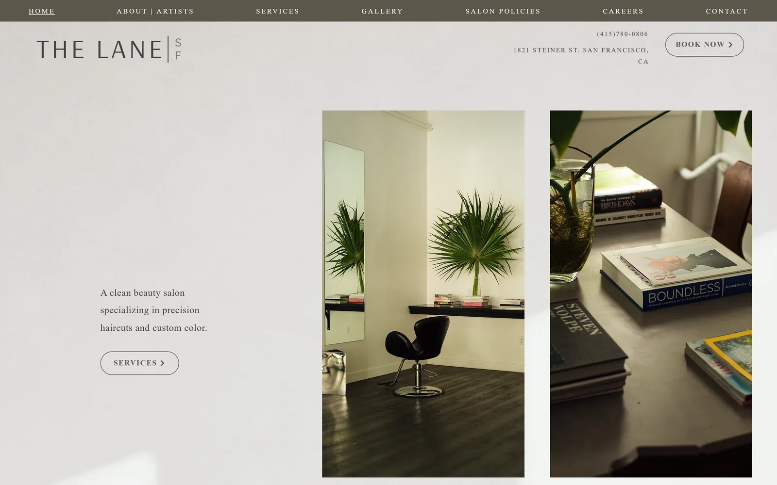
A taupe nav strip above a letterspaced wordmark, one sentence of serif copy at the left and two tall interior photos at the right.
Type
Letterspaced serif, 38px
Body
Serif 18px, 1.8 line height
Build
Nav strip above header, text and image pair
Made on
Wix
Colour
#ffffff #5d564b #414141
Type. Everything is serif, including the nav. THE LANE is letterspaced to about 0.1em at 38px, and the single sentence of body copy runs at 18px with a 1.8 line height and 0.02em tracking, which gives it the air of a printed page. Nav links are small caps at 0.2em, around 13px. No bold weight appears anywhere above the fold.
Colour. Two colours do the whole job: a taupe #5d564b for the nav strip and the hairline button outlines, and near white for everything else. Black type on white, taupe for navigation, and the plants and black chair in the photographs supply the rest. No accent colour is introduced at all.
Layout. A 1440 frame with the taupe nav running full width at 55px above the logo row, which is an inversion of the usual order. The left column starts at about 255px and holds only a sentence and a button; the two portrait images sit from 830px to the right edge with a 70px gutter between them. Buttons are pill-shaped outlines, the only round corners on the page.
The ask. The header carries the phone number and 1821 Steiner St. San Francisco above the BOOK NOW pill, so the visitor can check the location before being asked for anything. The second ask, SERVICES ›, sits under the description rather than beside the booking. Seven nav items, all plain, nothing fighting for attention.
Putting the street address directly above the booking button answers "is this near me" before the page asks for a commitment.
09
thenailsaloon.com
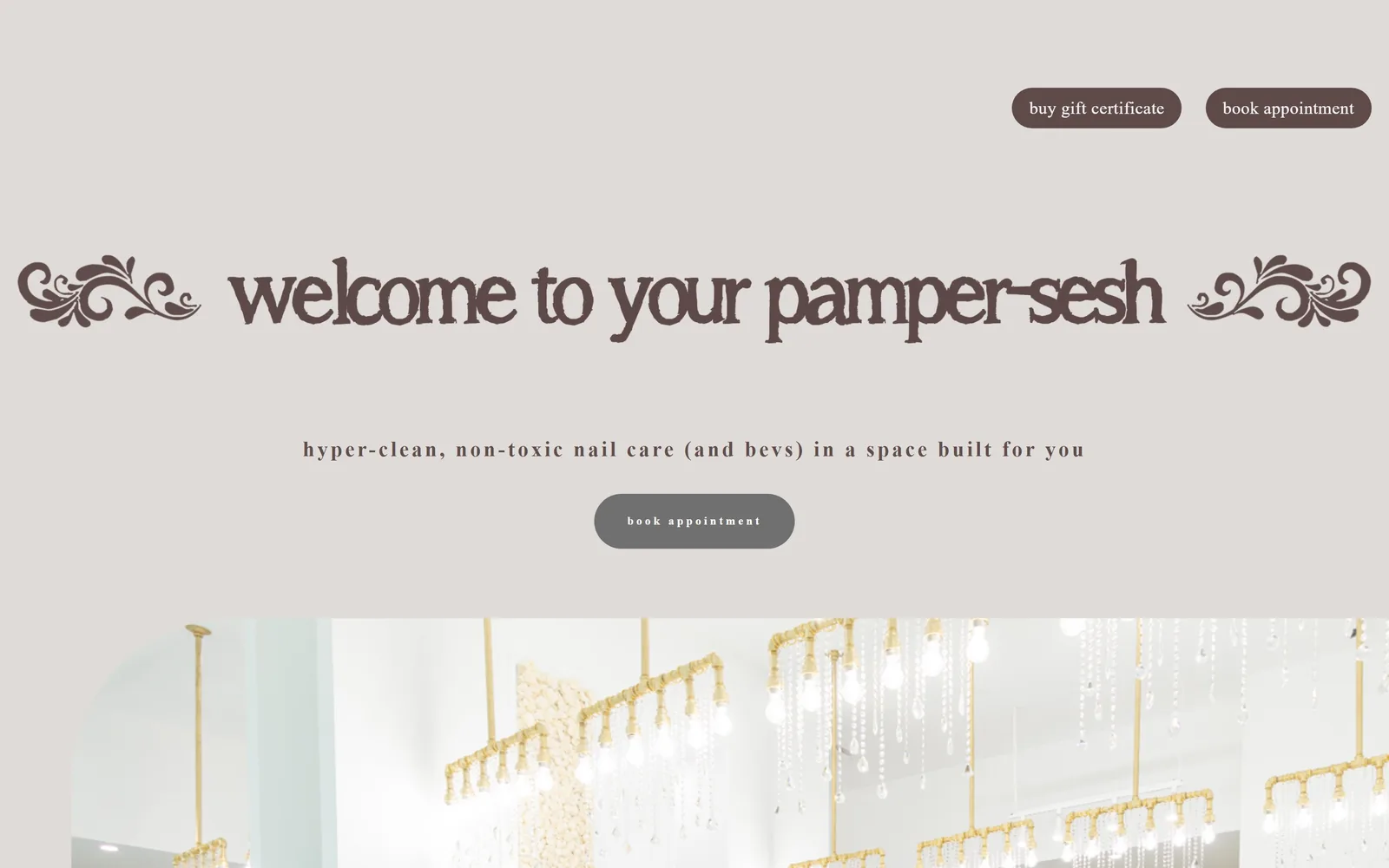
A warm grey field with "welcome to your pamper-sesh" in brown ornamental lettering, fleurons at both ends, over a chandelier photo.
Type
Ornamental display, 75px
Body
republic-web serif, 18px
Build
Centred stack above interior photo
Made on
Squarespace
Colour
#dfdbd8 #442f2c #707070
Type. The display face is an eccentric brown display with bulbous terminals and a slight hand-cut wobble, set lowercase at roughly 75px and flanked by two floral fleurons. The subhead is a serif at 18px tracked to about 0.1em, and the buttons drop to a geometric sans at 12px, bold, lowercase, tracked hard to 0.24em. Three registers, each used once, which is the right number.
Colour. A single warm grey #dfdbd8 covers the entire fold, with brown #442f2c for the lettering and the two header pills. The third colour is a mid grey #707070 on the hero's own button, and that is the weak point: the most important button is the least contrasted thing on the screen. The photograph below is almost white, so the grey field reads as a panel rather than a background.
Layout. A 1440 frame with no logo and no navigation above the fold, just two pills in the top right corner. The content is a centred stack, headline at around 400px down, subhead, then the button, with the photograph starting about 870px in. Pills are 300px radius, so fully round, and the layout is symmetrical to the pixel.
The ask. Three asks, all booking-adjacent: buy gift certificate and book appointment as brown pills in the corner, then book appointment again in the middle of the fold. The centred one should be the strongest and is instead the palest. Nothing else competes, because there is nothing else on the fold.
One ornamented display face plus one tracked sans is enough identity for a small studio, as long as the colour contrast lands on the button.
10
societysalons.com
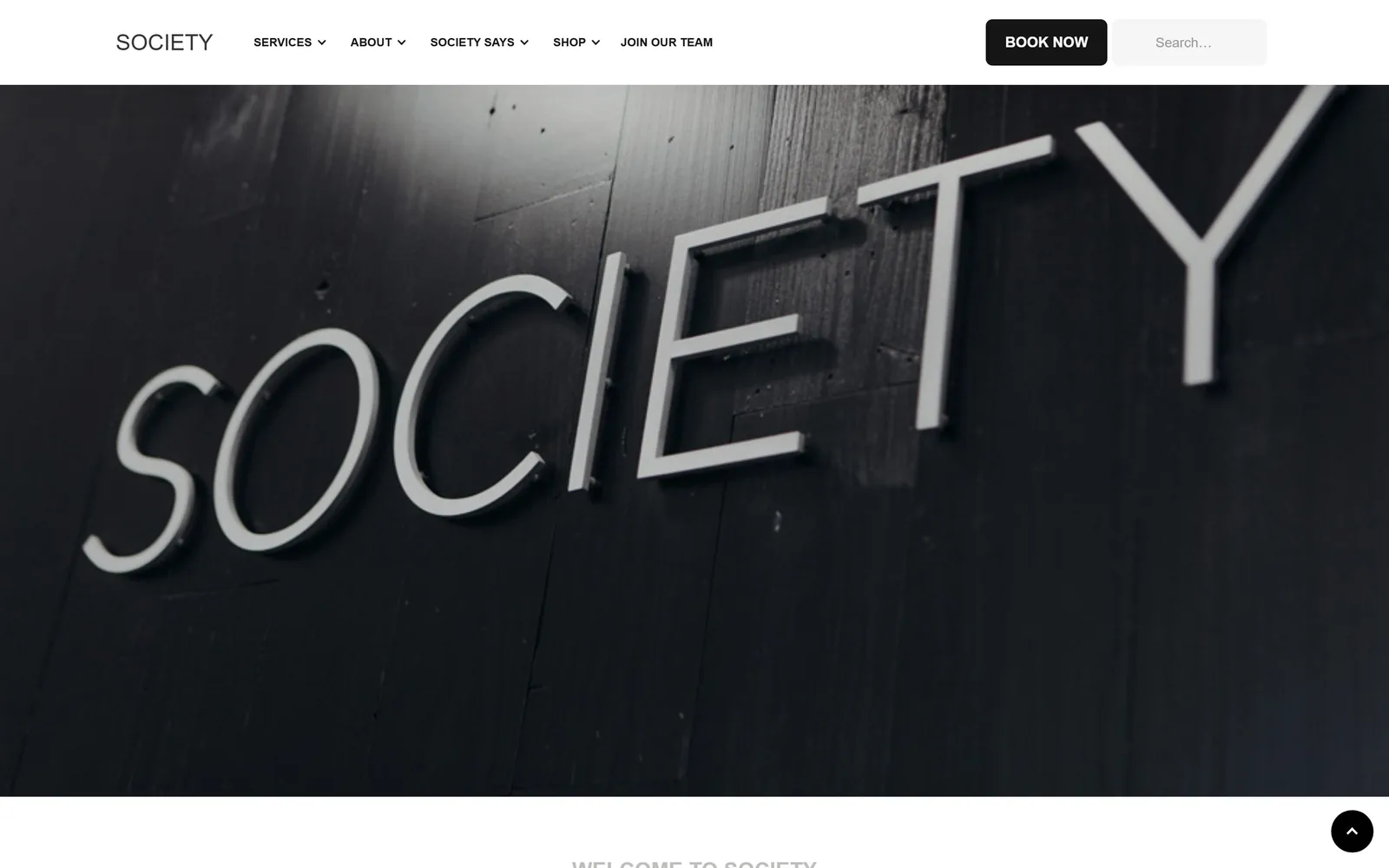
A close black-and-white photograph of the salon's own SOCIETY signage, angled across a dark painted wall under a thin white header.
Type
None above fold, photographed signage
Body
Lato, 15px
Build
Thin header over full-bleed signage photo
Made on
Webflow
Colour
#000000 #ffffff #151515
Type. There is no display type above the fold at all. The wordmark is a geometric sans at about 24px, letterspaced, and the nav runs at 14px with dropdown carets; BOOK NOW is 15px at weight 700. The headline job is done by the aluminium letters in the photograph, which are legible at a metre away.
Colour. Pure black and pure white, with #151515 on the button and #f5f5f5 in the search field. The photograph is monochrome, so the entire fold contains no hue at all. That is a decision, not a default, and it makes the single black button the only object with weight.
Layout. A 1240 content width inside the 1440 viewport, header 120px, photo full bleed below it running well past the fold. The button has a 7px radius, the search field matches, and those are the only soft corners anywhere. A circular back-to-top control sits bottom right.
The ask. One ask above the fold: BOOK NOW, black, in the header. Beside it a search field, which is an odd neighbour for a five-location salon and dilutes the button a little. Five nav items, three with dropdowns, nothing else pulling.
Photographing your own signage close enough to read lets the picture serve as the headline and saves you writing one.
11
paintbarla.com
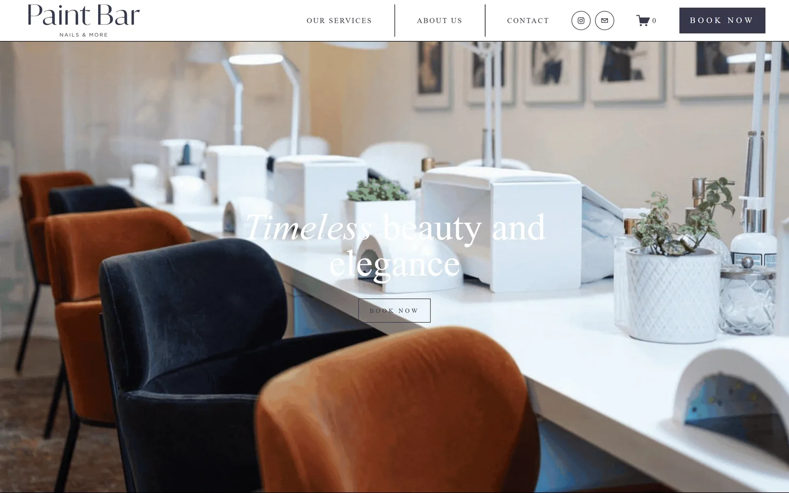
Rust and navy velvet chairs along a white manicure bench, with a white serif line and outlined BOOK NOW over it.
Type
Kepler display, 69px
Body
freight-sans-pro, 13px caps
Build
Centred hero over interior photo
Made on
Squarespace
Colour
#37384e #ffffff #b4542c
Type. Kepler display at 69px with the line height squeezed to 0.96, two centred lines, white. The nav and button use freight-sans-pro at 13px and 15px, uppercase, tracked to 0.17em and 0.3em respectively, which is wide enough that BOOK NOW reads as a label rather than a word. The logo pairs a serif "Paint Bar" with a tiny tracked NAILS & MORE beneath it.
Colour. Navy #37384e carries the logo, the nav type and the filled header button, and white does everything else. The rust velvet chairs and the black ones in the photograph are the room's colours, and the navy is picked straight off them, which is why the header does not feel bolted on. The hero text, though, is white over a brightly lit white bench with no scrim, and it loses.
Layout. A 1440 frame with a 100px white header, then the interior photograph full bleed to the fold. The headline is centred at roughly 55 percent height with the outlined button under it, and every corner on the page is square. Nav is split by two vertical rules into services, about and contact, which keeps three links from looking thin.
The ask. The same ask twice, BOOK NOW navy in the header and BOOK NOW outlined in the hero, plus Instagram, email and cart icons between them. Three nav items means almost nothing competes. The weakness is contrast, not count: the hero button is a thin white outline on a pale photograph.
Taking the nav colour from something physical in the room ties the site to the space, but the hero type still needs a scrim to survive a bright photograph.
12
blindbarber.com
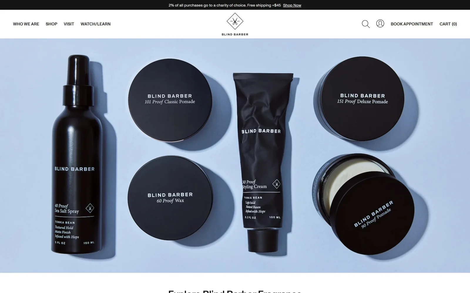
Six black grooming products arranged flat on a pale blue backdrop, filling the fold under a thin white header.
Type
Monument Grotesk Medium, 30px
Body
Monument Grotesk Regular, 14px
Build
Centred-mark header over full-bleed product photo
Made on
Shopify
Colour
#141414 #c5d0e2 #f7f7f7
Type. Monument Grotesk Medium at 13px, uppercase, 0.02em tracking, runs the entire navigation, and headings reach only 30px with a -0.01em squeeze. Nothing on the fold is set at display size. The only typography with presence is printed on the packaging in the photograph, where BLIND BARBER and "101 Proof" in italic serif do the brand work.
Colour. Near black #141414 for type and products, a pale periwinkle photographic backdrop around #c5d0e2, and #f7f7f7 for the header. The black mass is entirely supplied by the bottles and tins rather than by any block of colour the page draws. The result is a palette that changes whenever they reshoot.
Layout. A 1440 frame with a 48px black announcement bar, then a 125px white header with the diamond mark centred and nav split left and right around it. The photograph is full bleed and runs to the bottom of the fold, with the next headline just breaking it. Button radius is 1px, which is effectively square.
The ask. BOOK APPOINTMENT is plain text in the top right, no box, sitting next to CART (0). For a business that cuts hair in several cities, making the booking ask indistinguishable from a nav link is the clear cost of a shop-first homepage. The only emphasised link on the fold is Shop Now in the charity and free shipping bar.
Setting the whole interface at 13px leaves the photography as the only loud thing on the page, which only works if the photography is this good.
How these were chosen
Twelve hair salons, barbershops and nail studios, all captured at 1440 wide and judged on what is actually visible above the fold. They run from a single room on Steiner Street in San Francisco to a nail chain selling franchises, and the small ones often make the braver calls. The pattern worth stealing: a booking button in the header, then a second one lower down with a longer label that says what you are booking. Most salon website design advice still recommends a rotating slider, and the few sites here that use one were caught mid-crossfade and look worse for it. Where a site paid for its look in legibility or hierarchy, the entry says so.
Finding salon sites that someone had actually designed took far longer than it should have. 30 candidates made the shortlist. 12 made the page.
Each one was opened and looked at properly: what the type is doing, where the colour gets spent, how the page is built, how it asks for the job. Nothing is here because it ranks. Nothing is here because an agency filed it under portfolio. Several well known names were left out for the plain reason that their site came out of the same template as everyone else's, and a few sites worth including did not survive a second look.
Where a site is only competent, it says so. The order is the order worth your time, best first.
Reviewed and selected by Larry W. Matthews for Websitely.