Tattoo Website Design Beyond the Flash Wall, 16 Studios
Sixteen US studios that lead with the shop, the flash wall and the lettering. Tattoo website design where the room does the selling, not the skin.
Shown
16 sites
Reviewed
40 candidates
Chosen on
The work, not the ranking
Updated
15 October 2026
01
vismstudio.com
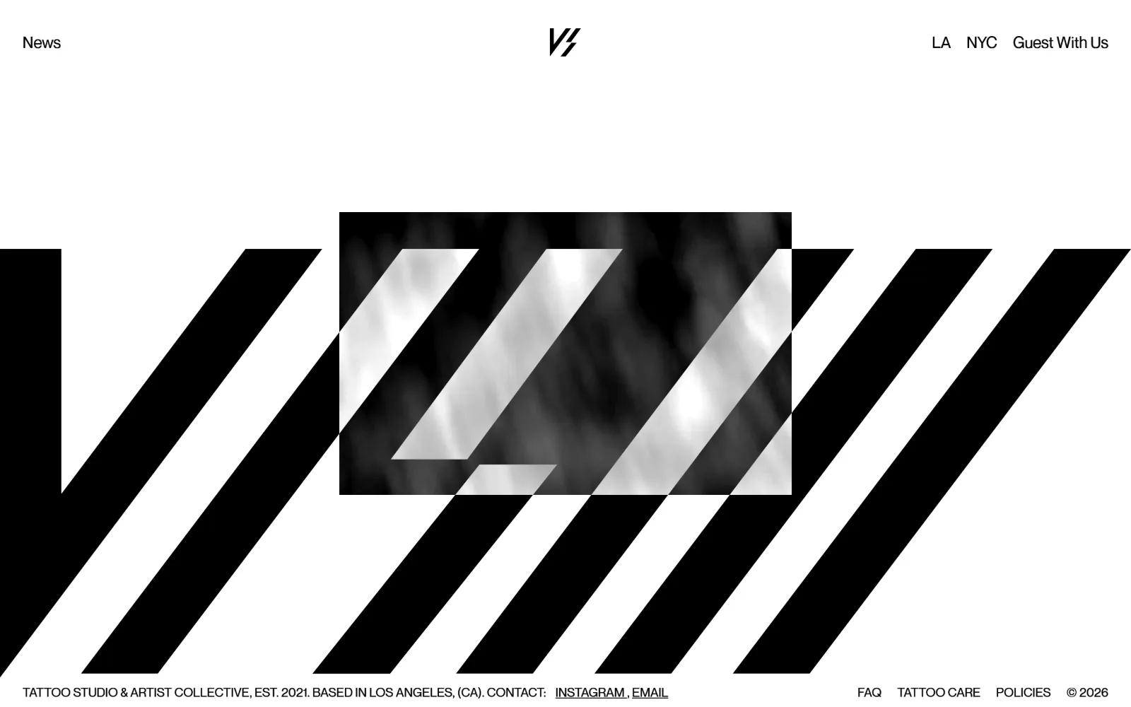
A white page carrying a huge black diagonal stripe field, a slashed monogram centred in the header, and a grey photo panel cropped by the stripes.
Type
Neuemontreal 20px
Body
Neuemontreal 19px nav, 16px footer
Build
full-viewport stripe field, single 900px screen
Made on
Webflow
Colour
#ffffff #1a1b1f
Type. Neuemontreal carries every word on the page and there is no display face at all: 19px nav links in #1a1b1f, a 20px line in the header stack, and 16px for the whole footer rule. The stripe graphic is doing the job a headline would normally do, which is why News, LA and NYC can sit at identical size and weight without any of them having to shout.
Colour. Two values and nothing else. The ground is #ffffff and the type is near-black at #1a1b1f, with the diagonal field reading as flat black across the lower two thirds. The only tonal relief is the greyscale photo panel, and the stripes run straight over it, so even the image is pulled into the black and white system rather than sitting outside it.
Layout. No container width is set, so the stripe field runs the full viewport edge to edge and the document stops at 900px, a single screen with no scroll. Header items pin hard left, centre and hard right, and the footer line repeats that three-point split. The photo panel is a plain rectangle with zero corner radius, overlapped by the stripes instead of framed by them.
The ask. Nothing is sold on the first screen and there is no booking button, no phone number and no form. The entire ask is Guest With Us in the top right next to LA and NYC, with Instagram and an email link in the footer. It is a gate for people who already know the studio, and the restraint is the point rather than an oversight.
A single full-bleed graphic device can replace the headline outright, as long as the nav carries the only words that actually matter.
02
fleurnoiretattoo.com
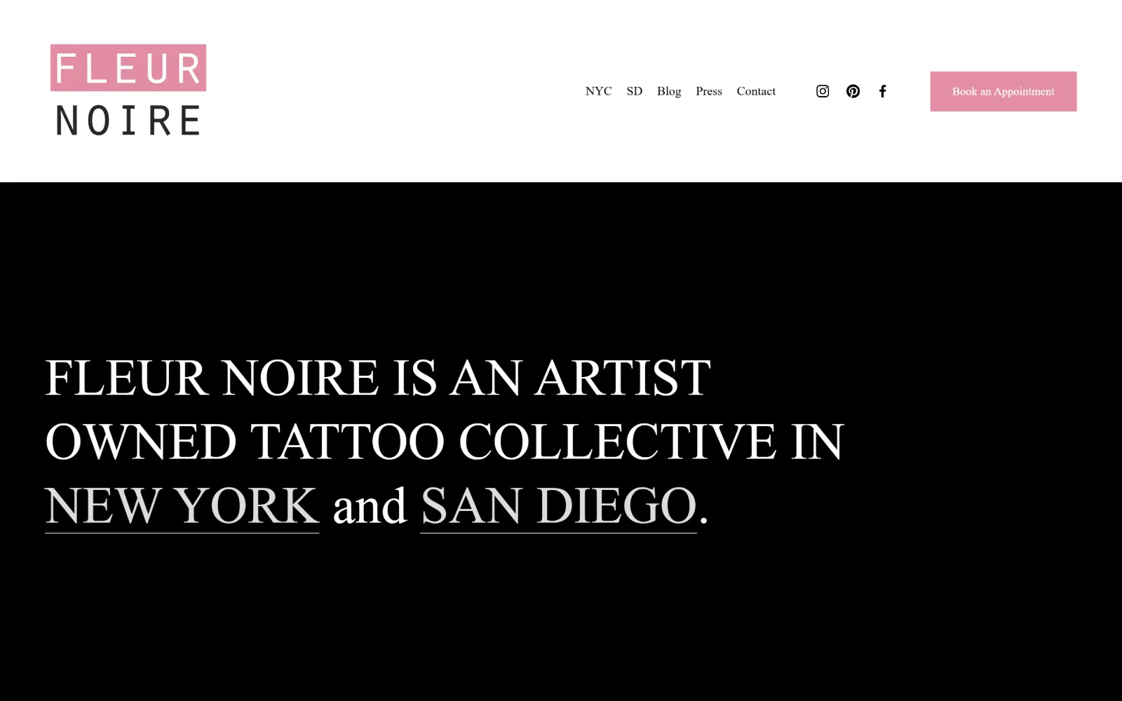
Pink block logo over white, then a black field filled by one 66px serif sentence naming New York and San Diego, with both city names underlined.
Type
66px serif, line-height 1.23
Body
Poppins 16px, weight 300, 1.80
Build
white header band over black hero, 234px padding
Made on
Squarespace
Colour
#ffffff #2e1736 #e38da4
Type. One sentence at 66px, weight 500, line-height 1.23, set in a high contrast serif with the two city names underlined so the sentence doubles as navigation. Body copy drops all the way to 16px at weight 300 on 1.80 leading, and the 22px Clarkson line in between is the only intermediate step. A 36px second tier handles section headings.
Colour. Four values, used flatly: #ffffff for the header band, black for the hero field, the recorded #2e1736 plum behind it, and #e38da4 pink carrying the logo block and the Book an Appointment button. The pink is the whole brand and it appears exactly twice above the fold, which is why it registers rather than decorating.
Layout. The white header is a separate band from the black hero rather than floating over it, so the pink logo tile reads as a sticker against white. Container runs the full 1440px viewport with 234px of section padding, the largest in this set, and the hero text block is left aligned on a hard margin. Button radius is 0, matching the square logo tile.
The ask. One ask, bottom right of the header: Book an Appointment in #e38da4 at 14px. Five nav items sit left of it, two of which are cities rather than pages, and three social icons separate the two groups. No phone number anywhere on the first screen, which fits a two-city collective where artists keep their own books.
Put the brand colour on exactly two elements above the fold and let everything else stay black, white and type.
03
greatlakestattoo.com
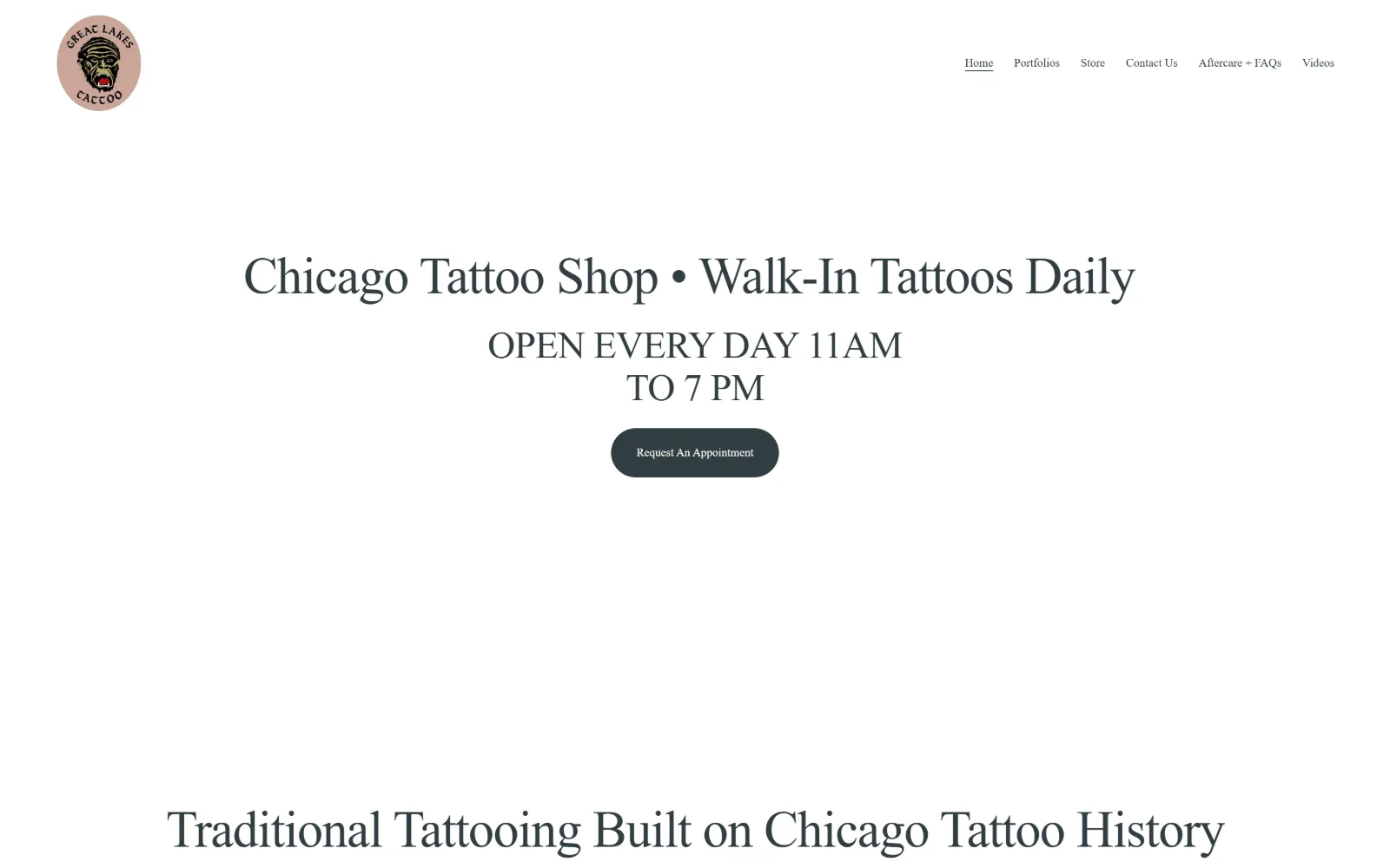
Centred serif line about walk-in tattoos on plain white, opening hours stacked beneath it, a dark pill button, and a round logo top left.
Type
Instrument Serif 53px, -0.02em
Body
Newsreader 19px, 1.50
Build
centred column, 131px padding, 1938px page
Made on
Squarespace
Colour
#ffffff #313d41
Type. Instrument Serif at 53px with -0.02em tracking and a tight 1.08 line-height sets the hero, and a second 40px step carries the section head below it. Body is Newsreader at 19px on 1.50, and the nav drops to 12px of the same serif, so there is no sans anywhere. Two serifs that share a skeleton read as one voice at two temperatures.
Colour. A near-monochrome build: #ffffff at 300 coverage and #313d41, a cool slate grey, doing all 1844 characters of type plus the button fill. The only saturation on the page is the dusty pink disc behind the gorilla logo, which is artwork rather than interface, so the colour arrives from the shop mark instead of from the CSS.
Layout. Everything is centred on a 1440px full-width container with 131px of section padding, and the document is only 1938px tall, so the homepage is deliberately short. Squarespace's 26-column grid with 11px gutters sits underneath. Corner radius is 0 everywhere except the button, which is set to 300px and so renders as a full pill.
The ask. Request An Appointment is the single button, sized small at 12px so it reads as a quiet link rather than a banner. Opening hours are promoted above it in 40px type, which is the real conversion move for a walk-in shop: the answer to can I come in today is larger than the booking ask.
When walk-ins are the business, set the hours bigger than the booking button and let the button stay small.
04
pilgrimagetattoo.com
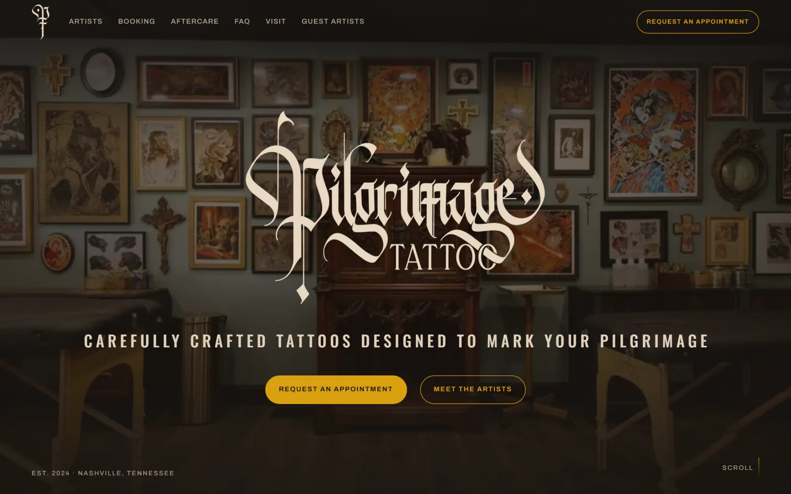
Dimmed photograph of a wall packed with framed flash and a carved cabinet, a cream blackletter wordmark centred over it, two gold buttons beneath.
Type. Three faces, each with one job. Big Shoulders Display at 89px, weight 800, -0.005em, handles the headings further down; Beatster sets the hero line at 29px uppercase with an unusually wide 0.22em of tracking; Archivo covers body at 21px on 1.55 and nav at 12px uppercase. The blackletter wordmark is artwork and sits outside that system.
Colour. An almost single-hue page. The ground is #00003c, a navy so deep it passes for black, with #010052 as the button fill and three ink values clustered within a few points of each other, #01004c, #01004e and #010052. The gold of the buttons and the cream of the wordmark come from the artwork, not from a second brand colour.
Layout. A sticky header sits over a full-bleed hero photograph with the wordmark locked to the optical centre. The container is 1440px with 112px of section padding, and below the fold a two-column grid splits 562.906px against 675.5px with an 86px gutter, so the page is intentionally asymmetric. Buttons are set to 999px radius, full pills against hard-edged everything else.
The ask. Request An Appointment appears twice on the first screen, once pinned top right and once as the primary gold button, with Meet The Artists as the outlined secondary next to it. Six nav items, no phone. The repetition is deliberate rather than clumsy, because the header copy and the hero button are the same words.
Repeating one CTA in the header and the hero works when the wording matches exactly, so the second sighting confirms rather than competes.
05
mantletattoo.com
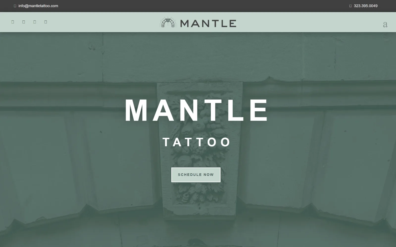
Sage green duotone over a photograph of a carved stone keystone, with MANTLE set in wide white caps and a pale outlined Schedule Now button under it.
Type
Montserrat 108px, 0.139em, uppercase
Body
Montserrat 22px nav, 13px button
Build
duotone full-bleed hero, 180px padding
Made on
WordPress
Colour
#4b635b #c3d5ce #404041
Type. Montserrat does everything across five steps: 108px at weight 600 with 0.139em tracking for the wordmark, 43px at a very wide 0.347em for the word underneath, 34px at 0.088em for the tagline, 22px bold uppercase for nav, and 13px at 0.154em on the button. Tracking widens as the size drops, which keeps the small caps legible over photography.
Colour. The duotone is the design. A #4b635b sage wash sits over the whole hero so the stone photograph loses its own colour entirely, with #c3d5ce, the lighter sibling, filling the button and the top utility bar. Type is #ffffff over the wash and #4a625b inside the button, so the palette never leaves the green.
Layout. A thin utility strip carries email and phone above a pale green header band, and the hero below runs full bleed with 180px of section padding inside a 1440px container. Corner radius is 0 on everything including the button, which is an outlined rectangle. The wordmark and the button share one centre line down the page.
The ask. The phone number 323.395.0049 is top right and the email is top left, both in the utility strip, which leaves the hero with a single ask: Schedule Now. Three routes to contact, but only one of them is given any visual weight, so the hierarchy holds instead of splitting.
Washing the hero photograph in the brand colour lets you use any image you have and still own the first screen.
06
handofglorytattoo.com
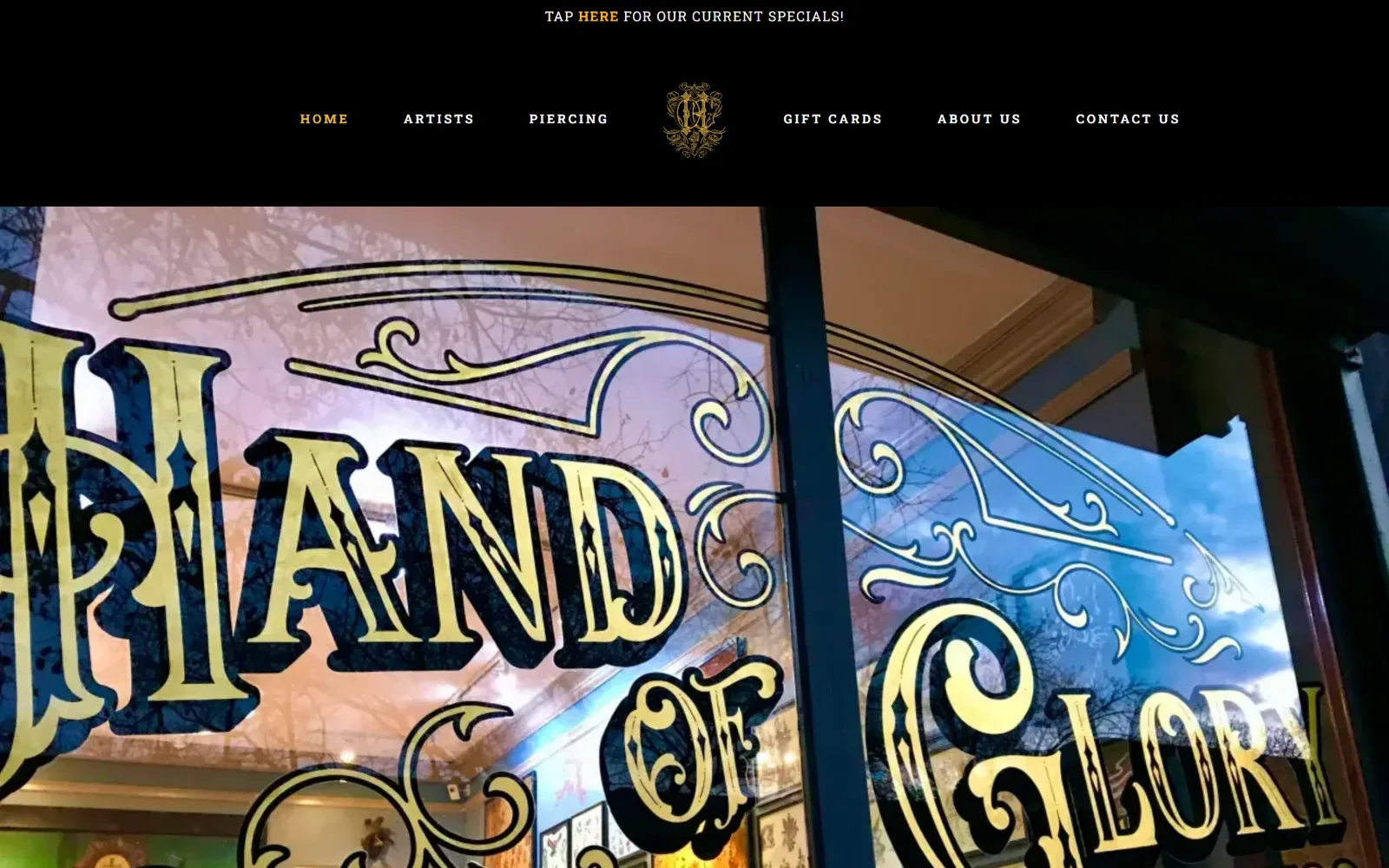
Gilded gold window lettering shot from the pavement fills the frame, under a black bar holding a small gold monogram and seven uppercase links.
Type
Roboto Slab 40px, 0.200em, uppercase
Body
Roboto 15px, weight 700
Build
full-bleed cropped storefront, 60px padding
Made on
WordPress
Colour
#ffffff #000000 #fcb123
Type. Roboto Slab runs the chrome at 13px, weight 700, uppercase, with a very wide 0.200em of tracking, and that same slab appears at 40px for the heading below the fold. Roboto at 15px bold handles 198 characters of body copy in 16 separate blocks. The hero carries no type at all, because the gold signwriting in the photograph is the display face.
Colour. The interface is just #ffffff and #000000, with ink at #d0cfcf for body and a single gold #fcb123 used on four characters, the word HERE in the specials strip. Everything else chromatic comes from the photograph: gold leaf, blue sky reflection, and the shop window behind it.
Layout. A 60px padded page on a 1440px full-width container, with the nav split either side of the centred monogram and a thin announcement strip above it. The hero photograph is full bleed and cropped so hard the lettering runs off three edges, which is what makes a flat storefront shot feel like a hero image. Radius is 0 throughout.
The ask. There is no button on the first screen. The only ask is the top strip, Tap Here For Our Current Specials, with the link word in gold, and the nav carries Gift Cards and Contact Us as the fallback. For a walk-in and piercing studio that is a soft open rather than a booking funnel, which costs it conversions.
Cropping a signwritten storefront until the lettering runs off three edges turns a flat photograph into a display typeface.
07
livebytheswordtattoo.com
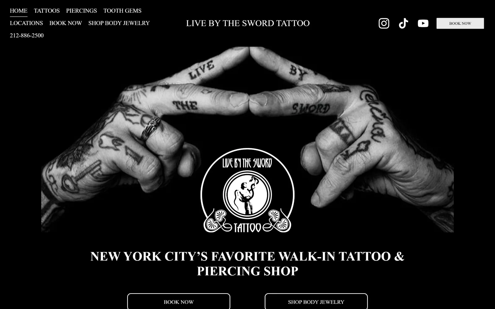
Two heavily tattooed hands meet fingertip to fingertip in black and white, a circular shop seal sits between them, and a serif headline runs below.
Type
runytunes 74px
Body
Poppins 17px, weight 500
Build
sticky header, inset hero image, 136px padding
Made on
Squarespace
Colour
#000000 #e9e9e9
Type. A custom face called runytunes sets the display at 74px and again at 26px, giving the shop name a hand-cut look, while Poppins at weight 500 handles everything functional: 17px nav, 16px secondary links, 12px buttons. The hero line sits at 37px, deliberately smaller than the display, so the photograph is never competing with two large type sizes.
Colour. Black at 316 coverage against one light value, #e9e9e9, used for the button fill and nothing else. Ink is 184 characters of #ffffff and 23 of #000000 inside that button. The photograph is desaturated to match, so the page is a true two-value build rather than a dark theme with accents dropped in.
Layout. A sticky header spans the full 1440px width with the nav wrapping to three lines on the left, the shop name centred and the icons right. The hero image is inset with black margins rather than bled, which frames the hands like a print. Section padding is 136px, button radius is a soft 5px, and the document runs 10254px, by far the longest here.
The ask. Four asks compete on the first screen: Book Now in the header, Book Now again in the hero, Shop Body Jewelry beside it, and the phone number 212-886-2500 set into the nav block. For a walk-in shop with two boroughs that is defensible, but the duplicate Book Now buttons split attention rather than reinforcing.
Two identical buttons on one screen do not double the signal; give the secondary a different job or drop it.
08
riverwesttattoocompany.com
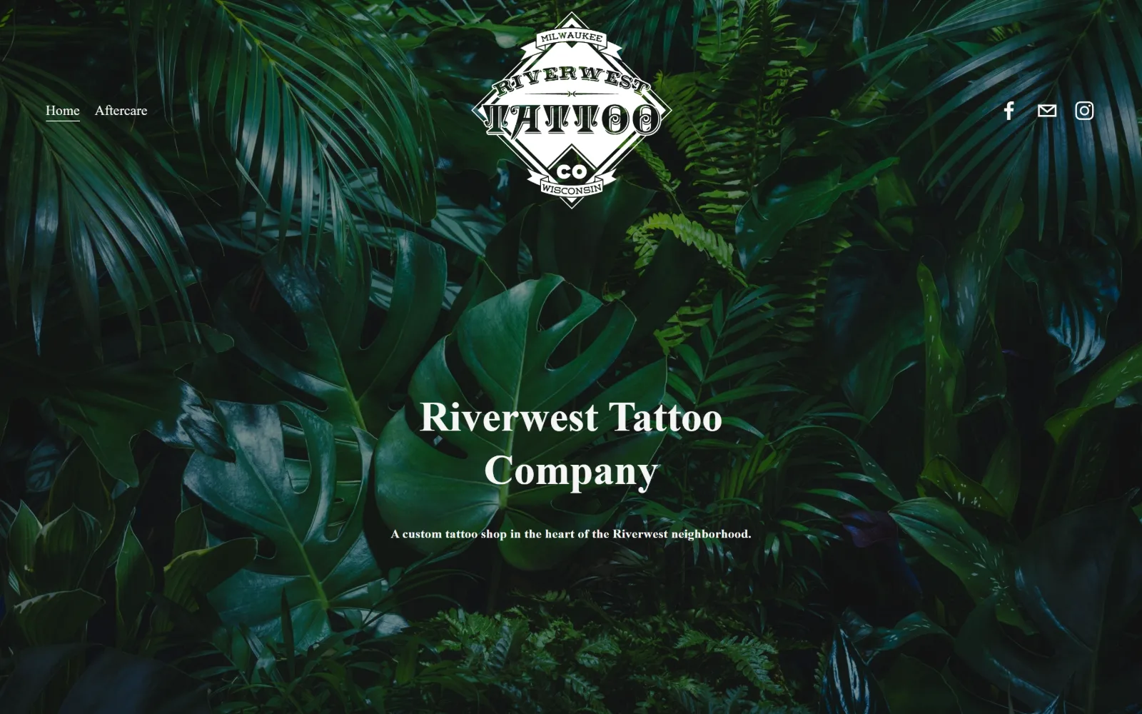
Dense dark green foliage fills the frame, a white diamond badge sits at the top centre, and the shop name is set in white serif over the leaves.
Type
ivymode 53px, weight 600
Body
athelas-web 18px
Build
full-bleed foliage, 279px padding, two-item nav
Made on
Squarespace
Colour
#030303 #000000 #f5f5f5
Type. ivymode at weight 600 does all the display work, 69px for the badge-adjacent line and 53px on 1.27 for the shop name, with no tracking adjustment at either size. Supporting type is athelas-web, a bookish serif, at 18px for nav and 14px for the single tagline. Two serifs, no sans, and only four type sizes on the entire page.
Colour. The interface palette is black on black, #030303 over #000000, with ink at #f5f5f5 and a white button fill. Every bit of colour on the screen is photographic: the monstera and fern greens of the hero, which the measured palette does not record at all because none of it is in the CSS.
Layout. A full-bleed photograph with the logo badge centred at the top and the name centred around the optical middle. The container is the full 1440px and section padding is 279px, the deepest in this set, which is why the first screen holds so little. The 26-column Squarespace grid underneath uses 11px gutters, and corner radius is 0.
The ask. Nothing is asked above the fold. The nav holds two items, Home and Aftercare, with Facebook, email and Instagram icons to the right, so booking happens off-site through social. That is a real choice for a small shop with full books, but a visitor who wants to enquire has to leave the page to do it.
A two-item nav signals that booking happens elsewhere, so add one contact route on the first screen or visitors will bounce to Instagram.
09
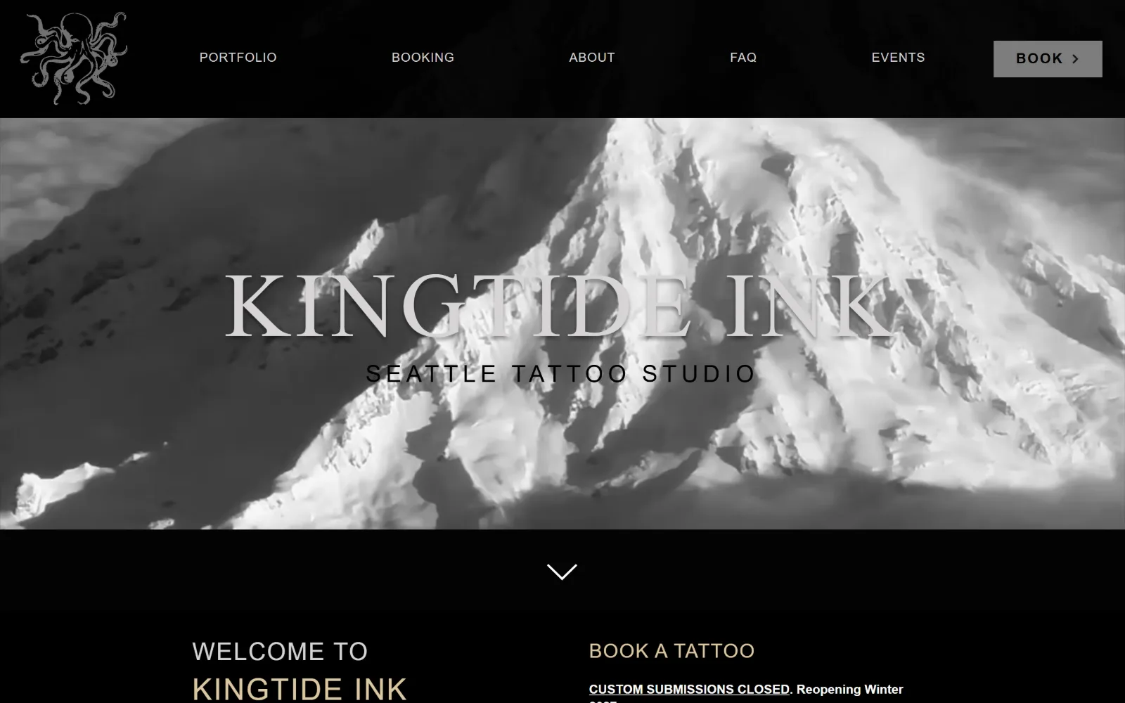
kingtideink.com
Black and white photograph of a snow-covered mountain ridge behind KINGTIDE INK in large light serif caps, with a line-drawn octopus logo at the left.
Type
117px serif caps, 0.05em
Body
helvetica-w01-roman 16px, 1.30
Build
black bar over full-bleed photo, 1440px
Made on
Wix
Colour
#000000 #bababa #dbc7a1
Type. The display sits at 117px with 0.05em of letter-spacing in #d6d4d4, light enough that the mountain reads through it, and the subtitle under it drops to a tracked 30px at 0.200em. Below the fold an Avenir heavy cut takes over at 38px, 31px and 25px, with body at 16px on 1.30. The nav is tiny at 10px, which is too small to be comfortable.
Colour. Black at 168.5 coverage with a near-identical #030303 behind it, and one interface grey, #bababa, filling the Book button. Ink runs #ffffff and #d6d4d4 for the display, with a sand tone, #dbc7a1, used for 44 characters of heading below the fold. That warm sand is the only thing stopping the page from being pure greyscale.
Layout. A black header bar sits on top of a full-bleed hero photograph, with the octopus mark squared off at the far left and the Book button squared off at the far right. The container is the full 1440px, radius is 0 throughout, and a centred chevron marks the scroll point before the page splits into a two-column welcome and booking block.
The ask. Book sits in the header with an arrow glyph, and the hero itself asks for nothing. Directly below, the booking column states Custom Submissions Closed in underlined caps before any form appears, which is honest and saves the enquiry. Six nav items including FAQ and Events share the bar with the button.
Stating that books are closed above the booking form respects the reader more than a form that quietly fails.
10
slowpoketattoos.com
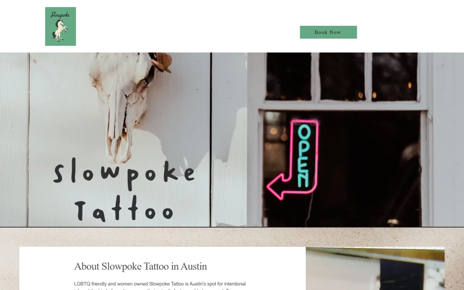
Two photographs side by side: hand-painted shop lettering under a mounted cow skull, and a pink neon OPEN arrow glowing in a dark window.
Type
hand-drawn Wix face 56px
Body
poppins-v2 15px, 1.50
Build
sticky header, two-up full-bleed photo band
Made on
Wix
Colour
#ebe4da #323232 #66a884
Type. A hand-drawn Wix face sets the display at 56px and the section head at 33px with -0.03em of tracking, which is unusual for a casual face and keeps it from sprawling. Body is poppins-v2 at 15px on 1.50 with -0.01em, and Playfair Display at 16px with 0.1em of tracking handles small label text. The painted sign in the photograph sets the tone the webfont then matches.
Colour. Five values, warm rather than neutral: an #ebe4da sand ground, #323232 and #1a1615 for the dark bands, white, and #66a884 green on the Book Now block with a darker #3d7a57 for link text. The pink neon in the photograph is the loudest thing on the page and it is not in the palette at all, which is why the green reads as calm.
Layout. A white sticky header with the logo tile left and the booking block right, then a full-bleed two-up photo band splitting the width roughly 55 to 45. Below it a white card overlaps the sand ground and a second image hangs off the right edge. Container is 1440px, radius is 0, and the document is a short 3418px.
The ask. Book Now is a solid green rectangle in the header and it is the only ask on the first screen. Seven nav items sit behind it. The About paragraph underneath leads with who the shop is for rather than with services, so the booking block carries the whole conversion load without competition.
Keep the brand colour out of the photography so the one button in that colour stays the loudest interface element.
11
alchemynashville.com
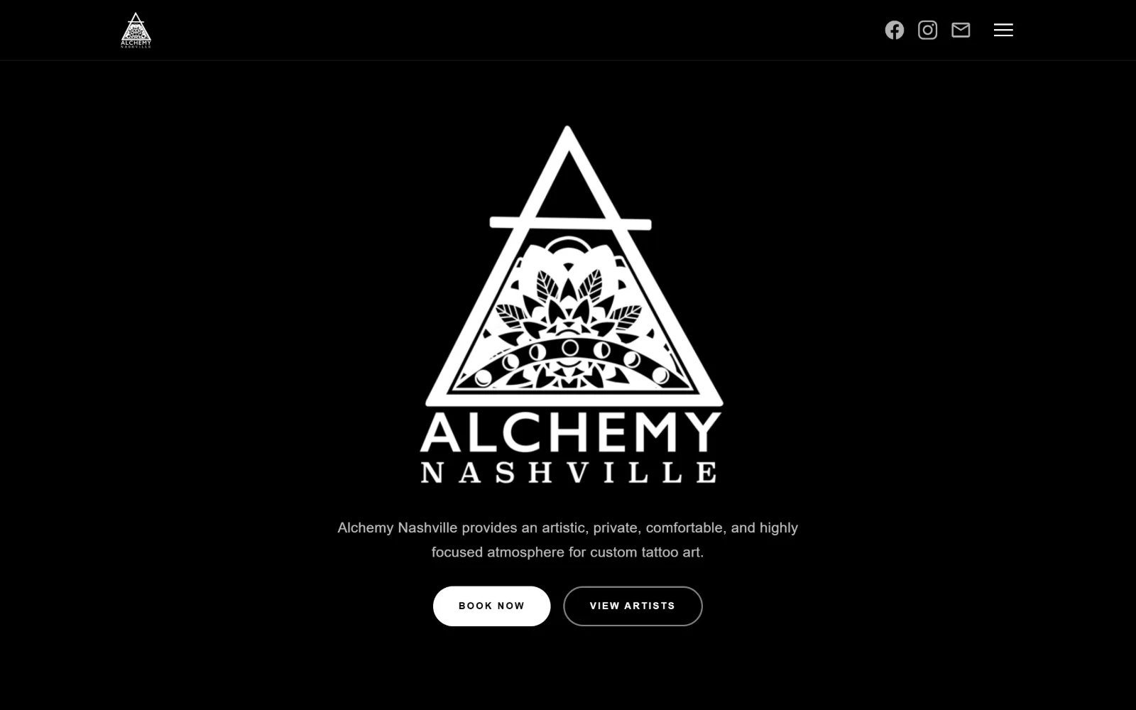
White triangular mandala logo centred on pure black, a single line of description under it, and two pill buttons reading Book Now and View Artists.
Type
Anton 64px, 0.063em
Body
Raleway 18px, weight 300, 1.70
Build
centred logo on black, 520px + 520px grid
Made on
Squarespace
Colour
#000000 #0d0d0d #ffffff
Type. Anton handles display at 64px and 42px with 0.063em and 0.048em of tracking, both below the fold, while the hero line is Raleway at only 18px, weight 300, on 1.70 leading. Buttons use Montserrat at 12px, weight 700, uppercase, with a very wide 0.167em. Setting the hero sentence at body size is the decision here: the logo is the headline.
Colour. Three measured values and two of them are black: #000000 at 164.9 coverage, #0d0d0d at 39.3, and #ffffff at 3.1. Ink is 596 characters of white against 70 of black inside the filled button, with #666666 on 19 characters of fine print. No accent colour is set anywhere in the CSS.
Layout. A 1440px full-width container with 80px of section padding and a 4141px document. Below the hero a two-column grid runs 520px against 520px with 60px gutters on both axes, which is a rare symmetric split. Corner radius is 0 everywhere except the buttons, set to 40px so they render as pills against the hard-edged grid.
The ask. Two pills sit side by side, Book Now filled white and View Artists outlined, which is the correct pairing for a private studio where choosing the artist comes first. The header collapses to a hamburger with Facebook, Instagram and email icons, and no phone number appears. Two asks, clearly ranked.
Pair a filled primary with an outlined secondary only when the secondary is a genuine earlier step, such as choosing an artist.
12
wonderlandpdx.com
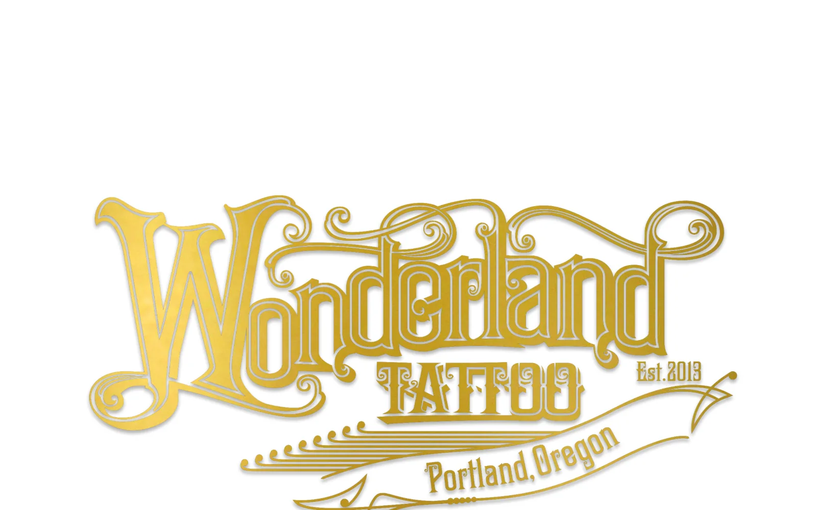
The entire first screen is one gold engraved wordmark on white, with a ribbon banner reading Portland, Oregon and a small Est. 2013 beside it.
Type
gold engraved wordmark artwork
Body
Alice 17px, 0.02em, 1.80
Build
full-width wordmark, no header band
Made on
Squarespace
Colour
#ffffff #393838 #272727
Type. Live type is Alice throughout, a transitional serif, at 30px for the largest real heading, 18px uppercase with 0.07em of tracking used 13 separate times, 21px uppercase for nav and 17px on 1.80 for body. The ornate gold lettering is an image, not a webfont, which is why the page can afford one quiet serif behind it.
Colour. The only measured value is #ffffff, with ink at #393838, #272727 and #181616, three near-blacks that differ by a few points. Every bit of warmth is in the gold of the wordmark artwork, so the site is literally a white page with one coloured object on it.
Layout. The container is the full 1440px with the wordmark scaled to fill almost the entire viewport width, and the document runs 3924px. No header band, no nav bar and no measured nav items on the first screen: the artwork sits alone with white above and below it, and the menu only appears once you scroll past it.
The ask. Nothing is asked on the first screen, not even a menu. For a Portland studio that books through enquiry rather than walk-ins this is a brand statement first and a website second, and the cost is that a visitor on a phone sees one image and must scroll before finding out what the business even does.
A full-screen logo works as an entrance only if the next scroll immediately answers what the business does and how to book.
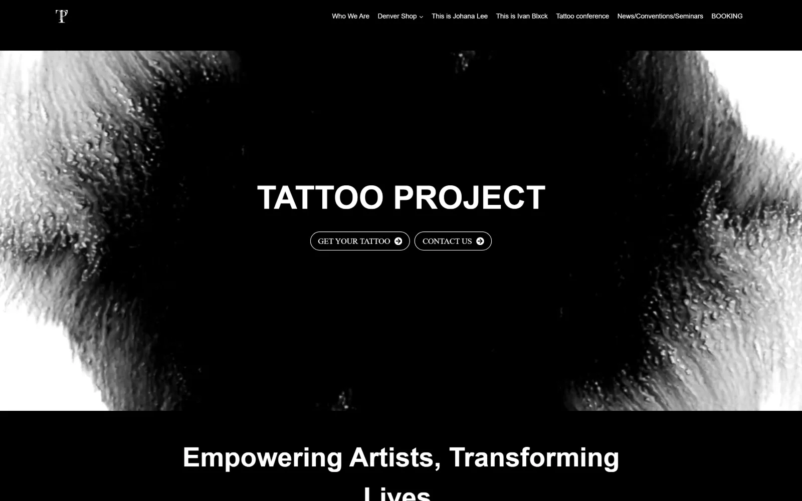
13
tattooproject.co
Monochrome ink bloom video fills the hero, TATTOO PROJECT in bold sans caps across the middle, and two outlined pill buttons underneath it.
Type
Arial 48px bold with Helvetica 48px weight 100
Body
Helvetica 20px, weight 300
Build
full-bleed video hero, 3 x 432px card grid
Made on
WordPress
Colour
#000000 #ffffff #f7fafc
Type. An odd but effective pairing: Arial bold at 48px for the wordmark and Helvetica at weight 100 at the same 48px for the line below, so one size reads as two voices. Helvetica Light at 20px carries the subheads, League Spartan at 14px labels small items, and the nav sits at 12px. The system fonts are a limitation turned into a flat, unbranded look.
Colour. Black at 267 coverage with white at 1, plus #f7fafc on a handful of characters. The ink bloom in the video supplies every grey on the screen, so the contrast curve of the footage is effectively the palette, and the buttons are outlined rather than filled to keep any solid shape out of it.
Layout. The video hero runs full bleed to roughly 820px before a black section takes over, and the wordmark and buttons are centred on it. Below, a 256px against 985px two-column split handles the sidebar layout and a three-column 432px grid with 16px and 32px gaps handles cards. Radius is 0 on panels, pills on the buttons.
The ask. Get Your Tattoo and Contact Us sit as equal outlined pills, which is one ask too many given they lead to the same conversation. Seven nav items carry two named artist pages and a conventions page, so the header is doing audience splitting that the hero buttons repeat.
Two equally weighted buttons that end in the same conversation should be one button and one link.
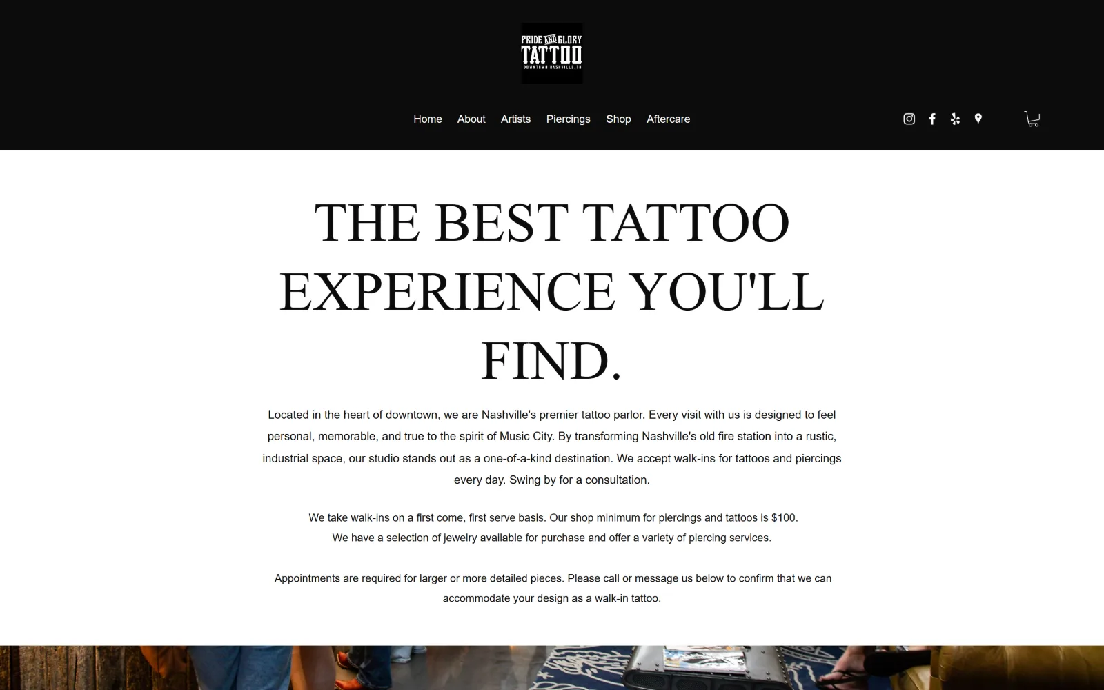
14
prideandglorytattoo.com
Black header band with a boxed logo above the nav, then a 72px uppercase serif claim on white, over three paragraphs of walk-in and minimum policy.
Type
Playfair Display 72px, uppercase, 1.25
Body
Avenir light 15px, 1.88
Build
stacked black header, centred single column
Made on
Wix
Colour
#ffffff #fafafa #0c0c0c
Type. Playfair Display at 72px, uppercase, on 1.25 leading in #0c0c0c, with a 22px step of the same face for the section label underneath. Body is a light Avenir cut at 15px on an airy 1.88, and a Futura light sits at 21px for one short line. High contrast serif against a geometric sans is a conventional pairing and it is executed cleanly here.
Colour. Three near-neutrals: #ffffff at 200.7 coverage, #fafafa at 20.7 for the secondary band, and #0c0c0c carrying all 857 characters of type. No accent is set, so the only colour on the first screen is the photograph at the very bottom edge, where blue denim and a patterned floor appear under the fold.
Layout. A black header band holds the boxed logo stacked above six centred nav items, and the content below is a single centred column on a 1440px full-width container. Corner radius is 0 and the measured flex rows are the two icon groups. The document is 4133px and the full-bleed photo band begins right at the fold line.
The ask. No button exists on the first screen. Instead the copy states the walk-in policy, the 100 dollar shop minimum and when appointments are required, which answers the three questions a walk-in shop gets by phone. Contact sits in the nav and a cart icon sits far right, so commerce and booking are kept apart.
Answering the shop minimum and the walk-in rule in body copy removes more friction than a button would.
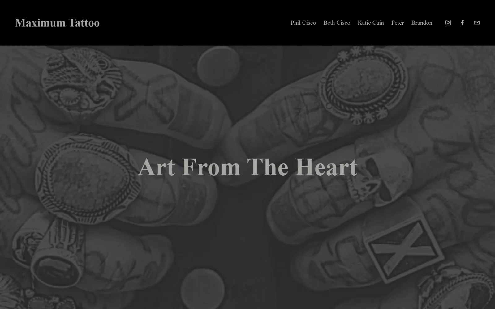
15
maximumtattoostudio.com
Heavily darkened photograph of tattooed hands and heavy silver rings laid in a circle, with Art From The Heart centred over it in grey serif.
Type
ivymode 73px, weight 600
Body
athelas-web 18px
Build
black bar over full-bleed photo, 133px padding
Made on
Squarespace
Colour
#38383b #a8a6a1 #000000
Type. ivymode at 73px, weight 600, on 1.22 is the only large size, and it is set in #a8a6a1 rather than white, so it sits inside the photograph instead of on top of it. A 33px second step and athelas-web at 18px for nav and 14px for the button complete a four-size system. The restraint reads as confidence until you notice the image is too dark to carry it.
Colour. A warm charcoal, #38383b, at 220 coverage with white at 100 and black at 60.7, and all type in #a8a6a1, a grey that is only a few steps brighter than the photo behind it. There is no accent value at all, which is why the hero feels muted rather than moody and the headline struggles for contrast.
Layout. A solid black header band with the shop name left and five nav items right, then a full-bleed photograph beneath it on a 1440px container with 133px of section padding. Radius is 0 throughout. The document is a short 3420px, so the homepage is effectively the hero plus a handful of artist sections.
The ask. The nav is five artist first names, Phil Cisco, Beth Cisco, Katie Cain, Peter and Brandon, which is the whole conversion model: pick a person, not a service. Instagram, Facebook and an email icon close the bar. There is no button and no phone number, so the email glyph is the only direct contact.
Setting headline type in a grey sampled from the photograph behind it loses the contrast the headline needs; lift it or darken the image further.
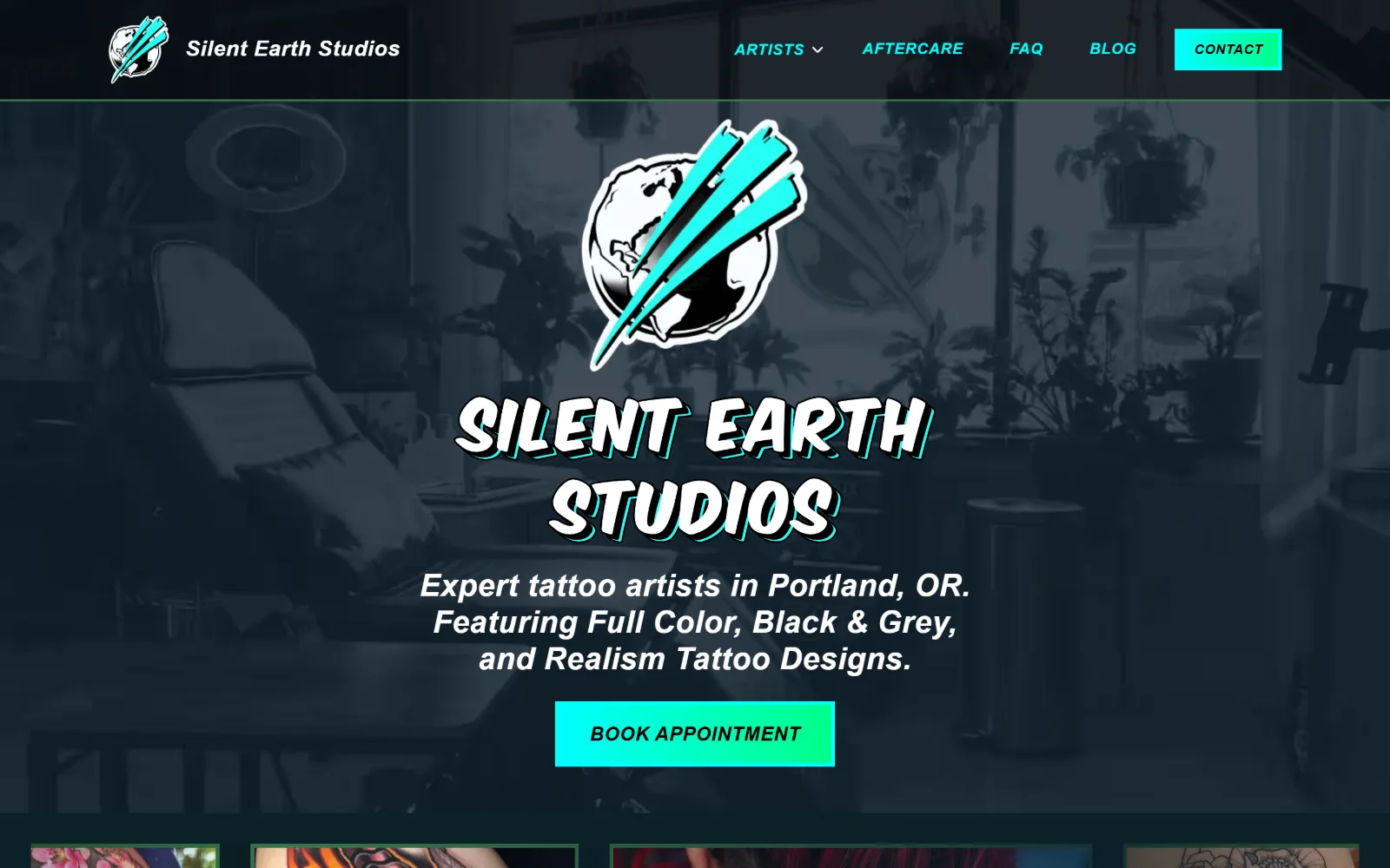
16
silentearthstudios.com
Teal-tinted studio photograph behind a globe-and-claw logo, a comic-style outlined wordmark, and a cyan gradient Book Appointment button below it.
Type
outlined comic wordmark with cyan offset
Body
Open Sans 16px italic, weight 700
Build
edge-to-edge header, 32px section padding
Made on
Webflow
Colour
#102e39 #00ffff #ffffff
Type. Open Sans in italic across the whole interface, which is an unusual commitment: nav at 16px bold with 0.03em, button at 20px bold uppercase with 0.024em, and the hero paragraph at 32px. The wordmark itself is artwork with a hard offset shadow in cyan, so the italic nav reads as an extension of that slanted logo rather than a default.
Colour. Four values with one of them doing all the work: #102e39 as the body ground, black over the photograph, white for the paragraph, and #00ffff at just 0.9 coverage on the button fill and 16 characters of type. Pure cyan is a hard colour to control and here it is rationed to two places, which is what keeps it from going cheap.
Layout. Section padding is only 32px, the tightest here, so the artist tiles start before the fold and the page feels busy next to the rest of this set. The container is the full 1440px, radius is 0, and the header runs edge to edge with a thin cyan rule under it separating the bar from the tinted hero photograph.
The ask. Book Appointment is a solid cyan gradient block in the centre of the hero, and Contact as a cyan button in the top right duplicates it. Four nav items sit between them. Two identical-looking cyan targets on one screen is one too many, and the header one wins by position while the hero one wins by size.
Rationing a fully saturated colour to one filled element per screen is what separates a confident accent from a loud one.
How these were chosen
Every tattoo website design runs into the same problem: the portfolio wants to be the whole site, and the homepage still has to say where the shop is and whether the books are open. The pattern that holds across this shortlist is restraint at the top. Most of these open on something other than the work itself, a storefront, a flash wall, a painted window, a mountain ridge, a logo alone, and let the first screen carry one sentence and one ask. The second pattern is that type does the branding rather than photography: Instrument Serif, ivymode, Playfair Display, Anton, a hand-drawn Wix face. The one that does not hold is colour. Half the set is black and white by choice and the other half commits hard to a single hue, sage, navy, cyan, pink, with almost nothing in between.
Finding tattoo sites that someone had actually designed took far longer than it should have. 40 candidates made the shortlist. 16 made the page.
Each one was opened and looked at properly: what the type is doing, where the colour gets spent, how the page is built, how it asks for the job. Nothing is here because it ranks. Nothing is here because an agency filed it under portfolio. Several well known names were left out for the plain reason that their site came out of the same template as everyone else's, and a few sites worth including did not survive a second look.
Where a site is only competent, it says so. The order is the order worth your time, best first.
Reviewed and selected by Larry W. Matthews for Websitely.