Coffee Shop Website Design With a House Style, 14 Examples
Fourteen US cafes and roasters with a house style on the page as well as in the cup. Coffee shop website design that puts the hours above the story.
Shown
14 sites
Reviewed
47 candidates
Chosen on
The work, not the ranking
Updated
15 October 2026
01
perccoffee.com
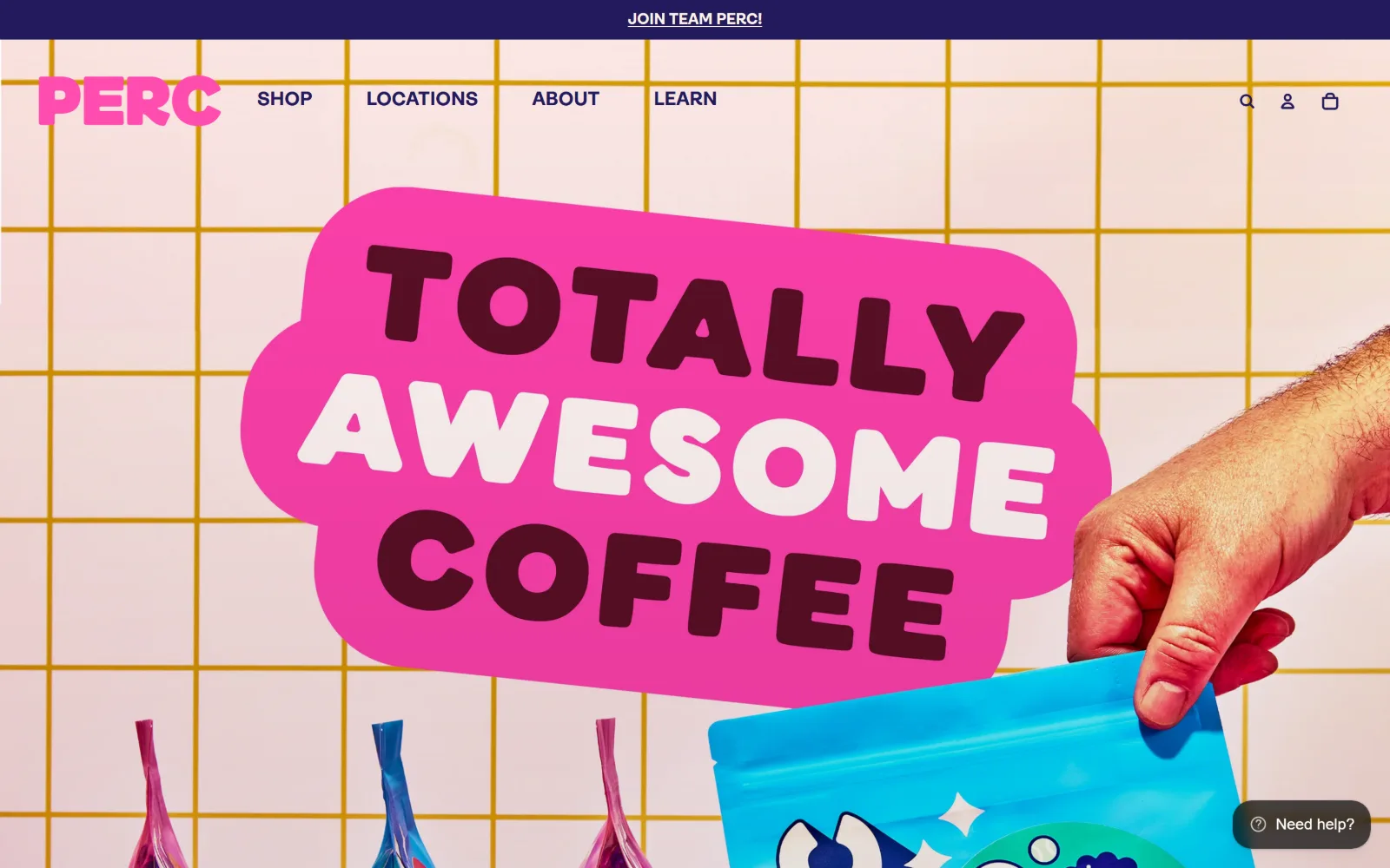
Pink sticker lettering reading Totally Awesome Coffee sits on a cream tile wall while a hand lowers a cyan bag of beans.
Type
PERC Chonky Boi, 72px uppercase
Body
Ambit Bold, 16px
Build
Full-bleed hero on a 40/1360/40 gutter grid, 1440px container, 100px pill buttons
Made on
Shopify
Colour
#fff3e6 #ff4daf #221a5b
Type. PERC Chonky Boi carries the hero at 72px, uppercase, set as three stacked lines inside a rounded sticker shape, with the middle word reversed to cream so the line breaks read as colour changes. Everything else is Ambit Bold at 16px to 20px, uppercase, zero tracking, so there is no middle tier at all between the display and the interface.
Colour. Six colours are in play and none of them apologise: a #fff3e6 cream ground, #623def violet, #221a5b navy for ink, #0c968f teal on the primary button, #81eab6 mint and #ff4daf pink. The pink runs the wordmark and the hero sticker, so the accent is also the loudest area of the screen rather than a trim applied at the end.
Layout. The page sits on a 40px / 1360px / 40px gutter grid at 1440px, with a secondary 721px and 619px two-column split further down, and the hero photograph runs full bleed behind everything. A navy announcement strip caps the page at roughly 44px, the header below it is around 70px, and buttons take a 100px radius, which is a full pill at that type size.
The ask. Shop leads the navigation and Locations follows immediately, so the two jobs are declared in the first two words. The hero itself sells neither: it is a brand statement with a product shot, and the actual retail ask is deferred to the nav and to a help widget pinned bottom right. The cafes get a nav slot rather than hours on the page.
A loud accent only reads as deliberate when it also carries the logo; used once on a button it looks like an accident of the theme.
02
deadstockcoffee.com
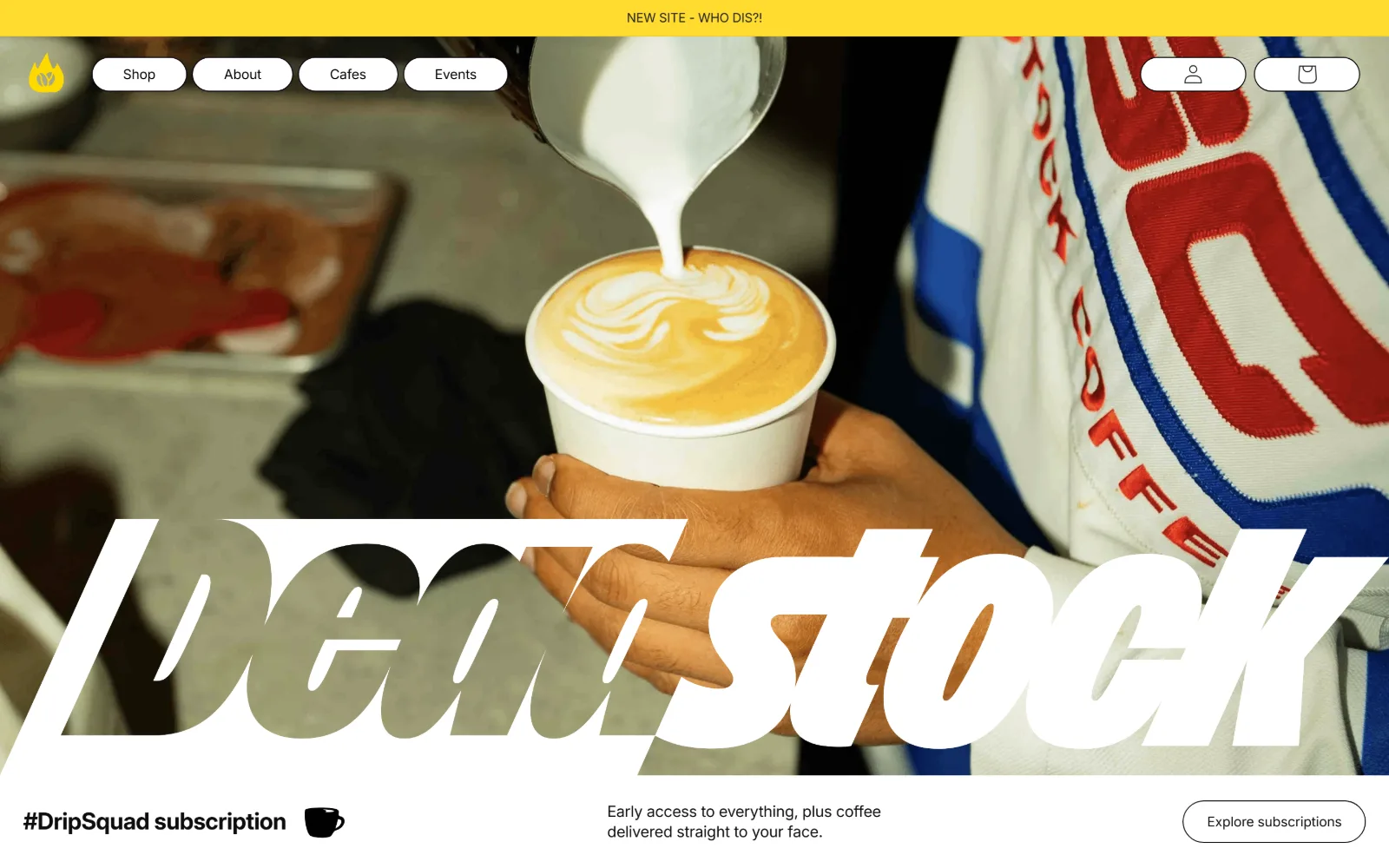
Hands hold a cup under a milk pour while a white italic Deadstock wordmark cuts across the whole width of the photograph.
Type
Custom Display Air italic, 64px to 320px uppercase
Body
Inter, 15px
Build
Full-bleed photo hero, pill nav, 3-column 44/437/858 band below
Made on
Shopify
Colour
#ffdb30 #0d0d0d #ffffff
Type. The wordmark is a custom display italic sized to the viewport rather than to a scale, running past 300px with the counters clipped by the photo edges, and tracking held near zero so the letters touch. Interface type drops to Inter at 24px bold for section heads and 13px to 16px at minus 0.01em elsewhere, a gap of roughly twelve to one.
Colour. Five colours do the work: #ffffff, #0d0d0d and #1f1f21 for the two near-blacks, a near-purple #09000e in shadow, and #ffdb30 for the top strip and the primary button. The yellow appears twice and only twice, which keeps it functioning as a signal rather than a mood.
Layout. A yellow notice strip runs full width above a header of roughly 70px, where the nav items sit as separate white pills rather than a row of links. The hero photograph is full bleed to 1440px, and beneath it a three-column band of 44.5px, 437px and 858px carries the subscription offer. Button radius is 41px, pill at that height.
The ask. Cafes and Events sit in the nav beside Shop, which is unusual, and the first panel below the fold asks for a subscription rather than a single bag. The hero asks for nothing at all, which is the point: the wordmark is the ask, and the commercial request waits one scroll.
Sizing a wordmark to the viewport instead of the type scale lets a hero carry brand weight without a headline competing for the same attention.
03
dayglow.coffee
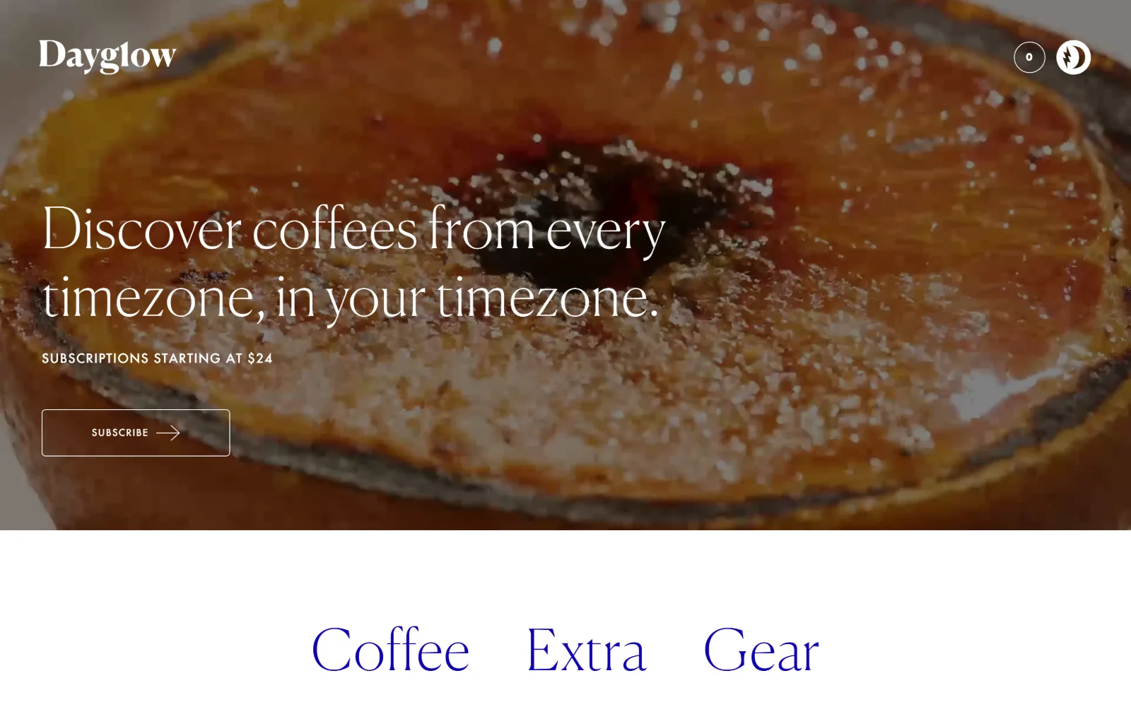
Slow video of a broiled grapefruit half fills the frame behind a thin white serif line about coffees from every timezone.
Type
Canela Thin, 72px
Body
Futura Medium, 16px uppercase
Build
Full-bleed video hero at 750px, floating header, centred category row
Made on
Shopify
Colour
#ffffff #0c00b2
Type. Canela Thin sets the hero at 72px with 1.2 line height and a hair of positive tracking, and the weight is light enough that the video reads straight through the strokes. Against it, Futura Medium runs at 12px and 16px in uppercase with tracking pushed to 0.063em and 0.125em. Two families, no third voice, and nothing in between 16px and 72px.
Colour. The palette is two values: #ffffff and an electric #0c00b2 that is closer to a pigment than a web blue. The blue appears only below the fold, on the Coffee, Extra and Gear category words, so the hero itself is white on photography and the colour arrives as a deliberate change of register.
Layout. The hero fills about 750px of the 900px viewport with the video running full bleed to 1440px, no container inset, and the header floating directly on the image with a wordmark left and two icons right at roughly 80px. Category words below sit on flat white at 46px, centred, with generous air around them.
The ask. Price comes before the button: subscriptions starting at $24 sits above an outlined Subscribe control, so the commitment is qualified before it is asked for. There is no address, no hours and no Visit link in sight, which makes the position unambiguous: this page sells the bag and treats the room as somebody else's business.
Naming the price above the button answers the first objection before the click, which matters more for a subscription than for a single purchase.
04
ritualcoffee.com
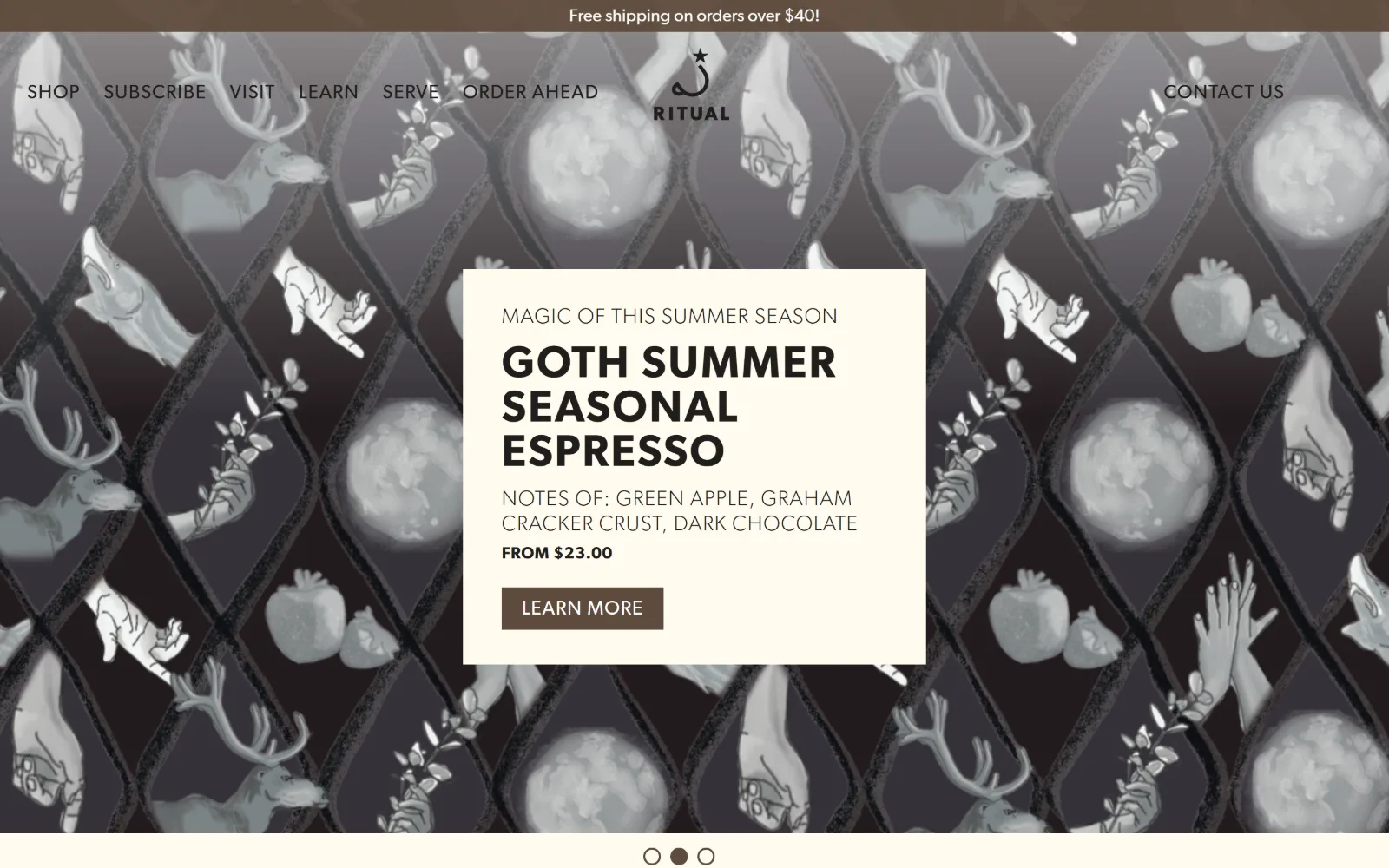
Greyscale wallpaper of hands, antlered animals, apples and moons runs behind a cream card announcing a seasonal espresso.
Type. Gibson SemiBold in uppercase handles the hierarchy at 46px, 30px and 22px with tracking between 0.033em and 0.045em, which keeps caps legible at small sizes. Iowan Old Style Roman at 25px supplies the one serif voice, used for running text rather than for display, an inversion of the usual arrangement.
Colour. Three values carry the page: #fffbef and #fefbef as near-identical creams, and #5e4b3c for buttons and the top strip. Ink is #201e1c. The illustrated hero is greyscale by design, so the brown is the only saturated thing on screen and it lands entirely on the two clickable elements.
Layout. The illustration runs full bleed at 1440px and the cream card is roughly 520px wide, centred, with the slider dots sitting below it rather than overlaid. Buttons keep a 0px radius against all those curved drawn shapes. Document height is 4466px, short for a roaster homepage.
The ask. Order Ahead and Visit both appear in the navigation ahead of Learn, which is a cafe telling you it would rather you walked in. The hero card still works as a product tile, carrying tasting notes and a from price of $23.00, so the bag is sold inside a frame that otherwise reads as a poster for the shop.
Putting the price and tasting notes inside the hero card turns a brand image into a product listing without adding a second section.
05
joecoffeecompany.com
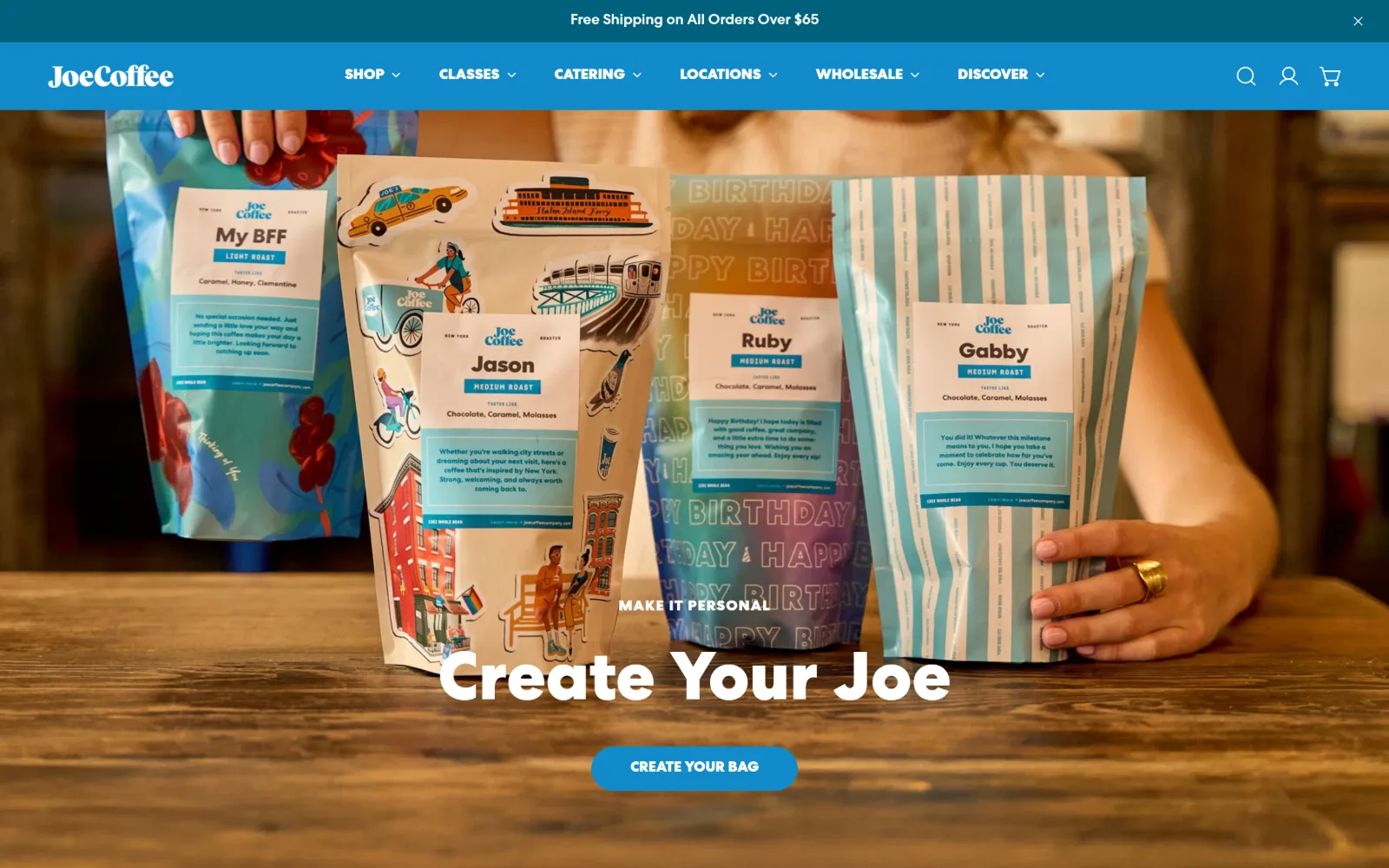
Four illustrated coffee bags are held across a wooden counter under a white Create Your Joe headline and a rounded blue button.
Type
Rounded custom sans, 64px
Body
Centra No.2 Medium, 15px
Build
Full-width blue header, full-bleed hero, 4-column 331px product grid
Made on
Shopify
Colour
#118acb #24282a #ffffff
Type. Centra No.2 does all four jobs, with ExtraBold at 22px for section heads and Medium at 14px to 16px, mostly uppercase, for navigation and labels. The hero headline is a softer rounded cut at roughly 64px, matched to the drawn wordmark, so the display voice belongs to the packaging rather than to the website.
Colour. Five values: #ffffff, a charcoal #24282a that carries almost all the ink, #118acb for the header band and buttons, a deeper #00617f, and #dc612c used sparingly. The bright blue is strong enough to hold a full-width navigation bar, which is rarer than it sounds and makes the header itself the brand element.
Layout. A teal notice strip sits above a blue header of roughly 70px, and the hero photograph runs full bleed beneath. Section padding is 40px, and the page uses a four-column grid of 331.25px with a 5px gap, which is tight enough that product cards almost touch. Document height reaches 7474px.
The ask. Classes, Catering, Locations and Wholesale all occupy nav slots, so five businesses are declared before the fold. The hero button is neither Shop nor Visit but Create Your Bag, a configurator, which sidesteps the usual competition by making the first retail action a bit of play rather than a category page.
When a nav has to carry five business lines, colouring the whole bar turns a crowded row into the strongest brand element on the page.
06
onyxcoffeelab.com
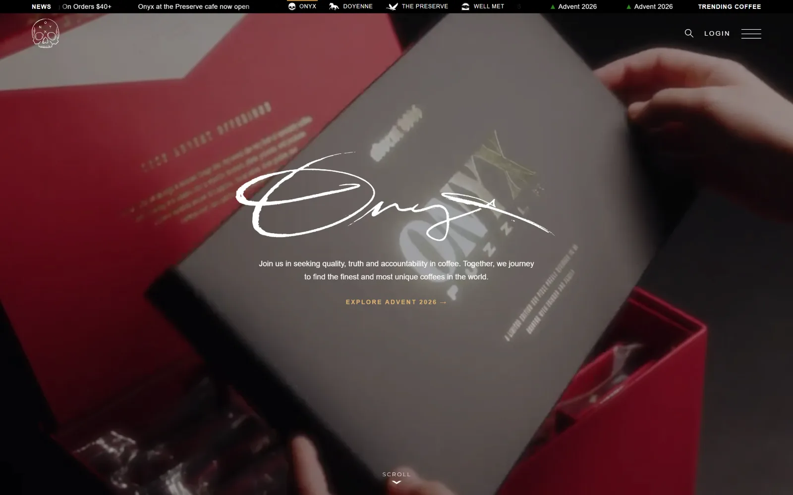
Dim footage of hands opening a red presentation box sits under a brushed white signature and a small gold seasonal link.
Type
Bajern script, 68px
Body
Montserrat, 14px
Build
Sticky header under a 28px ticker, full-bleed video hero, 60px section padding
Made on
Shopify
Colour
#000000 #fbfaf3 #e2b571
Type. Bajern sets the signature at 68px, a brush script used as a logotype rather than a headline, and nothing else on the page competes with it. Montserrat handles everything from 11px to 16px, with uppercase tracking pushed as far as 0.182em on labels, which turns small type into ruled lines across the dark field.
Colour. Three values and a gold: #000000, an off-white #fbfaf3, pure #ffffff, and #e2b571 reserved for the single call to action. Because the video is dark and desaturated, that gold link is the only warm point on the screen, and it is doing the entire job of directing the eye.
Layout. A black ticker of roughly 28px runs above a sticky header, and the video hero fills the remaining viewport full bleed at 1440px. Section padding is 60px and the document runs to 15212px, long even by roaster standards. Corners are square throughout, including buttons.
The ask. No Shop button appears in the hero. The ask is a seasonal release link, while the ticker overhead advertises a cafe opening alongside sub-brand names, so retail and room are both handled in a 28px strip rather than in the hero. It is a confident sequencing: identity first, commerce in the furniture.
A ticker bar can absorb every secondary announcement, which is what frees a hero to carry one message and one link.
07
varietycoffeeroasters.com
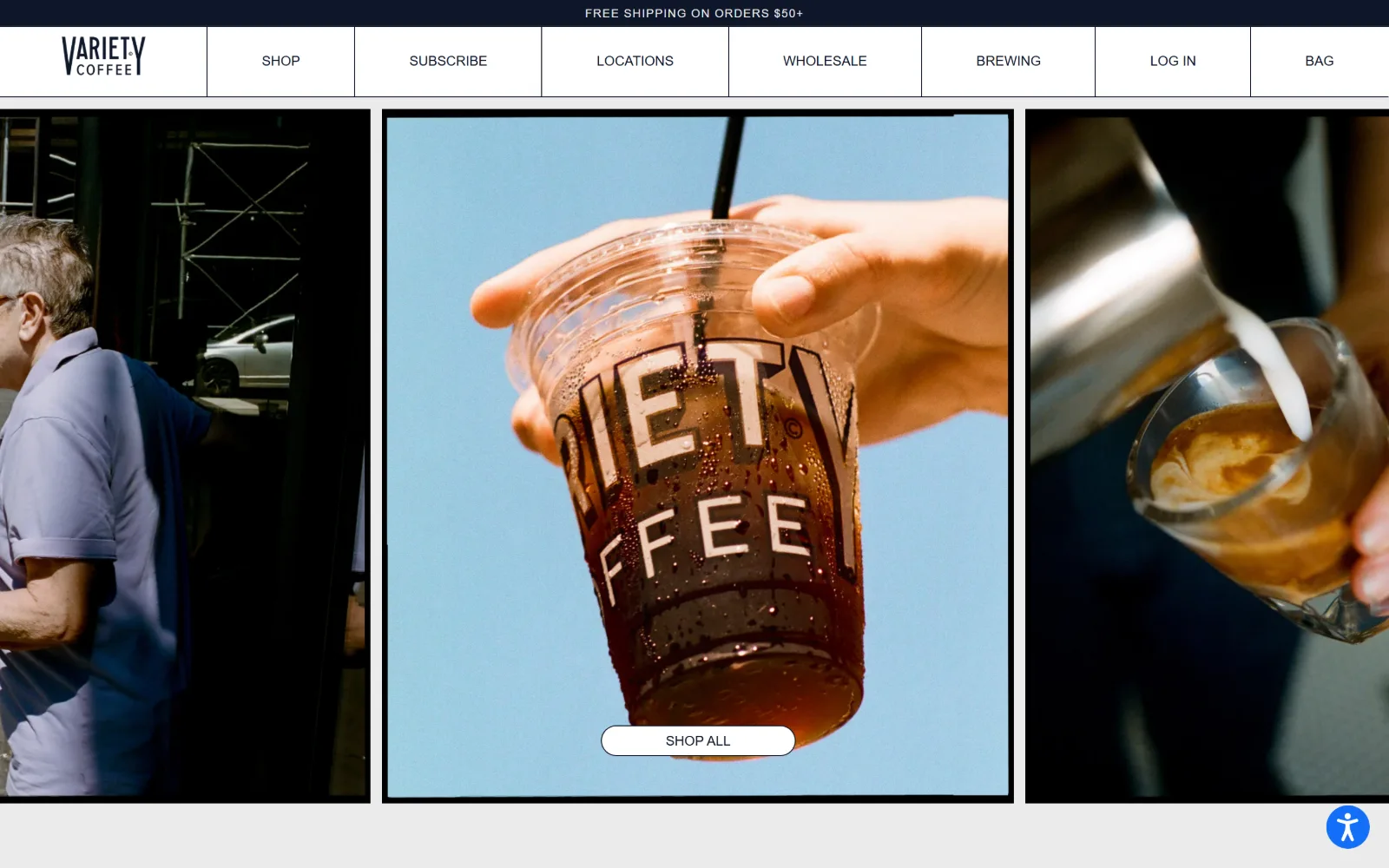
Three photo panels run side by side below a navy nav divided into ruled cells, with a Shop All pill on the centre image.
Type
Aktiv Grotesk, 40px
Body
Aktiv Grotesk Extended, 14px uppercase
Build
72px ruled nav cells, three-panel hero, 2-column 615px grid with 70px gap
Made on
Shopify
Colour
#ebebeb #0e1629 #ffffff
Type. Aktiv Grotesk Extended handles navigation and labels at 12px and 14px in uppercase with 0.083em tracking, wide enough that seven nav items fill the full 1440px. Statement text switches to the regular width at 40px with minus 0.04em tracking, so the family changes proportion rather than weight to signal hierarchy.
Colour. Three values only: a #ebebeb ground that is grey rather than white, #0e1629 navy for the bar and all the ink, and #ffffff for the pill. Holding the page off pure white lets the centre photograph, which is a saturated sky blue, read as the only colour event on screen.
Layout. The nav is a row of equal cells separated by vertical rules at roughly 72px tall, unusual in 2026 and closer to a printed index. Below it a two-column 615px grid with a 70px gap governs later sections, while the hero runs three panels edge to edge, the middle one inset inside a black keyline frame.
The ask. Locations sits third, between Subscribe and Wholesale, and the only hero control is a Shop All pill laid over the centre image. The three panels split the difference another way: one shows the roastery, one shows a takeaway cup, one shows a pour, so the room is argued photographically while the words sell the bag.
Ruled nav cells read as an index rather than a menu, which lets a wide navigation carry seven destinations without looking crowded.
08
heartroasters.com
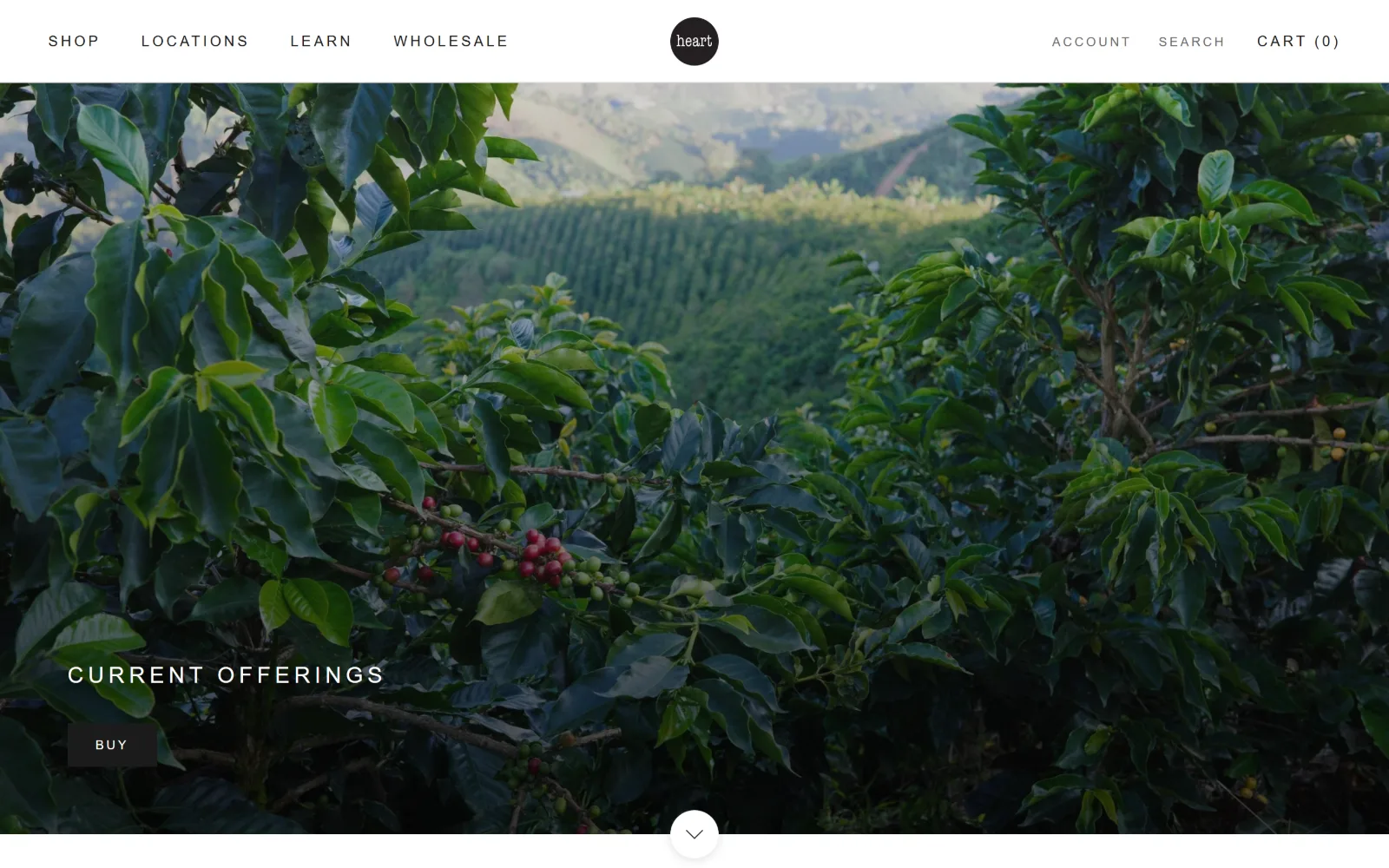
Coffee trees fill a full-bleed photograph, with Current Offerings in widely tracked caps and a small dark Buy button beneath.
Type. One family, Helvetica, at five sizes between 12px and 24px, uppercase throughout, with 0.2em tracking applied at every size without exception. There is no display tier: the largest thing on the page is 24px. Hierarchy is carried by position and colour alone, which is a genuinely difficult way to build a homepage.
Colour. The ground is #ffffff and the ink splits between #1c1b1b and a mid #6a6a6a for the secondary nav items, which is how Shop separates from Search and Account. No accent colour exists anywhere on screen, so the photograph supplies all of the saturation.
Layout. A white header of roughly 95px carries four nav items left, a circular mark centred and three utilities right. The photograph runs full bleed from the header to the fold. Section padding below is a measured 80px, corners are square at 0px, and the whole document is only 2432px, which is very short.
The ask. Locations sits second in the nav, and the hero Buy button is perhaps 100px wide, smaller than the headline above it. The balance is deliberately flat: nothing shouts, so a visitor arriving for an address finds it as fast as one arriving for beans. Restraint here is a routing decision, not just taste.
Capping the type scale at 24px forces hierarchy into position and colour, and keeps a photograph as the only loud element on the page.
09
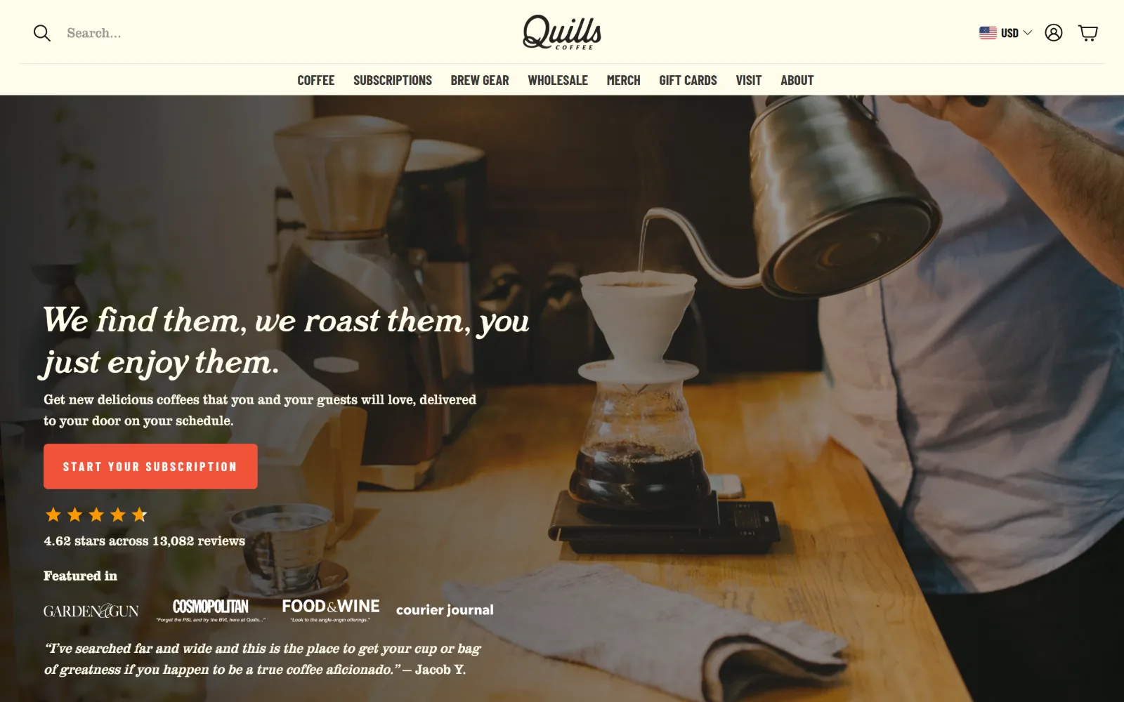
quillscoffee.com
Warm kitchen photography of a pour-over sits behind an italic serif headline, an orange subscription button and five stars.
Type
El Hidrant italic, 44px
Body
Clarendon URW Extra Narrow, 18px
Build
Two-row sticky header, full-bleed hero with 700px text column, 3-column 437px grid
Made on
Shopify
Colour
#fffdeb #f15239 #151515
Type. El Hidrant sets the headline in a 44px italic serif with 0.023em tracking, and Clarendon URW Extra Narrow runs body text at 18px, so two distinct serifs share the page without collision because one is italic and one is condensed. Barlow Condensed in uppercase at 16px with 0.188em tracking handles buttons and nav.
Colour. Four values: a #fffdeb cream that runs the header and all reversed text, #151515, #f15239 orange on the one primary button, and #3a3837 for ink on light. The orange appears exactly once above the fold, next to a row of amber review stars that reinforce it without repeating the hex.
Layout. A sticky header carries two rows, search and wordmark above a seven item nav, at roughly 140px combined. The hero photograph runs full bleed with text held to a 700px column on the left. A three-column 437px grid with 24px gaps governs product rows, buttons take a 5px radius, and the document reaches 7522px.
The ask. Visit sits last of eight nav items while Start Your Subscription takes the single orange button, so this page has chosen. Stacked underneath the button are a 4.62 star average across 13,082 reviews, a press row and a customer quote, which is a lot of proof assembled before the first scroll.
Two serifs can share a hero if one is italic and the other condensed, since the contrast then comes from proportion rather than weight.
10
sightglasscoffee.com
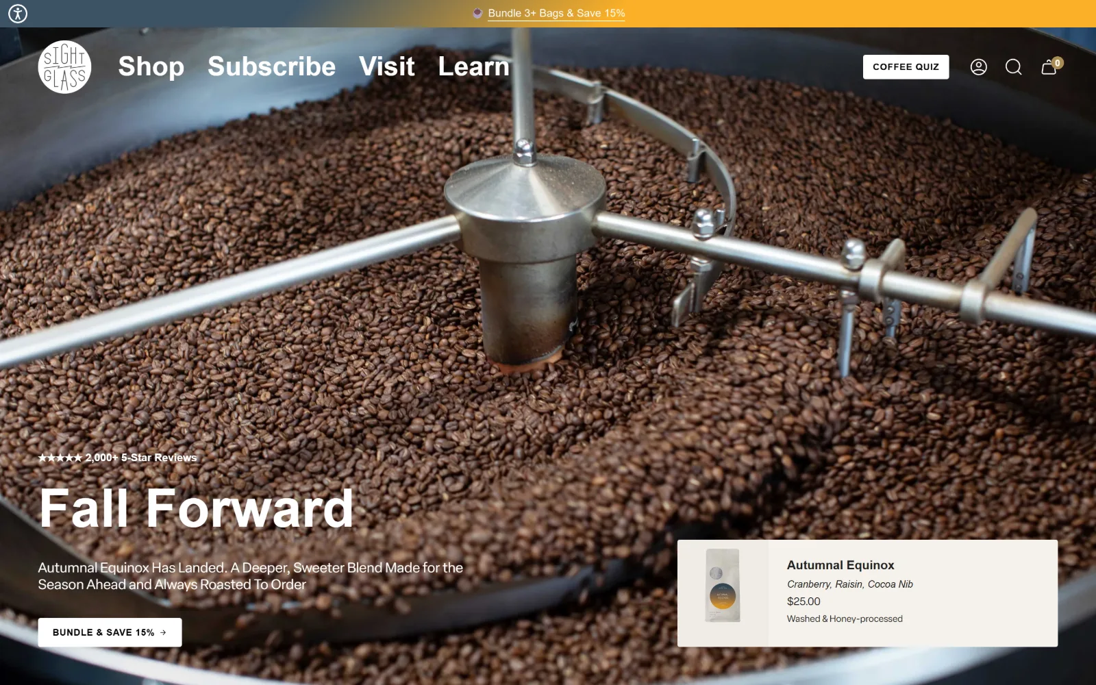
Looking down into a roaster drum full of beans, with Fall Forward in heavy rounded grotesk and a product card at lower right.
Type. A single variable family, Elza Round, covers 14px to 70px with weights from 400 to 700, and the rounded terminals keep the heaviest setting from reading as aggressive. Navigation sits at 16px bold rather than the usual regular, which is why four words can hold their own against a photograph this busy.
Colour. The palette is a run of warm neutrals, #f2efe7, #f5f2ec and #eae6dd, with #212121 for ink and small amounts of #ffffff. No accent exists in the chrome at all, so the orange notice strip at the top is the single saturated element and it is carrying a discount, not a brand idea.
Layout. Section padding is a consistent 45px and the roaster photograph runs full bleed behind a transparent header of roughly 80px. The product card sits inset at the lower right, about 550px wide, floated over the image rather than placed in a row, which is closer to a retail window display than a grid.
The ask. Visit is third of four nav items, ahead of Learn. The hero asks twice: a Bundle and Save pill on the left and a named bag at $25.00 on the right, with tasting notes and process listed. Review proof sits above the headline rather than below it, which is an unusual order and gives the number more weight.
Floating a priced product card over the hero photograph gives a brand image a shelf, so one screen does both the mood and the sell.
11
mostracoffee.com
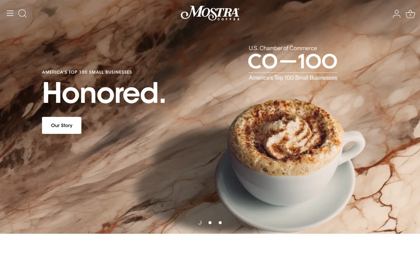
Brown-veined marble fills the frame behind the word Honored set very large, with an award lockup and a cappuccino at right.
Type
ITC Avant Garde, 96px
Body
ITC Avant Garde, 16px
Build
Transparent header with hamburger, full-bleed video hero at 890px, 5px radius
Made on
Shopify
Colour
#ffffff #000000 #212121
Type. ITC Avant Garde carries the whole page, with the hero word at 96px, weight 600 and minus 0.025em tracking so the geometric forms close up into a tight block. Below that it drops to 28px, 20px, 16px and a 14px uppercase label at minus 0.025em, which is unusually tight for small caps.
Colour. Two values hold the chrome, #ffffff and #000000, with ink at #212121 and #423f3f. All of the warmth comes from the marble footage itself, which runs rust and cream, so the brand palette stays neutral and the seasonal art direction can change without a redesign.
Layout. A hamburger and search sit left, the wordmark centred, account and bag right, in a transparent header over full-bleed video at 1440px. The hero occupies roughly 890px with three slider dots at the bottom. Buttons take a 5px radius and the document is a compact 4341px.
The ask. The hero sells the story rather than the bag: an award kicker, one word, and an Our Story button. Shop is hidden behind the hamburger, which is a real cost, and the cafes are not mentioned above the fold at all. This is a homepage betting that credibility converts better than a product row.
Keeping brand colours neutral lets seasonal hero footage supply the warmth, so art direction can be swapped without touching the system.
12
bluebeardcoffee.com
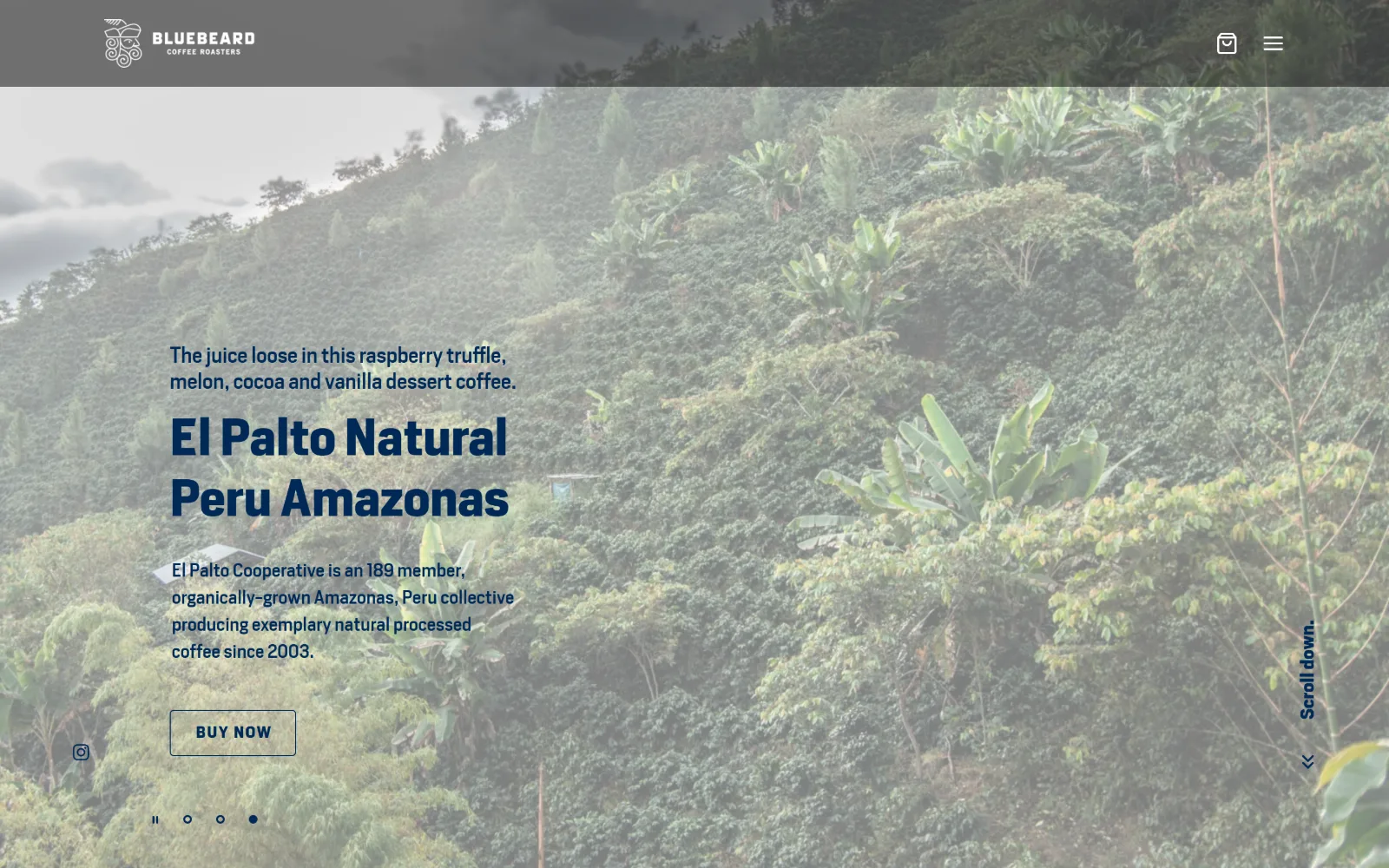
Washed-out hillside of coffee trees sits behind navy text naming a single lot, with an outlined Buy Now control below it.
Type. Zilla Slab sets the lot name at 101px, weight 700, 1.05 line height, and the slab serifs stay readable at that size against foliage where a hairline face would disappear. Heron Sans runs at 19px and 24px for supporting text, with the button at 16px uppercase and 0.09em tracking, giving three clearly separated tiers.
Colour. Two values, and that is the whole system: #ffffff and #002855. The navy carries 845 characters of ink against 52 reversed, so the page is navy on white with the photograph tinted light enough that the same navy survives on top of it. No accent, no third colour.
Layout. The header runs about 96px with a translucent dark overlay, a mark left and cart and menu right. The hero photograph is full bleed to 1440px with text held in a 400px column on the left and slider dots at the lower edge. A later four-column 174px grid uses very wide 96px gaps, and the document reaches 5171px.
The ask. One lot, one button. The hero reads like a tasting note with a Buy Now attached, and it names the cooperative, the member count and the year, which is a lot of sourcing detail for a first screen. Locations live behind the hamburger, so the online bag is clearly the priority here.
Lightening a photograph until dark text survives on it is cheaper than a scrim, and it keeps the image doing its own work.
13
timelesscoffee.com
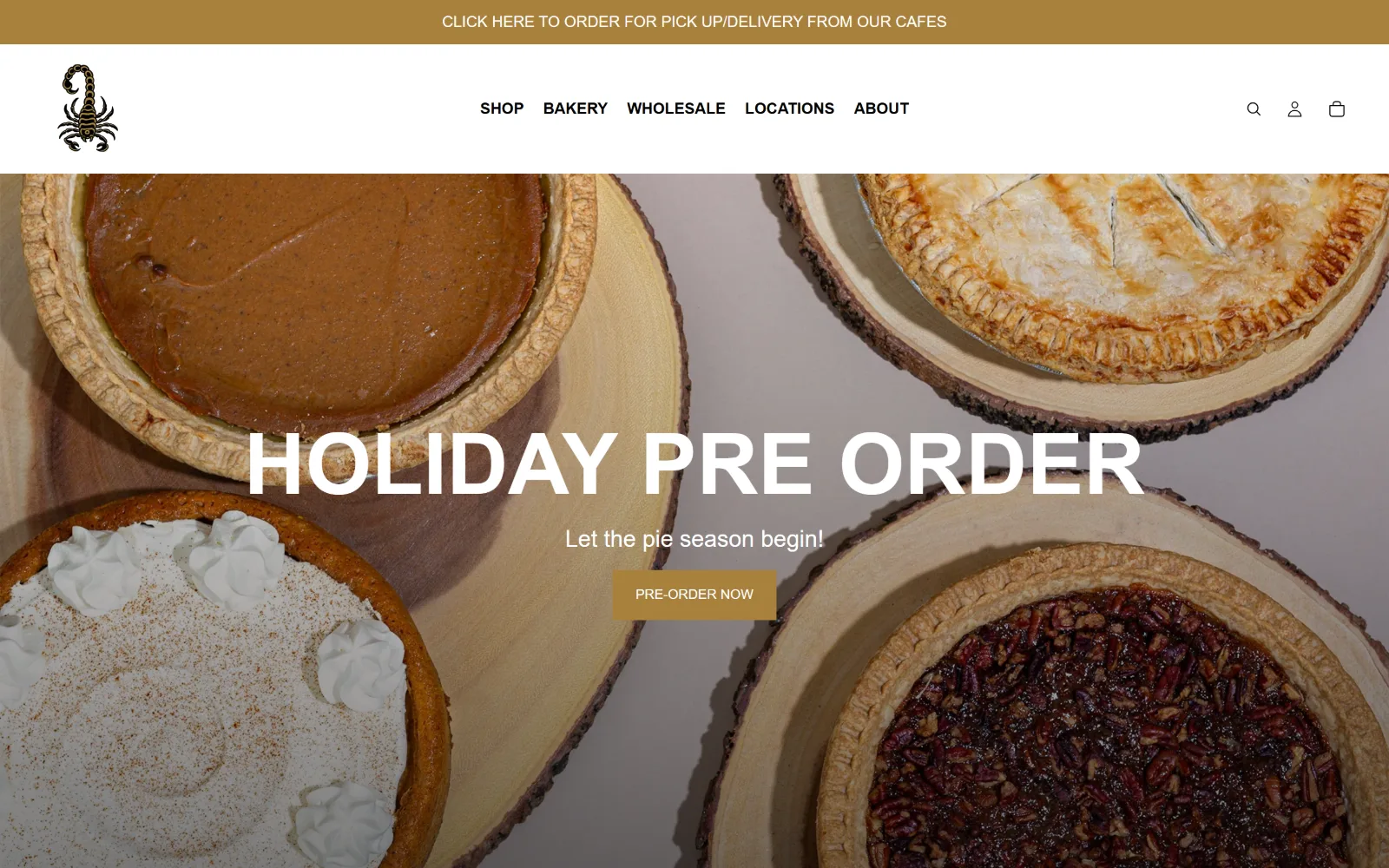
An overhead shot of four pies on wood boards runs behind Holiday Pre Order in white caps and a gold pre-order button.
Type. Helvetica carries the page at 14px, 16px and 24px, with the hero at 88px in uppercase and no tracking adjustment at all, which leaves the caps slightly loose at that size. There is no display face and no second family, so the typographic identity rests entirely on the scorpion mark in the header.
Colour. Two values: #ffffff and a gold #a8813d that takes the top strip, the button and the accent. Because the gold also appears in the pastry photography, the chrome and the image read as one surface, and the page needs no third colour to feel finished.
Layout. A sticky header of roughly 110px sits under a 50px gold notice strip. Content uses a 40px / 1360px / 40px gutter grid with a later three-column split of 437px, 444px and 437px at 20px gaps. Corners are square at 0px throughout, including the button, and the document is a short 3605px.
The ask. The gold strip at the top links to cafe pick-up and delivery, so the room is the first thing addressed, while the hero below sells a seasonal pre-order. Bakery sits second in the nav ahead of Wholesale. The split is clean because the two asks occupy different bands rather than fighting inside one hero.
Giving the cafe ask its own notice strip above the hero stops it competing with the retail headline for the same vertical space.
14
meritcoffee.com
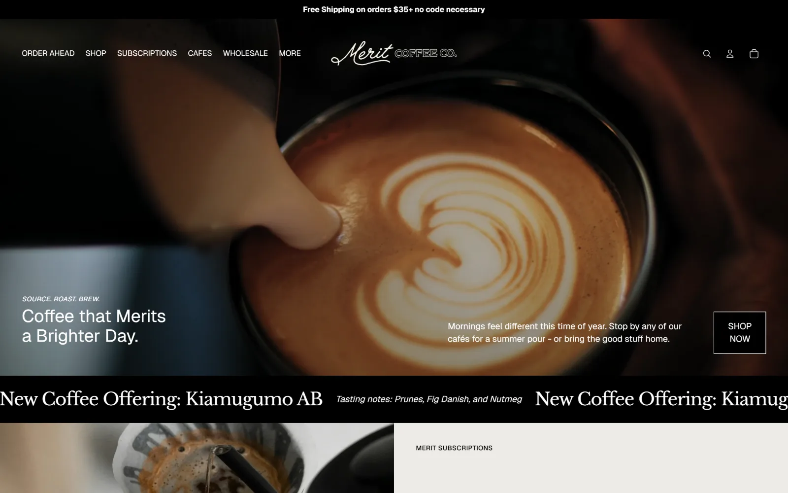
Milk pours into a cup across a dark video hero, with a two-line headline left and an outlined Shop Now square far right.
Type
Geist, 32px
Body
Geist, 16px
Build
40/1360/40 gutter grid, full-bleed video hero, lower-third text band, scrolling marquee
Made on
Shopify
Colour
#ffffff #edebe7 #000000
Type. Geist runs the headline at 32px over an italic 12px kicker, with body at 16px and labels at 14px uppercase, a restrained scale for a hero this cinematic. A 32px Libre Baskerville italic appears only in the scrolling marquee below the fold, which gives the offer band a voice distinct from the interface.
Colour. Four values: #ffffff, a warm #edebe7 for alternating panels, #000000 for the marquee band and buttons, and #8f8575 used lightly. Ink splits almost evenly between white and black because half the page is reversed out of video, so the system has to work in both directions.
Layout. A 40px / 1360px / 40px gutter grid governs the page, with a stacked 680px two-column variant and a later 545px / 230px / 545px row. The video hero is full bleed and the hero text sits in a band across its lower third, headline far left and button far right, roughly 1200px apart. Corners are 0px.
The ask. Order Ahead takes the first nav slot, before Shop, and the hero paragraph invites you to stop by a cafe while the button beside it says Shop Now. The two asks are placed at opposite ends of the same band, which lets both be prominent without either being the obvious default.
Placing a cafe invitation and a shop button at opposite ends of one band gives two competing asks equal weight without stacking them.
How these were chosen
Speciality coffee has the strongest house-brand culture of any small trade, which is why so little of this work looks templated. These are art-directed pages, with commissioned lettering, bespoke photography and palettes nobody picked off a theme menu. Looking across the fourteen here, the useful split in coffee shop website design is not minimal against maximal but commercial: some homepages exist to move a bag of beans through a checkout, and some exist to get you through a door on a particular street. Watch where each one puts Shop, where it puts Locations or Visit, and what the hero photograph is actually of, the product or the room. The ones trying to do both at once are the most instructive, because that is where the compromises show.
Finding coffee shop sites that someone had actually designed took far longer than it should have. 47 candidates made the shortlist. 14 made the page.
Each one was opened and looked at properly: what the type is doing, where the colour gets spent, how the page is built, how it asks for the job. Nothing is here because it ranks. Nothing is here because an agency filed it under portfolio. Several well known names were left out for the plain reason that their site came out of the same template as everyone else's, and a few sites worth including did not survive a second look.
Where a site is only competent, it says so. The order is the order worth your time, best first.
Reviewed and selected by Larry W. Matthews for Websitely.