The Short Guide to Catering Website Design: 15 Examples
Fifteen US caterers whose sites photograph the food and nothing else. Catering website design judged on the menu, the enquiry and the route to a price.
Shown
15 sites
Reviewed
23 candidates
Chosen on
The work, not the ranking
Updated
15 October 2026
01
myradish.com
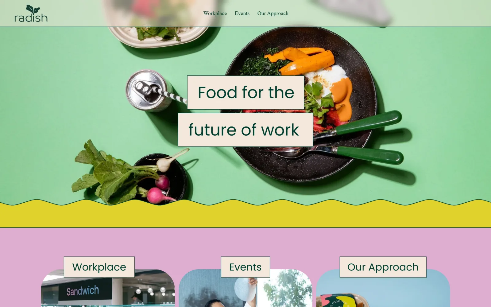
Mint green, lilac and yellow blocks stack behind an overhead food shot, with a hand-drawn wave dividing the hero from three rounded cards.
Type
Poppins 44px
Body
Poppins 16px Medium
Build
Full-bleed colour blocks with a wave divider and a three-card row
Made on
Squarespace
Colour
#deadcf #f3e8db #e0d22d
Type. Poppins at 16px Medium does every job on the first screen, nav and buttons alike, with no second family in sight. The hero line sets in the same geometric sans at roughly 44px, knocked into two cream label blocks so the type reads as applied signage rather than as an overlay. Tracking stays at zero throughout, and nothing is set in capitals.
Colour. Four flats carry the screen: a lilac #deadcf panel, cream #f3e8db label blocks, a yellow #e0d22d band and a coral #ff7574 button, all sitting against a mint hero ground. Unusually for this trade the food is not the colour source here. The painted backgrounds are, and the plated dish reads as one more flat shape dropped onto them.
Layout. Everything is full bleed, under a translucent header of roughly 90px holding the logo at far left and three nav words centred. The hero photograph runs edge to edge and is cut off by a hand-drawn wave rather than a straight rule, and the panel below carries three cards about 300px wide with a 28px corner radius.
The ask. Nothing is asked for on the first screen beyond a choice of three: Workplace, Events, Our Approach. No phone number, no form, no price. The enquiry is pushed one click deeper, which trades speed for a sorting step that sends a workplace buyer and an event buyer down separate paths before either sees a menu.
Flat painted colour fields can carry a food brand when the photography is single-dish, which frees the hero from needing a whole spread.
02
chanterellecateringcompany.com
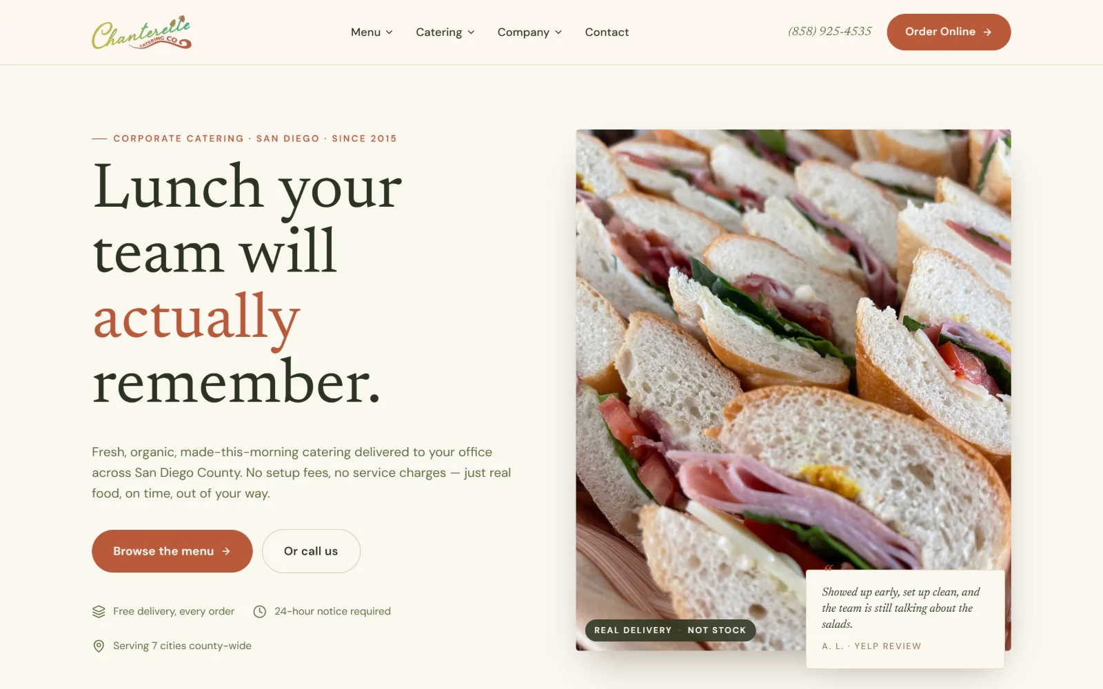
A 50/50 split pairs a serif headline and two buttons with a tight sandwich-platter photograph carrying a review card at its corner.
Type
Newsreader 83px
Body
DM Sans 17px
Build
Half-width type and image split with an overlapping review card
Made on
Custom JS framework
Colour
#fbf8f1 #2a3320 #b8593a
Type. Newsreader runs the headline at 83px on a 1.02 line, tight enough that three lines stack almost as a single block, with one word set in terracotta to break the mass. DM Sans handles body at 17px on 1.63 and nav at 15px Medium. The eyebrow above sits near 13px uppercase with roughly 0.1em of tracking.
Colour. Six values, all warm: #fbf8f1 ground, #f2ebd9 and #d9cfb8 for cards and edges, #2a3320 for the deep green type with #1c2317 beneath it, plus the #b8593a terracotta that carries both the button and the accent word. The food is the only saturated thing on screen and it does the heavy lifting against an otherwise muted base.
Layout. A container of roughly 1300px splits near evenly, type left and image right, with the photo given a 12px radius and a testimonial card overlapping its lower corner. The header runs about 92px with a hairline rule under it, and a three-item trust row sits directly below the buttons rather than in a separate band.
The ask. Three asks share the first screen without fighting: Order Online in the header, a filled Browse the menu button and an outlined Or call us beside it, with the number printed at 15px next to the header button. Delivery terms, notice period and service area are all legible before any scroll happens.
Setting the phone number beside the menu link lets a buyer who already knows what they want skip the enquiry form entirely.
03
diginn.com
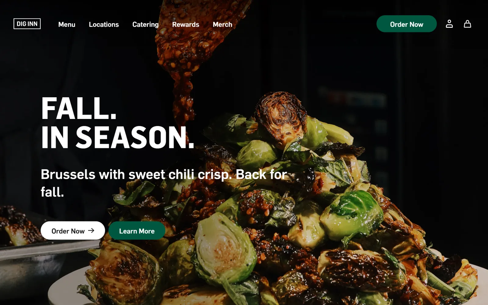
Ninety-pixel uppercase type sits left over a near-black close-up of brussels sprouts with sauce being spooned in from above.
Type
Flama Semibold 90px
Body
Flama 20px
Build
Full-bleed photo with left type column and paired pill buttons
Made on
Custom JS framework
Colour
#1a1a1a #ffffff #005740
Type. Flama Semibold sets the two-line headline at 90px uppercase on a 0.96 line, so the lines almost touch. The supporting sentence drops to 40px in the same family at a lighter weight, and nav items sit at 20px with no case change. One family covers the whole screen, separated only by weight and by scale.
Colour. Only three values are measurable: a #1a1a1a ground across half the frame, #ffffff type and the #005740 green filling one button and the header pill. Everything else is the dish, and the dish is the palette. Olive, char and chilli red all come out of the photograph rather than out of a brand sheet.
Layout. Full-bleed photography with a left column of type held to roughly 800px, a transparent header near 72px and no sticky behaviour. Buttons are fully rounded at a 60px radius and sit paired at the lower left. Account and basket icons at the far right give the header a retail rhythm rather than a service one.
The ask. Order Now appears twice before any scroll, once as the header pill and once as a white button, with Learn More beside it as the softer option. Catering sits in the nav as a bare word rather than an offer, so an event buyer has to recognise it among five siblings of identical weight.
One typeface at two weights can hold an entire hero when the photograph supplies every colour the layout needs.
04
tacos1986.com
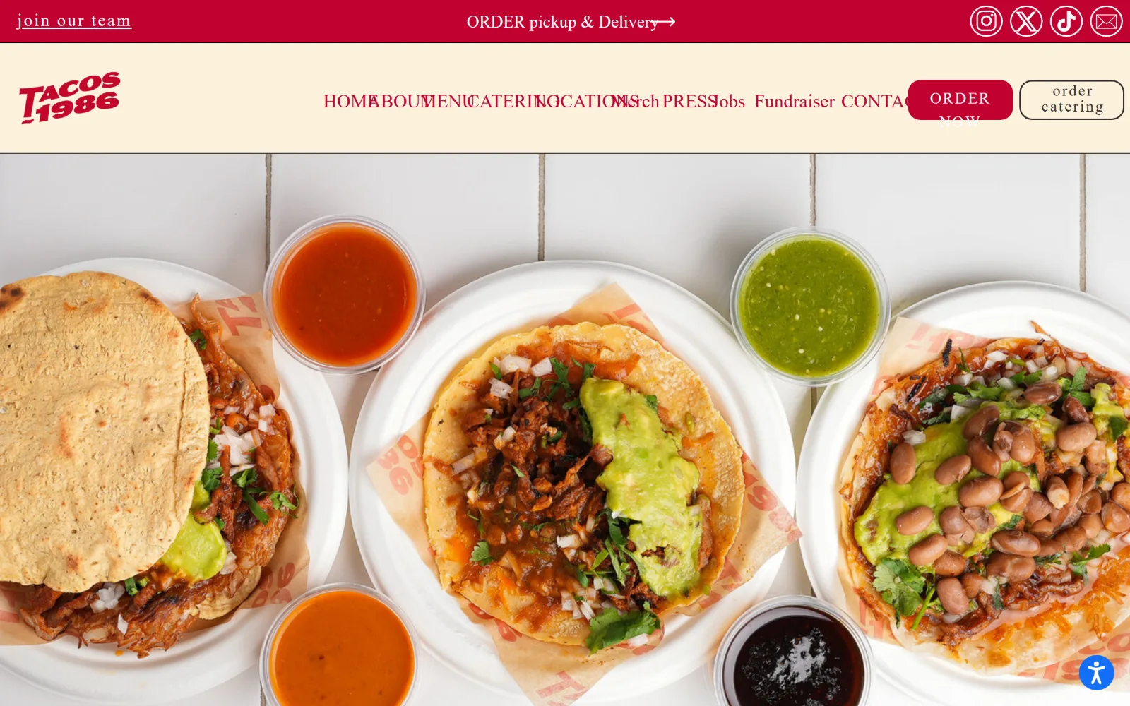
Three tacos on paper plates and four salsa cups, shot from directly overhead, fill the frame under a cream nav band and a crimson strip.
Type
SignPainter 74px
Body
Tiling Gothic Condensed Bold 23px
Build
Utility strip over a nav band over a full-bleed overhead photograph
Made on
Shopify
Colour
#c10230 #fbf2dc #ffffff
Type. SignPainter sets the brand mark and a hero line at 74px, a hand-lettered script that only works because everything around it stays plain. Tiling Gothic Condensed Bold carries body at 23px on a 1.5 line. The strip above mixes a serif ORDER with a lighter secondary face, which is where the discipline slips.
Colour. Three values and no more: #ffffff plates, a #c10230 crimson running the top strip and the logo, and #fbf2dc for the nav band. Every other colour on screen is salsa, bean and avocado, which makes this the clearest case on the page of food carrying an entire palette without any help from the layout.
Layout. Two stacked bands, a crimson utility strip near 60px and a cream nav around 150px, sit above a full-bleed overhead photograph. Nav items run centred and are crowded enough to collide at this width. The two buttons are pill shaped, one filled and one outlined, pushed to the right edge.
The ask. Order Now and order catering sit as separate buttons at the top right, which is the whole proposition on screen: one path for a single customer and one for an event. Catering repeats in the nav as well, so the enquiry is reachable in one click from three places before anything scrolls.
Separating the retail order button from the catering button stops two very different buyers competing for the same call to action.
05
mightyquinnsbbq.com
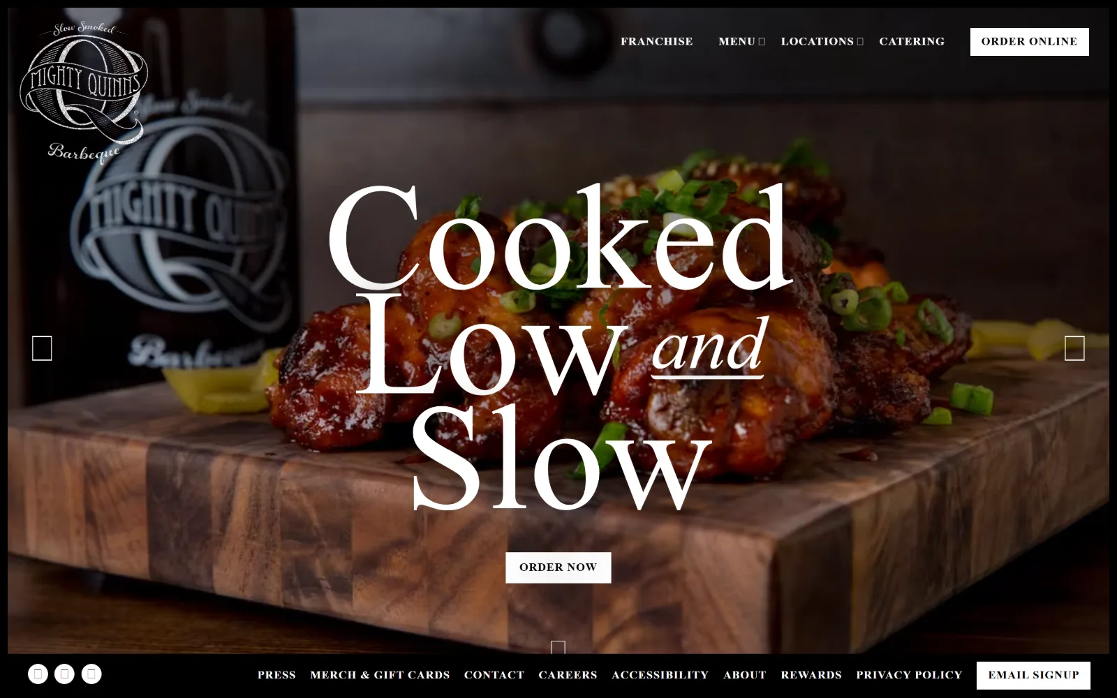
White script type at 194 pixels runs across a warmly lit board of glazed barbecue, with an italic 'and' tucked between the lines.
Type
Atlantic Bentley 194px
Body
EB Garamond 18px
Build
Centred headline over full-bleed photo with a pinned footer link row
Made on
Not detected
Colour
#ffffff #111111 #000000
Type. Atlantic Bentley sets the headline at 194px on a 0.70 line, so descenders from one line pass the caps of the next. The word and drops to an underlined italic near 60px, a deliberate change of register mid-phrase. Hepta Slab handles nav at 14px uppercase with 0.069em tracking, and EB Garamond carries body at 18px.
Colour. Three measured values: #ffffff for the type and the order button, #111111 for the vignetted ground and #000000 at the edges. Saturation is entirely photographic, the amber glaze and scallion green of the board, and the design never introduces a brand colour that would have to compete with the food for attention.
Layout. Full-bleed background with the headline centred rather than set to one side, a transparent header near 115px and a second utility row pinned at the foot of the viewport carrying nine small links. Slider arrows sit at both edges. The order button is a hard-edged white rectangle with no radius at all.
The ask. Order Online in the header and Order Now in the centre are the same ask twice, some 700px apart. Catering is a nav item with no supporting line, so an event buyer gets no reassurance before clicking, and the pinned footer row competes for attention with press, careers and rewards.
A display script at extreme size reads as texture rather than as text, which only holds up when the supporting type is a plain slab.
06
fromscratchcatering.com
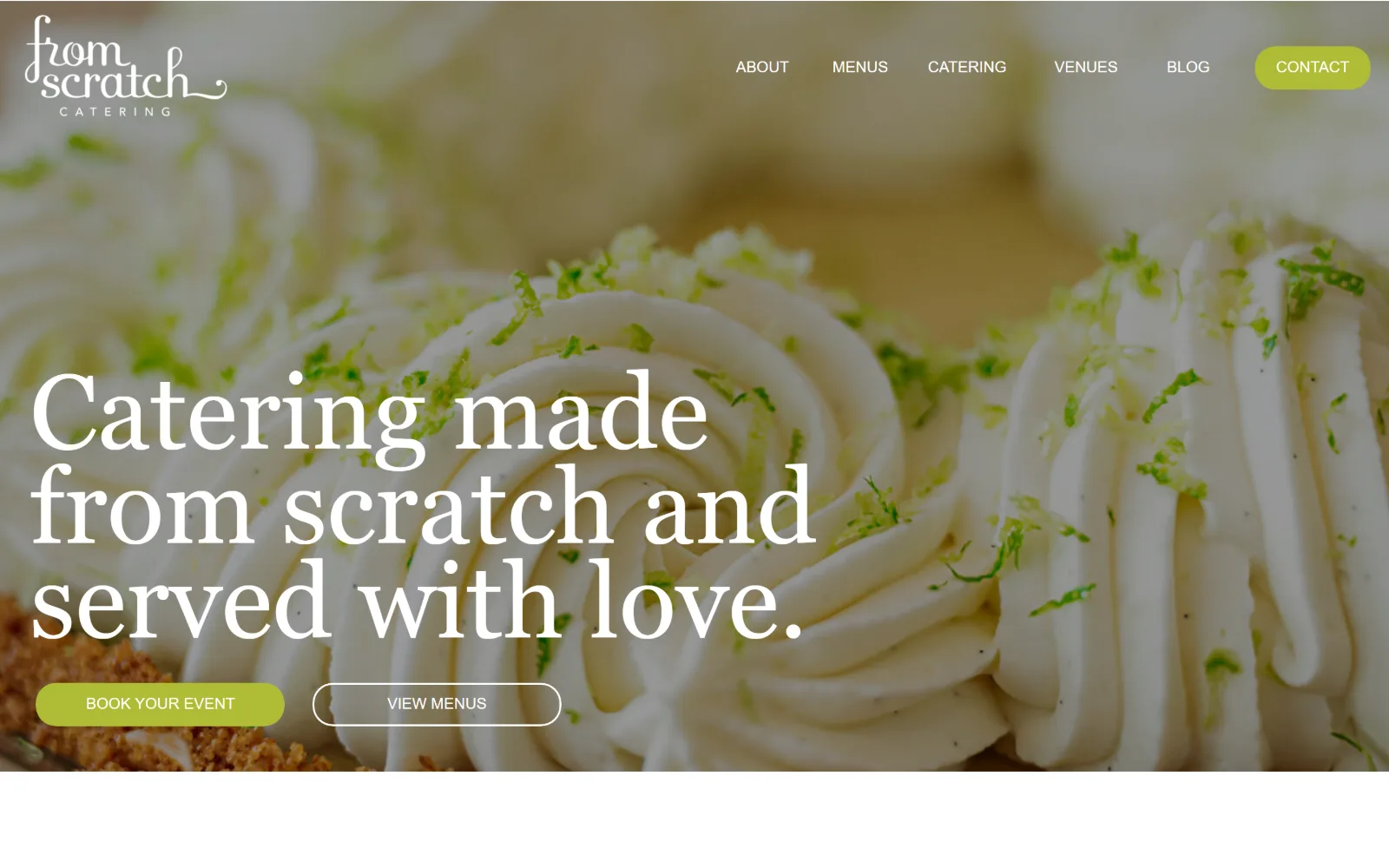
Georgia at 109 pixels sits lower left over an extreme close-up of piped cream and lime zest, with two pill buttons beneath it.
Type
Georgia 109px
Body
Arial 16px
Build
Full-bleed photo with lower-left headline and paired pill buttons
Made on
Not detected
Colour
#ffffff #000000 #aebc36
Type. Georgia at 109px on a 0.90 line is an unusual choice at this scale, and the tight leading turns a system serif into something that reads as deliberate. A 44px secondary line follows in the same face. Arial carries body at 16px and the nav sits small and uppercase at the top right, letting the headline own the screen.
Colour. Three values only: #ffffff type at just over half coverage, #000000 behind the nav and a chartreuse #aebc36 filling the contact pill and the primary button. The cream and lime zest of the dessert supply everything else, and that chartreuse was clearly sampled from inside the photograph rather than chosen next to it.
Layout. Edge-to-edge photography with no container, a transparent header near 155px and the headline anchored at the lower left with roughly 45px of side gutter. Buttons are fully rounded, one filled and one outlined in white, set in a row. The hero stops at a hard white edge rather than fading out.
The ask. Book Your Event leads and View Menus sits beside it, which puts the enquiry ahead of the browse rather than the other way round. Contact is also pinned as the only filled item in the nav. No phone number and no price appear anywhere, so every route ends at a form.
Pulling the accent colour out of the hero photograph rather than the brand guide makes a single button look like part of the image.
07
theculinistas.com
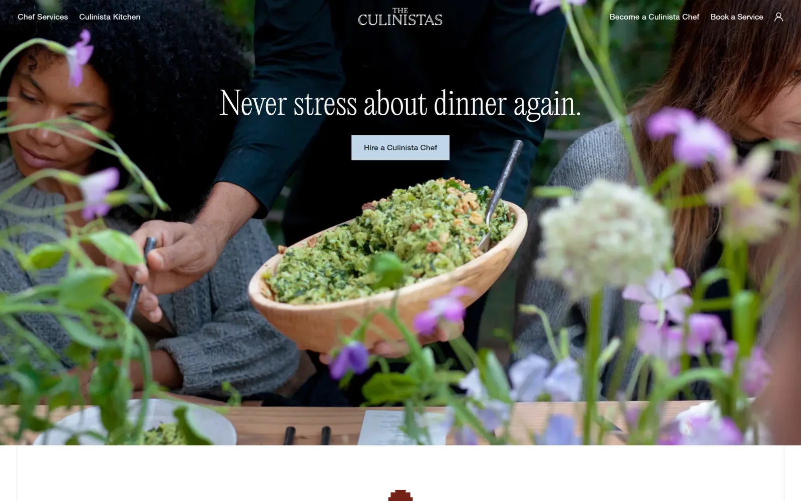
Thin serif type and a pale blue button float centrally over a chef passing a wooden bowl of herb salad through blurred flowers.
Type
Editorial New Ultralight 56px
Body
Garamond Premier 18px
Build
Full-bleed photo hero with centred logo and split nav
Made on
Custom JS framework
Colour
#ffffff #482718 #f9f2ed
Type. Editorial New Ultralight sets the headline at 56px at a 200 weight, thin enough that it survives sitting directly on a busy photograph. Garamond Premier carries body at 18px on a 1.35 line and Helvetica Neue handles nav and buttons at 14px. Three families on one screen, split cleanly between voice, text and interface.
Colour. A #ffffff base, a #482718 brown drawn out of the wooden bowl, a #f9f2ed tint for the sections below and a single #c0d7e9 pale blue filling the only button. The flowers and the salad carry all the saturation, and the interface deliberately holds back to a colour with almost no chroma in it.
Layout. A full-bleed hero around 890px tall with the centred logo in a 68px header and nav split to the two outer edges. Content below starts inside a container with visible side margins, so the photograph is the only full-bleed element on the page. The button is a hard rectangle with no radius, roughly 200px wide.
The ask. One ask, Hire a Culinista Chef, sits directly under the headline with Book a Service repeating it in the header. There is no phone number and no price on the first screen, and the press mention is held back below the fold rather than crowding into the hero alongside the button.
A single low-chroma button stays legible over a busy photograph precisely because it does not try to out-saturate the image.
08
andpizza.com
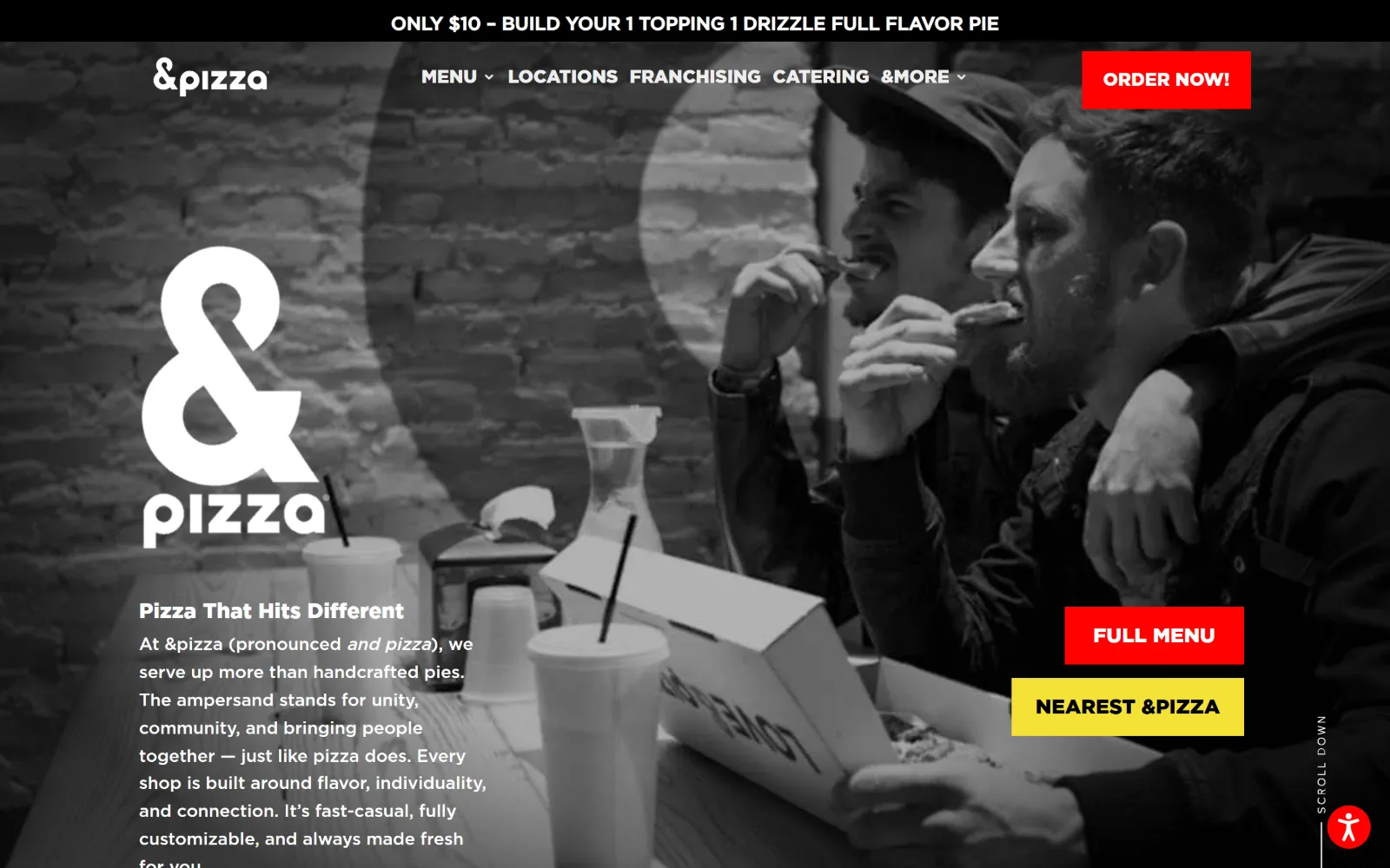
Two people eating, shot in greyscale, sit behind a large white ampersand logo with red and yellow buttons stacked at the right edge.
Type
Gotham Black 76px
Body
Gotham Medium 18px
Build
Announcement strip, header and full-bleed greyscale photo with left text column
Made on
WordPress
Colour
#ffffff #000000 #ff0000
Type. Gotham Black runs everything structural, from a 76px wordmark down to a 19px uppercase button, and Gotham Medium handles body at 18px. The headline above the paragraph is only 22px, which inverts the usual hierarchy: the logo becomes the display type and the headline drops to the status of a label. Nav sits at 14px with no tracking.
Colour. A strict four: #ffffff, #000000, a #ff0000 red at 1.4 per cent coverage and a #f5e238 yellow at 0.6. The photograph is pushed to greyscale so the two accents are the only chroma on screen. Food supplies no colour at all here, which is the exact opposite of how most of this shortlist behaves.
Layout. A black announcement strip near 50px sits above a 100px header, then a full-bleed image with the text column held to roughly 420px at the left. Buttons are square cornered at zero radius and offset from each other rather than aligned, which keeps the red one reading first in the stack.
The ask. Four asks compete before a scroll: a price in the top strip, Order Now in the header, then Full Menu and a nearest-shop button stacked together. Catering is a single nav word with no supporting offer, making the event buyer the lowest priority on a screen built around the single order.
Desaturating the photograph is a legitimate way to protect two brand colours, but it costs a food business its strongest asset.
09
rosensbagels.com
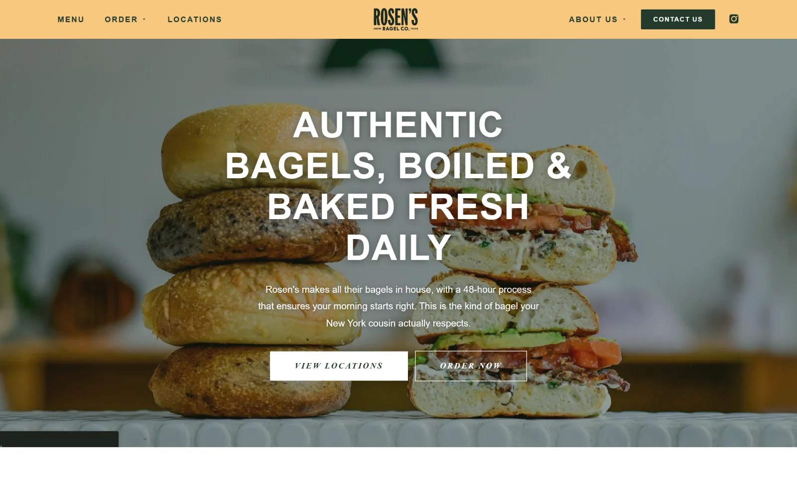
Centred uppercase type and two small buttons sit over a stack of four bagels and a cut sandwich, under a solid apricot header band.
Type
Oswald 64px
Body
Work Sans 17px
Build
Solid colour header band above a centred full-bleed photo hero
Made on
Not detected
Colour
#f8c880 #fbefd9 #22392b
Type. Oswald sets the headline at 64px uppercase with 0.02em tracking across four centred lines, then repeats at 42px and 34px further down with tracking opening to 0.18em. Work Sans carries body at 17px on a generous 1.8 line and nav at 14px uppercase with 0.14em. Button text is italic Oswald at 15px, a small oddity.
Colour. Five values, led by #ffffff and a #fbefd9 cream, with #f8c880 apricot filling the header band, #22392b deep green for nav type and a #e85c2b orange appearing only in small marks. The bagels sit at the warm end of that range, and the header band was clearly matched to them rather than set against them.
Layout. A solid apricot header near 78px with the logo centred and nav split either side sits above a full-bleed photograph. All hero content is centred on a measure of roughly 700px. The two buttons are square with no radius, one filled white and one outlined, both sized small against the type above them.
The ask. Contact Us is the only filled element in the header, with View Locations and Order Now below it. A line about the 48-hour process does the persuading in place of a price. Catering is absent from the first screen entirely, so an event enquiry depends on the visitor opening the contact page.
Matching a solid header band to the dominant tone of the hero photograph joins the two into one field instead of two stacked ones.
10
talkofthetownatlanta.com
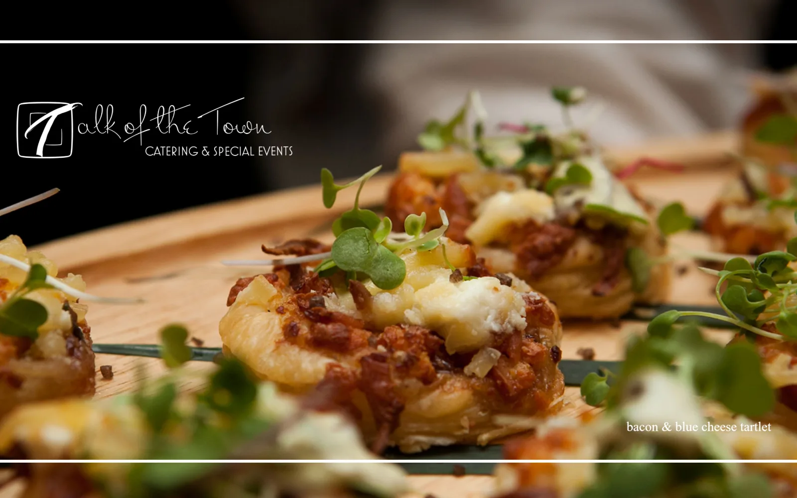
Black bands crop a macro of bacon and cheese tartlets into a strip, with a white script logo reversed out of the upper left corner.
Type
Prata 13px
Body
Montserrat 15px
Build
Letterboxed full-width image with a corner logo and no visible header row
Made on
WordPress
Colour
#ffffff #d7d6d6 #000000
Type. Prata appears only at small sizes, 13px and 12px, with extreme tracking at 0.231em and 0.417em, so the serif reads as spacing rather than as a headline. Montserrat handles nav at 15px with 0.067em. There is no display type at all: the script logo is artwork, and nothing on this screen is set larger than 15px.
Colour. Two measured values, #ffffff and a #d7d6d6 grey, with black framing the image above and below. The tartlets, the microgreens and the wooden board are the only colour anywhere on screen, and the letterbox crop is what turns that into a decision rather than reading as an absence of one.
Layout. A black band at the top and another at the bottom crop the photograph into a cinematic strip roughly 840px tall. The logo sits in the upper left over black rather than inside a header, and a 12px dish caption is set at the lower right. No navigation is visible on this screen at all.
The ask. Nothing is asked for above the fold. No button, no phone number, no form and no menu link appear, leaving the photograph to carry the whole first impression. For a trade that sells an enquiry that is a long wait, and the nav sits below the image rather than above it.
Cropping a hero into a letterbox makes a single dish feel like a portfolio plate, at the cost of delaying every navigational cue.
11
canardinc.com
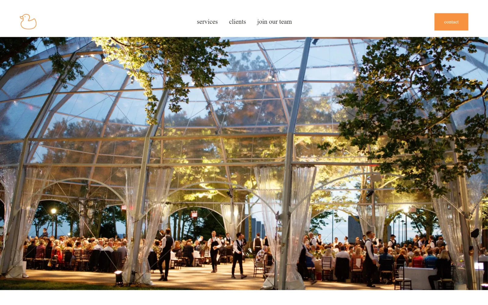
A line-drawn tangerine duck mark and three lowercase nav words sit above a wide photograph of a clear-span tent lit at dusk.
Type
Montserrat 45px lowercase
Body
Montserrat 19px
Build
Full-height header button over an uncaptioned full-bleed photograph
Made on
Squarespace
Colour
#ffffff #f69240 #2f2f2b
Type. Montserrat does every job, set in lowercase at 45px for the headline below and at 19px for the nav, which is unusually large for a three-item menu. The contact button drops to 14px with 0.02em tracking. Keeping the whole page lowercase is the single typographic gesture, and it carries more character than the typeface itself does.
Colour. Two values are measurable: #ffffff across header and body, and a #f69240 tangerine at under three per cent coverage filling the contact button and drawing the duck mark. The photograph supplies the rest, the blue of dusk and the amber of the lighting rig, with no third brand colour introduced to compete.
Layout. A white header near 115px holds the logo at the far left, nav centred, and a flush-right contact button that runs the full header height with square corners. Below it the photograph is full bleed with no container, no overlay and no text, which makes the header read as a caption sitting above the image.
The ask. One ask, contact, and it is the only coloured element on the screen. There is no menu, no price and no phone number, and services sits in the nav as the nearest thing to an offer. The structure assumes a visitor who arrived already knowing what this company does and why.
Running a single accent colour on one button and the logo mark alone is enough to direct a whole screen without any other emphasis.
12
ffthospitality.com
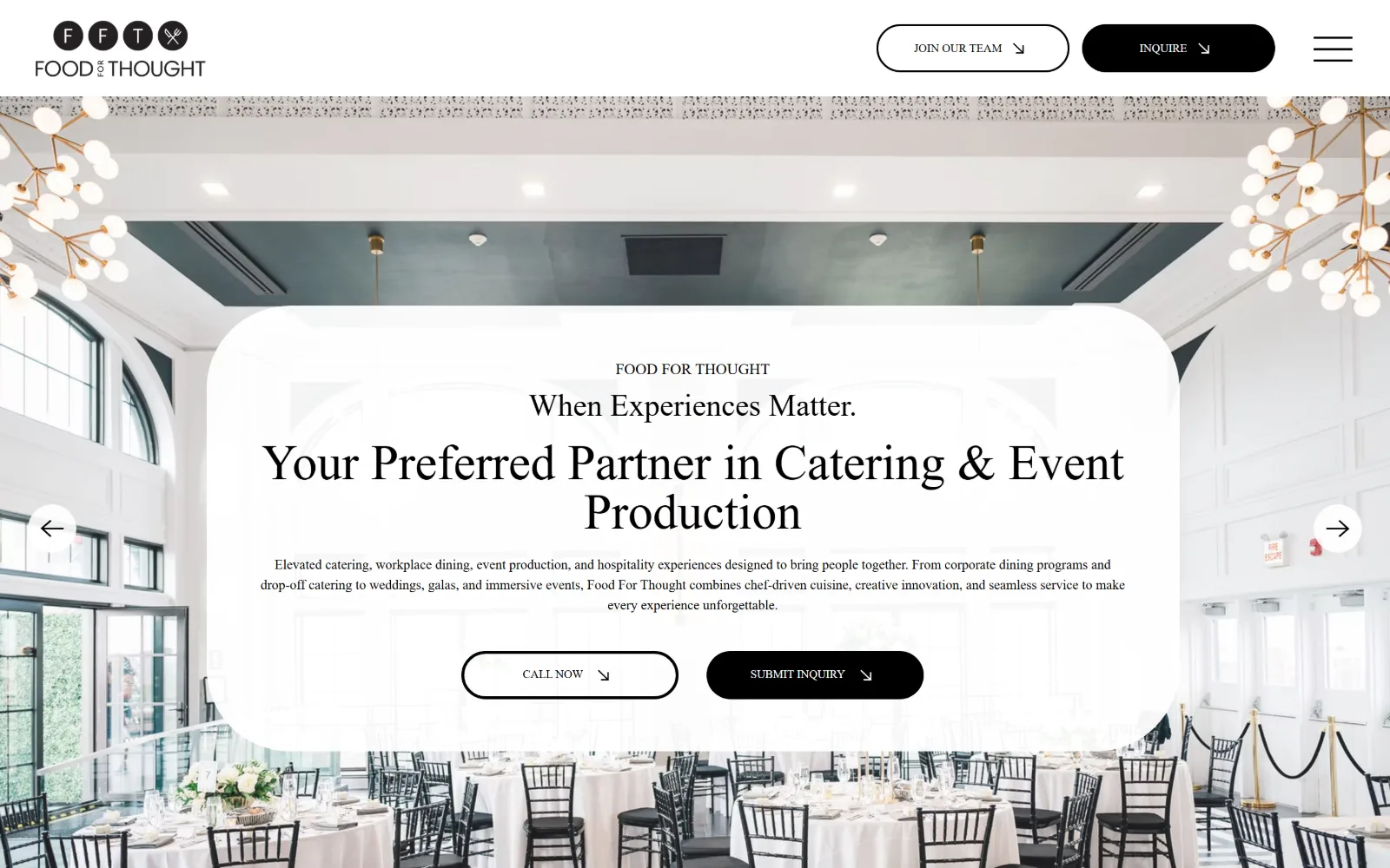
Floating over a bright ballroom of round tables and chandeliers, a rounded white card holds a serif headline and two buttons.
Type
Montserrat Bold 48px
Body
Montserrat Regular 14px
Build
Translucent rounded card floating over a full-bleed slider image
Made on
Wix
Colour
#ffffff #000000
Type. A Montserrat-derived serif sets the main line at 48px with a 32px eyebrow above it and a small brand line above that, all centred. Body sits at 14px on a 1.5 line across a very wide measure, which is small for the width it spans. Nav and button labels drop to 10px Arial, noticeably below a comfortable minimum.
Colour. Only #ffffff and #000000 register at any real coverage, so the card, the type and the buttons form a monochrome system. The ballroom photograph supplies the warmth, brass and pale green, showing through the card's translucency. Restraint here is close to absence: nothing on screen is coloured by choice.
Layout. A white header near 100px sits above a full-bleed photograph, with a translucent card roughly 1100px wide and a 60px corner radius floating over it from about a third of the way down. Slider arrows sit at both edges as circular white controls, and the card's padding covers most of the room behind it.
The ask. Call Now and Submit Inquiry sit as a matched pair, outlined and filled, which is the right pattern for a trade selling an enquiry. Inquire repeats in the header too. The weakness is the 10px label size on both, which makes the most important element on the page the smallest type on it.
Pairing a call button with a form button acknowledges that event buyers split into those wanting speed and those wanting a record.
13
pizzamoto.com
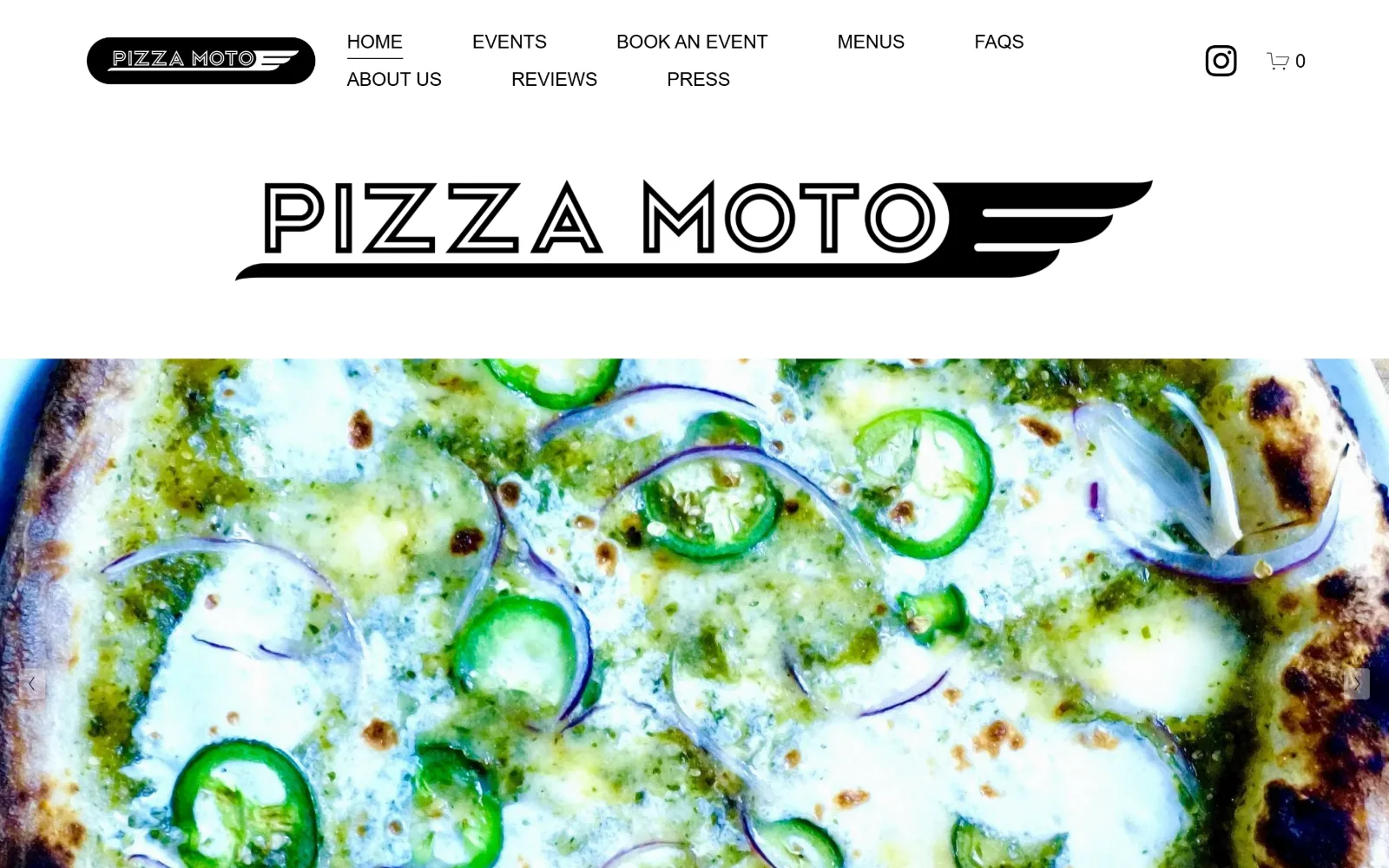
An outlined winged wordmark sits on white above a full-width macro of a pesto and jalapeno pizza, with nav wrapping onto two rows.
Type
Outlined custom wordmark
Body
Helvetica Neue 19px
Build
Stacked white nav band, wordmark panel and full-bleed photo
Made on
Squarespace
Colour
#ffffff #000000
Type. Helvetica Neue at 19px uppercase with minus 0.03em tracking runs every link on the screen, and there is no second size anywhere. The wordmark is drawn artwork rather than set type, an outlined speed-wing lockup supplying all the display character. Nine nav items wrap onto two rows at this viewport width.
Colour. The measured palette is a single value, #ffffff, with black type and a black pill control. Everything else is the pizza: the green of pesto and jalapeno, the char on the crust, the blue rim of the pan. This is the purest case here of a food photograph standing in for an entire colour scheme.
Layout. A white band near 150px holds the nav in two rows, then a panel around 280px carries an oversized repeat of the wordmark, then the photograph begins. Three stacked full-width bands with no container and no overlap, and slider arrows pinned at both edges of the image below.
The ask. Book an Event sits third in the nav alongside Events, Menus and FAQs, so the enquiry is one click away but competing with eight siblings at identical weight. No phone number, no price and no button on the image itself; the basket icon is the only filled control on screen.
Repeating the wordmark at large size between header and hero gives a logo-led brand a display moment without licensing a typeface.
14
lostacos1.com
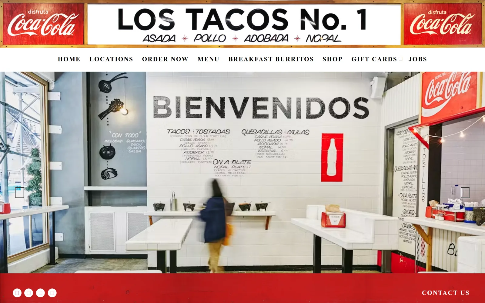
Photographic shopfront signage runs above a white nav row and an interior shot of a taqueria with a hand-painted menu wall.
Type
Photographic signage
Body
Roboto 19px
Build
Four stacked full-width bands with no container
Made on
Not detected
Colour
#27242c #ffffff #cd080c
Type. Roboto Condensed Bold at 19px uppercase with 0.105em tracking carries all eight nav items, and Roboto at 19px italic handles body text. The brand name itself is photographic signage rather than web type, and a 29px slanted face turns up below the fold. The nav is the only typographic decision actually made in CSS here.
Colour. Three values: a #27242c near-black at eighty per cent coverage, #ffffff across the nav row and the interior tiling, and a #cd080c red band at the foot of the hero. The photographs run cool and white-dominated, so that red band is the only warmth the layout itself contributes to the screen.
Layout. A photographic banner near 155px sits above a white nav row around 60px, then the slider image, then a red band. Four stacked full-width strips with no container and no vertical padding between them, which makes the page read as a shopfront elevation rather than as a web layout.
The ask. Order Now sits third in a nav of eight at the same weight as Jobs and Gift Cards, and Contact Us is pushed into the red band at the base of the hero. Nothing is styled as a button, so there is no visual priority between ordering, browsing the menu and applying for work.
Using photographic signage in place of a logo lockup is cheap character, but it leaves the nav doing all the typographic work alone.
15
proofpudding.com
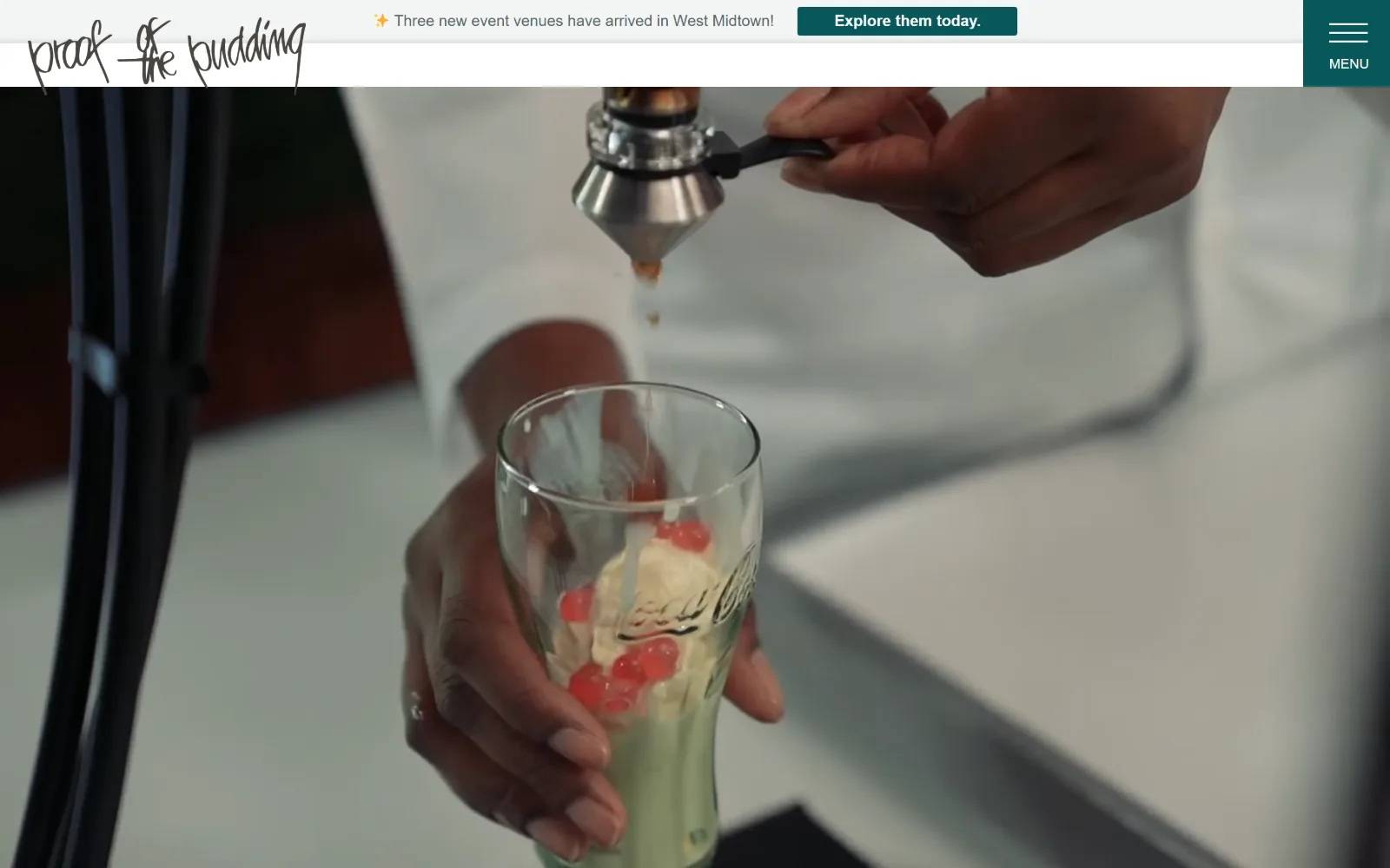
Soft focus fills the frame as a video still of two hands finishing a layered dessert sits beneath a thin announcement strip.
Type
Playfair Display 36px
Body
Montserrat 16px
Build
Announcement strip and header above a full-bleed video with a side menu tab
Made on
WordPress
Colour
#f3f5f5 #08585b
Type. Playfair Display sets headings at 36px below the fold, but nothing larger than 18px appears on the first screen. Montserrat carries nav at 18px Medium and the announcement line at 16px on a 1.8 line. The result is a hero with no typographic voice at all, because the video has been asked to do that job on its own.
Colour. Two measured values, a #f3f5f5 near-white behind the strip and a #08585b teal filling both the announcement button and the menu tab. The video supplies everything else and it reads largely desaturated, so that teal is the only decisive colour on screen and it appears twice within a few hundred pixels.
Layout. An announcement strip near 48px and a white header around 55px stack above a full-bleed video, with the menu control broken out as a teal tab at the far right running the full height of both bands. The script logo sits top left over white, and nothing else occupies the first screen.
The ask. The only ask above the fold is Explore them today, pointing at new venues rather than at catering. Navigation is collapsed behind a single tab, so a visitor wanting a menu, a price or a form has to open that first. That is one extra step for a trade that sells an enquiry.
Collapsing navigation behind one tab and spending the only visible button on an announcement delays every question a buyer arrived with.
How these were chosen
Catering splits into two trades that look alike from outside. One sells an event, with service staff, hire stock and a venue to photograph. The other sells food, and nothing else. Across these fifteen, the food-only operators tend to produce the more confident sites, because they have one subject to shoot and the photograph can carry the whole colour scheme without help. The event-led sites reach for atmosphere instead, and atmosphere is harder to crop. What follows is a close reading of catering website design across both groups, looking at how quickly each page gets a visitor to a menu, a price or a form, and how much work the type is doing once the photography stops.
Finding catering sites that someone had actually designed took far longer than it should have. 23 candidates made the shortlist. 15 made the page.
Each one was opened and looked at properly: what the type is doing, where the colour gets spent, how the page is built, how it asks for the job. Nothing is here because it ranks. Nothing is here because an agency filed it under portfolio. Several well known names were left out for the plain reason that their site came out of the same template as everyone else's, and a few sites worth including did not survive a second look.
Where a site is only competent, it says so. The order is the order worth your time, best first.
Reviewed and selected by Larry W. Matthews for Websitely.