16 Brilliant Restaurant Website Designs to Copy in 2026
The fold as a poster rather than a brochure. Sixteen rooms, delis and coffee roasters, and the restaurant website design decision behind each one.
Shown
16 sites
Reviewed
30 candidates
Chosen on
The work, not the ranking
Updated
15 October 2026
01
gget.com
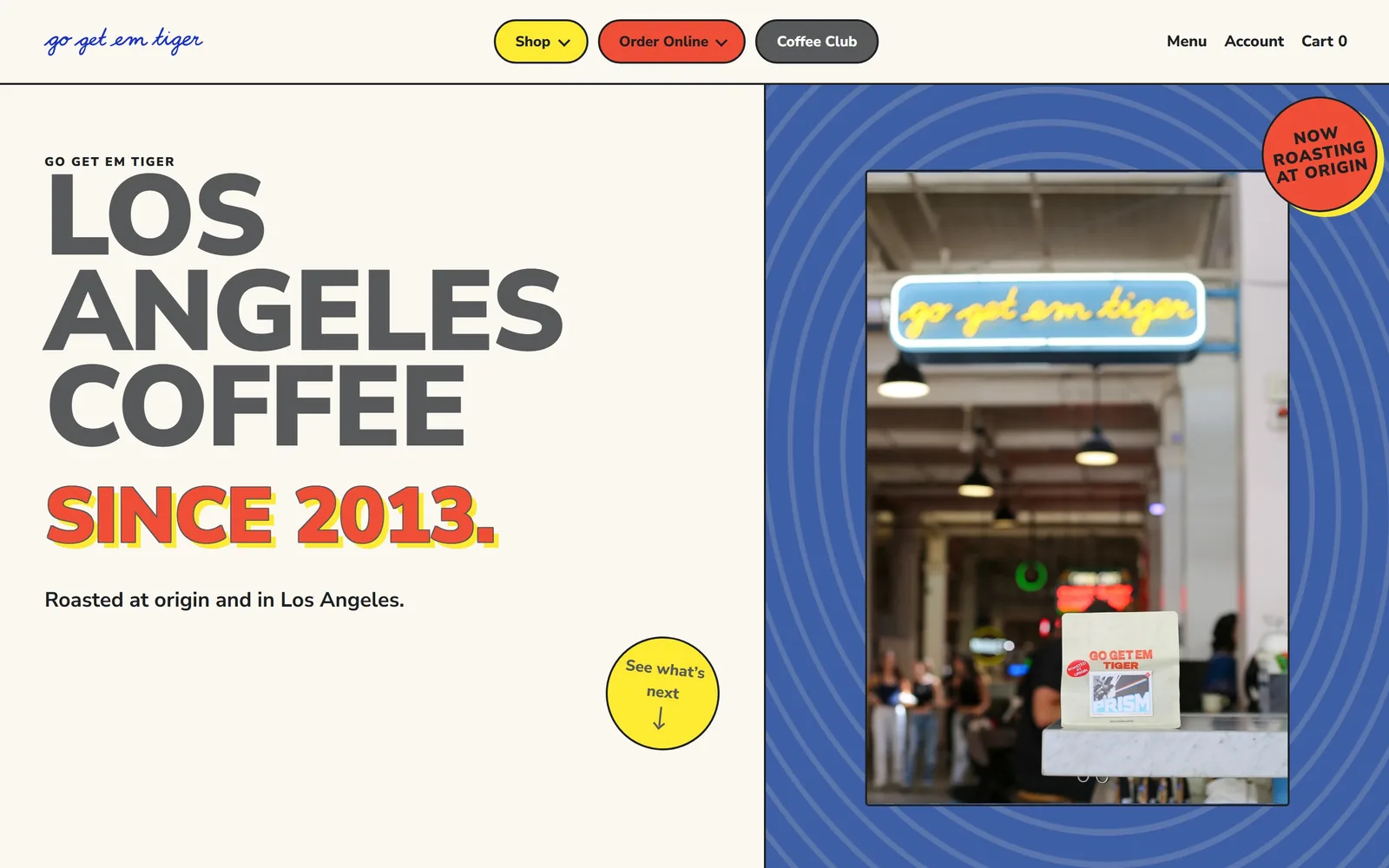
Cream page split down the middle: grey caps stacked three deep on the left, a cobalt panel and neon sign photo right.
Type
Nunito Sans 900, ~72px uppercase
Body
Nunito Sans 650, 19px
Build
792/648 split hero, 50px pills
Made on
Shopify
Colour
#faf8f0 #3e5fa5 #f04e37
Type. Nunito Sans does every job here. The stack LOS ANGELES COFFEE is set in the 900 weight, uppercase, at around 72px, tracked tight enough to lock into a solid block. Under it SINCE 2013. runs the same weight with a red fill and a yellow offset shadow, like a screenprint misregistration kept on purpose. Body drops to 19px at weight 650, and there is no serif anywhere on the page.
Colour. Cream #faf8f0 holds the left half, cobalt #3e5fa5 the right. The accents arrive in pairs: red #f04e37 on the Order Online pill and again on SINCE 2013., yellow #fdea32 behind it and on the Shop pill. Ink is #1f2021, near black but warmed off it. Three saturated colours on a warm neutral is a decision, and most coffee sites in this set default to one.
Layout. A 1440 full-bleed container split into a 792/648 two-column grid with no gutter between the halves. Nav pills sit at 50px radius in the top bar; the photo on the right is inset inside the blue field with concentric line rings drawn behind it. Above the fold you get the script wordmark, three pills, the headline stack, one line of body and a yellow circle that says See what's next.
The ask. Three asks in the top bar alone, Shop, Order Online and Coffee Club, each a different colour so they rank themselves without any size change. The hero adds a fourth, the yellow circle, which is a scroll prompt rather than a sale. Nothing competes with the red pill because red appears nowhere else in the header.
Giving each call to action its own colour lets three buttons sit side by side without any of them losing.
02
canlis.com
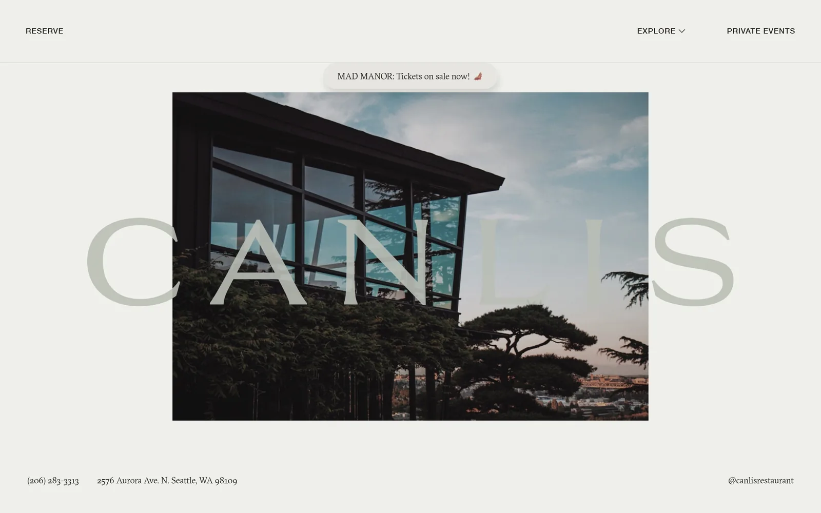
A pale sage wordmark the width of the screen, printed both over and under a photograph of the restaurant's cantilevered glass roof.
Type
GT Sectra, ~110px letterspaced
Body
GT Sectra, 15 to 20px
Build
843px centred image in a 1440 frame
Made on
Custom
Colour
#eff0eb #272320 #3b3c37
Type. GT Sectra, a sharp-cut serif, runs the whole page. CANLIS is letterspaced wide and set around 110px so it reaches almost edge to edge across 1440. Headings sit at 20px and the footer line at 15px in the same face. The one exception is the nav, Helvetica Neue Medium at 14px, uppercase, tracked 0.056em, and that gap between one enormous serif and a small cold sans is the entire type system.
Colour. Off-white #eff0eb covers everything and ink is #272320 rather than black. The wordmark is a desaturated sage pulled out of the cedar in the photograph, so it half vanishes where the image is bright and reappears over the sky. There is no accent colour on the page at all. For a room that has been open since 1950, that refusal reads as confidence rather than caution.
Layout. An 843px image sits centred in the 1440 container with deep empty margins left and right. The wordmark crosses in front of the picture and behind it at the same time, which is the only trick on the page. Phone number and address pin to the bottom left at 15px, Instagram handle bottom right. Three nav items total.
The ask. Reserve is the first word on the page, top left, in the slot where a logo normally goes. It is asked once and never repeated. The phone number along the bottom is the backup. A small event pill floats above the image and is the only thing on screen trying to interrupt.
Putting Reserve in the logo position tells a visitor what the site is for before anything else has loaded.
03
middlechildphilly.com
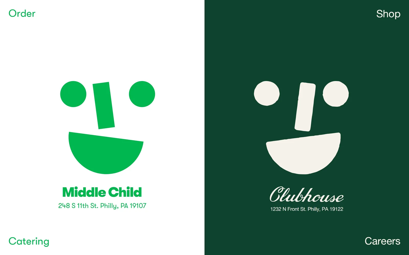
Two halves, white and bottle green, each carrying a smiley face built from a circle, a bar and a half-moon bowl.
Type
Heavy geometric sans logotype
Body
Alte Haas Grotesk, 18px
Build
50/50 vertical split, corner nav
Made on
Custom
Colour
#0e4330 #00b74f #f7f2e9
Type. The two wordmarks are deliberately mismatched. Middle Child is a heavy geometric sans with tight ink traps; Clubhouse is a looping script with a long tail. Addresses underneath run 18px in a grotesk with slightly soft outlines. Nav is 24px GT Walsheim, four single words parked in the four corners, and that is every piece of type on the page.
Colour. The screen is exactly half #ffffff and half #0e4330 bottle green, with #00b74f drawing the face on the white side and cream #f7f2e9 drawing it on the green side. Four values, two of them the same green. There is no photograph anywhere above the fold, which for a sandwich shop takes some nerve.
Layout. A hard 50/50 vertical split at 720px, no gutter, no container, no radius. Each half is built as a poster: mark centred, name under it, address under that in small caps. Navigation sits in the corners, Order and Catering on the left, Shop and Careers on the right, which turns the whole fold into a fork.
The ask. The page never asks for a booking. It asks you to choose a location first, then offers Order in the top left as the only transactional link. Four nav words in total, which is an unusually small ask for a group running two rooms, a shop and a catering arm.
When a group runs two rooms, making the homepage a fork rather than a feed removes one decision from the visitor.
04
misterjius.com
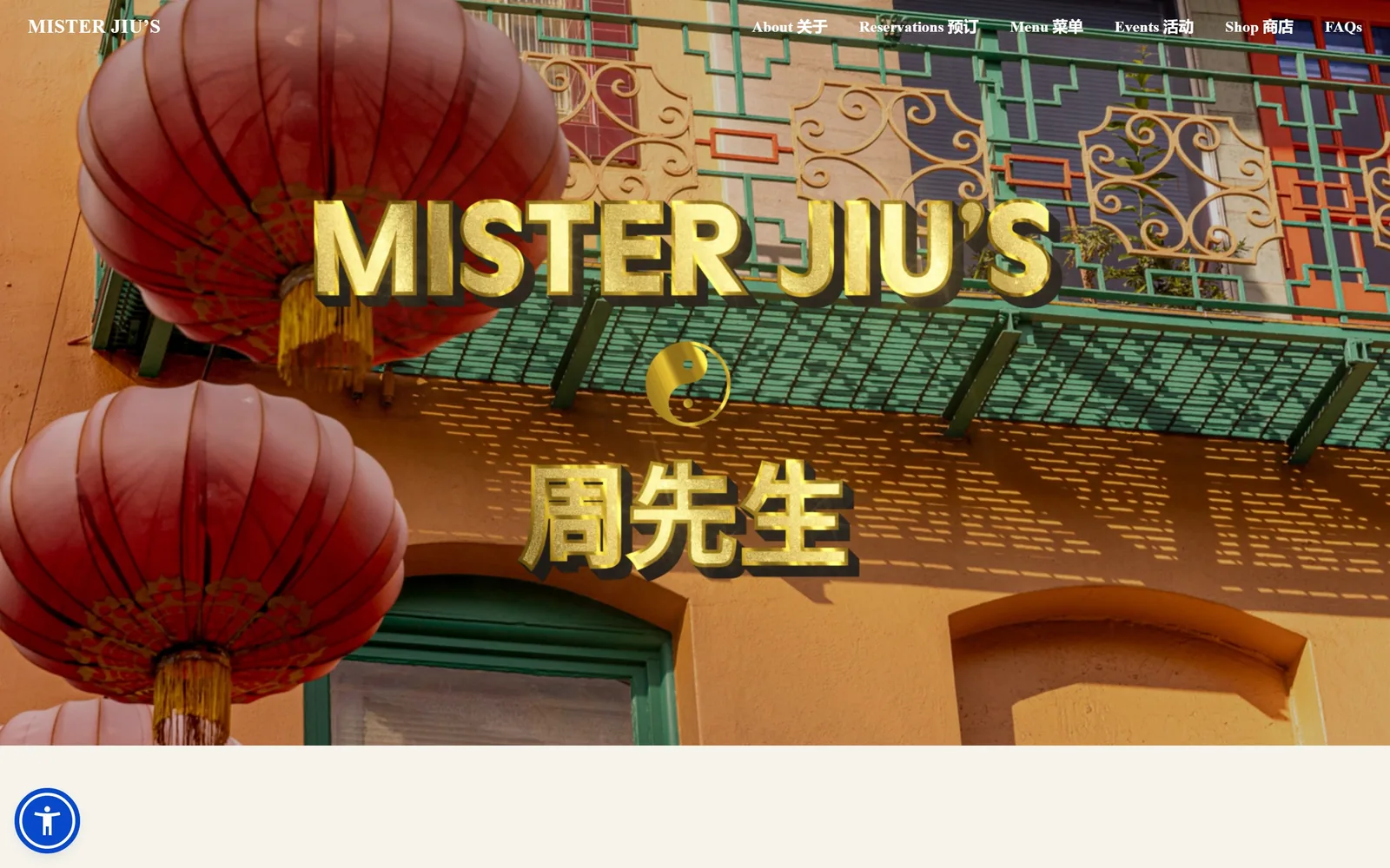
Gold extruded letters and Chinese characters sit over looping video of red paper lanterns on a Chinatown balcony.
Type
Gold extruded sans logotype
Body
Manrope 700, 16px
Build
Full-bleed video, floating nav
Made on
Squarespace
Colour
#f5f3ec #000000 #c9951f
Type. The wordmark is a wide gold sans with a hard drop shadow, closer to sign painting than to any licensed typeface, and the characters below are built the same way. Nav runs Manrope at 16px in the bold weight, with every item doubled in English and Chinese at identical size. A small serif repeats MISTER JIU'S in the top left at about 22px. Three voices, and each stays in its lane.
Colour. Almost everything on screen comes out of the footage: terracotta stucco, jade green railings, lantern red. The only applied colours are the gold of the lockup and white for the nav. Scroll past and the page falls back to #f5f3ec and black. Letting the video carry the palette means the brand looks like the building it is in.
Layout. Full-bleed 1440 video with the navigation floating directly on it, no bar and no scrim. The lockup is centred and pushed low, around 60 percent down the screen, so the lanterns in the upper left stay readable. Squarespace's 26 column grid takes over below with 56px section padding.
The ask. Reservations is the second nav item and the only transactional word above the fold. No button, no panel, no popup, no phone number. The page is betting you will want the room after five seconds of watching it.
Setting both languages in the navigation at the same size treats neither one as a translation of the other.
05
statebirdsf.com
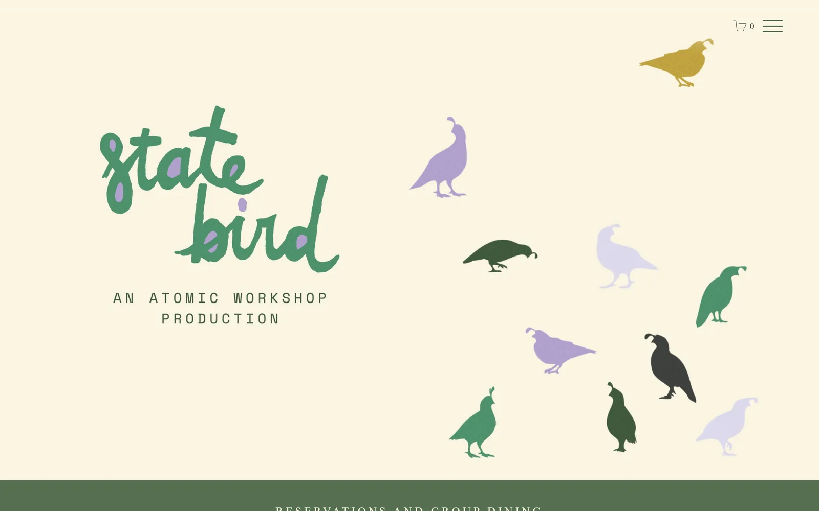
Nine quail silhouettes in green, lilac and black scatter across a cream field beside a hand-brushed wordmark.
Type
Brush script logotype, ~170px wide
Body
Space Mono, 18px, 0.25em tracking
Build
Squarespace 26-col, scattered motif
Made on
Squarespace
Colour
#faf5e2 #55704e #c5b7dc
Type. The words state bird are brushed by hand across two lines, roughly 170px wide, with lilac flecks knocked out of the strokes so the ink looks dry. Under it AN ATOMIC WORKSHOP PRODUCTION runs in Space Mono, uppercase, 18px, tracked out to 0.25em. Choosing a monospace as the only supporting face for a Michelin listed dining room is strange, and it is the reason the page does not look like one.
Colour. Cream #faf5e2 covers the screen, forest #55704e fills the band at the bottom and some of the birds, lilac #c5b7dc fills the others, and text is #3e413d. The lilac is the surprise. It carries no food association at all, and that is exactly what stops the green from reading as rustic farmhouse.
Layout. Squarespace's 26 column grid at 1440, with the wordmark parked in the left third and the birds scattered across the right two thirds at four different sizes. Nothing aligns to anything, which is clearly on purpose. A green band starts at the bottom edge with RESERVATIONS AND GROUP DINING just cresting the fold.
The ask. A cart icon and a hamburger top right, and a reservations band you only half see. The ask is deliberately held back by a screen. For a room that is hard to book anyway, delaying it is a defensible choice rather than an oversight.
An illustrated motif scattered at varied scale does the work a hero photograph usually does, and it never looks out of season.
06
kannrestaurant.com
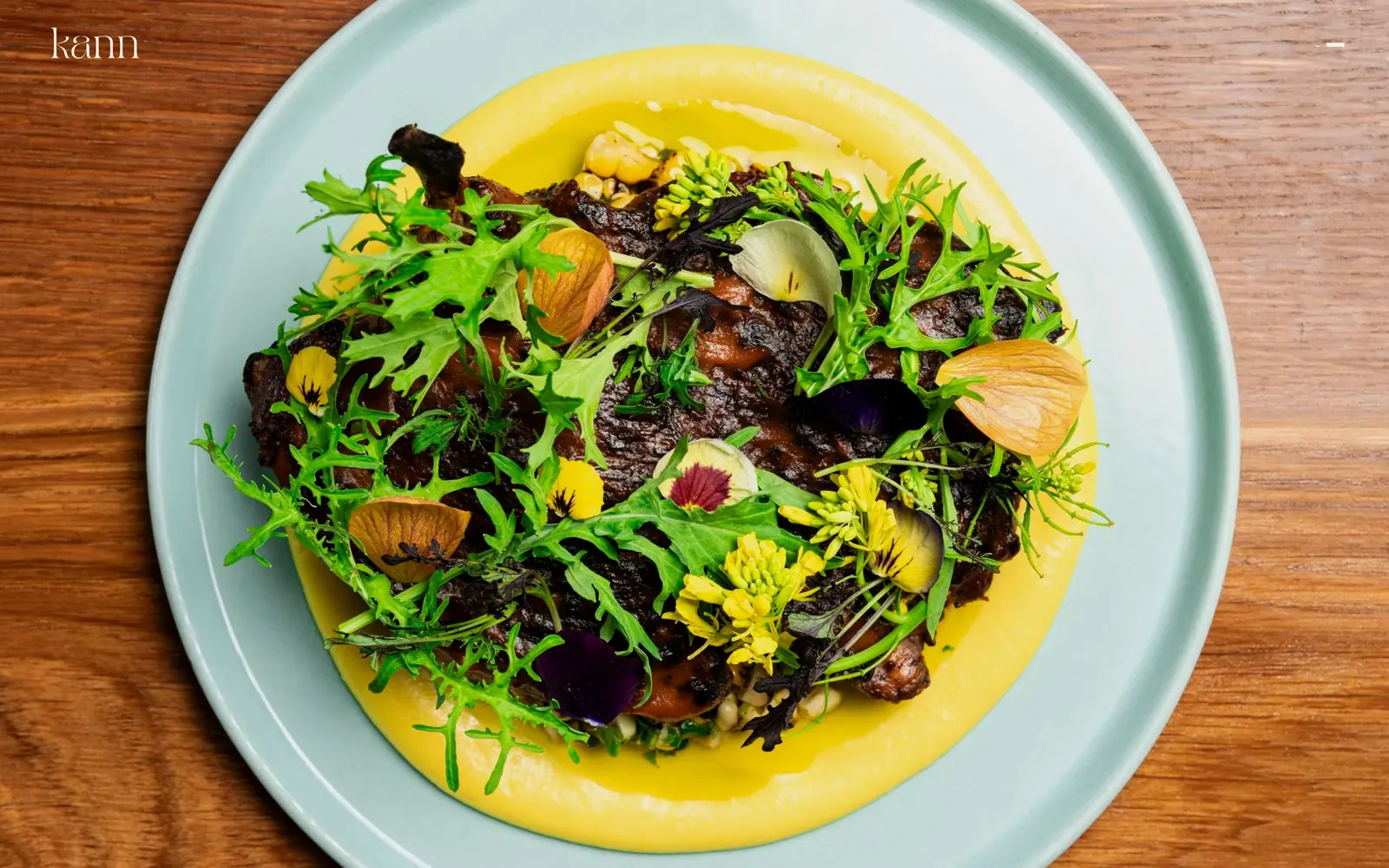
One overhead plate shot fills the screen: charred meat and greens on pale yellow sauce, a sage dish, bare oak table.
Type
Light serif logotype, ~35px lowercase
Body
Raleway 500, 14px
Build
Full-bleed single image, hidden nav
Made on
Squarespace
Colour
#0a0a0a #f6f1e4 #a9793f
Type. There is almost none of it. A lowercase kann sits top left in a light serif at roughly 35px, and a two-stroke hamburger sits top right. Open the menu and the links are Raleway at 14px tracked 0.07em. The only visible typographic decision above the fold is the lowercase, and that is the point.
Colour. The page background is #0a0a0a and you never see a pixel of it, because the photograph covers 1440 by 900 completely. The colours on screen belong to the food: oak brown, sage glaze, a yellow puree. Type is #f6f1e4, a warm off-white rather than pure white, so it sits on the image instead of cutting into it.
Layout. Full-bleed single image, no container, no overlay panel, no caption, no scroll cue. Squarespace underneath on the 26 column grid with 93px section padding once you move. Above the fold there is exactly one photograph and two pieces of chrome.
The ask. Nothing is asked above the fold. Reservations live behind the hamburger alongside eleven other links including Goldbelly shipping and a cookbook preorder. That is a real cost, and the page is betting one photograph buys enough curiosity to cover it.
If your food photography is genuinely good, one frame at full size will outperform three at thumbnail size.
07
cultureespresso.com
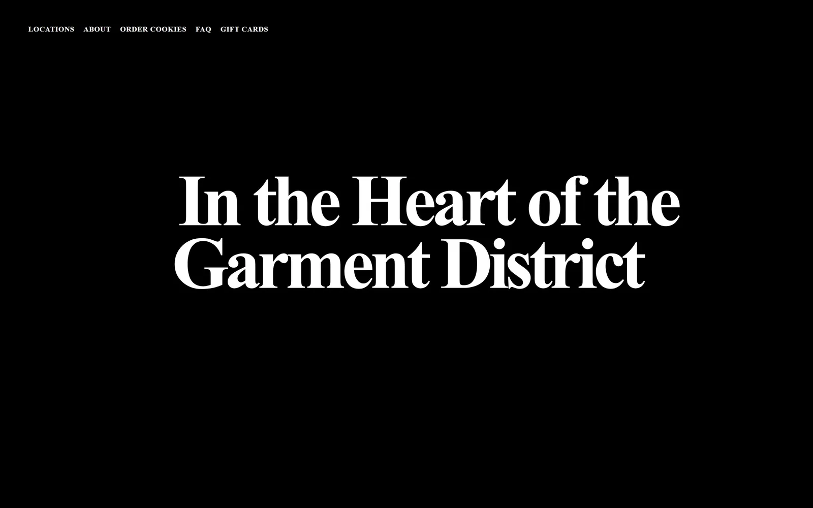
Pure black screen carrying one line of white display serif, two decks high, reading In the Heart of the Garment District.
Type
Heavy high-contrast serif, ~130px
Body
Uppercase sans, 13px
Build
Full-bleed black type poster
Made on
Squarespace
Colour
#000000 #ffffff #a8a8a8
Type. A heavy high-contrast serif set around 130px over two lines, with ball terminals and very narrow vertical stress, closer to a nineteenth century fat face than to anything a page builder ships with. The measurement file names a geometric sans, which is simply wrong; the drawn glyphs are unmistakably serif. Nav above it runs 13px, uppercase, heavy, tracked 0.03em.
Colour. #000000 and #ffffff, and that is the complete palette above the fold. Grey #a8a8a8 turns up further down for hours and addresses. For a coffee shop in a district full of kraft paper and warm browns, going to flat black is the entire brand position stated in one choice.
Layout. A 1440 full-bleed black field. Nav pinned top left at small size, headline optically centred and set slightly above the midline so the block does not sag. No image, no button, no photograph of a cup, no hours. The fold is one sentence about where the shop is.
The ask. Nothing above the fold asks for money. Order Cookies and Gift Cards sit in the nav at 13px and are easy to miss. The selling happens below, on location blocks with addresses and opening times for each shop. Confident, and slow.
A single sentence at display size tells a visitor where you are faster than an embedded map does.
08
atoboynyc.com
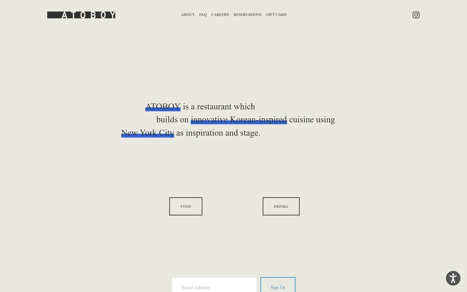
Grey-green page with one sentence in serif, three phrases highlighted in blue as if a cursor had been dragged across them.
Type
Transitional serif, 27px
Body
Mono, 14px
Build
Centred sentence, two outlined boxes
Made on
Squarespace
Colour
#e9e9e0 #303030 #3d8bc1
Type. The sentence runs at 27px in a transitional serif on a 1.5 line height, broken over three lines at odd points so the ragged edges read as handset rather than wrapped. Supporting type is a 14px mono and the nav is 12px, which keeps everything below the headline quiet. A 27px headline should not dominate a 900px screen, and it does, because nothing else is there.
Colour. The field is #e9e9e0, a warm grey-green that photographs like unbleached linen. Ink is #303030. The only other colour on screen is the text selection blue, #3d8bc1 as fill with #145380 showing through where it crosses dark glyphs. Three highlighted phrases, maybe two percent of the screen, and that is the whole accent budget.
Layout. A 1440 container with 92px section padding, the sentence centred in the middle third. Two outlined boxes sit below it, FOOD and DRINKS, roughly 140 by 70 with square corners and a 1px rule. The email capture field crests the bottom edge of the fold.
The ask. Reservations is a nav item, not a button, and the only button-shaped objects on the page lead to two menus. The real ask above the fold is the email signup, which is a long game. For a prix fixe room that books out anyway, that ordering makes sense.
Borrowing the browser's own selection highlight to emphasise three phrases costs nothing and no competitor will own it.
09
kismetlosangeles.com
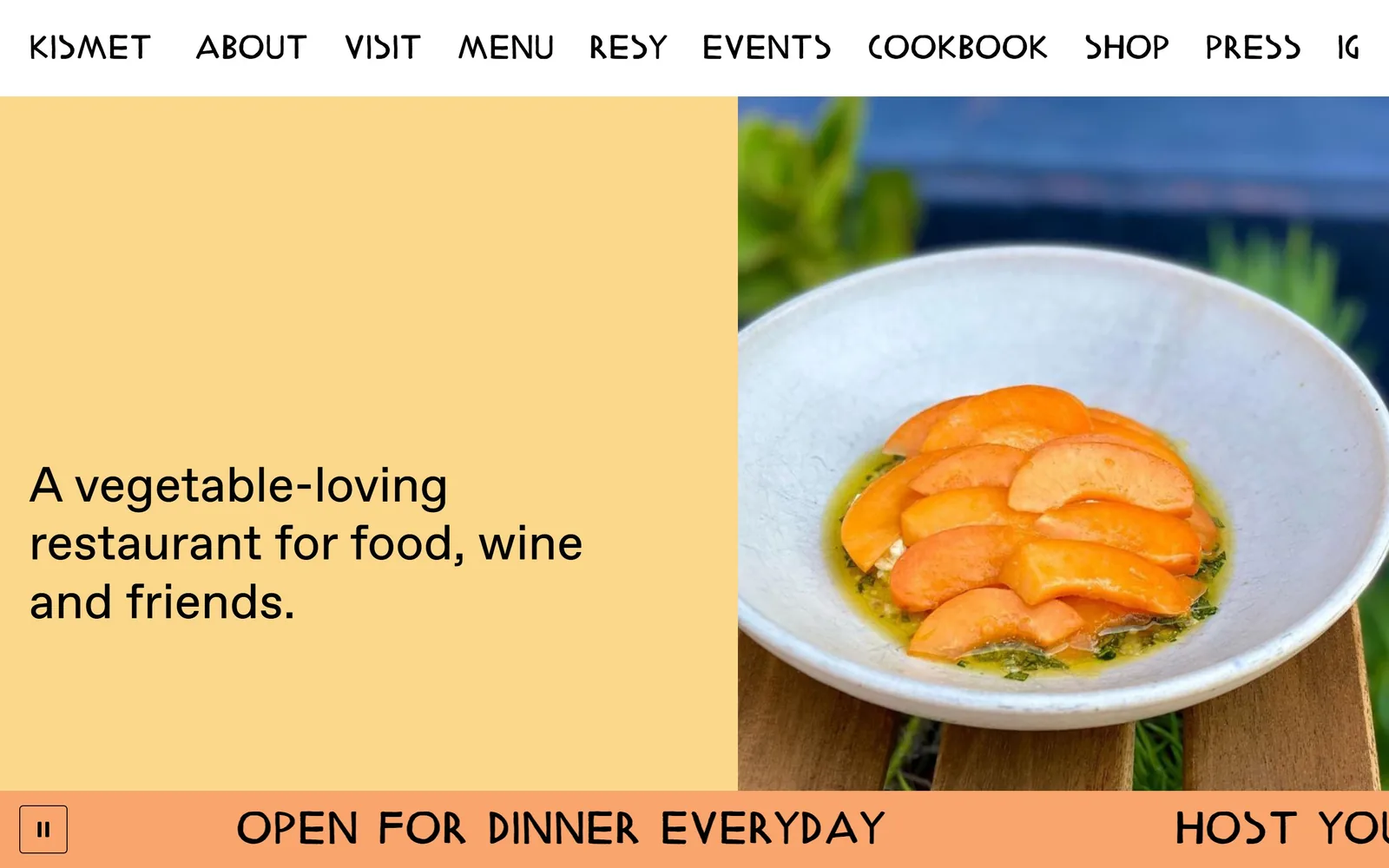
Apricot panel carrying a three-line statement, a bowl of sliced persimmon alongside, and a running ticker across the bottom.
Type
Custom angular sans, 48px caps
Body
Favorit, 51px and 26px
Build
748/691 two-column, bottom ticker
Made on
Webflow
Colour
#fad78a #f9b36d #000000
Type. The nav is a custom face with flat-topped A's and angular bowls, uppercase at 48px, ten items running the full width. It looks hand cut rather than licensed. The hero line is Favorit at 51px in the regular weight, perfectly neutral by comparison. Putting the quirk in the navigation and the calm in the headline is backwards from how most sites do it, and it works.
Colour. Apricot #fad78a fills the left panel, a deeper #f9b36d runs the ticker, white sits behind the nav and type is black throughout. The persimmon slices in the photograph land between the two oranges, so the image and the flat colour read as one continuous surface rather than a picture placed on a background.
Layout. Two columns at 748px and 691px with a 16px gutter, a white nav bar above, and an animated ticker band pinned to the bottom of the fold. 100px section padding below that. Built in Webflow, and the only page in this set that runs a marquee without it feeling like a relic.
The ask. Resy is the fourth nav item and there is no button anywhere. The ticker does the asking instead, cycling OPEN FOR DINNER EVERYDAY and HOST YOUR EVENT AT KISMET. Two offers in one strip, neither shouting over the other.
A ticker along the bottom gives you somewhere to put time-sensitive messages without ever touching the hero again.
10
sqirlla.com
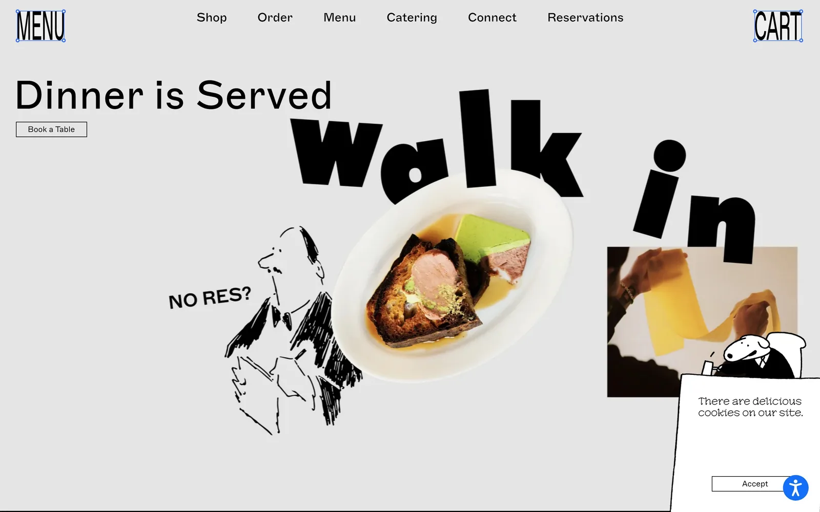
Light grey collage: Dinner is Served in neat sans, WALK IN tumbling in fat black letters, a plate and a line drawing between.
Type
Marfa Pre 500, 70 to 100px
Body
Marfa Pre 300, 14px
Build
Free collage over a 1380 container
Made on
Shopify
Colour
#e9e9e9 #000000 #fff700
Type. Two families doing opposite jobs. Marfa Pre, a grotesk, sets Dinner is Served at 70px and the nav at 22px with slightly negative tracking. Then WALK IN arrives at 100px in a very heavy weight with every letter rotated off the baseline by a different amount. A sharp serif at 40px turns up below the fold. It should be a mess, and it holds because everything is black.
Colour. #e9e9e9 grey everywhere, black type, white plate. Yellow #fff700, green #59965e and purple #826ab0 each take about 1.3 percent of the screen, all of it below the fold. Up top the page is monochrome apart from the food, which is the only warm object on screen and gets looked at first.
Layout. No grid above the fold at all. The hero is a free collage of five objects floating over a 1380px container, 96 percent of the viewport. Below it a five column grid at 184px with a 115px gutter, which is an unusually wide gap. Book a Table is a 1px outlined box at roughly 180 by 36.
The ask. Three asks compete on the fold: Book a Table under the headline, Reservations in the nav, and a NO RES? line drawing that answers the objection instead of making an offer. The cookie card bottom right is the only thing in the way.
Answering the obvious objection in the hero artwork, rather than in an FAQ, takes a question off the visitor before they ask it.
11
catandcloud.com
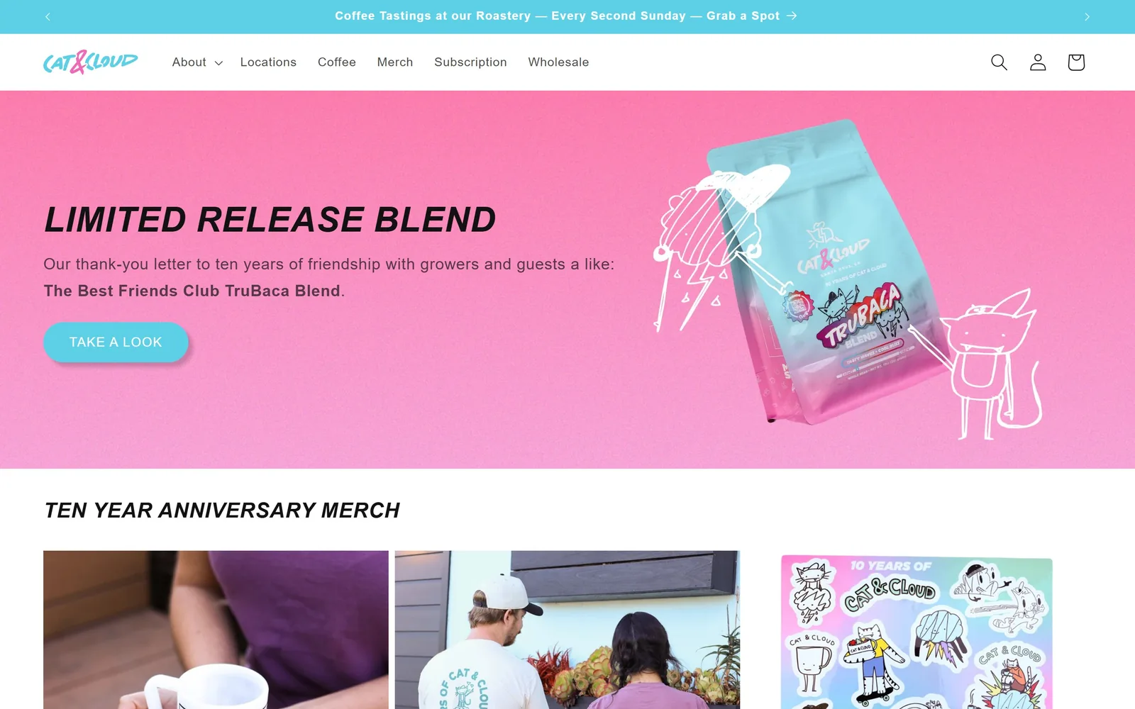
Hot pink band with a bag of coffee floating in it, white marker doodles of a cat and a raincloud drawn around the bag.
Type
Acumin Pro bold italic, ~48px
Body
Acumin Pro, 20px
Build
Announcement bar, nav, full-width colour band
Made on
Shopify
Colour
#f06ea8 #5bd0e6 #121212
Type. Acumin Pro throughout. LIMITED RELEASE BLEND is set in the bold italic at around 48px, uppercase, slanted hard right so it reads as motion rather than emphasis. Body is the same family at 20px with 0.033em tracking and a 1.73 line height, which is loose for a shop page and stops the pink from shouting. One family, two moods, divided by the italic.
Colour. A hot pink around #f06ea8 fills the hero band and does not appear in the measurement file at all, which tells you it is baked into an image rather than set as a background. Against it sit cyan #5bd0e6 on the button and the logo, pale ice #bff8ff further down, and #121212 ink. Pink and cyan at full strength is a risk that pays because the product photography is lit flat to match.
Layout. A cyan announcement bar, a white nav row, then the pink band running the full 1440 to about 830px deep. Content sits on a 128/556/602 three column grid with a 22px gutter. The button is a pill at 41px radius. Merch rows start immediately below the fold with no breathing space.
The ask. TAKE A LOOK is the single hero button and it opens a story, not a cart. The actual commerce lives in the nav, with Coffee, Merch, Subscription and Wholesale, and in the free shipping line up top. The announcement bar rotates two messages, which splits attention a little.
Hand-drawn marks over a product shot make a packaged good feel made rather than manufactured, and they cost one illustrator an afternoon.
12
seycoffee.com
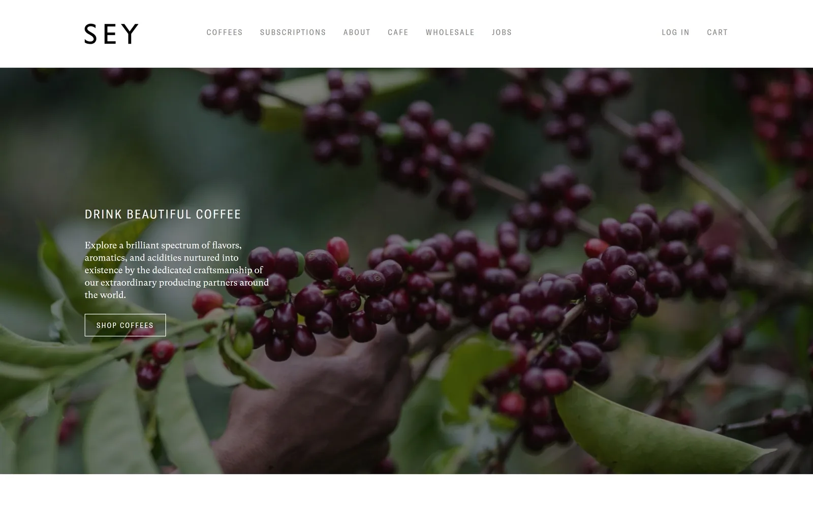
Close-up of ripe coffee cherries being picked by hand, with a short statement and an outlined Shop Coffees box over the dark left side.
Type
GT America Condensed, 22px caps
Body
GT Super Text Book, 16px
Build
1140 container, full-bleed hero image
Made on
Shopify
Colour
#ffffff #000000 #858585
Type. GT America Condensed in uppercase at 22px with 0.1em tracking carries the headline, and GT Super Text Book at 16px carries the paragraph under it. Nav runs 14px condensed with tracking pushed to 0.15em, set in grey #858585 rather than black. A condensed sans over a transitional serif, both kept small, is as close to a Swiss approach as this category gets.
Colour. There is no brand colour. A white nav bar, black type, and then whatever the photograph supplies, here deep burgundy cherries against green leaf. Text on the image is plain white with no scrim behind it. The absence is the position: a roaster that wants the coffee to be the only thing on the page with a hue.
Layout. A 1140px container, 79 percent of the viewport, with a white nav band about 150px deep sitting above a full-bleed image. The copy block is left aligned at roughly 460px wide and sits on the vertical centre line. Shop Coffees is a 1px outlined rectangle, around 200 by 46, no fill.
The ask. One button above the fold, and the nav ordered by what they want sold: Coffees first, Subscriptions second, About third. The outlined button is low contrast against a busy photograph, which is the clearest weakness on the page and an easy fix.
Ordering the navigation by what you want people to buy, rather than by convention, is free and most sites never do it.
13
wisesonsdeli.com
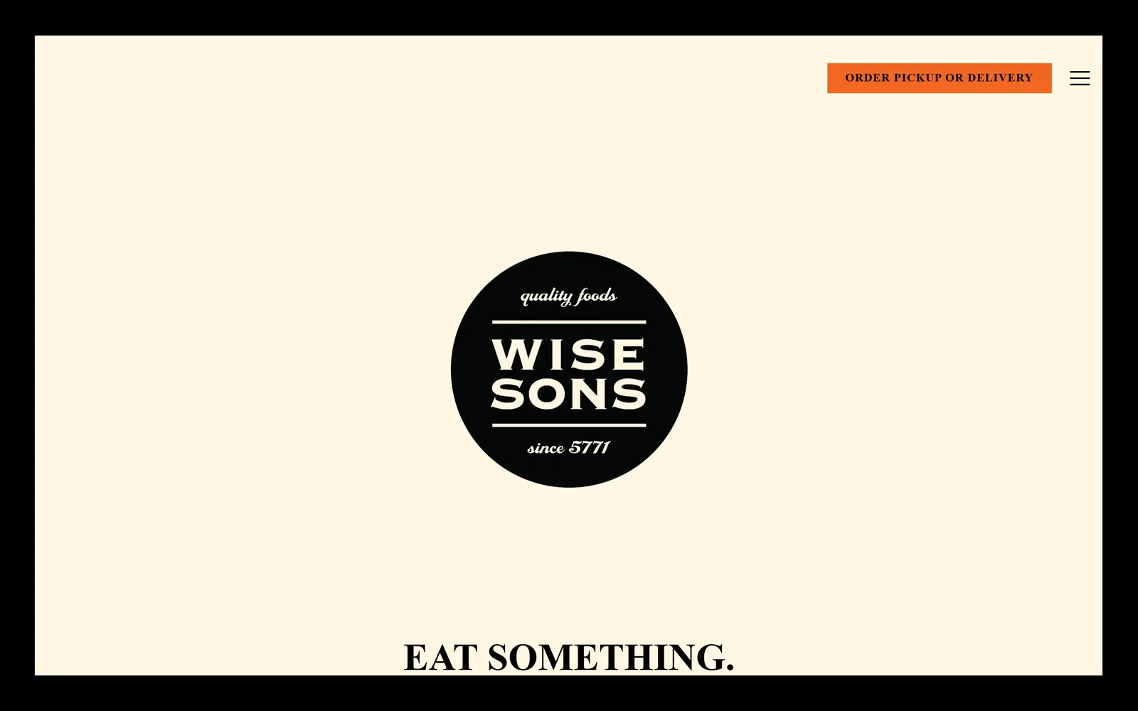
Cream page inside a thick black border, a black circular badge reading Wise Sons quality foods since 5771 dead centre.
Type
Condensed slab badge, ~410px
Body
Brandon Grotesque, 16px
Build
1350 container inside a black frame
Made on
Custom
Colour
#fff7e1 #000000 #f26722
Type. The badge is a condensed slab with heavy inline rules above and below the name, and a script handling quality foods and since 5771. Below it EAT SOMETHING. arrives at 48px in Brandon Grotesque bold, uppercase, with a full stop doing real work. Body and nav are the same family at 16px and 13px, the smaller one tracked 0.039em.
Colour. #fff7e1, a yellowed cream the colour of deli paper, inside a black frame running the full perimeter. The single accent is orange #f26722 on the order button, which occupies well under one percent of the screen. One colour, used once, on the only thing you can actually buy from.
Layout. A 1350px container, 94 percent of the viewport, inset inside a black border roughly 55px thick. The badge is centred at around 410px across with a lot of empty cream around it. Order button and hamburger sit top right; everything else is behind the menu. EAT SOMETHING. crests the bottom edge.
The ask. ORDER PICKUP OR DELIVERY is the only button on the fold and the only orange object on the page, so it cannot be missed. There is no reservation ask at all, correctly, because this is counter service. One ask, one colour, one position.
Spending your entire accent colour on the single action you want beats tinting five unrelated things brand orange.
14
winsonbrooklyn.com
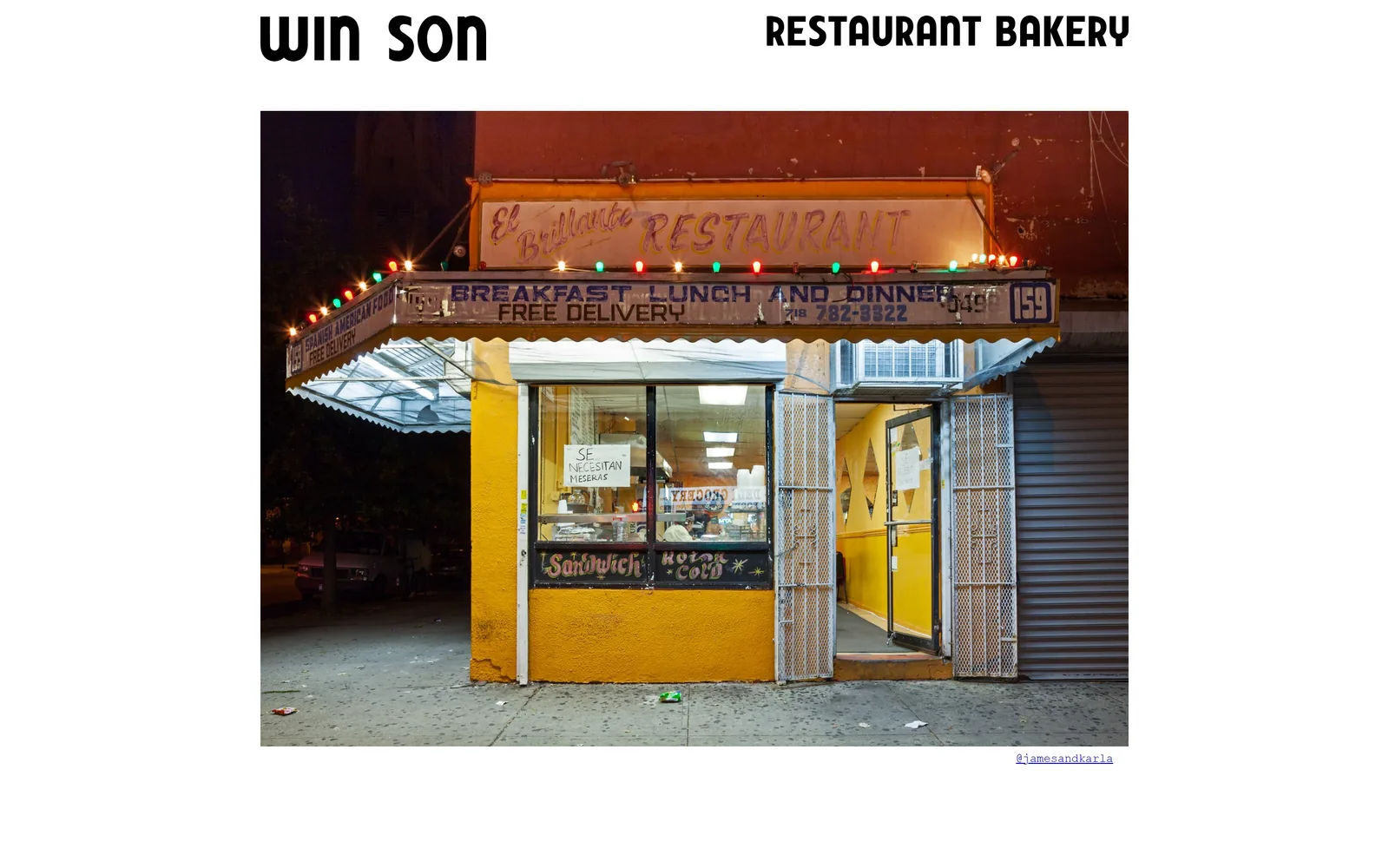
WIN SON and RESTAURANT BAKERY in bold condensed caps above a single photograph of a lit corner storefront at night.
Type
Heavy condensed sans, two groups
Body
Courier New and Times, 16px
Build
900px centred column, one image
Made on
Custom
Colour
#ffffff #000000 #0000ee
Type. Two groups of words in a heavy condensed sans with softened corners, set large across the top, and that is the entire display system. The only other type is a blue Times New Roman credit reading @jamesandkarla at 16px bottom right, plus a Courier New line below the fold. Leaving the browser default link blue #0000ee untouched is either lazy or the most confident thing on the page.
Colour. White ground, black type, and a photograph supplying all the colour: sodium yellow stucco, red brick, green and red bulbs strung along an awning. No brand colour exists anywhere. The site has no palette because the picture is replaced often enough that it would only get in the way.
Layout. A 900px container, 63 percent of the viewport, so the page reads as a narrow column in the middle of a wide screen. The wordmark splits into two groups, left and right, with the photo centred beneath at roughly 1050px wide. Document height is 958px, meaning this fold is very nearly the whole site.
The ask. Nothing. No order button, no reservation link, no menu above the fold. A photographer credit is the only link on screen. It is the least transactional page in this set, and it earns a place because the restraint is instructive, not because the ask is.
A documentary photograph of the block, rather than of the food, sells the neighbourhood the restaurant belongs to.
15
dimesnyc.com
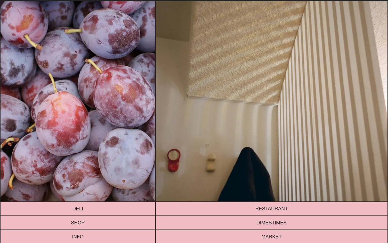
Two full-height photographs side by side, plums and a striped interior, over a pink table of six nav words in plain Arial.
Type
None, navigation only
Body
System sans, 18px caps
Build
Two 720px images over a 2x3 link table
Made on
Squarespace
Colour
#f2bcc5 #222222 #ffffff
Type. One size, one face: 18px uppercase in a system sans, slightly letterspaced, set in #222222. The words sit in table cells with hairline rules between them, a Web 1.0 structure used deliberately. There is no headline, no logotype and no second type size anywhere above the fold.
Colour. #f2bcc5, a chalky bubblegum pink, fills every nav cell. It is the only applied colour on the page; everything else is whatever the two photographs happen to contain, here the dusty bloom on a crate of plums and a cream striped wall. The pink and the plum bloom are close enough that the match is clearly intentional.
Layout. Two images at 720px each running full height to roughly 1040px, then three rows of two cells beneath. No container, no padding, no corner radius. Total document height is 904px, so this fold is effectively the entire site. Built on Squarespace, in a way nobody would guess was Squarespace.
The ask. Six words, six destinations: DELI, RESTAURANT, SHOP, DIMESTIMES, INFO, MARKET. No button, no reservation link, no email capture, no hours. The homepage is a directory for a business with six arms and it flatly refuses to rank them.
When a brand genuinely has several equal front doors, a plain table of links beats inventing a hierarchy that does not exist.
16
sweetgreen.com
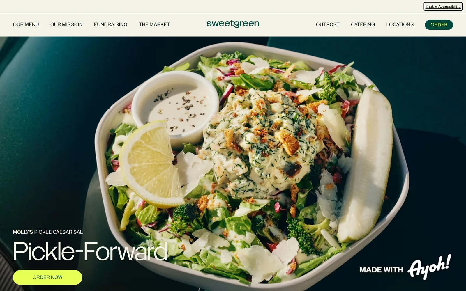
A salad bowl shot tight from above fills the screen, with Pickle-Forward set large in the lower left over a lime Order Now pill.
Type
SweetSans 80px, 0.85 line height
Body
SweetSansText, 18px
Build
Full-bleed photo under a sticky 150px nav
Made on
Custom
Colour
#f4f3e7 #00473c #e6ff55
Type. SweetSans at 80px with a 0.85 line height for the dish name, tight enough that descenders almost touch the line below. Above it the product name runs 24px uppercase in SweetSansText. Body sits at 18px and nav at 16px uppercase in the same text cut. A proprietary family covering all four roles is what a chain budget buys, and it shows in how evenly the sizes step.
Colour. Bone #f4f3e7 in the nav bar, near-black #0e150e for text, forest #00473c on the small order pill in the header, and acid lime #e6ff55 on the hero button. The lime covers well under one percent of the screen and is the only high-chroma object on it, so the eye lands on the button before it lands on the salad.
Layout. Full-bleed 1440 photograph under a sticky nav bar about 150px deep. Copy stacks bottom left with a pill at 1000px radius below it, and a partner lockup sits bottom right. Past the fold a 589/162/589 three column grid with a 10px gutter and 60px section padding.
The ask. ORDER in the nav and ORDER NOW in the hero, both pointing at the same flow, plus Download the app and Catering nearby. Two identical asks on one screen is redundant and the lower one wins purely on colour. The partner logo bottom right is the only thing pulling attention sideways.
Reserving your single loudest colour for the order button, and using it nowhere else, makes a busy photograph safe to run at full bleed.
How these were chosen
Sixteen pages here, running from a Haitian live-fire room in Portland to a Jewish deli in San Francisco to four coffee roasters who ship bags. The pattern that held almost everywhere: the first screen carries one idea and nothing else, a photograph or a wordmark or a flat field of colour, with the menu and the booking link pushed out to the edges. The best restaurant website design in this group treats the fold as a poster rather than a brochure. Where colour turns up it is rarely an accent stripe, it is the whole background, bottle green at full strength or hot pink wall to wall. Only one of these is a national chain, and it is not the boldest page on the list.
Finding restaurant sites that someone had actually designed took far longer than it should have. 30 candidates made the shortlist. 16 made the page.
Each one was opened and looked at properly: what the type is doing, where the colour gets spent, how the page is built, how it asks for the job. Nothing is here because it ranks. Nothing is here because an agency filed it under portfolio. Several well known names were left out for the plain reason that their site came out of the same template as everyone else's, and a few sites worth including did not survive a second look.
Where a site is only competent, it says so. The order is the order worth your time, best first.
Reviewed and selected by Larry W. Matthews for Websitely.