15 Bakery Website Design Ideas Worth Stealing in 2026
Flat brand colour or one honest photograph: fifteen US bakeries whose folds hold to that, plus the bakery website design habit of a very short ask.
Shown
15 sites
Reviewed
30 candidates
Chosen on
The work, not the ranking
Updated
15 October 2026
01
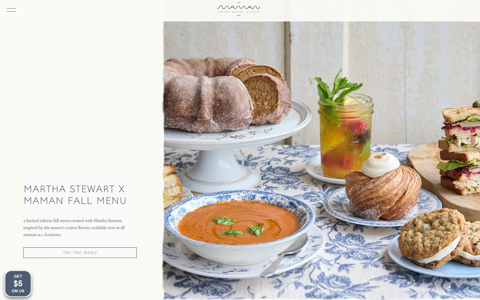
mamannyc.com
A third-page cream panel carries the headline and an outlined button while a styled table of soup, bundt and cruffin fills the rest.
Type
wide tracked uppercase sans, ~32px
Body
EB Garamond 14px, lowercase
Build
one-third text panel, two-thirds full-bleed photograph
Made on
Shopify
Colour
#f7f7ef #4c5b72 #f9faf8
Type. Display is a wide, tracked uppercase sans at about 32px, two lines deep, with roughly 0.08em between letters so it reads as a label rather than a shout. Body underneath is EB Garamond at 14px, lowercase throughout, including the brand name itself. That lowercase is a house rule and it holds on every line of the page. Small type doing quiet work next to a very large photograph.
Colour. Two colours do all the work: a warm pale ground at #f7f7ef and slate blue #4c5b72 for every character on the page, headline, body and button label alike. There is no accent at all. The food supplies the only saturation, and the blue picks up the blue and white china in the picture, which is why it does not feel invented.
Layout. The viewport splits at roughly one third, about 540px of flat panel on the left and the photograph bleeding off the right edge and the bottom. Nothing sits in a card and no corner is rounded. Section padding runs 70px. A hamburger sits alone in the top left and the wordmark is centred above the fold line, so the header costs almost no height.
The ask. One request above the fold: an outlined rectangle reading TRY THE MENU, about 480px wide, no fill. A sticky dark tab in the bottom left offers GET $5 ON US, and that is the only thing competing. No cart badge, no popup, no banner. The carousel dot at the bottom right admits more panels are coming.
A single ink colour used for every word on the page will hold a site together better than any extra accent you could add.
02
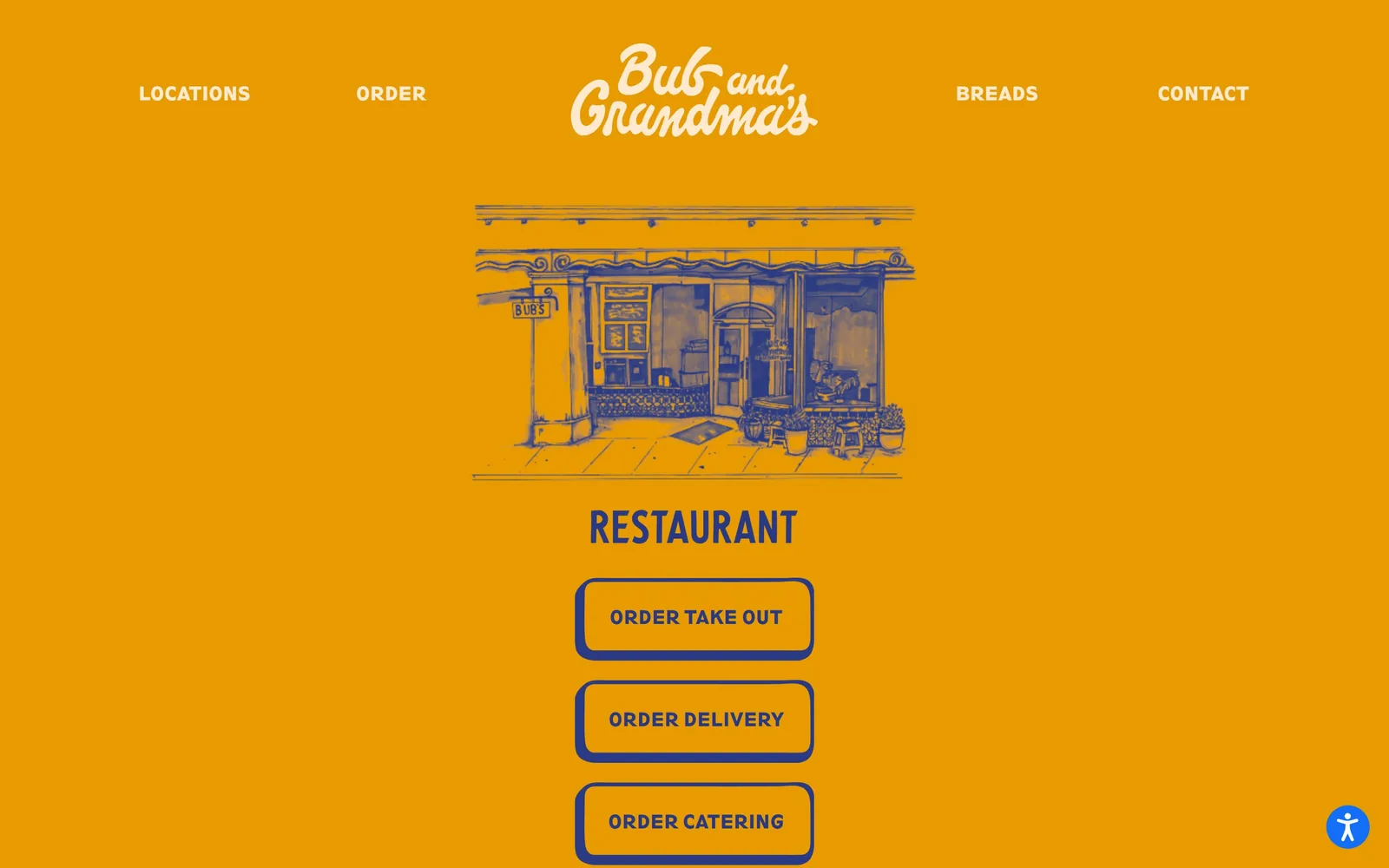
bubandgrandmas.com
Amber fills the whole screen with a navy ink drawing of the storefront and three outlined order buttons stacked down the middle.
Type
condensed gothic uppercase, 48px
Body
condensed gothic, 16px
Build
single 900px screen, 640px centre column
Made on
WordPress
Colour
#e79b00 #293983 #ffead0
Type. The wordmark is a fat 1970s script in cream, set as a two-line lockup. Everything else is a condensed gothic in caps: nav at 19px bold with 0.05em tracking, the word RESTAURANT at 48px. There is no third face and no lowercase anywhere above the fold. It reads like the side of a bakery van rather than a website.
Colour. Two colours and nothing else: amber #e79b00 across the full 1440 and navy #293983 for every mark on it, with the script logo in cream #ffead0. The drawing is a duotone of the same two inks. Choosing an amber this loud as the field rather than as an accent is the whole decision, and most bakeries would not have the nerve.
Layout. One screen, 900px tall, with nothing to scroll past the fold. The nav runs in a single row with the logo centred inside it, and the content is a 640px centre column: drawing, heading, then three buttons at about 340px wide with 12px gaps. Corners are a soft 10px and the borders are 4px navy.
The ask. Three asks, stacked and equal: ORDER TAKE OUT, ORDER DELIVERY, ORDER CATERING. Nothing else on the screen competes, not even a photograph of the food. The cost is that a first-time visitor is asked to order before being shown a single loaf.
Pick two colours, commit the entire screen to them, and most of the design problem solves itself.
03
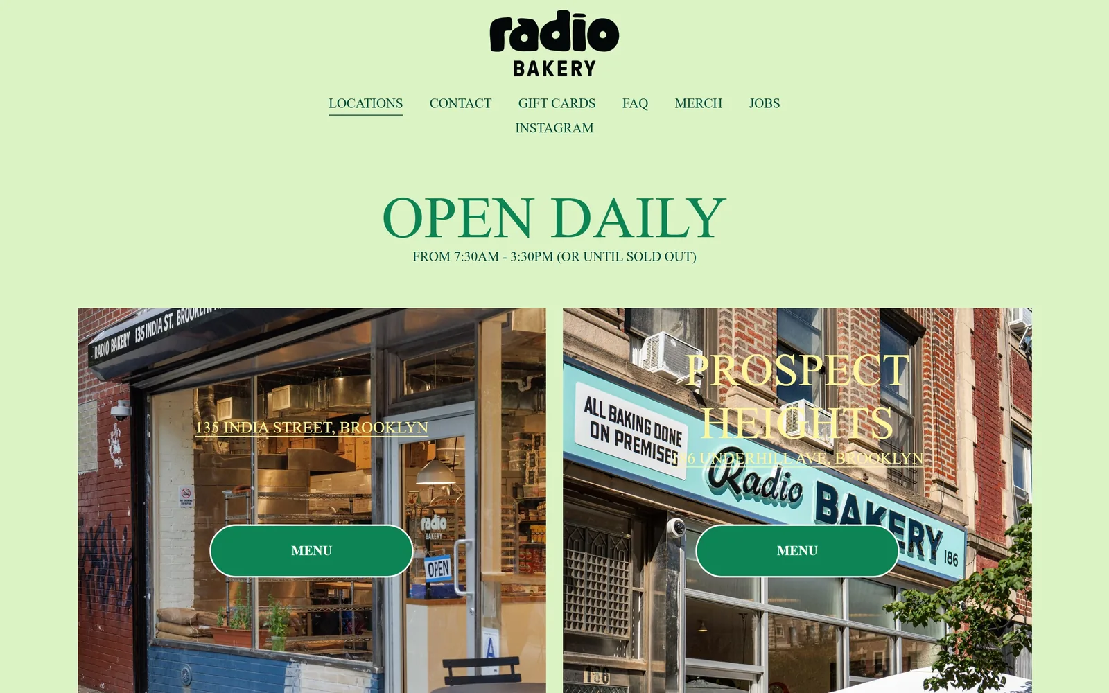
radiobakery.nyc
A pistachio green field, a 76px serif reading OPEN DAILY, and two Brooklyn storefront photos each carrying a green pill marked MENU.
Type
high-contrast serif, 76px caps
Body
geometric sans, 17px light
Build
centred text block, two-up location photos
Made on
Squarespace
Colour
#dcf3c6 #0d8453 #004b3b
Type. The headline is a high-contrast serif in caps at about 76px, not the geometric sans the stylesheet names. Hours underneath run at 17px in a light geometric sans. The nav is the same sans at 17px uppercase, seven items wrapping onto a second line, which is the one careless thing on the page. The logo is a soft rounded sans with a dot over the i that reads as a radio dial.
Colour. Pistachio #dcf3c6 covers everything that is not a photograph. Type is forest #0d8453 for the headline and a deeper #004b3b for the hours, with location names sitting on the photos in butter yellow. Green type on a green field sounds risky and works because the values are far apart. The two buttons are the only solid green, maybe two percent of the screen.
Layout. Full width at 1440 with 197px of air above and below the headline block, more breathing room than any other site here. Below it two photographs sit side by side with an 11px gutter and no rounding. The whole document is 2188px tall, so this fold is close to the entire site.
The ask. One word, MENU, inside a green pill, repeated once per location. No cart, no newsletter popup, no order button anywhere. The copy further down says production is for retail customers on a first come, first served basis, so the site is deliberately not selling online.
If you are not taking orders online, say so and spend the whole fold on hours and addresses instead.
04
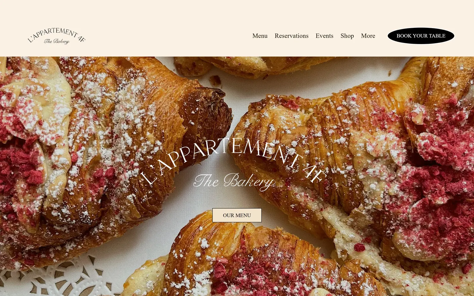
lappartement4f.com
A macro shot of raspberry-dusted croissants with the name arched across it in white and a black ellipse reading BOOK YOUR TABLE.
Type
arched high-contrast serif, ~90px
Body
Libre Baskerville 19px
Build
cream header strip over full-bleed macro photograph
Made on
Squarespace
Colour
#faf1e4 #211703 #c7af86
Type. Two faces, both doing period work. The name is a high-contrast display serif, roughly 90px, curved along an arc, with The Bakery under it in a fine copperplate script. The nav is Libre Baskerville at 19px in mixed case, unusual for a restaurant header and calmer than caps would be. The button label is Archivo Black at 18px, the only hard modern thing on the screen.
Colour. The header band is cream #faf1e4 and the type on the photograph is plain white. The one solid is the black ellipse holding the booking link. Everything else is the picture: egg-wash browns, powdered sugar and a bright raspberry the cream band was clearly matched to. No accent colour was invented for this page, which is right when the food is this loud.
Layout. A 230px cream header strip, then the photograph bleeds edge to edge for the remaining 1020px. Content is centred: wordmark, script line, then a cream OUR MENU box about 200px wide. Zero corner radius except the ellipse. Section padding runs 172px further down.
The ask. Two asks, both soft. BOOK YOUR TABLE sits in the header as a black ellipse and OUR MENU sits centred on the photograph. No cart, no ordering, no email capture above the fold. For a bakery that keeps serving after the pastry case empties, a table booking is the right first thing to ask for.
Let the photograph set the palette and match your interface colour to something already inside it.
05
dozen-nashville.com
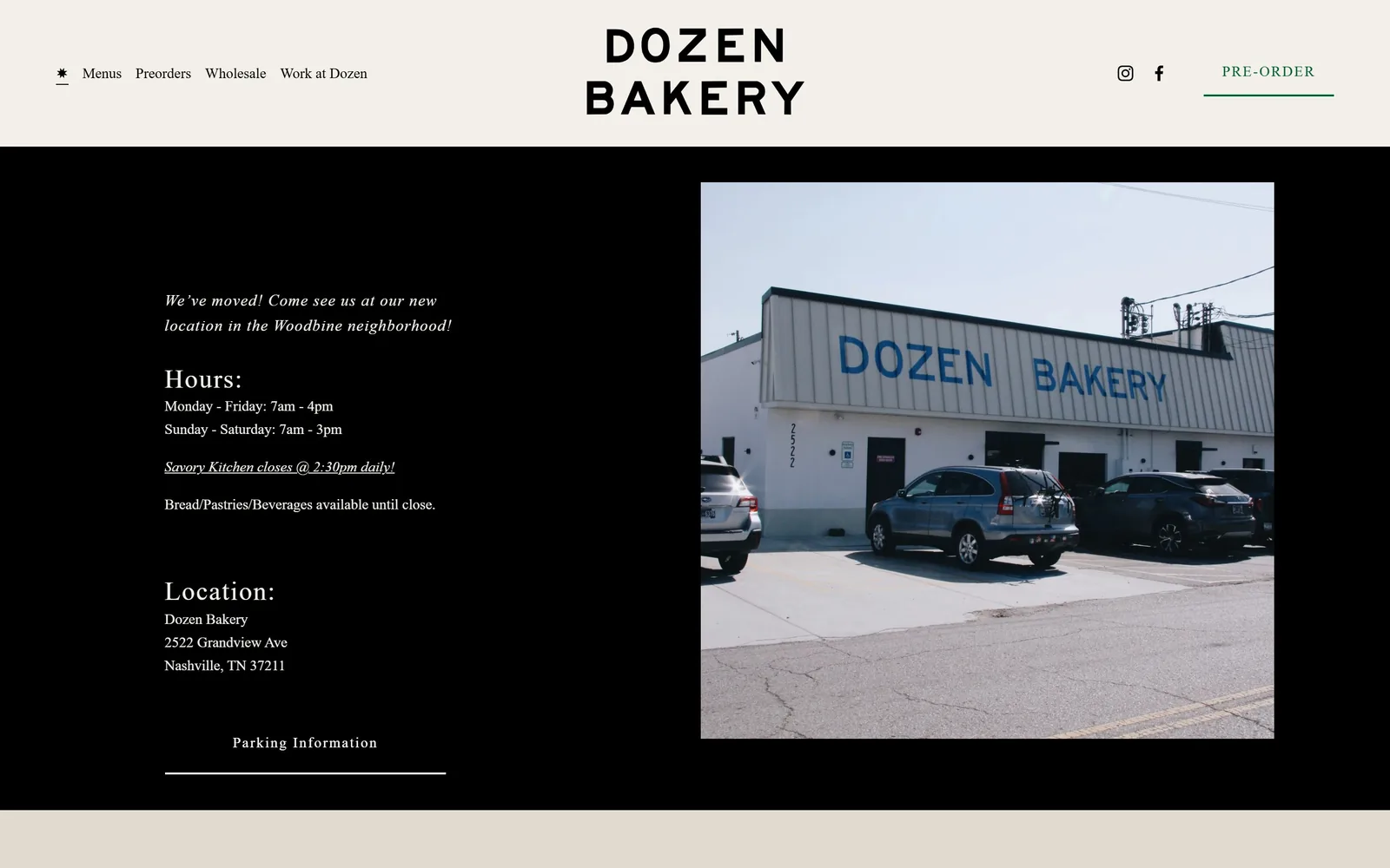
A cream band holds a widely spaced DOZEN BAKERY wordmark above a black slab carrying hours, address and a daylight photo of the building.
Type
wide-tracked geometric sans, 50px
Body
old-style serif, 15px
Build
cream header, black panel, text left and photo right
Made on
Squarespace
Colour
#f3efe9 #000000 #006031
Type. The wordmark is a heavy geometric sans in caps with very wide tracking, stacked on two lines at about 50px. Everything below switches to a serif: Hours and Location as headings, body at 15px on 1.6 line height, and the relocation notice in italic. Two faces, strictly divided by role, with the sans used only for the name and the nav.
Colour. Cream #f3efe9 for the header, pure black below it, and a dusty #e0dad0 band at the base. One accent, a deep green #006031, used once on the PRE-ORDER link and its underline. That is a fraction of a percent of the screen and it is all the colour this page needs.
Layout. The full 1440 splits into a 200px cream header and a black panel underneath. Inside the panel, text runs down a 410px column on the left while the photograph occupies an 830px square on the right, hard edged, no rounding. Section padding is 152px.
The ask. PRE-ORDER sits alone in the top right with a green rule under it, and Parking Information is the only other link above the fold. Hours and address get far more space than either. The site treats the visitor as someone about to drive over, not someone about to check out.
Giving the address and the opening hours the largest block above the fold beats another photograph of a croissant.
06
sidecardoughnuts.com
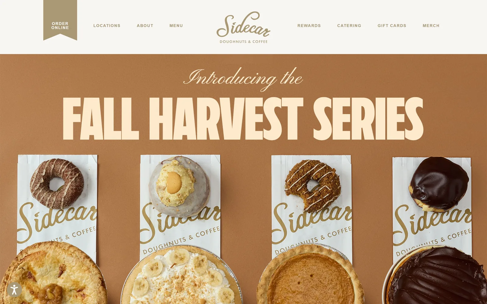
A caramel field with FALL HARVEST SERIES in heavy condensed cream caps above four doughnuts lined up on branded paper bags.
Type
heavy condensed sans, ~71px caps
Body
bicyclette 18px light
Build
white header strip, flat colour hero, four-up product row
Made on
WordPress
Colour
#b07a44 #f4f3e9 #aa9773
Type. The headline is a very heavy condensed display face at about 71px, caps, set tight so four words fill nearly the full width. Above it, Introducing the is a fine connected script, and that contrast is what the hero rests on. Nav is Futura at 30px uppercase tracked 0.04em, unusually large for navigation, which keeps the header from collapsing into the field below it.
Colour. The hero field is a flat caramel, around #b07a44, with display type in cream #f4f3e9. The header strip above is near-white #f7f6f3 and the nav and body type are a muted bronze #aa9773. No red, no pink, no blue anywhere. The whole site sits in one warm value range, which is rare discipline for a doughnut shop.
Layout. A 215px header strip with the script logo centred and the nav split either side of it, then the caramel panel runs to the bottom of the viewport. The doughnuts sit on a four-column rhythm, each on its own bag, aligned to a single baseline. Nothing is in a card and no corner is rounded except the order tag.
The ask. ORDER ONLINE is pinned to the far top left as a tan ribbon tag hanging below the header, the single ask above the fold, and it never scrolls away. Everything else up there is navigation. The hero is selling a seasonal range rather than a transaction, which is the slower play.
One script line over one very heavy condensed line will carry a hero that has no photograph behind it.
07
gjusta.com
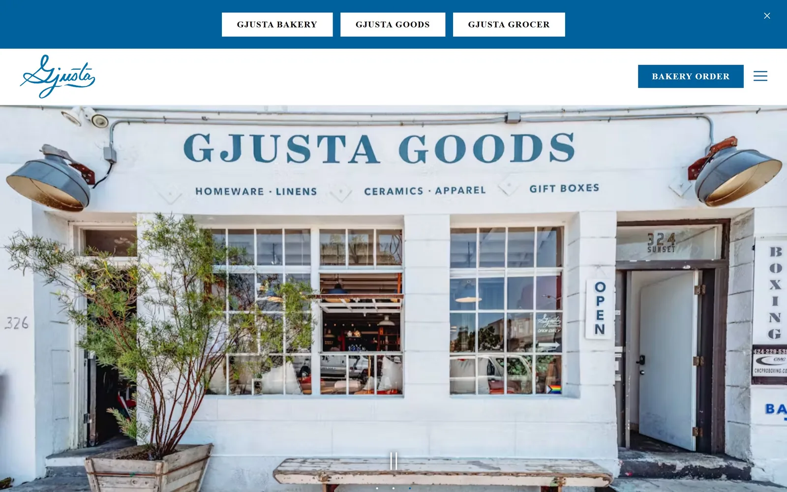
A blue bar with three white brand chips, a script logo, and a photograph of the Venice storefront with GJUSTA GOODS hand-painted across it.
Type
handwritten script logo
Body
Noto Sans 18px
Build
utility bar, white header, full-bleed storefront slider
Made on
custom
Colour
#00609c #ffffff #000000
Type. The logo is a loose handwritten script in blue, the only soft shape in the header. Navigation and buttons are Cabin Condensed at 16px, caps, tracked 0.062em, close enough to the hand-painted sign in the photograph to look deliberate. Body copy further down is Noto Sans at 18px on 1.5. Nothing is set large, because the photograph is doing the display work.
Colour. A single blue, #00609c, runs the top bar, the logo and the order button against white. The photograph is almost entirely white wall and blue signwriting, so the interface colour and the building are the same colour. About five percent of the screen is blue and all of it is on things you are meant to click.
Layout. A 125px blue utility bar carrying three white chips for the three businesses, then a 135px white header, then the photograph full bleed to the bottom. The CTA is a hard-edged rectangle with no radius. Carousel dots sit centred at the base of the image.
The ask. BAKERY ORDER is the only button, top right, solid blue on white. The three chips above it sort you between bakery, grocer and goods rather than selling anything. Email signup waits until further down and nothing interrupts the fold. For a business with three storefronts, sorting the visitor first is the correct order.
Match your interface colour to a colour that physically exists on your shopfront and the site stops looking like a template.
08
littletartatl.com
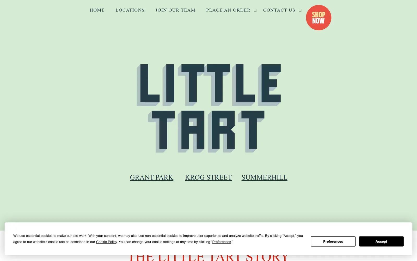
Mint green field with LITTLE TART in chunky slate block letters casting a hard offset shadow, and a red SHOP NOW circle top right.
Type
compressed grotesk with offset shadow, ~160px
Body
TT Norms 16px
Build
centred lettering block over flat colour
Made on
custom
Colour
#d6ebd4 #263c48 #e32b1b
Type. The name is a compressed grotesk at roughly 160px with a solid offset shadow in pale blue, so the letters read as painted signage rather than web type. Nav is the condensed cut of the same family at 16px caps tracked 0.08em. Location names below the logo sit at 24px, underlined, in the same slate. One family, three widths, no serif anywhere.
Colour. Mint #d6ebd4 across the fold, slate #263c48 for type, and one hot accent: the red-orange SHOP NOW disc top right with yellow lettering on it. The same red returns as #e32b1b in the section heading below. Mint and slate is a soft pairing, and the disc is what stops the page going sleepy.
Layout. Full width and centred, with the lettering block about 700px wide and the three location links on one row underneath. Section padding is 64px, tighter than most here. The order badge is a 125px circle, the only round object on the page. A cookie banner eats the bottom 170px, which is a real cost on a page this spare.
The ask. SHOP NOW in a circle, top right, is the only coloured element on the page, so it is the only thing your eye goes to. Under the logo, three location links act as a quieter ask for people who would rather walk in. Two empty boxes in the nav, where dropdown icons failed to load, are the sloppy detail.
If the rest of your palette is soft, one saturated shape is enough to carry every click on the page.
09
lastcrumb.com
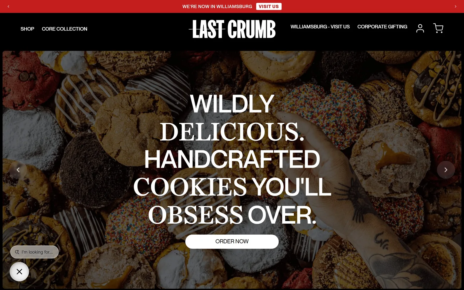
Cookies fill the frame edge to edge while a four-line headline alternates between grotesk and serif words, with a white ORDER NOW pill beneath.
Type
grotesk and serif mixed, 77px caps
Body
Neue Montreal 14px
Build
announcement bar, black header, full-bleed photo carousel
Made on
Shopify
Colour
#000000 #ffffff #c41e1e
Type. The headline runs at about 77px in caps over four lines and switches face mid-sentence: WILDLY and HANDCRAFTED in a tight grotesk, DELICIOUS. and COOKIES YOU'LL OBSESS OVER. in a high-contrast serif. Tracking is slightly negative so the lines lock together. The wordmark has a rule struck through it. It is the most aggressive type here and it suits cookies sold at luxury prices.
Colour. Black, then more black: #000000 behind the nav, #0a0a0a and #1a1a1a in the photograph's shadows, white type throughout. One red, #c41e1e, holds the announcement bar, about two percent of the screen. The cookies supply every other colour, which is why a black site selling baked goods does not read cold.
Layout. A 45px red announcement bar, a 155px black header, then the photograph to the bottom edge. The headline sits in a centre column of about 780px on a three-column 521 / 270 / 521 frame. Section padding is a tight 50px. The CTA is a full pill and everything else is square.
The ask. ORDER NOW in a white pill is the main ask, with VISIT US in the red bar above it and a persistent search field bottom left. Carousel arrows on both sides say more offers are queued behind this one. Four things want a click above the fold, two more than most sites here attempt.
Switching typeface mid-headline gives one sentence a voice, as long as both faces are set at the same size.
10
lodgebread.com
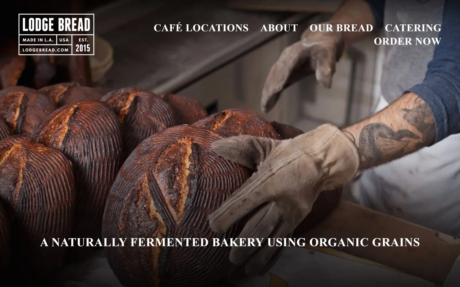
A baker in a welding glove turning scored sourdough in low light, with the tagline set in condensed white caps along the bottom edge.
Type
condensed DIN, 37px caps
Body
condensed DIN, 21px
Build
full-bleed photograph, boxed logo lockup, no container
Made on
Squarespace
Colour
#ffffff #242424 #000000
Type. One family throughout, a narrow DIN in caps. The tagline runs at 37px bold tracked 0.023em, the nav at 32px, nearly as large as the tagline, an odd call that pushes the header onto two lines. The logo is a boxed lockup with MADE IN L.A., USA and EST. 2015 stacked in rules under the name, borrowed straight from workwear labels.
Colour. Only two values are declared, white and #242424, and the photograph supplies the rest: oven browns, a navy sleeve, a tan glove. Type is white over the darkest part of the image with no scrim, which only works because the photo was lit for it. Nothing is tinted and no colour has been branded.
Layout. Edge to edge photograph for the whole viewport, with the boxed logo at about 320px wide top left and the nav running right. The tagline is pinned near the bottom, centred. Below the fold the page falls back to a 26-column Squarespace grid with 11px gutters, but above it there is no container at all.
The ask. ORDER NOW sits at the end of the nav as plain text, no button, no fill, and it wraps onto its own line, so it looks like an afterthought rather than the point. The tagline makes a claim about method instead of asking for anything. Defensible for a wholesale-heavy bakery, but it is the weakest ask on this page.
A real photograph of your own process, lit properly, beats any stock shot of flour on a bench.
11
tattebakery.com
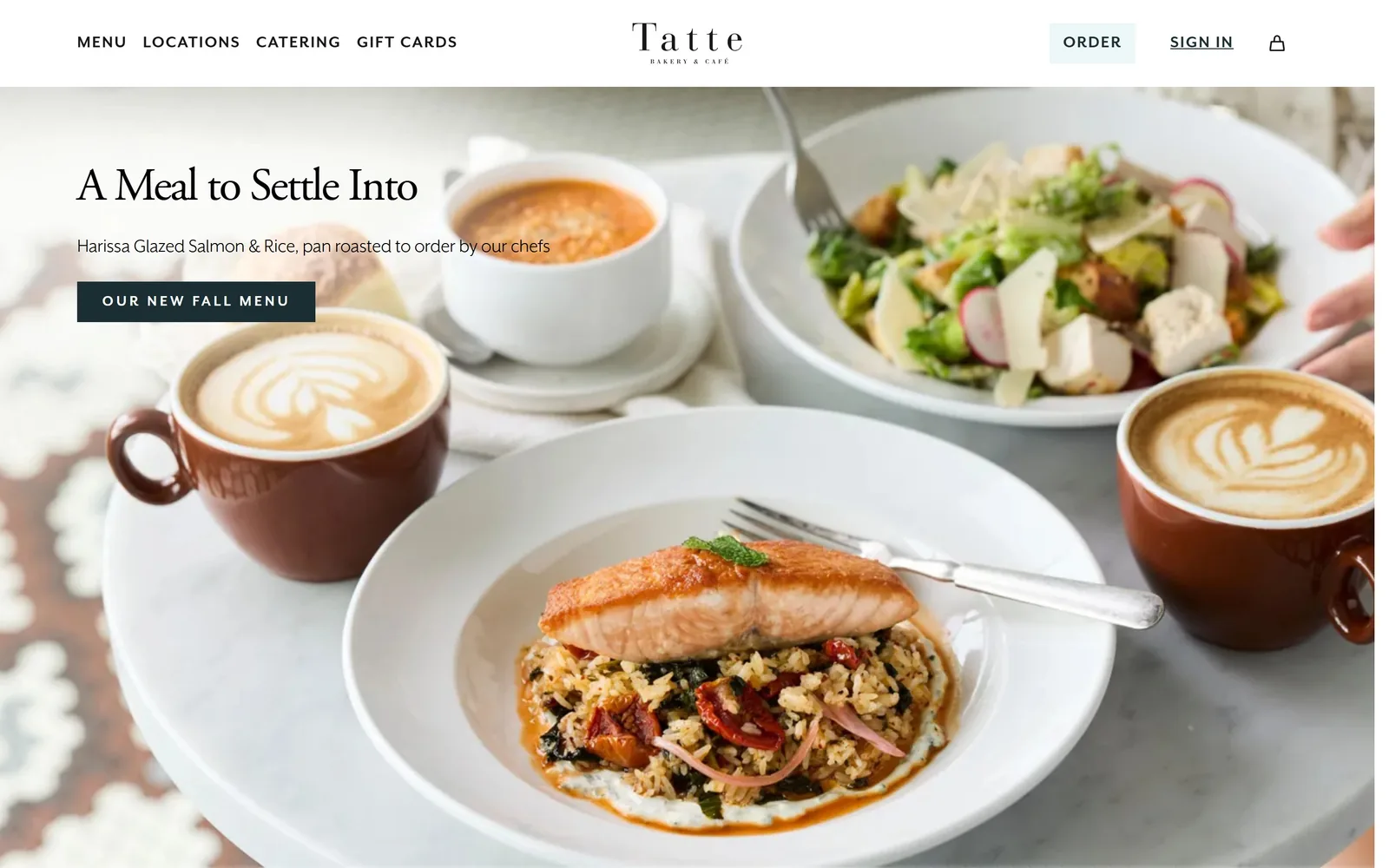
A marble table of salmon, soup and two cappuccinos under a Garamond headline and a dark teal rectangle reading OUR NEW FALL MENU.
Type
Adobe Garamond 48px
Body
Mr Eaves sans 16px
Build
white header, full-bleed photo, left-third headline block
Made on
custom
Colour
#1a2e33 #ffffff #edf7f7
Type. Headline is Adobe Garamond at 48px with slightly negative tracking, mixed case, left aligned. Body is Mr Eaves, the sans companion to Mrs Eaves, at 16px on 1.3. Nav is the same sans at 18px caps tracked 0.08em. The wordmark spaces T a t t e out widely over a hairline BAKERY & CAFE. A conventional pairing, executed more carefully than most.
Colour. White header, dark teal #1a2e33 on the button, a pale #edf7f7 chip behind ORDER, and #666666 for body text. The photograph carries all the warmth. The teal appears exactly twice. Nothing here is a risk; it is the default palette for the category done to a higher standard.
Layout. A 120px white header with nav left, wordmark centred and actions right, then a full-bleed photograph. The headline block sits in the left third at about 500px wide. The CTA is a hard rectangle with zero radius, roughly 345px by 60px. Container measures 1430px, 99% of the viewport.
The ask. Two asks in the header, ORDER in a pale chip and SIGN IN underlined, plus OUR NEW FALL MENU on the photograph. The hero sells a menu rather than a transaction, and the subhead names the dish and says it is pan roasted to order. Three clickable things above the fold, clearly ranked by weight.
Naming the actual dish in the subhead does more work than any adjective you could put in the headline.
12
gpdoughnuts.com
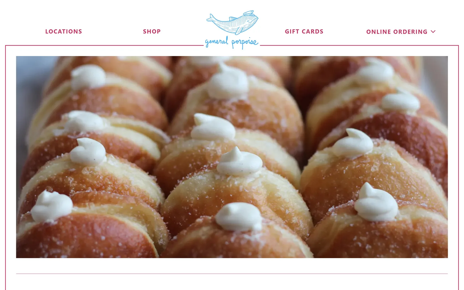
A sky blue porpoise over a script wordmark, raspberry nav either side, and a tray of cream-topped doughnuts inside a thin keyline.
Type
Proxima Nova 36px bold
Body
Proxima Nova 16px
Build
centred logo nav, keyline-framed hero image, three-column grid
Made on
custom
Colour
#cb3365 #50b4f1 #303030
Type. The logo pairs a fine line drawing with a loose handwritten script, both in sky blue. Navigation is Proxima Nova at 18px caps with heavy 0.097em tracking, which is what gives the header its width. Headings further down run 36px bold in the same blue. No serif anywhere and nothing set large; the restraint is the point.
Colour. White ground, raspberry #cb3365 for navigation, sky blue #50b4f1 for the mark and headings, and #303030 for body copy. Two accents on white is more than most sites here use, and it balances because each one has exactly one job. The keyline rules are drawn in the raspberry at a single pixel.
Layout. Nav runs in one row with the logo centred inside it, then a hairline raspberry rule crosses the full width. The photograph sits inside a frame with roughly 35px of white margin on every side, so it is bordered rather than bleeding. Below the fold the page uses three 436px columns with 16px gaps.
The ask. There is no button above the fold at all. ONLINE ORDERING is a nav item with a dropdown chevron, and SHOP and GIFT CARDS sit beside it as equals. The photograph is the entire pitch. A confident choice for a Seattle shop with two locations, and it costs them anyone who arrived ready to buy.
Framing the hero image with white margin instead of bleeding it makes a small site feel considered rather than empty.
13
ayubakehouse.com
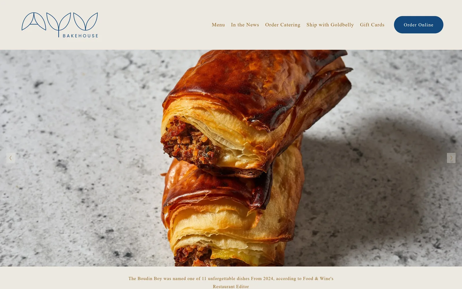
A cream header with a navy leaf monogram and pill button sits above a close crop of two flaky boudin rolls on speckled stone.
Type. The DOM claims Lato but the drawn glyphs are a transitional serif with proper bracketed serifs, used for the nav at 16px and the press line at 14px tracked 0.06em. The button label is a geometric sans at 14px tracked to 0.1em, so there are two voices inside one header. Nothing above the fold exceeds 16px, which is unusually quiet for a hero.
Colour. Cream #ede9e0 for the header band, navy #14497d for the monogram and the button, and a caramel brown #8a5c18 for every piece of text. Caramel on cream is low contrast and the press line under the photograph sits at the edge of comfortable reading. Navy is used twice and covers roughly seven percent of the fold.
Layout. A 210px cream band, then the photograph fills to a second cream strip at the base holding the press quote. Squarespace's 26-column grid with 11px gutters runs below the fold with 155px of section padding. Carousel arrows sit at the vertical midpoint on both edges. No rounding except the button, which is a full pill.
The ask. Order Online in a navy pill, top right, is the single ask, and the nav opens four more routes to money: catering, Goldbelly shipping, gift cards and the menu. The press quote under the photograph persuades rather than sells. One button, five revenue paths, no popup.
A navy pill on cream pulls the eye harder than any larger element you could put in the same header.
14
seawolfbakers.com
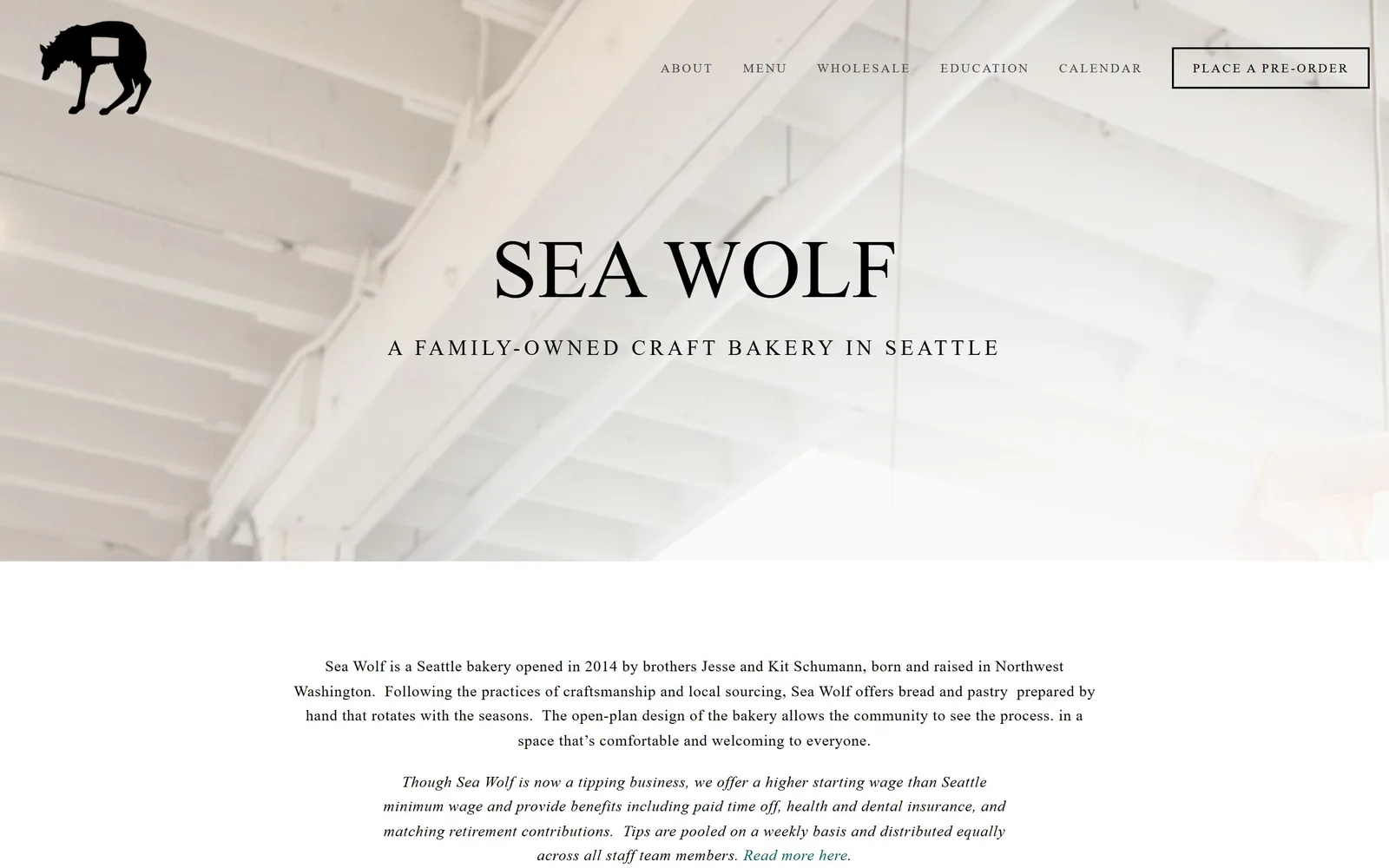
A black wolf mark over a pale photograph of painted ceiling joists, with SEA WOLF set large in a high-contrast serif across the middle.
Type
high-contrast serif, ~86px
Body
light serif, 16px
Build
1400px container, header row, photograph, centred text column
Made on
Squarespace
Colour
#f5f5f5 #000000 #87817d
Type. SEA WOLF runs at about 86px in a high-contrast serif with fine hairlines, and the line under it, A FAMILY-OWNED CRAFT BAKERY IN SEATTLE, sits at 22px in a light sans tracked to 0.182em, which is extremely wide. Body copy below is a light serif at 16px, centred, with an italic paragraph about staff wages. Nav runs 13px caps tracked 0.154em.
Colour. There is almost no colour. Ground is #f5f5f5 and white, type is black, and the only other value is the warm grey #87817d of the photograph. The hero image is a washed-out ceiling, so the top half of the page is effectively one pale value. Calm, and also the least memorable fold kept here.
Layout. Container is 1400px at 97% of the viewport, so a visible margin runs down both sides. Header is a single 190px row, logo left, nav right, with the pre-order link inside a thin black keyline box. The photograph takes about 800px, then the page drops into a centred 1000px text column. Zero radius anywhere.
The ask. PLACE A PRE-ORDER in a keyline box, top right, is the only ask above the fold. Below it the copy spends its first two paragraphs on who owns the bakery and how staff are paid rather than on product. That ordering tells you the business wants wholesale and classes more than it wants a web order.
Tracking a short subhead out to 0.18em turns one line of plain sans into a piece of the design.
15
thecakebakeshop.com
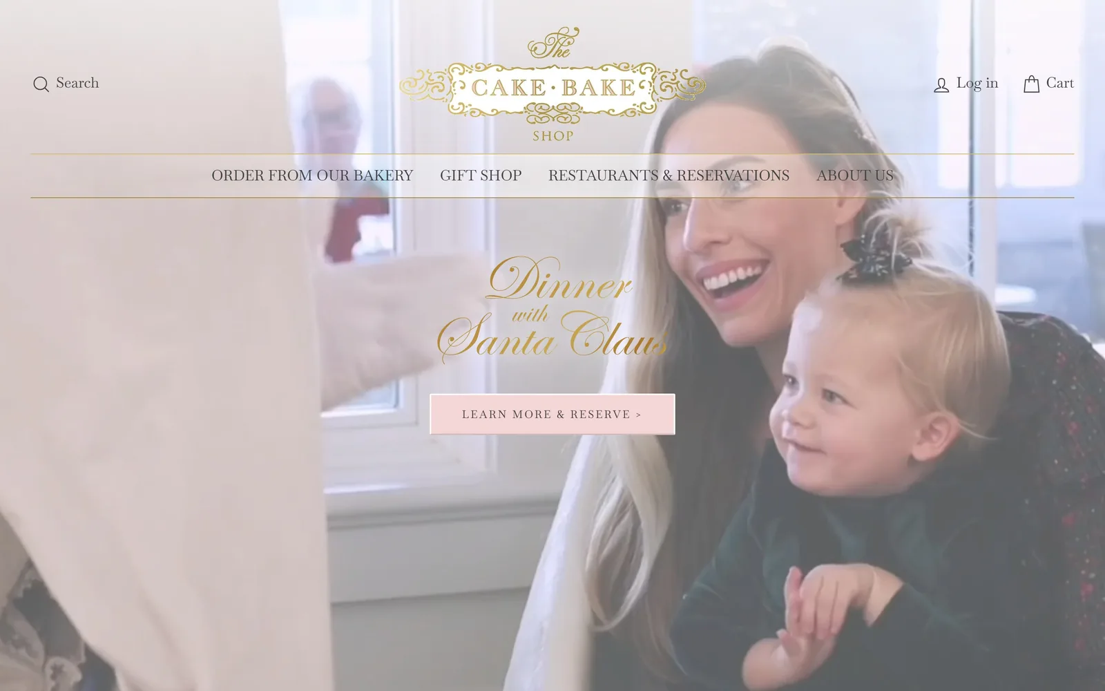
A gold filigree crest and Spencerian script reading Dinner with Santa Claus sit over a bright video, with a blush reservation button below.
Type
Spencerian script, ~90px
Body
Baskervville 18px
Build
tall header with gold rules, full-bleed video, centred CTA
Made on
Shopify
Colour
#ffffff #f5d6d7 #b89b5e
Type. The crest is an engraved gold cartouche with CAKE BAKE in spaced caps inside it. The hero line is a full Spencerian script with long flourishes at roughly 90px, in gold, over video. Nav and button use Baskervville at 18px and 14px, the button tracked and in caps. Three ornamental registers on one screen is a lot, and the script is the one that suffers.
Colour. White header, gold for the crest and the script, blush #f5d6d7 for the button with #414141 lettering on it. Two hairline gold rules bracket the nav row. The video behind it is daylight and pale walls, so the gold script lands on the worst possible background and several letters disappear.
Layout. A tall 290px header holds the crest, search, account and cart, with the nav on its own row between the gold rules. Video runs full bleed below. The CTA is a 440px blush rectangle with a 2px radius, centred under the script. The page past this fold runs over 17,000px, by far the longest here.
The ask. One button, LEARN MORE & RESERVE >, pointed at a seasonal dinner rather than at the bakery. ORDER FROM OUR BAKERY and GIFT SHOP sit in the nav as equals. The chevron on the label is the only thing giving it urgency. For a business selling both cakes and restaurant seats, leading with the event is a seasonal bet.
If you put script type over video, test it against the brightest frame, because that is the one your visitor lands on.
How these were chosen
Fifteen bakeries, pastry shops and donut makers made this page, from a two-location Brooklyn bread shop to a Boston cafe group trading in three states. One pattern holds across nearly all of them: the fold is either a flat brand colour or one honest photograph, never a stock image with a dark gradient dropped over it. Strong bakery website design here also means a short ask, usually a single button with a verb on it, and hours and addresses given far more room than you would expect. The ones that stumble all stumble in the same place, with script or pale type laid over a bright photograph.
Finding bakery sites that someone had actually designed took far longer than it should have. 30 candidates made the shortlist. 15 made the page.
Each one was opened and looked at properly: what the type is doing, where the colour gets spent, how the page is built, how it asks for the job. Nothing is here because it ranks. Nothing is here because an agency filed it under portfolio. Several well known names were left out for the plain reason that their site came out of the same template as everyone else's, and a few sites worth including did not survive a second look.
Where a site is only competent, it says so. The order is the order worth your time, best first.
Reviewed and selected by Larry W. Matthews for Websitely.