Local Business Website Design: 111 Best Examples
Eight categories that all sell the same thing: letting somebody into your life at a moment that matters. A move, a house to clean, a child to leave somewhere, a school to hand them to for twelve years, a death in the family, a Sunday morning, a cause worth money.
One hundred and eleven sites here, and the ones that work all solved the same problem, which is how to look like somewhere a stranger can walk into in about four seconds.
- Galleries
- 8
- Sites
- 111
- Chosen on
- The work, not the ranking
- Updated
- 15 October 2026
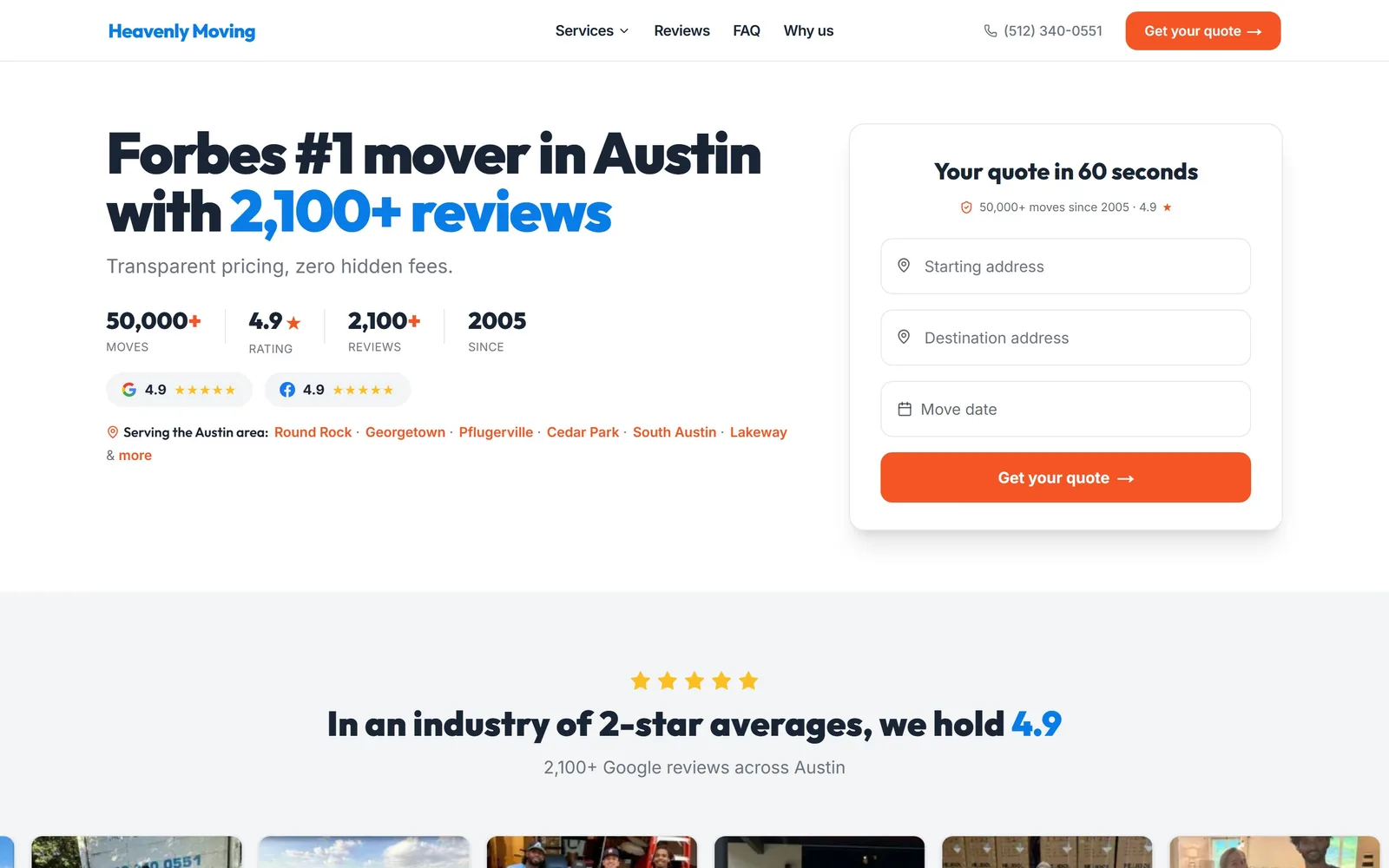
Moving Company Website Design
Quote form in the hero, proof under the submit button. Fourteen movers, from app crews to fine art logistics, doing moving company website design properly.
14 sites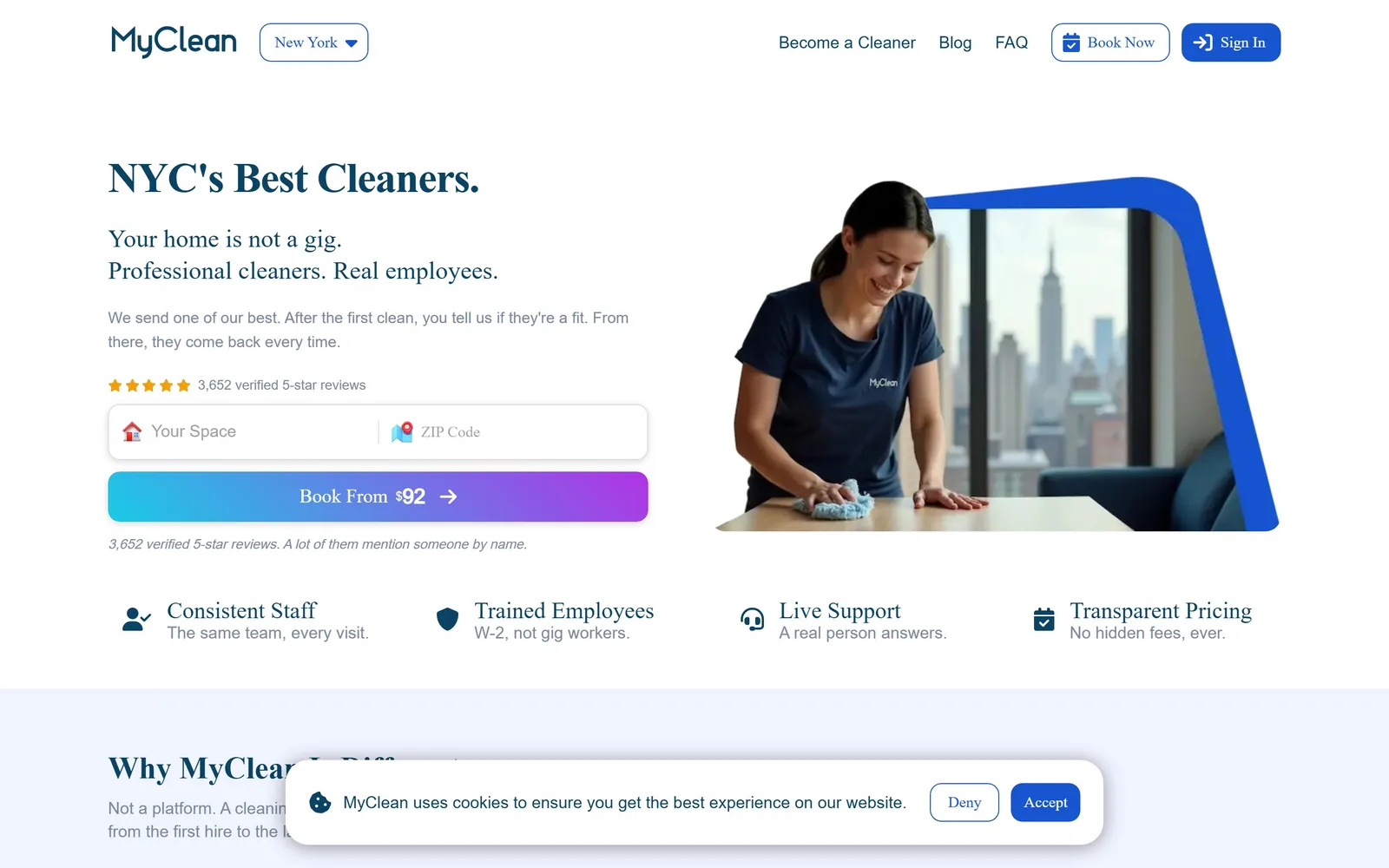
Cleaning Company Website Design
Judge any cleaning company website design by what its first screen asks for. Fifteen maid, janitorial and biohazard firms, ranked on exactly that.
15 sites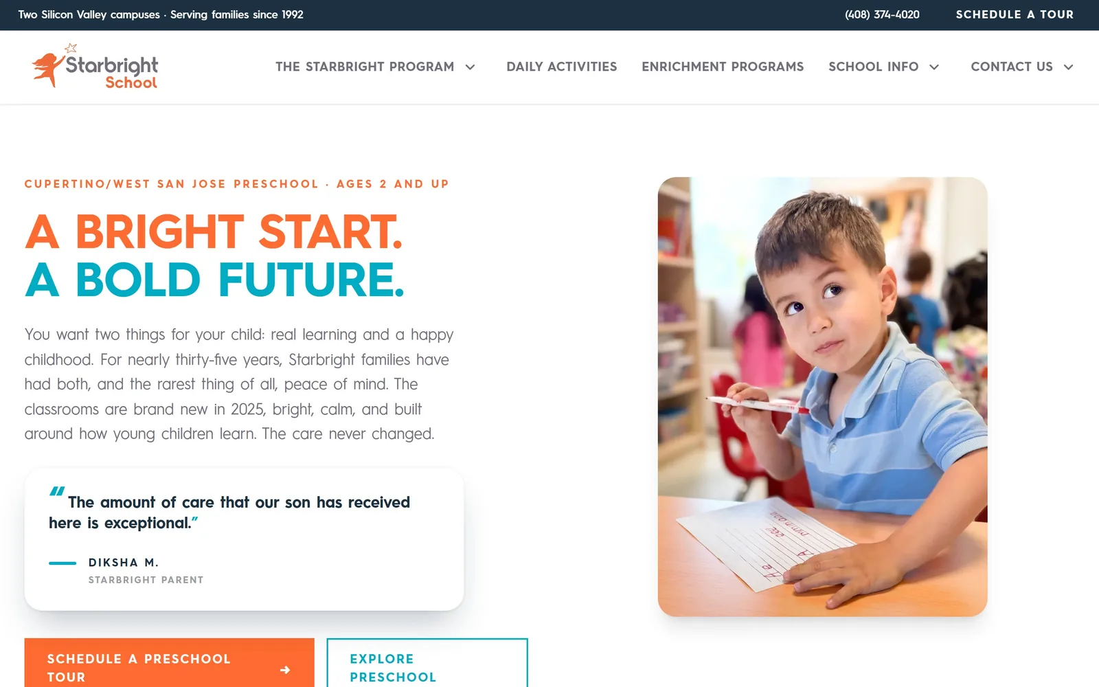
Daycare Website Design
One idea per first screen, and an ask for a tour rather than an enquiry. Fifteen nurseries and preschools whose daycare website design has some nerve.
15 sites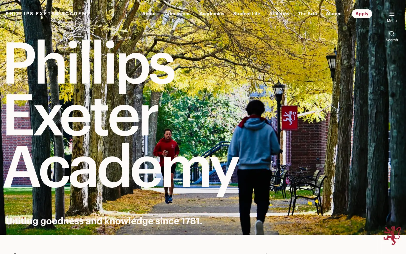
Private School Website Design
Thirteen US independent schools that escaped the platform template. Private school website design where the photography is commissioned, not bought.
13 sites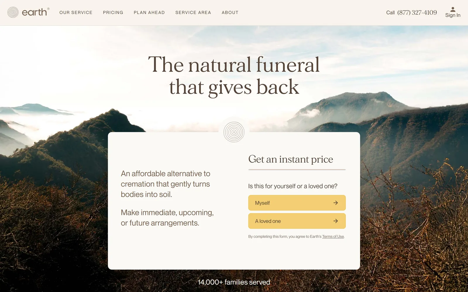
Funeral Home Website Design
Funeral home website design turns on the first button, and the best of these twelve name a situation rather than an action. Pricing is often right there.
12 sites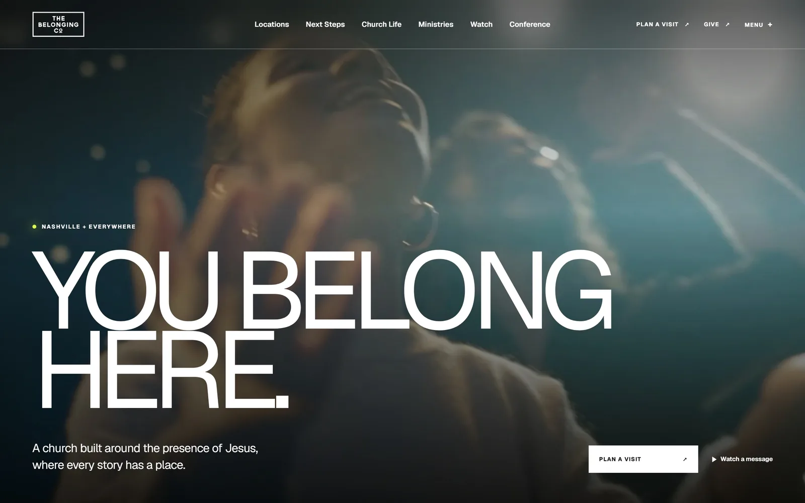
Church Website Design
Thirteen congregations, cathedrals and chapels that spend almost nothing on colour. Church website design carried by one photograph and the service times.
13 sites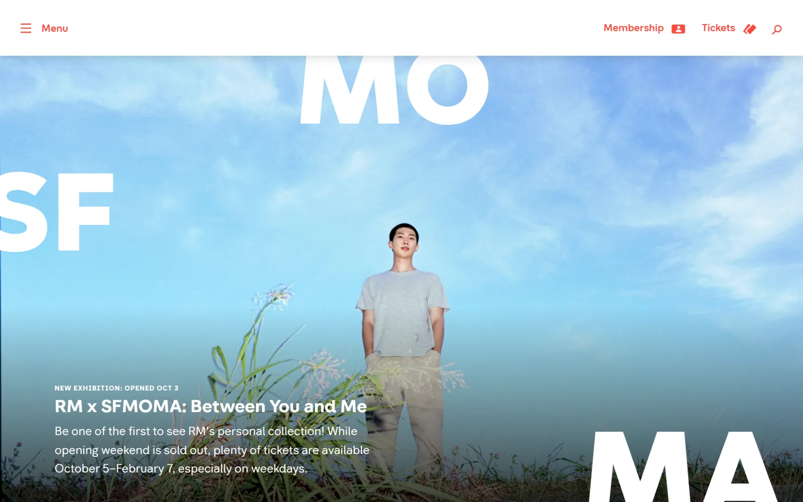
Nonprofit Website Design
Fifteen charities, foundations and museums that ask for money without a guilt photograph. Nonprofit website design that trusts the reader to care.
15 sites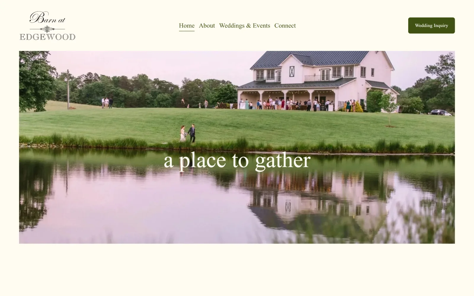
Wedding Venue Website Design
Fourteen US barns, estates and halls. What separates good wedding venue website design is how fast you reach a date, a number and a plan.
14 sitesThe first screen has to ask one answerable question
This is the clearest pattern across all eight galleries. MyClean puts a space and a zip field in the hero and names the price on the button itself, Book From $92. Heavenly Move runs a three-field quote card in orange with four hard numbers above it. Maid Marines asks for a zip code and nothing else.
The sites that fail offer three equally weighted buttons and hand the visitor a decision nobody asked for. Gleem goes the other way and puts nine fields in the hero, which works only because the design has already earned it. The question to ask of your own first screen is whether a stranger could answer it without scrolling, and whether answering it is worth something to you.
Name the situation, not the action
The funeral galleries do this better than anyone, because they have to. The strongest pages label the first button with the visitor's circumstance rather than a verb: a death has occurred, I have an immediate need, a two-answer question standing in for a contact form. Earth Funeral opens a price quiz behind two buttons on a floating stone-grey card. After runs a drawn mountain scene in pale yellow and a peach button under a two-weight headline.
It transfers. A mover can split residential from commercial before anything else; a preschool can split touring from applying. Anything that lets somebody self-select in one click beats a menu of services every time.
Ask for a visit, in those words
Almost every strong site in the childcare gallery asks for a tour rather than an enquiry, and says tour on the button. Star Bright puts two tour buttons beside a classroom photograph. Presidio Knolls sets a 128px white headline over a girl mid-laugh. Laurel Hill uses a faded 1970s photograph of two children on a climbing frame and an 80th anniversary badge drawn by hand, which is the single most memorable fold on that page.
Those are not childcare tricks. Any local service that is bought in person converts better asking for the visit than asking for the enquiry.
Spend nothing on colour and everything on one photograph
The church gallery is the most disciplined set on the site. The Belonging runs two lines of 194px white capitals over dim teal video. Bridgetown shows a dark auditorium with a wall of amber and lilac glass block and stacks three lines of Helvetica at the lower left. Thorncrown gives the whole screen to a glass and timber chapel glowing gold in blue winter woods and prints six nav words over it.
None of them decorate. They have a building, or a room, or a congregation worth photographing, and they let it carry the page while the type stays out of the way. Any local business with premises worth showing can copy that directly, and most of the weak sites in the other galleries here are weak because they tried to make up for a thin photograph with colour.
Pricing above the fold is a design decision
Half the funeral providers here put a number on the first screen, usually one number, set as type rather than hidden in a table. Several cleaners put a starting price on the button. In categories where everybody else makes you call to find out, the firm that says the number looks confident before it has said anything else, and that is worth more than the photography.
Read movers for quote forms, cleaners for what a first screen should ask, childcare for photography, and funeral homes for how to word a button.
The other sectors: Contractors, for construction website design inspiration among others; Health & Wellness, for medical website examples among others; and Small Business, for accounting website design among others.