Daycare Website Design That Families Trust, 15 Examples
One idea per first screen, and an ask for a tour rather than an enquiry. Fifteen nurseries and preschools whose daycare website design has some nerve.
Shown
15 sites
Reviewed
30 candidates
Chosen on
The work, not the ranking
Updated
15 October 2026
01
starbright.com
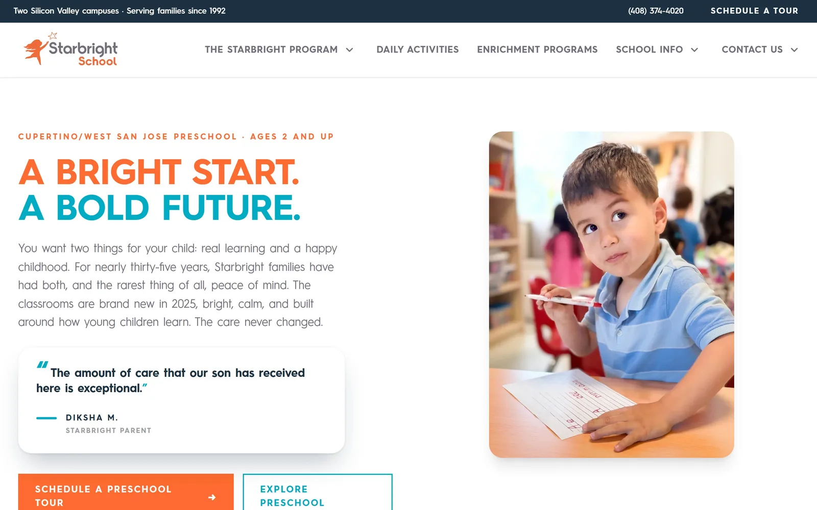
Orange and teal two-line headline, a parent quote in a white card, and two tour buttons, all left of a classroom photo.
Type
Hurme Geometric Sans 3, 63px uppercase
Body
Hurme Geometric Sans 3, 20px
Build
Split hero, 12-column grid, 96px sections
Made on
Custom build
Colour
#ff6b31 #00abc4 #1c3142
Type. The display face is Hurme Geometric Sans 3, set at 63px in all caps, bold, with tracking pulled in to -0.02em so the two lines lock up as a block. Body copy is the same family at 20px regular, which keeps the page to one typeface and still reads warmly because the letterforms are round rather than grotesque. Above the headline sits a 16px orange eyebrow line, uppercase, tracked out hard, carrying the two things a parent searches for: the suburb and the age range.
Colour. White carries most of the screen. The orange is #ff6b31 and it does real work: first line of the headline, the eyebrow, the primary button, the logo mark. Teal #00abc4 takes the second headline line and the quote mark, and a navy #1c3142 runs the thin utility bar at the very top. Two accents in a category that usually picks six is a decision, not a default.
Layout. Full 1440 container, section padding 96px, a 12-column grid with 56px gutters underneath, and the hero split so copy holds the left 525px and the photo takes the right 787px. The photo is a rounded rectangle, not a bleed, which keeps the white field in charge. Above the fold you get the utility bar, the nav, the eyebrow, the headline, a five-line paragraph, a testimonial card and both buttons.
The ask. The ask is a tour, and it appears three times before you scroll: 'Schedule a tour' in the top utility bar, '(408) 374-4020' next to it, and 'Schedule a preschool tour' as a square orange button at the bottom of the hero. The secondary 'Explore preschool' button is an outline, so it never fights the orange. Nothing else competes, because there is no slideshow and no newsletter box.
Put the real parent quote above the fold instead of three screens down, and let one accent colour mark every place you want a click.
02
presidioknolls.org
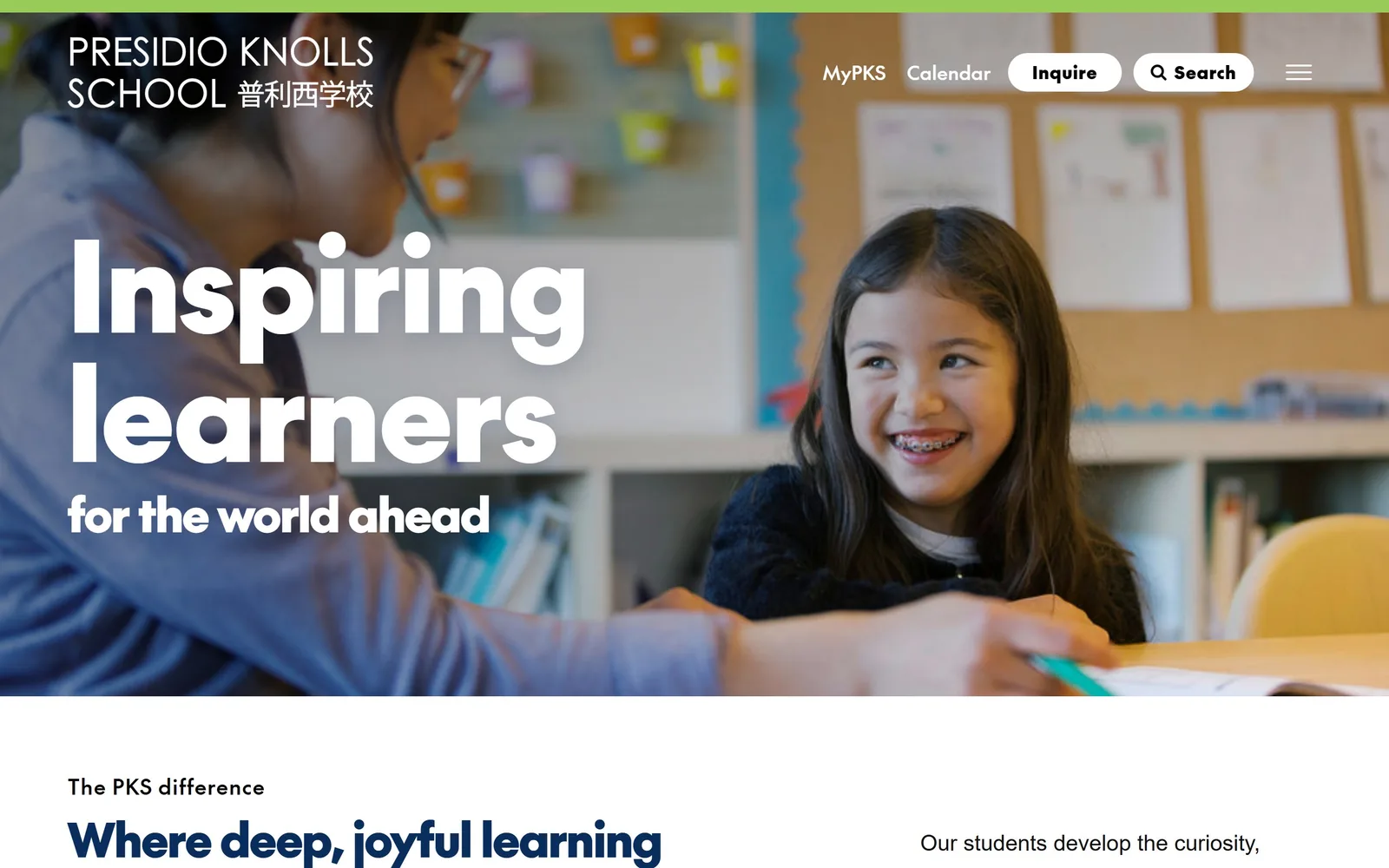
A 128px white headline sits over a full-bleed classroom photo of a girl mid-laugh, with a bilingual logo top left.
Type
Geometric sans, 128px
Body
Geometric sans, 18px
Build
Full-bleed hero, 804/416 split below
Made on
WordPress
Colour
#092d5d #99cb58 #ffffff
Type. The headline runs at 128px in a heavy geometric sans, with 'Inspiring learners' on two lines and 'for the world ahead' dropping to 48px underneath. It is set in a face the site serves as Test The Future, with wide round bowls and a tall x-height, so it stays legible at that size over a photograph. The logo lockup sets 'PRESIDIO KNOLLS SCHOOL' in letter-spaced caps beside the Chinese name, which tells you the school is bilingual before any copy does.
Colour. There is almost no colour in the hero. White type, one lime strip #99cb58 along the very top edge, and the photograph supplying everything else. Navy #092d5d turns up below the fold for the section headings. Letting a photo be the palette is the cheapest way to look expensive, and it only works because the photo is properly lit.
Layout. Edge to edge at 1440 with no side gutter, the photo running the full height to the fold. Below it the page uses an 804px and 416px two-column split with an 80px gap, and a three-column 433px row. Buttons are 48px pills. Above the fold there is nothing but the logo, five nav items and the headline, which is unusually disciplined.
The ask. Two white pill buttons, 'Inquire' and 'Search', sit in the nav and nothing else asks for anything in the hero. The whole first screen is a claim, and the conversion work is deferred to the second. That is a bet that the photograph and the headline earn the scroll, and for a school charging private tuition it is a reasonable bet. A daycare competing on price should not copy it.
If your photography is good enough, one sentence at 128px beats four stacked value propositions.
03
maplestreetschool.org
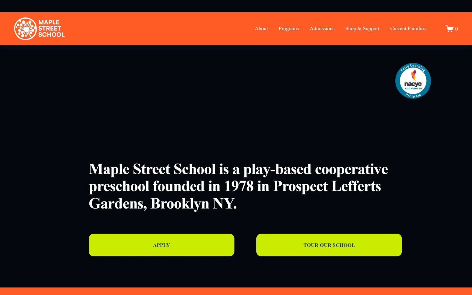
A near-black page with an orange nav band, a serif headline in white, and two acid-lime buttons.
Type
Transitional serif, 47px
Body
Nunito Sans, 16px
Build
Full-width, 26-column fluid grid
Made on
Squarespace
Colour
#04070e #ff5b26 #caec02
Type. The headline is a high-contrast transitional serif at about 47px, the kind with sharp bracketed serifs and a vertical stress, and it reads like a book rather than a brochure. The nav above it is a different serif at 16px, lighter weight, and the buttons are set in letter-spaced small caps. Three serif voices on one screen is risky and it holds together because only one of them is large.
Colour. The field is #04070e, close to true black. The nav band is #ff5b26 orange and the two buttons are #caec02, a lime that is almost uncomfortable. Those three plus white are the entire palette, with no softening tint anywhere. A preschool choosing black as its background is the single most contrarian decision across these fifteen sites.
Layout. Full 1440 width, Squarespace's fluid 26-column grid with 11px gutters, and roughly 137px of section padding. The orange nav is a solid 125px band, not a transparent overlay. The headline sits at about 55 percent down the fold with the two buttons below it, and an NAEYC accreditation badge floats top right. Buttons carry a 15px radius, wide enough to look drawn rather than default.
The ask. 'Apply' and 'Tour our school' are given equal weight, equal width and the same lime, side by side. That is a mistake in most funnels, because apply and tour are very different levels of commitment, but on a Brooklyn co-op with a waitlist it signals that both doors are open. The cart icon in the nav is the only other click, and the shop link is genuinely part of how the school raises money.
Black is available to you, and it makes a cheap photo library irrelevant because you are not using photos.
04
westsidewaldorf.org
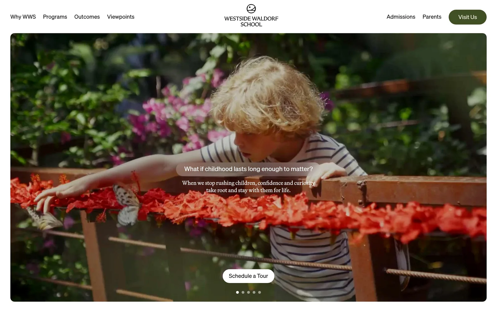
A rounded video card of a boy at a flower bed fills a white frame, one question in a soft pill over it.
Type
Soehne, 18px
Body
Martina Plantijn, 16px
Build
Inset video card, full pill buttons
Made on
Framer
Colour
#ffffff #404f24 #595449
Type. The nav and the question in the pill are set in Soehne, a Swiss grotesque at 18px, quiet and even. The two lines under the question switch to Martina Plantijn, a serif with a slightly old-style colour, at about 16px. The logo wordmark is letter-spaced caps on two lines, centred, which is the only piece of styling in the header. The restraint is the point: nothing is larger than 18px anywhere above the fold.
Colour. White #ffffff frames the video on all four sides and takes about 15 percent of the screen outright. The only brand colour is an olive #404f24 in the 'Visit Us' pill, and even that is low in chroma. The video supplies the greens and the red hibiscus. Choosing an olive rather than a primary green is the kind of small decision that separates a designed site from a configured one.
Layout. A 1440 container with the hero video inset about 40px from every edge and a generous corner radius, so the page reads as a card on a white sheet rather than a full-bleed. Buttons are full pills at 9999px radius. Above the fold there is the nav, the centred logo, the video, one question, two lines of answer, one button and five slide dots.
The ask. One ask, 'Schedule a Tour', as a white pill centred near the bottom of the video, plus 'Visit Us' in the olive pill top right. That is two instances of the same request and nothing else. The five slide dots mean the question rotates, so a visitor who waits sees four more framings of the same offer, which is a smarter use of a carousel than four unrelated photographs.
Insetting the hero with a white margin on all sides makes an ordinary video look like a deliberate piece of art direction.
05
vivvi.com
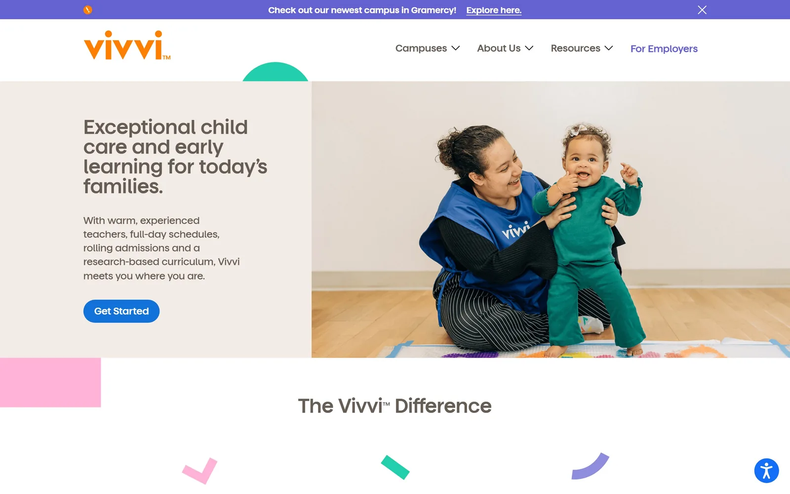
Warm sand panel on the left with a four-line headline and a blue button, a teacher and toddler photo filling the right half.
Type
Matter, 48px semibold
Body
Matter, 18px medium
Build
50/50 split hero, 3-column grid
Made on
WordPress
Colour
#f3ece6 #6462d0 #ffb3d7
Type. The headline is Matter at 48px semibold with the lines broken tightly, a geometric sans with a distinctive single-storey 'a' that keeps it friendly without going rounded. Body copy drops to 18px in the medium weight with generous leading, and the nav sits at 18px with chevrons. The custom cut of the typeface is named after the brand in the font files, which tells you this was a real identity project rather than a theme.
Colour. A warm sand #f3ece6 holds the left panel and white holds the rest. The accents are periwinkle #6462d0 in the announcement bar, orange in the logotype, a pink #ffb3d7 block that hangs off the left edge, and a teal half-circle peeking above the hero. Four accents, each used once, each as a flat geometric shape. It is a system, and the shapes repeat down the page as checkmarks and arcs.
Layout. Two equal halves at 1440, sand on the left and photo on the right with a hard vertical seam at the midpoint. No rounded corners on the hero itself, which is why the decorative half-circle and the offset pink rectangle read as deliberate rather than decorative filler. Below the fold a three-column 354px grid with a 26px row gap. Total page is only 4,671px, short for the category.
The ask. One blue 'Get Started' pill in the hero and one 'Explore here' link in the dismissible announcement bar. 'For Employers' sits in the nav in the accent colour because Vivvi sells to companies as well as families, and that single coloured nav item is doing segmentation work. There is no phone number above the fold, which suits a multi-campus operator but would hurt a single site.
Build three or four flat shapes into the brand and scatter them down the page, and every section looks related without needing more photography.
06
laurelhill.org
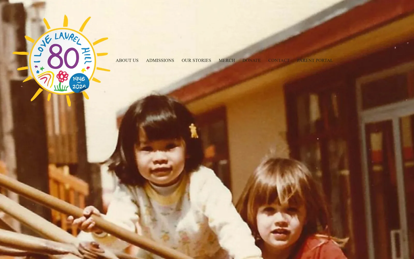
A faded 1970s photograph of two children on a climbing frame fills the screen, with a hand-drawn 80th anniversary sun badge over it.
Type
new-spirit, 56px
Body
Inter, 15px uppercase
Build
Full-bleed photo hero, 26-column grid
Made on
Squarespace
Colour
#f9eedc #1a7fc2 #1d231c
Type. The nav is Inter at 15px, uppercase, tracked out to 0.03em, in near-black, and it is the only typography on the first screen. Everything else is lettering inside the badge: 'I LOVE LAUREL HILL' curved around a sun, an '80' in purple, '1946 to 2026' in a blue dot. Headline type does not arrive until you scroll, where it is set in new-spirit at 56px with -0.02em tracking.
Colour. The warm cream and faded orange of the photograph, around #f9eedc in the wall and #c76a3f in the roofline, carry the whole fold. The badge adds yellow, purple, red and green in flat marker strokes. Below the fold the page sits on a strong blue #1a7fc2. Letting an aged snapshot set the colour is an unusual choice for a nursery and it buys eighty years of credibility instantly.
Layout. A 1440 full-bleed photograph with the nav floating directly on it, no bar, no scrim. Squarespace's 26-column grid with 11px gutters runs the rest, with section padding around 379px, which is why the page reaches 9,832px. Buttons use a 300px radius, so they are full pills. The badge is positioned top left at roughly 400px square, overlapping the nav baseline.
The ask. Nothing is asked for above the fold at all. No button, no phone, no form. The nav carries 'ADMISSIONS', 'DONATE', 'CONTACT' and 'PARENT PORTAL' and that is the whole conversion surface on the first screen. For a school with a 5:1 ratio and an 80-year waitlist this is a flex, and it will cost a new centre enrolments.
An archive photo nobody else can buy will beat any stock image, and most schools already have a box of them.
07
onefiftyparker.org
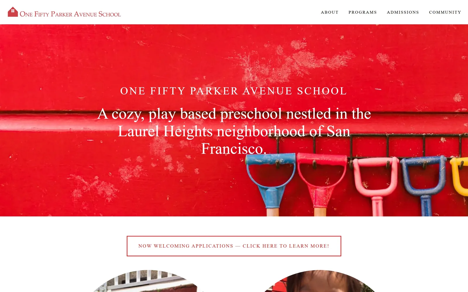
A scuffed red painted wall hung with children's spades, white serif type centred over it, and a thin red nav above.
Type
High-contrast serif, 40px
Body
futura-pt, 13px caps
Build
1400px container, full-width photo hero
Made on
Squarespace
Colour
#ee1b24 #ffffff #ababab
Type. The school name sits at 33px in letter-spaced caps, tracked out to around 0.12em, and under it the sentence runs at about 40px in a high-contrast serif with fine hairlines. Both are white on red, which is a tough contrast pairing, and it survives because the wall is flat and evenly lit. The nav is futura-pt at 13px, caps, tracked to 0.154em, in near-black.
Colour. The hero is almost entirely #ee1b24, a hard primary red, taken straight from a photographed wall rather than a colour picker. The spade handles supply blue, pink and yellow in a row along the bottom. The page below drops to white with a grey #ababab body field. One photograph is doing the work of an entire brand palette here.
Layout. A 1400px container at 97 percent of the viewport, Squarespace underneath, with the photo running the full width and the nav as a thin white bar above it. The copy block is centred and holds about 60 percent of the width. Below the fold a thin red-outlined banner spans the centre, then circular-cropped photographs begin. Total page height is 4,068px, the shortest of the fifteen.
The ask. One ask below the fold: 'NOW WELCOMING APPLICATIONS, CLICK HERE TO LEARN MORE!' in a red hairline box, set in the same tracked caps as the nav. Nothing in the hero asks for anything. The nav's four items are the only other route in. For a school with three classes and 12 to 18 children each, that quiet approach fits the supply.
Photograph something your own building actually has, close up and flat, and you own a colour nobody else in your town is using.
08
portlandwaldorf.org
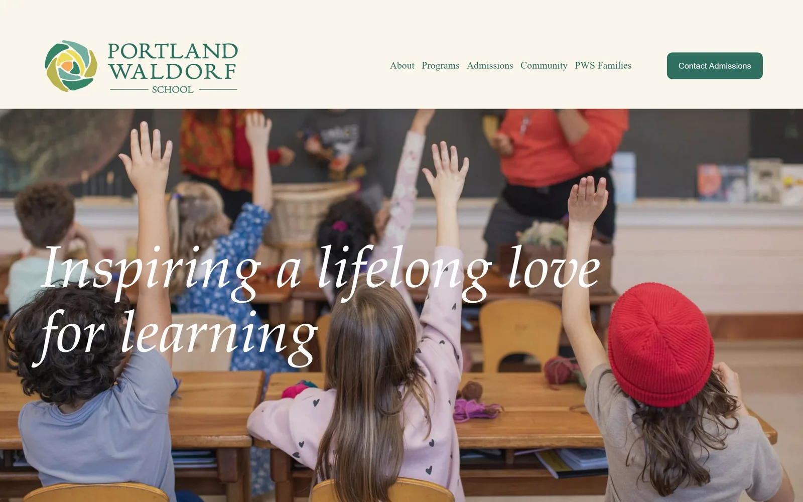
Children with hands up at wooden desks, with an italic serif headline in white across the lower left of the photograph.
Type
Italic serif, 105px
Body
Fira Sans Condensed, 21px
Build
Cream header band, full-bleed photo
Made on
Squarespace
Colour
#faf6eb #2e6e5e #2e2d2d
Type. The headline is an italic serif at around 105px, with long entry strokes and a true italic rather than a slanted roman, which is why it reads as handwriting without being a script. Body copy is Fira Sans Condensed at 21px, a condensed grotesque, which is an odd partner for that italic and works because the two never sit on the same line. The nav runs at 18px in green.
Colour. A cream band #faf6eb holds the logo and nav, then the photograph takes over. Forest green #2e6e5e is the single brand colour and it appears exactly twice above the fold, in the nav links and in the 'Contact Admissions' button. The rest is whatever the classroom was wearing that day, which includes a red hat doing more for the composition than any accent colour could.
Layout. 1440 full width, Squarespace's 26-column fluid grid with 11px gutters, roughly 195px of section padding. The cream header is a solid band about 265px tall rather than an overlay, so the logo gets room to breathe. The headline is positioned low left over the photograph's quietest area. Button radius is a modest 10px.
The ask. 'Contact Admissions' is a single green button at the top right of the header and it is the only ask on the screen. The nav is wide, five items with deep dropdowns covering high school through parent and child classes, because this school runs nursery to grade 12. The hero itself asks for nothing, which means the button has to carry the whole fold.
A real italic at display size gives you warmth without a single rounded corner or pastel.
09
sf.lascuolainternational.org
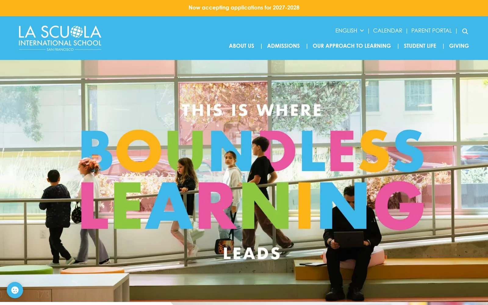
'BOUNDLESS LEARNING' set huge over a school atrium photo, with every letter in a different flat colour.
Type
Geometric sans caps, ~190px
Body
Century Gothic Pro, 16px
Build
18-column grid, two-row nav
Made on
WordPress
Colour
#3eb8eb #fcb316 #eb559f
Type. The display line is a heavy geometric sans in caps, running roughly 190px tall, with 'THIS IS WHERE' and 'LEADS' bracketing it at about 55px in white. Each letter of the big words takes its own colour from a four-hue set, cycled rather than randomised. Nav and utility links are Century Gothic Pro at 16px, which is the same geometric skeleton at a small size, so the two scales rhyme.
Colour. Cyan #3eb8eb runs the header band, amber #fcb316 the announcement strip above it, and the letters cycle cyan, amber, pink #eb559f and green #8dc73f. Four saturated hues at full strength over a photograph is normally a mess. It holds because the photograph is a pale concrete and glass interior with almost no colour of its own.
Layout. Full 1440 with an 18-column grid underneath, 32px edge columns, 88.6px content columns and 24px gutters. The hero photo runs edge to edge under a solid cyan header. Nav is split across two rows, utility links above and sections below, eleven items in all, plus a five-language switcher. The page runs 10,719px, the longest here.
The ask. 'Now accepting applications for 2027-2028' takes the top strip, and the only other asks above the fold are 'Parent Portal' and 'Calendar' in the utility row. There is no button in the hero at all. The language switcher sitting in the most valuable nav position, left of Calendar, tells you who this school is actually recruiting.
Colouring individual letters instead of the whole word lets one headline carry a four-colour brand without any other graphics.
10
flamingoschool.com
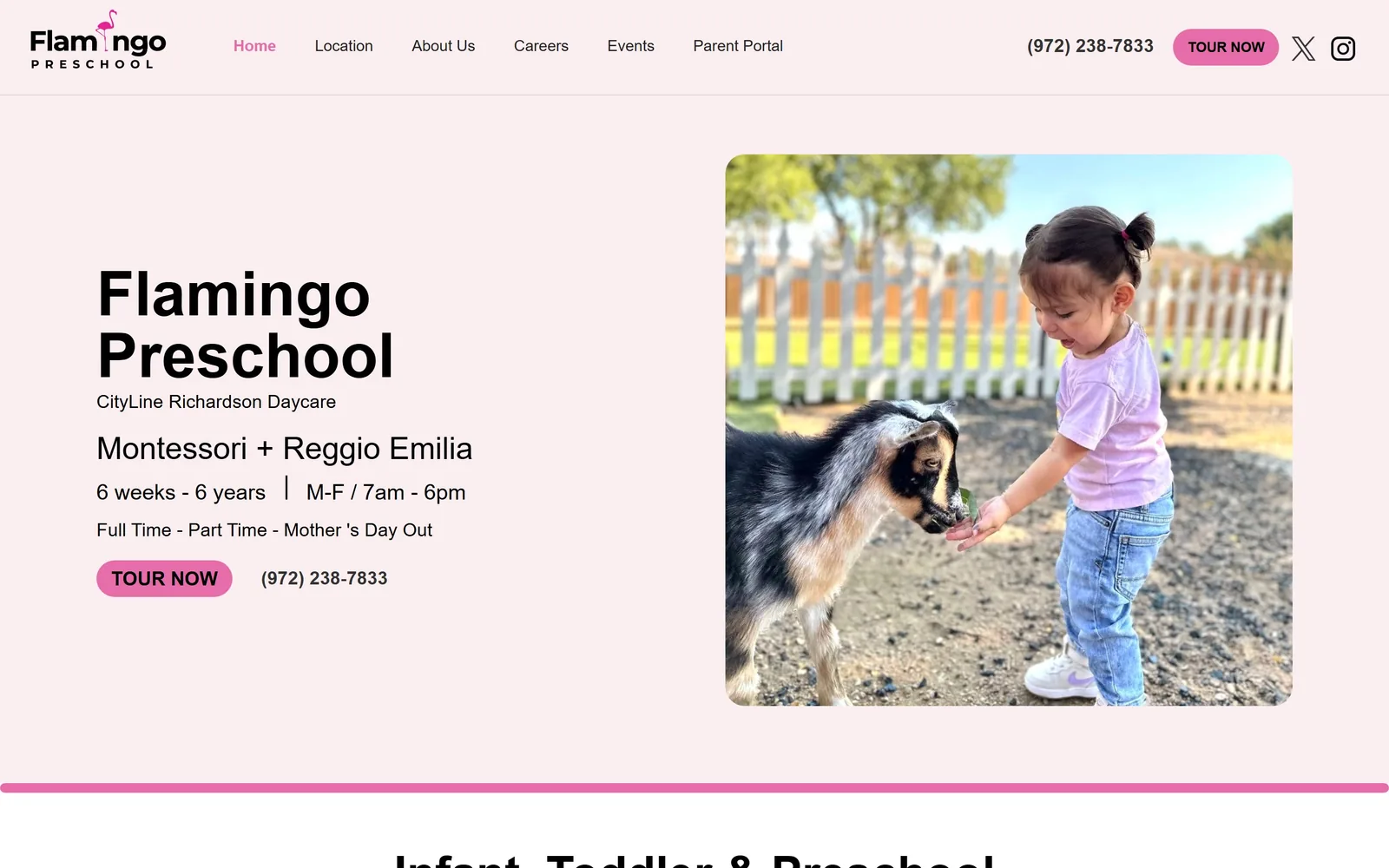
Pale pink field, 'Flamingo Preschool' in heavy black type, ages and opening hours listed under it, a goat photo on the right.
Type
Montserrat, 64px semibold
Body
Montserrat, 18px
Build
Split hero, 1440 full width
Made on
Custom build
Colour
#faeef0 #e66daa #000000
Type. Montserrat at 64px in semibold sets the name, black on pink, with no tracking adjustment. Under it the hierarchy steps down cleanly: 18px for the location line, 32px for 'Montessori + Reggio Emilia', 22px for ages and hours, 18px for the programme list. Five sizes in one block and every one earns its place because each line is a different kind of fact.
Colour. The field is #faeef0, a pale pink that reads as warm grey at a glance. White sits behind the photograph. The only saturated colour is #e66daa, used for the 'TOUR NOW' pill, the active nav item and a 4px rule at the bottom of the hero. One accent, three appearances, about 2 percent of the screen. For a daycare, picking pink and then barely using it is a smarter restraint than most competitors manage.
Layout. 1440 full width with the copy in the left half and a rounded-corner photograph in the right, 40px of section padding and a 20px button radius. The nav carries the phone number and the tour button in the top right, which is where a parent looks. Above the fold you get name, location, pedagogy, age range, opening hours, programme types, the button and the phone number. That is eight facts before a scroll.
The ask. 'TOUR NOW' appears twice in the first screen, once in the nav and once in the hero, and the phone number appears twice alongside it. 'Parent Portal' is pushed to the end of the nav where existing families will still find it. Nothing competes: no newsletter, no popup, no slideshow. This is the most straightforwardly commercial page of the fifteen and it is better for it.
List the hours, the ages and the phone number above the fold, because that is the entire search a working parent is running.
11
bubblesacademy.com
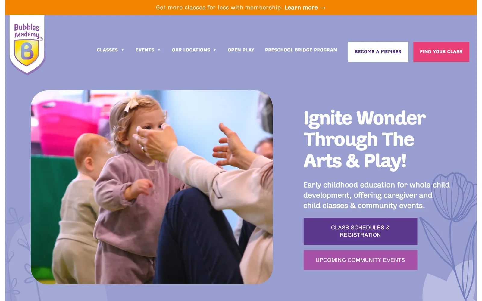
A periwinkle page with a rounded video of a toddler on the left, soft white display type and two stacked purple buttons right.
Type
Adesso Bold, 58px
Body
Adesso, 22px
Build
1410px container, split hero
Made on
WordPress
Colour
#989ed0 #5e388f #f08300
Type. 'Ignite Wonder Through The Arts & Play!' runs at 58px in Adesso Bold, a rounded sans with slightly condensed proportions and tracking pulled to -0.04em so three long lines stay tight. Body copy is the same family at 22px with 0.03em added, opened up for reading. The nav is 14px caps at 0.05em. One typeface, three different tracking values, each matched to its size, which is the part most sites skip.
Colour. Periwinkle #989ed0 covers the hero and makes up roughly 38 percent of the screen. Orange #f08300 takes the announcement strip, deep purple #5e388f the primary button, and a mid purple the secondary. White type throughout. The purple-on-periwinkle button is the weak link, around 3:1 contrast against its own background, and a darker field behind it would have fixed it.
Layout. A 1410px container at 98 percent of the viewport, with the video in a rounded rectangle on the left at about 1000px wide and the copy stack on the right. Section padding is a very large 270px. Buttons are square at 0px radius, which sits oddly against the heavily rounded video and the rounded typeface. Line-drawn tulips sit at low opacity in both bottom corners.
The ask. Four asks are live above the fold: 'Learn more' in the orange strip, 'BECOME A MEMBER' and 'FIND YOUR CLASS' as paired nav buttons, then 'CLASS SCHEDULES & REGISTRATION' and 'UPCOMING COMMUNITY EVENTS' stacked in the hero. That is a lot, and it is defensible here because the business sells drop-in classes, memberships and a preschool bridge programme to three different buyers.
If you sell more than one thing, give each one its own button and colour-rank them rather than hiding them behind a single generic call to action.
12
bezosacademy.org
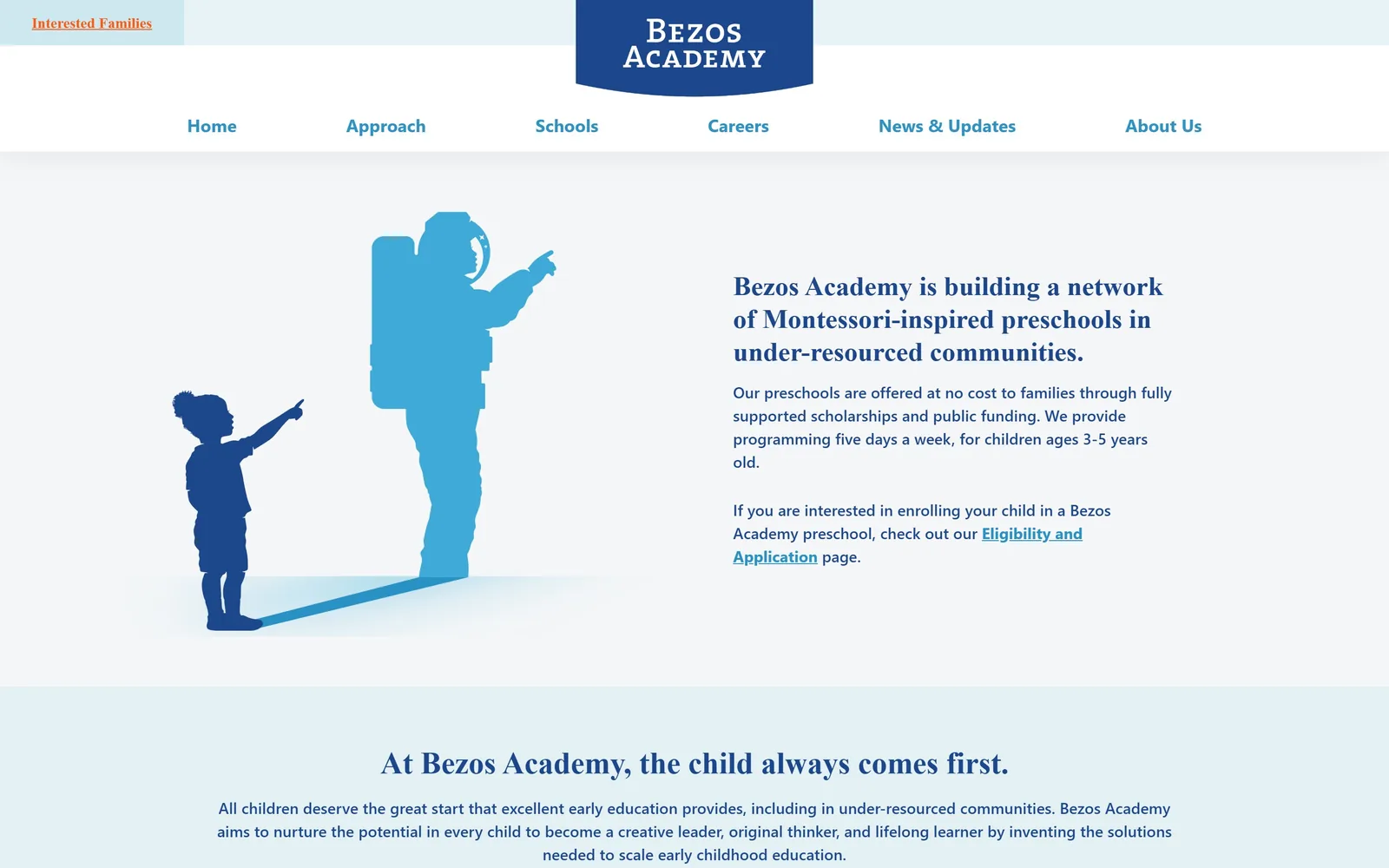
A flat illustration of a child pointing at an astronaut, next to a blue serif paragraph on a very pale grey field.
Type
Transitional serif, 28px
Body
Geometric sans, 16px
Build
1130px container, two-column 654px grid
Made on
WordPress
Colour
#f5f6f8 #1c478c #fc5914
Type. The lead statement is set at 28px in a transitional serif, blue rather than black, with three tight lines. Body copy switches to a geometric sans at 16px in medium weight with 1.5 leading. Nav is the same sans at 18px bold in a lighter blue. The pairing of serif for claims and sans for explanation is used consistently all the way down the page, which makes the hierarchy readable without any size jumps.
Colour. Pale grey #f5f6f8 holds the hero, a tinted blue #e3f1f4 holds the band below it, and white runs underneath. Type is #1c478c navy throughout with a lighter #3faad8 for nav and links. Orange #fc5914 appears only in the 'Interested Families' tab in the top left corner. One orange item on an otherwise entirely blue page is the loudest possible way to mark a single door.
Layout. An 1130px container at 78 percent of the viewport, which is narrow for 2026 and leaves real margin on both sides. A two-column 654px grid underneath, illustration left and text right, with no gutter. The nav is centred under a shield logo rather than beside it. Section edges are square, 0px radius everywhere. The page is only 3,117px tall.
The ask. 'Interested Families' is the only call to action and it sits in the top left corner, tinted and underlined, outside the nav row. Enrolment is handled by a text link inside the paragraph, 'Eligibility and Application'. For a free, publicly funded network with more demand than places, keeping the ask that quiet is the correct decision and the opposite of what a fee-charging centre needs.
Commissioned flat illustration removes every photo consent problem a childcare site has, and it dates far more slowly than stock photography.
13
thecoopschool.org
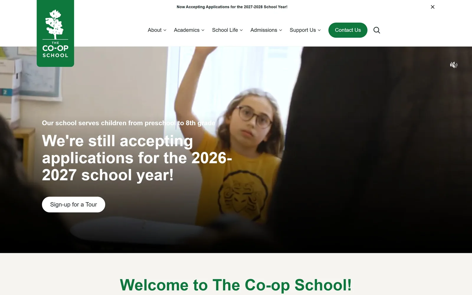
A green flag logo hangs off the top left over a video of a girl raising her hand, white pill button below.
Type
Open Sans, 48px semibold
Body
Open Sans, 18px
Build
Full-width video hero, flag logo
Made on
WordPress
Colour
#0e773c #f5f4f0 #1b262a
Type. Open Sans at 48px semibold carries the headline, with a 20px line above it in the same family. It is a workhorse pairing and nothing more, which is fine, because the type is not what the page is selling. The nav runs at 16px medium with chevrons. The announcement strip at the very top is 13px bold and tracked slightly, so it reads as a notice rather than a heading.
Colour. White and a warm off-white #f5f4f0 structure the page. Forest green #0e773c is the brand, used for the logo flag, the 'Contact Us' pill and the section heading below the fold. The video supplies the yellow t-shirt that happens to be the brightest thing on the screen. Only one accent colour in use, which is why the green flag reads as a mark rather than decoration.
Layout. 1440 full width, 72px of section padding, and buttons at a full 9999px radius. The logo is a green rectangle hanging below the header line rather than sitting inside it, which is the one piece of real invention on the page. The video runs edge to edge to the fold. Below it a flex row of programme cards begins on the off-white field.
The ask. 'Sign-up for a Tour' is the hero button, 'Contact Us' is the green nav pill, and the dismissible top strip announces 2027-2028 applications. Three asks, all pointing the same direction. The muted-audio icon in the top right of the video is unfortunate, because it reads as a broken control rather than a feature.
Hanging the logo below the header line as a solid flag gives a plain nav a piece of structure that costs nothing to build.
14
citygardenschool.org
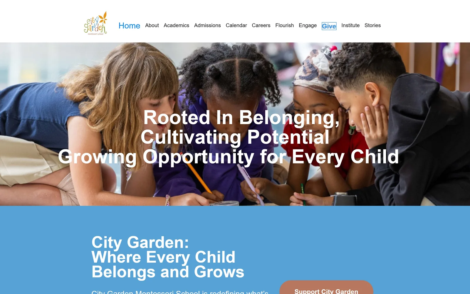
Four children drawing on the floor, a centred white headline over them, and a blue band below carrying a second headline.
Type
mr-eaves-sans, 50px bold
Body
Poppins, 16px
Build
Full-bleed photo plus colour band
Made on
Webflow
Colour
#56a2d6 #b7775e #ffffff
Type. mr-eaves-sans sets the hero line at 50px bold and the blue band repeats the structure at the same weight. It is a humanist sans with open apertures, a sensible choice for a school, and it is let down by the centring: three lines of unequal length, broken at odd points, with 'Cultivating Potential' and 'Growing Opportunity' running together without punctuation. The nav uses mr-eaves-modern at 25px for the active item, lighter for the rest.
Colour. A clear mid-blue #56a2d6 takes about a quarter of the screen in the band below the photograph, and white type runs over both. The button is a terracotta #b7775e, a genuinely unusual accent in this category and the best colour decision on the page. The logo brings in orange, green and purple, none of which appears anywhere else.
Layout. 1440 full width with the photograph bleeding to all edges and the blue section butting straight against it, no gap. Button radius is 100px. The nav carries eleven items at 1440, which is three or four too many, and 'Give' is boxed to pull it out. Below the fold the page settles into a well-built Webflow column layout and runs 4,005px.
The ask. 'Support City Garden' is the terracotta button and it is a donation ask, not an enrolment ask. 'Book a Tour' appears only after the fold. For a public Montessori charter the funding ask makes sense, but putting the donate button above the admissions button on the homepage is a choice most private centres should reverse.
If you are going to centre white type on a photograph, choose the photograph for its empty quiet area or add a scrim, because this one does neither.
15
hilltopchildrenscenter.org
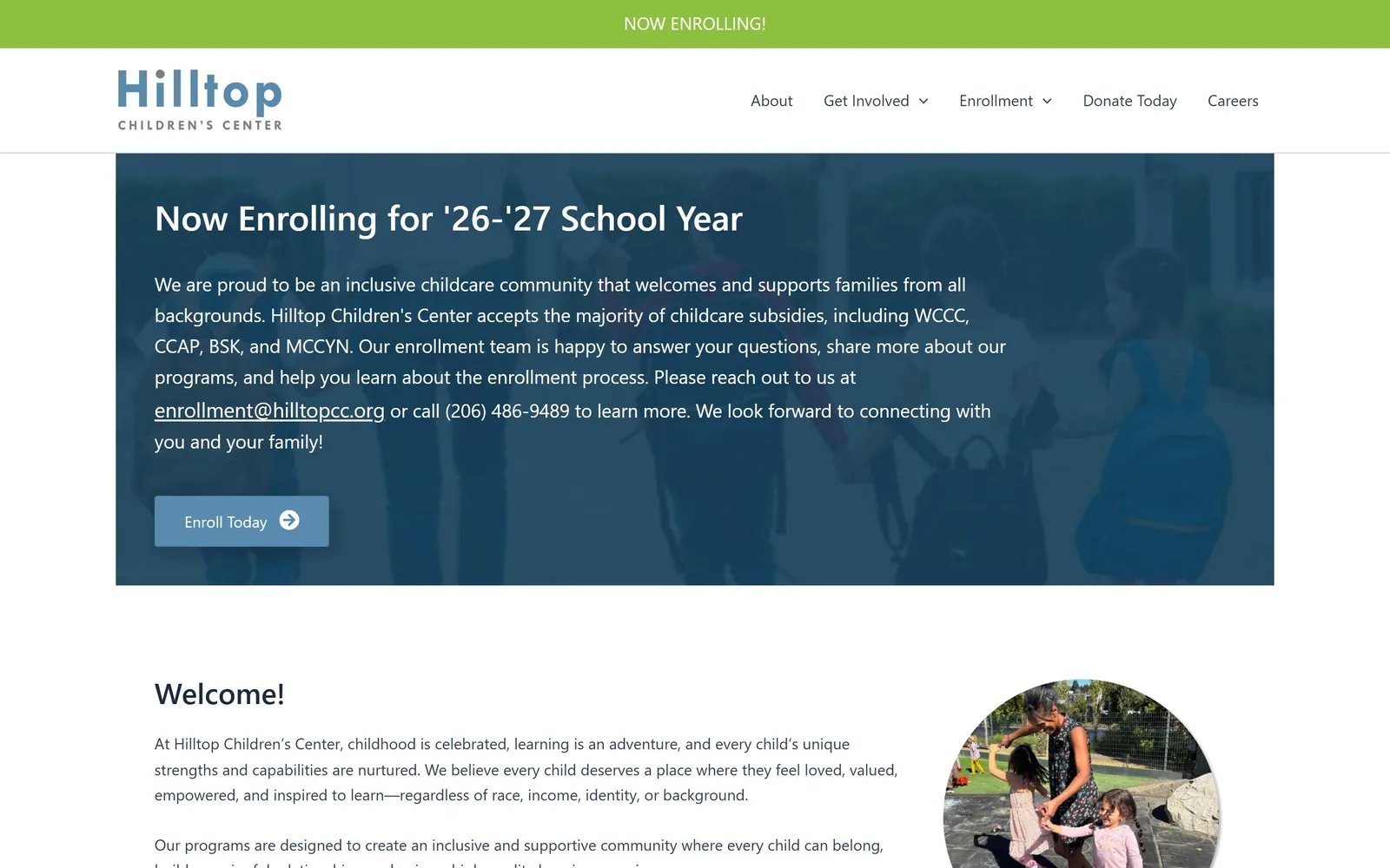
A green notice bar, a blue wordmark, then a navy panel over a faded photo of children walking, carrying enrolment details.
Type
System sans, 36px semibold
Body
System sans, 19px
Build
Inset hero panel, 407/772 split
Made on
WordPress
Colour
#284c64 #8dc03f #588bae
Type. The whole page runs on the system stack, which lands as Segoe UI on Windows and the San Francisco face on Mac. The headline is 36px semibold, body 19px regular with 1.6 leading, nav 16px regular. There is no display face anywhere. It is honest and completely anonymous, and the page would gain more from one bought typeface than from any other single change.
Colour. A lime #8dc03f runs the notice bar at the top, the wordmark and the hero panel use a muted slate blue around #284c64, and the button is a lighter #588bae. White holds everything else. The lime and the slate blue are not a considered pair, they are two colours from a logo used separately, and the result is pleasant without being memorable.
Layout. 1440 full width with the hero as an inset panel, roughly 1670px wide against the viewport, sitting on a dimmed photograph at low opacity. Below it a two-column split of 407px and 772px with a 20px gap, portrait right in a circle crop. Button radius is a timid 3px. The page runs 4,269px.
The ask. The ask is clear and repeated: a 'NOW ENROLLING!' bar, a hero headed 'Now Enrolling for 26-27 School Year', the subsidy codes spelled out, an email address, a phone number and an 'Enroll Today' button. Naming WCCC, CCAP, BSK and MCCYN in the hero is the strongest thing on the page, because for the families this centre serves that list is the answer to the only question that matters.
Spell out which subsidies and vouchers you accept above the fold, because for a large share of parents that single list decides whether they call.
How these were chosen
Fifteen sites made the cut here out of twenty-three captured, and they run from a single Richardson, Texas daycare with a goat in its hero photo up to a Brooklyn co-op, a bilingual Mandarin immersion school and a multi-campus operator that sells to employers. The pattern that showed up again and again: the pages that work pick one idea for the first screen and refuse to add a second, while the ones that failed the review were drowning in slideshows, popups and eleven-item navigation. Almost every strong entry asks for a tour rather than an enquiry, and says so in those words. Good daycare website design here is mostly a matter of nerve, since the sites that chose black, or a photographed red wall, or a single archive snapshot from 1976 are the ones you remember an hour later. Each entry below names the sizes, the hex values and the actual button text, so you can hand it to whoever is building your site.
Finding daycare sites that someone had actually designed took far longer than it should have. 30 candidates made the shortlist. 15 made the page.
Each one was opened and looked at properly: what the type is doing, where the colour gets spent, how the page is built, how it asks for the job. Nothing is here because it ranks. Nothing is here because an agency filed it under portfolio. Several well known names were left out for the plain reason that their site came out of the same template as everyone else's, and a few sites worth including did not survive a second look.
Where a site is only competent, it says so. The order is the order worth your time, best first.
Reviewed and selected by Larry W. Matthews for Websitely.