Church Website Design Carried by the Service Times
Thirteen congregations, cathedrals and chapels that spend almost nothing on colour. Church website design carried by one photograph and the service times.
Shown
13 sites
Reviewed
30 candidates
Chosen on
The work, not the ranking
Updated
15 October 2026
01
thebelonging.co
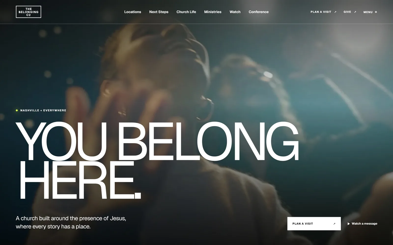
Two lines of 194px white capitals sit over a dim teal video of a singer, with a lime dot marking the location line.
Type
Geist, 194px uppercase, -0.09em
Body
Geist 21px
Build
Full bleed video hero, no container
Made on
Custom build
Colour
#11110f #f2efe8 #d8ff45
Type. The display line is Geist set at 194px in regular weight, uppercase, tracked in to -0.09em and leaded at 0.73 so YOU BELONG and HERE. almost touch. Running that tight at that size is the whole idea: the letterforms become a shape, not a sentence. The supporting line drops to Geist 21px at normal tracking, and the nav sits at 13px semibold. One family, four jobs, no second typeface anywhere.
Colour. The screen is a near black video, #11110f at the edges, cooling to a desaturated teal where the stage light hits. Text is pure white, and the only colour that is not borrowed from the footage is a single #d8ff45 lime dot beside NASHVILLE + EVERYWHERE, maybe forty pixels of it. Below the fold the page flips to a warm off white, #f2efe8, so the hero reads as a held breath rather than the house style.
Layout. Full bleed 1440px video with no container and no corner radius at all. The headline is pinned to the left gutter, roughly 80px in, and the type block runs from the mid point of the frame to the bottom edge. Nav is a single 13px row across the top with the logo in a hairline box at left. Sections below use 115px of vertical padding and a three column 398 / 529 / 398 split.
The ask. Two asks above the fold and both in the bottom right: a white rectangular PLAN A VISIT button with a diagonal arrow, and a bare Watch a message text link with a play triangle. PLAN A VISIT and GIVE also repeat in the top nav, so the visit ask appears twice without ever shouting. Nothing competes with the headline for the first two seconds.
Set one line of type big enough and tight enough that it becomes the image, then let everything else get small.
02
bridgetown.church
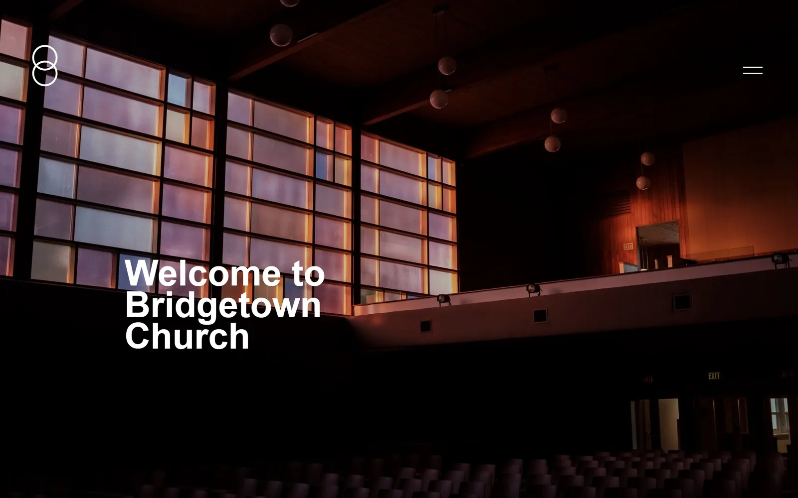
A dark auditorium with a wall of amber and lilac glass block, and three lines of white Helvetica stacked at the lower left.
Type
Helvetica Neue Bold, 65px, 0.88 leading
Body
Adobe Caslon Pro 16px
Build
Edge to edge photo hero, 216px section padding
Made on
Squarespace
Colour
#000000 #ffffff #c97b4a
Type. Welcome to Bridgetown Church is set in Helvetica Neue Bold at 65px with leading of 0.88, so the three lines close up into a solid block. Zero tracking, sentence case, no flourish. Body copy further down switches to Adobe Caslon Pro at 16px, a serif against the sans headline, which is the opposite of what most churches do and reads older and calmer for it.
Colour. Black is the page, 183 units of coverage against 178 of white, and every other colour in the frame is borrowed from the photograph: the glass block runs lilac through rose into a hot amber at the stage end. No brand accent is applied on top of it. That is a decision, not a default, and it means the building supplies the palette.
Layout. Full width 1440px photograph, nothing inset, no radius anywhere. The headline sits at roughly 320px from the left and 650px down, which puts it in the darkest quadrant of the image where it needs no scrim. The header is two marks only, an interlocking circles logo at top left and a two line hamburger at top right. Sections below run 216px of padding, the most generous spacing on this page.
The ask. There is no button above the fold. None. The only interactive elements are the logo and the menu icon, and the first real ask, service times at 9, 11 and 5 on NE Tillamook St, waits until you scroll. That costs conversions from someone in a hurry and buys a first impression nobody else here gets.
Shooting your own room well removes the need for a brand palette entirely.
03
thorncrown.com
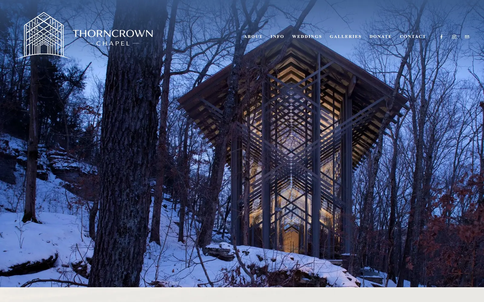
A glass and timber chapel glows gold in blue winter woods, with a line drawing logo and six nav words floating over it.
Type
Minerva Modern, 13px caps, 0.17em
Body
Source Sans 3
Build
Full bleed photo, 220px section padding
Made on
Squarespace
Colour
#f1e9da #3d5a8a #1c2a45
Type. There is no headline. The only type above the fold is the nav, set in Minerva Modern at 13px, bold, uppercase, with 0.17em of letterspacing, which is enough air to make six words read as a frieze rather than a menu. Body copy on the page is Source Sans 3. Holding the entire first screen with 13px type takes nerve and it works because the photograph is doing the talking.
Colour. The page colour is a warm parchment, #f1e9da, which shows as a band under the fold and as the logo and wordmark colour. Everything else is the picture: cobalt snow shadow, bare grey bark, and the lit interior at the centre. The one applied colour is #3d5a8a on buttons deeper in the page, lifted straight out of the dusk sky, and it covers well under one percent of the screen.
Layout. Full bleed 1440px photograph at 100 percent of the viewport, no container, no corner radius. The line drawing chapel logo sits top left at around 100px square, the nav runs right across the top at the same baseline, and the entire centre of the frame is left empty. Below, sections carry 220px of padding, the widest gaps in this set.
The ask. Nothing is sold above the fold. ABOUT, INFO, WEDDINGS, GALLERIES, DONATE and CONTACT are equal weight, and the commercial ask, weddings, is the third word rather than a button. The DONATE link and the later blue buttons are the only conversion pressure on the page, which suits a site whose job is to get people to drive to Eureka Springs.
If the photograph is extraordinary, the correct amount of overlay type is almost none.
04
cotc.com
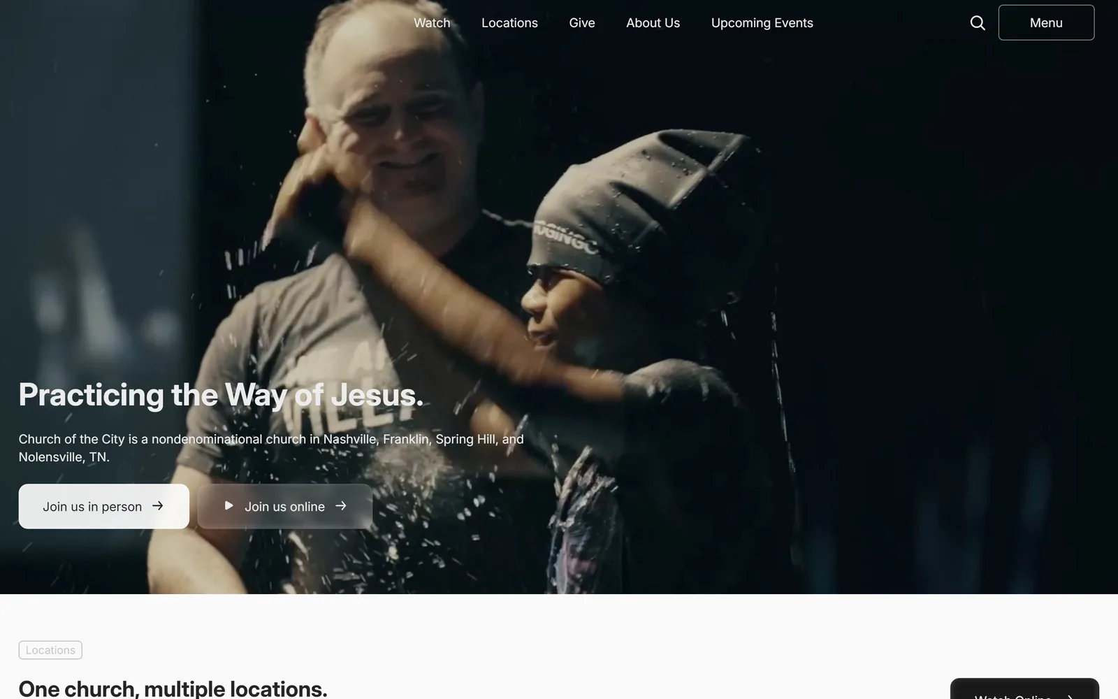
A dark baptism video fills the frame and a 40px white headline sits low left above two pill buttons.
Type
Inter Display Bold, 40px
Body
Inter 16px
Build
Full bleed video, 684px twin columns, 24px gutters
Made on
Webflow
Colour
#fafafa #252525 #ffffff
Type. Practicing the Way of Jesus. runs in Inter Display Bold at 40px with 1.1 leading, restrained for a hero and deliberately so, because the video behind it has a face in the centre of frame. The subhead and both buttons sit at Inter 16px regular. Only two sizes carry the whole first screen, 40 and 16, with a 22px step appearing further down.
Colour. The page ground is #fafafa and the hero is near black video with a single warm skin tone at the centre. Button text is #252525 rather than true black, which softens the edge against white. There is no accent colour at all, which for a four campus Nashville church is a decision to let the footage carry the warmth.
Layout. A 1440px full bleed video hero ending in a hard horizontal cut, with the content below on a two column 684 / 684 grid at 24px gutters. Buttons carry a 12px radius. The headline block is pinned about 35px from the left edge and sits roughly 700px down, below the subject's face. The header is sticky and runs five links plus search and a bordered Menu button.
The ask. Two buttons side by side, Join us in person in solid white and Join us online in a translucent grey with a play glyph, both with trailing arrows. The primary ask is physical attendance and the online option is visually second without being hidden. Give sits in the nav as a third, quieter ask, and a dark Watch Online button appears again just past the fold.
Name the two things a visitor can actually do and give the in person one the brighter button.
05
cathedral.org
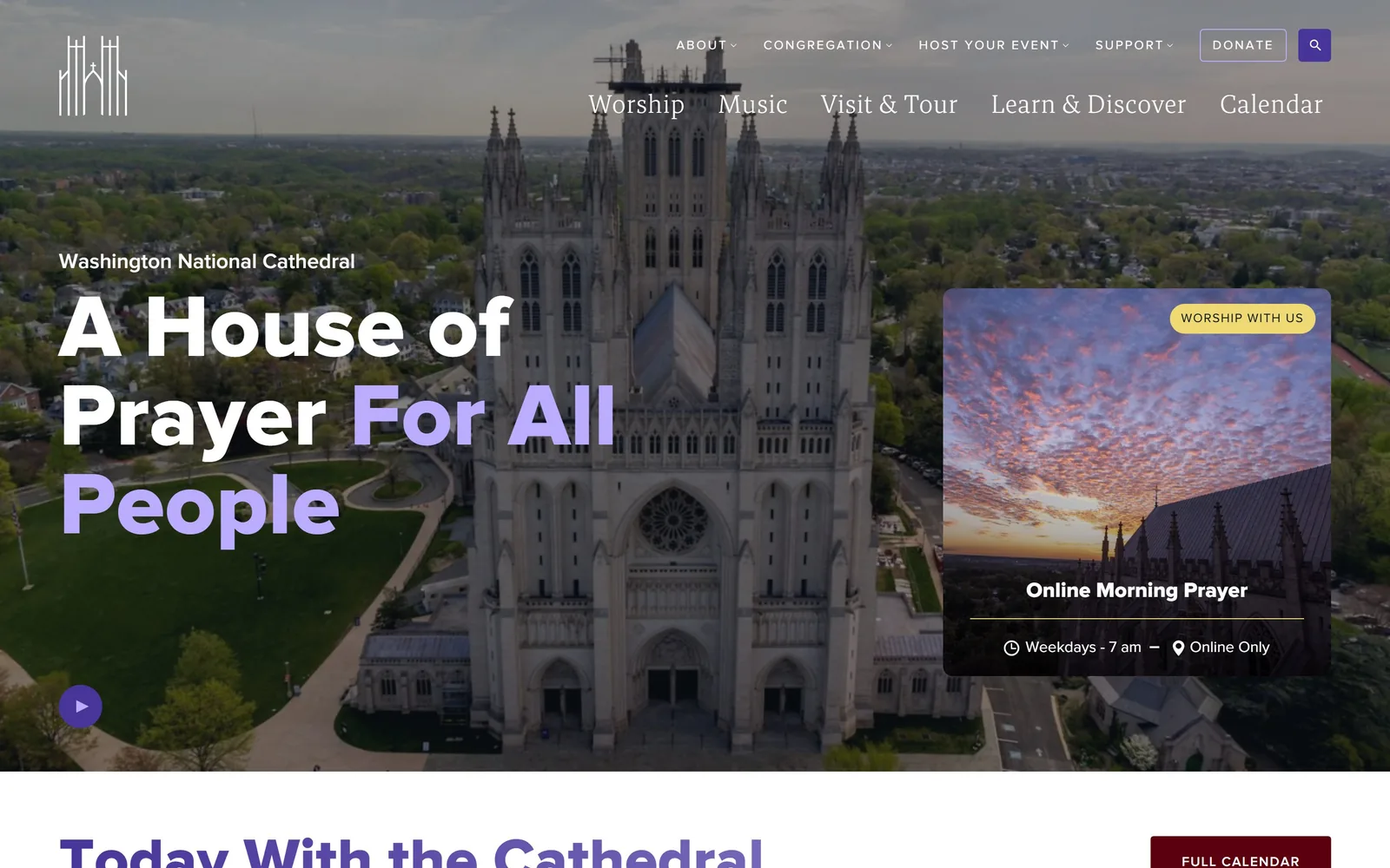
An aerial of the Gothic cathedral with a 92px headline split between white and lavender, and a worship card at right.
Type
Proxima Nova 800, 92px
Body
Proxima Nova 18px
Build
329 / 988 two column under a full bleed aerial
Made on
WordPress
Colour
#473599 #eed974 #5b000f
Type. A House of Prayer For All People is Proxima Nova at 92px in weight 800, leading of exactly 1.0, with the last three words switched to lavender. Above it the institution name sits at 18px semibold. The nav runs two rows at two treatments: 13px uppercase with 0.154em tracking on top, and a larger mixed case row below at around 26px. That split row is the one thing I would simplify.
Colour. The accent is #473599, a saturated violet, and it is doing real work: it colours half the headline, the play button, and 226 characters of body ink further down. A yellow pill, #eed974, carries WORSHIP WITH US, and a deep oxblood #5b000f takes the FULL CALENDAR button. Three accents is one more than most sites can hold, but the violet dominates enough to stay coherent.
Layout. A 1440px full bleed aerial with a two column split underneath at 329px and 988px. The headline occupies the left third over green lawn, and a roughly 560px event card with a generous corner radius sits at the right, carrying a sunrise photo, a title, a time and a location. A circular play button sits at the lower left of the hero.
The ask. Donate is a bordered button in the top nav, the strongest ask on the page. The event card doubles as a conversion unit with WORSHIP WITH US as its pill, and the play button offers a third path. Below the fold a FULL CALENDAR button in oxblood pulls toward ticketing and tours, which is where a cathedral with paid admission actually makes money.
Colouring half a headline in your brand hue turns one sentence into the brand statement.
06
trinitychurchnyc.org
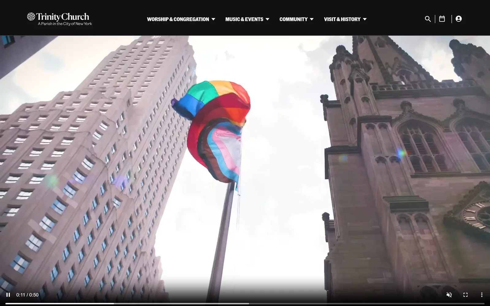
A looking up video of the Gothic spire beside a limestone tower, with a pride flag mid frame under a black nav bar.
Type
Martina Plantijn serif
Body
Community Gothic 16px
Build
Sticky black header over full bleed video, 588px twin columns
Made on
Custom JS framework
Colour
#121212 #f7f7f7 #0053a2
Type. The wordmark is Martina Plantijn, a serif with sharp bracketed serifs and real contrast, and deeper in the page it runs up to 152px. The nav itself is Community Gothic Condensed at 16px, uppercase, which is a condensed grotesque against a bookish serif. That pairing, a literary serif for identity and a newsroom condensed for navigation, is why this reads as a publisher rather than a parish.
Colour. The header band is #121212 and the video is mostly white sky, so the page splits hard into black type furniture over a bright image. The applied accent is #0053a2, a flat civic blue used sparingly below the fold. The rainbow in the frame is content, not palette, and the restraint around it is deliberate.
Layout. A sticky 1440px black header roughly 125px deep sits above a full bleed autoplaying video with native controls visible along the bottom edge. Content below runs a 588 / 588 two column grid at 24px gutters with 72px of section padding, and the document runs nearly 10,000px, the longest here. Corner radius is zero throughout.
The ask. No button above the fold. The asks live in the header as icons, search, calendar and an account avatar, plus four dropdown sections. For a parish that publishes $522 million and $34 million figures further down, the conversion job is really calendar and giving, and both are one click from the top bar rather than shouted in the hero.
A condensed gothic nav under a high contrast serif wordmark makes a church site read like an institution that publishes.
07
passioncitychurch.com
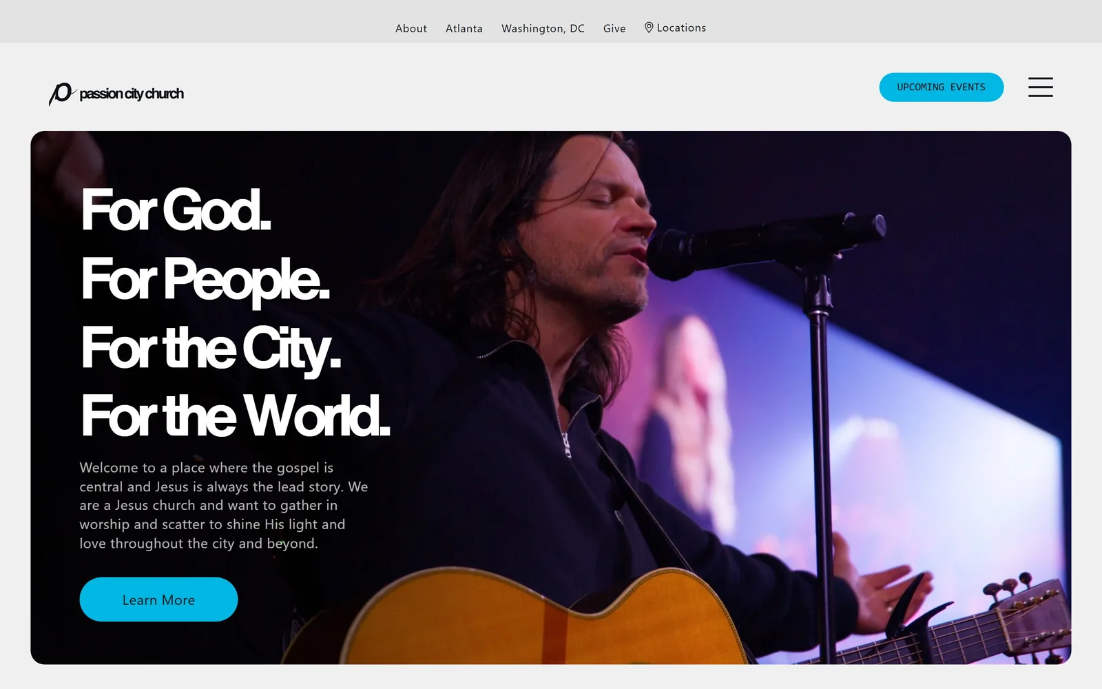
A rounded dark card holds a worship leader at a microphone, with four short white lines stacked at the left and a cyan button.
Type
Helvetica Now Bold, 80px, -0.04em
Body
Owners 18px
Build
Inset rounded hero card, 640px twin columns
Made on
WordPress
Colour
#00b7e3 #262626 #f0f0f0
Type. For God. For People. For the City. For the World. is set around 80px in a Helvetica Now Bold cut, tracked in to -0.04em, four lines each ending in a full stop. The negative tracking at that weight closes the counters and gives it the look of a record sleeve. Supporting copy drops to Owners at 18px with 0.025em of positive tracking, and the button label is set in a monospace at 14px uppercase.
Colour. The page ground is a light #f0f0f0 and the hero card is #262626 fading to #404040. The accent is #00b7e3, a hard cyan, and it takes about nine percent of the screen across the UPCOMING EVENTS pill and the Learn More button. That cyan against a near monochrome card is the only colour decision on the page and it carries the whole brand.
Layout. The hero is a card, not a bleed: inset roughly 55px from each side with a corner radius near 32px, floating on the grey page. A thin secondary nav strip runs above the logo bar, so there are two header rows before the content starts. Below the card, sections run on a 640 / 640 two column grid at 32px gutters with 171px of vertical padding.
The ask. UPCOMING EVENTS is a cyan pill in the header and Learn More is a cyan pill in the hero, so the same colour marks both asks and nothing else. Give sits as plain text in the top strip. Three asks total, clearly ranked, and the hamburger holds the rest. The weakness is that Learn More says nothing about what you learn.
Insetting the hero as a rounded card instead of bleeding it full width makes a megachurch site feel like a product page.
08
parkchurch.org
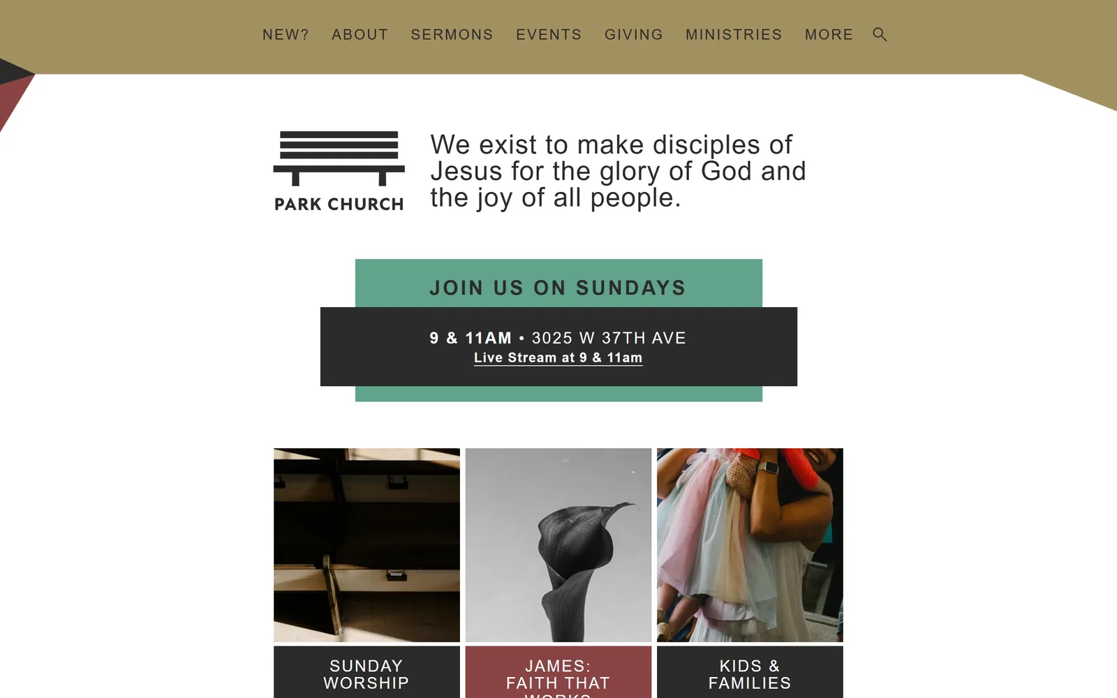
A khaki band cuts diagonally across the top, a bench logo sits beside a 34px mission statement, and a green block holds service times.
Type
New Kansas, 34px, 0.03em
Body
New Kansas 17px
Build
980px container, angled header band
Made on
WordPress
Colour
#a39061 #61a38b #8a4444
Type. The mission statement runs in New Kansas at 34px with 0.03em of tracking, a face with slightly flared stems that sits between serif and sans and keeps the sentence from feeling corporate. The nav is New Atten at 19px, light weight, uppercase, with 0.1em of letterspacing. JOIN US ON SUNDAYS is pushed to 26px with 0.122em of tracking, so the invitation is tracked wider than the mission.
Colour. Four colours, all muted and all unusual for the category: a khaki #a39061 for the angled header band, a sage #61a38b behind JOIN US ON SUNDAYS, a brick #8a4444 on one of the three card labels, and #2b2b2b for text and the dark time block. Khaki alone takes 55 units of coverage. Nobody else in this set would have picked these, and that is the point.
Layout. A 980px container, only 68 percent of the viewport, which is unusually narrow and makes the page feel like a printed bulletin. The header band is a solid khaki shape with an angled lower edge cutting across the full width. Below, the service block layers a dark rectangle on top of a sage one with a deliberate offset. Three equal image cards follow with coloured caption bars. Radius is zero everywhere.
The ask. One ask, repeated as a single unit: JOIN US ON SUNDAYS over 9 & 11AM at 3025 W 37th Ave, with an underlined Live Stream at 9 & 11am beneath it. Giving sits in the nav only. The three cards below, Sunday Worship, the James series and Kids & Families, are secondary and clearly subordinate.
A narrow 980px container and an off palette like khaki and sage will separate you from every other church in your city.
09
oldsouth.org
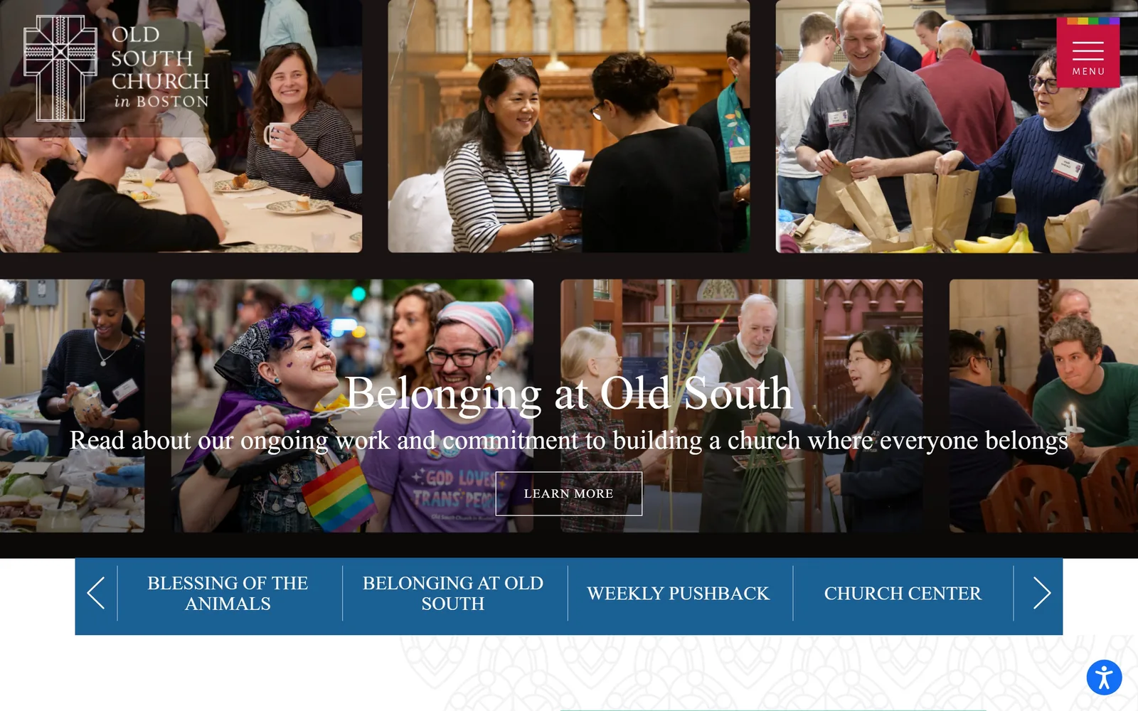
Eight candid congregation photographs tile the screen in two rows, with a serif headline overlaid across the middle seam.
Type
Cormorant Garamond, 60px light
Body
Alegreya Sans 18px
Build
Eight image mosaic, two rows, full bleed
Made on
Custom
Colour
#292929 #1b6094 #c4123d
Type. Belonging at Old South is set at 60px in a Cormorant Garamond style old style serif, light weight, with the standfirst beneath it at a similar face around 34px. The nav and the 1,343 characters of body copy below run in Alegreya Sans at 18px. A high contrast Garamond over a humanist sans is a safe pairing, executed carefully here, and the light weight at 60px is what keeps it from feeling municipal.
Colour. The page ground is #292929, a warm near black, so the photographs read as prints on a dark wall. Beneath the mosaic sits a solid #1b6094 navy blue band of section links. The menu button is a #c4123d red square with a six colour pride flag above it, the only saturated mark in the header. A mint #92d9cd appears further down at around ten percent coverage.
Layout. Eight photographs in two rows filling the full 1440px, with narrow dark gutters between them rather than a grid container. The headline is centred across the seam between the rows, which means it crosses four images at once and relies on a dark overlay to stay legible. A LEARN MORE button in a hairline box sits centred below. The blue carousel band under the mosaic holds four section names with chevrons.
The ask. One button above the fold, LEARN MORE, in an outlined box with no fill. Everything else is navigation: a four item carousel for Blessing of the Animals, Belonging at Old South, Weekly Pushback and Church Center, plus an A to Z menu behind the red square that lists well over sixty destinations. That menu is the real conversion risk here.
A tiled wall of your own candid photographs says more about who attends than any headline about welcome.
10
vouschurch.com
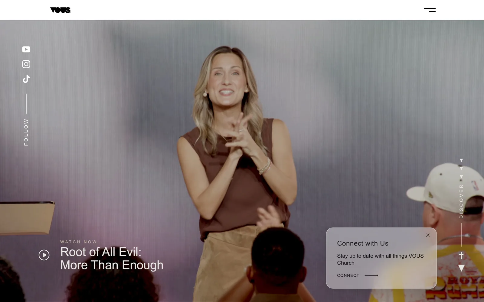
A full screen video of a speaker on a lavender lit stage, with vertical FOLLOW and DISCOVER rails down the left and right edges.
Type
Inter Tight 500, 36px
Body
Inter 14px
Build
Full bleed video with rotated edge rails
Made on
Webflow
Colour
#e8e6e3 #131212 #b7a9bd
Type. Root of All Evil: More Than Enough sits in Inter Tight at 36px in medium weight, with WATCH NOW above it at around 13px uppercase and wide tracking. Nav items run Inter at 14px medium. The two vertical rails, FOLLOW at left and DISCOVER at right, are rotated 90 degrees at small caps size. Holding a 1440px screen with a 36px headline is the restraint decision of this page.
Colour. The video gives the palette: a dusty lavender and warm grey stage wash with a cream wall behind. The page proper is #e8e6e3, a warm off white, and the slim white header sits on top. The only applied colour is the near black #131212 of the wordmark. No accent hue is introduced anywhere above the fold.
Layout. Edge to edge video at the full 1440px with a thin white header bar roughly 80px deep above it, holding only the VOUS wordmark at left and a hamburger at right. The two rotated rails are pinned to the left and right edges at about 110px in. The sermon title block sits bottom left behind a circular play button, and a rounded notification card floats bottom right.
The ask. The ask is a sermon, not a visit. A circular play button and the Watch Now title are the primary unit, and a dismissible Connect with Us card in the lower right offers CONNECT with a long arrow. The rest, prayer request and need care, live in the menu. For a church whose audience mostly arrives from YouTube and Instagram, leading with the message rather than the service time is the right call.
Lead with your current sermon rather than a welcome line if most of your traffic comes from social.
11
gracechurchnyc.org
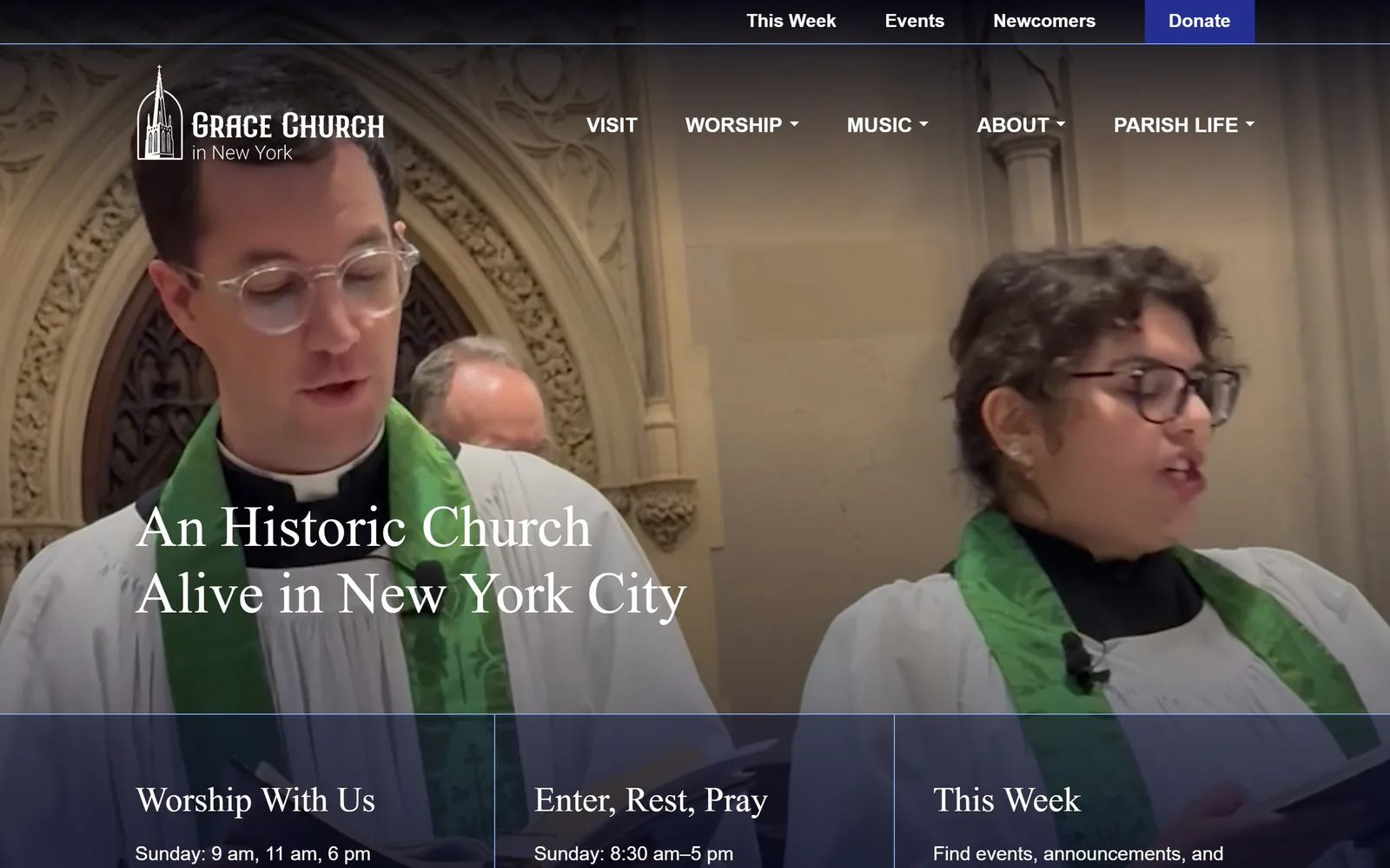
Two clergy in white surplices and green stoles sing in a stone nave, with a 60px serif headline at the lower left.
Type
Alice serif, 60px
Body
PT Sans 20px
Build
Full bleed video with three card band at the fold
Made on
WordPress
Colour
#0c1030 #ffffff #233091
Type. An Historic Church Alive in New York City runs in Alice at 60px, regular weight, leading 1.15. Alice is a low contrast old style serif and at 60px over video it holds up better than a Didone would. The body and nav switch to PT Sans, 20px for copy and 19px bold for navigation, with a 21px uppercase bold for the card headings. Serif for voice, sans for wayfinding, applied consistently.
Colour. The hero bottom resolves to a deep navy, #0c1030, which the three card band inherits as a translucent overlay. White text carries 319 characters, black 313, so the page is genuinely split between dark hero and light body. Donate gets a brighter #233091 blue in the top bar, under one percent of the screen and the only saturated patch above the fold.
Layout. A full 1440px video hero with a narrow dark utility strip above the main nav. At the fold, a three column band of equal width cards drops in over the video, divided by hairline rules, carrying Worship With Us, Enter, Rest, Pray and This Week with times beneath each. Sections below run 90px of padding. No corner radius anywhere.
The ask. Donate is a filled blue rectangle in the utility strip and is the only button above the fold. The three card band is the real conversion device though: service times at 9, 11 and 6, opening hours of 8:30am to 5pm, and a this week link, which answers the three questions a stranger actually has before they decide to walk in.
Putting service times and opening hours in the hero band answers the visitor's real question before any button has to.
12
saintmarks.org
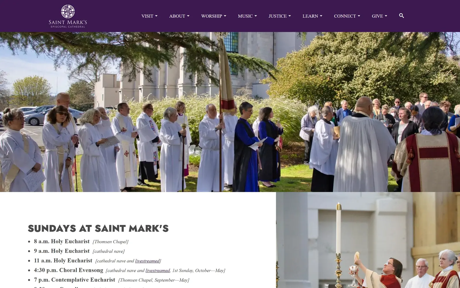
A purple nav band sits above a wide photograph of a vested procession outdoors, with a bulleted service list beneath.
Type
Neutraface 2 Display Black, 30px caps
Body
Heebo 17px
Build
1170px container, full bleed photo band
Made on
WordPress
Colour
#3d1951 #121f6b #ffffff
Type. SUNDAYS AT SAINT MARK'S is set in Neutraface 2 Display Black at 30px, uppercase, a geometric sans with very short descenders that reads as mid century rather than ecclesiastical. Everything else is Heebo: 17px for the service list, 15px medium for nav. The service times are bold Heebo with the venue in italic brackets beside them, a small editorial move that makes a long list scannable.
Colour. The nav band is #3d1951, a deep aubergine, and a navy #121f6b appears lower on the page at around twenty percent coverage. The photograph supplies white vestments, spring green and a flash of cobalt and crimson from the copes. Body background is white and headings sit at #494949 rather than black. The purple is liturgical colour used as brand colour, which for an Episcopal cathedral is the obvious and correct call.
Layout. An 1170px container, 81 percent of the viewport, with the purple header band running the full width above it. The hero photograph bleeds edge to edge. Below the fold the page splits into an asymmetric two part row: a service list on the left at roughly 60 percent, and a second photograph filling the right to the page edge. Nine top level nav items is a lot, and they all carry dropdowns.
The ask. There is no button above the fold and no donate pill, only a GIVE item in the nav. The conversion unit is the service list: eight entries from 8am Holy Eucharist through 9:30pm Compline, each with its room named and the livestreamed ones underlined as links. For a cathedral, telling people exactly which service is in the chapel and which is in the nave is more useful than a button.
Using your liturgical colour as the brand colour costs nothing and instantly dates the site to the right tradition.
13
rockharbor.org
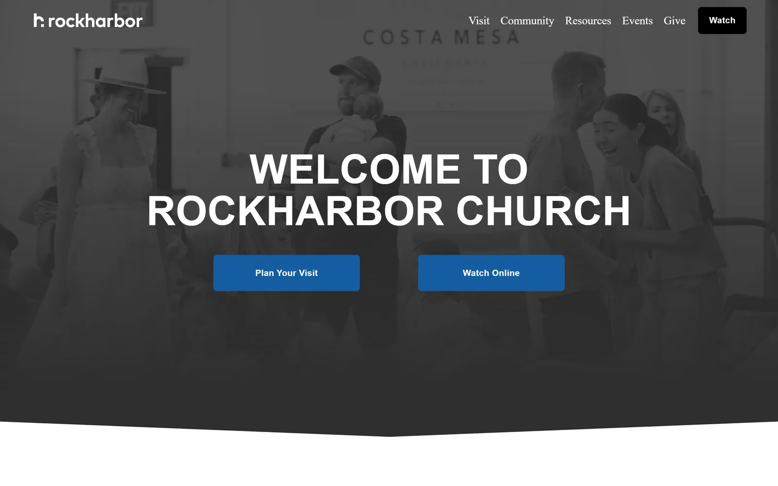
A blue tinted greyscale photo of people greeting each other, with a 75px uppercase welcome line and two blue buttons.
Type
Helvetica grotesque, 75px caps
Body
Helvetica Neue 21px
Build
Full bleed duotone hero with curved lower edge
Made on
Squarespace
Colour
#155da1 #1f1f1f #f4ead4
Type. WELCOME TO ROCKHARBOR CHURCH is set around 75px in a Helvetica style grotesque, uppercase, with no tracking adjustment, centred over two lines. The lowercase rockharbor wordmark at top left is the counterpoint. Nav and buttons are Proxima Nova, 21px for nav and 14px bold uppercase with 0.08em of tracking for the buttons. Competent rather than interesting, and the 75px caps do most of the work.
Colour. The photograph is pushed to greyscale and tinted with a cool blue, which is where the accent #155da1 comes from, and the two buttons repeat that exact blue at roughly three percent coverage. A cream #f4ead4 appears below the fold at 41 units of coverage. The duotone treatment is the one real decision here and it unifies a candid snapshot that would otherwise look busy.
Layout. A full 1440px hero whose lower edge is a shallow convex curve rather than a straight cut, which is the only shape idea on the page. The centred type column is roughly 1200px wide, the buttons are 6px radius and sit side by side with about 150px between them, and the Watch button at the top right is a black rounded rectangle. Sections below carry 76px of padding.
The ask. Two blue buttons of identical weight, Plan Your Visit and Watch Online, which is the problem: nothing tells a first time visitor which one is for them. A third Watch button sits black in the nav, so watching gets two entry points and visiting gets one. Give is text only in the nav.
If you give two calls to action the same colour and size, you have chosen neither.
How these were chosen
Thirteen sites made this page, ranging from a 1,500 seat Nashville congregation to a cathedral in Washington, a glass chapel in the Arkansas woods and two historic parishes in Manhattan. The pattern that showed up again and again: the ones that work hardest spend almost nothing on colour and almost everything on one photograph or one piece of video, then set a single line of type over it. Good church website design here means knowing whether your first screen should sell a Sunday visit, a sermon, or a building worth driving to see, because trying to do all three is what makes the weaker entries feel generic. Service times beat buttons: the pages that put 9, 11 and 5 above the fold answer the only question a stranger has.
Finding church sites that someone had actually designed took far longer than it should have. 30 candidates made the shortlist. 13 made the page.
Each one was opened and looked at properly: what the type is doing, where the colour gets spent, how the page is built, how it asks for the job. Nothing is here because it ranks. Nothing is here because an agency filed it under portfolio. Several well known names were left out for the plain reason that their site came out of the same template as everyone else's, and a few sites worth including did not survive a second look.
Where a site is only competent, it says so. The order is the order worth your time, best first.
Reviewed and selected by Larry W. Matthews for Websitely.