Nonprofit Website Design Without the Guilt Photograph
Fifteen charities, foundations and museums that ask for money without a guilt photograph. Nonprofit website design that trusts the reader to care.
Shown
15 sites
Reviewed
30 candidates
Chosen on
The work, not the ranking
Updated
15 October 2026
01
sfmoma.org
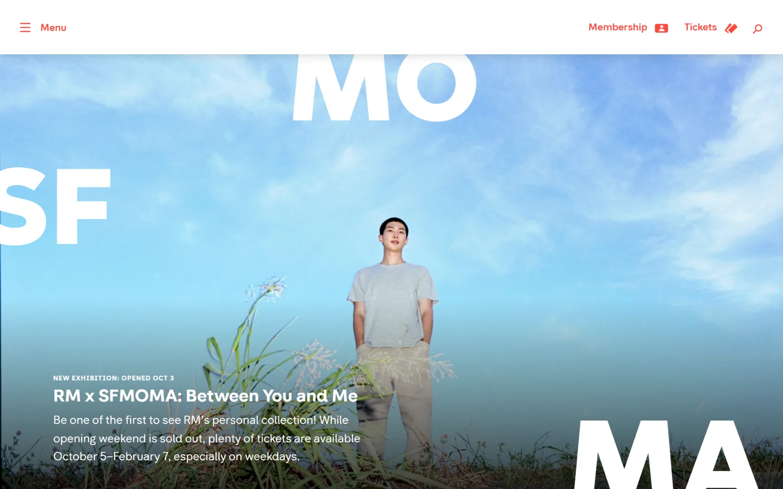
Giant white SFMOMA letterforms crop off three edges of a blue sky photograph showing a figure standing in tall grass.
Type
SFMOMASans Bold, 32px, with oversized cropped logo letterforms
Body
SFMOMASans Regular, 21px
Build
Full-bleed photograph with overlaid cropped wordmark under a 110px white header
Made on
WordPress
Colour
#f7f7f7 #ffffff #9bdffa
Type. One family, SFMOMASans, carries everything. The cropped SF, MO and MA letters run several hundred pixels tall and sit far outside the ordinary scale, which otherwise holds a 32px bold exhibition title, a 21px regular standfirst and 18px medium nav labels. The eyebrow above the title is small uppercase with wide tracking.
Colour. A near-white #f7f7f7 header, pure #ffffff letterforms and the photograph's own pale blue #9bdffa carry almost all of it. A single red is held back for Menu, Membership and Tickets, so the only coloured text on the page is also the only text that does anything at all.
Layout. The header is a 110px white band flush to both edges with no container. Below it the photograph runs full bleed to the viewport, and the wordmark fragments are positioned over it rather than inside it, two cropped at the left and top edges and one at the bottom right. Text sits in a left column at roughly a 110px gutter, with no card, no scrim and no rounded corners.
The ask. Two asks share the header, Membership and Tickets, both set as red text with small icons rather than filled buttons. No Donate link is in view at all. The hero sells one exhibition and the ticketing line sits inside the body copy instead of a button, which puts the show ahead of the transaction.
Cropping the wordmark past the frame edge turns identity into composition, and lets one typeface do display and interface work at once.
02
mintmuseum.org
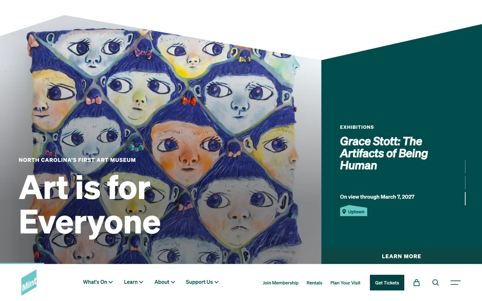
Stacked cartoon faces from a painting sit behind an angled mask against a dark teal panel, with the navigation bar at the foot of the frame.
Type
Sohne Bold, 99px
Body
Sohne Regular, 16px
Build
Angled two-thirds image and one-third panel split, navigation bar at the bottom of the viewport
Made on
WordPress
Colour
#014c4c #024243 #ffffff
Type. Sohne Bold at 99px sets the two-line hero over the artwork, with a 16px uppercase eyebrow tracked out to 0.08em above it. The exhibition title in the teal panel drops to 34px bold italic and nav items run 20px regular, so the display size does all the shouting and nothing else in the frame competes for volume.
Colour. Two teals do the structural work, #014c4c for the panel and #024243 for the Get Tickets button, against white and whatever the artwork brings. There is no third accent. The button is a darker shade of the panel behind it, which stops it reading as an alarm colour.
Layout. The split is angled rather than vertical: the artwork sits under a sloped mask rising left to right, and the teal panel takes the right third. Everything is full bleed and the button has square corners. Navigation is parked in a white bar at the bottom of the viewport rather than the top, roughly 115px deep.
The ask. Get Tickets is the only filled button, square-cornered and dark teal, sitting in the bottom bar beside Join Membership and Plan Your Visit. Support Us is a dropdown in the same row, so giving is one of six equal nav items rather than a standing ask. Learn More runs full width under the exhibition panel.
An angled mask across a full-bleed image gives a split layout a direction, so the eye runs into the panel instead of stopping at the seam.
03
calwellness.org
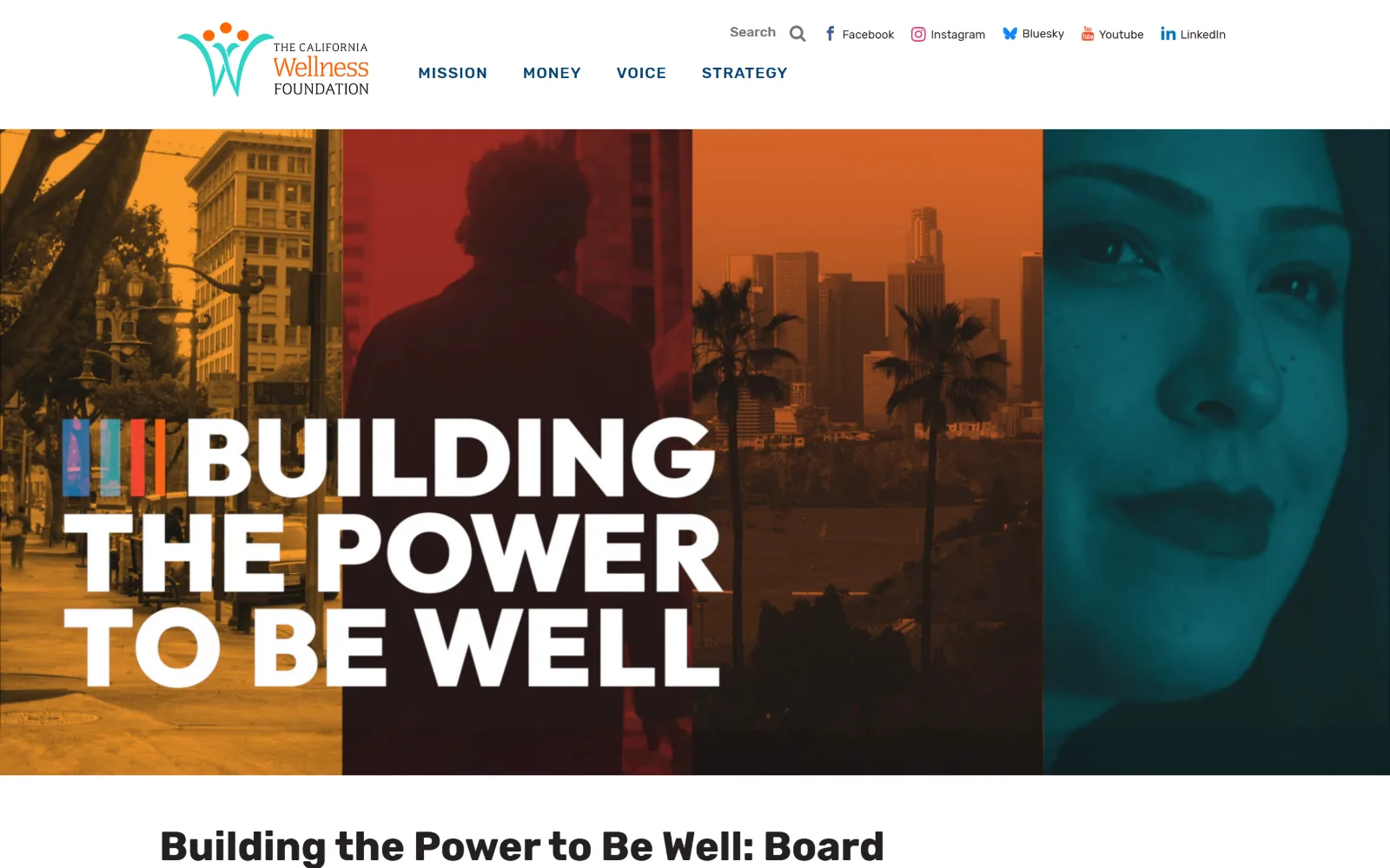
Four vertical video panels tinted amber, red, orange and teal run behind a white all-caps headline reading Building the Power to Be Well.
Type
Rubik Bold, 42px, with an outsized all-caps hero title
Body
Rubik Medium, 20px
Build
Full-bleed four-panel video band under a 145px white header
Made on
WordPress
Colour
#ffffff #231f20 #006dc6
Type. Rubik does everything here. The hero title is set huge, tight and all caps in white across three lines, while a 42px bold Rubik headline below the fold starts the editorial scale, body copy runs 20px medium and nav labels 18px regular. Section labels appear at 16px and 20px uppercase with 0.05em to 0.06em tracking.
Colour. The frame is white. Colour arrives entirely through four duotone video tints, amber near #b3762d, deep red, orange and teal #0d5c61, split into equal vertical bands. Interface colour is minimal by comparison: #006dc6 for links, #f6461e for the nav row and #231f20 for text.
Layout. The header is a white band roughly 145px deep with the logo left and a two-row cluster of search, social links and four nav items on the right. The hero below is full bleed with no side padding at all and no rounded corners. Content under it returns to a centred container with generous white margins on both sides.
The ask. No Donate button appears anywhere in the header and there is no ask in the hero. The one call to action is a Read More under a board reflections headline. A grantmaking foundation does not need gifts and the page behaves accordingly, with nav reading Mission, Money, Voice, Strategy.
Four duotone bands turn one piece of footage into a colour system, so a flat white page gets its register from the content rather than from brand paint.
04
girlswhocode.com
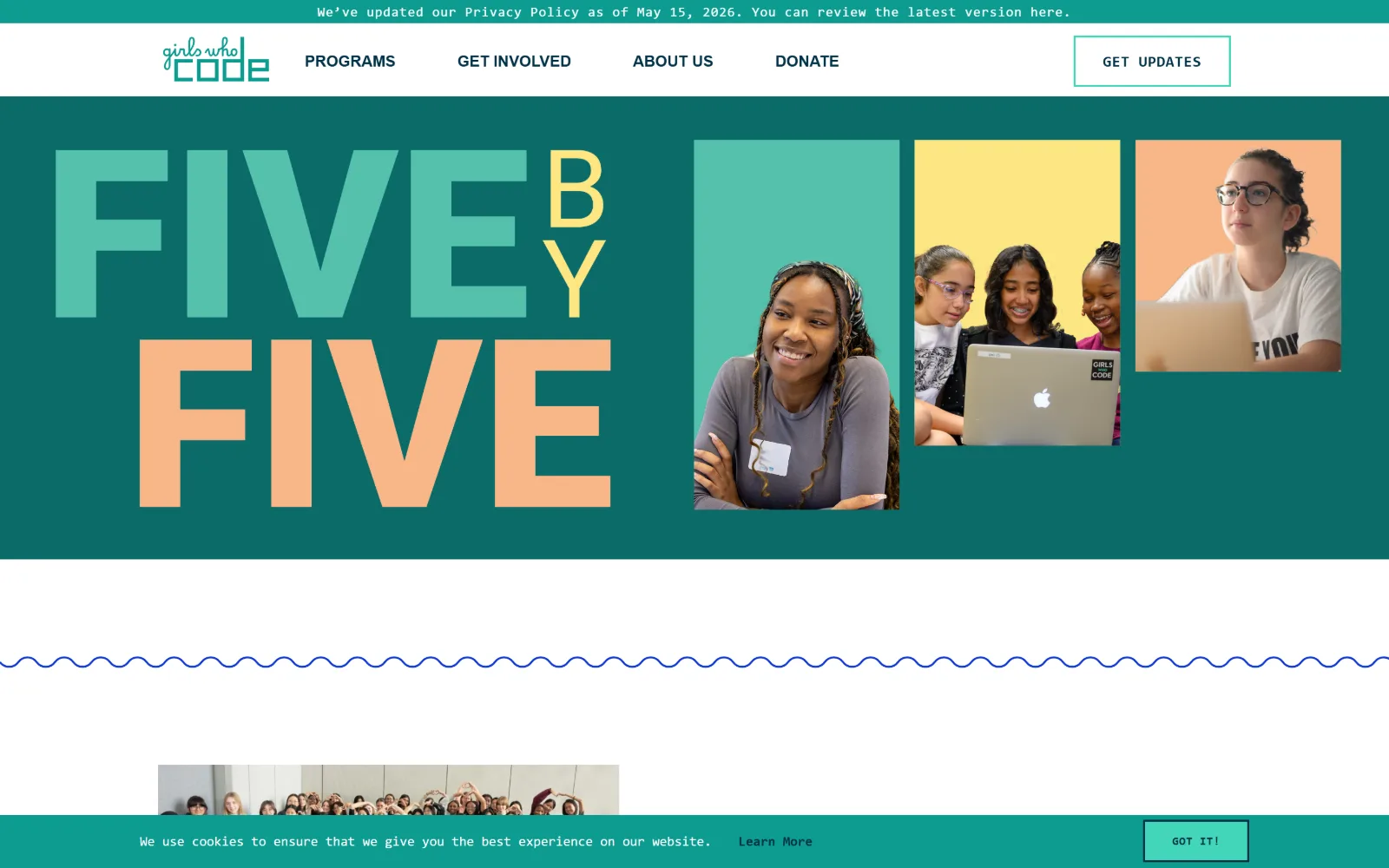
The words FIVE BY FIVE fill the left half in mint and peach block letters beside three photographs on coloured backgrounds.
Type
Roboto ExtraBold, 42px, with an oversized typographic hero
Body
Roboto Mono Regular, 14px
Build
540px full-bleed colour band split between type block and staggered photo panels
Made on
Not detected
Colour
#0b6b68 #55c1ac #f8b788
Type. Roboto ExtraBold at 42px is the nominal heading size, but the hero sets FIVE and FIVE far larger in the same heavy grotesque, with BY rotated and stacked vertically between them. Everything else is Roboto Mono: 14px nav tracked to 0.057em and 12px uppercase buttons at 0.042em. The mono voice keeps the chrome reading as code.
Colour. Deep teal #0b6b68 fills the hero band. Four pastels sit on it, mint #55c1ac, peach #f8b788, butter #fde683 and white, each used once as a photograph backing. The button green #43d6b9 is a fifth. Nothing in the palette is red and nothing signals urgency.
Layout. A full-bleed teal band roughly 540px tall holds a two-column split: the typographic block left, three staggered photo panels right at different heights and widths. The header is a 70px white bar with a square outlined button. Below the hero a blue hand-drawn wave rule runs the full width, and no corner is rounded.
The ask. Donate is a plain nav item, fourth of four, set in the same weight as Programs and About Us. The only emphasised control is Get Updates, an outlined square button in the top right, so the page asks for an email address rather than money.
Setting a goal figure as the hero artwork, not as a statistic in a strip, makes the number the thing the organisation is actually selling.
05
carbon180.org
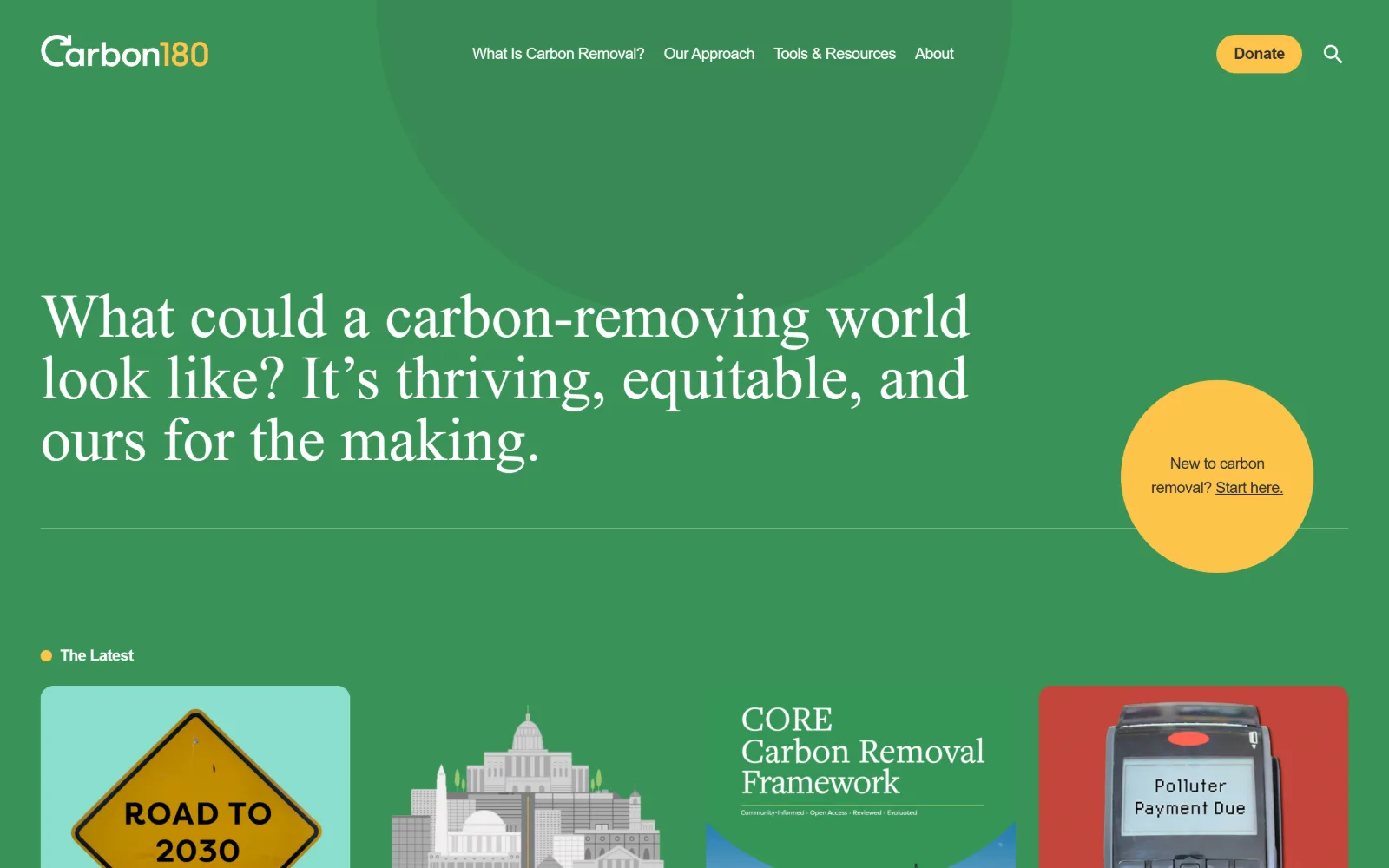
Flat mid-green fills the frame behind a three-line serif question set in white, with a yellow circle floating at the right edge.
Type
freight-big-pro Light, 48px
Body
Inter Regular, 16px
Build
Full-bleed flat green hero with a 1070px text column and an offset circle
Made on
WordPress
Colour
#399257 #fdc54d #ffffff
Type. freight-big-pro at 48px light sets the hero question, a high-contrast didone on a page that is otherwise Inter at 16px to 18px with -0.025em tracking. That is the whole scale: one serif voice for the argument, one neutral sans for everything else, and no uppercase anywhere in sight.
Colour. Green #399257 covers more than half the viewport, with a slightly lighter circle ghosted into it behind the nav. Yellow #fdc54d is the only accent and it does two jobs, the Donate pill and the floating circle. White text, one hairline rule, and nothing else.
Layout. Full-bleed flat colour with no hero image at all. The question sits in a left column of roughly 1070px with a hairline rule beneath it, and a 220px yellow circle breaks that rule at the right. The header is about 125px; the Donate pill is fully rounded at 100px radius and the cards below use soft radii.
The ask. Donate is a yellow pill at the top right and the only filled control above the fold. The competing ask is the yellow circle, which offers an explainer rather than a gift. Below it the page goes straight into four research cards, so the money ask stays single, small and permanent.
A flat colour field with one serif sentence on it reads as confidence, because the page is betting the argument alone will hold attention.
06
826national.org
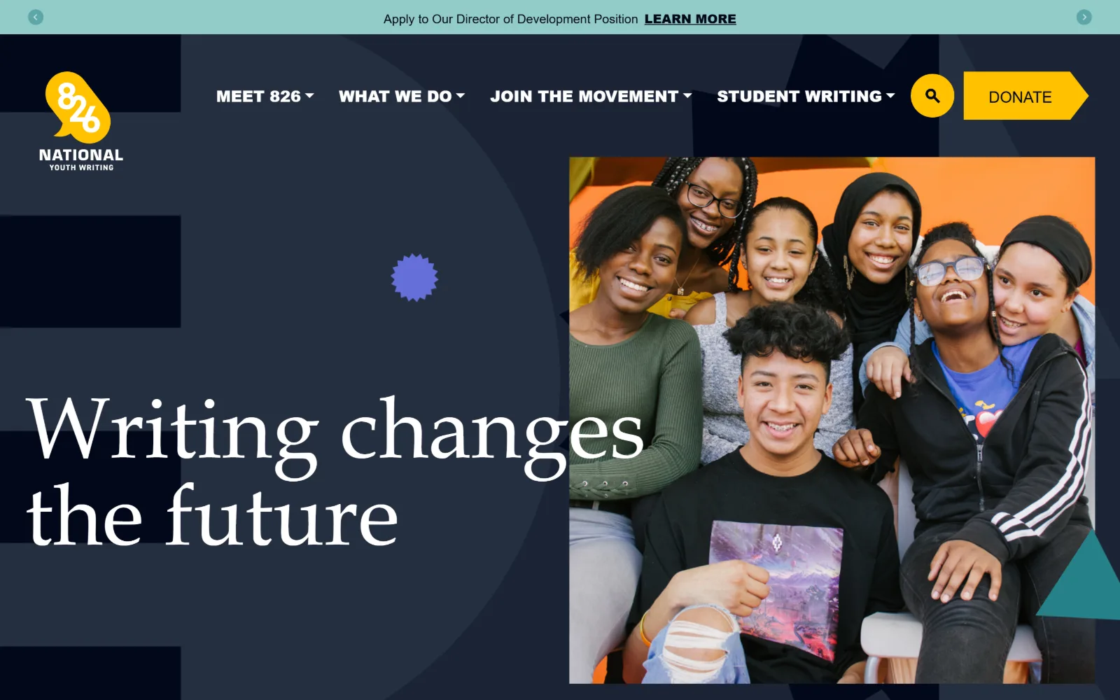
Offset geometric shapes build a navy field carrying the serif line Writing changes the future, beside a photograph of seven smiling students.
Type
DM Serif Display Regular, 110px
Body
Source Serif 4 Regular, 22px
Build
Full-bleed flat navy canvas of offset shapes, two-column hero split under a 100px header
Made on
WordPress
Colour
#02081a #242f40 #ffc100
Type. DM Serif Display at 110px sets the hero line across two lines, an unusually high-contrast serif on a navy ground. Body copy is Source Serif 4 at 22px, so the page runs serif on serif, while nav is Rubik Light at 16px and the small labels are Overpass Black uppercase at 16px and 20px. Three families, each kept to one job.
Colour. Navy #02081a and a lighter #242f40 build the stepped background shapes. Yellow #ffc100 carries the Donate chevron and the logo. A mint #92ccc8 announcement bar sits above the header and a violet #656fd9 starburst floats mid-field. Four accents, each used once, none of them repeated.
Layout. A 100px header sits over a full-bleed navy canvas built from offset rectangles and one large circle, all flat with no gradient. The hero is a two-column split, type left and photograph right in a hard-edged rectangle running off the right edge. The Donate control is shaped as a chevron rather than a rectangle.
The ask. Donate is a yellow arrow-shaped button at the far right of the header, pointing right, and the brightest object on a dark page. Nothing else competes above the fold: the hero carries no secondary button, so the only decisions are the four nav dropdowns and the gift.
Shaping the primary button as an arrow instead of a rectangle gives it emphasis without needing a louder colour or a larger size.
07
japansociety.org
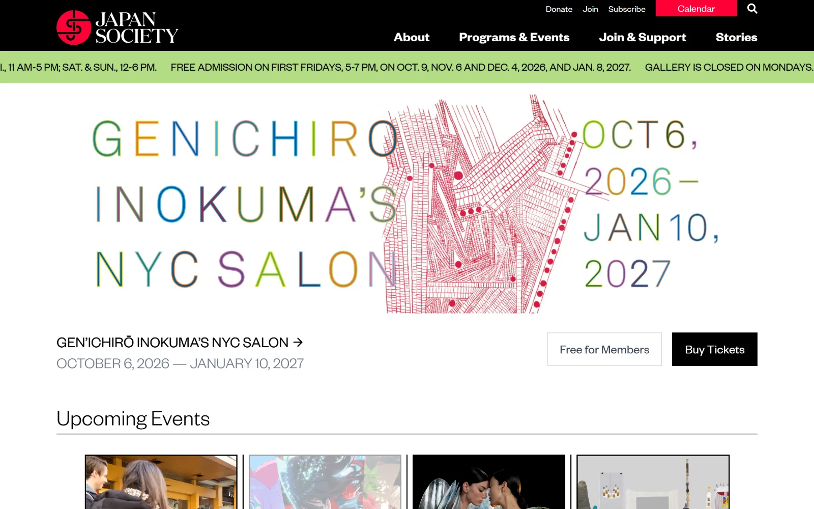
An exhibition poster of multicoloured letterforms and a dense red line drawing fills the hero, under a black header and a green information ticker.
Type
Founders Grotesk Light, 40px
Body
Founders Grotesk Regular, 23px
Build
Black header over a full-width ticker, centred container for the poster and booking row
Made on
WordPress
Colour
#000000 #ffffff #b3d890
Type. Founders Grotesk runs the whole interface, from 40px light section headings down to 23px to 27px uppercase nav. The hero type is not type at all but artwork, so the only typographic decision in view is to keep the chrome quiet: dates in grey, the exhibition title in tracked uppercase, nothing raising its voice.
Colour. Black header, white page, and a pale green #b3d890 announcement ticker that reads as a gallery label rather than a warning. The only saturated colour in the chrome is #ff0036 on the Calendar button. The poster supplies everything else, and the page does not try to match it.
Layout. A 100px black header, then a full-width green ticker running opening hours in one unbroken line clipped at both edges. The exhibition artwork sits in a centred container below with white around it. Title left, two square buttons right, Buy Tickets filled black and Free for Members outlined, both at zero radius.
The ask. Donate, Join and Subscribe are small text links in the black utility strip, visually below Calendar, which takes the red fill. Buy Tickets is the one filled black button in the body. Giving is deliberately quieter than visiting, a ranking the colour weight makes obvious.
Letting a commissioned poster be the hero instead of a photograph means the homepage changes register whenever the programme does.
08
earthjustice.org
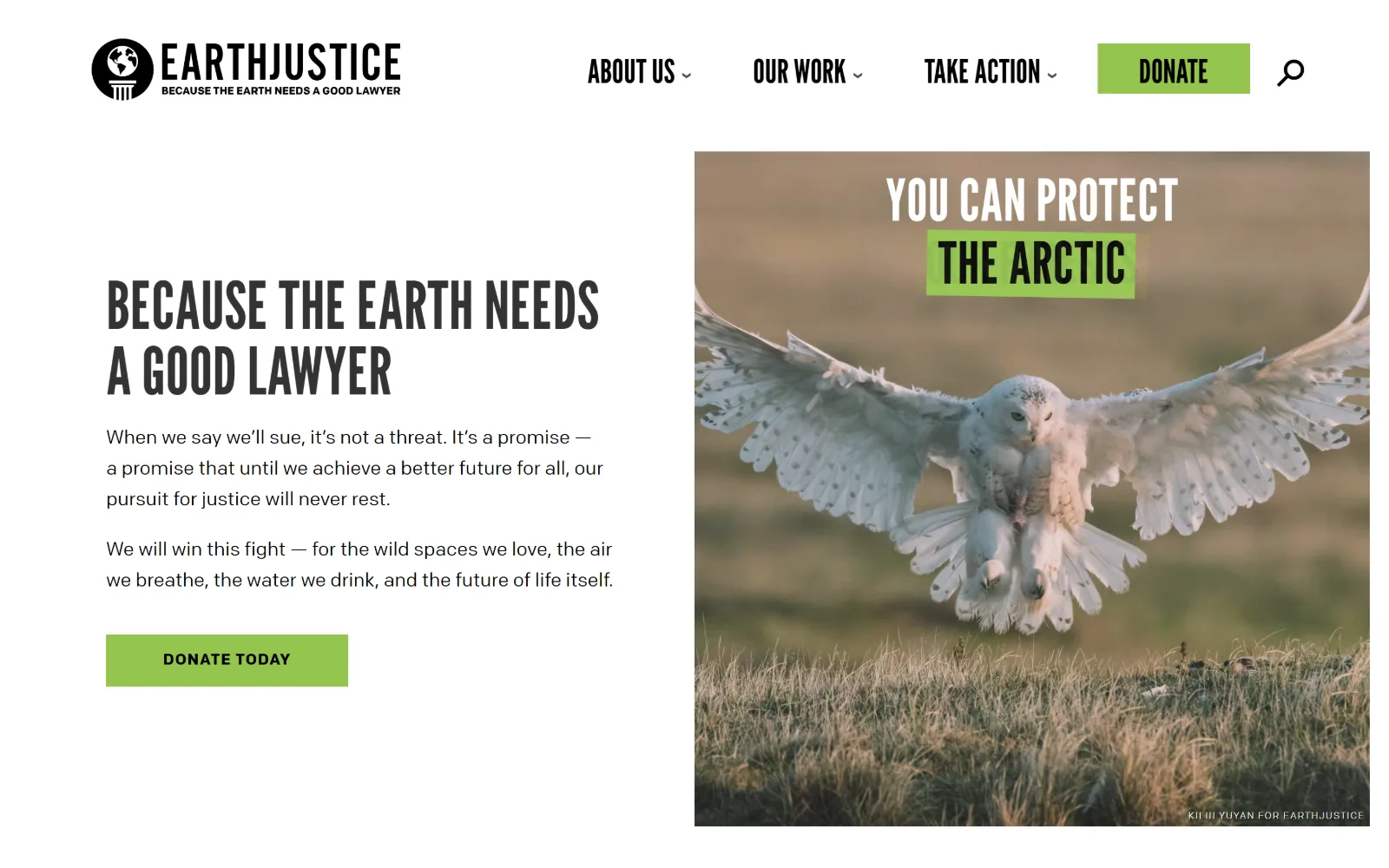
Condensed black headline type and two paragraphs sit left of a square photograph of a snowy owl landing over open grass.
Type
League Gothic Regular, 68px, uppercase
Body
ColfaxWeb Regular, 20px
Build
50/50 split with a square edge-flush photograph, 160px static header
Made on
WordPress
Colour
#ffffff #333333 #94c54d
Type. League Gothic at 68px uppercase sets the tagline in two tight lines, a very narrow condensed face that lets a long sentence run large without wrapping badly. The nav uses the same face at 34px, which makes the menu read as headline rather than interface. Body is ColfaxWeb at 20px and buttons 16px uppercase at 0.063em.
Colour. White page, #333333 headline, black body text, and a single green #94c54d doing all the pointing: the header Donate fill, the Donate Today fill, and the highlighter block behind THE ARCTIC inside the photograph. One accent, three appearances, every one of them a call to act.
Layout. A two-column split at roughly 50/50, the text column left at a 120px gutter and a square photograph flush to the right edge. The header is about 160px tall and does not stick. Buttons are square at zero radius. The photo carries its own baked-in headline and a credit line in the bottom corner.
The ask. Donate appears twice above the fold, once in the header as a green block beside the nav and once as Donate Today under the body copy, both in the same green. Take Action is a nav dropdown. There is no ticket, no event and no newsletter, so the page asks for one thing in two places.
Reusing a single accent for the button and for a highlight inside the photograph ties the image to the ask without adding a caption.
09
psarts.org
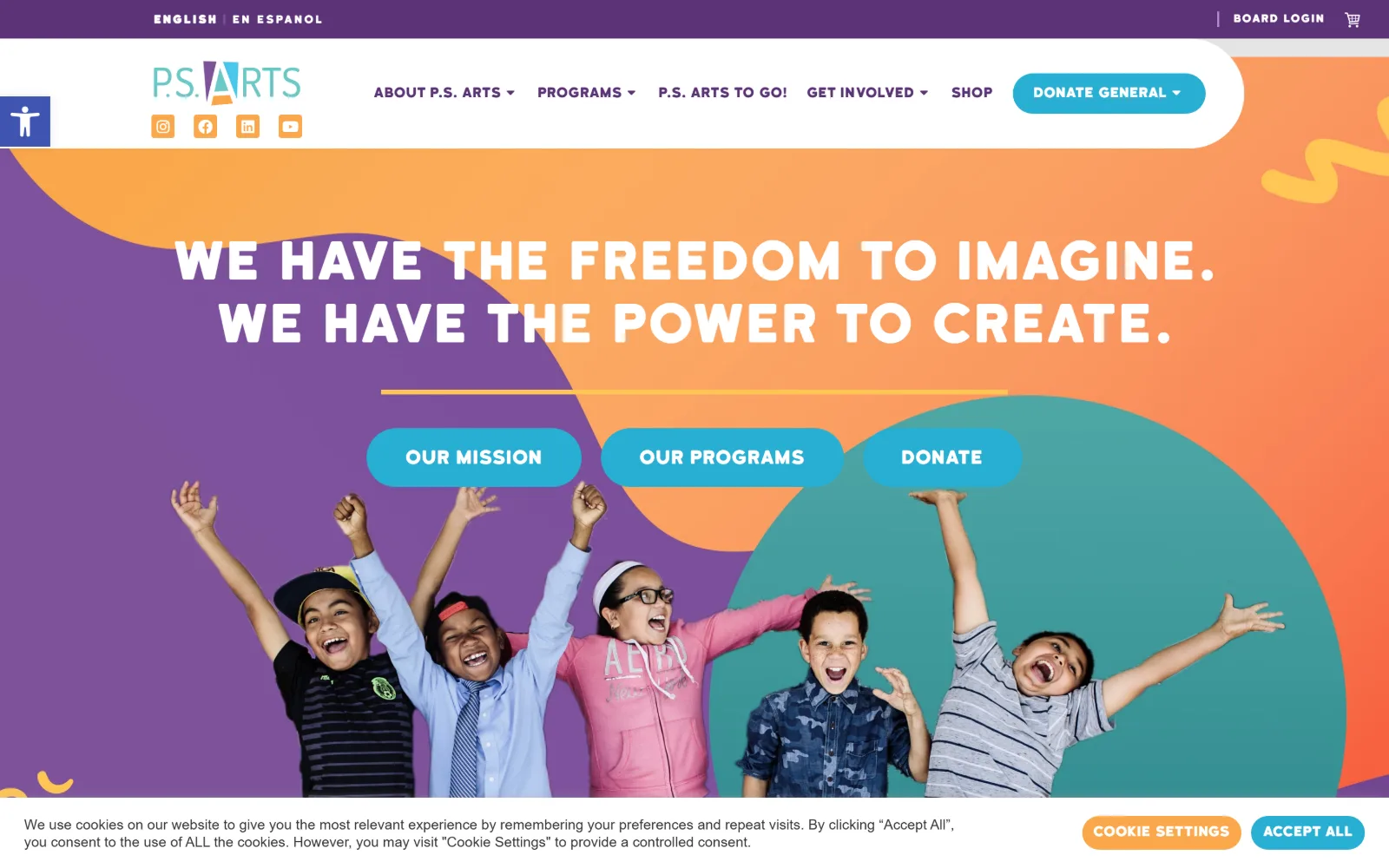
Purple, orange and teal organic shapes sit behind a white all-caps headline and three rounded blue buttons, above five cheering children.
Type
Katahdin Regular, 54px
Body
Montserrat Regular, 16px
Build
Full-bleed illustrated field with a floating rounded white header panel
Made on
WordPress
Colour
#5c3377 #7e529a #28aed2
Type. Katahdin at 54px sets the two-line headline in white caps with wide word spacing, a rounded humanist face that answers the blob shapes behind it. Buttons use the same family at 19px. Montserrat handles body copy at 16px and the nav row, so the display face stays reserved for the one thing that shouts.
Colour. Four colours and no neutral ground: purple #5c3377 in the utility bar and #7e529a in the blob, orange near #fb9e63, a teal circle, and cyan #28aed2 on the buttons. White type sits on all of it. Cyan is the only one used for controls, which is the single piece of discipline holding the palette together.
Layout. The header floats as a white panel with a large bottom-left corner radius so the coloured field runs behind and around it. The hero is full bleed with no container, and the children are cut out and placed along the bottom edge rather than photographed in a frame. Buttons are fully rounded pills at 40px radius.
The ask. Three pills sit side by side at equal weight: Our Mission, Our Programs and Donate. Donate is third and identical to the other two, while the header carries a separate Donate General dropdown. The page asks twice but never raises its voice, and ties the hero ask to reading about the work first.
Cutting figures out of their backgrounds lets photography sit inside a flat illustrated system instead of fighting it for depth.
10
perotmuseum.org
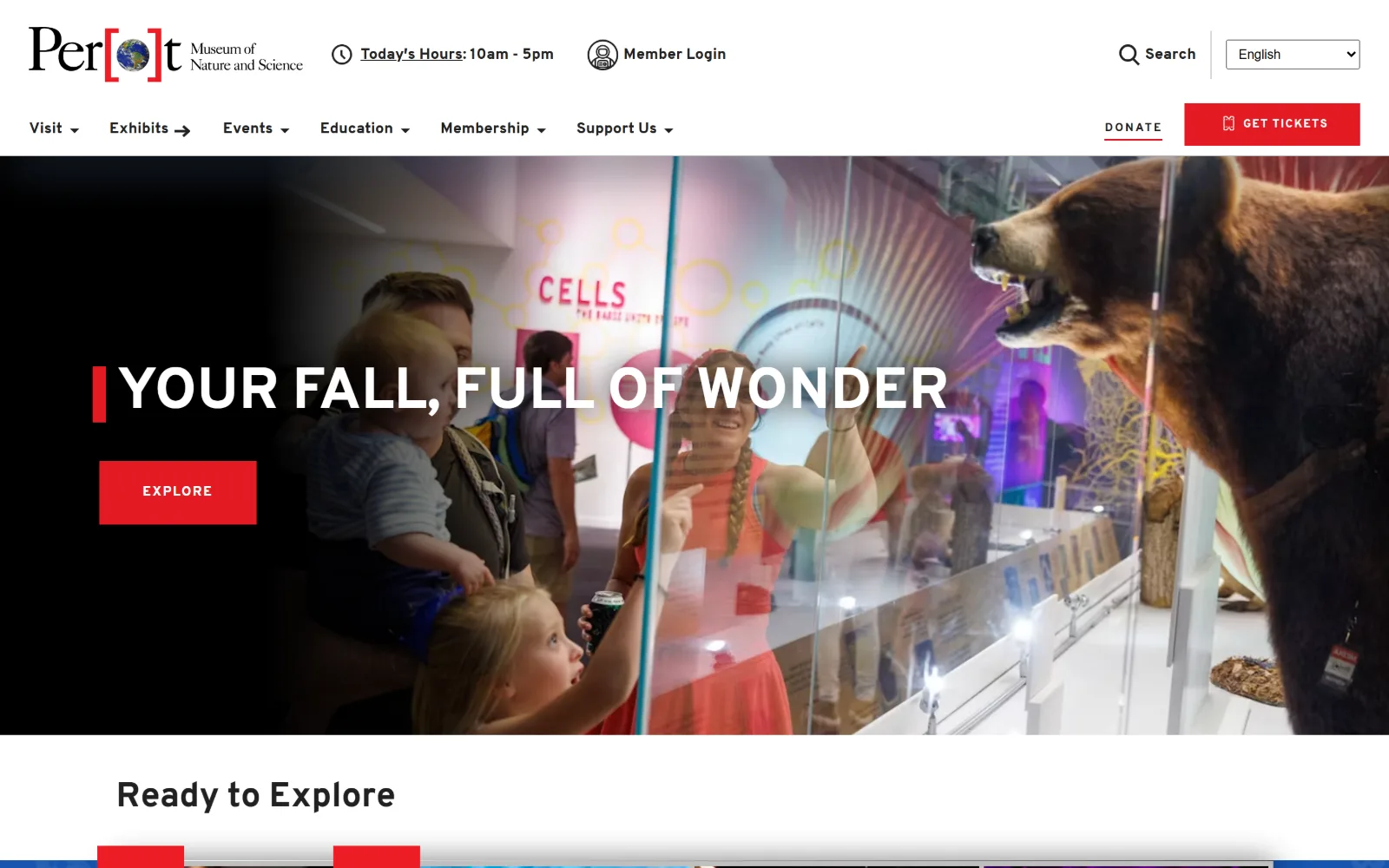
White compressed capitals reading Your Fall, Full of Wonder sit over a dim photograph of visitors at a gallery case beside a mounted bear.
Type
interstate-compressed Bold, 60px, uppercase
Body
interstate Regular, 14px
Build
Two-row 185px header over a 665px full-bleed darkened photograph
Made on
WordPress
Colour
#ffffff #000000 #e31b23
Type. interstate-compressed Bold at 60px uppercase with -0.011em tracking sets the hero line, a signage face used at signage proportions. Section headings switch to regular-width interstate at 36px, and the small uppercase labels run 14px at 0.071em. Compressed for display, normal for everything else, one family throughout.
Colour. White, black and a single red #e31b23. That red carries the Get Tickets button, the short rule before the headline, the Donate underline and the bracket inside the logo. The photograph is darkened heavily so white type survives on it, which keeps the red as the only chromatic event in the frame.
Layout. A two-row white header about 185px deep, utility items above and primary nav below. The hero photograph is full bleed and roughly 665px tall, with the headline on a left baseline and a short red rule standing in for a drop cap. Buttons are square at zero radius throughout the page.
The ask. Get Tickets is a red filled button at the top right; Donate sits immediately left of it as underlined text only, no fill and no box. That difference states the priority plainly: admission pays the bills, and the donation link is kept available rather than pushed.
Putting Donate next to a filled ticket button as plain underlined text is an honest ranking, and it stops two asks cancelling each other out.
11
vlt.org
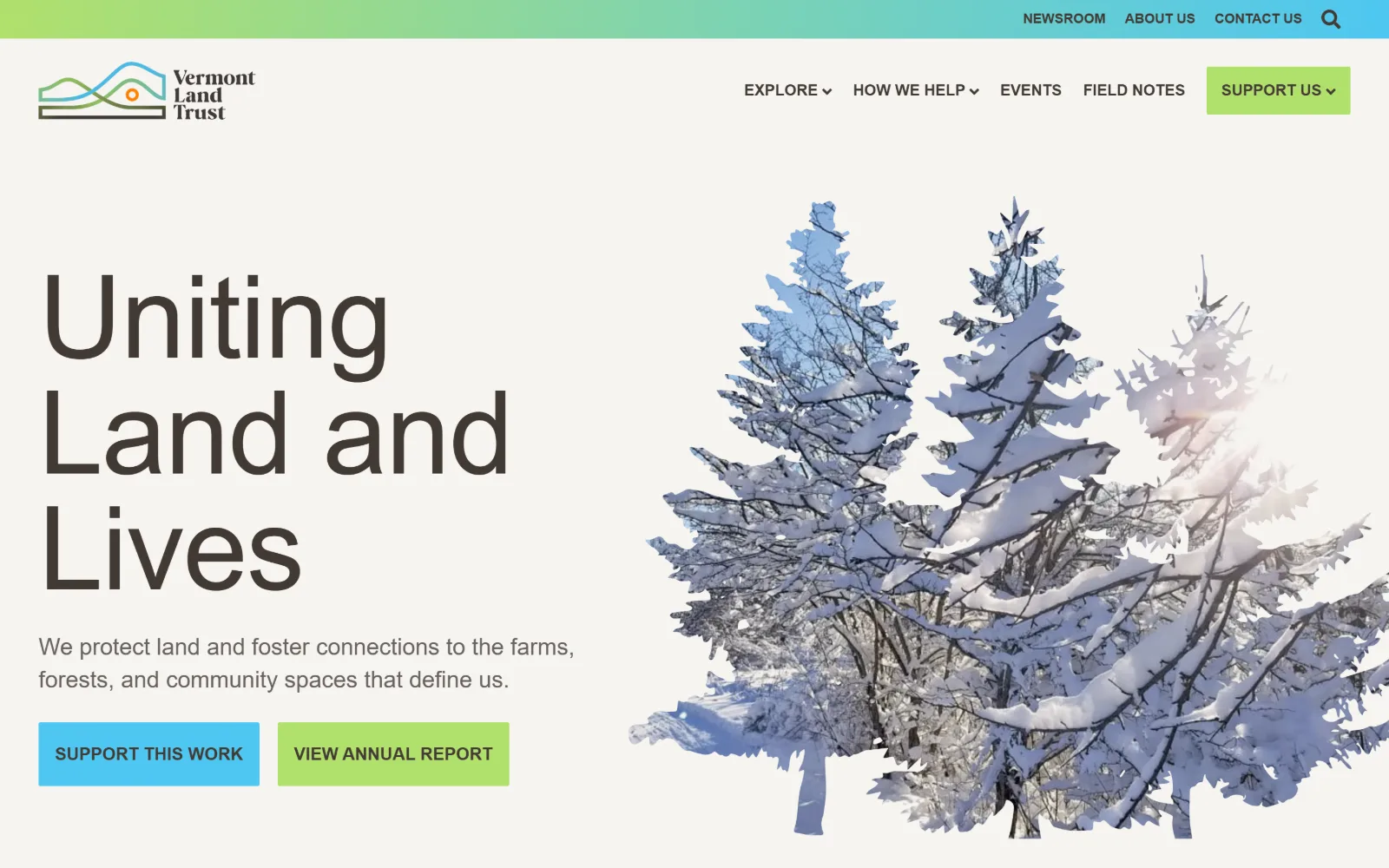
Uniting Land and Lives runs in very large light grey type on cream, beside a cut-out photograph of snow-laden conifers.
Type
Source Sans Pro Light, 120px
Body
Source Sans Pro Regular, 24px
Build
45/55 split of oversized type and a background-free cut-out photograph
Made on
WordPress
Colour
#f6f4f0 #423a34 #4ec7f2
Type. Source Sans Pro Light at 120px over three lines, tracked to -0.009em, is the whole idea: a workhorse interface sans used at poster size, where its low contrast reads as calm rather than cheap. Body drops to 24px regular in a warm grey #68615d, and buttons are 18px bold uppercase.
Colour. A warm cream #f6f4f0 ground with brown-grey #423a34 type. Two accents split the two buttons, cyan #4ec7f2 and lime #b0e16c, with the lime repeated on Support Us in the header and a cyan-to-green gradient in the utility strip above. Nothing in the palette is red and nothing is urgent.
Layout. Flat colour, with no hero image behind the type. The split runs about 45/55, text left at a 48px gutter and the photograph right as a cut-out with no frame and no background, bleeding off the right edge. The header is roughly 160px; buttons are nearly square at 2px radius.
The ask. Support Us is a lime block in the header and Support This Work is a cyan block in the hero, so the ask appears twice in different colours and neither reads as the system's alert state. View Annual Report sits beside it at equal size, pairing the request with the evidence for it.
Pairing the gift button with an annual report button at identical size offers proof in the same gesture as the request.
12
chrysler.org
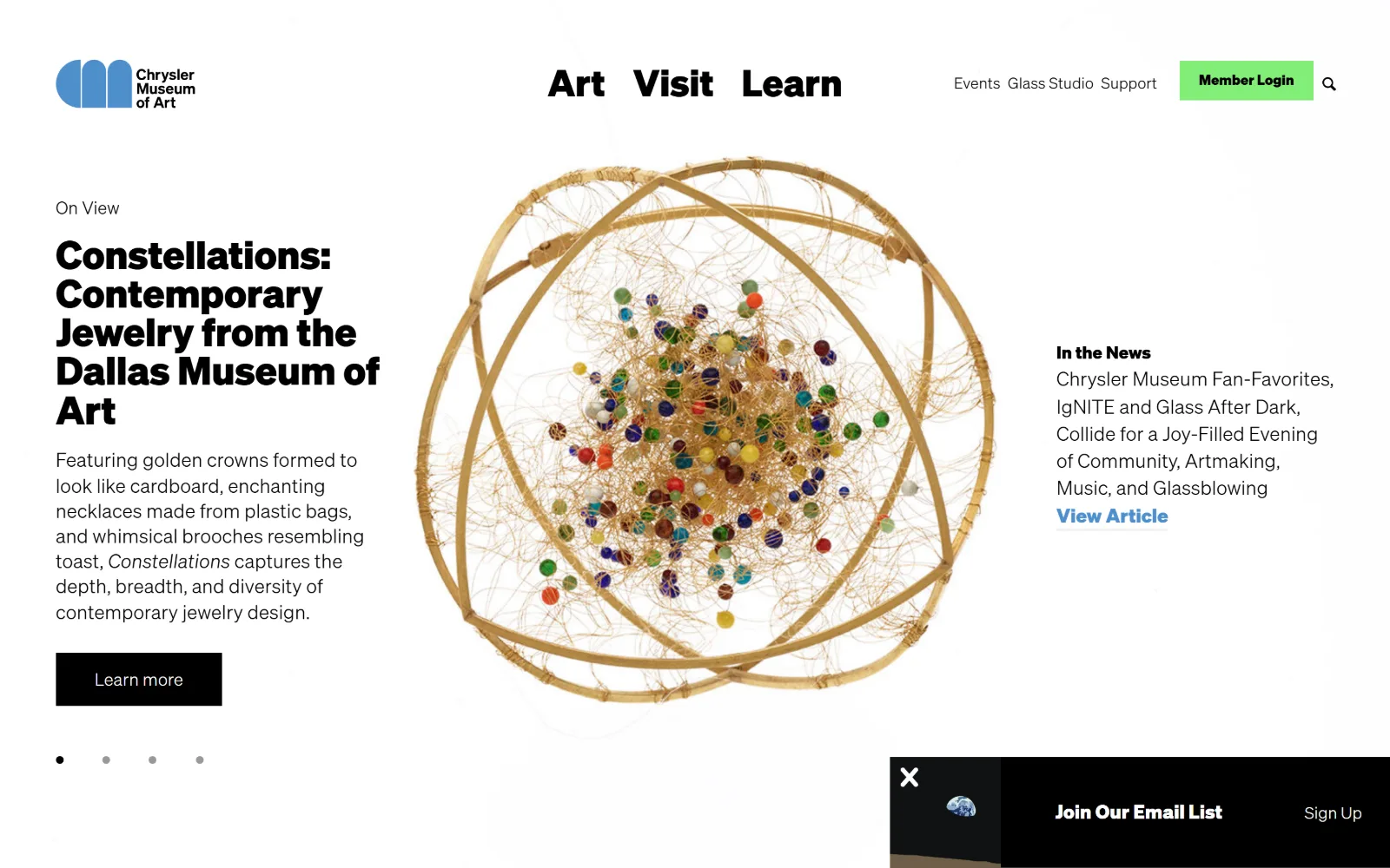
Gold wire and glass beads form a sculpture floating on white between a left column of exhibition text and a right column of news.
Type
Soehne Bold, 101px for nav and 40px for titles
Body
Soehne Light, 20px
Build
Three-column white gallery layout with a centred object and a 190px header
Made on
WordPress
Colour
#ffffff #000000 #82ee78
Type. Soehne Bold at 40px sets the exhibition title over five tight lines, while Art, Visit and Learn run at 101px in the same weight and occupy the nav slot, so the menu is the largest type in view. Secondary nav drops to a light weight at a much smaller size, and body copy is Soehne Light at 20px.
Colour. White, black, and one acid green #82ee78 on the Member Login button. A mid blue is held back for the View Article link. That is the entire interface palette; the object's own golds and coloured beads supply every other colour in the frame.
Layout. Three columns on white with no coloured panels at all: a text column of roughly 400px at the left, the object centred at about 700px wide, and a news column right. The header is around 190px with no rule beneath it. Carousel dots sit under the left column and the Learn more button is a black square block.
The ask. Member Login is the only filled button in the header, which is a retention ask rather than an acquisition one. Support is a plain nav item in the small right-hand group and the hero's own button is Learn more. A free museum selling membership rather than admission, and the colour weight says so.
Scaling three nav words to headline size makes the menu the page's display typography, which removes the need for a separate hero line.
13
metmuseum.org
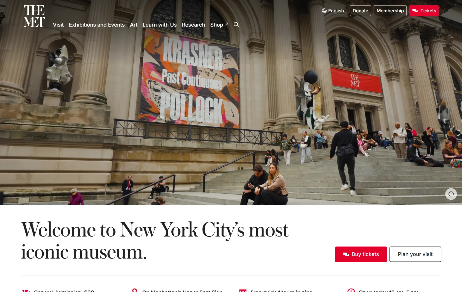
Stone steps under a Krasner and Pollock banner fill the upper half of the frame, with a serif welcome line and two buttons set below.
Type
Austin Regular, 68px
Body
Inter Regular, 16px
Build
700px full-bleed photograph with overlaid nav, white content band beneath
Made on
Not detected
Colour
#ffffff #222222 #e4002b
Type. Austin at 68px with -0.01em tracking sets the welcome line, a high-contrast English serif that does the institutional voice in one gesture. Everything functional is Inter: 16px nav and buttons, 20px and 31px for subheads. The serif never appears in the interface and the sans never appears in the headline.
Colour. White page, #222222 type, and the house red #e4002b on the Tickets button and the small icons in the fact strip below. Donate and Membership are outlined in grey rather than filled. One red, used sparingly, against a photograph supplying warm stone and pale sky.
Layout. The photograph is a full-bleed band roughly 700px tall with the nav overlaid on it, logo and menu at the top left and utility buttons at the top right. Below it a white section holds the headline left and two buttons right on the same baseline, then a four-column fact row. Button radius is 4px.
The ask. Three asks sit in the header: Donate outlined, Membership outlined, Tickets filled red. Only one is filled and it is the transactional one. Buy tickets repeats below the headline next to an outlined Plan your visit, so the paid path and the free path are offered side by side.
Outlining two asks and filling only the third ranks them without hiding any, which is what a header with three competing jobs needs.
14
charitywater.org
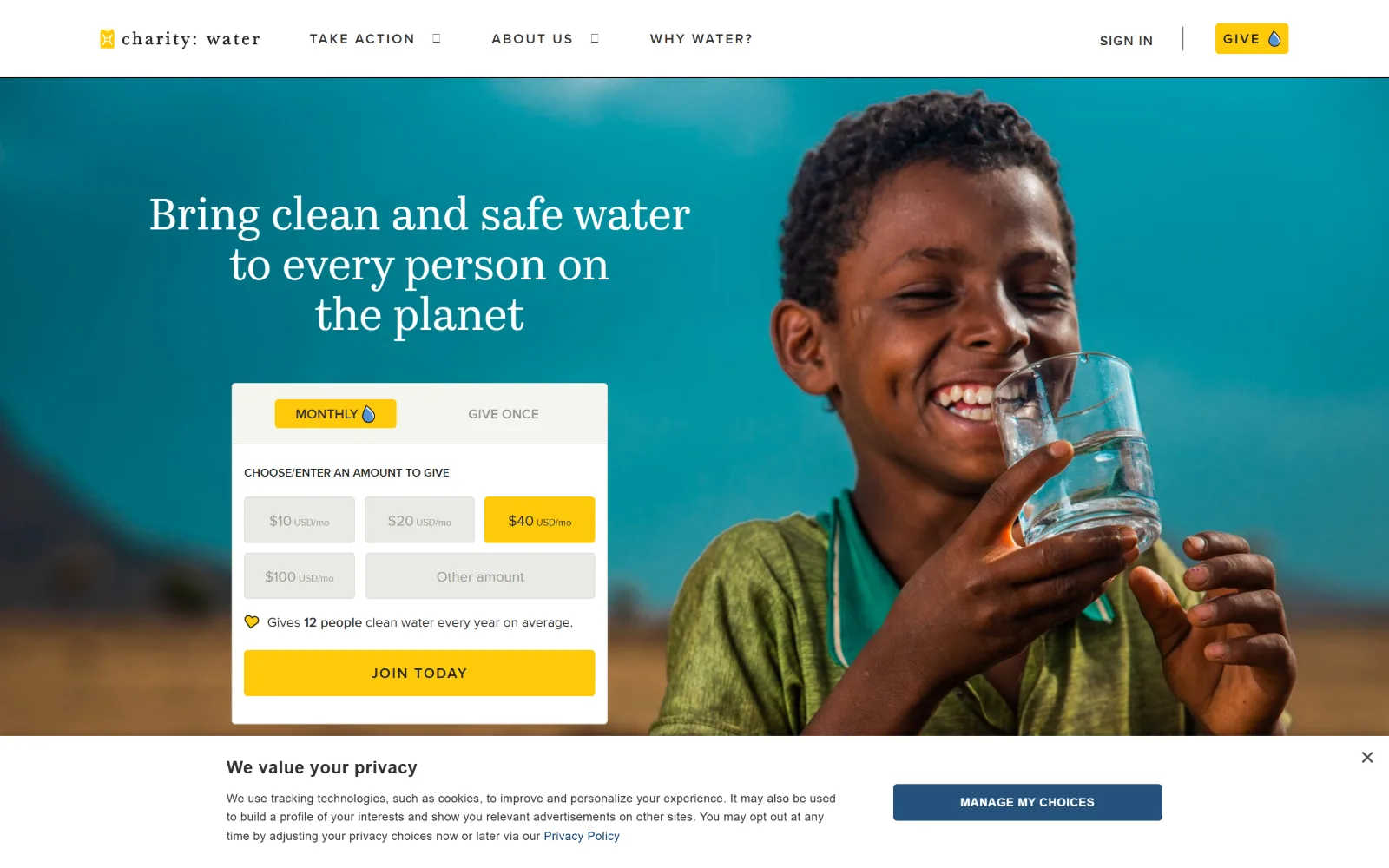
Monthly amount options inside a donation card sit in the hero, over a photograph of a boy drinking from a glass of water.
Type
Kazimir Text Regular, 46px
Body
Proxima Nova Regular, 14px
Build
Full-bleed photograph with a 435px donation card pinned to the left third
Made on
Not detected
Colour
#ffc507 #e9eae4 #ffffff
Type. Kazimir Text at 46px, a serif with sharp wedge terminals, sets the mission line centred over three lines. Everything else is Proxima Nova: 16px uppercase nav at 0.09em, 15px lowercase buttons, 12px uppercase labels at 0.143em. The wide tracking on those small caps is what makes the chrome read as considered.
Colour. A warm yellow #ffc507 is the single accent and it appears three times in the hero, on the Give button, on the selected monthly tier and on Join Today. The card itself is off-white #e9eae4 over white. The photograph brings the teal and ochre. No red anywhere and no second accent.
Layout. A 90px white header over a full-bleed photograph. The donation card is a white panel roughly 435px wide pinned to the left third at 4px radius, holding a two-tab toggle, a six-cell amount grid and a full-width submit. The headline above it is centred inside that column rather than across the page.
The ask. This is the hard push, and it is worth seeing done properly. The ask is not a button but a complete monthly giving form in the hero, with a tier preselected and an impact line under it. Give sits in the header too. Nothing competes: the nav is four items with no ticket or event.
Putting the whole giving form in the hero removes a click, but only works because every other ask has been stripped off the page.
15
americanrivers.org
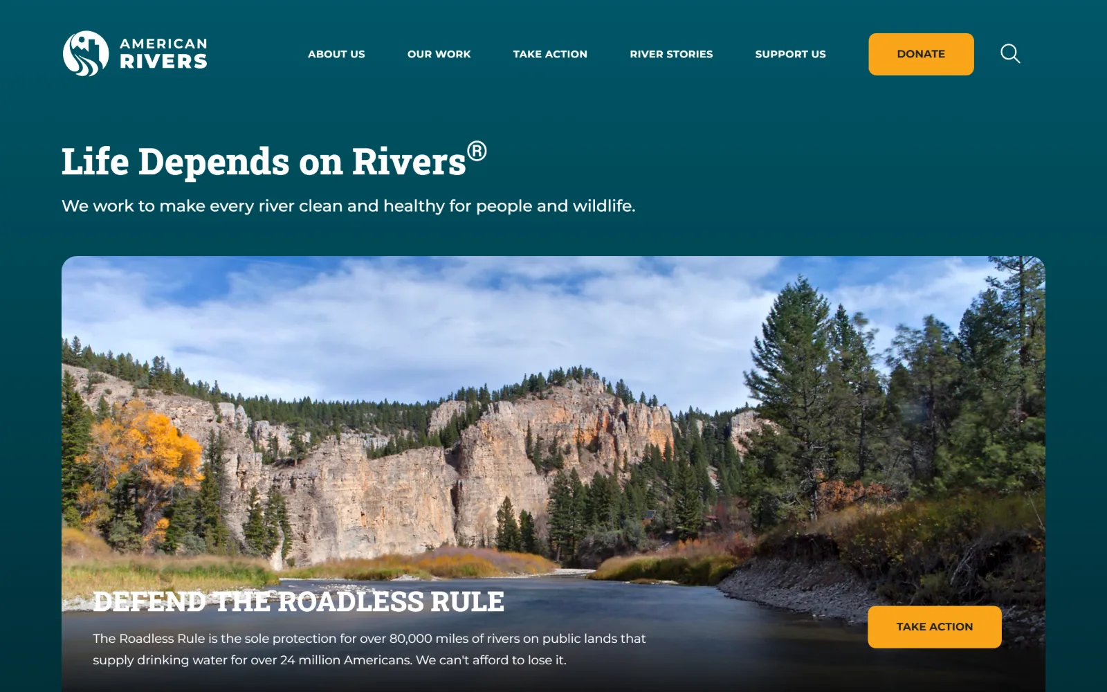
Deep teal covers the upper page behind a slab-serif headline and strapline, above a rounded photograph of a river below limestone cliffs.
Type
RobotoSlab ExtraBold, 48px
Body
Montserrat Regular, 16px
Build
Sticky 155px header over a teal field with an inset 1420px photograph
Made on
WordPress
Colour
#004f5d #f9a51a #ffffff
Type. RobotoSlab ExtraBold at 48px sets the headline, a slab heavy enough to hold its own on a dark ground. Montserrat handles everything else: a 21px standfirst, 16px body and 13px nav in bold uppercase tracked to 0.03em. A 36px uppercase slab reappears over the photograph for the campaign line.
Colour. One deep teal #004f5d covers the whole upper page as a soft gradient with white type on it. Orange #f9a51a is the only accent, used on the header Donate and on the Take Action button. Two colours in the chrome in total, which is why the orange reads as loud without being large.
Layout. The header is a 155px band that sticks on scroll, with a 10px radius on the Donate button. Below it the headline sits at a 90px gutter, then a photograph inset to roughly 1420px wide with a small top radius, and the campaign headline and a floating orange button sit inside its lower edge.
The ask. Donate is an orange block in the header and Take Action is the same orange on the photograph. The two asks share a colour and nearly a size, so the page does not separate giving from doing. The header Donate wins only on position, sitting above a fold given over to one campaign.
Insetting the hero photograph instead of bleeding it keeps the brand colour visible as a field, so the page still reads as the organisation's.
How these were chosen
The sector's worst habit in nonprofit website design is the guilt photograph paired with a red Donate button, a pairing that treats the reader as a wallet and the beneficiary as evidence. The fifteen homepages below mostly refuse it. What they share is that the subject of the hero is the organisation's own work: an exhibition, a legal argument, a river, a question about carbon. The ask is still present, but it is sized honestly, usually one filled control in the header with nothing else competing. Where the push is harder, as with a full giving form sitting in the hero, the page commits to it rather than hedging. Chosen for spread across museums, conservation groups, education charities and foundations, and ranked by how much there is to look at.
Finding nonprofit sites that someone had actually designed took far longer than it should have. 30 candidates made the shortlist. 15 made the page.
Each one was opened and looked at properly: what the type is doing, where the colour gets spent, how the page is built, how it asks for the job. Nothing is here because it ranks. Nothing is here because an agency filed it under portfolio. Several well known names were left out for the plain reason that their site came out of the same template as everyone else's, and a few sites worth including did not survive a second look.
Where a site is only competent, it says so. The order is the order worth your time, best first.
Reviewed and selected by Larry W. Matthews for Websitely.