A Closer Look at Medical Website Design: 12 Practices
Twelve US practices that have actually been designed, and a good share are dental, which is where the bravest medical website design is happening now.
Shown
12 sites
Reviewed
28 candidates
Chosen on
The work, not the ranking
Updated
15 October 2026
01
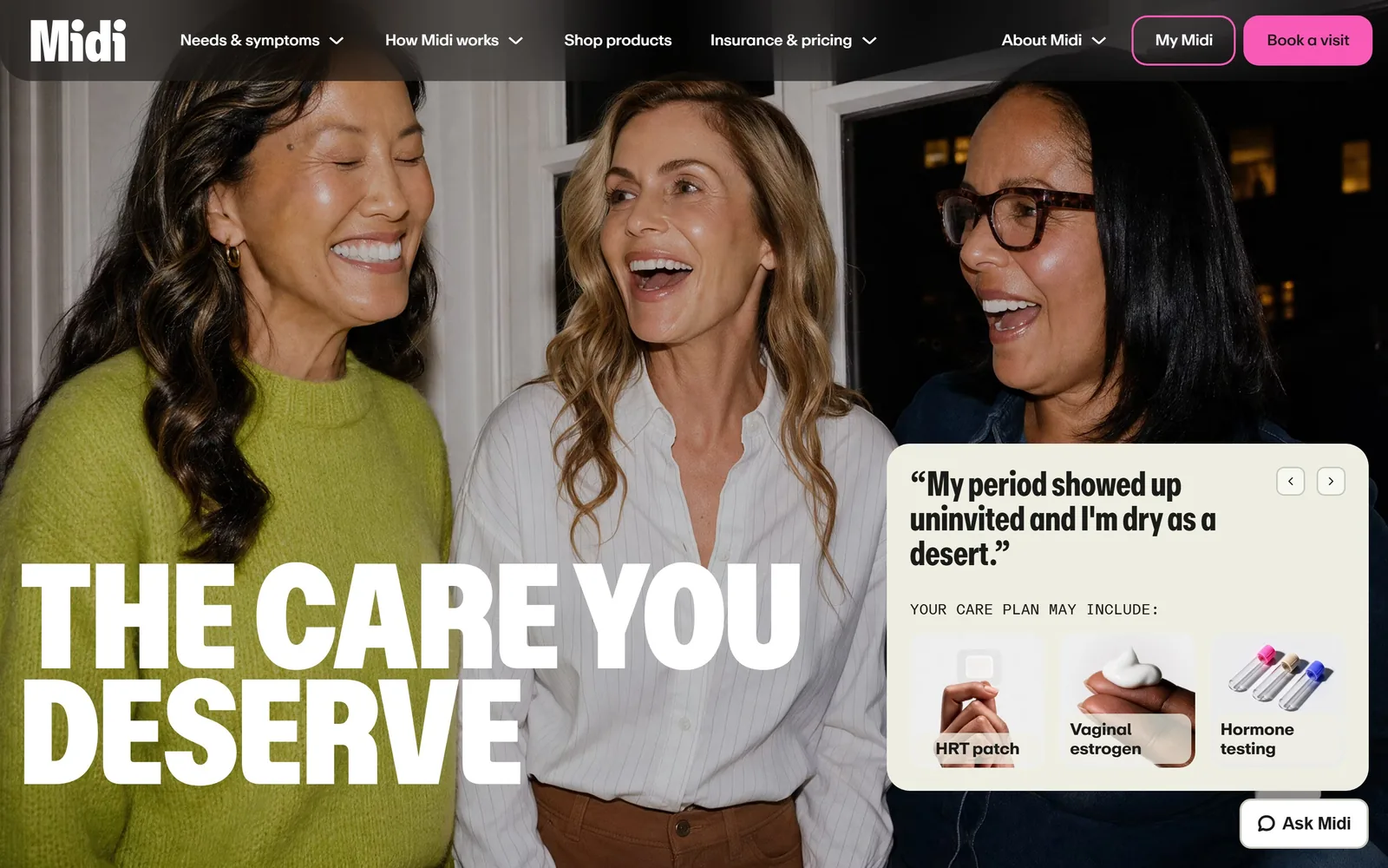
joinmidi.com
Two lines of enormous condensed capitals sit along the bottom edge of three women caught mid-laugh.
Type
midiRepro Condensed 154px, weight 900
Body
abcRepro 36px
Build
full-bleed photograph, headline on the bottom edge, floating card right
Colour
#ffffff #1b1b19 #f95ab7
Type. THE CARE YOU DESERVE runs about 154px in a heavy condensed grotesque, tracked in a touch and leaded so tight the two lines nearly collide. It is the loudest type in this collection and it works because it is the only loud thing on the screen. Supporting copy sits at 36px, which most sites would consider a headline. Midi treats it as body text and never drops to a timid 16px.
Colour. White and near-black do everything. The hot pink at #f95ab7 shows up once, on Book a visit, and nowhere else in the frame. That single restraint is what makes the button impossible to miss. A bone panel at #eeeee3 lifts the testimonial card off the photograph without introducing a fourth colour.
Layout. The photograph is uncropped and full width, three women caught mid-laugh. Rather than centring the headline over their faces, Midi runs it along the bottom edge where the image is darkest. On the right a bone card carries a patient quote and three small product tiles, so the hero doubles as an explanation of what a visit actually includes.
The ask. There is no form and no promise of a free consultation. Just a pink button and a card showing HRT patches, vaginal estrogen and hormone testing, which tells a nervous visitor what they are signing up for before they commit. The quote carousel is the persuasion. The button is almost an afterthought, which is the right order.
A practice with one genuinely good photograph should crop the type around the subject instead of laying a box over it.
02
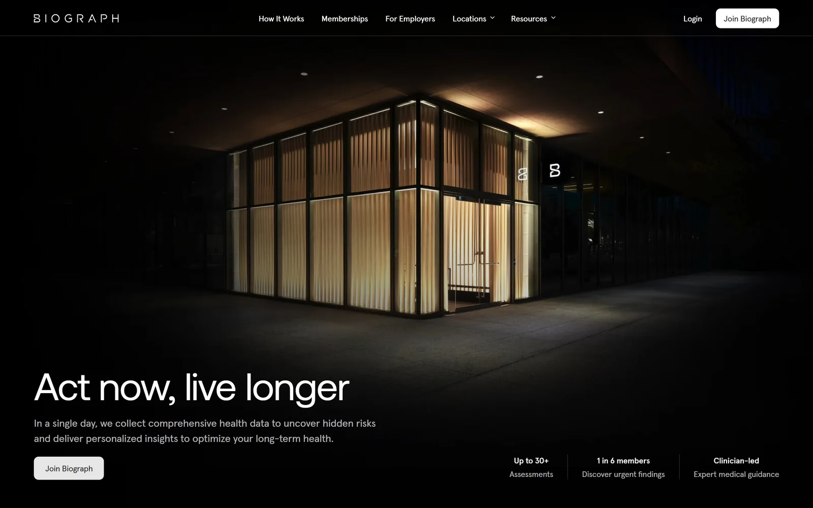
biograph.com
The clinic photographed at night, a lit glass pavilion behind wood slats, with the headline dropped low in white.
Type
Aeonik Regular 68px, weight 400
Body
Apercu Pro 18px
Build
full-bleed night photograph, type low left, proof row bottom right
Made on
Framer
Colour
#0c0c0e #ffffff #c99a5b
Type. Act now, live longer sits at roughly 68px in Aeonik, kept at regular weight and pulled tight to -0.02em with the leading closed to 0.95. Choosing regular over bold at that size is the whole decision. It reads as composed rather than as an advert. Apercu Pro at 18px handles everything else and never raises its voice.
Colour. The frame is almost entirely dark. Warm interior light coming through the timber slats supplies the only colour, a soft amber against near-black, and no brand colour is imposed on top of it. Further down the page opens out to white, but the first thing you see is a building at night.
Layout. Biograph leads with architecture instead of a patient. The glass pavilion fills the frame and the text column is held narrow, well under a third of the width, so the photograph keeps its scale. Three proof points run along the bottom right at 14px, up to 30+ assessments, 1 in 6 members find something urgent, clinician-led, each deliberately too quiet to compete.
The ask. One button, Join Biograph, in a pale pill at the foot of the copy. No pricing, no form, no urgency device. For a service this expensive the page is betting that the room and the statistics do the selling, and it is a reasonable bet.
Photographing the room instead of the patient gives a practice something no competitor can copy.
03
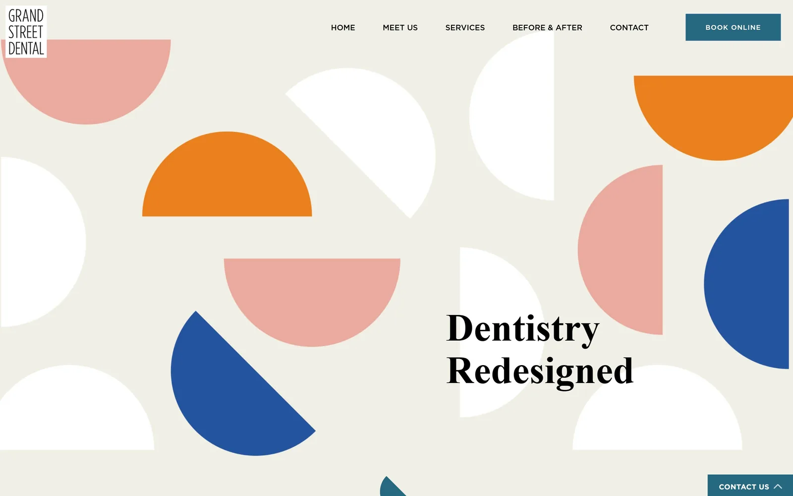
grandstreetdental.com
Big flat half-circles in orange, pink and cobalt scatter across a bone field with two words of serif dropped in.
Type
Superior Title 70px, weight 600
Body
Gotham 14px, weight 300
Build
flat graphic field, headline low right
Made on
WordPress
Colour
#ebe9e1 #e8731c #1e4b9c
Type. Two words, set at about 70px in Superior Title, dropped into a gap between the shapes. That is the entire first screen. The confidence is in the word count rather than the size. Everything functional retreats to Gotham, nav at 18px in a soft grey, body at 14px in a light weight with the leading opened right out.
Colour. Burnt orange, dusty pink and cobalt half-discs scatter across a bone ground at roughly #ebe9e1. It should not work for a dentist and it does, because the shapes are flat, evenly weighted and never arranged into anything resembling a tooth. The teal Book Online block at #266880 is the only hard rectangle on the screen, which is how you find it.
Layout. No photography at all, which is close to unheard of in dentistry. Half-circles sit at varying sizes with real space between them, and the headline is placed low and right rather than centred, so the composition stays off-balance in a controlled way. The logo sits in a small white box top left like a stamp.
The ask. A single teal Book Online button in the corner and nothing else. No phone number, no reviews, no insurance logos above the fold. It is the boldest conversion decision in the set and the one most practices would not get past their own board.
Pattern and colour will carry a small practice further than another photograph of a reception desk.
04
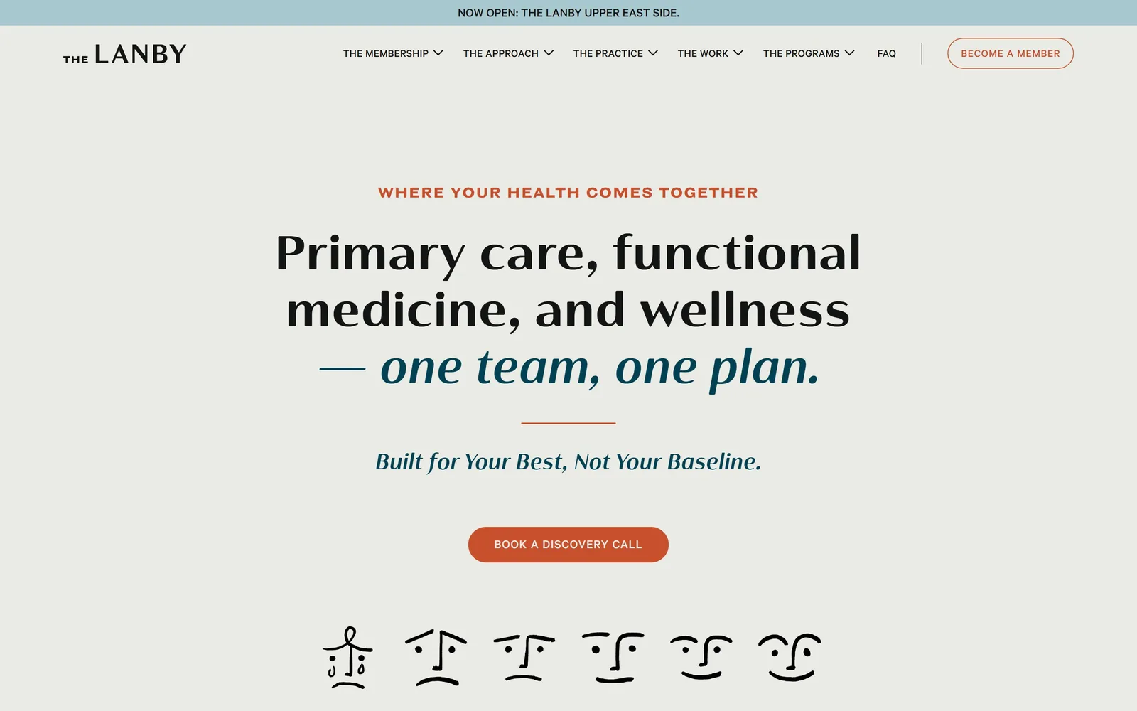
thelanby.com
A centred headline breaks into teal italic on its third line, over cream, with a row of drawn faces beneath.
Type
Cabrito Contrast 60px, weight 900
Body
Calibre 18px
Build
centred single column, drawn portrait row beneath
Made on
Webflow
Colour
#ebebe6 #c8502d #004253
Type. Cabrito Contrast at around 60px in its heaviest weight, tracked out slightly, then the last line switches to italic in deep teal. One team, one plan stops being headline and becomes something a doctor said to you. Above it a terracotta eyebrow runs small and letterspaced in a display grotesque. Three typographic registers, all pulling in the same direction.
Colour. Cream at #ebebe6 carries the page and terracotta at #c8502d does the pointing, on the eyebrow, the rule and the button. Teal at #004253 appears only inside the italic line. A pale blue strip across the very top announces the new location and is the only cool note on the screen.
Layout. Everything is centred on one axis with no photograph in sight. Beneath the headline sits a row of faces drawn in a few pen strokes, which is where the staff headshot grid would normally go. They are charming and they cost almost nothing, and they do more for the practice's character than a photoshoot would.
The ask. Book a Discovery Call, in a terracotta pill, uppercase and letterspaced. The word discovery is doing careful work, promising a conversation rather than an appointment, which suits a membership that needs to be explained before it is bought.
Commissioning simple drawings rather than buying stock portraits is the cheapest way to stop looking like every other practice.
05
deschamps-braly.com
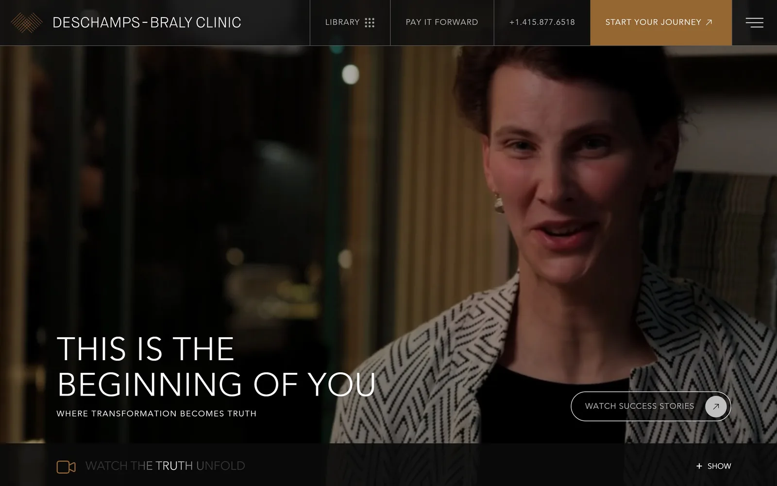
A dark video frame of a patient talking, with uppercase white type set low and a single gold nav block.
Type
Avenir Light 60px, uppercase
Body
Avenir Light 18px
Build
full-bleed video, type low left, compartmented nav
Made on
WordPress
Colour
#111111 #956532 #c0c0c0
Type. THIS IS THE BEGINNING OF YOU runs about 60px in Avenir at light weight, uppercase and tracked open. A light weight at display size is a risk and it pays off here, reading as calm rather than shouted. The strapline beneath drops to 18px with wider tracking still. The gap between the two sizes is large enough that no rule or colour change is needed to separate them.
Colour. The page holds at #111111 and the video supplies everything else. Gold at #956532 is used exactly once, filling the Start Your Journey cell in the navigation. Body copy sits in a soft grey at #c0c0c0 against white headlines, so the hierarchy survives on a dark ground without resorting to a second accent.
Layout. The navigation is divided into vertical ruled compartments like a newspaper masthead, which is an unusual choice and gives the top of the page real structure. Below it the video runs full bleed, a patient mid-sentence rather than a before and after. Every corner on the page is square.
The ask. Watch Success Stories sits as an outlined pill at the lower right, and a Watch The Truth Unfold bar runs along the bottom edge. The page is selling a documentary, not a consultation. For facial surgery, where the decision takes months, leading with other people's stories is the correct read.
One accent colour used on exactly one element will always outperform a palette spread evenly across a page.
06
asktia.com
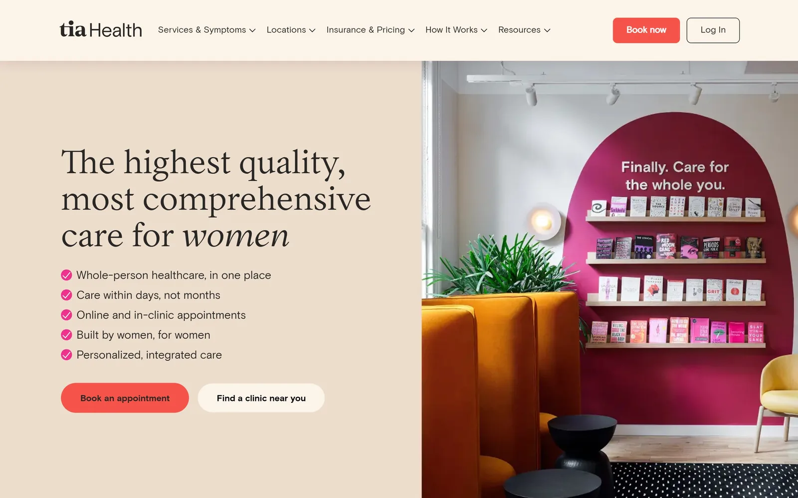
Blush left half carries a serif headline ending in italic, with a magenta clinic interior photographed on the right.
Type
Inferi 60px serif
Body
Basis Grotesque 20px
Build
half and half split, type left, clinic photograph right
Colour
#fcf4e9 #f6544a #ef308d
Type. A high-contrast serif at about 60px carries the headline, and only the final word, women, turns italic. That lands as emphasis rather than ornament. Beneath it five benefit lines in Basis Grotesque at 20px, each short enough to read in one pass. The serif and the grotesque are doing clearly separate jobs and neither strays.
Colour. Blush at #fcf4e9 carries the left half and a deeper sand sits behind it. Magenta at #ef308d appears only on the five small ticks, and the warmer red at #f6544a only on the button. Both are tiny and both are unmissable. All the real saturation comes from the photograph, which has a magenta arch and orange banquettes in it.
Layout. The frame splits cleanly down the middle, type left, clinic interior right. Photographing the waiting room rather than a patient is the smart part, because it shows a place that does not look like a doctor's office and makes the claim visually rather than in copy.
The ask. Two buttons sit side by side, a solid Book an appointment and a white Find a clinic near you. The second one matters more than it looks: it catches everyone who is interested but not yet ready, who would otherwise leave.
Letting the interior photography carry the brand colour means the page itself can stay calm.
07
findoctave.com
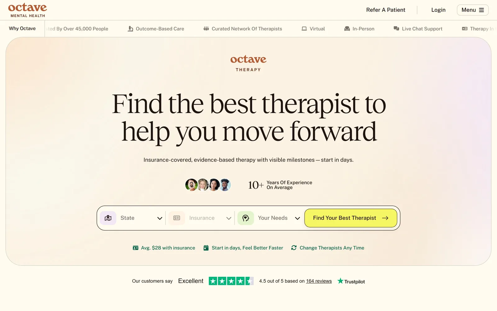
A soft pastel gradient panel holds a large serif headline above a three field therapist finder.
Type
Reckless Neue 80px, weight 300
Body
Public Sans 18px
Build
rounded gradient panel, centred, finder bar beneath
Made on
custom
Colour
#fffbef #1e130f #f6f664
Type. Reckless Neue at roughly 80px in a light weight, tracked in hard to -0.04em so the words knit together across two lines. Every character on the page is set in one ink colour, a warm near-black at #1e130f, which is a quiet discipline most sites abandon by the third section. Public Sans at 18px handles all the functional text and leaves the serif to carry the tone.
Colour. The hero is a single wide gradient drifting from peach through to lilac, contained inside one rounded panel. Around it the page holds at a warm off-white, #fffbef. An acid yellow at #f6f664 lands on the button and is the only colour in the palette that could be called loud.
Layout. Rounding the entire hero into one panel gives the page a card-like calm and stops the gradient from taking over. Four therapist faces and a 10+ years figure sit between the headline and the finder as reassurance. A thin marquee of service claims runs just under the nav.
The ask. The call is not a button but a three-field bar: state, insurance, your needs. Asking for qualification before contact filters the enquiry and sets the expectation that therapy here is matched rather than assigned. Trustpilot stars sit directly beneath, which is the right place for them.
Turning the call to action into a short qualifying form filters enquiries before a receptionist ever picks up the phone.
08
dentologie.com
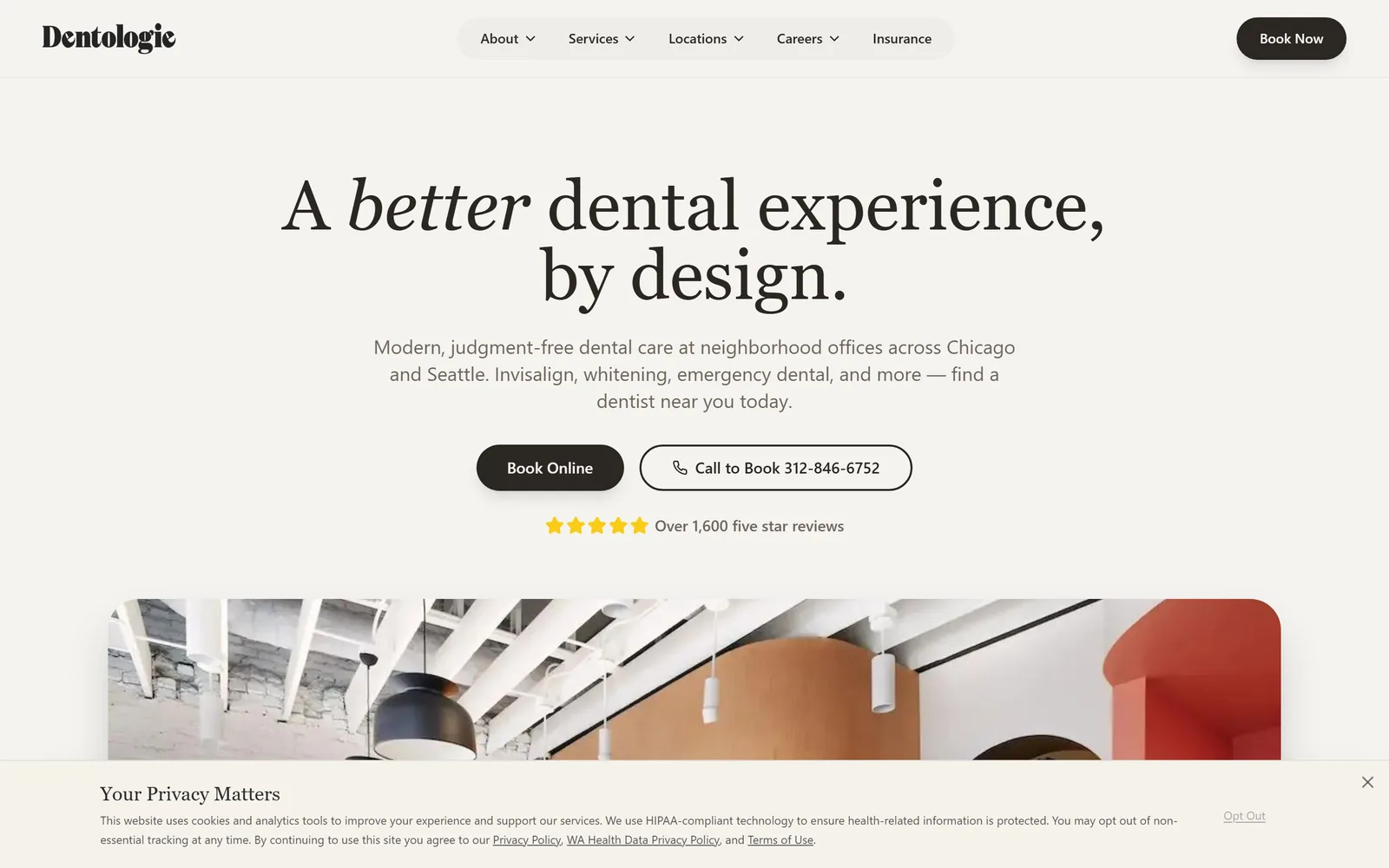
A centred Playfair headline italicises one word, over warm bone, above a rounded photograph of the office.
Type
Playfair Display 72px
Body
Inter 20px
Build
centred stack, rounded interior photograph below
Colour
#f5f3f0 #2a2622 #9ee5c8
Type. Playfair Display at around 72px with one word, better, turned italic. That is the single typographic move on the screen and the page is built around it. Inter at 20px handles the supporting line and names cities and treatments outright, Chicago and Seattle, Invisalign, whitening, emergency dental. Plain nouns beat brand language here.
Colour. Warm bone at #f5f3f0 across almost everything, with two near-neutrals carrying the small shifts between sections. A mint at #9ee5c8 appears in trace amounts. The only strong value on the screen is the near-black pill, which is why your eye goes to it.
Layout. A centred stack, tight and symmetrical, with a wide rounded photograph of the office beginning just below the fold. The interior shot is of exposed white beams and a red partition, so the architecture does the differentiating rather than a stock smile.
The ask. Two calls of equal weight, a dark Book Online and an outlined Call to Book with the number spelled out. Most practices bury the phone number. Giving it the same visual weight as the form respects the patients who will never fill one in. Five gold stars and 1,600 reviews sit directly under the buttons rather than in a trust band further down.
Offering the phone number as an equal partner to online booking respects the patients who will never use a form.
09
sollishealth.com
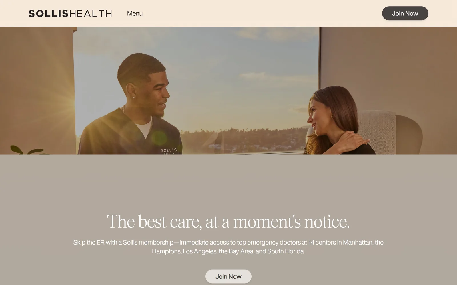
A cream nav bar, a sunlit consultation photograph, then a greige block carrying a light serif line.
Type
Items 60px serif, weight 300
Body
Helvetica Now Display 16px
Build
three stacked bands, nav, photograph, headline block
Made on
WordPress
Colour
#f7f5ef #e4e2dc #2b2823
Type. A light serif at about 60px, set in white on a greige band. Light weight at that size reads as expensive and keeps an emergency service from sounding like an advert for one. The line beneath runs 16px with open tracking and manages to state the proposition, the number of centres and all five regions in a single sentence. The wordmark splits its own weights, SOLLIS bold against HEALTH light.
Colour. Cream at #f7f5ef on the nav, then a photograph, then a greige block at #e4e2dc. No accent colour anywhere. The warmth all comes from the sun flare in the image, which is a risk if the photography ever changes but works here.
Layout. Three horizontal bands stacked rather than layered, so nothing sits on top of anything. It is the simplest structure in this collection and it makes the page feel orderly, which for urgent care is worth more than drama.
The ask. Join Now appears twice, dark in the nav and pale under the headline. Membership tiers are named immediately below, Signature, Platinum, Pediatrics. Naming the locations in the opening sentence does more for a fourteen-site practice than any amount of brand copy.
Naming your locations in the first sentence does more for a multi site practice than any amount of brand copy.
10
elsegundopediatricdentistry.com
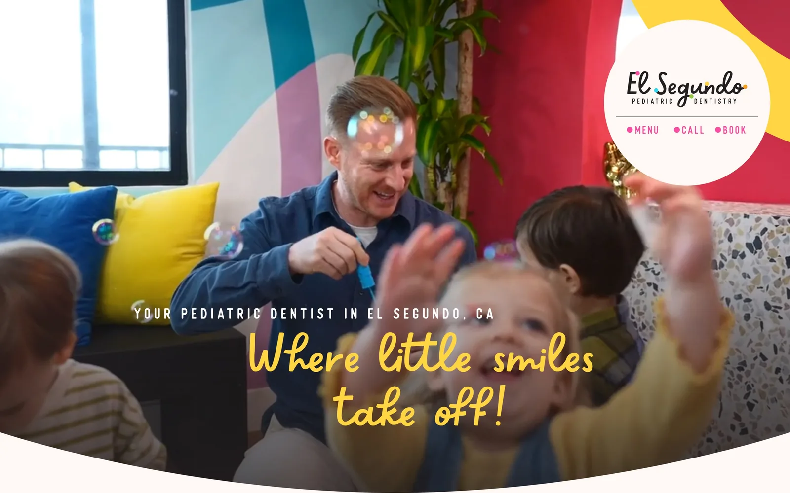
A yellow brush script reading Where little smiles take off sits over a video still of bubbles and clapping children.
Type
Sweetapricot 110px script
Body
Raleway 20px
Build
full-bleed video, circular logo badge top right
Made on
Webflow
Colour
#fff8f5 #ffd543 #f99d1c
Type. A brush script at roughly 110px, leading closed right down, set in yellow at #ffd543. Scripts at display size usually fail, and this one survives because nothing else on the screen is asking for attention. Above it a small eyebrow in a condensed face, letterspaced hard and set in caps, names the service and the city, which is also the line doing the search work. Raleway at 20px handles body copy with the leading opened right out for parents reading on a phone.
Colour. Yellow against a busy video frame of bubbles, a mural and clapping children. It holds because the yellow is warm and the video is mostly mid-tone. Orange at #f99d1c carries through the rest of the page over a pale blush ground.
Layout. The logo sits in a white circle cut into the top right corner with three dotted links under it, menu, call, book, so the navigation stays out of the picture entirely. Below the hero a white curve cuts up into the frame. Playful without being chaotic, which is a narrow line in pediatric work.
The ask. No button in the hero at all, just the three small links in the badge. The page is confident that a parent who likes what they see will find the booking link, and for a practice that lives on word of mouth that is probably right.
A script face only survives at display size when nothing else on the screen is asking for attention.
11
bouldersmiles.com
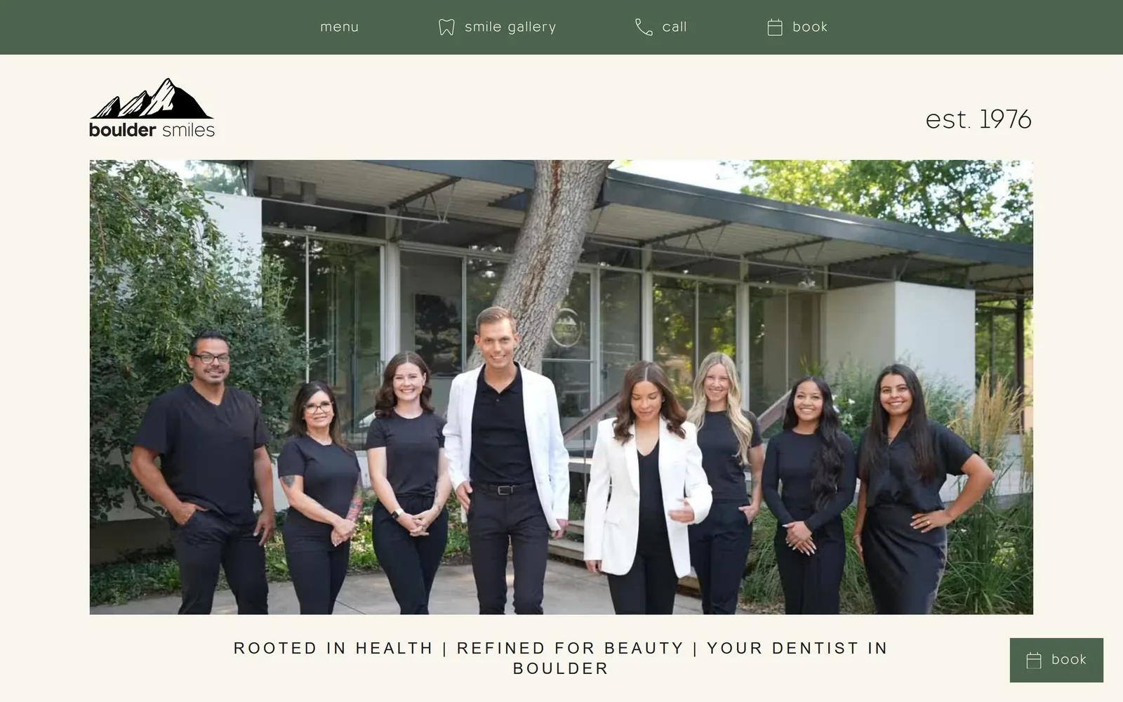
A deep green utility bar over cream, a hand drawn mountain mark, and the full team photographed outside the building.
Type
Minerva Modern 20px caps, 0.2em tracking
Body
TT Otilito, lowercase
Build
green utility bar, inset team photograph, centred line beneath
Made on
Webflow
Colour
#f8f6ed #4c644d
Type. There is no big headline here, which is the interesting part. The line that carries the proposition, rooted in health, refined for beauty, your dentist in Boulder, sits at only 20px but is letterspaced hard and set in caps, so it reads as a crest rather than a heading. The nav above runs in the thinnest weight of TT Otilito, lowercase and widely tracked. Restraint as a house style.
Colour. Two colours and nothing else. Deep green at #4c644d on the utility bar and the sticky book button, cream at #f8f6ed everywhere else. Having a palette this short in 2026 is a decision, not an oversight.
Layout. A hand-drawn Flatirons mark top left, est. 1976 balanced against it on the right, and one photograph of the whole team in black scrubs outside the mid-century building. The image is inset rather than bled, with cream margins holding it, which makes it feel printed.
The ask. A green book button sits in the bottom right and follows you down the page. Everything else is left to the photograph. A practice fifty years old is selling continuity rather than novelty, and the page understands that.
Two colours and one honest photograph of the actual team will outlast any trend a practice is tempted to follow.
12
shaferplasticsurgery.com
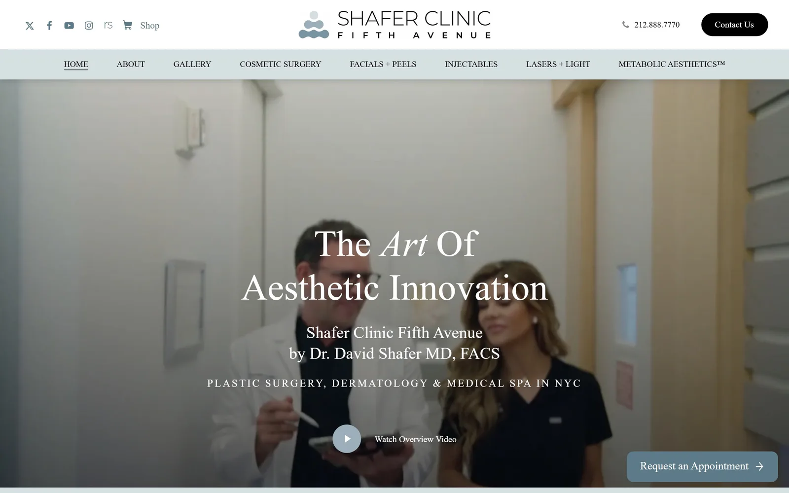
A pale blue nav strip over a washed out clinic video, with a Playfair headline italicising the word Art.
Type
Playfair Display 67px
Body
Poppins 16px
Build
two-row nav, full-bleed video, centred type
Made on
WordPress
Colour
#ffffff #d6dfe2 #5d7a88
Type. Playfair Display at about 67px with Art italicised, then the surgeon's name beneath at 30px in the same face. The voice is consistent even if it is not distinctive. A Poppins line at 19px in a light weight, letterspaced wide and set in caps, lists the services and the city underneath. It is a tidy hierarchy built from a very familiar pairing.
Colour. A pale blue strip at #d6dfe2 holds the second nav row and is the only colour on an otherwise white site. A muted slate at #5d7a88 carries most of the body text. Nothing is wrong with it and nothing about it is memorable.
Layout. Two navigation rows stacked above a full-bleed video of the surgeon with a patient. The footage is low in contrast and the white headline sits over a lit corridor, so legibility depends entirely on the overlay doing its job. It barely does.
The ask. A Request an Appointment pill floats bottom right and a Watch Overview Video control sits under the headline. The phone number is in the header, which for cosmetic surgery is correct. This is the most conventional page in the collection, included because it shows the category's default done carefully rather than carelessly.
A video hero only earns its place if the footage has a dark enough area to hold the headline, which this one barely does.
How these were chosen
Twelve American medical practices that have actually been designed, from a concierge clinic in Manhattan to a pediatric dentist in El Segundo, with the typeface, the palette and the thinking behind each call to action. A good share of them are dental, which is simply where the most adventurous medical website design is happening right now. If you run a practice or build for one, the useful question is not which of these is prettiest but which decision you could take back to your own site on Monday.
Finding medical practice sites that someone had actually designed took far longer than it should have. 28 candidates made the shortlist. 12 made the page.
Each one was opened and looked at properly: what the type is doing, where the colour gets spent, how the page is built, how it asks for the job. Nothing is here because it ranks. Nothing is here because an agency filed it under portfolio. Several well known names were left out for the plain reason that their site came out of the same template as everyone else's, and a few sites worth including did not survive a second look.
Where a site is only competent, it says so. The order is the order worth your time, best first.
Reviewed and selected by Larry W. Matthews for Websitely.