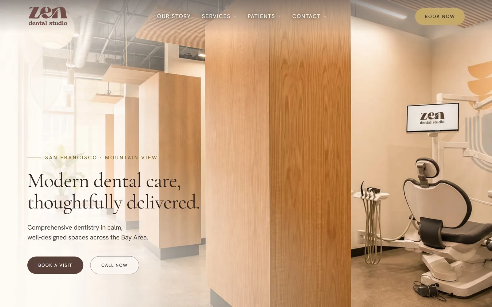
Type. The headline is Cormorant Garamond at 60px, regular weight, tracked in slightly to -0.018em so the two lines lock together as a block. Body copy is Hanken Grotesk at 19px on 1.6 line height, which keeps the serif from tipping into wedding-invitation territory. The button label drops to 13px uppercase at 0.12em, the only tracked-out type on the screen. A 60px serif is restrained for a hero, and it works because nothing else competes with it.
Colour. The photo is washed in #fdfaf6 at the left edge so the text sits on near-paper rather than on wood grain. Ink is #33231f for the headline and #4a3a34 for the subhead, both browns rather than black, which is the whole trick. The brown #574139 pill and a soft chartreuse BOOK NOW in the corner are the only saturated shapes. This is a decision, not the category default, which is navy and white.
Layout. A 1440px container with 128px of section padding, and a 168px / 768px two-column grid with a 56px gutter running down the page. The hero is a single full-bleed photo of their real operatory with a gradient scrim on the left third. Buttons are full pills at 9999px radius. Above the fold: logo, four nav items, location line, headline, two lines of body, two buttons.
The ask. The page asks twice in the hero, BOOK A VISIT as the filled pill and CALL NOW as the outline, plus BOOK NOW parked top right. Three asks total, all of them scheduling, none of them competing with a newsletter or a chat widget. The location line reading SAN FRANCISCO MOUNTAIN VIEW does quiet qualifying work before the ask. Nothing pops up.
Tint the photograph toward your paper colour and the serif headline stops fighting the image for attention.
02
gentrydentistry.com
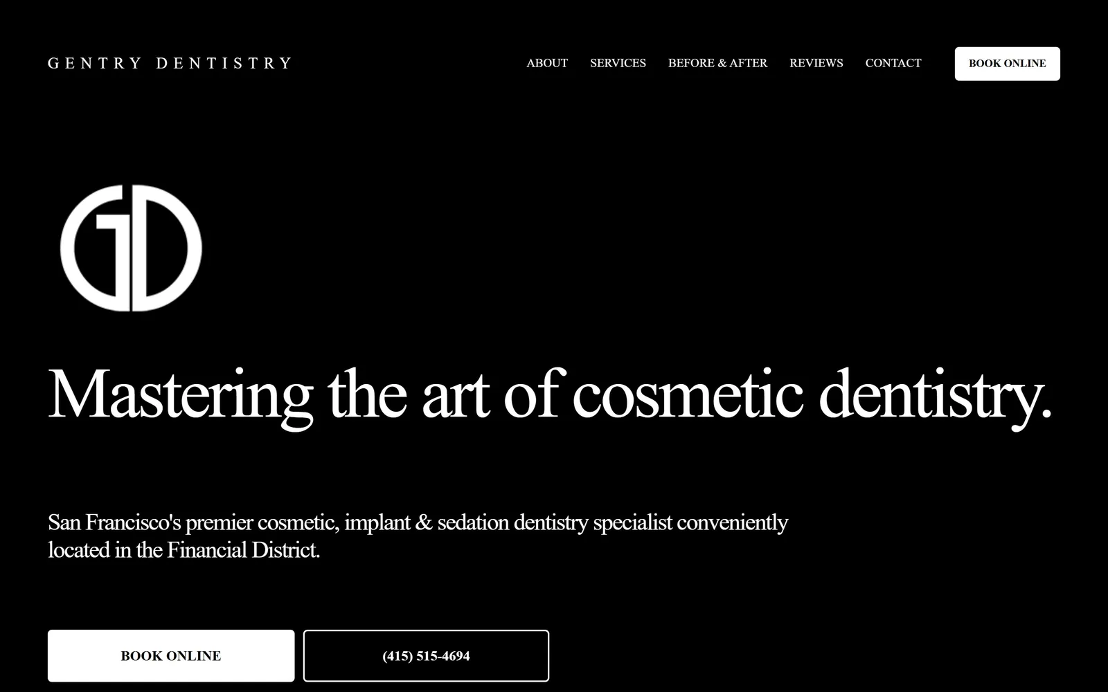
Pure black field, a monogram, and a high-contrast serif headline running nearly the full 1440 at display size.
Type
High-contrast display serif, about 93px
Body
Helvetica Neue, 16px
Build
1440px container, 129px section padding, flat-colour type hero
Made on
Squarespace
Colour
#131516 #ffffff #8f8f8f
Type. The headline is a high-contrast transitional serif, close to 93px, with tracking pulled to -0.04em and line height under 1.0. The DOM claims futura-pt, which is wrong: the drawn glyphs have hairline serifs and sharp ball terminals, so read what you see. Body and subhead sit in Helvetica Neue at 16px in #8f8f8f, deliberately recessive. Nav is 16px uppercase, widely spaced across the top right.
Colour. Two colours: #131516 and white. Grey #8f8f8f carries the one paragraph of body copy, which is the only tonal step in the whole screen. The accent is white itself, held back for the BOOK ONLINE button and the monogram. Most cosmetic dentists reach for gold here, and refusing to is the point.
Layout. A 1440px container with 129px of section padding, which is a lot of air and the reason the screen feels expensive. The hero is flat colour, no photograph at all: wordmark, monogram, headline, two lines, two buttons, stacked left on a single column. Buttons are 6px radius, one filled white and one outlined. Everything above the fold is type and one logo.
The ask. BOOK ONLINE appears twice, once in the nav as a white pill and once in the hero as a filled block, with the phone number as a bordered twin beside it. Two asks and a phone number, no form, no chat. The nav carries five items plus a dropdown full of services, which is where the competition actually lives.
A hero can be nothing but a headline if you give it enough black around it and resist adding a stock smile.
03
normandentist.com
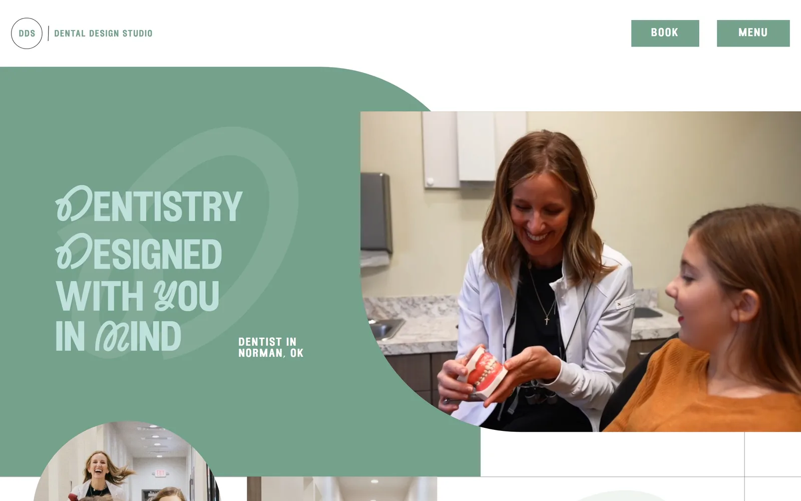
A sage green panel with a quarter-circle bite taken out of it, holding condensed caps with calligraphic swash letters.
Type
Condensed display caps with swash alternates, about 72px
Body
Proxima Nova Light, 20px
Build
1440px container, split panel hero with a quarter-circle mask
Made on
custom build
Colour
#74a18b #ffffff #c0e0db
Type. The headline runs about 72px in a condensed display face whose D, Y and M are swash alternates, which is why DENTISTRY DESIGNED reads as a logo rather than a sentence. The rest of the characters are plain condensed caps, so the swashes land as punctuation. Body and the location line are Proxima Nova at 20px, light weight, tracked out to 0.1em. Setting the headline a shade lighter than its own panel is a confident move and it pays off.
Colour. Sage #74a18b covers about a quarter of the screen as a solid panel, and white takes the rest. The headline is #c0e0db, a pale tint of the same green, with the body in #222222 on the white side. There is no third colour anywhere. A single hue used at two values is rarer in this category than it should be.
Layout. A 1440px container, no corner radius anywhere, and the hero built from two shapes: a sage panel on the left with a quarter-circle cut, and a video of the practice masked into the resulting curve on the right. A smaller circular crop peeks in at the bottom left, so the fold has a deliberate cut rather than a clean stop. Above the fold: logo, BOOK, MENU, headline, location line, two image crops.
The ask. BOOK sits top right as a filled sage block next to MENU, which is the only nav. That is one ask, repeated nowhere else above the fold. The hero holds no button at all, which is unusual and means the header has to carry the whole job. It is a clean trade: less clutter, more dependence on that one block.
Set the headline in a tint of your brand colour on a panel of the same colour and you get depth without a second hue.
04
summit-dentalstudio.com
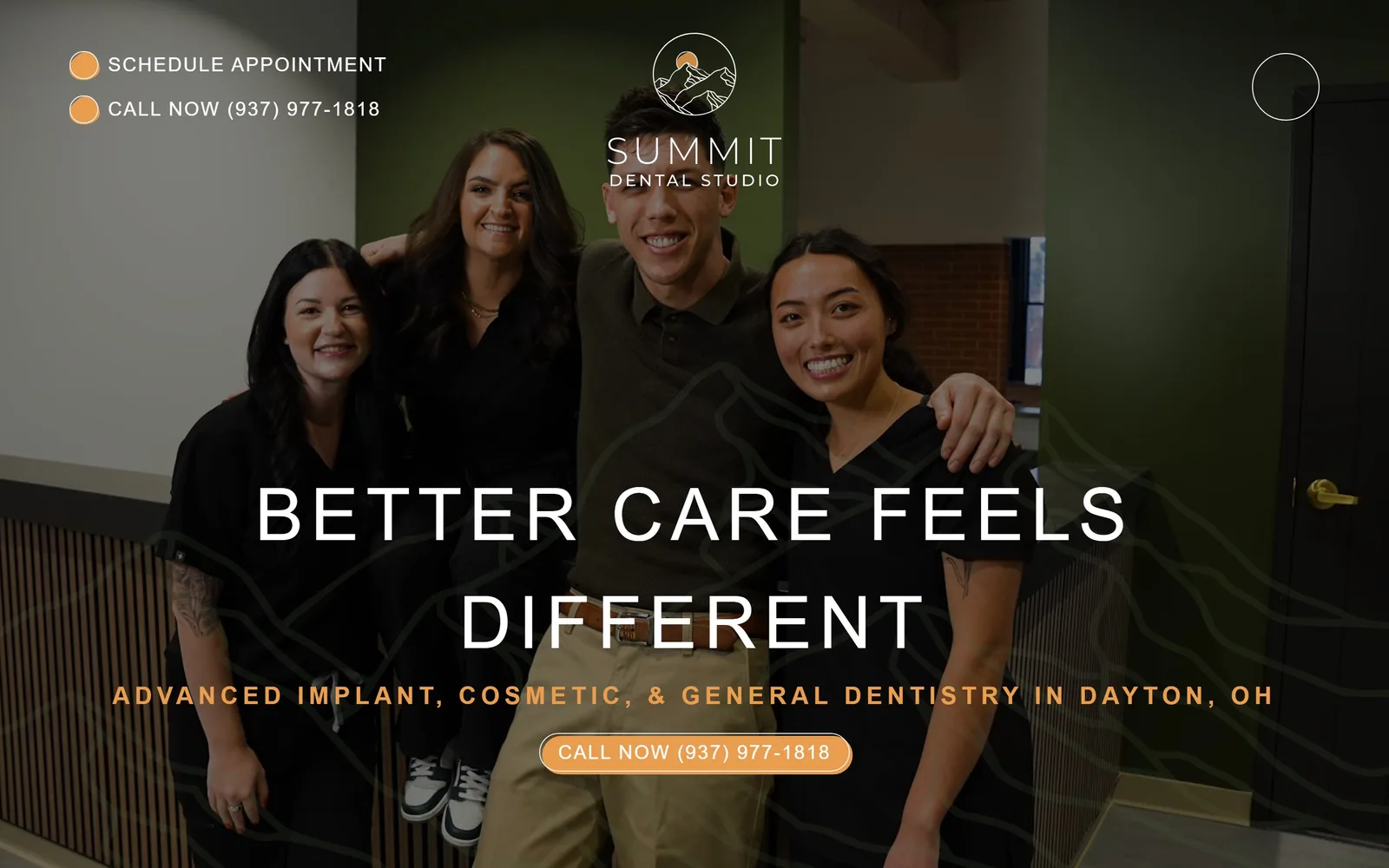
Four staff in black scrubs in an olive-walled hallway, with widely tracked light capitals across the bottom third.
Type
Montserrat Light, 75px uppercase
Body
Montserrat, 16px
Build
1440px full-bleed video hero, centred stack
Made on
Webflow
Colour
#1d2929 #e99d4f #e5e4de
Type. The headline is Montserrat at 75px in weight 300, uppercase, tracked to 0.1em, which is a hard combination to pull off at that size and mostly succeeds. The subhead drops to 16px but tracks even wider at 0.169em, so the two lines read as a matched pair. There is no serif anywhere and no second family. One face at two weights, carrying the whole page.
Colour. The body background is #1d2929, a near-black with green in it, and the hero video is colour-graded to match the olive wall. Amber #e99d4f takes under one percent of the screen: two small dots beside the top-left links, the subhead, and the CALL NOW pill. White is reserved for the headline alone. The restraint on the amber is what makes it register.
Layout. A 1440px container running full bleed with no inner gutter, so the video reaches both edges. The hero is a single video with a faint topographic contour line pattern laid over it, echoing the mountain mark in the logo. Everything is centred: logo at the top, headline at about 60 percent down, subhead, then a pill. Two text links sit alone in the top left where nav would normally be.
The ask. SCHEDULE APPOINTMENT and CALL NOW (937) 977-1818 sit top left as plain amber-dotted links, and the phone number repeats as the only pill in the hero. Two asks, one of them twice, both above the fold. There is no booking form and no nav menu competing for the click. Putting the phone number in the button instead of the word Book is a choice that suits a practice that wants to talk first.
One sans at 300 weight, tracked wide and set large, can carry a hero that would otherwise need a second typeface.
05
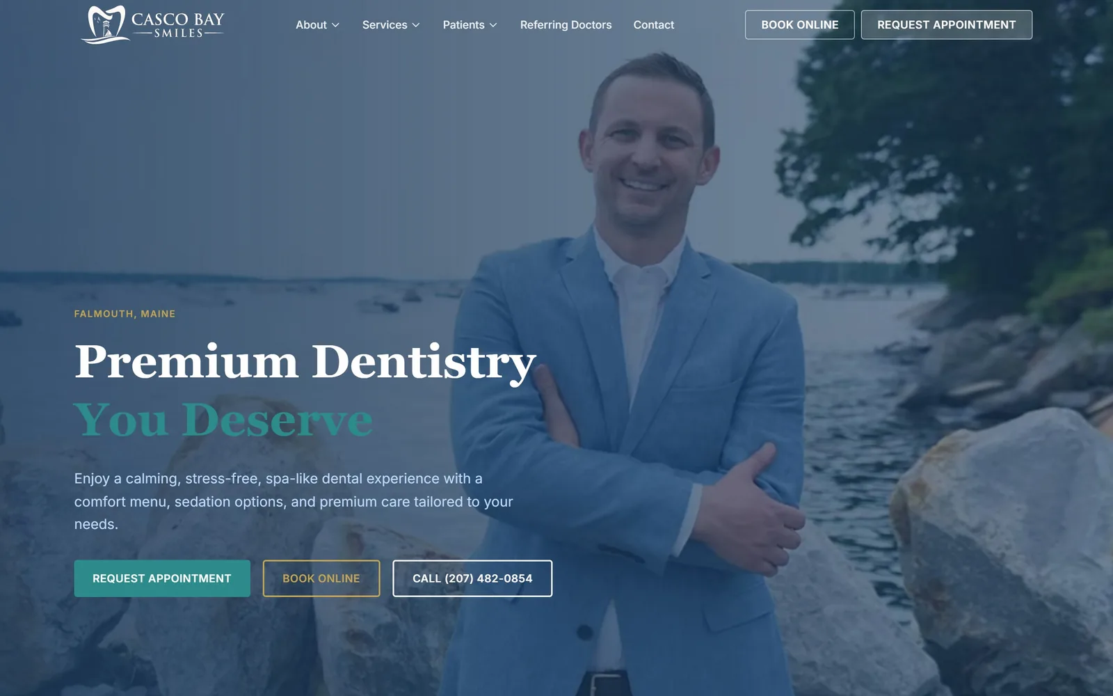
cascobaysmiles.com
The dentist on the rocks of the Maine coast under a navy wash, with a two-tone serif headline on the left.
Type. The headline is Georgia at 60px bold, split across two lines and two colours, which is doing the work that a weight change usually does. Body is Inter at 18px on 1.63, and the buttons drop to 14px uppercase at 0.025em in semibold. Georgia is a system face and an unfashionable pick, and at 60px on a photograph it holds up better than most licensed serifs would.
Colour. Navy #1b3a5c covers around 60 percent of the screen as a gradient scrim over the photo. Teal #2e8b8b takes the second headline line and the primary button, occupying well under one percent of the area. A gold eyebrow reading FALMOUTH, MAINE is the third note. Teal and navy is the safe coastal default for the category, but tying the teal to the words You Deserve makes it do something.
Layout. A 1440px container with 80px section padding, and grids of four 303px columns at a 12px gutter and three 394px columns at 32px further down. The hero is one full-bleed photograph with the copy stack held to the left 45 percent. Buttons are 4px radius, nearly square. Sticky header with five nav items and two buttons.
The ask. Five asks above the fold: BOOK ONLINE and REQUEST APPOINTMENT in the sticky header, then REQUEST APPOINTMENT, BOOK ONLINE and CALL (207) 482-0854 as a row of three in the hero. That is a lot, and the row of three dilutes the filled teal button beside it. Pick one and the other four get easier to ignore.
Photograph the dentist in a place only your town has, and the hero stops being interchangeable with every other practice.
06
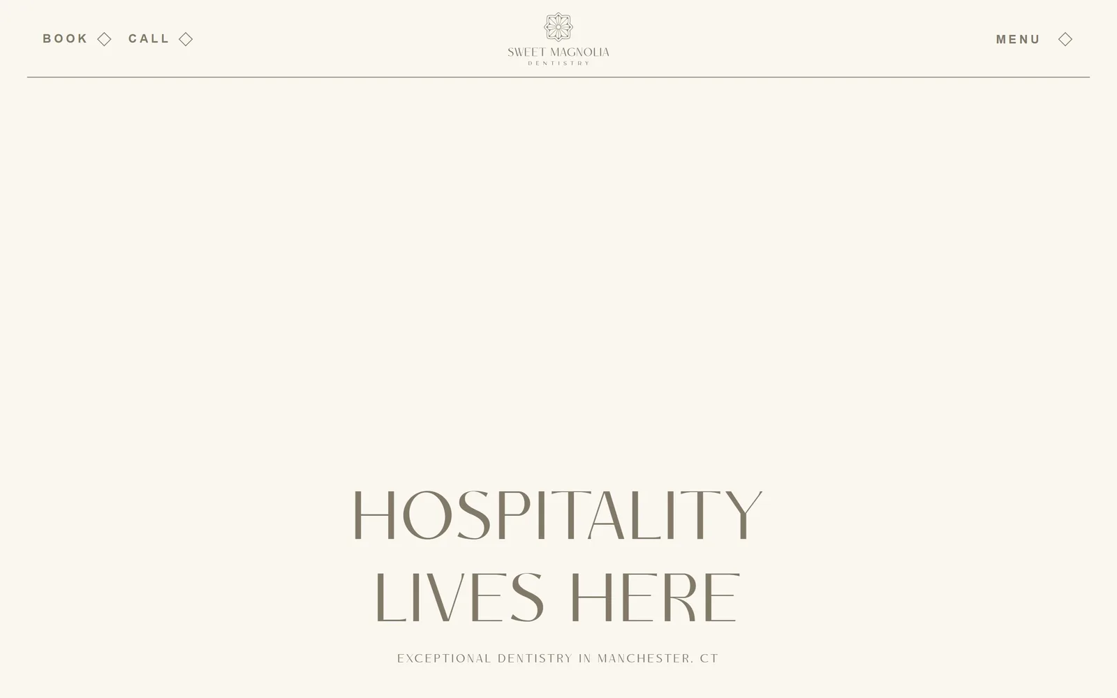
sweetmagnoliadentistry.com
A cream page with nothing on it but a monoline floral mark, a hairline rule, and HOSPITALITY LIVES HERE in taupe.
Type
Flared-stem display caps, 88px
Body
Proxima Nova, 15px tracked 0.25em
Build
Edge-to-edge rule, flat-colour type hero, bottom-weighted
Made on
custom build
Colour
#f9f7ef #827969 #ffffff
Type. The display face is a flared-stem sans with serif-like stress at 88px, uppercase, tracked to 0.05em, and it is the entire design. Nav sits in Proxima Nova at 15px semibold, uppercase, tracked hard to 0.25em so it reads as a border rather than a list. Body elsewhere runs 20px at 0.1em. Two typographic registers, no third.
Colour. Cream #f9f7ef covers everything and taupe #827969 draws everything. That is the complete palette: two values, no accent, no black. The subhead reading EXCEPTIONAL DENTISTRY IN MANCHESTER, CT is the same taupe at about 15px. In a category that defaults to white plus a bright hue, choosing two muted neutrals and holding the line is the whole brand.
Layout. No fixed container; the hairline rule under the header runs edge to edge with roughly a 45px gutter. The hero is flat colour with the headline pushed down to the lower third, leaving the top 60 percent empty on purpose. Logo centred, nav split left and right around it. Nothing above the fold but type, a rule, and a mark.
The ask. BOOK and CALL sit top left as text links with small diamond glyphs beside them, with MENU mirrored top right. No filled button anywhere, no form, no phone number in large type. It is the lightest ask in this set and it suits a practice whose pitch is calm. The cost is real: a visitor who wants to book has to notice a 15px link.
Holding a page to two neutrals and one display face reads as more expensive than adding a colour ever will.
07
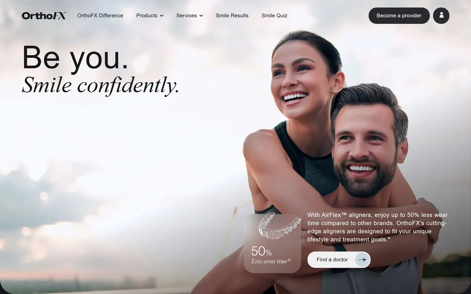
orthofx.com
A couple at dusk on a rooftop, with Be you. in grotesk and Smile confidently. in Baskerville italic stacked left.
Type
Neue Haas Grotesk Display 96px with Baskerville Display PT italic
Body
Neue Haas Grotesk, 14px
Build
1440px container, photo hero with corner-pinned copy clusters
Made on
custom JS framework
Colour
#15161a #ffffff #292930
Type. The pairing is the entire idea: Neue Haas Grotesk Display at 96px for Be you. and Baskerville Display PT italic at about 104px for Smile confidently. Setting the italic serif slightly larger than the grotesk is what makes the second line read as the emphasis. Body copy is tiny by comparison at 14px in weight 450, tracked 0.01em. The 50% stat card brings the italic back at small size for Less wear time, so the two faces bracket the whole hero.
Colour. The brand base is #15161a, but the hero is a pale dusk photograph so the headline is near-black type on cloud. The frosted card over the photo is white at low opacity with a blur, borrowing its colour from whatever sits behind it. The dark #292930 pills in the header are the only solid dark shapes. There is no brand accent colour at all above the fold, which for a consumer aligner brand is a real decision.
Layout. A 1440px container, 40px section padding, and a two-column grid of 342px and 355px at a 40px gutter lower down. The hero is one photograph with copy pinned top left and a cluster of card, paragraph and button pinned bottom right, leaving the middle to the image. Pills are 24px radius. Above the fold: wordmark, five nav items, two header buttons, headline, stat card, paragraph, one arrow button.
The ask. Find a doctor is the hero ask, a white pill with an arrow, which is honest for a brand that does not treat patients directly. Become a provider and an account icon sit in the header, so three asks compete and two of them are aimed at dentists rather than patients. The 50% Less wear time card does the persuading before the button is reached. Splitting patient and provider traffic in the header costs clarity.
Pairing one grotesk with one italic display serif gives you a headline hierarchy without changing size or weight much.
08
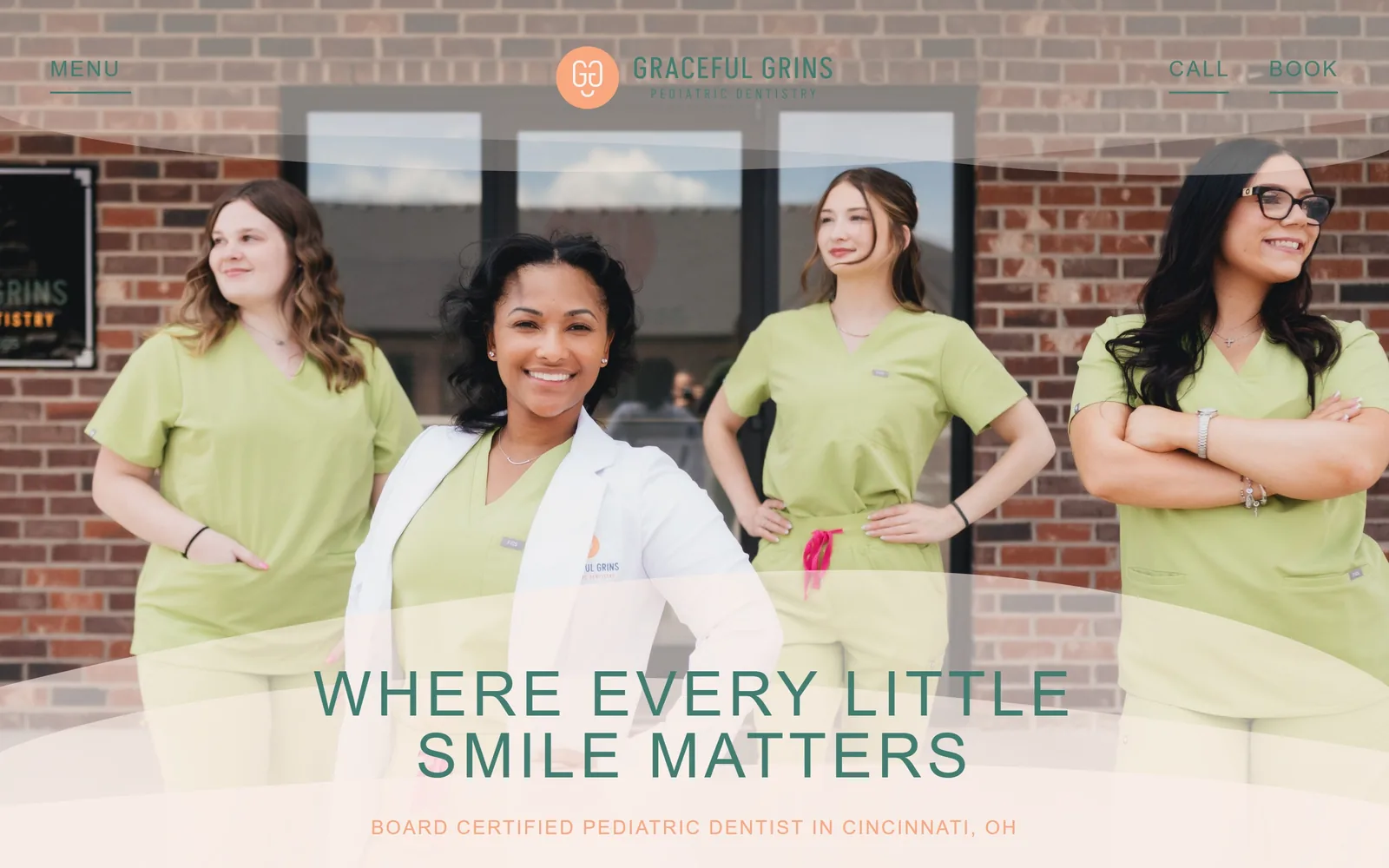
gracefulgrinspd.com
Four staff in lime scrubs outside their brick storefront, behind translucent wave bands and green condensed caps.
Type
Akshar, 64px uppercase
Body
Red Hat Mono, 20px
Build
609px two-column grid, full-bleed photo hero with wave overlays
Made on
Webflow
Colour
#faeee8 #427d71 #f9a77f
Type. The headline is Akshar at 64px, uppercase, tracked to 0.08em, a condensed grotesk that stays readable at two lines across the centre. Body is Red Hat Mono at 20px tracked 0.1em, which is a monospace in a pediatric dental hero and surprisingly it reads as precise rather than technical. Nav is Akshar again at 22px uppercase. Pairing a condensed sans with a mono instead of a rounded script is the opposite of what this category does.
Colour. The page sits on #faeee8, a warm blush, and the headline is #427d71, a deep green. The subhead picks up peach #f9a77f, which also fills the logo circle. Green on blush with peach as the third note is a considered palette, not the primary-colour grab bag most pediatric sites reach for. The translucent wave bands over the photo carry the blush down across the image.
Layout. A two-column grid of 609px with a 20px gutter runs the page below the fold. The hero is a full-bleed team photograph with two soft wave shapes overlaid, one near the top and one under the headline, which is how the type stays legible over brick. Centred composition: logo top centre, MENU left, CALL and BOOK right. Headline and subhead sit in the bottom third.
The ask. CALL and BOOK are underlined text links top right, matched by MENU top left, and that is the full set. No filled button and no form above the fold. The appointment form exists but lives behind the link rather than in the hero. For a pediatric practice where parents are often calling anyway, leading with CALL as an equal is defensible.
A translucent band of your background colour laid over a busy photo buys legibility without darkening the whole image.
09
bloomdentalgroup.com
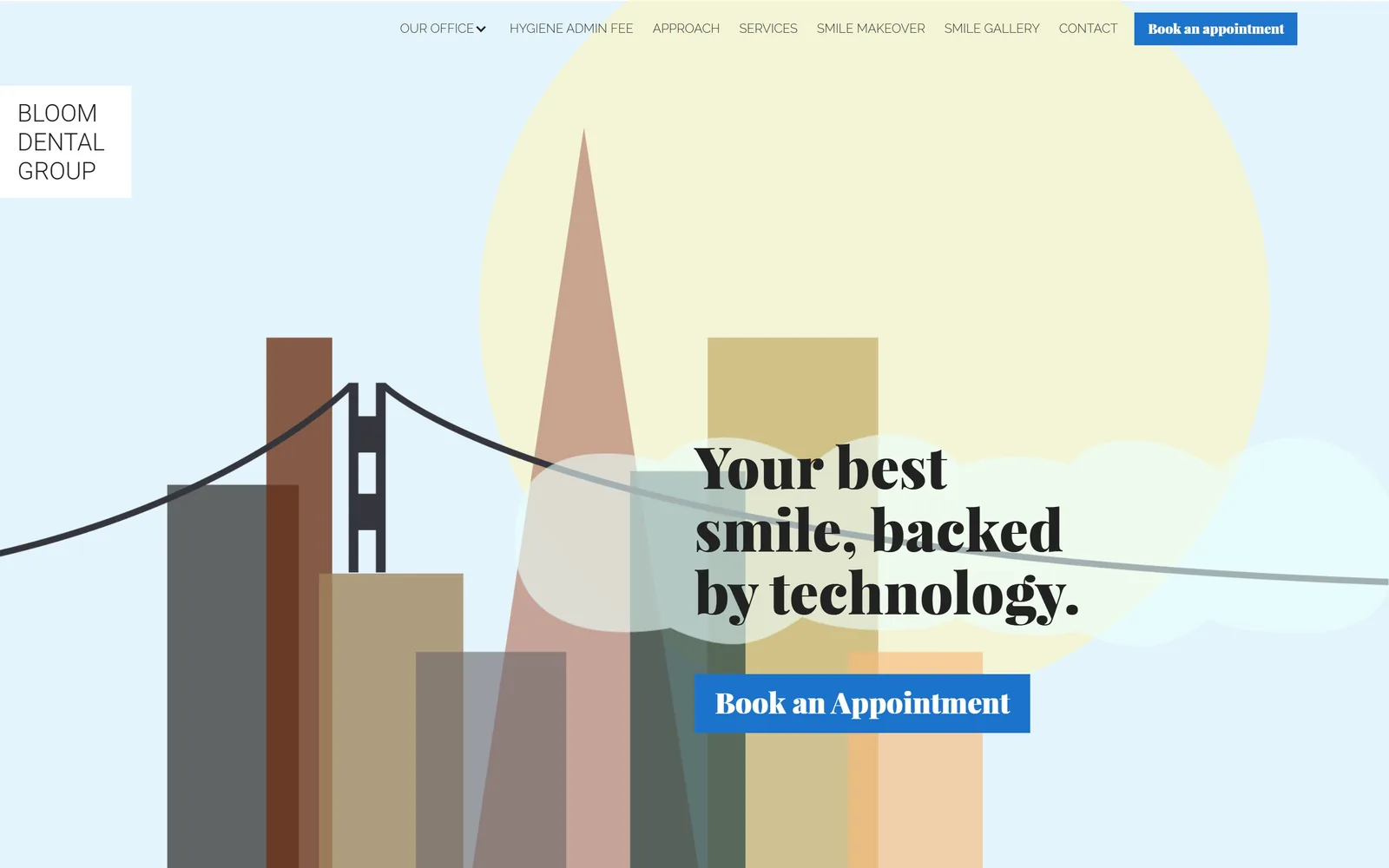
A flat vector San Francisco skyline in dusty earth tones, with a Playfair headline and a blue square button.
Type. The headline is Playfair Display at 60px bold on 1.08 line height, broken to three lines so it forms a block against the illustration. Nav is Raleway at 13px in weight 300, uppercase, which is very light for eight items and sits almost too quiet. The button label is Playfair again at 30px in weight 900, which is an odd call: a display serif at near-black weight on a button. It works because the button is the only blue thing on the screen.
Colour. White dominates, with the illustration supplying muted brick, sand, sage and a pale yellow sun. The accent is #1c73cc, a flat utility blue, and it covers about one percent of the screen across two buttons. That blue is the one default in an otherwise specific palette: it does not appear in the illustration at all. Ink is #222222 for the headline and #333333 for nav.
Layout. No fixed container; the illustration runs full bleed to both edges and the nav floats over it. Buttons are square at 0 radius. The hero is a single piece of custom vector artwork with the copy block sitting right of centre, overlapping the tallest towers. The logo is knocked out in a white rectangle at the top left, pinned to the edge.
The ask. Book an appointment appears twice, as a blue block in the nav and a larger blue block in the hero, about 300px apart. Two asks, identical label, identical colour, which is clear if repetitive. Eight nav items including Hygiene Admin fee and four individual dentist pages compete hard for the same attention. Trimming the nav would do more for conversion than moving either button.
Commissioning one piece of flat illustration gets you a hero nobody else can buy, at a fraction of a photo shoot.
10
footeorthodontics.com
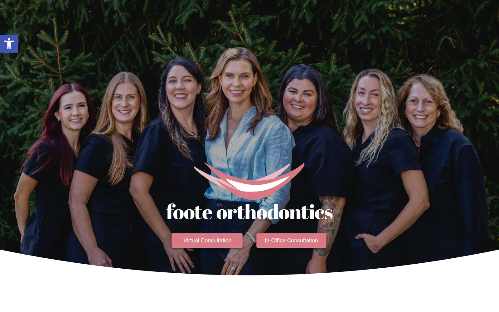
Seven staff in black against evergreens, with a didone wordmark and two rose buttons, cut off by a curved white edge.
Type. The wordmark is a high-contrast didone set lowercase at roughly 60px, and it carries the whole typographic identity since there is no headline above it. Everything else is Montserrat: 30px semibold for section headings further down, 18px regular for body. The contrast between the hairline serif mark and the plain geometric sans underneath is deliberate and clean. There is no display type in the hero at all beyond the logo.
Colour. The page background is #f2f2f2 and the hero is full-colour photography with no scrim. Dusty rose #d87984 takes about 17 percent of the visible area across the logo swoosh and two buttons. Ink is white over the photo and #333333 below. Rose on dark green evergreen is a specific pairing rather than the orthodontic default of blue and white.
Layout. A 1440px container with the hero photograph clipped by a wide convex curve at the bottom, so the white page swells up into the image. Buttons are 4px radius, sitting side by side under the wordmark, centred. There is no visible nav bar: the menu is collapsed, and an accessibility toolbar tab is pinned top left. Above the fold there is nothing but photo, mark, and two buttons.
The ask. Virtual Consultation and In-Office Consultation sit side by side, equal weight, equal colour, which frames the choice as how rather than whether. Two asks and no third option, no phone number, no form. Giving the virtual option equal billing is the right call for orthodontics, where the first visit is a consult. The risk is that two identical buttons make neither one primary.
Offering two ways to consult as equal buttons reframes the decision from whether to book into which kind of visit.
11
toothbar.com
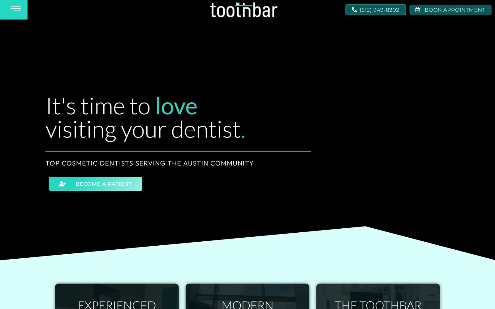
A black screen with It's time to love visiting your dentist in thin type, love in teal, over an angled mint wedge.
Type
Lato Light, 68px
Body
Montserrat, 15px
Build
1440px container, flat black hero with a diagonal colour wedge
Made on
WordPress
Colour
#0a5a5c #d8fffb #000000
Type. The headline is Lato at 68px in weight 300, with the single word love set in the same size and colour-swapped to teal, which is cheaper than a second font and reads better than italics would. The eyebrow below sits in Outfit at 19px uppercase tracked to 0.074em. Body throughout is Montserrat at 15px on 1.6. Three families is one too many, and only the Lato is doing real work.
Colour. Black carries about 42 percent of the screen, with #123a3c and #0a282a as the deeper greens inside it. Teal #0a5a5c fills the button and mint #d8fffb takes roughly 23 percent as the angled band at the bottom. The gradient on the BECOME A PATIENT button from teal to mint is the only gradient on the page. Black plus mint is a genuine choice in a category that almost always goes white plus blue.
Layout. A 1440px container with the content held to the left 60 percent. The hero is flat black with a hairline teal rule under the headline, and the fold is broken by a hard diagonal wedge of mint that rises from the left edge to about two thirds across. Dark cards with rounded corners sit on the mint below. Buttons are 5px radius.
The ask. BOOK APPOINTMENT and the phone number sit as a paired block top right, and BECOME A PATIENT is the hero button, so the primary ask uses different words from the header ask. That inconsistency costs more than it looks: Become a patient and Book appointment are not obviously the same action. The hamburger at top left hides the entire nav. Two asks above the fold, worded three ways.
A single word recoloured inside the headline gives you emphasis without a second typeface or a weight jump.
12
villagedentaldtc.com
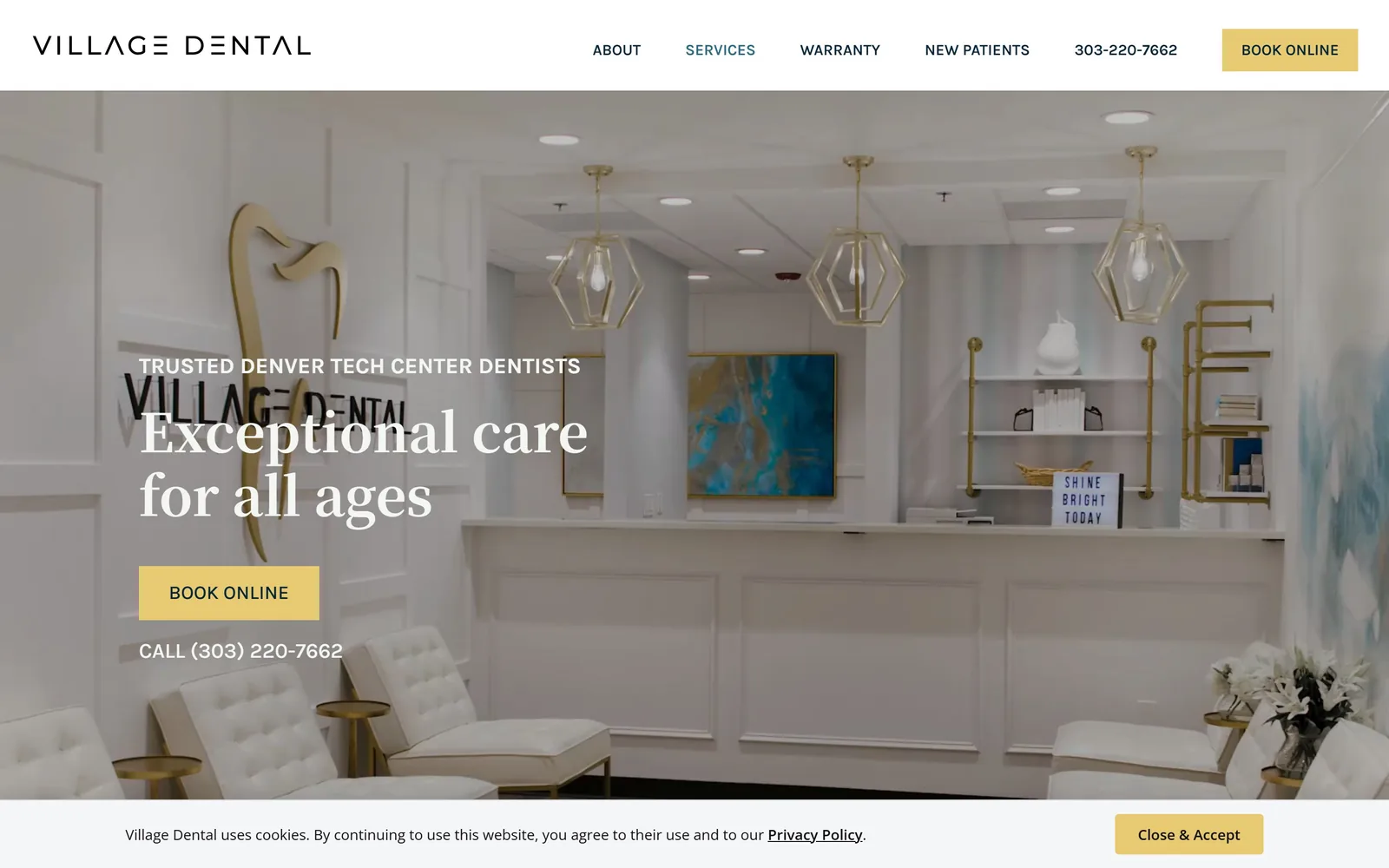
A white and brass waiting room on video, with a serif headline in white and a butter yellow square booking button.
Type
Bold serif, about 55px
Body
Karla, 18px
Build
1440px container, sticky header, full-bleed video hero
Made on
WordPress
Colour
#e7ca71 #052639 #ffffff
Type. The headline is a sturdy serif at about 55px in bold, set over two lines, and it is fighting the practice's own gold logo painted on the wall behind it. The eyebrow above runs in Karla at around 16px, uppercase, semibold, which separates cleanly. Body and nav are Karla throughout at 18px and 16px. The serif-over-sans split is conventional and executed without fuss.
Colour. The hero is a bright white interior, so the white headline survives only because of a soft dark gradient at the left. Butter yellow #e7ca71 takes under one percent of the screen but owns both buttons and the cookie bar. Navy #052639 carries the nav type. Yellow picked out of the brass fittings in the room is a smarter accent than yet another dental blue.
Layout. A 1440px container with the video full bleed behind it and a sticky white header above. Buttons are square at 0 radius, which matches the panelled millwork in the shot more than a pill would. A promotional bar sits above the header, so the fold loses about 80px before anything starts. Above the fold: promo bar, header, six nav items, eyebrow, headline, button, phone number.
The ask. BOOK ONLINE appears twice in butter yellow, once in the header and once in the hero, with CALL (303) 220-7662 as plain white text beneath and the number again in the nav. A promo bar at the very top adds a fifth ask, Book Now!, for an Invisalign offer. That is five asks before any content, and the offer bar undercuts the calm the interior shot is selling.
Pull your accent colour out of something physical in your office and the brand and the room stop looking like separate projects.
13
sunnysidepediatricdentistrytx.com
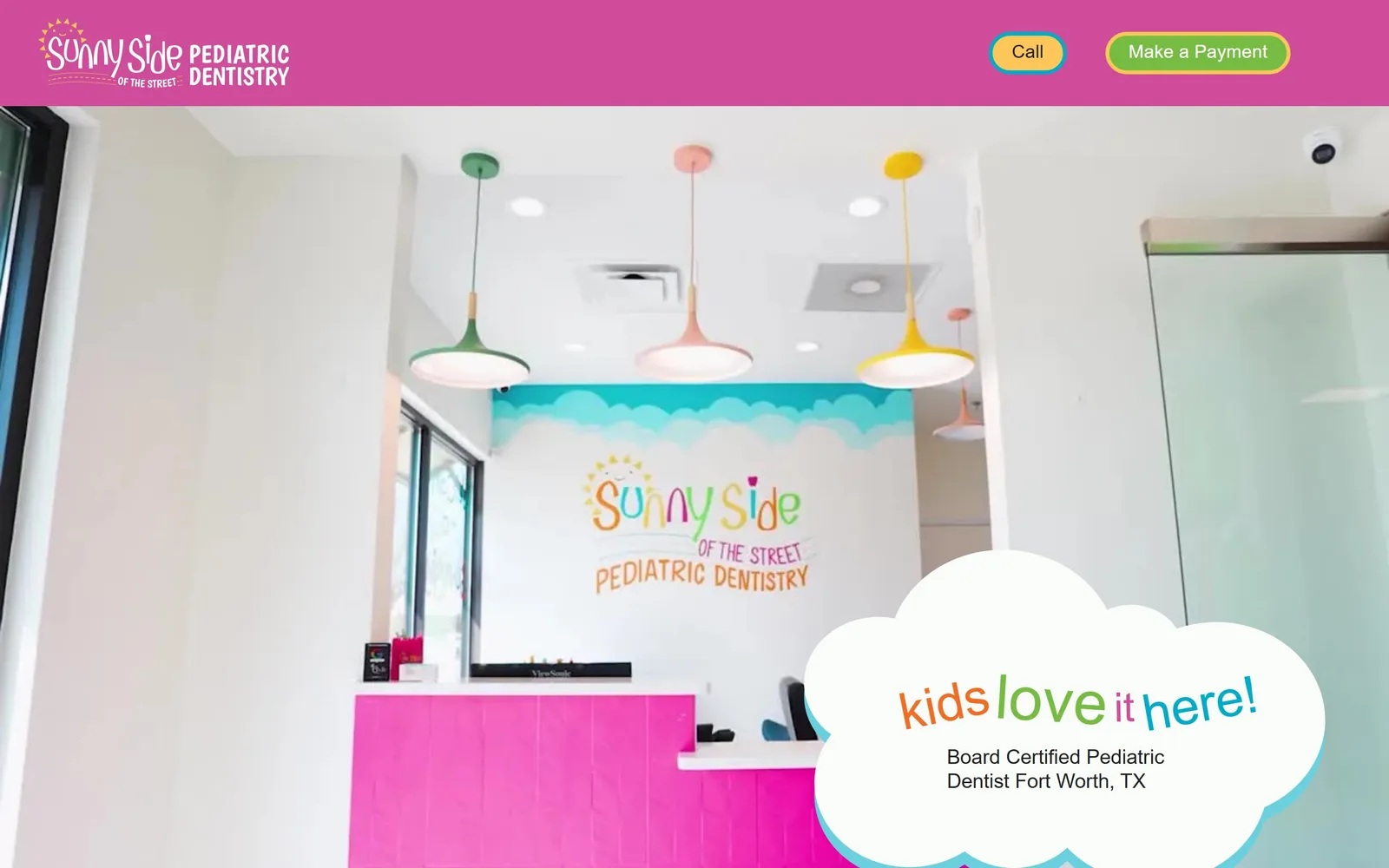
A magenta bar over video of a candy-coloured reception, with kids love it here! inside a white cloud shape.
Type
Hand-drawn multicolour lettering, about 63px
Body
Barlow, 21px
Build
1440px container, solid header bar, video hero with a drawn cloud panel
Made on
Webflow
Colour
#cf4c9b #00abc7 #fec558
Type. The headline is hand-drawn, multicoloured and set inside the cloud at around 63px, with each word a different hue, which is the same lettering as the painted wall in the shot. Supporting copy is Barlow at 21px and the nav is Barlow Condensed at 16px, both plain and deliberately invisible next to the lettering. Letting the building's own signwriting set the type is the strongest idea here. Nothing competes with it.
Colour. Magenta #cf4c9b runs the header bar, with cyan #00abc7, green #76bc43, orange #f36c23 and yellow #fec558 all active. That is five saturated hues above the fold, which would be a mess anywhere else and is exactly right for a pediatric office that painted its walls the same way. The room supplies the palette rather than the palette being imposed on the room. White keeps it from collapsing.
Layout. A 1440px container with the video running full bleed under a solid magenta header. The hero's one piece of structure is a white cloud-shaped panel pinned to the bottom right, holding the headline and the credential line. No grid is visible above the fold and no corner radius applies, because the panel is a drawn shape rather than a rounded box. Everything else is video.
The ask. The two header buttons are Call and Make a Payment, which is an odd pair: one acquires a patient and one serves an existing one. There is no Book or Request Appointment button above the fold at all. The cloud panel carries a credential line, Board Certified Pediatric Dentist Fort Worth, TX, but no button. For a practice this clearly confident, giving Make a Payment equal billing with Call is the one real mistake on the screen.
If your office is already painted in your brand, shoot it and let the room do the work your palette would have done.
14
perlsmile.co
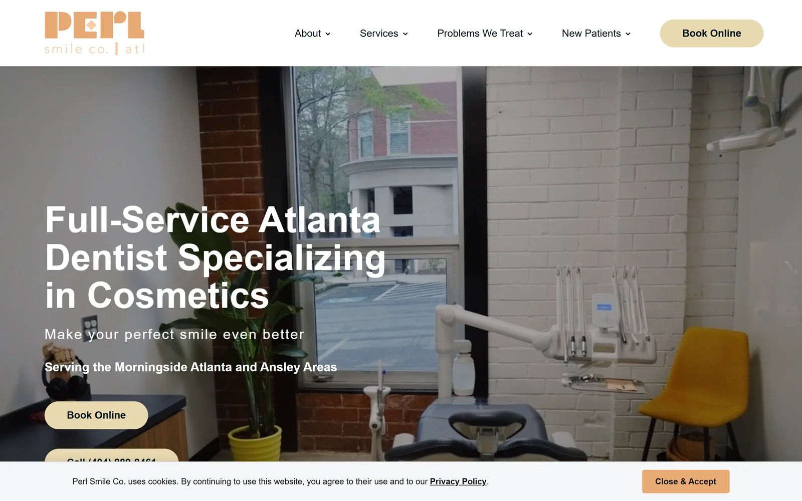
A real operatory with painted brick, a mustard chair and a window onto the street, under a heavy sans headline.
Type. The headline is Kanit at 65px in bold on 1.05 line height, broken to three lines, a semi-condensed face with flat terminals that holds up over a busy photograph. The subhead runs in Kanit light at 25px tracked 0.08em, and body and nav sit in Poppins at 18px. The weight jump from 700 to 300 inside the same family is the hierarchy, and it is clearer than a size change alone would be.
Colour. White owns the header and the photograph supplies the rest: brick red, grey block, and the mustard chair that happens to rhyme with the brand. The accent is cream #e8d9b1 on the pill buttons, with a peach #ebab75 variant on the cookie bar. The logo's apricot cut-paper letterforms are the only saturated brand mark. Cream buttons on a photo is quieter than the category norm and slightly underpowered because of it.
Layout. A 1440px container with a three-column grid of 372px, 372px and 495px at a 20px gutter below the fold, so the last column is deliberately wider. The hero is a full-bleed photograph with a white header bar above it and copy held to the left third. Pills are 26px radius. The cookie bar clips the second hero button, which is a real flaw in the captured state.
The ask. Book Online appears in the header as a cream pill and again in the hero, with Call (404) 889-8461 beneath it as a second pill that the cookie notice cuts in half. Two asks plus a phone number. Five nav items each open long dropdowns, and the Problems We Treat list alone runs to sixteen entries, which is where attention goes.
Shooting your actual treatment room, window and all, beats any stock interior because the street outside is proof.
15
jacksonfamilydentalonline.com
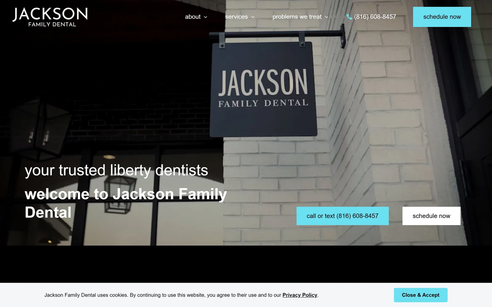
Video of the practice's own hanging sign on white brick, with cyan square buttons and lowercase welcome copy.
Type
Work Sans, 45px lowercase
Body
Sen, 18px
Build
Full-bleed video hero, 0px radius buttons, 13,371px page
Made on
WordPress
Colour
#6ae0f2 #000000 #ffffff
Type. The headline is Work Sans at 45px, with the eyebrow in weight 300 and the second line in semibold, everything lowercase including the practice name. Lowercasing welcome to Jackson Family Dental makes a 1930s-style hanging sign feel current, which is the point of the pairing. Body is Sen at 18px and button labels sit in Karla at 18px. Three families for very little typographic range.
Colour. The screen is mostly the video: white-painted brick, a charcoal sign and a black overhang that takes the left third. Cyan #6ae0f2 covers about 1.5 percent across three square buttons and the phone icon. Cyan against grey brick is a sharper choice than the warm neutral most practices would have picked to match the masonry. White text has no scrim behind it and nearly loses the fight where the brick is brightest.
Layout. No fixed container; the video is full bleed but stops about 150px short of the viewport bottom, leaving a black band before the cookie bar. Buttons are square at 0 radius. The hero holds the copy in the left 45 percent with two buttons pushed right, which leaves the middle oddly empty. The page runs to 13,371px, the longest in this set by some margin.
The ask. schedule now sits in the header as a cyan block and again in the hero, with call or text (816) 608-8457 beside it and the number repeated in the nav. Three asks, two phone placements. The offer of call or text as one button is a small, genuinely useful detail. The dropdown nav carries over thirty service links, which is the real competition.
Filming your own exterior signage gives you a hero that proves the practice exists, which no stock interior can do.
How these were chosen
Fifteen practices here, ranging from a single Norman, Oklahoma studio to a national clear aligner brand, with pediatric offices, orthodontists and cosmetic dentists in between. They sort into three camps: boutique general dentistry built on warm neutrals and serif type, pediatric practices that commit completely to colour, and orthodontists selling a free consultation rather than a cleaning. The pattern across the good ones is that they photographed their own rooms, their own staff and in two cases their own exterior signage, and that single decision does more for dental website design than any font pairing on this page. Not one of the fifteen leads with a stock model holding a perfect smile. Where these sites fall down is the ask: several stack four or five competing buttons above the fold and lose the one that matters.
Finding dental sites that someone had actually designed took far longer than it should have. 30 candidates made the shortlist. 15 made the page.
Each one was opened and looked at properly: what the type is doing, where the colour gets spent, how the page is built, how it asks for the job. Nothing is here because it ranks. Nothing is here because an agency filed it under portfolio. Several well known names were left out for the plain reason that their site came out of the same template as everyone else's, and a few sites worth including did not survive a second look.
Where a site is only competent, it says so. The order is the order worth your time, best first.
Reviewed and selected by Larry W. Matthews for Websitely.