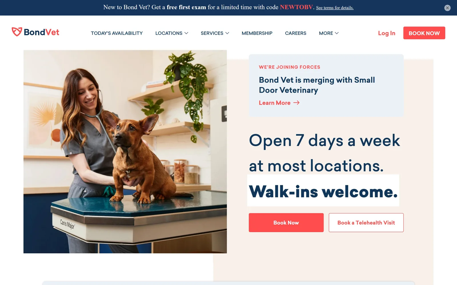
Type. Everything is set in Sailec, a soft geometric sans, and the site never reaches for a second face. The hero line runs 50px at weight 500 in navy, with a generous 1.6 line height that lets 'Open 7 days a week at most locations.' breathe across three lines. 'Walk-ins welcome.' is the same size but bolder and knocked out on a white bar, so the promise that actually wins the click sits one notch louder than the sentence around it. Body copy drops to 22px with tracking pulled in to -0.042em, which keeps long paragraphs tight without looking squeezed.
Colour. Cream #f7f0eb carries 26% of the screen and pale blue #ecf1f7 another 20%, so the page is warm first and clinical second. Navy #10365a does all the reading, which is why the coral #ff4d4d gets away with under 1% coverage and still runs the page: it appears only in the logo mark, the Book Now button and the 'Learn More' arrow. Red is the obvious choice for a walk-in clinic and this one picks a coral rather than an emergency-room red, which reads as open rather than urgent.
Layout. The container is 1290px at 90% of a 1440 viewport, built on a 24-column grid with 10px gutters. The hero is two slabs that deliberately fail to line up: the photo starts higher and the cream panel starts lower, and they overlap in the middle rather than sitting in a tidy 50/50 split. Corners are 4px, close to square. Above the fold you get the promo bar, nav, the photo, a merger notice card, the headline and two buttons, which is a lot, and it only works because the colour is so quiet.
The ask. The ask is Book Now and it appears three times before you scroll: the nav button, the primary coral button, and the outlined 'Book a Telehealth Visit' next to it. The outlined second button is the smart part, since someone who will not drive in tonight still converts. Competing for attention are the 'free first exam' code bar at the very top and the merger card sitting directly above the headline, which is the one thing on the page fighting its own CTA.
A single accent used on less than one percent of the screen can still run the whole page if nothing else is allowed to be colourful.
02
splootvets.com
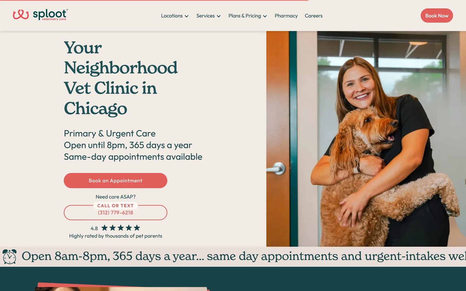
Serif headline in deep teal on oatmeal, with a staff member carrying a goldendoodle through a clinic door.
Type. The headline is Newspirit at 52px, a serif with soft bracketed slabs and slightly flared terminals, tracked in to -0.027em and set in deep teal. Running text is Outfit, a plain geometric sans at 16px, and the gap between the two is the whole typographic idea: the serif does warmth, the sans does the 8pm closing time and the phone number. The three-line subhead stacks 'Primary & Urgent Care', the hours and 'Same-day appointments available' as separate lines rather than a paragraph, so each fact can be read on its own.
Colour. Oatmeal #f2eae4 covers the hero and most of the page, teal #164347 handles all the type, and coral #e25e5a is reserved for the one filled button and the phone number. The teal and coral pairing is doing real work here, because the usual vet move is blue plus green, and this is closer to a cafe palette. Below the fold a full teal band flips the contrast, which is how you can tell the cream is a decision and not just a default background.
Layout. Full-bleed 1440 with the hero split roughly 57/43, text left on cream, photograph right and bleeding off the edge with no rounding. The button is a 60px pill, fully rounded, and so is the outlined 'CALL OR TEXT' block under it. Above the fold: nav, headline, three-line subhead, primary button, phone block, and a 4.8 star rating line. A marquee strip repeating the opening hours runs along the bottom edge of the hero.
The ask. Two asks, ranked. 'Book an Appointment' is the filled coral pill; underneath, 'Need care ASAP?' introduces an outlined block carrying 'CALL OR TEXT' and (312) 779-6218. Splitting urgent from routine at the hero rather than burying the number in the header is the right call for a clinic that takes walk-ins. The star rating sits below both and supports rather than competes.
Separate the urgent path from the routine one in the hero itself, and label which is which.
03
hagyard.com
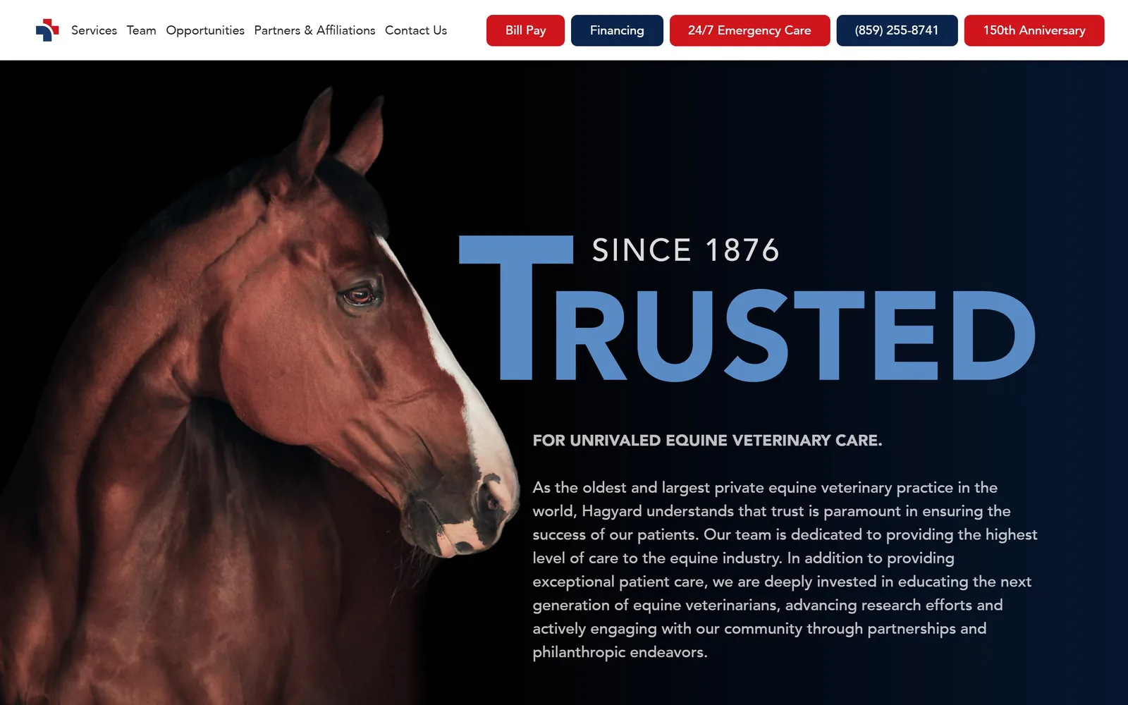
A bay horse lit against black, with the word TRUSTED set enormous in cornflower blue beside it.
Type. The display word is a heavy sans, close to Avenir Black, set at roughly 150px and letterspaced just enough to stop the letters touching. 'SINCE 1876' sits in white caps at about a third of that size, tucked into the shoulder of the T so the two read as one lockup rather than a headline and a kicker. Running text is the same family at 20px weight 500, white on black, which stays readable because the line length is held to around 70 characters.
Colour. This is a black page. The photograph fades into #000 on the left and a near-black navy on the right, and the only colours are the cornflower blue of the display word, around #6fb1fe, and the red #d0151c on the emergency and bill-pay buttons in the header. Blue type on black is unusual for a medical practice and it is what stops the page reading as a luxury car ad. The red is doing triage duty, not branding.
Layout. A 1440 full-bleed hero on a two-column 600/600 split with an 80px gutter, horse left, type right. Section padding runs 96px. The header is an unusual strip of five coloured pill buttons, red and navy alternating, sitting flush against a white bar. The hero itself has no button at all, which is a confident choice for a practice whose clients already know who they are.
The ask. The hero sells reputation and asks for nothing. Every action lives in the header strip: Bill Pay, Financing, 24/7 Emergency Care, the phone number, and a 150th Anniversary link. That makes the phone number and the emergency link the de facto CTAs, which is honest for an equine hospital where the call comes before the browse. The cost is that a first-time visitor has nowhere obvious to start.
If your reputation is the product, give the hero to a single word and move every button into the header.
04
smalldoorvet.com
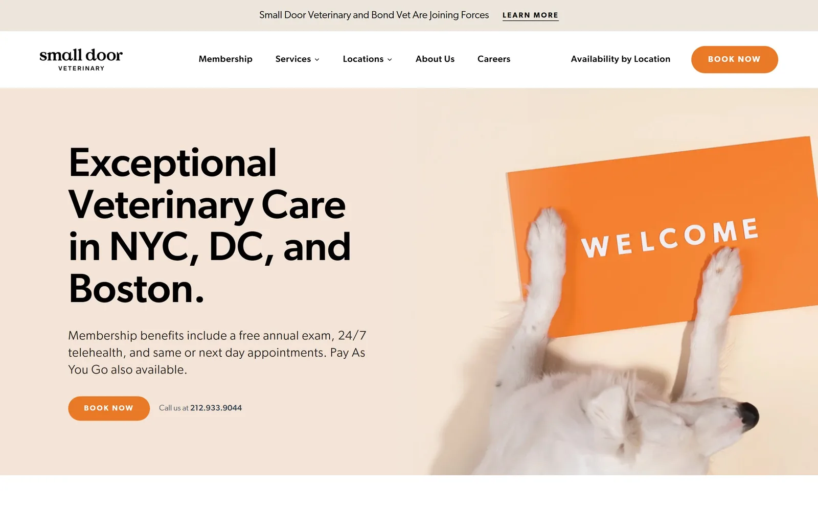
A dog lies upside down holding an orange WELCOME sign, beside a 72px black headline on peach.
Type. The headline is Gibson at 72px, weight 600, a humanist sans with open apertures and a very slight tracking of -0.007em. It is set in black rather than a brand colour, which is why it holds against the peach. The supporting paragraph drops all the way to 22px at weight 300, a three-step jump that gives the page only two typographic voices: the claim and everything else. Nav is 16px at weight 600 with 0.031em tracking, small enough to stay out of the way.
Colour. Peach #f4e4d8 is the hero and the top bar, orange #ea7927 is the button and the sign in the photograph, and black carries all the type. The clever part is that the orange in the picture and the orange in the button are the same orange, so the photograph is doing brand work rather than decoration. There is no third colour anywhere above the fold, which is rare and is why it reads as expensive.
Layout. Full-bleed 1440, hero split roughly 50/50 with text left and photograph right, no rounding on the image. The lockup is left-aligned and hangs on a consistent margin with the logo above it. Below the hero the grid becomes three columns of 368px with 48px gutters. Above the fold: an announcement bar, nav, headline, one paragraph, one button and a phone number, and nothing else.
The ask. One button, 'BOOK NOW', as an orange pill, with 'Call us at 212.933.9044' sitting beside it in small grey type rather than underneath. The same BOOK NOW pill repeats in the nav. 'Availability by Location' sits next to it as a text link, which is the quiet second path for someone who is comparing clinics rather than booking tonight. Nothing else on the screen asks for anything.
Pick the accent colour out of your best photograph and use it for the button, so the picture and the brand agree.
05
cityvet.com
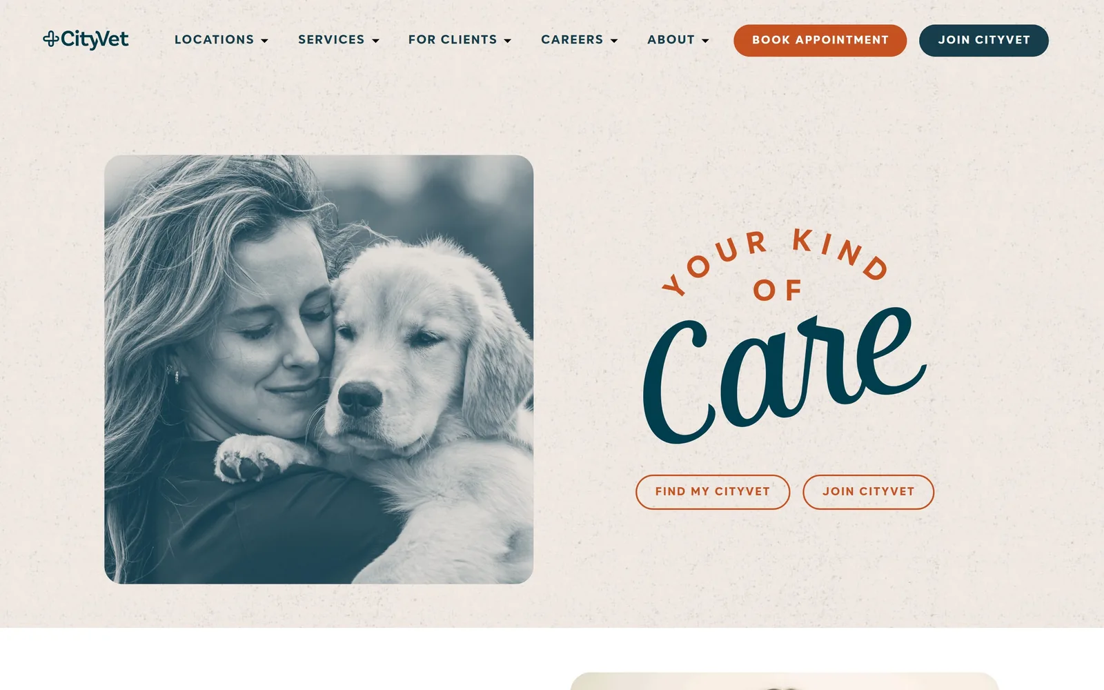
A teal duotone photo of a woman holding a puppy, beside a hand-script Care lockup on bone paper.
Type
Brush script with Kanyon caps at 36px, 0.150em tracking
Type. The hero lockup mixes three things: 'YOUR KIND OF' in Kanyon caps at 36px with a wide 0.150em tracking, set on an arc, and 'Care' in a thick connected brush script at roughly four times that size. The arc plus script is the kind of move that usually looks like a craft-fair logo, and it survives here because the sans around it is so plain and so widely letterspaced. Nav and buttons are Kanyon at 15 to 16px, uppercase, tracked to 0.131em.
Colour. The page is bone #efe8e2 with a visible paper grain, deep teal #13323e for type, and burnt orange #c55220 for the accent. Orange holds only 0.4% of the screen and lands on the arc text, the Book Appointment pill and the two outlined buttons. The photograph is duotoned to the same teal rather than left in colour, which is what ties a stock-looking hug shot to the rest of the palette and keeps the whole screen to three colours.
Layout. Full-bleed 1440, section padding 58px, hero split with a rounded-corner photo card on the left at roughly 55% and the type lockup centred in the right half. The photo card has a soft radius of about 24px, the only rounding above the fold other than the buttons. Above the fold: nav, two header buttons, the photo, the lockup, and two outlined pills. It is a sparse screen by vet-chain standards.
The ask. Two filled buttons in the header, 'BOOK APPOINTMENT' in orange and 'JOIN CITYVET' in teal, and then two outlined pills under the lockup, 'FIND MY CITYVET' and 'JOIN CITYVET'. Join appears twice, which tells you the membership is the business. The repeat is the weakness: four buttons above the fold and two of them say the same thing.
Duotoning a photograph into your brand colour is the cheapest way to make stock imagery look commissioned.
06
galaxyvets.com
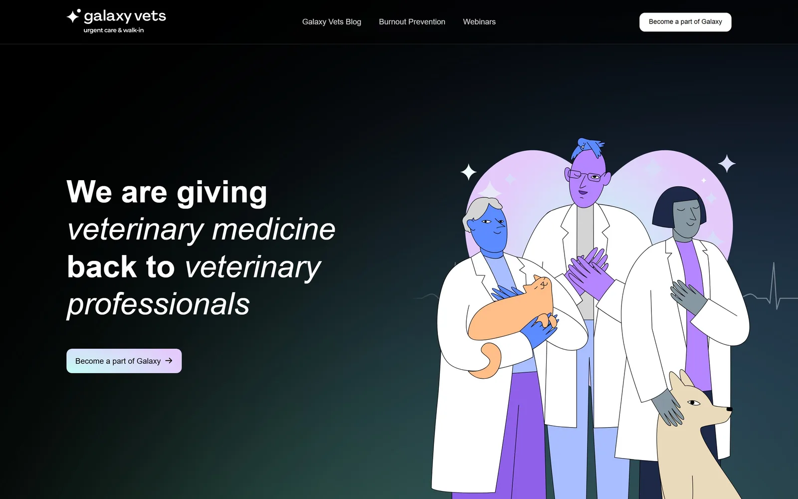
Three flat-illustrated vets in white coats, purple and blue skinned, against a black-to-green gradient.
Type. Montserrat throughout, with the headline at 56px weight 700 alternating roman and italic line by line: 'We are giving' upright, 'veterinary medicine' italic, 'back to' upright, 'veterinary professionals' italic. The italic is doing the emphasis that a second colour would normally do, and because Montserrat's italic is a true slant rather than a cursive, the rhythm reads as stress rather than decoration. Body text is tiny by comparison at 15px.
Colour. Black #000000 and near-black #101010 cover almost the entire screen, with a faint teal-green bloom in the lower left corner. Type is white. The only saturated colour is inside the illustration, where the figures are violet and cobalt and the heart behind them is a lilac gradient. The button is a pale mint-to-lilac gradient pill, picked straight out of that illustration. For a category that defaults to sky blue and pale green, an all-black page is a position, not a palette.
Layout. A 1230px container on a full-bleed black background, hero split roughly 45/55 with type left and illustration right. The button is a 10px-radius pill. Nav is only three links plus a button, and there is no phone number, no location finder, and no hours. Above the fold there is the headline, one button, and the artwork, which is the least crowded hero of the fifteen.
The ask. One ask, 'Become a part of Galaxy', with an arrow, repeated in the header. It is aimed at veterinarians rather than pet owners, and the nav backs that up: Blog, Burnout Prevention, Webinars. Nothing competes with it. The risk is obvious, since a pet owner landing here has nowhere to go, but the page clearly knows which audience it wants.
Flat illustration lets you own a colour no photographer could have handed you.
07
medvet.com
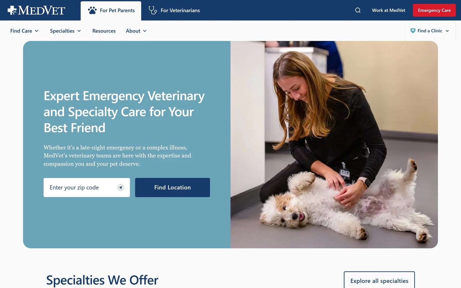
A vet kneels with a small white dog on its back, beside a dusty-blue panel holding a zip-code field.
Type
Usual 40px, weight 500, tracking -0.020em
Body
Usual 18px
Build
700/460 two-column hero, 40px gutter, two-bar header with audience tabs
Made on
WordPress
Colour
#173b6b #6ba4b8 #d81a2a
Type. Usual is the only face, a neutral grotesque, with the headline at 40px weight 500 and tracking pulled to -0.020em so the three lines sit tight. The supporting paragraph is 18px at weight 400 in white, which is the minimum that survives on a mid-value blue, and it only just does. Nav runs 20px at weight 500 in a pale blue against navy. The restraint is the point: nothing on this page is trying to have a personality.
Colour. The dominant colour is a dusty blue #6ba4b8 covering about 32% of the hero panel, against navy #173b6b for the header and the Find Location button. Off-white #fafafa carries the page below. Red #d81a2a is held back entirely for the Emergency Care button in the top right corner, which is the only saturated thing on screen. That discipline is what makes the red mean something.
Layout. A 1440 page with the hero as a two-column grid of 700px and 460px with a 40px gutter, text panel left and photograph right, both sharing one rounded container with roughly a 16px radius. The header is two stacked bars, an audience switch on top and the main nav below. Above the fold: the audience tabs, nav, headline, paragraph, a zip field and a button.
The ask. The hero asks for a zip code, not a booking, which is the correct ask for a 30-location specialty network where the nearest clinic decides everything. 'Find Location' is the filled navy button. 'Emergency Care' sits in red in the header as a separate, faster path. The 'For Pet Parents' and 'For Veterinarians' tabs split the audience before anyone reads a word, which keeps the referral traffic out of the way.
If location decides which service a visitor gets, make the hero a zip-code field instead of a booking button.
08
heartandpaw.com
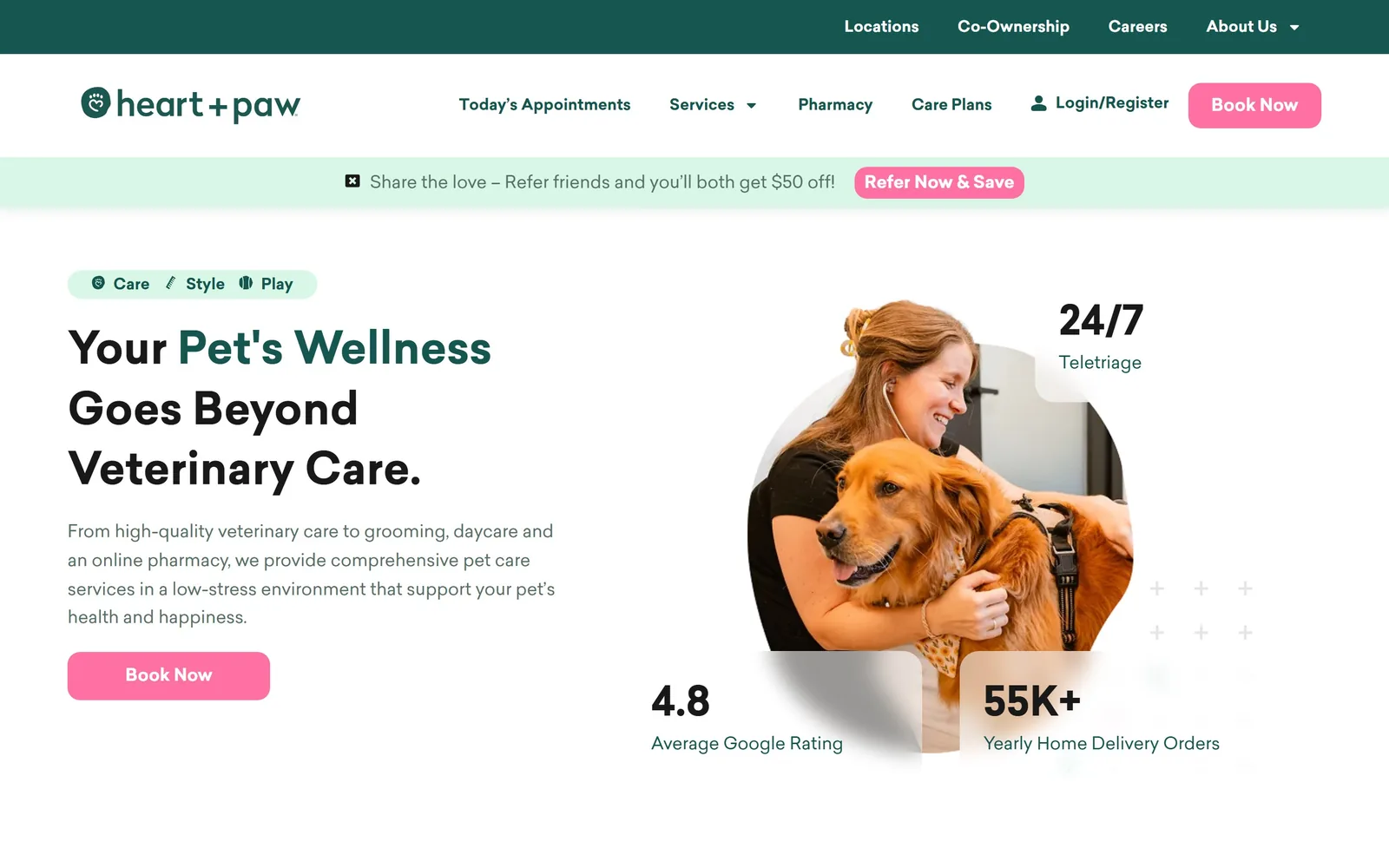
A woman hugs a golden retriever inside a circular crop, ringed by floating 24/7, 4.8 and 55K+ stat cards.
Type
Sailec 46px, weight 700
Body
Sailec 18px, line height 1.65
Build
Full-bleed hero, circular photo crop, three overlapping stat cards
Made on
WordPress
Colour
#155750 #ff71a2 #d9f7e7
Type. Sailec again, at 42 to 46px weight 700 for the headline and capitalised rather than title-cased. The trick is a two-tone heading: 'Your' in black, 'Pet's Wellness' in forest green, then back to black for the rest, so the phrase that matters gets colour instead of a bigger size. Body copy is 18px at 1.65 line height in a soft grey-green, and the stat numbers jump to around 40px weight 700 to act as a third typographic level.
Colour. White covers most of the screen. Forest green #155750 carries the top bar and the emphasised words, mint #d9f7e7 fills the pill badge and the referral strip, and hot pink #ff71a2 takes under 1% of the area on the two Book Now buttons. Pink and forest green is not a combination this category reaches for, and it is the single thing stopping the page looking like every other white-background clinic site.
Layout. A full-bleed 1440 with the hero in two halves, copy left and a circular photo crop right. The three stat cards are white with soft shadows and overlap the circle at the top right, bottom left and bottom right, which gives the composition depth without a drop-shadow on the photo itself. Buttons are 13px radius. Above the fold: green utility bar, nav, mint referral strip, a Care/Style/Play pill, headline, paragraph, one button and three stats.
The ask. 'Book Now' appears twice in pink, once in the nav and once under the paragraph. Competing against it are the referral offer strip, a Login/Register link, and a Care/Style/Play toggle sitting directly above the headline. That is three things between the top of the page and the actual pitch, and the strip offering $50 off is the loudest of them.
Colour one phrase inside the headline instead of making the whole headline bigger.
09
petersonsmith.com
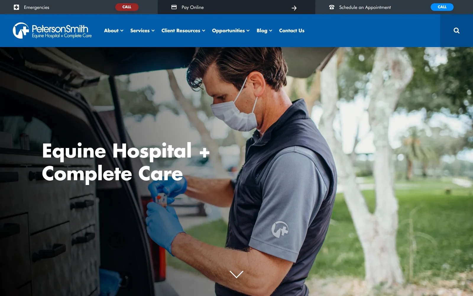
A masked vet in a grey polo loads blood tubes at the back of a truck under Florida oaks.
Type
Futura Bold 56px
Body
Futura Book 18px
Build
Edge-to-edge photo hero, segmented utility bar above the nav
Made on
WordPress
Colour
#005dac #272e36 #ffffff
Type. The headline is Futura Bold at 56px, knocked out in white over the photograph with no scrim behind it. Futura's geometric circles make 'Equine Hospital + Complete Care' feel engineered rather than friendly, which matches a practice that does surgery and sports medicine. Body copy is Futura Book at 18px in #444444. Using the plus sign as a typographic element rather than the word 'and' keeps the line to two tidy rows.
Colour. Blue #005dac is the brand colour and it takes the full-width nav bar, roughly 5% of the screen, which is the most saturated area on the page. Below it the photograph supplies everything else: grey polo, blue gloves, green grass, white tree trunks. Dark charcoals #272e36 and #303842 hold the utility bar. The decision here is to let the photograph be the palette and keep the interface to one blue.
Layout. Full-bleed 1440 with no container at all above the fold, the photograph running edge to edge and the headline sitting at roughly 40% down the left. A thin dark utility bar runs above the blue nav, carrying Emergencies, Pay Online and Schedule an Appointment as three separate segments. A white chevron centred at the bottom invites the scroll. Nothing is rounded except the two small CALL pills.
The ask. Three asks sit in the utility bar before you reach the nav: an Emergencies CALL in red, Pay Online, and Schedule an Appointment with a blue CALL. The hero itself asks for nothing, which leaves the chevron doing the work. For a referral practice where owners arrive with a vet's recommendation, putting payment and emergency ahead of booking is a defensible order.
Real documentary photography of your own staff beats any stock image, and it lets you cut the interface down to one colour.
10
thefishtownanimalhospital.com
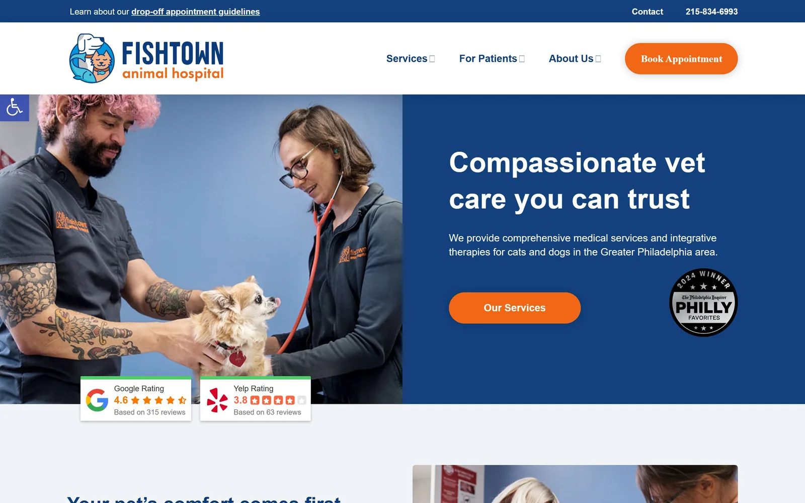
A tattooed tech and a vet with a stethoscope hold a tiny chihuahua, next to a navy panel of white type.
Type. Poppins throughout, with the headline at roughly 50px weight 700 in white. Poppins is a geometric sans with perfectly circular bowls, which usually reads generic, and the page gets away with it by setting the headline large and keeping the supporting paragraph small at 18px. There is no second typeface and no italic anywhere. The nav is the weak point, since the dropdown chevrons render as empty boxes where the icon font failed to load.
Colour. Navy #12417e holds the right half of the hero and the top utility bar, orange #f16716 takes the two buttons at about 1.5% of the screen, and the rest is white and a very pale blue-grey #f1f4f8. Navy and orange is the default pairing for American veterinary practices, so this is a competent choice rather than an interesting one. What saves it is that the photograph behind the staff is a flat blue-grey wall that nearly matches the panel.
Layout. A 1200px container, narrower than most here, with the hero split close to 50/50 and the photograph bleeding to the left edge. Buttons are 29px radius, almost pills. Two Google and Yelp review cards sit tucked into the bottom left of the photograph, overlapping it, and a 2024 Philly Favorites badge sits inside the navy panel. Above the fold: utility bar, nav, photo, headline, paragraph, one button, two review cards and an award seal.
The ask. The nav carries 'Book Appointment' as an orange pill and the hero offers only 'Our Services', which is a softer ask than most on this page and probably deliberate for a practice that wants you to read about integrative therapies first. The 4.6 Google and 3.8 Yelp cards are the real persuasion, and publishing the 3.8 rather than hiding it is a small act of nerve.
Publishing your honest review scores, including the unflattering one, buys more trust than a stack of badges.
11
sactownvet.com
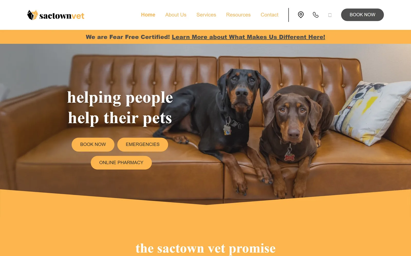
Two dobermans sit on a tan leather sofa under a lowercase serif line reading helping people help their pets.
Type
Playfair Display 60px, weight 700, lowercase
Body
Poppins 19px, weight 100
Build
Full-bleed photo hero with angled colour cut, 100px pill buttons
Made on
WordPress
Colour
#fcb54d #f4eedf #4f4f4f
Type. Playfair Display at 60px weight 700, forced to lowercase, which is the whole personality of the page. Playfair is a high-contrast transitional serif usually set in title case, and dropping the capitals pulls the formality out of it and leaves the warmth. Body and nav are Poppins, at 19px and 20px, set at weight 100, which is far too light and is the one thing I would change. The weight gap between a 700 serif and a 100 sans is almost comically wide.
Colour. Amber #fcb54d is the brand colour and it is not shy: 56% of the screen area, including the full announcement bar, the three hero buttons and the angled block cutting under the photograph. Cream #f4eedf and charcoal #4f4f4f fill in around it. The amber happens to sit almost exactly on the tan of the leather sofa in the photograph, which is either luck or good art direction, and it makes the cut-out angle at the bottom of the hero read as intentional.
Layout. Full-bleed 1440 with 80px section padding, the photograph running the full width and an angled amber shape slicing diagonally across its lower third. Buttons are 100px radius, true pills, and they stack in a 2+1 arrangement rather than a neat row, which is sloppy but reads as handmade rather than broken. Above the fold: nav, amber announcement strip, photo, headline, three buttons.
The ask. Three pills of equal weight: 'BOOK NOW', 'EMERGENCIES' and 'ONLINE PHARMACY'. Giving the pharmacy the same visual weight as the emergency link is a mistake, since those are not comparable urgencies. The 'We are Fear Free Certified!' strip above competes directly, and the nav carries a fourth 'BOOK NOW' in dark grey.
Setting a high-contrast serif in lowercase is a cheap way to make a formal face sound like a neighbour.
12
ccvetco.com
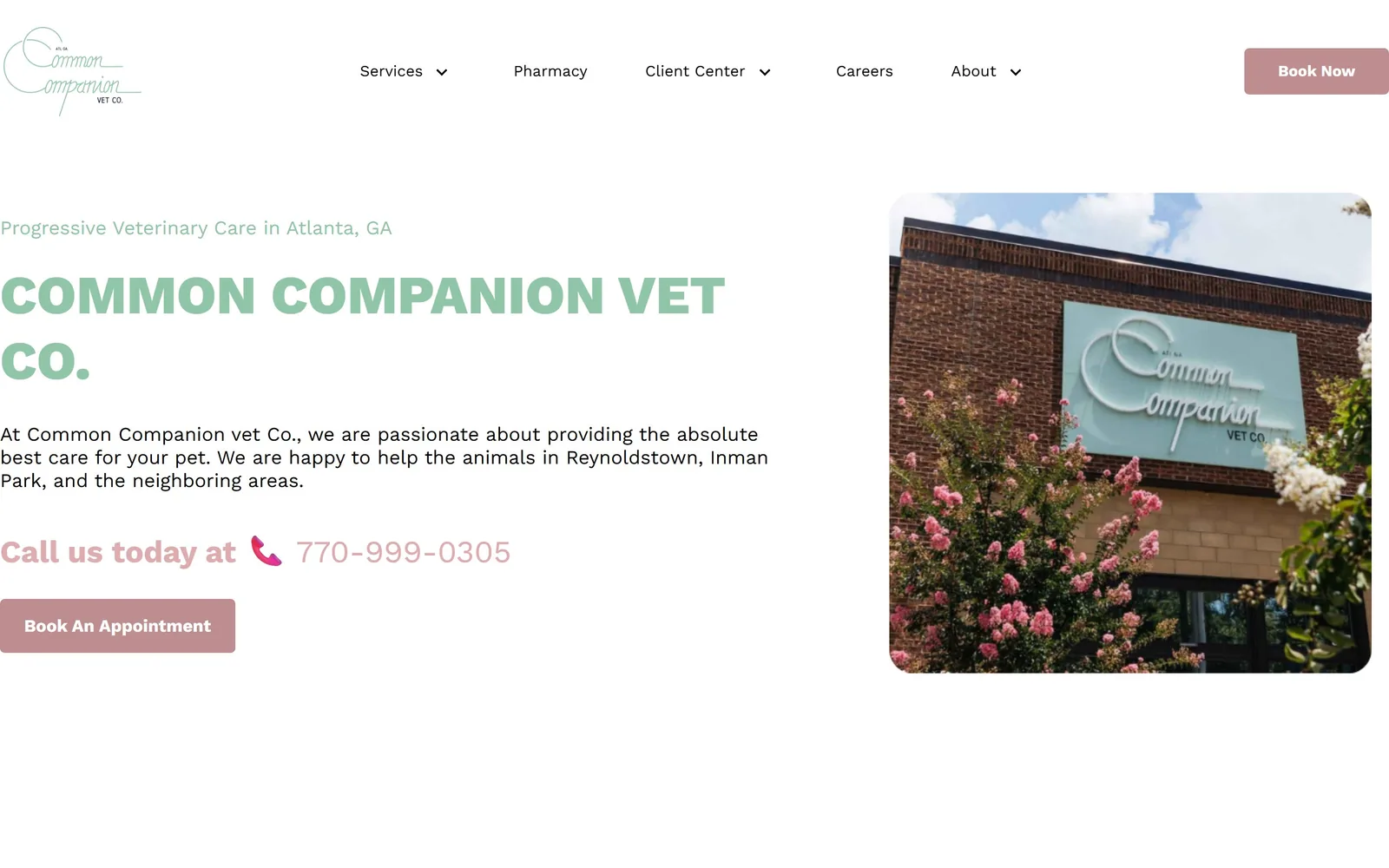
A sage script logo and a pale green all-caps headline beside a photo of crepe myrtles against brick.
Type
Work Sans 56px, weight 800, uppercase
Body
Work Sans 20px
Build
Full-bleed hero, rounded storefront photo right, wide left margin
Made on
Custom
Colour
#90c5a7 #be8d8f #ffffff
Type. Work Sans does all the work. The clinic name runs 56px at weight 800, uppercase, with no tracking added, and the eyebrow above it sits at around 20px in the same sage green. The script in the logo is the only other voice and it stays in the logo. Body copy is 20px at weight 400 in near-black. The size jump from a 56px heavy caps heading to 20px body is large enough that the page needs no intermediate level, and it does not try to invent one.
Colour. Sage #90c5a7 covers 17% of the screen and carries the headline, which is the problem: pale green type on white is around 2:1 contrast and genuinely hard to read. Dusty rose #be8d8f takes the Book Now button and the 'Call us today at' line. White is everything else. The sage and rose pairing is lovely and clearly chosen rather than inherited, and the clinic sign in the photograph is the same sage, which ties it together. The contrast is the price.
Layout. Full-bleed 1440 with a very wide left margin, type occupying roughly the left half and a rounded-corner photograph of the storefront on the right at about a 24px radius. The button is a 5px-radius rectangle, almost square, which sits oddly against the soft everything else. There is a lot of white space below the hero before the next section, more than most sites here allow themselves.
The ask. The phone number is the primary ask, set large in dusty rose with a pink phone icon, above a 'Book An Appointment' button. Putting the number above the button is the right order for a two-person neighbourhood practice where someone will actually answer. The nav carries a second Book Now. Nothing else competes, which is the advantage of being small.
A small practice can put the phone number above the booking button, because someone will actually pick up.
13
rhinebeckequine.com
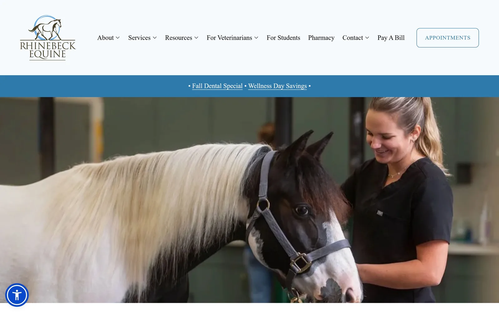
A vet in black scrubs stands with a piebald cob in a green-walled barn aisle, with no headline over it.
Type
Engraved serif logo, light sans nav at 19px
Body
Light sans 19px, weight 300
Build
290px white header band, textless full-width photo hero
Made on
Squarespace
Colour
#2f7aad #ffffff #333333
Type. The logo is an engraved serif in caps, letterspaced wide and stacked over two lines, and it is the only serif on the page. Everything else is a light sans at 19px in weight 300, including the nav, which gives the header almost no visual weight at all. The promo strip across the middle runs the same 19px light in white on blue, bracketed by bullet points. The page is typographically quiet to the point of being self-effacing.
Colour. Near-white #ffffff holds 218% coverage across the header and page, a mid blue #2f7aad takes the promo strip and the Appointments button outline, and charcoal #333333 does the rest. The blue is pulled from the circle in the logo mark. There is no warm colour anywhere, which for an equine practice in the Hudson Valley is a restrained choice, and the photograph supplies the only warmth with the horse's cream mane and the green barn wall.
Layout. A 1440 page with a tall white header band running roughly 290px deep, which is generous, then a thin blue promo strip, then the photograph running full width with 217px of section padding below. The Appointments button is a 10px-radius outline rather than a filled block. The single most interesting decision is that the hero photograph carries no text, no scrim and no button.
The ask. 'APPOINTMENTS' sits in the header as an outlined button and that is the entire ask above the fold. The promo strip offers two seasonal links, 'Fall Dental Special' and 'Wellness Day Savings', which are the only competing claims. An eight-item nav including 'For Veterinarians' and 'For Students' tells you the practice serves referrals and teaching as well as owners.
A hero photograph with no headline over it can say more than one with a slogan, if the photograph is actually yours.
14
urbananimalnw.com
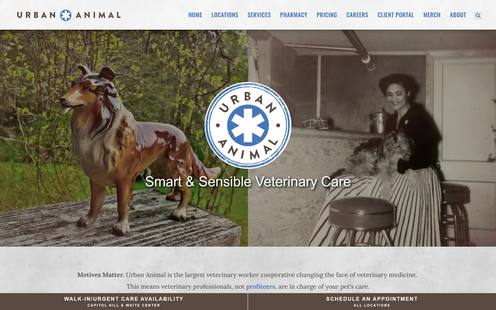
A diptych pairing a ceramic collie figurine on a porch with a sepia snapshot of a woman and her dog.
Type
Light sans hero line, Oswald condensed caps nav
Body
Lora 18px, weight 500
Build
50/50 photo diptych, centred stamp logo, split action bar
Made on
WordPress
Colour
#4274ba #5a4a42 #e0e0e0
Type. Three faces, which should not work. Oswald in condensed uppercase at 17px with 0.029em tracking handles the nav, Lora at 18px weight 500 carries the body text in a warm grey, and a thirsty brush script at 40px appears below the fold. The hero line 'Smart & Sensible Veterinary Care' is set in a plain light sans, white, with no shadow. Lora in the body is the right call, since a serif at 18px makes the cooperative's manifesto read like editorial rather than marketing copy.
Colour. Grey #e0e0e0 covers the page frame, with a mid blue #4274ba for the nav links and the logo roundel, and a warm brown #5a4a42 for the bottom action bar. The photographs supply the actual colour: spring green on the left, sepia and cream on the right. There is no accent colour in the usual sense, and the brown bar at the foot of the fold is the closest thing to one. For a worker cooperative rather than a chain, the absence of a bright brand colour reads as deliberate.
Layout. Full-bleed 1440 with the hero built as a 50/50 diptych, the circular stamp logo centred on the seam between the two images. Below it a grey band carries two centred lines of Lora, and below that a brown bar splits into two halves. There is no rounding anywhere and no container narrower than the viewport. Nine nav items is a lot, and they are all set at the same size.
The ask. The hero asks for nothing. The brown bar at the bottom of the fold splits into 'WALK-IN/URGENT CARE AVAILABILITY' on the left and 'SCHEDULE AN APPOINTMENT' on the right, each with a small subtitle naming locations, which is the whole conversion strategy. Putting walk-in availability on equal footing with scheduling is the right split for a clinic in a dense neighbourhood.
A diptych of two unglamorous real photographs will say more about who you are than any commissioned hero shot.
15
dovelewis.org
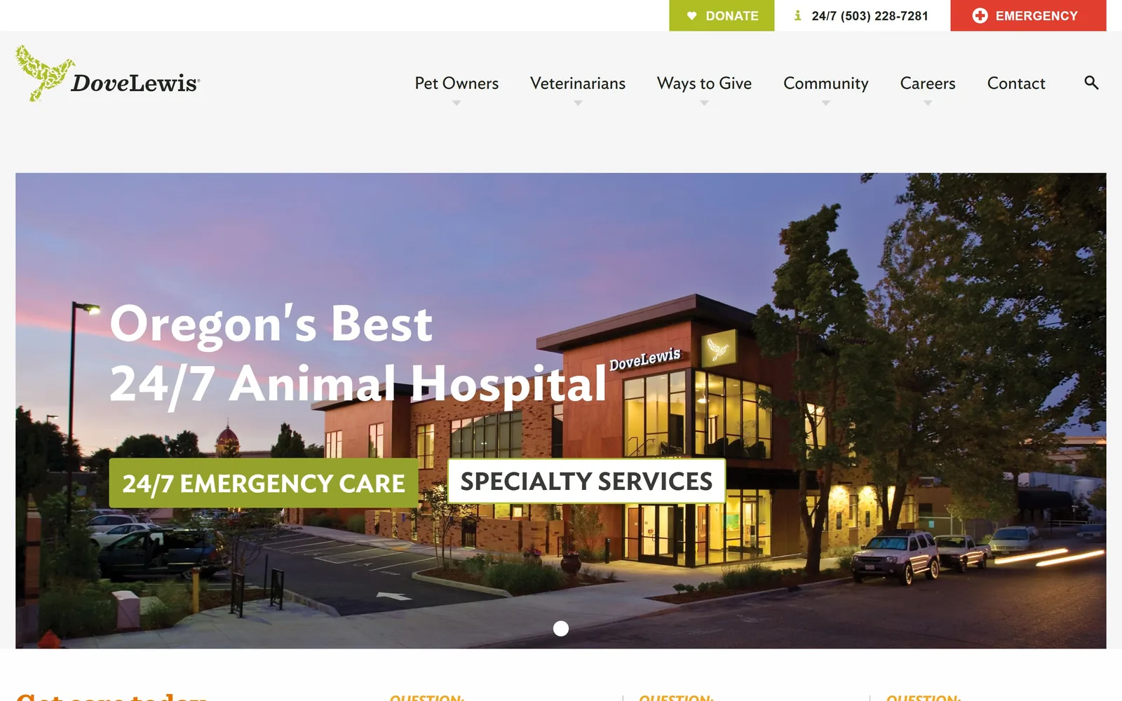
A brick animal hospital photographed at dusk under a pink and violet sky, with white type across it.
Type. Ideal Sans at 64px weight 600 with 0.020em tracking for the headline, which is a humanist sans with slightly splayed legs and a warm, drawn quality that stops 'Oregon's Best 24/7 Animal Hospital' sounding like a boast. Body copy drops to 20px in a grey-green #4e5149, and the two buttons under the headline use the same face at 32px uppercase weight 700, which is unusually large for a button and is what makes them read as navigation rather than CTAs.
Colour. Olive green #95a22b is the brand colour and it takes exactly 1% of the screen, on the Donate button and the '24/7 EMERGENCY CARE' block. Navy #0a2240 holds about 26%, mostly in the dusk sky of the photograph rather than in any interface element. A single emergency red #e23e2f sits in the top right corner. The palette is essentially set by the photograph, and the olive was chosen to survive against a violet sky, which it does.
Layout. A 1440 page with a light grey header, then a full-width hero image in a slider with a single visible dot at the bottom. Buttons are 4px radius, nearly square, and sit in the lower left of the image rather than centred. Above the fold: a three-button utility strip, a seven-item nav with dropdown arrows, and the hero image with its headline and two blocks. The architecture of the building is doing the composition work.
The ask. Three asks compete in the top strip: Donate in olive, a 24/7 phone number, and Emergency in red. Inside the hero, '24/7 EMERGENCY CARE' and 'SPECIALTY SERVICES' sit side by side as equal blocks. For a nonprofit hospital that needs both patients and donors, that competition is structural rather than careless, and the red Emergency button is correctly the loudest thing on the screen.
Photograph your own building at dusk and you get a hero image no competitor can buy.
How these were chosen
Fifteen clinics, animal hospitals and equine practices are collected here, from a two-person neighbourhood surgery in Atlanta to a thirty-location emergency network and the oldest equine hospital in the world. The pattern that showed up again and again: the practices that look most expensive are the ones that photographed their own staff, their own building or their own waiting room, and then cut the interface down to a single accent colour. The ones that look cheapest bought a stock hug shot and surrounded it with four buttons. Good veterinary website design in this set is almost always a decision about what to leave out, whether that is a second typeface, a third colour, or a headline over the photograph. Note how many of the best heroes ask for one thing and let the phone number sit quietly beside it.
Finding veterinary sites that someone had actually designed took far longer than it should have. 30 candidates made the shortlist. 15 made the page.
Each one was opened and looked at properly: what the type is doing, where the colour gets spent, how the page is built, how it asks for the job. Nothing is here because it ranks. Nothing is here because an agency filed it under portfolio. Several well known names were left out for the plain reason that their site came out of the same template as everyone else's, and a few sites worth including did not survive a second look.
Where a site is only competent, it says so. The order is the order worth your time, best first.
Reviewed and selected by Larry W. Matthews for Websitely.