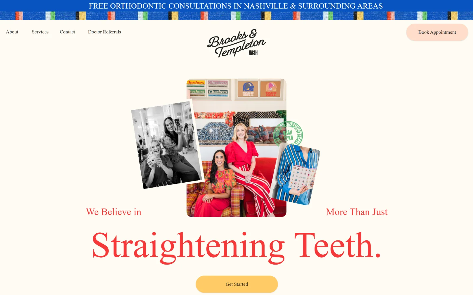
Type. Three faces, each given exactly one job. Bethany Elingston Regular sets the 20 character payoff line at 110px, weight 400, 1.20 line height, in #f73737. Above it WILCO LOFT SANS TREBLE runs 24px uppercase across 63 characters, and League Spartan handles 15px captions. The display face is a wide scripted serif, and at 110px it is the only thing on the page allowed to be big.
Colour. A #fffbf3 ground at 173.6 percent coverage, then #086d18 green at 24.7 for the woven ribbon and the circular stamp, #cae5ff and #0853bf blue at 2.3 and 1.9, #ffcc66 at 0.7 and #ffddca at 0.4. Six values is more than anything else in this set carries, and the red ink at #f73737 is a seventh, used on 20 characters only.
Layout. No container is set, so the collage floats on the full field with the headline running behind and around it rather than below. Nav sits far left, the script wordmark is centred, the booking pill is far right, so the header reads in three separate zones instead of one bar. Corner radius is 0 and the document runs 5437px.
The ask. Book Appointment sits top right and Get Started sits under the headline, two asks in the same vertical line. No phone number appears in the header at all. Further down the page the figures $2,550 and $7,000 are printed, which is the only set here to put treatment prices on the homepage.
Publishing your price range on the homepage replaces the consultation call as the qualifying step, so the booking button meets a warmer visitor.
02
hullandcoleman.com
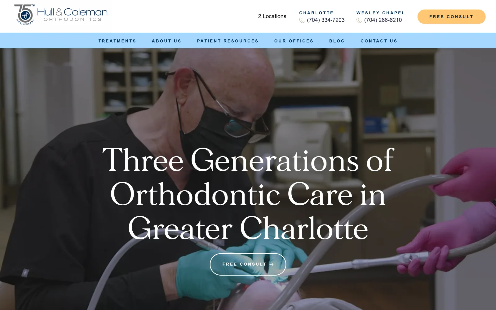
A video still of a masked orthodontist working fills the frame, with a white serif headline over three lines and an outlined pill button beneath it.
Type
Morion 90px
Body
sofia-pro 16px
Build
Two-tier header, full-width video, 112px padding
Made on
WordPress
Colour
#222325 #002d56 #a5d8ff
Type. Morion at 90px, weight 400, 1.10 line height, white, carries 58 characters across three lines of a high contrast serif. Everything else is sofia-pro: 30px weight 700 uppercase at 0.050em, 16px for reading, and a 12px weight 700 cut at a very wide 0.250em with a 3.75 line height for nav and buttons. The 90 to 12 range is the widest ratio on the page.
Colour. Five values. The hero sits on #222325 at 50 percent coverage, navy #002d56 at 45.8 carries 224 characters of ink, #a5d8ff pale blue at 22.3 fills the nav band, white at 7.8 and #ffc774 butter at 4.5 on one button. The accent is warm and the ink is cold, so the single yellow pill reads as the only invitation.
Layout. A two-tier header: contact row on white, then a pale blue bar holding six nav items, roughly 150px of chrome before the video starts. The video runs full width at 1440 with the headline centred on it and no scrim. Section padding is 112px below the fold, corner radius is 0 everywhere except the pill, which is 100. Document 5128px.
The ask. Free Consult appears twice, once as a solid pill in the header and once outlined and centred under the headline. Two phone numbers are labelled by location and the words 2 Locations sit beside them. Five separate asks compete above the fold, and the outlined one wins because it is the largest.
Putting one CTA solid in the header and the same CTA outlined in the hero avoids two identical buttons fighting for the same glance.
03
freshorthodontics.com
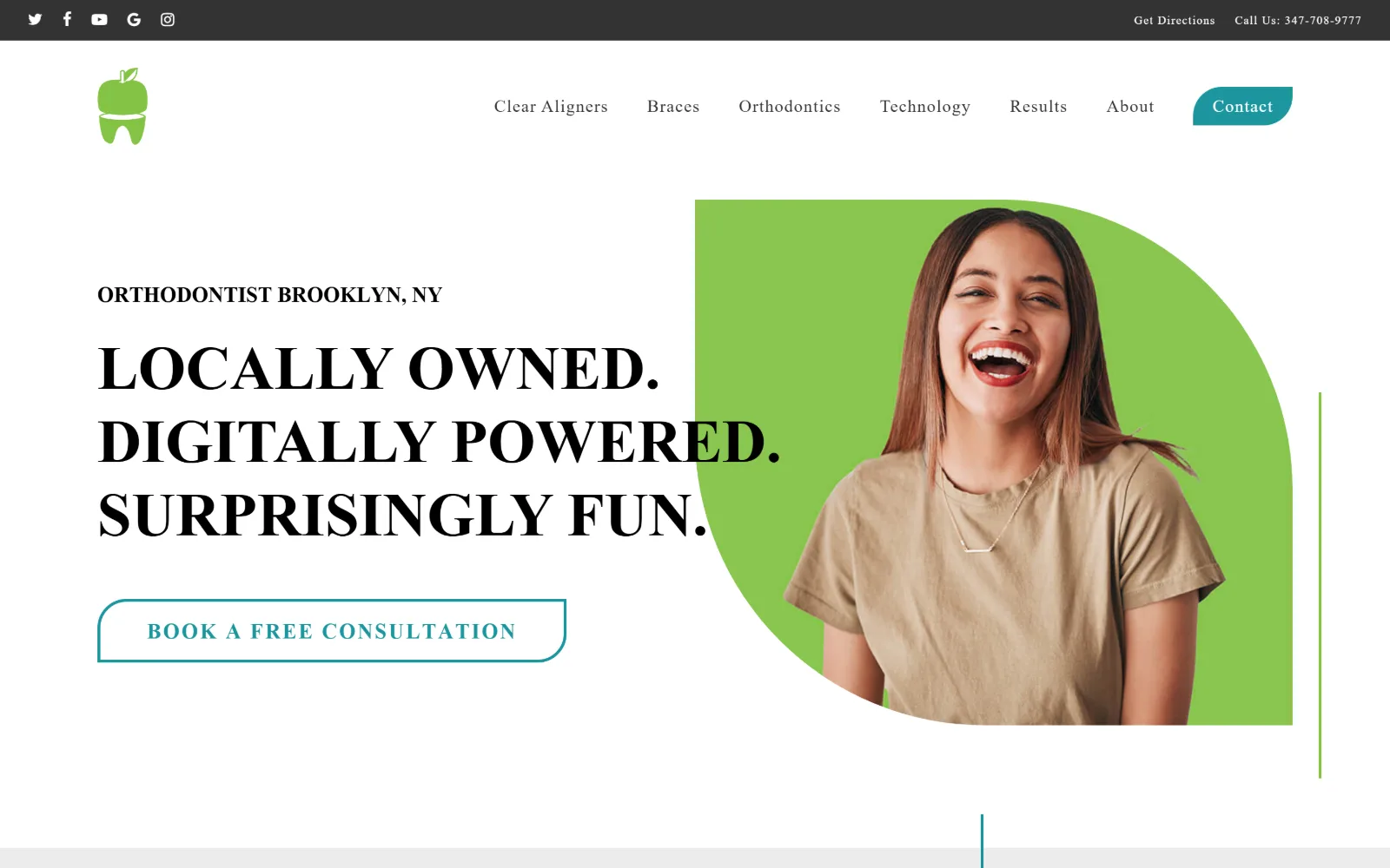
Three lines of heavy black capitals sit left of a laughing patient cut into a quarter-circle lime panel, above an outlined teal consultation button.
Type. Measured as Figtree at 63px weight 900 uppercase across 51 characters, rendering with strong thick and thin contrast so it behaves like a display serif rather than a grotesque. Body is the same family at 20px weight 300 with 0.050em tracking across 607 characters, nav at 12px weight 300 at 0.083em. Weight 900 against weight 300 is the entire hierarchy.
Colour. The measured ground is white at 341 percent coverage with #ececec at 40.1 and #333333 at 2.3. Three brand values sit in the stylesheet at zero measured coverage: #83c344 green, #8e2c62 plum and #1c969f teal. The lime quarter circle behind the portrait and the teal Contact tab are where two of those three actually surface.
Layout. The hero splits roughly 55 to 45, text left and image right, but the image is masked into a quarter circle with the curve on the lower left, so the portrait sits inside a shape rather than a rectangle. Container is the full 1440. Thin vertical rules in green and teal run down the right edge and up from the fold. Radius 0 on the button, document 8402px.
The ask. Seven nav items plus a leaf-shaped Contact tab, a phone number in the dark utility strip, and one outlined Book a Free Consultation under the headline. The outline rather than a fill is the restrained choice, and the leaf tab gives Contact a different silhouette from every other nav word.
Masking a portrait into a quarter circle instead of a rectangle lets a single brand colour fill the hero without a flat colour block.
04
thousandsmilesaustin.com
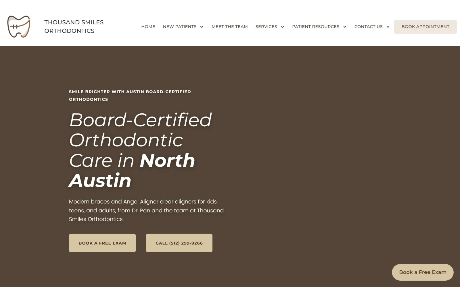
A deep brown field holds an italic white headline over four lines with North Austin in bold, two tan buttons, and a line-drawn tooth logo at top left.
Type
Montserrat 58px italic
Body
poppins 17px / 300
Build
Left-half hero, 4x288px grid, 8px button radius
Made on
WordPress
Colour
#495338 #d8c6a4 #554538
Type. Montserrat at 58px, weight 400, set in italic, with the place name picked out in the same size at weight 700 so one sentence carries two emphases. A 40px weight 700 uppercase cut at 0.007em appears below, poppins runs the 134 character standfirst at 17px weight 300 with a 1.60 line height, and Montserrat 16px weight 500 handles 753 characters. Italic at headline scale is rare in this trade.
Colour. The hero records as #495338, an olive, though on screen it reads as a warm dark brown. Supporting values are white at 106.7 percent, #f7f3ee at 48.7, #3e3227 at 1.6, #d8c6a4 tan at 1.3 and #efe7df at 0.3. Ink is #554538 across 999 characters, a brown rather than black, so even the body copy stays inside the palette.
Layout. Full 1440 field with the hero text set in the left half and the right half left empty. Below the fold a four column grid of 288px columns runs 30px gutters. Buttons take a small 8px radius while everything else is 0. The header is white and shallow, with the wordmark set over two lines at left. Document height 11575px.
The ask. Four asks. Book Appointment in the header, Book a Free Exam and the phone number as paired tan buttons under the copy, and a persistent Book a Free Exam pill anchored bottom right. The phone number is given a button of its own rather than being set as text, which weights calling equally with booking.
Giving the phone number its own button, the same size as the booking button, treats calling as a real option rather than a fallback.
05
millcityortho.com
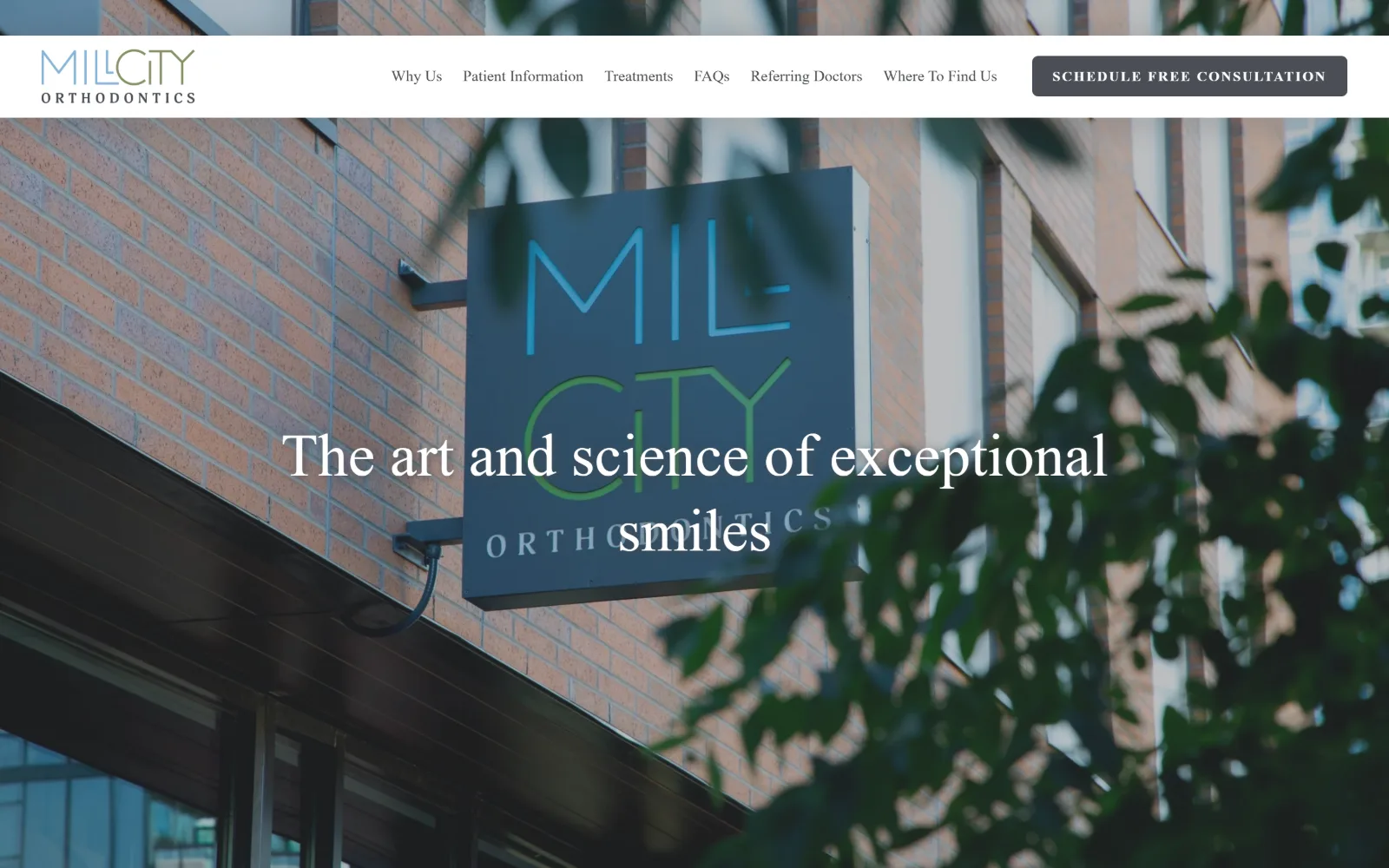
A photograph of the practice sign bolted to a brick wall, half obscured by out of focus leaves, with a white headline across its lower middle.
Type. Three sizes and no more. Poppins at 63px weight 400 with a 1.25 line height sets the 41 character line in white, Poppins 16px in #484a4d runs the six nav items, and the button alone switches to Noto Serif at 14px weight 700 with 0.130em tracking in uppercase. Using a serif only for the button is an odd and effective inversion of the usual pairing.
Colour. A #4a4e55 slate at 150.5 percent coverage is the dominant value, with #5491c0 and #639ac5 blues at 100 and 66 from the sky in the photograph, #828d62 at 34 from the leaves, and white at 4.7 for the headline. Body background is set to #5491c0. The brand values and the photograph values are the same values, which is what makes the overlay sit flat.
Layout. A Squarespace build with a sticky white header about 128px deep, logo left, six nav items centred, one slate button right. The photograph runs full bleed at 1440 behind it. Section padding below the fold is 122px, the base grid resolves to 26 narrow columns with 11px gaps, and the button takes a 6px radius against 0 elsewhere. Document 5462px.
The ask. One button, Schedule Free Consultation, in slate rather than an accent colour, and no phone number in the header at all. A single ask with no competing pill, no chat widget and no floating calendar glyph is the quietest conversion layer in this set.
Photographing your own exterior signage gives you a hero image nobody else can license, and the brand colours come back out of the picture.
06
reeseorthopdx.com
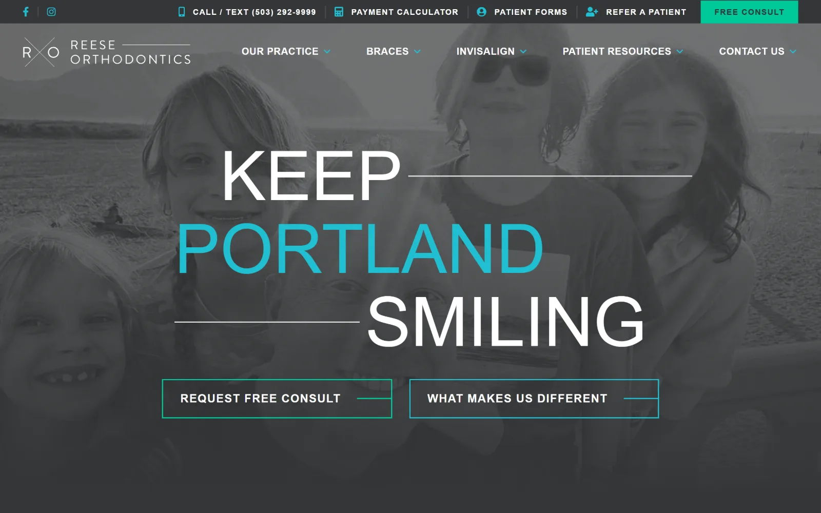
Three words stacked huge across a desaturated beach photo of grinning children, the middle word in cyan, with two outlined buttons below.
Type. One family at seven steps. brandon-grotesque runs 120px weight 500 uppercase for the three stacked words, 60px for the next slide, 24px weight 700, 23px weight 400 at a 1.57 line height in #e0e0e0 for the 225 character paragraph, then 20px, 17px and 14px for labels at tracking from 0.029em to 0.089em. The 120 to 14 spread is handled without a second typeface.
Colour. White at 100 percent coverage, #333536 at 47.7 and #343637 at 2.3, then #00c999 at 0.3. The photograph has been pushed to greyscale so the only saturated things on screen are the cyan word PORTLAND, measured on just 8 characters as #20bfd1, and the green button outline. Two accents, each spent on one element.
Layout. A full bleed background image at 1440 with a dark utility strip above a transparent nav. Hairline rules extend from the first and third words of the headline out to the edges, aligning the three lines on a stepped diagonal. Both hero buttons are outlined rectangles at 0 radius rather than pills. The page runs 12405px and uses a slider.
The ask. Six asks compete: Free Consult in the strip, call or text, payment calculator, patient forms, refer a patient, then Request Free Consult and What Makes Us Different as paired outlines. The pairing is the useful part, one for the ready visitor and one for the undecided, given equal visual weight.
Desaturating a hero photograph to grey lets a single word of type carry the only colour, which no overlay or scrim can do as cleanly.
07
garfinkleortho.com
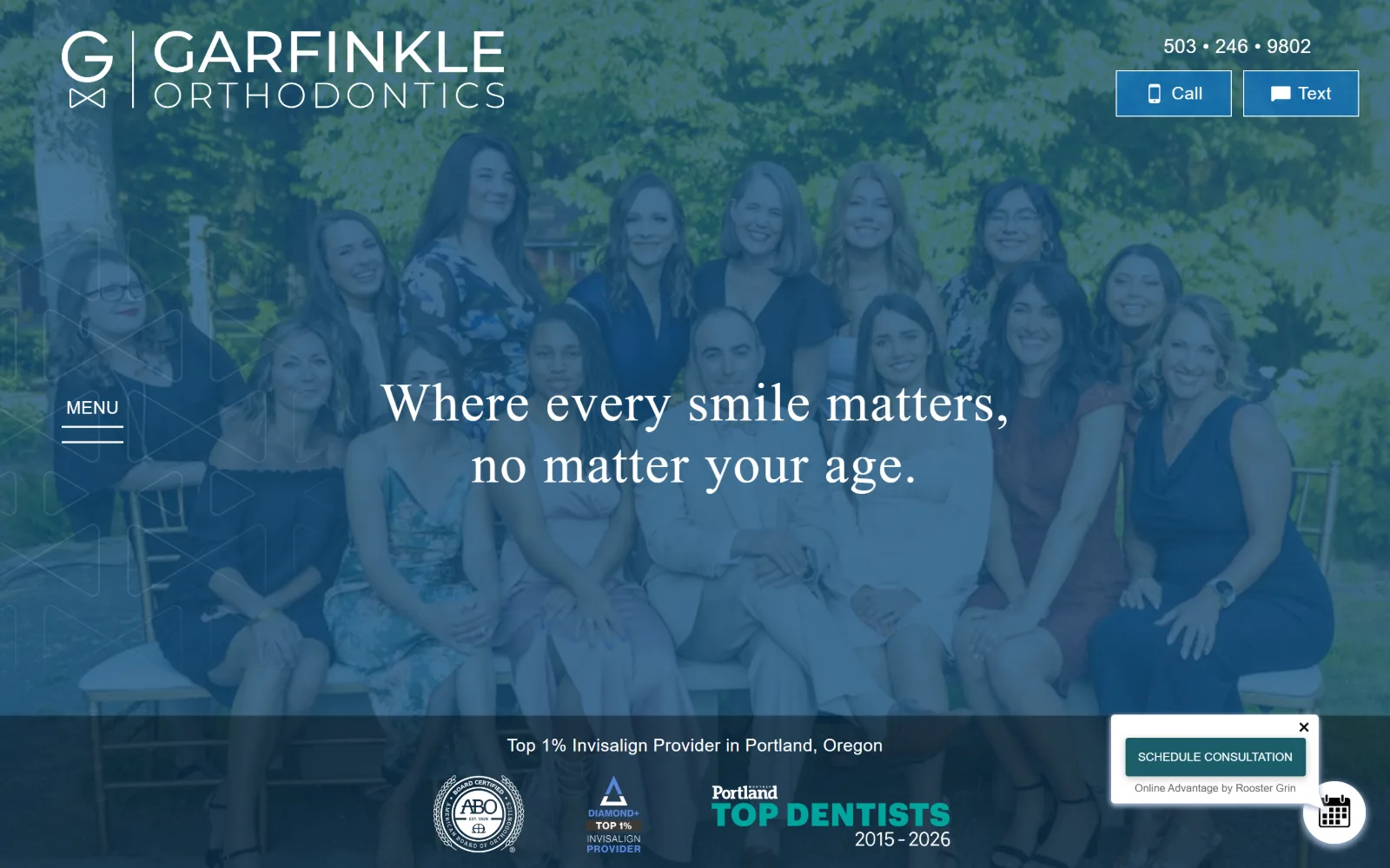
Fifteen staff posed on chairs in front of trees, the whole photograph washed in flat blue, with a two-line white serif sentence centred over them.
Type. Zilla Slab at 56px weight 400 with 0.026em tracking and a 1.14 line height sets the 64 character sentence, and a 30px weight 300 cut of the same slab handles the sub line. Prompt supplies the sans: 24px weight 300 at an extreme 0.167em in lowercase for the word menu, 18px for buttons, with Oxygen at 12px uppercase for the award captions. A slab serif reads warmer here than a grotesque would.
Colour. The duotone does the work: #14507c at 50 percent coverage is laid over the entire photograph, with white at 11.8 and black at 8.8, then #0e6aac at 1.7, #1b5c69 at 0.6 and #1376bf at 0.4 on the buttons. Four blues inside one narrow band, so the team photograph becomes a brand surface rather than a snapshot.
Layout. There is no nav bar. MENU sits underlined at mid height on the left edge, which is the only menu placement like it here. The photograph is full bleed at 1440, the awards row sits in a dark band across the base, and a dismissible scheduling card floats bottom right. Section padding below the fold is 128px, radius 0, document 6693px.
The ask. Call and Text sit as paired blue buttons top right under a phone number set with middle dots instead of hyphens. Schedule Consultation arrives separately in a floating card. Three asks, and the two header buttons are the honest ones because they name the channel rather than the outcome.
Flooding a group photograph with one brand blue turns ordinary staff pictures into a controlled surface that type can sit on without a scrim.
08
austinorthodontics.com
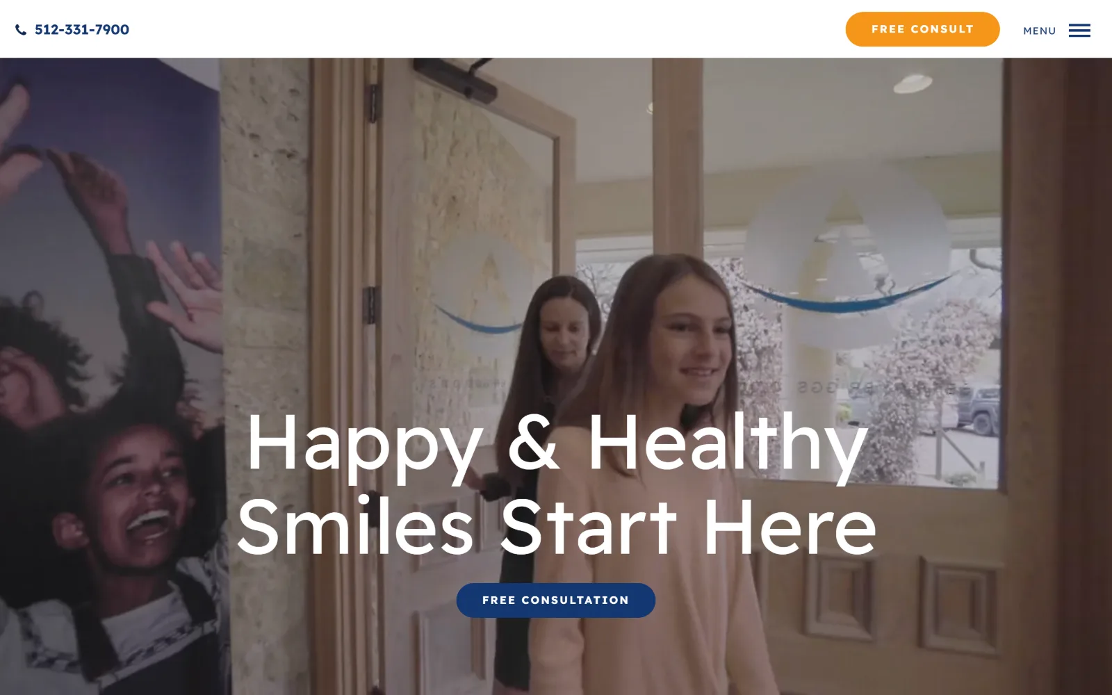
A video still of a girl walking out through a timber clinic door, with a huge two-line white headline and a navy button low in the frame.
Type
Readex Pro 100px
Body
Readex Pro 17px / 1.88
Build
85px header, desktop hamburger, full-bleed video
Made on
WordPress
Colour
#133771 #93c9ff #f59519
Type. Readex Pro is the only family and it is pushed to eight steps: 100px weight 400 at a 1.10 line height for the 33 character headline, then 60px, 31px, 20px, 18px, a 17px weight 400 body at 1.88 across 430 characters, and two 14px cuts at 0.143em and 0.214em uppercase. A 100px headline on a 900px viewport means the type occupies a fifth of the screen.
Colour. Six values. #93c9ff at 50 percent coverage, #222325 at 45.8, #102954 at 24, #7abcff at 17.3, white at 4.2 and #133771 at 0.9, with #f59519 orange reserved for the header pill. The blues are the brand and the orange appears exactly once, which is the right ratio for a button that has to be found quickly.
Layout. A shallow white header of roughly 85px holds the phone number far left and the consult pill plus a hamburger far right, with nothing in between. The nav collapses to MENU even at 1440. Video runs full bleed below. Section padding is 113px, the pills take a 100px radius and everything else is 0. Document 6505px.
The ask. Three asks and two of them say the same thing: Free Consult in the header pill and Free Consultation under the headline, with the phone number third. The repetition is defensible on a long page but above the fold it means two buttons both answer the same question.
A hamburger at desktop width only works when the two things visitors actually need, a phone number and a booking button, are already outside it.
09
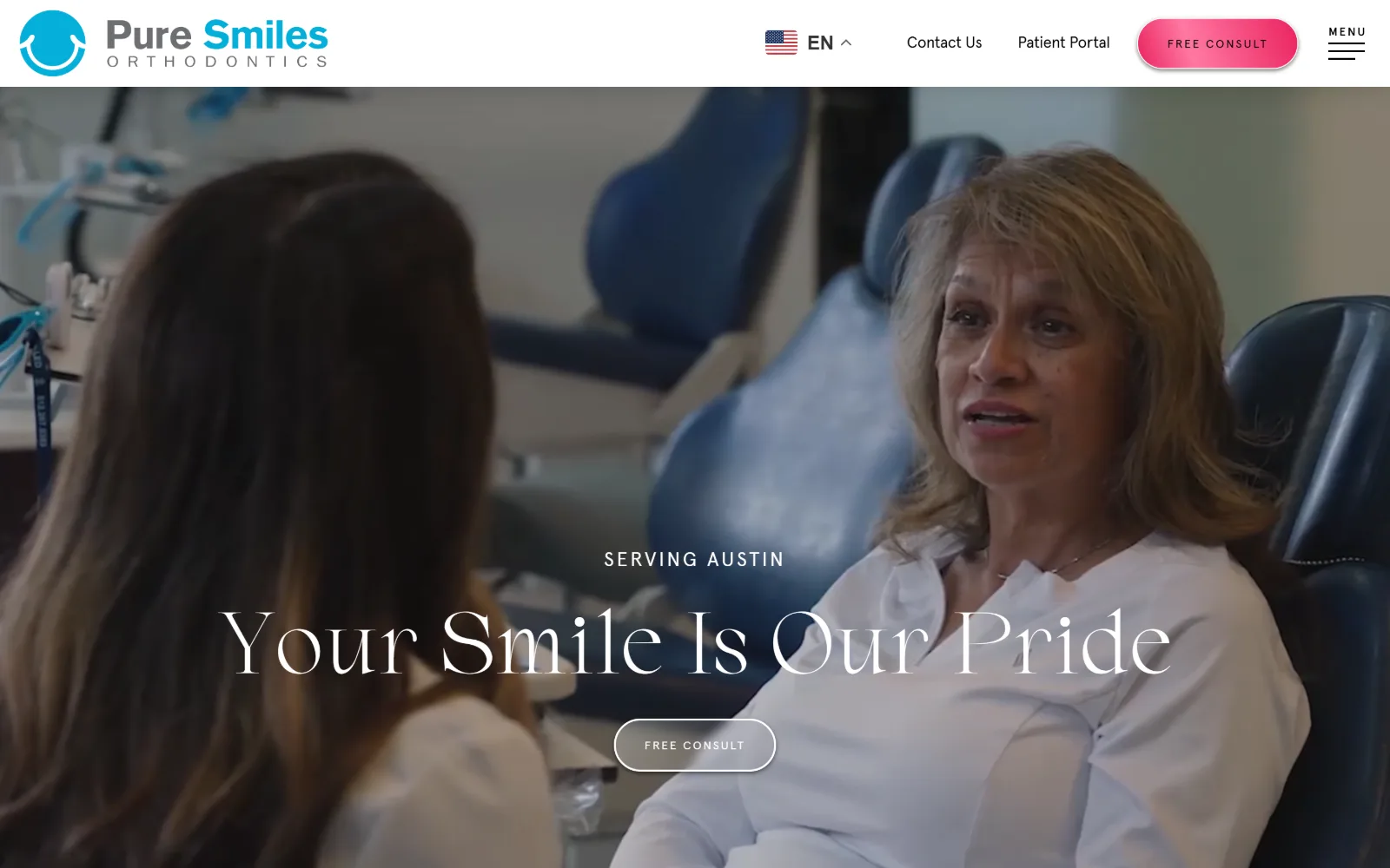
puresmilesortho.com
A clinical video still of a clinician talking to a patient in a treatment chair, with a wide white serif headline and an outlined button over it.
Type. Lagency-Regular, a high contrast serif, at 90px weight 400 with a 1.10 line height carries the 23 character line, and the same face reappears at 70px and at 26px with a 2.50 line height for the nav. Reading copy switches to Apercu-Regular at 16px with a generous 1.94 line height across 317 characters. Display serif against a neutral grotesque, cleanly separated.
Colour. Three measured values only: white at 55.4 percent coverage, #222325 at 50.6 and #f3fcfe at 29.2. Ink splits four ways, black on 234 characters, #00627a on 154, #222325 on 66 and #009dc4 on 52. The magenta Free Consult pill in the header does not appear in the palette at all, which makes it the loudest thing on a page of near neutrals.
Layout. Sticky white header with the logo left, a language switcher, two text links, the pill and a MENU label right. Video runs full bleed at 1440 underneath. The hero button takes a 70px radius and is outlined in white rather than filled, while everything else measures 0. Document height 11802px.
The ask. Two consultation buttons, one magenta and solid in the header, one outlined and transparent in the hero, plus Contact Us and Patient Portal as plain links. Putting the quiet version over the footage and the loud version in the chrome keeps the image readable without losing the ask.
Keeping an outlined button over video and a filled one in the header means the footage is never covered by a solid colour block.
10
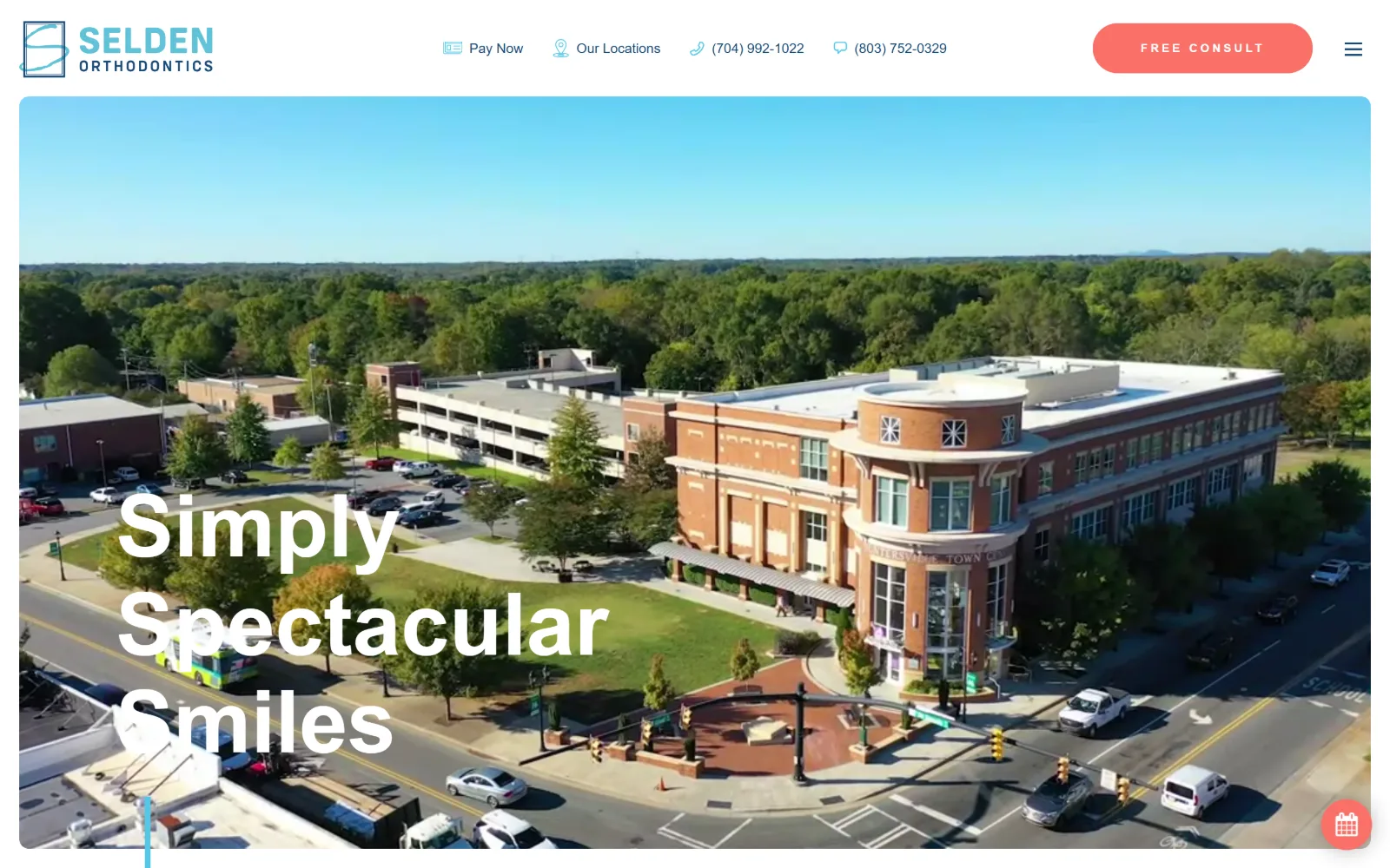
seldensmiles.com
Drone footage of a brick town centre building and its parking lot, inset inside a white margin, with a bold three-line headline in the lower left.
Type
europa 90px / 700
Body
europa 25px / 300
Build
Inset video with white margin, 140px padding, 50px pill
Made on
WordPress
Colour
#ffffff #f97068 #184977
Type. europa alone, at seven sizes. The headline runs 90px weight 700 with a 1.13 line height over three lines, then 64px, 26px weight 400, a 25px weight 300 paragraph at a 1.80 line height across 209 characters, 18px nav, 14px, and a 12px weight 700 button at 0.250em uppercase. Weight carries the hierarchy from 700 down to 300 within one family.
Colour. White at 98.8 percent coverage is effectively the whole interface, with #f97068 coral at 0.6 on the one button and #edf9fd and #54c8e8 registering at 0. Ink is white across 258 characters over the video, #184977 navy on 155 and #54c8e8 on 22. Every colour you actually see belongs to the aerial footage.
Layout. The video does not bleed. It sits inset with a white margin on the left, right and bottom, so the header is a clean white band rather than an overlay, and the headline sits inside the video frame at lower left against a short vertical cyan rule. Section padding is 140px, the button takes a 50px radius, everything else is 0. Document 5304px.
The ask. Five asks across the header alone: Pay Now, Our Locations, two phone numbers for two offices, and a coral Free Consult pill, with a floating calendar glyph bottom right. Pay Now sitting first in the row is unusual, and it says the site serves existing patients as much as new ones.
Insetting hero video inside a white margin keeps the header legible as a white bar, so no scrim or gradient is needed over the footage.
11
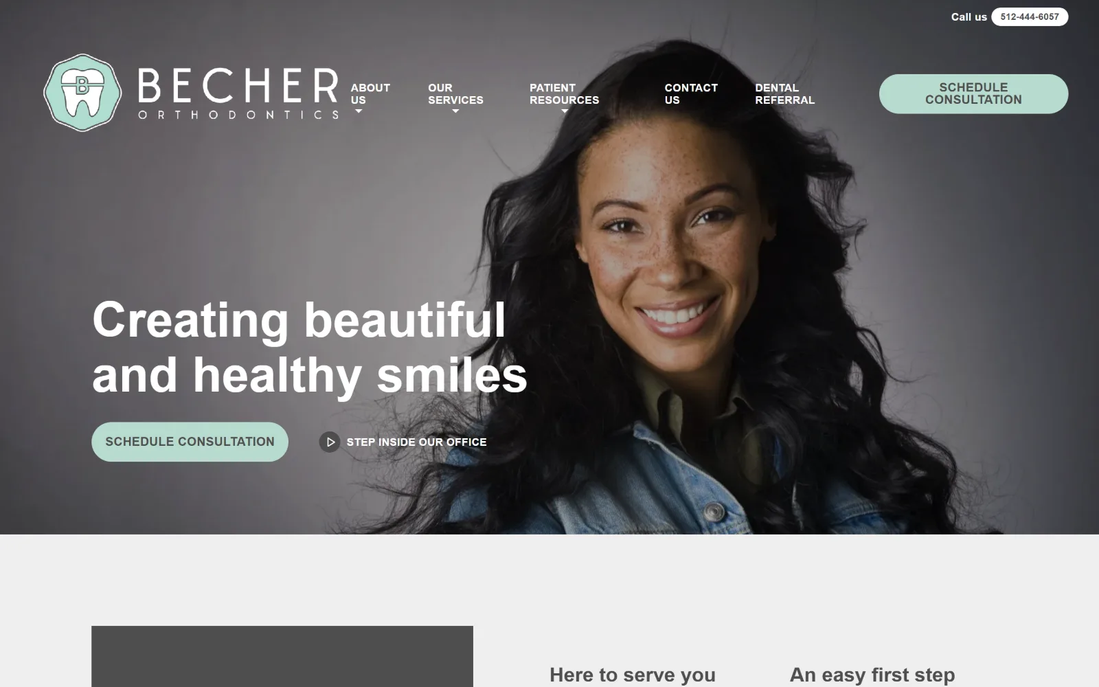
austinsmilefixer.com
A portrait of a smiling woman against a grey studio backdrop fills the right half, with a two-line white headline and a mint pill button at the left.
Type
brandon-grotesque 64px / 700
Body
brandon-grotesque 20px
Build
No header bar, nav on photo, 52px pills
Made on
WordPress
Colour
#efefef #b8dbcf #4e4e4e
Type. brandon-grotesque handles everything across six sizes: 64px weight 700 for the 37 character headline, then 40px, 34px and 26px all at weight 700, a 20px weight 400 body across 521 characters in #4e4e4e, and 14px weight 700 at 0.021em uppercase for nav. Four bold sizes above one regular size is a top heavy scale, and it is why the page below the fold feels louder than the hero.
Colour. Five values and only one of them has a hue: #efefef at 100 percent coverage as the ground, #4e4e4e at 12.9 for 692 characters of ink, #eaebed at 9.3, white at 9.1, and #b8dbcf mint at 1.3 on both buttons. A secondary #63b7a5 appears on 20 characters. Grey page, mint accent, and the photograph supplies the rest.
Layout. There is no header bar. The tooth mark logo, five nav items with dropdown carets and the mint pill sit straight on the photograph, with the nav text wrapping to two lines because the words are long. Container is the full 1440, buttons take a 52px radius, everything else is 0. Below the fold the ground turns #efefef. Document 6946px.
The ask. Schedule Consultation twice, as a mint pill in the header and a mint pill in the hero, with a small phone pill above them and a Step Inside Our Office video link beside the second button. Four asks, three of them the same colour, so the video link is the only one that reads as different.
A muted mint used on every button and nowhere else makes the action colour unmistakable, even against a photograph with no colour of its own.
12
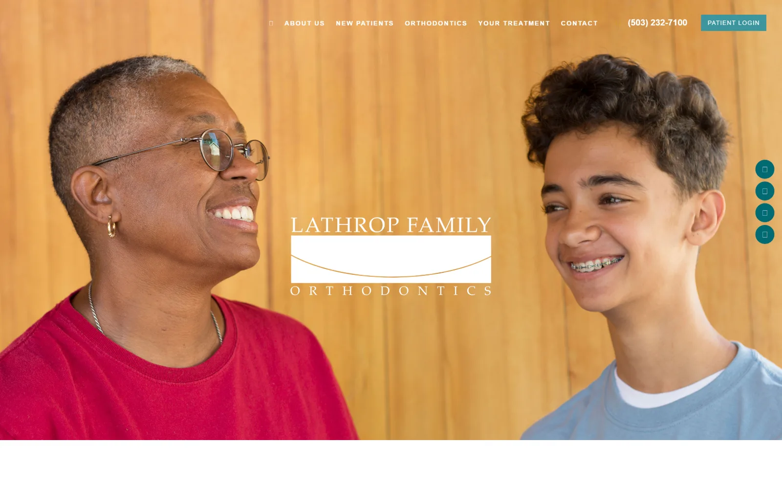
lathroportho.com
Two patients face each other across a warm timber wall, the practice wordmark centred in the gap between them, teal dots down the right edge.
Type
Raleway 40px / 300 uppercase
Body
Raleway 20px / 2.00
Build
1380px container, nav on photo, centred wordmark, no CTA
Made on
Not detected
Colour
#ffffff #37939b #e3933a
Type. Raleway at 40px weight 300 with 0.100em tracking in uppercase sets the 27 character welcome line, Playfair Display arrives at 25px for 70 characters of sub heading, and the body runs Raleway 20px weight 400 at a doubled 2.00 line height across 498 characters. Nav is 12px weight 400 at 0.125em uppercase with a 3.50 line height. The 2.00 body leading is the loosest measured here.
Colour. Four values: white at 155.6 percent coverage, #37939b teal at 31.6, #e3933a amber at 23.4 and #05417c navy at 4.2. Ink is #2a2929 across 498 characters with white on 137 and navy on 37. Teal and amber are close to complementary, and the timber wall in the photograph sits between them, which is why the hero looks colour matched.
Layout. A 1380px container at 96 percent of viewport. Navigation sits directly on the photograph with no bar or scrim, and the wordmark is centred in the dead space between the two sitters rather than placed at a corner. Four teal social dots stack vertically at the right edge. Corner radius is 0 throughout and the document runs only 4990px.
The ask. A phone number and a Patient Login link, and no button anywhere above the fold. No consultation pill, no chat widget, no floating scheduler. In a trade where every other page here carries between two and six asks, offering one phone number is the strongest filter on the list.
Centring the wordmark in the empty space between two subjects uses the photograph's composition as the layout grid instead of fighting it.
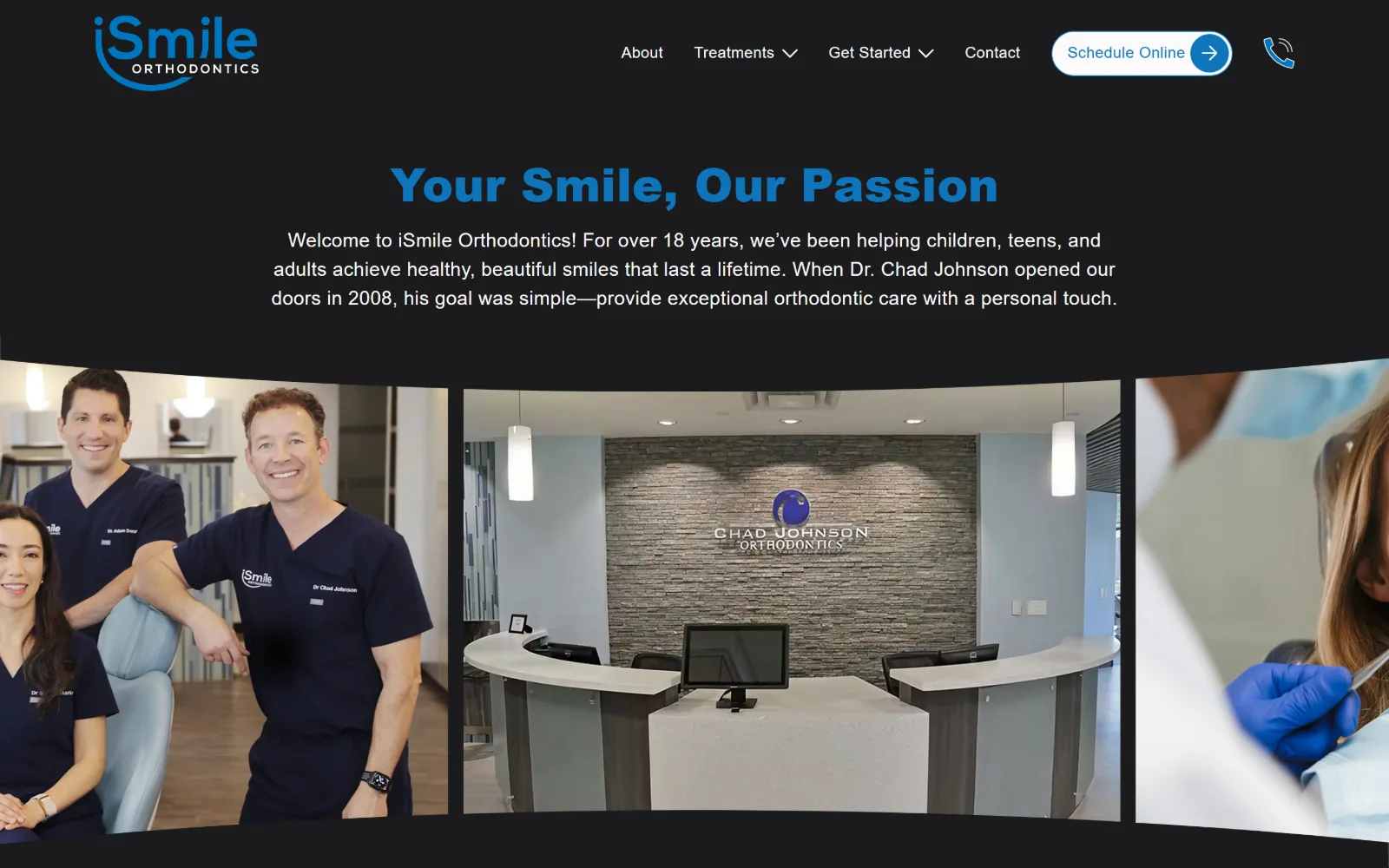
13
ismilecharlotte.com
A near black page carries a centred blue heading and a short paragraph above a band of three photographs curved upward like the face of a cylinder.
Type
Poppins 48px / 800
Body
Poppins 20px / 500
Build
Text hero on black, curved three-panel band, 175px padding
Made on
Custom JS framework
Colour
#1a1b1c #0f75bc #fcfafa
Type. Poppins only, at four steps. The heading runs 48px weight 800 at 0.007em in #0f75bc, a second heading sits at 40px weight 700 at 0.020em, body is 20px weight 500 at 0.016em across 601 characters, and a 16px weight 300 cut appears 16 times for nav and labels. Weight 800 against weight 300 inside a geometric sans gives separation that size alone would not.
Colour. Four values and almost no saturation: #1a1b1c at 111.9 percent coverage, #e0f0f4 at 8.7, #fcfafa at 0.7 and #0f75bc at just 0.1. Ink is #fcfafa across 765 characters with the blue on 59. One accent, used only for headings and the Schedule Online pill, on a ground dark enough that the photographs glow.
Layout. The hero is type, not an image. A centred heading and paragraph sit on black with 175px of section padding, and the photographs arrive below in a three panel band curved upward at the edges so the row reads as a cylinder rather than a grid. Three 12 column grids run 24px gutters. Container is the full 1440, radius 0, document 7128px.
The ask. Schedule Online as a white pill with an arrow, a phone glyph next to it, and four nav items. Two asks total, both in the header, with nothing in the hero itself. Opening with a paragraph about the practice rather than a button is a slower approach than anything else here.
Opening on a centred paragraph instead of a hero image works when the ground is dark enough to make the photographs below the fold the reward.
14
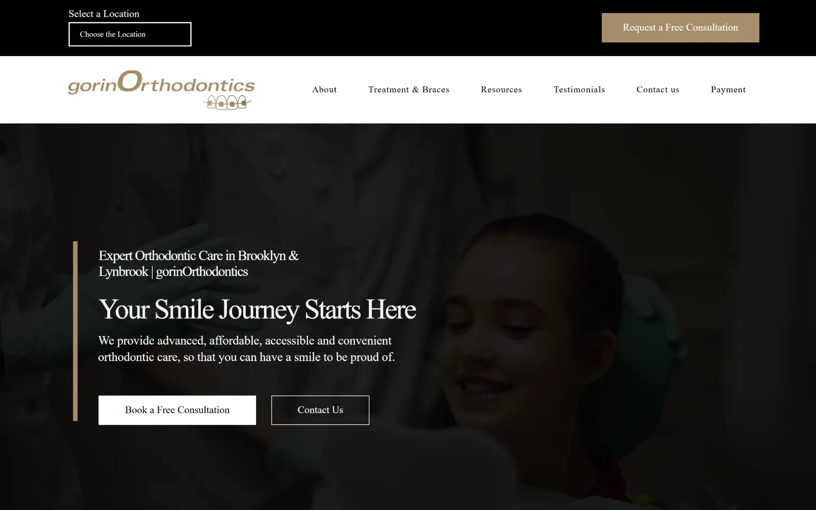
gorinortho.com
A darkened photograph of a child in a treatment chair sits under a black utility strip and a white nav bar, a tan rule marking the text at left.
Type
Wix display face 50px, -0.05em
Body
Wix body face 20px
Build
Black strip, white nav bar, darkened photo, left rule
Made on
Wix
Colour
#ffffff #000000 #a58d6b
Type. Wix returns obfuscated font names, so what can be read is the metrics: display at 50px weight 400 with -0.050em tracking across 30 characters, then 40px and 25px at the same negative tracking, body at 20px over 509 characters, and nav falling back to Arial at 10px. Pulling -0.050em through every display size is a deliberate tightening that keeps the serif compact.
Colour. Three values and nothing else: white at 135.3 percent coverage, black at 49.7 and #a58d6b tan at 1.6. Ink is black on 737 characters, white on 284 and tan on 28. The tan is the entire brand, spent on one button, one rule and the wordmark, with the darkened photograph supplying the rest.
Layout. Three stacked bands before any content: a black utility strip holding a location selector and a tan button, a white nav bar with six items, then the photograph. A vertical tan rule marks the left edge of the hero text block instead of a box or a panel. Container is the full 1440, button radius 0, document 8262px.
The ask. Five asks: Request a Free Consultation in the black strip, Book a Free Consultation as a white button, Contact Us outlined beside it, Contact us again in the nav, and Payment as a nav item. The location selector sitting above everything is the one that earns its position, because a two office practice has to answer that first.
A location selector placed above the logo answers the only question a multi-office practice gets before anything else can be useful.
15
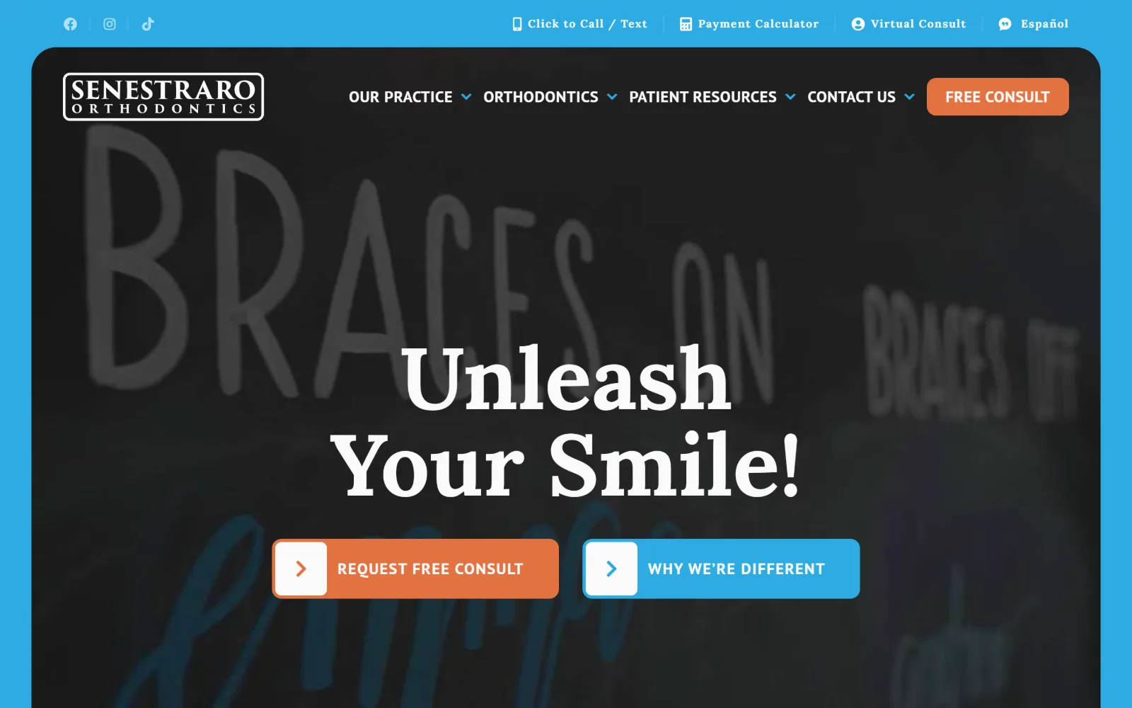
senestrarofamilyortho.com
A dark video panel of a chalkboard reading Braces On sits inset inside a bright blue frame, with a white serif headline and orange and blue buttons.
Type
Lora 110px / 700
Body
PT Sans 20px
Build
Inset video panel in blue frame, 12px buttons, sticky header
Made on
WordPress
Colour
#2dabe2 #e37241 #ffffff
Type. Lora at 110px weight 700 in capitalised case sets the two line headline, with 56px and 32px cuts of the same serif below it and a 14px weight 700 at 0.089em for small labels. PT Sans covers the rest at a single size, 20px, split only by weight and case: 700 uppercase at 0.025em for nav and buttons, 400 for 337 characters of body. One size doing two jobs is efficient.
Colour. Three values. White at 100 percent coverage, #2dabe2 blue at 61 and #e37241 orange at 2.5. Ink runs #141414 on 291 characters, #fafafa on 200, #2dabe2 on 57 and #207ca5 on 46. Blue and orange sit near opposite each other, so the orange button is the highest contrast element on the page without being large.
Layout. The structural decision is the frame. The video panel is inset so the blue shows as a border along the top and both sides, with the utility links sitting out on the blue rather than inside the panel. The panel corners are rounded while everything else measures 0 and buttons take a 12px radius. Sticky header, four nav items, document 13384px.
The ask. Free Consult as an orange pill in the header, then Request Free Consult in orange and Why We Are Different in blue as paired buttons with arrow chips. Above them Click to Call, Payment Calculator, Virtual Consult and Espanol. Eight asks, which is the most crowded fold here, and the orange repetition is what keeps it navigable.
Insetting the hero inside a coloured frame gives the page a brand edge on three sides without tinting or overlaying the footage itself.
How these were chosen
Fifteen practices, and the one thing every page agrees on is the free consultation: all fifteen ask for it, nine ask for it twice, and six put the same words in a pill at the top right and again under the headline. What does not hold is the stock teenager. Half of this set paid for photographs of their own rooms, their own staff or their own street sign, and those are the pages that survive a second look, because the brand colours come back out of the picture instead of being chosen beside it. The vendor monoculture in orthodontist website design is real, so the shortlist was built on two questions: did the practice commission its own imagery, and does the type do more than set a slogan large. Several near-identical builds with a licensed smiling model and a scheduling button were left out for having nothing of their own to show.
Finding orthodontic sites that someone had actually designed took far longer than it should have. 30 candidates made the shortlist. 15 made the page.
Each one was opened and looked at properly: what the type is doing, where the colour gets spent, how the page is built, how it asks for the job. Nothing is here because it ranks. Nothing is here because an agency filed it under portfolio. Several well known names were left out for the plain reason that their site came out of the same template as everyone else's, and a few sites worth including did not survive a second look.
Where a site is only competent, it says so. The order is the order worth your time, best first.
Reviewed and selected by Larry W. Matthews for Websitely.