The vendor template rules this trade. Thirteen clinics that escaped it, and the chiropractor website design decisions that got them out.
Shown
13 sites
Reviewed
28 candidates
Chosen on
The work, not the ranking
Updated
15 October 2026
01
mpoweredchiro.com
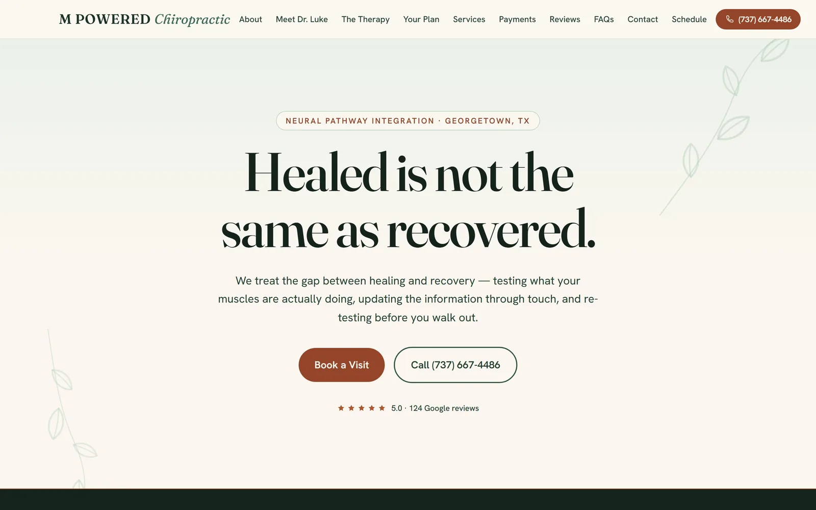
A single sentence in a big contrasty serif, centred on warm paper, with no hero photograph at all.
Type
Fraunces 96px
Body
Hanken Grotesk
Build
centred single column, no hero image
Made on
custom build
Colour
#fbf7f0 #14231b #95452a
Type. Fraunces runs at about 96px across two lines, and the thin strokes are left thin rather than bulked up for safety. Body text drops to Hanken Grotesk at 20px, which gives the page a clean break between the voice and the explanation. The nav pairs small caps for M POWERED with an italic Chiropractic, a two-part lockup that does more work than most clinic logos manage.
Colour. The ground is #fbf7f0, a warm off-white that keeps the page from looking like a medical form. Ink is a deep green-black, #14231b for headings and #234030 for body, which reads softer than true black without going grey. One rust tone, #95452a, carries the primary button and the small eyebrow label, and appears nowhere else.
Layout. Everything is centred in a single column and the hero has no image. Two pale line drawings of a stem sit at the far edges, faint enough that you register them as texture. Confident, and the sort of restraint that only works when the sentence is good enough to hold the space.
The ask. Two buttons, filled Book a Visit next to an outlined Call, sit directly under the copy, and the phone number repeats in the nav as a filled pill. Below them, five stars and 124 Google reviews in small type. The booking path is one click from a page that has asked you to read exactly thirty words, which is the opposite of how most clinics sequence it.
If your positioning line is genuinely good, give it the whole screen and cut the hero photo.
02
charlestonchirostudio.com
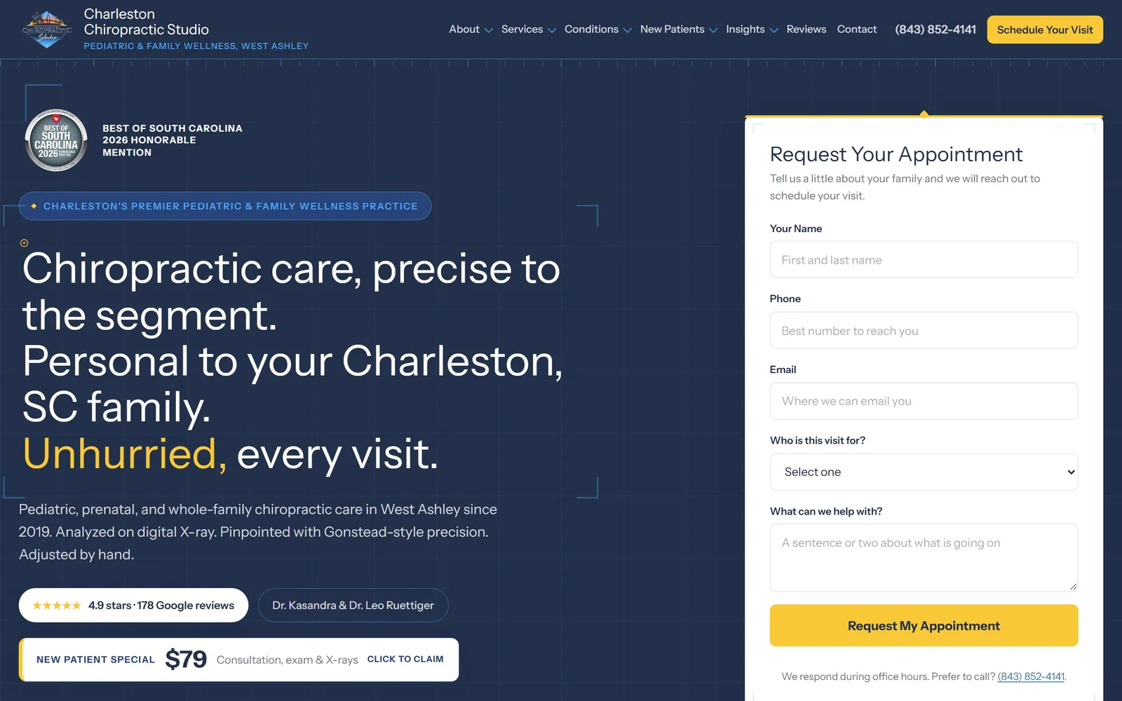
A navy page with faint blueprint corner marks and a full appointment form sitting in the hero itself.
Type
Instrument Sans 54px
Body
Instrument Sans
Build
two column, copy left and booking form right
Made on
custom build
Colour
#223049 #f9c837 #f7f9fc
Type. Instrument Sans does the whole page, headline at about 54px down to 14px on buttons, with no second family anywhere. The headline is set at regular weight rather than bold, which is unusual on a dark ground and stops it shouting. One word, Unhurried, is tinted yellow, and that single colour change carries the entire positioning.
Colour. Deep navy #223049 under everything, with #274377 for the panel edges and a pale #f7f9fc for the form card. The yellow, #f9c837, appears on exactly two things: the word Unhurried and the submit button. Restricting an accent to the promise and the action is a decision, not a default.
Layout. Two columns, copy left and form right, with thin registration marks and a faint grid drawn into the background. The blueprint motif suits a practice that leads with digital X-ray and Gonstead precision, so the ornament is actually arguing something.
The ask. The booking form is the hero rather than a button that leads to one, with five short fields and a plain sentence underneath saying they respond during office hours and offering the phone number as an alternative. Social proof sits where a hesitant visitor will see it: 4.9 stars, 178 reviews, both doctors named, and a $79 new patient price in its own bar. Every objection gets answered on the first screen.
Putting the form in the hero only works if you shorten it first, and five fields is about the limit.
03
brooklynsportschiropractic.com
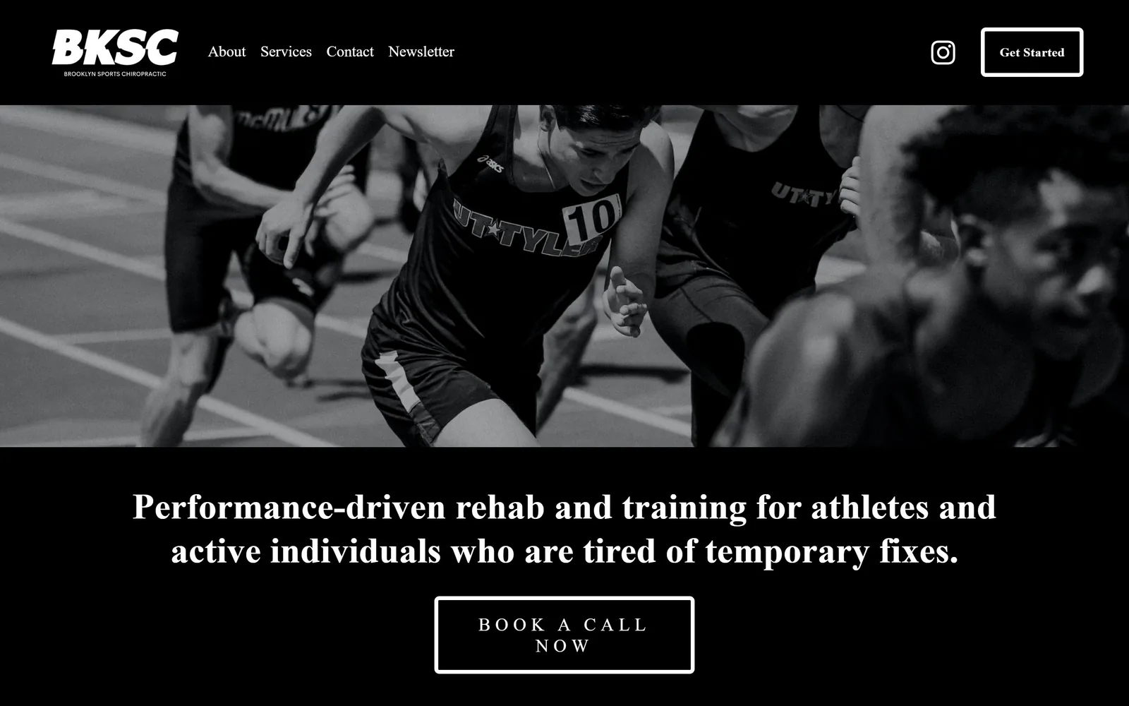
Black, white, and a photograph of sprinters mid-start, with a serif headline that belongs on a magazine cover.
Type
high-contrast serif, about 46px
Body
Brandon Grotesque
Build
full bleed photo band above centred type
Made on
Squarespace
Colour
#000000 #ffffff
Type. The headline is a high-contrast serif at roughly 46px, which is not what you expect over track photography and is exactly why it lands. The button text is letterspaced small caps in the same serif. Brandon Grotesque handles the nav and the body copy further down, so the serif stays reserved for moments that matter.
Colour. Two colours, black and white, and nothing else. The photograph is desaturated to match rather than left in colour and fought with. That discipline is rarer than it should be in sports chiropractic, where the default is a navy and electric blue gradient.
Layout. A full width photo band sits between the black nav and a black type block, so the image is a stripe rather than a backdrop. Centred copy below, outlined button under that. Simple, and it gives the photograph room to be the only loud thing on the page.
The ask. One call to action, Book a Call Now, outlined in white and set wide. Not Book an Appointment, a call, which suits a practice selling a longer relationship rather than a ten minute adjustment. The copy underneath goes straight at the reason people have given up on chiropractors, naming the 10-minute adjustment and the cookie-cutter exercise sheet, and that is more persuasive than any badge.
Desaturate your hero photograph to the palette instead of letting it set one for you.
04
alignedmodernhealth.com
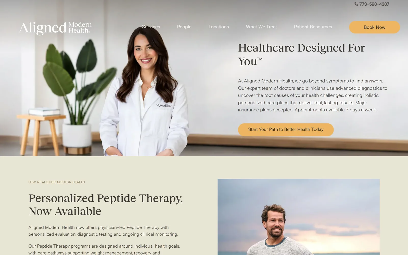
A clinician photographed in a real room, with a warm serif headline and one amber button holding the whole page.
Type
Reckless Neue 40px
Body
Metro Sans
Build
split hero, photo left and copy right
Made on
WordPress
Colour
#ffffff #e9e5d5 #efb661
Type. Reckless Neue sets the headline at about 40px, small for a hero and all the better for it, since the paragraph beside it needs to be read. Metro Sans at 16px in a light weight does the body. The restraint is notable for a sixteen location group, where the usual move is to go bigger to feel bigger.
Colour. White and a sand tone, #e9e5d5, with #3d3935 as a warm near-black for all text. Amber #efb661 is the only saturated colour and it is spent entirely on buttons. Nothing here reads as clinical blue, which for a practice selling functional medicine alongside chiropractic is the right call.
Layout. A split hero, photography on the left bleeding to the edge and copy on the right, with the second section arriving immediately underneath on sand. The photograph is their own clinician in their own space with a plant and a bench in shot, not a stock portrait against a white sweep.
The ask. Book Now sits as an amber pill in the nav, and the hero repeats it with the longer Start Your Path to Better Health Today. The paragraph does the quiet work, naming insurance acceptance and seven day availability in its final line, which removes the two objections most likely to stop a booking. With sixteen locations the hard part is routing, and that is pushed into a form rather than a map.
A group this size can afford to look calm; going louder would only make it look like a chain.
05
lucechiropractic.com
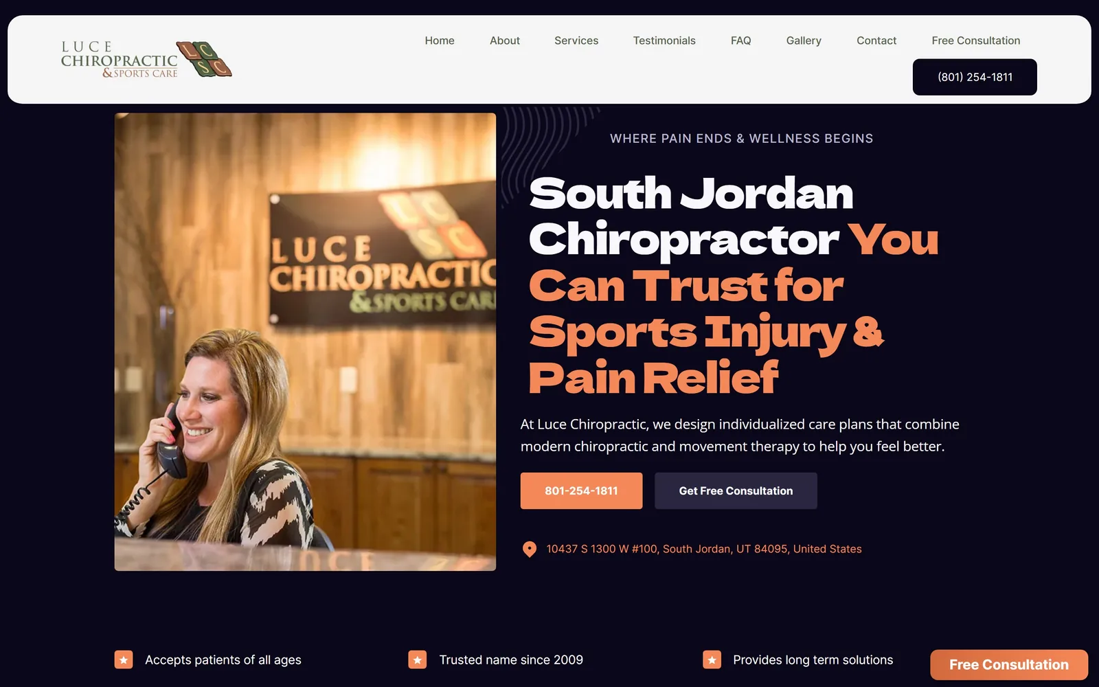
Near-black page, a chunky orange display face, and the headline split across two colours mid sentence.
Type
Dela Gothic One 55px
Body
Inter
Build
image left, copy right, floating nav card
Made on
Webflow
Colour
#0a071b #f58859 #ffffff
Type. Dela Gothic One at about 55px is a heavy, slightly squared display face, and tightening it to minus 0.03em keeps the mass together. Inter handles everything else at 16px with a generous line height. The headline switches from white to orange partway through, so the type is doing the emphasis rather than a highlighter bar.
Colour. The ground is #0a071b, close to black but violet-tinged, which is why the page does not feel like every other dark clinic site. Orange #f58859 is the single accent, on the phone button, the headline fragment and the address pin. A floated white nav bar sits on top like a card, which separates navigation from the hero cleanly.
Layout. Image left in a rounded frame, copy right, with a faint radial line pattern behind the type. A three item trust row runs along the bottom. The photograph is their own front desk with the sign visible, which is a small honesty most sites skip in favour of stock.
The ask. The phone number is the primary button and Get Free Consultation is secondary, which is the correct order for a practice whose patients are usually in pain and want to speak to someone. A persistent orange Free Consultation tab sits bottom right. The address sits directly under the buttons, so local intent is answered without a scroll.
Putting the phone number ahead of the form is right whenever your visitor is in pain today.
06
havenchiroclt.com
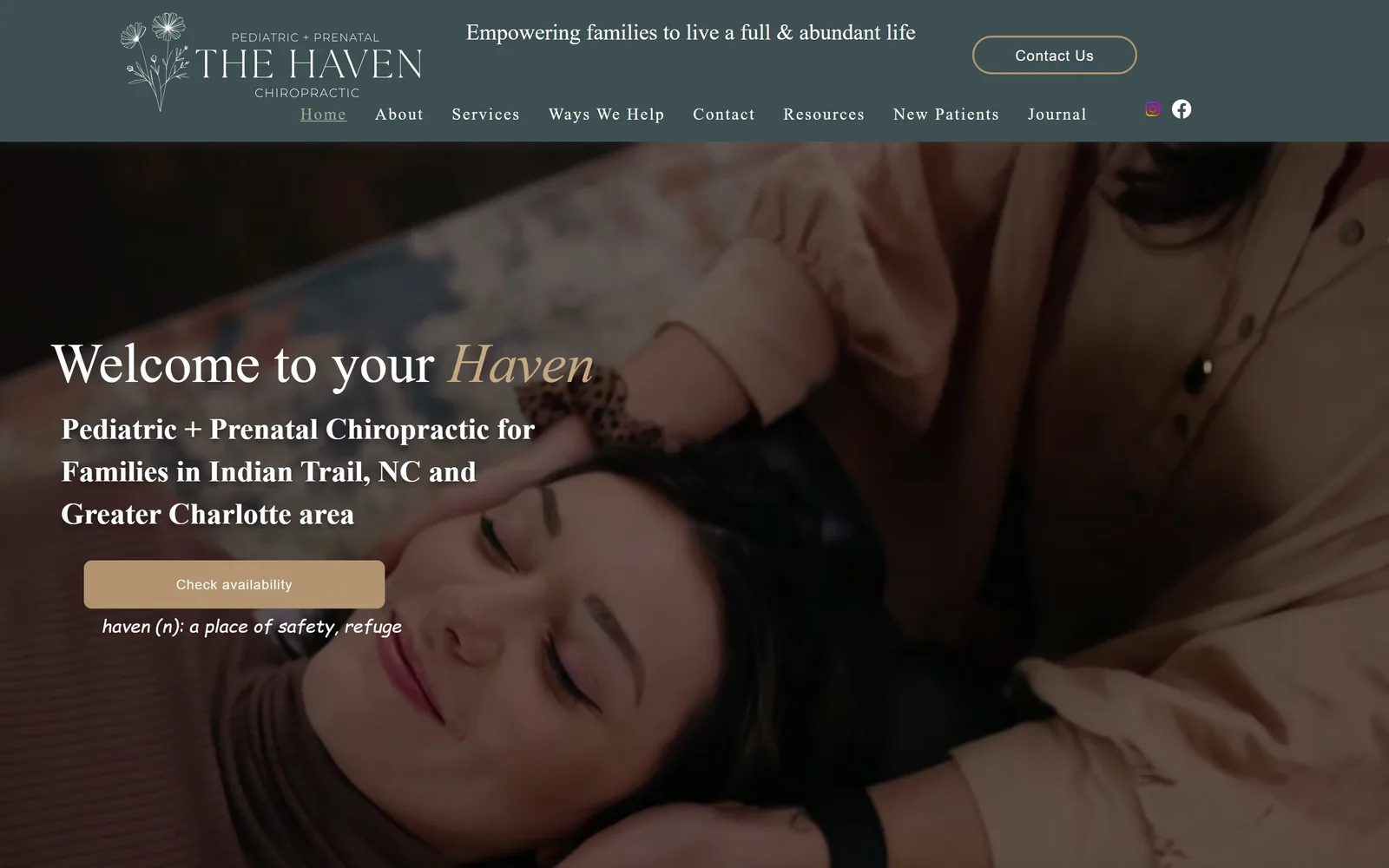
Dark green nav over a soft-focus photograph, with one word of the headline set in italic gold.
Type
Gloock 58px
Body
Cormorant Garamond
Build
full bleed video, left aligned copy
Made on
Wix
Colour
#3d4f52 #b39470 #fcfaf8
Type. Gloock sets Welcome to your at about 58px and Haven follows in italic, tinted gold, so the brand name is the only italic on the screen. Cormorant Garamond carries the subhead. A handwritten line under the button defines haven as a place of safety, which is the kind of flourish that usually goes wrong and here does not.
Colour. A muted slate green, #3d4f52, in the header, warm tan #b39470 on the button, and the photograph supplies dusty pinks and browns that the palette was clearly chosen against. The whole thing is low saturation, which suits prenatal and paediatric work far better than the pastel mint most of this sub-niche defaults to.
Layout. Full bleed video behind left aligned copy, with the logo centred as a floral line drawing rather than a spine icon. The copy block sits in the lower left third, leaving the image legible. Nav runs on two lines, tagline above and links below, which is tidier than it sounds.
The ask. One button, Check availability, and that wording is doing something: it implies a cash-based practice with limited slots rather than an insurance mill. Contact Us sits as an outlined secondary in the header. The booking path goes out to Jane, so the page itself stays uncluttered, though it does mean the first screen asks for trust before it asks for anything else.
Check availability outperforms Book Now when scarcity is real, and reads badly when it is not.
07
physiologicnyc.com
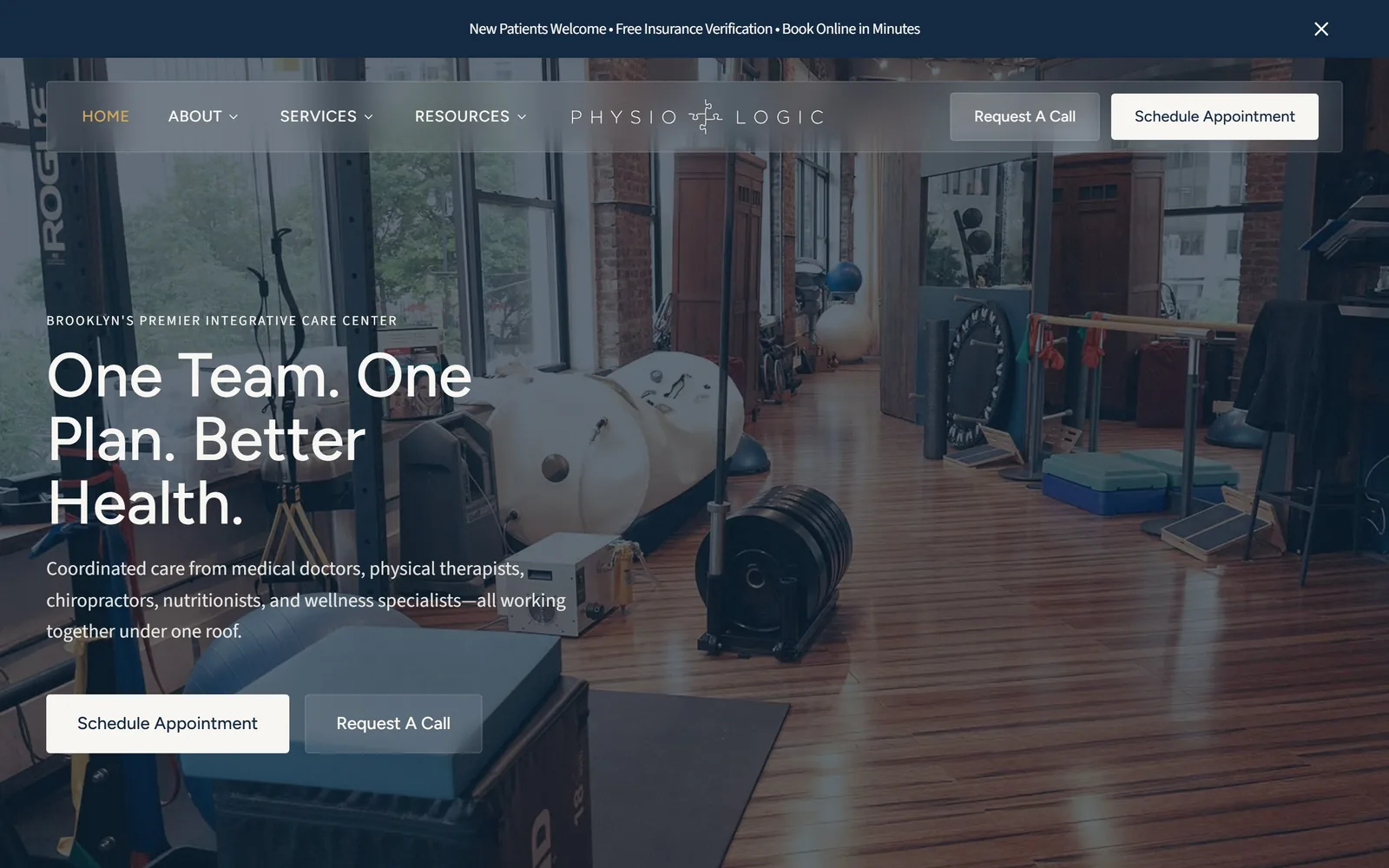
A wide shot of a working Brooklyn gym floor, with three short sentences stacked over it in white.
Type
Gilroy 64px
Body
Source Sans 3
Build
full bleed photo, left aligned copy
Made on
custom build
Colour
#0d1f33 #f8f6f2 #d4a857
Type. Gilroy at about 64px with a line height just above one, so One Team. One Plan. Better Health. stacks into a tight block. Source Sans 3 at 20px underneath. The nav is letterspaced uppercase in a muted gold, which keeps it legible over photography without a dark bar behind it.
Colour. Navy #0d1f33 and a warm off-white, with #d4a857 gold on the nav and the logo rule. The gold is restricted to navigation and branding and never touches a button, which is an unusual split and it works, because the buttons stay plain and readable.
Layout. Full bleed photography with the copy pinned left and a floating translucent nav bar on top. The image is the real space, hyperbaric chamber, rings, plyo boxes, shot wide enough that a visitor can see what forty practitioners across seven disciplines actually means. Far more convincing than an org chart of service cards.
The ask. Schedule Appointment and Request A Call appear twice each, once in the nav and once in the hero, with the filled version leading. A dismissible bar along the top adds free insurance verification and book online in minutes. Offering a call as an equal path matters for a clinic doing insurance work, since those visitors have questions before they have a date.
Shoot your actual room wide; for a multi-discipline clinic the space is the proof.
08
flourishchiropracticspa.com
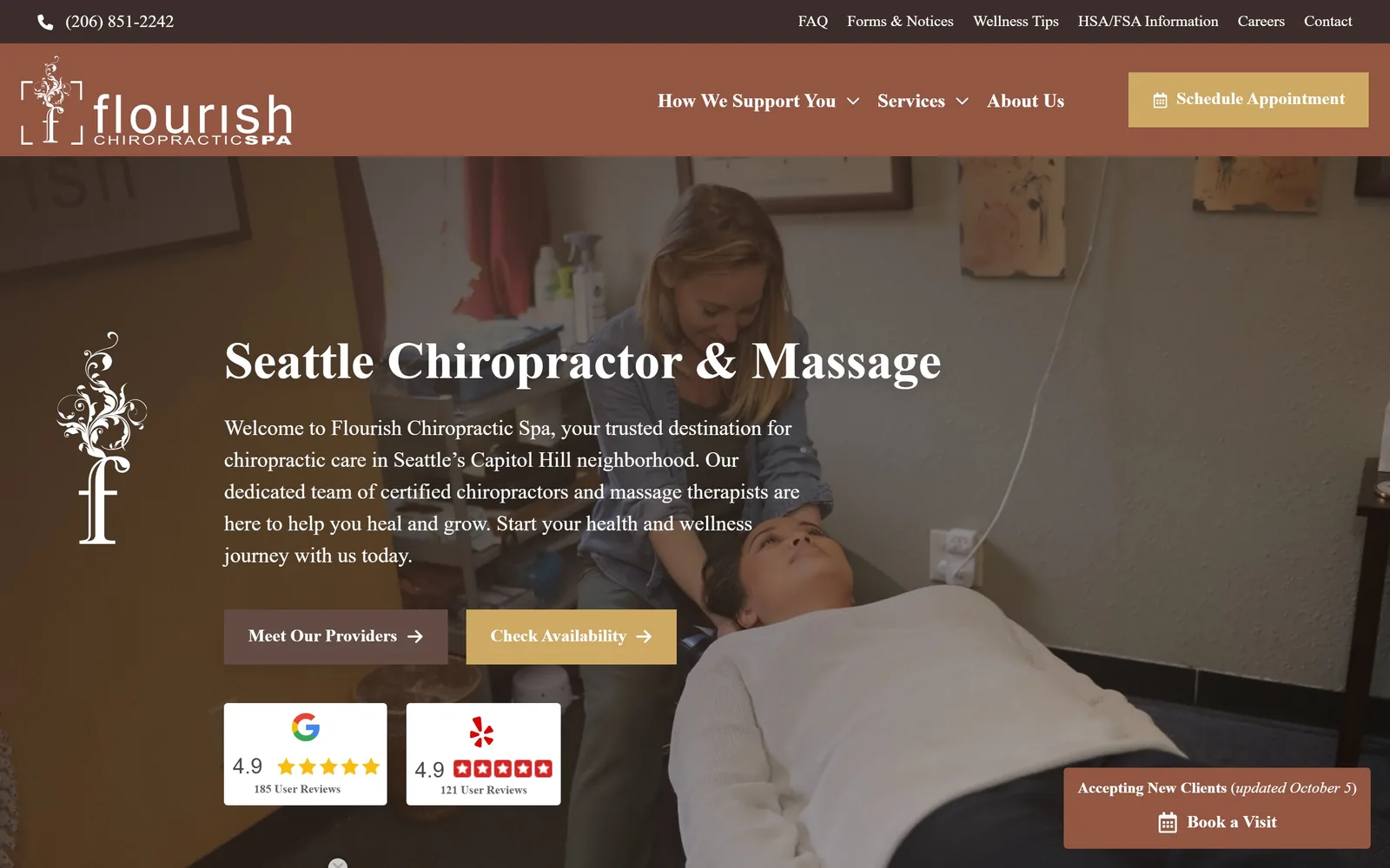
Terracotta header over a warm treatment-room photo, with an ornate drop cap f standing beside the headline.
Type
Playfair Display 54px
Body
Sofia Pro
Build
full bleed photo, left aligned copy
Made on
WordPress
Colour
#935643 #cea963 #fdf1d9
Type. Playfair Display at roughly 54px for Seattle Chiropractor & Massage, Sofia Pro at 22px for the paragraph. The large decorative f sitting to the left of the copy is lifted from the logo and used as an ornament, which gives the page a print feel. Pairing a Didone with a geometric sans is a familiar move but the sizes are judged well.
Colour. Rust #935643 in the header and the secondary button, antique gold #cea963 on the primary, and the photograph carries the same warm range so the join is invisible. Further down the page moves onto a cream ground. For a practice calling itself a spa, the register is right.
Layout. Full bleed photo of an actual adjustment in progress, copy left, two buttons, then review cards. The photograph is slightly busy, with a power outlet and a cable in frame, which costs it a little polish and buys back some credibility.
The ask. Three separate paths: Schedule Appointment in the header, Check Availability in the hero, and a persistent Accepting New Clients badge bottom right carrying a dated update. That dated note is the smartest thing on the page, because the question a new patient actually has is whether this clinic is taking anyone. Google and Yelp cards with 185 and 121 reviews sit immediately under the buttons.
A dated Accepting New Clients note answers the real question faster than any trust badge.
09
gogachiro.com
A black screen with three lines of white serif and a thin rule under a single text link.
Type
high-contrast serif, about 68px
Body
Poppins
Build
centred single column on black
Made on
Squarespace
Colour
#000000 #c19830 #ffffff
Type. The headline is a high-contrast serif at around 68px, set across three lines with no widow control problems, and it is the only thing on the hero besides the link. The link itself is small, underlined with a long rule, and sits a long way below the headline. Confident spacing.
Colour. Black ground, white type, and a gold mark in the logo that returns as a section heading further down. The gradient band behind the header is the weak point, a grey wash that belongs to an older version of this site and sits awkwardly against the hard black below it.
Layout. Centred single column on black, with a lot of empty space above and below the type. A four location Bay Area practice choosing to show nothing at all in its hero is a real decision, and mostly it pays off.
The ask. Book Your Initial Exam Now is a text link rather than a button, which is the risk here. Initial Exam is good wording, specific about what the first visit is, but a visitor scanning for something to click has to slow down to find it. Book Appointment also sits in the nav, so the path exists; it is just quieter than the design elsewhere deserves.
Minimal heroes earn attention, then lose it again if the call to action is only a text link.
10
tangelohealth.com
Orange sunset photography, a runner stretching mid-frame, and a condensed uppercase headline running three lines deep.
Type
Montserrat 48px uppercase
Body
Lato
Build
full bleed photo, left aligned copy
Made on
WordPress
Colour
#faa54b #ffffff #000000
Type. Montserrat bold uppercase at about 48px, with Lato at 30px for the paragraph. Setting the headline in caps across three lines is a lot of weight, and it only holds together because the photograph behind it is soft and dark on the left side. The nav is uppercase Lato in the brand orange.
Colour. Orange #faa54b throughout, in the top bar, the logo, the nav links and the pill buttons, chosen to match a tangelo and then committed to. The sunset in the photograph was clearly selected to extend the palette into the image. A sliver of green, #a6d14f, on the Book Now pill is the one off note.
Layout. Full bleed photo, copy left, with a row of Seattle Met award marks starting at the fold. The repeated identical award badges are the laziest thing on the page; six copies of the same logo reads as filler rather than proof.
The ask. Book Now in the nav and Schedule Your Visit Now in the hero, both pill shaped and both orange, with the rating stated plainly as 4.9 and 500+ reviews above the headline. Putting the rating above the headline rather than below is the right order when your differentiator is volume of satisfied patients. Two phone numbers for two locations sit in the top bar.
Pick your hero photograph to extend the brand colour rather than fight it.
11
ferrarospine.com
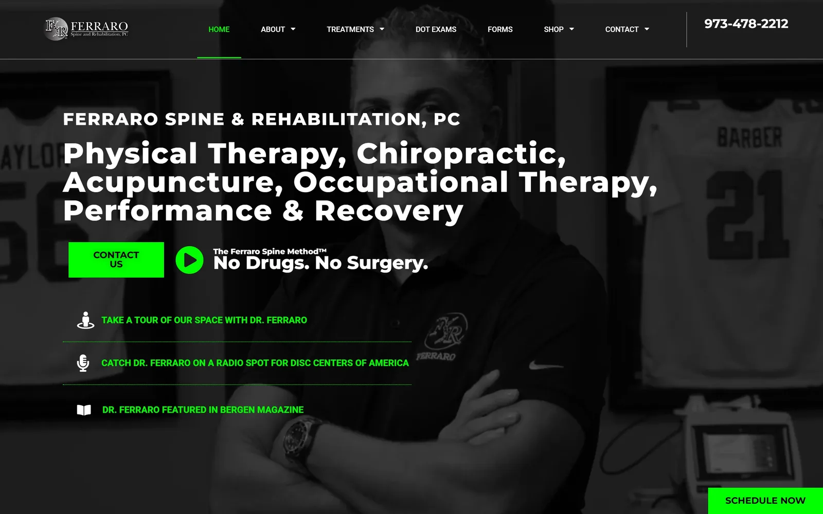
Pure green on black, a practitioner shot against framed sports jerseys, and five services listed as one headline.
Type
Montserrat 50px
Body
Montserrat
Build
full bleed photo, copy left with link list
Made on
WordPress
Colour
#000000 #00ff00 #ffffff
Type. Montserrat extra bold at about 50px, letterspaced slightly open, running the full list of services as the headline. It should not work, and it nearly does, because the alternative for a six discipline practice is a grid of cards that nobody reads. Smaller bold Montserrat handles the three link rows below.
Colour. Black and white with #00ff00, pure screen green, on the Contact Us button, the play glyph, the link text and the sticky Schedule Now bar. That is an aggressive choice and it is applied consistently enough to read as a decision rather than an accident. The photograph is desaturated to let the green be the only colour.
Layout. Full bleed portrait with copy left and a stack of three hairline-separated links underneath, each with an icon: a space tour, a radio spot, a magazine feature. Treating press as a navigable list rather than a logo wall is a better use of the space.
The ask. Contact Us leads in green, a video play button sits beside it carrying the No Drugs. No Surgery. line, and a Schedule Now bar is pinned bottom right. The phone number is large in the header. For a practice whose pitch is an alternative to back surgery, leading with the video rather than a form is defensible, since this decision takes more than one visit.
One saturated accent is a strategy; three is a mess, and most clinics reach for three.
12
bixbyknollswellness.com
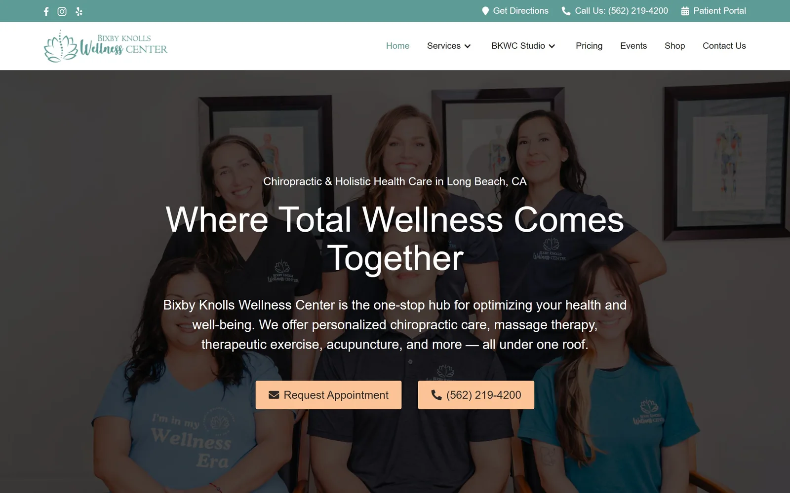
The whole team photographed together behind the headline, with peach buttons against a sage and teal palette.
Type
Lato 64px
Body
Work Sans
Build
full bleed team photo, centred copy
Made on
Webflow
Colour
#5d9b96 #fcc397 #2d2b29
Type. Lato at about 64px in regular weight, not bold, which is a quiet choice for a headline that size and keeps it from competing with the faces behind it. Work Sans at 24px in a light weight for the paragraph. Nothing clever, executed cleanly.
Colour. Teal #5d9b96 in the utility bar and the nav, sage #c3d29c further down, and peach #fcc397 on both buttons. Peach on teal is an uncommon pairing in this trade and it gives the page an identity that the typography alone would not. The logo is a line-drawn lotus in the same teal.
Layout. Full bleed team photograph with centred copy over it, darkened just enough to hold white type. Putting nine practitioners in the hero is the honest way to show a one-stop clinic, and it beats nine service tiles. The shirt reading Wellness Era on the front row is a small gift.
The ask. Request Appointment and the phone number sit side by side as equally weighted buttons, both peach, and a Patient Portal link sits in the top bar for existing patients. Separating new from returning in the utility bar rather than the hero is the right hierarchy. A closure notice runs above the nav, which is practical but currently shows a date gap.
Photograph the whole team if you are selling a one-stop clinic; service tiles cannot carry that claim.
13
traininghaus.com
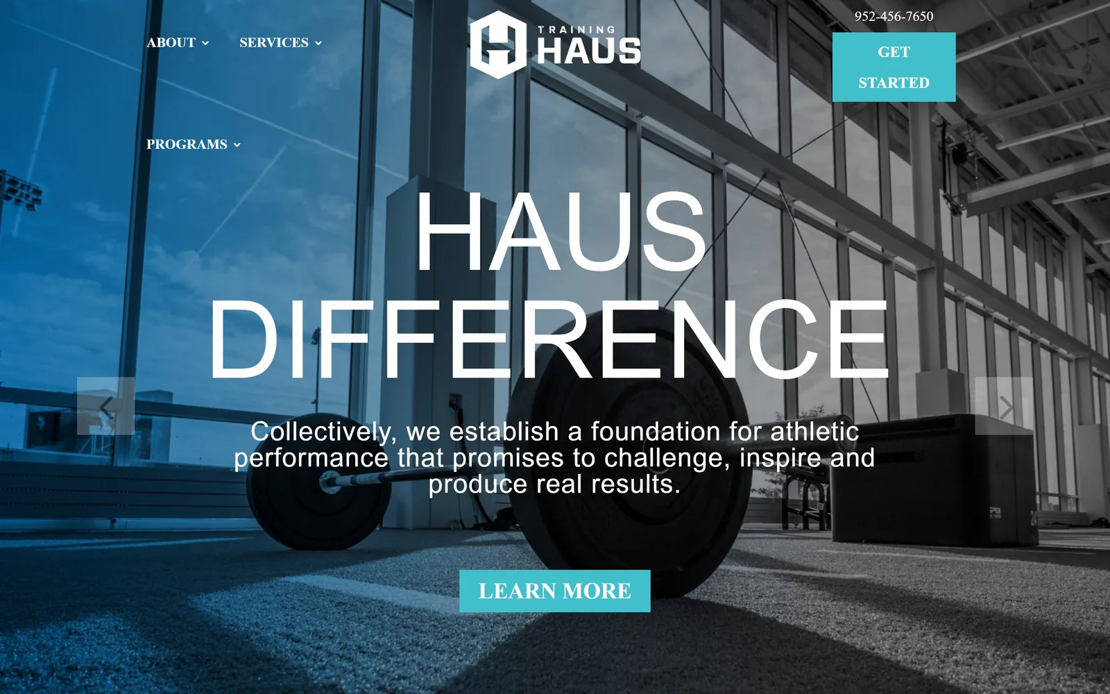
HAUS DIFFERENCE set enormous and thin across a teal-washed photograph of an empty training floor.
Type
Oswald 140px
Body
Lato
Build
full bleed photo carousel, centred copy
Made on
WordPress
Colour
#000000 #41bfcb #ffffff
Type. Oswald at roughly 140px, condensed and set at a light weight, which is the opposite of the usual sports move and far more interesting for it. Lato at 34px for the paragraph. The nav is uppercase Oswald, though it wraps onto a second line and leaves PROGRAMS stranded below the logo, which is sloppy on a facility this well resourced.
Colour. Black and teal #41bfcb, with the hero photograph duotoned into the same teal so the image and the brand colour are one thing. The button and the Get Started block are the same teal at full strength. Two colours, total, and the page is stronger for the limit.
Layout. Full bleed carousel with the headline centred and arrows at the edges. The empty gym is a deliberate choice, equipment and light rather than athletes mid-lift, which suits a facility selling expertise rather than intensity.
The ask. Get Started sits top right in teal, Learn More sits under the headline, and the phone number is above both. For a facility where sports chiropractic is one service among rehab, performance and combine prep, Learn More is the honest first step and Get Started catches anyone already decided. Routing to the right programme happens further down.
Setting a huge display face light instead of heavy is the cheapest way out of the sports cliche.
How these were chosen
Most chiropractic sites look the same because a handful of healthcare marketing vendors sell the same template to the profession in enormous numbers, down to the identical $47 new patient banner. The thirteen practices here all escaped that, and what they show a clinic owner is that good chiropractor website design is mostly a few decisions held to: one accent colour, one typeface doing real work, and a booking path that answers the question a patient in pain is actually asking. Solo rooms, sixteen-location groups, prenatal studios and performance facilities are all represented, so there is a comparison worth making whatever size the practice is.
Finding chiropractic sites that someone had actually designed took far longer than it should have. 28 candidates made the shortlist. 13 made the page.
Each one was opened and looked at properly: what the type is doing, where the colour gets spent, how the page is built, how it asks for the job. Nothing is here because it ranks. Nothing is here because an agency filed it under portfolio. Several well known names were left out for the plain reason that their site came out of the same template as everyone else's, and a few sites worth including did not survive a second look.
Where a site is only competent, it says so. The order is the order worth your time, best first.
Reviewed and selected by Larry W. Matthews for Websitely.