Sage green and blush are the reflex. Fourteen practices whose therapist website design put a real face or a real room above the fold instead.
Shown
14 sites
Reviewed
29 candidates
Chosen on
The work, not the ranking
Updated
15 October 2026
01
myeverroot.com
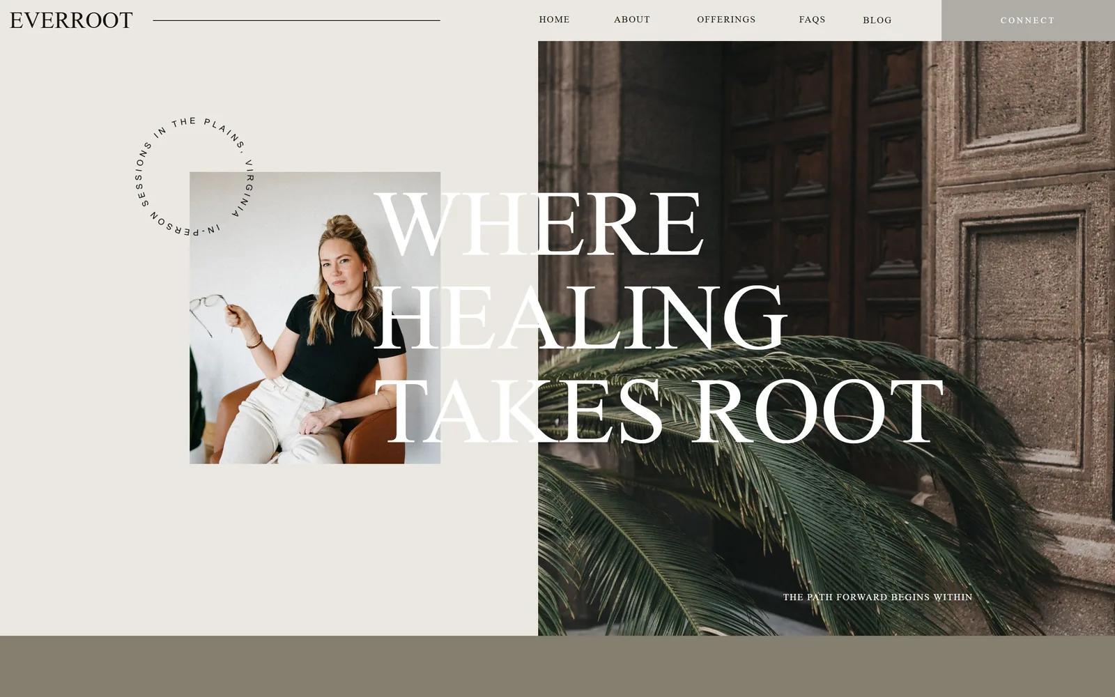
Split screen: a warm grey panel and a photo of palm fronds, with 121px white capitals laid across the seam.
Type
Cormorant Garamond, 121px uppercase
Body
Barlow, 11 to 12px, 0.1em tracking
Build
50/50 split hero, inset portrait, no radius
Made on
Custom build
Colour
#eae8e0 #857e6e #ffffff
Type. The headline is Cormorant Garamond at 121px, all capitals, regular weight, line height 1.00, white. It is set wide enough that WHERE HEALING TAKES ROOT crosses from the pale panel onto the photograph, so the two halves of the screen read as one surface. The supporting type drops to Barlow at 11px and 12px with 0.1em tracking, uppercase, which is a ratio of roughly eleven to one. A small circular lockup reading IN-PERSON SESSIONS IN THE PLAINS, VIRGINIA curls around the top corner of the portrait.
Colour. Two neutrals do almost all the work: #eae8e0 on the left at 72% coverage and a muted #857e6e bar across the bottom at 28%. The photograph supplies the only saturated colour, green fronds against a brown door, and there is no accent hex at all. White type is the brand colour here. For a solo practice in rural Virginia that is a decision, not the sage-and-blush default the category runs on.
Layout. The hero is a hard 50/50 vertical split at 1440, with the photograph bled to the right edge and the top. A square portrait sits inset in the left panel, overlapping the seam by about a third of its width. Corner radius is 0 throughout. Above the fold you get the wordmark, six nav items, the portrait, the headline and the line THE PATH FORWARD BEGINS WITHIN at 11px in the lower right of the photo.
The ask. There is no button in the hero. The only ask is CONNECT in the nav, given a grey tab so it reads as the end of the row. Everything else above the fold is atmosphere. A visitor who wants to book has to find a small word in the top right corner, which is the price this layout pays for its composure.
Letting one line of display type cross the seam between two panels makes a split hero read as a single picture instead of two boxes.
02
thepracticetherapy.com
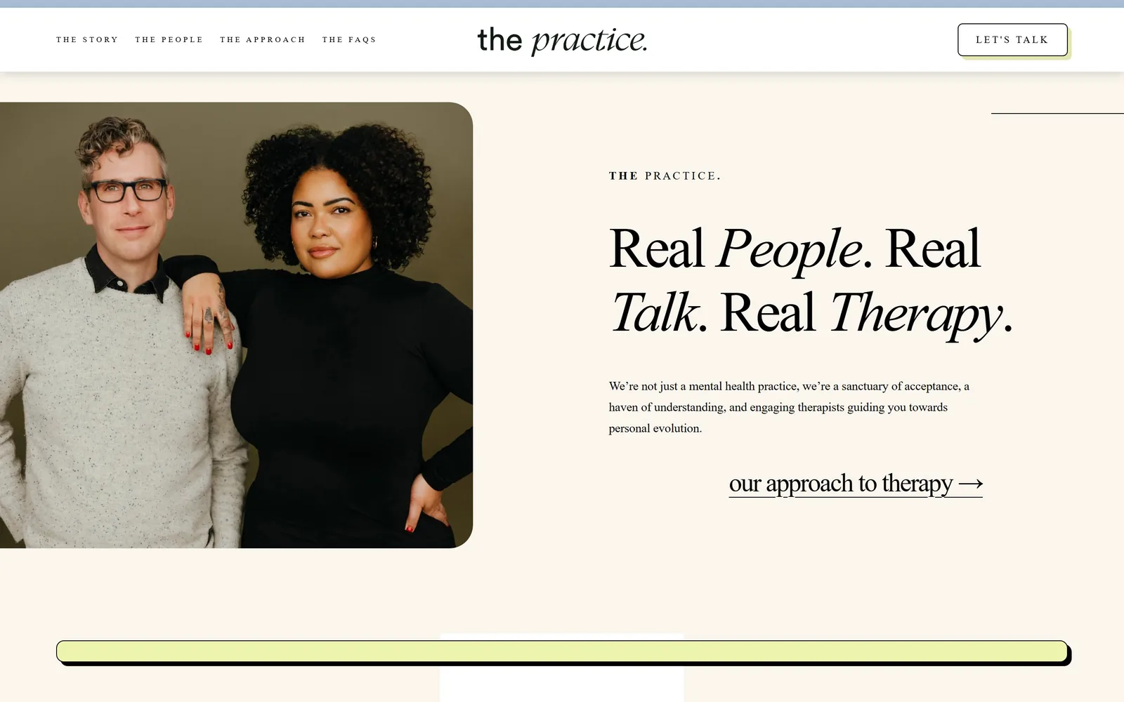
Two therapists photographed against olive, next to Real People. Real Talk. Real Therapy. alternating roman and italic.
Type
gyst-variable, 73px, weight 100
Body
circular, 16px/1.7
Build
Full-width hero, bled portrait left, 92px padding
Made on
Squarespace
Colour
#faf5ed #eef3ae #000000
Type. The display face is gyst-variable at 73px, weight 100, tracked tight at -0.04em with a 1.13 line height. The trick is alternating roman and italic word by word, so People, Talk and Therapy lean while Real stays upright. Body is circular at 16px with 1.7 line height. The nav drops to 10px at 0.3em tracking in capitals, which is small enough to read as a rule rather than a menu.
Colour. The page is cream #faf5ed over white, with a pale blue #aabfd5 strip at the top edge and lime #eef3ae used twice, under the LET'S TALK button and in the long bar at the bottom. Lime gets about 1.4% of the screen. Ink is flat black #000000. The olive studio backdrop in the portrait is doing more colour work than the palette is.
Layout. Container runs the full 1440 with 92px section padding. The hero is a two part arrangement: a portrait bled to the left edge with a rounded right side of about 24px, and a text column starting near the middle of the screen. Above the fold you get a centred wordmark, four nav items, the eyebrow THE PRACTICE., the headline, three lines of body and one text link.
The ask. The page asks twice. LET'S TALK sits top right in a black outlined box with a lime shadow, and our approach to therapy with an arrow is an underlined text link under the paragraph. The second one is not really a conversion, it is a nudge deeper into the site, which means the hero only has one genuine booking path.
Alternating roman and italic inside a single headline gives you emphasis without a second typeface or a second colour.
03
therapygroupdc.com
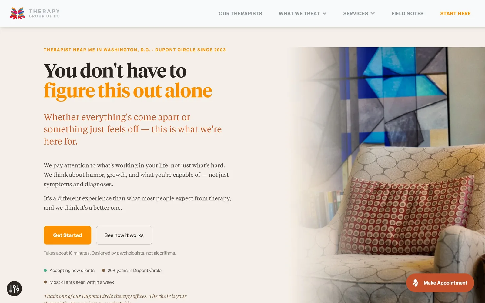
A Tiempos headline where the second line turns orange, beside a photographed office chair fading into cream.
Type
Tiempos Headline, 56px, weight 600
Body
Tiempos Text, 17 to 26px
Build
707/603 two column, 72px padding, 8px radius
Made on
WordPress
Colour
#f4efe8 #fb9000 #c15a2e
Type. Tiempos Headline carries the hero at 56px, weight 600, tracked -0.02em at a tight 1.06 line height. The subhead is Tiempos Text at 26px, so the serif runs the whole left column and the sans only appears in the nav and buttons, General Sans at 14px, weight 600, 0.036em tracking, capitals. Two sizes of the same serif family at 56 and 26 is a simpler scale than most practices attempt and it holds.
Colour. Background is #f4efe8. The headline splits across two inks: #2a2520 on line one and #fb9000 orange on line two, with the subhead in a softer rust #c15a2e. Orange occupies well under 1% of the screen yet it owns the page, because it appears exactly three times: half the headline, the Get Started button, and the floating appointment pill in #c2512c. That restraint is the decision.
Layout. A two column grid at 707px and 603px, so the text column is slightly wider than the image. The office photograph is faded into the cream at its left edge rather than cut, which removes the need for a hard seam. Section padding is 72px, button radius 8px. Above the fold: eyebrow, headline, subhead, two paragraphs, two buttons, a line of microcopy and three status dots.
The ask. Get Started in solid orange and See how it works as an outline, with the line Takes about 10 minutes. Designed by psychologists, not algorithms. directly underneath, answering the two questions that stop people clicking. A Make Appointment pill floats bottom right. Competing with all of it are five nav items and a START HERE link, which is one route too many.
Putting the time cost of your form in 12px grey under the button removes the main reason people do not press it.
04
sevenstarling.com
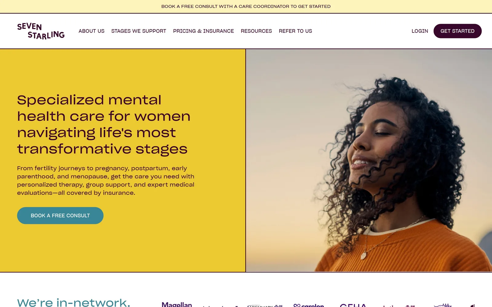
A flat chrome yellow panel butted against a portrait at sunset, with aubergine type and one teal button.
Type
Sharp Grotesk, about 45px, weight 500
Body
Sharp Grotesk, 16px
Build
50/50 split, no gutter, 30px pill button
Made on
Custom build
Colour
#ecc931 #38062b #398697
Type. Sharp Grotesk runs the entire page, headline through nav, at roughly 45px on screen for the hero with a 1.33 line height and slightly open 0.011em tracking. It is a grotesk with a squarish bowl that reads as contemporary without being a geometric cliche. Supporting copy sits at 16px, nav at 14px in capitals. Using one family at four sizes is why the page feels calm despite the yellow.
Colour. Chrome yellow #ecc931 covers about 18% of the screen, paired with deep aubergine #38062b for all ink and a teal #398697 reserved solely for the button. The strip above the nav is a paler #fcf3ba. Perinatal and menopause care almost always defaults to sage, blush or dusty blue, so yellow at this volume is the single bravest colour choice on this page.
Layout. A clean 50/50 vertical split at 1440 with no gutter between the panels and no corner radius anywhere except the 30px pill button. The photograph is cropped tight to the face and bled to the right and bottom edges. Above the fold: announcement strip, wordmark, five nav items, headline, four lines of body, one button, and the top of the insurance logo row.
The ask. BOOK A FREE CONSULT appears three times above the fold: the yellow strip at the very top, the teal button in the hero, and GET STARTED as an aubergine pill in the nav. Free is doing the work in all three. Nothing else competes, because the hero carries no secondary link at all.
A single saturated flat colour at half the hero is cheaper than any photograph and harder to forget.
05
twochairs.com
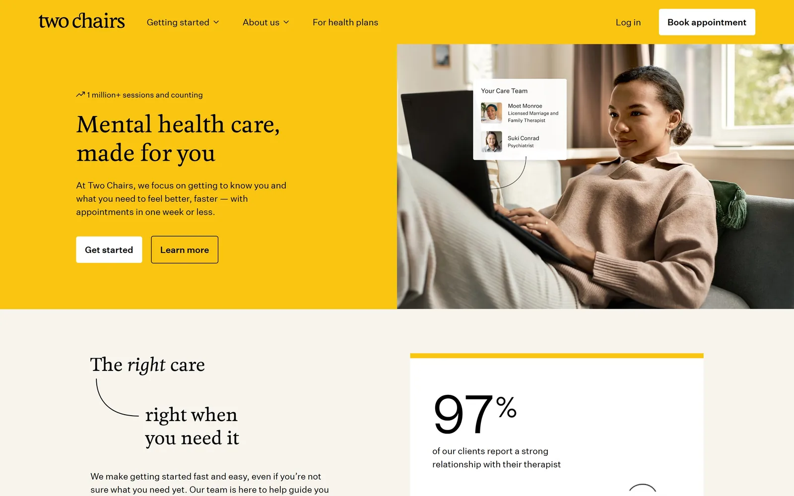
A yellow half-panel with a soft serif headline, next to a woman on a sofa and a floating care team card.
Type
Feijoa, 40px, weight 500
Body
Untitled Sans, 16 to 24px
Build
720/720 split, 80px padding, 4px radius
Made on
Webflow
Colour
#f9c511 #f6f4ec #000000
Type. Feijoa, a humanist serif with rounded terminals, sets the headline at 40px, weight 500, 1.30 line height, no tracking adjustment. Untitled Sans handles everything else: 24px for the subhead, 16px for nav and buttons. The headline is small for a hero, only 40px, and it works because the yellow panel gives it so much empty space. Below the fold the same serif turns italic for the word right, the one flourish on the page.
Colour. Yellow #f9c511 takes about 36% of the screen, over white and a bone #f6f4ec. Every piece of ink is pure #000000, no greys, which is unusual and keeps the yellow from turning muddy. The buttons are white and outlined black rather than a contrasting accent, so the palette stays at exactly three values plus photography.
Layout. A 720/720 two column split at 1440, flush, with 80px section padding and a 4px button radius that is nearly square. The photograph is not full bleed: it stops short of the top so the yellow panel carries the nav. A UI card labelled Your Care Team with two named clinicians is composited over the laptop, a product screenshot pretending to be part of the room.
The ask. Get started filled white and Learn more outlined, with Book appointment repeated in the nav and Log in beside it. The eyebrow 1 million+ sessions and counting does the credibility work before the ask. Directly under the fold a 97% stat card picks it up again, so the proof and the request alternate the whole way down.
Compositing one real product card into the hero photograph shows what the service is in less space than a paragraph.
06
minaab.com
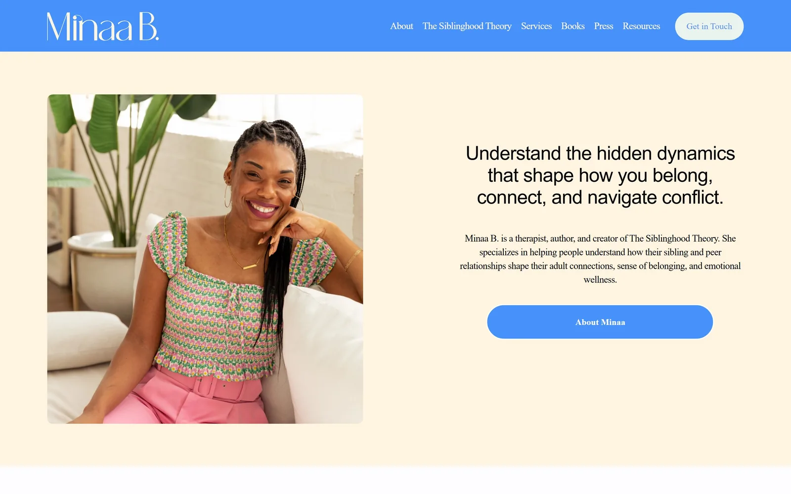
A cornflower blue nav band over cream, a centred portrait in pink and green, and one wide blue pill button.
Type
Custom sans, 35px, tracked -0.02em
Body
Poppins, 18px, weight 300
Build
Two column centred hero, 95px padding, pill button
Made on
Squarespace
Colour
#fff4e0 #5991f1 #e3f7ec
Type. The headline is a quirky sans at 35px, tracked -0.02em, centred, in near black #030303, with a distinctive narrow lowercase a that also shows up in the wordmark. Body is Poppins at 18px, weight 300, tracked tight at -0.03em and centred to match. Light Poppins at 18px centred is a risky setting for a paragraph and here it just survives, helped by the short line length.
Colour. Cream #fff4e0 is the field, cornflower #5991f1 is the nav band and the button, and a pale mint #e3f7ec fills the Get in Touch pill in the corner. Blue takes about 6% of the screen but all of it is at the top and bottom edges, framing the cream. For a therapist and author selling a named framework, a primary blue rather than a muted neutral is the right call.
Layout. A 1440 container with 95px section padding. The hero is two columns: a portrait on the left in a square with roughly 12px radius, text block right, both vertically centred. The button is unusually wide, running the full width of the text column at a 300px radius so it is a complete lozenge. Above the fold: nav band, portrait, headline, three lines of bio, one button.
The ask. About Minaa is the only button, and it points at a biography rather than a booking page, which is deliberate for someone whose product is a book and a theory. Get in Touch sits in the nav as the real conversion. Six nav items including Books, Press and Resources compete heavily for the click.
A button stretched to the full width of its text column turns a weak secondary ask into the loudest element on the screen.
07
kiptherapy.com
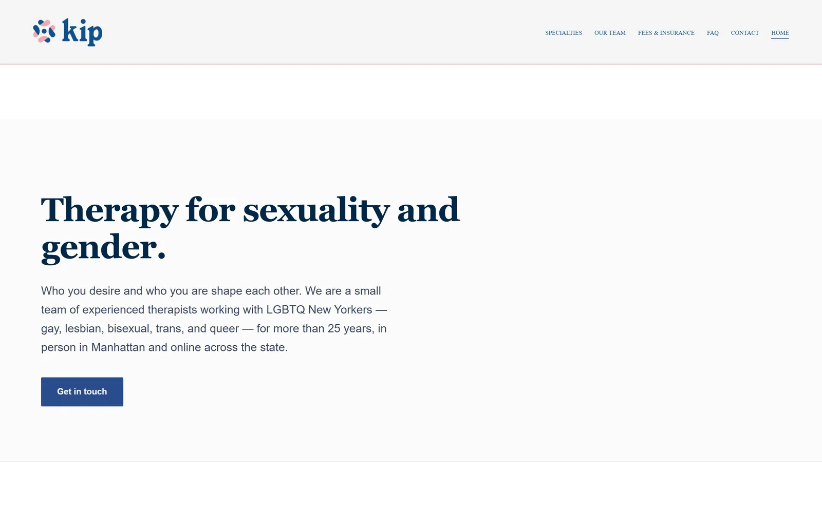
No photograph at all: a navy Source Serif headline on near-white, with one blue button and a coral hairline.
Type
Source Serif 4, 58px, weight 600
Body
Public Sans, 20px/1.65
Build
Single left column, 88px padding, 15px radius
Made on
Squarespace
Colour
#fbfbfc #012746 #0f518f
Type. Source Serif 4 at 58px, weight 600, tracked -0.02em, line height 1.12, in navy #012746. Body is Public Sans at 20px with a generous 1.65 line height in a softer #3c4a63, measuring about 60 characters a line. Nav drops to 10px capitals. The contrast between a heavy serif headline and a plain workhorse sans below it is the whole typographic idea, and it does not need a third face.
Colour. Near white #fbfbfc holds about 88% of the screen. Navy #012746 for headlines, #3c4a63 for body, and a single blue #0f518f on the button. The only warm note is a one pixel coral rule under the header and the pink half of the logo mark. Blue and white for a mental health practice is the category default, but the near total absence of anything else turns a default into a position.
Layout. A 1440 container with the text column starting about 100px from the left and stopping around 60% width. Section padding is 88px, button radius 15px. The hero is a single left aligned column with nothing on the right half, which is a lot of empty screen to leave at 1440. Above the fold: logo, six nav items, headline, four lines of body, one button.
The ask. Get in touch, filled blue, once. That is the entire ask above the fold. The nav carries FEES & INSURANCE and CONTACT, which for a practice billing out of network are the two pages people actually want. Nothing shouts, and for a 25 year old practice with a specific clientele that is a defensible trade.
Dropping the hero image entirely is a real option when your headline names exactly who you treat in six words.
08
cindyshutherapy.com
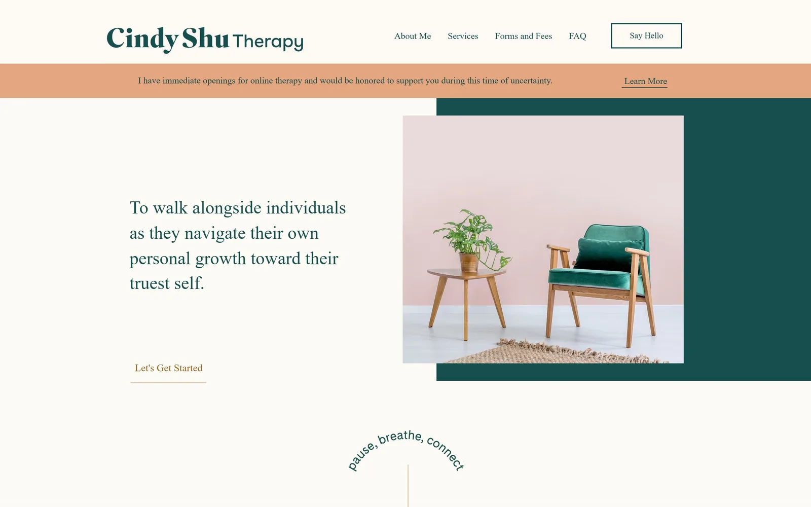
A green velvet chair on a pink wall, offset over a dark teal block, with teal serif type on cream.
Type
High-contrast serif, 32px
Body
Humanist sans, 16 to 18px
Build
Offset image over colour block, left text third
Made on
Wix
Colour
#164e4e #fdfbf6 #e3a681
Type. The wordmark pairs a heavy serif Cindy Shu with a lighter sans Therapy at the same size, a simple way to separate name from service. The hero line is that serif at 32px with a loose 1.40 line height, in teal, running four short lines. It is a small headline by the standards of this page set, and the generous white space to its left is what gives it weight rather than size.
Colour. Teal #164e4e for all ink and for the block behind the photograph, cream #fdfbf6 for the field, and peach #e3a681 for the announcement bar at about 3.4% coverage. The call to action is a rust #9e671f. Four colours, each used once in one role. The green velvet chair in the photograph was clearly chosen to match the teal, which is the kind of art direction most solo practices skip.
Layout. The photograph sits offset over a solid teal rectangle so that the block shows along the right and bottom edges, a classic layered frame built here in Wix. The text column occupies roughly the left third at 1440. There is no corner radius. Above the fold: logo, four nav items, an outlined Say Hello box, the peach bar, the headline, a text link, and the top of an arched pause, breathe, connect lockup.
The ask. The hero call to action is Let's Get Started as a text link with a rust underline, no fill, no box. That is quiet to the point of being easy to miss. Competing with it are Say Hello in an outlined box top right and Learn More in the peach bar, so three different asks in three different visual weights, none of them a solid button.
Choosing a prop whose colour already matches your palette does more for brand coherence than any overlay or filter.
09
alexisbesstherapy.com
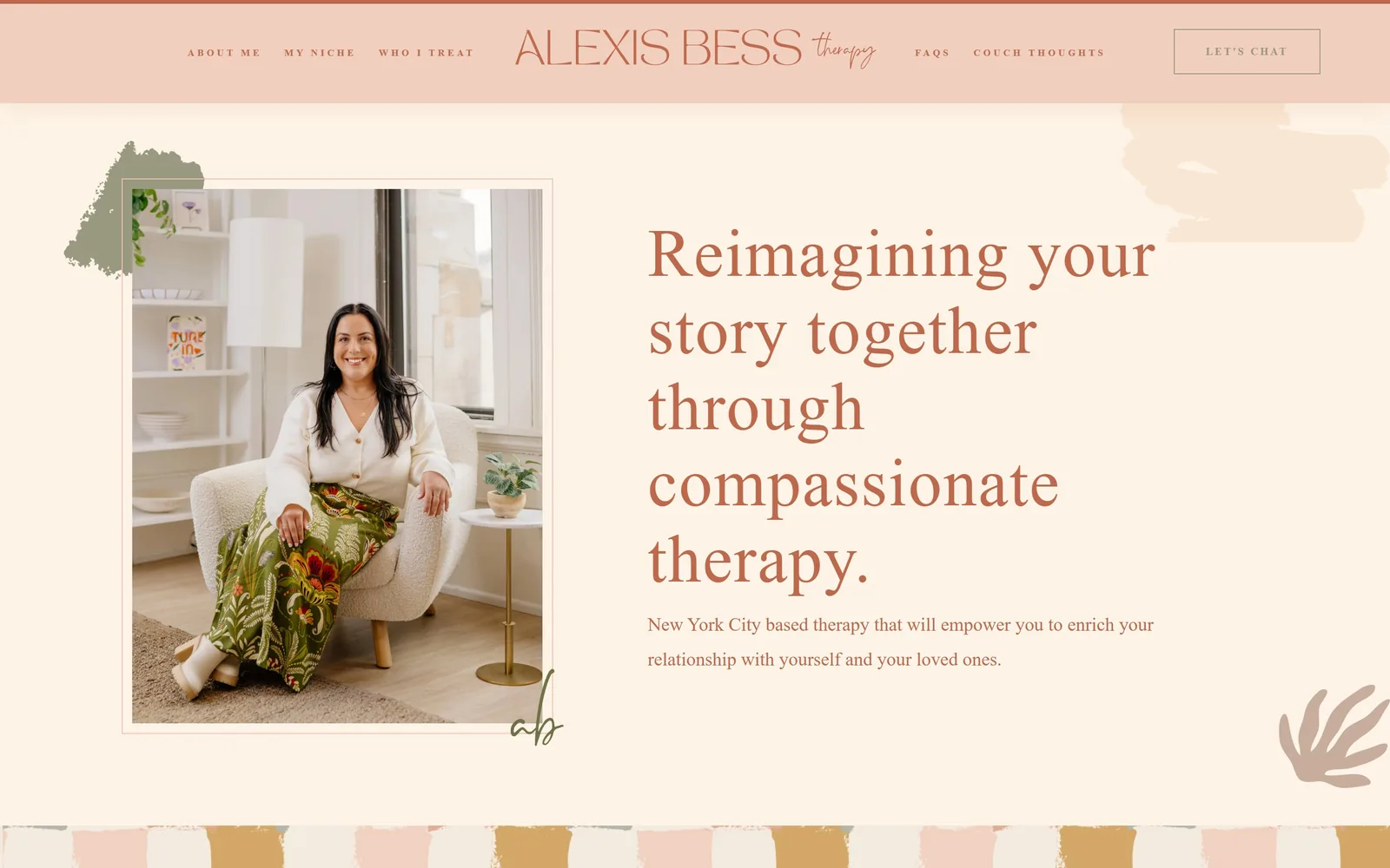
Terracotta display serif on cream, a framed portrait in a boucle chair, and painted brush marks in the corners.
Type
Migra, 70px display serif
Body
ss-pro, 19px/1.8
Build
360/375/360 grid, 107px padding, framed portrait
Made on
Squarespace
Colour
#fdf4e7 #bf694c #999981
Type. Migra sets the headline at 70px with a slight positive 0.02em tracking and 1.14 line height, a high contrast display serif with sharp thin strokes that survives being set in terracotta rather than black. Body is ss-pro at 19px with a loose 1.8 line height. The nav is the extreme end of the scale: 10px, weight 800, 0.29em tracking, capitals, which reads as a decorative band rather than text.
Colour. Cream #fdf4e7 is the body, blush #f1cfbe the header band at about 66% coverage, and terracotta #bf694c every piece of ink including the headline and the body copy. A sage #999981 is held back for the button fill alone. The painted strip across the bottom brings in ochre #ca984c. Setting body copy in terracotta rather than a dark neutral is the risky call and at 19px it stays readable.
Layout. Three column grid at 360, 375, 360 with 107px section padding. The portrait sits in a thin inset frame with a hand painted sage shape behind its top left corner and a script monogram bleeding off its bottom right. Headline and subhead occupy the right half, starting about 46% across. No corner radius anywhere.
The ask. LET'S CHAT in an outlined box, top right, is the only ask above the fold. The hero itself carries no button, which leaves a 70px headline and two lines of copy doing all the persuading. Five nav items including COUCH THOUGHTS compete for attention; the booking link is the thinnest thing in the row.
Setting body copy in the same warm accent as the headline, not grey, makes a two colour palette feel deliberate rather than unfinished.
10
thevibranttapestry.com
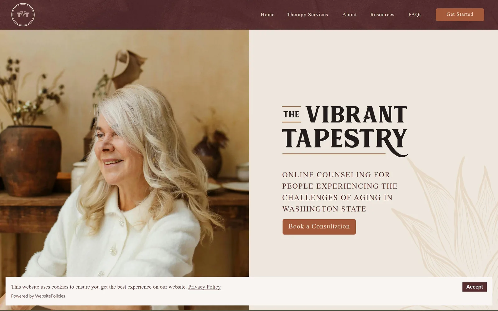
An olive nav band over a split of portrait and oat panel, with a tracked serif wordmark between two rules.
Type
Article serif, 22px, 0.08em tracking
Body
Article serif, 19px capitals
Build
50/50 split, olive nav band, line art watermark
Made on
Custom build
Colour
#572f30 #eae1d5 #4d523e
Type. One serif runs the whole page. The wordmark is set at 22px in capitals with 0.08em tracking and rules above and below it, and the subhead beneath drops only to 19px at 0.06em, also capitals. That narrow gap between headline and subhead is the unusual move: the page is built on tracking and rules rather than on size. The THE is tucked small against VIBRANT, which keeps the two word stack even.
Colour. Burgundy #572f30 for ink, oat #eae1d5 for the right panel at about 45% coverage, and an olive #4d523e for the nav band, which at 50% coverage is heavier than it looks because it also appears below the fold. The button is a terracotta #a45a3a. Burgundy and olive for counselling aimed at older adults avoids the pastel wellness register entirely, which is the point.
Layout. A 50/50 vertical split, photograph bled to the left and bottom edges, text panel right with the content stacked and left aligned starting at about 57% across. A line art frond watermark sits in the lower right of the panel in a slightly darker oat. Above the fold: olive nav with six items, the wordmark, three lines of subhead, one button, and a cookie bar across the bottom.
The ask. Book a Consultation in solid terracotta is the hero ask, with Get Started repeated as a smaller terracotta button in the nav. Both go to the same place, which is the right decision for a solo online practice. The cookie bar with its own dark Accept button is the only real competition, and it is parked at the very bottom.
Tracking a two word logotype out and bracketing it with rules can carry a hero without any display size at all.
11
littleotterhealth.com
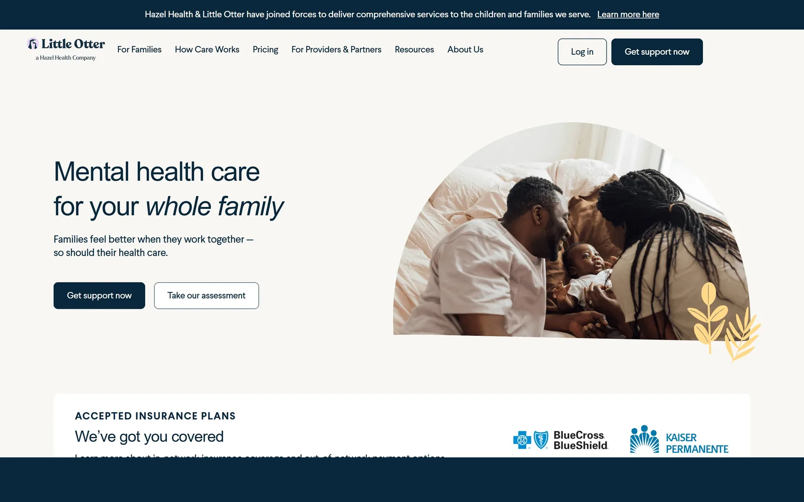
Navy type on shell white, whole family set in italic, beside a photo cropped into a half arch.
Type
lft-etica-sheriff, 48px, -0.03em
Body
Larsseit, 18px
Build
1250px container, 608/640 split, 8px radius
Made on
Webflow
Colour
#f8f7f3 #09273b #f3eedb
Type. lft-etica-sheriff sets the headline at 48px, tracked tight at -0.03em over a 1.30 line height, with whole family italicised to carry the emphasis. It is a slab sided sans with just enough serif detail to feel warm. Body is Larsseit at 18px, also tracked slightly negative. The pairing is two near neighbours rather than a contrast, which suits a brand selling calm to tired parents.
Colour. Shell #f8f7f3 holds the page, sand #f3eedb sits under the panels, and navy #09273b does triple duty as headline ink, body ink and button fill at about 8% coverage. The only other colour is a yellow leaf doodle tucked under the photograph. A single navy at three jobs is cheaper than a brand palette and it is why the page reads as one voice.
Layout. A 1250px container, narrower than the 1440 viewport, with 94px section padding and a consistent 8px radius. The hero runs a 608/640 two column split. The photograph is masked into a half arch, flat along the bottom and curved across the top, a shape used again further down the page. Above the fold you also catch the top of the insurance panel.
The ask. Get support now in solid navy and Take our assessment as an outline, with Get support now repeated in the nav and Log in beside it. Four asks across the top, two of which are identical. The insurance logos sliding into view at the fold answer the price question before anyone has to click Pricing.
Masking a hero photograph into one distinctive shape and reusing that shape down the page does more branding work than a logo.
12
anisehealth.co
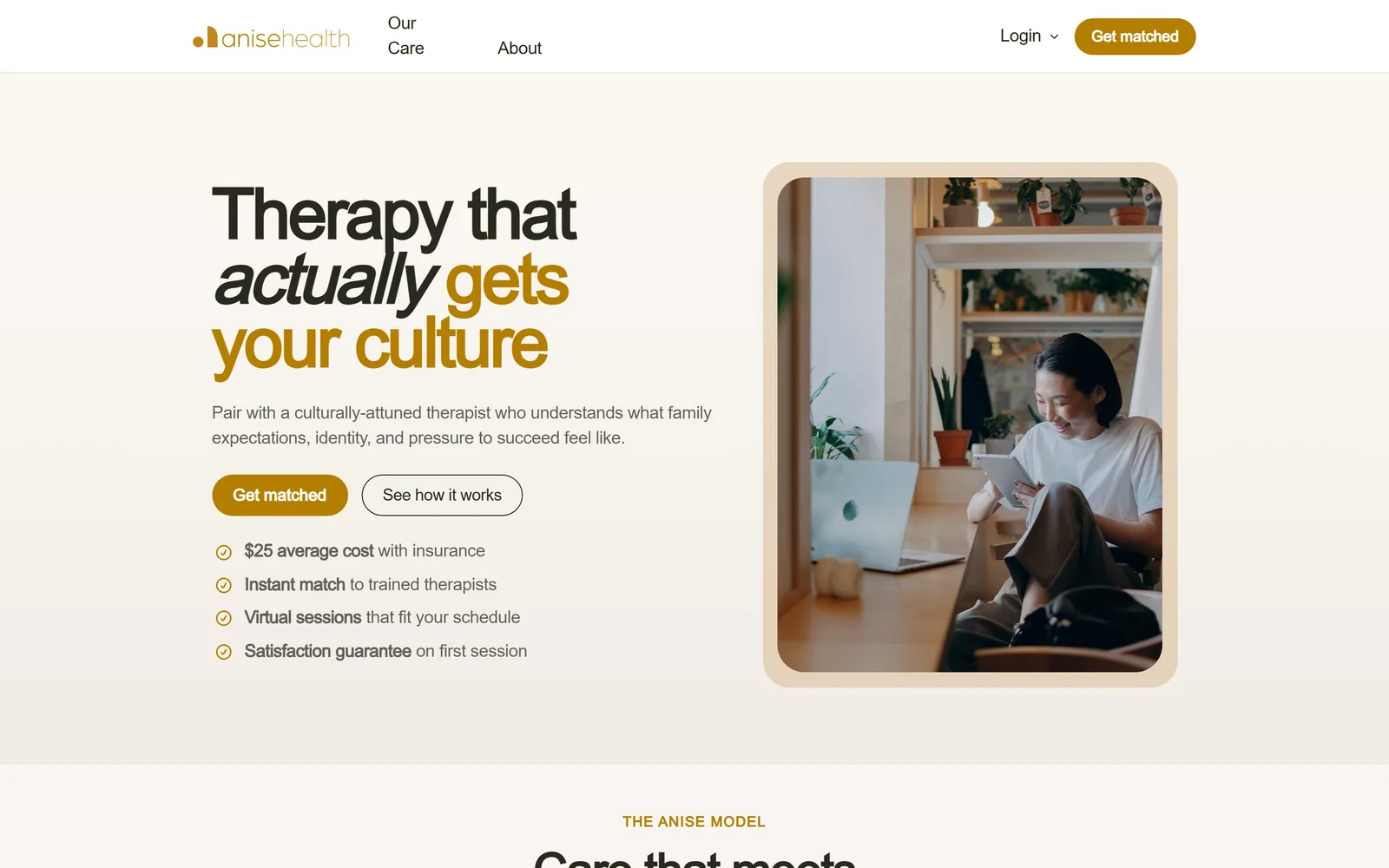
Heavy Poppins in black and ochre, actually set in italic, beside a photo framed in a tan rounded card.
Type
Poppins, 64px, weight 700, -0.04em
Body
Poppins, 16px/1.65
Build
Two column, framed photo card, 999px pills
Made on
Framer
Colour
#f8f5f2 #b47e00 #d8b690
Type. Poppins at 64px, weight 700, tracked hard at -0.04em with a 1.04 line height, so the three lines nearly touch. The word actually is italicised and the third line switches from near black #29291d to ochre, giving one headline three states. Body sits at 16px with a 1.65 line height. Poppins bold this tight is a common Framer default, rescued here by the italic and the colour break.
Colour. Warm white #f8f5f2 covers most of the screen, ochre #b47e00 does the accent work in the logo, the second half of the headline, the four tick marks and the Get matched buttons, and a tan #d8b690 forms the frame around the photograph. Ochre lands on about 0.4% of pixels yet appears six times, which is why it registers as the brand colour rather than as a highlight.
Layout. The hero is a two column arrangement with the text left and a photograph inset in a tan card with roughly 24px radius, so the image is framed rather than bled. Buttons are full pills at a 999px radius. Under the paragraph sit four check rows at 16px, each with a bold phrase and a light tail. The next section begins just at the fold with the eyebrow THE ANISE MODEL.
The ask. Get matched is the ask and it appears twice above the fold, in the nav and as the primary button, with See how it works as a white outlined pill beside it. The four check rows are the real persuasion, led by $25 average cost with insurance, which is the number people are actually looking for. One defect: the nav wraps Our Care onto two lines and knocks it out of alignment with About.
Putting the price with insurance in the first bullet under the button answers the question that decides whether anyone books.
13
cobbpsychotherapy.com
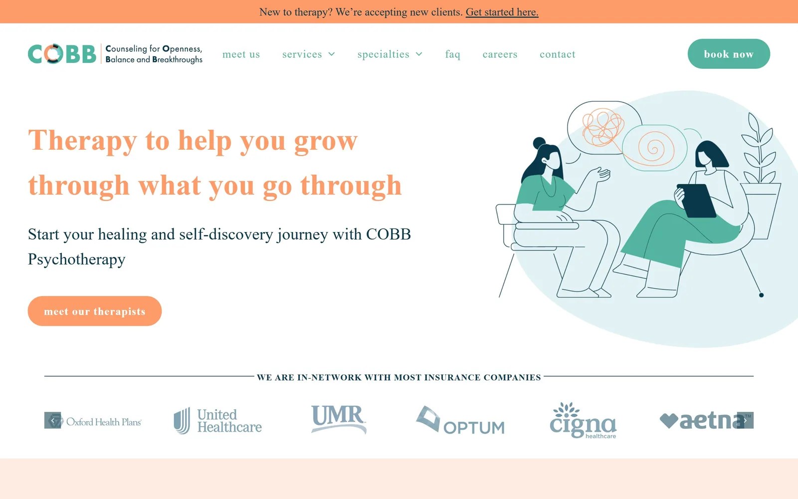
A coral serif headline next to a two tone line drawing of two women talking, over a row of insurer logos.
Type
Transitional serif, about 54px, coral
Body
futura-pt, 20px/1.6
Build
1280px container, two column, 50px pills
Made on
WordPress
Colour
#ff9a69 #53b4a0 #0c384a
Type. The headline is a sturdy transitional serif at roughly 54px in coral, two lines, no tracking adjustment, and the DOM reports it as the same geometric sans used everywhere else, which the drawn glyphs flatly contradict. Everything else really is futura-pt: body at 20px with a 1.6 line height, nav at 20px weight 500 with 0.05em tracking, button at weight 700. A 20px nav is large and gives the top of the page an informal, almost handwritten rhythm.
Colour. Coral #ff9a69 is the dominant colour at over 100% coverage once the announcement bar, headline, button and the blush band below are counted, with teal #53b4a0 for the nav and the book now pill, and deep ink #0c384a for body copy. A blush #ffebe1 strip begins under the fold. Coral and teal is a livelier pairing than the category norm and the illustration repeats both exactly.
Layout. A 1280px container inside a 1440 viewport. The hero is two columns, copy left and illustration right, with the illustration sitting on a pale blue blob that bleeds off the right edge. Button radius is 50px, a full pill. Above the fold there is a coral announcement bar, the logo lockup with its expanded tagline, six nav items, the headline, two lines of copy, one button, and a full insurance carousel.
The ask. meet our therapists in a coral pill is the hero ask, which points at people rather than a calendar, and book now in a teal pill sits in the nav. The announcement bar adds a third, Get started here, underlined. The insurance carousel immediately under the hero is the strongest conversion element on the screen and it is not a button at all.
A custom illustration drawn in exactly your two brand colours replaces stock photography without the budget of a photo shoot.
14
williamsburgtherapygroup.com
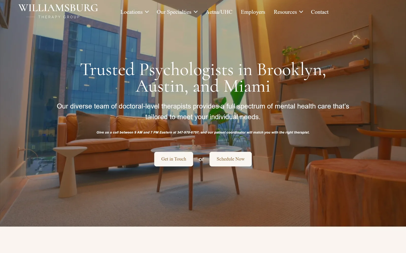
A looping video of a corner office at golden hour, with a centred Cormorant headline and two cream buttons.
Type
Cormorant, 65px, 0.90 line height
Body
Proxima Nova, 24px
Build
1300px centred container over full bleed video
Made on
Custom build
Colour
#f8f4ef #b28c57 #ffffff
Type. Cormorant at 65px with a very tight 0.90 line height, white, centred, so the two lines of Trusted Psychologists in Brooklyn, Austin, and Miami almost interlock. The subhead is Proxima Nova at 24px with a 1.58 line height, also centred and white. Nav is Roboto at 18px bold. Three unrelated families in one hero, Cormorant, Proxima and Roboto, is one too many, and the Roboto nav is the weakest element on the screen.
Colour. The video supplies the colour: tan leather, orange light, blue glass. Over it sit white type and two cream #f8f4ef buttons, with a gold #b28c57 used for secondary links further down. There is no brand colour holding the composition together, so if the video changes frame the palette changes with it. That is the cost of a video hero with no overlay panel.
Layout. A 1300px content container centred over a full bleed video. Everything in the hero is centre aligned: wordmark top left aside, the headline, subhead, a line of bold italic phone copy and the button pair all stack down the middle. Button radius is 8px. The video is bright enough in places that the white subhead loses contrast against the window frames behind it.
The ask. Get in Touch and Schedule Now, two cream buttons separated by the word or, which is a nice touch because it tells the hesitant visitor they do not have to book yet. Above them the line Give us a call between 9 AM and 7 PM Eastern with a phone number gives a third route. Six nav items including Aetna/UHC compete, and that one is smart: it names the insurer people search for.
Splitting your two calls to action with the word or lowers the stakes of the whole decision for a nervous visitor.
How these were chosen
Fourteen sites here, ranging from one-person counselling rooms in rural Virginia to venture-funded clinics counting sessions in the millions. The pattern that kept repeating: the strong ones put either a real face or a real room above the fold and then let one large typeface carry the entire message, while the weak ones hid behind stock interiors and a headline that would fit any practice in the country. Price, insurance and waiting times turn up above the fold far more often than you would expect from a category that used to bury them three clicks deep. Most therapist website design still reaches for sage green and blush by reflex, so the practices that picked chrome yellow, cornflower blue, burgundy or coral are the ones you actually remember a day later.
Finding therapy sites that someone had actually designed took far longer than it should have. 29 candidates made the shortlist. 14 made the page.
Each one was opened and looked at properly: what the type is doing, where the colour gets spent, how the page is built, how it asks for the job. Nothing is here because it ranks. Nothing is here because an agency filed it under portfolio. Several well known names were left out for the plain reason that their site came out of the same template as everyone else's, and a few sites worth including did not survive a second look.
Where a site is only competent, it says so. The order is the order worth your time, best first.
Reviewed and selected by Larry W. Matthews for Websitely.