Gym Website Design Examples From 10 US Fitness Brands
The photograph carries the colour and the stylesheet holds at three values. Ten studios, climbing gyms and recovery clubs doing gym website design well.
Shown
10 sites
Reviewed
37 candidates
Chosen on
The work, not the ranking
Updated
15 October 2026
01
remedyplace.com
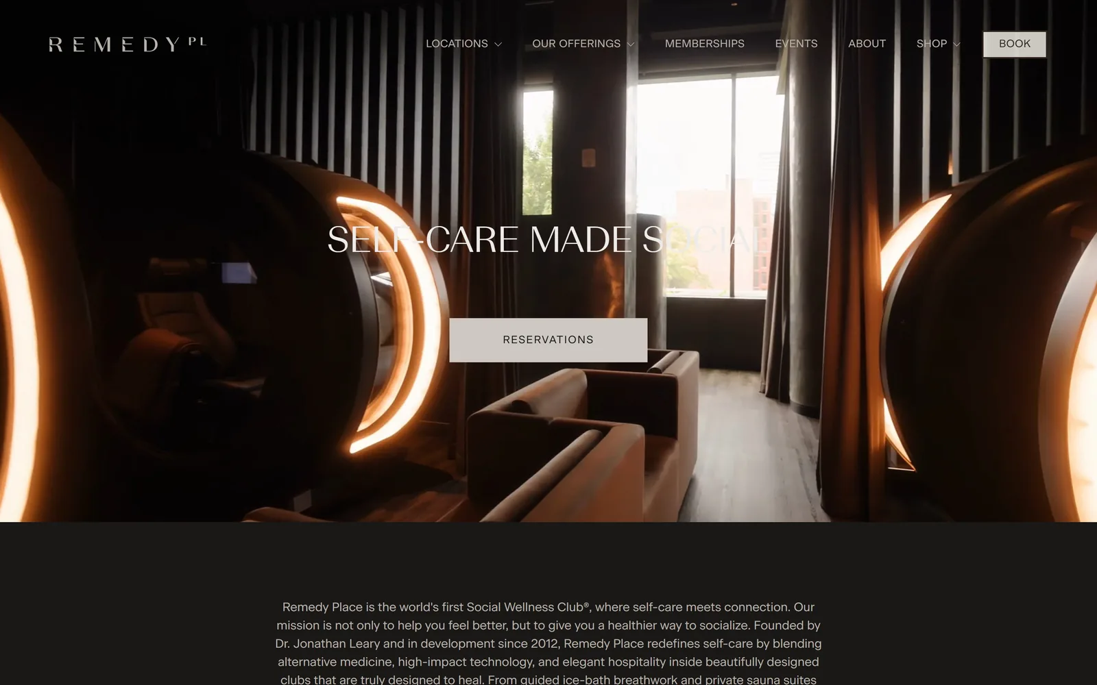
Near-black page, amber hyperbaric pods glowing in a dim lounge, a centred caps headline and one stone-grey Reservations button.
Type
Beausite Slick, 48px caps
Body
Beausite Classic 16px
Build
full-bleed video hero, single centred column
Made on
custom JS framework
Colour
#1a1817 #cdc9c2 #b9b2aa
Type. Beausite Slick sets SELF-CARE MADE SOCIAL at 48px, all caps, line-height 1.00, a wide low-contrast sans with slightly flared terminals. Body and nav run Beausite Classic at 16px and 14px, the nav caps tracked out 0.025em. Nothing on the page is bold: every weight is 400 and the hierarchy comes from size and spacing alone. The headline is centred over the brightest part of the video and the right end of it half dissolves into the sauna light, which is where the restraint costs something.
Colour. Near-black #1a1817 covers the page, and the long paragraph under the hero is #b9b2aa warm grey rather than white. The only non-photographic colour is the amber ring light of the pods in the footage. The single button is #cdc9c2 stone with #1a1817 text, square corners. Dark is the default for a recovery club, but the warm grey ink instead of pure white is a decision.
Layout. Full-bleed 1440px video hero with no container inset, a nav spread edge to edge with seven items and BOOK pinned right. Headline and button are centre-stacked at roughly 35% and 50% down the fold. Below it, one centred paragraph of 16px text on flat #1a1817, no cards, no image, no columns. Corner radius is 0 everywhere, buttons included.
The ask. Two asks, both the same thing: BOOK in the nav, RESERVATIONS in the hero. Nothing else competes above the fold, no price, no offer strip, no popup. The cost is that the first thing below the hero is an 840-character mission paragraph, so a stranger reads a manifesto before seeing a service list or a number.
One ask, one button, and everything else on the fold is just the room.
02
thefortnyc.com
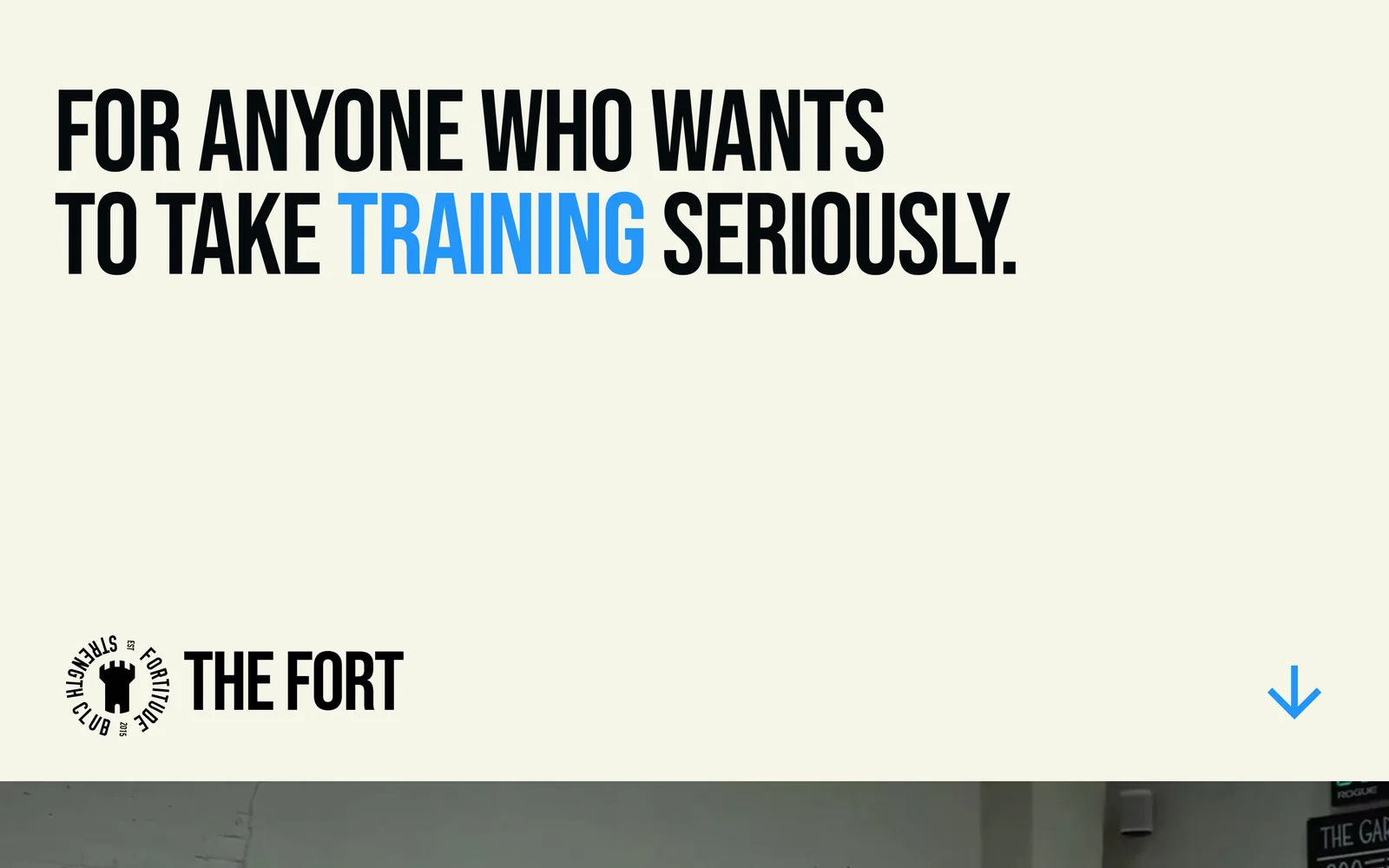
Two lines of 120px condensed caps on a pale ground, one word in blue, a castle logo bottom-left and a blue arrow bottom-right.
Type
Bebas Neue, 120px
Body
Anderson Grotesk
Build
type-only hero, video starts at the fold
Made on
Webflow
Colour
#f6f6e8 #04090c #2496fa
Type. Bebas Neue at 120px, tracked in to -0.017em with line-height 0.89, filling the top third in two lines. It is the only type on the fold apart from the wordmark. Condensed caps at that size with that leading stop behaving like a sentence and start behaving like a graphic. One word, TRAINING, is swapped to blue and carries the whole emphasis.
Colour. A #f6f6e8 ground, #04090c near-black type, and #2496fa blue on exactly one word and the down arrow. Three values, no fourth. The blue is used twice and both times it points: once at the promise, once at where to go next.
Layout. There is no nav bar at all. The headline is anchored top-left at about 88px padding, the logo lockup sits bottom-left, the arrow bottom-right, and a full-bleed video of the gym floor begins exactly at the fold line. The page runs 40,263px deep, so the empty middle of the first screen is a held pause, not missing content.
The ask. Nothing is clickable above the fold, not even a menu. The arrow is the only instruction given. For a studio whose whole funnel is a 15-minute intro call, that is a brave bet, and it stakes the entire first screen on the sentence being good enough to earn a scroll.
One sentence, one accent word, and the nerve to leave the rest of the screen empty.
03
equinox.com
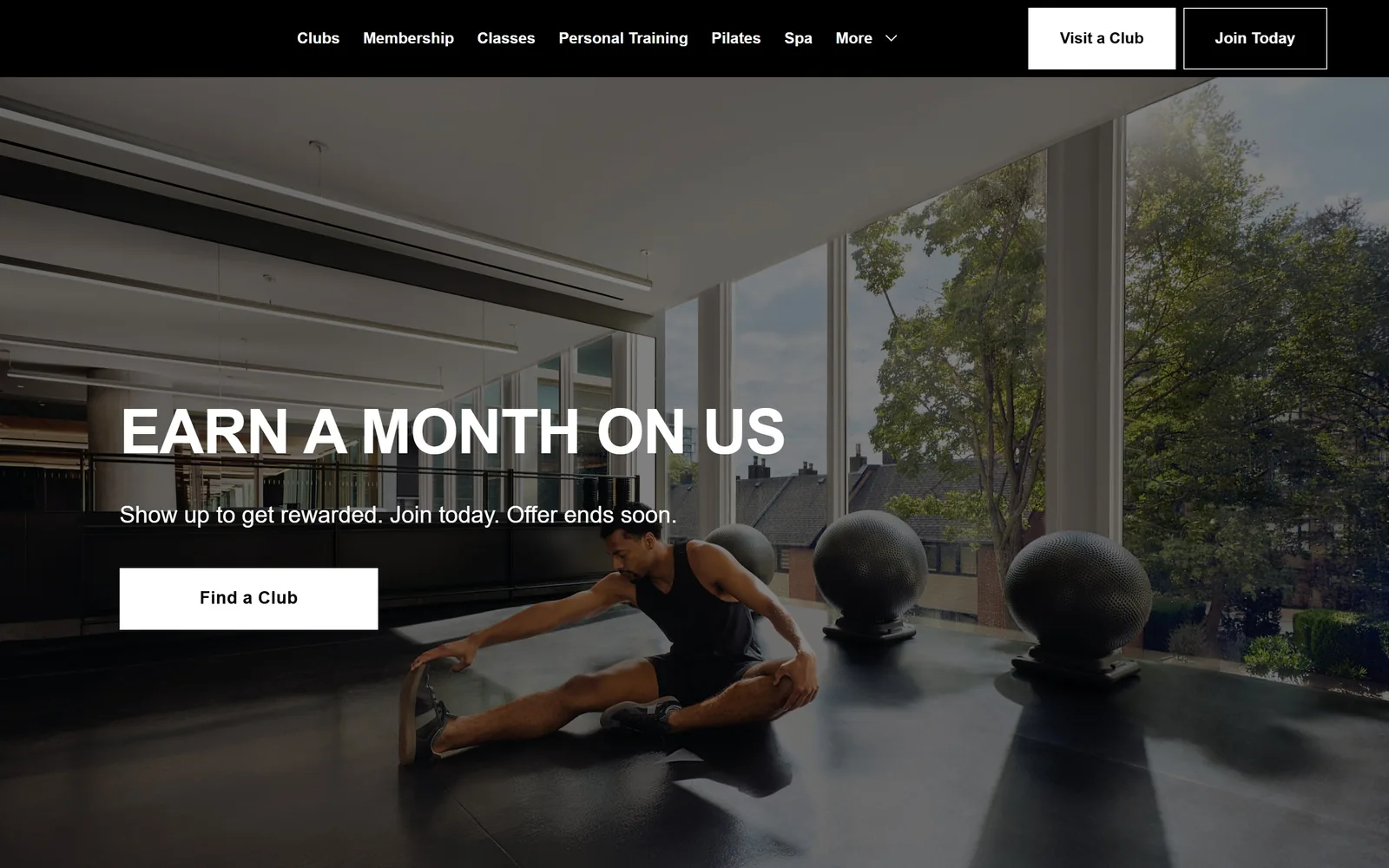
Black nav bar over a sunlit club floor, 64px white caps headline low on the left, one square white Find a Club button.
Type
Equinox Sans, 64px caps
Body
Equinox Sans 16 to 24px
Build
full-bleed photo hero, 12-column grid
Made on
custom JS framework
Colour
#000000 #ffffff #333333
Type. Equinox Sans sets EARN A MONTH ON US at 64px, weight 600, caps, tracked -0.02em with line-height 1.00. The deck below runs the same face at 24px regular in sentence case, which is the only real contrast in the system. Nav is 18px regular. One typeface across the whole page, separated by size and weight only.
Colour. #000000 and #ffffff. That is the entire palette, confirmed by a page where black covers 350% of a screen height and white covers 7.6%. Black nav bar, white type on the photograph, white button with black text. No accent colour at all, which at this membership price is the position rather than an omission.
Layout. A black bar across the full 1440px with nine nav items centred and two buttons flush right, Join Today outlined and Visit a Club solid white. The hero photograph is full bleed. Headline, deck and button stack left at roughly 175px in, sitting low at 50 to 70% of the fold. Radius is 0 on every element.
The ask. Three asks on the fold: Visit a Club, Join Today, Find a Club. All three are location or join, with no class booking and no price. The headline is a promotion rather than a brand line, which tells you the club treats its homepage as an acquisition page and not a brochure.
Black, white, one typeface and zero corner radius: the restraint is doing the luxury signalling.
04
gothamgymnyc.com
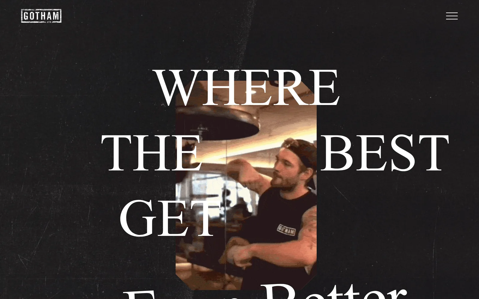
Scratched black ground with 160px hairline-serif caps reading WHERE THE BEST GET, a narrow vertical video panel punched through the middle.
Type
high-contrast display serif, about 160px
Body
Martian Mono 13px nav
Build
26-column grid, type over a centred video panel
Made on
Squarespace
Colour
#000000 #ffffff #b7ff00
Type. The fold is set in a high-contrast display serif at roughly 160px caps, hairline serifs and very thin joins, with the words breaking around a video panel. A second line drops below the fold in a script face, so the sentence completes only on scroll. Nav is a 13px monospace at light weight, which is a strange and genuinely good contrast against type that size. The facts file names a script face for the headline; the drawn glyphs on screen are a Didone-style roman.
Colour. Pure black ground with a fine grain and scratch texture laid over it, white type, and the sepia of the video as the only warmth. A #b7ff00 acid green exists in the system but is held back for buttons far down the page, so it never touches the fold. The logo is a small white stamped box top-left.
Layout. Full-bleed 1440px on a 26-column Squarespace grid with 11px gutters and 96px section padding. The video sits as a narrow vertical panel dead centre, with the headline set over and around it so words and footage share the same space. The page runs 13,365px deep.
The ask. Nothing to click above the fold but a hamburger. The first real button, BOOK A CLASS, sits a full screen below. Three locations and three phone numbers only turn up in the footer, which for a gym operating in the West Village, Bridgehampton and Miami Beach is a real cost.
Letting oversized type and video occupy the same rectangle makes a hero out of two cheap ingredients.
05
rumbleboxinggym.com
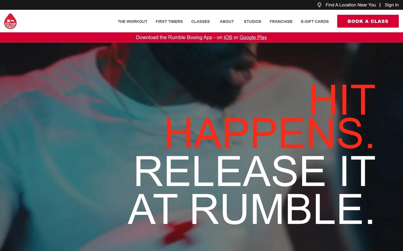
Teal and magenta graded footage of a boxer, with 150px type right-aligned over it, the first line red and cropped by the frame.
Type
grotesque caps, 150px
Body
sans 18px
Build
three stacked bars over a full-bleed video
Made on
custom
Colour
#d50032 #ffffff #191919
Type. A grotesque set at 150px with line-height 0.80, so the three lines nearly collide. HIT HAPPENS. is red, RELEASE IT AT RUMBLE. is white, every line right-aligned and running past the right edge of the frame. The nav beneath it is a modest 16px regular across seven items, deliberately quiet so the headline does all the shouting.
Colour. #d50032 brand red in the app strip and the BOOK A CLASS block, a hotter red on the headline itself, over video graded teal and magenta. Red covers about 2.5% of the screen and reads like half of it because of where it lands. The white nav bar between the two is what stops the whole thing turning into a nightclub flyer.
Layout. Three stacked bars before the hero: a dark utility strip, a white nav, then a red app-download strip. Below them a full-bleed 1440px video with type pinned right and its last line cropped by the fold. No container, no grid, no corner radius anywhere.
The ask. BOOK A CLASS sits in a red block top right and is the only filled button on the screen. Find A Location Near You and Sign In compete from the utility strip, and the red app-download bar takes a whole strip of attention for a download rather than a booking, directly above the hero.
Set the headline big enough to crop at the frame edge and the fold starts working like a poster.
06
memphisrox.com
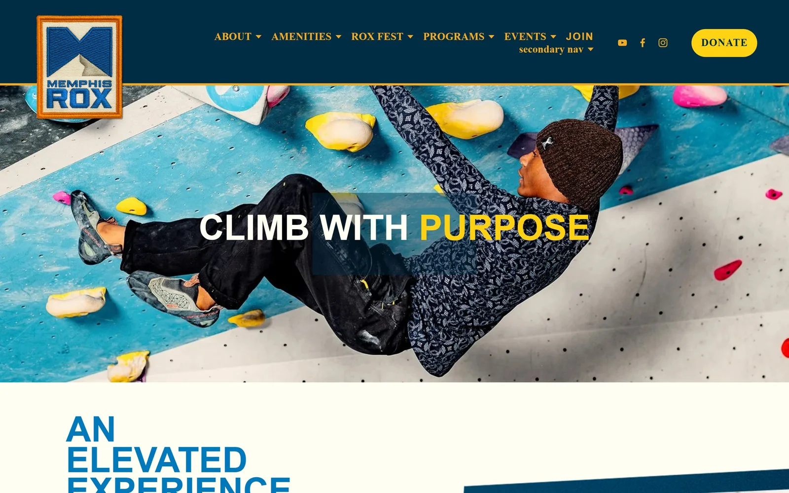
Navy bar and embroidered patch logo over a climber on a blue wall, with CLIMB WITH PURPOSE centred and PURPOSE in yellow.
Type
Beachwood, 64px
Body
Montserrat 14px
Build
26-column grid, navy bar over a full-bleed photo
Made on
Squarespace
Colour
#002c44 #ffd214 #fffef2
Type. Beachwood, a geometric sans, sets CLIMB WITH PURPOSE at 64px with line-height 0.88. The nav runs the same face at 17px tracked 0.08em. Body copy switches to Montserrat at 14px with 0.04em tracking and a 2.00 line-height, which is loose for that size and makes the sections under the hero read slowly.
Colour. #002c44 navy on the nav bar, #ffd214 yellow on the DONATE pill and on the second word of the headline, and #fffef2 below the fold. The yellow holds well under 1% of the screen and still controls the eye, because it marks only two things: the word PURPOSE and the donate button. The blue wall and coloured holds in the photograph supply everything else.
Layout. 1440px on a 26-column Squarespace grid with 156px section padding, and a thin yellow rule separating the navy bar from the hero. The embroidered-patch logo hangs over that rule into the photograph. The headline is centred on a faint dark block for legibility, and the next section starts in 64px type that is already cut off at the fold.
The ask. DONATE is the primary button and JOIN is a plain nav link, which is the right order for the largest non-profit climbing gym in the world. Against that, the nav carries seven dropdowns, and a placeholder item literally labelled secondary nav is sitting live on the homepage.
Spend your one bright colour on exactly two things and it will beat a whole accent system.
07
pausestudio.com
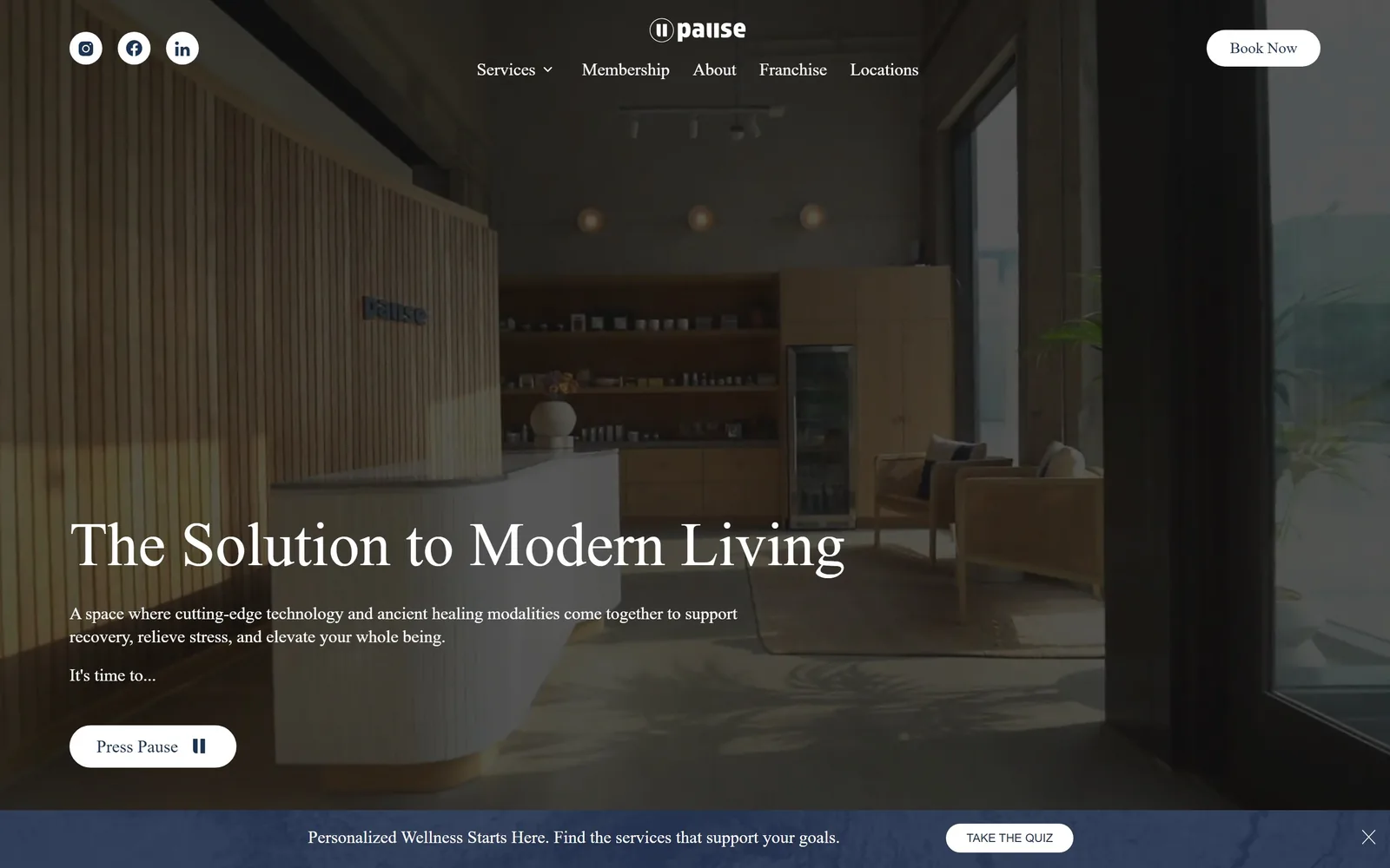
Dim recovery lounge with fluted wood and three warm pendants, a 64px serif headline bottom-left and a Press Pause pill.
Type
Lora, 64px
Body
Montserrat 18px
Build
floating nav, bottom-left hero block, pinned promo bar
Made on
custom
Colour
#171717 #ffffff #1b3452
Type. Lora at 64px, roman, line-height 1.09, sets The Solution to Modern Living in sentence case. It is a bookish serif rather than a fashion one, and the sentence case is what keeps a recovery studio from reading as a hotel day spa. The two supporting lines run 18px at weight 500 in a quieter face, and the whole fold uses three sizes total.
Colour. #171717 over the video with white type, and a #1b3452 navy that only ever shows up as button text. The real colour on the fold comes from the room itself: fluted pale wood, three warm pendant bulbs, a green drinks fridge. The blue quiz bar pinned to the bottom edge is the one element on screen not drawn from that palette.
Layout. The nav floats on the video with no bar behind it, logo centred, five items under it, Book Now pill at the right. The headline block is set bottom-left at about 60% down with 48px of section padding, and buttons are 44px radius pills. A promo bar is fixed along the bottom of the viewport so it holds its space on every scroll.
The ask. Book Now top right, Press Pause as the hero button, and TAKE THE QUIZ in the pinned bar: three asks and three different verbs on one screen. Press Pause is a nice line that tells you nothing about what happens after the click, and that vagueness is what the joke costs.
A sentence-case serif over a photograph of your own room beats any stock fitness shot at half the effort.
08
thefrontclimbingclub.com
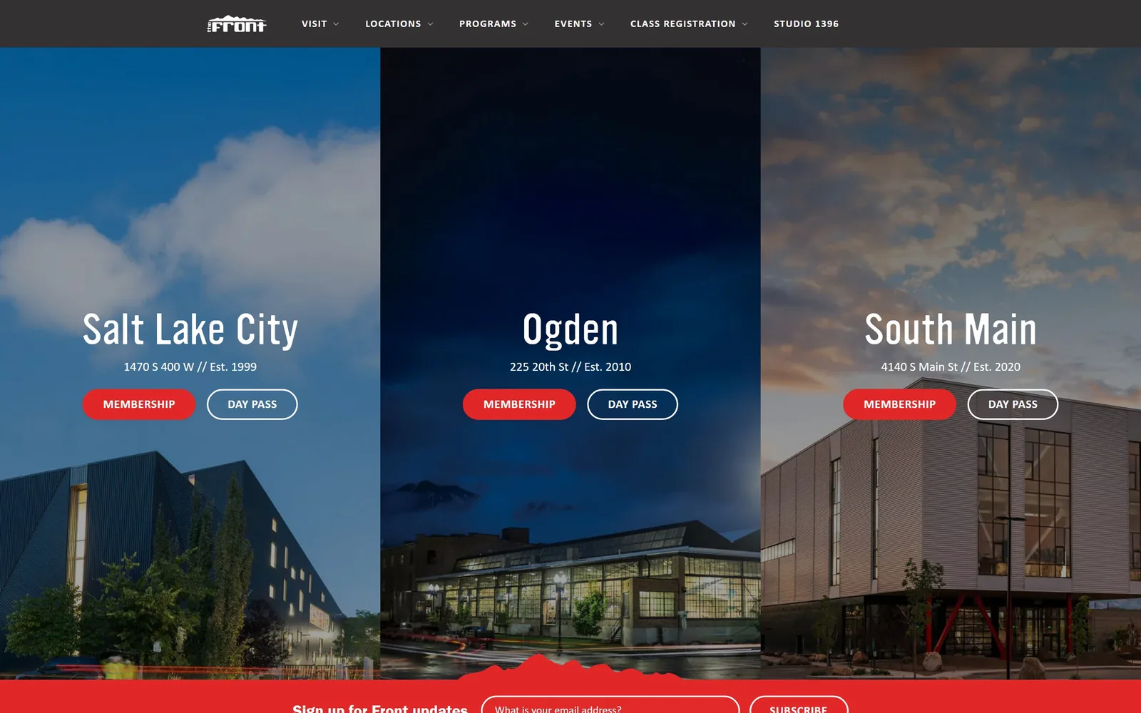
Three floor-to-ceiling panels, one per Utah gym, each with its own sky, a city name and a red Membership pill.
Type
squarish light sans, 48px
Body
Calibri 15 to 16px
Build
three equal 480px panels, torn-edge band
Made on
custom
Colour
#e12727 #21344c #ffffff
Type. City names are set at 48px in a squarish light sans with flat-sided bowls, addresses under them at 16px, and the nav in Franklin Gothic Demi at 16px. That is three unrelated faces on one fold, and the Calibri in the supporting text is the one that drags the whole thing down a tier. The est. dates set after a double slash are a nice small touch that costs nothing.
Colour. Each panel carries its own photographed sky, so the fold runs cold daylight blue, a #21344c midnight navy and a dusk orange side by side. #e12727 red lands on all three MEMBERSHIP pills and on the torn band at the bottom. That red against three different skies is the only thing holding the three panels together as one page.
Layout. A three-column grid at 480px per panel with no gutter, each panel running floor to ceiling. City name, address line, then two pills per panel, all vertically aligned across the three. A red band with a torn mountain-silhouette edge cuts across the bottom carrying the newsletter signup. Container 1440px, pills at full radius.
The ask. Six buttons on the fold: MEMBERSHIP and DAY PASS for each gym, with the paid option filled red and the trial outlined. The newsletter form competes from the bottom band. Forcing a location choice before anything else is right for a three-site operator, and the day pass sitting beside every membership is a sensible lower rung.
If location decides the sale, make the fold a location picker and skip the hero entirely.
09
hithouse.com
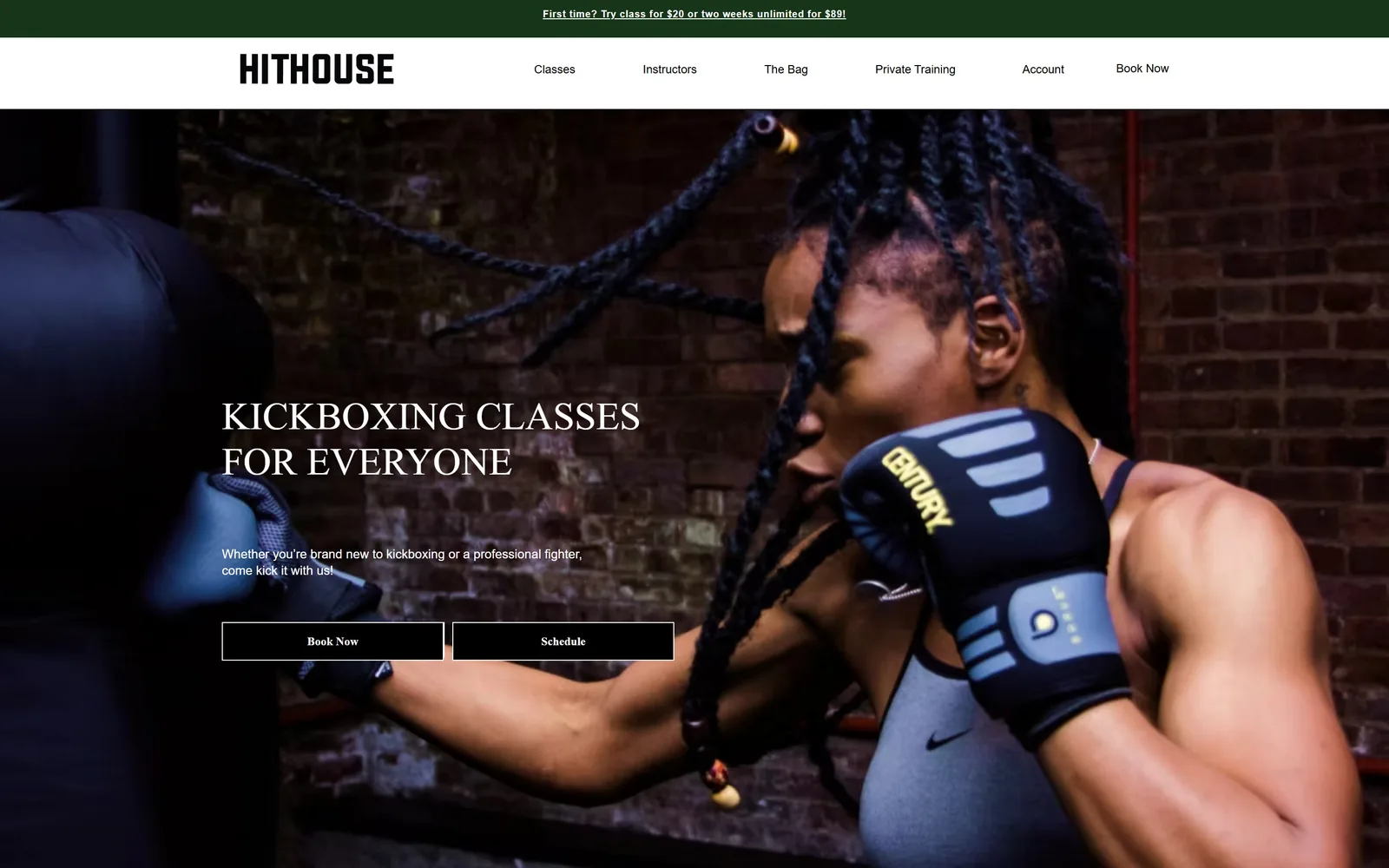
A fighter against red brick, with a Didone-style serif headline in white caps on the left and two square black buttons below it.
Type
Didone-style serif, 40px caps
Body
Helvetica Light 13px
Build
full-bleed photo, left-aligned text block
Made on
Wix
Colour
#000000 #ffffff #173518
Type. The headline is a Didone-style serif at 40px caps across two lines, with strong thick-to-thin and unbracketed hairline serifs. Body under it is Helvetica Light at 13px, which is small for a lead paragraph and sits very light against the photograph. A fashion serif on a Muay Thai studio is an odd pairing on paper, and on screen it is the thing that separates this from every other kickboxing site.
Colour. Black and white only, taken from the photograph: #000000 buttons with white rules and white labels, white type on brick. A #173518 dark green strip carries the offer at the very top and that green appears nowhere else on the page. The brick, the glove and the blue wrap supply all the colour the fold has.
Layout. Green offer strip, white nav bar with the HITHOUSE wordmark left and five items spread wide, then a full-bleed photograph. The hero text block sits left at about 320px in, headline at 46% down, two square outlined buttons under it at equal width. Radius is 0 on everything, which suits the wordmark.
The ask. The first line on the page is First time? Try class for $20 or two weeks unlimited for $89, which is more useful than the headline underneath it. Then Book Now in the nav plus Book Now and Schedule in the hero, so the same verb three times with no price attached to any of them.
Put the trial price in the top strip and a visitor can qualify themselves before reading a word of the pitch.
10
thedogpound.com
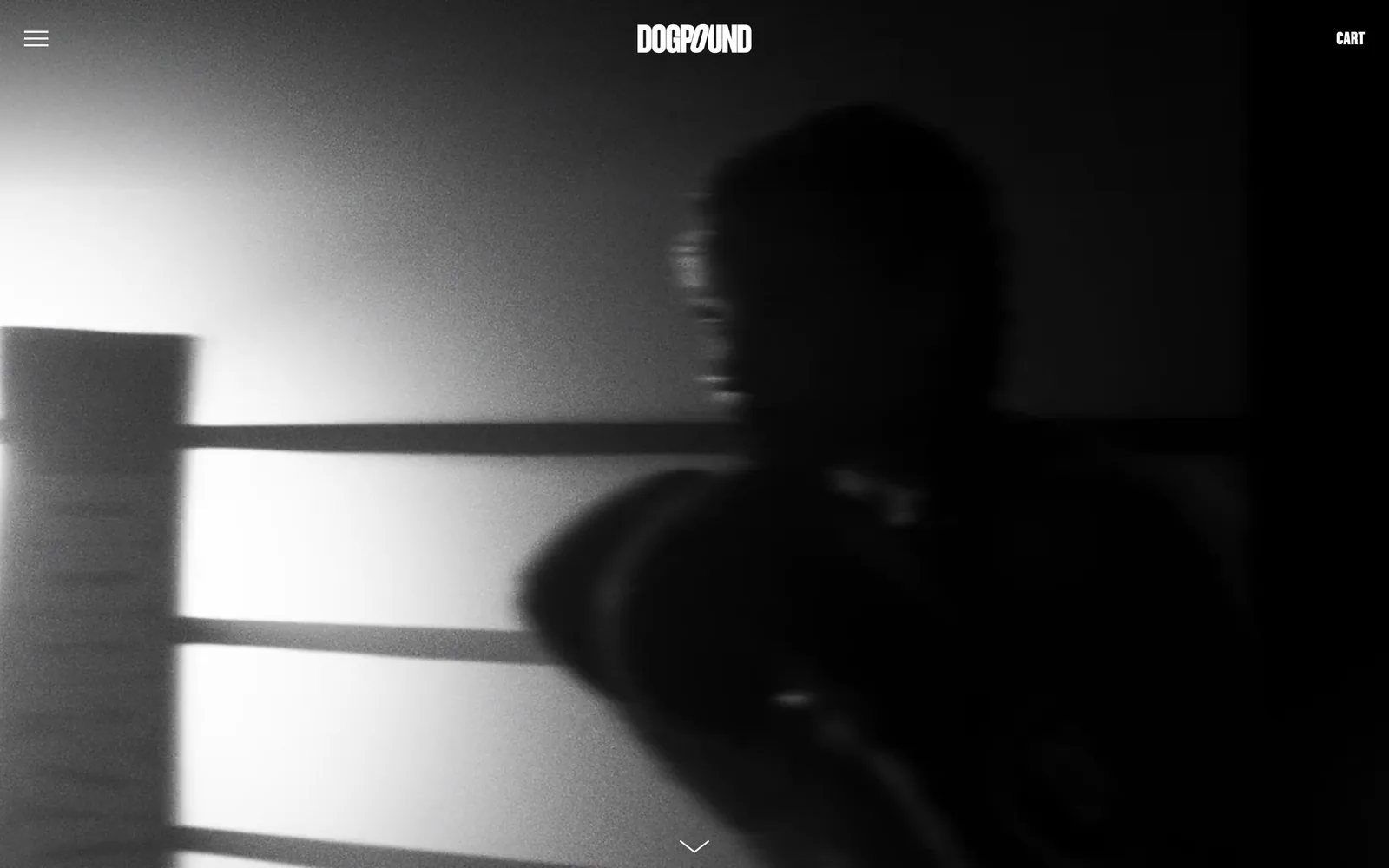
Grainy black and white footage of a boxer in a ring, with only a wordmark, a hamburger, CART and a scroll chevron on screen.
Type
condensed caps sans wordmark, about 20px
Body
Acumin Pro Condensed 21px
Build
full-bleed video, four elements on the fold
Made on
Shopify
Colour
#000000 #ffffff #9c9c9f
Type. There is no headline. The only type on the fold is the DOGPOUND wordmark in a condensed caps sans with a slashed O, at roughly 20px, plus CART at the same size. Copy further down runs Acumin Pro Condensed at 21px tracked 0.048em. For an entire screen, the type budget is about thirty characters.
Colour. Black and white, and nothing else: #000000 covers 451% of a screen height across the page and white 1.1%. The hero video is graded to black and white too, so the whole frame is values between the two. The grain is heavy enough to read as 16mm film rather than a filter dropped on in post.
Layout. Full-bleed 1440px video, hamburger top-left, wordmark centred, CART top-right, and a chevron centred at the bottom. That is the entire first screen. Section padding below the fold runs 115px, and the nav is sticky so those four elements follow you down.
The ask. Nothing is asked for above the fold. No book, no join, no price, and the only clickable commercial element is CART. A visitor who does not scroll learns the name and nothing more. A brand with this much press can carry that; almost nobody else can.
If the footage is genuinely yours and genuinely good, a wordmark and a chevron are enough for one screen.
How these were chosen
Ten sites survived the cut here out of twenty-four captured: boxing and HIIT studios, two climbing gyms, a members club floor, a dog-themed training room and a pair of recovery clubs selling memberships in much the same way. The pattern that kept repeating is that the photograph or the video carries the colour and the stylesheet stays at two or three values, which is why so many of these folds hold together with almost no accent at all. The best gym website design on this list also decides early what the first screen is for, whether that is a location picker, a trial price or a single sentence, and then refuses to do the other two. The weaker ones put every ask on screen at once and leave the visitor to sort it out. Several put a studio finder or a trial offer above the headline, which tells you plainly what converts in this category.
Finding gym sites that someone had actually designed took far longer than it should have. 37 candidates made the shortlist. 10 made the page.
Each one was opened and looked at properly: what the type is doing, where the colour gets spent, how the page is built, how it asks for the job. Nothing is here because it ranks. Nothing is here because an agency filed it under portfolio. Several well known names were left out for the plain reason that their site came out of the same template as everyone else's, and a few sites worth including did not survive a second look.
Where a site is only competent, it says so. The order is the order worth your time, best first.
Reviewed and selected by Larry W. Matthews for Websitely.