What Works in Physical Therapy Website Design: 14 Clinics
Fourteen US clinics, sports rehab through movement practice. Physical therapy website design that shows the room rather than the body.
Shown
14 sites
Reviewed
30 candidates
Chosen on
The work, not the ranking
Updated
15 October 2026
01
physiorx.nyc
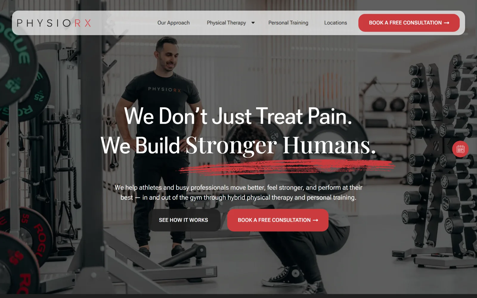
Dark gym photography fills the frame behind two lines of white display type, underscored by a hand-drawn red brush stroke.
Type
Roboto Flex 70px, 1.20 line-height
Body
Roboto Flex 16px
Build
full-bleed hero photo, 1320px container, floating sticky bar
Made on
Webflow
Colour
#1f1f1f #cb3b3f #ffffff
Type. Roboto Flex carries the headline at 70px, weight 500, line-height 1.20, and the page switches to Playfair Display at 64 to 70px further down, so a grotesque sets the pitch and a high contrast serif handles the slower sections. Nav and body both sit at 16px Roboto Flex, which keeps the interface quiet beneath a large hero.
Colour. Four values do the work: #1f1f1f as the page ground, #433f3f in the photographic mid-tones, white for the headline, and #cb3b3f for the brush stroke and the booking button. The red covers roughly two per cent of the frame and appears nowhere decorative, which is why the eye lands on it first.
Layout. A 1320px container sits inside the 1440px viewport, leaving a 92 per cent measure and visible side margins. The sticky header floats as a rounded white bar over the full-bleed hero rather than pinning to the top edge. Below it the content drops into two and three column grids with 16 to 20px gaps and 40px of section padding.
The ask. Two asks in the hero, a dark See How It Works and a red Book A Free Consultation, plus the same red consultation button repeated in the floating header and a circular booking tab clipped to the right edge. No phone number competes with them, so every route ends at the same form.
Keep the accent to one hue at low coverage and the primary action reads instantly, even over busy photography.
02
ascensionrf.com
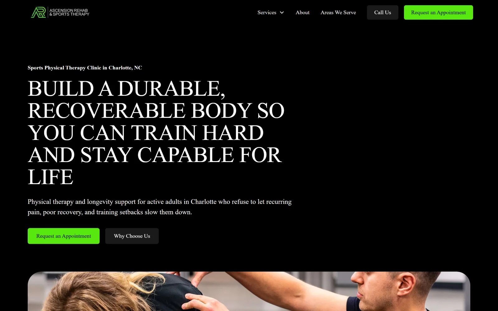
Six lines of white uppercase display type on pure black, an acid green button beneath them and a treatment photo entering at the fold.
Type
Outfit 64px uppercase, -0.013em
Body
Inter 20px
Build
full-bleed black hero, rounded photo tile at the fold
Made on
Webflow
Colour
#000000 #ffffff #57e80e
Type. Outfit handles the headline at 64px in uppercase, tracked at -0.013em with a line-height of exactly 1.00, so the six lines stack into a solid block. A bold 16px eyebrow sits above it and Inter at 20px carries the supporting paragraph, holding the hierarchy to three steps on a screen with almost no other furniture.
Colour. Two neutrals and one signal: #000000 ground, #ffffff type, and #57e80e on the primary button alone at roughly one per cent coverage. The green is the only saturated thing on the screen, so Request an Appointment needs no extra size or border to be found.
Layout. Full bleed black across 1440px with no visible container edge, the headline left-aligned to a generous margin and the right half left deliberately empty. The header runs a two item nav plus paired Call Us and Request an Appointment buttons, and the first photograph is clipped into a rounded rectangle at the fold rather than bleeding.
The ask. Request an Appointment appears twice above the fold, in the header and as the green hero button, with Call Us as a dark secondary and Why Choose Us as the soft option. Four clickable things, but only one of them is green, so the ranking is unambiguous.
A single high-chroma accent on a black and white page does the ranking work that size and weight usually have to do.
03
theperformanceshift.com
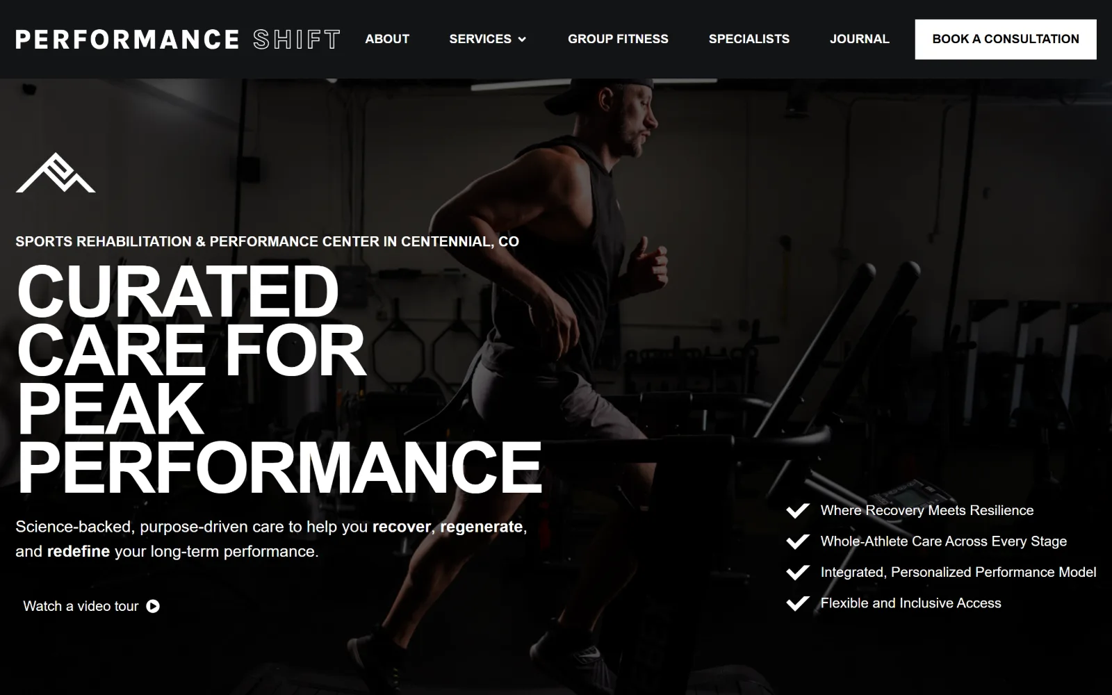
Near-black video of a runner on a treadmill, with four lines of heavy uppercase type stacked left and a ticked list set at the right.
Type
Karla 92px uppercase, -0.038em
Body
Karla 21px
Build
full-bleed video hero, 1420px container
Made on
WordPress
Colour
#131416 #ffffff #d5d5d5
Type. The display setting is Karla at 92px, weight 700, uppercase, tracked tight at -0.038em over a 0.83 line-height, so four words lock into a near-solid rectangle. A 107px Poppins figure turns up later in the page, and 21px Karla carries body copy with bold picked out on three verbs, the only emphasis on the screen.
Colour. Two values and nothing else: #ffffff type over #131416, carried by desaturated video rather than a flat fill, with secondary copy dropping to #d5d5d5. Since no accent hue exists at all, contrast and the footage's own falloff have to separate the layers.
Layout. A 1420px container across a 1440px viewport, which is as close to full bleed as makes no difference. Video runs behind the whole first screen, the headline hugs the left margin and a four item checklist is pushed to the lower right, leaving the centre to the footage. The header is a dark band with a square white booking button.
The ask. One hard ask, Book A Consultation in the header, and one soft one, a Watch a video tour link at the foot of the hero. No phone number, no form and no second button competing inside the headline block, which is unusual for the category.
Two colours and one tightly tracked display face can carry a hero if the footage behind it is desaturated enough to stay underneath.
04
wellesthealth.com
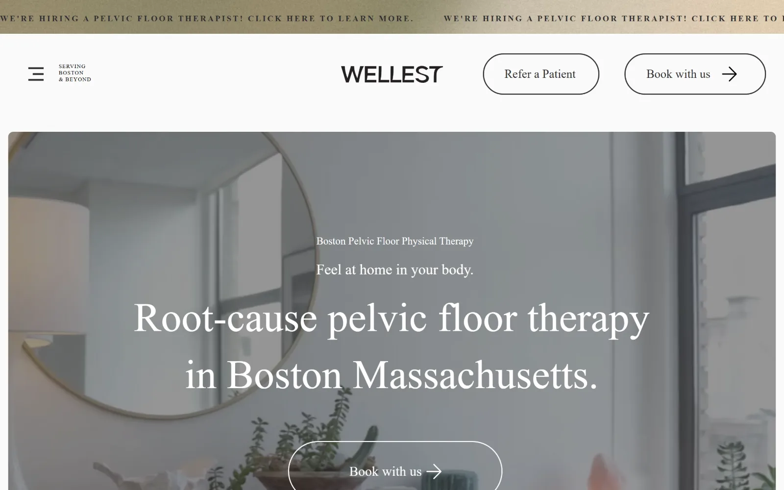
Pale interior photography of a treatment room sits behind centred serif type, with pill shaped buttons and a gold announcement ticker above.
Type
custom serif 75px, 1.40 line-height
Body
custom serif 19px
Build
inset hero photo, centred wordmark, pill buttons
Made on
Wix
Colour
#ffffff #fafafa #303030
Type. One custom serif runs the whole page, 75px for the headline at a 1.40 line-height, then 27px and 19px for subordinate lines, all at weight 400. Nothing is bold and nothing is uppercase except the ticker, so the hierarchy is built purely from size. The 45px nav setting is unusually large for a menu.
Colour. #ffffff and #fafafa make up almost the entire frame, with #303030 for type and outlines and #dbdbdb for hairlines. The one saturated element is the gold announcement bar pinned to the very top, which makes the hiring notice read as a separate layer rather than page furniture.
Layout. Full width at 1440px, but the hero photograph is inset with a white margin on all four sides instead of bleeding, and that is what gives the page its quiet. The header is a three part bar: hamburger left, wordmark centred, two pill buttons right, with the primary button repeated inside the hero.
The ask. Book with us appears twice above the fold, in the header and centred in the hero, with Refer a Patient beside it addressing a different audience entirely. The hamburger hides the rest of the navigation, so those two buttons are effectively the only choices on the screen.
Hiding the full menu behind a hamburger on desktop holds up when the page leaves exactly two labelled buttons in its place.
05
themethodpt.com
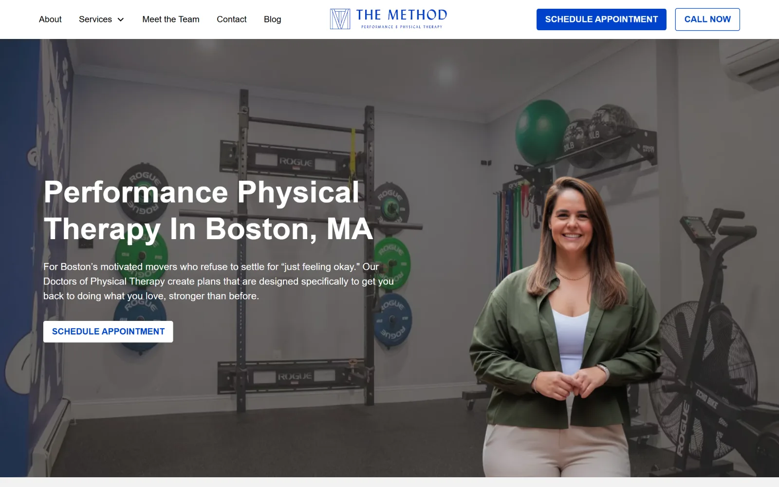
Racked bumper plates and a smiling therapist fill a wide studio photograph, white headline and paragraph set over its left third.
Type
Inter 56px bold, 1.20 line-height
Body
Inter 18px
Build
full-bleed photo hero, 522/220/522 grid
Made on
Webflow
Colour
#ffffff #f2f2f2 #0042cc
Type. A single family, Inter, covers every level: 56px bold for the headline at a 1.20 line-height, 48px uppercase for the next section, 32px for subheads and 18px for body at 1.50. No second face, no tracking adjustments, and the only variation is weight and case, which puts the burden on the photograph.
Colour. Three values. #ffffff dominates, #f2f2f2 separates the alternating bands, and #0042cc carries the buttons along with 175 characters of link text. The blue is the brand and it never appears decoratively, only where something can be clicked.
Layout. Full 1440px bleed with the hero photo running edge to edge and text held to the left third. Below it the page runs a 522 / 220 / 522 three column grid with 16px gaps, then a 666 / 533 split with 80px gutters, so the rhythm changes rather than repeating one card row. Buttons take a 4px radius.
The ask. Schedule Appointment sits in the header, again in the hero, and Call Now is pinned beside it as an outlined secondary, giving the phone equal billing rather than small print. Two asks, repeated once each, with no third option to muddy them.
One typeface across four sizes is enough hierarchy when colour is reserved strictly for interactive elements.
06
mypowerphysio.com
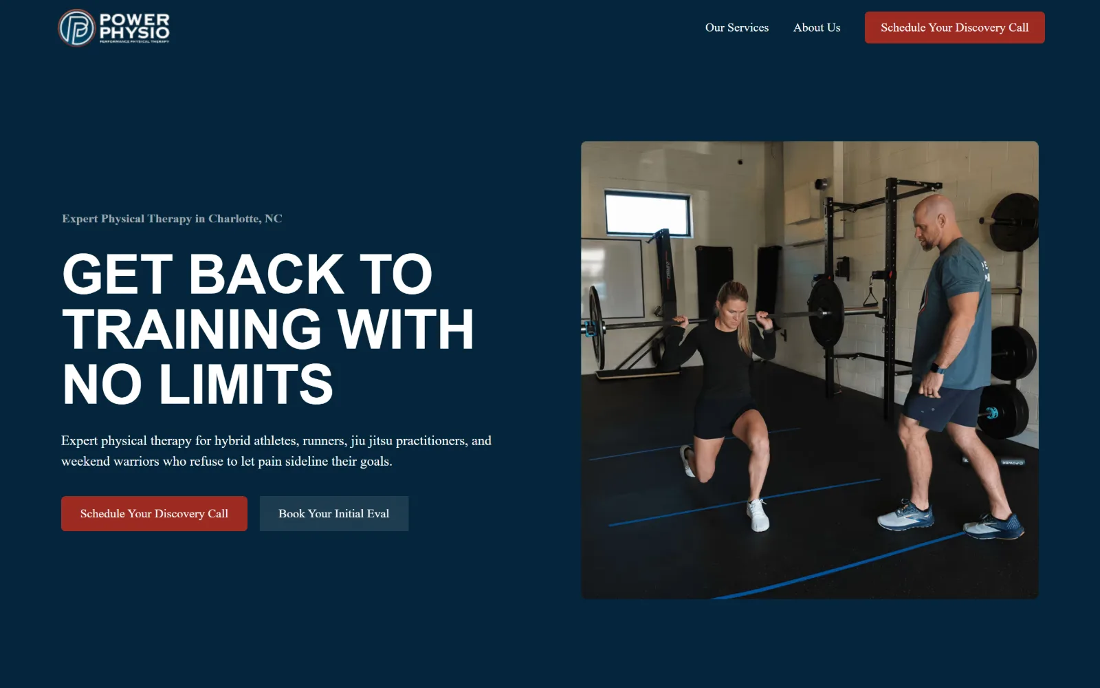
Navy ground split in two: a three line uppercase headline on the left, a square photograph of a lunge in a weights room on the right.
Type
Alexandria 72px uppercase, -0.010em
Body
Heebo 18px
Build
600/600 split, 80px gutter, squared photo
Made on
Webflow
Colour
#04263b #ffffff #9d2b22
Type. Uppercase Alexandria at 72px, weight 600, tracked at -0.010em over a 1.00 line-height, set against Heebo at 18px for the paragraph. A small grey serif eyebrow sits above the headline and is the only serif on the page, giving the stack a top edge it would otherwise lack.
Colour. #04263b covers most of the frame, #ffffff carries all 771 characters of type, #f2f2f2 fills the panels below, and #9d2b22 appears only on the primary button. One brick red against one navy is the entire scheme, with no third hue anywhere.
Layout. A straight two column split at 600px and 600px with an 80px gutter and 64px row gap, the right column filled by one squared photograph with a slight radius. Full 1440px width, the header reduced to a two item nav and a single button, and a 6px corner radius on the buttons.
The ask. Schedule Your Discovery Call runs in the header and again as the red hero button, with Book Your Initial Eval as a muted slate alternative beside it. The two asks are different commitments, a call and an evaluation, rather than one thing worded twice.
Offer a low commitment call next to the full booking and the secondary button stops being decoration and starts catching hesitant visitors.
07
villageptpdx.com
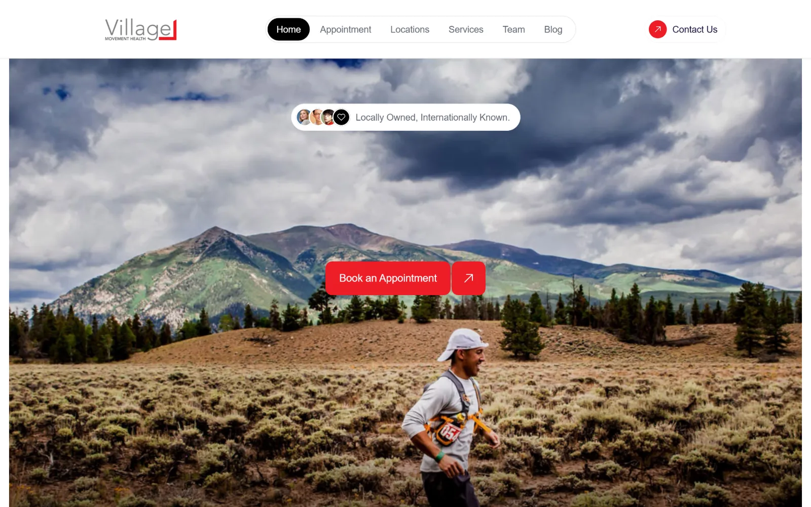
Full width shot of a trail runner crossing high desert scrub under storm clouds, with a floating pill nav and a red booking button on it.
Type. Instrument Sans at 18px for the booking label and 16px for everything else, both tracked at -0.010em. There is no display size on this screen at all, and that is the decision: the photograph is the headline, the type is reduced to interface. Line-height sits at 1.56, generous for text set this small.
Colour. The palette is #ffffff and #ed1c24 over whatever the photograph supplies, with body text in #636977 and a near-black #1b123d further down. Red is used exactly twice, on the logo mark and the booking button, and the landscape provides every other colour on the screen.
Layout. A 1410px container at 98 per cent of the viewport, 100px of section padding and a 1000px corner radius that rounds the nav, the buttons and the avatar cluster into capsules. The header floats as a white capsule over the image instead of sitting in a band of its own.
The ask. One button, Book an Appointment, centred over the photograph with an arrow tile attached, plus Contact Us in the header and a small proof capsule reading Locally Owned, Internationally Known. Nothing else asks for anything above the fold.
When the photograph is strong enough to carry the message, cutting the headline entirely leaves the one button nowhere to hide.
08
evoperformancetherapy.com
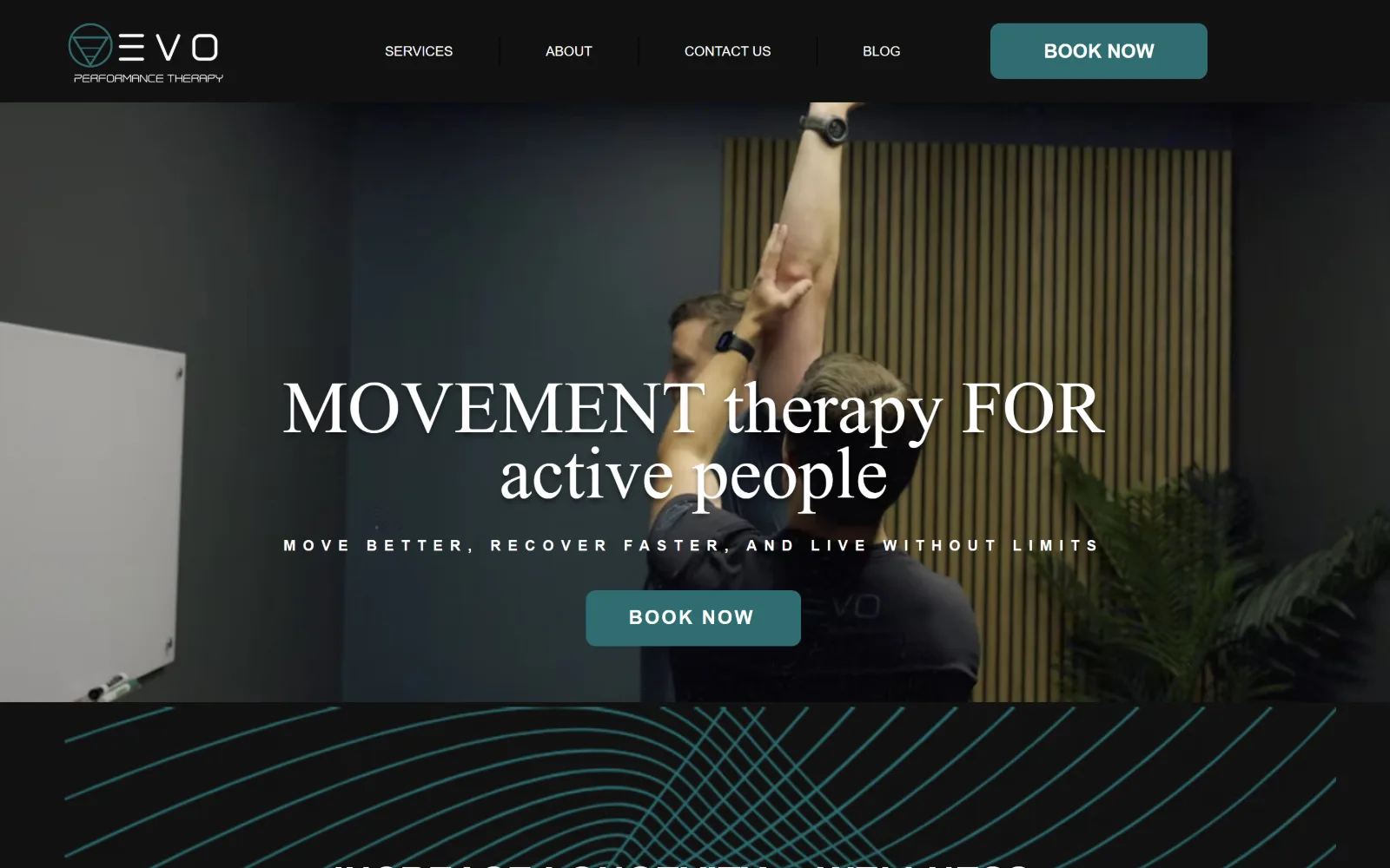
Low-lit treatment room behind a mixed serif headline, with a teal Book Now button and thin teal curves beginning below the fold.
Type
custom serif 76px, 0.90 line-height
Body
Inter 20px weight 300
Build
full-bleed photo hero, fixed dark header
Made on
Wix
Colour
#111111 #2f6c70 #ffffff
Type. The headline runs at 76px over a 0.90 line-height in a custom serif, alternating capitals and lower case word by word so the weight shifts across the line. A widely letterspaced caption sits underneath it, and Inter handles body at 20px weight 300. Three distinct treatments in one block, held together by the tight leading.
Colour. Effectively a two colour page: #111111 across the bulk of the frame and #2f6c70 for the button and the line work, with type in white and links in a lighter #3d8c91. Teal is the only hue and it is used at low saturation, so the room photograph stays dark behind it.
Layout. Full 1440px bleed with a dark fixed header carrying four nav items separated by hairline rules and a teal Book Now at the right. The hero photograph is cropped tight on a single raised arm, and the section below opens with a field of concentric teal curves rather than the usual row of cards.
The ask. Book Now twice, once in the header and once centred under the headline, both in the same teal with a 10px radius. No phone number and no secondary link, so the page funnels everything into one booking action and accepts the loss of the browsers.
Mixing case and weight inside a single headline reads as deliberate when the leading is tight enough to make the lines one shape.
09
hidefpt.com
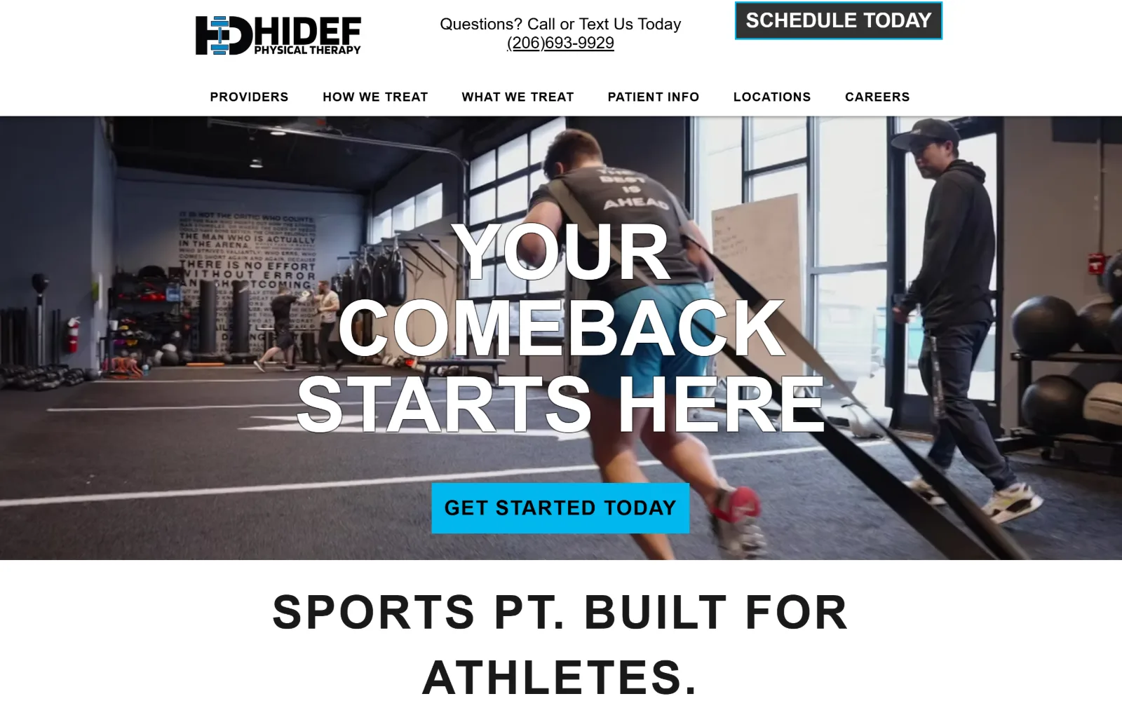
An athlete drags a sled across a gym floor, overlaid by Your Comeback Starts Here in heavy condensed capitals above a cyan button.
Type
Anton 98px, 1.00 line-height
Body
Raleway 18px
Build
two row header, full-bleed photo hero, square corners
Made on
Wix
Colour
#ffffff #00b7ed #000000
Type. Condensed Anton at 98px with a 1.00 line-height gives the hero a poster-like block, with 66px and 60px cuts used further down at 0.05em tracking. Body copy switches to Raleway at 18px and Lato at 21 to 34px, so the display face never appears at the small sizes where it would get hard to read.
Colour. #ffffff and #f7f7f7 make up the chrome, #000000 and #181919 the type, and #00b7ed does double duty on the Get Started button and 109 characters of headline accent. The dark grey #323232 button in the header is deliberately quieter than the cyan one in the hero.
Layout. Full 1440px bleed with a two row header: logo, phone number and Schedule Today on the first row, a seven item nav on the second. The hero photograph runs edge to edge with no container holding it, and every button is square with a zero radius throughout the page.
The ask. Three asks compete above the fold: a Schedule Today button, a tappable phone number set as large as the line of copy beside it, and the cyan Get Started Today in the hero. The phone gets equal billing, which suits a multi location practice that takes calls.
Setting the phone number at tagline size rather than as small print is defensible when calls convert better than forms.
10
pacerphysicaltherapy.com
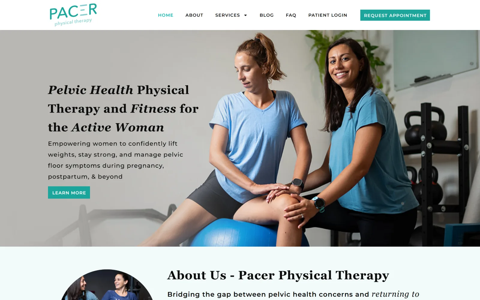
Two women work on a stability ball in a bright gym, with a mixed roman and italic serif headline on a grey ground at the left.
Type
Georgia 36px, 0.028em
Body
Montserrat 18px, 1.83 line-height
Build
1140px container, left text column, cropped photo
Made on
WordPress
Colour
#ffffff #f2fbfb #1ba49a
Type. Headings are Georgia at 35 to 36px with 0.028em tracking, italicised on the words Pelvic Health, Fitness and Active Woman, so emphasis comes from the face instead of the weight. Montserrat runs everything else at 13 to 23px with tracking out to 0.077em and a 1.83 line-height on body, which is unusually airy.
Colour. #ffffff and a very pale #f2fbfb alternate the bands, with #49b6ae and #1ba49a carrying the logo, the nav and the button, and body ink at a near-black #0b0b0b. Two tones of one teal, the deeper for interface and the lighter for decoration, is the whole system.
Layout. An 1140px container at 79 per cent of the viewport, so real margins sit on both sides rather than edge to edge content. The hero photograph is cropped with the figures right of centre and the text column on the left, and the next section opens with a circular portrait beside its heading.
The ask. Request Appointment sits in the header in solid teal while the hero offers only Learn More, so the first screen asks for curiosity rather than a booking. A patient login in the nav signals a practice with an existing client base to serve.
A hero button reading Learn More works when the header already holds the committed action in a stronger colour.
11
brooklynsportspt.com
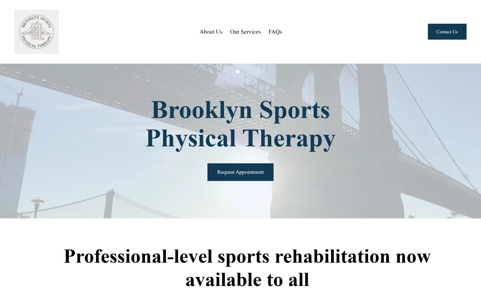
The Brooklyn Bridge, washed almost white, sits behind the practice name in heavy navy serif capitals above a square booking button.
Type
Dapifer 76px weight 900
Body
Sanchez 18px
Build
fixed height image band, 191px section padding
Made on
Squarespace
Colour
#ffffff #eaf1f6 #113a55
Type. At 76px and weight 900, Dapifer sets the name in a high contrast serif that behaves like a masthead, with a 60px cut of the same face carrying the section head below it. Sanchez, a slab, handles the nav at 18px and buttons at 14px, so two serifs share the page without either having to read as body text.
Colour. #ffffff and #eaf1f6 make up nearly the whole frame, with #113a55 on the headline, the button and the circular logo, and black carrying 85 characters of secondary heading. One navy against two whites, with the photograph bleached back almost to the page tone.
Layout. Full 1440px width with 191px of section padding, the most generous in this set and the reason the page feels unhurried. The hero image is a fixed height band rather than a full screen, the header sits above it on plain white, and every corner on the page is square.
The ask. Contact Us in the header and Request Appointment centred in the hero, both solid navy rectangles. Three nav items, no phone and no form, so above the fold this is effectively a one button site with a second route tucked in the corner.
Bleaching a location photograph back towards the page background lets heavy serif type sit on it without a scrim or an overlay.
12
flourishphysicaltherapy.com
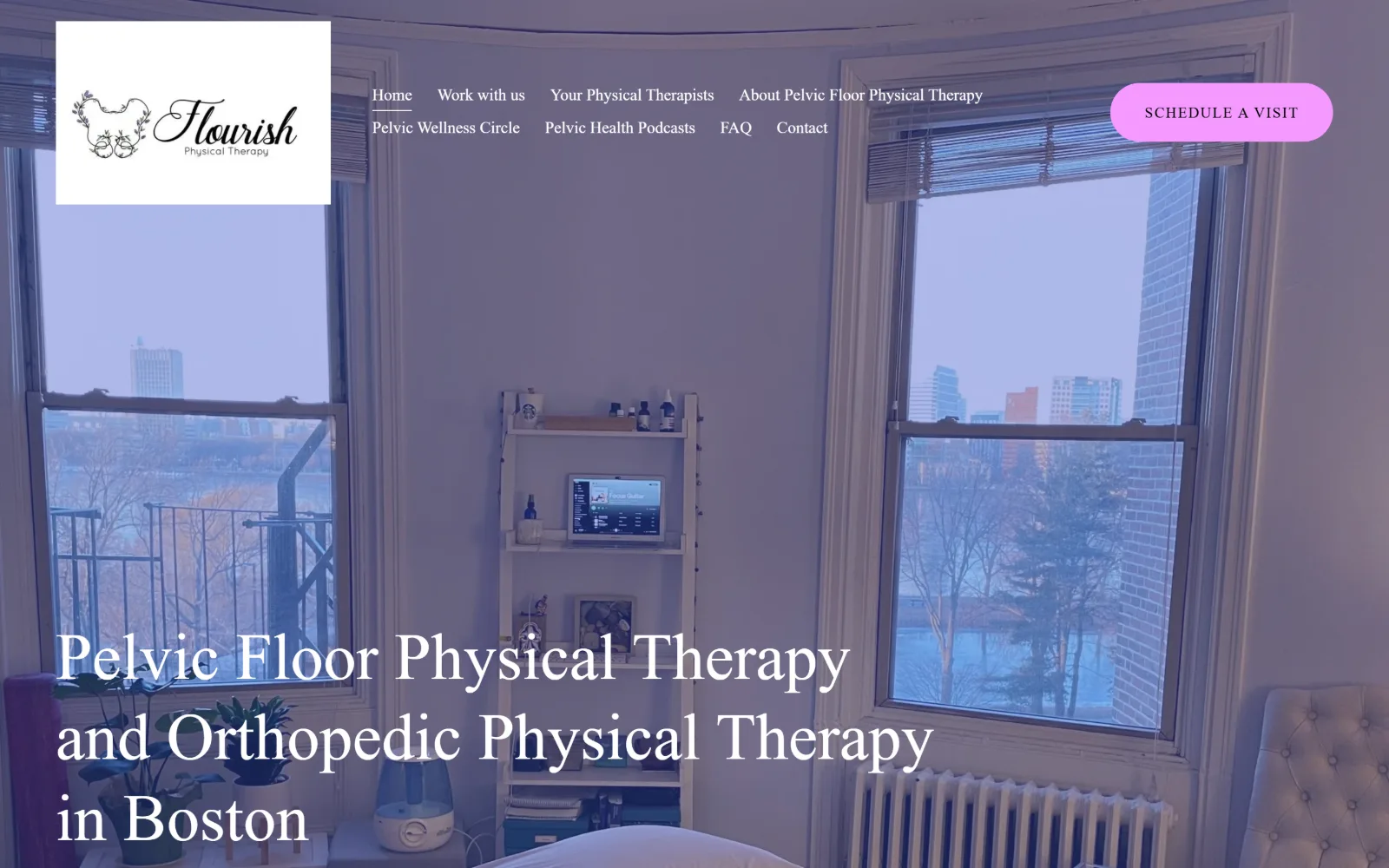
Two tall windows in a treatment room under a violet wash, the clinic name in white serif at lower left and a pink pill in the corner.
Type
Adonis Web 68px, 1.23 line-height
Body
Pontano Sans 17px
Build
full-bleed washed photo, 233px section padding
Made on
Squarespace
Colour
#3851cc #ffffff #f598ff
Type. Adonis Web at 68px over a 1.23 line-height gives a transitional serif set lower case except for proper nouns, so a long clinical phrase reads as a sentence rather than a slogan. Pontano Sans takes the nav at 17px and the button at 15px with 0.100em tracking in capitals, the only tracked element present.
Colour. #3851cc covers more than half the frame as a photographic wash, #ffffff carries 200 characters of type, and #f598ff sits on the button alone. A cobalt against a hot pink is an uncommon pairing for a clinic, and it is the reason this page does not look like its neighbours.
Layout. Full 1440px bleed with 233px of section padding and an eight item nav wrapping onto two rows beside a white logo panel. The photograph fills the screen while the headline is anchored to the bottom left rather than centred, leaving the room itself the upper two thirds.
The ask. Schedule a Visit is the only button, a 300px radius pill in the top right corner, and it is not repeated in the hero. The eight nav items carry the weight instead, including a podcast and a membership circle, so the page is built for browsing before booking.
A single pill button in the corner holds its own against a full bleed photograph if its hue appears nowhere else on the page.
13
movementguild.com
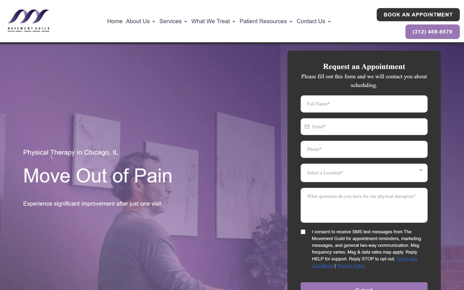
Purple washed photograph of a man in a clinic corridor on the left, a dark appointment request form sitting over the right half.
Type
Outfit 60px weight 500
Body
Roboto 16px
Build
60/40 hero split, inline form panel, 10px radius
Made on
WordPress
Colour
#f4f4f4 #333333 #9875b4
Type. Weight 500 Outfit at 60px sets a headline unusually loose for its size, a 1.70 line-height with a 21px label above it. Roboto runs body at 16 to 20px, and the nav brings in a third family, Palanquin Dark at 18px on a 0.78 line-height, which is a seam showing in an otherwise consistent page.
Colour. #f4f4f4 and #ffffff make the page ground, #333333 the buttons and nav ink, and the purple arrives as a #9875b4 wash over the hero with #413064 turning up in 97 characters of type. Nothing in the palette is saturated except that overlay, which is doing all the branding.
Layout. A full width hero split roughly 60 / 40, photograph on the left and a dark form panel with a 10px radius occupying the right. Two header rows, the second holding a purple phone pill, and a six item nav with dropdowns. The document runs to 13449px, the longest page in this set.
The ask. The form is the ask: five fields, a consent checkbox and a submit, all above the fold, with Book an Appointment and a tappable phone number stacked in the header behind it. Three routes to one outcome, and the form is given by far the most space.
Putting the form itself in the hero removes a click, but it costs the headline half the screen, so the headline has to be short.
14
aptphilly.com
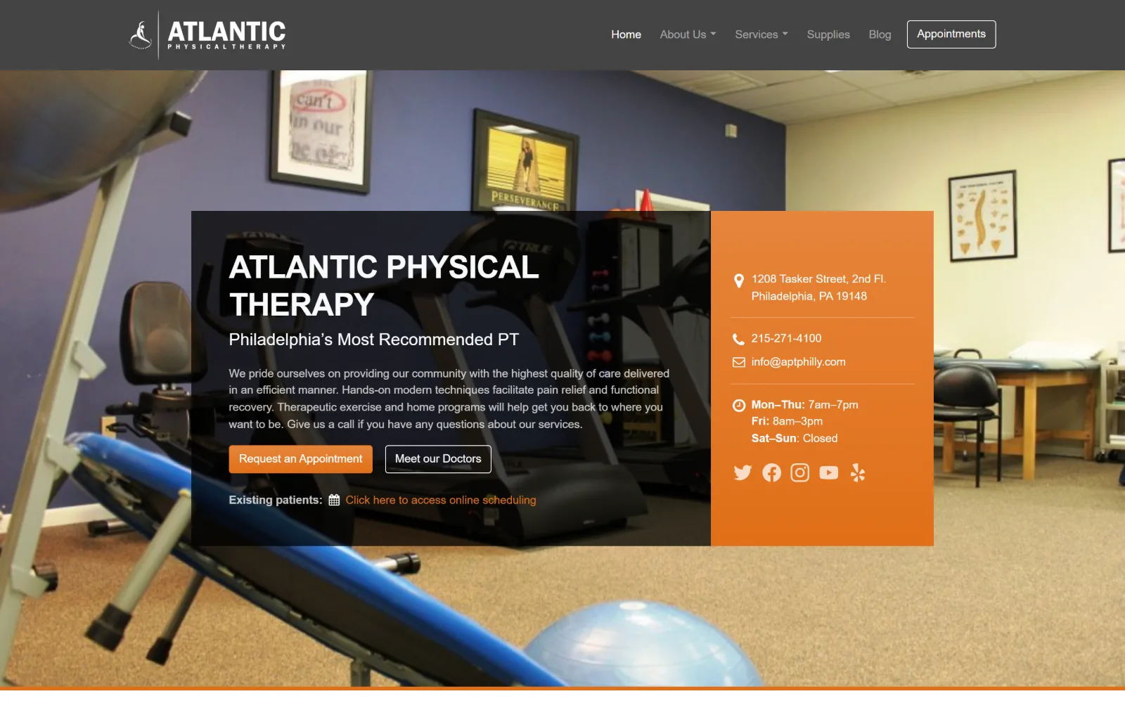
Clinic floor photography behind a dark text panel and an orange column listing address, phone, email and opening hours.
Type
Open Sans 40px bold uppercase, -0.020em
Body
Open Sans 14px
Build
1140px container, dark panel plus orange contact column
Made on
WordPress
Colour
#444444 #ffffff #e06f18
Type. Open Sans does everything, from a 40px uppercase bold headline tracked at -0.020em down to 14px body across 1908 characters. The 18px nav is set larger than the body text, which inverts the usual relationship, and a 22px weight 500 line sits between headline and paragraph as a tagline.
Colour. #444444 for the hero scrim and #ffffff for the page, with #212529 carrying most of the ink and #e06f18 on the orange panel, the primary button and the inline scheduling link. Orange is the only hue, used for both decoration and action, which blurs the difference between them.
Layout. An 1140px container at 79 per cent of the viewport, with the hero split into a wide dark panel and a narrow orange sidebar laid over a full bleed photograph. The header is a flat grey bar holding six nav items and an outlined Appointments button, and buttons take a 4px radius.
The ask. Four asks on one screen: Request an Appointment, Meet our Doctors, an existing patient scheduling link, and the phone and email in the orange column. Putting hours and address above the fold suits a practice whose visitors mostly arrive wanting logistics.
Listing address, phone and opening hours in the hero answers the most common visit intent before any button has to be pressed.
How these were chosen
Fourteen clinic homepages, all captured at 1440px, and what they share is restraint with colour: most run two neutrals plus one signal hue, held to a few per cent of the frame and spent only on the booking button. The split that matters in physical therapy website design is what the hero is for. Half of these treat it as a typographic surface, where the photograph is pushed back towards black and a tightly tracked display face does the talking. The other half hand the screen to the room itself and shrink the type down to interface. The pattern that does not hold is the phone number: some give it tagline size next to the headline, others keep it off the first screen entirely, and in both cases the choice looks deliberate rather than accidental.
Finding physical therapy sites that someone had actually designed took far longer than it should have. 30 candidates made the shortlist. 14 made the page.
Each one was opened and looked at properly: what the type is doing, where the colour gets spent, how the page is built, how it asks for the job. Nothing is here because it ranks. Nothing is here because an agency filed it under portfolio. Several well known names were left out for the plain reason that their site came out of the same template as everyone else's, and a few sites worth including did not survive a second look.
Where a site is only competent, it says so. The order is the order worth your time, best first.
Reviewed and selected by Larry W. Matthews for Websitely.