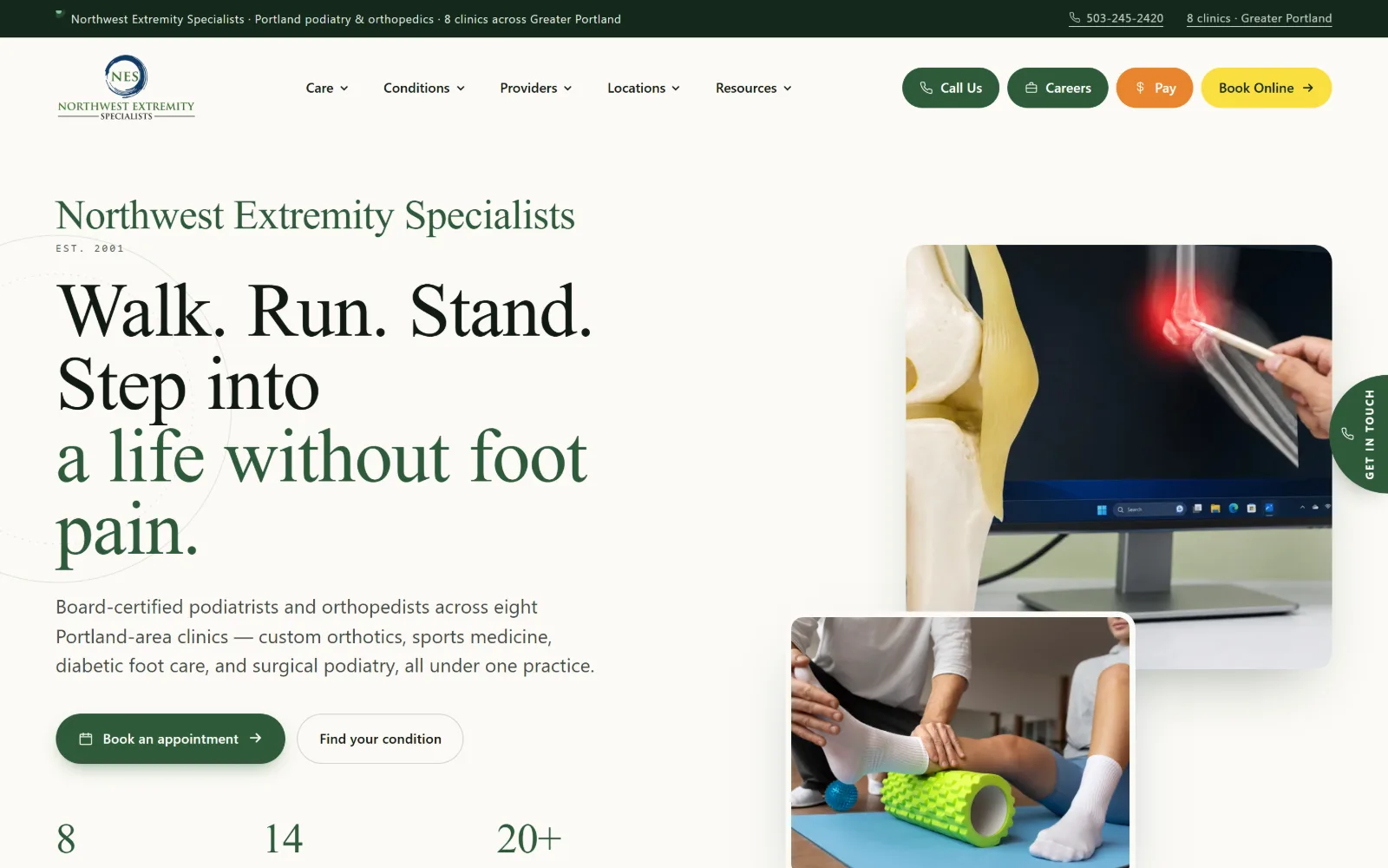
Type. Instrument Serif runs the display at 79px, tracked in to -0.015em with 0.95 leading, so the four-line headline stacks almost as tightly as a logotype. Geist handles everything else: 20px body at 1.5 leading, 14px nav and buttons at weight 500. One serif, one grotesque, and no third voice anywhere on the frame.
Colour. Three colours do the work. A barely warm near-white at #fbfaf5 covers the page, #14291b sets the near-black text, and #2e5a3a carries the brand through the top bar, the booking pill and the second half of the headline. Yellow #fae040 and orange #e8852d appear only on the small Book Online and Pay chips.
Layout. A two-column split: text left, a pair of overlapping photographs right, the lower one sitting proud of the upper so the pair reads as one object. Section padding is 56px, tighter than the usual clinic template, and a utility strip above the logo holds the phone and the clinic count. Buttons are full pills at 999px radius.
The ask. Five asks sit in the header: Call Us, Careers, Pay and Book Online as coloured pills, plus a vertical Get In Touch tab pinned to the right edge. The hero repeats the booking ask next to a softer Find your condition. The phone number sits in the top strip, underlined, placed ahead of the logo in the reading order.
A tight serif at 79px with 0.95 leading gives a clinic a voice without a custom typeface. Keep the rest of the page on one grotesque.
02
foothillspod.com
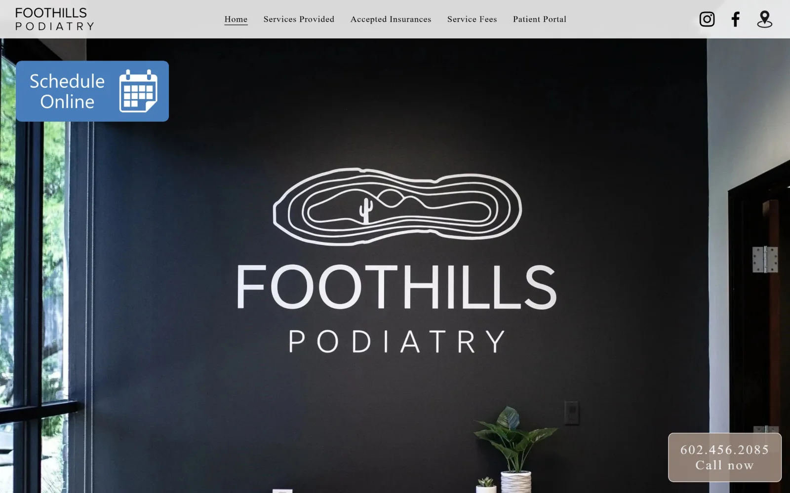
A full-bleed photo of a near-black reception wall carrying the painted clinic logo, with a blue Schedule Online tile pinned top left.
Type. The wordmark and nav are set in a light, wide-tracked face at 16px with 0.05em letter-spacing, and the page never climbs above 40px, where a 200-weight cut handles headings at 0.02em. Nothing is bold anywhere in the frame. The restraint is the point: the painted wall supplies the display type, so the markup does not have to.
Colour. Three values and no more: #ffffff for the header bar and body ground, #d5d2cd for the grey panels, and #9c8b7e, a dry taupe, for the call tile and every button. The only saturation on the screen is the blue scheduling tile, which is borrowed from a booking widget rather than chosen to sit with the rest.
Layout. The header is a thin light bar with the logo left, five nav items centred and three icons right, and under it the photograph runs edge to edge with no container holding it. Section padding is 70px. Both floating tiles are hard-cornered rectangles at 0px radius, one anchored top left, the other bottom right.
The ask. Two asks, placed at opposite corners so they never compete: Schedule Online as a blue tile top left, and the phone number set over Call now in taupe at the bottom right. The nav carries Service Fees and Accepted Insurances, which answer the two questions that otherwise turn into a phone call.
When the hero photograph already contains the logotype, the page can drop to a single light weight and let the wall carry the display size.
03
modpodiatry.com
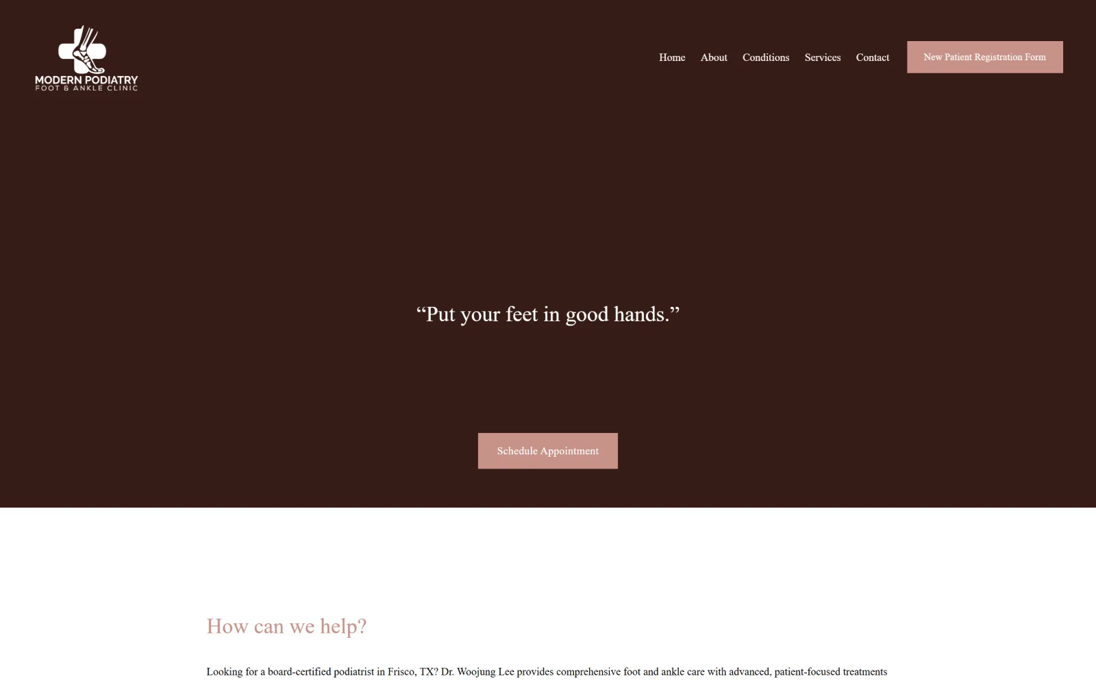
A deep brown band fills the screen with a centred serif quotation, Put your feet in good hands, and a rose Schedule Appointment button below it.
Type
serif 28px, centred
Body
14px/1.8, weight 300
Build
full-bleed brown band, 151px section padding
Made on
Squarespace
Colour
#361c17 #f6ecea #c79288
Type. The display is a transitional serif, not the geometric sans the stylesheet reports, set at 28px for the centred quotation and again for the rose section heading underneath. Body runs 14px at weight 300 with 1.8 leading, a lot of air for a small size. Nav sits at that same 14px, so hierarchy comes from colour and position rather than scale.
Colour. A deep cocoa #361c17 fills the hero and most of the upper page, #f6ecea supplies the pale blush band below the fold, and #c79288 is the single accent, used for both buttons and the section heading. White type over the brown is the only high-contrast pairing anywhere on the screen.
Layout. One full-bleed brown band roughly a screen tall, with everything centred inside it: the quotation at mid-height, the button well below it. Section padding is a generous 151px, which is what produces the empty space around the quotation. Buttons are flat rectangles at 0px radius. Below, the ground turns white and the column goes left-aligned.
The ask. Two asks, both in rose: New Patient Registration Form parked in the header, and Schedule Appointment centred under the quotation. No phone number is visible in the frame, which is unusual for the trade and costs the page the one tap most visitors arriving with foot pain actually want.
One dark ground plus one dusty accent will carry a whole practice site, provided the type stays at two sizes and the section padding stays generous.
04
nwfootankle.com
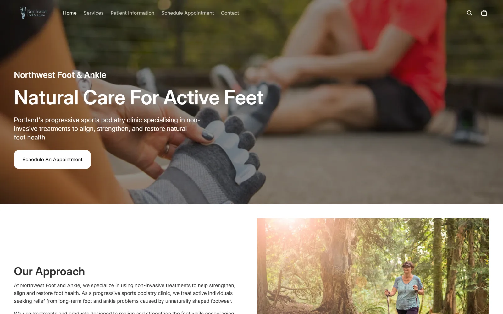
A photograph of hands fitting a toe-spacer sock fills the hero, with Natural Care For Active Feet and a white pill button set over it.
Type. Inter does everything. The hero line runs 56px at weight 600 with 1.0 leading, the standfirst 18px at 1.4, section heads 32px, and body drops to 14px. A single family across five sizes with no tracking adjustment anywhere, which suits a clinic whose argument is about mechanics rather than atmosphere.
Colour. Essentially two values: #ffffff for type over the photograph and for the whole lower page, and #121212 for the dark nav type and headings. There is no accent colour at all. Every bit of saturation on the screen comes out of the photographs, the red shirt in the hero and the green of the forest below the fold.
Layout. A full-bleed photograph about two-thirds of the viewport deep, text set in the left third over it, with the nav floating on the image instead of sitting in a bar. Below the fold the page goes to a half-and-half split, copy left and a tall photograph right. The button is a white pill at 14px radius and the header sticks.
The ask. One ask, repeated: Schedule An Appointment as a white pill in the hero and again as a nav item. A search icon and a shopping bag sit at the right of the nav, which quietly says the practice also sells footwear. No phone number competes with the booking button anywhere in the frame.
Dropping the accent colour entirely makes photography the only source of saturation, which stops a one-typeface page from reading as unfinished.
05
sanmateopodiatrygroup.com
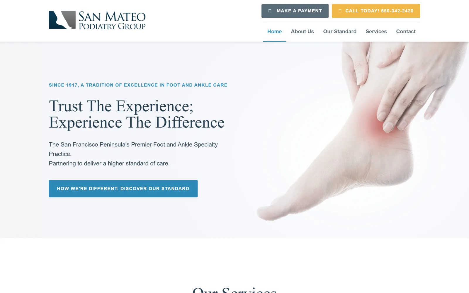
A pale grey panel holds a serif headline and a blue button, with a cut-out photograph of a foot and a red glow at the ankle at right.
Type
Crimson Text 50px/1.0
Body
Source Sans Pro 18px/1.63
Build
two-column hero panel, cut-out photo, 3px radius
Made on
WordPress
Colour
#f3f5f7 #263e4e #2d89b8
Type. Crimson Text at 50px with 1.0 leading sets the two-line headline, and a 52px cut returns further down, so one serif carries every heading on the page. Source Sans Pro takes the 18px body at 1.63 and the 14px buttons, tracked out to 0.075em and set upper case. The eyebrow above the headline is 16px of that sans in blue caps.
Colour. A restrained five: #ffffff and #f3f5f7 for the two grounds, #263e4e for headline and body text, #2d89b8 for the eyebrow, the nav underline and the hero button, and #f1b747 for the call bar top right. The yellow appears exactly once and is the only warm note on the page.
Layout. A two-column hero inside a pale #f3f5f7 panel, copy left and a cut-out foot photograph right with no frame or mask around it. The header splits into two rows, two action buttons above and five nav items below with the active item underlined in blue. Buttons carry a 3px radius, close enough to square to read as square.
The ask. Three asks, ranked by colour: a yellow Call Today bar carrying the number itself, a grey Make A Payment button beside it, and in the hero a blue button that sells the practice rather than the diary, How We're Different: Discover Our Standard. Routing the hero click to a positioning page instead of a form is a deliberate choice.
Putting the phone number in the only warm colour on the page ranks it above the booking button without introducing a second accent.
06
jawspodiatry.com
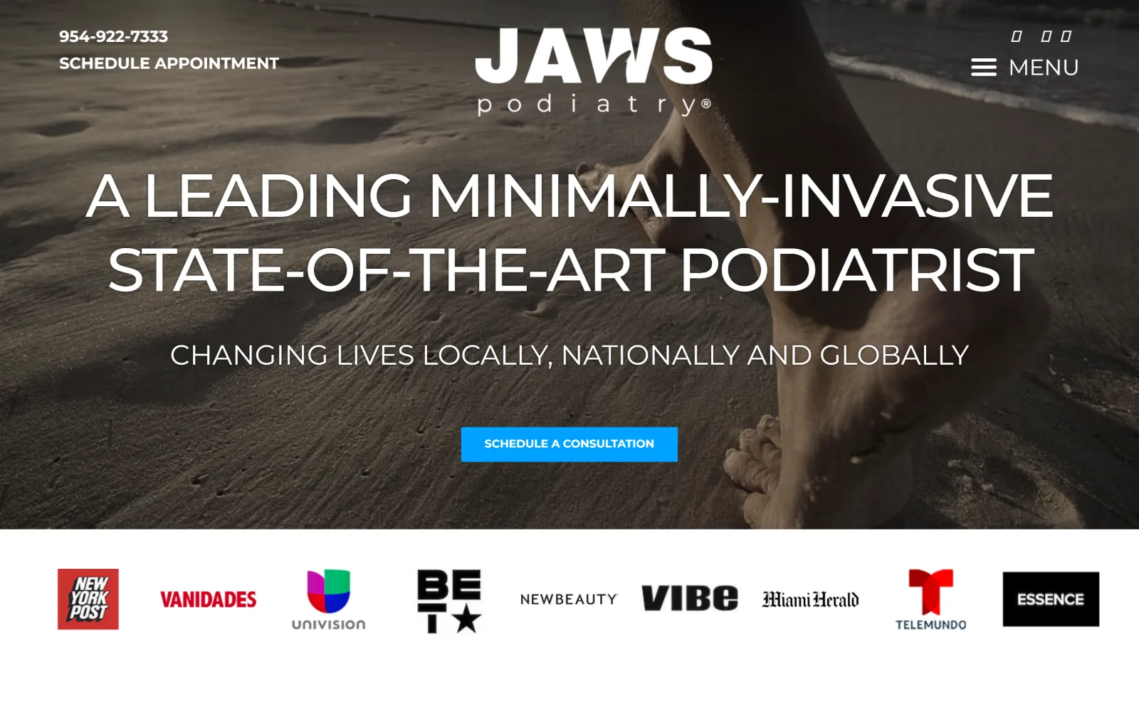
A dark beach photograph of a bare foot in wet sand sits under a wide uppercase headline, with a blue button and a press logo row below.
Type. The headline is Montserrat at 77px, upper case, pulled in to -0.039em at weight 100, so a geometric sans at that size reads as wide rather than heavy. The subline drops to 38px in the same treatment and buttons fall to 14px bold caps. Two sizes carry the entire frame and there is no serif anywhere on the page.
Colour. The photograph supplies nearly everything: warm grey sand, near-black water at the top edge. Only #00a1ff is applied as colour, and it appears once, on the Schedule A Consultation button. White type over the image does the rest. The press logo strip below the fold is the first white ground on the page.
Layout. A full-bleed photograph with no container, the headline centred across almost the full width, and one centred button beneath it. The header is stripped to three elements: phone and Schedule Appointment stacked left, logo centred, a hamburger labelled MENU right. Under the hero, nine press logos sit in a single even row.
The ask. Two asks and both are the same ask: Schedule Appointment in the header, Schedule A Consultation in the hero. The phone number sits above the schedule link top left in the same bold caps, so it reads as a label rather than a tap target. The press row does the credibility work that review stars usually do here.
Setting a geometric sans at 77px in weight 100 with negative tracking buys scale without the shoutiness bold caps produce at that size.
07
tdpodiatry.com
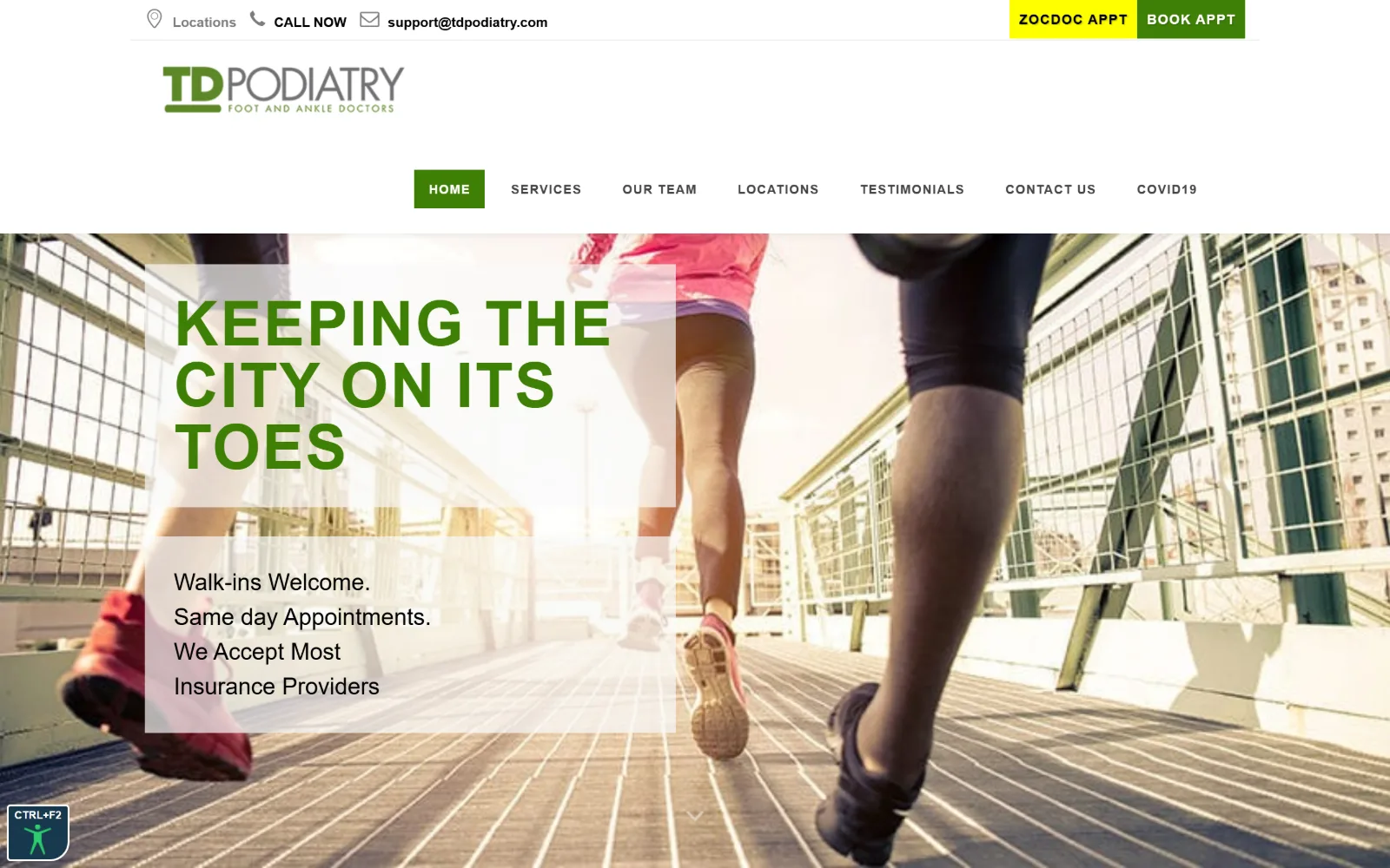
Runners on a bridge fill the hero behind a translucent white panel holding a green uppercase headline and three lines of walk-in copy.
Type. Raleway at 64px, upper case, 1.0 leading and 0.031em tracking sets the headline in green, and the same face at 13px with 0.077em runs the nav caps. Lato handles body copy at 14px with 1.8 leading. Putting the display face in the navigation and the text face in the paragraphs is the right way round, and rarer than it should be.
Colour. White covers almost everything. #3e8005 is the single brand green and it carries the logo, the headline, the active nav tab and the primary button, while a flat #ffff00 block sits behind ZOCDOC APPT in the utility bar. That yellow against the green is the one jarring pair in the frame.
Layout. The header runs three stacked rows: a utility bar, a centred logo, then a centred nav. Below it a full-bleed photograph carries a translucent white panel left of centre, split into a headline block and a copy block with a visible gap between the two. Panels and buttons are square throughout at 0px radius.
The ask. Four asks across the top strip: Locations, Call Now, an email address, then ZOCDOC APPT and BOOK APPT as adjacent coloured blocks. The hero itself asks for nothing and sells the walk-in policy instead, which is the smarter play for a practice whose real advantage is same-day access.
A translucent panel over a busy photograph works better split into two blocks, so the image shows through the gap and the frame stays photographic.
08
footprince.com
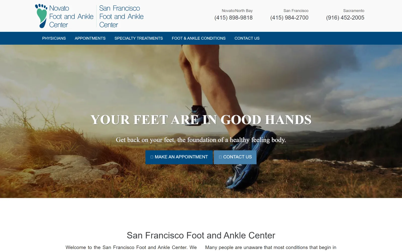
A runner's legs on a hillside at dusk fill the hero, with a centred slab-serif headline in caps and two blue buttons beneath it.
Type
Roboto Slab 48px caps, bold
Body
Roboto 18px/1.42
Build
full-bleed photo hero, navy nav strip, centred headline
Colour
#014a7f #447fab #f9f9f9
Type. Roboto Slab at 48px, upper case and bold, sets the hero line, and a lighter 24px cut of the same slab takes the subline, so the display voice is one family at two weights. Roboto handles the 18px body at 1.42. Montserrat turns up only on buttons at 16px caps, a third family doing a job the slab could have done itself.
Colour. A dark navy #014a7f carries the nav bar and the primary button, with a lighter #447fab as the secondary. The ground alternates #ffffff and #f9f9f9, and body copy sits at #646464. The photograph's amber grass supplies the only warmth on the screen, and nothing in the palette answers it.
Layout. A three-part header: a two-practice logo lockup left, three phone numbers ranged right as separate labelled columns, then a full-width navy nav strip. Under that the hero photograph runs edge to edge with the headline centred and two buttons side by side. Every corner on the page is square at 0px radius.
The ask. Three phone numbers compete at the top, one per city, which is honest for a three-location practice and harder to act on than a single routed line. The hero then offers Make An Appointment and Contact Us as near-identical blue buttons, and the second largely duplicates the first.
Two adjacent buttons in the same colour and size hand the visitor a choice they did not ask for. Rank them by weight, or cut one.
09
valhallafootankle.com
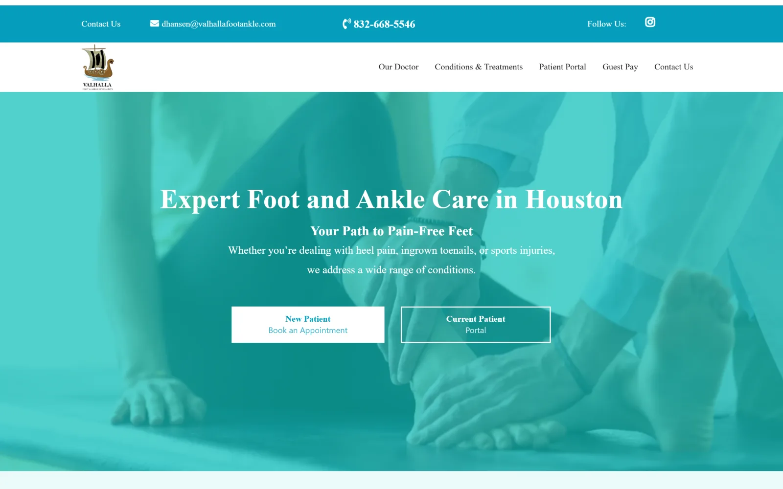
A teal wash covers a photograph of a clinician examining a foot, with a white serif headline and two outlined buttons centred over it.
Type. The headline is set as a serif at 50px, white over the image, with a bold 20px line beneath it and two lighter 15px lines under that, all centred. Body elsewhere runs 15px at 1.6 leading. Four sizes in total and the steps between them are small, so the hierarchy leans on weight and centring rather than on scale.
Colour. A single teal does almost all of it. #07beb8 is laid over the photograph as a flat wash, #059dbc darkens it for the top contact bar and the button labels, and #ebfafa gives the pale band below the fold. White is the only other value. Covering a clinical photograph in brand colour is blunt, but it holds the palette to one hue.
Layout. A two-row header, a teal contact strip above and a white nav bar below, then a tall full-bleed hero with everything centred in the middle third. The two buttons sit side by side, one filled white and one outlined in white, each two lines deep. No radius anywhere: every edge on the page is square.
The ask. Two asks, split by patient type rather than by action: New Patient Book an Appointment, and Current Patient Portal. That is the right division for a practice whose portal logins would otherwise clog the booking form. Phone and email sit in the teal strip above, both in the header's single bold weight.
Splitting the hero buttons by new against returning patient stops portal logins from eating clicks meant for the booking form.
10
footkc.com
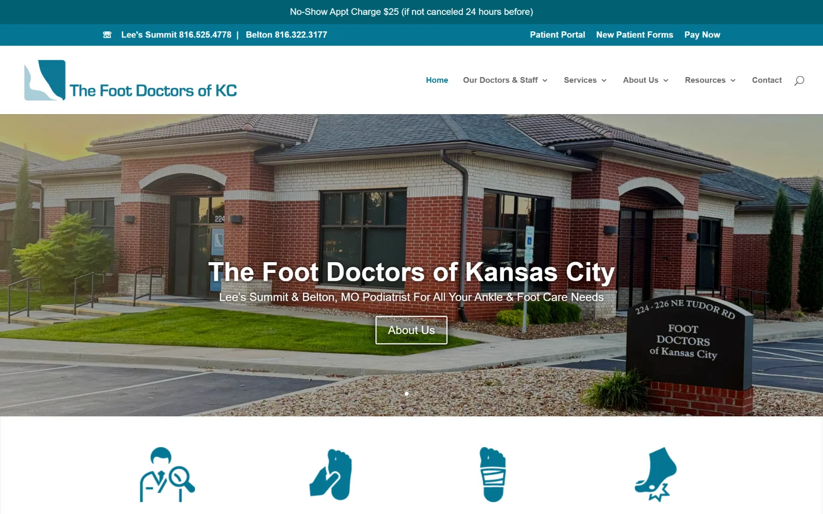
Brick clinic building and its roadside sign fill the hero, with the practice name and an outlined About Us button centred over them.
Type. Open Sans runs the whole site. The hero name sits at 46px semibold with the standfirst immediately below at 20px, a two-step gap that is narrow for a hero of that scale. Nav drops to 14px semibold in teal and body settles at 16px. There is no second family and no tracking anywhere, so the page reads as competent rather than considered.
Colour. Two teals carry the brand: #026072 for the dark announcement bar and #047693 for the second strip and the nav links, with #a8ccd7 filling the flat icons below the fold. White is the ground and black does the body copy. Nothing warm appears on the page except the brick of the building in the photograph.
Layout. Three stacked header rows arrive before any content: a no-show policy notice, a phone and portal strip, then the logo with six nav items. The hero is a full-bleed photograph with centred text and a single slider dot beneath. Below it, four flat teal icons sit in an even four-column row on white.
The ask. Two phone numbers, one per clinic, sit in the second strip alongside Patient Portal, New Patient Forms and Pay Now, so five links compete above the fold. The hero then asks for About Us rather than a booking, and the loudest commercial message on the screen is a twenty-five dollar no-show charge.
Leading with a cancellation penalty in the top bar teaches policy before trust is built. Policy belongs below the fold, not above the logo.
11
austinfootandanklecenter.com
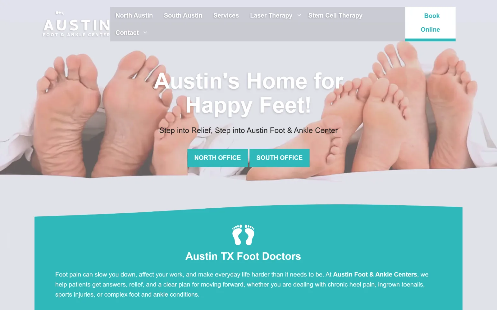
Four pairs of bare feet under a sheet fill the hero behind a white shadowed headline, with two teal office buttons centred below it.
Type
Roboto 64px bold
Body
Roboto 18px/1.6
Build
full-bleed photo, curved section edge, floating nav panel
Made on
WordPress
Colour
#2fb7ba #e0e2e8 #ffffff
Type. Roboto at 64px bold sets the hero line with a drop shadow doing the job a tint overlay should have done. The subline sits at 22px regular and body below runs 18px at 1.6. Nav is 18px bold, unusually large, and in this capture its grey panel overlaps the logo and clips the wordmark down to AUSTIN.
Colour. One accent, used everywhere: #2fb7ba, a mid teal, fills the buttons, the curved band below the hero and the footprint icon inside it. The ground is #ffffff with #e0e2e8 for the cool grey behind the photograph. Body copy reverses to white on the teal band, the only place on the page where type is not dark.
Layout. A full-bleed photograph with a centred text stack, then a band whose top edge is a shallow curve rather than a straight rule, which softens the join between image and copy. The nav floats over the hero in a translucent grey panel instead of sitting in a header bar. Buttons are square at 0px radius.
The ask. Book Online sits in a white tab at the top right, raised clear of the nav panel so it reads as a separate control. The hero then splits by location, NORTH OFFICE against SOUTH OFFICE as adjacent teal buttons, sensible for a two-site practice but leaving no general path for a visitor who does not know the city.
A curved section edge is a cheap way to join a photograph to a colour band, but it only reads as intentional while the curve stays shallow.
12
barrettpodiatry.com
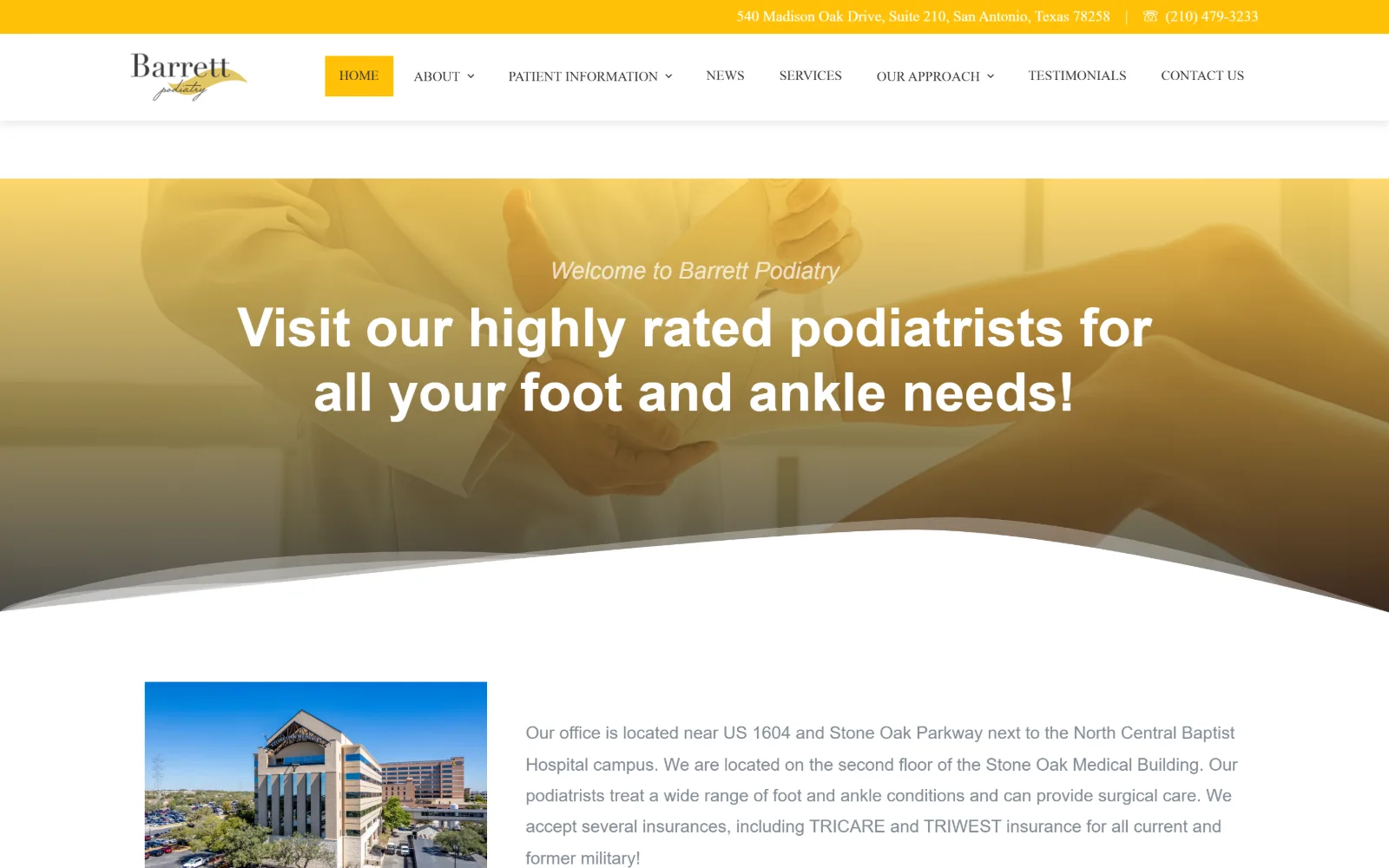
A yellow-graded photograph of a clinician holding a patient's foot sits behind a white two-line headline and an italic welcome line.
Type
heavy sans over graded photo
Body
15px/1.2
Build
yellow utility bar, graded full-bleed photo, S-curve edge
Made on
WordPress
Colour
#ffc107 #ffffff #111111
Type. The headline is a heavy sans at display size over the image, with an italic grey welcome line above it that sets the main line up rather than repeating it. Nav runs Oswald at 14px upper case with 3.0 leading, a condensed face against rounded body text at 15px. A third face appears at 48px in the logo area, so three families share one small page.
Colour. Yellow is the entire identity. #ffc107 fills the address bar, the active HOME tab and the logo swash, and the hero photograph is graded to match it, fading from yellow at the top to grey at the bottom. White and a near-black #111111 do everything else. There is no second accent and nothing cool anywhere in the frame.
Layout. A thin yellow utility bar, then a white header with the logo left and eight nav items right, then a full-bleed graded photograph that ends in a long shallow S-curve rather than a straight edge. Below it a two-column block pairs a photograph of the medical building with a paragraph of location and insurance copy.
The ask. The street address and phone number sit together in the yellow bar at the top, the only persistent ask on the screen. The hero carries no button at all, so the first thing offered below the fold is reading where the office is. For a practice selling a hospital-campus location, that ordering is defensible.
Grading a hero photograph to the brand colour lets one hue carry an identity, but it costs the image contrast the headline then has to make up in weight.
13
acefootandankle.com
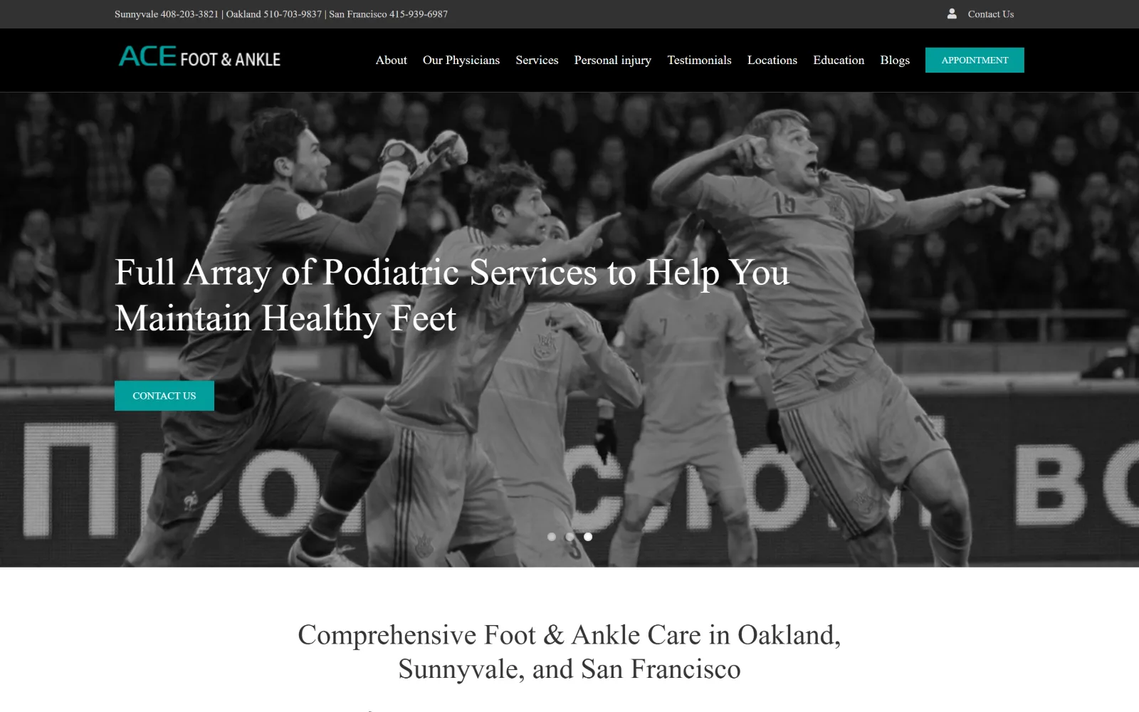
A monochrome photograph of footballers mid-leap fills the hero, with a white serif headline and a small teal Contact Us button at left.
Type
serif 48px over photo
Body
PT Sans 16px/1.5
Build
two-row dark header, full-bleed monochrome slider
Made on
WordPress
Colour
#029d9b #e2e2e2 #323232
Type. The hero line is a light serif at 48px over the image, and the same face returns at 36px for the centred section heading below the fold. Body is PT Sans at 16px with 1.5 leading and nav drops to 13px. A serif display against a plain sans body is the only typographic decision on the page, and it is enough to lift it clear of its theme.
Colour. The photograph is desaturated to grey, which leaves #029d9b, a strong teal, as the only colour on the screen. It appears twice, on the APPOINTMENT button in the black header and on the hero's Contact Us button. The ground is #ffffff with #e2e2e2 panels and a #323232 header bar above them.
Layout. A dark two-row header, a phone strip above and the logo with nine nav items below, then a full-bleed photographic slider with three dots at its foot. Hero text is ranged left at about a tenth of the width rather than centred. Buttons are square at 0px radius and the header does not stick on scroll.
The ask. Three phone numbers run along the top strip, one per city, ahead of a Contact Us link. The teal APPOINTMENT button in the header is the only booking ask, and the hero's Contact Us button duplicates the top-right link instead of repeating it, which wastes the largest button on the page.
Desaturating a hero photograph to grey makes a single accent colour read as deliberate rather than as a leftover from the theme.
14
oregonfoot.com
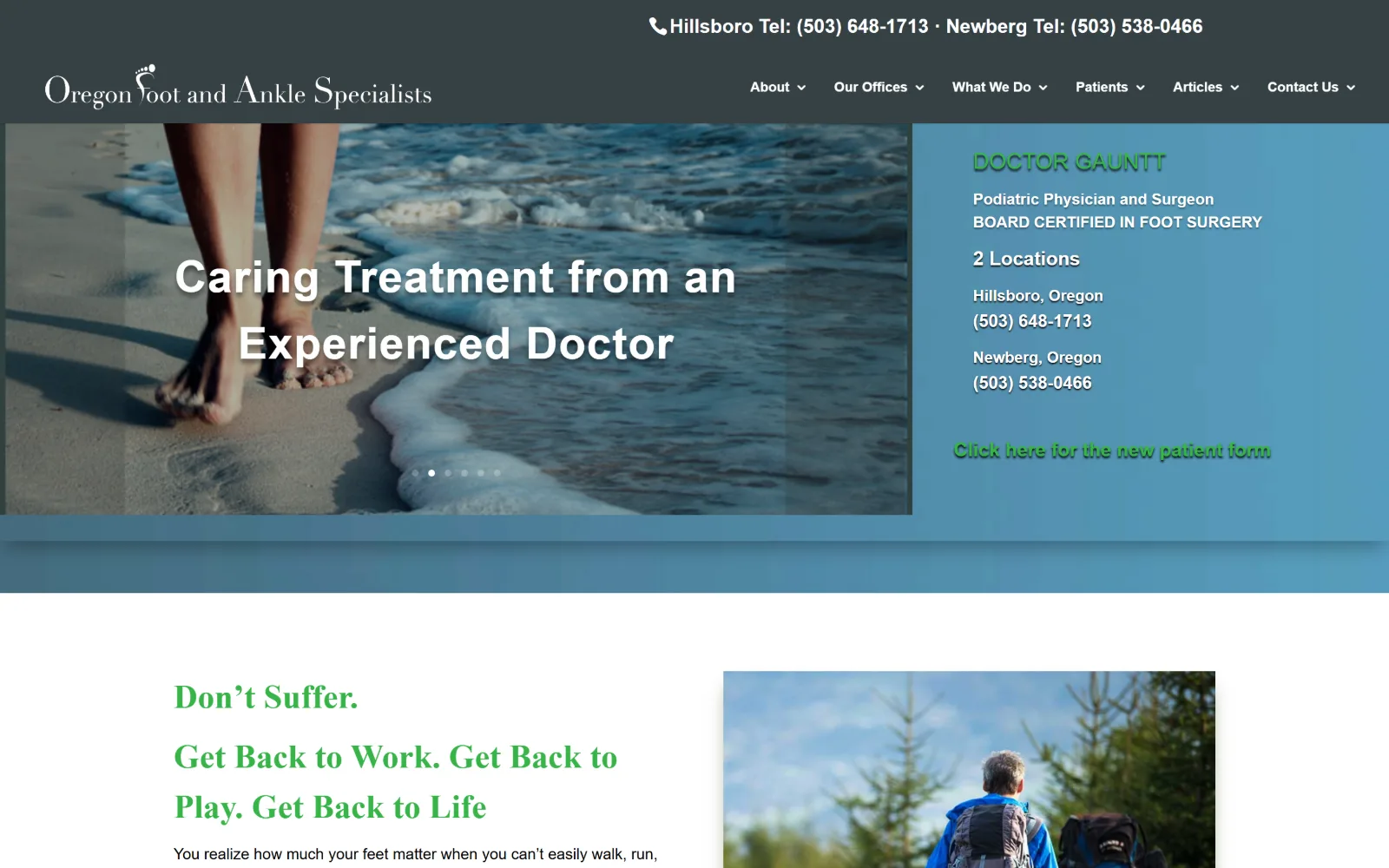
A beach photograph of bare feet at the waterline sits left of a pale blue panel listing the doctor's credentials and two office numbers.
Type
Open Sans 46px bold, 0.022em
Body
Open Sans 20px
Build
split hero, photo left, info panel right, sticky header
Made on
WordPress
Colour
#364145 #508097 #ffffff
Type. The hero line runs Open Sans at 46px bold with 0.022em tracking and a drop shadow, while the credential panel beside it mixes bold and regular at the same 20px. Below the fold the headings switch to a serif at 35px in green, a different voice from the hero entirely. Nav sits at 14px bold caps in white across the dark bar.
Colour. A slate header at #364145 sits above a #508097 blue panel, and that blue is structural rather than an accent, filling a third of the hero. The lower section then introduces a green for headings that appears nowhere else above it. White is the ground and the hero type. Four colours, two of which do not speak to each other.
Layout. A split hero: photograph across the left two-thirds, a flat blue information panel on the right third, both ending on the same baseline with a blue band beneath them. Below the fold the page returns to a conventional white two-column block, copy left and photograph right. The header sticks on scroll.
The ask. The two office phone numbers sit at the very top, then appear again inside the blue panel with their city names, so the same information runs twice above the fold. A green new patient form link closes the panel. There is no booking button anywhere in the frame; the page is built to be phoned.
Repeating the same phone numbers in the header and again in the hero panel doubles the noise without adding a path. Pick one position.
15
solonfootandankle.com
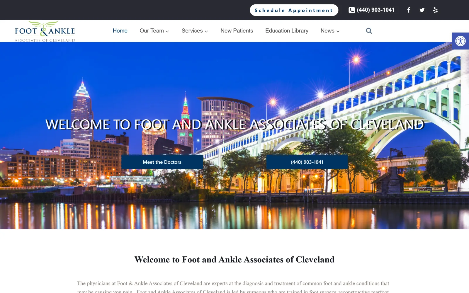
A night photograph of the Cleveland skyline and a lit bridge fills the hero, with a white caps headline and two navy buttons centred low.
Type
system sans 43px caps, thin
Body
Oxygen 17px/1.6
Build
full-bleed night photo, 20px button radius
Made on
WordPress
Colour
#00002d #003463 #f5f7fa
Type. The hero line is set in the system sans at 43px, upper case and thin, running nearly the full width of the frame so the type competes with the skyline behind it. Headings below switch to Oxygen at 28px bold and body sits at 17px with 1.6 leading in a warm grey. One button label is tracked out to a very wide 0.267em.
Colour. Navy does the structural work: #00002d for the dark top bar and #003463 for the hero buttons and footer. The grounds alternate #ffffff and #f5f7fa. Body copy sits in a warm grey at #8c8279 rather than a cool one, which is at odds with the blues around it and is the only loose note in the palette.
Layout. A dark utility bar carrying the booking pill and phone, then a white header with the logo left and six nav items, then a full-bleed photograph with the headline at mid-height and two buttons below it. Those buttons are the only rounded elements on the page, at 20px radius against square everything else.
The ask. Three asks and two of them are the phone number: a Schedule Appointment pill and the number in the top bar, then the number again as one of the two hero buttons, paired with Meet the Doctors. Giving half the hero to a call and half to a bio page is a reasonable split for a practice selling its surgeons.
Thin caps at 43px across a full-width night photograph lose legibility fast. Shorten the line, or darken the image underneath it.
16
footankle.com
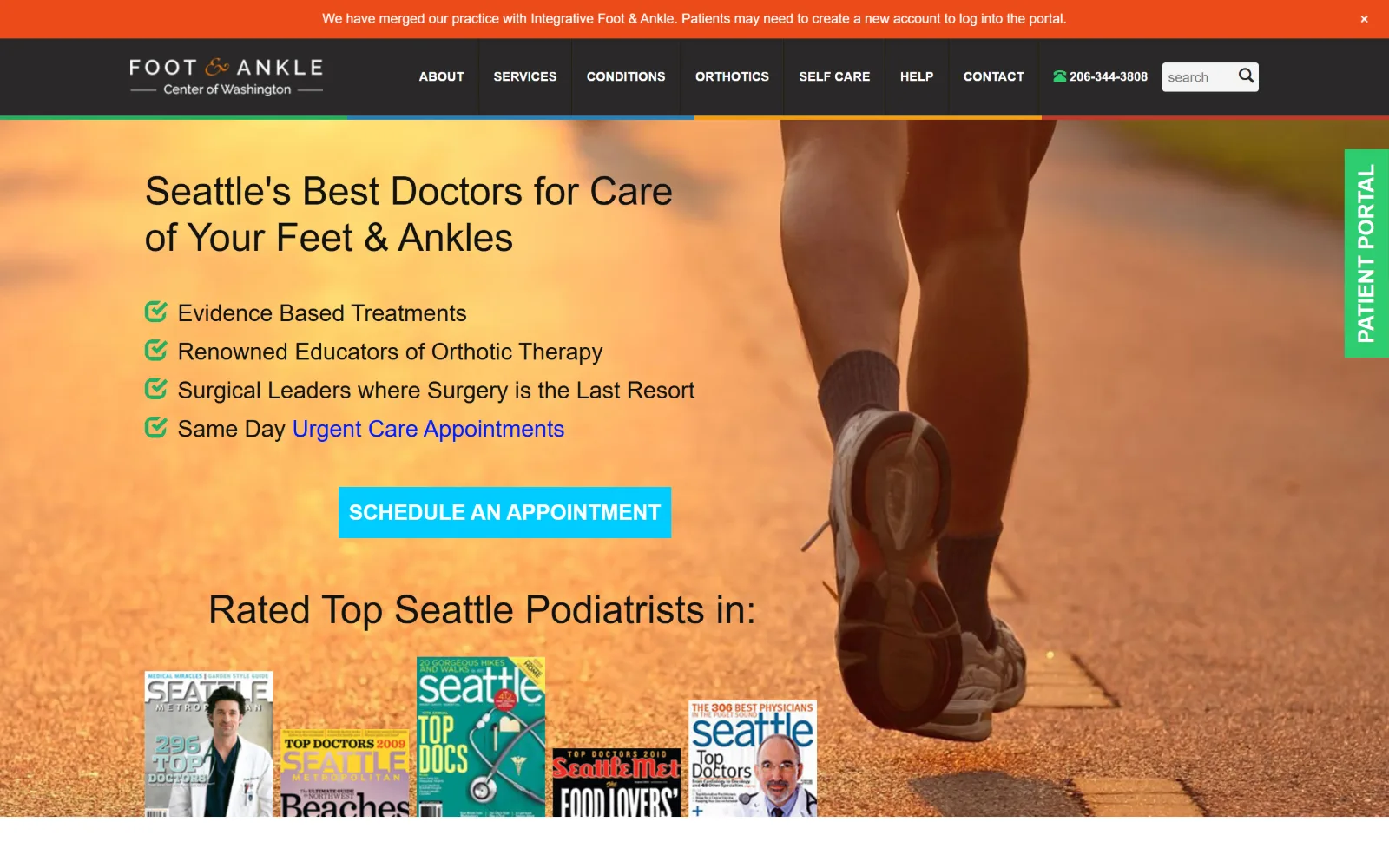
An orange-lit photograph of a runner backs a black headline, four ticked claims and a cyan Schedule An Appointment button at left.
Type
Lato 40px/1.2
Body
Open Sans 16px/1.63
Build
four stacked header bands, 80px section padding
Made on
WordPress
Colour
#00ccff #ed4b1a #2ecc71
Type. Lato runs the display at 40px with 1.2 leading and returns at 36px and 24px for the claim lines, all in regular weight. Open Sans takes the 16px body at 1.63 and the 13px nav caps. The button jumps to 22px bold caps, larger than any subheading on the page, which is an unusual but effective way to rank it.
Colour. Six values are in play and they do not agree: #00ccff on the appointment button, #ed4b1a on the merger notice bar, #2ecc71 on the pinned Patient Portal tab, plus the orange of the photograph itself. Dark text at #292828 sits on white. The four-colour rule under the header is the clearest sign of a palette that accumulated.
Layout. Four stacked bands arrive before the hero: a merger notice, a dark header with nine nav items and a search field, a four-colour rule, then the photograph. Section padding is 80px. A green Patient Portal tab is pinned vertically to the right edge, and the hero text column holds the left half over the image.
The ask. The cyan Schedule An Appointment button is the largest element in the hero and it is unambiguous. Against it sit the phone number in the header, a search field, the pinned portal tab and a row of magazine covers, so four secondary paths surround the one clear ask.
Setting the primary button at 22px, larger than the subheadings around it, ranks it by size rather than leaving colour to do all the work.
How these were chosen
Podiatry is one of the most heavily templated trades on the web, and most of what a search returns is the same medical-marketing build with a different logo dropped into it. This shortlist is what survived that: twenty-two captures cut to sixteen pages where somebody actually made a decision. The pattern that holds is the photographic hero, almost always feet, legs or a running shoe, with a single accent colour carrying every button on the page. The pattern that breaks is typographic ambition. Most of these set their headline in whatever the theme shipped with, and only three or four treat type as part of the podiatry website design rather than as a label laid over a picture. Those four are at the top.
Finding podiatry sites that someone had actually designed took far longer than it should have. 37 candidates made the shortlist. 16 made the page.
Each one was opened and looked at properly: what the type is doing, where the colour gets spent, how the page is built, how it asks for the job. Nothing is here because it ranks. Nothing is here because an agency filed it under portfolio. Several well known names were left out for the plain reason that their site came out of the same template as everyone else's, and a few sites worth including did not survive a second look.
Where a site is only competent, it says so. The order is the order worth your time, best first.
Reviewed and selected by Larry W. Matthews for Websitely.