Optometrist Website Design Where the Frames Do the Talking
Sixteen US optical shops and eye care practices. Optometrist website design where the frames are the product and the exam is the quiet half.
Shown
16 sites
Reviewed
38 candidates
Chosen on
The work, not the ranking
Updated
15 October 2026
01
twelvesixtynine.com
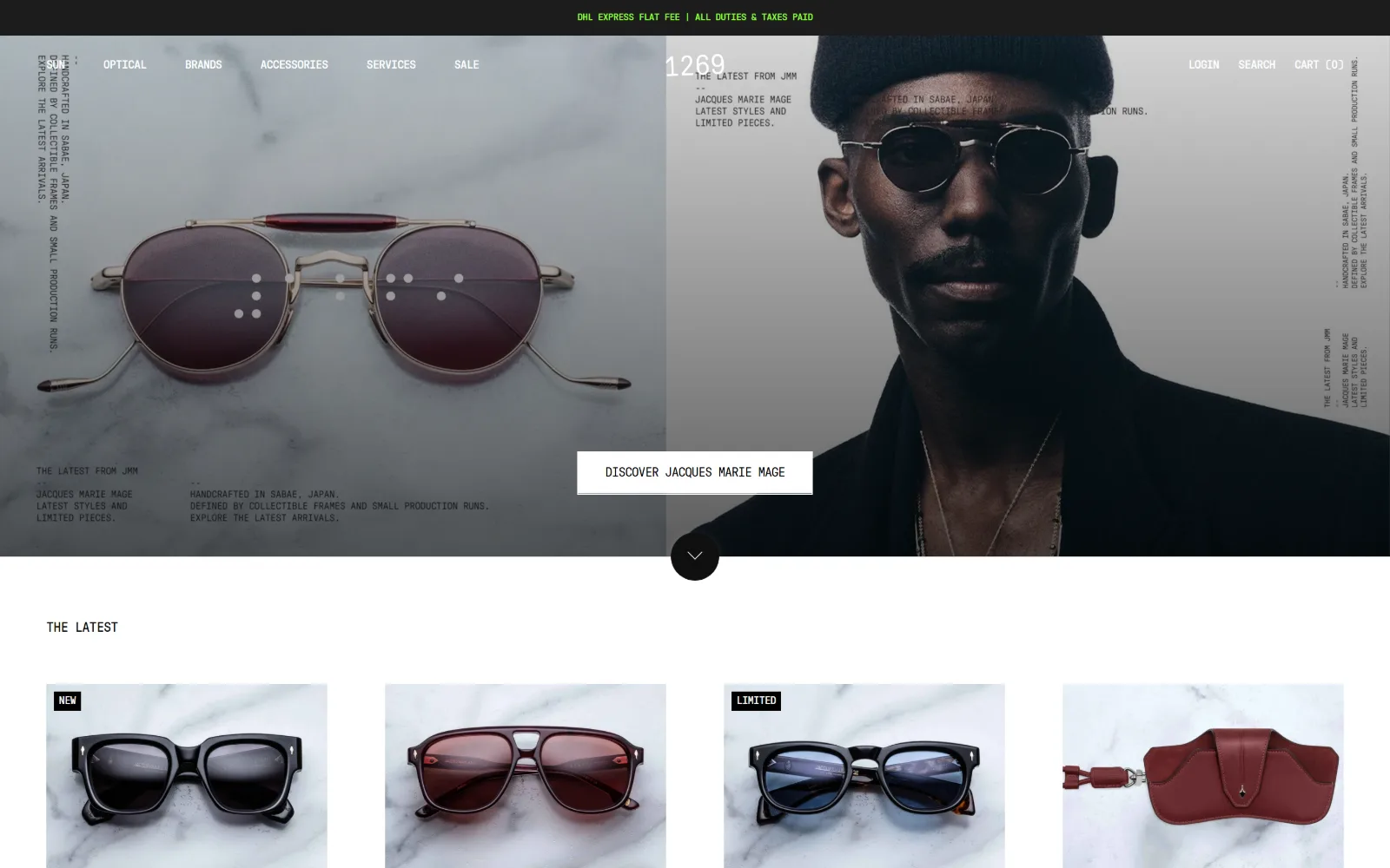
Two panels butted together: gold-rimmed sunglasses on marble on the left, a portrait in the same frames on the right, mono captions in the corners.
Type
GT Pressura Mono 28px uppercase, -0.02em
Body
GT Pressura Mono 14px, -0.02em
Build
two-panel split hero, 1344px content column
Made on
Shopify
Colour
#ffffff #0f0f0f #1c1c1c
Type. One typeface does the whole site. GT Pressura Mono runs from the 28px uppercase section head down to 14px body and 12px nav, all at -0.02em, so the tracking is tightened rather than the size varied. Caption blocks sit at 11px and 10px in the corners of the hero, set like film stills rather than marketing copy, and the only hierarchy left is position.
Colour. White covers 153.9 of the measured area against #000000 at 30.1 and #1c1c1c at 16.1, with text set in #0f0f0f. The single saturated value is a #8dff3b green reserved for the shipping line at the very top of the page, roughly forty characters of acid against an otherwise greyscale layout.
Layout. The 1440px hero is a full-bleed two-panel split, 602px and 602px with a 60px gutter between them. Below it the content column locks to 1344px inside a seven-track grid, then product cards fall into four 291px columns with 60px column gaps and 64px row gaps. Corner radius is zero throughout and the header is sticky.
The ask. A single white rectangle, DISCOVER JACQUES MARIE MAGE, straddles the seam between the two hero panels, and a round scroll cue sits directly beneath it. Search, login and cart are the only other asks, grouped right. There is no phone number and no appointment prompt above the fold.
Setting an entire retail site in one monospace face at one size turns position and tracking into the hierarchy, which photography then has to carry.
02
classicvisionoptical.com
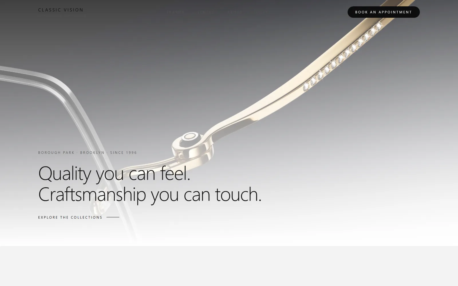
A macro photograph of a gold temple arm set with crystals fills the frame, with a two-line headline and a small eyebrow line stacked at lower left.
Type. Inter at 60px in weight 200 with -0.025em tracking carries the headline, and the body sits at 32px in the same thin weight and the same negative tracking, so display and text differ only in size. Against that, the eyebrow and nav drop to 11px uppercase at 0.26em, and a 10px label stretches to 0.34em. Two extremes, nothing in between.
Colour. The measured fills amount to #010000 at 290.4 coverage and #000000 at a trace, with all type set in #000000. Every tone visible on screen is photographic: the silver-to-white gradient on the frame arm supplies the only modelling, so the page carries no accent colour at all and no brand hue to maintain.
Layout. The hero is a full-bleed 1440px photograph with the headline parked in the lower left quarter rather than centred, leaving the top two thirds to the frame itself. Further down, a three-column grid of 373px cells with 40px gaps gives way to a two-column 639.5px split with a 1px gap. The header is sticky and the booking control is a pill.
The ask. A black pill reading BOOK AN APPOINTMENT sits in the top right corner, and the only other ask is a quiet EXPLORE THE COLLECTIONS link with a rule running off it. Nav items sit pale against the photograph. No phone number, no second button, nothing repeated.
A thin weight at 60px only works over a photograph with a genuine tonal gradient behind it, because the type relies on that contrast rather than on colour.
03
moscot.com
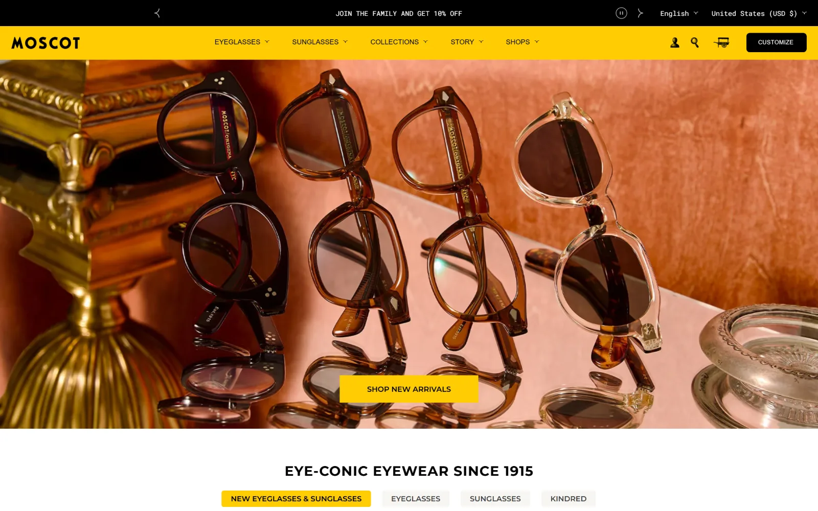
A yellow navigation band runs above a warm still life of four frames propped on a pink ledge beside a brass lamp, with a yellow button centred low.
Type
Montserrat 24px bold uppercase, 0.042em
Body
Roboto Mono 12px
Build
full-bleed photo under 211/847/325 header grid
Made on
Shopify
Colour
#ffffff #ffcd03 #000000
Type. Montserrat handles everything structural: 24px bold uppercase at 0.042em for EYE-CONIC EYEWEAR SINCE 1915, 16px bold uppercase at 0.063em for section labels, 12px medium for nav, and 10px uppercase for buttons. Roboto Mono at 12px carries the announcement row and running labels, which keeps the shop furniture visually separate from the brand voice.
Colour. White dominates at 150.1 coverage, with #ffcd03 at 6.6 doing all the signalling and #000000 at 3.1 holding type and the CUSTOMIZE button. A warmer #f6f5f1 sits under secondary chips. The yellow is confined to the nav band and one button, so saturation reads as a brand mark rather than decoration.
Layout. A 1440px full-bleed hero photograph sits below a three-track header grid of 211px, 847px and 325px with 8px gaps, which pushes the wordmark hard left and the account controls hard right. Section padding is 60px and button radius is 6px, the only softening anywhere on the page.
The ask. CUSTOMIZE is a black block in the header, SHOP NEW ARRIVALS is a yellow block on the photograph, and four category chips sit immediately below the fold. The asks are all commercial; there is no phone number and no exam booking competing for the same space.
Confining a loud brand colour to one nav band and one button lets it read as identity rather than as decoration, even at high contrast.
04
blackoptical.com
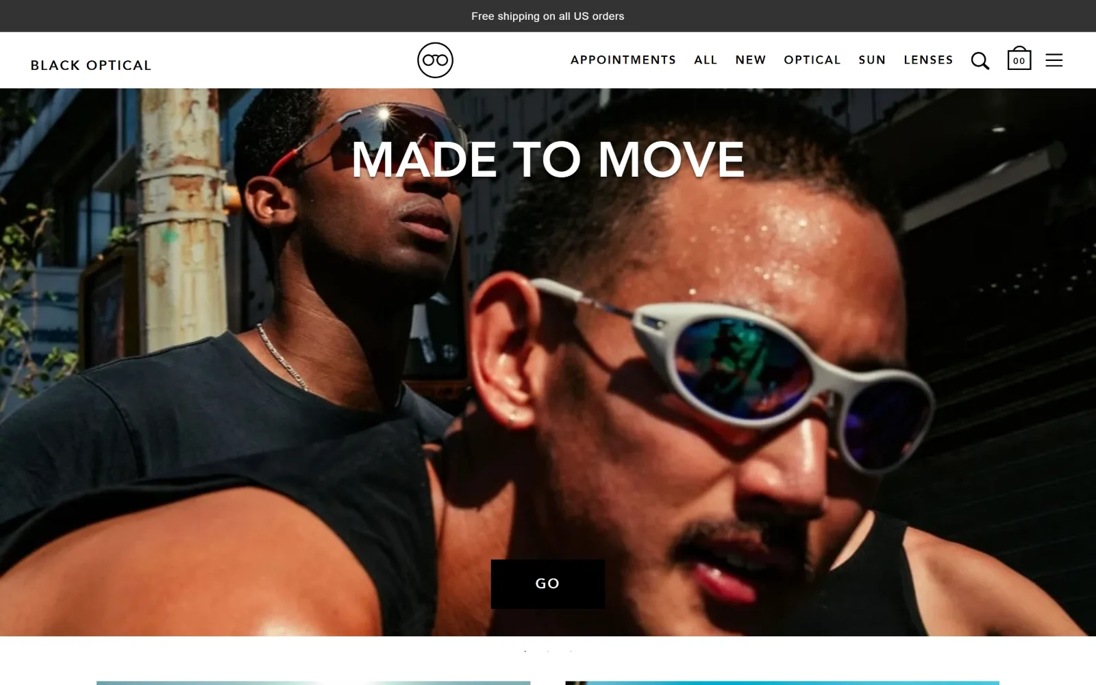
A full-bleed street photograph of two men in sunglasses, MADE TO MOVE in white caps across the upper third and a black GO block low in the frame.
Type
Avenir LT Heavy 64px uppercase, 0.006em
Body
Avenir LT Std Book 16px, 0.025em
Build
full-bleed slider, 354/354/650 gutterless grid
Made on
Shopify
Colour
#ffffff #f5f5f5 #333333
Type. Avenir LT Heavy at 64px, uppercase, with 0.006em tracking and 1.6 leading makes the headline wide and airy rather than tight. The supporting scale drops to 36px and 32px at a much lighter weight with tracking opened to 0.083em and 0.094em, and nav and labels run 14px to 18px uppercase at 0.1em, so caps and letterspacing carry the whole system.
Colour. The measured fills are almost entirely neutral: #ffffff at 55.7, #f5f5f5 at 8.8, #333333 at 2.4 and #000000 at 1.3, with 853 characters set in pure black. All colour comes from the photography, which is why a mirrored blue lens in the centre of the frame reads as the brightest thing on the page.
Layout. The hero is a full-bleed slider at 1440px with dots beneath it, and section padding tightens to 24px. Below, a deliberately uneven three-column grid of 354px, 354px and 650px runs with no gutter at all, and cards take a 27px radius, the only rounded geometry in an otherwise square layout.
The ask. APPOINTMENTS is the first nav item, ahead of the product categories, which is unusual for a shop. The hero itself offers one black GO block and nothing else. Search and cart sit right, and the slider rotates through further campaign frames.
Putting appointments first in a retail nav tells visitors the shop is also a practice without spending any hero space saying so.
05
framedewe.com
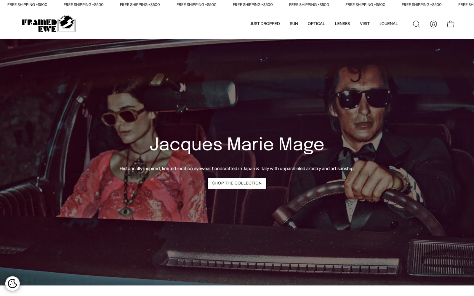
A grainy campaign still of two people in a car in sunglasses, Jacques Marie Mage set across the centre and a white SHOP THE COLLECTION block below.
Type
Epilogue 53px regular
Body
Instrument Sans 14px, 1.56
Build
full-bleed campaign hero, 4x315px product grid
Made on
Shopify
Colour
#ffffff #000000 #0b0b0b
Type. Epilogue at 53px regular carries the brand name in sentence case, with a second line at 51px, and that is the whole display range. Everything else is Instrument Sans: 14px for running copy at 1.56 leading, 13px medium uppercase for nav, 12px at 0.05em uppercase for buttons and 11px for labels. The hero name is the only large thing on the page.
Colour. Two values are measured across the entire layout, #ffffff at 341.1 coverage and #000000 at 41.7, with body text in #0b0b0b. There is no accent. The warm reds and pinks in the hero are entirely photographic, which means the campaign image can be swapped without touching the palette.
Layout. A 1440px full-bleed hero sits under a scrolling ticker and a white header row. Section padding is 52px, product rows use four 315px columns with 20px gaps, corner radius is zero, and the document runs to 13174px, so the hero is a cover rather than a summary of the page.
The ask. One white button, SHOP THE COLLECTION, sits under the campaign name. The ticker repeating FREE SHIPPING +$500 is the second ask and it is passive. Account and cart sit top right, and VISIT is buried mid-nav rather than promoted as a booking link.
Naming the brand rather than the shop in the hero borrows that brand's customer, and a two-colour palette lets the campaign image change without a redesign.
06
spectaclepdx.com
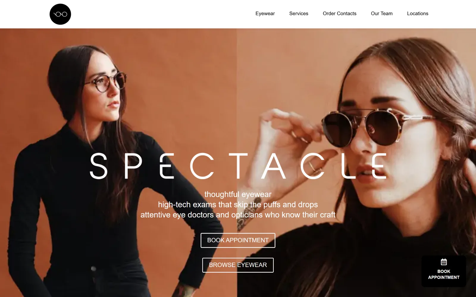
Two terracotta-toned portraits butted edge to edge, with SPECTACLE letterspaced in white across the seam and two outlined buttons stacked beneath.
Type
Montserrat 50px, weight 500, wide tracking
Body
Montserrat 16px, 1.75
Build
two half-width photos, 1150px container
Made on
WordPress
Colour
#ffffff #666666 #000000
Type. Just one sans, Montserrat, does the entire page. The wordmark runs 50px at weight 500 with the letters pulled far apart so the word spans both photographs, while the three-line subhead sits at 24px regular in sentence case and reads like a note rather than a slogan. Body is 16px at 1.75 leading and nav is 15px medium, which keeps the furniture quiet.
Colour. The measured fills are #ffffff at 200 coverage and #000000 at under 1, with body copy in #666666 and hero text in white. Every warm tone on screen is in the photography, which is shot against terracotta backdrops, so the page itself has no brand colour to clash with the next campaign shoot.
Layout. The hero is two images at exactly half width each, so the seam lands dead centre and the wordmark crosses it. Content below narrows to an 1150px container at 80% of the viewport, giving generous outer margins. The header is sticky, corner radius is zero, and a fixed booking tab is pinned bottom right.
The ask. BOOK APPOINTMENT and BROWSE EYEWEAR are stacked outlined blocks of equal weight, clinic first. A dark BOOK APPOINTMENT tab stays pinned to the lower right through the page, so the primary ask survives the 9040px scroll. No phone number is shown.
Splitting the hero into two half-width portraits gives a letterspaced wordmark a seam to span, which makes the type structural rather than overlaid.
07
eyeeye.care
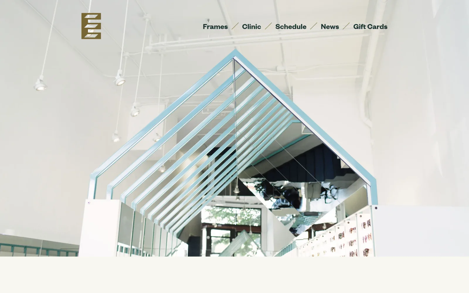
A wide interior shot looking up at a mirrored canopy over the frame displays, with a small brass logo at left and five nav words split by slashes.
Type
Founders Grotesk Web 48px, 0.88 leading
Body
Founders Grotesk Web 24px
Build
full-bleed interior photo, transparent header
Made on
Shopify
Colour
#f8f7f0 #766633 #75b8c2
Type. Founders Grotesk Web runs the page at two sizes only: 48px at 0.88 leading, which is tighter than the cap height and makes blocks of text read as slabs, and 24px for nav. There is no third step and no uppercase, so the difference between a heading and a link is purely scale. The slashes between nav items do the separating that tracking usually would.
Colour. The ground is an off-white #f8f7f0 at 34.9 coverage, with an olive #766633 at 10.7 and a pale blue #75b8c2 at 10.7, both pulled straight out of the photograph. Text runs in the same olive and in a deep green #1a322f, so the palette and the image share values rather than sitting next to each other.
Layout. The hero is a full-bleed 1440px photograph under a transparent header, with the logo at far left and the nav pushed to the right half. No grid is declared anywhere on the 6225px page, so sections stack as full-width bands and the photography sets the rhythm. Corner radius is zero.
The ask. There is no button in the hero and no phone number. Schedule sits as the third of five nav words, given exactly the same weight as Frames, Clinic, News and Gift Cards, which treats booking as navigation rather than as a conversion event.
Pulling the palette out of the hero photograph rather than choosing it separately keeps a photo-led page coherent when the image is replaced.
08
raopticians.com
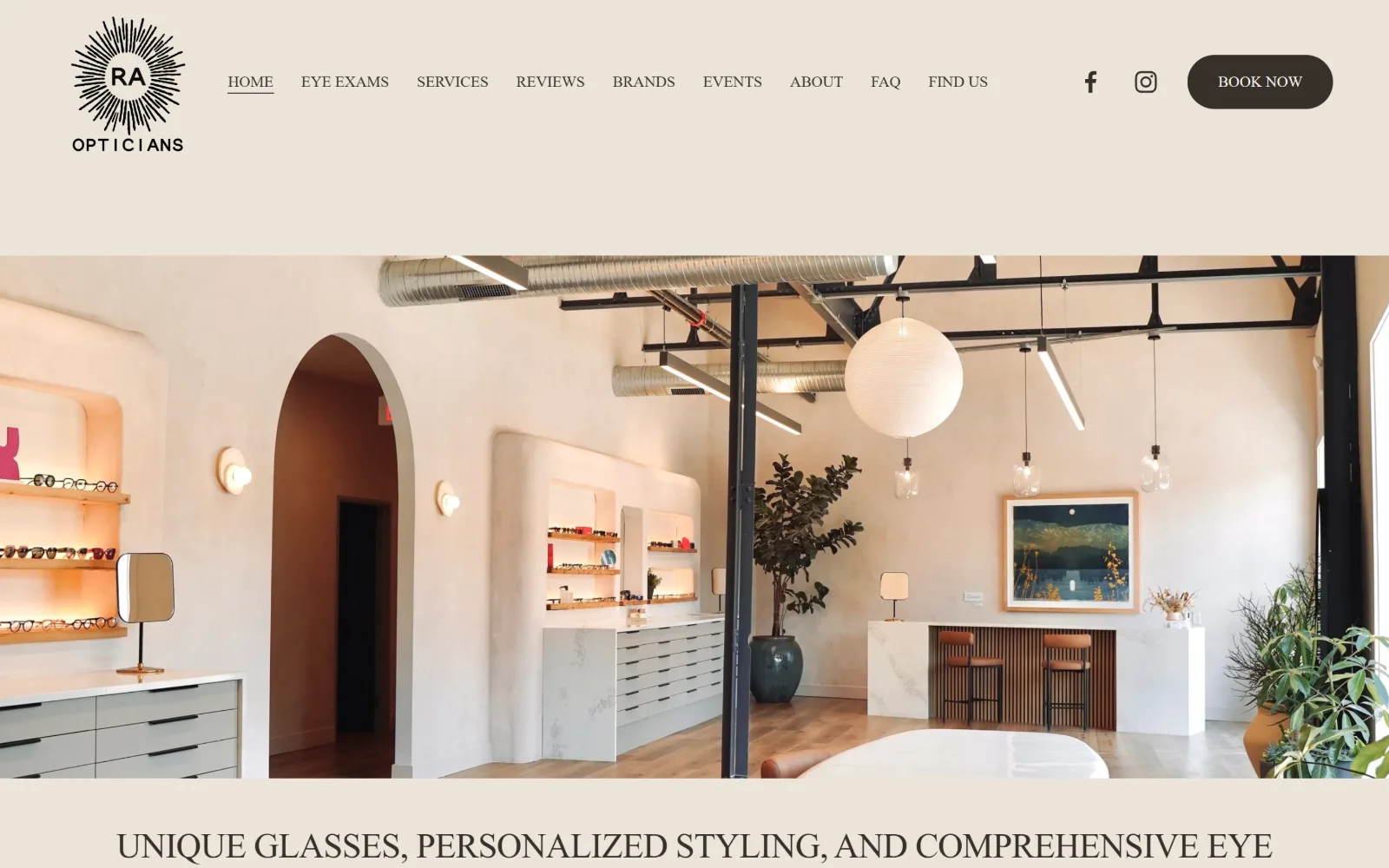
A sand-coloured header band holds a starburst logo and nine nav items above a wide photograph of a plastered, arch-doored shop interior.
Type
Manrope 36px, weight 500, -0.02em
Body
Nunito Sans 23px
Build
170px section padding, 26-column grid
Made on
Squarespace
Colour
#ece4da #36302a #574c3f
Type. Manrope at 36px in weight 500 with -0.02em tracking sets the headline, and Nunito Sans at 23px carries the intro paragraph, so the gap between display and body is only thirteen pixels. Running copy, 696 characters of it, is set uppercase at 16px, which slows reading noticeably and is the one decision here that costs more than it returns.
Colour. Two values are measured across the whole layout: #ece4da at 309.5 coverage and #36302a at 1.5. Text runs in #574c3f and the same #36302a, with button text in #f6f3ec. Nothing is saturated, so the warm plaster and terracotta in the interior photograph provide all the colour the page has.
Layout. The 1440px page uses 170px of section padding, which is the largest measured in this set and the reason the header band reads as a frame rather than a bar. Underneath sits a 26-column Squarespace grid with 11px gutters, and the booking control takes a 300px radius, making it a full pill.
The ask. A dark BOOK NOW pill is pushed to the far right of the header, past social icons, and it is the only button. Nine nav items compete for the row beneath the logo, including Reviews, Events and FAQ, which dilutes the path to the one thing the page actually wants.
Section padding of 170px is what makes a single-hue page read as composed rather than empty, but nine nav items will undo it.
09
lookandseevision.com
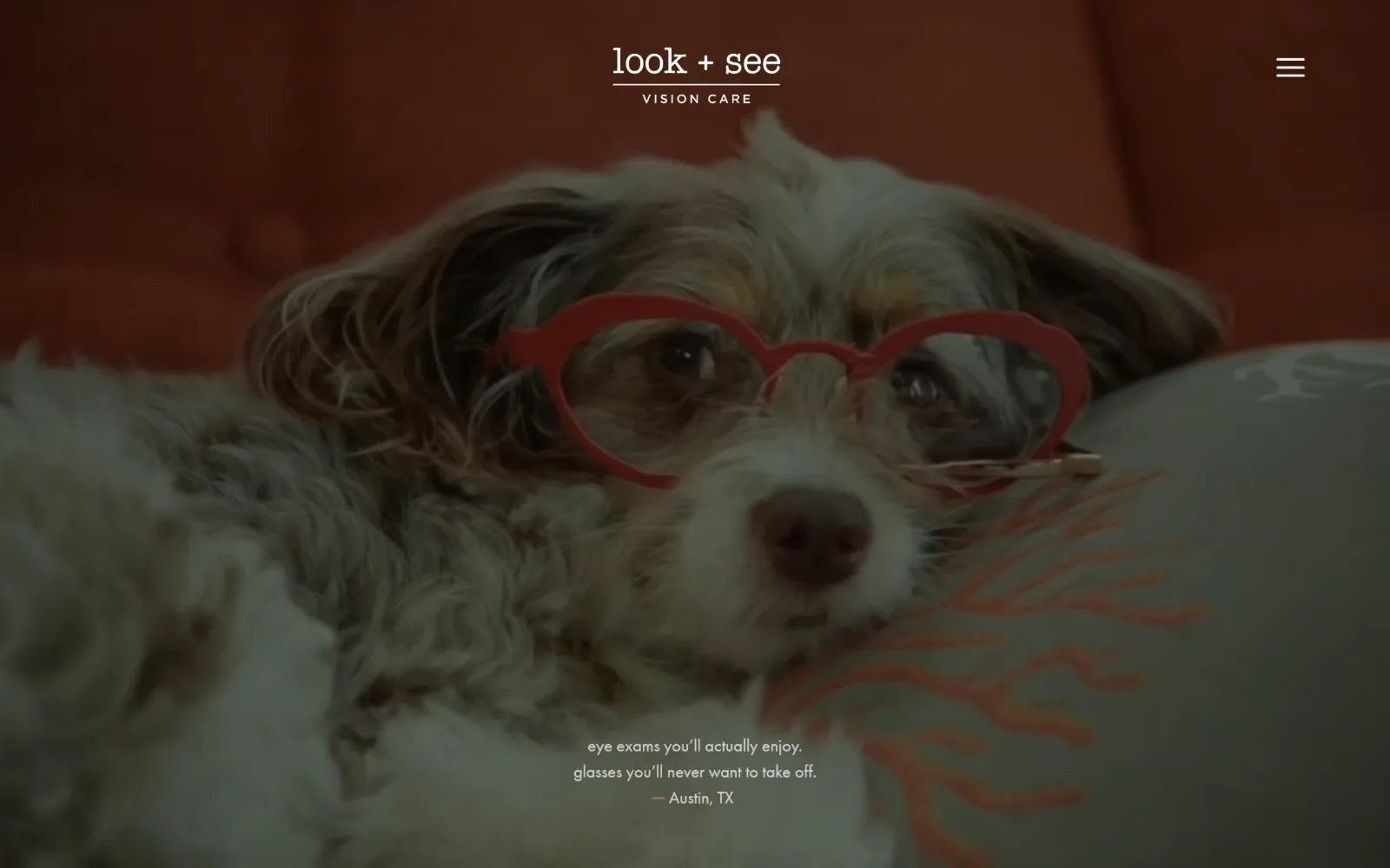
A dimmed video still of a scruffy dog wearing red heart-shaped glasses, with a centred wordmark above and two lines of lowercase copy at the bottom.
Type
high-contrast display serif, 90px
Body
Futura PT 18px
Build
full-bleed video hero, hamburger nav
Made on
WordPress
Colour
#ffffff #42553d #f1eadd
Type. A high-contrast display serif runs at 90px and again at 60px, paired with Futura PT at 18px and Mr Eaves XL Modern Book at 18px for nav. The two lines of hero copy are set lowercase and centred at small size under a very large image, so the only shouting on the page is done by the photograph.
Colour. Measured fills are #ffffff at 135.6, a deep green #42553d at 15.1, a warm #f1eadd at 10 and a rust #894826 at 5.1. Nav text picks up a pale gold #e8d890 and a line of body copy runs in #e5a99e, so five hues are in play, all of them muted and all of them taken from the film grade.
Layout. A full-bleed 1440px video fills the viewport with no overlay panel, the wordmark centred at the top and a hamburger at the right. No grid is declared on the 8637px page; sections run full width and the video carries the whole first screen.
The ask. Nothing in the hero asks for anything. There is no button, no phone number and no appointment link visible, and the entire nav is folded behind a single hamburger. The page is betting that the film holds attention long enough to earn the scroll.
A hero that asks for nothing only works when the image is genuinely arresting, and the trade is a scroll before any booking path appears.
10
chinatownoptical.com
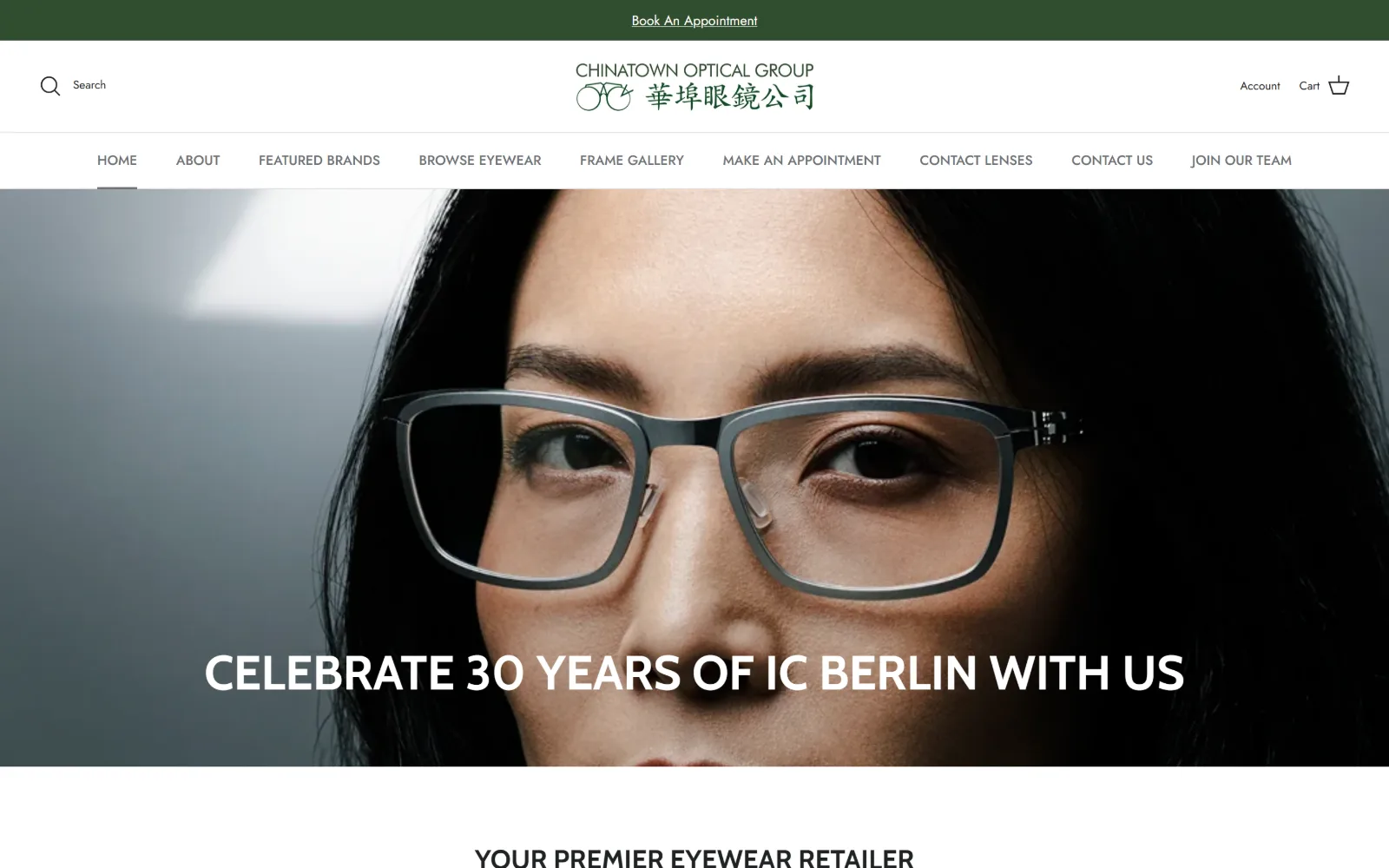
A tight portrait of a woman in grey titanium frames fills the hero, with CELEBRATE 30 YEARS OF IC BERLIN WITH US in white caps along the bottom edge.
Type
Cabin 50px bold uppercase, 1.1
Body
Jost 14px
Build
centred logo over full-width nav, full-bleed hero
Made on
Shopify
Colour
#ffffff #000000 #304d2e
Type. Cabin at 50px bold uppercase with 1.1 leading sets the campaign line, stepping down to 30px and 28px for section heads in the same treatment. Everything functional is Jost: 14px medium for the ten nav items, 13px at 0.08em uppercase for labels, 12px for small print. Two families, one for voice and one for furniture.
Colour. White at 108.5 coverage and black at 33.3 carry the layout, with a bottle green #304d2e at 2.8 holding the announcement strip and the bilingual logotype. Body text sits in a soft #6d7175 rather than black, which stops the ten-item nav from competing with the photograph above it.
Layout. The 1440px page centres the logo over a full-width nav row rather than placing it left, so the header reads as two stacked bands before the photograph starts. The hero runs full bleed with the headline on the image itself rather than in a panel. Corner radius is zero and the document runs 7641px.
The ask. Book An Appointment appears twice before the fold, once in the green strip at the very top and once as the seventh of ten nav items. The hero carries no button at all, so the campaign line does the persuading and the header handles the ask.
A brand anniversary makes a better hero line than a service claim because it dates the page honestly and gives visitors a reason to come in now.
11
alexanderdaas.com
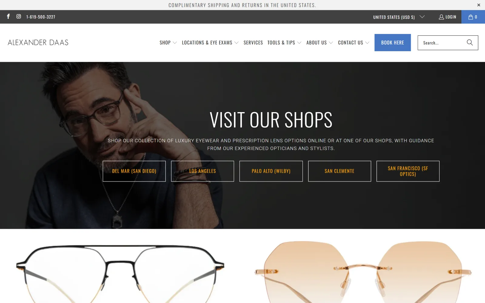
A dark portrait of a man adjusting his glasses runs behind VISIT OUR SHOPS, with five outlined boxes naming each location in amber text.
Type
Oswald 56px, weight 300, uppercase
Body
Roboto 14px uppercase, 0.071em
Build
full-bleed portrait, 5x187px product grid
Made on
Shopify
Colour
#ffffff #ecf0f3 #4676c3
Type. Oswald at 56px in weight 300, uppercase, at 0.018em makes a condensed headline that stays narrow enough to centre over a face. Body is Roboto at 14px, also uppercase, at 0.071em with 1.6 leading, which is the one weak choice: a two-line uppercase paragraph at 14px is harder to read than the same text in sentence case.
Colour. Neutrals carry the layout, #ffffff at 129.1, #ecf0f3 at 27.6, #000000 at 27.6 and #424242 at 18.2. Two accents do the work: a blue #4676c3 on the BOOK HERE block in the header and an amber #f4a20b used for the 84 characters of location names in the hero boxes.
Layout. The hero photograph runs full bleed at 1440px under a sticky header carrying seven nav items plus a search field. Product rows below use a five-column grid of 187px cells with 16px gaps. Corner radius is zero, and the location boxes are outlines rather than filled buttons.
The ask. The phone number sits in the utility bar at the very top, a blue BOOK HERE block sits in the header, and the hero offers five location choices rather than one action. That is six asks before the fold, but they are tiered by weight rather than competing as equals.
Five location boxes beat one generic booking button when a business has five shops, because the first decision a visitor makes is where, not when.
12
optiqueeyewear.com
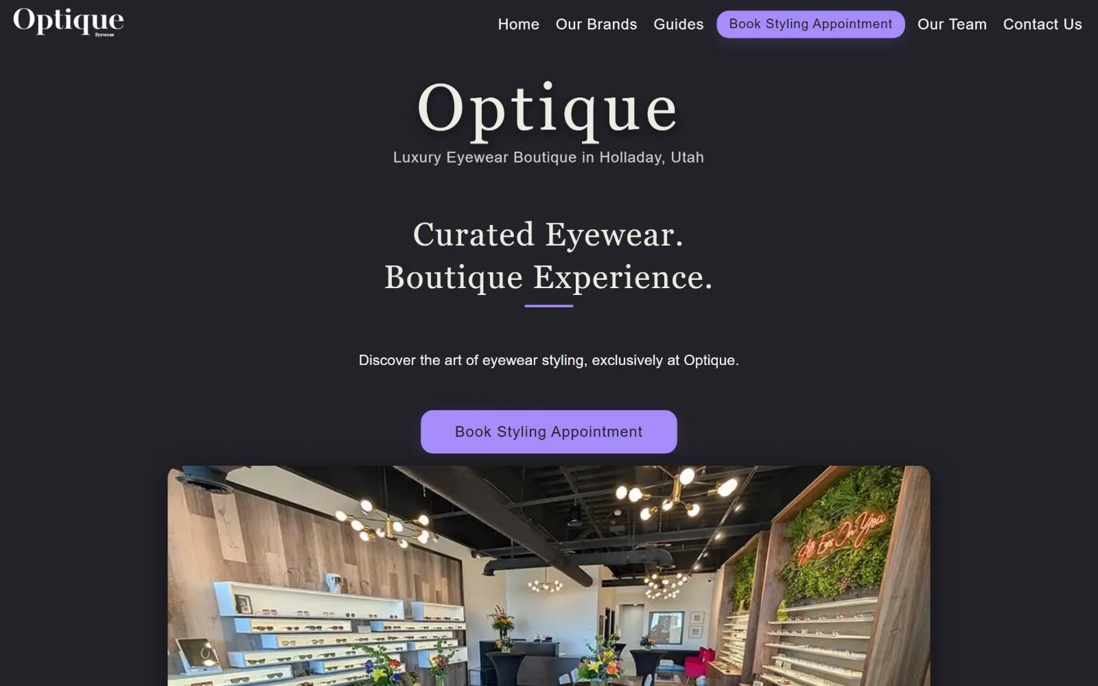
A near-black page with a serif wordmark, the line Curated Eyewear. Boutique Experience. below it, a violet pill button and a rounded interior photo.
Type
Playfair Display 80px, weight 900, 0.08em
Body
Inter 20px, 1.7
Build
96px section padding, 3x257px grid
Made on
custom
Colour
#232129 #a78bfa #f9f8f7
Type. Playfair Display runs the wordmark at 80px in weight 900 at 0.08em, then returns at 40px regular at 0.04em for the headline, so the same serif does both the logotype and the message. Inter at 20px with 1.7 leading handles body and at 18px handles nav, which keeps the serif for voice and the sans for everything operational.
Colour. Only two fills are measured, a warm charcoal #232129 at 170.6 coverage and a violet #a78bfa at 1.1. Type runs in #f9f8f7 and a creamier #efece3 for headings, with a tan #d4c0a7 on 30 characters of secondary text. One accent, used twice, on a ground dark enough to make it glow.
Layout. The 1440px page uses 96px of section padding and a three-column grid of 257px cells with 40px gaps. Corner radius is 8px on the button and larger on the inset interior photograph, which is the only element not aligned to the dark ground. The header is not sticky.
The ask. Book Styling Appointment appears twice, as a violet pill in the nav row and again as a larger violet button in the centre of the page, with identical wording. Naming the booking as styling rather than as an exam positions the shop before it positions the clinic.
One accent at roughly one percent coverage reads as deliberate on a dark ground, where the same hue over a white page would look like a default link colour.
13
bozemanoptical.com
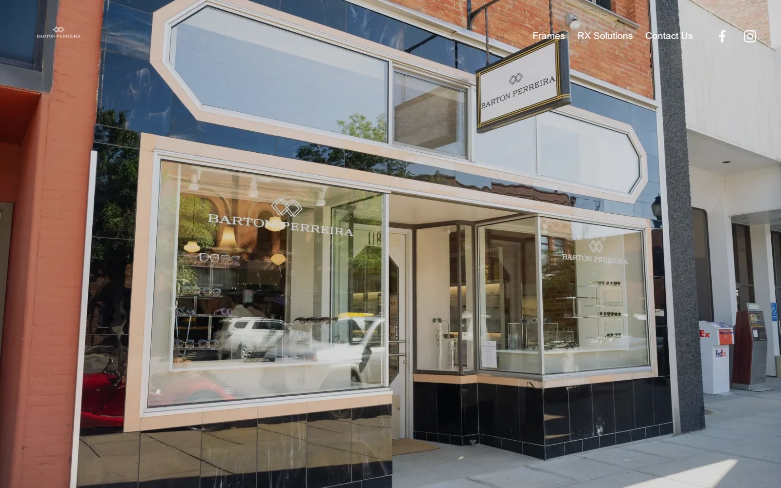
A full-bleed daylight photograph of a Barton Perreira storefront with angular white window frames, a tiny brand logo left and three nav words right.
Type. Helvetica Neue is the only face on the page. Nav runs 18px regular, body 14px at 1.8 leading and the button 14px medium at 0.02em. No display size is declared at all, which means the shopfront photograph is the headline and the type is reduced to labels. It is a confident omission rather than an oversight.
Colour. The measured fills are #ffffff at 200 coverage and #000000 at 150, with text in black and white only. The sole colour on the page is a tobacco #96694c on the button, which picks up the brickwork in the photograph. Everything else is daylight, glass and black tile from the image itself.
Layout. A Squarespace 1440px full-bleed image sits under a sticky header with no background band, so the nav floats over brick. Section padding is 134px, the underlying grid runs 26 columns with 11px gutters, and corner radius is zero. The document runs 4528px.
The ask. There is no hero call to action, no phone number and no booking button above the fold. Three nav items, Frames, RX Solutions and Contact Us, are the entire interface, with Contact carrying the whole conversion load.
Leading with a partner brand's storefront rather than your own logo is a positioning choice: it tells visitors what they will find inside before the name does.
14
anthonyaidenopticians.com
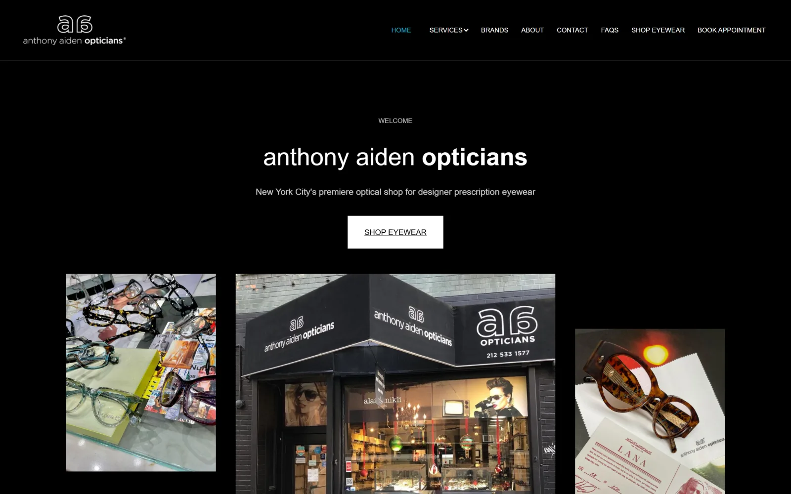
A pure black page: WELCOME in small caps, a lowercase wordmark where only opticians is bold, a white SHOP EYEWEAR block and three photos below.
Type
Work Sans 44px, weight 300 with bold inset
Body
Work Sans 16px, 1.63
Build
12-column grid, 36px gutters, sticky header
Made on
Webflow
Colour
#000000 #ffffff #15b1c3
Type. Work Sans at 44px in weight 300 sets the wordmark, with the single word opticians jumping to a heavier weight inside the same line, which is the only typographic emphasis on the page. Body sits at 16px with 1.63 leading and nav drops to 12px medium uppercase with 2.17 leading, so the nav row breathes more than the paragraph does.
Colour. Black covers 106.8 of the measured area and white barely 0.4, which is the ratio you would expect from a page that is ink-on-black rather than panelled. 292 characters run in white and just thirteen in a cyan #15b1c3, used only to mark the current nav item. One accent, thirteen characters.
Layout. A Webflow 1440px layout runs a 12-column grid with 36px gutters, dropping to a two-column 676px split for the wider image pair. Corner radius is zero, the header is sticky, and eight nav items sit on one row. The document runs 4793px.
The ask. One white SHOP EYEWEAR block sits in the hero, underlined, and BOOK APPOINTMENT is the last of eight nav items. Shopping is the promoted action and booking is the afterthought, which is an honest reflection of a shop that sells designer frames first.
Changing weight on one word inside a wordmark is enough emphasis on a black page, where any second accent would read as noise.
15
dvoptical.com
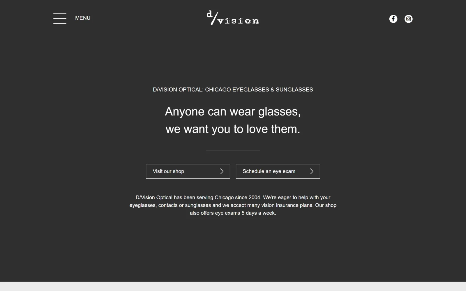
A charcoal page with a typewriter-style wordmark centred at the top, a two-line headline, a short rule and two outlined buttons side by side.
Type
Fira Sans Condensed 36px, weight 300
Body
Fira Sans 16px, 1.5
Build
1140px centred column, 79% of viewport
Made on
WordPress
Colour
#2f2f2f #ffffff #ebebeb
Type. Fira Sans Condensed at 36px in weight 300 carries the two-line headline, with Fira Sans at 16px for body and 17px uppercase for the eyebrow line above it. The condensed cut is used only at display size and the normal width only at text size, which is the correct way round and keeps the centred column narrow without crushing the paragraph.
Colour. Three fills: #ffffff at 121.5 coverage, a charcoal #2f2f2f at 48.4 and #ebebeb at 25.2. Hero text is white, the eyebrow is #999999 and lower sections run #333333 and #24292e. There is no accent colour anywhere, so the outlined buttons are defined by stroke rather than by fill.
Layout. The container is 1140px, or 79% of the viewport, which is the narrowest measured here and produces wide dark margins either side of a single centred column. MENU sits left as a hamburger, the wordmark centres, social icons go right. Corner radius is zero and the whole document is only 2084px.
The ask. Visit our shop and Schedule an eye exam sit side by side as identically weighted outlined boxes, each with a chevron. Giving retail and clinical the same visual weight is deliberate, and the short paragraph beneath names insurance acceptance and exam days rather than repeating the pitch.
Two equally weighted calls to action are defensible when the business genuinely has two front doors, but only if nothing else on the screen competes.
16
viewtopiaoptical.com
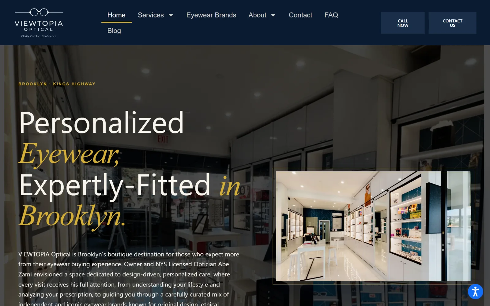
A navy header over a dimmed video of a bright shop interior, a four-line headline mixing white sans with gold italic serif, and an inset photo card.
Type
Plus Jakarta Sans 88px with gold italic serif
Body
Plus Jakarta Sans 18px, 1.65
Build
full-bleed video, two-row navy header, inset photo card
Made on
WordPress
Colour
#f7f4ed #0b1b32 #1a2e4a
Type. Plus Jakarta Sans at 88px with 1.0 leading sets Personalized and Expertly-Fitted, while Eyewear, in and Brooklyn. drop into a gold italic serif at the same size, so two faces alternate within one sentence. Body runs 18px at 1.65 and an 11px eyebrow is tracked out to 0.22em, which gives the stack three clear tiers.
Colour. White at 100 coverage and a cream #f7f4ed at 32.2 carry the type, over a navy #0b1b32 at 7.4 and a lighter #1a2e4a at 1.4 on the buttons. The gold in the italic lines and the BROOKLYN eyebrow is the only warm value, and it is used on roughly a third of the headline rather than as a trim.
Layout. A full-bleed 1440px video sits beneath a navy header deep enough to hold two stacked nav rows, with Blog dropping to a second line. The headline is pushed hard left and an inset photograph with a thin border is laid over the video at right, which is the only card-like element on the page. Radius is zero.
The ask. CALL NOW and CONTACT US sit as two stacked blocks in the header, the phone number is live, and the hero itself carries no button. The named owner in the opening paragraph is doing the persuading instead, which suits a single-optician shop.
Alternating a sans and an italic serif inside one headline gives emphasis without a colour change, provided both sit at the same optical size.
How these were chosen
Twenty-two homepages went into this shortlist and sixteen came out, and the balance is not where you would expect. The retail opticians carry the page: shops that sell frames treat the homepage as a shop window, while the clinical practices lean on stock exam-room photography and template layouts, so the eyewear boutiques are over-represented here on merit. Across the keepers, the hero is usually a brand campaign, Jacques Marie Mage, Barton Perreira, IC Berlin, rather than a photograph of the practice, which is a decision about who the visitor thinks they are buying from before any copy is read. The pattern that does not hold is booking. Strong optometrist website design is normally described as a short run to the appointment button, and several of the best pages in this set put nothing of the kind above the fold.
Finding optometry sites that someone had actually designed took far longer than it should have. 38 candidates made the shortlist. 16 made the page.
Each one was opened and looked at properly: what the type is doing, where the colour gets spent, how the page is built, how it asks for the job. Nothing is here because it ranks. Nothing is here because an agency filed it under portfolio. Several well known names were left out for the plain reason that their site came out of the same template as everyone else's, and a few sites worth including did not survive a second look.
Where a site is only competent, it says so. The order is the order worth your time, best first.
Reviewed and selected by Larry W. Matthews for Websitely.