What 16 Jewelers Know About Jewelry Store Website Design
Small objects, enormous photographs. Sixteen US jewelers, and the jewelry store website design decisions that keep a ring legible on a wide screen.
Shown
16 sites
Reviewed
41 candidates
Chosen on
The work, not the ranking
Updated
15 October 2026
01
pollywales.com
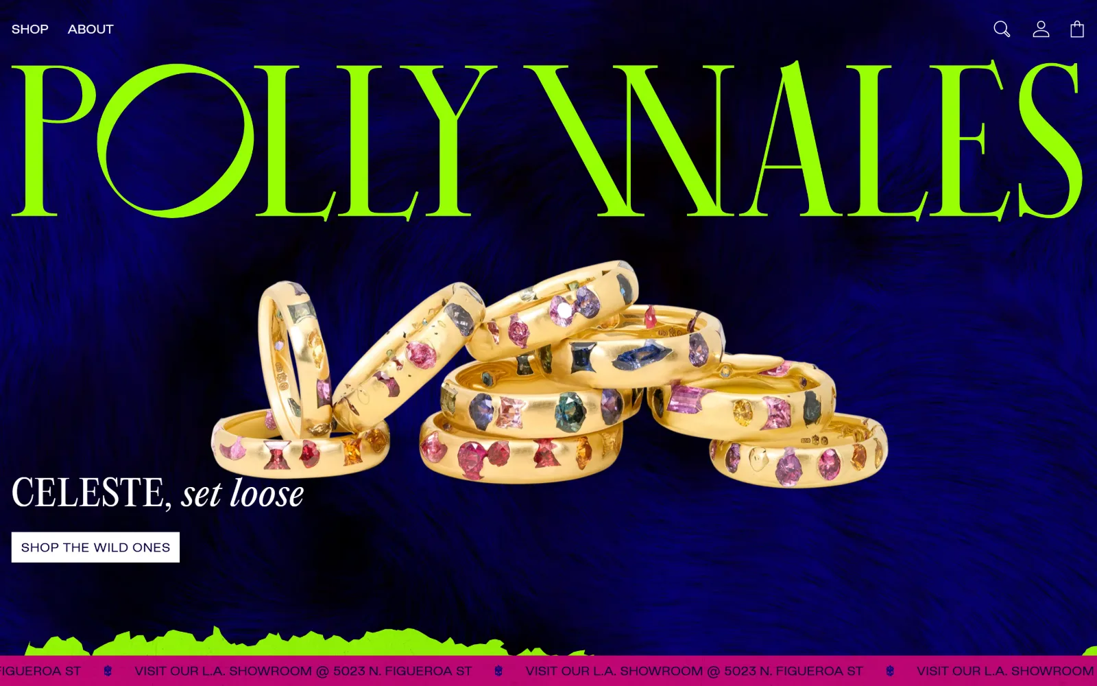
Acid-green display type runs the full width over a deep blue fur backdrop, with a stack of gem-studded gold bands piled beneath it.
Type
Editorial 70px / 1.05
Body
Editorial 31px / 1.25
Build
full-bleed video, 1440px container, 75px sections
Made on
Shopify
Colour
#08003d #99ff05 #ffffff
Type. The wordmark runs in Editorial at 70px, weight 400, no tracking, line height 1.05, filling the 1440px width edge to edge. Beneath it the campaign line sits at 46px in the same serif with 0.025em added. Nav drops all the way to 10px sans, a 60px gap between the loudest and quietest type on the page, and nothing is allowed in between.
Colour. Ink is #08003d, a near-black navy, carried across 657 characters, while the nav is set in #99ff05 acid green. Measured page ground is #ffffff at 53.6 percent with #f0f0f0 behind secondary blocks, so every saturated pixel on the fold is photographic: the blue fur, the green lettering, the magenta marquee at the base.
Layout. Container is the full 1440px viewport with no gutter, section padding 75px, radius 0 on the single white button. The hero is one video plane with type laid directly on it rather than inside a box, and a pink scrolling marquee is pinned to the bottom edge carrying the LA showroom street address.
The ask. One ask above the fold: SHOP THE WILD ONES, a white rectangle holding 15px uppercase Good Sans at 0.025em. Nav is four items. No phone number, no form, no appointment booking anywhere on the fold. The marquee repeats the street address instead of a call, which treats walking in as the quiet secondary action.
A single display face at 70px with the nav at 10px gives you hierarchy without a second typeface, and lets colour carry the shouting.
02
ericaweiner.com
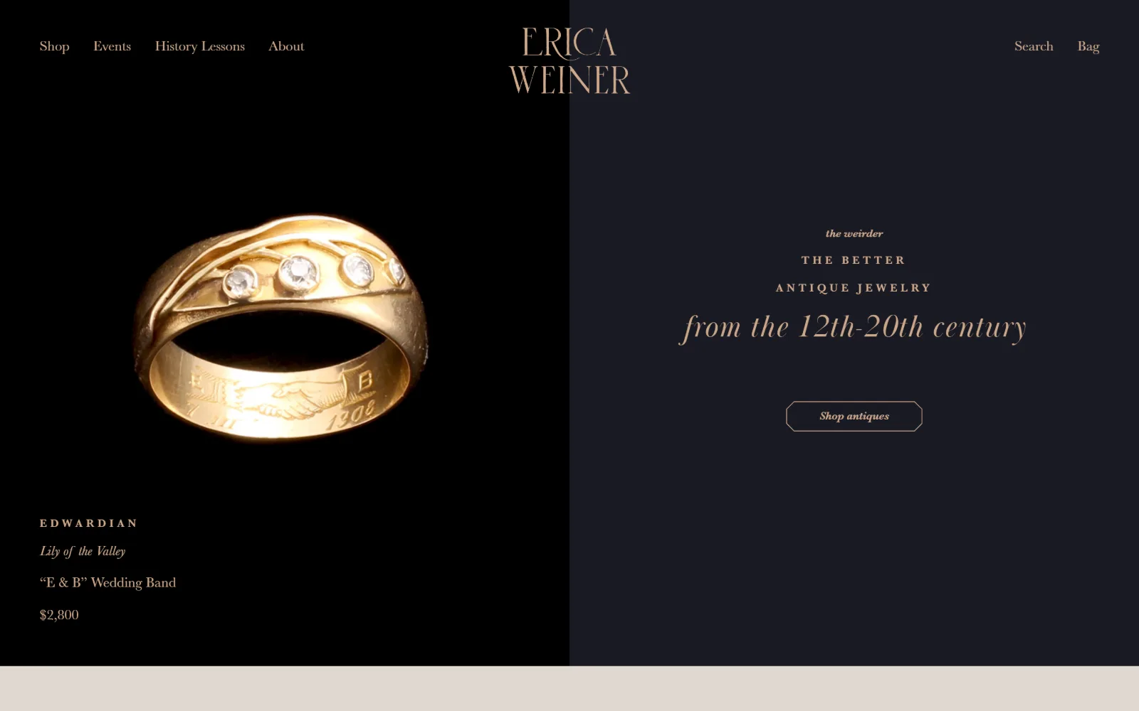
An Edwardian gold band photographed on black fills the left half, with cream and rose-gold text stacked on a near-black navy panel to the right.
Type
BaskervilleDisplayPT 40px italic, 0.03em
Body
MonotypeBaskerville 18px
Build
50/50 split, full-bleed photo left, 1440px
Made on
Shopify
Colour
#191a24 #cca789 #e0d8d0
Type. BaskervilleDisplayPT does the display work at 40px italic with 0.030em tracking, and the supporting lines step down to MonotypeBaskerville at 18px. A third register sits at 14px, weight 700, uppercase, with 0.300em letter-spacing, the widest tracking measured anywhere in this set. Three sizes, one family, and no sans face on the page at all.
Colour. Two grounds and one accent: #191a24 covers the page, a cooler #0b0c14 at 23.4 percent darkens the photographic panel, and #e0d8d0 at 53.2 percent lifts the band below the fold. Every heading is #cca789, a muted rose gold, across 149 characters. The ring itself supplies the only other colour on screen.
Layout. A hard vertical split at the full 1440px width, photograph left, type right, with no gutter between the two halves. Radius is 0. The product caption, era then name then price, is set bottom left inside the photograph rather than underneath it, so the hero doubles as a working product tile.
The ask. One button, Shop antiques, drawn as an outlined octagon rather than a rectangle. No measurable nav list, no phone, no newsletter capture. The price, $2,800, sits in the hero as plain text, which is a quiet way of qualifying a visitor before they have clicked anything.
Putting a real price in the hero filters visitors before the first click, which costs nothing and saves a browse through the whole catalogue.
03
toddreed.com
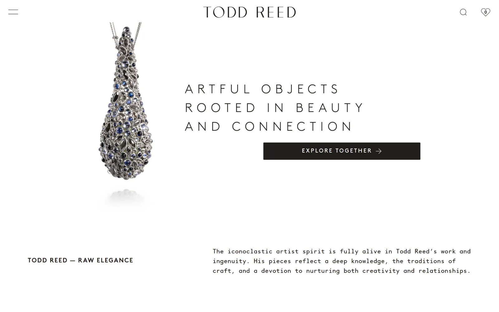
One silver pendant encrusted with moonstones floats on white at the left, with three lines of widely tracked uppercase and a black button right.
Type
BrownStd 36px uppercase, 0.35em
Body
BrownMono 18px / 1.56
Build
product left, type right, 1440px, 80px sections
Made on
Shopify
Colour
#211e1c #b8c9cc #dd4124
Type. BrownStd carries the headline at 36px, weight 300, uppercase, with 0.350em tracking across three lines at 1.50 line height, so the words read as an inscription rather than a sentence. Body switches to BrownMono at 18px with 1.56 leading, and the contrast between airy caps and a fixed-width paragraph is the entire type system.
Colour. Almost nothing is coloured: #b8c9cc, a pale blue-grey, covers 28 percent and #211e1c, a warm near-black, only 0.9. Ink is that same #211e1c across 297 characters, with #637675 for secondary notes and a single #dd4124 red appearing on 20 characters. The pendant provides the rest.
Layout. Product left, type right, both on white with no panel edge drawn between them. Container is the full 1440px, section padding 80px, and the content below runs on a three-column grid of 437px tracks with 40px gutters plus a 12-column grid underneath. Radius is 2px on the one button and 0 elsewhere.
The ask. A single black rectangle, EXPLORE TOGETHER, set 16px uppercase at 0.200em in white. Nav is two items plus a hamburger. No prices, no phone, no booking link. The ask is to look rather than to buy, which is the right ask for a maker selling one-of-a-kind work at unlisted prices.
Pair wide-tracked caps for display with a monospace for body and you get two distinct voices out of one typographic temperament.
04
oscarheyman.com
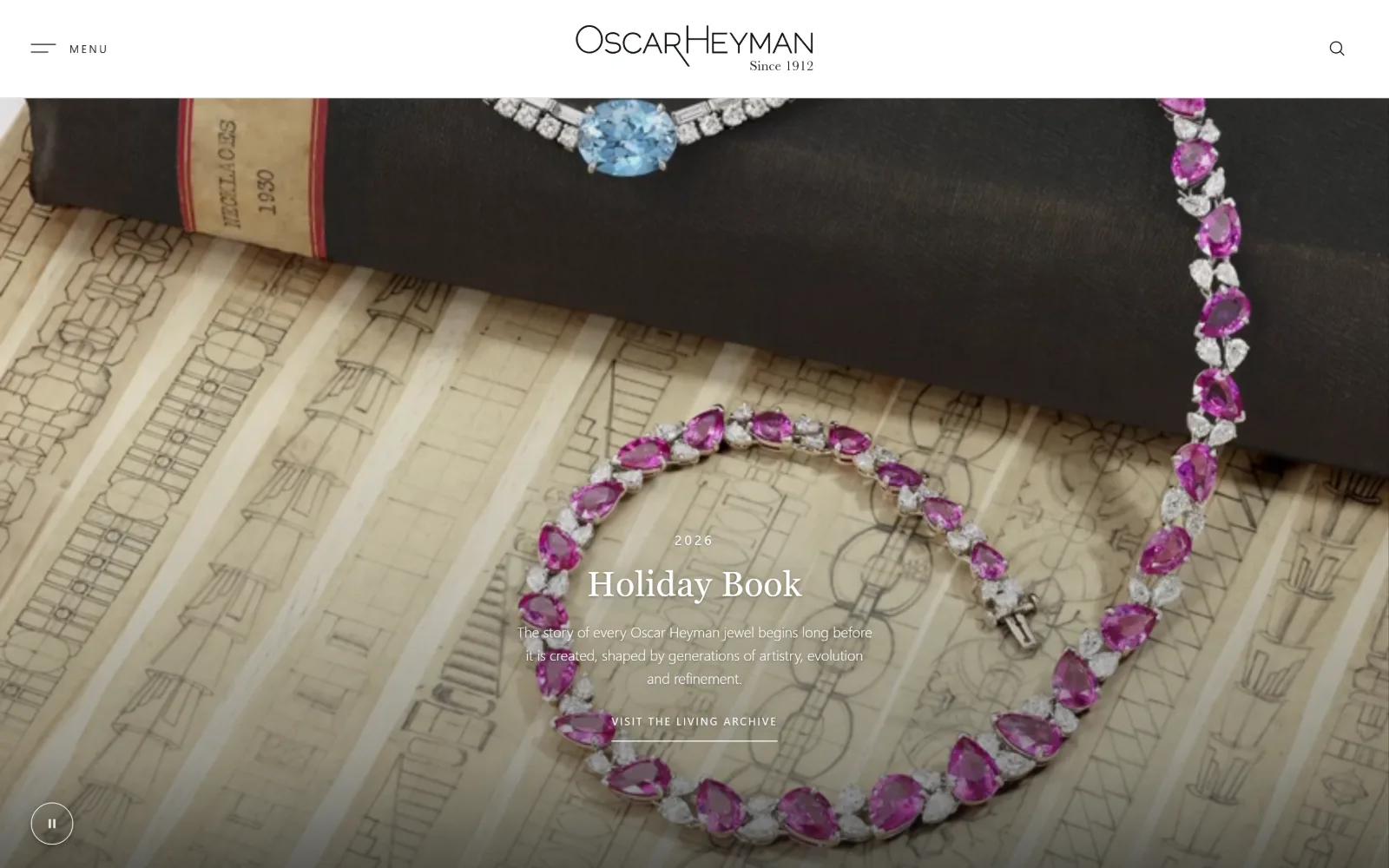
Pink sapphires and diamonds set in a bracelet lie across a 1930s design ledger, with a short centred title block and an underlined link over them.
Type
Libre Caslon Text 36px, 0.015em
Body
Karla 15px / 1.60
Build
full-bleed video, asymmetric 545/245/545 grid
Made on
Shopify
Colour
#101215 #ffffff #f5f5f5
Type. Libre Caslon Text sets Holiday Book at 36px with 0.015em in white; the supporting paragraph drops to Karla at 15px, weight 300, 1.60 line height. Nav takes a third family, Libre Baskerville at 25px uppercase with 0.160em tracking. Three families is a lot to carry, but the fold only ever shows two of them at once.
Colour. White ink over #101215, a near-black that also serves as the measured hero ground, with #f5f5f5 at 21.6 percent for the sections below. Two neutrals and the photograph, nothing else. The photograph carries all the saturation: hot pink sapphires, one aquamarine, and the aged graph paper under them.
Layout. Full-bleed video at 1440px with the title block centred low rather than on the optical centre, so the bracelet reads first and the words second. Below the fold a three-column grid runs asymmetric tracks of 545px, 245px and 545px with 20px gutters. Radius is 0 and a pause control sits bottom left.
The ask. VISIT THE LIVING ARCHIVE, underlined rather than boxed, is the only ask on the fold. No prices appear anywhere on the page, no phone, no cart badge. For a house that has sold through retailers since 1912 the archive is the product, and the link treats it as such.
Underlining the single call instead of boxing it keeps a dark cinematic hero intact while still marking exactly one next step.
05
foundrae.com
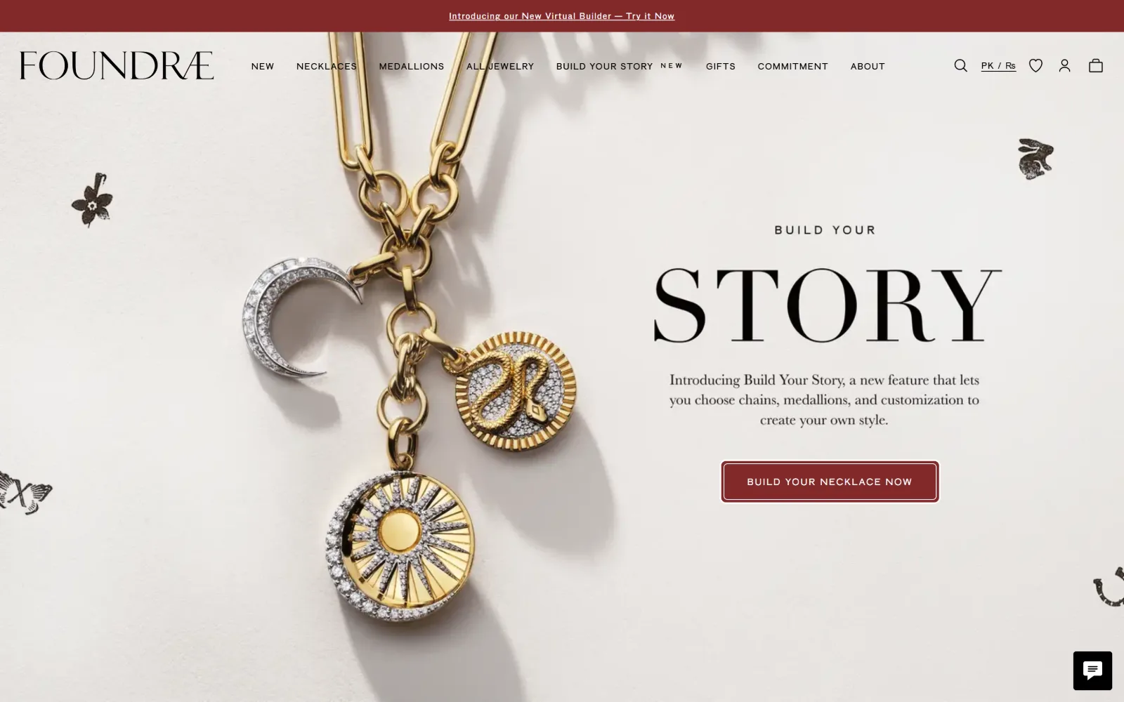
Gold medallions on a chain hang down the left of a pale stone ground, with BUILD YOUR STORY set large to the right above an oxblood button.
Type. Display is Baskerville at 30px with supporting copy at 22px, both the same serif, while every piece of interface type switches to A-Gothic at 12px, 11px and 10px with tracking from 0.091em up to 0.200em. The STORY line in the frame is far larger than any measured value, meaning it ships as artwork rather than as text.
Colour. One brand colour does all the work: #81292a oxblood at 9.5 percent coverage, on the announcement bar and on the single button. Ink is plain #000000 for 256 characters and #ffffff for 124. The ground is the photograph's own warm stone, so nothing on the fold competes with the red.
Layout. Full-bleed photograph at 1440px with the copy block right of centre, and small engraved motifs, a rabbit, a butterfly, a flower, scattered into the outer margins. Below it a six-column grid of 196px tracks with 32px gutters. Button radius is 8px, unusual in a set where almost everything is square.
The ask. BUILD YOUR NECKLACE NOW in 12px uppercase at 0.120em sits inside the oxblood button, and the same feature is announced again in the top bar and a third time in the nav. Three mentions of one tool is repetition rather than competition, and it is the only thing this fold asks for.
Repeating one call in the bar, the nav and the button converts better than three different calls fighting for the same space.
06
catbirdnyc.com
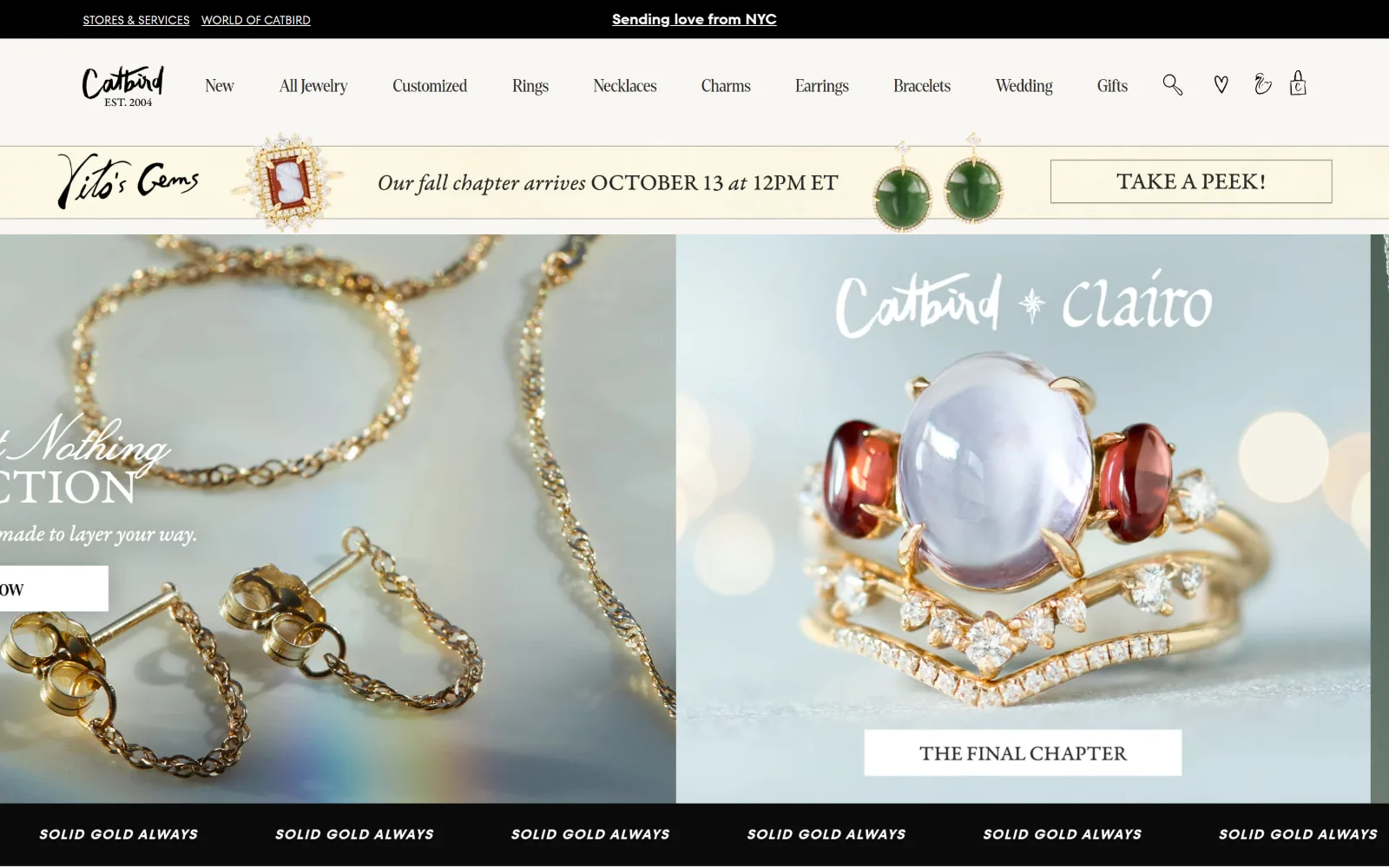
Two jewellery close-ups split the fold under a cream announcement strip, with a black SOLID GOLD ALWAYS marquee running along the bottom edge.
Type
Denton Condensed 32px
Body
TT Fors 15px
Build
two-panel hero, 10-item nav, bottom marquee
Made on
Not detected
Colour
#f9f7f3 #eef8ef #2a2a2a
Type. Denton Condensed carries headings at 32px and the nav at 18px on a loose 3.17 line height, while TT Fors handles interface from 14px to 18px. A script face, Lucia, appears at 56px for campaign lockups. Three families is a risk that holds because each has one job: index, interface, and handwriting.
Colour. Five measured values, more than any other site here: #ffffff at 57.9 percent, #f9f7f3 at 38.1, a mint #eef8ef at 13.6, and two near-blacks at #0b0b0b and #000000. Ink is #2a2a2a. The mint is the tell that this is a shop running several campaigns at once rather than one collection.
Layout. A ten-item nav sits on a single line under the wordmark, then a full-width promotional strip, then a two-panel hero split across 1440px. Button radius is 2px and the container takes the full viewport. The slider was mid-transition when captured, so the left panel's headline is clipped at the viewport edge.
The ask. Several asks compete: a top-bar link, TAKE A PEEK on the strip, a clipped button on the left panel and THE FINAL CHAPTER on the right. Nav runs to ten items. This is a busy retailer rather than a single-collection brand, and the page does not pretend otherwise.
Ten nav items and four competing calls stay usable when each one differs in weight, colour and shape rather than repeating a button style.
07
jewelsbygrace.com
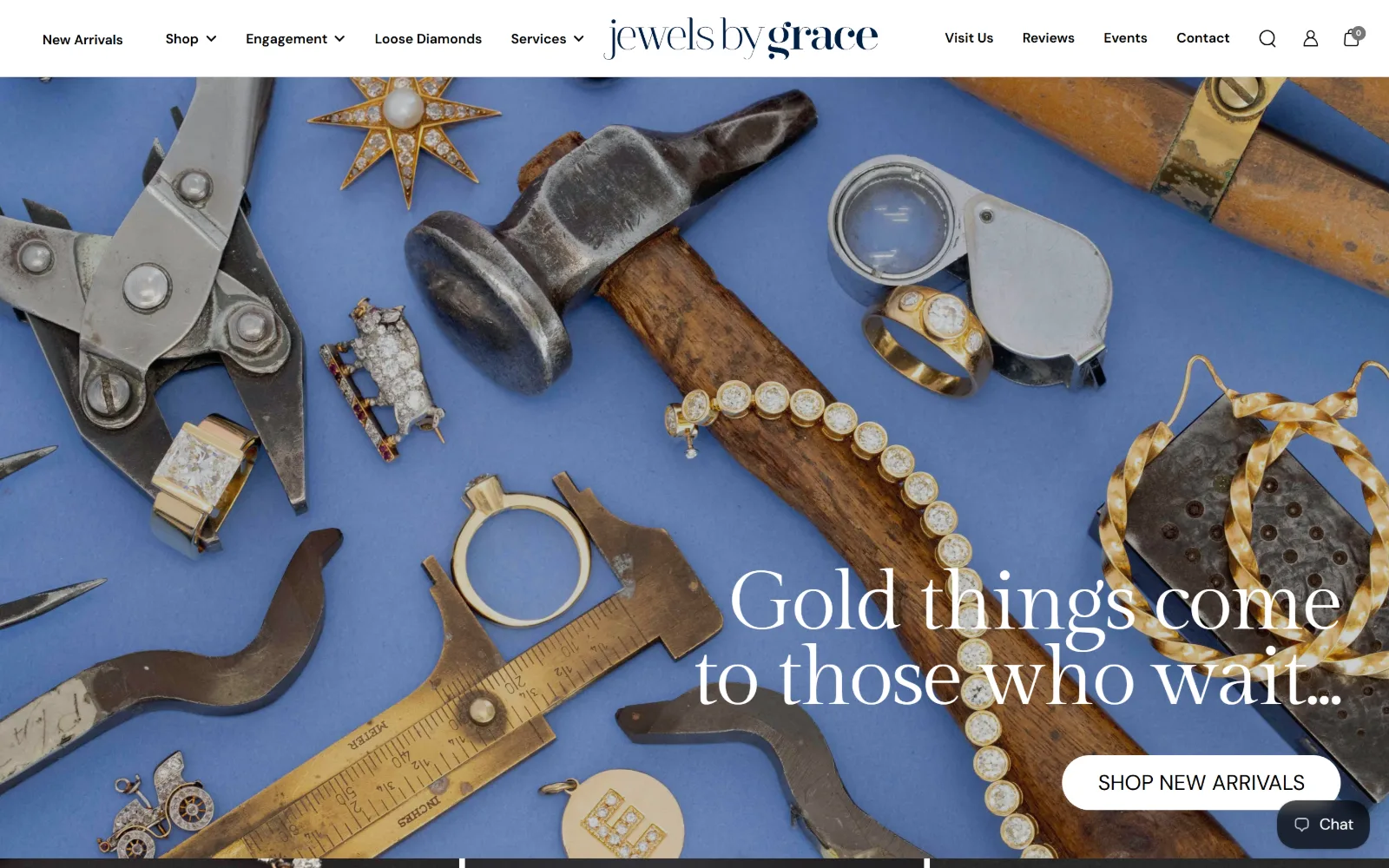
Bench tools, calipers and a hammer lie on cornflower blue paper scattered with antique jewels, with a serif line and a white pill button at right.
Type
Gilda Display 65px, -0.03em
Body
DM Sans 14px
Build
full-bleed photo, 576/283/480 grid, 120px pill
Made on
Shopify
Colour
#ffffff #000000 #757575
Type. DM Sans runs the whole interface: nav at 14px weight 600, labels at 22px uppercase, and one enormous 103px weight 200 figure further down. The hero line is the exception, Gilda Display at 65px with -0.030em tracking, so the serif appears once and reads as the voice while the sans stays out of its way.
Colour. Measured ground is #ffffff with #757575 for secondary text and black ink across 119 characters. Nothing is branded in the CSS. The cornflower blue of the photographic backdrop is the only strong colour on the fold and it lives in the picture, which is why the interface can afford to stay plain.
Layout. Full-bleed photograph at the 1440px viewport, headline and button at lower right, a five-item nav split either side of a centred wordmark. Below it a three-column grid of uneven 576px, 283px and 480px tracks with 20px gutters. Button radius is 120px, a true pill, against 0 everywhere else.
The ask. SHOP NEW ARRIVALS in a white pill is the single fold ask, with Visit Us, Reviews, Events and Contact carried in the nav instead. Prices run from $9,950 to $189,000 below. A chat tab sits bottom right. Scarcity does the selling: the line promises waiting, not stock.
Let the photograph supply the brand colour and the interface palette can stay neutral, which stops the chrome fighting the product imagery.
08
verdura.com
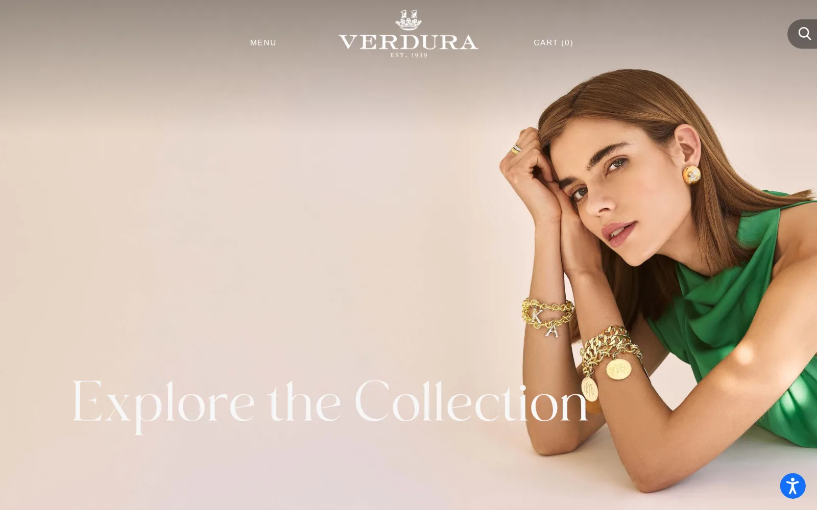
Emerald silk, charm bracelets and a gold earring on a model resting on her hands, with Explore the Collection in a wide ligatured script lower left.
Type
MollieGlaston 76px
Body
Montserrat 12px / 1.80
Build
full-bleed photo, sticky 3-item header, no CTA
Made on
Shopify
Colour
#000000 #ffffff
Type. MollieGlaston sets the hero at 76px with the letters spaced far apart to span most of the width, stepping down to 58px and 23px for secondary lines. Everything else is Montserrat at 14px uppercase with 0.100em tracking, used 33 times, plus 12px for paragraphs. One expressive serif, one neutral sans, no middle register.
Colour. Measured CSS colour is close to nil, #000000 at 0.1 percent coverage, with ink splitting between black for 481 characters and white for 267. The photograph's own gradient backdrop, pink into cream, serves as the page ground, and the emerald dress is the only saturated note on the fold.
Layout. The photograph fills the full 1440px viewport with a sticky three-item header laid over it: MENU left, wordmark centred, CART right. No container inset, no panel, no radius. The hero line sits low enough that it crosses the model's forearm rather than clearing her entirely.
The ask. No button at all on the fold. The only ask is the script line itself, Explore the Collection, which is not marked as a link. Nav is three items and the cart count reads zero. A house founded in 1939 is relying on the name to carry the visitor, which it can afford to do.
A hero with no button only works when the name already sells; without that recognition the visitor has nothing to click and leaves.
09
sidneygarber.com
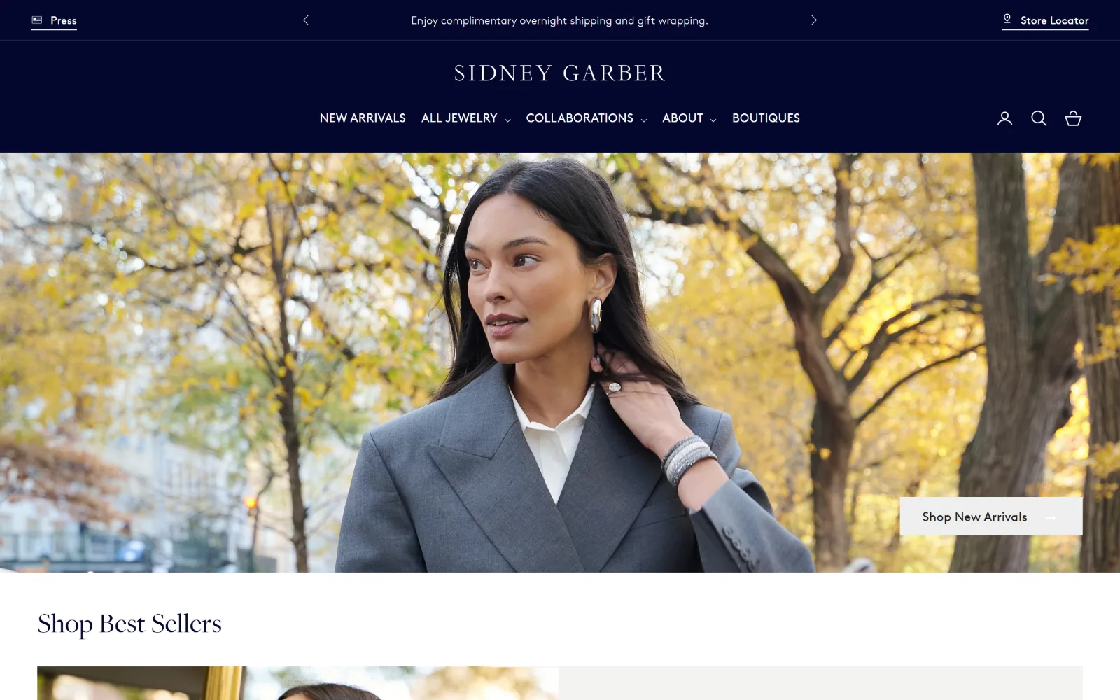
Deep navy header with a centred wordmark above an autumn street portrait, and a white Shop New Arrivals tab tucked into the right-hand edge.
Type
FreightBig-Pro 36px / 1.40
Body
Brown 16px / 1.65
Build
deep stacked header, full-bleed photo, 1344px content
Made on
Shopify
Colour
#04072c #ffffff #f4f4f2
Type. FreightBig-Pro sets headings at 36px, weight 300, 0.010em, 1.40, and Brown handles everything else at 16px: nav uppercase at weight 500, body at 400 on 1.65 line height across 478 characters. A two-family system with one size for all interface type, which is the reason the page reads as calm rather than busy.
Colour. Three values do the work: #ffffff ground, #04072c navy at 48.4 percent coverage, and #f4f4f2 at 34.8 for alternating bands. The navy is both header background and heading ink, 286 characters of it. #1c1c1c appears on 17 characters only. The yellow foliage in the photograph is the sole warm note.
Layout. The header is deep, carrying an announcement row, a centred wordmark and a five-item nav on three stacked lines before the image starts. The photograph below runs full bleed to 1440px. Section padding is 40px and the grids include a 1344px content track and two-column 672px splits. Radius 0.
The ask. One ask on the fold, Shop New Arrivals, set in a white tab anchored to the right edge rather than centred over the image. Store Locator and a Press link sit in the top bar. Prices from $9,100 to $13,500 appear below. Nothing is placed where it could compete with that single tab.
Anchoring the call to the edge of a photograph instead of its centre leaves the image intact and still puts the click where the eye exits.
10
erstwhilejewelry.com
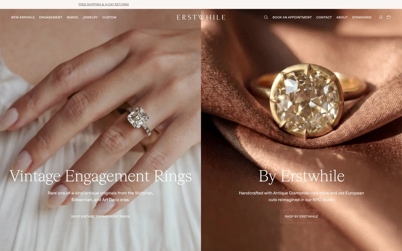
Two photographs split the screen, a hand wearing a vintage solitaire on the left and a yellow diamond on copper silk on the right, each captioned.
Type
HW Cigars 56px
Body
HAL Four Grotesk 11px, 0.04em
Build
exact 50/50 photo split, 1440px, no gutter
Made on
Shopify
Colour
#564a3b #ffffff #f8f5f1
Type. HW Cigars sets both hero titles at 56px, weight 300, no tracking, in white, with a 32px step below. All interface drops to HAL Four Grotesk at 11px and 10px uppercase with 0.040em. The gap between 56px and 11px is severe, and it means the two titles are the only things the eye can land on.
Colour. #ffffff at full coverage and #564a3b, a warm brown pulled from the right-hand photograph, at 50 percent, plus #f8f5f1 at 23.5 for the sections below. Ink is white on the hero, then #6b6763 and #49443e underneath. The copper silk is doing the colour work for the whole brand.
Layout. An exact 50/50 split across 1440px with no gutter, each half carrying its own title, two-line subtitle and outlined button on a shared baseline. The header is a single row with a five-item left nav and four utility links right. Radius 0. The symmetry is the structure, not a decoration on it.
The ask. Two asks of equal weight, SHOP VINTAGE ENGAGEMENT RINGS and SHOP BY ERSTWHILE, in matching outlined rectangles. BOOK AN APPOINTMENT and CONTACT sit in the header above. Splitting the fold between antique and in-house poses a sorting question rather than staging a competition.
When a brand genuinely sells two different things, a symmetrical split lets visitors sort themselves instead of guessing which one to feature.
11
commonera.com
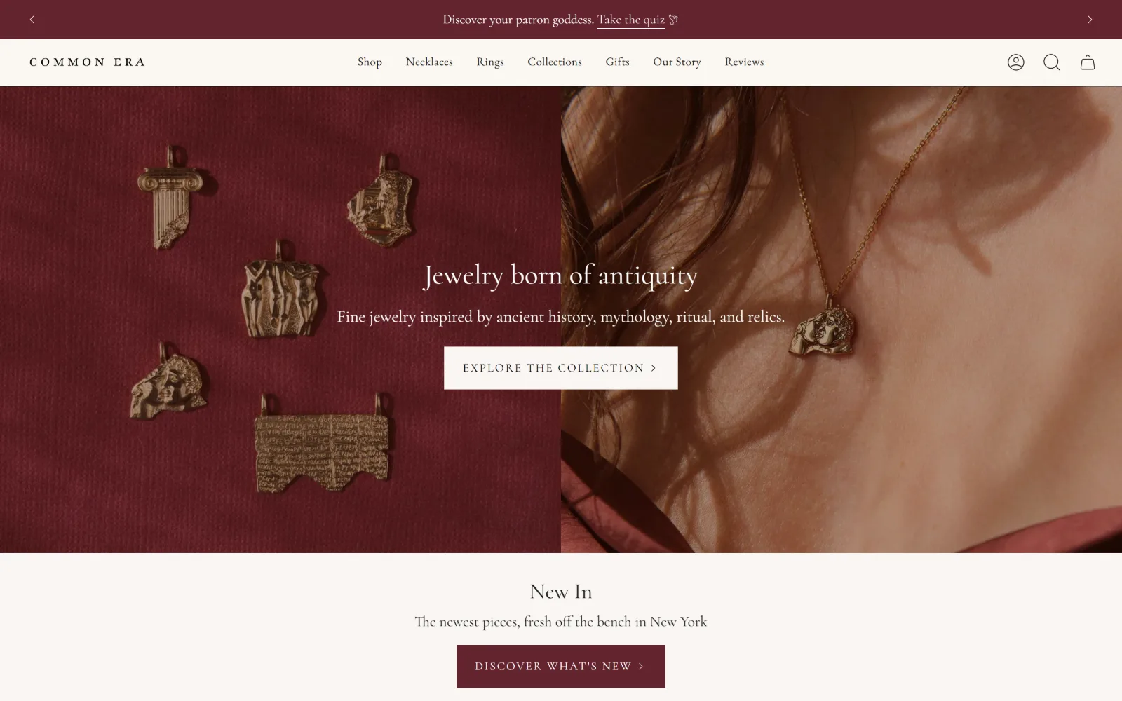
Gold pendants cast from antiquity lie on oxblood velvet at left while a sunlit neck wears one at right, a centred serif line between the panels.
Type
Cormorant 36px
Body
Cormorant 19px
Build
two-panel split, CTA over the seam, 33px sections
Made on
Shopify
Colour
#f9f6f2 #64242f #330d02
Type. Cormorant does nearly all of it: 36px for the hero line, 21px for the subtitle, 19px used 41 times through the body, 16px for smaller labels. EB Garamond takes the nav at 19px with 0.025em. Two old-style serifs and no sans at all, which suits a brand casting its product from Roman reliefs.
Colour. Four measured values: warm paper #f9f6f2 at 170 percent coverage, #64242f oxblood at 50 percent on the announcement bar and the lower button, #330d02 deep brown at 33, and #fbf7f2. Ink splits between #212121, a #493518 brown and white. The oxblood is the only saturated value and it is used twice.
Layout. Two photographic panels split the 1440px viewport, with the headline, subtitle and button set across the seam rather than inside either one. Section padding is 33px and radius is 0. The announcement bar carries arrows for a rotating message. No container inset is applied anywhere on the page.
The ask. EXPLORE THE COLLECTION in a white box over the seam, then DISCOVER WHAT'S NEW in oxblood immediately below the fold. A quiz is offered in the top bar. Three asks inside the first two screens, but stacked in order of commitment rather than placed side by side to compete.
Setting the call across the seam of a two-panel hero ties both images to one action instead of implying each panel is separately clickable.
12
brentneale.com
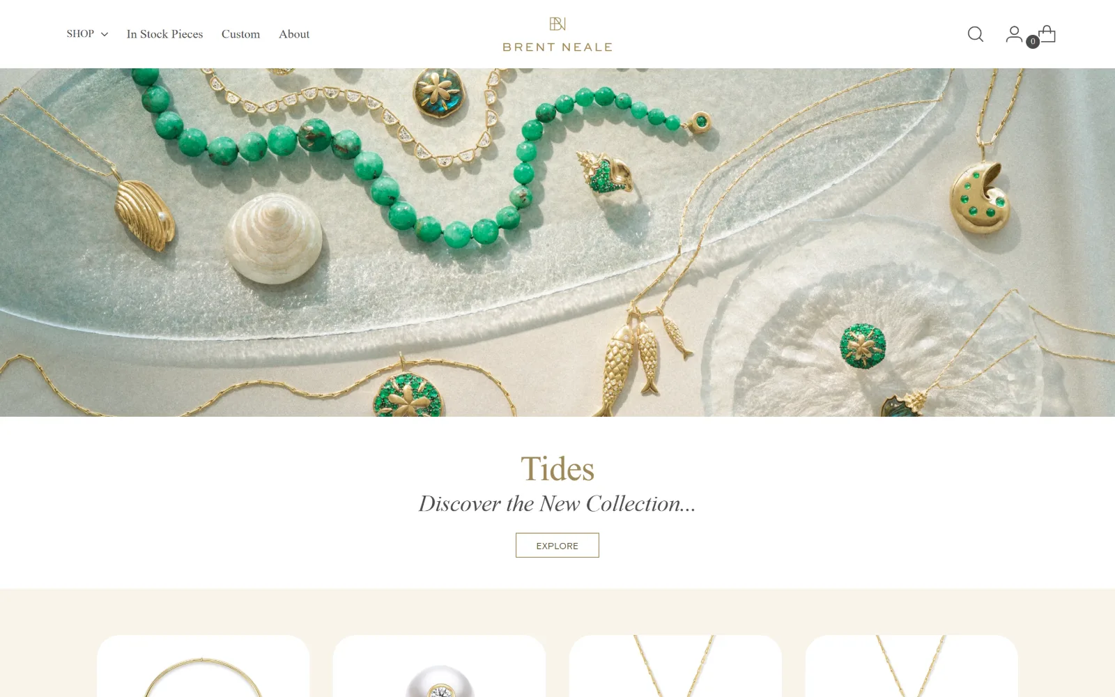
Green chrysoprase beads and gold charms lie on a frosted glass dish, with Tides and an outlined Explore button on cream below the photograph.
Type
garamond-premier-pro-display 45px, -0.01em
Body
Garamond 16px
Build
half-height photo band, 565/140/565 grid
Made on
Shopify
Colour
#ffffff #f8f4eb #4a4a4a
Type. garamond-premier-pro-display sets Tides at 45px, weight 300, -0.010em, with the subtitle at 38px italic and body at 16px used seven times. Labels switch to basis-grotesque-regular-pro at 12px uppercase with 0.040em. The Garamond handles display and nav both, which is unusual and keeps one voice throughout.
Colour. #ffffff carries most of the page with #f8f4eb, a warm cream, at 27.1 percent behind the product row. Ink is #4a4a4a grey rather than black across 220 characters, with #9d8858 and #625332 gold-browns for labels. Soft grey ink is the real decision: nothing on this page sits at full contrast.
Layout. The photograph is a full-bleed band roughly half the fold deep rather than a full-height hero, so the collection title and button land on cream beneath it. A three-column grid of 565px, 140px and 565px creates a deliberately empty centre track. Container 1440px, radius 0 on the product tiles.
The ask. EXPLORE, an outlined rectangle, is the single ask and it sits below the image rather than on top of it. Nav is four items, one with a dropdown. No prices on the fold, no phone, no booking. Shortening the hero to make room for the button is the entire conversion strategy here.
A half-height hero that puts the button on clean ground below reads faster than white type struggling against a busy photograph.
13
vrai.com
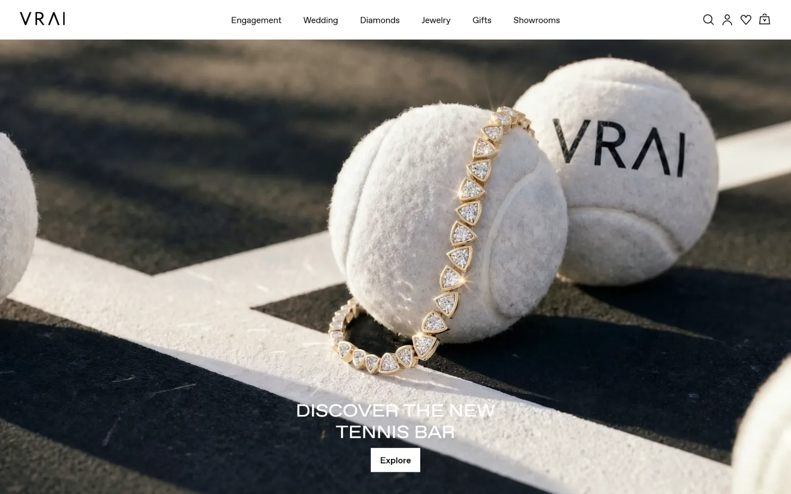
Diamonds set in a gold bracelet drape over two tennis balls on a court line in low sun, with the title and an Explore button centred near the base.
Type
mendesHeadingFont 32px uppercase
Body
mendesBodyFont 16px, -0.063em
Build
full-bleed photo, sticky 6-item header, no grid
Made on
Shopify
Colour
#ffffff #000000
Type. mendesHeadingFont sets the hero at 32px uppercase in white, small for a full-bleed photograph and reading as a label rather than a headline. Nav and buttons share mendesBodyFont at 16px, the nav at weight 350 with -0.063em tracking, tight enough to be noticeable, and the buttons at weight 500.
Colour. One measured value, #ffffff, at 104 percent coverage, with ink black across 128 characters and white across 30. There is no brand colour in the CSS whatsoever. The photograph supplies the entire palette: cream felt, warm low sun, and the black and white of the court surface.
Layout. Full-bleed photograph at the 1440px viewport under a sticky white header with a six-item nav and four utility icons. No grid, no container inset, radius 0. The title and button sit centred low, around the bottom third, leaving the bracelet to occupy the optical centre of the frame.
The ask. Explore, a white rectangle, is the single ask. Showrooms sits in the nav alongside Engagement and Wedding, so the funnel splits by occasion rather than by product type. No prices, no phone, no chat widget. One button over a photograph that is already making the argument.
A visual pun can do the positioning work a headline would need, which lets the title shrink to 32px and stay out of the picture's way.
14
gembreakfast.com
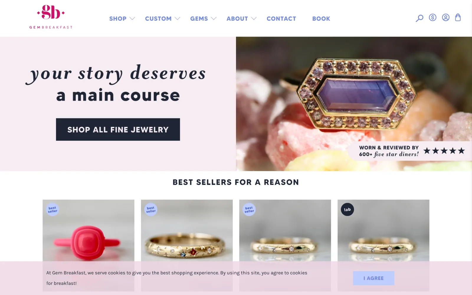
Script and bold sans headline on a pale pink panel sit left of a ring shot on raw crystals, above a best-seller row and a pink cookie bar.
Type. KarlaRegular handles body at 15px on a loose 2.10 line height, while MadeTommyBold takes nav and buttons at 18px and 15px uppercase with 0.056em and 0.050em. The hero pairs a script with a heavy geometric sans across two lines, the one place on the page where a display voice is allowed.
Colour. Four values: #ffffff at 104 percent, #eed4e3 pale pink at 5.7, #1e2535 navy at 1.2 and #bfcdff periwinkle at 0.2. Ink is #1e2535 across 426 characters with #637cf6 and #738add blues for links and nav. Pink ground, navy ink, blue links, and the gemstone photography fills in the rest.
Layout. The fold splits roughly in half between a flat pink panel and a photograph, with the button inside the pink half on solid ground. Section padding is 39px and radius is 0 throughout, buttons included. Five flex rows carry the product strip below. Container takes the full 1440px.
The ask. SHOP ALL FINE JEWELRY in a navy rectangle is the main ask, with a five-star review badge placed inside the photograph beside it and a BOOK item in the nav. A pink cookie bar covers the lower product row. Social proof sitting in the image rather than below it is the smart move.
Putting a flat colour panel beside the photograph gives the button clean ground, so it never needs a scrim or a drop shadow to stay legible.
15
sarahhendler.com
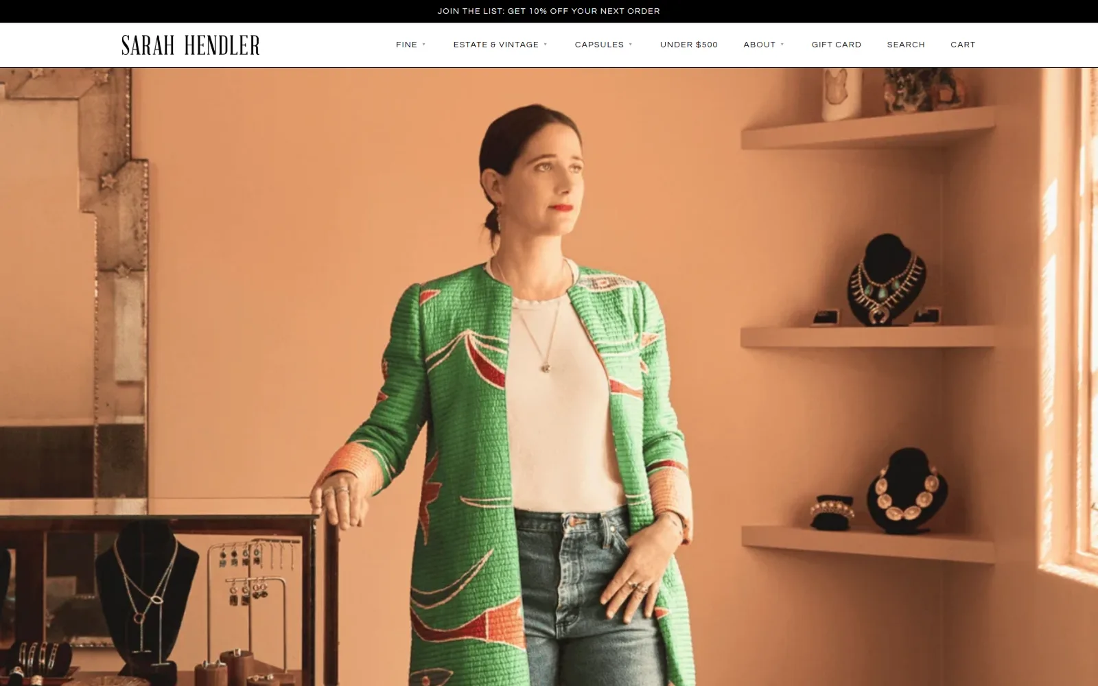
Peach walls, floating shelves of necklaces on black busts, and the owner standing centre in a green and red brocade coat over white jeans.
Type
Cabin 28px
Body
Questrial 11px, 0.089em
Build
1180px container, full-width photo band
Made on
Shopify
Colour
#ffffff #000000
Type. Only three registers are measured: Cabin at 28px for section titles, Questrial at 13px bold uppercase with 0.078em, and Questrial at 11px uppercase with 0.089em used nine times. Nothing on this page is large. Nav and wordmark sit at the same weight, so the header reads as a single line of small caps.
Colour. Two values, #ffffff at 21.6 percent and #000000 at 8.5, with ink split 92 characters black and 77 white. The CSS is monochrome. Every colour on the fold, the peach wall, the green coat, the red brocade detail, is photographic, which is a deliberate way of letting one image set the mood.
Layout. Container narrows to 1180px, 82 percent of the viewport, the only inset container in this set. The photograph runs as a full-width band under a single header row carrying the wordmark left and a seven-item nav right. Radius 0, no grid measured, and no section padding declared at all.
The ask. Nothing on the fold asks for anything. The top bar offers 10 percent off for joining the list, and UNDER $500 sits in the nav as a price filter. No button, no phone, no booking. The portrait is the pitch: there is a person, she has a shop, and the shop is behind her.
An owner portrait shot in the real shop does what a mission statement cannot, and it needs no overlay type to make the point stick.
16
sofiakaman.com
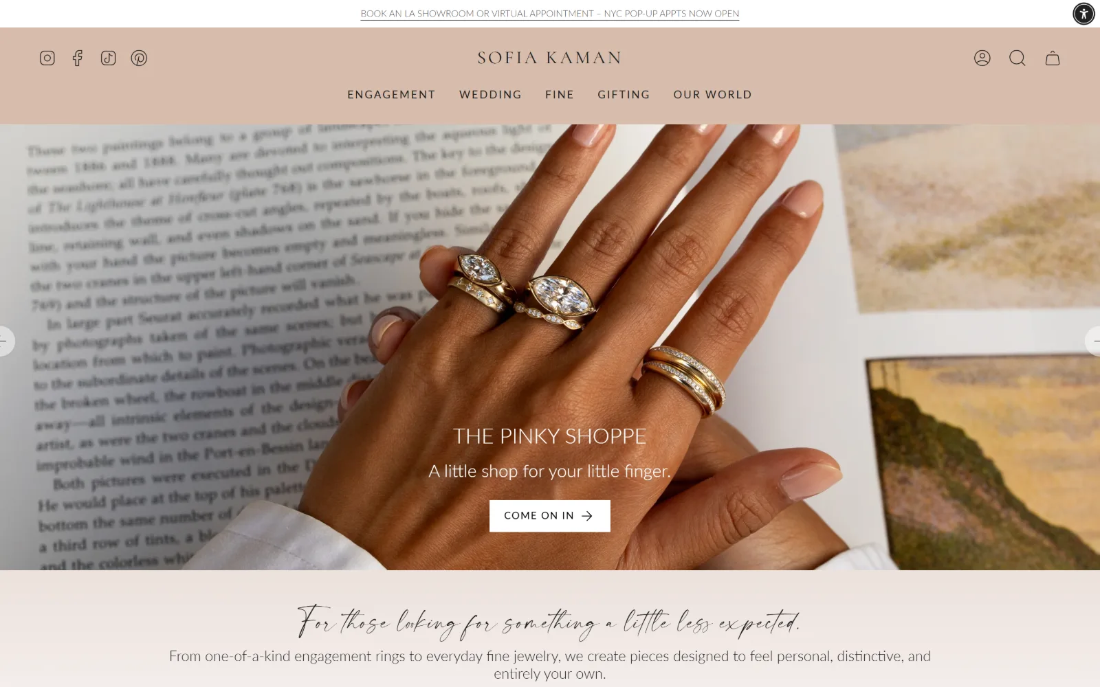
Three diamond rings on a hand resting over an open book about Seurat, with The Pinky Shoppe and a white Come On In button centred below.
Type
Cormorant 52px
Body
Lato 19px
Build
deep stacked header, full-bleed slider, 10,231px page
Made on
Shopify
Colour
#ffffff #212121 #545454
Type. Cormorant sets the largest line at 52px weight 300, with a 24px uppercase at 0.120em under it, while Lato carries everything else: 19px body at weight 300, and 16px uppercase used 100 times across 2,707 characters. A script, Modernline, appears at 28px for the tagline. Three voices, clearly ranked.
Colour. Measured ground is pure #ffffff, with a dusty pink header band coming from the theme rather than the palette. Ink is black across 2,717 characters, #212121 across 766 and #545454 for fine print. There is no accent colour declared, so the pink band and the photograph carry all the warmth.
Layout. The header is deep: an announcement line, then a pink band holding four social icons left, the wordmark centred, and five nav items on a second row. The photograph runs full bleed below with slider arrows at both edges. Section padding is 40px, container 1440px, radius 0.
The ask. COME ON IN, a white rectangle, is the fold ask, with appointment booking in the top line and a Forbes mention further down. Prices run from $1,600 to $45,000. The document is 10,231px tall, the longest measured here, so this homepage is doing catalogue work as well as brand work.
A long homepage can carry brand and catalogue together provided the fold keeps one button and the depth is reserved for product below it.
How these were chosen
Sixteen American jewellers, and the thing they agree on is that the photograph is the palette. Eleven carry two or three measured colour values and no brand accent at all, leaving the gemstone, the velvet or the studio wall to supply every saturated pixel, and corner radius is 0 on almost all of them. What does not hold is the idea that jewelry store website design means a quiet serif on cream: one opens with acid-green type on blue fur, one with a bracelet draped over tennis balls, one with bench tools on cornflower paper. The real division is between the houses asking you to look, which carry no button above the fold at all, and the shops asking you to sort yourself, which split the hero in two and label each half. A price appears in the fold on three of them, and each time it works as a filter rather than a pitch.
Finding jewelry sites that someone had actually designed took far longer than it should have. 41 candidates made the shortlist. 16 made the page.
Each one was opened and looked at properly: what the type is doing, where the colour gets spent, how the page is built, how it asks for the job. Nothing is here because it ranks. Nothing is here because an agency filed it under portfolio. Several well known names were left out for the plain reason that their site came out of the same template as everyone else's, and a few sites worth including did not survive a second look.
Where a site is only competent, it says so. The order is the order worth your time, best first.
Reviewed and selected by Larry W. Matthews for Websitely.