Ecommerce Website Design in 2026: 14 Stores That Sell
Fourteen US stores where the product does the talking. Ecommerce website design judged on the first screen, the type, and how fast you reach the cart.
Shown
14 sites
Reviewed
59 candidates
Chosen on
The work, not the ranking
Updated
15 October 2026
01
moscot.com
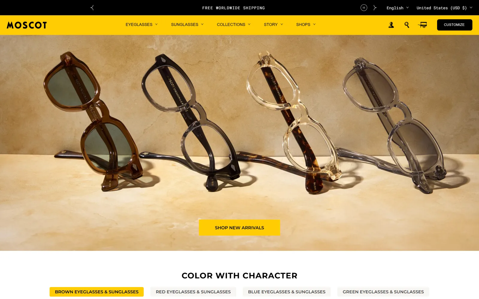
Saturated yellow fills the navigation bar above a sandstone hero where four pairs of frames lean over one Shop button.
Type
Montserrat 34px uppercase, 0.05em
Body
Montserrat 12px with Roboto Mono 12px for figures
Build
Full-bleed hero over a four column 334px product grid
Made on
Shopify
Colour
#ffcd03 #000000 #ffffff
Type. Montserrat does everything. The hero strapline runs 24px at 700 weight, uppercase, tracked to 0.042em, with a 34px uppercase line for section headings and 12px at 500 in the navigation. The surprise is Roboto Mono at 12px, used fifteen times for prices and product codes, which keeps the figures from reading as marketing copy.
Colour. Three colours carry the page: white #ffffff, a taxi yellow #ffcd03 and black #000000, with #f6f5f1 for quiet panels and #7c7c7c for rules. Yellow is not an accent, it is the entire header band, and it returns on the one hero button, so the eye learns that a single colour means buy. Black is held back for the Customize chip.
Layout. The container runs the full 1440px with 60px section padding and zero corner radius anywhere. Header height is about 110px across two bands, an announcement strip and the yellow nav. The hero is full bleed. Editorial below sits on a 212/847/325px three column split at an 8px gap, and product arrives on four columns of 334px tiles at 21px gaps.
The ask. The first Shop button lands roughly 760px down, centred in the hero, so the frames are seen before the ask. No price is visible above the fold; prices arrive in mono type further down. The cart stays a small icon rather than a slide-out shouting totals, and the announcement bar sells free worldwide shipping instead of a discount, with country and language pickers beside it.
One loud colour used for both the header band and every buy button teaches the eye where to click without a word of instruction.
02
ugmonk.com
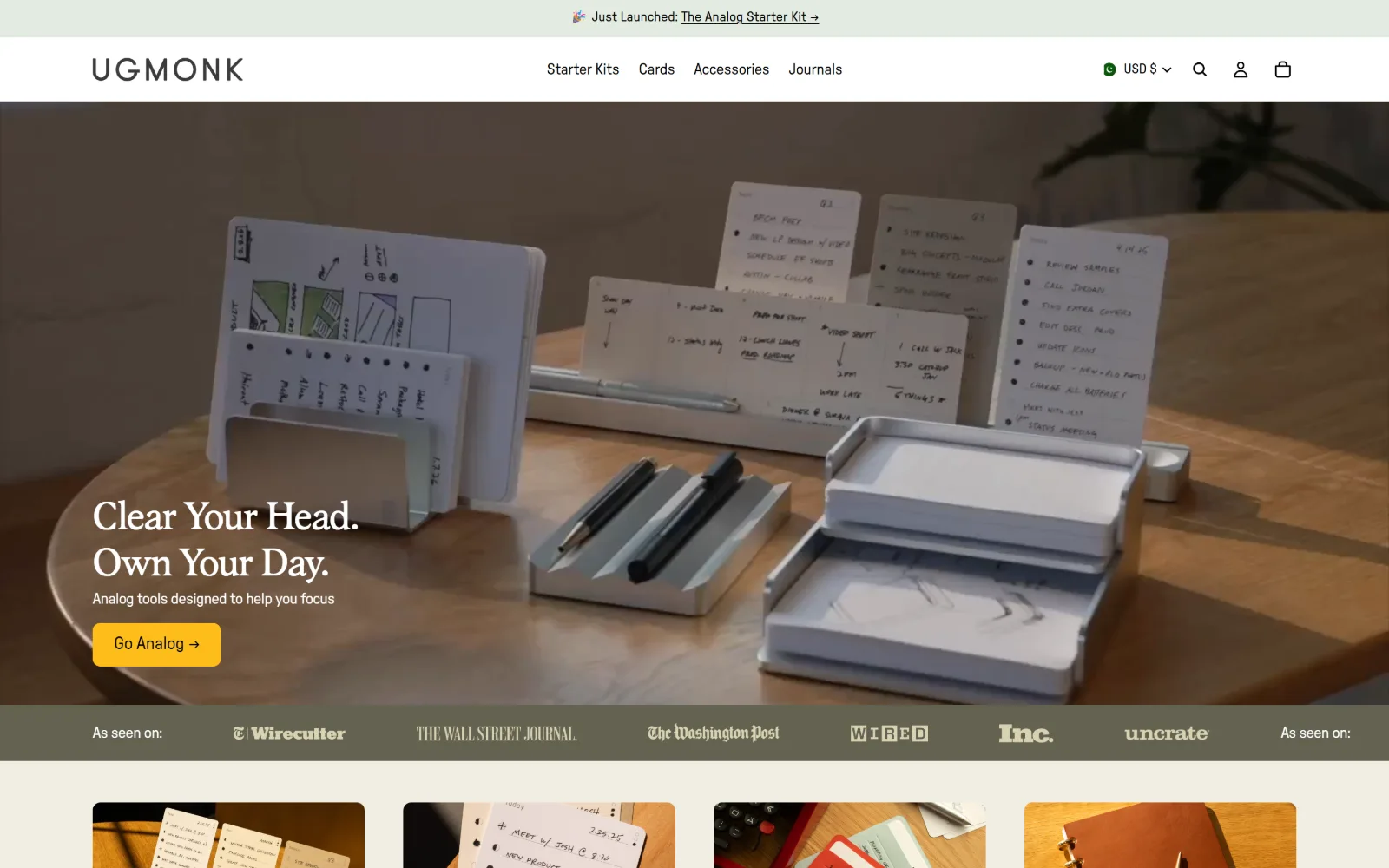
Desk cards and aluminium trays fill a video hero behind a two line serif headline and a single yellow Go Analog button.
Type
Albra Book 40px, -0.030em
Body
GT Pressura Standard 16px
Build
Full-bleed video hero, 1248px content column, three column tiles
Made on
Shopify
Colour
#f8f6ef #010101 #febd1a
Type. Albra Book sets the display at 40px with -0.030em tracking, two short sentences stacked. GT Pressura Standard handles everything else: 20px in the navigation, 18px on the button, 16px body at -0.019em. Only five sizes exist on the entire page, which is the reason nothing competes with the headline for attention.
Colour. A warm paper ground of #f8f6ef carries the page, with #010101 ink and #3b3b3b for secondary text. The accent is one yellow, #febd1a, spent entirely on the hero button, while the press band below runs #636251. Six values in total and exactly one of them is doing any pointing.
Layout. Content sits in a 1248px column with 96px gutters inside a 1440px frame. The hero video is full bleed and the headline is pinned to the lower left rather than centred. A press logo band breaks the scroll at about 844px, then product tiles arrive on a 451/306/451px three column grid at 20px gaps. Corners are square apart from the 8px button.
The ask. The first buy path is the button at about 742px, low in the frame, after the video has had its run. No price appears above the fold and product tiles only begin at 920px, so the first screen spends itself on a claim about focus rather than on stock. The announcement bar sells a launch, not a code, and six press logos do the trust work a review widget usually does.
Spending the only accent colour on the only button, with press logos in place of a discount bar, leaves one obvious action.
03
wildone.com
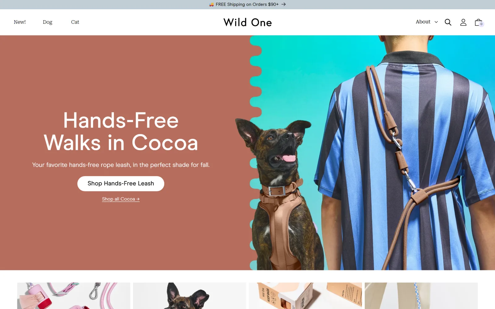
Terracotta type panel meets a scalloped teal cut-out where a dog in a tan harness sits beside a bold striped shirt.
Type
Modern Era 65px, 500
Body
Roboto Serif 16px with Modern Era 14px labels
Build
50/50 colour and photo hero with a scalloped seam
Made on
Shopify
Colour
#ffffff #000000 #e7e5ff
Type. Modern Era runs the display at 65px, weight 500, line height 1.00, set white across three short lines, then drops to 18px for the button and 14px for the interface labels used twenty seven times. Roboto Serif at 16px, weight 300 and -0.020em, handles navigation, which inverts the usual arrangement of serif headline over sans menu.
Colour. Six values. White #ffffff and black #000000 do the structural work, #f3f3f3 backs the tiles, and two soft lilacs, #e7e5ff and #cac5ff, carry the button and badges. A pale #c1cdd4 runs the shipping strip. The terracotta panel and the teal cut-out are photography rather than CSS, which keeps the token set small.
Layout. A 1440px full width frame with a 50/50 hero split: flat colour and type left, photography right, joined by a scalloped edge instead of a straight seam. The header is about 110px including the shipping bar. Product tiles run a 592/155/592px three column arrangement at a 20px gap, and the primary button is a 30px pill.
The ask. Two calls to action stack at roughly 594px and 644px: a filled pill for one product and a text link to the wider shade range, a clean primary and secondary pairing. No price above the fold. The cart icon carries a zero badge rather than a count, the bar sells free shipping over $90 rather than a code, and the first product tiles appear at 915px.
Pairing a filled pill for one product with a plain text link to the full range serves two intents from one hero without splitting it.
04
fieldnotesbrand.com
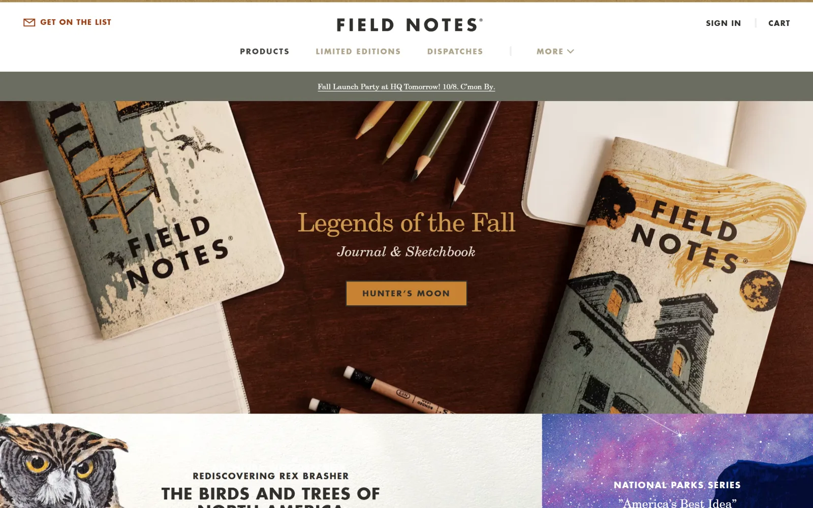
Notebooks and pencils photographed from above on dark timber, under a gold serif headline and a small ochre button.
Type
New Century Schoolbook 46px, -0.022em
Body
Futura W01 Heavy 13px
Build
Stacked full-bleed image blocks with no column grid
Made on
Not detected
Colour
#242320 #c78334 #ededed
Type. New Century Schoolbook sets the 46px headline in gold at -0.022em, with an italic cut at 24px for the subtitle. Everything functional is Futura: 13px Heavy for body, 12px Bold for navigation, and a 14px uppercase button tracked wide to 0.150em. Literary against utilitarian, and the split is held right down to the footer links.
Colour. Ink is #242320 and #302e2a, grounds are #ffffff and #ededed, and #6c6d62 fills the event strip. The accent is a single ochre, #c78334, which prints the button, while the headline takes a lighter #ce9a50 and small rules use #aea288. Four working colours, every one of them lifted straight out of the product photography.
Layout. A 1440px full bleed hero sits under a two band header of about 196px: a logo row, centred navigation, then an olive event strip. No column grid is measured at all, which fits a page assembled from full width image blocks butted against one another. Corners are square throughout and the button carries zero radius.
The ask. The hero button sits at roughly 577px and is labelled with the edition name rather than Shop, which only works because the photograph has already answered what it is. No price above the fold. The announcement bar promotes an event at the office instead of an offer, the cart is plain text top right, and editorial blocks start immediately at 820px.
Naming the edition on the button instead of writing Shop works once the photograph above has already said what the thing is.
05
topodesigns.com
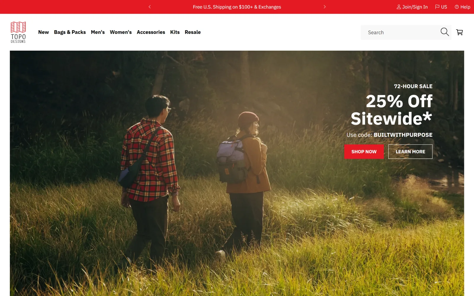
Two walkers cross a sunlit meadow inside an inset hero, with a 25 percent sitewide offer and a red Shop Now at right.
Type
IBM Plex Sans 53px, 800
Body
IBM Plex Sans 15px
Build
Inset card hero over 432/576/432px editorial columns
Made on
Shopify
Colour
#e31b23 #1e1c1c #ffffff
Type. IBM Plex Sans does all of it, from an 800 weight 53px headline at line height 1.00 down to the 15px regular used ninety eight times for body and links, with a 14px uppercase 600 on the button. One family at five weights is a cheaper decision than a pairing, and at this density it reads as deliberate rather than thin.
Colour. White #ffffff and a near black #1e1c1c hold the frame, #f8f8f8 lifts panels, and one red, #e31b23, carries the shipping bar, the primary button and 913 characters of link text. That last figure is the tell: red here is not decoration, it is the interactive colour, and nothing else borrows it.
Layout. The hero is inset inside the 1440px frame with roughly a 32px margin on three sides, so it reads as a card rather than a bleed. The header runs about 175px across the red strip and a white bar holding a full search field. Editorial sits on a 432/576/432px three column split, with a second 53/509/767px grid for the asymmetric blocks below.
The ask. The offer is stated before the product: a 72 hour sale, a percentage and a code, with the red Shop Now at about 512px and an outlined Learn More beside it. No price above the fold, though the discount does that work instead. The bar repeats free shipping over $100 and carries account links, and the cart sits next to search rather than hiding behind an icon.
Putting the percentage and the code in the hero saves the shopper hunting for terms later, which is the point of a sitewide offer.
06
smithey.com
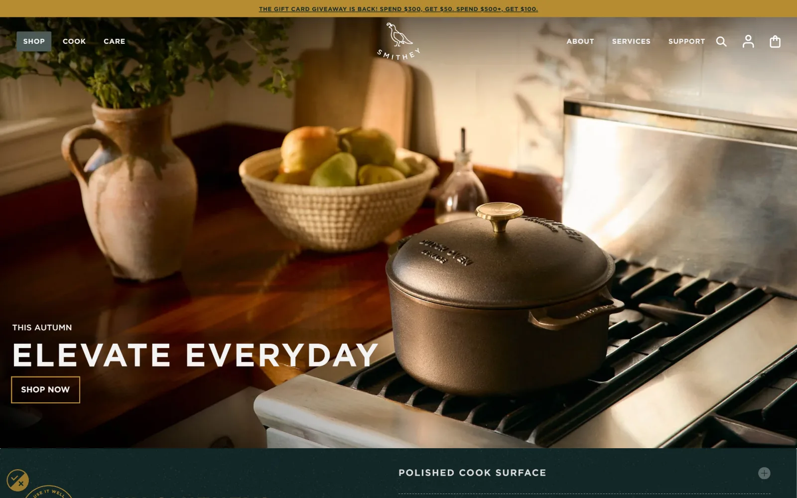
Warm kitchen light, a lidded cast iron pot on a gas range, headline and an outlined Shop Now stacked at the lower left.
Type
Gotham 42px uppercase, -0.024em
Body
Sentinel 16px
Build
Full-bleed photo hero over a dark teal accordion band
Made on
Shopify
Colour
#112626 #2e413f #b68b32
Type. Gotham runs uppercase and heavily tracked: 42px at -0.024em for the hero, 36px at 0.050em for section headings, 18px at a very wide 0.111em for labels. A 16px Sentinel serif appears for running copy and is the only soft shape in view. Tracking rather than size is what separates the levels, which is unusual and legible at speed.
Colour. Six values, and the darks do the work: #112626 and #2e413f for the bands under the hero, #000000 for ink, #dfdfdf for the light ground and #4b5a57 in the shadows. The accent is a muted gold, #b68b32, held back for the announcement strip and small marks rather than spent on a button.
Layout. Full width 1440px with no measured grid, built from a full bleed hero running to about 900px and a dark teal band immediately beneath it carrying an expandable row. The header is transparent over the photograph at roughly 110px with the logo centred. Corners are square and the hero button is an outline rather than a fill.
The ask. A giveaway rather than a discount runs in the gold bar: spend $300 get $50, spend $500 get $100, which sets an order value target before a single product is seen. The hero button lands at about 782px and stays outlined so the photograph remains the loudest thing. No price above the fold, and a sticky header keeps the cart reachable across 7909px.
A spend threshold in the announcement bar sets the basket target before the first product appears, which a flat discount cannot do.
07
tracksmith.com
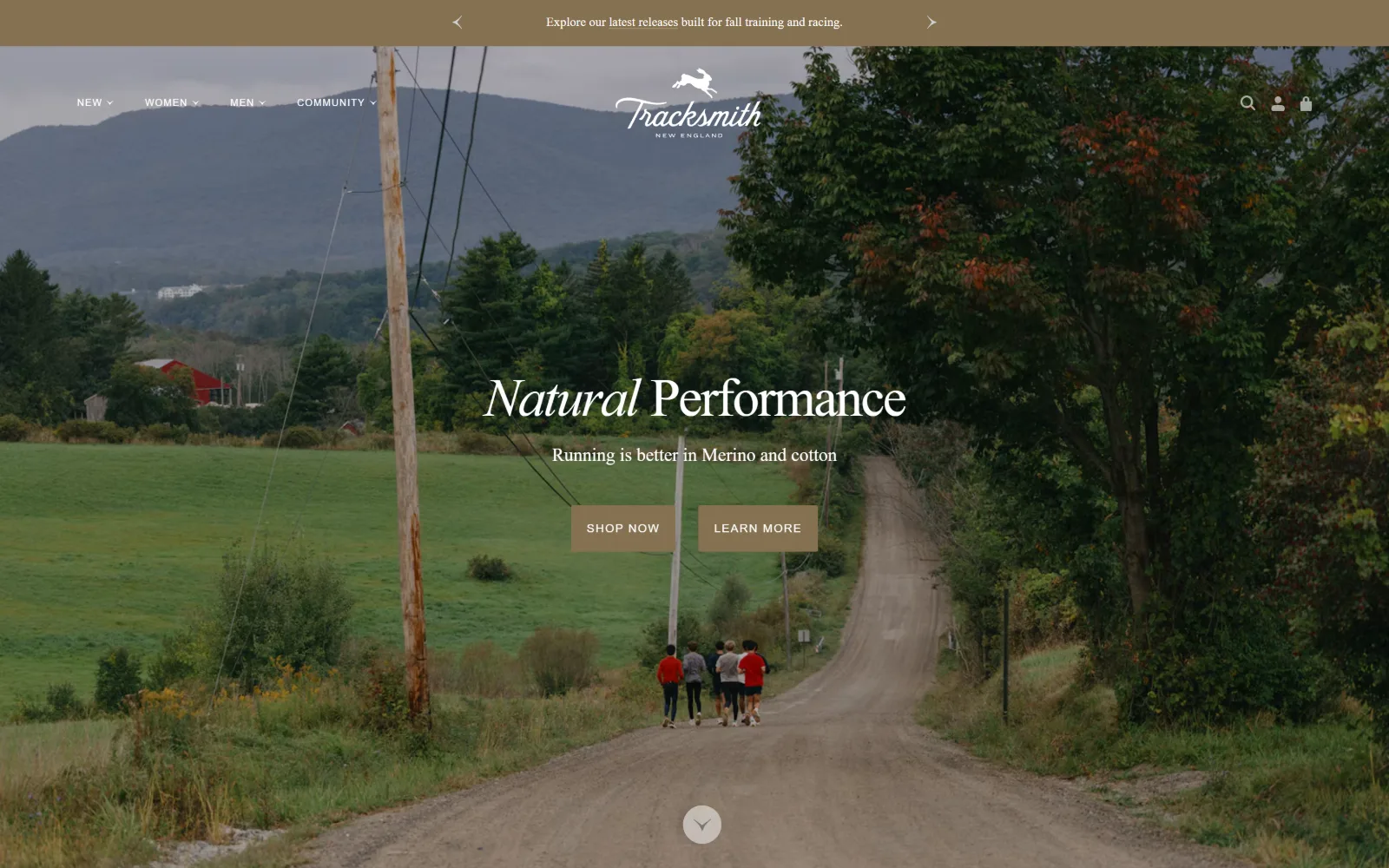
A dirt road runs through farmland with five distant runners, a centred headline and two equally weighted buttons over it.
Type. Sainte Colombe carries the whole page, from a 56px headline at -0.036em in weight 300, first word in italic, down to 13px running copy used seventeen times. The only other face is Akzidenz Grotesk Extended at 10 and 12px, uppercase, tracked to 0.100em, reserved for buttons and labels. A serif for voice, a grotesque for instructions.
Colour. Two values are measured: white #ffffff and a tobacco brown #857151. White is type over photography; the brown fills the announcement strip and both hero buttons at a 2px radius. There is no third colour above the fold at all, which is why the landscape itself ends up functioning as the palette.
Layout. Full width 1440px with a transparent header over the photograph, logo centred and navigation split either side of it. The hero bleeds to all four edges and the type block is centred rather than set left. Below it a 620/620px two column grid at 40px gaps handles editorial, and a scroll chevron sits at about 950px to admit the fold is far down.
The ask. Nothing is for sale in the first screen. The headline at 459px is a claim about fibre, the two buttons at 608px are Shop Now and Learn More weighted identically, and no price or product name appears. The announcement bar points at new releases rather than an offer. The brand film comes first and a sticky header is the only commerce down 6284px.
Giving Shop and Learn More identical weight says the brand expects a reader on the first visit and a buyer on the second.
08
areaware.com
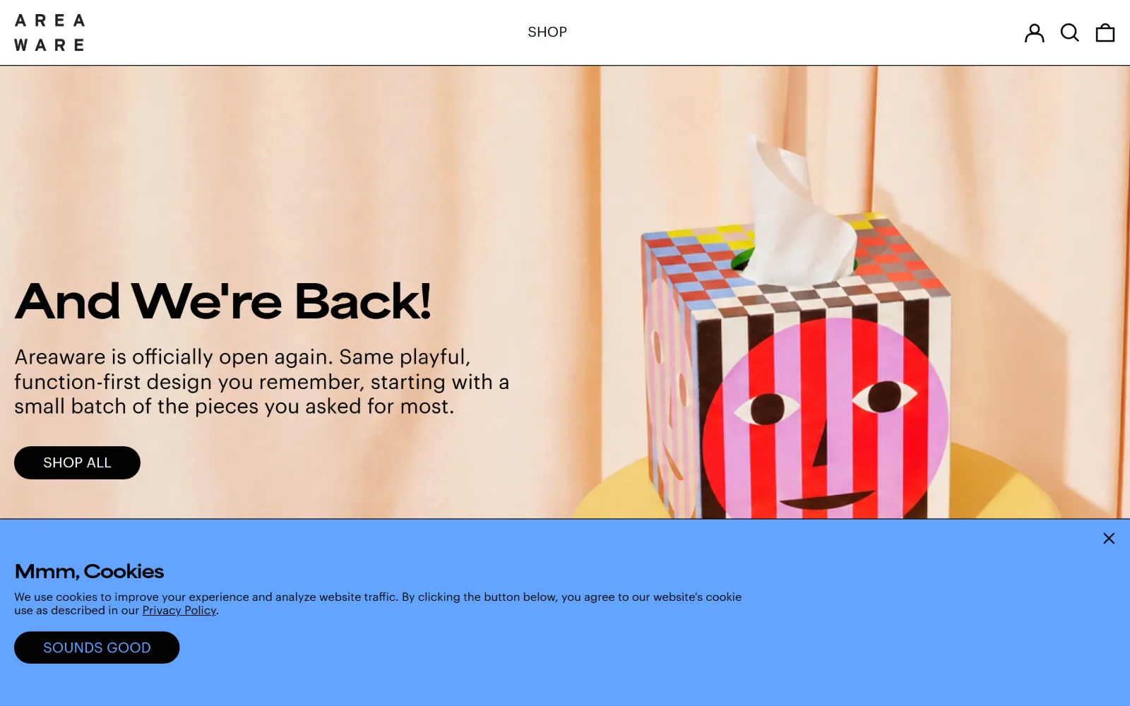
Peach fabric backs a striped tissue box with a painted face, beside a short headline and a black Shop All pill.
Type
AreaExt 58px, 900, -0.050em
Body
Graphik Web 26px
Build
Half and half hero over a twelve column 1px gap product wall
Made on
Shopify
Colour
#ffffff #020202 #d2f37f
Type. AreaExt sets the headline at 58px, weight 900, pulled tight to -0.050em, which is what gives the line its blocky bounce. Graphik Web handles the rest at 26px for the hero paragraph and 18px for the twelve interface labels. Two faces, one extreme in weight and one neutral, with no italic and no uppercase anywhere on the page.
Colour. Four values at high contrast: #ffffff ground, #020202 ink, and two toy colours, a lime #d2f37f and a cornflower #63a4ff, which appear as blocks rather than as text. Blue covers the consent strip across the foot of this capture. Colour is kept out of the typography entirely, apart from links picking up the same #63a4ff.
Layout. The hero splits roughly half and half, type left and a full bleed photograph right, under a 92px header with the wordmark locked top left and a single Shop link centred. Beneath it a twelve column grid of 119px tracks at a 1px gap builds the product wall, so tiles touch and the page reads as one sheet instead of a set of cards.
The ask. The Shop All pill sits at about 655px and is the only button in the first screen, under a navigation of one word. No price above the fold. The twelve column wall below is the real merchandising, and those 1px gaps fit far more stock per screen than a padded grid would. The cart is an icon; nothing in the header sells shipping or a code.
A product wall built on 1px gaps fits far more stock into one screen than a padded card grid, and still does not look crowded.
09
fellowproducts.com
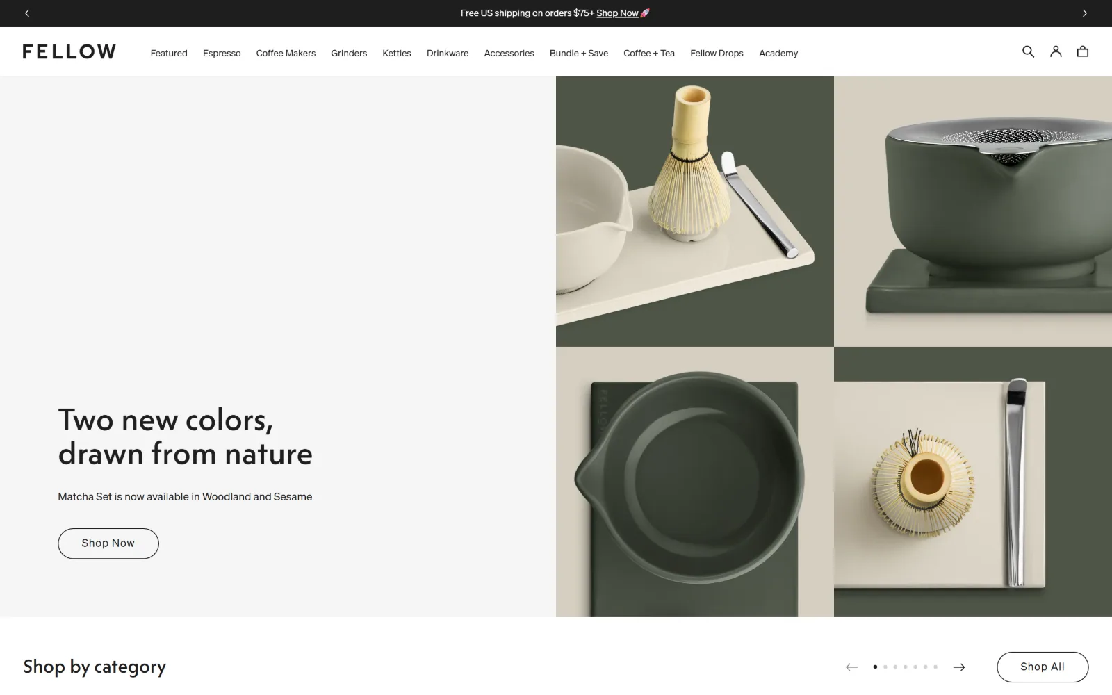
Flat grey fills the left half behind a two line headline and an outlined Shop Now; four product frames fill the right.
Type
Fellow Solar 40px, 500
Body
Sohne 18px
Build
50/50 hero with a two by two photo grid bleeding right
Made on
Shopify
Colour
#ffffff #efefed #1e1e1f
Type. Fellow Solar sets the headline at 40px, weight 500, line height 1.10, broken over two lines so the comma lands on the turn. Sohne covers navigation at 18px and takes the page down to a 12px label used twenty three times. Those small sizes are what make an eleven item navigation fit on one row without a dropdown.
Colour. Four values and nothing else: #ffffff, a warm grey #efefed for the hero panel, #f5f5f5 for alternating bands and #1e1e1f for ink. There is no accent colour at all. The green and sand in the hero come from the product photography, so a new launch can recolour the page without anybody touching the stylesheet.
Layout. A 1440px frame with 45px section padding. The hero is a straight 50/50 split: flat panel left, a two by two photo grid right that bleeds off the right edge with no gutter. The header is about 110px including the shipping strip. The button is a full radius pill while the photography keeps square corners, so the only curve is the thing you click.
The ask. Shop Now sits low at about 782px under a single line naming two new colours, so the page sells a variant rather than a category. No price above the fold. A shop by category carousel starts at 959px with its own Shop All pill, giving two routes into the catalogue inside a screen and a half. The strip sells free shipping over $75.
Keeping the palette neutral lets product photography set the season colour, so a launch never turns into a redesign.
10
helmboots.com
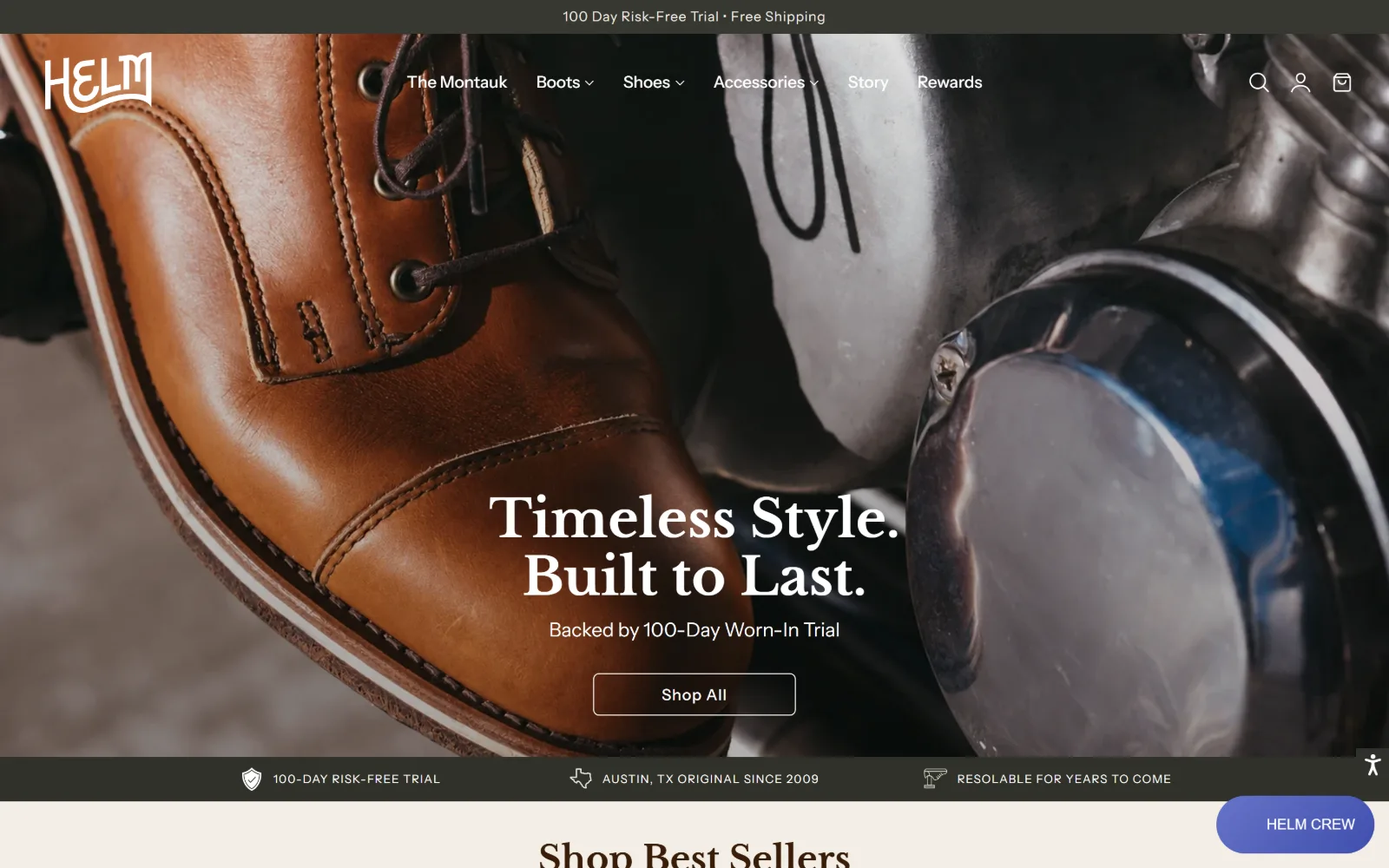
Tan leather fills the frame as a cap toe boot leans on a motorcycle, under a centred serif headline and an outline button.
Type
Libre Baskerville 54px, 700
Body
Instrument Sans 17px
Build
Transparent header over a full-bleed hero and a 347/626/347px trust row
Made on
Shopify
Colour
#fbf9f5 #2b251f #f5f1e9
Type. Libre Baskerville carries the display at 54px in weight 700, with a 64px cut used further down, a serif doing a job usually handed to a condensed grotesque. Instrument Sans runs the interface at 24px in navigation and 16 to 18px below. The serif is always centred, the sans always left aligned, so alignment alone tells you which voice is speaking.
Colour. A cream system: #fbf9f5 as the page ground with #f5f1e9, #f3eee5 and #eee8de as three further tints for alternating bands. Ink is #2b251f and #241f19. The brown in the hero is leather rather than a swatch, so the whole palette is one hue at six values and nothing in the interface fights the photograph.
Layout. Full width 1440px with a transparent header over the hero and the wordmark top left. A 347/626/347px three column arrangement holds the trust row at a 20px gap, and a 630/770px two column split handles the asymmetric block below. The hero runs to about 870px, then a 60px band of three claims, then the best sellers heading at 985px.
The ask. The outlined Shop All lands at roughly 800px under a guarantee line rather than a price. The announcement bar sells a 100 day trial, and the trust row at 897px repeats it alongside the founding date and a resoling promise, so durability is answered three times before any product appears. No price above the fold, and a loyalty chip floats bottom right.
Repeating one objection killing claim in the bar, the hero subline and the trust row settles the doubt before the first product.
11
nickeykehoe.com
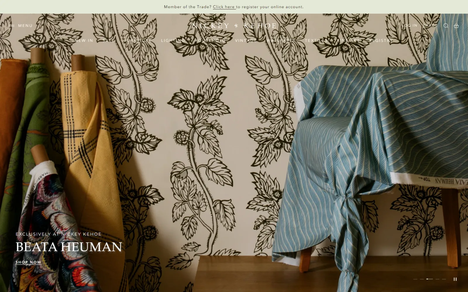
Bolts of fabric lean against patterned wallpaper beside a draped chair, with a designer's name set small in the lower left.
Type
Palatino 39px, 0.020em
Body
Avenir Next 14px
Build
1380px container, slider hero, 461px three column grid
Made on
Shopify
Colour
#fffdf6 #1d222a #efeae2
Type. Palatino sets the hero name at 39px with 0.020em tracking and a tight 0.90 line height, in white over the photograph. Avenir Next does everything else, 14px at 1.80 line height for copy and 11 to 12px uppercase at 0.150 to 0.200em for navigation. Montserrat appears only in the trade strip. Three faces, each restricted to a single job.
Colour. An off white #fffdf6 carries text over the image, pure #ffffff the panels, and #1d222a the ink. Two soft tints, #efeae2 and #e2e9d6, appear in the blocks below. The hero contributes no colour of its own: the olive and the pale blue in view are the wallpaper and the chair, not values set anywhere in the theme.
Layout. A 1380px container inside a 1440px viewport, so the page keeps a breathing margin rather than bleeding to the edge. The header runs about 165px over three bands: trade notice, wordmark row, then eleven uppercase links. The hero is a slider with its dots bottom right, and a 461px three column grid sits inside a named seven column frame with 48px rails.
The ask. Nothing sells in the first screen except a Shop Now link set at 11px in the lower left corner, about 898px down. No price, no filled button, no cart count. The top strip addresses trade buyers and account registration rather than shoppers, which is a deliberate filter, and the whole document is only 1429px tall, so the catalogue is one click away.
Addressing trade registration in the top strip filters the audience before the catalogue does, which a shipping offer cannot.
12
missionworkshop.com
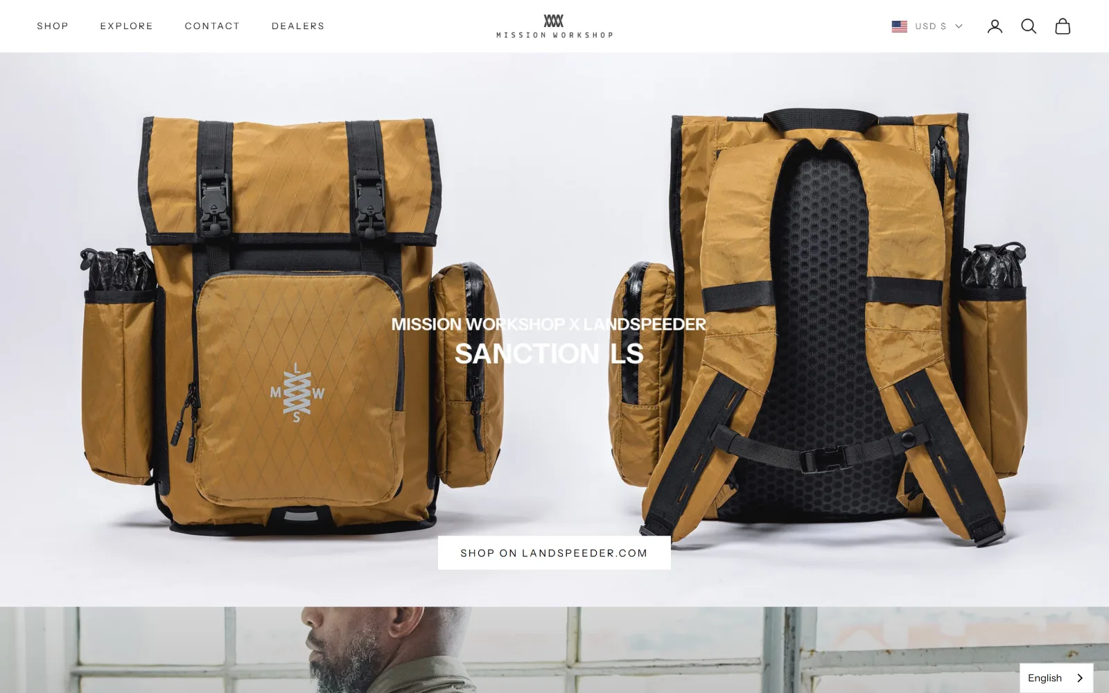
Two views of a tan roll-top pack sit on white under a thin uppercase product title and a single white button.
Type
Instrument Sans 32px, 0.180em
Body
Instrument Sans 14px
Build
Full-bleed white product hero, 557/150/557px columns, 16930px page
Made on
Shopify
Colour
#ffffff #000000 #1c1c1c
Type. Instrument Sans only, and the tracking does all the signalling: 32px at 0.180em for the hero title, then 13, 12 and 11px at the same 0.180em for labels, with a 14px untracked regular used twenty five times for body. Nothing is bold anywhere. Letterspacing has replaced weight as the hierarchy, which is why the page reads as technical.
Colour. Two values are measured, #ffffff and #000000, with #1c1c1c as the ink. That is the entire system. Colour enters only through the product, here the tan of the pack and its black webbing, so every new drop restyles the homepage without a single token being edited.
Layout. A 1440px frame, a 75px header and no announcement bar. The hero photograph is full bleed on white. Beneath it a 557/150/557px three column split at a 40px gap, then a named seven column frame with a 1344px content track and 48px gaps repeating down a document that runs 16930px, by a distance the longest page in this set.
The ask. The single hero button at about 798px points at a different domain, an unusual thing for a shop to do in its first screen. No price above the fold and no cart badge. The header carries a currency selector where most carry a shipping offer, and with the header sticky across nearly 17000px of scroll the cart icon is the only permanent commerce.
A two colour system means each product drop recolours the homepage by itself, with no theme change and no new tokens to maintain.
13
klur.co
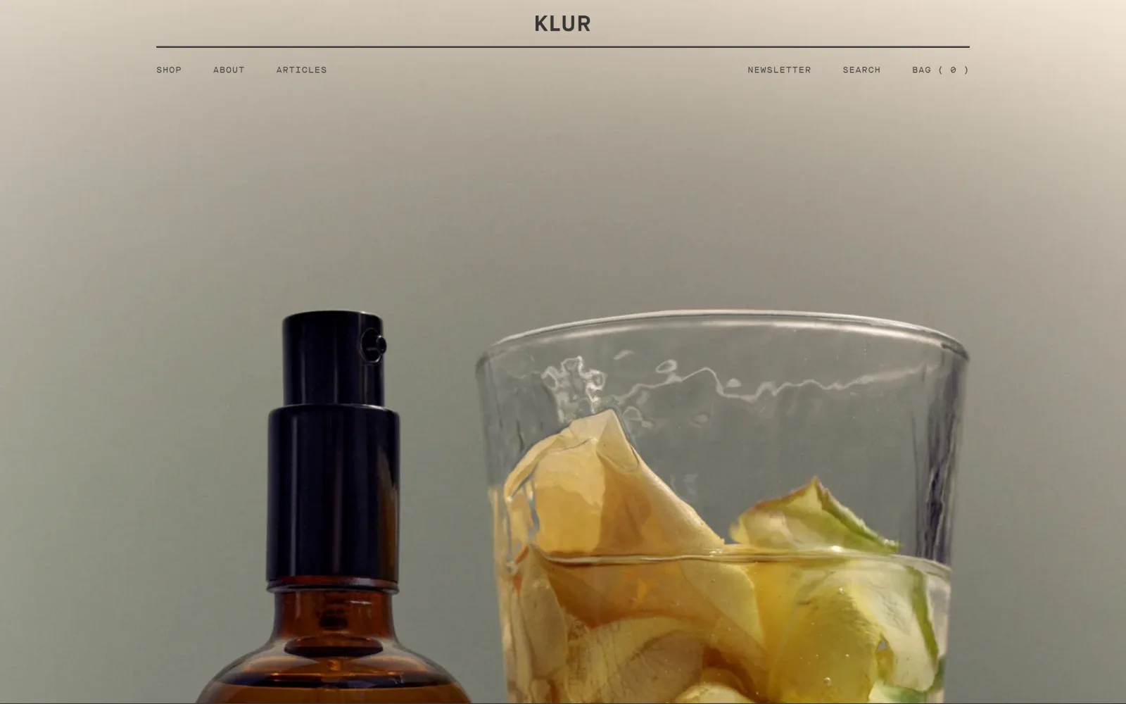
Centred wordmark over a hairline rule and a split nav row, above a full width still of an amber pump bottle and a glass.
Type
Maison Neue Mono 11px uppercase
Body
Maison Neue Mono 11px
Build
1120px header rule over a full-bleed video, 2176px document
Made on
Shopify
Colour
#e6e4df #373535
Type. One face at one size: Maison Neue Mono at 11px, weight 400, uppercase, tracked to 0.091em and used nine times across the whole page. There is no heading, no body copy and no button text, because there is nothing else. The mono is serving as wordmark, navigation and label set at once, and the 1.5px of tracking is the only styling.
Colour. A single measured value, #e6e4df, a warm grey ground, carrying 88 characters of #373535 ink. One colour and one ink is the smallest palette in this set, and it leaves the video still as the only source of hue on the screen, which here means amber glass, olive shadow and a pale petal.
Layout. A 1120px container inside the 1440px viewport, so the rule under the wordmark stops well short of the edges while the video below bleeds full width. The header is about 125px: centred logo, hairline rule, then navigation split left and right along one baseline. Total document height is 2176px, shorter than several heroes here.
The ask. There is no button, no price and no announcement bar in the first screen. The only commerce in view is the word Bag with a zero count top right. Shop is one of three equally weighted links. A page this withheld is betting that whoever arrived already knows the brand, and the 2176px document gives them very little to scroll past before the catalogue.
Setting an entire interface in one 11px mono removes every hierarchy decision, but it only holds up on a document this short.
14
blackwing602.com
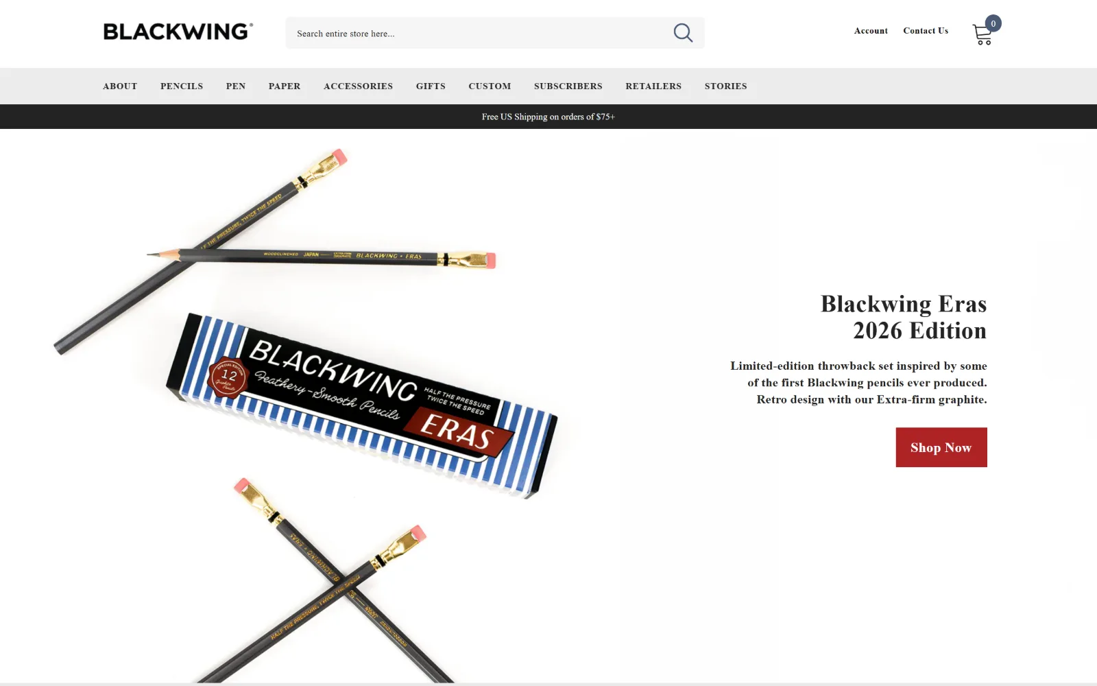
Pencils and a striped box float on white, with a serif product title, three lines of copy and a small red Shop Now.
Type
Open Sans 32px, 700
Body
Open Sans 16px
Build
1200px container, three band header, 200/550/300px hero split
Made on
Shopify
Colour
#ffffff #e9e9e9 #232323
Type. A serif display line carries the product name while Open Sans runs everything functional: 16px body at 0.015em, 12px bold uppercase navigation at 0.050em used twelve times, and a 32px bold at the top of the scale. Eight steps are measured, which is a lot, and they are separated by tracking at least as much as by size.
Colour. Restrained to greys: #ffffff ground, #e9e9e9 and #ececec for the navigation strip and panels, #232323 and #252525 for ink, #f6f6f6 for the lightest fill. The only saturated colour on the page is the red, which appears in the packaging photograph and on the button and nowhere else, so the two read as a pair.
Layout. A 1200px container, 83 percent of the viewport, which is among the narrowest measured here. The header stacks three bands to about 196px: a logo row with a wide search field, a grey ten item navigation strip, then a black shipping bar. A four column 200/550/0/300px grid holds the hero, product left and copy right at a 40px gap.
The ask. The product occupies the left two thirds and the copy block sits right, with the red Shop Now at about 652px. No price above the fold, but the search field is the largest element in the header, which is the right bet for a catalogue of hundreds of near identical variants. The bar sells free shipping over $75 and the cart shows a zero count.
Making search the widest element in the header is the correct call for a catalogue of many small, nearly identical items.
How these were chosen
Fourteen American shops, and the first thing the measurements give away is how little the platform decides. Almost every store here runs the same one, so what separates them is art direction and restraint: where the type sits, how much colour is let in, how soon a figure appears. The split worth naming is between shops that put the product first, with a photograph of the thing and a buy button inside the first screen, and shops that put the brand film first and ask you to scroll past a mood before anything is for sale. Good ecommerce website design happens on both sides of that line. The order below runs by how much there is to look at, not by how hard each one sells.
Finding online store sites that someone had actually designed took far longer than it should have. 59 candidates made the shortlist. 14 made the page.
Each one was opened and looked at properly: what the type is doing, where the colour gets spent, how the page is built, how it asks for the job. Nothing is here because it ranks. Nothing is here because an agency filed it under portfolio. Several well known names were left out for the plain reason that their site came out of the same template as everyone else's, and a few sites worth including did not survive a second look.
Where a site is only competent, it says so. The order is the order worth your time, best first.
Reviewed and selected by Larry W. Matthews for Websitely.