Thirteen US flower shops and event studios. Florist website design has one job harder than it looks: photographing colour against more colour.
Shown
13 sites
Reviewed
35 candidates
Chosen on
The work, not the ranking
Updated
15 October 2026
01
lewismillerdesign.com
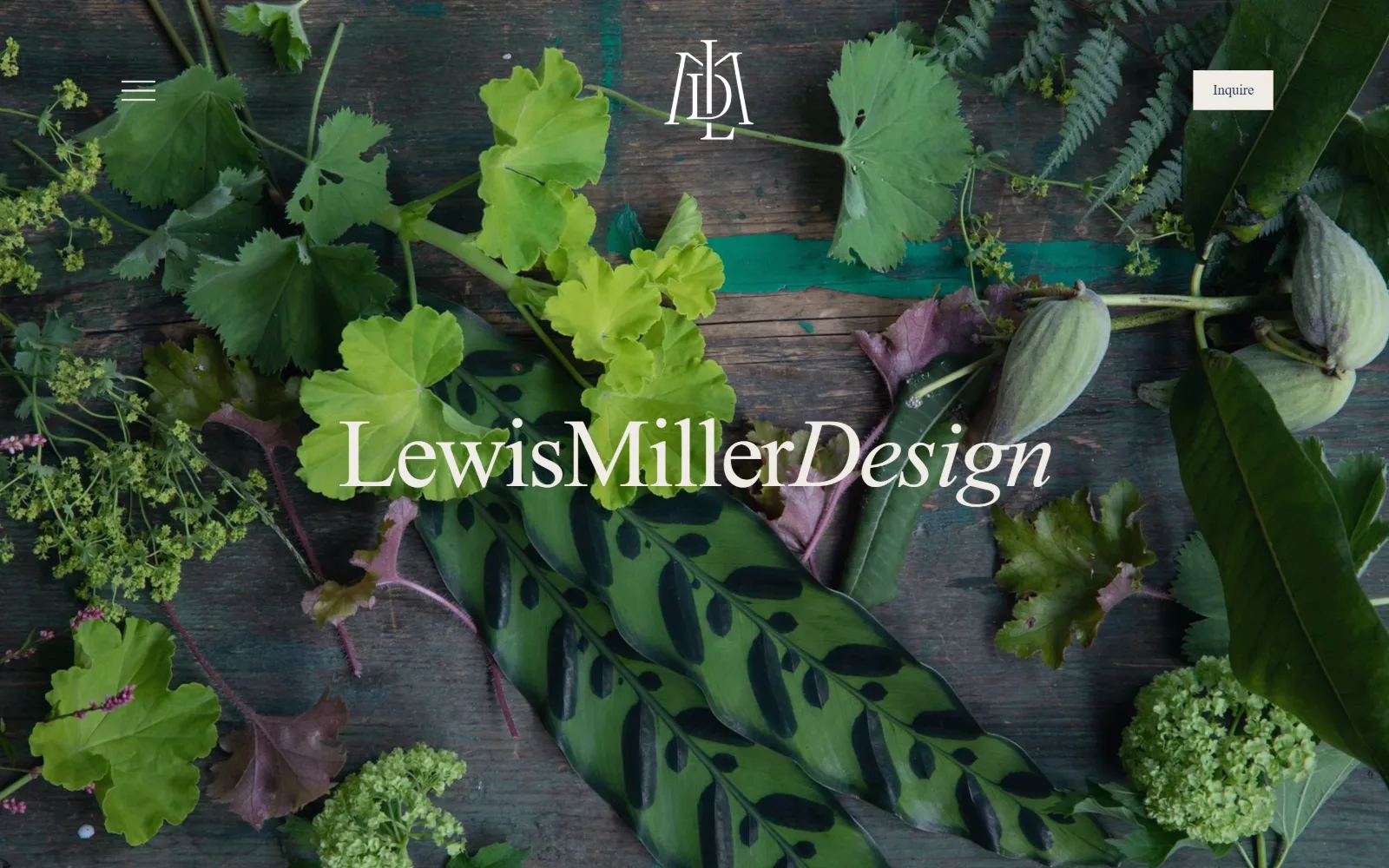
An overhead spread of foraged leaves, figs and alchemilla on teal painted boards, with the studio wordmark in white serif across the middle.
Type
Bodoni Moda 101px
Body
EB Garamond 18px / 1.50
Build
full-bleed photo, 1440px, 187px section padding
Made on
Squarespace
Colour
#243759 #eeb544 #fef7ed
Type. The wordmark runs at 101px in Bodoni Moda, with Design broken into italic so three words read as one lockup rather than a name plus a label. Below the fold Bodoni drops to 37px and 22px and EB Garamond picks up body at 18px in #6a3e4f, a muted plum. Navigation is the only sans, proxima-nova at 14px, and it stays out of the way.
Colour. Four values and a photograph. Below the hero the page sits on #eeb544, a marigold covering 100 of its band, against #243759 navy at 201.3. Cream #fef7ed and #f0ece5 carry the button fill and nav ink, and body copy is #6a3e4f plum across 184 characters. The green of the hero is entirely photographic and none of it is repeated in the interface.
Layout. Full bleed image at 1440px with the chrome floating on top: hamburger left, monogram centred, a cream Inquire button pinned right at 0 radius. Nothing else is boxed. Section padding below the fold runs 187px, which is generous even for a studio page, and the 26-column Squarespace grid is set with a 109px first column and 11px gutters.
The ask. One ask, the word Inquire, in a cream rectangle at top right. No phone number, no email capture, no shop. For a studio that prices events by negotiation that is the correct count, and putting the ask in the only solid filled shape on screen lets it read as a button without carrying any extra weight.
Reserving the page's only filled rectangle for the single ask makes a button out of restraint rather than out of colour or size.
02
emilythompsonflowers.com
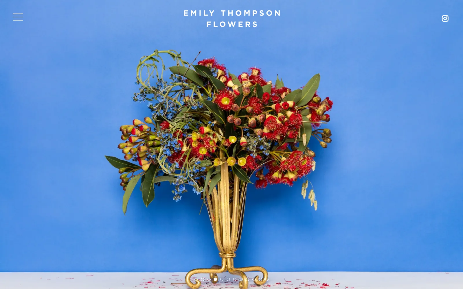
A gold footed vase of red gum blossom and blue forget-me-nots stands against a flat cobalt wall, the studio name in white caps above it.
Type
none, nav is the largest type
Body
gotham-4rysqx 20px, 0.160em
Build
single 1009px viewport, full-bleed photo
Made on
Squarespace
Colour
#ffffff #000000
Type. One typeface does visible work: gotham-4rysqx at 20px, weight 500, uppercase, tracked to 0.160em and set on a 1.05 line height so the two-line name stacks as a block. No display size exists anywhere on the page. Poppins at 13px handles the single interface label. Letting the photograph own all the scale is the whole typographic decision.
Colour. The measured palette has exactly one value, #ffffff at 168.2 coverage. Every colour on screen, the cobalt ground, the gold vase, the red stamens, belongs to the photograph. Nothing in the stylesheet tints the interface except #000000 on one button, so the arrangement redecorates the page each time the frame advances.
Layout. One viewport and no more: document height measures 1009px against a 900px window, so the page is effectively a single frame. The wordmark is centred, the menu glyph sits hard left and Instagram hard right at the extreme margins of a full-width 1440px container. Ten slider dots anchor the foot. Radius measures 50px on the rounded elements.
The ask. Nothing is sold and nothing is asked. There is no button, no form, no phone number, and the navigation hides behind a single hamburger. A studio whose work is commissioned rather than browsed can afford a homepage that behaves as a portfolio slide, and the row of slider dots is the only invitation to act on screen.
When photography carries all the colour, holding the CSS palette to a single white forces every frame of the slider to redecorate the page.
03
studiomondine.com
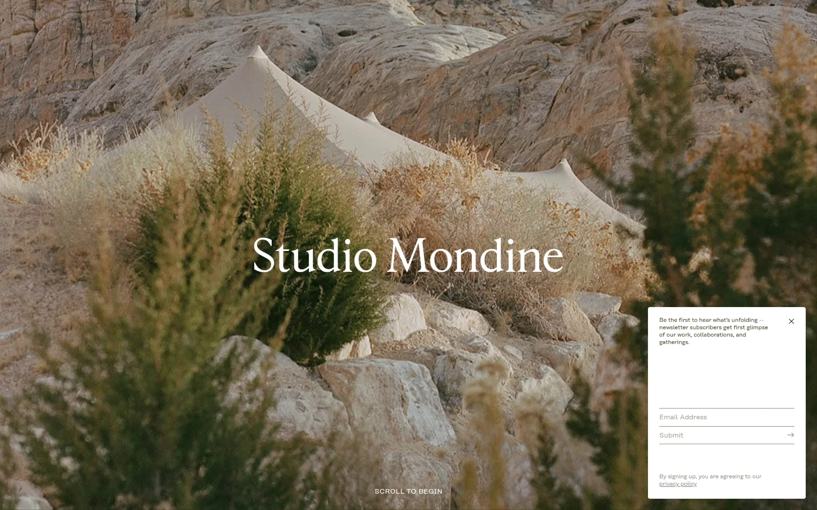
Cream canvas tents pitched among desert boulders and sagebrush fill the frame, with the studio name in white serif across the centre.
Type
Fautive-Roman 42px / 1.20
Body
rationaltext-book 12px uppercase
Build
full-bleed hero, 1440px, no header bar
Made on
WordPress
Colour
#26290a #fdfcf8 #ffffff
Type. Two faces and four sizes in total. Fautive-Roman, a high contrast roman, carries both the centred wordmark and the 42px slide titles at weight 300 with zero tracking, then drops to 18px for captions. rationaltext-book handles small print at 12px uppercase and 10px regular. Nothing is bolded and nothing is tracked out, which keeps type from competing with a busy landscape.
Colour. Two measured values: #26290a, a near-black olive that is also the body background, at 150 coverage, and #ffffff at 3.6. Text sits in #fdfcf8, a warmed white that holds against a sun-bleached photograph better than pure white would. All the sand, rock and sage saturation is photographic rather than specified.
Layout. A full-bleed image runs across the whole 1440px viewport with no container inset and no header bar at all. The wordmark is optically centred rather than top-aligned, and SCROLL TO BEGIN anchors the bottom edge. Corner radius is 0 throughout, including on the newsletter card floated over the lower right corner at capture time.
The ask. The only ask on screen is email capture, and it arrives as an overlay card rather than header furniture: a short line of copy, one Email Address field, a Submit row with an arrow, and a privacy policy link. SCROLL TO BEGIN is the alternative path. No phone number, no enquiry form and no pricing appear above the fold.
A warmed white at #fdfcf8 keeps overlay type sitting inside a sunlit photograph instead of floating on top of it like a caption.
04
flwrshop.com
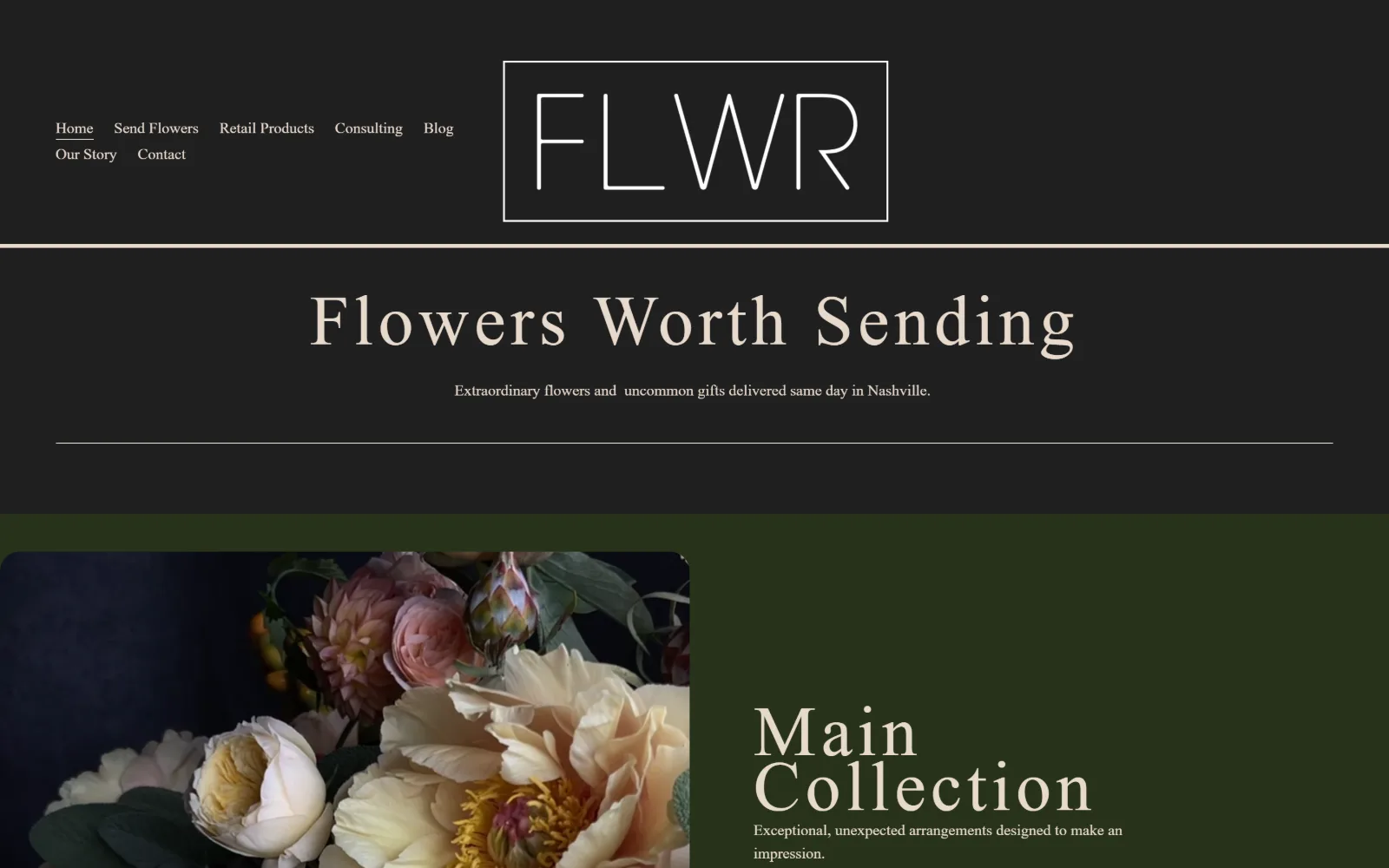
A near-black screen with FLWR boxed in a thin white rule, Flowers Worth Sending in large cream serif, and a dark green band of peach blooms below.
Type
minerva-modern 73px / 0.78
Body
freight-text-pro 16px / 1.50
Build
centred boxed wordmark, 257px section padding
Made on
Squarespace
Colour
#27321b #e7d9cb #000000
Type. minerva-modern sets the headline at 73px on a 0.78 line height, tighter than the cap height, so one line reads as a slab rather than a sentence. Tracking opens to 0.070em to stop it closing up. Everything else is freight-text-pro at 16px, navigation included, so there are two sizes above the fold. Ink is #e7d9cb across 458 characters and never white.
Colour. Three values carry the page. A deep olive #27321b sits at 300 coverage and does every ground, including the band below the fold, #ffffff reaches 29.6, and #000000 fills the buttons. Type is #e7d9cb, a warm bone rather than white. The only saturation anywhere is the peach of the dahlias and garden roses in the photograph.
Layout. Seven nav items sit left across two rows while the boxed wordmark holds the centre, an unusual split that works because the rule box gives the empty right half something to balance. A hairline closes the header. Section padding measures 257px, the deepest here, and the image tile below carries the one 15px radius against 0 everywhere else.
The ask. Send Flowers is second in the nav and the delivery promise, same day in Nashville, is handled in the subhead rather than a button. No phone number sits in the header. The first real button appears further down, black with a 15px radius. A $100 figure exists in the page, most likely a delivery threshold, but it is not sold above the fold.
Setting a 73px headline at 0.78 line height turns one line into a block of mass, which makes opening the tracking structural rather than decorative.
05
foxfodderflowers.com
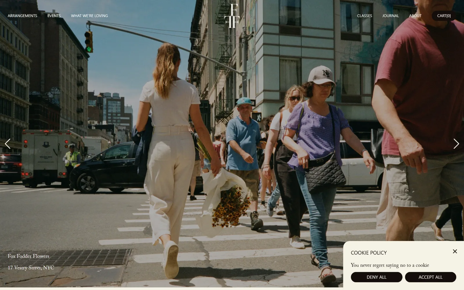
A documentary street shot of a woman crossing a Manhattan intersection with marigolds under her arm, the nav split white across the top edge.
Type
none, headline sets at 16px
Body
Inter 12-16px
Build
sticky split nav, full-bleed photo carousel
Made on
Shopify
Colour
#fcfbf7 #f6f3e7 #000000
Type. Nothing here is set large. Inter runs navigation at 12px uppercase and the headline at 16px, and ACaslonPro-Regular appears at the same 16px for 120 characters of editorial copy, so serif and sans sit at identical size and separate themselves by shape alone. The address block at lower left is the Caslon. A florist resisting a display size is rare and it hands the photograph every bit of scale.
Colour. Four values, three of them off-white: #fcfbf7 at 100 coverage, #f6f3e7 at 52.6 and #140e0b for ink at 0.5. Black at 49.6 does the buttons and the lower half of the page. Nav type is #fcfbf7 laid straight onto the photograph with no scrim behind it, which only survives because the image is a bright midday exposure.
Layout. A sticky header splits the nav three items left and four right with the monogram centred between them, all sitting directly on a full-bleed 1440px photograph with no bar behind it. Carousel arrows pin to the vertical centre of each edge. The shop name and street address sit bottom left in the gutter. Radius is 0 throughout.
The ask. Three nav items and a cart counter are the whole ask above the fold, and the cart reads CART[0] in brackets rather than as a badge. There is no button and no phone number. The address, 17 Vestry Street, is the only contact detail and it is treated as a photograph caption rather than as information to act on.
Setting serif and sans at the same 16px makes them read as two voices rather than two levels, which flattens hierarchy on purpose.
06
maxgilldesign.com
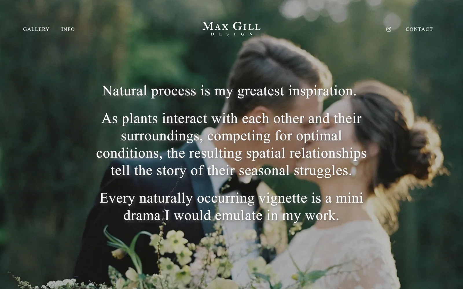
Three centred paragraphs of white Garamond run over a soft-focus photograph of a couple at a wedding, with the wordmark small above them.
Type
Garamond Premier Pro 45px / 1.21
Body
Maven Pro 16px uppercase
Build
full-bleed soft-focus photo, 183px padding
Made on
Squarespace
Colour
#1c1c1c #efede6 #ffffff
Type. A statement of intent set at 45px in garamond-premier-pro-display, weight 400, 0.020em tracking, 1.21 line height, running 293 characters across three centred paragraphs. The wordmark and the two nav items are Maven Pro at 16px uppercase with 0.080em tracking, barely a third of the size of the copy they sit above. Writing is the hero and the photograph is texture.
Colour. Two measured values: #1c1c1c at 215.2 coverage and #efede6, a warm bone, at 90.2 as the body ground below. White ink sits over the image and black appears across 42 characters on the one white button. The photograph is desaturated and out of focus, so the only real saturation is the green of the garden behind the couple.
Layout. Document height is 1402px, just over one and a half screens. Nav splits two items left, Instagram and CONTACT right, wordmark centred, none of it boxed, all of it over the photograph. Copy is held to roughly the middle third of a 1440px frame by line length alone rather than by a container. Section padding below is 183px and radius is 0.
The ask. CONTACT is the only ask and it sits at the far right of the nav, unstyled, the same size as GALLERY and INFO. The single button on the page is Maven Pro at 22px uppercase, black on white, square cornered. No phone number, no form above the fold, no pricing. The page asks you to read a paragraph before it asks you for anything.
Blurring the hero photograph down to texture lets 45px of body copy become the display element without the two fighting over the same attention.
07
crimsonhort.com
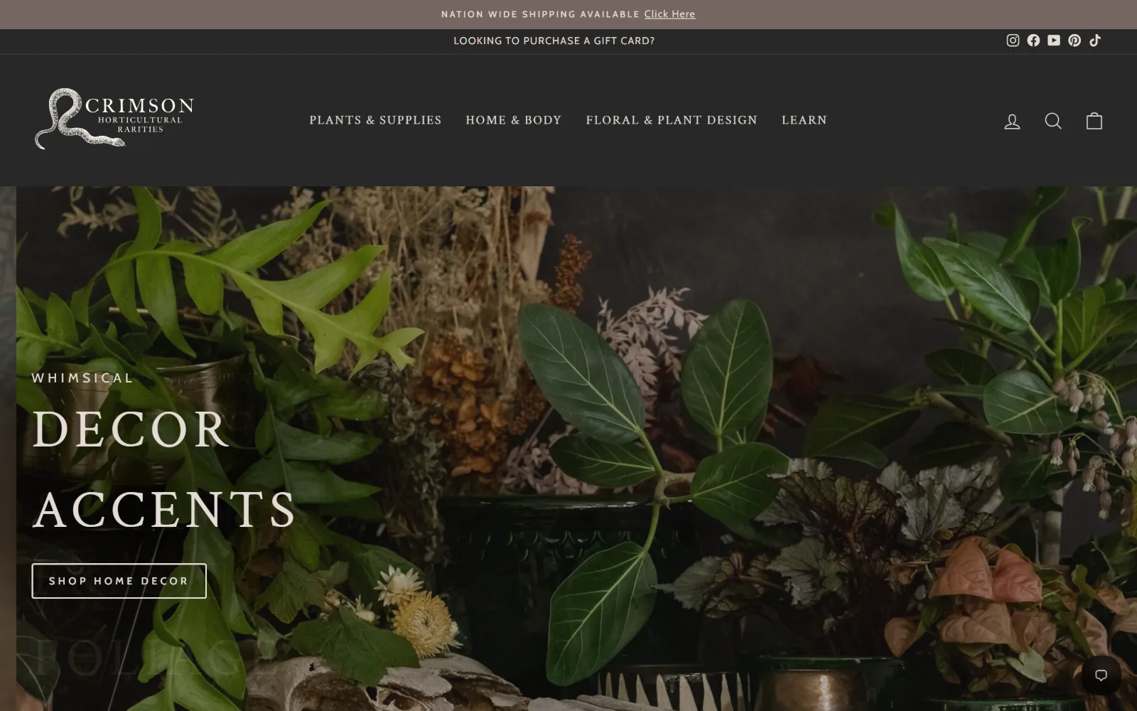
A dark photograph of ferns, begonias and dried stems carries large cream serif caps reading DECOR ACCENTS above an outlined Shop Home Decor button.
Type
Crimson Text 68px uppercase, 0.100em
Body
Cabin 13px, 0.300em
Build
two announcement bars, full-bleed hero, 1440px
Made on
Shopify
Colour
#fffaf1 #282828 #e3dcd5
Type. Crimson Text sets the hero at 68px, uppercase, tracked to 0.100em on a 1.50 line height, loose enough that the two stacked words read as separate bands rather than as a paragraph. Everything else is Cabin and its tracking is extreme: 0.300em at 13px bold uppercase in the announcement bars and 0.200em at 11px. The serif and the business share a name, which is unlikely to be accidental.
Colour. Four values, and the measured palette is mostly #fffaf1 at 232.8 coverage, a warm off-white that only surfaces below the fold. Above it, #282828 charcoal at 52.7 runs the header and the photograph's shadows, with #746661 taupe at 2 for the top strip. The accent is #e3dcd5, a pale stone doing both the 68px heading and the button outline.
Layout. Two stacked announcement bars sit above a charcoal header, three horizontal strips before any content, and together they run roughly 255px deep. The hero photograph then goes full bleed at 1440px with its text block left-aligned at about the first sixth of the width. No grid is declared and radius is 0, the outlined button included.
The ask. Four nav categories plus account, search and bag, one outlined SHOP HOME DECOR button in the hero, a gift card line in the second bar, a shipping link in the first and a chat bubble bottom right. That is six asks competing above the fold, and the button is visually the weakest of them because it is an outline rather than a fill.
Stacking two announcement bars above the header spends roughly 255px of viewport before a visitor sees anything the business actually makes.
08
mooncanyondesign.com
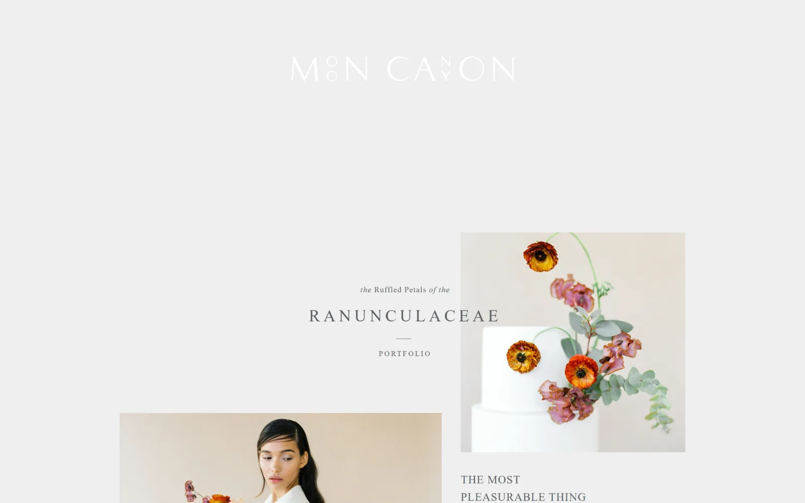
A near-white page with the wordmark set in white on pale grey, a cake dressed in ranunculus at right and a portrait tile entering from the lower left.
Type
adobe-caslon-pro 30px, 0.200em
Body
adobe-garamond-pro 14-20px
Build
1340px container, absolute-placed tiles
Made on
Squarespace
Colour
#e4e4e4 #eeeeee #595e63
Type. Four faces across five sizes, which is a lot for a page carrying barely 200 characters. adobe-caslon-pro at 30px with 0.200em tracking sets RANUNCULACEAE, adobe-garamond-pro at 20px and 14px handles the italic and roman line above it, Nunito at 30px sets the wordmark and brandon-grotesque at 13px with 0.200em labels the links. The mixing is audible but the sizes keep it quiet.
Colour. The entire measured palette is #e4e4e4 and #eeeeee, two greys ten points apart, each at 100 coverage. Ink is #595e63, a cool slate, across 170 characters. The remaining 33 characters are #ffffff, and those are the wordmark, set white on a near-white ground so it is legible only at an angle. It is a decision rather than a capture fault.
Layout. The container narrows to 1340px, 93 percent of a 1440 viewport, and placement is absolute rather than gridded: the cake tile sits upper right, the portrait enters from the lower left edge and is cropped by it, and a short text column floats between the two. Document height is 2455px. Nothing aligns to anything else, which is the point.
The ask. The word PORTFOLIO under a short rule is the only link in view and it is set at 13px. Four nav items exist but none are visible in the hero. No button, no form, no phone number, no email. The page is a mood board that happens to be clickable, and a studio booking a handful of events a year can carry that.
A wordmark set white on #eeeeee reads only at an angle, which filters for visitors who already know the name and loses the ones who do not.
09
floretflowers.com
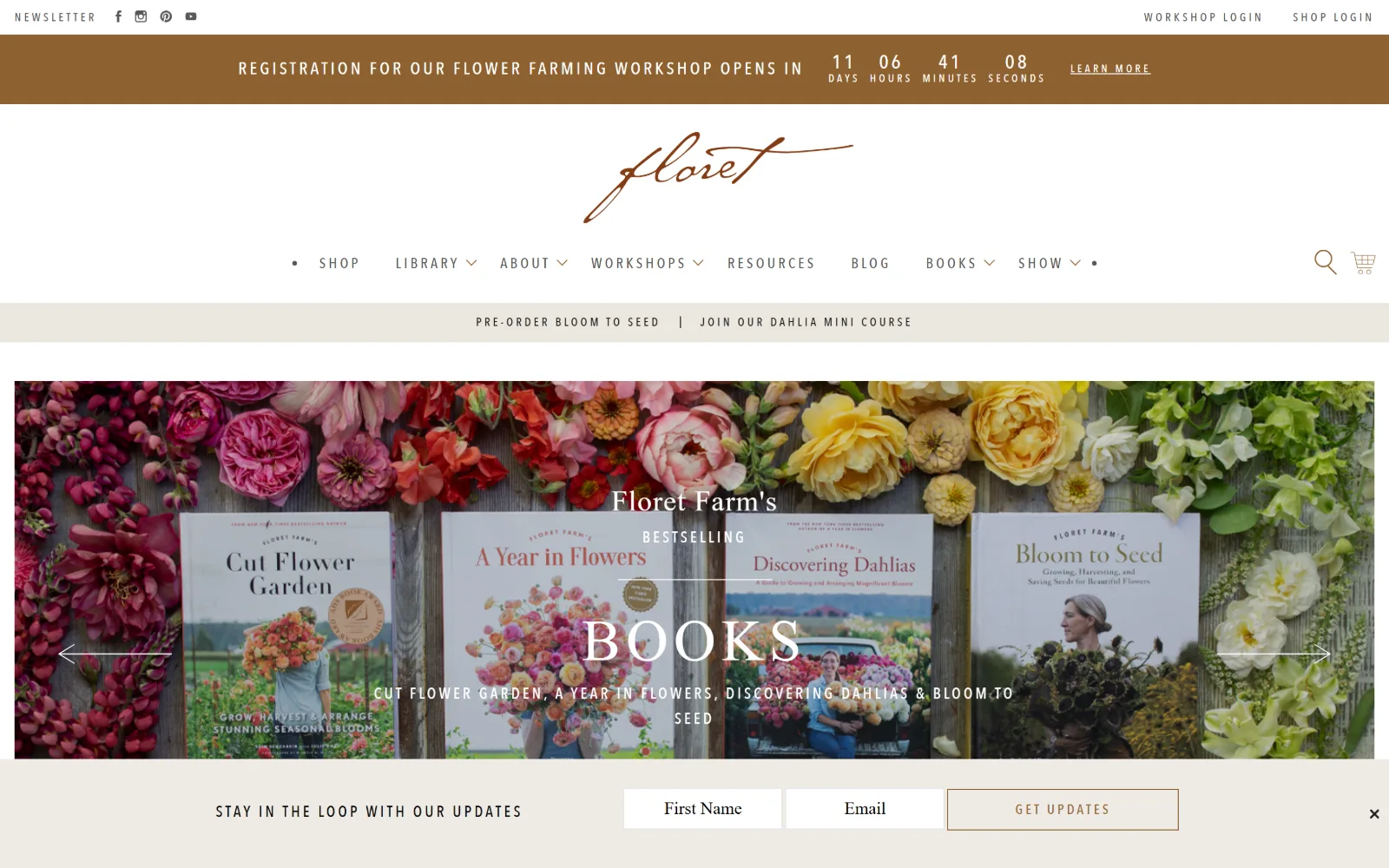
A live countdown bar sits above a script wordmark, eight nav items, and a hero of four book covers laid on weathered planks between banks of flowers.
Type
EB Garamond 60px uppercase, 0.100em
Body
EB Garamond 18px / 1.40
Build
four stacked bars, sticky header, 45px padding
Made on
WordPress
Colour
#ffffff #8e6130 #eeeae4
Type. EB Garamond does both jobs: 60px uppercase at 0.100em for BOOKS in the hero and 18px roman for body, so display and body are one family separated only by case and tracking. Navigation switches to AvenirNextLTW01-MediumC at 15px with 0.200em tracking in #8e6130, and the script wordmark is artwork rather than a font. Five sizes of the Avenir run from 20px down to 15px.
Colour. Six measured values but the working set is three: #ffffff at 126.9 coverage, then #eeeae4 and #f6f6f6, two near-identical warm greys for the utility bars, with #1d1d1b for ink. The accent is #8e6130, a tobacco brown at only 4 coverage, and it carries a great deal: nav links, the countdown bar, the GET UPDATES outline and the wordmark.
Layout. Four stacked horizontal bars arrive before the hero begins: utility links, countdown, wordmark and nav, then a promo strip. The header is sticky. Section padding is a tight 45px, the narrowest in this set, which suits a page selling many things at once. The hero is a full-width slider with arrows at both edges and an email bar docked to the bottom.
The ask. Counting honestly, eleven asks are visible: two logins, a newsletter link, a countdown with LEARN MORE, two promo links, eight nav items with dropdowns, search, cart, slider arrows and a docked form with First Name, Email and GET UPDATES. The countdown is the sharpest of them because it is the only one with a deadline attached.
A live countdown gives one of eleven competing asks a deadline, which is the only thing that reliably sorts a crowded header into an order.
10
bloomist.com
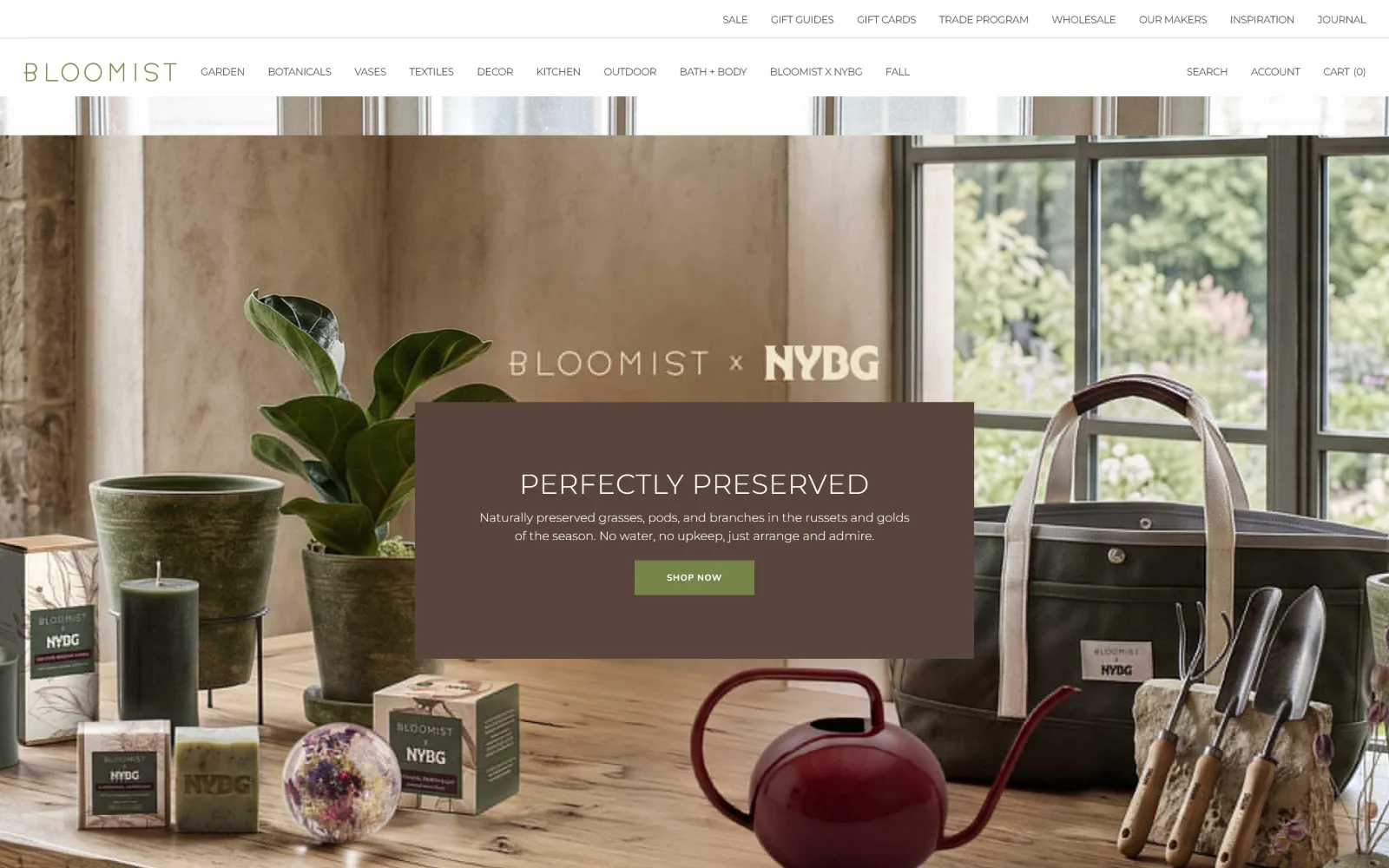
Eighteen nav links sit above a table of pots, soaps and a red watering can, with a brown panel carrying Perfectly Preserved and a green Shop Now.
Type
Montserrat 29px, weight 300
Body
Montserrat 13px / 1.50
Build
two header rows, full-bleed photo, 330px four-column grid
Made on
Shopify
Colour
#ffffff #58443d #758448
Type. Montserrat at weight 300 handles nearly everything: 29px for the hero heading, 15px for the nav, 13px for body on a 1.50 line height. A 10px uppercase size appears 64 times across the page, doing product and utility labelling. The button breaks to Nunito at 9px, weight 700, 0.080em tracking, and 9px is small enough that the button reads as a caption.
Colour. Three measured values. #ffffff at 231.4 coverage, which is almost the whole interface, #58443d at 6 for the brown hero panel, and #758448, an olive green, at 1 for the single button. Nav ink is #4d4d4d rather than black. All the warmth is photographic, and the olive is the only saturated pixel the stylesheet contributes.
Layout. Two header rows, eight utility links above ten category links, roughly 105px of chrome before the image starts. The photograph goes full bleed at 1440px with a semi-opaque brown panel floated over its centre. Below, content runs on a four-column 330px grid with 24px gutters alongside a two-column 931 and 198 split. Section padding is 24px, radius 0.
The ask. SHOP NOW in the hero panel is the only button and at 9px it is the smallest type on screen. Competing with it are eighteen nav links, a cart count, search, account, a sale link and a trade programme. The hierarchy is inverted: what the page most wants is set smaller than the wholesale enquiry it wants least.
Setting the primary button at 9px while the nav runs 15px inverts the hierarchy, so colour has to do the work that size should have done.
11
pistilsnursery.com
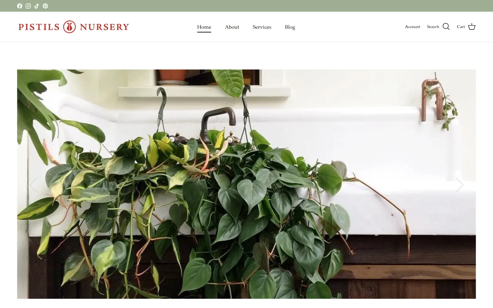
A sage utility strip and a red letterspaced wordmark sit above an inset photograph of trailing philodendron spilling over a white farmhouse sink.
Type
Palatino 25px
Body
Palatino 15px
Build
38px social strip, inset hero image, 1440px
Made on
Shopify
Colour
#ffffff #9eaf92 #171717
Type. One typeface, Palatino, at three sizes: 25px, 15px and 12px, with zero letter-spacing at every one of them. No sans appears anywhere on the page. Navigation sits at the smaller end and an underline beneath Home is the only state indicator. Palatino is an unfashionable choice and it reads as a shop twenty years old rather than one launched last season, which is accurate.
Colour. Two measured values: #ffffff at 104.9 coverage and #9eaf92, a soft sage, at 49 running the top strip. Ink is #171717. The red of the wordmark never appears in the measured palette because it is an image rather than text, so the brand colour exists only as artwork and is reused in no link, button or rule anywhere on the page.
Layout. The hero photograph is inset rather than full bleed, held off the left and right edges by about 55px and off the header by a clear gap, which frames it as a picture instead of a backdrop. The header is a single row around 85px deep beneath a 38px social strip. Carousel arrows overlay the image edges. Container is 1440px and radius is 0.
The ask. Four nav items, three icons, four social links and a carousel. No button, no phone number and no delivery promise above the fold, which is a gap for a shop that ships plants across the country. The only measurable call to action string is the carousel control labelled Previous, which indicates how little the page is asking for.
A brand colour that lives only inside a logo image never reaches links or buttons, so the working palette is two colours rather than three.
12
flowergirlnyc.com
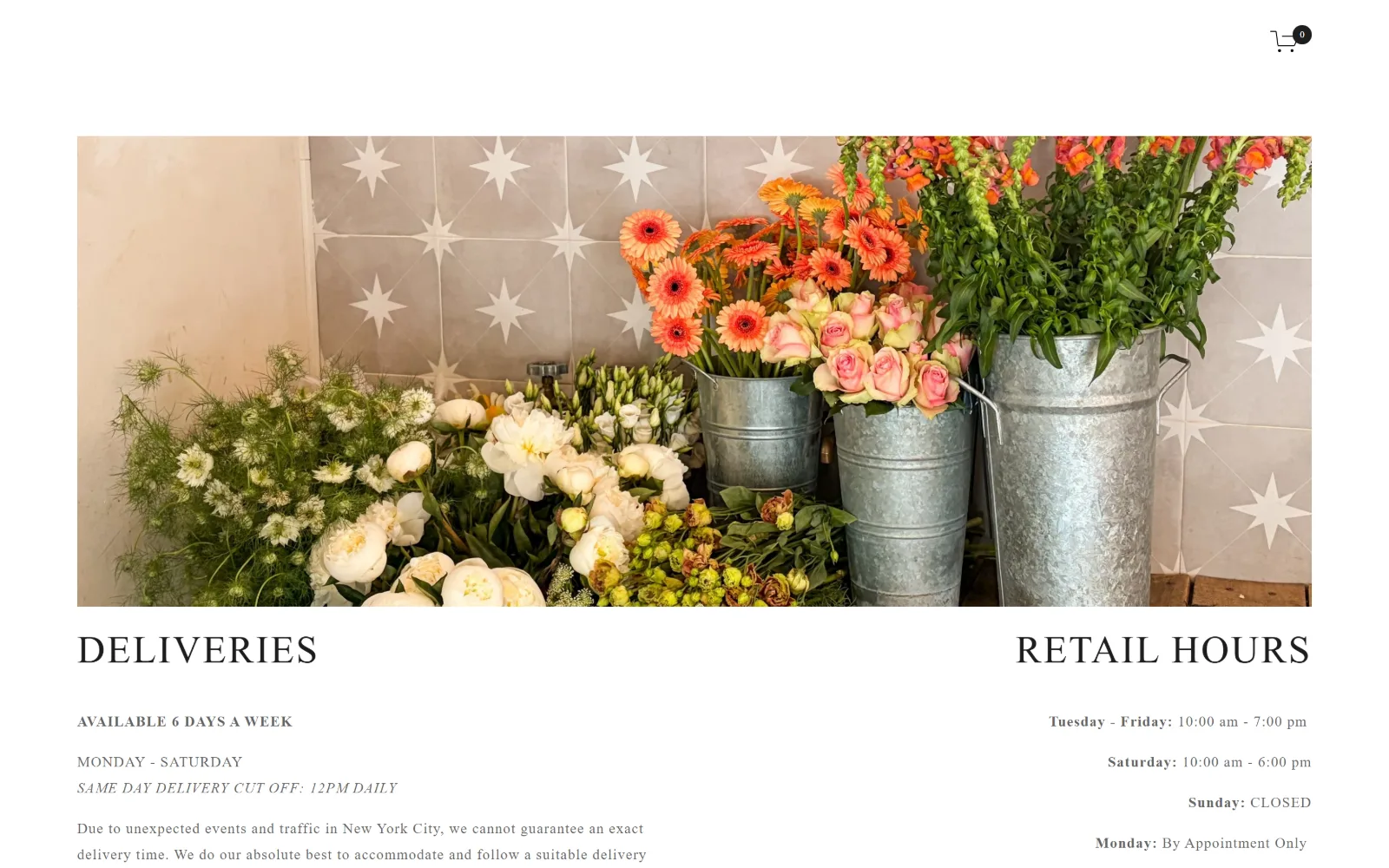
Two serif headings, Deliveries and Retail Hours, sit left and right under an inset photo of flower buckets against star-patterned tile.
Type
serif caps over a 40px measured ceiling, 0.050em
Body
futura-pt 15px / 1.80
Build
no header bar, inset photo, mirrored two-column info
Made on
Squarespace
Colour
#fafafa #ffffff #1d1d1d
Type. futura-pt carries almost everything, at 15px weight 300 on an unusually open 1.80 line height with 0.060em tracking, which gives the delivery paragraph a great deal of air. The measured scale tops out at 40px, and the two section headings read as a high contrast serif in caps that cuts hard against the geometric sans beneath. One Rubik size at 20px uppercase appears once.
Colour. Three values, two of them off-white: #fafafa at 126 coverage as the body ground and #ffffff at 64.9. Ink is #1d1d1d, with #000000 for the nav and #1c1c1c for a third block, three near-blacks where one would do. Nothing in the interface is coloured, so the only saturation is the orange gerberas and pink roses in the single photograph.
Layout. No header bar appears in the capture, only a cart glyph with a zero badge pinned top right. The photograph is inset from the edges of a 1440px frame rather than bleeding, and the two information columns below are mirrored: Deliveries flush left, Retail Hours flush right with the hours right-aligned so the column reads as a receipt. Radius is 0.
The ask. The page leads with logistics rather than product: six days a week, a 12pm same-day cut-off, retail hours by day, and a paragraph admitting that New York City traffic makes exact delivery times impossible to promise. That candour is the conversion strategy. The cart is the only button and no phone number appears above the fold.
Leading with a delivery cut-off time and an admission that traffic breaks exact windows pre-empts the question most same-day flower orders hinge on.
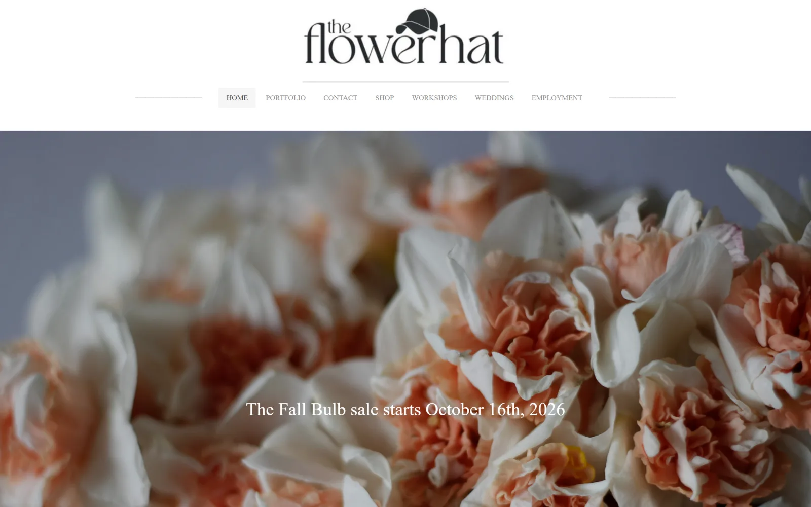
13
theflowerhat.com
A wordmark with a baseball cap perched on the r sits above a centred seven-item nav and a soft-focus bed of peach and cream daffodils.
Type
wordmark artwork, no measured display size
Body
Raleway 14px
Build
960px container, centred rule-bracketed nav
Made on
Not detected
Colour
#ffffff #f9f9f9 #5199a8
Type. The measured type is small and uniform: Raleway at 14px and 13px uppercase, nothing larger, with zero letter-spacing anywhere. The wordmark is artwork, a high contrast lowercase didone with a baseball cap resting on the r, and it is the only lettering on the page with any weight. The line overlaid on the photograph is a serif that the measured scale does not account for.
Colour. Three measured values and all three are white: #ffffff at 148.1 coverage, #f9f9f9 at 84.6 as the body ground, and #f6f6f6. Ink splits evenly between #8e8e8e grey and #5199a8, a dusty teal, at 47 characters each, which means half the text on the page is a link. The lavender and peach of the hero are entirely photographic.
Layout. The container is 960px, 67 percent of a 1440 viewport and the narrowest here, leaving wide white margins either side of the header while the photograph goes full bleed beneath it. The nav is centred and bracketed by two hairline rules running to the container edge, with the active item in a pale grey box. Radius is 0 and document height is 1396px.
The ask. Seven nav items, no button, no phone number and no form. The single dated promise, a bulb sale starting 16 October, is set over the photograph and is not a link. For a farm selling tubers seasonally that date is the whole message, and leaving it unlinked wastes the only urgency the page has to spend.
A dated announcement set as flat text over a hero image carries urgency but no destination, spending attention the page has no way to collect.
How these were chosen
Thirteen shops and studios, and the division that matters is not retail against events but pages that sell against pages that show. Six have no button at all above the fold, five carry no measurable display size and let a single photograph own every bit of scale, and corner radius is 0 on eleven of the thirteen. What does not hold is the assumption that florist website design means pale pink and a script face: the grounds here run #27321b olive, #282828 charcoal, #243759 navy and #eeb544 marigold, and the only script belongs to a flower farm selling books. The shops stack announcement bars and count eighteen nav links; the studios hide navigation behind one glyph and ask once. Both are coherent. The ones that struggle sit in the middle, asking six times in a voice pitched for asking once.
Finding florist sites that someone had actually designed took far longer than it should have. 35 candidates made the shortlist. 13 made the page.
Each one was opened and looked at properly: what the type is doing, where the colour gets spent, how the page is built, how it asks for the job. Nothing is here because it ranks. Nothing is here because an agency filed it under portfolio. Several well known names were left out for the plain reason that their site came out of the same template as everyone else's, and a few sites worth including did not survive a second look.
Where a site is only competent, it says so. The order is the order worth your time, best first.
Reviewed and selected by Larry W. Matthews for Websitely.