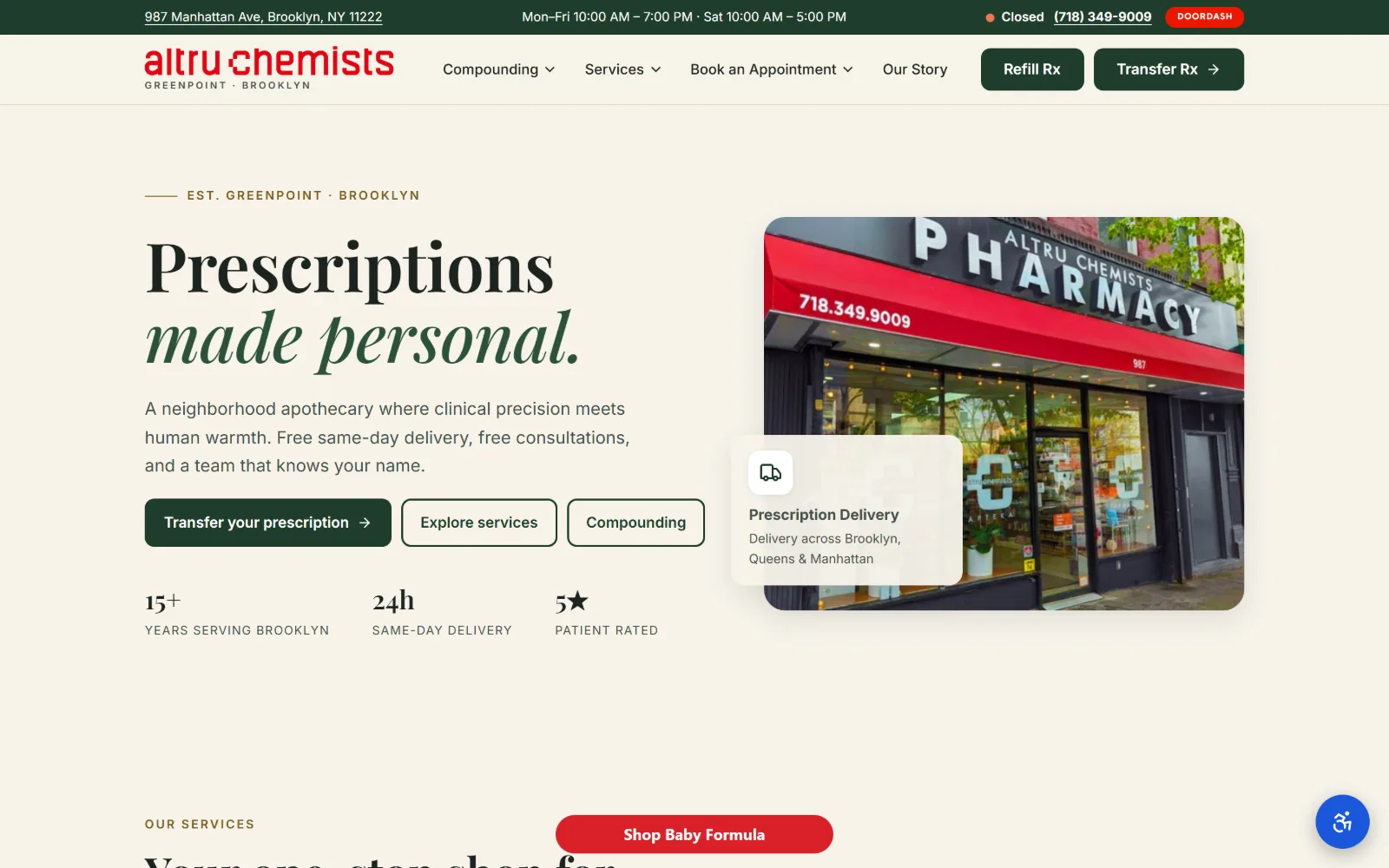
Type. Playfair Display runs 70px at weight 600, tracking -0.010em and leading 1.04, and the emphasis is handled by setting the second line in italic rather than by a size jump. Inter carries body at 18px on 1.65 leading and nav at 15px. The stat figures sit at 16px bold above letterspaced caps labels, so the numbers read before the words.
Colour. The ground is #f7f3ea with a warmer #ece6d6 band under it, forest #1f3d2b on the filled button and the italic word, body ink #46514a and headline ink #1c2420. Saturation is rationed: #d92128 covers 0.4 percent and appears only in the awning photograph and the delivery chip, so the red reads as the shop rather than as branding.
Layout. An 1180px container at 82 percent of the frame, 96px of section padding, and a hero split 572/497 with a 70px gutter. A dark utility strip above the sticky header holds address, hours and phone. The photograph sits in a rounded card with a delivery panel overlapping its left edge; buttons use 10px radius against a 22px card radius.
The ask. Transfer your prescription is the one filled button, with Explore services and Compounding outlined beside it, and Refill Rx and Transfer Rx repeated in the header. The phone number is a live link in the top strip next to an open or closed indicator. The 15+, 24h and 5 star row answers the obvious objection before the second ask arrives.
Rank the asks by fill: one solid button, two outlines, and the repeat pair in the header. Three equal buttons would have flattened it.
02
lakehillsrx.com
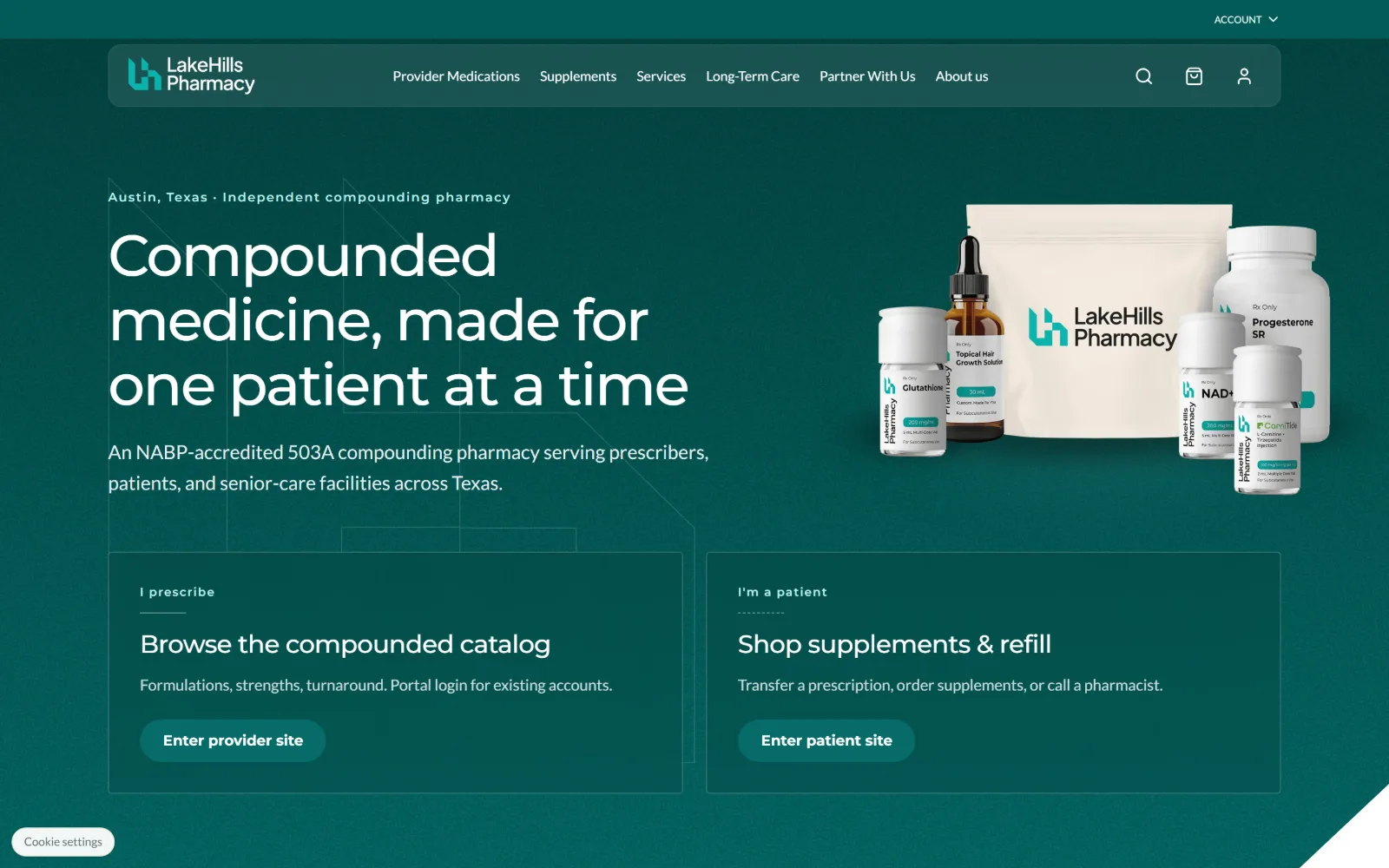
Deep teal fills the whole frame: a white headline over three lines, a product group photographed right, two bordered panels sharing the foot.
Type
Montserrat 60px, -0.03em, 1.12
Body
Lato 20px, 1.60
Build
1220px container, 12 col / 32px gutter, 80px padding
Made on
custom JS framework
Colour
#035b58 #066b68 #faf8f3
Type. Montserrat sets the headline at 60px, weight 500, tracked in to -0.030em on 1.12 leading, so the three lines close up into a block instead of drifting. Lato handles body at 20px on 1.60 and nav at 14px weight 500. Panel headings drop to 26px Montserrat at -0.020em; buttons are 15px at weight 700. One geometric sans, one humanist sans, no third voice.
Colour. Teal does nearly all of it. The field reads as #035b58 deepening to #066b68 on the buttons, with #faf8f3 and #ffffff held back for type and the product bag. Ink runs #044846 and #0f2e2c on light ground and white on dark. There is no second accent hue anywhere in the hero, which is why the white product cluster carries so much weight.
Layout. A 1220px container at 85 percent of the frame sits on a 12 column grid of 72px tracks with 32px gutters, and section padding is 80px. The two foot panels are 596px each with a 24px gap and a thin border rather than a fill. Corners stay square across the page apart from the fully rounded buttons. Faint line drawings sit behind the headline.
The ask. The page forks at the first screen: Enter provider site and Enter patient site, each under its own label and one line of scope. Cart, search and account icons sit in the header, no phone number. Supplements and Provider Medications are separated in the nav, so the commerce path and the prescription path never share a button.
When two audiences need different pages, give each its own panel with a scope line, rather than one button and a dropdown they have to guess at.
03
absoluterx.com
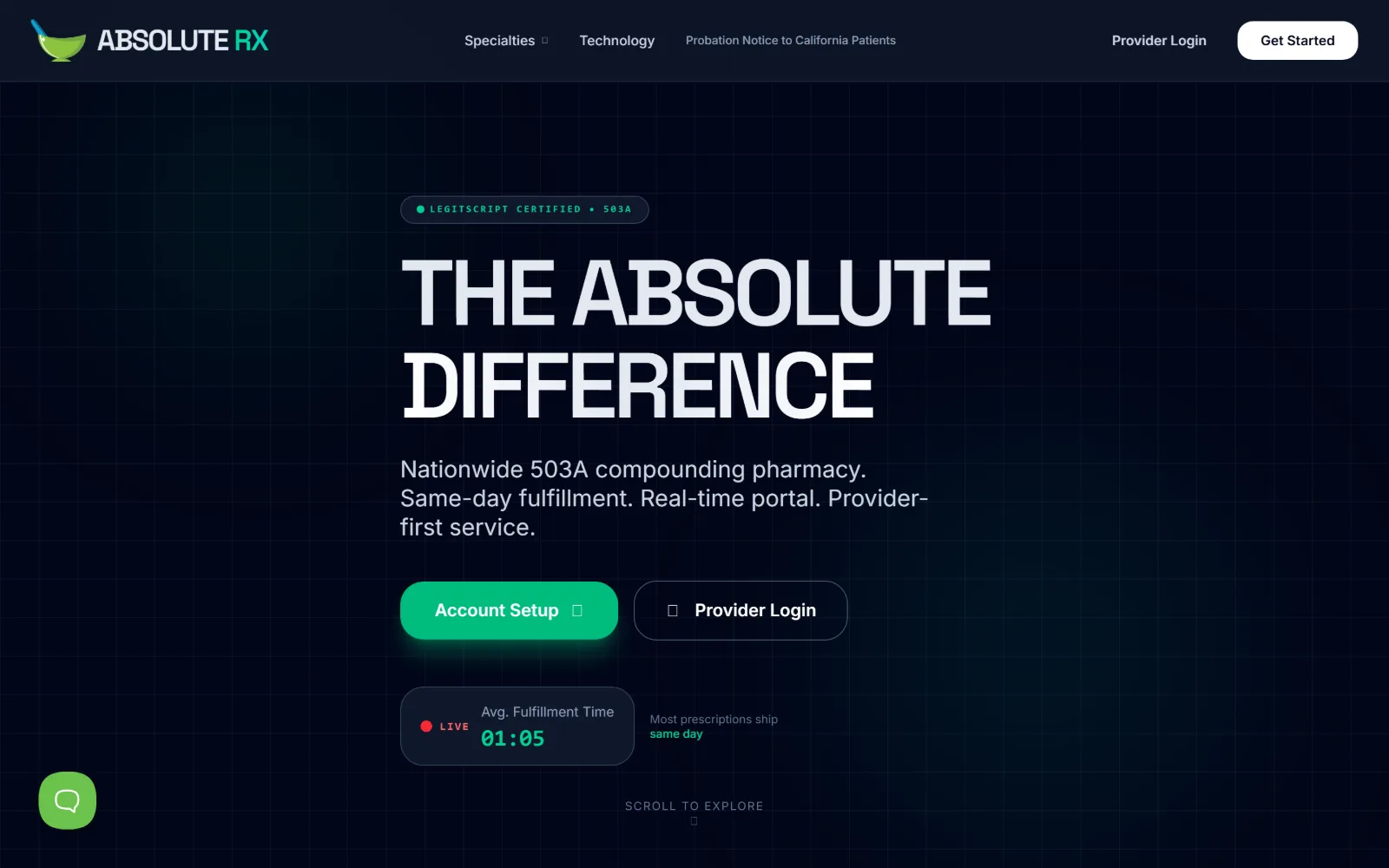
Near black throughout, with a faint grid, a huge condensed caps headline, a green pill button and a live fulfilment timer reading 01:05.
Type
Space Grotesk 96px caps, -0.05em
Body
Inter 24px, 1.25
Build
1440px full bleed, 12 col / 32px, 96px padding
Made on
custom JS framework
Colour
#020109 #0f172a #ffffff
Type. Space Grotesk sets the headline at 96px weight 600, tracked to -0.050em on 1.00 leading, in caps, so the two lines lock into a solid mass. Inter takes the subline at 24px on 1.25 and a 52px weight 700 tier further down at -0.040em. The certification badge sits in small letterspaced caps. Negative tracking at every display size is the consistent move.
Colour. The base is #020109 at 150 percent coverage, with #08020f and #0f172a shading the grid and the cards. White type does the reading. A single green carries the badge dot, the Account Setup fill and the same day phrase, and nothing else on the page is saturated, so the eye lands on the button without a border being drawn round it.
Layout. A 1440px full bleed frame with 96px section padding and a 12 column grid of 85.3px tracks at 32px gutters, though the hero ignores it and centres one column. Buttons take 24px radius while the page keeps square corners elsewhere. The timer card floats below the buttons with its own darker fill, and a scroll cue closes the viewport.
The ask. Account Setup is the filled primary against an outlined Provider Login, with Get Started repeated in the header. There is no phone number and no patient path; the live fulfilment counter stands in for the reassurance a phone number usually gives, which only works because the number updates.
A live number beats a claim. Replacing a turnaround promise with a running counter makes the same point and cannot be written by a copywriter.
04
la-pharmacie.com
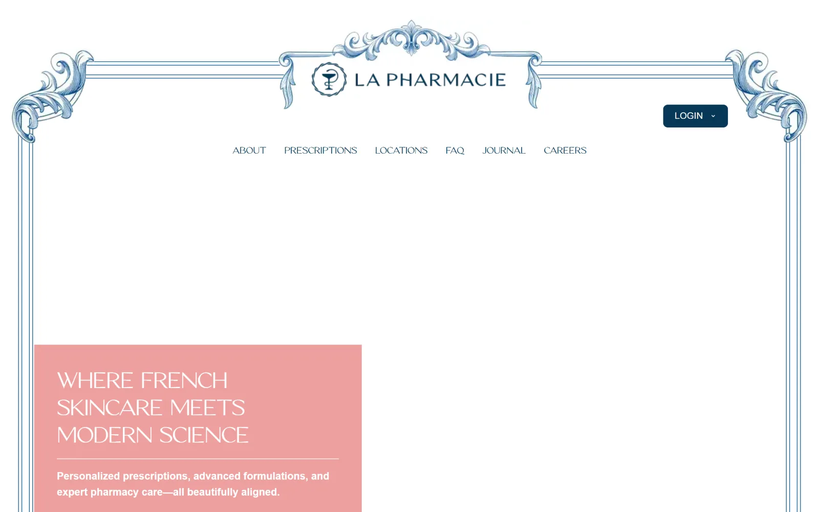
An engraved blue filigree frame runs round a white page, with a centred logo, six caps nav items, and a salmon block carrying white caps bottom left.
Type
geometric caps 48px, -0.021em
Body
Montserrat 18px, w600
Build
1320px container, engraved frame, video hero
Made on
custom build
Colour
#ec9695 #ffffff #063755
Type. The display face is a high contrast geometric set in caps at 48px with -0.021em tracking on 1.00 leading, and a lighter 75px cut at -0.027em appears further down. Montserrat handles everything else: 18px weight 600 for the standfirst, 16px caps for nav. The display is wide and thin, the body is short and heavy, and the contrast between them is the whole idea.
Colour. Three colours and no more: #ec9695 for the single salmon block, #ffffff for the page, and #063755 navy for the engraving, the logo and 475 characters of ink. The salmon is the only saturated area in the frame, so a flat rectangle with no border or shadow reads as the primary panel on its own.
Layout. A 1320px container at 92 percent of the frame, with the engraved border acting as the structure instead of a header bar. Video fills the hero, and the headline block is a flat salmon rectangle anchored bottom left with a hairline rule under the heading. Corners are square throughout; the only rounded element is the navy LOGIN pill top right.
The ask. One ask, a LOGIN pill with a dropdown. Prescriptions, Locations and FAQ carry the practical routes in the nav instead. No phone number, no refill button and no form in view, which suits a brand selling skincare and prescriptions in the same breath but costs it the walk in patient.
A decorative frame can replace a header rule entirely, but only if the palette stays at three colours and every corner inside it stays square.
05
southendpharmacystore.com
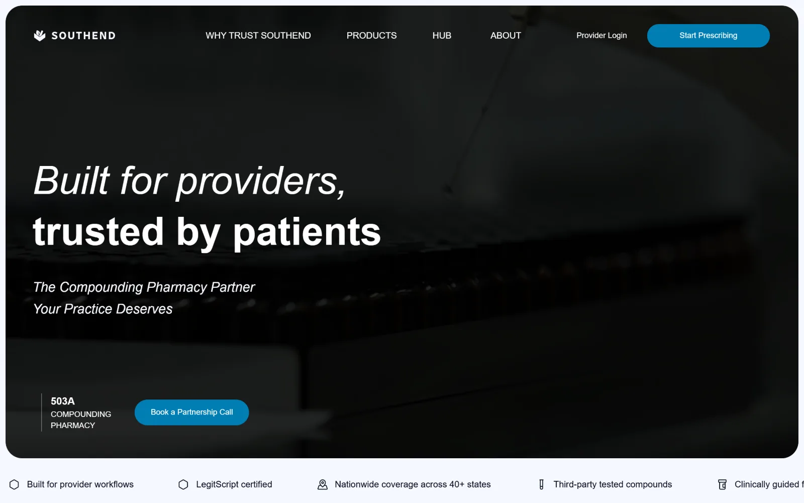
Floating on a pale lilac page, a dark rounded panel holds an italic then roman headline, a blue pill and a five item trust strip underneath.
Type. Noto Sans runs the hero at 70px weight 600, with the first line italic and the second roman so the sentence turns on its own axis. The supporting line repeats the italic at 24px. Body drops to 18px weight 300 on 1.63 leading and nav sits at 16px. Using one family in two postures instead of two families is what keeps it quiet at that size.
Colour. The page is #f5f7ff and the hero panel is #0a1420 at 37 percent coverage, which is a deliberate inversion: the dark area is the content, the light area is the margin. Accent is a single #017eb4 on the two pills. White type on the panel, #010000 on the strip below.
Layout. A 1320px container at 92 percent of the frame, with the hero inset rather than full bleed so the lilac shows on all four sides and the corner radius is visible. Section padding is tight at 24px. The trust strip of five icon items runs full width directly under the panel, outside the dark area, which separates claims from pitch.
The ask. Start Prescribing is the filled header pill, Book a Partnership Call is the hero pill, and Provider Login is a bare text link, so three asks sit in one screen without competing. A 503A label sits left of the hero button as qualification rather than decoration. No patient route and no phone number.
Insetting a dark hero so the page colour frames all four sides makes the corner radius do work. Full bleed would have thrown that detail away.
06
merzapothecary.com
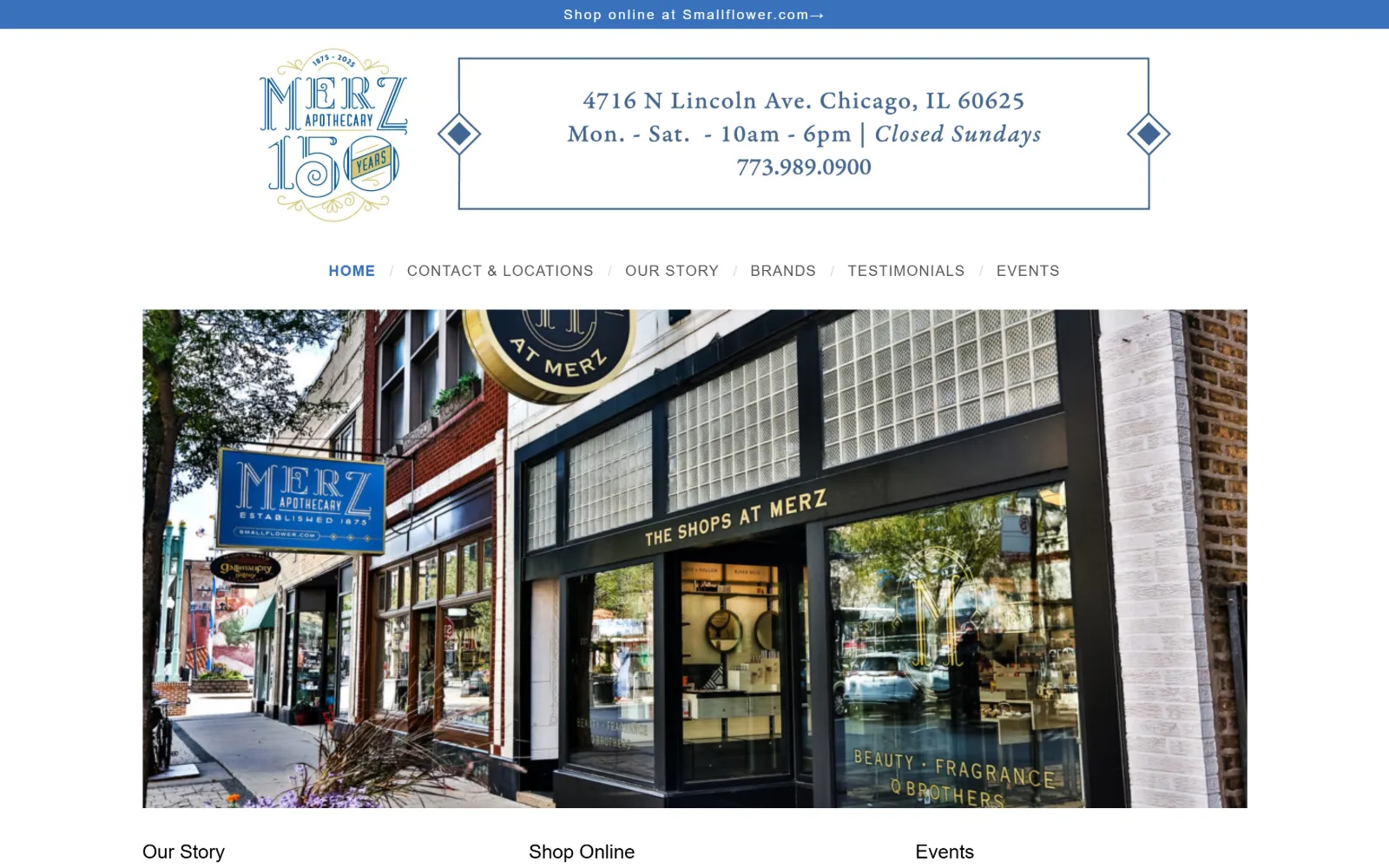
Blue bar pointing visitors to the shop, under it an engraved 150 year logo, a boxed address and hours panel, six nav items and the storefront.
Type. The address panel is set in a serif at 14 to 20px, with the closing line in italic, and it is the largest type on the page because the address is the message. Open Sans takes nav at 15px weight 700 with 0.067em tracking in caps, body at 14px on 1.43, and one 14px line opened out to 0.143em. There is no display tier at all.
Colour. White at 121 percent coverage, a working blue of #3971bb with #405176 beneath it, and gold held entirely inside the logo artwork. Ink is plain #000000 across 701 characters. The restraint is the point: the engraved logo supplies the ornament, so the page colour does not have to.
Layout. An 1150px container at 80 percent of the frame. The address panel is a hairline rectangle flanked by two solid diamond rules, a Victorian trade card device done in CSS. The photograph is a fixed width band inside the container rather than full bleed, and a three column Our Story, Shop Online, Events row follows beneath it.
The ask. No button exists anywhere above the fold. The phone number, the street address and the opening hours are the conversion, set larger than anything else, and the blue bar hands anyone wanting to buy over to the sister shop. For a 150 year old shop with one location that is the right order.
If the business is one address, set the address as the display type. A hero slogan over a storefront photo would have buried the only fact that matters.
07
mediverarx.com
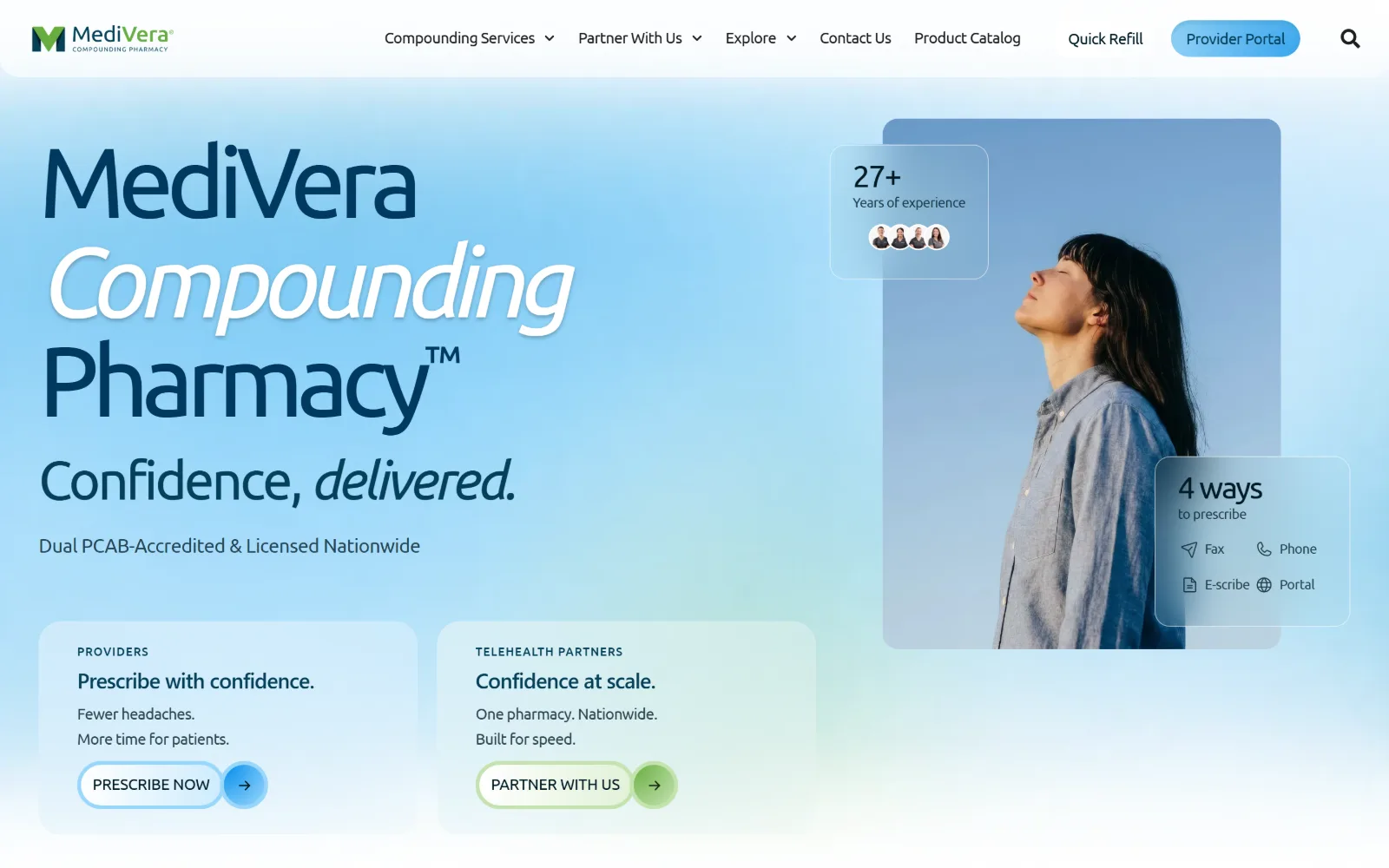
Pale blue gradient behind a stacked wordmark whose middle word is white italic, a portrait card right, two glass stat panels overlapping it.
Type
Ubuntu 103px, -0.07em
Body
Ubuntu 16px, -0.03em, 1.60
Build
1440px full width, rounded cards, glass stat panels
Made on
WordPress
Colour
#e6f2f5 #99d7fb #021c26
Type. Ubuntu runs the brand block at 103px tracked hard to -0.070em, with a 56px tier at -0.050em and a 32px line that mixes roman and italic in the same sentence. Body sits at 16px on 1.60 with -0.030em, and eyebrow labels at 18px caps opened to 0.020em. Tightening tracking as size grows is applied consistently, which is what stops 103px looking accidental.
Colour. Six tints share the field: #ffffff and #e6f2f5 do the bulk, with #cce5eb, #99d7fb and #ccebfd shading the gradient and a lone green #c3e3af on one button edge. Ink is #021c26 with #054059 for headings. Nothing is fully saturated, so the two glass cards read by blur and border rather than by fill.
Layout. A 1440px full width frame with no fixed section padding, split so the portrait sits in a rounded card on the right and two translucent cards overlap its corners. Two pale panels sit below the headline, each closing with a pill button that ends in a filled circular arrow. The whole hero is built from rounded rectangles at three different sizes.
The ask. PRESCRIBE NOW and PARTNER WITH US split the page by audience, with Quick Refill as a text link and Provider Portal as a pill in the header. A floating card lists four ways to prescribe, fax, phone, e-scribe and portal, which converts a friction question into a reassurance before anyone clicks.
Listing every intake channel in the hero removes the commonest reason a prescriber bounces, which is not knowing whether their workflow is supported.
08
empowerpharmacy.com
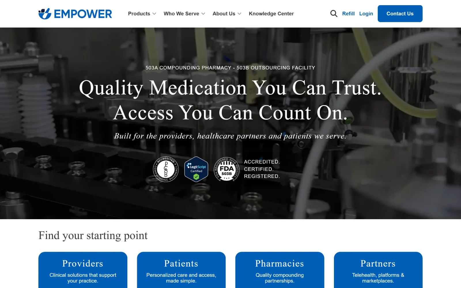
Grayscale filling line fills the hero behind a white serif headline, three accreditation seals in a row, four blue cards starting below.
Type
ivypresto-display 65px, 0.015em
Body
Roboto 18px, 1.63
Build
1200px container, full bleed hero, four 8px cards
Made on
WordPress
Colour
#121e3e #005eb8 #ffffff
Type. ivypresto-display sets the two headline lines at 65px weight 400 with 0.015em tracking on 1.20 leading, and repeats in italic for the supporting line and again at 25px for the card titles. The eyebrow is letterspaced caps. Roboto handles body at 18px on 1.63 and nav at 16px weight 700. A serif display over a neutral sans is the whole typographic argument.
Colour. Four colours: #121e3e at 64.9 percent coverage, #000000 at 33.3 from the desaturated photograph, white type at 12, and #005eb8 at 9.6 carrying the four cards and the single filled header button. Because the photo has been stripped of colour, the blue is the only hue in the frame.
Layout. A 1200px container at 83 percent of the frame with a sticky header and a full bleed hero photograph. Four equal cards at 8px radius sit under a left aligned 48px heading, while the hero itself is centred, so the page switches alignment at the fold rather than blending the two.
The ask. Contact Us is the only filled header button; Refill and Login stay as text links beside it. The seals sit directly under the headline with the words accredited, certified and registered stacked next to them. The four cards sort visitors into providers, patients, pharmacies and partners before any form is offered.
Desaturating the hero photograph leaves exactly one hue for the interface, which is why a single blue reads as a system rather than as a button colour.
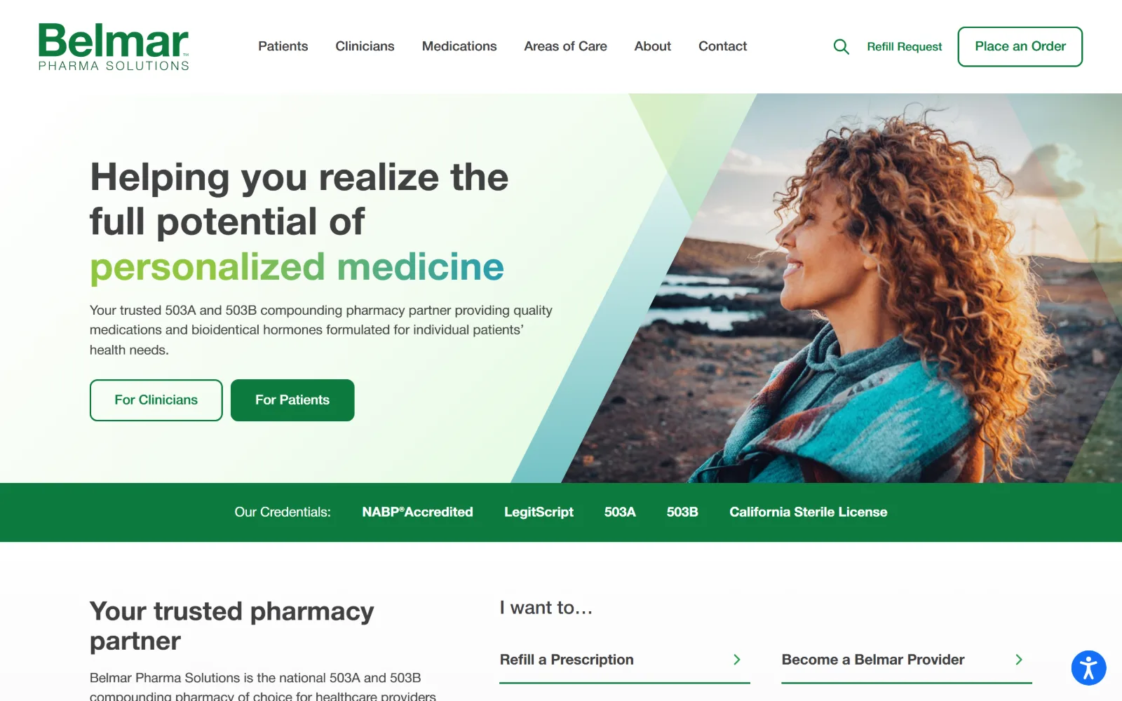
09
belmarpharmasolutions.com
White hero, headline shifting from light green to teal on its last line, a diagonal wedge cutting a portrait, then a green credentials bar.
Type
Helvetica Neue 50px, w600, 1.15
Body
Helvetica Neue 17px, 1.50
Build
1440px full width, diagonal photo mask, full bleed credentials bar
Made on
WordPress
Colour
#ffffff #f7f7f7 #0d7b3e
Type. Helvetica Neue sets the headline at 50px weight 600 on 1.15 leading, with the final two words carrying a colour change instead of a weight or size change. Body runs 17px on 1.50 and nav 17px weight 500, so the nav and the body sit at the same size, which flattens the hierarchy more than it should.
Colour. Three measured values only: #ffffff at 127 percent and #f7f7f7 at 61 carry the field, and #0d7b3e does the logo, the filled button, the credentials bar and 82 characters of ink. The gradient on the headline runs from a lighter green into a teal, which is the one place the palette is allowed to drift.
Layout. A 1440px full width frame with the hero split so the photograph is masked by a diagonal edge, and a soft green wash bleeding across the join. The credentials bar runs full bleed beneath it in solid green. Buttons take 10px radius while everything else stays square, and the header is sticky.
The ask. For Clinicians is outlined, For Patients is filled, and Place an Order sits outlined in the header with Refill Request as a text link beside it. Below the fold an I want to list reduces the same choices to two arrow links. Five credentials sit on the green bar between the two layers of asks.
Putting accreditations on a solid bar between the hero and the next section lets them interrupt without being a card, and nobody scrolls past them.
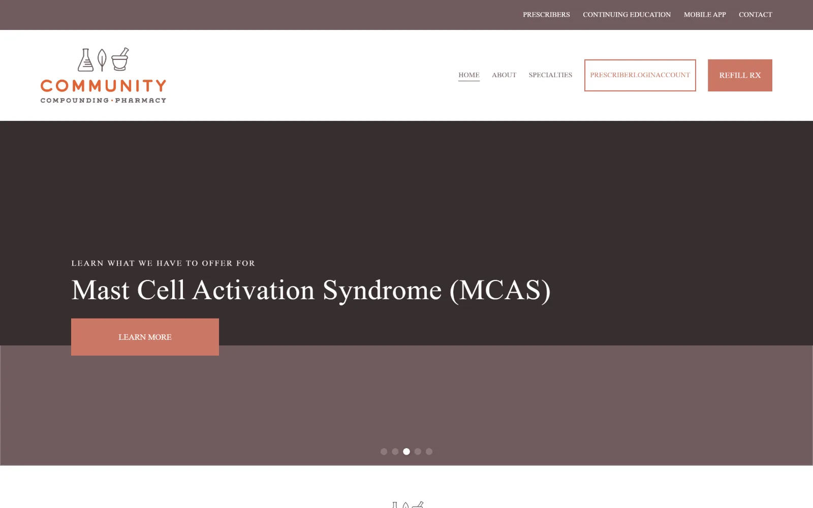
10
communitycmpd.com
Brown bands, a terracotta mortar and pestle line mark, a serif slide headline about MCAS, a solid terracotta button and five slider dots.
Type
Bitter 51px, 0.01em, 1.10
Body
Catamaran 20px, 1.68
Build
1440px full width, 214px padding, two band hero
Made on
Squarespace
Colour
#705b5d #cc7766 #ffffff
Type. Bitter sets slide headlines at 51px weight 400 with 0.010em tracking on 1.10 leading, over an eyebrow at 14px opened right out to 0.150em in caps. Catamaran takes body at 20px on 1.68 and nav at 13px caps. The eyebrow tracking is the detail that makes the pairing work; at normal spacing it would read as a stray line.
Colour. A muted brown of #705b5d covers 746 percent across the hero bands, white 161, and terracotta #cc7766 just 2.9 percent on the button, the logo and the login border. Using a desaturated brown rather than black for the dark area is what lets a low saturation terracotta still register as an accent.
Layout. A 1440px full width frame with unusually deep 214px section padding and a hero built from two horizontal brown bands of different value rather than one block. Every button is a hard edged rectangle with no radius. The header is sticky and carries a bordered Prescriber Login box alongside a filled Refill Rx.
The ask. Refill Rx is filled, Prescriber Login is outlined, Learn More sits in the slide, and the slider rotates five messages so the primary ask changes under the visitor. That is the weakness here: the headline in view talks about one condition, and the next slide will talk about another.
A rotating hero moves the primary message out from under the visitor. Keep the header buttons fixed so at least one ask survives the rotation.
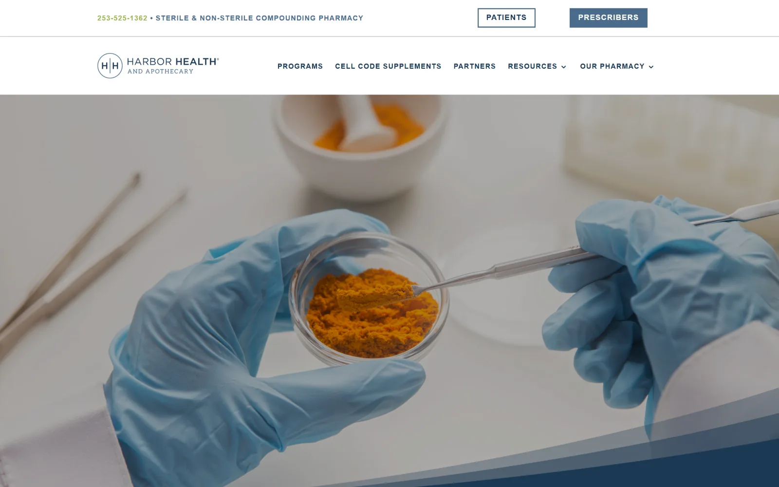
11
harborhealth.net
Two tier white header carrying a phone number and two audience buttons, over a full bleed macro of gloved hands lifting ochre powder in a dish.
Type
Raleway 40px caps, 0.05em
Body
Montserrat 37px, 1.32
Build
1440px full width, two tier header, full bleed macro photo
Made on
WordPress
Colour
#ffffff #1c3954 #99b54b
Type. Raleway does the interface work at 13 and 14px weight 700 with 0.077em and 0.071em tracking in caps, and opens to 0.050em at 40px for section headings. Montserrat carries the promise line at 37px on 1.32. The nav is tiny and heavily letterspaced, which reads as deliberate restraint rather than as a shortage of space.
Colour. White at 197 percent and black at 42 from the photograph, navy #1c3954 for ink and nav, and a single olive #99b54b used on exactly 12 characters, the phone number. That is the whole accent budget, and it is spent on the one element the business most wants clicked.
Layout. A 1440px full width frame with the header split into a utility row and a nav row, so the phone number and the audience split never compete with the menu. The photograph runs full bleed with a navy diagonal entering from the bottom right. Buttons are square. The page is short at 3480px, which suits a two audience site.
The ask. PATIENTS and PRESCRIBERS sit as an outlined and filled pair in the utility row, with the phone number to their left in the accent colour. JOIN NOW appears further down. The split happens before the logo is even reached, which is unusual placement and works because the two audiences need different sites.
Spending the only accent colour on the phone number, and nothing else, turns a utility row into the most clicked part of the header.
12
westsidebendrx.com
Heavily blurred shelf photography fills the frame behind a two line grey headline, with a leaf wordmark, a phone number and a pink menu square.
Type
neutral grotesque 72px
Body
grotesque 19px, w700
Build
1440px full width, floating header, blurred full bleed hero
Made on
WordPress
Colour
#f8f8ff #eaeaea #121217
Type. The headline runs at 72px regular with a 56px tier at -0.025em elsewhere, in a plain neutral grotesque, set in dark grey rather than white or black. Labels drop to 12px at 0.167em in caps, and nav sits at 16px weight 500 on 3.00 leading. The measured font name does not match what the page renders, so take the sizes and ignore the label.
Colour. The ground is #f8f8ff with #eaeaea behind it and ink at #121217, and the entire saturated budget is one pink, #fb4b7a at 0.1 percent coverage, on the menu square. Everything else in the frame is supplied by the out of focus photograph, which is doing the work a flat colour usually would.
Layout. A 1440px full width frame with no header bar at all: logo, phone and menu float directly on the photograph. The hero is a full bleed blurred background with the headline set left at about a third of the height. Further down a 757/422 two column split appears. The page is long at 11839px, which the single screen gives no warning of.
The ask. The phone number beside the menu square is the only visible ask, and the navigation is folded behind an icon on a desktop width where there is room for it. There is no refill button, no transfer link and no form in view, so a visitor who does not want to call has nowhere obvious to go.
Blurring a photo to near abstraction buys you a legible headline, but hiding desktop navigation behind a burger throws away the room you just saved.
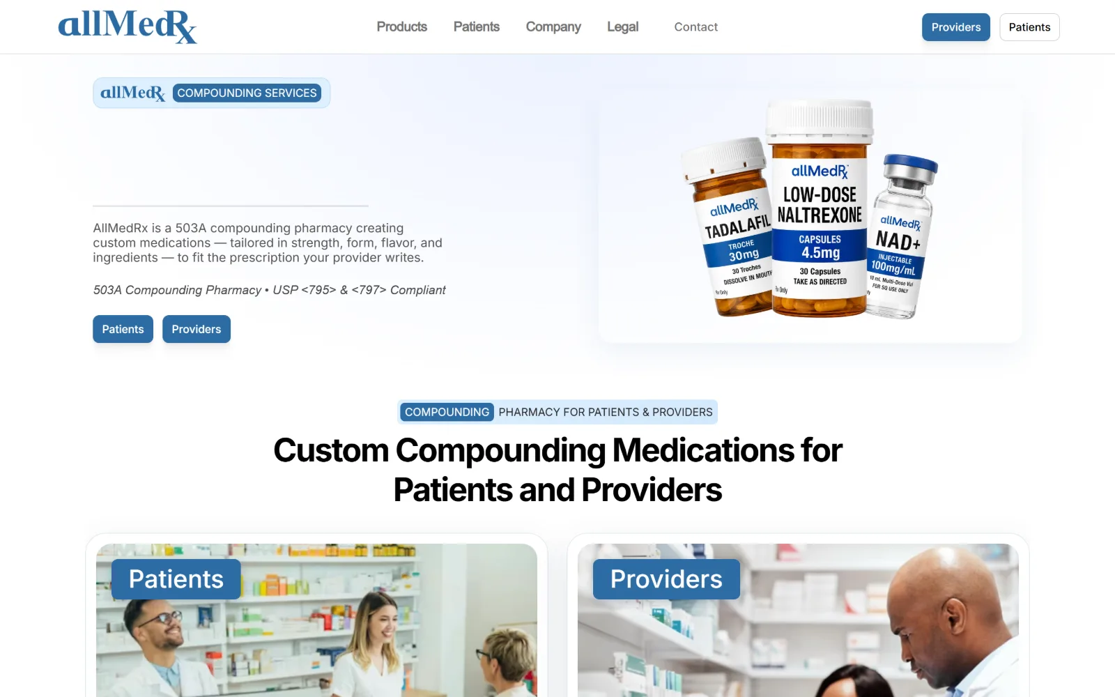
13
allmedrx.org
Framer build on white: a blue pill badge, a paragraph where a headline should be, a product render on a pale card, a centred heading below.
Type
Inter 32px, w500, 1.00
Body
Inter 16px, 1.20
Build
1440px full width, 42px padding, 8px radius cards
Made on
Framer
Colour
#ffffff #def0ff #2d6ca4
Type. Inter carries everything: 32px weight 500 on 1.00 leading for the section heading, 16px on 1.20 for body, 15 and 14px for labels, and an italic 16px line for the compliance note. There is no display tier, so the hero opens with running text at body size and the first real heading does not arrive until the second screen.
Colour. White at 254 percent coverage, a pale #def0ff at 4.6 on the badge and the hero wash, and #2d6ca4 at 1.8 on buttons and labels. Ink is #525252 across 1368 characters with #212121 reserved for headings. The palette is clean and the hero is nearly empty, which makes the one blue pill badge carry more than it should.
Layout. A 1440px full width frame with 42px section padding and 8px radius on both buttons and cards. The hero is split with the product render on a pale rounded panel and the text left, though a large empty block sits above the paragraph. The heading band below is centred with its first word set in a filled chip.
The ask. Patients and Providers appear three times in one screen: as header buttons, as two small buttons under the hero paragraph, and again as two photo cards. Repeating the same fork at three weights without changing the wording means the visitor reads it as duplication rather than as emphasis. No phone, no refill.
Repeating one audience fork three times in a screen is not emphasis. Pick the layer with the most room and delete the other two.
14
bobjohnsonspharmacy.com
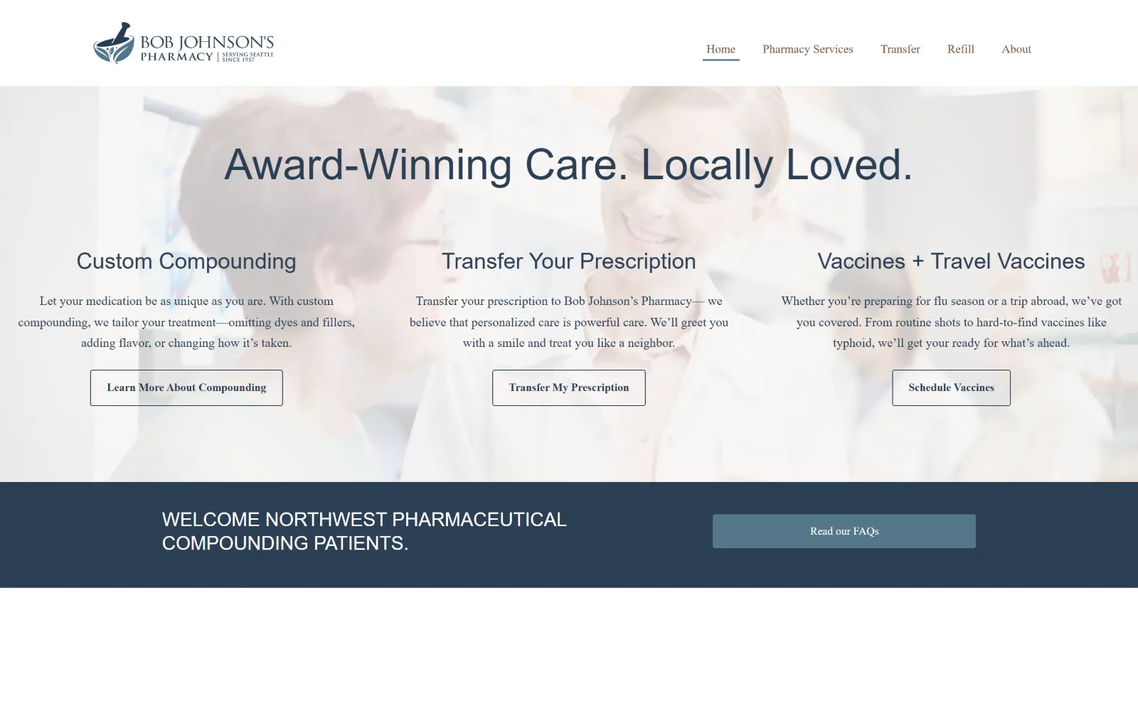
Three equal text columns sit over a faded photograph of two people, each with a serif heading and an outlined button, above a navy band.
Type
Tenor Sans 54px
Body
Poppins 16px, w300, 1.68
Build
1280px container, three 368px columns, 1027/553 band
Made on
WordPress
Colour
#f7f5f3 #2c3f54 #537789
Type. Tenor Sans sets the hero line at 54px and the column headings at 28 to 30px, with a 24px caps size in the navy band. Poppins runs body at 16px weight 300 on 1.68, nav is Figtree at 15px weight 300, and buttons are Montserrat 14px. Three sans families supporting one serif is more than the page needs.
Colour. The field splits between #f7f5f3 at 133 percent and white at 100, and navy #2c3f54 carries 1175 characters of ink plus the full width band. The FAQ button is a lighter #537789 and the nav picks up a warm brown #765539. The brown is the only thing stopping the page reading as a stock navy template.
Layout. A 1280px container at 89 percent of the frame, with three 368px columns at 32px gutters laid over a washed out photograph rather than beside it. The navy band below splits 1027/553 so the text and the button sit in unequal halves. Buttons carry a 3px radius. The page is short at 4567px.
The ask. Three asks of identical weight, Learn More About Compounding, Transfer My Prescription and Schedule Vaccines, each outlined, none promoted. Read our FAQs sits alone in the navy band with more room than any of them. Nothing tells a first time visitor which of the three they were meant to click.
Fading a photo to 20 percent so text can sit on it costs you the photo and gains you a texture. Either crop it properly or use a flat colour.
How these were chosen
Two different businesses share one word here. A pharmacy that dispenses sells a service it cannot photograph, so its homepage leans on accreditation seals, an audience fork and a transfer button. A pharmacy that sells a shelf leans on product photography, a category nav and a basket. Merz Apothecary, La Pharmacie and Westside Bend sit on the retail side and get to use ornament, colour and a real display face; the compounding labs mostly inherit a stock photo and a vendor template. The shortlist keeps whichever side made a decision: an engraved frame, a two tone headline, an inset dark panel, a 96px condensed cap. What holds across both halves is that fork between patients and prescribers, usually settled inside the first screen. What does not hold is typography, and that is where pharmacy website design separates the considered from the assembled.
Finding pharmacy sites that someone had actually designed took far longer than it should have. 33 candidates made the shortlist. 14 made the page.
Each one was opened and looked at properly: what the type is doing, where the colour gets spent, how the page is built, how it asks for the job. Nothing is here because it ranks. Nothing is here because an agency filed it under portfolio. Several well known names were left out for the plain reason that their site came out of the same template as everyone else's, and a few sites worth including did not survive a second look.
Where a site is only competent, it says so. The order is the order worth your time, best first.
Reviewed and selected by Larry W. Matthews for Websitely.