17 of the Best Senior Living Website Design Examples
Seventeen US communities where the first screen is a room you can picture living in. Senior living website design without the stock-photo smile.
Shown
17 sites
Reviewed
30 candidates
Chosen on
The work, not the ranking
Updated
15 October 2026
01
koelschseniorcommunities.com
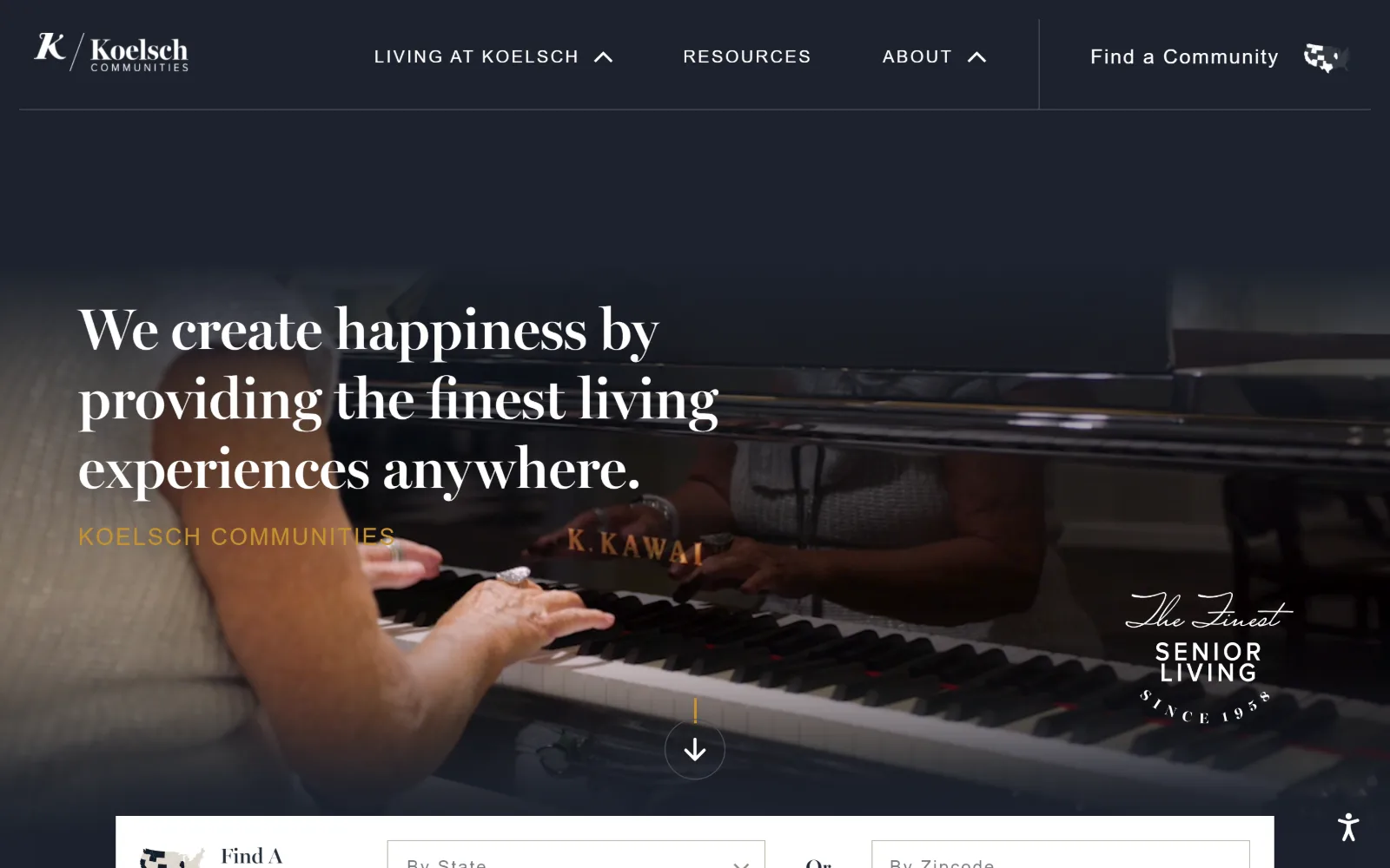
Hands on a Kawai grand piano fill a dimmed video frame, with a white serif sentence set left and a gold eyebrow line under it.
Type
MillerBanner 60px / 1.20
Body
proxima-nova 18px uppercase, 0.122em
Build
full-bleed video, 1440 container, search card over the fold
Made on
WordPress
Colour
#1c222d #ffffff #c69230
Type. MillerBanner carries the one sentence on screen at 60px, weight 700, line height 1.20, white, broken over three lines and left aligned rather than centred. Everything else is proxima-nova: nav at 21px with 0.076em tracking, a 24px uppercase line at 0.083em, and six uses of 18px uppercase at 0.122em. A Scotch serif against a wide-tracked grotesque is an old pairing, and the size gap does the ranking.
Colour. Two values only, white at 127.6 percent coverage and #1c222d at 50, with the navy running from the header straight into the dimmed footage so the seam disappears. Ink adds #252d3b and a single gold #c69230 across 19 characters, the eyebrow under the headline. All the warmth on screen comes from the piano lacquer and skin tones in the video.
Layout. The header is a single 1440 wide row with a vertical rule separating Find a Community from the three nav items, and a hairline under the whole thing. Below it the video runs full bleed with a centred scroll arrow, a circular Finest Senior Living seal at lower right, and a white search card rising over the bottom edge. Corner radius is 0 everywhere measured.
The ask. There is no button in the markup and no phone number in the header. The single ask is the Find A Community card sitting half over the fold, offering By State and By Zipcode selects. A multi-site operator that sells by location is right to make the locator the only thing competing with the headline.
Running the navy of the header into the darkened video removes the header edge entirely, so one sentence owns the whole viewport.
02
theadmiral.org
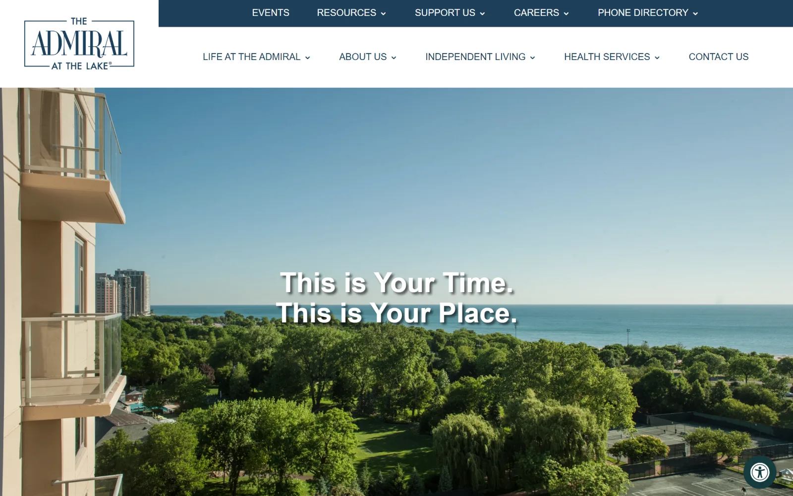
An aerial view from a balcony across Lincoln Park treetops to Lake Michigan, with a two-line white headline centred over the water.
Type. Tenez sets the headline at 50px, weight 700, line height 1.10, with a 36px step below it for section heads. Body is Roboto at 18px weight 300 on a 2.00 line height, which is unusually open and reads as generous rather than thin at that weight. Nav is Roboto 17px weight 500 uppercase across two rows. One high contrast display face against one neutral workhorse, no third voice.
Colour. White dominates at 293.4 percent coverage with navy #1e3f5a at 93.3 doing the upper nav strip and every section heading. A warm #eee7e0 at 5.6 softens the panels below the fold and #403936 appears in small print. There is no accent colour at all, so the lake and the park supply the only saturation above the fold.
Layout. Two header tiers: a navy utility strip with five secondary items, then a white row with the boxed wordmark at far left and five primary items. The photograph is full bleed under a 1440 container at full viewport width, with no overlay scrim, the headline relying on the pale sky behind it. Radius is 0 throughout.
The ask. Nothing is buttoned. Contact Us closes the primary row, Support Us and Phone Directory sit in the strip above, and no phone number is exposed. For a single building with a waiting list this is a reasonable bet, though the headline is doing no work to move anyone forward.
A headline placed over open sky instead of a dark scrim keeps a photograph intact, but it only works when the sky is reliably pale.
03
collington.kendal.org
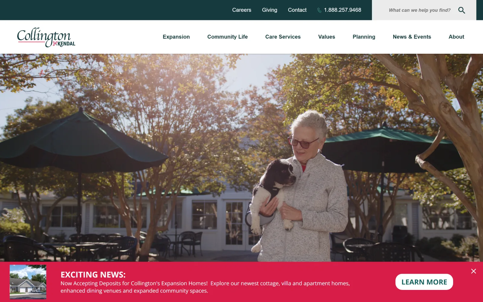
A resident in a grey fleece holds a small spaniel on a terrace under dark green umbrellas, with a magenta alert bar pinned across the base.
Type
Roboto 24px, weight 700
Body
Roboto 16px / 1.50
Build
sticky utility strip, full-bleed video, bottom alert bar
Made on
WordPress
Colour
#15625c #173a3e #d71e47
Type. Roboto does all of it, with only three measured steps: 24px weight 700 across 109 characters, 16px weight 400 for 844 characters of body on a 1.50 line height in #173a3e, and a 16px bold for labels. There is no display face and no hero headline at all, which leaves the photograph to speak and the type to behave as signage.
Colour. White covers 208.9 percent, black 45 from the video, then a deep teal #15625c at 7.2 and the darker #173a3e at 3.3 carrying body ink. The one hot value is magenta #d71e47 at 0.4 coverage, spent entirely on the announcement bar, so the single loudest colour on the page is also the newest piece of information.
Layout. A sticky teal utility strip holds Careers, Giving, Contact, the phone number and a search field in a lighter inset box. Under it a white row carries the script wordmark and seven items in a wide even spread. The video runs full bleed inside a 1440 container, and the alert bar across the foot pairs a small cottage thumbnail with two lines of copy and a pill. Radius is 0.
The ask. The phone number 1.888.257.9468 sits in the strip, and the only button on screen is Learn More on the expansion alert, which pushes new cottages rather than a tour. The hero itself asks for nothing, so the hierarchy is phone first, construction news second, everything else by navigation.
Spending the only saturated colour on the one time-sensitive message makes an announcement bar read as news rather than as an ad.
04
panorama.org
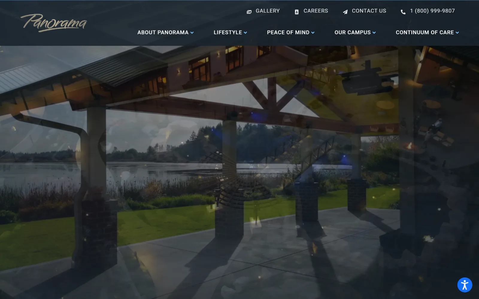
A dark translucent header floats over footage of a timber pavilion looking out to a lake, the frame caught mid crossfade so two shots ghost together.
Type. Futura-pt runs the brand voice: 54px weight 700 uppercase for the section head, 20px weight 900 uppercase in the nav, 18px weight 500 for labels. Poppins 18px weight 300 on a 1.89 line height handles reading copy in #2b3c4a, and Roboto 16px uppercase at 0.05em takes the utility row. Geometric caps over a humanist text face keeps the uppercase from feeling shouted.
Colour. Three measured values and no accent: white at 100 percent coverage, #1a242c at 7.6 for the header glass and dark panels, #e8e9ea at 2.2 for rules and muted labels. Every saturated pixel above the fold belongs to the footage, the lawn, the lake and the warm interior lights.
Layout. The header is two rows deep inside one dark translucent band, script wordmark left, four utility items with icons on the top line and five dropdown parents below. Video sits full bleed behind it at 1440, section padding below the fold measures 80px, and corner radius is 0 across the page.
The ask. The phone number 1 (800) 999-9807 is the rightmost item in the header, with Contact Us beside it and Gallery and Careers before. There is no hero button and no measured CTA, so the page routes by menu and trusts the phone to catch intent, which fits a not-for-profit community that sells on campus visits.
A translucent dark header lets video run to the top of the viewport while still giving white nav type a reliable contrast floor.
05
inglesideonline.org
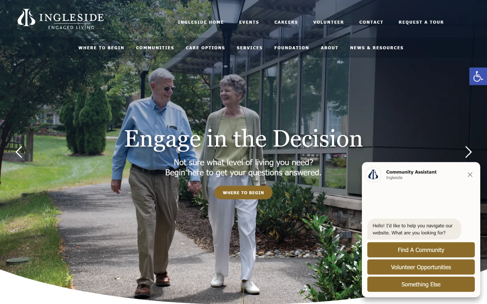
A couple walk a path beside a glass pergola, with a white serif headline, a gold pill button and a chat panel docked at lower right.
Type. Georgia at 40px uppercase carries the slide headline, and that is the only serif moment: Tahoma takes the rest, 17px on a 1.76 line height for body, 16px for lists, and a 12px bold uppercase at 0.167em used fifteen times for eyebrows and buttons. Tahoma is a system face doing more work than it was drawn for, and the wide-tracked small caps are what rescue it.
Colour. White covers 250 percent across a long page, with near-black #000119 at 50 and navy #14284b at 35.5 structuring the bands, plus #f6f5f3 at 27.7 for alternating sections. Gold #8b6c29 at 0.7 coverage is the whole accent, spent on the pill and the chat buttons so every clickable thing shares one colour.
Layout. Navigation stacks into two rows of seven over the photograph with no bar behind it. The hero bottom is a shallow curve rather than a straight edge, which cuts the feet out of the walking shot. Below it a three column grid runs 416, 362 and 362 pixels with a 40px gutter inside a 1440 container, section padding is 50px and buttons round to 25px.
The ask. Request A Tour ends the top row, Where To Begin sits under the headline, the phone number is in the header, and a Community Assistant panel offers three more routes before anyone has scrolled. That is four competing asks in one viewport, and the chat panel covers the slider arrow while it is open.
One accent colour applied to every interactive element, pill, chat and link alike, keeps a crowded page legible as a set of choices.
06
merrillgardens.com
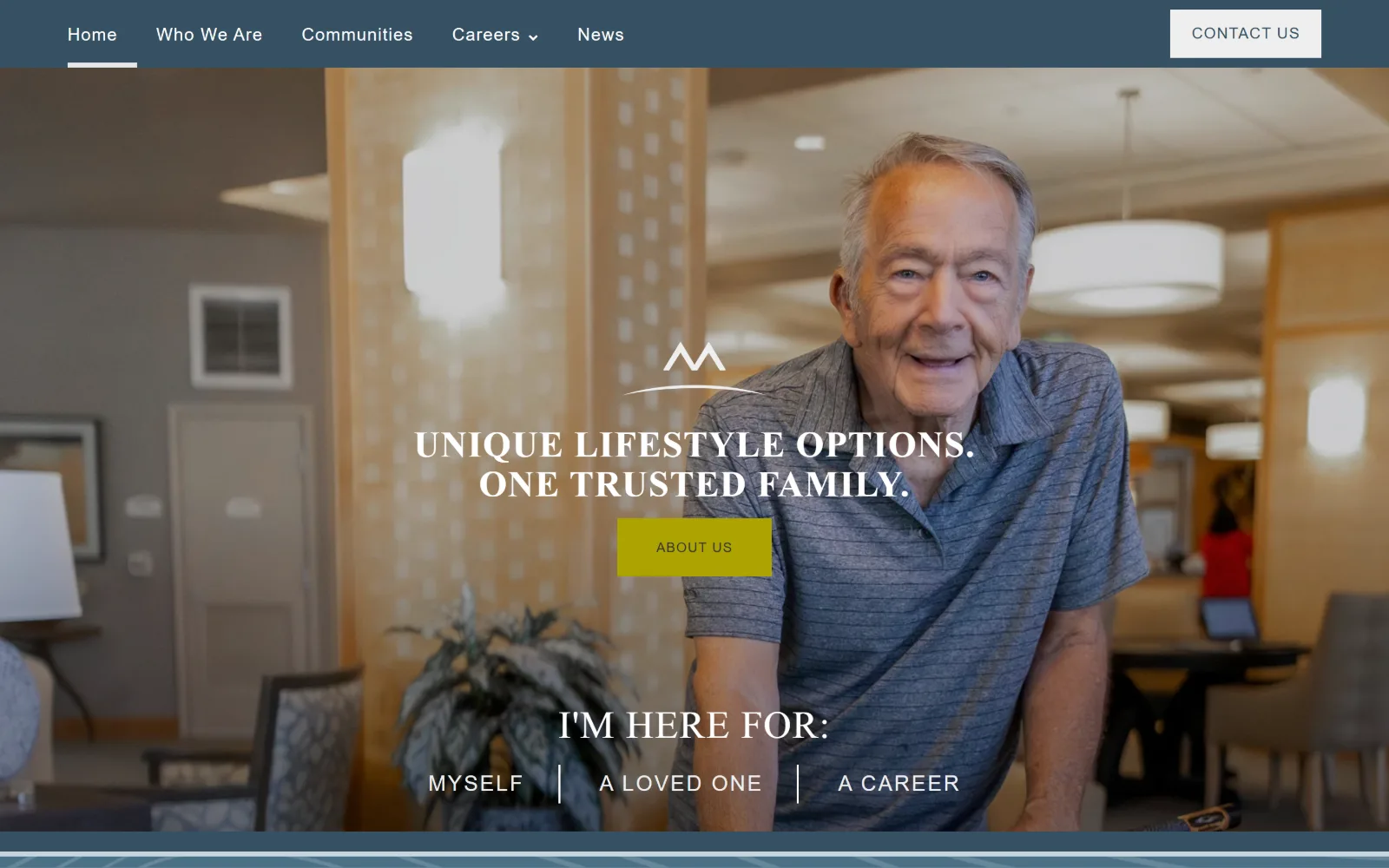
A smiling man in a striped polo leans on a lobby counter behind a slate blue nav bar, with an olive button and a three-way choice beneath.
Type
foco 45px uppercase, 0.022em
Body
foco 20px / 1.38
Build
flat slate nav bar, full-bleed photo, centred three-way split
Made on
Not detected
Colour
#365163 #4f758b #ada400
Type. Foco sets display in caps at 45px, 40px and 38px with tracking from 0.022em to 0.027em, and also takes body at 20px on a 1.38 line height in #444444. Trade-gothic-next handles nav at 18px and buttons at 14px uppercase, and a third face, tgn-soft-round-con, appears at 22px and 18px. Three families is one more than the page needs, though the caps setting hides the overlap.
Colour. Slate carries it: #365163 at 105.6 percent coverage and the lighter #4f758b at 44, with white at 48.2 and #e7eef2 at 2.8 for cool panels. The only warm value is olive #ada400 at 0.4, used on the About Us button and nowhere else, so the single yellow rectangle is the brightest thing in the viewport.
Layout. A flat slate bar spans the top with five items left and a bordered Contact Us at the right edge, no logo in the row. The photograph runs full bleed to a 1440 container, the brand mark and headline are centred in the dead middle, and the self-selection row sits low in the frame. Radius is 0 on the page and 0 on the button.
The ask. Contact Us is the only outlined ask, About Us the only filled one, and the real conversion device is the line reading I'm here for, split into Myself, A Loved One and A Career. Separating the adult child from the resident from the job applicant at the first click is the right call for an operator hiring as hard as it sells.
Splitting the first click by visitor type, resident, family or job seeker, removes the need to write one headline that serves all three.
07
phgainc.org
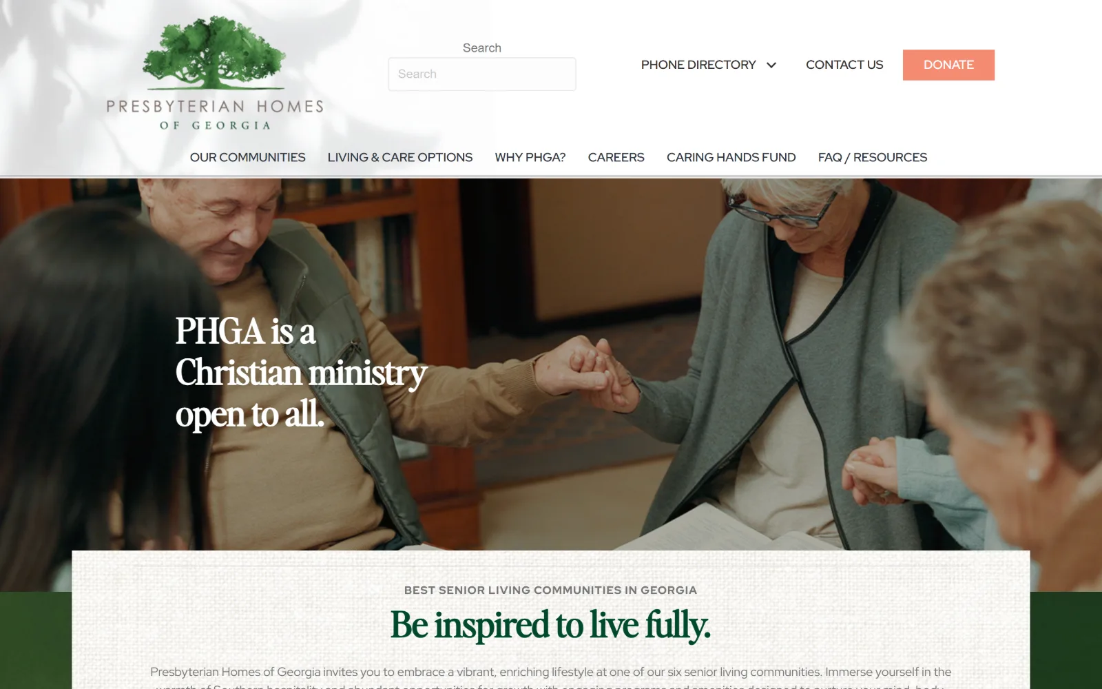
Joined hands in prayer fill a library photograph, with a white serif line at left and a cream panel below carrying a green headline.
Type. Editors Note, a high contrast serif, runs display at 46px weight 700 on a 1.40 line height in #00492c, with a 45px size repeated six times down the page and a 36px step under it. Red Hat Display takes body at 16px on 1.50 in #757575 and nav at 16px weight 600 uppercase. The serif holds every statement, the sans holds every instruction, and the split is kept clean.
Colour. Two grounds share the page at 100 percent coverage each, #f2f2f2 and white, with a warm #fffcf0 at 60.1 for the textured panel. Coral #f58b71 at 0.2 coverage is the only saturated value in the stylesheet and it is reserved for Donate. Deep green #00492c belongs to type alone, never to a fill.
Layout. The logo sits left, a labelled search box is centred, and the utility items run right, then a second row of six items spans the full width. The photograph is full bleed and the cream panel overlaps its lower edge, pushing an eyebrow and headline over the join. A green band shows at the panel edges. Container is 1440 and radius is 0.
The ask. Donate is the only filled button in the header, which is an unusual priority for a community that also needs enquiries, with Contact Us and a Phone Directory dropdown as text beside it. The hero carries no button at all, so the first sales ask only arrives inside the cream panel's copy.
Reserving the one saturated colour for Donate tells a visitor instantly which asks are commercial and which are charitable.
08
vinsonhall.org
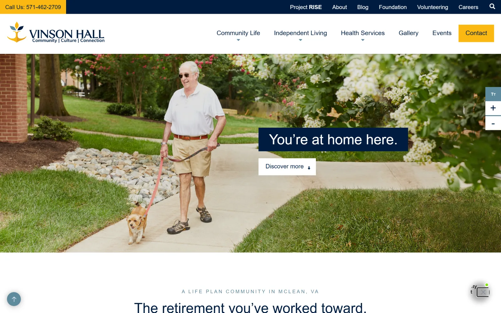
A man walks a small dog along a campus path past flowering shrubs, with a navy caption block reading You're at home here placed right of centre.
Type. Playfair Display sets the caption at 40px weight 400 on a 1.20 line height, reversed out of navy, and repeats at the same size for the section head below. Mulish handles everything else at 20px on 1.40 in #666666, with 469 characters at 18px and nav at 16px. Nothing is uppercase and nothing is tracked out, which keeps a military-linked community from reading as institutional.
Colour. White at 106.8 percent coverage, black at 32.3 and #eaeaea at 30.6 make the ground, navy #001c40 at 8.4 takes the utility bar and the caption block, and yellow #fab812 at 1.5 carries the Call Us strip and the Contact button. A muted #5e8a9e at 0.5 appears in small eyebrow type. Two brand colours, one of them used only for asks.
Layout. A yellow phone strip occupies the top left corner against the navy utility bar, then a white row holds the wordmark and five dropdown parents with a yellow Contact block flush to the right edge. The photograph is full bleed while content below sits in a 1200 container at 83 percent of viewport. Radius is 0 on both the button and the page.
The ask. The phone number is the first element on the page, set in the yellow corner strip, and the same yellow returns on Contact at the opposite end of the row, bracketing the header. In the photograph a white Discover more button scrolls rather than converts, so the page keeps one commercial ask and one navigational one.
Giving the phone number its own coloured corner block makes it findable without a sticky bar or an icon that has to be decoded.
09
fourseasonsretirement.com
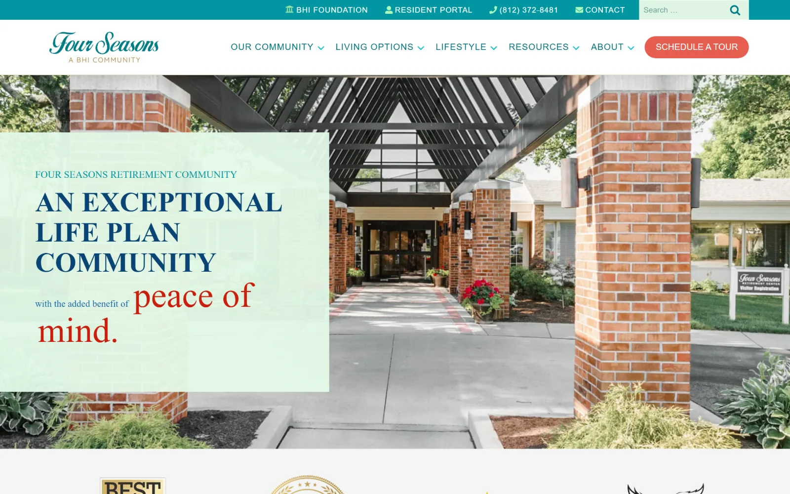
A brick entry canopy photographed down the walkway, with a pale mint panel over the left third carrying navy caps and a red script phrase.
Type
Poppins 50px uppercase, weight 600
Body
Work Sans 22px / 1.60
Build
mint panel over left 46%, full-bleed photo, 35px button radius
Made on
WordPress
Colour
#0196a1 #e3fae8 #e65d4f
Type. Poppins sets 50px uppercase weight 600 for the headline and a 45px mixed case line for the script-styled phrase that finishes the sentence. Work Sans takes body at 22px weight 300 on a 1.60 line height and nav at 14px uppercase tracked to 0.06em. Splitting one sentence across two sizes, two cases and two colours is a risk that pays off because the caps block is set tight.
Colour. White runs to 213.2 percent coverage with #f4f4f4 at 14.3 for alternating bands. The hero panel is mint #e3fae8 at 10.9, teal #0196a1 at 2 holds links and the utility strip, and coral #e65d4f at 0.3 is spent only on Schedule A Tour. The red in the hero phrase is the same temperature as that button, which ties the two together.
Layout. A teal strip carries four utility items and a search field, then a white row with the script wordmark and five dropdown parents. The mint panel covers roughly the left 46 percent of a full-bleed photograph, flush to the top and bottom of the hero. Below, grids run two columns at 215 and 1075 pixels and a four-up at 286.5 with 32px gaps. Buttons round to 35px.
The ask. Schedule A Tour sits as a coral pill at the end of the header and is the only filled button above the fold. The phone number (812) 372-8481 and Contact share the teal strip with the resident portal and the foundation, so family, resident and donor routes are separated before the nav begins.
Setting a translucent panel flush to the hero's full height, rather than floating a card, keeps a text block from looking pasted onto a photo.
10
willametteview.org
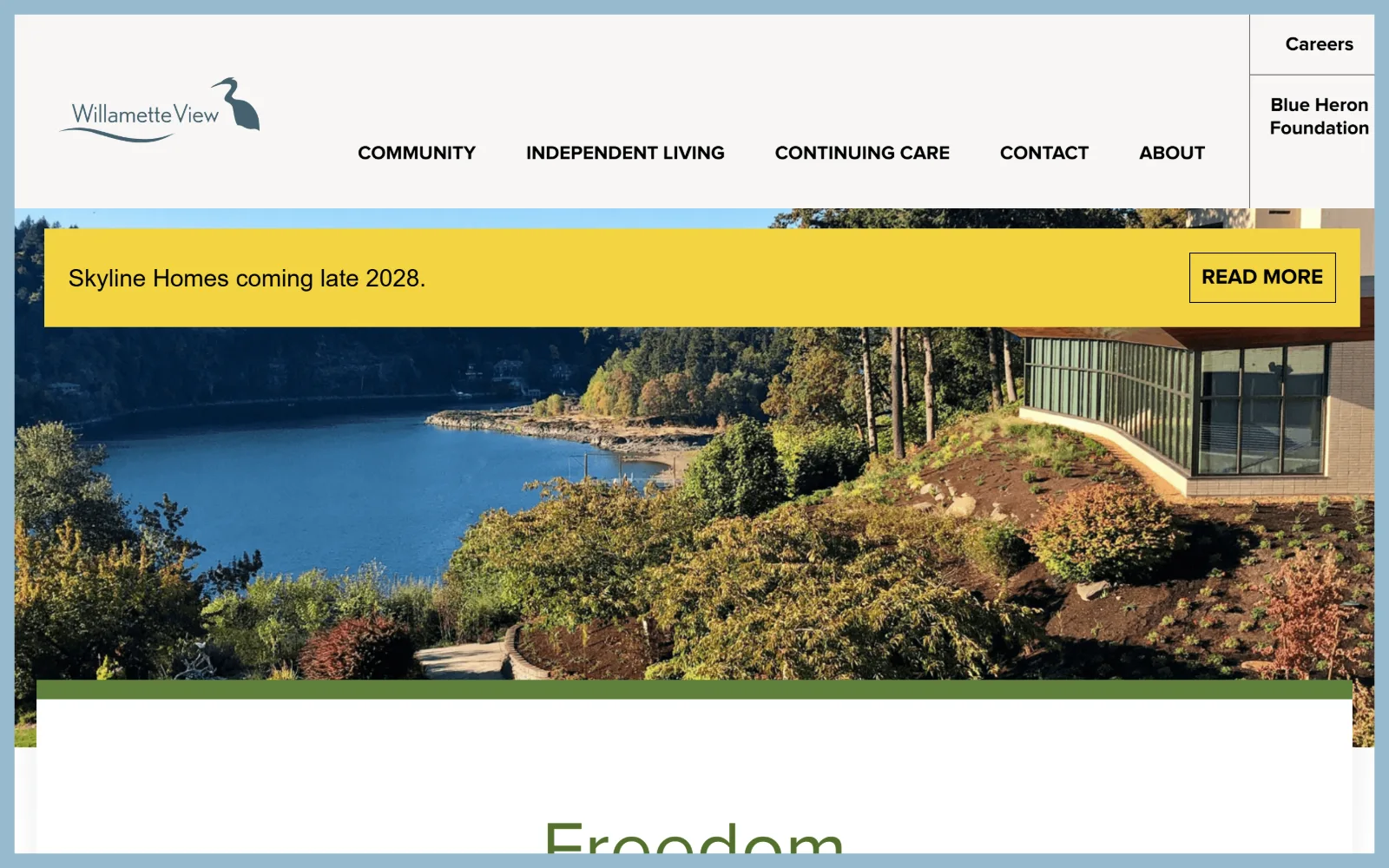
A bluff above the river with a glass building at the right edge, a yellow announcement band across it and the word Freedom starting below.
Type
Proxima Nova 80px / 1.10
Body
Nunito Sans 28px
Build
page inset in a border, sticky header, 1410px container
Made on
WordPress
Colour
#53702d #f2d442 #f7f6f5
Type. Proxima Nova sets Freedom at 80px weight 400 on a 1.10 line height in green #53702d, with nav at 20px weight 700 uppercase in black and a 22px uppercase label. Nunito Sans picks up the supporting copy at 28px and 25px. Only 183 characters of ink were measured on the whole page, so a single word at 80px really is the typography.
Colour. Three values: white at 129.2 percent coverage, #f7f6f5 at 11.1 and yellow #f2d442 at 5.4. Green #53702d exists only as ink, on seven characters. The pale blue surround framing the whole page is not in the stylesheet palette, which makes the yellow band the loudest thing by some distance.
Layout. The entire page is inset inside a pale blue border, so the white sheet reads as a card on a desk. A sticky header carries the heron wordmark left, five items centred, and a stacked right column holding Careers above Blue Heron Foundation in its own ruled box. Container is 1410 at 98 percent of viewport and radius is 0.
The ask. READ MORE on the yellow band is the only button above the fold and it points at a development announcement for 2028. Contact sits in the nav, there is no phone number and no tour request, so a visitor ready to act has to go looking. The band also covers the top third of the photograph it sits on.
A single word at 80px can carry a hero, but it fails if a promotional band lands between the word and the image it belongs to.
11
gencarelifestyle.com
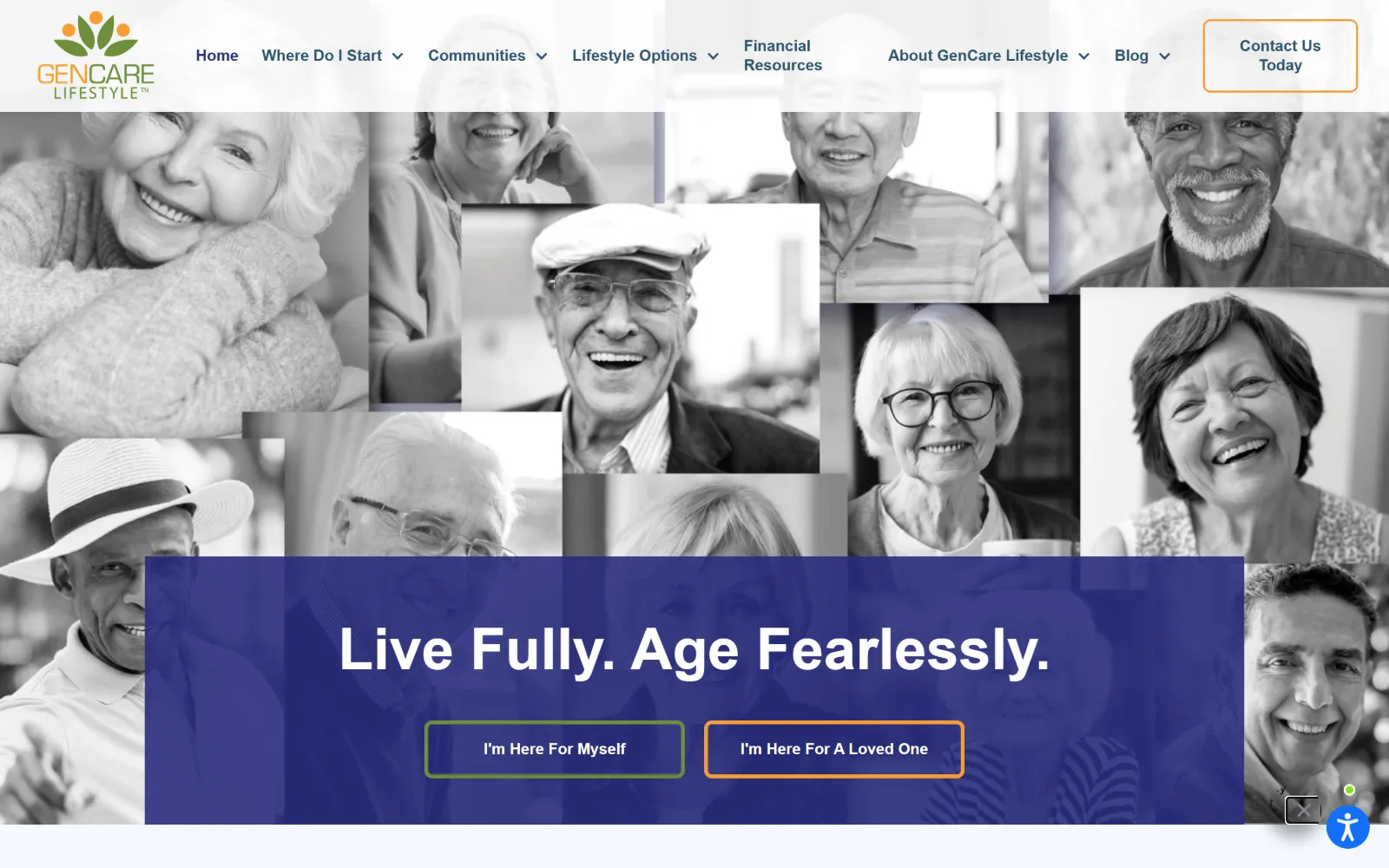
A greyscale mosaic of a dozen portraits fills the frame behind an indigo panel reading Live Fully. Age Fearlessly. with two outlined buttons.
Type. Poppins does everything. The headline sits at 60px weight 700, a 36px capitalised step follows across 97 characters, body runs 20px on a 1.50 line height in #39454d and nav is 16px weight 600 in indigo. A single geometric sans at four sizes is a thin toolkit, and the page leans on the photo grid rather than on type contrast to hold attention.
Colour. White at 106.4 percent coverage and a cool #f4f8ff at 40.4 make the ground, with indigo #292c7d at 12.2 taking the hero panel and nav ink. The mosaic behind is desaturated to greyscale on purpose, so the green #6e8d3b and the orange outlines on the two buttons are the only chromatic marks above the fold.
Layout. Webflow build with a sticky header: logo left, eight items with dropdowns centred, an outlined Contact Us Today at the right. The portrait mosaic runs full bleed with varied tile sizes and the indigo panel sits across its lower half, centred within a 1440 container. Below the fold a six column grid runs 226.7 pixels with 16px gaps and 72px section padding. Radius is 0.
The ask. The two outlined buttons, I'm Here For Myself and I'm Here For A Loved One, are given different border colours so they read as a fork rather than a primary and secondary pair. Contact Us Today waits in the header, there is no phone number and no tour booking, which puts the whole weight of the page on that one choice.
Desaturating a photo collage to greyscale lets a two-button fork carry the only colour, which makes the choice impossible to miss.
12
avivaseniorlife.org
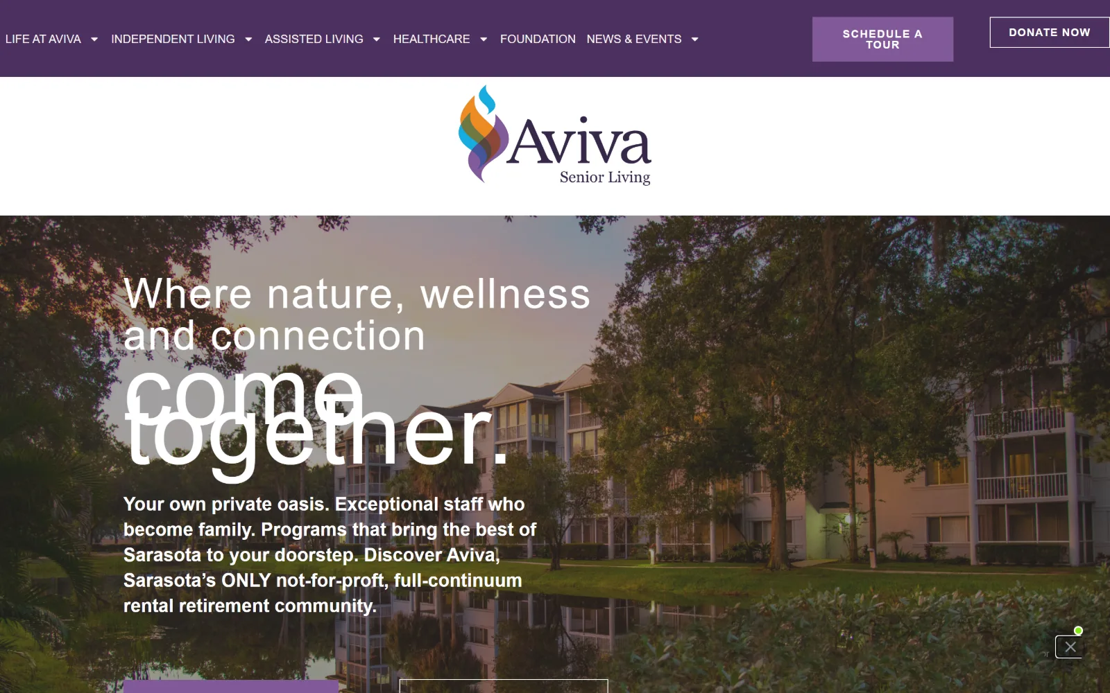
A purple utility bar and a centred flame logo sit above a dusk photograph of apartment blocks, with a white headline overlapping itself mid-animation.
Type
Inter 54px, weight 300, 0.037em
Body
Inter 20px
Build
purple nav bar, centred logo band, full-bleed dusk photo
Made on
WordPress
Colour
#4b2f5e #815999 #ffffff
Type. Three display faces compete: Allura, a formal script, at 126px and 66px, Inter at 54px weight 300 tracked to 0.037em, and Cormorant Garamond at 50px weight 600. Body is Inter 24px weight 600 reversed over the photo and 20px below it, with buttons at 14px weight 700 uppercase on 0.1em. The hero word set in Inter light at 54px is the only part that holds together at a glance.
Colour. Purple carries it, #4b2f5e at 41.4 percent coverage with a near twin #4c305f at 16.5, against white at 132.5. The accent is a lighter #815999 at 1 percent, used on the Schedule A Tour fill and on ten characters of link text. Everything warm on screen, the sunset and the lit windows, comes from the photograph.
Layout. A purple bar holds eight nav parents and two buttons, then a full white band centres the logo, so the brand mark gets its own tier before the content starts. The hero photograph runs full bleed in a 1440 container with copy set left at about one eighth in. Buttons are square at 0 radius.
The ask. Schedule A Tour and Donate Now sit side by side in the purple bar, a filled pill against an outlined one, and two further buttons appear at the bottom of the hero. No phone number is exposed. The tour and the donation asking at identical weight is the kind of compromise a not-for-profit board tends to impose.
Giving a logo its own full-width tier below the nav buys brand presence, but it costs 180 pixels of hero before anything is read.
13
81oaks.com
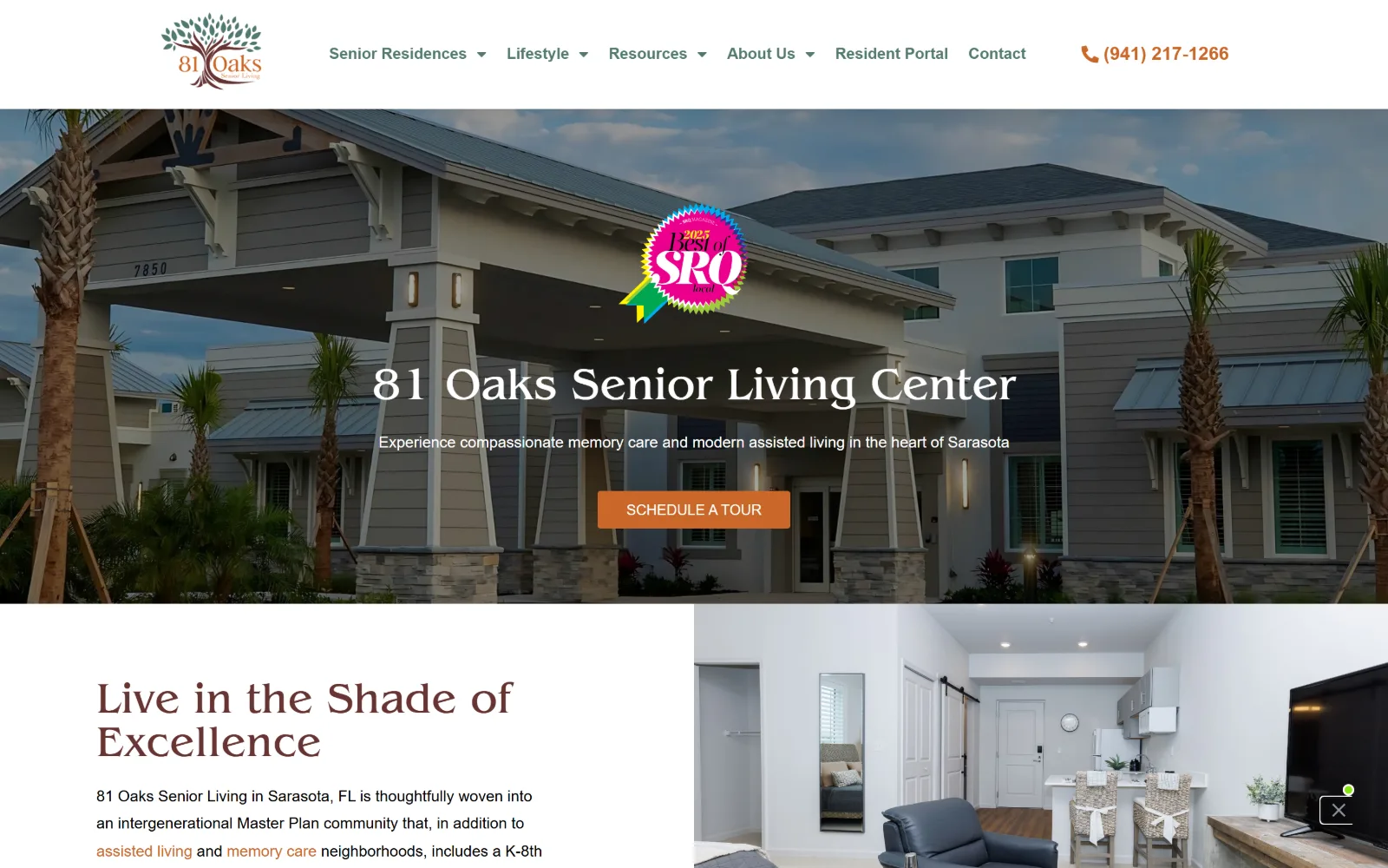
A new building's porte-cochere under palms, with the community name in white serif across the middle and an orange Schedule A Tour button below.
Type
Benguiat Pro ITC Book 47px
Body
Open Sans 16px / 2.00, weight 300
Build
full-bleed hero, 60px padding, half-and-half text and photo split
Made on
WordPress
Colour
#ca6728 #537a6f #673432
Type. Benguiat Pro ITC Book handles display at 47px and 45px, a distinctive face with heavy calligraphic bracketing that reads nothing like the Poppins and Playfair defaults around it. Open Sans takes body at 16px weight 300 on a 2.00 line height, nav at 16px weight 700 in green, and the button at 15px uppercase. The light body weight at that leading suits readers who want air.
Colour. White at 142.8 percent coverage and black at 57 from the photography, with orange #ca6728 at just 0.3 covering the button and the phone number. Ink adds a muted green #537a6f for the nav and a brown #673432 for section headings, which pulls the palette toward the tree in the logo rather than toward the Florida blue in the photograph.
Layout. A white header spans the full 1440 with the logo left, six items centre and the phone right. The hero photograph is full bleed with a centred headline and an awards badge floating above it. Below, a half and half split puts a brown section heading and body copy on white against an apartment interior at full height. Section padding is 60px and the button rounds to 3px.
The ask. The phone number (941) 217-1266 is set in orange beside a receiver icon at the top right, and the same orange returns on Schedule A Tour in the hero, which are the only two asks. Resident Portal and Contact sit as plain nav items, so the page keeps one colour for conversion and nothing else.
Choosing a display face with real calligraphic character separates a new community from the Poppins-and-photo template its competitors share.
14
lec.org
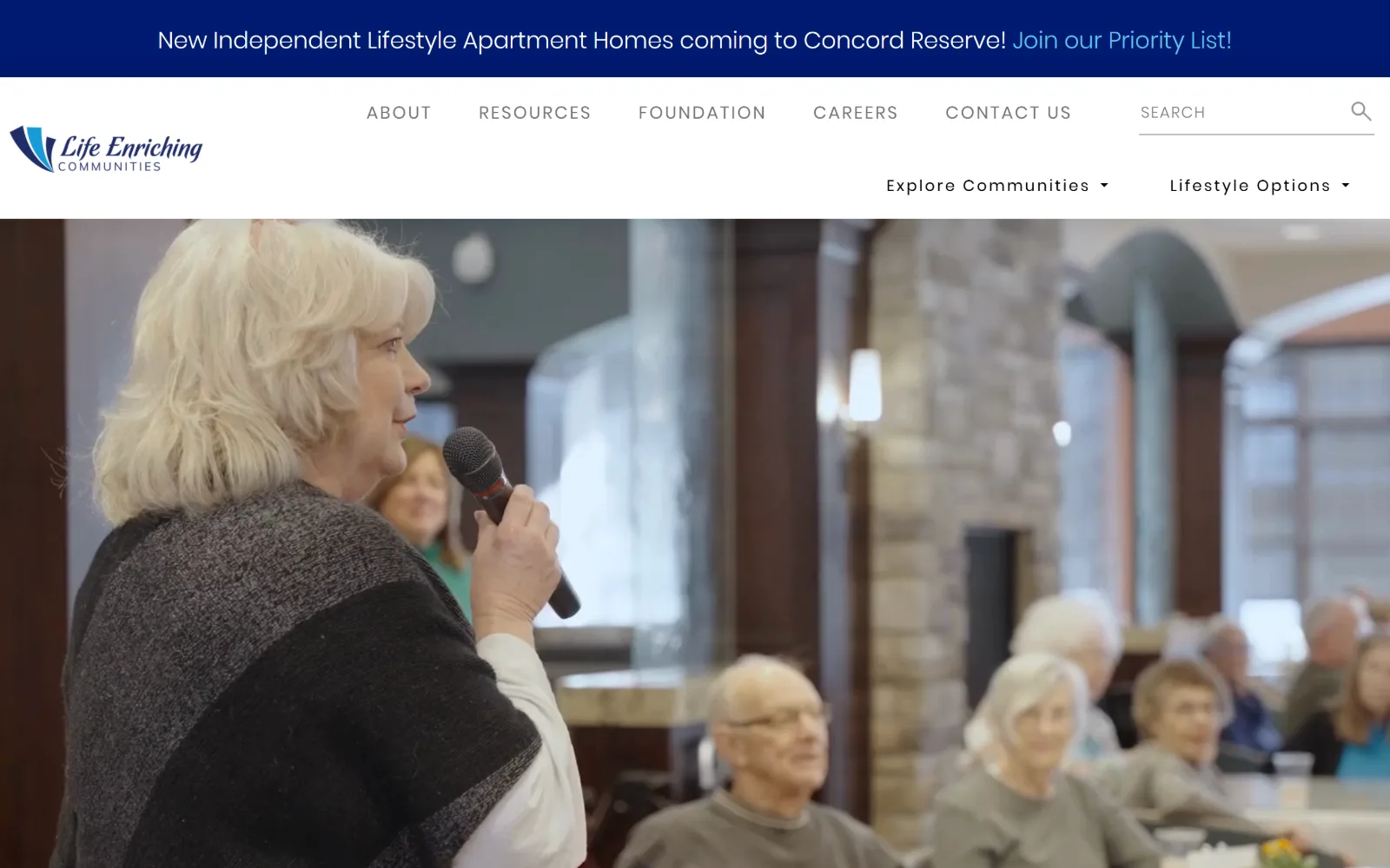
A navy announcement band runs above a white header, then a full-width video still of a woman speaking into a microphone to a seated audience.
Type
Vollkorn 77px, weight 700
Body
Poppins 24px / 1.75, weight 100
Build
top announcement band, two-row header, 1380px container
Made on
WordPress
Colour
#001a70 #262c5d #66c4eb
Type. Vollkorn sets display at 77px weight 700 and 52px further down, a sturdy bookish serif rather than a fashion one. Poppins handles the rest: 24px at weight 100 on a 1.75 line height in the band, 25px in the nav, and 18px uppercase tracked to 0.111em for labels. Weight 100 at 24px over navy is thin enough that the announcement reads as delicate rather than urgent.
Colour. White at 133.9 percent coverage, navy #001a70 at 4.4 and a softer #262c5d at 0.7. The only other value is a pale blue #66c4eb carrying 23 characters, the link inside the announcement band. It is a two colour system where the second colour appears in one band and a few headings and nowhere else.
Layout. The band sits above everything, then a white header puts the logo at the far left and splits the nav across two rows, six utility items with a search field on top and two dropdown parents below. The video runs full bleed under a 1380 container at 96 percent of viewport, section padding is 64px and radius is 0.
The ask. Join our Priority List inside the band is the only coloured ask above the fold, pointing at a new apartment development. Contact Us and a search field sit in the header, there is no phone number and no hero button, so a visitor with a general question has only the menu to work with.
Setting the only link in a dark announcement band in a lighter tint of the same hue keeps it visible without introducing a second accent.
15
bayviewseattle.org
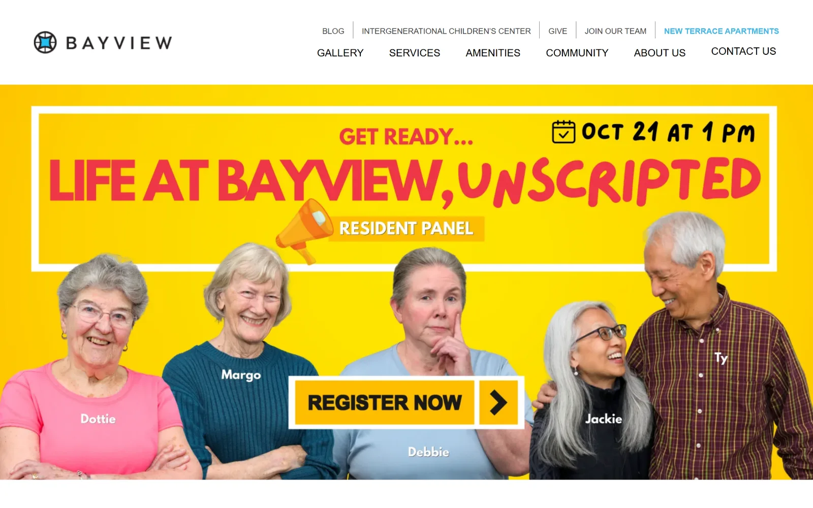
A two-row black nav sits above a yellow event graphic with five named residents cut out and a black Register Now button across the middle.
Type
Arial 48px, weight 600
Body
Arial 20px / 1.50
Build
two-row nav, inset promo banner with keyline frame, 1440 container
Made on
WordPress
Colour
#19488d #ffffff #333131
Type. Arial, and only Arial, at 48px weight 600 for the largest heading, 30px below it, 20px on a 1.50 line height for 1042 characters of body in #333131, plus 18px and 14px uppercase weight 500 for the two nav rows. No webfont is loaded anywhere on the page, which is a defensible accessibility choice and also leaves the type with no voice of its own.
Colour. The measured palette is almost bare: white at 116.3 percent coverage and a single blue #19488d at 0.5, used for the highlighted nav item and link ink. Every saturated colour on screen, the yellow field, the red headline, the orange megaphone, lives inside a flat promotional image rather than in the stylesheet, so none of it can be reused elsewhere.
Layout. A white header runs the wordmark at far left with five small items on the top row and seven larger ones below, right aligned. The promo banner is inset from the page edges with a white keyline rectangle drawn inside it, the cut-out portraits breaking that frame at the bottom. Container is 1440, radius 0.
The ask. Register Now is drawn inside the artwork, so the main call to action is a picture rather than a link target. Contact Us closes the second nav row and Give sits in the first, with no phone number and no measured button anywhere. A baked-in CTA is cheap to produce and expensive to change.
Building a call to action into a flat promo image means it cannot be restyled, translated or tracked without a new graphic.
16
aldermanoaks.com
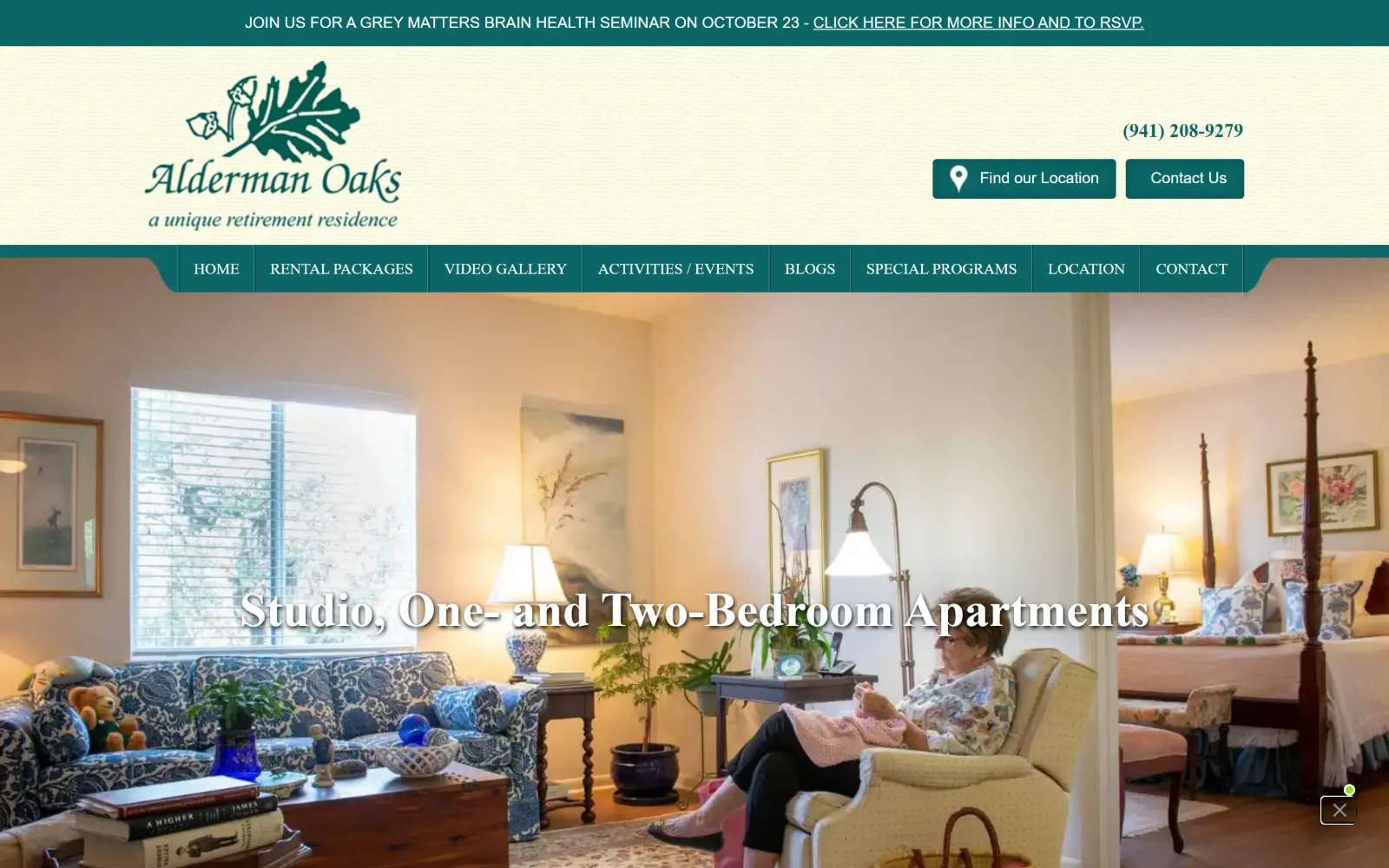
A teal seminar bar tops a cream header with a leaf mark and two teal buttons, above a photo of an apartment interior with a resident reading.
Type
Roboto Slab 20px, weight 700
Body
Lato 16px / 1.50
Build
seminar bar, tall cream header, notched teal tab nav
Made on
WordPress
Colour
#fffde5 #0a6665 #6dab3c
Type. Lato carries the page at 16px on a 1.50 line height with 24px and 21px steps above it, and Roboto Slab appears twice, at 20px weight 700 and at 16px uppercase across the nav tabs. The hero line over the photograph is a condensed serif with no drop shadow, so its white strokes break up where the window light hits. Eight uses of slab caps for navigation is the strongest typographic decision here.
Colour. Cream #fffde5 covers the full ground at 100 percent with a pale green #ebf0db at 28.4 layered over it. Teal #0a6665 at 5.3 takes the nav bar, buttons and heading ink, and a leaf green #6dab3c at 2.7 appears in rules and icons. Body ink is #333333. The cream is doing the work a white page usually does, which dates the palette.
Layout. The seminar bar spans full width, then a tall cream header holds a large leaf wordmark left and the phone and two buttons stacked right. Below that a teal tab bar carries eight items with notched ends, like folder tabs, and the photograph runs full bleed under it. No content container was measured and button radius is 4px.
The ask. Four asks arrive before the photograph: the seminar RSVP link, the phone number (941) 208-9279, Find our Location and Contact Us. Only two are styled as buttons and both are teal, so the visual hierarchy separates the two navigation asks from the two informational ones even though all four sit in the same band.
Notched tab shapes give a long flat nav bar a physical metaphor, which helps when eight items have to share one row.
17
fairmounthomes.org
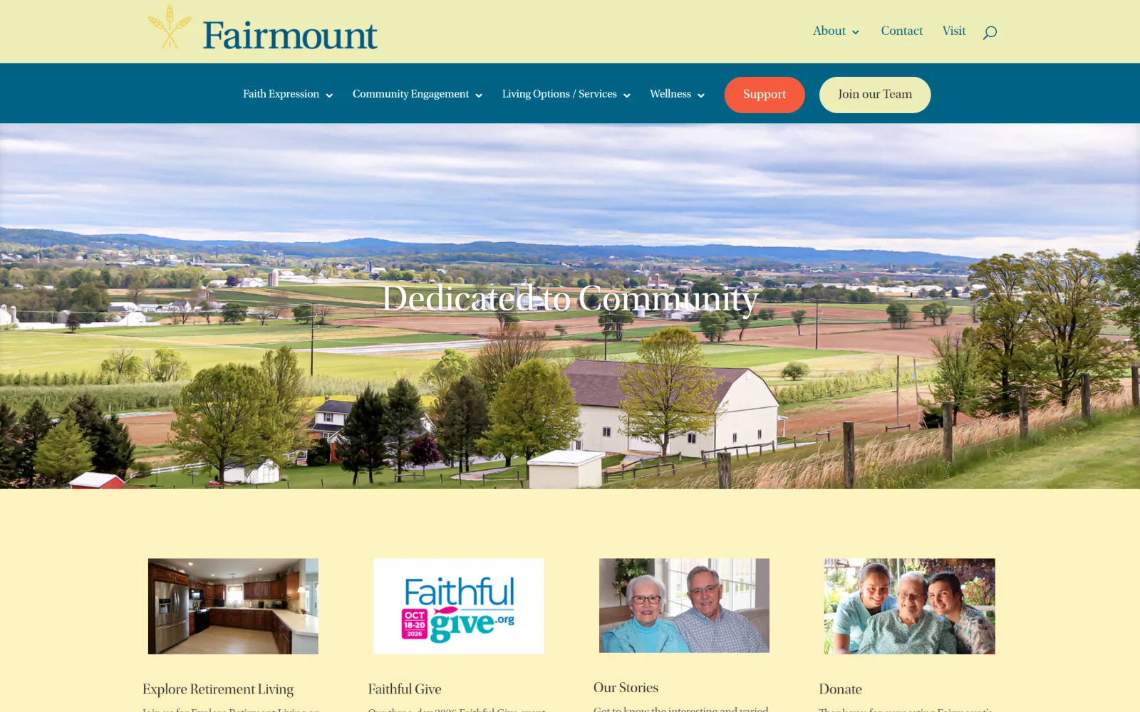
A pale yellow header sits over a wide Pennsylvania farmland photograph with a white serif headline, and four square thumbnails on yellow below.
Type
Utopia-Display 46px, weight 300
Body
Utopia-Subhead 14px / 1.70
Build
two-tier header, full-bleed slider, 1080px container at 75%
Made on
WordPress
Colour
#ededb6 #006385 #3a448c
Type. Utopia-Display, a licensed Adobe serif rarely seen on community sites, sets the headline at 46px weight 300 on a 1.00 line height, with 20px and 18px steps for the card titles. Utopia-Subhead takes body at 14px on a 1.70 line height in #666666 and nav at 16px in teal. A 14px body size is small for this audience, and the 1.70 leading only partly compensates.
Colour. Yellow #ededb6 covers 104 percent as the page ground with a lighter #fcf2bf at 27.7 layered inside it, teal #006385 at 41.5 taking the nav band and link ink, white at 29.9 and a navy #3a448c at 25.6 in panels. Five strong values is a lot, and the yellow ground is what forces the rest to work that hard.
Layout. Two header tiers: a yellow band with the wheat wordmark and three items at the right, then a teal row with five dropdown parents and two pill buttons. The slider photograph is full bleed under them while content sits in a 1080 container at 75 percent of viewport, unusually narrow. Four equal thumbnails sit in a row below the fold. Radius is 0.
The ask. Support and Join our Team are the two pills, which puts donation and recruitment ahead of enquiry, while Visit and Contact sit as plain text in the tier above. No phone number is in the header. The four thumbnail cards below carry the real routes, including retirement living and resident stories.
A 1080px container at 75 percent of the viewport keeps measure short on a text-heavy page, but it strands the full-bleed photo above it.
How these were chosen
Seventeen communities, and the split is not between budgets, it is between those who sent a photographer onto their own campus and those who bought a smiling couple. The ones that photographed their own buildings, a terrace with umbrellas, a brick entry canopy, a bluff above the Willamette, have something to put in the viewport that nobody else can use. What holds across almost all of them is restraint in colour: corner radius is 0 on every single site here, and most spend their one saturated value on a single button. What does not hold is the assumption that senior living website design means a tour booking above the fold. Several of these open on an expansion announcement, a donation ask or a job advert instead, because a life plan community is selling to residents, families, donors and staff from the same page, and the header is where that argument gets settled.
Finding senior living sites that someone had actually designed took far longer than it should have. 30 candidates made the shortlist. 17 made the page.
Each one was opened and looked at properly: what the type is doing, where the colour gets spent, how the page is built, how it asks for the job. Nothing is here because it ranks. Nothing is here because an agency filed it under portfolio. Several well known names were left out for the plain reason that their site came out of the same template as everyone else's, and a few sites worth including did not survive a second look.
Where a site is only competent, it says so. The order is the order worth your time, best first.
Reviewed and selected by Larry W. Matthews for Websitely.