Private School Website Design: 13 Schools, Judged on Design
Thirteen US independent schools that escaped the platform template. Private school website design where the photography is commissioned, not bought.
Shown
13 sites
Reviewed
29 candidates
Chosen on
The work, not the ranking
Updated
15 October 2026
01
exeter.edu
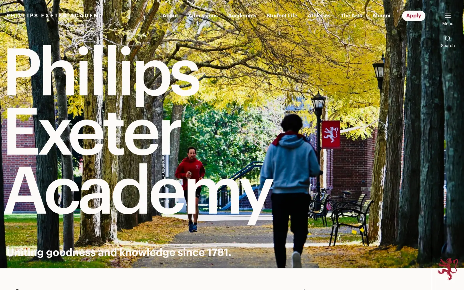
Three lines of enormous white sans-serif set the school name across a photograph of a tree-lined path in autumn, with a thin rail at the right edge.
Type
Graphik 204px
Body
Lyon Text 22px
Build
Full-bleed photo, right rail
Made on
WordPress
Colour
#fcf9f8 #a31f34 #0f0d0d
Type. Graphik at 204px with -0.060em tracking and a 0.90 line height stacks the name tight enough that the ascenders nearly touch the line above. Lyon Text takes body copy at 22px, line height 1.35, a serif answering a grotesque rather than echoing it. Small labels run Graphik 16px uppercase at a very wide 0.220em.
Colour. A two-colour system: warm off-white #fcf9f8 at 160.8 coverage and a single crimson #a31f34 at 46.2. The red appears on only five characters of ink, carried instead by the Apply pill and the heraldic lion. Everything else chromatic in the hero comes from the photograph's yellow foliage, not from CSS.
Layout. The photograph is full bleed behind the type, and the header sits flat on it with no bar or scrim. Section padding is 50px and the container is the full 1440, with a narrow fixed rail on the right holding Menu and Search stacked vertically. Radius is 0, so the Apply pill is the only curved object on screen.
The ask. Apply is the one filled element in the header, in crimson against white type, and it sits after seven plain nav items including Admissions. Two routes to the same action, one promoted, one not, which keeps the bar readable while giving the primary ask a colour nobody else owns.
If photography supplies the colour, the stylesheet only needs two values, and the single saturated one can be reserved for the primary action.
02
lawrenceville.org
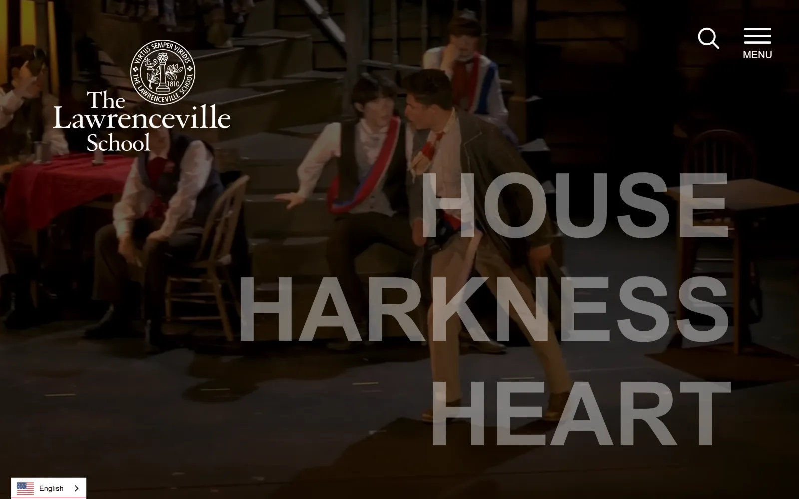
A dark stage video runs behind three words in huge semi-transparent grey capitals, with the seal and wordmark locked to the top left corner.
Type
azo-sans-web 160px
Body
azo-sans-web 18px
Build
Full-bleed video, no container
Made on
Not detected
Colour
#ffffff #222222 #c61a37
Type. azo-sans-web at 160px, weight 700, uppercase, line height 1.00, stacks HOUSE HARKNESS HEART in a grey that sits only a few steps above the video behind it. The lockup opposite uses adobe-garamond-pro at 38 to 50px, so the page runs a geometric sans for the slogan and a Garamond for the institution, each kept to its own corner.
Colour. Four values, and two of them barely register: #ffffff and #222222 at 150 coverage each, then #c61a37 at 21.6 and a second red #ba0c2f at 0.6. Having two nearly identical reds in one sheet is the loose thread. Body ink is #343b41, a blue-grey rather than black.
Layout. Full-bleed video at 1440 with no inner container, no scrim and no header bar, so contrast depends entirely on the frame the video happens to be on. The type block is right-of-centre, the lockup top left, search and MENU top right, and a flag-and-language chip is pinned to the bottom left corner.
The ask. The first screen asks for nothing at all. Admissions lives behind MENU, and the only clickable objects are search, the menu toggle and a language switcher. That is a confident choice on a boarding school site, and it rests on the video holding attention for the length of one scroll.
Setting display type a half step lighter than the footage behind it keeps a video hero legible without a scrim, but only if the footage stays dark.
03
saintannsny.org
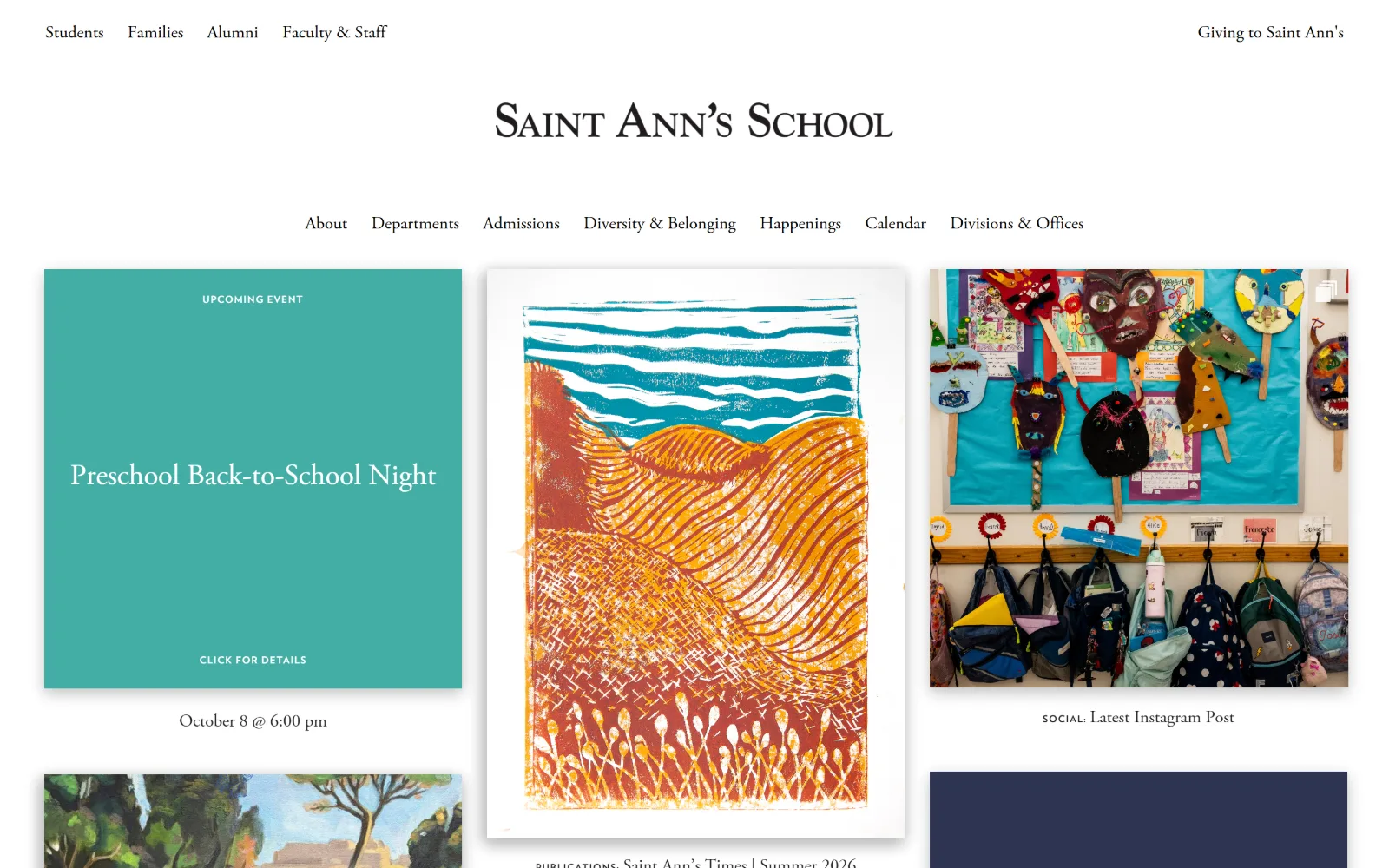
A centred Garamond wordmark sits above a seven-item nav and a three-column mosaic of a flat teal event card, a linocut print and a classroom wall.
Type
Adobe Garamond 30px
Body
Adobe Garamond 18px
Build
1380px three-up mosaic
Made on
WordPress
Colour
#43ada5 #9d118b #2d3452
Type. Adobe Garamond does nearly everything: a letterspaced caps wordmark, the 30px event titles and the 18px captions, all at line height 1.30 or looser. The only break is VerlagBold at 10px uppercase with 0.100em tracking for the kicker labels, which are small enough to read as metadata rather than headings. One text face, three jobs.
Colour. White at 100 coverage underneath, then five flat hues at 7.3 each: navy #2d3452, magenta #9d118b, teal #43ada5, blue #0096d6 and green #69bf62. Those tiles supply the saturation, so the palette changes as the content changes. Ink is plain #000000 on white.
Layout. The container is 1380px, 96 percent of the viewport, which leaves a thin white margin rather than a full-bleed edge. No hero image at all: the page opens on a centred masthead and drops straight into a three-up mosaic of equal-width tiles at radius 0, each captioned below the image rather than over it.
The ask. Giving to Saint Ann's is the only promoted link, pinned opposite the audience menu at top right. Admissions is one of seven nav items at equal weight, and the tiles ask for attention rather than action, with CLICK FOR DETAILS as the one in-tile prompt.
A single text face across every size works when colour comes from flat content tiles, which lets the palette shift with the calendar instead of the stylesheet.
04
archer.org
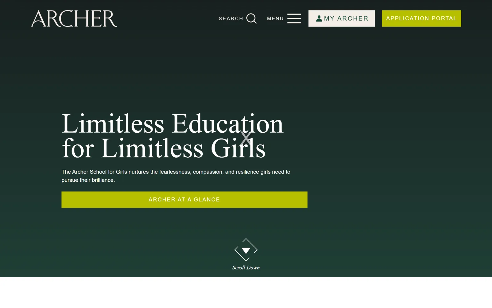
A deep green gradient field holds a two-line serif headline, a short sans paragraph and a wide chartreuse button above a centred scroll cue.
Type
petersburg-web 81px
Body
Jost 16px
Build
Full-bleed green field
Made on
Not detected
Colour
#144835 #b6bf00 #f4ede7
Type. petersburg-web sets the headline at 81px with no tracking adjustment, a high-contrast serif that reads as editorial rather than institutional. Jost carries the rest: 14px nav at 0.150em and 20px labels at 0.216em, both uppercase. The paragraph beneath the headline drops to 16px, a wide gap from 81px that gives the serif the whole room.
Colour. The page body is #144835, a dark forest green at 101.6 coverage, with #34363b behind the video and white at 55. The accent is #b6bf00, a sharp chartreuse at only 1.8 coverage, used on the portal button and the glance bar. Cream #f4ede7 at 0.4 handles nav ink. One loud colour, rationed.
Layout. No inner container is set, so blocks hang off the viewport with the headline starting near the 200px mark and a generous empty lower third. The header is roughly 120px tall with square-cornered buttons at radius 0, and the green gradient runs full bleed to a hard white edge below the fold.
The ask. Four asks compete in the header alone: SEARCH, MENU, MY ARCHER and APPLICATION PORTAL, the last two as adjacent filled blocks. In the hero itself the single full-width chartreuse bar says ARCHER AT A GLANCE, which is a browse prompt rather than an admissions step, so the portal link in the header carries the conversion.
Keep the loudest accent under two percent coverage and it reads as a signal; the moment a second element borrows it, the button stops being the brightest thing.
05
nuevaschool.org
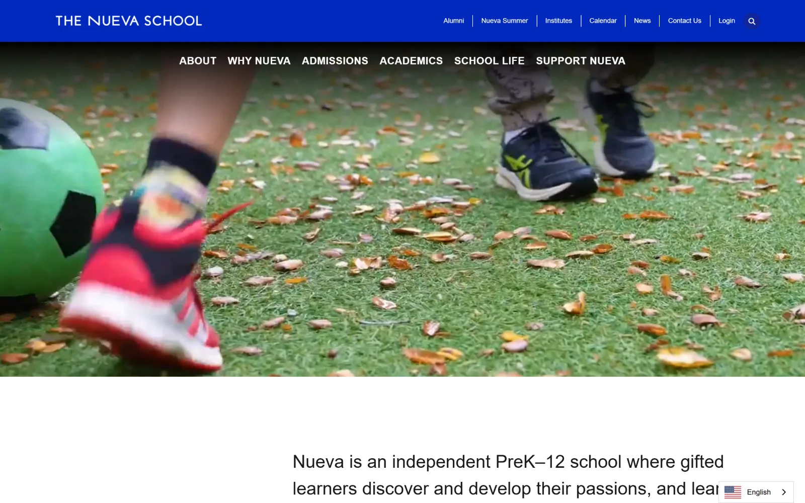
A tight ground-level video crop of a ball and footwork on leaf-covered grass runs full width beneath two stacked blue nav bars.
Type
Poppins 32px
Body
Poppins 15px
Build
Stacked bars over full-bleed video
Made on
Not detected
Colour
#0028bc #d0f300 #ffffff
Type. Poppins runs the entire page. The statement under the hero is set at 32px, weight 400, line height 1.50, which is body size pushed up to headline duty rather than a true display cut. Nav sits at 18px weight 700 with 0.028em tracking, and card titles at 20px weight 700. A single geometric sans doing eight sizes, and the smaller ones work harder than the large one.
Colour. #0028bc, a hard electric blue, covers 112.3 against white at 142.1, with lime #d0f300 at 8.9 and a pale blue-grey #c4d3dd at 8.7. The lime is the only warm note and it never touches the hero. Ink is #262626 for small copy and #1a171b for the statement.
Layout. Two stacked bars, the upper solid blue holding the wordmark and utility links, the lower transparent over the video with the six primary items. The video is full bleed at 1440 with no scrim. Section padding is 80px, radius 0, and the statement block below sits left-indented rather than centred.
The ask. No button appears above the fold. ADMISSIONS is one of six equal-weight primary items, with Login and Contact Us in the upper bar. The page leads with a statement of purpose instead of a form, which suits a school that has to explain what it is before it asks.
Splitting navigation into a solid utility bar and a transparent primary bar lets a full-bleed video start at the true top of the viewport.
06
riverdale.edu
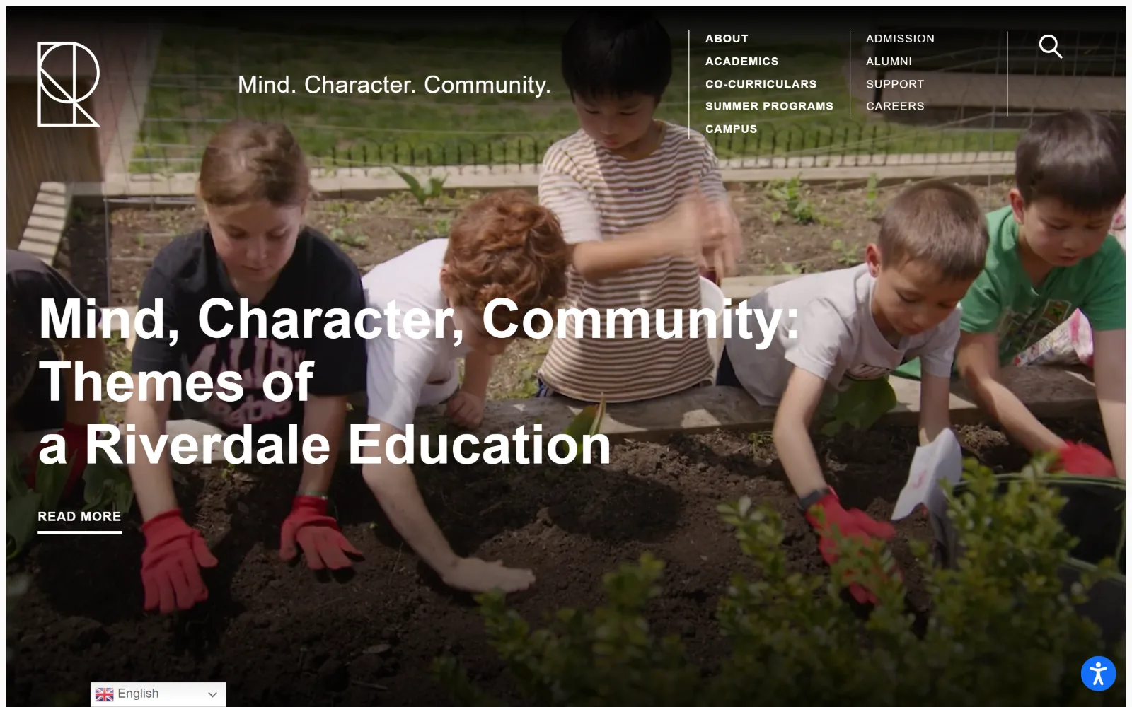
Full-bleed footage of a planting bed fills the screen, with a line-drawn monogram, a two-column white nav and a heavy three-line headline over it.
Type
Outfit 70px
Body
Outfit 22px
Build
Edge-to-edge video, two-column nav
Made on
WordPress
Colour
#872242 #fafafa #ffffff
Type. Outfit covers everything from 70px down to 20px. The headline runs weight 700 at 70px with a 1.14 line height, and the nav sits at 20px weight 700 uppercase, which is unusually large for a nav and makes the two columns read as a menu panel rather than a bar. Body drops to weight 300 at 22px, a four-step weight range inside one family.
Colour. Near-white #fafafa at 98.4 coverage and a single maroon #872242 at 49.4. That maroon is the nav ink colour once the header goes sticky and the background turns pale, and it accounts for 592 characters of type, more than black does. The hero itself is white type on photography, no overlay colour at all.
Layout. Container 1420 at 99 percent of the viewport, so the page is effectively edge to edge. The video is full bleed and the header floats on it with no bar, the nav splitting into two uneven columns at the right. Radius 0, sticky header, and the READ MORE link is underlined by a hairline rule rather than boxed.
The ask. A single READ MORE under the headline, with ADMISSION and SUPPORT sitting in the nav columns at the same weight as ABOUT and CAMPUS. One in-hero ask, no button fill, and the real admissions path treated as navigation rather than conversion.
Running nav links at 20px in two columns turns a header into a readable menu, but it only works when it floats over imagery with room to breathe.
07
dalton.org
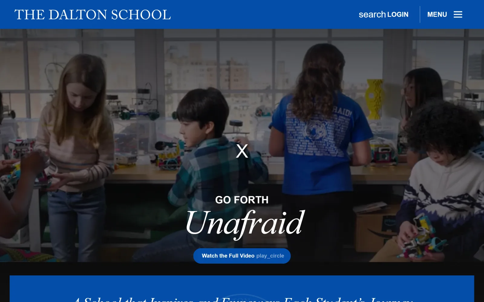
A royal blue bar runs above a makerspace video, with a centred uppercase kicker, a large italic serif word and a blue pill button stacked under it.
Type
linotype-sabon italic 101px
Body
neue-haas-grotesk 16px
Build
1190px container, blue band
Made on
Not detected
Colour
#044ea8 #f0f5fa #ffffff
Type. linotype-sabon italic at 101px carries the single word, with -0.020em tracking and a 1.00 line height, and the same italic returns at 43px in the section below. neue-haas-grotesk-display handles the kicker at 30px uppercase and the nav at 18px weight 700. The pairing is a book serif in italic against a Swiss grotesque, with the serif reserved for sentiment.
Colour. Blue #044ea8 at 26.4 coverage against #ffffff at 149.9 and #000000 at 100.1, plus a pale #f0f5fa at 11.2 for alternating sections. The blue is the header band, the button fill and the section ground, so one value does three structural jobs and no second accent is introduced anywhere.
Layout. The container narrows to 1190px, 83 percent of the viewport, which is the tightest measure in this set and gives the page visible side margins. The header band is roughly 95px of solid blue above a full-bleed video. Radius is 0 everywhere except the button, which is set to 100px and reads as a true pill.
The ask. Watch the Full Video is the only button on the first screen, and it asks for a minute of attention rather than an enquiry. Search, LOGIN and MENU sit top right; admissions is entirely behind the menu. The conversion sequence is video first, form later, which is a bet on the film.
One curved element on a page of square corners will be read as the action, so spend the radius on the button and nowhere else.
08
castilleja.org
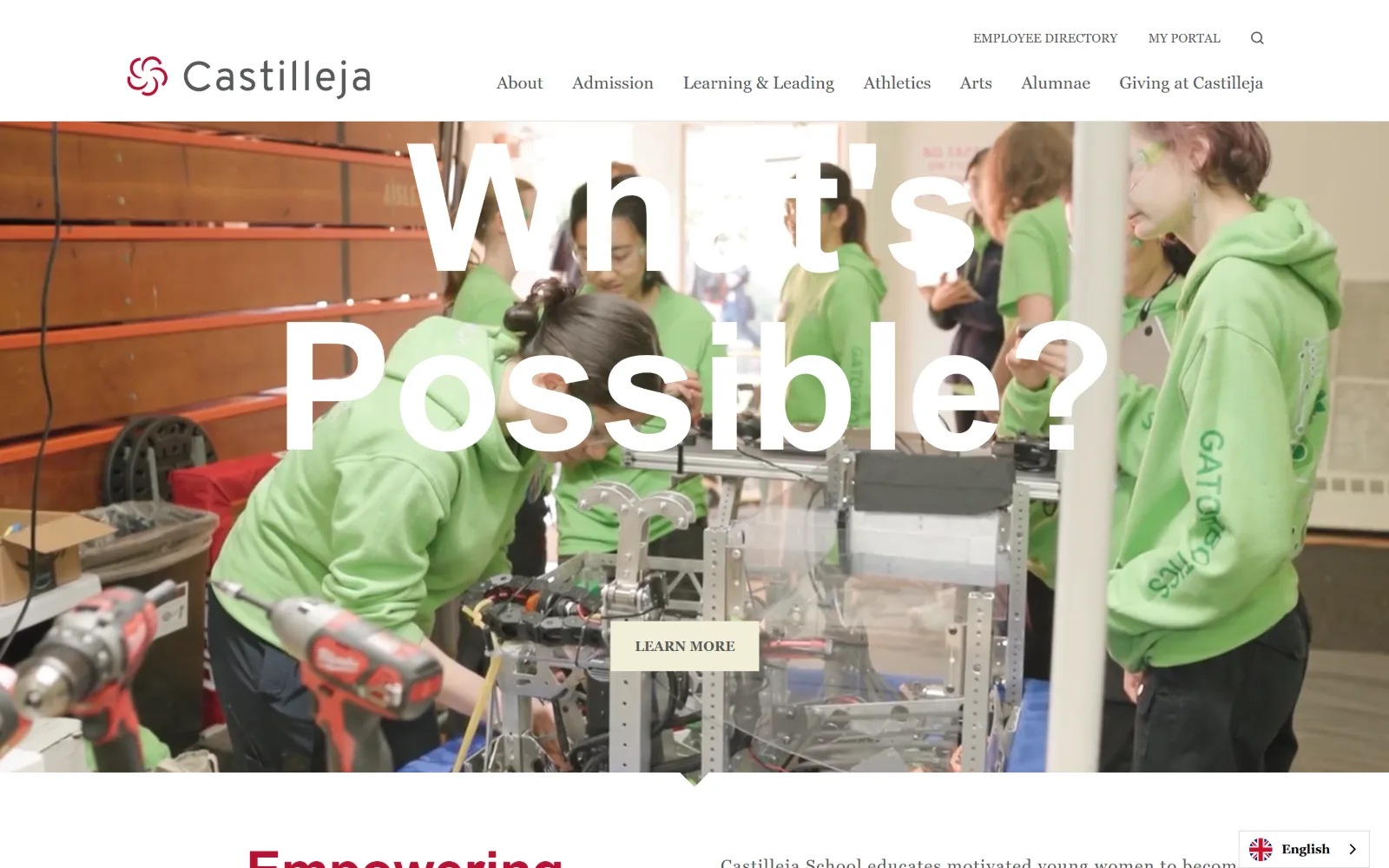
A white header sits above a robotics workshop video, with a very large semi-transparent question across it and a small cream button lower centre.
Type
Playfair Display 185px
Body
Overpass 15px
Build
Full-bleed video, 387px padding
Made on
Not detected
Colour
#b71234 #f3efda #5d5955
Type. Playfair Display at 185px is the largest display setting in this set, dropped to partial opacity so the photograph reads through the letterforms, then repeated at 55px and 38px for section heads. Overpass carries all running text at 18px and 15px. The scale jumps from 38px to 185px with nothing between, which makes the hero word a graphic rather than a heading.
Colour. The sheet is almost colourless: white at 200.3 coverage with two tints, #d6e8ef at 0.3 and #f3efda at 0.3. Ink is a warm grey #5d5955 for body and #565959 for nav, never black. The only saturated value is #b71234 on 37 characters, which is the spiral mark and the section heading below the fold.
Layout. Section padding measures 387px, far above anything else here, so the sections below the hero sit in large empty bands. The container is the full 1440 with the video full bleed under a white header of about 130px. Radius 0, including the cream LEARN MORE button, which is sized small enough to be easy to miss.
The ask. LEARN MORE is the single hero ask and it sits low and centred in a pale cream that barely separates from the footage. Admission is one of seven nav items, with MY PORTAL and EMPLOYEE DIRECTORY above. The first screen is set up to be looked at, not clicked.
Display type at 185px set to partial opacity turns a headline into a texture, so the actual call to action needs more contrast, not less.
09
ross.org
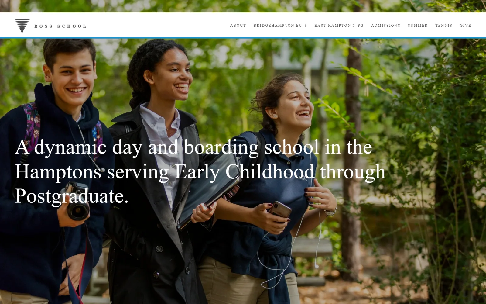
A slim white header with a tornado mark and letterspaced caps sits above a sunlit outdoor photograph carrying a three-line white serif sentence.
Type
ITC Century Std 63px
Body
Univers LT Std 11-14px
Build
26-col grid, 114px padding
Made on
Squarespace
Colour
#015d7c #d6831d #ffffff
Type. ITC Century Std sets the headline at 63px, weight 300, line height 1.16, a transitional serif with enough contrast to hold up against bright foliage. Univers LT Std does the rest at 11px with 0.182em tracking for nav and 14px at 0.050em for buttons. The scale has only three steps, which keeps a long Squarespace page consistent across 10735px of document.
Colour. Two values and nothing else: white at 204.3 coverage and teal #015d7c at 100. The teal is the hairline rule under the header and the section grounds further down. Button fill is a warm orange #d6831d, the one value that sits outside the two-colour system, and nav ink is a soft #4c4c4c rather than black.
Layout. Squarespace's 26-column grid underneath, with 11 to 15px gutters, driving a 1440 container and 114px section padding. The header is a thin white strip of around 55px with a sticky behaviour, separated from the photograph by a single teal rule. Corners are square throughout.
The ask. Seven nav items, two of which are campus-specific entry points, plus ADMISSIONS and GIVE. No button in the hero at all, which leaves GIVE as the only coloured ask in the header and pushes the enquiry step to a later section of a very long page.
Three type sizes and two colours will hold a 10,000px page together better than a wide scale, provided the headline face has enough contrast for photography.
10
andover.edu
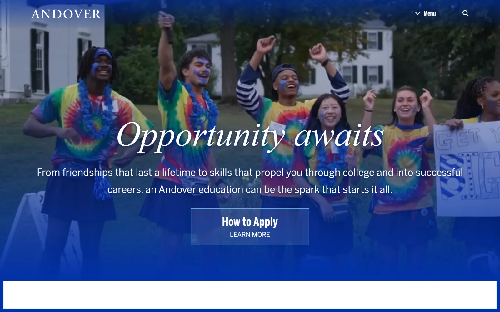
A blue wash covers a video of a campus celebration, with an italic serif headline, a two-line sans subhead and an outlined button stacked centrally.
Type
miller-headline italic 100px
Body
BentonSans 28px
Build
Tinted video, 8-col grid
Made on
Not detected
Colour
#0031a7 #44b8f3 #ffffff
Type. miller-headline italic at 100px with a 1.12 line height sets the headline, and miller-display returns at 60px for section titles. BentonSansStdRegular carries the 28px subhead at a loose 1.75 line height, with BentonSansStdCompressedBold at 22px uppercase for labels. Three cuts of two families, the compressed bold being the detail that makes the system feel designed rather than assembled.
Colour. The measured sheet is nearly empty: white at 55.7 coverage and #0031a7 at 0.6, with a light #44b8f3 declared as accent. Almost all the blue on screen is a tinted overlay on the video rather than a background colour, so the palette lives in the image treatment and the stylesheet stays minimal.
Layout. Container 1420 at 99 percent, with an eight-column 143px grid and 10px gutters below the fold. The video is full bleed under a transparent header of about 90px. Radius 0, and the button is a hairline-outlined rectangle rather than a fill, which keeps it from competing with the white type above it.
The ask. One ask, stacked in two lines inside the button: How to Apply above LEARN MORE. That is a single target doing two jobs, which reduces the header to Menu and search alone. Clear, though the outlined treatment makes the primary admissions path quieter than the headline above it.
A coloured overlay on video can carry the entire brand palette, letting the stylesheet hold almost no colour values at all.
11
avenues.org
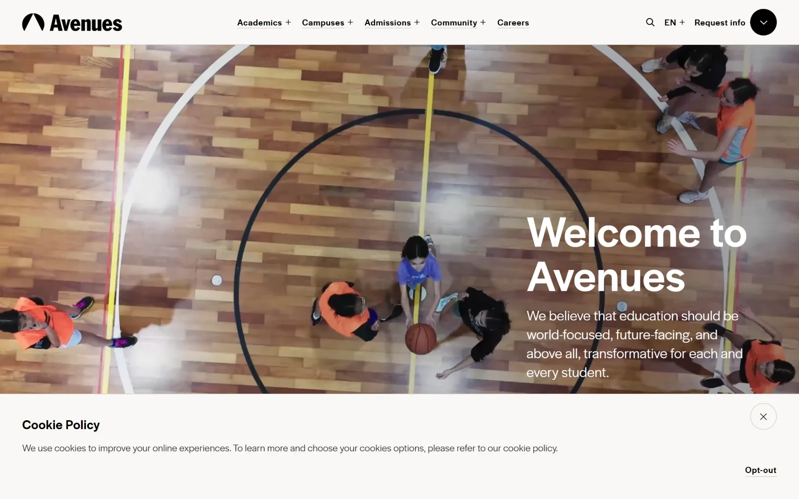
An overhead video of a basketball court runs full width under a white header, with a two-line headline and short paragraph set hard to the right edge.
Type
Halyard Display 80px
Body
Halyard Display 18px
Build
Solid header, right-set type
Made on
Not detected
Colour
#111a29 #f9f8f6 #b7b09c
Type. Halyard Display runs the whole page, at 80px weight 500 with 0.010em tracking and a 1.00 line height for the headline, then 18px weight 300 for the paragraph directly beneath it. The weight gap does the contrast work that a second family would usually do, and the tight leading on an 80px two-line stack makes the block read as a single shape.
Colour. Four near-neutrals: white at 100, warm off-white #f9f8f6 at 60.6, near-black navy #111a29 at 10.6 and a taupe #b7b09c at 6. There is no accent colour at all. The orange and blue on screen are the court and the clothing in the footage, which is a deliberate hand-off of saturation to the photography.
Layout. Container 1440, section padding 80px, radius 0 except a single circular toggle at the top right of the header. The header is a solid white strip of about 90px, so the video starts below it rather than behind it, and the type block is right-aligned against the viewport edge instead of centred in a column.
The ask. Request info sits in the header beside a language switch and search, in plain text at the same weight as the five nav items. No hero button. A cookie policy bar occupies the bottom strip, which is the only element on the first screen with a visible dismiss control.
A single family across two weights can replace a display and body pairing, as long as the lighter weight sits directly under the heavier one to show the gap.
12
marlborough.org
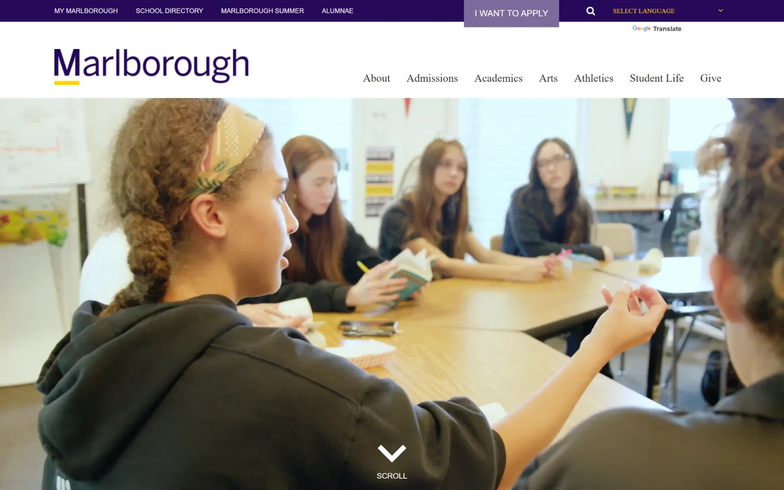
A dark purple utility bar tops a white masthead with a yellow-underlined wordmark, above a full-bleed video of a seminar table and a SCROLL cue.
Type
Miller Text Rom 55px
Body
Benton Sans Reg 18px
Build
Two-row header, 50px padding
Made on
Not detected
Colour
#260859 #e8e5f2 #7d6b9b
Type. Miller Text Rom at 20px capitalize carries the nav and most running copy at 18px, so a serif is doing the navigation rather than the headlines. Benton Sans Bd appears only in uppercase at 12 to 16px for utility links and buttons. The effect inverts the usual arrangement: the serif is the voice of the site and the sans is reduced to labels.
Colour. Deep purple #260859 at 13.5 coverage, a pale lavender #e8e5f2 at 38.9 and white at 132.8, with #7d6b9b at 0.3 on the apply block. Body ink is #260959, so the purple is also the reading colour rather than a separate grey. Saturation comes from a tonal family rather than a complement.
Layout. Container 1440 with 50px section padding and a two-row header: a 45px purple utility strip above a 120px white masthead, then full-bleed video below. Radius 0. The wordmark is anchored left with a yellow rule under its first letters, the only non-purple mark in the lockup.
The ask. I WANT TO APPLY sits in the utility bar as a filled lighter-purple block, phrased in the visitor's voice rather than the school's. Admissions and Give also appear in the main nav, and a language switch sits to the right of the apply block, so three asks share one 45px strip.
Phrasing a primary button in the first person makes it read as the visitor's intent rather than the institution's request, without changing its position.
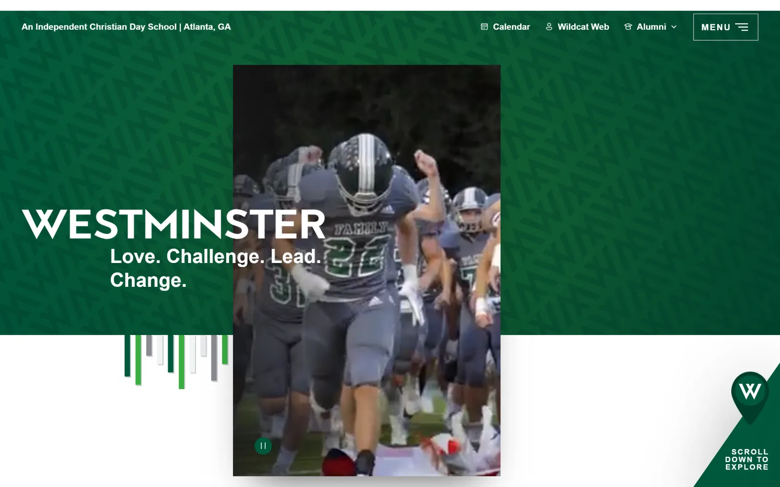
13
westminster.net
A dark green field patterned with tonal chevrons holds a centred portrait video panel, with the wordmark and tagline overlapping it from the left.
Type
proxima-nova 72px
Body
proxima-nova 26px
Build
670px container on full-bleed field
Made on
Not detected
Colour
#00583d #ffffff #53565a
Type. proxima-nova does everything, at 72px weight 700 uppercase for the wordmark, 36px weight 600 for the tagline and 26px weight 400 at a 1.50 line height for the paragraph below. A 14px uppercase label at 0.143em tracking handles the scroll cue. No serif anywhere, and no second family, so hierarchy is carried entirely by weight and case.
Colour. Two declared values: white at 200 coverage and #00583d, a deep bottle green, at effectively zero because the green is painted as a patterned block rather than a flat fill. Ink is a soft #53565a for body. The lighter greens in the chevron pattern and the small bar graphic are image assets, not stylesheet colours.
Layout. The content container is 670px, 47 percent of the viewport, which is unusual and explains why the text block sits narrow at the left while the green field runs full bleed behind it. The video panel is portrait format, centred, and the wordmark crosses over its left edge. Radius 0, with a pin-shaped mark at the bottom right.
The ask. No admissions button on the first screen. Calendar, Wildcat Web and Alumni sit in the top bar with MENU boxed at the far right, which serves current families before prospective ones. The only forward prompt is SCROLL DOWN TO EXPLORE inside the corner pin.
Overlapping a wordmark across the edge of a media panel breaks the grid, which only reads as intentional when everything else is flush and square.
How these were chosen
Thirteen US independent school homepages, read closely for what the design is actually doing. They share more than they admit: nearly all open on commissioned video, almost all set radius to 0, and most run a serif for the institution against a sans for everything else. The pattern that does not hold is the big admissions button. Several of these pages ask for nothing at all on the first screen, leaving Apply behind a menu toggle. Most US independent schools run on Finalsite or Blackbaud, so the interesting question in private school website design is not which platform a school picked but what it did with original photography and a real typographic system on top of infrastructure everyone else is also using. The schools below answer that differently, and the measurements show where.
Finding independent school sites that someone had actually designed took far longer than it should have. 29 candidates made the shortlist. 13 made the page.
Each one was opened and looked at properly: what the type is doing, where the colour gets spent, how the page is built, how it asks for the job. Nothing is here because it ranks. Nothing is here because an agency filed it under portfolio. Several well known names were left out for the plain reason that their site came out of the same template as everyone else's, and a few sites worth including did not survive a second look.
Where a site is only competent, it says so. The order is the order worth your time, best first.
Reviewed and selected by Larry W. Matthews for Websitely.