16 Examples of Home Care Website Design That Earns Trust
Sixteen US agencies whose home care website design leads with a face rather than a logo, and names a price or a phone before you scroll.
Shown
16 sites
Reviewed
30 candidates
Chosen on
The work, not the ranking
Updated
15 October 2026
01
alliancehomecare.com
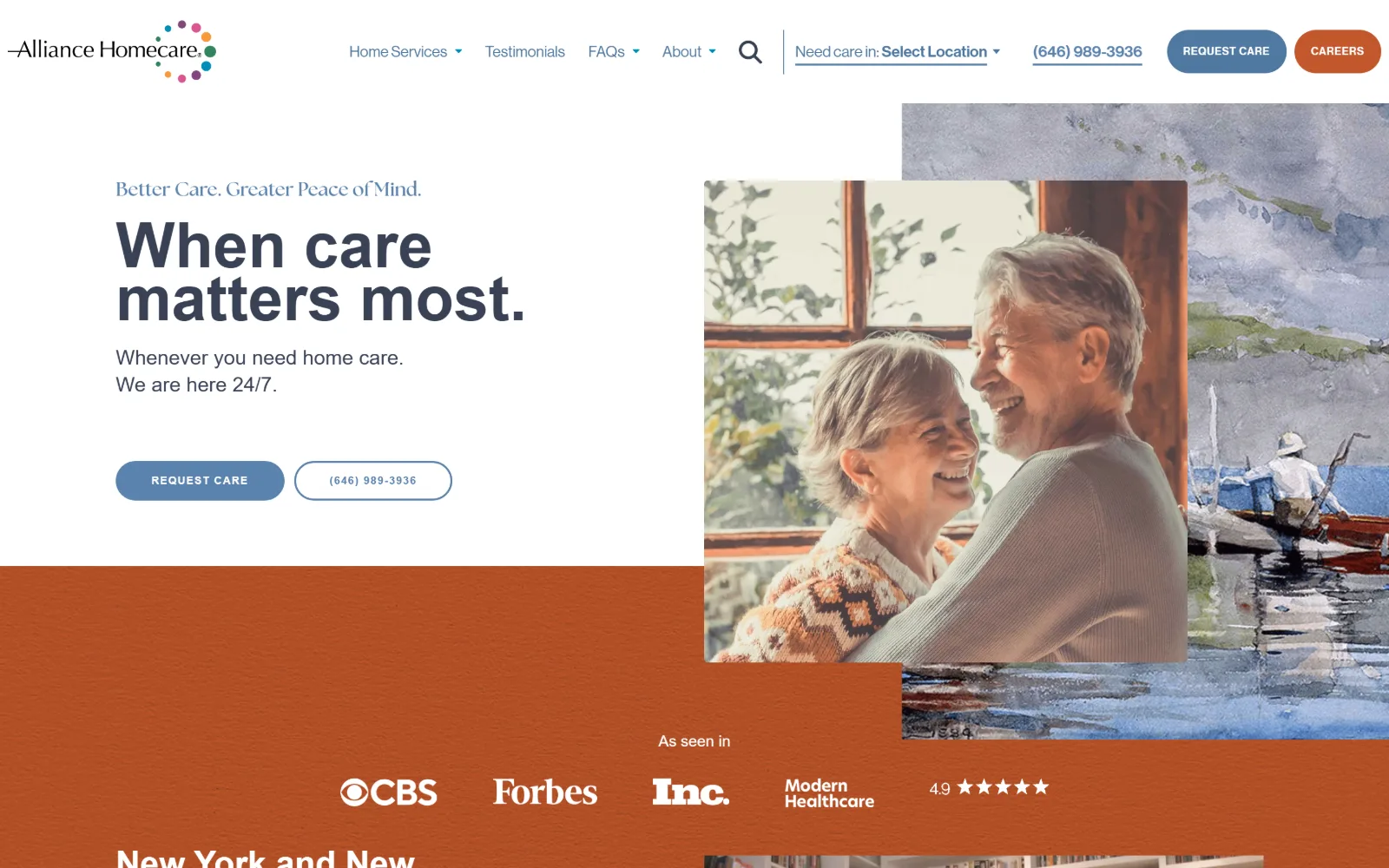
Navy sans headline on white at left, beside a photo of a laughing older couple layered over a watercolour painting, above a burnt orange band.
Type
Neue Haas Grotesk Display 65px, bold
Body
Neue Haas Grotesk Text 16-21px
Build
offset photo over watercolour, 1420px container
Made on
WordPress
Colour
#b55d37 #4f78a1 #5a82ae
Type. Neue Haas Grotesk Display carries the 65px headline in bold, tightly stacked over two lines, while a 20px line of The Seasons sets the pale blue eyebrow above it. Body and nav run 16px to 21px in the Grotesk Text cut, and both buttons drop to 11px uppercase at 0.063em tracking. One grotesque family does nearly everything; the serif appears once, as a signal rather than a second voice.
Colour. White ground at 100 per cent coverage, then a single burnt orange field at #b55d37 covering 67 per cent of what is visible, which is unusually brave for this trade. Blue does the quiet work: #4f78a1 on buttons, #5a82ae on nav links, #394255 for the headline, with #fed3b9 picking out type against the orange. Four hues, one of them loud.
Layout. A 1420px container at 99 per cent of the viewport, with a two column grid of 240px and 1184px behind the header and a 518px / 48px / 617px split in the body. The hero photo and the watercolour are stacked at offset angles so both bleed off the right edge, and the orange band starts mid photograph rather than below it. Buttons are fully rounded at 100px; nothing else is.
The ask. Two pill buttons repeat in the header and again in the hero: REQUEST CARE filled, the phone number outlined beside it, so the call is given equal visual weight rather than tucked into a top bar. A location selector sits inline in the header, and an orange CAREERS button is kept visually separate so recruitment never competes with the care enquiry.
Running the hiring call-to-action in a different colour from the client one stops the two audiences fighting over the same header space.
02
arosacare.com
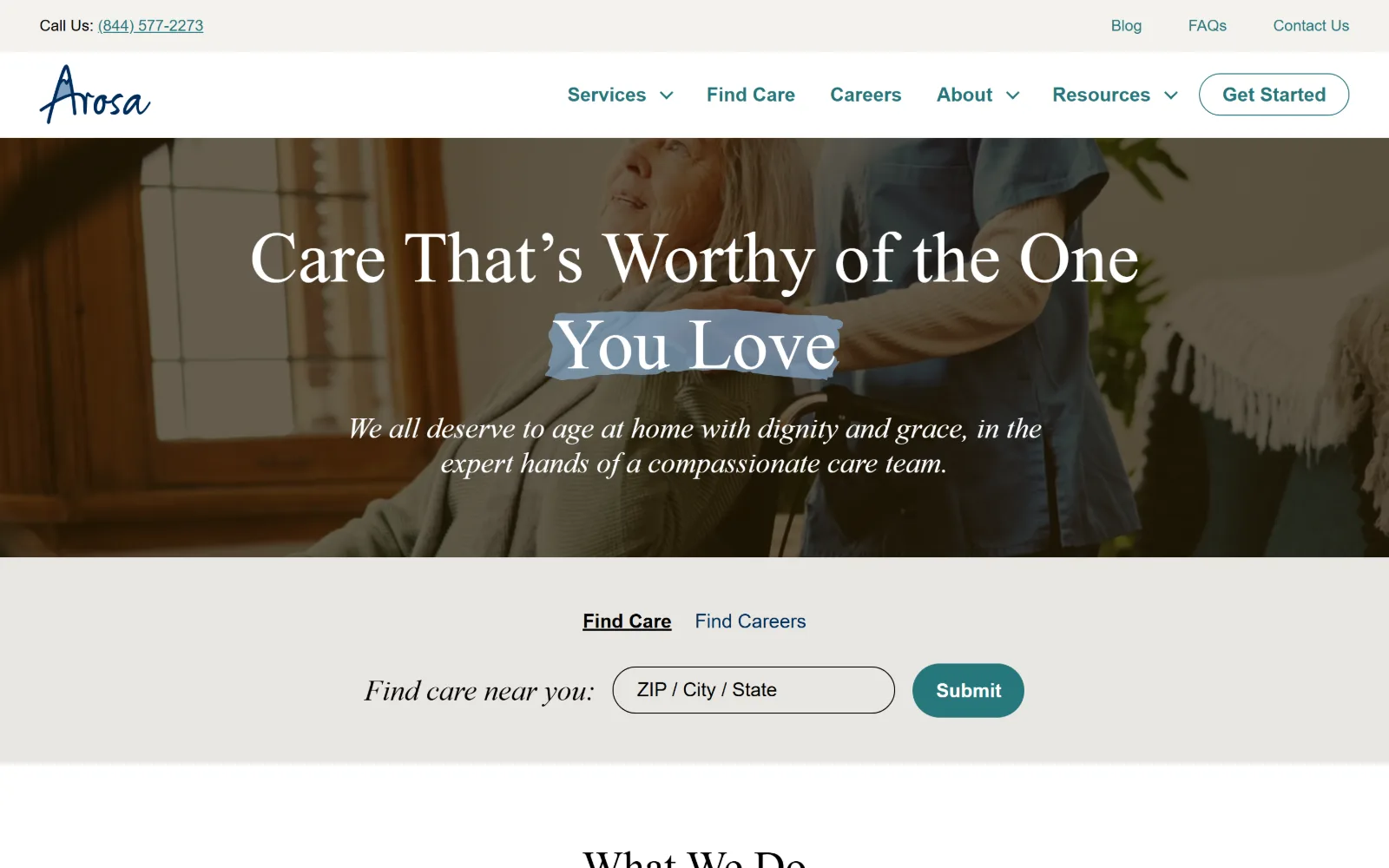
A serif headline in white across a dimmed photo of a carer standing behind a seated older woman, with a zip code search bar on a grey band below.
Type. IvyPresto Display sets the 75px headline, with one phrase given a hand-drawn pale blue highlight behind it, and an italic cut of the same face carries the subhead. Inter Variable handles everything functional at 16px with a loose 1.88 line height, and the button steps up to 20px bold. The split between a high contrast display serif and a plain UI sans is clean and deliberate.
Colour. White page, near black #221700 in the photography, and two warm greys at #e8e6e2 and #f4f2ee for the search band. Deep teal #26777c carries every interactive element, nav links included, at well under one per cent coverage. Five values, with the teal doing all of the signalling and the greys doing all of the separating.
Layout. An 1140px content column inside an eleven track grid that names full, wide and content boundaries, sitting at 79 per cent of the viewport with 48px section padding. The hero photograph is full bleed; the search band beneath it is a distinct grey slab rather than an overlay, which stops the widget fighting the headline for contrast.
The ask. The zip code widget is the main ask and it is given its own band, with Find Care and Find Careers as underlined tabs above the field so the two journeys share one control. A 28px radius Submit button and a Get Started pill in the header repeat the teal; the phone number sits in a utility bar at the very top.
Putting the search widget on its own band under the hero keeps the photograph readable and gives the field a contrast ratio the overlay would have destroyed.
03
privatehomecare.com
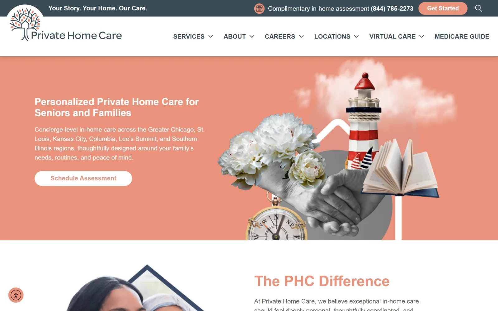
White type on a salmon field at left, with a cut-paper collage at right of a lighthouse, a compass, peonies, an open book and clasped hands in grey.
Type
Nunito 42px semibold
Body
Nunito 18px
Build
half-split salmon hero, 1440px full width
Made on
WordPress
Colour
#ea937c #3e4b64 #394d56
Type. Nunito does the whole page: 42px semibold for section headings, 28px for the hero line, 18px for body and nav at a 1.5 and 2.0 line height. A rounded humanist sans at one weight range is a modest choice, and the lack of a display face means the collage, not the type, is asked to carry the personality. It just about works because the headline is short.
Colour. Salmon #ea937c is the signature and runs at 30 per cent coverage, paired with a slate #3e4b64 utility bar and a deeper #394d56. Body copy sits in #58585a on white. The button inverts the scheme, white fill with salmon text, so the call to action reads as a hole punched in the colour rather than another block on top of it.
Layout. A full width 1440px salmon hero split roughly in half, type left and collage right, with the montage elements breaking the band edge at top and bottom. Below it the layout returns to white with a photograph clipped into an angled navy frame. Button radius is 50px; the header is sticky and two rows deep, utility bar over main nav.
The ask. One ask in the hero, Schedule Assessment, with Get Started and a complimentary assessment line held in the utility bar above. The phone number is set in bold inside that bar next to the assessment offer, so the free consultation and the number read as a single sentence rather than two competing buttons.
Commissioning one collage instead of licensing another carer photograph buys a whole brand identity from a single asset.
04
24hourcaregivers.com
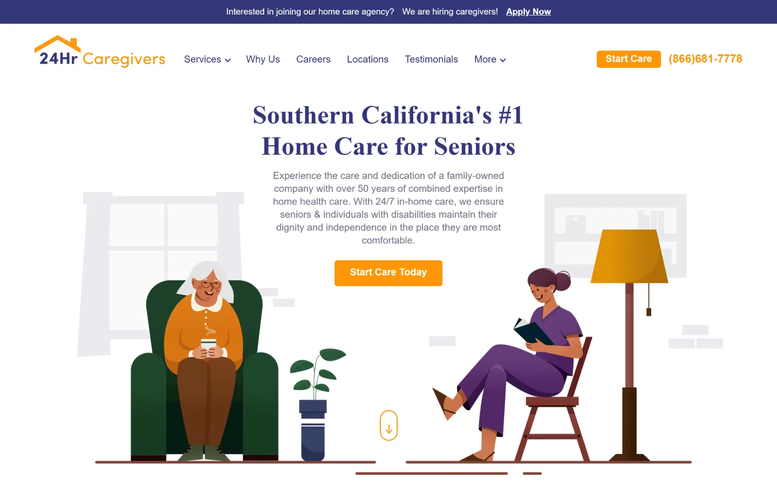
A centred indigo serif headline over white, flanked by flat vector illustrations of a seated older woman and a caregiver reading in a lamp-lit room.
Type
P22 Mackinac Pro 48px, bold
Body
Sofia Pro 18px
Build
centred hero between illustrations, 1440px full width
Colour
#35377b #ff9607 #6f7086
Type. P22 Mackinac Pro sets the 48px headline in bold indigo, dropping to 34px for sections, and Sofia Pro handles body at 18px with a tight 1.33 line height. The pairing of a contemporary bookish serif with a geometric sans is the most considered typographic decision in this set, and the 1.33 leading on the intro paragraph is the only place it goes slightly wrong.
Colour. Indigo #35377b for headings, a softer #6f7086 for body, orange #ff9607 for the single button and the phone number, on white. A deep green #20482d appears further down the page at 17 per cent coverage. Four working values, with the orange confined to things you can click and the green reserved for a later section rather than sprayed across the hero.
Layout. A 1440px full width hero built as a centred text column with illustration to either side rather than the usual left type, right photo split. Two column grids of 350px and 370px with 40px gaps structure the lower sections. Button radius is 5px, the header is sticky, and a recruitment ribbon sits above it in indigo.
The ask. One ask, Start Care Today, in orange, repeated as a smaller Start Care pill in the header beside the phone number in matching orange. The caregiver recruitment line is pushed to a separate ribbon above the nav, which keeps the hiring message from borrowing the main call to action.
A centred text column with illustration either side gives a hero symmetry that the standard type-left, photo-right split cannot.
05
abundanthomehealthcare.com
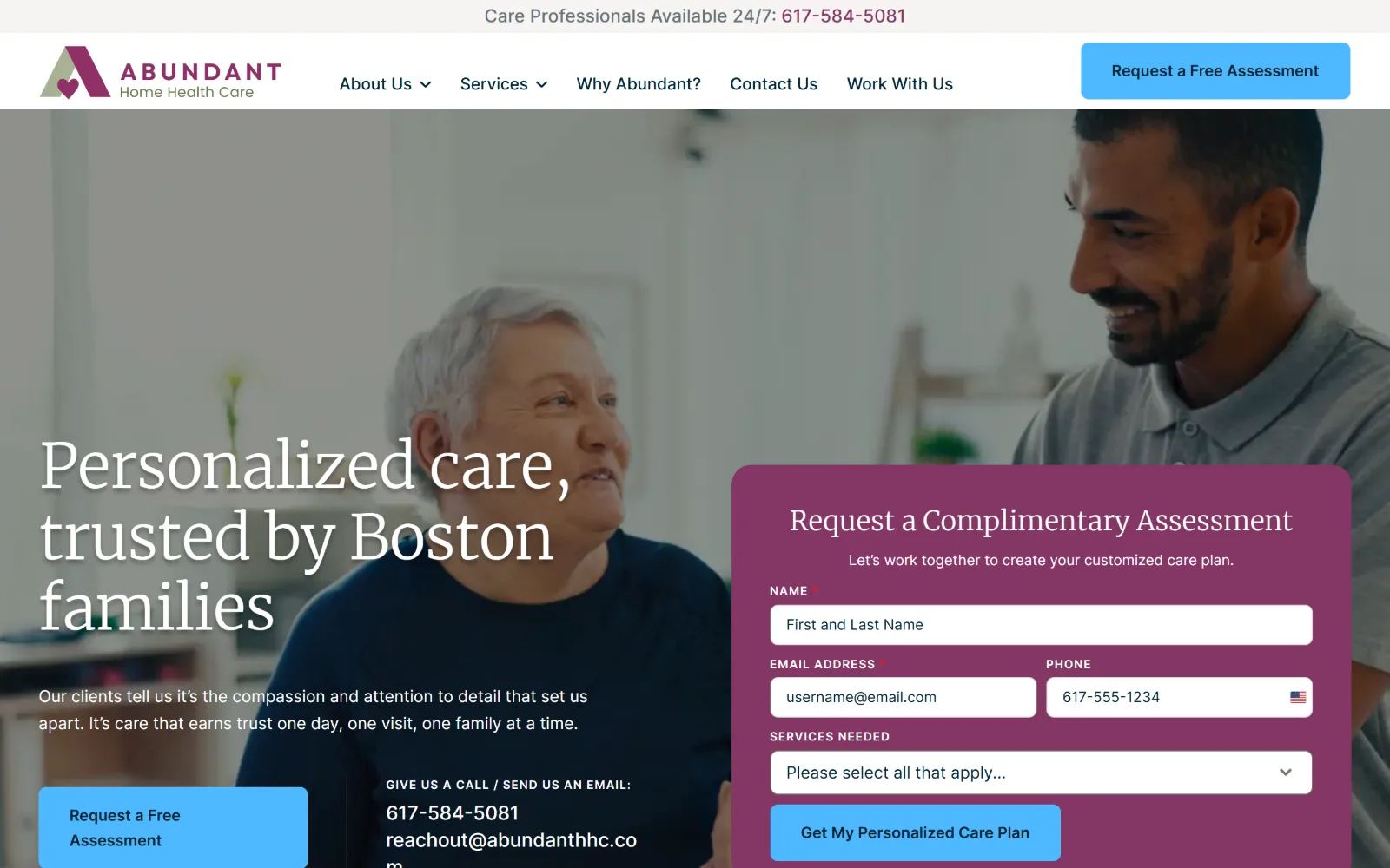
A light serif headline in white over a dimmed photo of two people talking at home, with a magenta enquiry form panel occupying the right third.
Type
Merriweather 64px, weight 300, -0.016em
Body
Inter 17px, 1.65 line height
Build
full-bleed photo hero with overlapping form panel, 1440px
Made on
WordPress
Colour
#843665 #4db8ff #687276
Type. Merriweather at weight 300 and 64px with -0.016em tracking gives a headline that is large but not heavy, which is rare in this trade; sections drop to 52px and 28px in the same light cut. Inter runs 16px to 20px for body, nav and labels. The light serif against a neutral UI sans is what makes the hero feel like editorial rather than a brochure.
Colour. Magenta #843665 is the whole identity, used for the form panel at 10.7 per cent coverage and nothing else of size. A pale blue #4db8ff fills the buttons, which is the one jarring note against the magenta. Ink is #687276 on white, with #002333 on the blue buttons. Four values, two of which are fighting slightly.
Layout. A 1440px full bleed photographic hero with the form panel anchored to the right, overlapping the image rather than sitting beside it. Below, a four column grid of 320px tracks runs edge to edge with zero gap. Button radius is 8px; the header is a plain white bar with a thin utility strip above it carrying the 24/7 phone number.
The ask. The form is the hero: name, email, phone and a services dropdown, closing on Get My Personalized Care Plan. A Request a Free Assessment button repeats in the header and again under the headline, and the phone number and email are set as plain text beneath, so a caller who will not fill in a form still has a route.
Placing the enquiry form inside the hero photograph rather than below it removes a scroll from the only action that matters.
06
handledcare.com
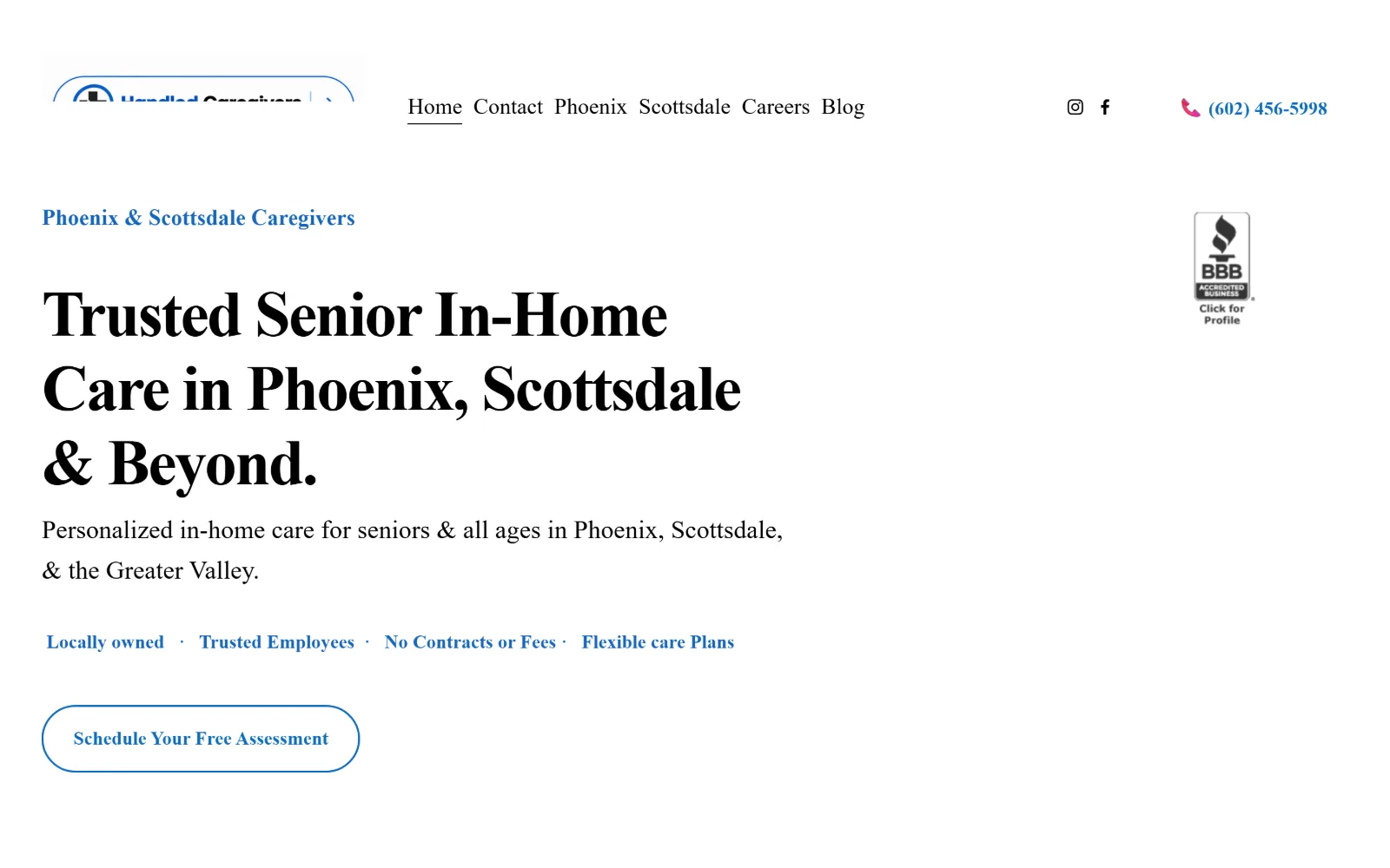
A heavy black serif headline three lines deep on plain white, with a blue eyebrow, a blue benefits row, an outlined pill button and a BBB badge.
Type
66px semibold, -0.030em, rendering as a serif
Body
Inter 27px
Build
no-image type hero, 168px section padding, 1440px
Made on
Squarespace
Colour
#0f6cbd #000000 #f4f4f3
Type. The declared stack is Inter at 66px semibold with -0.030em tracking, but it resolves to a high contrast serif on screen, which is why the hero reads like a newspaper masthead. Body runs 27px and nav 23px, both unusually large, and the benefits strip sits at 18px bold. The accidental serif is more interesting than the intended sans would have been.
Colour. Effectively two colours. White at 321 per cent coverage carries everything, black #000000 sets the headline and body, and #0f6cbd blue marks the eyebrow, the benefit words, the outlined button and the phone number. A near white #f4f4f3 and a charcoal #111827 appear in trace amounts. Nothing is tinted, shaded or gradiented.
Layout. A 1440px viewport with a 26 track Squarespace grid at 11px gutters and a generous 168px of section padding, which is what gives the hero its air. No photograph at all in the first screen. The button radius of 300px makes a true pill. The header logo is clipped by the sticky bar in this capture, the one real flaw on the page.
The ask. A single outlined pill, Schedule Your Free Assessment, sits at the bottom of the hero with nothing competing. The phone number is set in blue beside a pink handset icon at the top right, and a row of four claims including No Contracts or Fees does the reassurance work that a photograph usually does.
Running a hero on type and white space alone is a viable option in a trade where every competitor opens with the same licensed photograph.
07
house-works.com
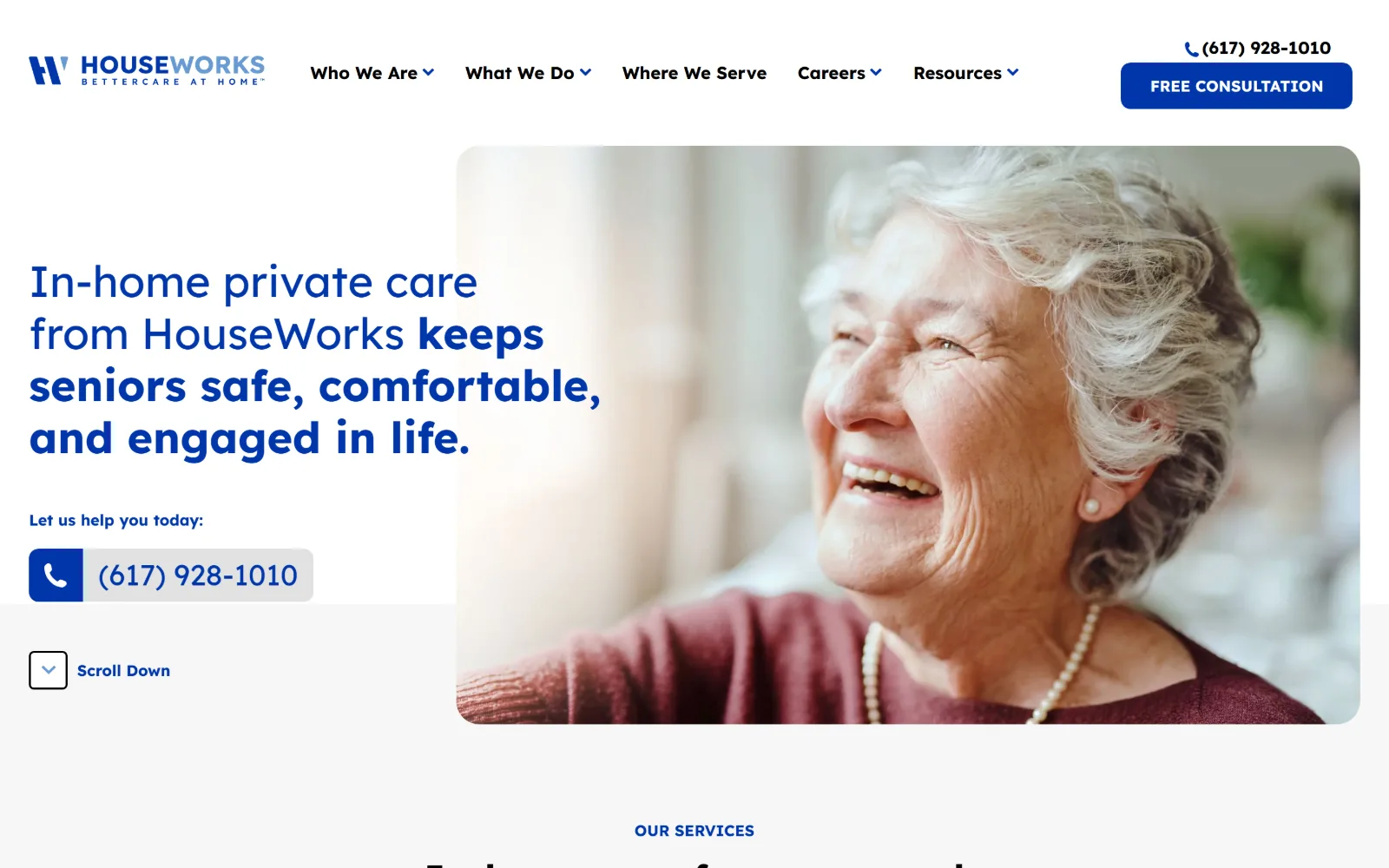
Blue type at left mixing light and bold weights in one sentence, beside a rounded-corner photograph of a laughing older woman in a red cardigan.
Type. Lexend runs the whole page, with the 45px hero sentence switching from regular to bold mid clause so the promise is emphasised inside the line rather than in a separate subhead. Supporting type sits at 38px bold, 30px uppercase and 18px for body and nav. A single family at two weights, used as a rhetorical device, is doing more work than most pairings here.
Colour. Royal blue #0037ab at 5.5 per cent coverage against white and a pale #f7f7f7 that fills 64 per cent of the page below the fold. Ink is plain black. Three values and no accent beyond the blue, which is left to carry the logo, the headline, the button, the phone block and the section labels without help.
Layout. A 1440px full width split, type left and image right, with a very large 225px of section padding and two flex rows holding the structure. The photograph is rounded at the corners and sits clear of the viewport edge, so the hero reads as a card rather than a bleed. A Scroll Down control sits at the lower left on a grey band.
The ask. FREE CONSULTATION as a 10px radius blue block in the header, with the phone number above it. In the hero the phone number is repeated as a large tappable block with a blue handset tile fused to its left edge, under the line Let us help you today. That treatment makes calling the primary action and the form the secondary one.
Setting part of a headline in bold inside the sentence emphasises the claim without the cost of an extra line of subhead.
08
seacarehomecare.com
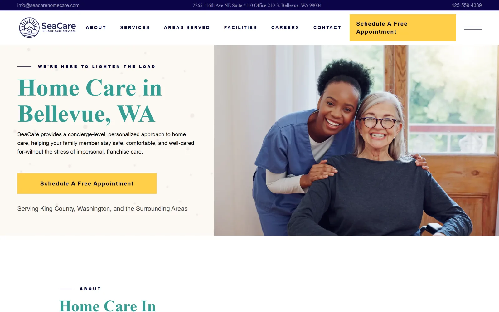
A teal headline on a pale ground at left with a yellow block button, beside a photograph of a carer leaning in beside a seated older woman.
Type. Raleway at 70px semibold sets the hero in teal, with a 13px uppercase eyebrow tracked out to 0.200em and a rule beside it. Nav is the same 13px uppercase at 0.200em in near black, and the button is 16px semibold at 0.100em. The heavy tracking on everything small, against a loose unspaced display size, gives the page a clear two tier system.
Colour. Navy #0b0449 and #00002e for nav and ink, a saturated yellow #ffcf48 for every button, and a teal that appears as #359d93 in the headline type. White ground, with the hero panel on a warm pale tint. The yellow is the only high chroma element and is used exclusively for the booking action, which makes it unmissable.
Layout. A 1440px viewport with a 12 column grid of 92.5px tracks at 30px gutters and 145px section padding below. The hero is a flat 50/50 split with no radius anywhere, corners square throughout. A full width navy utility bar carries email, street address and phone, and the yellow CTA block is squared off into the header rather than floated as a pill.
The ask. Schedule A Free Appointment is stated twice, as a square yellow block filling the top right of the header and again as a yellow block in the hero. Email, address and phone all sit in the navy bar above. The service area line under the button is plain text, which keeps the hero to one ask.
Reserving the only saturated colour on the page for the booking button means the eye finds the action before it reads the headline.
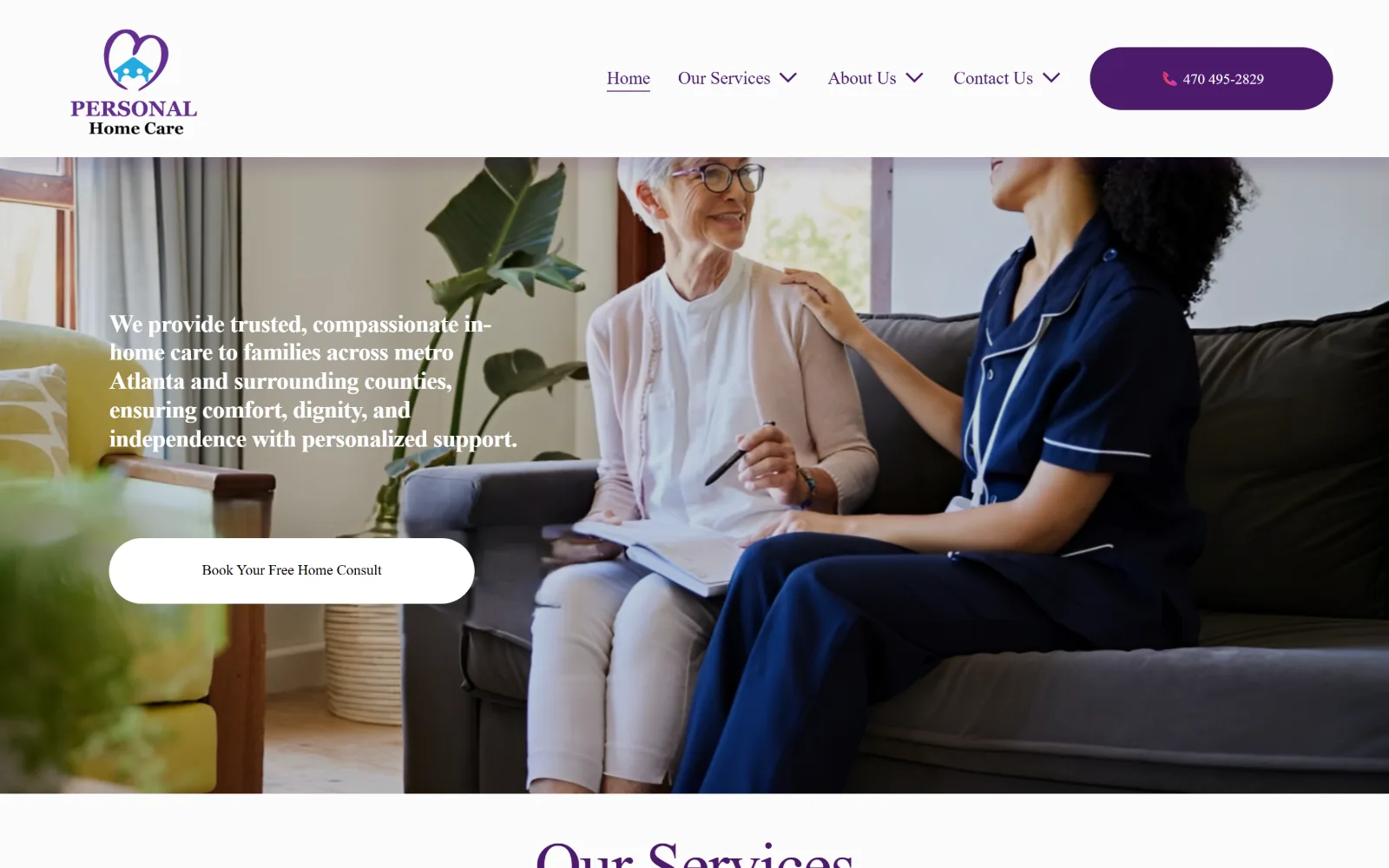
09
personalhomecareatlanta.com
A full-bleed photo of a carer seated beside an older woman on a sofa, with a white bold serif paragraph at left and a white pill button beneath it.
Type
Young Serif 67px, -0.020em
Body
Bitter 18px
Build
full-bleed photo hero, 26-col grid, 163px padding
Made on
Squarespace
Colour
#4b1a6b #fbfbfb #ffffff
Type. Young Serif at 67px with -0.020em tracking and a 1.06 line height sets the section headings in deep purple, and Bitter carries body, nav and buttons at 15px to 18px. Two serifs, one display and one slab, with no sans anywhere on the page. The hero paragraph is set in the slab at heavy weight, which is why it reads as a statement rather than a caption.
Colour. A single purple, #4b1a6b, sets every character on the page, fills the phone pill in the header and the button backgrounds. The ground is a near white #fbfbfb; the photography supplies all remaining colour. One hue plus one neutral is the most disciplined palette in this group, and the restraint is what makes the purple read as a brand rather than a default.
Layout. A 1440px full bleed photograph fills the hero with no text panel, the copy simply laid over the image at left. Below it the Squarespace 26 track grid at 11px gutters takes over with 163px of section padding. Button radius is 300px, so pills in the header and the hero. The header is sticky and white, which keeps the logo legible over the photograph.
The ask. Book Your Free Home Consult sits as a white pill against the photograph, and the phone number is given the loudest element in the header, a filled purple pill with a pink handset icon. Those two asks are the entire hero; there is no form, no chat widget and no second button.
A one-hue palette lets a single photograph supply all the colour on a page without the brand losing its hold on it.
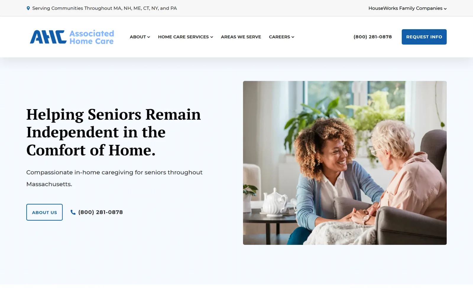
10
associatedhomecare.com
A black serif headline at left on a pale blue gradient, beside the familiar licensed photograph of a carer holding a seated older woman's hand.
Type
PT Serif 46px bold
Body
Montserrat 12-18px
Build
type-left photo-right, 1280px container
Made on
WordPress
Colour
#115eaa #2b2b2b #1376cd
Type. PT Serif at 46px bold over three lines, with Montserrat at 12px to 18px for everything else. The gap between a 46px display and a 12px body is wide, and the 13px uppercase nav at 0.050em holds the header together. The serif is a stock Google pairing rather than a commissioned choice, but it is set at a sensible measure and the rag is clean.
Colour. Blue #115eaa for the button and #1376cd for links, ink in #2b2b2b, against white and a pale #f7f7f7. The hero sits on a faint blue to white wash rather than flat white. Three working values with the blue at 0.2 per cent coverage, so the page reads as near monochrome with the photograph supplying the warmth.
Layout. A 1280px container at 89 per cent of the viewport, narrower than almost everything else here, which gives the hero generous outer margin. Type left, photograph right in a straight split, image corners rounded. Button radius 5px, header sticky with a thin grey utility bar above carrying the service area and a parent company dropdown.
The ask. REQUEST INFO as a filled blue block in the header with the phone number in bold beside it, then ABOUT US as an outlined button in the hero with the same number repeated next to a handset icon. The primary ask is kept in the header and the hero offers a softer one, which is an unusual and sensible division.
Keeping the hard ask in the header and a softer one in the hero suits a decision that families rarely make on a first visit.
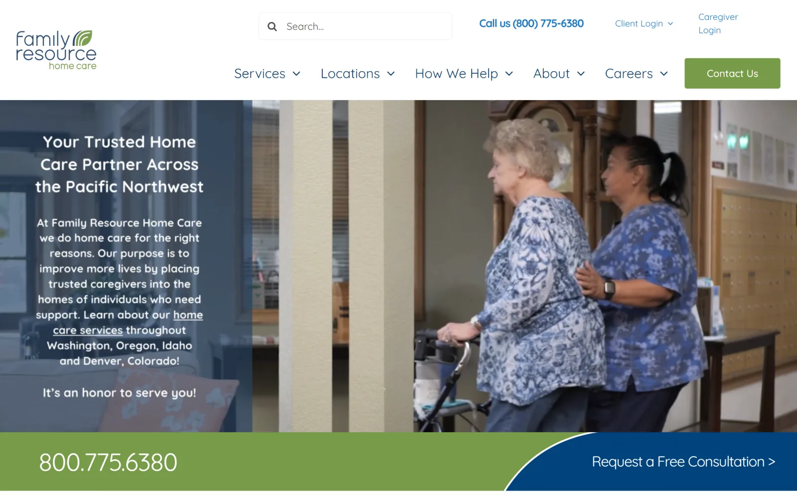
11
familyresourcehomecare.com
A video of a carer walking an older woman with a frame, with white copy over a blue scrim at left and a green and navy action bar across the bottom.
Type
Quicksand 45px, -0.022em
Body
Quicksand 16-24px
Build
full-bleed video, left scrim panel, split bottom bar, 1380px
Made on
WordPress
Colour
#789b48 #13406b #207bc6
Type. Quicksand carries everything, 45px for the hero with -0.022em tracking down to 16px for nav, with a 20px bold cut at a very tight -0.050em. A single rounded geometric sans at five sizes. It is soft to the point of being childlike at display size, and the long hero paragraph set in it at 24px is more text than the face can hold comfortably.
Colour. Blue #207bc6 for nav links, a deeper #13406b for headings, and an olive green #789b48 at 6.3 per cent for the action bar and the Contact Us button. Grey #a7adb7 covers the video scrim at 100 per cent, with #f0f3f6 for panels. The green and the blue split the calls to action between them rather than competing for the same one.
Layout. A 1380px container at 96 per cent of the viewport. The video is full bleed with a translucent blue panel over the left third holding the copy. The distinguishing move is the bottom bar: a green field carrying the phone number, cut by a curved diagonal into a navy field carrying the consultation link, so the two sit in one strip without a divider.
The ask. The phone number is set at display size in the green bar, roughly the largest text on the page, with Request a Free Consultation beside it in navy. A green Contact Us button and a site search field sit in the header, plus separate Client Login and Caregiver Login links, so four distinct audiences are served without any of them being hidden in a menu.
A curved diagonal cut between two colour fields separates two calls to action in one bar without needing a rule or a gap.
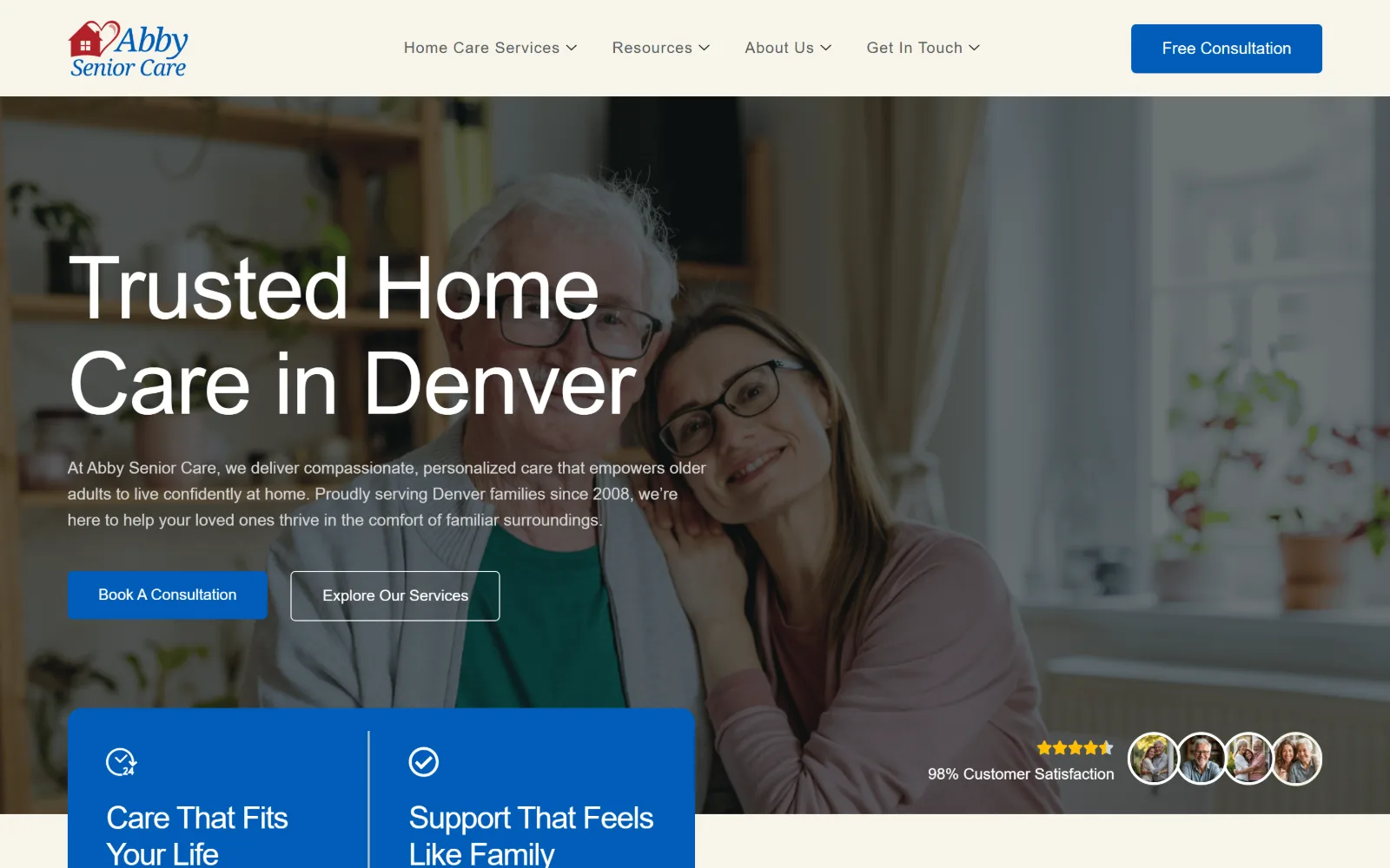
12
abbyseniorcare.com
A very large white headline over a dimmed photo of an older man and a woman leaning together, with two hero buttons and a blue stat panel below.
Type
90px, -0.014em, 1.10 line height
Body
Plus Jakarta Sans 17px, 1.60
Build
full-bleed photo hero with overlapping stat panel, 1440px
Made on
WordPress
Colour
#f7f5eb #005cb9 #edece3
Type. The headline runs 90px at -0.014em over two lines, stepping to 56px and 32px at -0.023em and -0.031em, so tracking tightens as size grows. Plus Jakarta Sans handles body at 17px with a 1.60 line height. The Lora declaration in the stylesheet resolves to a grotesque on screen, which is why the hero reads as neutral rather than bookish.
Colour. A warm pale ground at #f7f5eb with a second tint at #edece3, and blue #005cb9 at 9.2 per cent carrying the buttons, the stat panel and the header CTA. Body ink is #333333 with #d4d4d4 for copy over photography. Three structural colours and no secondary accent, so the blue has to serve as brand, button and panel all at once.
Layout. A 1440px full width hero with the photograph bleeding to all four edges and a blue two column panel sliding up over its bottom left corner. Section corners are square throughout. The header is a plain bar on the warm ground, not sticky, with four nav items and a single CTA at the far right.
The ask. Book A Consultation filled in blue and Explore Our Services as a white outline sit side by side under the headline, with Free Consultation repeated in the header. A satisfaction figure and a row of circular reviewer portraits sit at the lower right of the photograph, which is the only social proof on the first screen.
Tightening tracking as type size increases keeps a 90px headline from reading as loose at the exact point it would show.
13
withalittlehelp.com
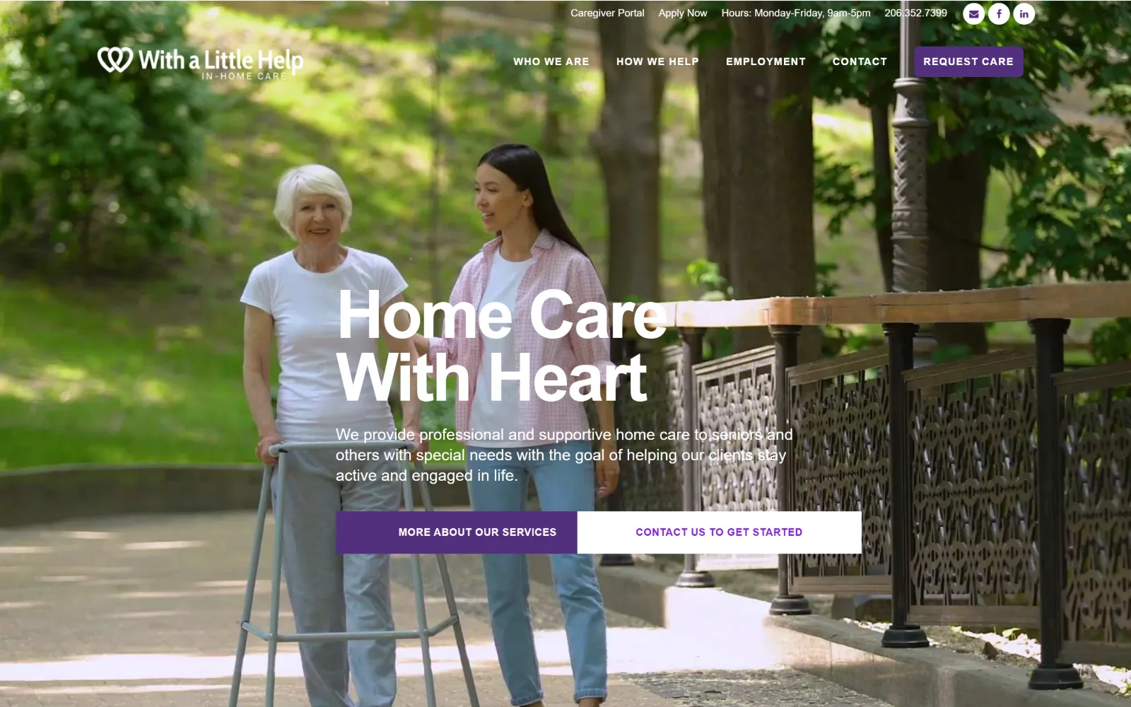
Huge white type centred over a sunlit photograph of a woman walking beside an older woman with a frame on a park path, with two wide buttons below.
Type. Work Sans at 85px bold, capitalised, at -0.035em and a 0.94 line height, which is tighter than the cap height and makes the two lines interlock. Body sits at 16px medium and nav at 13px semibold uppercase tracked to 0.077em. A 36px Alegreya appears further down as the only serif. The leading below 1.0 on a two line headline is the single most confident decision here.
Colour. Purple #522e7d on buttons with a brighter #8224e3 on links, against a #f6f6f6 ground that covers 300 per cent of the page. Body ink is #5d5c5c. Three values, with the two purples close enough that the brighter one reads as a hover state rather than a second accent. The photograph supplies all the green.
Layout. A 1440px full bleed photograph with the type centred rather than set to one side, so the walking figures sit either side of the headline block. Buttons are square cornered and unusually wide, roughly 400px each, laid as a pair with no gap between them. A utility strip above the header carries hours, portal links and social icons.
The ask. The pair of hero buttons split the choice evenly: MORE ABOUT OUR SERVICES filled in purple and CONTACT US TO GET STARTED reversed to white, with equal widths so neither is subordinate. REQUEST CARE repeats in the header and the phone number sits in the utility strip above it.
A line height under 1.0 on a short two-line headline makes the block read as one shape rather than two stacked lines.
14
livestarhomecare.com
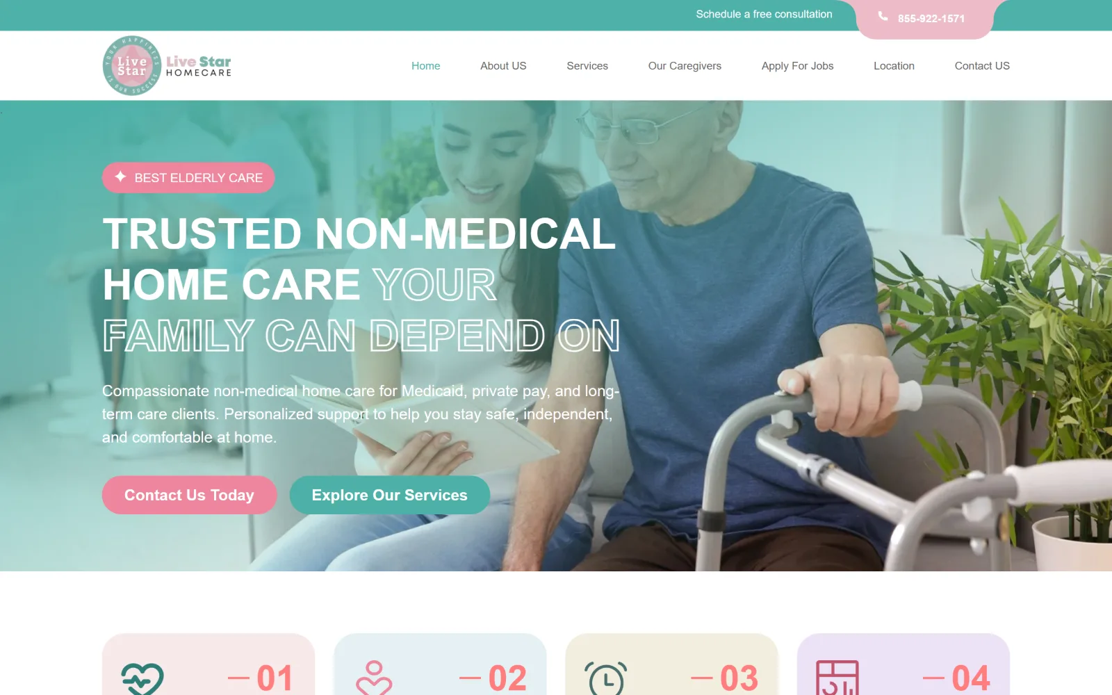
A mint-tinted photo of a carer and an older man on a sofa, uppercase white type where half the words are outlined, and pink and teal pill buttons.
Type. Tomato Grotesk at 55px semibold, uppercase, with the second half of the headline set as an outline rather than a fill, so one sentence carries two treatments. Montserrat runs body at 20px medium and Poppins the nav at 20px. Three families on one page is one too many, but the outline trick gives the hero a hierarchy the flat weight alone would not.
Colour. Mint and pink. The hero photograph is washed in teal, the eyebrow pill and first button are #ee859c, and the card row below uses four pastel tints, #fff0f4, #e5f1f3, #f3eedf and #eee2f7, one per card. Ink is #23314d. It is the only palette in this set that is not blue, navy or teal, and the pastel card row is a real decision rather than a default.
Layout. A 1440px full width hero with 80px section padding and two column grids of 278px tracks at 20px gutters below. Buttons are rendered at an 800px radius, so fully round ended. The header sits on white below a teal utility strip whose right edge is cut by a pink rounded tab holding the phone number, which is the one piece of shaped geometry on the page.
The ask. Contact Us Today in pink and Explore Our Services in teal sit as equal pills in the hero, with a free consultation line and the phone number in the strip above. Four numbered benefit cards follow immediately. The two hero buttons are the same size and weight, so the page never states which one it would prefer.
Outlining the second half of a headline creates emphasis inside a single uppercase line without changing size or weight.
15
friendsforlifeinc.com
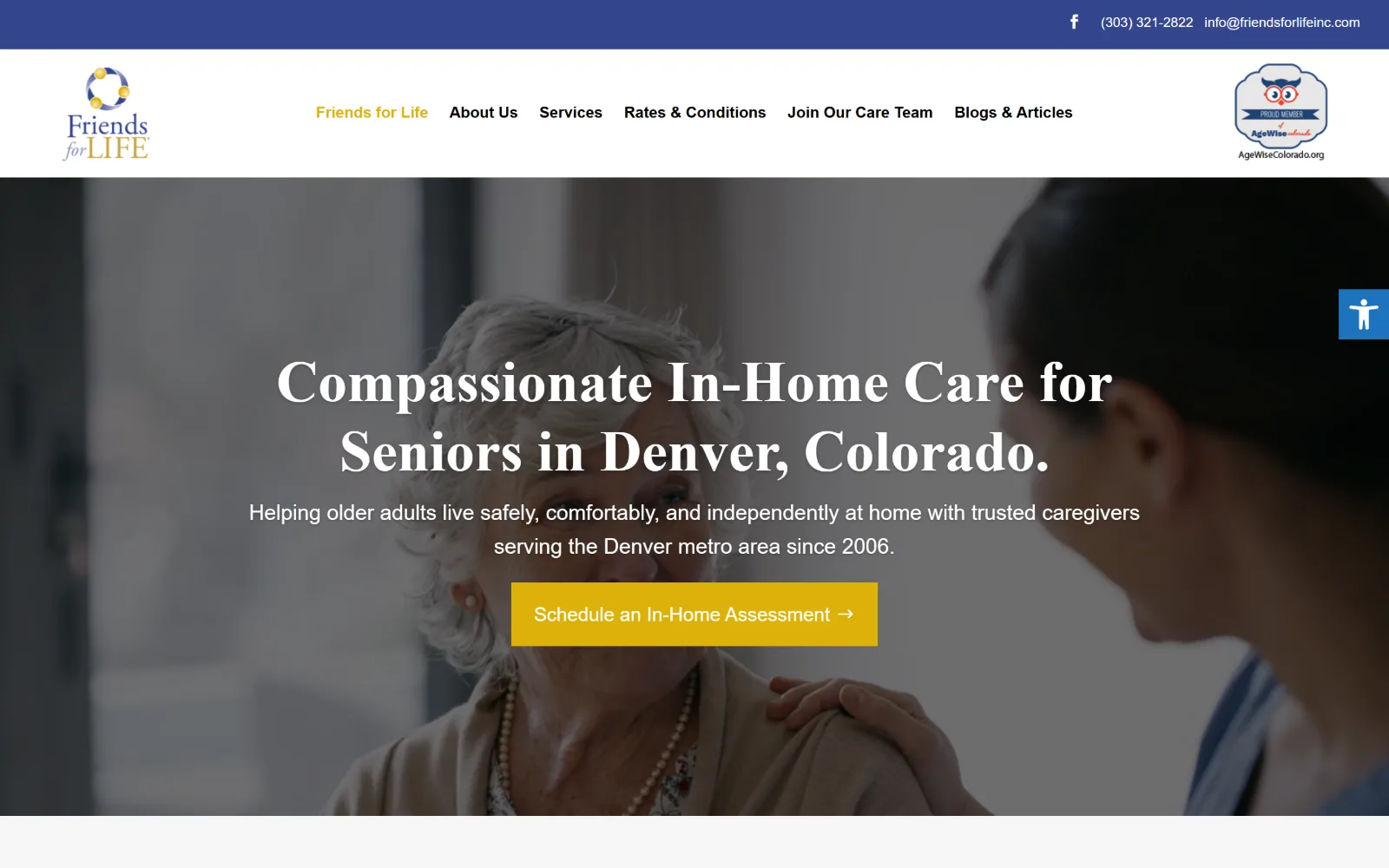
A centred white serif headline over a darkened video of a carer with a hand on an older woman's shoulder, above a single yellow rectangular button.
Type. Adobe Garamond Pro at 60px bold carries the centred headline, stepping to 42px, with Source Sans Pro at 22px for the subhead and body and DM Sans at 20px on the button. An old style serif at bold weight over video is a conservative choice, and the 22px subhead is close enough in size to the body copy that the hierarchy below the fold goes flat.
Colour. Navy #34458c in the utility bar and logo, gold #ddb10a on the button, against a #222222 video scrim and #f7f7f7 panels below. Links use #1e73be, a third blue that does not match the navy. The gold is the only warm note and it is spent entirely on the single button, which is the right call.
Layout. A 1440px full width hero with the video bleeding edge to edge and all copy centred on it rather than set to one side. The header is a plain white bar carrying six nav items and an accreditation badge at the far right. The button is square cornered. An accessibility toggle is pinned to the right edge of the viewport.
The ask. One ask on the first screen: Schedule an In-Home Assessment, in gold with a trailing arrow, centred under the subhead. The phone number and email sit together in the navy utility bar at the top. No form, no chat prompt and no second button, which is unusually restrained for a WordPress build of this vintage.
A single centred button under a centred headline is the simplest way to stop a video hero from collecting competing calls to action.
16
northwesthomehealthagency.com
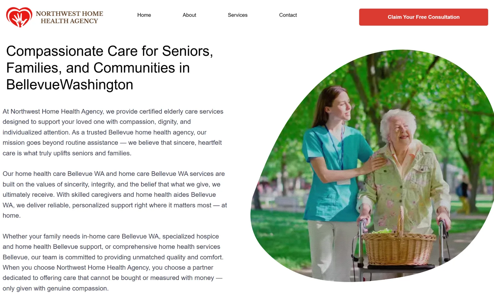
A black sans headline and three long paragraphs at left on white, beside a photo of a carer and an older woman with a frame clipped into a blob.
Type
Madefor Display Bold 41px
Body
Montserrat 19px, 1.60
Build
copy-left, blob-masked image right, 1440px
Made on
Wix
Colour
#dc3b33 #3d3d4e #ffffff
Type. Madefor Display Bold at 41px sets the headline, with a larger 57px cut used elsewhere, and Montserrat at 19px and 15px for body. The headline is smaller than the hero copy block deserves, and the body runs to three full paragraphs at a measure of roughly 60 characters, so the first screen is text heavy in a way the type scale does not support.
Colour. Effectively white and red. The ground is white at 194 per cent coverage, body ink is #3d3d4e, headings are black, and red #dc3b33 at 1.2 per cent is spent entirely on the single consultation button. There is no secondary colour at all, which leaves the photograph to do all the warming and the red to do all the signalling.
Layout. A 1440px viewport with a straightforward two column split, copy left and image right. The structural decision is the image mask: the photograph is clipped into an irregular organic blob rather than a rectangle or a circle, which is the only shaped element on the page. The header is sticky, with four nav items spaced widely and a red CTA block at the right.
The ask. Claim Your Free Consultation as a 5px radius red block in the sticky header is the single ask, and there is no phone number anywhere on the first screen. The hero copy repeats the service area in almost every sentence, which reads as keyword placement rather than reassurance and crowds out the room a call to action would need.
A blob mask only earns its place when the rest of the page is plain; here it is carrying a hero that the type scale has left unsupported.
How these were chosen
Twenty-two American agency homepages were captured for this set and sixteen survived the cut. The pattern that holds is the licensed photograph: the same handful of carer-and-client stock images turn up on site after site, and a great deal of home care website design amounts to choosing which one to buy and which blue to put beside it. The agencies kept here either commissioned something of their own, a collage, a set of illustrations, a watercolour, or made one structural decision worth copying, usually about where the booking widget or the phone number goes. The exception is the one that does not run a photograph at all and holds its first screen on type and white space. Franchise and vendor clones were dropped where two captures were plainly the same build under different logos.
Finding home care sites that someone had actually designed took far longer than it should have. 30 candidates made the shortlist. 16 made the page.
Each one was opened and looked at properly: what the type is doing, where the colour gets spent, how the page is built, how it asks for the job. Nothing is here because it ranks. Nothing is here because an agency filed it under portfolio. Several well known names were left out for the plain reason that their site came out of the same template as everyone else's, and a few sites worth including did not survive a second look.
Where a site is only competent, it says so. The order is the order worth your time, best first.
Reviewed and selected by Larry W. Matthews for Websitely.