Cleaning Company Website Design: 15 We Actually Rate
Judge any cleaning company website design by what its first screen asks for. Fifteen maid, janitorial and biohazard firms, ranked on exactly that.
Shown
15 sites
Reviewed
30 candidates
Chosen on
The work, not the ranking
Updated
15 October 2026
01
myclean.com
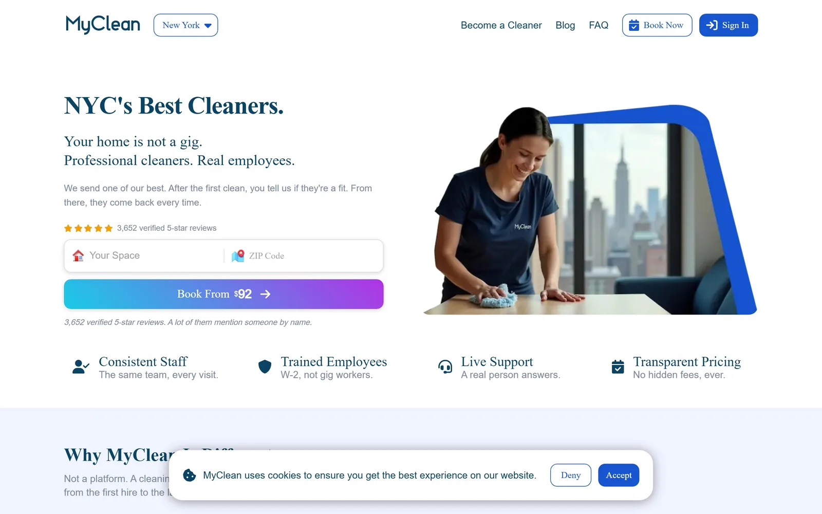
A serif headline sits beside a space and zip field, and the gradient button already names the price: Book From $92.
Type
Text serif, 44px
Body
Sans, 15px/1.65
Build
Two columns, 598px each, 20px gutter
Made on
Custom JS framework
Colour
#0b4364 #1654d0 #f0f4ff
Type. The display is a sturdy text serif at 44px, tracked tight at -0.023em, in deep navy #0b4364. Body runs 15px sans at 1.65 line height in a muted #7b8a9e. The DOM calls the display face Brown, but the drawn letters carry bracketed serifs, so read it as a transitional text serif pushed up to headline size. Choosing a serif in a category full of rounded geometric sans is most of the reason this page looks unlike its competitors.
Colour. White ground, a pale #f0f4ff band below the fold, navy #0b4364 on headings and #1654d0 on links and the Book Now chip. The accent occupies well under one percent of the screen, and the only loud element is the cyan to violet gradient on the booking button. That gradient fights the restraint of everything around it.
Layout. Full 1440 container, two columns at 598px each with a 20px gap and 48px section padding. The left column stacks headline, two-line subhead, star rating, a two-field form and the button; the right is a photograph masked into an angular blue shape. Under the fold a four-up row of icon claims runs edge to edge: Consistent Staff, Trained Employees, Live Support, Transparent Pricing.
The ask. The ask is a priced quote: Your Space, then ZIP Code, then Book From $92. Book Now and Sign In repeat the same destination in the header, so three routes to one place. A cookie bar covers the next section heading, and the small house and map emoji sitting inside the input fields cheapen a page that is otherwise careful.
Putting the starting price on the button turns a vague quote request into a decision the visitor can make before typing anything.
02
gogleem.com
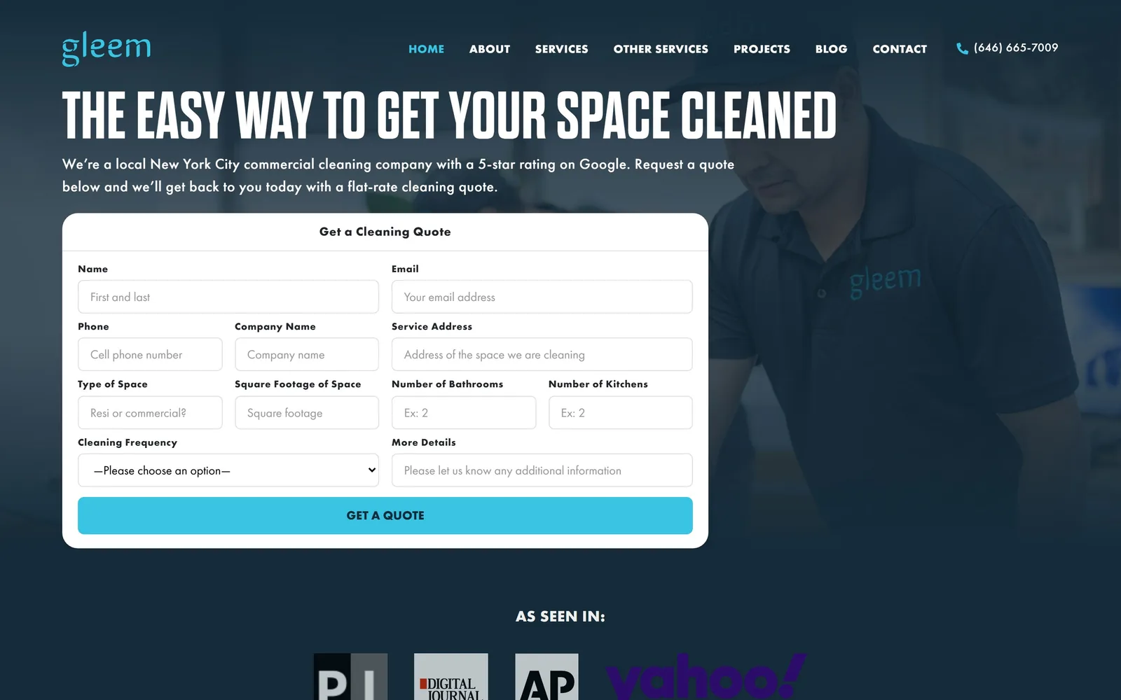
A nine-field quote form fills the hero, set on dark slate over a photo of a cleaner in a Gleem polo shirt.
Type
Condensed uppercase gothic, 86px
Body
Futura PT, 21px/1.67
Build
Full-bleed hero, 1140px form card
Made on
WordPress
Colour
#152b39 #39c4e4 #ffffff
Type. The display is a heavily condensed uppercase gothic at 86px with a hair of tracking at 0.006em, packing eight words across the full width. Everything else is Futura PT: 21px body at 1.67, 19px nav, 15px uppercase bold labels. A compressed poster face against a geometric sans is a deliberate pairing and it gives the page a voice the copy alone would not.
Colour. Slate #152b39 covers the entire first screen with white type over it, and cyan #39c4e4 appears exactly twice, in the wordmark and on the GET A QUOTE bar. That is about one and a half percent of the screen given to the accent. Going dark is a real decision in a category that defaults to white and sky blue.
Layout. Full-bleed 1440 hero with no container inset, headline flush left at the 112px margin. A white card roughly 1140px wide holds the form on a two-column grid of paired fields, with the photograph bleeding in behind it from the right. An AS SEEN IN logo row starts immediately below the card.
The ask. The form is the hero: name, email, phone, company, address, type of space, square footage, bathrooms, kitchens, frequency and notes. Nine fields is heavy friction, and the page pays for it by promising a flat-rate quote back the same day. Only the phone number top right competes.
If you can quote from a handful of facts, put the whole form in the hero instead of a button that leads to it.
03
aftermath.com
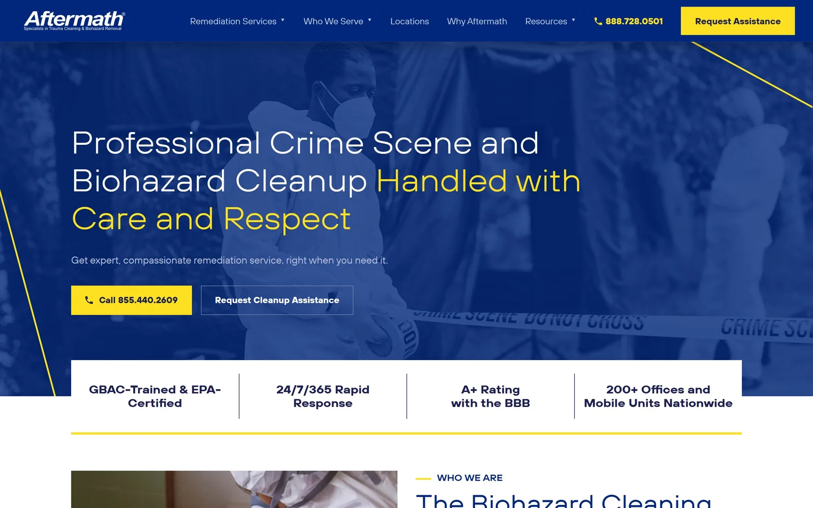
Navy duotone over crime scene tape, with the second half of the headline switched to yellow and two buttons side by side.
Type
Expanded grotesque, 44px
Body
TT Hoves Pro, 18px/1.5
Build
Full-bleed hero, inset four-cell proof bar
Made on
Custom
Colour
#00277c #fde021 #1d2050
Type. TT Hoves Pro Expanded sets the 44px headline, and the expanded cut does the work: wide letterforms read calm rather than urgent, which matters when the service is trauma cleanup. Body is the normal width at 18px, weight 100, line height 1.5. The four proof figures below jump to the expanded cut at 20px weight 900, eight steps heavier than the body.
Colour. Navy #00277c holds 39 percent of the screen against 59 percent white, and yellow #fde021 gets 1.3 percent: the phone button, two diagonal hairlines and the clause Handled with Care and Respect. Colouring half a sentence rather than the whole headline is the sharpest decision on the page.
Layout. A 1440 edge-to-edge hero with the copy column stopped near 1250px and thin yellow diagonals cutting two corners. A white proof bar inset from both sides overlaps the base of the hero, divided into four cells by hairline rules. Corner radius is zero throughout.
The ask. Two buttons: yellow Call 855.440.2609 and an outlined Request Cleanup Assistance. The header carries a different number and its own Request Assistance block, so the phone appears twice above the fold. For an emergency service, leading with the call and ranking the form second is the right order.
Colour one clause of the headline instead of the whole line, and the accent does the reading for the visitor.
04
maidmarines.com
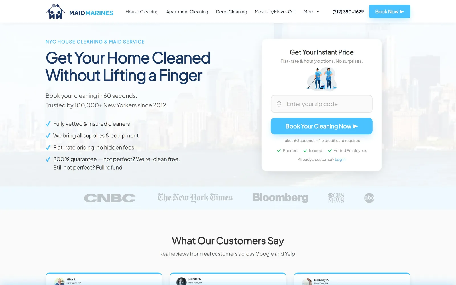
A white instant-price card asks only for a zip code, floating over a pale Manhattan skyline beside a four-point checklist.
Type
Plus Jakarta Sans Bold, 48px
Body
Plus Jakarta Sans, 15px/1.63
Build
Two columns 560px, 32px gutter
Made on
Custom
Colour
#1a3967 #49c2ff #fafafa
Type. Plus Jakarta Sans does everything: 48px bold at -0.025em for the headline, 15px regular at 1.63 for body, and a 15px uppercase eyebrow in the accent blue. One family, five sizes, no serif anywhere. Competent rather than interesting, and it keeps attention on the card.
Colour. White and #fafafa carry nearly the whole screen, navy #1a3967 holds the headings, and sky #49c2ff lands on the card button, the four check marks and the Book Now chip, roughly one percent of the pixels. The blue is the stock choice for the category; this page wins on arrangement, not palette.
Layout. A 1440 container with two columns at 560px and a 32px gutter, 80px section padding. Left is headline, two subhead lines and four checkmarked claims; right is a 520px white card at 24px radius. Below sit a press strip of CNBC, The New York Times, Bloomberg, CBS and ABC, then three testimonial columns at 368px.
The ask. One field, a zip code, under Get Your Instant Price, then Book Your Cleaning Now. The microcopy under the button clears the last objections: 60 seconds, no credit card required, bonded, insured, vetted. Only the header Book Now and the phone number compete.
Ask for the one piece of information you can price from, and put the reassurance under the button rather than above it.
05
zerorez.com
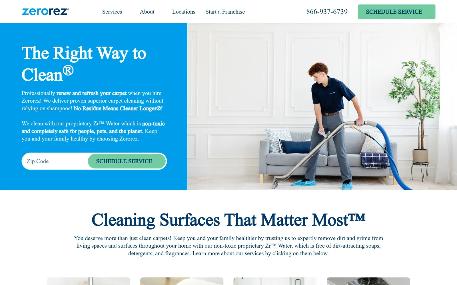
A cyan block holds a serif headline and a zip field while a photo of a technician in shoe covers fills the right half.
Type
Transitional serif, 48px
Body
Serif, 16px/1.5
Build
Split hero, 521px and 782px, no gutter
Made on
Custom
Colour
#009dea #71cda1 #003968
Type. The headline is a 48px serif with old-style proportions, white on cyan, and the same face reappears at 48px on the section head below the fold. Body is 16px at 1.5, also serif, with bold pulling out claims like No Residue Means Cleaner Longer. A serif at body size is unusual for a franchise site and it reads as a company with some history behind it.
Colour. Cyan #009dea takes the left 42 percent of the hero, white the rest, mint #71cda1 sits on both Schedule Service buttons, and navy #003968 carries every line of body ink below the fold. Mint on cyan is a risky pairing that survives because the mint never appears anywhere except a button.
Layout. Two unequal columns at roughly 521px and 782px with no gap, so the colour block butts straight into the photograph. Container is 1400px, section padding 64px, card radius 8px. The zip field and its button form a single pill split down the middle.
The ask. Zip code plus SCHEDULE SERVICE, repeated in the header alongside the 866 number. A franchise has to route a visitor to a local operator before it can quote, so the zip handles dispatch and conversion at once. The service tiles below the fold are the only other route.
When price depends on location, make the zip field the hero and build it as one pill so entering it is a single gesture.
06
kbs-services.com
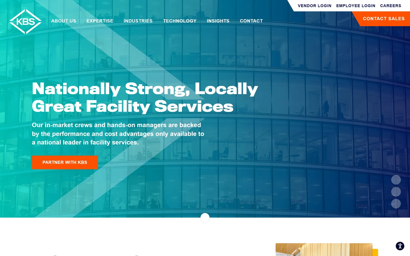
A teal to navy wash over a curved glass office block, with one square orange button reading PARTNER WITH KBS.
Type
Compressed grotesque, 52px
Body
Montserrat, 22px
Build
Full-bleed slider hero, 100px section padding
Made on
Custom
Colour
#050f50 #ff4f01 #ffffff
Type. TitlingGothicFBBold sets the headline at 52px over two lines, a compressed grotesque with tight apertures that reads industrial without shouting. Montserrat handles the rest: 22px semibold subhead, 16px uppercase nav. Nav and button are tracked out at 0.03em while the headline is not, which keeps the two layers visually separate.
Colour. A teal to navy gradient sits over the photograph and sets the temperature of the whole screen, anchored at the dark end by #050f50. Orange #ff4f01 covers less than one percent of the pixels and appears twice, on the notched Contact Sales tab and the hero button. One accent, reserved for asking.
Layout. Full 1440 bleed with content inset about 160px from the left and 100px section padding. Corner radius is zero everywhere. A slanted white panel cuts the base of the hero and carousel dots stack at the right edge, so this screen is one slide of several.
The ask. A single hero button, PARTNER WITH KBS, square and orange. The angled CONTACT SALES tab in the top corner repeats it. Vendor Login, Employee Login and Careers are parked in a smaller row above the nav, deliberately held back so staff traffic does not compete with buyer traffic.
Separating staff links from buyer links by size and position leaves exactly one button on the screen that matters.
07
encompassonsite.com
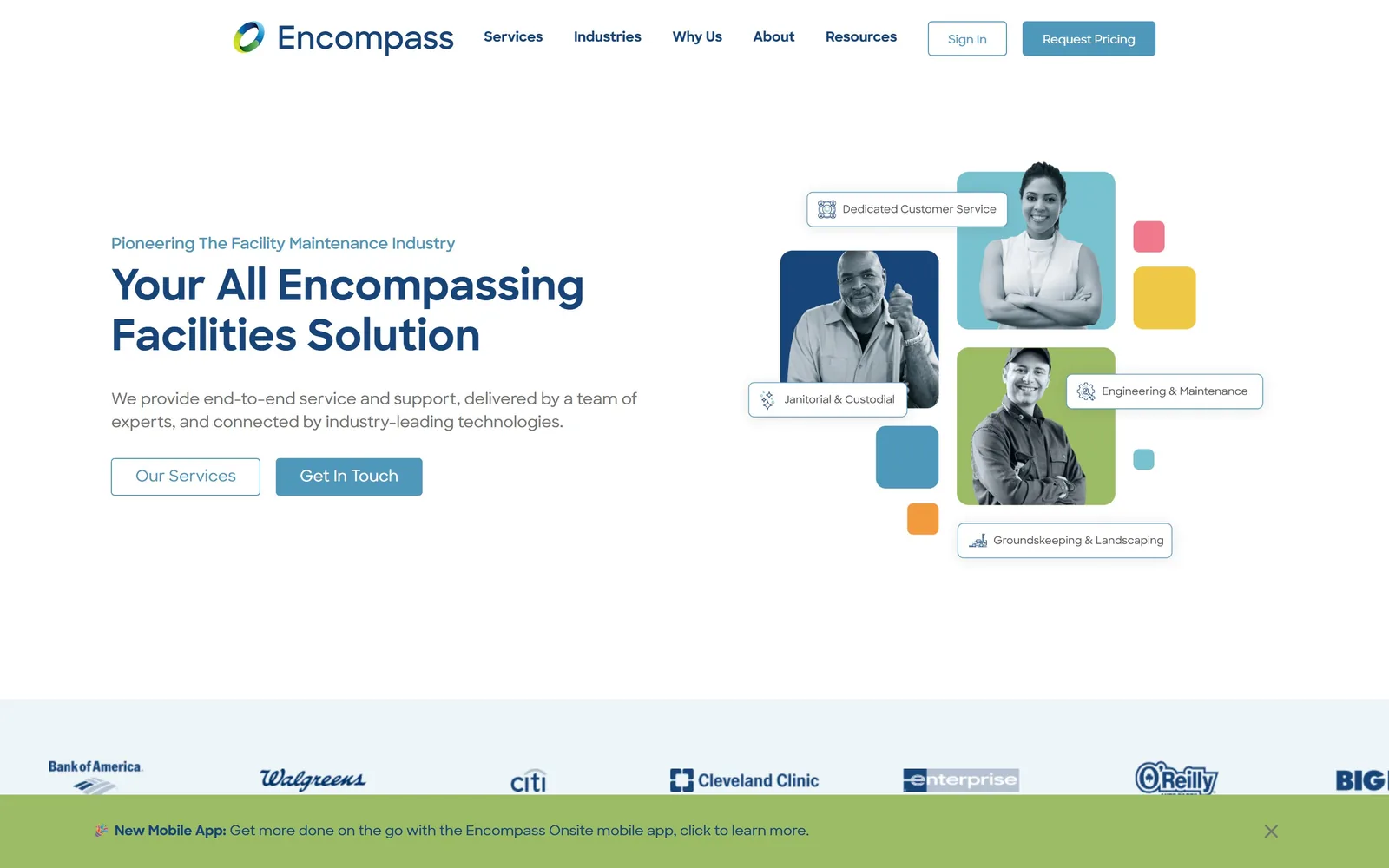
Duotone portraits in blue, teal and green tiles, labelled with floating white chips naming each service line.
Type
Sharpsans Bold, 44px
Body
Sharpsans, 16px/1.5
Build
1440 container, two 564px columns, 80px gutter
Made on
Custom
Colour
#17457a #4f98bc #9cbb65
Type. Sharpsans throughout, a geometric sans with a single-storey a. The headline runs 44px bold in #17457a with an eyebrow above it at 16px in the lighter #4f98bc, body is 16px at 1.5 in grey #747474, and the chip labels drop to 12px. That is small type for a business-to-business page, and it only works because there is so little of it.
Colour. White ground with an #edf5f8 band at the base. The colour lives in the hero collage: a navy tile, a teal tile, a green tile and loose squares in #9cbb65, coral and yellow. Button blue #4f98bc covers less than half a percent of the screen, so the collage is the brand and the button is just a button.
Layout. A 1440 container with a two-column grid at 564px and an 80px gutter, plus eight-column 200px grids at 24px gaps lower down. The hero right side ignores the grid: four images at 4px radius arranged freely, with chips overlapping their edges. Client logos for Bank of America, Walgreens, Citi and Cleveland Clinic run along the bottom.
The ask. Two buttons, an outlined Our Services and a filled Get In Touch, with Request Pricing and Sign In in the header. Pricing is the strongest word on the page and it sits top right rather than in the hero. A green mobile-app bar pinned across the bottom pulls at the same attention.
Naming your service lines on chips over the photographs tells a facilities buyer what you sell without a bullet list.
08
valcourt.net
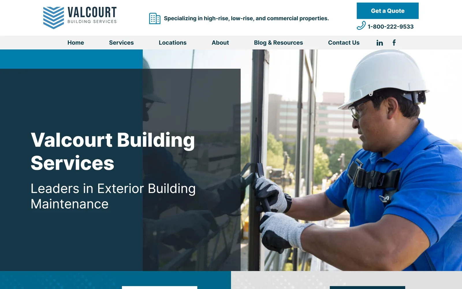
A dark teal panel overlaps a photo of a technician on a high-rise facade, stepped in three layers of blue.
Type
Inter 800, 60px
Body
Inter, 17px/1.88
Build
Stacked overlap hero, full 1440
Made on
WordPress
Colour
#027eac #063849 #1a252e
Type. Inter at 60px weight 800 for the title and 40px regular for the line beneath it, so weight rather than size separates the two. Body is 17px at a generous 1.88 line height, which makes the lower sections easy to scan. The nav is set at 18px, unusually large, and it stops the two-row header from feeling cramped.
Colour. Three blues doing three jobs: #027eac for the quote bar and buttons, #063849 for ink, #1a252e for the overlay panel, with white and #f2f2f2 filling the rest. There is no fourth colour anywhere, and that discipline is why the stepped panels read as structure instead of decoration.
Layout. A two-row header, first a utility row with logo, strapline and quote button, then a grey nav strip. The hero stacks three rectangles: a cyan band, a dark panel over it carrying the copy, and the photograph bleeding off the right edge. A dotted texture block closes the bottom left of the full 1440 width.
The ask. Get a Quote sits top right with the 1-800 number under it, and that is everything above the fold. The hero itself asks for nothing, which is the one change worth making: the copy panel has room for a button and leaves it empty. The headline is also just the company name, so the subhead carries the whole proposition.
Overlapping two flat panels across a photograph gives a hero real depth without a single shadow or gradient.
09
betterlifehome.com
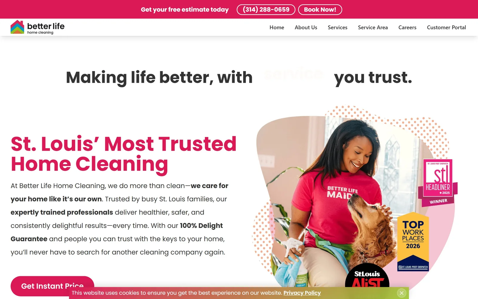
Magenta display type on white, with a cleaner and a dog photographed into a blob-shaped crop and three award badges.
Type
Poppins Bold, 60px
Body
Poppins, 20px/2.0
Build
1380 container, headline band over two-column split
Made on
WordPress
Colour
#db1a55 #333333 #ffffff
Type. Poppins for all of it: 60px bold for the magenta headline, 48px for the rotating line above, 20px at a loose 2.0 line height for body. At a 1.0 line height the two headline lines nearly touch, which suits the geometric letterforms but leaves no air. The rotating word was mid-swap when this was captured, so service shows as a ghost.
Colour. Magenta #db1a55 is the brand and it is used hard: top bar, headline, pill button and the blob behind the photograph, about 3.7 percent of the screen in a strong pink. Body ink stays plain #333333 so the magenta never has to share. This is the one site here that would be recognised from a thumbnail.
Layout. A 1380 container at 96 percent of the viewport across two flex rows. The rotating headline runs full width above a two-column split, so the fold carries four stacked bands: promo bar, nav, rotating line, then the actual hero. The CTA pill is fully rounded at 9999px and is the only radius on the page.
The ask. Get Instant Price in magenta at the bottom left, with Book Now and the phone number in the top bar. The three award badges for STL Headliner, Top Workplaces 2026 and the St. Louis A-List overlay the photograph and carry the trust load so the copy does not have to.
Awards layered onto the photograph prove the headline claim without adding a single line of text.
10
tidycasa.com
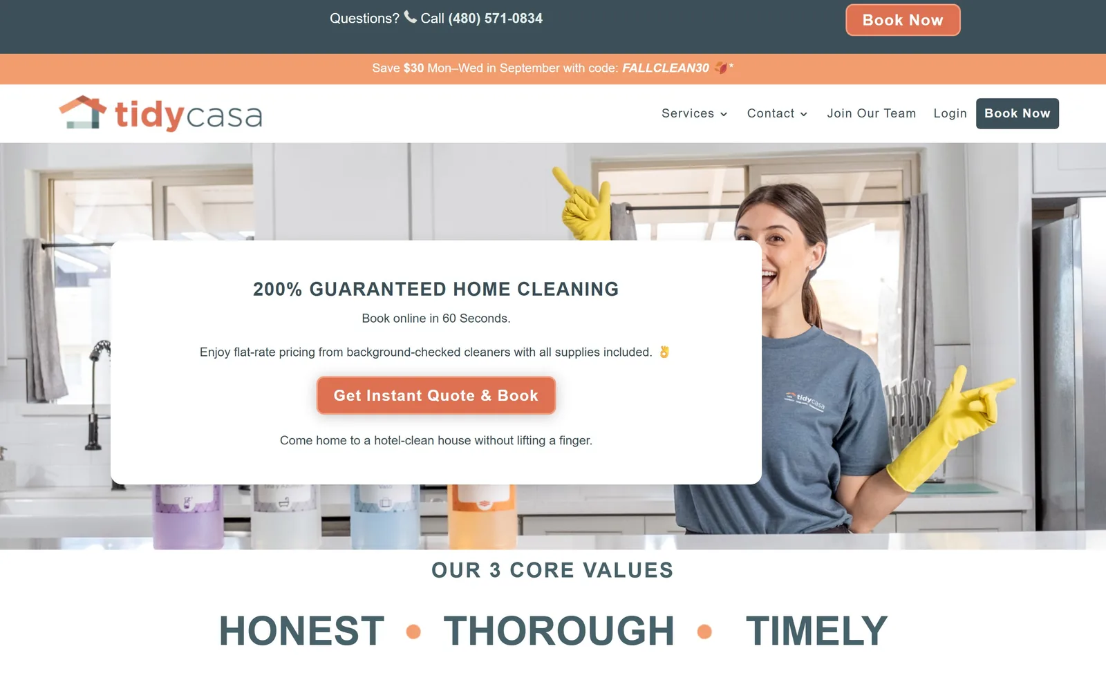
A white card over a kitchen photograph, slate type and a terracotta button, with HONEST THOROUGH TIMELY in caps below.
Type
Montserrat 700, 52px uppercase
Body
Open Sans, 16px/1.8
Build
Full-bleed photo, 1170px card
Made on
WordPress
Colour
#3b5059 #dd7152 #f39d6f
Type. Montserrat at 52px uppercase with a 0.55 line height for the three-word values line, which is why those words sit so tightly stacked. Open Sans does everything else at 16px with a roomy 1.8 line height, and the card heading runs 27px uppercase bold. The values line is the typographic idea and the rest stays out of its way.
Colour. Slate #3b5059 and terracotta #dd7152, with a lighter #f39d6f on the promo bar. The terracotta covers about 1.3 percent of the screen and lands only on buttons, while the slate carries all ink and the contact bar. Warm orange against cool grey is a genuine choice in a category that reaches for blue by reflex.
Layout. Full 1440 width with three bands above the hero: a slate contact bar, a terracotta promo bar, then the white nav. The hero is a photograph with a white card roughly 1170px wide at 10px radius floating over its left two thirds. Section padding is light, so the values line appears right under the card.
The ask. One button, Get Instant Quote & Book, terracotta at 20px with 0.05em tracking. Book Now repeats twice in the header bands and the phone number sits in the slate bar. The FALLCLEAN30 promo code in the second band is the only thing pulling attention sideways.
A single card over the photograph lets a busy stock image stay in the hero without eating the copy.
11
maidluxe.com
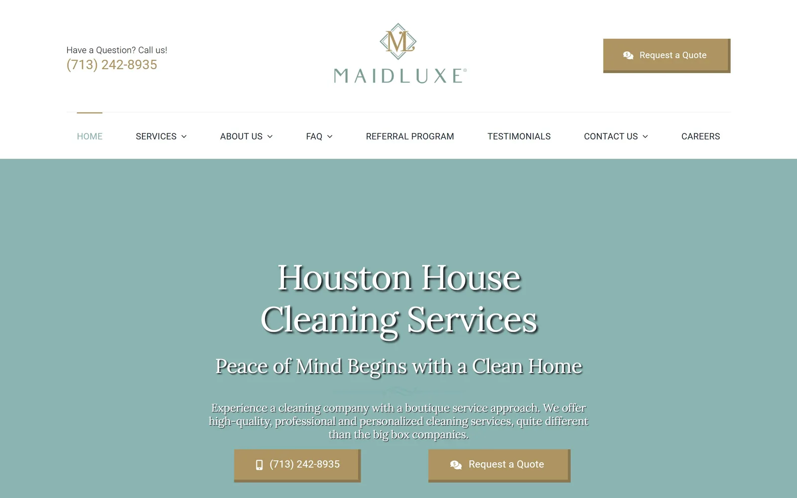
A flat sage panel with a white serif headline and two gold buttons, under a centred diamond monogram.
Type
Lora, 63px
Body
Roboto Light, 16px
Build
1380 container, centred flat hero
Made on
WordPress
Colour
#8ab4b2 #ae9461 #ffffff
Type. Lora at 63px for the headline and 36px for the line under it, both centred, both carrying a drop shadow. The serif plus the diamond monogram is the boutique signal the brand is reaching for. Roboto Light at 16px with 0.015em tracking handles body and the uppercase nav, and the gap between a bookish serif and a neutral interface sans is the weak joint.
Colour. Sage #8ab4b2 fills 62 percent of the screen as a flat field with no photograph at all, gold #ae9461 takes the two buttons, type is white. Three colours, no gradient, no image. It is the most committed palette here and the most likely to be remembered.
Layout. A 1380 container. A centred logo lockup with the phone number left and the quote button right, then a full-width nav row, then the flat hero. Everything in the hero sits on one centre axis: headline, subhead, a thin flourish rule, body copy and two buttons side by side.
The ask. Two gold buttons, the phone number and Request a Quote, both repeated from the header. The ask is clear, but the bevelled shadow on the buttons and the drop shadow on the headline date the page by about a decade. Strip those two effects and this is the most distinctive design in the set.
A flat colour field instead of a stock photograph forces the typography to carry the brand, and here it can.
12
marsden.com
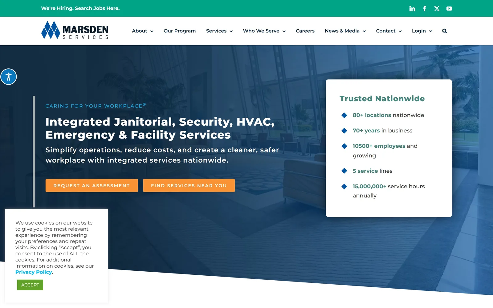
A white stats card listing 80+ locations and 70+ years floats over a blue-washed office lobby photograph.
Type
Montserrat 800, 32px
Body
Montserrat, 20px
Build
Full-bleed hero, 510px stats card
Made on
WordPress
Colour
#0b253b #fa9334 #01a486
Type. Montserrat only, at 32px extrabold for the headline, 20px semibold for the subhead at 0.05em tracking and 14px for the nav. The eyebrow, CARING FOR YOUR WORKPLACE, runs 14px in light blue with wide tracking. At 32px the headline is small for a 1440 hero and the page would carry further at 48.
Colour. A navy wash over the photograph, teal #01a486 on the hiring bar, orange #fa9334 on both buttons and a separate green on the cookie box accept button. Four accent colours is one too many: the orange earns its place, the green does not.
Layout. Full 1440 bleed. Hero copy sits behind a thin vertical rule at the left, the white stats card is about 510px wide on the right, and an angled white edge cuts the base of the hero. Section padding is 100px and button radius is 3px.
The ask. Two orange buttons, REQUEST AN ASSESSMENT and FIND SERVICES NEAR YOU, set at 13px with a heavy 0.154em tracking. An assessment is a softer ask than a quote and fits a contract sale with a long cycle. The cookie panel parks in the bottom left corner and stays there through the whole hero.
A proof card of five numbers beside the headline answers the are you big enough question before the buyer thinks to ask it.
13
alpinemaids.com
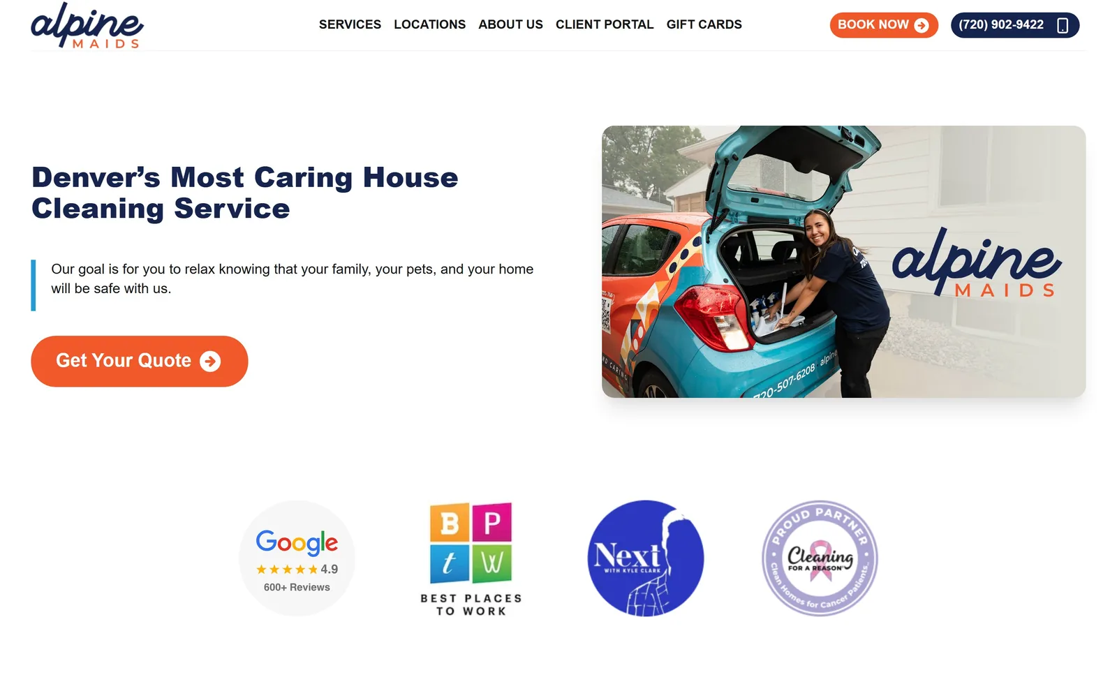
A navy headline on white beside a photograph of the company hatchback, with a Google 4.9 badge and three partner logos below.
Type
Open Sans 800, 36px
Body
Open Sans, 18px/1.38
Build
1360 container, two-column hero, four 340px proof cells
Made on
WordPress
Colour
#15244f #f1592a #ffffff
Type. Open Sans at 36px extrabold for the headline, 24px bold in the nav and 18px at 1.38 for body. Open Sans is a default rather than a decision, and at 36px the headline is undersized for the space it has been given. The 16px uppercase nav at weight 700 is the sharpest typographic moment on the page.
Colour. Navy #15244f for ink and the phone pill, orange #f1592a for the Book Now chip and the Get Your Quote button. Together they cover barely one percent of the screen and the rest is white. Legible, tidy and entirely conventional for the category.
Layout. A 1360 container at 94 percent of the viewport. Two columns, copy left and a softly rounded photograph right, with a four-column 340px grid holding the trust logos underneath. A blue vertical rule marks the subhead. The fold is mostly empty space, which here reads as calm rather than unfinished.
The ask. One orange pill, Get Your Quote, with an arrow. Book Now and the phone number repeat it in the header. The proof row below does the arguing: Google 4.9 from 600+ reviews, a Best Places to Work badge, a local TV segment and a Cleaning for a Reason partnership.
A photograph of your own branded van beats any stock image of a smiling cleaner, because it proves the company exists.
14
postgreencleaning.com
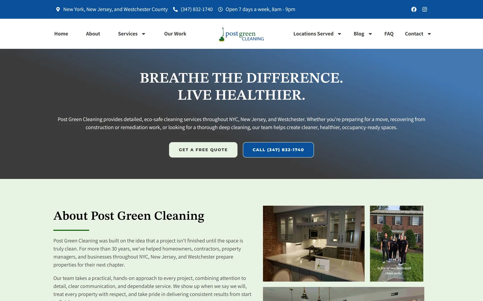
Serif capitals reading BREATHE THE DIFFERENCE over a grey to blue gradient, with the nav split around a centred logo.
Type
STIX Two Text, 43px uppercase
Body
Assistant, 16px
Build
Full 1440, centred hero, three 360px columns
Made on
WordPress
Colour
#e9f3e3 #0a4f9a #3b3b3b
Type. STIX Two Text at 43px, uppercase, weight 600: a text serif pushed into display duty, and it holds at that size. Assistant at 16px handles body and nav, and the two buttons drop to 12px with a wide 0.12em tracking. Serif capitals over a sans body is the cleanest pairing in the residential group here.
Colour. A pale mint #e9f3e3 fills the band under the hero and doubles as the primary button colour, with blue #0a4f9a on the top bar and the second button. The hero gradient runs from near black to blue and is the weak part: it goes muddy where the two ends meet.
Layout. Full 1440. A blue utility bar, then a white nav split four items left and four right around a centred logo, then a centred hero with copy capped near 1530px. Below sits a three-column 360px grid at 30px gaps holding real job photographs. Buttons carry a 10px radius.
The ask. Two buttons side by side under the subhead: GET A FREE QUOTE in pale green and CALL (347) 832-1740 in blue. Hours and the number repeat in the top bar. Making the phone button the darker of the two is a small decision that pushes urgent post-construction jobs to the phone.
Splitting the nav around a centred logo buys symmetry on a page whose hero is centred too.
15
lazysusanscleaning.com
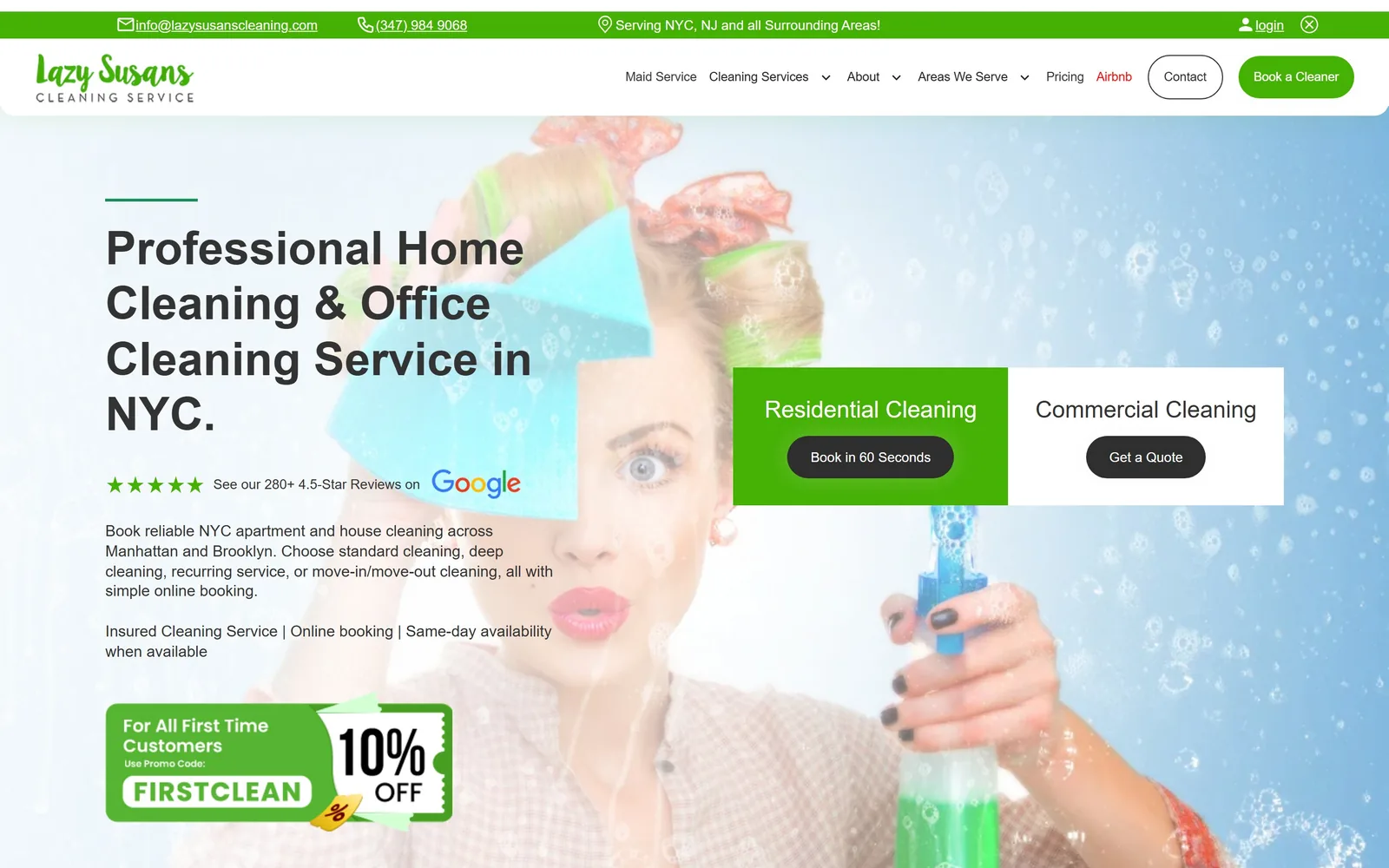
A black headline over a bubble-covered window photograph, with residential and commercial split into two adjacent panels.
Type
DM Sans Bold, 48px
Body
DM Sans, 16px/1.3
Build
Full 1440, 790px two-panel choice block
Made on
Webflow
Colour
#45b105 #2e2e2e #1a8e59
Type. DM Sans does all of it: 48px bold across four headline lines, 24px medium in the two choice panels, 16px at a tight 1.3 for body, 14px in the nav. A 1.2 line height on a four-line headline is tight enough that descenders nearly touch the line below. Competent, unremarkable, and at least it stays out of the way.
Colour. Green #45b105 on the top bar, the logo and the Book a Cleaner pill, near black #2e2e2e on the two action buttons and a darker #1a8e59 for secondary green. The stock photograph behind all of it is pale blue and white, which leaves the green nowhere comfortable to sit.
Layout. Full 1440 with grids at four columns of 232px and two of 570px at an 80px gutter. The hero puts copy flush left at 150px against a 790px two-panel block on the right, green on the left half and white on the right. A coupon graphic anchors the bottom left corner.
The ask. Two paths side by side: Book in 60 Seconds under Residential Cleaning, Get a Quote under Commercial Cleaning. That split is right for a firm serving both, because the two buyers want different things from the next click. Book a Cleaner, Contact, the phone number and a 10% FIRSTCLEAN coupon all crowd around it.
If you sell to households and to businesses, split the hero in two rather than making one button cover both.
How these were chosen
Fifteen sites made this page out of twenty-four I looked at: residential maid services, national janitorial contractors, and specialists in carpet, post-construction and biohazard work. What separates the good ones is not palette or photography. It is whether the first screen asks for one thing the visitor can actually answer. The pages that put a zip code, a starting price or a whole quote form above the fold turn a visit into a job, while the ones offering three equally weighted buttons just hand over a decision nobody asked for. Judge any cleaning company website design by what it asks for in that first screen and most of the other choices follow from it.
Finding cleaning company sites that someone had actually designed took far longer than it should have. 30 candidates made the shortlist. 15 made the page.
Each one was opened and looked at properly: what the type is doing, where the colour gets spent, how the page is built, how it asks for the job. Nothing is here because it ranks. Nothing is here because an agency filed it under portfolio. Several well known names were left out for the plain reason that their site came out of the same template as everyone else's, and a few sites worth including did not survive a second look.
Where a site is only competent, it says so. The order is the order worth your time, best first.
Reviewed and selected by Larry W. Matthews for Websitely.