Moving Company Website Design: 14 Professional Picks
Quote form in the hero, proof under the submit button. Fourteen movers, from app crews to fine art logistics, doing moving company website design properly.
Shown
14 sites
Reviewed
30 candidates
Chosen on
The work, not the ranking
Updated
15 October 2026
01
heavenlymove.com
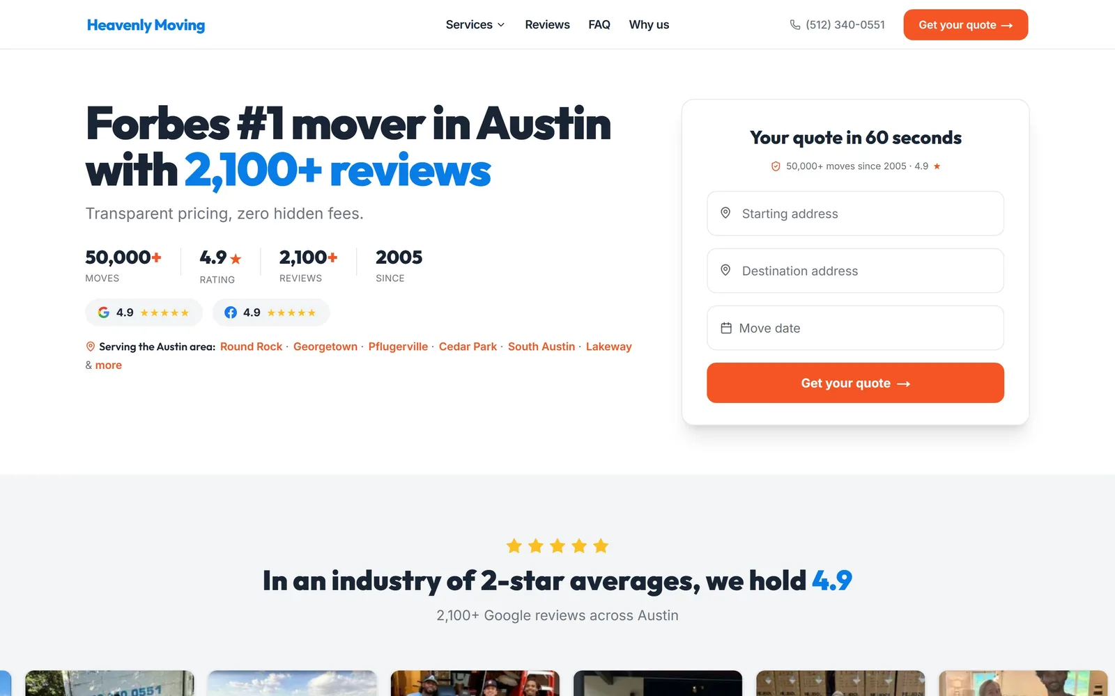
A black 60px headline, a row of four hard numbers, and a three-field quote card in orange, all above the fold.
Type
Outfit 900, 60px
Body
Inter 400
Build
Two column, 1440px, form right
Made on
Custom JS framework
Colour
#192434 #f55524 #ffffff
Type. The display is Outfit at 60px, weight 900, tracked in to -0.03em so the two lines lock up tight. Body text is Inter at 14 to 20px, regular, no tracking, which keeps the headline doing all the shouting. The headline splits colour mid-sentence: 'Forbes #1 mover in Austin' in near-black, '2,100+ reviews' in blue, so the proof is the part your eye lands on. The stat row under it reuses Outfit at 24px over 12px grey labels in caps.
Colour. Ink is #192434 on #ffffff with #f3f4f6 for the band below. Orange #f55524 is the only hot colour and it gets maybe one per cent of the screen: the Get your quote button in the header, the same button in the form, the plus signs on 50,000+ and 2,100+, and the service-area links. Blue #087ce7 carries the logo and the review count. Nobody else in this set runs orange against a near-white page, and holding it to that little area is why it reads as a signal rather than decoration.
Layout. A 1440px container, two columns, the left one roughly 60 per cent for copy and the right holding the quote card at about 630px wide. Corner radius is 12px on the button and larger on the card, which floats on a white page with a soft shadow rather than a border. Section padding is 64px. Above the fold you get the headline, a one-line subhead, four stats, two review badges, six linked suburbs, and the whole form.
The ask. The page asks for your move twice before you scroll: Get your quote in the header and the same words on the orange form button. The form itself is three fields, starting address, destination address, move date, and it is labelled 'Your quote in 60 seconds' with '50,000+ moves since 2005' sitting under it as a hedge against abandonment. The phone number is plain text in the header, deliberately quieter than the button.
Put the numbers that prove you are good inside the headline instead of in a trust bar further down the page.
02
lugg.com
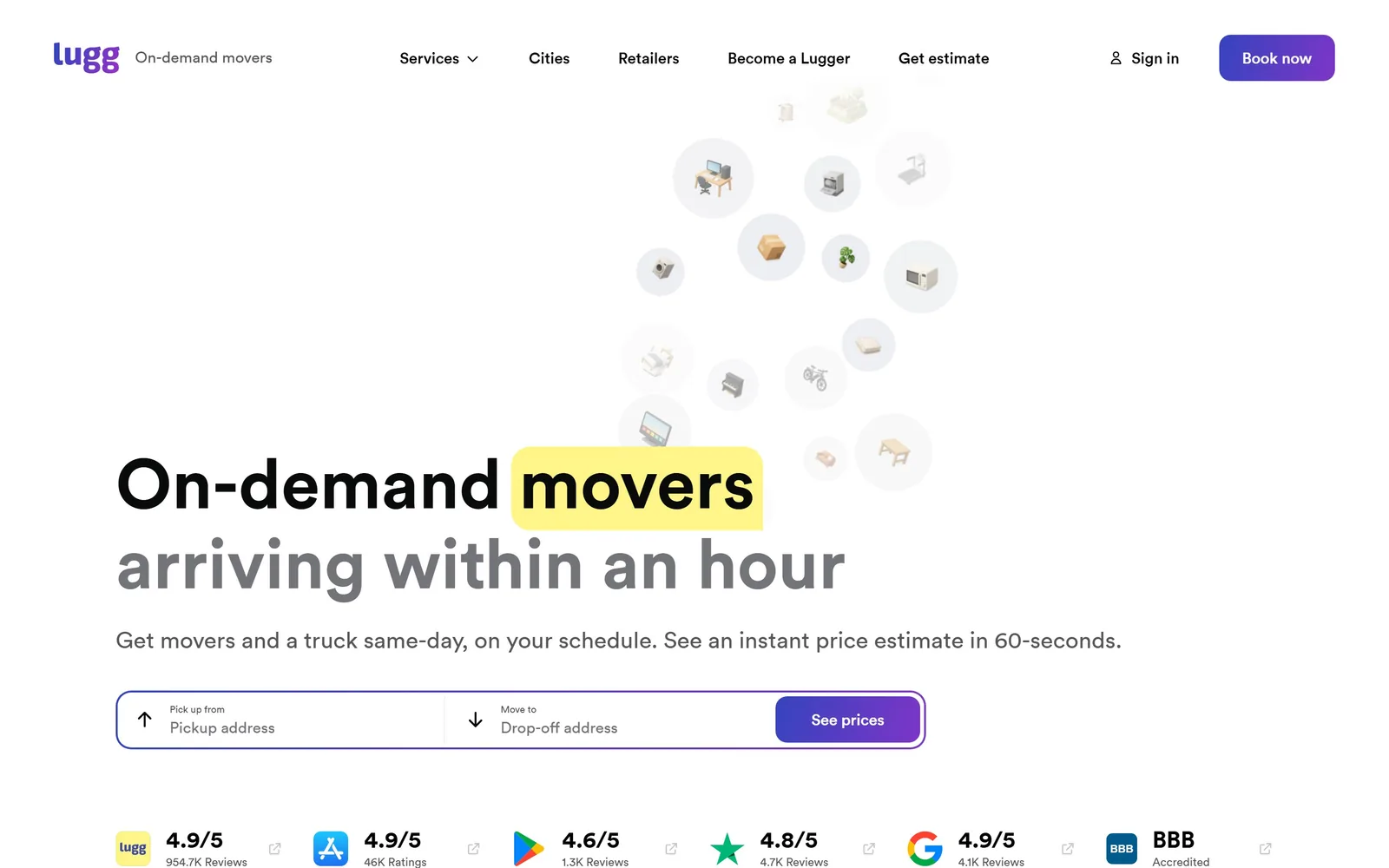
A 72px headline with 'movers' sitting on a yellow marker swipe, under a loose cloud of furniture icons.
Type
Circular 700, 72px
Body
Circular 400, 24px
Build
Single column, 1250px, address bar
Made on
Custom build
Colour
#090a0a #ffffff #f4e04d
Type. Circular at 72px, weight 700, no tracking adjustment, set in sentence case over two lines. The second line drops to grey while the first stays black, which separates the promise from the qualifier without a second type size. Supporting copy is Circular at 24px regular, unusually large for a subhead, and it works because the page has so little else on it. The whole site runs one typeface at seven sizes.
Colour. The page is white and stays white. Text is #090a0a going to #555657 for the second line and the subhead. The yellow marker block behind 'movers' and the violet Book now button are the only saturated areas, and together they are a rounding error of the screen. The furniture icons are drawn in near-grey circles so they read as texture, not illustration. It is a restrained palette for a category that usually reaches for a truck-livery green.
Layout. Container is 1250px with 40px section padding. The hero is a single left-aligned column with the icon cloud floating top-right, unanchored to any grid. The address bar sits directly under the subhead: pickup field, drop-off field, See prices button, all inside one pill with a violet outline. Below the fold, a six-logo rating strip runs full width with Lugg, App Store, Play Store, Trustpilot, Google and BBB scores.
The ask. One ask, repeated once: Book now in the header and See prices on the address bar. The address bar is the primary, and it is the only form on the page. The rating strip under it is doing the objection handling, 954.7K reviews at 4.9 being the number that answers 'are these people real'. No phone number competes for the click.
Collapse the entire hero to one sentence and two address fields when your product is genuinely that simple.
03
dietl.com
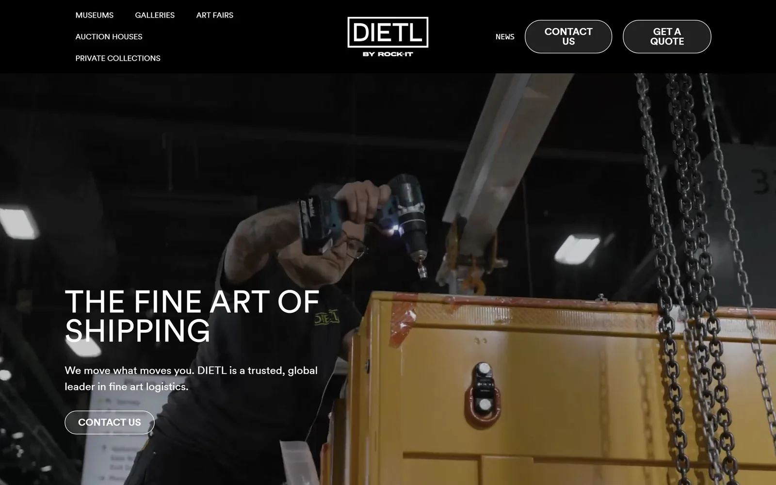
A dark warehouse video fills the frame; THE FINE ART OF SHIPPING sits low-left in thin white caps.
Type
Circular 400, 58px caps
Body
Circular 400, 20px
Build
Full-bleed video, 1440px
Made on
WordPress
Colour
#000000 #ffffff #fffcf5
Type. Circular at 58px, weight 400, set uppercase with no added tracking. Running a geometric sans at regular weight in caps at that size is rare and it is the whole move: it reads as measured rather than loud, which suits a company that crates Rothkos. Body copy is Circular at 20px regular on a 1.5 line height. Section headings jump to 36px bold caps. One family, two weights, nothing else.
Colour. Black and white, and that is not an exaggeration: the sampled palette is #000000, #ffffff and a warm off-white #fffcf5 used further down. The only colour on screen comes from the footage itself, the yellow crate and the orange safety tape. Letting the video supply the accent means the chrome never argues with the work, which is the correct answer for art logistics and the opposite of what most movers do.
Layout. Container 1440px, the black header bar pinned at the top with nav split left of a centred wordmark. The hero is full-bleed autoplay video with content stacked bottom-left at about a third of the width. Pill buttons at 30px radius sit against the hard-edged 0px header, a deliberate mismatch that softens the two CTAs. Below, a three-column 400px grid and a four-column 220px grid with 80px gutters.
The ask. Three asks, all in words rather than urgency: CONTACT US and GET A QUOTE as pills in the header, CONTACT US again as an outlined button in the hero. No phone number, no form, no review count. For a business where the enquiry is a conversation and not a transaction, stripping the funnel down to a single verb is the right trade.
When your clients are buying judgement rather than price, remove every number from the hero and let one sentence and one button carry it.
04
hilldrup.com
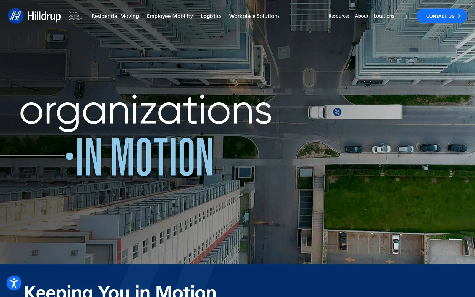
A 124px lowercase word over an aerial shot of a city block, with IN MOTION set in condensed pale blue caps beneath.
Type
Gilroy 300, 124px lowercase
Body
Frutiger 400, 18px
Build
Full-bleed photo hero, 1440px
Made on
WordPress
Colour
#002f6c #126ff7 #ffffff
Type. Gilroy at 124px, weight 300, line height 0.8, forced lowercase. A light weight at that size is a nerve-racking choice and it pays off: the counters stay open and the word reads as calm rather than shouted. Under it, a condensed grotesque in uppercase at a similar size but pale blue, so the two lines contrast in case, weight and colour at once. The word 'organizations' is one of five that cycle. Body is Frutiger at 18px regular.
Colour. Navy #002f6c and #ffffff do the structural work, with #f9f9f9 for alternating bands. Bright blue #126ff7 is held back entirely for the CONTACT US pill, about a third of a per cent of the screen. The pale blue on IN MOTION is pulled out of the photograph rather than from the brand palette, which is why the overlay sits in the image instead of on top of it. Navy for a 120-year-old mover is a default, but the handling is not.
Layout. 1440px container. The hero is a full-bleed drone photograph with the type stacked left and a thin rule running into the bullet before IN MOTION. Header is transparent over the image with nav left and a 999px pill right. Below the fold, a four-column 288px grid at 24px gutters and a lopsided two-column split of 972px and 324px. Above the fold there is nothing but the rotating headline and the nav.
The ask. One ask, CONTACT US, as a bright blue pill in the top right, and that is it on the first screen. No phone, no form, no quote. For a company selling corporate relocation contracts rather than single moves, holding the whole fold for a brand statement and putting the conversion below it is a defensible bet, though a residential mover copying this would starve.
Set two lines of the same headline in opposite cases and weights and you get hierarchy without a second type size.
05
dumbomoving.com
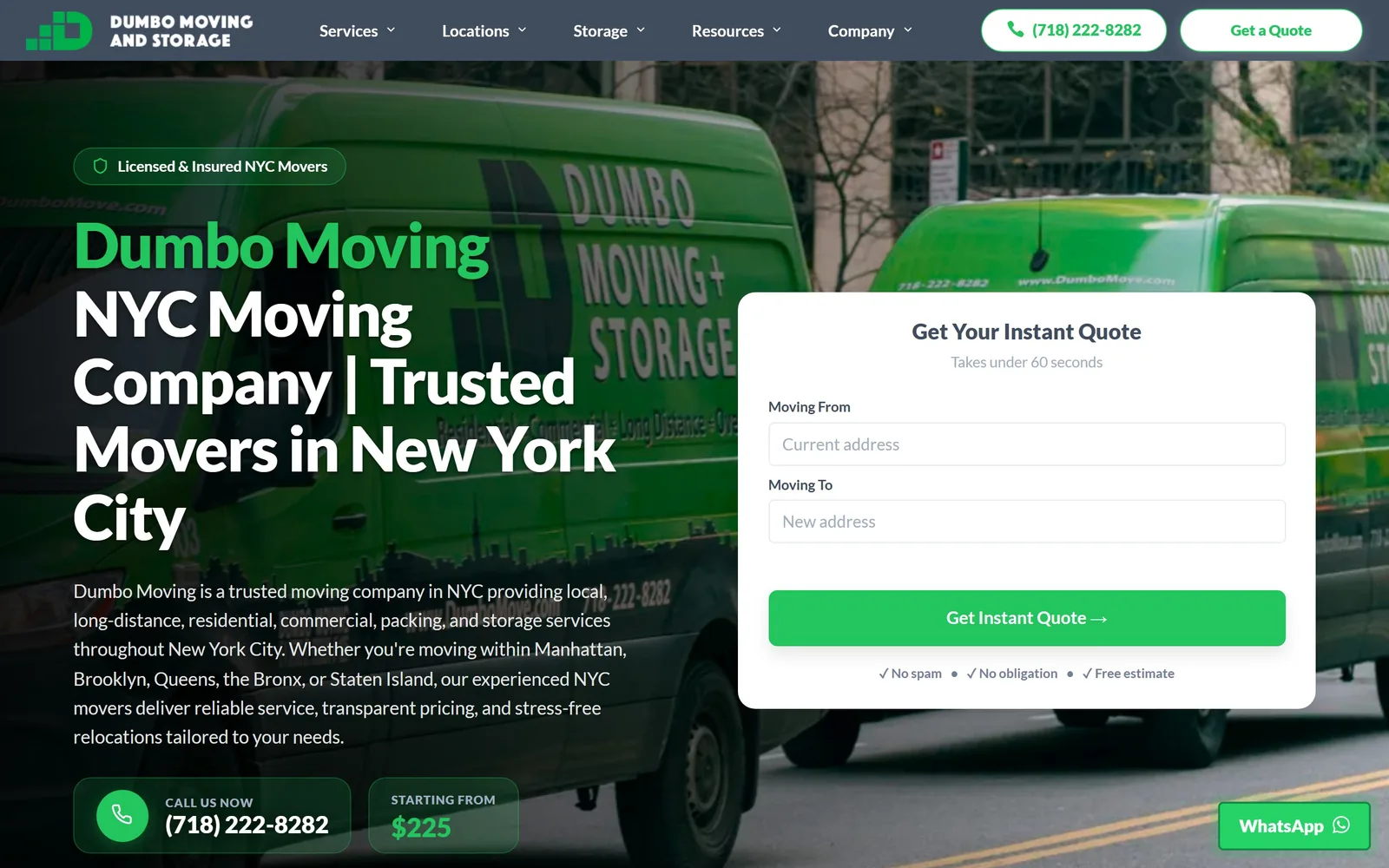
A green box truck fills the hero behind a 64px white headline and a white instant-quote card with two address fields.
Type
Lato 900, 64px
Body
Lato 500, 19px
Build
Two column, 1360px, form right
Made on
WordPress
Colour
#22c55e #f4f6f8 #404d5e
Type. Lato at 64px, weight 900, tracked to -0.02em, with the brand name on its own line at 72px in green and the rest in white. Black 900 is the heaviest Lato ships and at 64px over a photograph it is what keeps the text legible. Body runs Lato at 19px weight 500 with a 1.6 line height, light enough to sit under all that mass. Section headings drop to 27px.
Colour. Green #22c55e against a page background of #f4f6f8 and white cards. The green appears in the headline, the Get Instant Quote button, the licensed-and-insured pill, the phone block and the $225 figure, which is more area than most accents get but it is pulled straight from the truck livery in the photo. Secondary text is #718096. The WhatsApp button in the corner uses the slightly different #25d366, a small slip.
Layout. 1360px container with 90px gutters on the two-column grids below. The hero is a photograph with a dark overlay, copy at 55 per cent width, and an 18px-radius white card on the right holding the form. Section padding is 90px. Above the fold: trust pill, headline, four lines of body copy, the full form, a phone block and a starting price.
The ask. The page asks four ways: Get a Quote in the header, the phone number beside it, Get Instant Quote on the form, and a floating WhatsApp button. The form is two fields with 'Takes under 60 seconds' above and three reassurances under it, No spam, No obligation, Free estimate. Showing 'STARTING FROM $225' in the hero is the braver call and it filters the enquiries.
Printing a starting price in the hero costs you the tyre-kickers and buys you better-qualified forms.
06
roadwaymoving.com
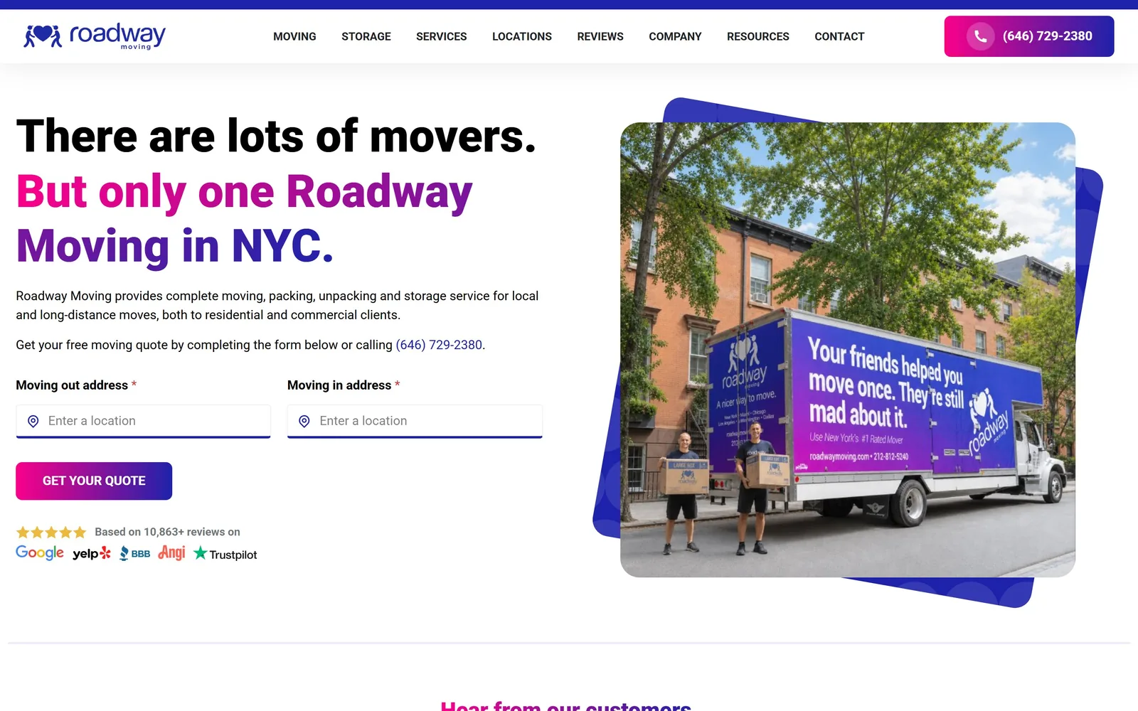
A 58px headline in three colours, black to magenta to violet, with two address fields and a gradient quote button.
Type
Roboto 900, 58px
Body
Roboto 400, 16px
Build
Two column, 1440px, form left
Made on
WordPress
Colour
#1e22aa #e6007e #ffffff
Type. Roboto at 58px, weight 900, no tracking adjustment, over three lines. The colour change does the hierarchy: 'There are lots of movers.' in black, 'But only one Roadway' in magenta, 'Moving in NYC.' in violet. Body is Roboto at 16px regular. Using the free default of the web at its heaviest weight is not a typographic statement, but at 900 with a 60-character line it does hold the page.
Colour. A magenta-to-violet gradient against white, with #1e22aa as the sampled solid for the shapes behind the photo. The gradient runs through the headline, the phone pill, the Get Your Quote button and the layered rounded rectangles behind the hero image. White is 117 per cent of the sampled coverage so the page reads as bright. Magenta for a mover is unusual enough to be memorable and it matches a fleet you can see in the photograph.
Layout. 1440px page, two columns, copy left and a rounded photograph right sitting on two offset violet rectangles that stick out past its corners. Field styling is minimal: underlined inputs rather than boxed ones, with location pins. Above the fold you get the headline, two paragraphs, two address fields, the quote button and a five-star line citing 10,863+ reviews across Google, Yelp, BBB, Angi and Trustpilot.
The ask. Two asks, the phone pill in the header and GET YOUR QUOTE under the form, plus the number repeated as a link inside the body copy. The form is two address fields, both marked required. The five-logo review line sits directly beneath the button rather than in a separate band, so the proof arrives at the moment of hesitation.
Put the review logos directly under the submit button, not in a trust bar three sections down.
07
movingproz.com
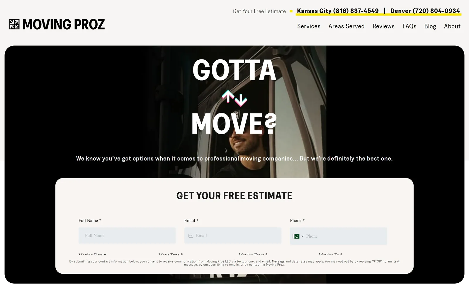
GOTTA MOVE? in white caps split by two glitchy arrows over a dark cab shot, with an estimate form sliding up beneath.
Type
Greed Bold, 54px caps
Body
Greed, 20px
Build
Centred hero, 1440px, form card
Made on
WordPress
Colour
#000000 #ffffff #e9f24a
Type. A bold condensed display called Greed, set uppercase at 54px with 0.018em tracking, centred and broken across two lines so the arrow mark can sit between them. The question mark is reversed, a small joke that only works because the rest of the page is disciplined. Supporting text runs the same family at 20px with 0.048em tracking in light, medium and regular, and the legal line drops to 10px at 0.096em. Seven weights of one face.
Colour. Black #000000 and white, with the near-white #f8f5f3 for the form card, and acid yellow used only as a highlighter rule under the two phone numbers in the top bar. The arrows are tinted cyan and magenta for a print-misregistration effect. Holding the yellow to two underlines in a 1440px header, rather than painting a button with it, is the restraint that makes it register.
Layout. 1440px container with 25px section padding. The hero is a dark photograph letterboxed by black panels either side, type centred, with a large rounded card rising from the bottom edge holding the estimate form in a three-across field layout. Above the fold you see roughly a third of that form, which is a deliberate tease rather than a mistake.
The ask. GET YOUR FREE ESTIMATE appears as a text link in the top bar and again as the heading on the form card. Two city phone numbers, Kansas City and Denver, sit in the header with yellow underlines. The form asks for name, email, phone, move date, move type, from and to, which is a lot of fields, and the consent paragraph sits under it in 10px.
A single joke in the headline buys more personality than a whole page of friendly stock photography.
08
getbellhops.com
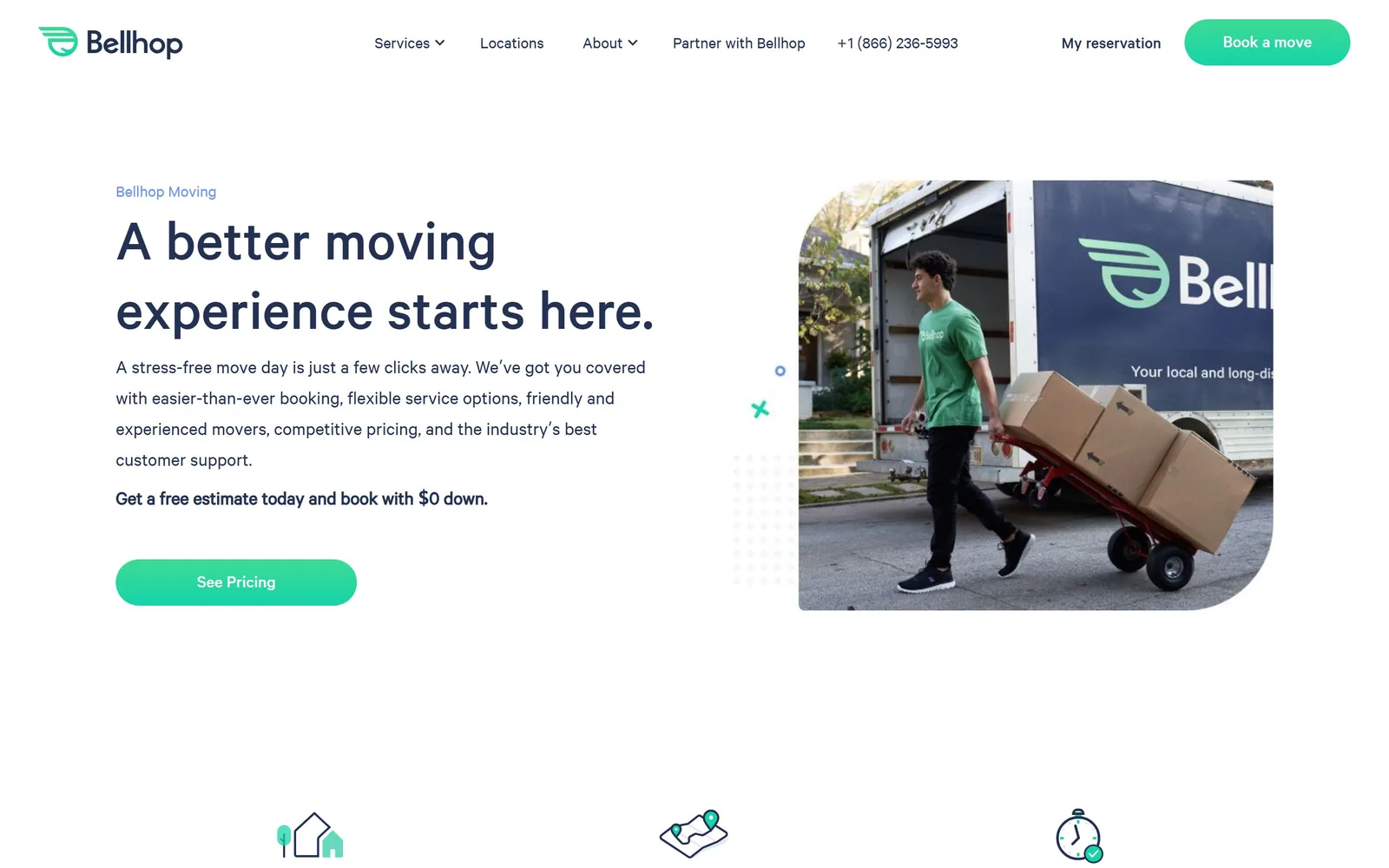
A 62px navy headline on white beside a rounded photograph of a mover with boxes, with one green pill button.
Type
Calibre Medium, 62px
Body
Calibre 400, 18px
Build
Two column, 1440px, image right
Made on
Custom JS framework
Colour
#233152 #16d3a9 #ffffff
Type. Calibre at 62px in a medium cut but a light weight, set in sentence case with a full stop. The face is a narrow American grotesque with tall x-height, so a 39-character line fits comfortably at that size without wrapping awkwardly. Body is Calibre at 18 to 20px regular with a 1.6 line height, and the final line of the paragraph goes bold to carry the offer. No caps, no tracking, no second family.
Colour. Navy #233152 for all type on pure white, with #f5f7f9 for alternate sections. Mint #16d3a9 is the single accent: the logo mark, the Book a move pill, the See Pricing button and one of the floating confetti marks. Body copy sits at #747c82, a soft grey that keeps the headline dominant. Mint and navy is a software palette rather than a trade one, which is the point for a company selling booking rather than trucks.
Layout. 1440px page, two columns at roughly equal width. The photograph is rounded on three corners and squared on the bottom-left, a small asymmetry that stops it reading as a stock card. Small geometric marks, a dotted square, a cross, a circle, float in the gutter. Above the fold: eyebrow label, headline, four lines of copy, a bold offer line and one button. Three line-drawn icons begin the next row at the bottom edge.
The ask. The header carries Book a move as a mint pill plus a phone number and My reservation. The hero asks once, See Pricing, which is a softer ask than Get a quote and matches a business that publishes rates. 'Get a free estimate today and book with $0 down' sits in bold above the button doing the objection handling. No form on the first screen at all.
One button and no form works if the button promises information rather than commitment.
09
flatrate.com
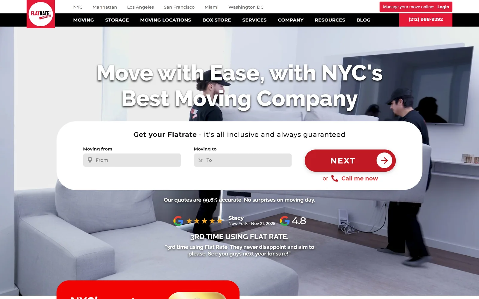
A 66px white headline with a drop shadow over a video of movers carrying a sofa, above a white quote bar.
Type
Raleway 800, 66px
Body
Calibri 500, 19px
Build
Full-bleed video, 1280px, quote bar
Made on
WordPress
Colour
#c21a25 #ffffff #2d2121
Type. Raleway at 66px, weight 800, centred over two lines with a soft drop shadow to lift it off the footage. The shadow is a crutch that a darker overlay would have done better, but it works. The NEXT button is Montserrat at 24px, weight 700, uppercase, tracked out to 0.1em, which is a lot of tracking for a button and makes a four-letter word fill the space. Body copy runs Calibri at 19px.
Colour. Red #c21a25 for the button and the phone bar against white, with the sampled hero background at #2d2121 from the video. A brighter #f20500 appears in the logo. The black nav bar under the white city strip gives the header two tiers of contrast before the image starts. Red for a moving company is the category default, and nothing here argues against that, but the quantity is controlled: one button, one phone bar.
Layout. 1280px container with 32px section padding. The hero is a full-bleed video with centred type and a white quote bar overlapping the lower third at a 39px corner radius. The bar runs three across: Moving from, Moving to, and the NEXT pill. Under it sit a 99.6 per cent accuracy claim and a dated Google review from a named customer, Stacy, New York, Nov 21 2025.
The ask. Two asks above the fold plus a phone number: the NEXT button on the quote bar and 'or Call me now' directly beneath it. Six city links across the top double as a market qualifier. The dated review under the bar is the detail worth stealing, because a review with a name, a city and a recent date reads as real in a way a star average does not.
Date and attribute the review you put under your form; a bare five-star average is ignorable, a named one from last month is not.
10
coffeybrosmoving.com
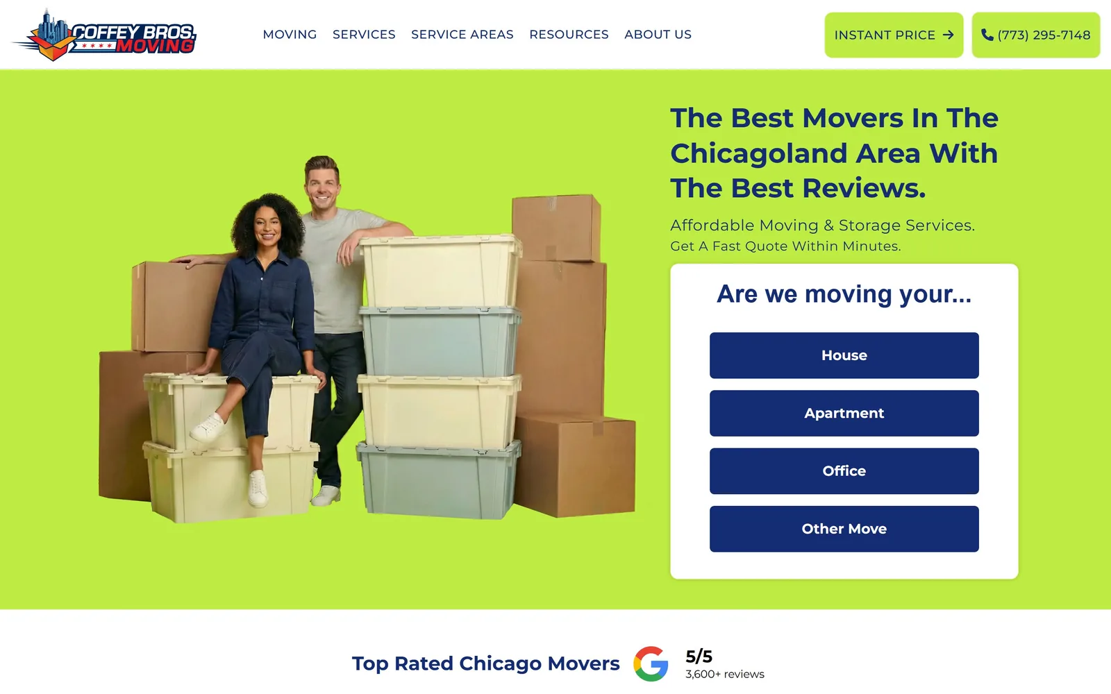
A lime green hero with two people on moving crates and a white card asking House, Apartment, Office or Other Move.
Type
Jost 600, 32px
Body
Montserrat 400, 20px
Build
Two column, 1440px, qualifier card
Made on
WordPress
Colour
#beec42 #132c73 #ffffff
Type. Jost at 32px weight 600 for the headline, which is small for a hero and the one place this page undersells itself. The geometric face with its single-storey a sits well against the navy. Montserrat handles everything else: 20px at 0.025em for the subhead, 16px at weight 500 tracked to 0.031em and uppercase for buttons. Two families where one would have done, but they do not clash.
Colour. Lime #beec42 fills the hero band, navy #132c73 does all the type and the four option buttons, and white is the card and the rest of the page. That is three colours and no fourth. Lime against navy is a contrast most movers would not risk, and the reason it holds is that the lime is background only and never type. The headline being navy on lime rather than white is the right call for legibility.
Layout. 1440px container, 30px section padding, hero split with a cut-out photograph left and copy right. The white card is 10px radius with the four option buttons stacked inside it at the same radius. Below the fold a review line runs centred: 'Top Rated Chicago Movers', the Google mark, 5/5, 3,600+ reviews. The hero band ends in a hard edge rather than a curve.
The ask. The ask is a question, 'Are we moving your...', answered by four buttons: House, Apartment, Office, Other Move. That is a qualifier rather than a quote form, and it collects intent before it collects contact details, which is a lower-friction opener than four input fields. INSTANT PRICE and the phone number sit in the header as the direct route.
Open with a one-tap question instead of a form and you capture the people who would not have typed an address.
11
meatheadmovers.com
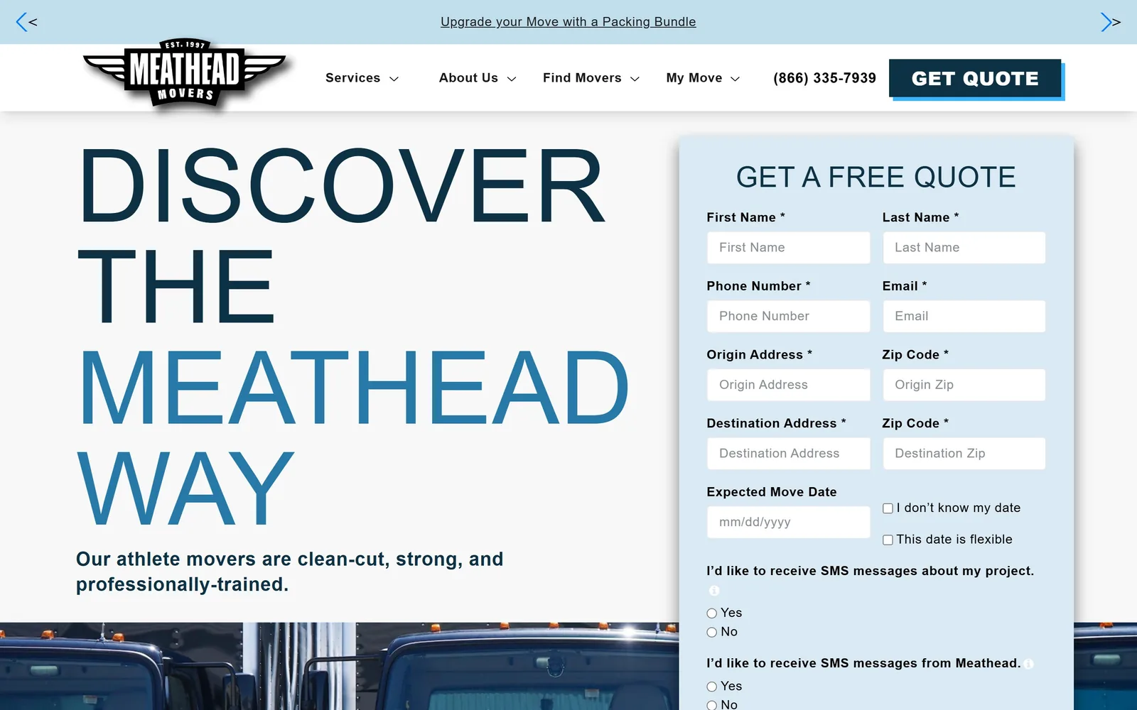
DISCOVER THE MEATHEAD WAY at 128px in extra-condensed caps, half navy and half mid-blue, beside a long quote form.
Type
Acumin Pro Extra Condensed, 128px caps
Body
Acumin Pro 400, 16px
Build
Two column, 1440px, long form right
Made on
WordPress
Colour
#0d3145 #d9eaf4 #f8f8f8
Type. Acumin Pro Extra Condensed at 128px, regular weight, uppercase, barely tracked at 0.004em, across four lines on a 1.0 line height. Regular weight at that size is the interesting part: the strokes stay thin so a 128px headline does not shout, it just occupies. The colour break between DISCOVER THE in navy and MEATHEAD WAY in mid-blue splits the line without a size change. Body is Acumin Pro at 16px with 0.034em tracking.
Colour. Navy #0d3145 and a mid-blue drawn from the same family, on #f8f8f8 with a pale #d9eaf4 panel for the form. White is the dominant area. There is no third hue anywhere above the fold, which is unusual and disciplined, though it does leave the page feeling cool. The GET QUOTE button is solid navy at 0px radius, squared off like the rest of the page.
Layout. 1440px container, 64px section padding, a three-column 394px grid at 32px gutters further down. The hero runs copy left at about 55 per cent and the form right in a pale blue panel that runs off the bottom of the viewport. Every corner on the page is square. Above the fold: announcement strip, nav, the four-line headline, one subhead line and most of the quote form.
The ask. GET QUOTE sits in the header in a navy block with a blue offset shadow, and the hero form repeats the ask at length: first name, last name, phone, email, origin address and zip, destination address and zip, move date, two SMS consent questions. That is eleven fields visible before you scroll, which will cost conversions, and the squared-off styling does not make them feel shorter.
A condensed face at regular weight lets you run a headline at 128px without the page feeling like it is yelling.
12
olympiamoving.com
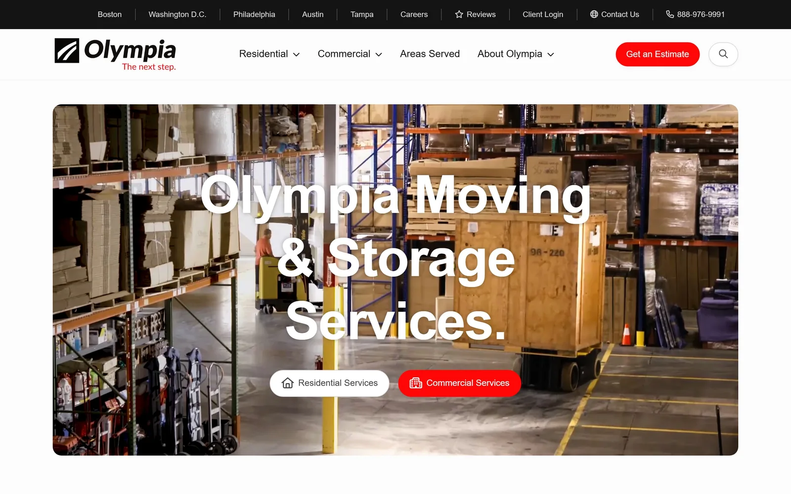
A 96px white headline laid over an inset rounded warehouse video, with two pill buttons centred beneath it.
Type
Lato 700, 96px
Body
Roboto 400, 18px
Build
Inset video hero, 1440px
Made on
WordPress
Colour
#ff0706 #fcfcfc #141414
Type. Lato at 96px, weight 700, tracked to -0.02em over three centred lines. That is the largest headline in this set after Meathead and Hilldrup, and setting it over footage rather than flat colour means the legibility rests entirely on the video being dim enough, which it just about is. Body is Roboto at 18px regular at a 1.55 line height, with section intros at 24px weight 500.
Colour. Near-white #fcfcfc for the page, #f5f5f5 for bands, and red #ff0706 for the Get an Estimate button, the Commercial Services pill and the tagline under the logo. The red is about one per cent of the screen. The warehouse footage supplies all the other colour, orange racking, yellow forklift, brown crates, so the interface stays neutral and the content does not. A standard red-and-white mover palette handled with more restraint than most.
Layout. 1440px container with 45px section padding. The hero video is inset rather than full-bleed, with margins on all four sides and generous corner rounding, so the page frame stays visible around it. The two hero buttons are fully rounded pills with small icons, one white and one red. Below the fold, a three-column grid of 228px, 765px and 223px and a four-column 295px grid at 22px and 48px gutters.
The ask. Two paths rather than one ask: Residential Services and Commercial Services as paired pills in the hero, with the red one marking the preferred route. Get an Estimate sits in the header, and a top bar carries five city links, Reviews, Client Login and a phone number. Splitting the hero by customer type instead of pushing a single form suits a company serving both.
Insetting the hero video instead of bleeding it full width keeps the page frame intact and makes the site feel composed rather than pasted together.
13
twomarinesmoving.com
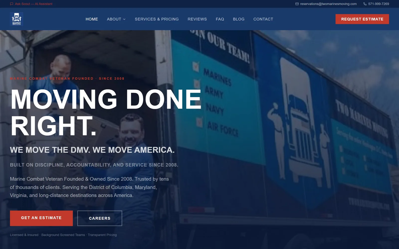
MOVING DONE RIGHT. at 96px in Oswald caps over a navy-tinted photograph of a branded trailer.
Type
Oswald 700, 96px caps
Body
Source Sans 3 400, 18px
Build
Full-bleed photo hero, 1440px
Made on
Custom build
Colour
#0f2347 #c0392b #f5f4f0
Type. Oswald at 96px, weight 700, uppercase, line height 1.0, across two lines. Oswald is a condensed grotesque that is everywhere on the free web, so this is not an original choice, but at 96px with the lines packed tight it does the military-signage job the brand is asking for. Body is Source Sans 3 at 18px regular. The eyebrow line runs Oswald at 14px tracked to 0.05em in red caps.
Colour. Navy #0f2347 and #1a3a6b over a warm off-white page at #f5f4f0, with red #c0392b for the REQUEST ESTIMATE button, the GET AN ESTIMATE button and the eyebrow text. Navy and red for a veteran-founded mover is the obvious answer and the page does not try to be clever about it. The heavy navy wash over the photograph is what makes the white type readable rather than any overlay gradient.
Layout. 1440px container with 56px section padding, a four-column 342px grid and a two-column 652px grid at 64px gutters below. The hero is a full-bleed photograph with the type stacked left at about 45 per cent width. Button radius is 0px throughout, which matches the typeface. Above the fold: contact bar, nav, eyebrow, headline, a line of white caps, a line of grey caps, a paragraph, two buttons and a credentials line.
The ask. Three asks: REQUEST ESTIMATE in the header, GET AN ESTIMATE as the red hero button, and CAREERS as its outlined sibling, which is unusual placement for a recruitment link and tells you the business is short of crew. The credentials line, Licensed & Insured, Background Screened Teams, Transparent Pricing, sits at the bottom edge where it answers the obvious worry.
Putting your recruitment link next to your quote button is honest about what a labour business actually needs.
14
graebel.com
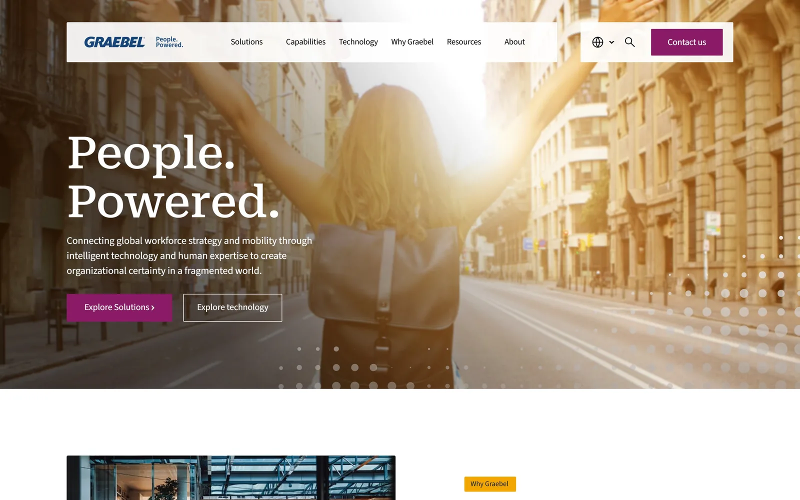
A serif headline reading People. Powered. in white over a backlit street scene, with a magenta Explore Solutions button.
Type
Transitional serif, 80px
Body
Source Sans 3 400, 18px
Build
Full-bleed photo hero, 1440px
Made on
WordPress
Colour
#003368 #8a1b67 #efefee
Type. A transitional serif at 80px, weight 500, two words each ending in a full stop and stacked on their own lines. The serif is the only one in this set used for a corporate relocation company, and against a sans body it reads as institutional rather than fashionable. Body and nav are Source Sans 3 at 15 to 18px regular with slight negative tracking at the smaller sizes. Section headings sit at 40px in the same sans.
Colour. Warm grey #efefee for the page, navy #003368 for brand elements, and magenta #8a1b67 for the Contact us button and Explore Solutions, at roughly half a per cent of the screen. A trace of amber #f3a600 appears on one label below the fold. Magenta against navy is the one decision here that is not a category default, and holding it to two buttons keeps it from looking arbitrary.
Layout. 1440px container with 110px section padding, which is the most generous spacing in this set, and a three-column 384px grid at 24px gutters. The header is a white bar floating inset over the photograph rather than pinned to the top edge. Button radius is effectively 0px. The hero is a full-bleed photograph with copy left and a dot pattern overlaid bottom-right.
The ask. Two buttons in the hero, Explore Solutions in magenta and Explore technology outlined, plus Contact us in the header. Nothing asks for a move, a date or an address, because the customer is an HR director running a global mobility programme and the sale takes months. The six-item nav with Solutions, Capabilities and Technology is the real conversion mechanism.
If the sale takes months, the hero's job is to route people into the right section, not to collect a form.
How these were chosen
Fourteen hero screens from companies that move things for a living, from on-demand app movers and five-borough residential crews to fine art logistics firms and global corporate relocation groups. The pattern that showed up again and again: the pages that work put the quote form in the hero and the proof directly under the submit button, not three sections down. What separates them is nerve. Most good moving company website design in this set holds its accent colour to under two per cent of the screen and spends the rest on one very large headline. The ones that fall flat all made the same mistake, which was asking for eleven form fields before they had given you a reason to care.
Finding moving company sites that someone had actually designed took far longer than it should have. 30 candidates made the shortlist. 14 made the page.
Each one was opened and looked at properly: what the type is doing, where the colour gets spent, how the page is built, how it asks for the job. Nothing is here because it ranks. Nothing is here because an agency filed it under portfolio. Several well known names were left out for the plain reason that their site came out of the same template as everyone else's, and a few sites worth including did not survive a second look.
Where a site is only competent, it says so. The order is the order worth your time, best first.
Reviewed and selected by Larry W. Matthews for Websitely.