Auto Repair Website Design That Escapes the Template
Most auto repair website design comes out of four lead-gen templates. These fifteen US shops escaped it, and the notes say how.
Shown
15 sites
Reviewed
38 candidates
Chosen on
The work, not the ranking
Updated
15 October 2026
01
electrifiedgarage.com
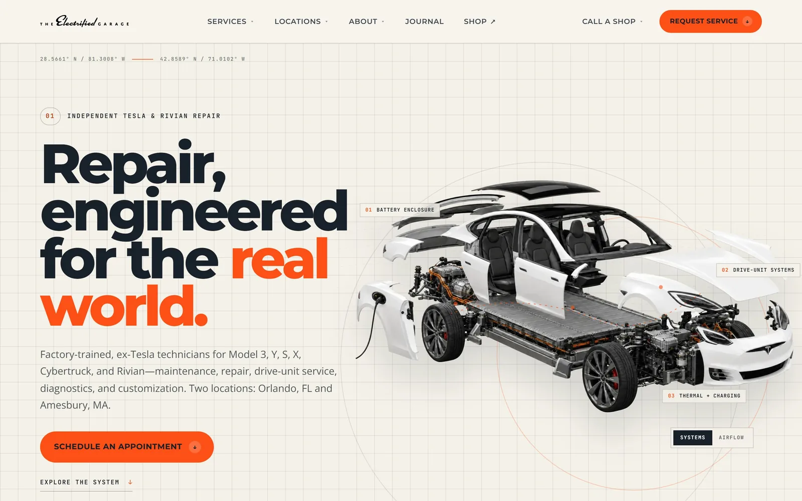
A cutaway Tesla floating on a drafting grid, with numbered callouts naming the systems the shop repairs.
Type
Montserrat 800, about 99px
Body
Open Sans 18px
Build
full width, two columns, pill buttons
Made on
custom JS framework
Colour
#f4f1e9 #18202a #fc5017
Type. Montserrat at 800 weight, close to 99px, tracked tight and set on a short leading so four lines stack into one block. One word, 'real', turns orange inside the sentence and that is the only emphasis on the screen. Open Sans runs the paragraph at 18px, and the labels drop to 12 and 13px in spaced caps, so three voices cover everything.
Colour. Warm paper at #f4f1e9, ink at #18202a, one orange at #fc5017. The orange sits on the request button, on that single word, and on the hairlines pointing at the car. Nothing else competes, which is why it reads as a decision rather than a default.
Layout. A faint drafting grid runs behind the whole screen, with the coordinates of both shops printed along the top like a survey note. Copy left, exploded Model S right, and the callouts numbered 01 to 03 against the car instead of listed in a panel. Sections breathe at around 115px, so the engineering idea never tips into looking like a spec sheet.
The ask. Request Service sits top right as a filled orange pill, then Schedule An Appointment repeats under the paragraph. Call A Shop is its own item, which matters when you run two locations. The copy names the models serviced and both cities before anyone scrolls, so the wrong customer self-selects out early.
If your technical knowledge is the product, draw it; an exploded diagram with three honest labels does more than a wall of trust badges.
02
graceautomotive.com
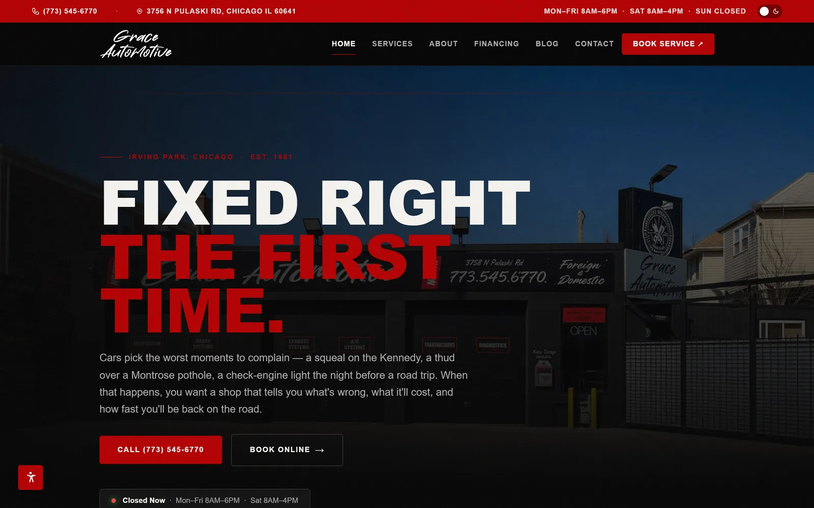
Enormous condensed caps over a night shot of the real storefront, the promise split white and red.
Type
Barlow Condensed 900, about 109px
Body
Barlow 300, 18px
Build
full width, left aligned, 4px corners
Colour
#080808 #b40304 #f4f2ee
Type. Barlow Condensed at 900, around 109px, caps running nearly the full width. The headline breaks over three lines and switches colour mid-sentence: white for 'Fixed Right', red for 'The First Time.' Body copy drops to Barlow Light at 18px, a wide enough gap that nothing below the fold shouts.
Colour. Black at #080808 almost everywhere, a shop red at #b40304, off-white text. Red appears on the top bar, in the headline, on the call button and on the sign in the photograph. Holding it to those four places is the discipline most shop sites skip.
Layout. That is the actual building at dusk, phone number painted on the glass, doors down. Everything hangs on a left margin with no centring, and the faint service words over the storefront read as signage rather than ornament. A Closed Now strip with the hours sits at the bottom edge.
The ask. Two buttons doing two jobs: solid red Call with the number spelled out, outlined Book Online beside it. Phone, address and hours are in a bar above the nav. The status strip tells you the shop is shut right now instead of letting you find out by ringing, which is a small kindness with real value.
Shoot your own building at the right hour and you own a hero image nobody else on the street can use.
03
evsmotors.com
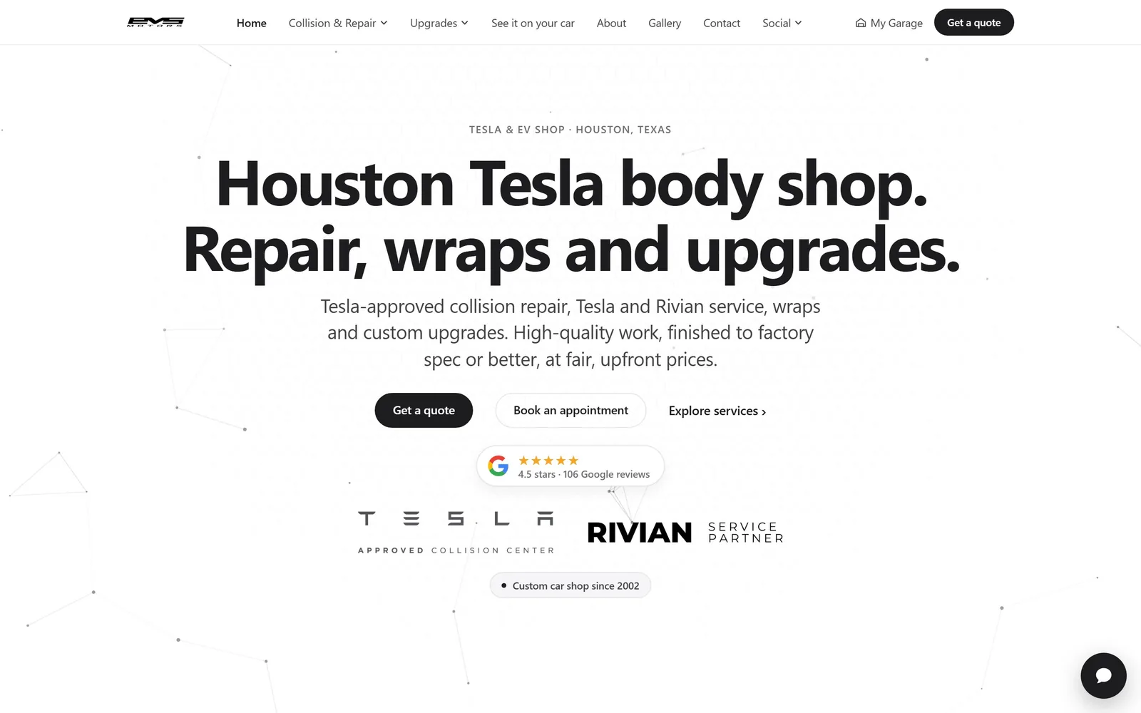
Two flat sentences in heavy black type, centred on white, over a faint constellation of connected dots.
Type
System sans 700, about 80px
Body
System sans 24px
Build
centred, 1120px column, pill buttons
Colour
#ffffff #1d1d1f #424245
Type. A heavy system sans at around 80px, negatively tracked, carrying two short declarative sentences instead of a slogan. The supporting line runs at 24px in grey, large enough to be read rather than skimmed. No caps, no condensed face, no italics anywhere, which is rare in this trade and the whole reason the page feels calm.
Colour. White at #ffffff with near-black at #1d1d1f and grey at #424245 for secondary copy. The only decoration is a pale network of dots and lines drifting behind the text, a nod to circuitry that stays almost invisible. Accent colour is simply absent.
Layout. Everything is centred in a narrow column, about 1120px wide, with generous air above and below. Under the buttons sits a tidy trust stack: a Google rating pill, the Tesla approved collision centre lockup, Rivian service partner, then a small 'custom car shop since 2002' tag. It is a lot of credentials handled without a single badge graphic.
The ask. Three options in descending commitment: a filled Get a quote, an outlined Book an appointment, then a plain Explore services link. My Garage in the header is a customer portal, which is further than most shops go. A chat bubble sits bottom right, small enough to ignore.
Rank your calls to action by how much they ask for, and let the lightest one be a plain link.
04
kingofhybrid.com
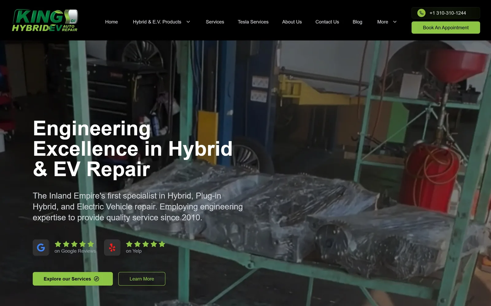
White headline over a dim shot of the actual workshop, with a bright green button cutting through the murk.
Type
Arial 700, about 60px
Body
Arial 24px
Build
full width video hero, left aligned, 6px corners
Made on
custom JS framework
Colour
#000000 #8dc443 #ffffff
Type. Plain Arial at 700, around 60px, three lines left aligned with nothing clever done to it. The supporting paragraph sits at 24px in light grey. It is the least designed type in this set and still works, because the hierarchy is right and the line breaks fall where the sense does.
Colour. Near-black ground with a lime green at #8dc443 on the primary button and in the logo. Green is the obvious choice for a hybrid shop and it is used sparingly enough to escape the cliche. The hero photograph is dark and a little muddy, which is the weakest thing here.
Layout. Copy sits in the left third over a video of the shop floor, with the right half left to the picture. Review marks from Google and Yelp sit between the paragraph and the buttons rather than being buried in a footer, which is the correct place for them. A phone pill and Book An Appointment are stacked in the top right corner.
The ask. Explore our Services is filled green, Learn More is outlined beside it, and the phone number is one tap away at the top. The five-star rows do the persuading before the buttons ask for anything. 'The Inland Empire's first specialist' in the first line is a claim with a geography attached, which beats a generic promise.
Review stars belong next to the buttons, not in the footer, because they answer the question the button is about to ask.
05
earthlingautomotive.com
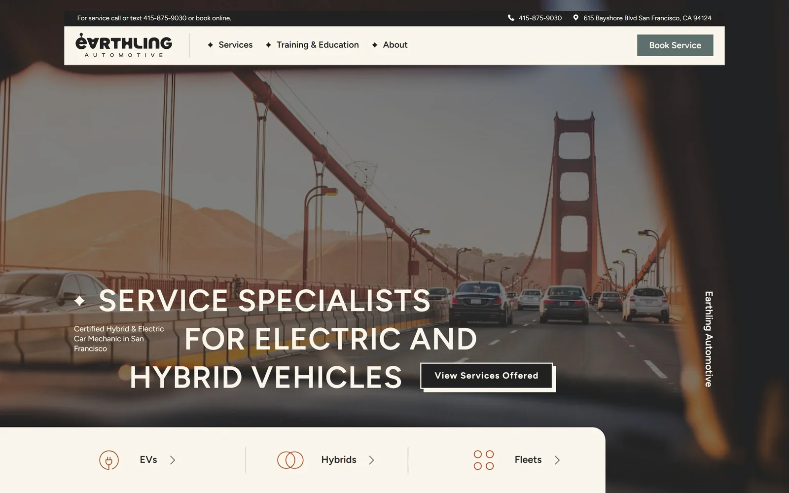
Staggered wide caps across a dashboard view of the Golden Gate, graded to match the cream header.
Type
Figtree 600 caps, about 56px
Body
Figtree
Build
full width, floating panels, square buttons
Made on
WordPress
Colour
#faf6eb #212121 #5d706d
Type. Figtree semibold caps at around 56px, widely set, with each line starting further left than the one above. A small sentence-case kicker tucks under the first line at a fraction of the size, an odd move that holds because the gap is so wide. Little diamond glyphs punctuate the nav and the headline and are the only ornament on the page.
Colour. Cream at #faf6eb across the header and panels, with the photograph graded to match so the bridge reads rust rather than red. The button is a muted sage, #5d706d, and the service icons are drawn in thin terracotta line. A sunlight palette rather than a workshop one, which suits an EV shop in San Francisco.
Layout. The header floats as a cream slab with rounded ends over the image, and a second slab rises from the bottom carrying three doors: EVs, Hybrids, Fleets. The company name runs vertically up the right edge. Shooting from inside a car on the bridge puts the viewer in the driving seat instead of looking at somebody else's lift bay.
The ask. Book Service sits in the header, phone and address above it, and the very top line offers call, text or online booking. Those three icon links split the audience before anyone scrolls. One quibble: the View Services Offered button lands inside the headline and crowds the third line badly.
Grading your hero photograph into your brand colours costs nothing and buys more coherence than another typeface.
06
workshop5001.com
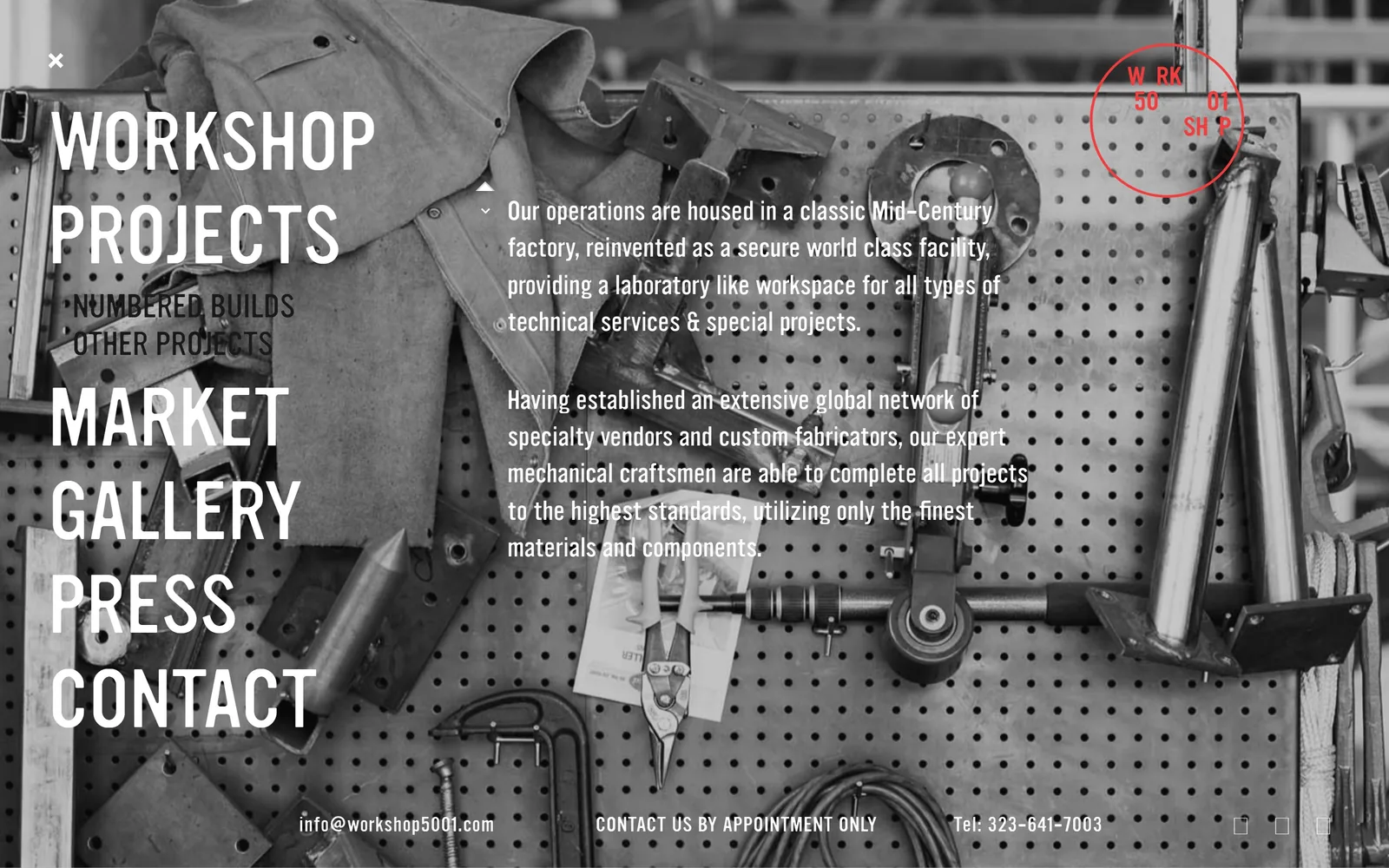
A black and white pegboard of hand tools, with the navigation set enormous straight over the photograph.
Type
Light geometric sans caps, about 75px
Body
Same face at 24px
Build
full bleed photograph, left column menu
Made on
WordPress
Colour
#ffffff #1a1a1a #e2231a
Type. One typeface, a light geometric with unusually wide caps, used at roughly 75px for the menu and 24px for the copy and nothing in between. Menu items are stacked as a left-hand column and treated as the display type, so navigation and headline are the same thing. It is a single idea executed without hedging.
Colour. Greyscale, and that is it, apart from a hand-drawn red circle stamped around the logo in the top right. The photograph supplies every tone on the page. One red mark on a monochrome screen does the work ten accent colours usually fail to do.
Layout. Full-bleed photograph with text laid straight onto it, no scrim, no panel, no card. Copy sits in the right half where the pegboard is quietest, which is a photographer's instinct rather than a template's. Contact details run along the bottom edge in small caps.
The ask. There is almost nothing: an email address, 'contact us by appointment only', and a phone number, all at the foot of the screen. For an appointment-only technical shop in Los Angeles that is a filter, not an oversight. Copy it onto a shop that needs a full diary and you will starve.
Setting your menu as the display type only works if you have one photograph strong enough to carry everything else.
07
rothsport.com
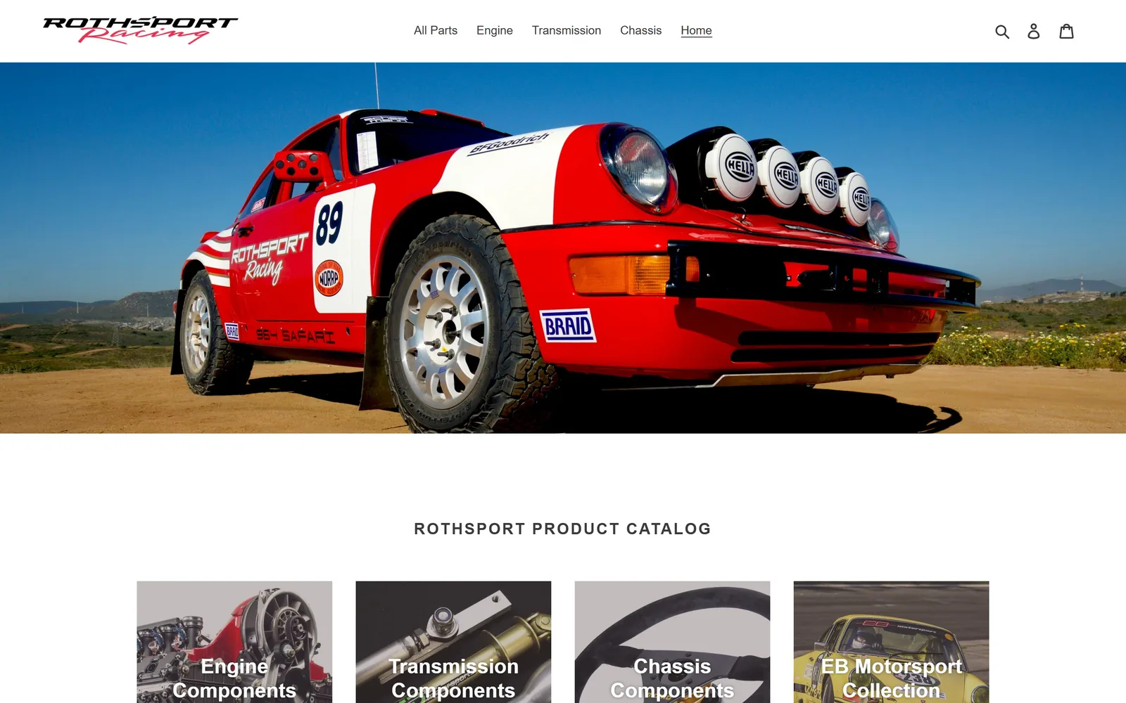
A red and white safari 911 shot low against desert scrub, sitting bright against a plain white page.
Type
Helvetica Bold caps, about 20px
Body
Helvetica 15px
Build
full width hero, four column tiles, square corners
Made on
Shopify
Colour
#ffffff #3a3a3a #d81e22
Type. Helvetica, set small and unfussy, with the catalogue heading at around 20px in caps and link text at 15px. The script in the logo is the only expressive letterform anywhere. Nothing is large, which is a defensible choice when the photograph is this loud but leaves the page feeling like a catalogue rather than a shop.
Colour. White page, pale grey panels, black text, and all the colour from the car: Hella lamps, the number 89, the red and white livery against blue sky. The logo picks up the same red. Letting the subject supply the palette is the oldest trick here and still the most reliable.
Layout. Hero image full width and uncropped, then a centred catalogue heading, then a four-up row of component tiles with white caps burned into the pictures. The tiles are evenly weighted, so engine, transmission, chassis and the motorsport collection read as equal paths rather than a hierarchy.
The ask. No booking action in the hero at all, just navigation and a cart. The four tiles are the whole funnel, and they lead to parts rather than to a service enquiry. For a shop that also builds and races cars, that is a lot of reputation routed into a product grid.
If the photograph is doing all the shouting, the type can stay quiet, but something still has to ask for the booking.
08
roadscholars.com
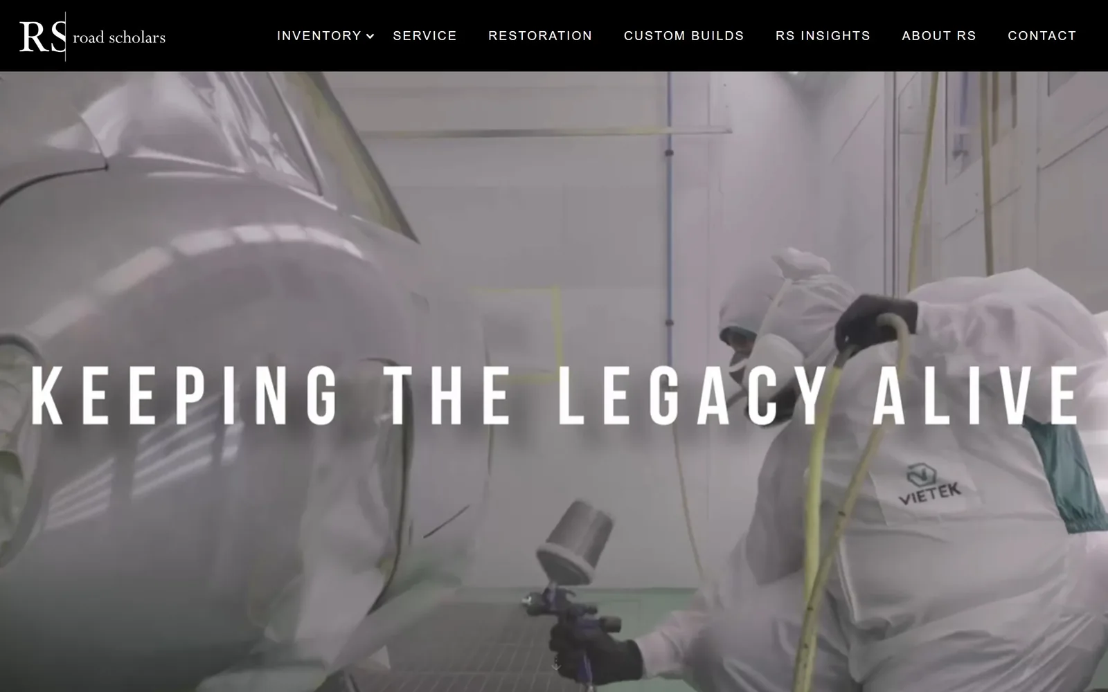
Two painters in full suits spraying a bare body, with four tracked words laid right across the frame.
Type
Tracked grotesque caps, full width
Body
Oswald 16px caps
Build
full bleed video, centred title
Made on
Webflow
Colour
#000000 #ffffff
Type. Four words, caps, tracked so far apart that the line spans the full width and reads as a title card rather than a headline. Oswald handles the nav at 16px with its own generous letterspacing, so the two sizes rhyme. There is no body copy on this screen at all, which is a confident thing to leave out.
Colour. The paint booth does the colouring: white suits, white walls, the ghost silver of primer, a single teal glove. Interface colour is limited to a black nav bar and white type. Nothing has been imposed on the photograph, and it does not need anything.
Layout. Full-bleed video of actual work in progress, nav pinned across the top on solid black, type centred on the vertical middle. The restoration, service and custom builds paths are separated in the menu, which is proper information design for a business doing three different jobs under one roof.
The ask. Nothing is asked for on the first screen beyond reading the menu. For a business selling concours restorations and six-figure inventory that is the right pace, since the enquiry comes after the proof. A repair shop should not borrow this.
Showing the unglamorous middle of the job, primer and masking tape, sells craft better than another photograph of a finished car.
09
bumperbuddies.com
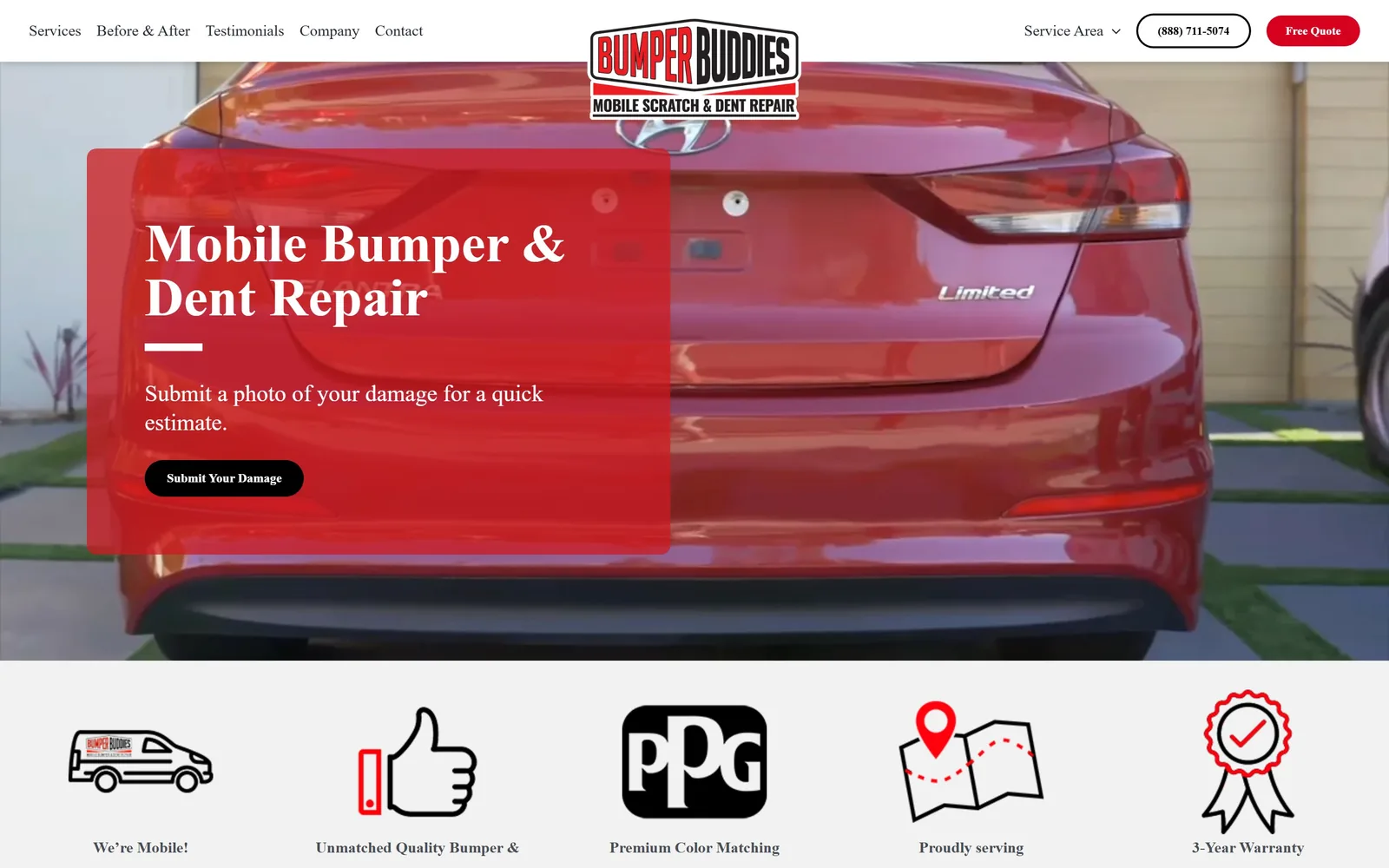
A translucent red panel over a close shot of a dented bumper, asking you to send a photo of the damage.
Type
Spectral 700, about 56px
Body
Karla 16px
Build
full width photograph, left panel, pill buttons
Made on
WordPress
Colour
#ffffff #ce1a20 #000000
Type. Spectral, a serif, at around 56px for the headline, which no other shop in this set has risked. Karla handles body copy at 16px and the buttons drop to Montserrat at 13px. Three families is one too many, but the serif gives a mobile dent repair outfit a steadiness it would not otherwise have.
Colour. White and light grey for the page, black for the buttons, and a signal red at #ce1a20 for the hero panel and the logo. The red panel sits semi-transparent over a red car, which is either neat or a coincidence they got away with. Icons below are line drawings in black with red picked out.
Layout. Headline panel anchored left over a full-width photograph of the damage itself, not a showroom car. Beneath it, a five-across row of drawn icons covering mobility, quality, colour matching, service area and warranty. Those drawings are the most distinctive thing on the page and they cost less than a photoshoot.
The ask. The single action is Submit Your Damage, paired with the line 'submit a photo of your damage for a quick estimate'. That is the right ask for mobile repair: no diary, no address, just a picture. Free Quote and the phone number repeat it in the header.
Match the ask to the job; for mobile repair, 'send a photo' converts better than any booking calendar.
10
kindigit.com
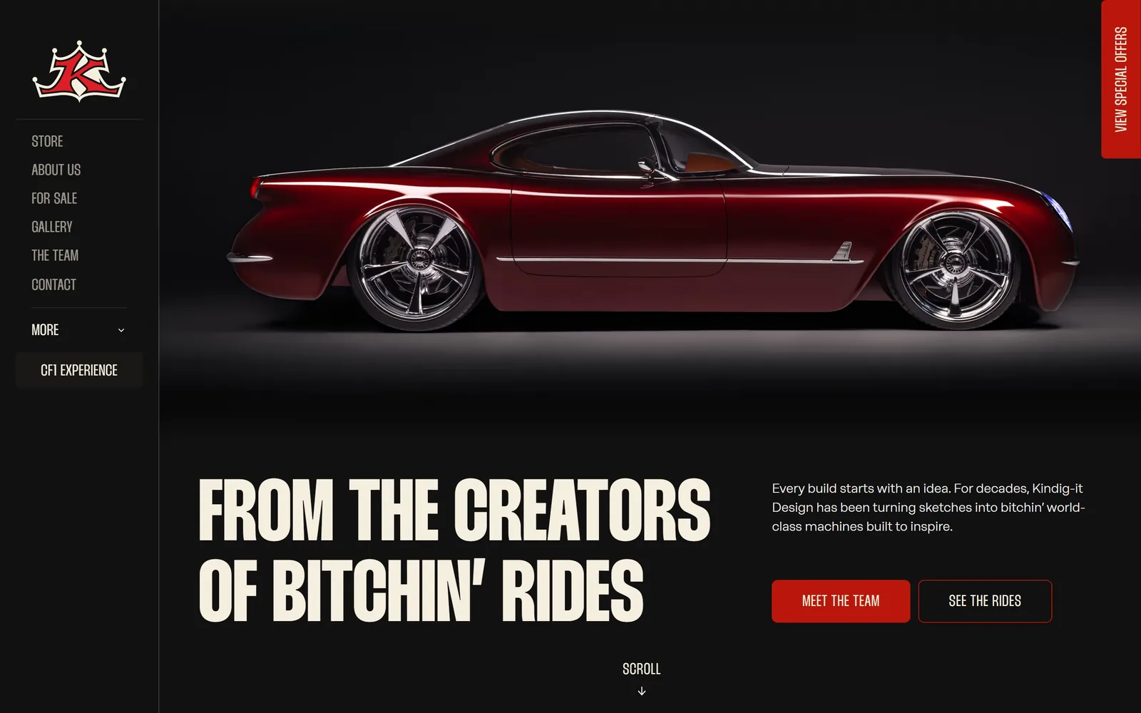
A candy red custom coupe lit on black, with cream condensed caps claiming the creators of Bitchin' Rides.
Type
Thunder, cream caps, about 60px
Body
Neuerational 16px
Build
fixed left rail, 8px corners
Made on
Webflow
Colour
#111111 #f5efdf #ba160c
Type. Thunder, a heavy condensed face, in cream caps at around 60px, set tight over two lines. Body copy switches to Neuerational at 16px, a wide geometric that contrasts properly instead of being a slightly different grotesque. The headline is a boast and the type knows it.
Colour. Near-black at #111111, cream type at #f5efdf, and a deep red at #ba160c on the button and the crown. The car is the same red, so the accent looks lifted from the paint rather than chosen from a picker. Cream instead of white is a small decision that keeps the page from going cold.
Layout. A fixed left rail holds the crown mark and the whole menu, leaving the rest of the screen to the car. Below the picture the headline sits left and the paragraph right, unbalanced on purpose. A red Special Offers tab runs vertically down the right edge, the one crass note in an otherwise controlled page.
The ask. Meet the Team filled in red, See the Rides outlined beside it, and a Scroll cue centred below. Neither button asks for money or a date, which fits a shop whose first job is to be wanted. The CF1 Experience sits in the rail as a separate entry point.
Pull your accent colour out of the car in the photograph and the whole page looks art directed rather than assembled.
11
importspecialty.com
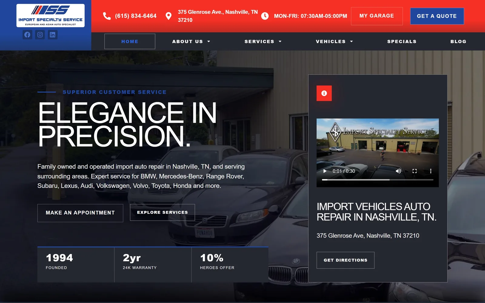
A red and blue header bar above a night shot of the lot, with a three-figure strip counting founding year and warranty.
Type
Tracked uppercase sans, about 85px
Body
Afacad 19px
Build
full width, left aligned with right video card, square corners
Made on
WordPress
Colour
#20479d #f73025 #262831
Type. Tightly tracked uppercase at around 85px for 'Elegance In Precision.', with a blue eyebrow above it in Montserrat at 13px and 0.15em of tracking. Body copy sits in a quiet humanist sans at 19px. The jump from 13px to 85px is the page's best move and the reason the header bar does not swallow everything.
Colour. Red at #f73025 and navy at #20479d, both strong, both used at full strength in the top bar. Below that the palette calms to a cool charcoal photograph with white type. Loud at the top and restrained underneath is an odd rhythm, and the header bar is the thing I would dial back.
Layout. Hero photograph of the shop's own lot with text left and a video card locked to the right. Under the copy, a three-column strip gives 1994 founded, 2yr 24k warranty, 10% heroes offer. Numbers in a row like that answer the three questions an import customer actually has.
The ask. Make An Appointment and Explore Services are outlined rather than filled, which undersells them against the solid Get A Quote in the header. Phone, address and hours run along the top. My Garage gives returning customers their own door, which is unusual at this size.
A short strip of real numbers, year founded, warranty terms, discount offered, outperforms a paragraph about commitment to quality.
12
olsenmotorsport.com
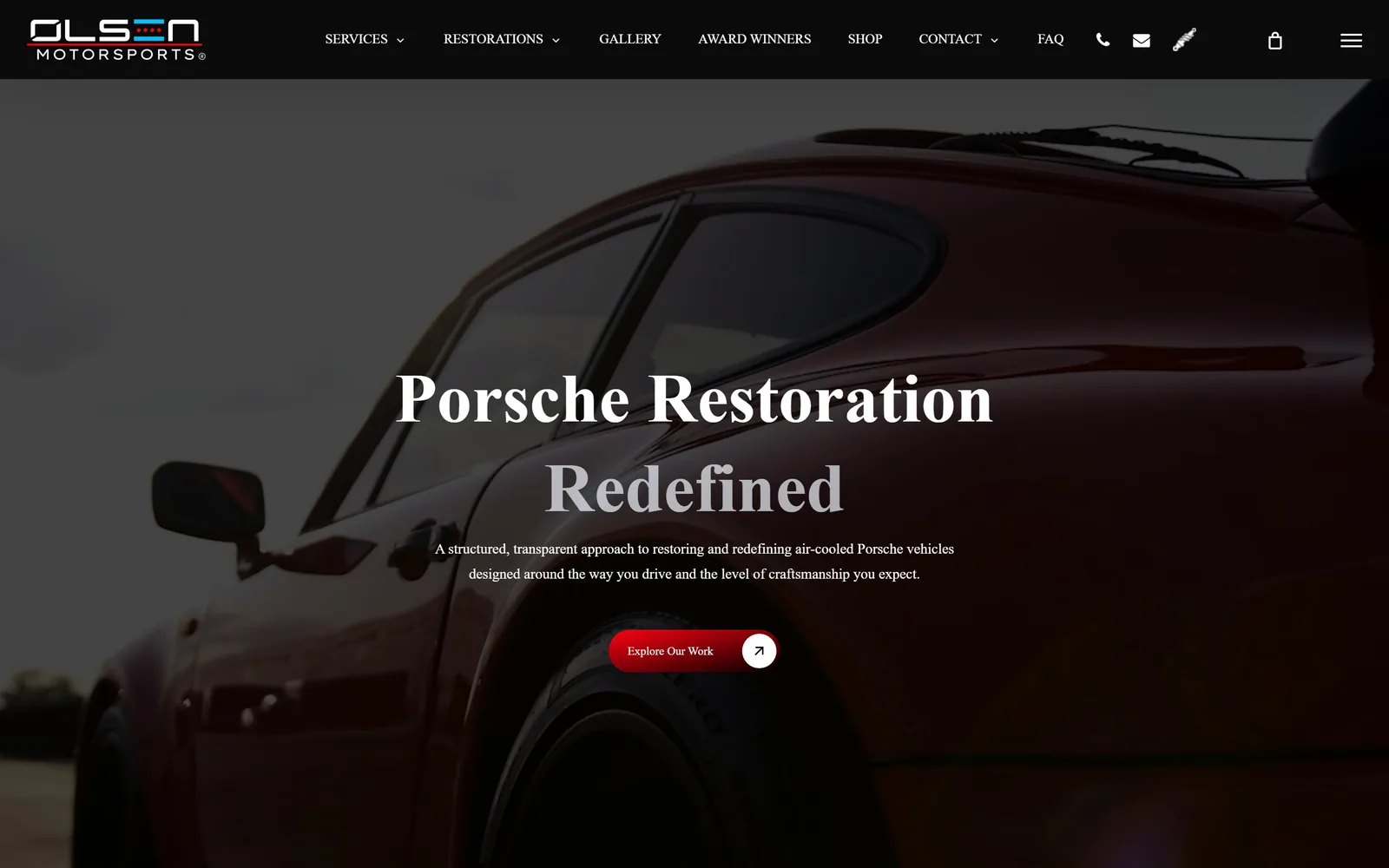
A serif headline in two tones over an oxblood 911 shot so close the body fills the frame.
Type
Serif, about 72px
Body
Inter 15px
Build
full width video, centred, pill button
Made on
WordPress
Colour
#000000 #ffffff #ff0010
Type. A high-contrast serif at around 72px, with 'Porsche Restoration' in white and 'Redefined' dropped to grey underneath. Splitting a two-word headline by tone instead of by weight is a light touch that works. Inter at 15px handles the paragraph and keeps the serif from looking fussy.
Colour. Effectively black, with the car's oxblood paint supplying the only warmth and a pure red at #ff0010 on the button and the active nav item. The logo's blue and red stripe is the one other colour and it is small. Dark pages are easy to do badly; this one survives because there is almost nothing on it.
Layout. Centred text over a video of the car, with the composition cropped tight enough that you read paint and glass rather than a whole vehicle. The nav carries small phone, mail and spark plug icons, a detail that is either charming or clutter depending on the day.
The ask. One button, Explore Our Work, a red pill with a circular arrow tacked on the end. No price, no form, no phone number in the hero. The three build tiers that make this shop interesting commercially are a scroll away, which is a missed opportunity on the first screen.
Splitting a headline into two tones of the same size gives you a second line of hierarchy without a second typeface.
13
speedkore.com
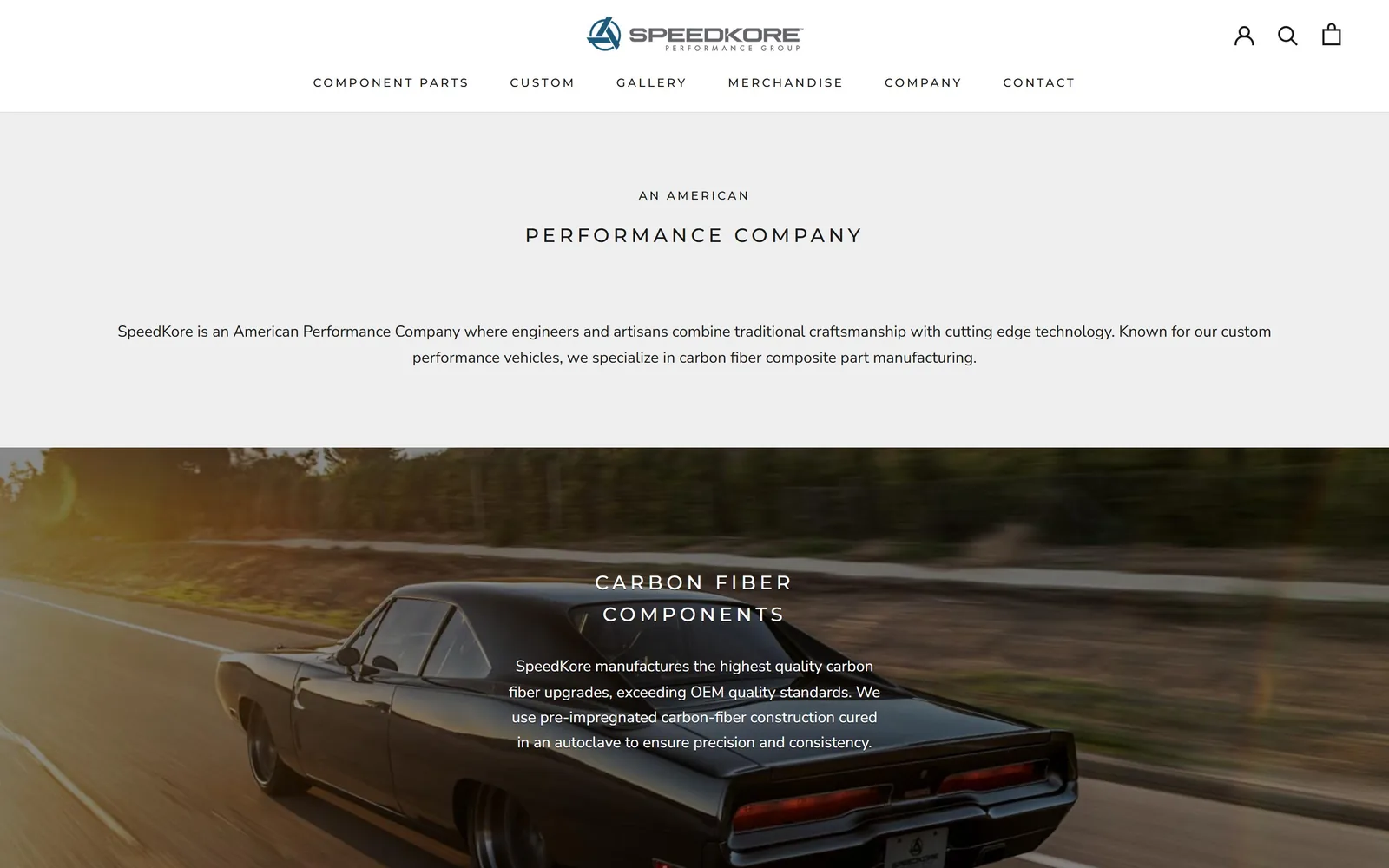
Widely tracked caps on a plain grey field, then the full width handed to one black Charger on a forest road.
Type
Montserrat 500 caps, 0.2em tracking, about 24px
Body
Nunito Sans 16px
Build
centred, full width image band, square corners
Made on
Shopify
Colour
#efefef #1c1b1b #ffffff
Type. Montserrat caps at 20 to 24px with tracking opened to about 0.2em, used for every heading on the page. Nunito Sans at 16px does the paragraphs. There is no large display size at all, which is the defining decision and the one worth arguing with.
Colour. A light grey field at #efefef, white panels, near-black text, then white type straight onto the photograph below. No accent colour. The logo supplies the only blue on screen, and the carbon black of the car does the rest.
Layout. The page opens with a quiet grey band of centred text, then gives the full width to the car. Everything is centred including the paragraphs, which costs readability on the longer lines. That empty opening band is either poise or a wasted screen, and I lean towards wasted.
The ask. No button in the hero, only navigation. Component Parts and Custom sit first in the menu so the commercial path exists, but a visitor has to go looking. For a shop selling build slots that is money left on the table.
Wide tracking at a small size can carry a page, but pair it with one real display size or the opening reads as a caption.
14
makellosclassics.com
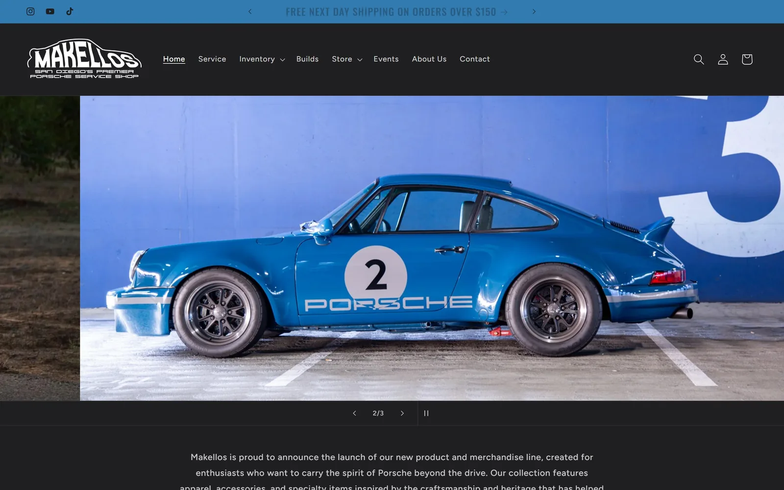
A works blue 911 against a painted blue wall, framed by a black bar and a squared italic wordmark.
Type
Oswald 500, lightly tracked
Body
Figtree 14 to 16px
Build
full width carousel, square corners
Made on
Shopify
Colour
#1f1f21 #ffffff #3d8fcc
Type. Oswald, condensed and lightly tracked, handles headings, and the logo pushes it further into a squared italic lockup with a tiny strapline reading San Diego's premier Porsche service shop. Figtree covers nav and body at 14 to 16px. Nothing is large because the photograph is meant to carry the screen, and it does.
Colour. Near-black at #1f1f21 for the furniture, white type, and a blue that arrives entirely through the image: a race blue 911 against a blue wall with a painted number 3. The cart and link accents pick up a related #3d8fcc, tying the interface to the car without anyone having to say so.
Layout. Announcement strip, then a black nav bar, then the photograph with a sliver of the next slide visible at the left edge. Slide counter and pause control sit in a black band directly under the picture rather than floating on it, so nothing is laid over the car. That restraint is the best decision on the page.
The ask. Service, Inventory, Builds and Store all sit at top level, honest about a business that repairs, sells and ships parts. The fold is the weakness: no booking button, no phone number, no service lead, just a rotating picture and a shipping offer. What it sells on this screen is taste.
Keeping carousel controls off the image costs you nothing and stops every slide being defaced by arrows.
15
guntherwerks.com
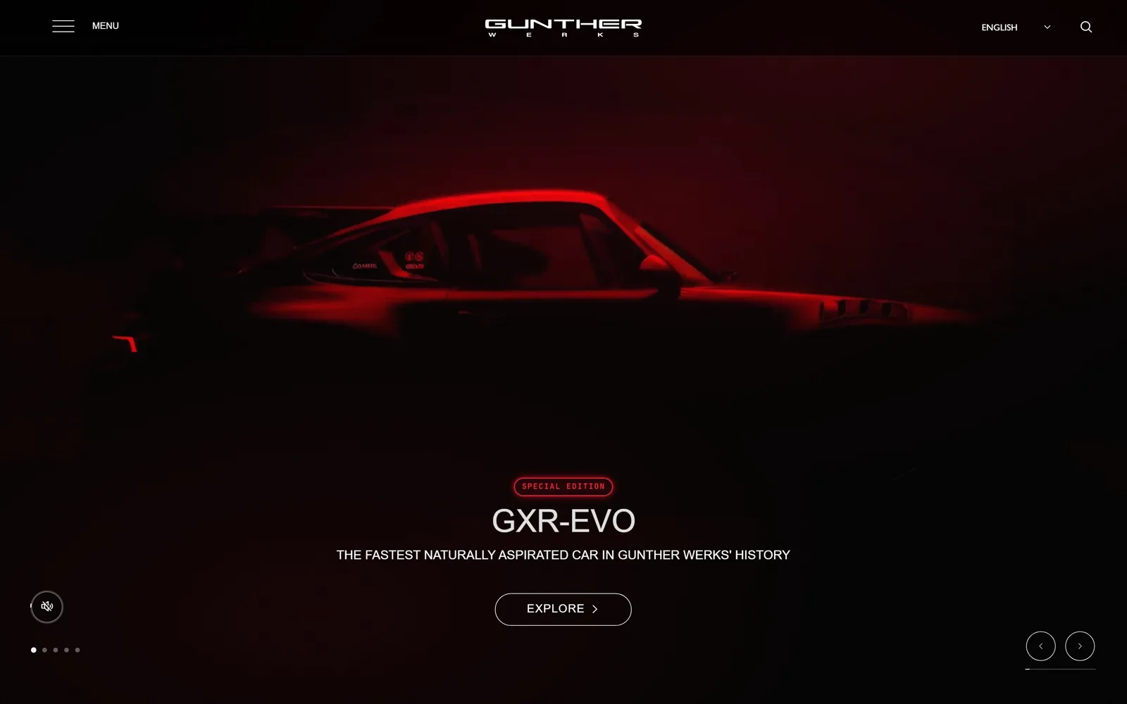
A 911 emerging from near total darkness under one red light, the interface reduced to centred white type.
Type
Gill Sans Nova caps, about 40px
Body
Gill Sans Nova 18px
Build
full width video, centred, square corners
Colour
#000000 #ffffff #ff2a3c
Type. Gill Sans Nova throughout, an unusual pick in a sector that reaches for condensed grotesques by reflex, and it lends the page an English, faintly literary air. The model name runs at about 40px in letterspaced caps with the line beneath at 16px in a lighter weight. A mono face appears at 10px on the Special Edition pill, tracked right out.
Colour. Black and white, and that is the entire system. One red source lights the car, so every bit of colour comes out of the photograph rather than the interface, and a thin red keyline around the badge picks it up. Restraint of this order is easy to describe and hard to hold for a whole site.
Layout. Logo, badge, model name, strapline and button all run down the centre. The car sits in the upper third and stays mostly in shadow, leaving the composition largely empty. Carousel dots bottom left, arrows bottom right, mute toggle acknowledging the video.
The ask. One outlined Explore button, no phone number, no form. That suits a business selling a handful of commissions a year. Put it on a shop that needs a full diary and the phone stops ringing.
Underlighting one car and leaving the rest of the frame black is cheaper theatre than a full studio shoot and reads as confidence.
How these were chosen
Fifteen working US shops read hero by hero, from independent EV specialists and a Chicago neighbourhood garage to Porsche houses and custom builders. Most of what passes for auto repair website design in this trade comes from four or five lead-gen template vendors, and the shops here all escaped that: one accent colour held in reserve, a photograph of their own building, a booking button that survives the first screen. Where a site gets something wrong, that is noted too.
Finding auto repair sites that someone had actually designed took far longer than it should have. 38 candidates made the shortlist. 15 made the page.
Each one was opened and looked at properly: what the type is doing, where the colour gets spent, how the page is built, how it asks for the job. Nothing is here because it ranks. Nothing is here because an agency filed it under portfolio. Several well known names were left out for the plain reason that their site came out of the same template as everyone else's, and a few sites worth including did not survive a second look.
Where a site is only competent, it says so. The order is the order worth your time, best first.
Reviewed and selected by Larry W. Matthews for Websitely.