Thirteen collector, restomod and EV dealers. What car dealership website design turns on here is how much each page leaves out before you scroll.
Shown
13 sites
Reviewed
26 candidates
Chosen on
The work, not the ranking
Updated
15 October 2026
01
ospreycustomcars.com
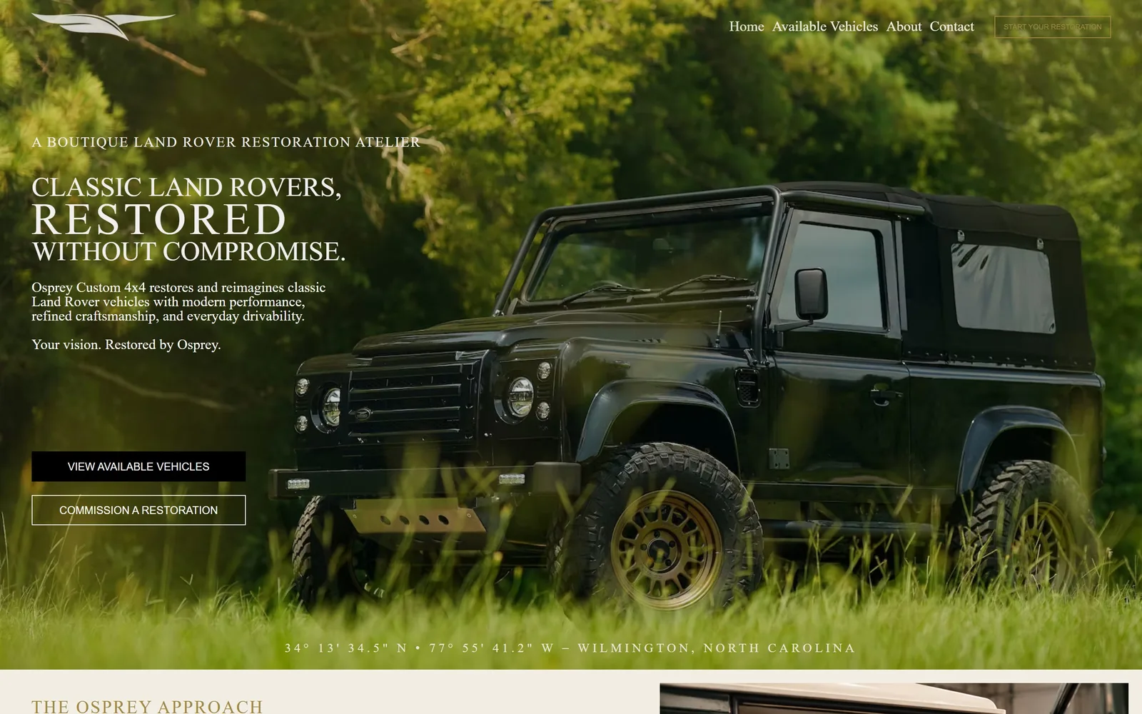
A black Defender sits in tall grass while a serif headline stacks at the left and GPS coordinates run along the bottom edge.
Type
high-contrast serif, 34 to 56px
Body
same serif, 23px on 1.1
Build
full-bleed hero, uneven 832/608 two-column below
Made on
Wix
Colour
#f3eee4 #a1883f #3c4142
Type. The display face is a high-contrast transitional serif in all caps, with RESTORED pulled out to 56px against 34px for the lines above and below it. Body copy uses the same serif family at 23px on a tight 1.1 line height, which keeps the paragraph compact beside the photograph. The eyebrow, A BOUTIQUE LAND ROVER RESTORATION ATELIER, is tracked at 0.08em so it reads as a label rather than a sentence. The DOM names a Gotham Narrow fallback, but what is drawn has bracketed serifs and real stroke contrast.
Colour. Above the fold the colour is photographic: green foliage, a near-black truck, warm white type at #f2f0ef. Below it the page switches to a warm paper tone of #f3eee4 with #3c4142 body ink and gold #a1883f on headings such as THE OSPREY APPROACH. The gold gets a couple of percent of the screen and never touches a button. The primary button is flat black, the secondary a hairline white outline.
Layout. Full-bleed 1440px hero photograph with no container inset, the copy block holding roughly the left third. Below the fold the page drops into a deliberately uneven two-column grid, 832px against 608px with zero gutter, so the image panel runs to the edge. Corner radius is 0 everywhere, buttons included. The coordinate line across the bottom of the hero does the job a divider normally would.
The ask. Two stacked buttons, VIEW AVAILABLE VEHICLES in solid black and COMMISSION A RESTORATION as an outline, plus START YOUR RESTORATION in the top right. Three asks above the fold, and stacking the hero pair vertically rather than side by side makes the hierarchy unmistakable. Nothing competes with them: no phone number, no chat bubble, no inventory strip. The nav is four items.
Stacking the primary and secondary button vertically instead of side by side tells the visitor which one you actually want them to press.
02
enthusiastauto.com
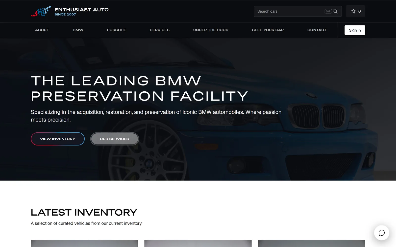
A blue E46 M3 shot dark and close, a wide-tracked all-caps headline over it, and a pill button ringed in red and blue.
Type. The headline is a geometric gothic at 48px, uppercase, tracked at 0.1em so THE LEADING BMW PRESERVATION FACILITY opens across two lines. Body is Geist Sans at 20px with negative tracking of -0.013em, so the sub-paragraph reads tight while the headline reads wide. Nav labels drop all the way to 11px uppercase at 0.08em. That 48px to 11px jump is the entire hierarchy; there is almost nothing in between.
Colour. #ffffff and a near-black #0a0c10 carry everything, with #d0d6e0 for rules and dividers. The only colour is the gradient ring on the VIEW INVENTORY pill, running red into blue, which is the BMW M stripe without saying so. It occupies a few hundred pixels and nothing else on the page repeats it. That is restraint rather than an absent palette.
Layout. 1440px container with the hero photo bled full width and the copy block indented to about 150px. Below the fold the inventory runs as a three-column grid of 389px cells, 24px column gap and 40px row gap, inside 96px section padding. Corners are square throughout apart from the pill buttons. Above the fold: logo, search field, favourites count, seven nav items, headline, sub-paragraph, two buttons.
The ask. VIEW INVENTORY and OUR SERVICES sit side by side under the sub-paragraph, joined by Sign in, a Search cars field and a favourites counter in the header. That is five things to click before you scroll. LATEST INVENTORY begins about 100px below the fold and is the real second ask. The chat bubble at bottom right is the only element that looks bolted on.
One gradient hairline on one button can carry a brand's colours without a single coloured panel anywhere on the page.
03
recharged.com
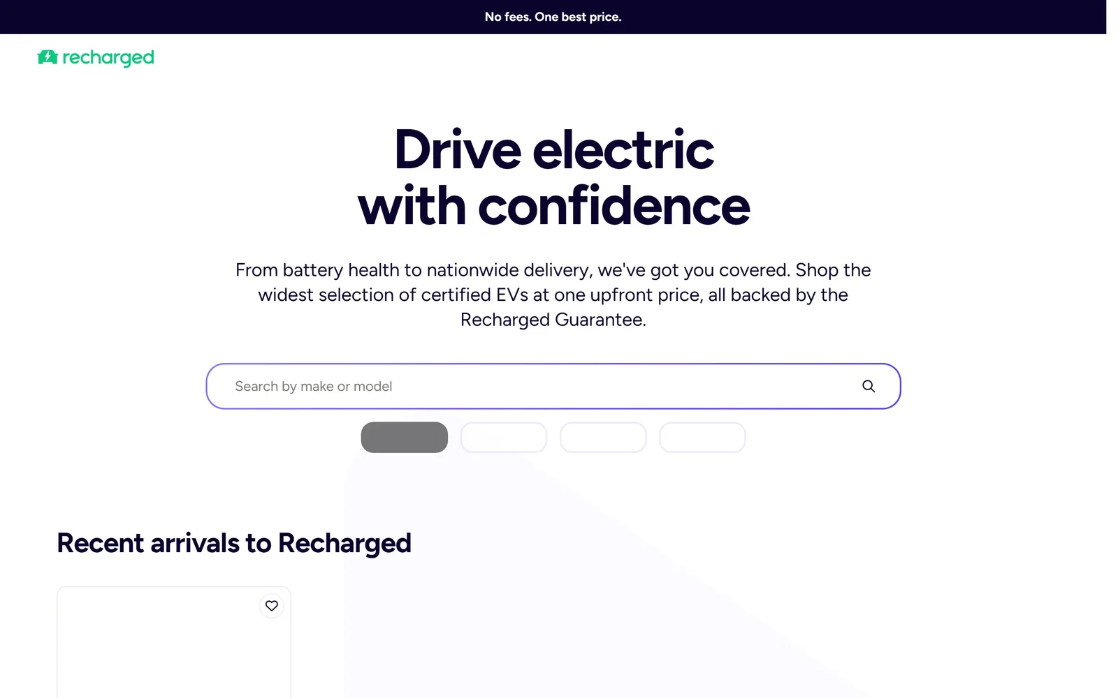
A white page with a two-line 72px headline, a violet-ringed search field under it, and a green wordmark as the only saturated colour.
Type
Figtree 72px bold, -0.03em
Body
Figtree 24px
Build
centred 1430px column, four-column 302px grid
Made on
custom JS framework
Colour
#0b042e #7357ff #16c67e
Type. Figtree at 72px bold with -0.03em tracking carries the two-line centred headline. The sub-paragraph runs 24px regular on a 1.33 line height and wraps to three lines, longer than most sites risk at that size. Everything else is Figtree too, down to 16px bold on the car cards. One family, four sizes, no uppercase anywhere, which is rare in this category.
Colour. Ink is #0b042e, a near-black with a blue cast, on #fbfaff. The search field is ringed in #7357ff and the wordmark is #16c67e, and those two accents are the whole colour budget above the fold. The black bar at the very top reading No fees. One best price. is the only solid block. Next to the restomod shops this looks like a fintech site, which is clearly the intent.
Layout. 1430px container, everything centred, with the headline starting about 230px down so the top of the page is deliberately empty. Inventory sits in a four-column grid of 302px cells with 24px gaps inside 48px section padding. Zero corner radius on cards, full pill radius on the search field and filter chips. Those chips were still rendering as grey skeletons when the capture ran.
The ask. There is no button in the hero. The ask is the search field, placeholder Search by make or model, with filter chips beneath it, and the next ask is the Recent arrivals to Recharged grid. For a retailer selling used EVs at one fixed price, making search the hero is the correct call. Only the promise bar at the top competes.
When buyers arrive knowing the model they want, a search field outperforms a button, and this page commits to that without hedging.
04
fj.co
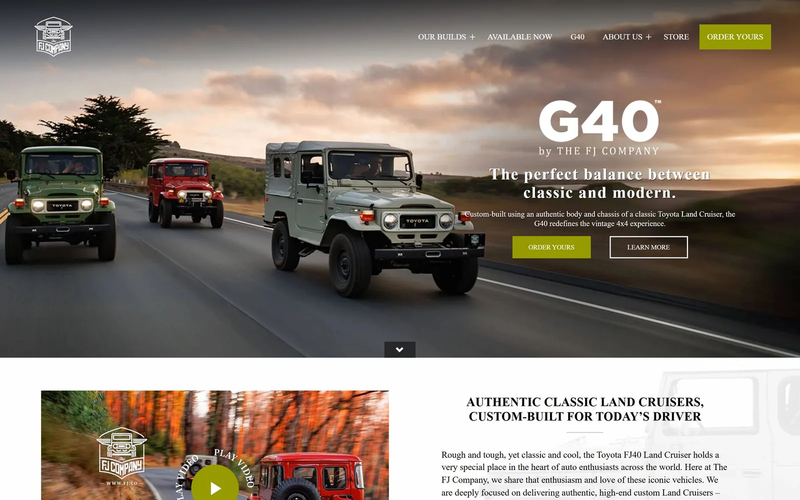
Three restored Land Cruisers on a coast road at dusk, with a G40 wordmark and olive buttons set into the right third.
Type
Source Serif 4, 30px semibold
Body
Source Serif 4 16px
Build
full-bleed hero with right-aligned copy, three-column 367px grid
Made on
custom
Colour
#f1f2f0 #969b02 #000000
Type. Source Serif 4 does every job here: headline, nav, body and buttons. The hero line, The perfect balance between classic and modern, runs 30px semibold at 0.049em, small for a hero, and it works because the G40 logotype above it is doing the shouting. Section headings sit at 22px uppercase and buttons drop to 12px. One serif across a 4x4 site is a gamble that pays off because the photography is already rugged.
Colour. The hero is the photograph: sunset orange, grey tarmac, white type. Below it the page sits on #f1f2f0 with black body copy. The accent is an olive #969b02 on ORDER YOURS in the nav and again in the hero, under one percent of pixels. Olive instead of the obvious red is the single decision that stops this looking like every other restomod site.
Layout. Full-width hero photograph with the copy stack right-aligned into roughly the right 40 percent, unusual and effective because the trucks are driving left to right into it. The section below runs a three-column grid of 367px cells with a generous 44px gap in both directions. Zero radius on every button and card. A centred chevron sits on the hero's bottom edge.
The ask. ORDER YOURS appears twice above the fold, once as the olive nav button and once in the hero, with LEARN MORE as its outlined partner. The video panel below adds a PLAY VIDEO target. Six nav items and no phone number, so everything funnels into one verb. Repeating ORDER YOURS reads as deliberate rather than careless.
Choosing an unexpected accent, olive rather than red, separates you from every competitor in the category at no cost.
05
superformance.com
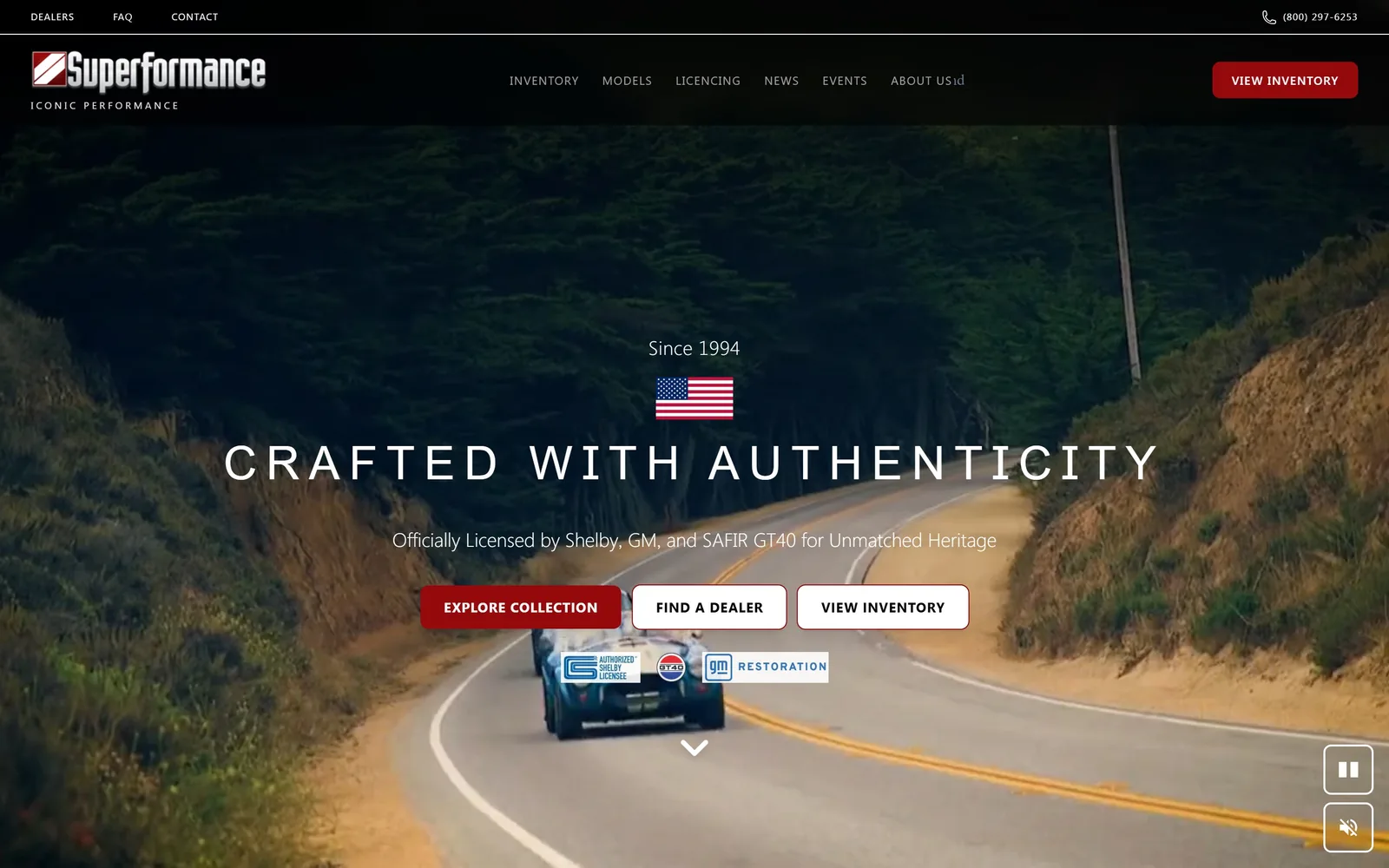
A Cobra viewed from behind on a coastal road, under a widely tracked Anton headline, a US flag and three buttons.
Type
Anton 48px at 0.2em
Body
Inter 20px light
Build
full-bleed video, single centred column
Made on
custom
Colour
#000000 #95080b #f1f5f9
Type. Anton at 48px with a huge 0.2em tracking turns CRAFTED WITH AUTHENTICITY into a band of type nearly 1300px wide. Anton is a condensed poster face, and spacing it that far pulls it back toward elegance. Supporting text is Inter at 20px light and nav labels sit at 10px uppercase at 0.08em. The ABOUT US item renders as ABOUT USid, a stray character somebody should fix.
Colour. The frame is #000000 with #f1f5f9 panels further down. The accent is a deep oxblood #95080b on EXPLORE COLLECTION and on VIEW INVENTORY in the header, under one percent of pixels. The licensing badges below the buttons import Shelby blue and GT40 red that the palette otherwise avoids, and they look like exactly what they are, borrowed logos.
Layout. Full-bleed autoplaying video at 1440px with six elements stacked in one centred column: eyebrow, flag, headline, sub, button row, badge row, then a chevron. That is a lot of vertical rhythm to hold in 900px. Buttons carry an 8px radius, the only softened corners on the page. Pause and mute controls sit bottom right.
The ask. Four asks above the fold: VIEW INVENTORY in the header, then EXPLORE COLLECTION, FIND A DEALER and VIEW INVENTORY again in a row. Two of them say the same thing, which splits attention for nothing. FIND A DEALER is the interesting one, because this is a manufacturer selling through a dealer network. A phone number sits in the top utility bar.
A condensed poster face stops looking cheap the moment you give it serious letter spacing.
06
hennesseyperformance.com
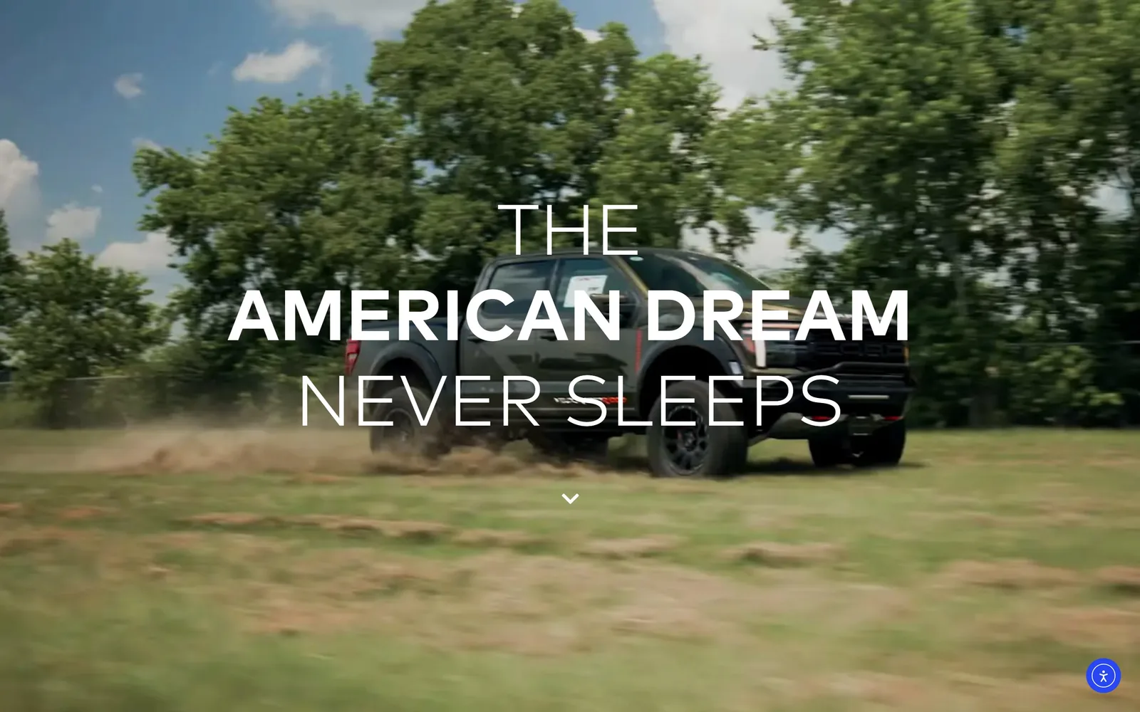
A full-bleed video of a black Raptor sliding through a grass field, a three-line headline over it, and nothing else on screen.
Type
FF Mark, 90px light over 65px bold
Body
FF Mark
Build
full-bleed video, centred headline, no visible nav
Made on
WordPress
Colour
#000000 #ffffff #f01c24
Type. FF Mark across three weights inside one headline: THE at 90px light, AMERICAN DREAM at 65px bold, NEVER SLEEPS back up to 90px light. Making the middle line smaller and heavier than the lines around it is the opposite of the usual move and it is why the thing reads. Tracking is effectively zero throughout. Nav labels sit at 10px, small enough to disappear against moving video.
Colour. Only two things occupy the screen: white type and whatever the video shows, here greens and sky. Site-wide the measured palette is #ffffff, #000000 and a single hot red #f01c24 holding 0.3 percent of pixels. There is no scrim and no gradient overlay behind the headline, which is brave given it sits over grass.
Layout. There is no container. The video fills 1440 by 900 and the headline is centred on both axes with a chevron below it. Nothing else is above the fold: no legible nav bar, no button, no phone number. Section padding elsewhere is 29px and the document runs to 7860px, so the restraint is confined to the top.
The ask. Zero calls to action above the fold. The page asks for one scroll and nothing more, then hits you with vehicle cards carrying LEARN MORE and INQUIRE NOW. For a tuner with a known name that is a defensible trade. Any dealer without that recognition would lose visitors at this screen.
Mixing weights inside one headline, heavy in the middle and light at both ends, builds hierarchy without changing a single colour.
07
lbilimited.com
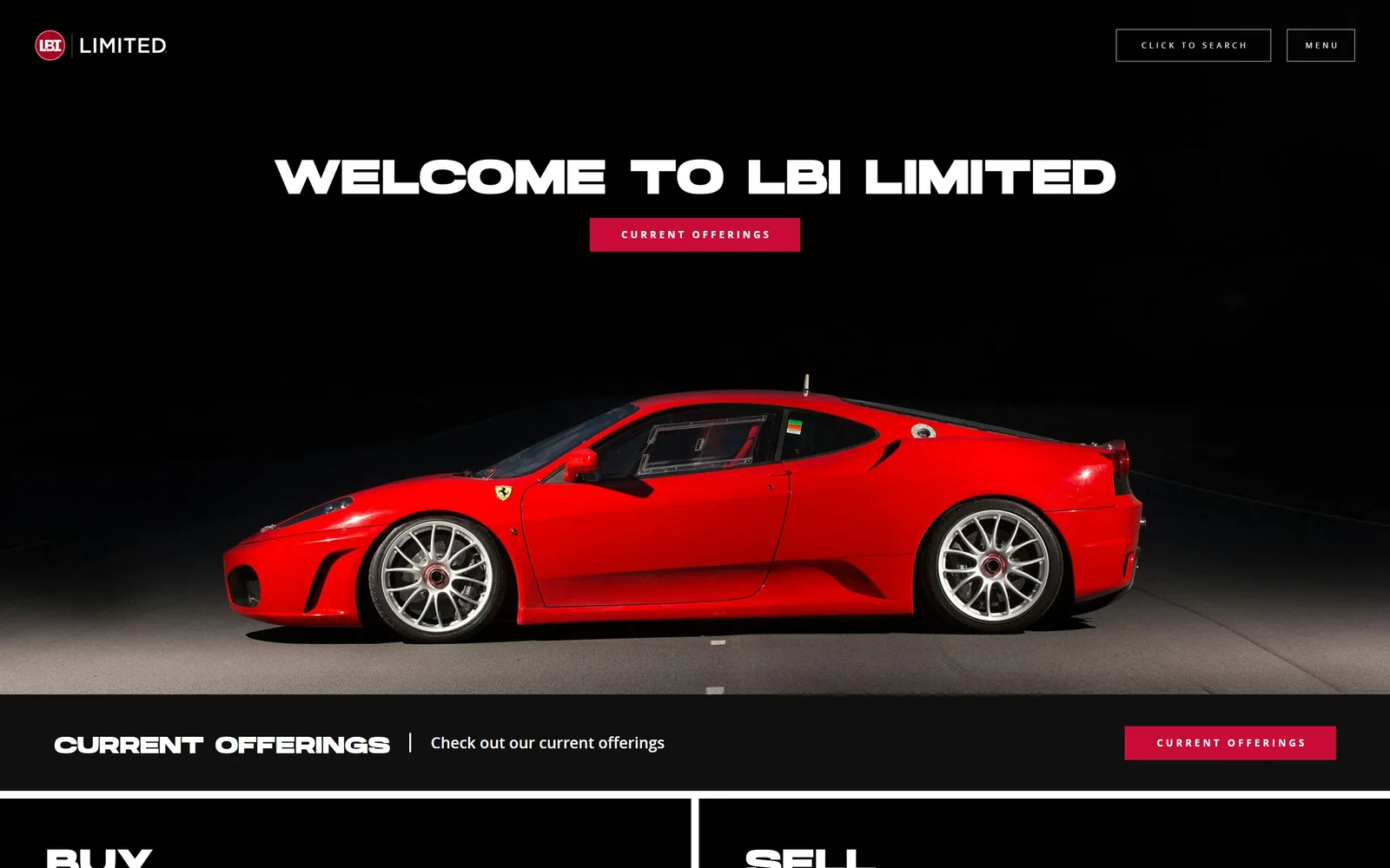
A red Ferrari F430 lit against black, WELCOME TO LBI LIMITED above it, and one crimson button beneath the headline.
Type. The headline is a heavy extended gothic at 50px uppercase with a line height of 0.51, which would collapse the moment the line wrapped. The small text goes the other way entirely: 10px and 8px open_sans tracked at 0.3em and 0.375em. CLICK TO SEARCH and MENU in the header sit at 12px with 0.292em. The gap between 50px and 10px is the page's only typographic idea and it is applied consistently.
Colour. Near-black #191b1c covers about 180 percent of a viewport once the sections below are counted. White type, and one crimson #bb0629 on CURRENT OFFERINGS, which appears twice. The Ferrari supplies the only other red on screen. Black studio photography on a black page is the obvious broker move, and here the car is lit well enough to carry it.
Layout. 1440px full-bleed with no container inset, the headline centred about 250px down and the car filling the lower two thirds. Below the hero a black band runs edge to edge with CURRENT OFFERINGS at the left, a sentence in the middle and the button at the right, then the page splits into BUY and SELL halves. Zero radius everywhere. The whole document is only 2860px tall.
The ask. CURRENT OFFERINGS appears twice before you scroll, once centred under the headline and once in the band below it. CLICK TO SEARCH sits top right. The BUY and SELL panels directly under the fold cover the two transactions a brokerage handles. No phone number, no form, no chat widget.
A short homepage that names the two transactions you handle beats a long one that lists capabilities.
08
revologycars.com
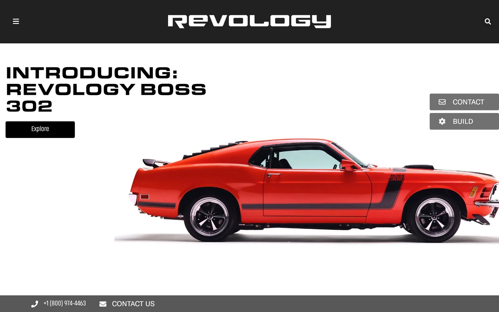
A Calypso Coral Boss 302 cut out on pure white, a squared headline top left, two grey tabs on the right rail.
Type
Eurostile Extended Black, 48px
Body
system sans, 21px
Build
full-bleed white hero, right-rail tabs, fixed bottom bar
Made on
WordPress
Colour
#ffffff #212121 #ba1c13
Type. The headline uses Eurostile Extended Black at 48px uppercase, the squared-off face that reads as a 1960s instrument panel. INTRODUCING: REVOLOGY BOSS 302 breaks across three lines because an extended face eats horizontal space fast. The Explore button under it uses Akhand at 28px, a softer and unrelated face, and the mismatch shows. Body copy falls back to the system stack at 21px, an unforced error on a site this considered.
Colour. White #ffffff covers 100 percent of the hero, with #212121 for the nav bar and the Explore button and the car supplying #ba1c13. That is the whole scheme: white, near-black, and whatever colour the car is painted. It works because the photograph is cut out on white, so page and product share one background.
Layout. 1440px full-bleed with the headline pinned to the top left about 30px in and the car bleeding off the right edge. CONTACT and BUILD sit as grey tabs attached to the right rail at mid-height, while a dark utility bar carrying the phone number and CONTACT US is fixed to the bottom. Below the fold the page uses a three-column 469px grid with zero gutter, and nothing anywhere is rounded.
The ask. Explore under the headline, CONTACT and BUILD on the right rail, then a phone number and CONTACT US in the fixed bottom bar: five asks. The right-rail tabs are the ones that will actually get used because they follow the scroll. The hamburger hides a ten-model list, a real cost for a builder whose models are the reason people visit.
Cutting the car out on white lets the product and the page share one background, so the photograph never looks pasted on.
09
ilusso.com
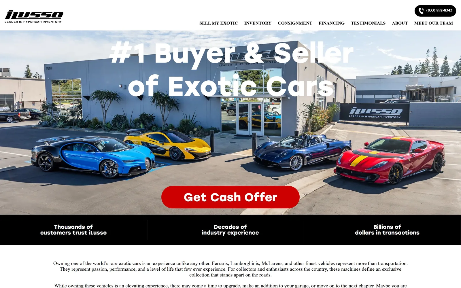
Four hypercars lined up outside a grey showroom, an 86px white headline across them, and a red pill reading Get Cash Offer.
Type
Stolzl 86px, weight 900
Body
Poppins 16px
Build
full-bleed photo hero, three-up stats band
Made on
WordPress
Colour
#ffffff #cc0000 #000000
Type. Stolzl at 86px, weight 900, for the headline, set over the photograph with no scrim behind it. Letters land on the building and across the showroom sign, so parts of the line fight the image. Poppins carries body copy at 16px. The statistics band below the hero uses Stolzl at 17px bold in two short lines per column and is the cleanest typography on the page.
Colour. White type over the photograph, then a solid #000000 band, then a white page with black body copy. The one accent is #cc0000 on the Get Cash Offer pill, reading nearer #d1040b on screen, at just over one percent of pixels. The cars supply blue, yellow and red, so the page itself stays neutral and lets the inventory do the colour work. For a dealer with photography this good, that is defensible.
Layout. 1440px full-bleed hero photograph, headline centred, button centred low, then a three-up statistics band with hairline dividers on black. 48px section padding. The pill button carries a 50px radius while nothing else on the page is rounded. Under the band sits a long block of body copy that is a search-engine decision rather than a design one.
The ask. One hero button, Get Cash Offer, in red, with its label set at 36px. Above it sit a phone number and seven nav items including Sell My Exotic and Consignment. The page knows its lead is the seller rather than the buyer and puts every bit of weight there. The statistics band restates the trust claim three times before any car appears.
Deciding which side of your market is the lead, and giving only that side a coloured button, is worth more than a tidier layout.
10
rkmotors.com
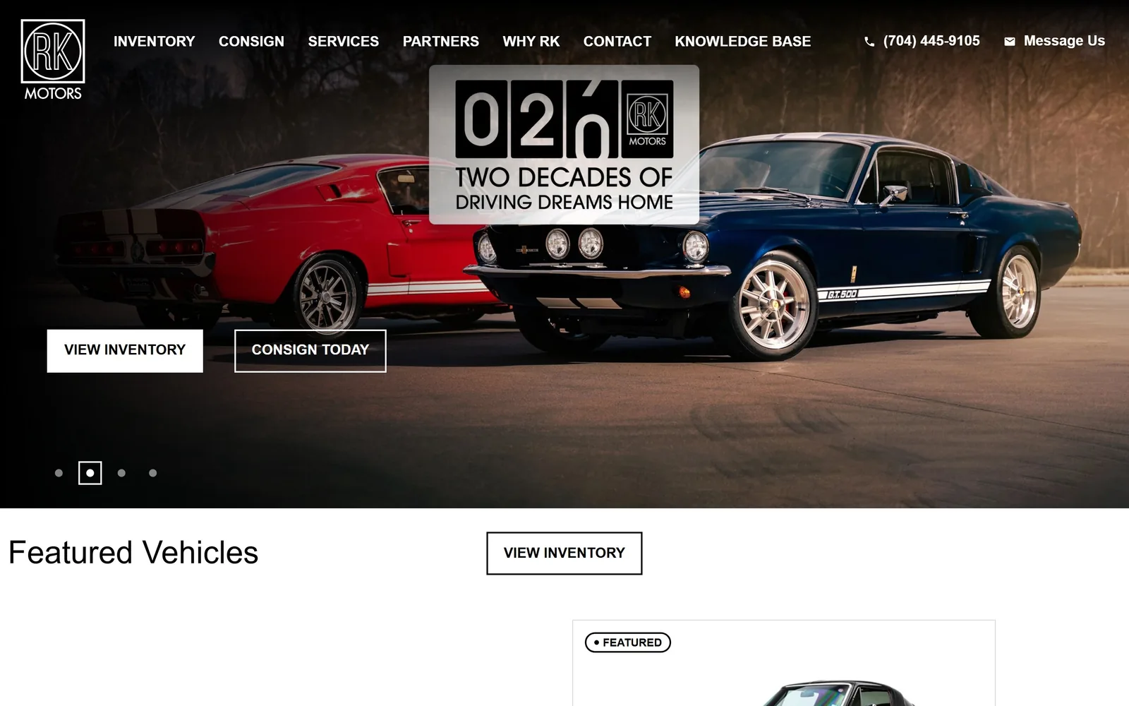
A red and a blue Shelby GT500 at dusk, a 20th anniversary odometer badge floating between them, and two square buttons bottom left.
Type
Roboto 40 to 50px light
Body
Roboto 18px
Build
full-bleed slider, two-button hero
Made on
custom
Colour
#ffffff #000000 #c8c5c0
Type. Roboto at 40px and 50px, weight 300, capitalised, for Featured Vehicles and the section headings. Roboto Condensed at 18px semibold uppercase carries the nav and every button. A 300 weight on a muscle car dealer is an odd pairing: the cars are heavy and the type is not. The anniversary badge is artwork, which is why its odometer numerals share nothing with the rest of the page.
Colour. Measured, the page is #ffffff and #000000 and nothing else. No accent colour exists anywhere. Buttons are white boxes with black text, or white outlines over photography. The badge sits on a translucent panel reading about #c8c5c0, parked dead centre of the hero because that is the only spot that does not cover a car.
Layout. 1440px full-bleed slider with four dots bottom left, the two buttons side by side about 620px down, and the brand badge centred near the top. Below the fold Featured Vehicles is left-aligned while its VIEW INVENTORY button sits centred, an alignment mismatch that is hard to unsee once noticed. Zero radius throughout. Seven nav items plus a phone number and Message Us in the header.
The ask. VIEW INVENTORY and CONSIGN TODAY in the hero, VIEW INVENTORY again under Featured Vehicles, plus the phone number and Message Us in the header: five asks. Giving consignment equal billing with inventory is right for a business that lives on supply. The slider rotating underneath the buttons is the main risk here.
Giving consignment the same button weight as inventory tells sellers you want their car before they have to go looking for you.
11
fantasyjunction.com
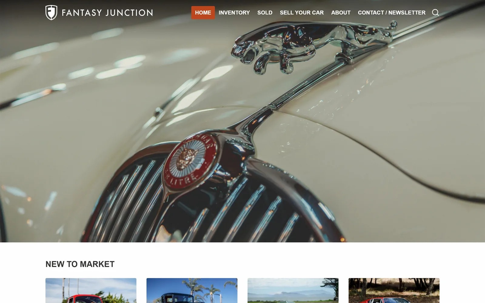
A cream Jaguar Mk2 bonnet with the leaping cat mascot filling the frame, logo and nav floating over it, and no headline at all.
Type
Source Sans Pro, 24 to 48px
Body
Source Sans Pro 18px
Build
full-bleed photo hero, 1200px catalogue grid
Made on
custom
Colour
#fefefe #333231 #be461c
Type. Source Sans Pro throughout: 24px semibold uppercase for NEW TO MARKET, 48px for the one large heading further down, 18px regular for body. Year and make labels in the listing grid switch to Merriweather at 32px weight 900, a heavy slab serif that appears nowhere else and does a lot of work. The FANTASY JUNCTION wordmark is tracked wide in white caps. There is no hero headline.
Colour. A near-white #fefefe page with #333231 for ink and furniture, and a burnt orange #be461c holding 0.1 percent of pixels: the HOME tab and a handful of links. The hero is carried entirely by the photograph's cream paint and chrome. An accent that small is a discipline decision, though with no headline to anchor it the hero leans hard on one photo being excellent.
Layout. A 1200px container at 83 percent of the viewport, narrower than almost anything else here, which makes the listing grid feel like a printed catalogue. The hero photograph runs full bleed above it. 48px section padding, zero radius. Above the fold there is only the logo, six nav items, a search icon and the picture.
The ask. Nothing in the hero asks for anything. The first ask is NEW TO MARKET and the four car cards under it, then SELL YOUR CAR and CONTACT / NEWSLETTER in the nav. For a brokerage over forty years old, the inventory is the pitch and the page trusts that. It is the least pushy page in this set and also the one working hardest on photography.
If your inventory is the product, a photograph and a nav can be the entire hero, provided the photograph is genuinely good.
12
autosportdesigns.com
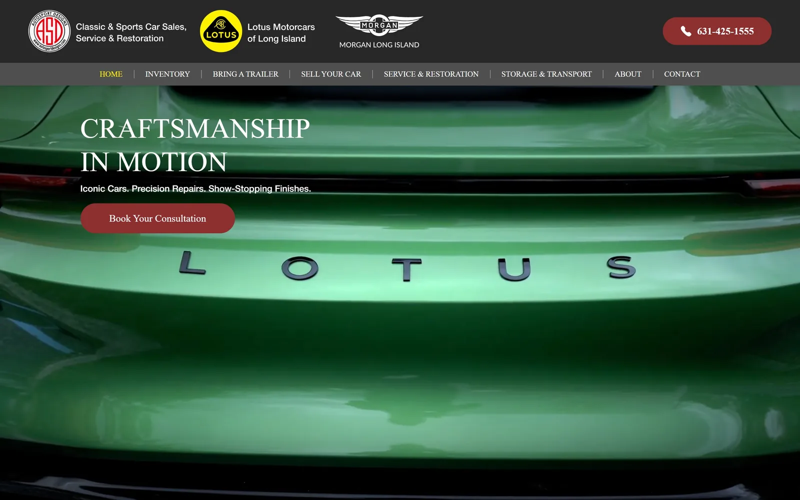
A green Lotus tailgate fills the screen behind CRAFTSMANSHIP IN MOTION and a maroon pill reading Book Your Consultation.
Type
serif fallback, 50px uppercase
Body
Neue Haas Grotesk 16px
Build
two-row header, full-bleed video hero
Made on
WordPress
Colour
#282828 #8e2f2f #ffffff
Type. A wide serif display face at 50px uppercase, set over two lines. The DOM calls it allumi-std-extended, which is a sans, so what is actually drawn is a Times-like fallback: bracketed serifs and visible stroke contrast. Body is Neue Haas Grotesk at 16px. The sub-line, Iconic Cars. Precision Repairs. Show-Stopping Finishes., is set bold but small enough to feel like a caption rather than a deck.
Colour. #282828 for the top bar and the page beneath, white type, and a maroon #8e2f2f on both the phone pill and Book Your Consultation. The hero video is green Lotus bodywork, so the screen is dominated by a colour the brand does not own. The active nav state uses #fff200 on four characters, a yellow that belongs to nothing else here.
Layout. Full-width 1440px with a two-row header: a dark bar holding three partner lockups and the phone number, then a lighter grey strip with eight nav items. The hero copy sits left about 200px in. 50px section padding and zero radius apart from the 50px pill buttons. The crop on the hero video is so tight that the car is unreadable as a car.
The ask. Book Your Consultation in maroon, a maroon phone pill top right, and View Inventory immediately below the fold. Eight nav items including Bring A Trailer and Sell Your Car. The consultation ask is right for a restoration shop, but it competes with three brand lockups in the header that all look clickable.
If your header has to carry franchise lockups, give them their own bar so they stop competing with your navigation.
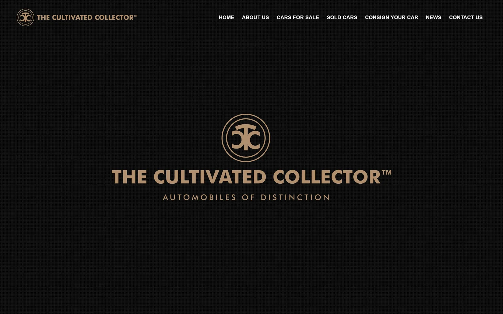
13
thecultivatedcollector.com
A near-black screen with the gold monogram and wordmark centred, and nothing else above the fold but seven nav links.
Type
condensed gothic lockup (artwork)
Body
Poppins 14px
Build
full-screen brand splash, 2554px page
Made on
WordPress
Colour
#111111 #ae8e6e #f7f7f7
Type. Poppins and very little of it: 14px semibold uppercase at 0.02em for the nav, 36px semibold for headings below the fold. The brand lockup is artwork rather than live type, a heavy condensed gothic in gold with AUTOMOBILES OF DISTINCTION tracked wide underneath. There is no hero headline, no sub-line and no button. The restraint is total, and it is also most of the problem.
Colour. A #111111 field with a faint texture, a muted gold #ae8e6e on the mark and tagline, and #f7f7f7 on nav links. Two colours, one of them metallic, which is the standard luxury-broker formula executed cleanly. Below the fold the page flips to #ffffff with nothing to bridge the jump.
Layout. 1440px full-bleed, everything centred, with the lockup at roughly the vertical middle of the screen. The document is only 2554px tall, the shortest here by a distance, and amounts to a splash screen followed by an inventory link and a mailing list box. No grid, no container inset, no corner radius.
The ask. There is nothing to click above the fold except the seven nav items, of which CARS FOR SALE is the one that matters. The first real ask, View Inventory, sits below the fold. CONSIGN YOUR CAR appears in the nav and gets no emphasis anywhere else. A brand this quiet makes the visitor do all the work.
A full-screen brand mark buys atmosphere, and it costs you every visitor who was not already sold on the name.
How these were chosen
Thirteen sites made the cut out of twenty captured: collector car brokers, Land Rover and Mustang restomod shops, a BMW preservation specialist, a certified EV retailer and a Texas tuner. Nearly all of them place the same bet, a full-bleed photograph or autoplaying video at 1440 by 900, type set straight over it with no scrim, and one or two square-cornered buttons. What separates the good ones from the merely competent is how much they leave out rather than what they add; Osprey and Enthusiast Auto each spend their colour budget on a single element and keep everything else to black, white and the car. If you are briefing a car dealership website design, the useful question is not which hero photo you will use but how many things you are willing to ask for before the visitor scrolls.
Finding car dealership sites that someone had actually designed took far longer than it should have. 26 candidates made the shortlist. 13 made the page.
Each one was opened and looked at properly: what the type is doing, where the colour gets spent, how the page is built, how it asks for the job. Nothing is here because it ranks. Nothing is here because an agency filed it under portfolio. Several well known names were left out for the plain reason that their site came out of the same template as everyone else's, and a few sites worth including did not survive a second look.
Where a site is only competent, it says so. The order is the order worth your time, best first.
Reviewed and selected by Larry W. Matthews for Websitely.